We decided to explore both options which we considered in class, where Elizabeth will make a post for the talking door, and I will make a post for the conversing billboard!
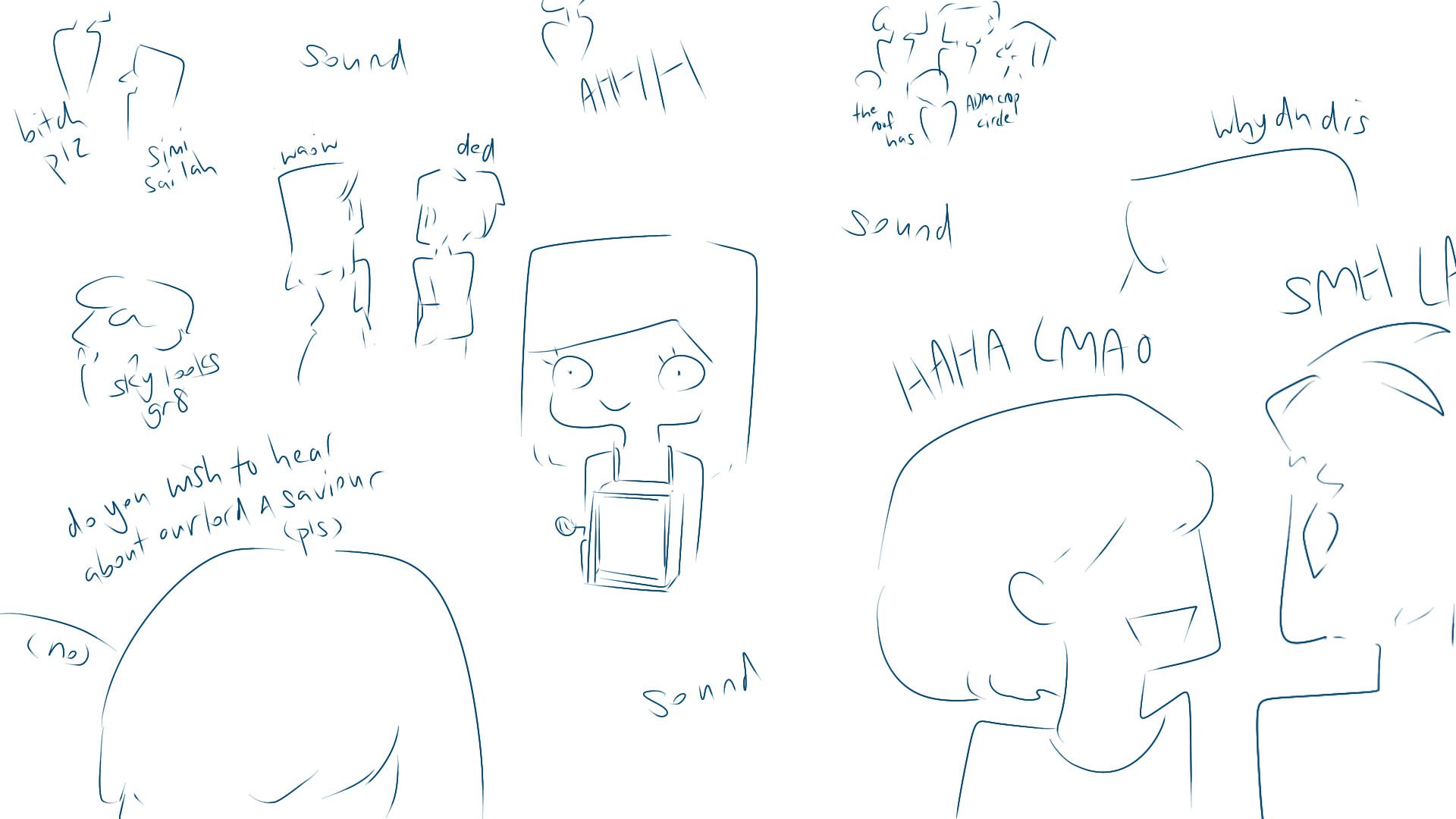
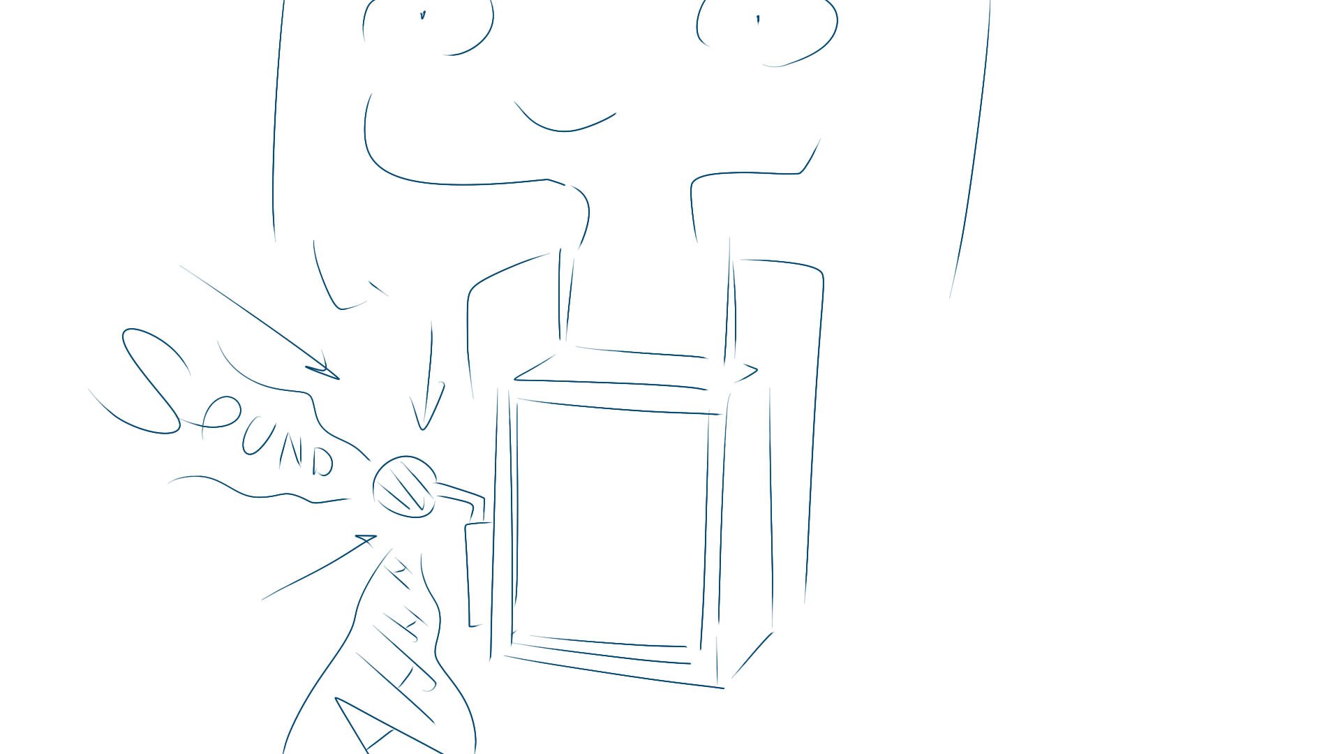
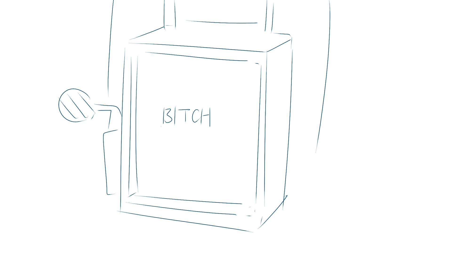
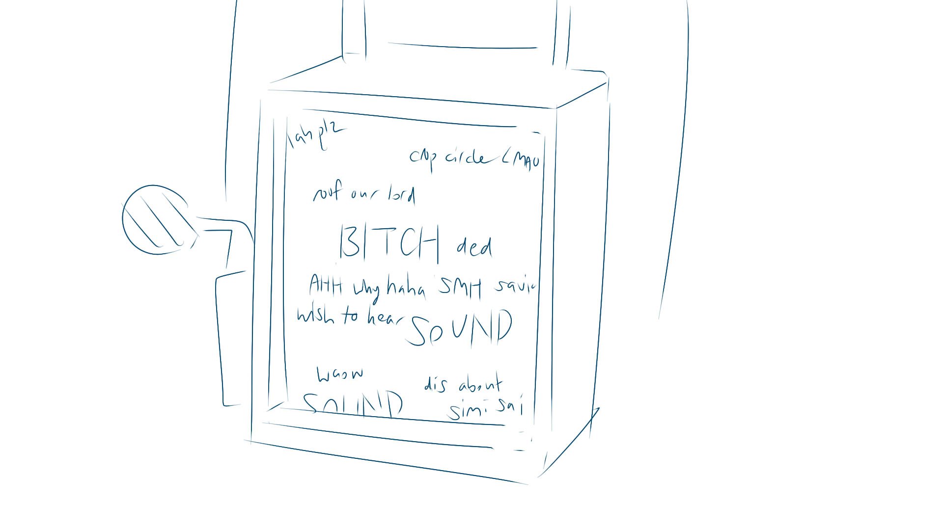
The original sketch.
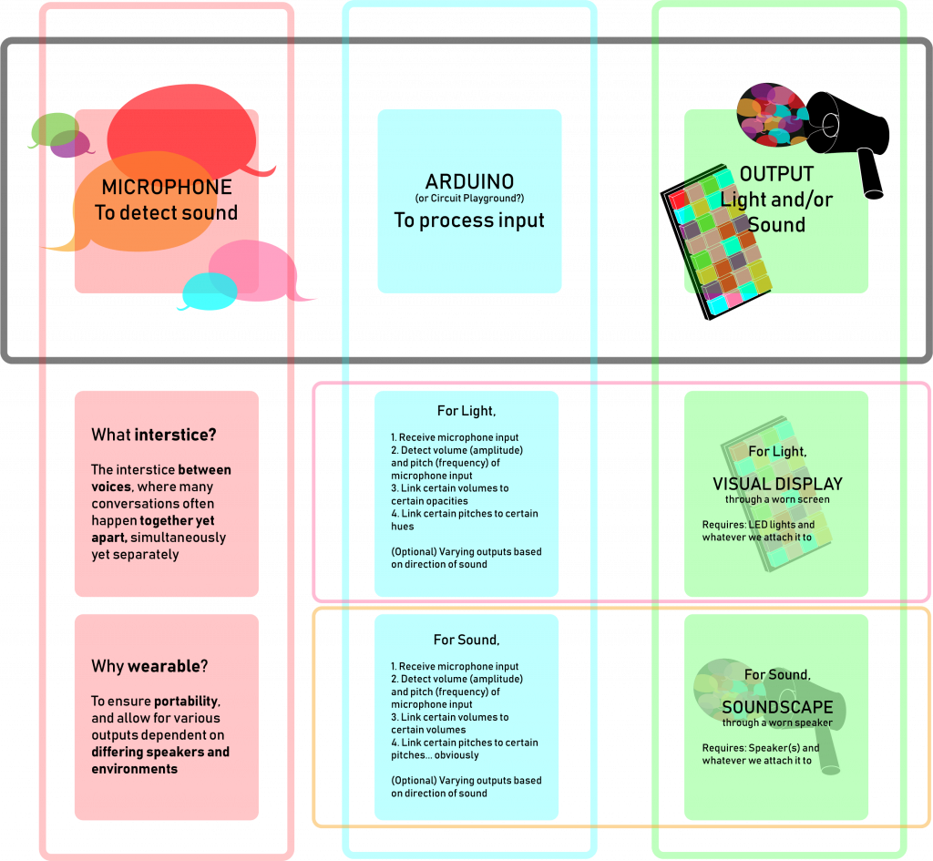
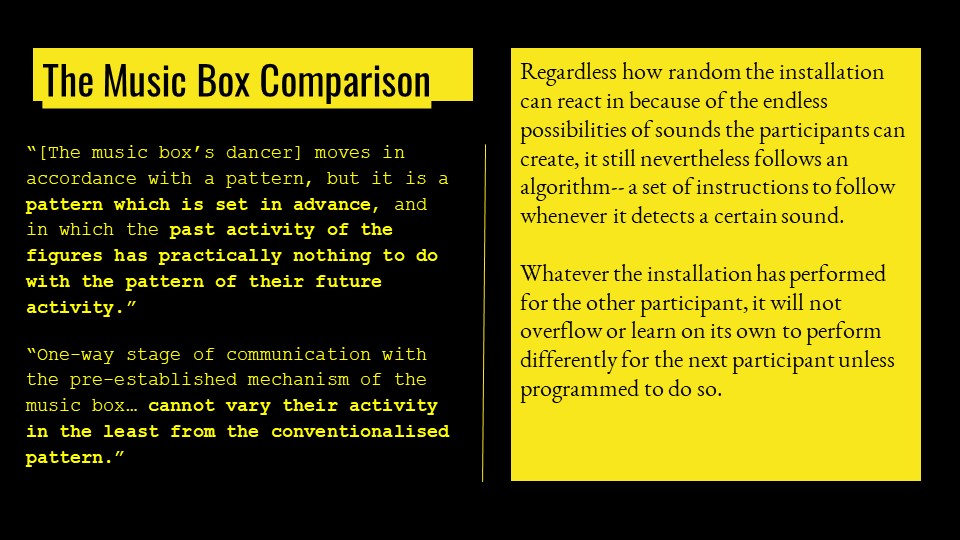
While we didn’t determine the exact output, the possibilities are mainly narrowed down to light, sound and/or text:
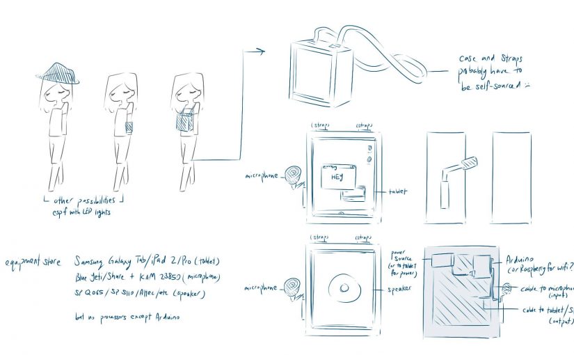
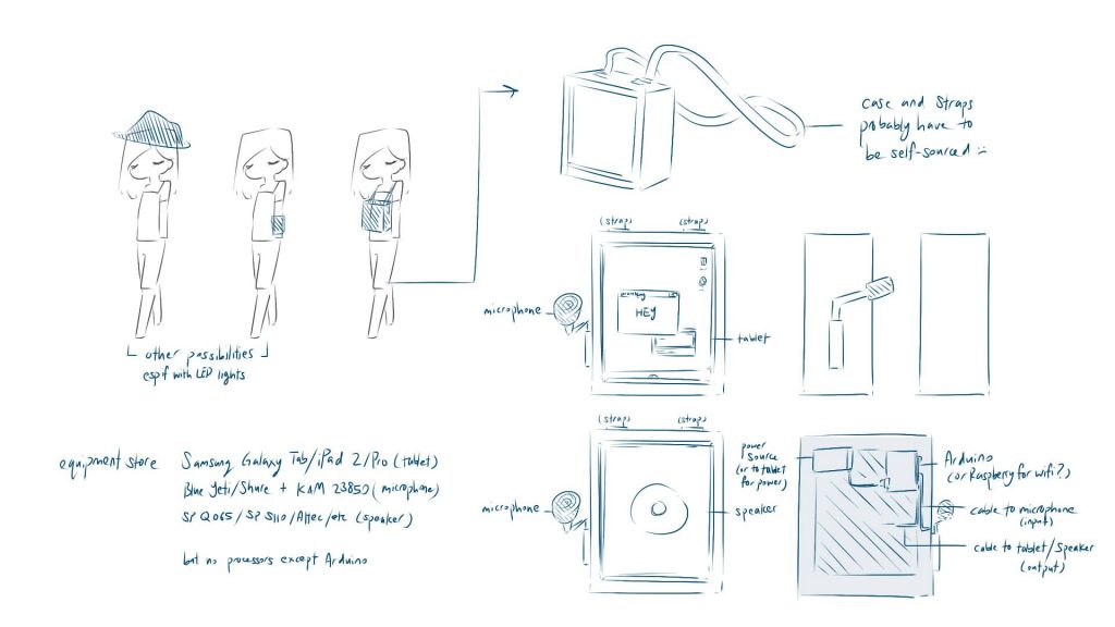
The item in mind (a carried display screen vs wearable accessory) and exact output is unconfirmed (lights, sound, or text).Example of various wearables and how it might be set up. All components needed are roughly the same, and can be hidden fairly easily due to its small size. Except for the speakers, of which one of the smallest, the Fostex Subwoofer, appears to be 13cm in height.
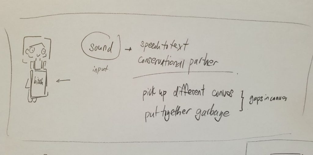
An even more complex possibility is of using speech-to-text code to create a direct replication than processed translation, for example:
Speech-to-text: Display various strings of text
Non-speech-to-text: Display various rgb values of light
An example of how it might work, which would be especially great in crowded places (assuming speech-to-text):
It may be possible that we will need a Raspberry Pi (for the wifi) or Circuit Playground (it’s easier for wearables).
Somebody once told me that humans are biologically engineered to instinctively look out for moving images and flashing lights. Seeing how easily we were distracted at i Light Singapore, he was probably right.
SHADES OF TEMPORALITY
Image of installation as shown on official website.
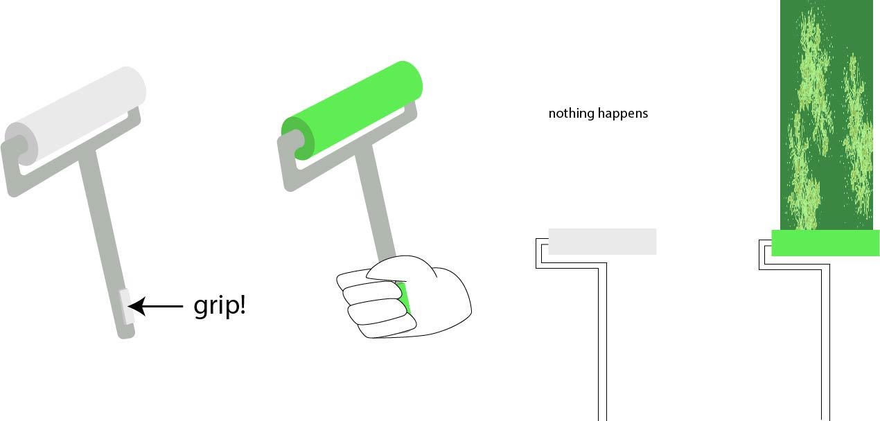
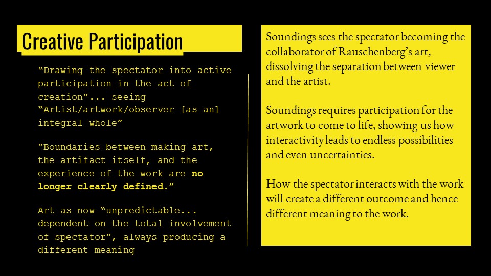
Shades of Temporality is easily one of the more interesting works presented. An homage to street art, it invites the audience to participate by painting onto the wall. The digital twist is that said paint is a video which only reveals itself when the roller detects that it is currently in the process of “painting”.
Interestingly, SWEATSHOPPE sees a much more philosophical meaning to their artwork. As the name suggests, it addresses the issue of temporality, where they are attempting to consider multiple layers of time: the experienced time of a participant’s creation of a canvas, and the edited time of a canvas moving separately from the painter.
Diagram 1: Side view of setup
Diagram 2: View of equipment (roller)
An ordered list of how it works might be like this:
Set video to play, but do not call in a command to project it
Camera tracks presence of green LED (or lack thereof)
If green LED is true,
Detect X-Y coordinates of LED positions
Store said coordinates in an array (to remember past coordinates)
Send projector the list of coordinates
Call a command to project the video at listed pixel coordinates
If green LED is false, do nothing
Somewhere, there is a button which resets the array to null whenever they switch participants
Diagram 3: Example of database system
This is a conclusion supported by both related articles and visible limitations, as evidenced by when we tried it out ourselves:
As can be seen in the video,
Lack of Z-axis detection: no matter how far from the wall, as long as the green LED is detected within the projection range, it will be registered as true. Their attempt to counter this is the button to activate it, which is affected by grip strength
Obstructions: putting the camera right behind evidently will make it impossible to write directly in front of yourself (an obstacle). In their defense, this is the best possible design, where the camera and projector must have minimal parallax error, and the roller is designed to make you subconsciously write above yourself than in front (it’s hard to wield a long item)
At 0:07, Christine and my lines intersect. I’m not sure why this happened; my only hypothesis is that there is some sort of supplementary background code which tries to account for fast movements/accidental turning off, perhaps something like this
If distance between green LED at time 1 & time 2 is small,
Assume that camera failed to track this movement, and
Fill in all coordinates in between with a linear function
Something much lower down the continuum of interactivity might be Shadow Exposed, which lacks both a feedback and database system.
SHADOW EXPOSED
Image of installation as shown on official website.
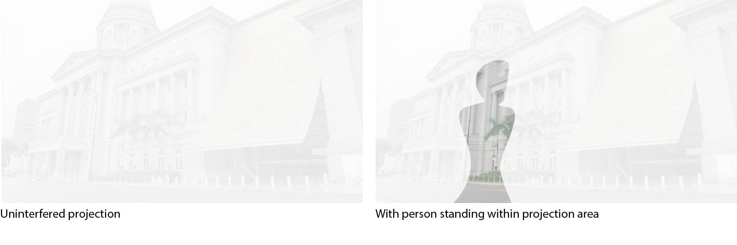
Like Shades of Temporality, Shadow Exposed is verily concerned with the nature of projection, though the focus is more on its relation with movement and light. There is an added layer of artist interest in attempting to let video “interact with the physical world”: in this case, by letting participants project their shadows against a backdrop of light and historical architecture.
Diagram 4: Side and top views
Diagram 5: With and without participation
An ordered list of how it works might be like this:
Make canvas with light-coloured materials in the shapes of architecture, which shows up better with darker backgrounds
Project video onto canvas
If projector is blocked,
Light does not shine in that area
Background is dark, thus image is clearer
Already, deviations from the sensor-based interactive artwork are evident.
My only conclusion is that the fundamental issue lay with that, while technology was involved, the interactive segment took on a fairly traditional form. If I were to make a comparison, it would be with the way a primary schooler might do shadow puppetry with a classroom projector.
While the description might lead one to believe that the video feed changes when it detects your presence, it was a constant image which varied only in terms of shadow and light, which requires no programs whatsoever as opposed to sheer physics. Is this an issue in relation to the ultimate message? Perhaps not, but it does compromise the interactivity, where this is a comparativelypassive piece.
Another issue may simply be insufficient contrast between shadow and light areas, where contents in light areas were still very clearly visible, and thus the presence of shadow didn’t “reveal” as opposed to “highlight”. For example, this sample image works well since it is truly only within the shadow that the buildings can be seen.
OTHER THOUGHTS THAT ARE NOT QUITE RELEVANT TO THE RESEARCH CRITIQUE BUT ARE HERE REGARDLESS
It is here that I wish to make a declaration, that a more precise lexicon may need to be established when speaking about interactive media. The term ‘interactive’ was used liberally to mean anything from emotional connection to talking with each other. Which isn’t necessarily wrong, but makes things rather difficult, if we wish to discuss certain types, such as sensor-based interactivity.
The question of how to identify interactive art also seems relevant here, where it is in hindsight that I realise that we had walked by this installation. (In my defense, there were many actual buoys with lights on. That is a very ordinary function of buoys. There was no reason to think otherwise.)
Then again, there is something rather endearing about a world in which interactive media has been assimilated into everyday life.
Going together with Elizabeth and Christine also led to an epiphany I might never have had otherwise: All the works were exceedingly founded on the assumption of being alone. That is not to say that it was required to only have 1 participant, of course, but that the involvement of additional participants was rarely, if ever, necessary. I find that to be a rather dismal state of affairs, considering that a majority of people would likely be coming in groups as tourists, families, colleagues… In other words, it may be worthwhile to have more interactive artworks which are founded on the assumption of companionship.
Isn’t everything interactive? The fact that we can perceive and influence things external to ourselves suggests that interactive media is a discipline that may transcend the technological, even reach back to whenever humanity gained sentience.
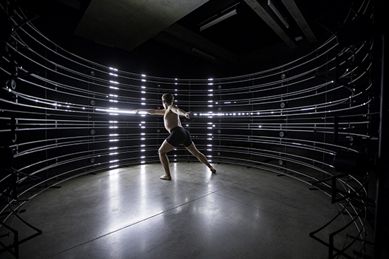
A work by the United Visual Artists (UVA), 440Hz, uses the human body as a basis to assert that possibility.
440Hz by United Visual Artists (UVA)
Where 440Hz is the frequency used to tune musical instruments, the body is similarly used as an instrument to tune the surrounding environment. What intrigues me most is perhaps the assumption that it is possible to translate certain kinetic movements into certain visual and auditory outputs.
This is done by taking the movements of the viewer as inputs, and creating outputs of light and sound around the viewer based on what was received. For example, a delicate flick of the hand may be but a momentary gleam. By adding up all the movements of our body, we create individualised canvases of sound and light around us.
The installation is meant to resemble a musical stave, a homage to the idea of the participant as the conductor, instrument, etc.
As a commission for On the Origin of Art, the intention of the artwork likely conflates both the artists’ tendencies towards self-reflection, and their response towards the origin of art. It claims that the body is inherently a medium of creation, one which continuously shapes the environment around us. Through this, creative expression manifests naturally. Consequently, the outcome of the project relies entirely on the participation of the viewer, limited only in terms of what type of output is generated.
DUNE, on the other hand, does not place this same emphasis on the importance of the physical self, as opposed to the significance of the experience.
Like a dune, the artwork shifts and sparkles when the viewer moves. Studio Roosegaarde describes the purpose of the artwork as “enhancing social interactions between [the audience] and the landscape”, and I am not inclined to disagree.
A suitable comparison might be of touching mimosa, just that the medium has changed from plants to lights, from biological instincts to sensors. Based on the proximity of the participant, the lights switch on, or do not, turning the viewer into a trigger than a mere observer. Outcomes may be considered to be fairly limited, however, in that the audience only determines if the lights are turned on or off (and where).
Thoughts and Questions Which Really Should Not Be Addressed in Class
It might be clear at this point that both artworks assume the environment and the individual to be separate entities which can be brought closer by means of technology, but hold different opinions on the environment: the individual is crucial in that the world collapses without them, versus that the individual merely serves to amplify a world which can continue even without them.
Obviously, this is interesting to consider. Is the world simply a form of interactive media that takes form only because we perceive it? Or does it cease to exist once we cease to interact with it?
I don’t think this is a question we can ever be equipped to answer, though, because it’s very much a question of epistemology. Which is philosophy. I’m sorry. I’m really sorry about this.
Actually Thoughts and Questions for Class
Maybe a simpler version would thus be this:
Are there any means of identifying when the interactive space should revolve solely around the audience, versus still existing outside of their perception? This works on the assumption that whether the interactive space lingers or collapses without an audience depends on the message that is being conveyed.
McLuhan was one of the first to suggest the idea of passivity and interactivity in media. In Understanding Media, he suggested that the medium is the message, i.e. the form in which content is delivered sends its own message. Combine this with the fact that interaction in itself suggests that there are at least 2 or more objects which are in contact with each other. In that case, would that imply that the message of interactive media is, inevitably, that of relationships?
Additionally, both of these works focus almost entirely on physicality and external senses. Even if we try to detect things like lies, we can only derive our results from physical reactions like heart rate, which is not necessarily accurate. Can interactive media ever hope to capture the intangible, like feelings and thoughts, without relying on physical signs?Should it even aspire to, considering the likely repercussions on personal space? Although this is more a question of the progress of technology, or lack thereof, and thus possibly one that we are not equipped to handle.
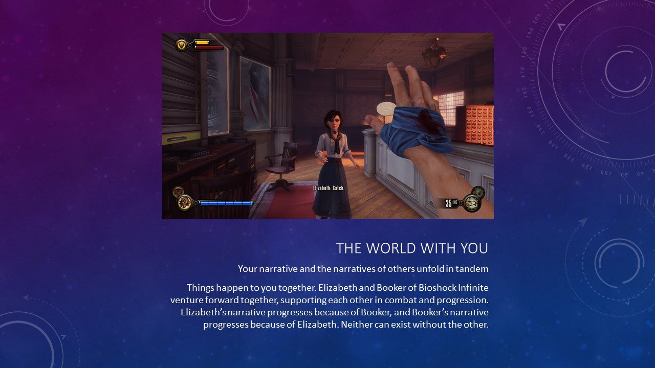
Humanity is approaching a moment in which technology and human understanding culminate, and video games is at that forefront. I may or may not write a short essay later, but everything I would say anyway is essentially in the slides.
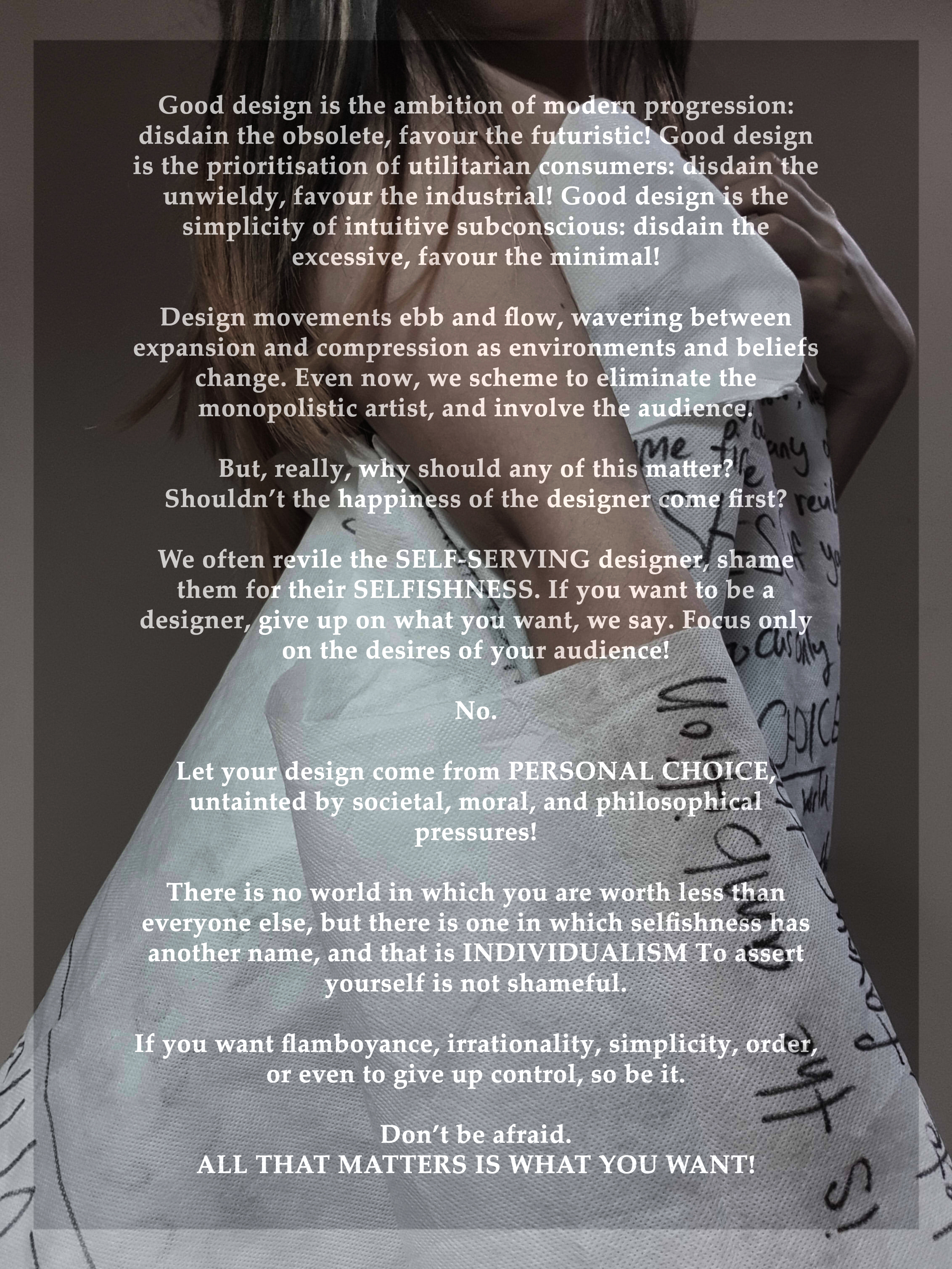
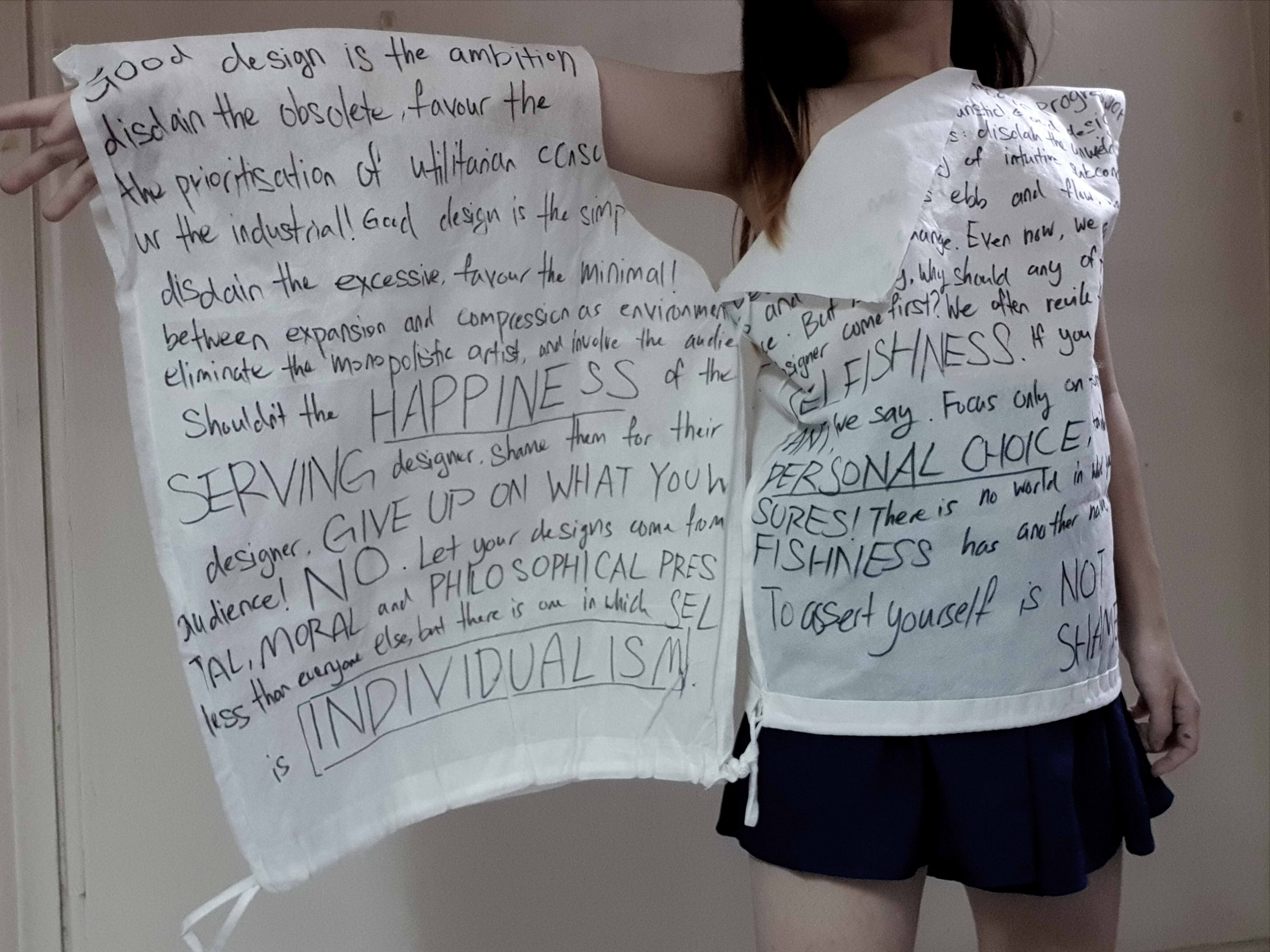
Good design is the ambition of modern progression: disdain the obsolete, favour the futuristic! Good design is the prioritisation of utilitarian consumers: disdain the unwieldy, favour the industrial! Good design is the simplicity of intuitive subconscious: disdain the excessive, favour the minimal!
Design movements ebb and flow, wavering between expansion and compression as environments and beliefs change. Even now, we scheme to eliminate the monopolistic artist, and involve the audience.
But, really, why should any of this matter? Shouldn’t the happiness of the designer come first?
We often revile the self-serving designer, shame them for their selfishness. If you want to be a designer, give up on what you want, we say. Focus only on the desires of your audience!
No.
Let your design come from personal choice, untainted by societal, moral, and philosophical pressures!
There is no world in which you are worth less than everyone else, but there is one in which selfishness has another name, and that is individualism. To assert yourself is not shameful.
If you want flamboyance, irrationality, simplicity, order, or even to give up control, so be it.
Don’t be afraid. All that matters is what you want!
A medium which spans across several disciplines, clothing simultaneously engages the visual senses of others and the tactile sense of the wearer. In more recent times, technology and fashion have converged to form “wearable technology”, ranging from new design techniques to new textiles.
A self-proclaimed material alchemist, Bowker is a prime example of the convergence of art and technology. Her expertise in the fields of chemistry and textiles allows her to meld the two to create new textiles supported by chemical reactions. Through The Unseen, she has also begun to delve into digital software to detect said factor and create reactions, than just chemical compounds.
In 2012, Bowker founded The Unseen to further pursue her interest in interactive textiles. A famous story is of how she fell sick while studying textiles, and had the epiphany that she desired the creation of textiles with “more meaning“. In simpler terms, textiles which can provide insights into issues like the physical and mental wellbeing of the wearer, or the characteristics of the surrounding environment (heat, wind, pollution, among others).
INTEREST IN THE PARTICIPANT, AND ITS EFFECT ON THE EXISTENCE OF EIGHTHSENSE AS INTERACTIVE ART
We see the culmination of this interest in the wearer’s condition in the interactivity of EIGHTHSENSE. Developed by The Unseen, it received assistance from partners Holition and Innovate UK.
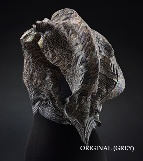
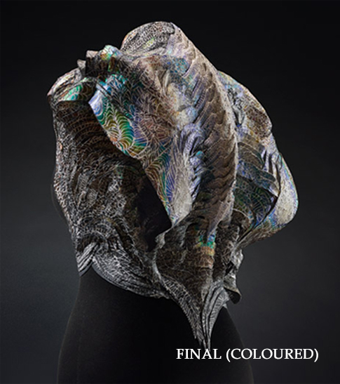
The piece in question. It is made of flexible ceramic, which in turn is made of innumerable pixels. Said pixels are hand-painted with colour-changing inks developed through Bowker’s expertise in chemistry.
Described as a “coded couture” piece, EighthSense is, simply put, a wearable ceramic sculpture which changes patterns of colour based on the emotional aura of the wearer.
While “couture” refers to its existence as an exclusive fashion piece, “coded” refers to the way in which the design functions: the smart textile is coded to analyse electromagnetic waves generated naturally by the wearer. This will later be essential in understanding EighthSense’s status as an interactive artwork.
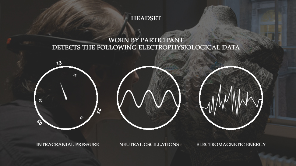
Graphic 1. Click to zoom in, or on images below to see each segment one by one. An explanation of how the system works to change the colour of the piece.
In EighthSense, there is a desire to understand more about the emotional status of the wearer, and reflect that through the garments they are wearing. Consequently, the piece takes on the qualities of behavioural art, where the artwork is something defined by the behaviour of the wearer than the assertion of the designer.The behaviour in question here is the emotional state of the wearer, such that the artwork can change form depending on that aura. The designer takes a supplementary role, simply providing the canvas and means through which the participant engages with the artwork. As the artwork must have an emotional status to reflect, it is necessary to directly engage the participant, lest the artwork cease to exist.
Furthermore, this reflection of emotional status can only occur through the use of something to execute complex actions, where that something is the use of technology in art. A complex action is defined as the action system by which the input will lead to an output, often through deliberately routing than direct causation. As shown through the video, without input, the artwork is static and grey. With varying inputs in the form of biological signals, then, comes varying patterns of colour.
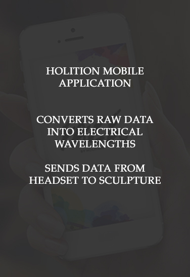
Referring to the graphic again, we see that the headset provides raw electro-physiological data. The Holition application then modifies the raw data as per necessary, and sends to the artwork as inputs for processing. After which, the sculpture creates outputs based on those inputs, allowing the electro-physiological data to be visualised as colour on the garment.
This provides structure through the existence of algorithms which continuously receives biological signals as feedback from the wearer. Since the objective is to reflect the wearer’s emotional status, the garment will constantly check said data, and change colour accordingly. By extension, this structure assists in staving off entropy, where entropy is defined as the possibility of “disorganisation in [information] transit”. As long as you have some knowledge of what inputs lead to what outputs, the awareness of the antecedent (emotional status) will allow you to deduce the consequent (garment colour), and vice versa.
CONVERGENCE OF TECHNOLOGY AND DESIGN, AND ITS EFFECT ON THE EXISTENCE OF EIGHTHSENSE AS IMMERSIVE & INTERACTIVE HYPERMEDIA
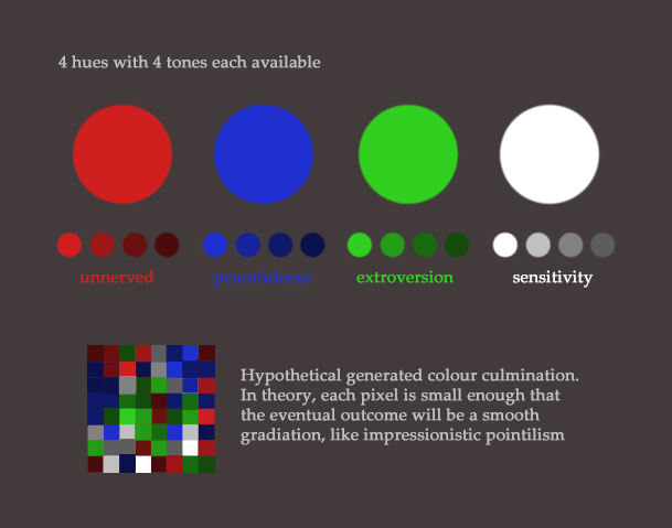
On the more technical side, a semblance of entropy can, regardless, still be maintained due to how the technology allows for infinite possibilities as to the form of the artwork. This is due to 1) the tessellation of pixels to build up the sculpture, and 2) the existence of multiple hues and tones, such that the colour culmination will never be exactly the same.
Graphic 2. Exact specifications, and a graphical example of how colours are culminated. Associated emotions are as per claimed by Bowker.
From this graphic, we can also see that EighthSense has inadvertently crossed into the realm of hypermedia, according to As We May Think, where the criteria primarily revolves around non-linearity and multimedia.
EighthSense is able to have a non-linear method of information organisation because of its dedication to tackling emotion in relation to colour. In this artwork, emotion and colour are linked not by artificial and linear methods like alphabetical order, but by a non-linear method: colour psychology. This is a distinctly human construct which relies entirely on how the human brain creates association. For example, one might categorise ‘fury’ and ‘irritation’ together as subsets of ‘anger’, than have them all on the same hierarchy level. It is not improbable, though, that it is simply that they generate similar electro-physiological data, and thus generate similar colours as outputs.
Furthermore, the medium of and technology behind EighthSense causes it to be considered interactive multimedia as well. The garment exists in the domains of many types of media: the visual image of the wearable, the animation of the ever-changing colour and the interactivity of the emotional input.
Many of its features also provide EighthSense with a reasonable amount of immersive quality. Immersion, as per Sutherland’s The Ultimate Display, involves the usage of appropriate input systems and interfaces to increase familiarity of control. Virtual Environments expands on Sutherland’s ideas, in suggesting engagement of some, if not all, senses, as a way to duplicate and extend reality.
Once again, the medium of and technology behind the garment allows it to cater to various senses. The wearable itself engages the tactile sense of experiencing the flexible ceramic against skin. The form of the wearable engages the visual sense of experiencing what the artwork looks like. In addition, there is emotional engagement in the form of emotions directing the outcome of the garment, which increases the level of immersion.
However, the headset is a somewhat disappointing input system, where it is neither intuitive nor immersive: should it not come from the garment, instead of an external factor? Would it not have been better to design a hat instead of having to wear extra items?
However, it is also important to note that EighthSense is incredibly successful at extending reality through technology in a way plausible enough for us to suspend belief: the manifestation of emotions on clothes. As intangible emotion is closely tied to tangible colour, we see that the notion of colour changing to match emotion can be smoothly integrated into textile design. Thus, it is able to be immersive enough to prevent disassociation.
CONCLUSION
It is not a travesty to assert that Bowker’s claim of exploring the wearer and their surroundings is true. Certainly, The Unseen has accomplished that in an astounding manner, where the garment’s interactivity elegantly detects, analyses and visualises the wearer’s aura.
The Unseen’s signature style of combining design and technology also shines, and unintentionally brings the artwork into the realm of hypermedia through the natural information categorisation and multimedia form. Of course, the immersion level could be better: it is simply bizarre to think that it is not necessary to wear the garment at all, since the input comes from elsewhere.
Regardless, EighthSense and The Unseen represent a positive step towards assimilating interactive technology in everyday life, and I am confident that this can and will be a future trend in fashion.
(Word Count: 1365 words)
Please note that hyperlinks have been included in the hyperessay for definitions and quotes.
Additionally, image sources can be found by clicking on each image, which will redirect you to the original website. (Images for Graphic 1 from here and here, and featured image from here)
REFERENCES
Chung, B. (2015). Now You Can Wear Your Aura on Your Sleeve. For VICE. (link).
Howarth, D. (2013). The Unseen creates “coded couture” to read wearers’ auras. For dezeen. (link).
Mower, S. (2015). Meet Lauren Bowker, London’s First Fashion-Channeling Witch. For VOGUE. (link).
The dress that changes colour with your emotions. On BBC News. (link).
While The Unseen dabbles in various things, I chose the key work based on what I believed 1) was related to fashion, and only fashion, design, 2) had the potential to be “normalised” as an integral part of design, and 3) had some form of official recognition.
Holition is a company which collaborates with companies dabbling in upcoming technologies
Innovate UK is a government-associated board which supports innovation in technology
Interestingly, The Unseen is its only fashion technology awardee so far. “When I applied for the award, it was the first one I had seen for fashion technology.” (Bowker, 2015)
Manifesting the wearer’s aura through colour changes and pattern shifts
Through recording the generated electromagnetic energy (human magnetism and “electroencephalogram”)
Which thus gives insight into the emotional state of the wearer
e.g. Turns red for anger, blue for serenity
Supported by the British Fashion Council
Received an award from Innovation UK’s Technology Strategy Board
Personally, I feel that this has the potential to be “normalised”, where it seems fairly plausible to have fashion designs which deal with reflecting the wearer or the wearer’s surroundings. While technology and fashion have already converged, such as with UNIQLO’s advanced fibers to absorb moisture or retain heat, interactive technology is much newer, from the earliest renditions in the 1980s, to The Unseen, of the 2000s.
Now, to hypermedia.
The key words of hypermedia might be “non-linearity” and “multimedia”. In essence, this means:
Information is organised as per how the human brain does, as opposed to how a machine might organise information
Feelings are organised as anger {fury, rage, irritation} and sadness {melancholy, despair} rather than alphabetically
This information can take many forms, perhaps simultaneously as well
Rather than just audio or text, the use of both simultaneously. May also include movement and interactivity, where the dynamic, shifting form is considered as multimedia
The link is perhaps not as clear as for interactivity, but this work loosely relates to hypermedia, where the consequent colours and patterns are grouped by types than ordered lists (although this may be because the electromagnetic waves are also similar within each set of feelings). Of course, it falls under multimedia: while it relies on visual and ignores things like texture or sound, the interactivity makes it such that there is movement, and as such, it serves as an “animation” of sorts.
But, what if our clothes became more than a basic covering? Creates a dress code that acts as an extension of you and adapts to the environment on your behalf? That’s the question fashion designers are starting to toy with, be it in the pre-prototype, prototype, or ready for market phase. (Kimani, 2016)
As one of the most ambiguous and cross-disciplinary forms, fashion could be anything from a product, to a visual communication, to avant-garde, to a commodity, to a new form of self-expression. This uncertainty fascinates me immensely, and as such I will be choosing an artist who dabbles in interactive fashion: Lauren Bowker, founder of The Unseen.
(Images from here. Example of a way clothing might be traditionally interactive, through responding to your movements. Arguably, fashion is also interactive, as a whole, in that you get to choose, customise and coordinate whichever pieces you want to create different outfits, such that it involves both the “artist” and the active participant.)
Due to the convergence of disciplines, it is difficult to describe her, but here are the two main descriptors:
Convergence of science and art: Though she does hold a design degree, Lauren Bowker is also primarily a material alchemist. Thus, her works are defined by the materials she personally developed through chemical experimentation.
Interest in the human condition: A famous story is of how she fell sick while studying, and discovered that she wished to “produce material that could speak for you“. Thus, her works are often dynamic and dependent on derivable information.
Combining her self-developed materials and her desire to accurately reflect the self would then lead to fashion pieces which provide visual feedback through said materials based on the collected data. For example, a jacket which turns from yellow to black through the use of a colour-change ink based on the pollution levels.
Examples of works:
A I R collection: changes colour based on the environment, from heat and sound to moisture levels
PHNX collection: Collaboration with Peachoo + Krejberg, ripples based on movement
F I R E hair dye: Changes colour based on surrounding temperature
Ponderings on Interactivity
Out of curiosity, I looked up existing essays from other classes, and was vaguely intrigued to see that many works somehow tended to… Look similar. It is not a phenomenon I can explain, but many of them have similarvibes, intermsofvisualstyle.
(For example, the usage of colourful lights arranged in wide areas, or the emphasis on the organic form reflected in digitally-rendered interactive pieces.)
Which brings to mind a few questions:
1) Why are there so many similar traits among interactive art pieces?
The foremost answer is likely that we all happened to choose fairly similar pieces because our preconceived notions of interactive art tends to be of installments and sculptures. Also, that perhaps it’s harder to choose things which don’t have defined forms, like games.
Entropy, active participation, process than product. Though these factors create an infinite number of artworks, many similarities are retained.
In terms of input, humanity is ultimately fairly homogeneous. Physically, we all perceive the world in a fairly similar way. As such, interactive art can only use what humanity is capable of, such as visual or auditory sensors. Even if technology expands to be able to cover “thoughts”, it is difficult to cater to program a different reaction to every single input, where we need to place them within sets, like “anger” to comprise any emotion from rage to irritation.
In terms of means, interactive art pieces are often severely limited by available technology, where there are limits to what can be done in the field of interactive art. For example, it is only possible to generate a feedback loop based on physical factors, like motion or voice frequency. Even pieces which claim to “tune into psychological state” can only determine it by things like pulse rate. If we were able to, for example, devise a technology that can detect your political standing from your thoughts than through your words, there might be a larger scope for interactive art to work in.
In terms of output, it may be that interactive art is a fairly new concept. We have not yet explored the various ways in which it can be incorporated, where mediums such as LED lights are one of the most explored ways. The rise of new media also means the expanding of possible platforms, from a physical form, to a digital form, such that things like the internet can be used for art.
2) What is the difference between interactive art in new media and interactive everything else?
If we compare new media versus old media, the difference is evident (two-way versus one-way and thus lack of an immediate feedback loop).
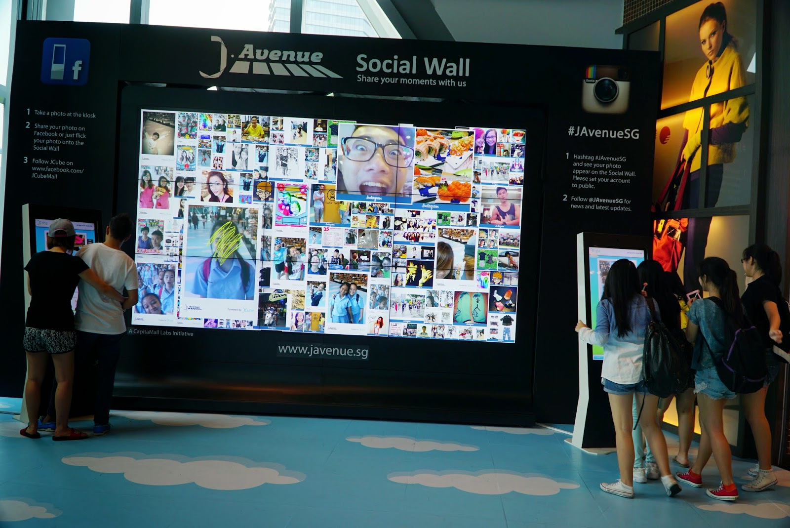
If we compare to things which can be interacted with, the difference is also evident. Just being able to perceive something (through sight, touch, etc) does not make it interactive art, which needs to involve an element of a fluid form shaped by your input. Think a wall at JCube, versus the photo wall at JCube.
Photo wall at JCube. Click on image for link.
The rest is unclear. Where is the line between “art” and “non-art” drawn? If we justify interactive art as having to involve the element of dynamically changing in response to feedback from the participant(s), would something like a lie detector be considered interactive art?
The only criteria I can come up with is “functionality” versus lack thereof, but it would be full of loopholes.
3) Where will interactive art go in the future and/or how do we integrate interactive art into society
Interactive art is, in a way, already integrated into society. Things like the elevator coming to you when you press a button, where the pressing indicates that you want an elevator (input leads to output) (albeit not very dynamic outputs).
The problem lies in that society is built to be homogeneous. The elevator may not come to you immediately, because it needs to cater to other people first. Or, the button might be too high to reach, or the elevator too small for you to enter. Currently, interactive art is also limited by said homogeneity, where technology has not reached a stage where we can create 100% individualised outputs for every single input.
I suppose the path forward for interactive art would thus involve 1) more time to delve into the subject, to explore more ways in which we can engage interactivity, and 2) further developments in technology as to be able to create even less homogeneity.
If both of these were to come, it would mean that we would be able to revolutionise society, from something which marginalises minorities, into something which can cater to everyone. It would not solve the issue that we still have to share physical resources though (you can’t just build an elevator per person), so interactive art may also be helpful in, at least, making better compromises such that everyone can be somewhat satisfied.
Caula, R. (2014). THE UNSEEN develops wind reactive ink that changes color upon contact with air. For designboom. (link).
Howarth, D. (2013). Clothes that change colour according to climate by Lauren Bowker. For dezeen. (link).
Kimani, N. (2016). Interactive Clothing: The future of fashion is all for connectivity. For The Designers Studio. (link).
In Chinese, these two characters mean “origin” and “travel”. In Japanese, it can be read as “genkou”, not unlike the Japanese term for manuscript paper.
Though intentionally left vague, it is meant to embody a sense of undertaking a journey towards the beginning. The violin of the leifmotif, Journey, pushing the song ever forward; the full stop soaring towards the direction from which one begins writing. Surely, the circle of a true ending would break out of the grid, break free of order and structure.
The original idea was as follows:
Rhythm-based bullet hell
Bullets appear on screen to the beat of the accompanying music
Dodge bullets to survive as long as possible
(Optional) Make music loop with remixes and increased tempo
Otherwise, just loop without progression, or just end it after the first loop
Just Beats & Shapes, the main visual inspiration. It uses geometric shapes, which are certainly easier to work with than having to animate with sprite sheets.
This was a fairly doable project, where it required quite standard systems: generation, movement, collision, reset and end processes. There were also fairly few necessary elements: the player, the damages and the stage.
I also just wanted to try using my own musical compositions in a game, so I did. MIDIs proved to be a very extensive subject, though, so I opted to convert to WAV and use it as an import than a program-generated sound sequence.
What I did not realise was that I have 1) no prior experience with programming, 2) an affinity for making extremely solid base systems, and 3) an affinity for catering to game quality of life systems. As a result,
Part of said unbreakable foundation includes using various things such as classes, booleans and variables to ensure statements do not encounter critical issues. Debugging was also done extensively, where I tested for every possibility possible that I could think of to ensure there were no loopholes in the code.
I spent an excessive amount of time on creating an unbreakable foundation with no critical bugs,
succeeded in making said unbreakable foundation, but
An example of millis() usage. Here, millis() is used for timing: for 3000 milliseconds after collision, the player will flicker. In the second case, millis() is used much more dubiously: +83500/soundrate refers to the exact calculated timing of how long should elapse, modified to match a new soundrate.
lacked the time to focus on creating the rhythm system,
lacked a good idea of how to create said rhythm system,
this would later prove to be a major problem, where I discovered that it was fundamentally problematic to use millis() in a system where FPS is unstable
Generation of damage zones, which are all just randomly generated blocks. I had to divide it up into multiple zones too, as it would drop too many frames if too much data was being processed at once. Many issues are evident, such as possibilities of RNG creating poor paths, and using guess and check to figure out how many damage zones to have.
lacked engaging gameplay,
as damage received is based on time spent in damage zones, it’s very easy to cheese the system by speeding through it fast enough that no damage is received
no attempt was made to tailor difficulty levels through formulating paths for players to navigate, as opposed to just random generation
this was partially caused by another issue, where input caused far too rapid movement to allow for careful maneuvering
The code used to reset the game, bringing you back to the title screen after the ending cutscene has played (boolean fadedone). Two different ending cutscenes are possible, depending on how far you’ve reached (determined by how much millis() has elapsed).
included many quality of life systems
such as a loop back to the title screen, removing the need to reset the game by closing and reopening it, or
visual feedback for collision occurrence and damage reception, or
starting and ending cutscenes
Sprite sheet. For the falling animation, I wasn’t sure how to derive the necessary components from the first array, so I took a simpler route by creating 2 separate sprite arrays.
If we assume quality playability, key issues which would have to be resolved are as follows:
Deciding on a direction for engaging gameplay
Maze navigating, where the damage zones are instead walls which cannot be bypassed. The player would then have to try to navigate through it, where the death condition is falling off the left side of the screen (think Icy Tower)
Rhythm dodging, a la the original idea
Fixing the excessively fast movement to allow for proper navigation
Kee Yong mentioned inserting a delay on frame checking, such that it does not check for keyPressed on every single frame (which is the reason behind the rapid movement)
Editing the damage dealt formula to discourage touching damage zones at all
Invincibility frames proved to be beyond my understanding, but I will probably have to eventually make an effort to understand it
Introduce initial damage, such that at the first moment of impact a certain percentage of damage is dealt, THEN for every subsequent moment spent in the zone, health values are drained
Fixing variables with millis() dependency which are currently using precisely calculated values than variables
Using the MIDI files directly and tying timing to that within Processing(I don’t believe this is a good idea, but entirely possible) Cutting up song into portions and tying sequences to the start of each segment of the song
Possible expansions would include the following:
An actual ending
Currently, set such that death is inevitable. Just a placeholder system, where I do not believe that should be the case, there should be a proper resolution
For now, 原 has no function attached (pressing will cause no effect but denial) but perhaps something like a second playthrough will allow it to be selected for a bonus stage?
Expanded gameplay
Different types of damage dealers. Not just out of bounds zones, but also moving squares, lasers, etc
Extended gameplay
Different levels and songs
Song looped with increasing difficulty (increased tempo, increased damage zones)
Certainly, though, I’ve learnt that I do have glaringly obvious strengths and weaknesses. That I have good awareness of where and why problems could possibly occur (though whether or not I can deduce the solution is another matter), that I have sufficient sensibilities to include easily-overlooked elements which greatly improve gameplay experience, but that I lack awareness of how to create engaging and effective gameplay. That I am good at recognising what is “additional” and knowing what kind of temporary concessions to put to make it seem complete even when incomplete, but that I am lacking in allowing it to remain incomplete, such that it’s difficult to do anything too extensive.
There’s also the fact that programming goes far beyond just games played with computer inputs, which I felt I didn’t consciously realise, like Brendan’s webcam filter program, or Joey’s music visualiser. I’m not sure if I will venture into such areas, since I feel like I haven’t adequately explored game programming (e.g. meta game, animation for visuals, interaction with various kinds of unique objects). It was a good realisation, nevertheless.


![[Manifesto] Individualistic Design (all that matters is what you want)](https://oss.adm.ntu.edu.sg/a170027/wp-content/uploads/sites/1810/2018/11/20181112_021857-6-825x510.jpg)
![[IM Hyperessay] E I G H T H S E N S E](https://oss.adm.ntu.edu.sg/a170027/wp-content/uploads/sites/1810/2018/11/8sense-825x510.jpg)


