![[Project 3: Ego]](https://oss.adm.ntu.edu.sg/a170027/wp-content/uploads/sites/1810/2017/11/idek.jpg)
Was everyone else really as alive as she was?… If the answer was yes, then the world, the social world, was unbearably complicated, with two billion voices, and everyone’s thoughts striving in equal importance and everyone’s claim on life as intense, and everyone thinking they were unique, when no one was. One could drown in irrelevance. (Atonement, by Ian McEwan)
It’s frightening to think that I am a unique individual, seeing as the world is so large that, all things considered, we eventually become この星の無数の塵の一つ, “one of the innumerable specks of dust on this star“. I find it so frightening that I can’t bring myself to treat myself as special. And yet, despite all that, I find that humans are so infinitely unlimited, that I can’t possibly describe myself, or anyone else, with mere words. How can I capture the essence of myself through 12 panels?
And thus, the compositions became a bizarre blur of those thoughts, of humanity’s struggles with their existences, where I am a part of that humanity, yet looking at it from a distance.

And a scanned in version, for proper documentation.


First, I will mention those which are common points across all compositions.
Mediums
- Self: Sakura Mat Water Colors (18-col)
- World: Rhomlon eyeshadow with Daler Rowney Gum Arabic Solution
- Result: Daler Rowney Gouache (12-col)
Subject
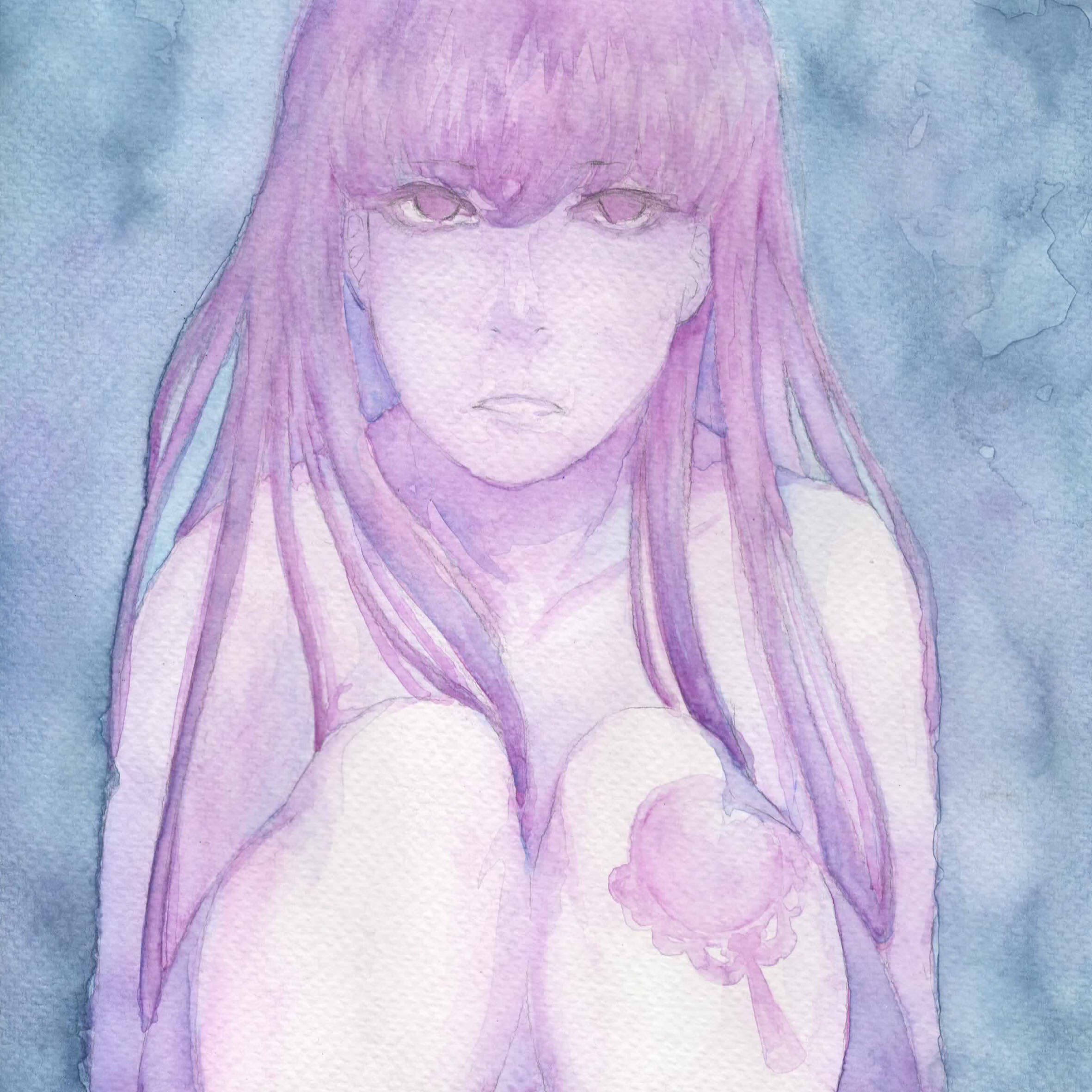
- Self: A facade of an arbitrary girl, with a symbolic tattoo pertaining to the represented quality. The presentation of the facade represents intimacy, though the generic appearance pertains to the universality of those qualities. They are also all nude to suggest intimacy, and also purity of form.
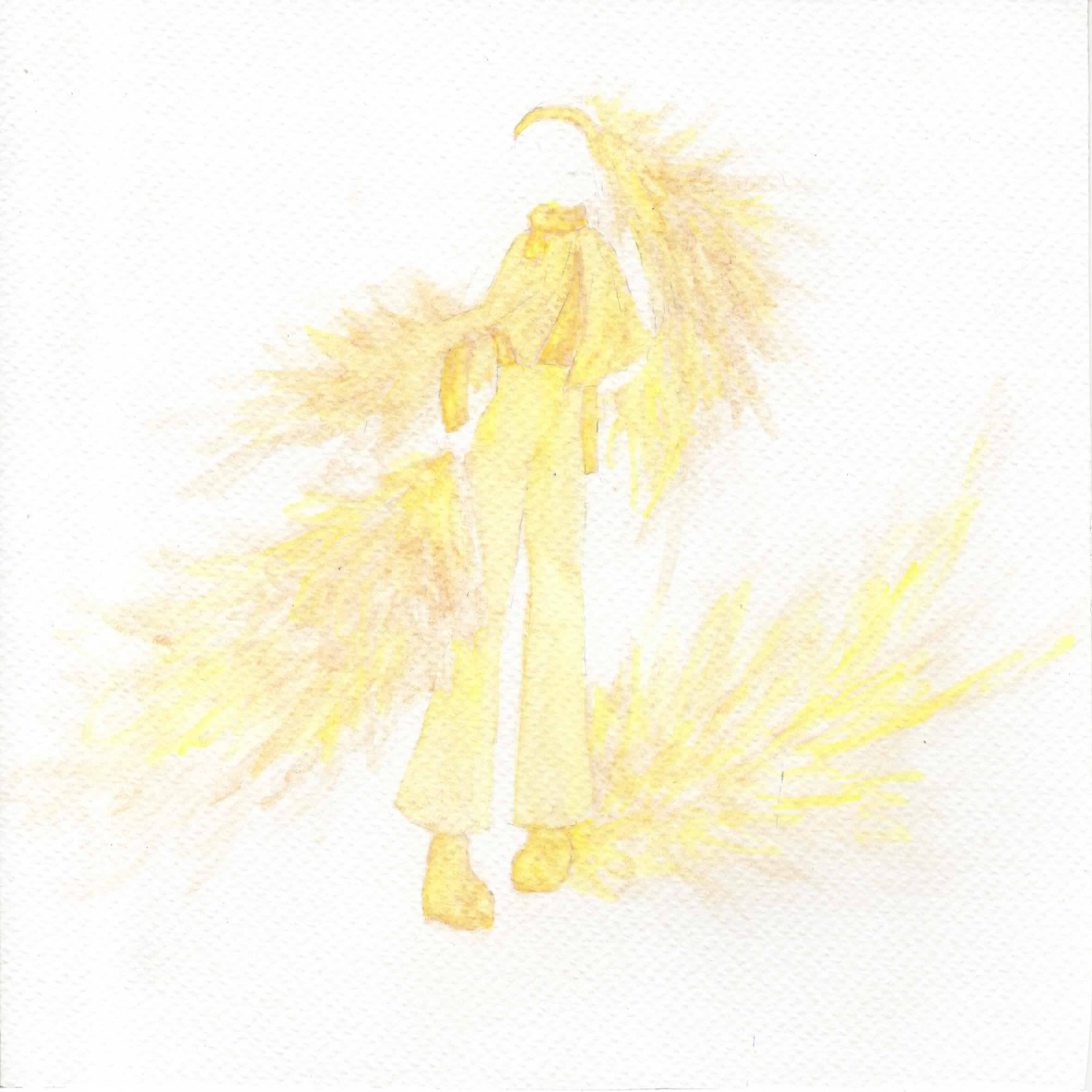
- World: Self-designed clothes. The person is implied but not seen, where the focus is the clothes, and together with the makeup pigments, it’s to imply the idea of having to “wear” something, that will cloud one’s self.
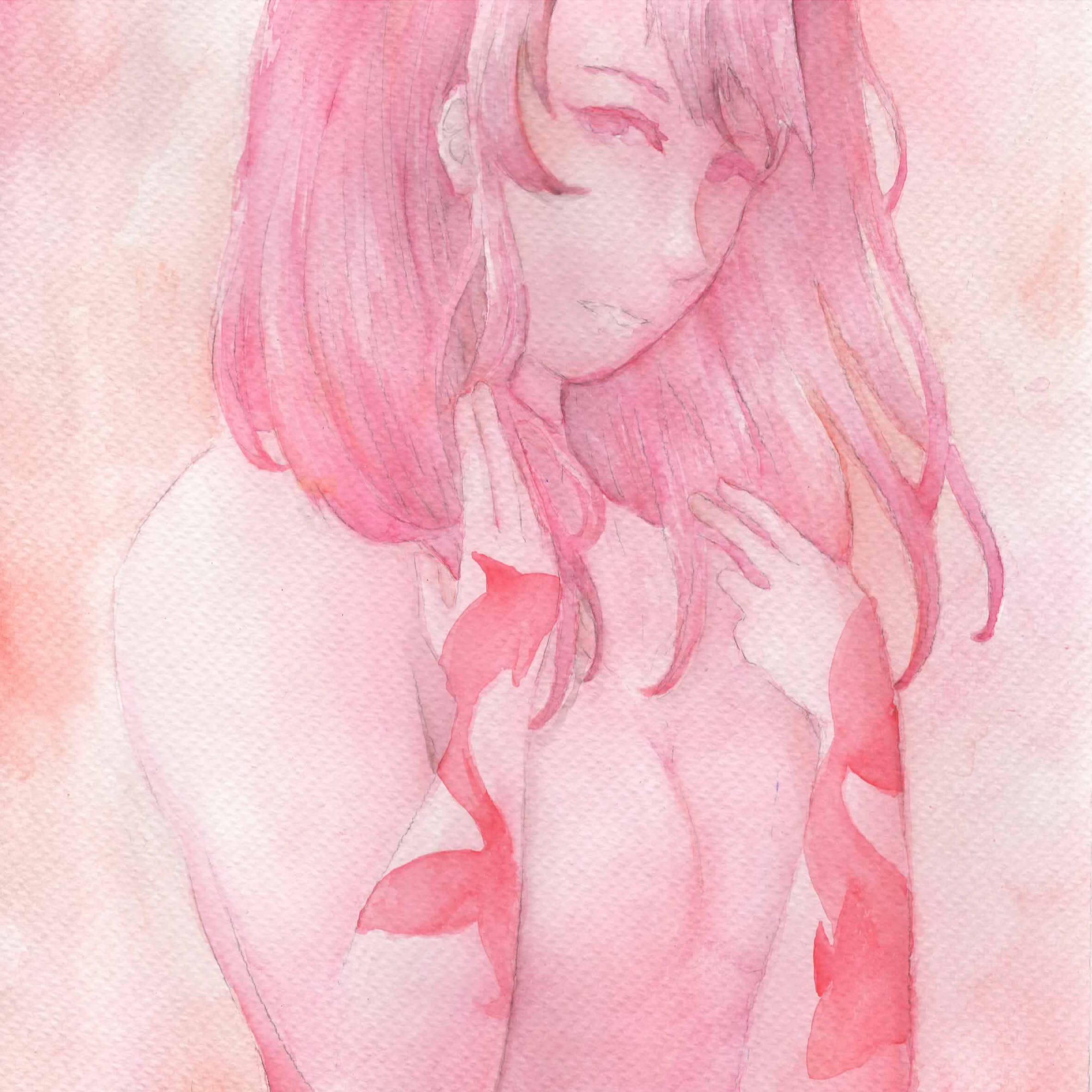
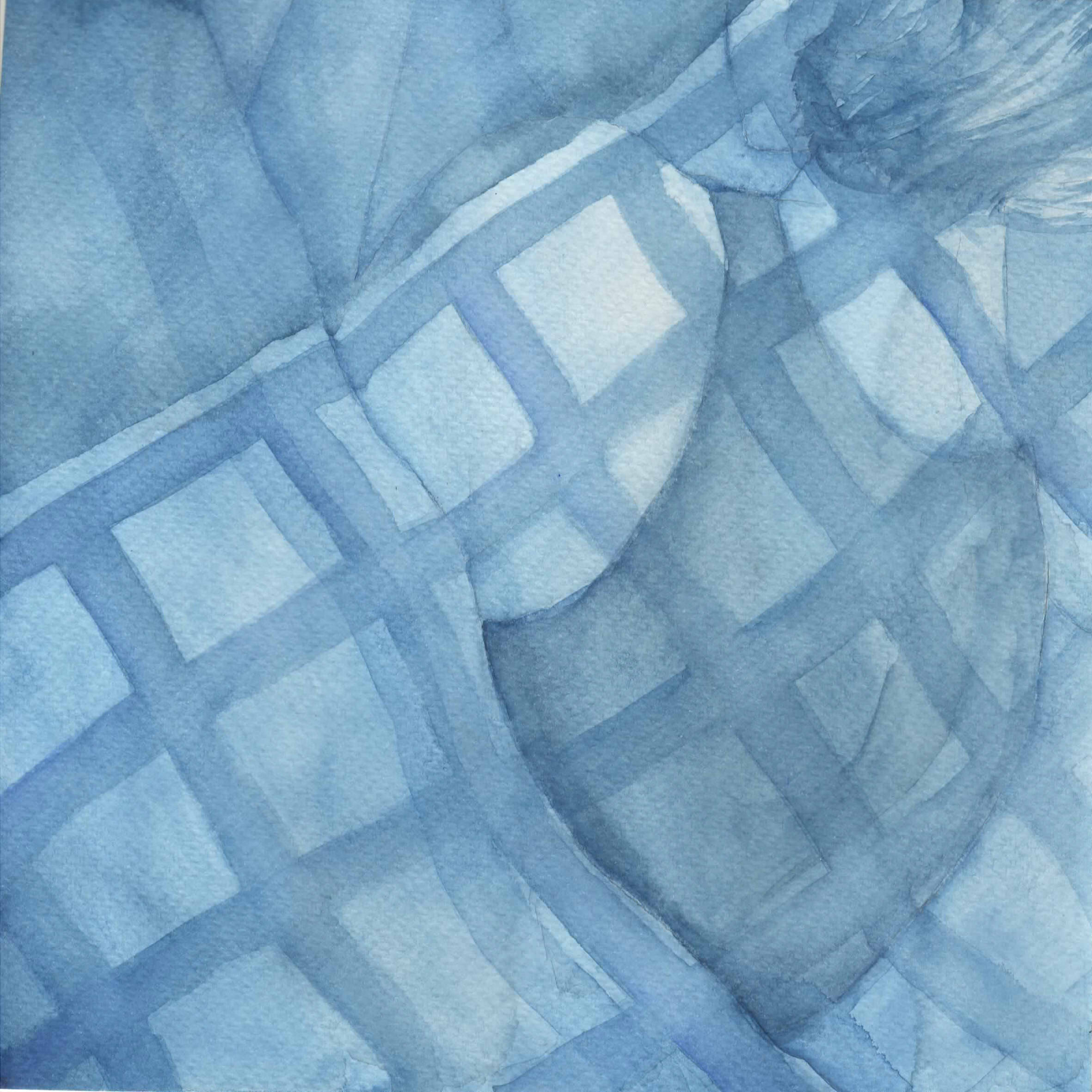
- Result: Varies, but again features a specific body part, same as with the location of each tattoo. the facade is also never seen as opposed to the Self, suggesting some form of distance.
Colour Harmony
- Self: Analogous with only 2 colours, to suggest the natural state without the discord of complementary hues nor the dullness of monochromatic harmony.
- World: Monochromatic to suggest rigidity in absolutism
- Result: Varies depending on how well the self and world integrate
In deciding the subjects, I drew up a chart with keywords for each panel, and worked towards that keyword. In choosing my colours, I originally abided by the 4 temperaments. While I didn’t follow it strictly in the end, it was still rather useful in providing me with a general gist and starting baseline of colours.


Sanguine (Red): Associated with extroversion and social behaviour.
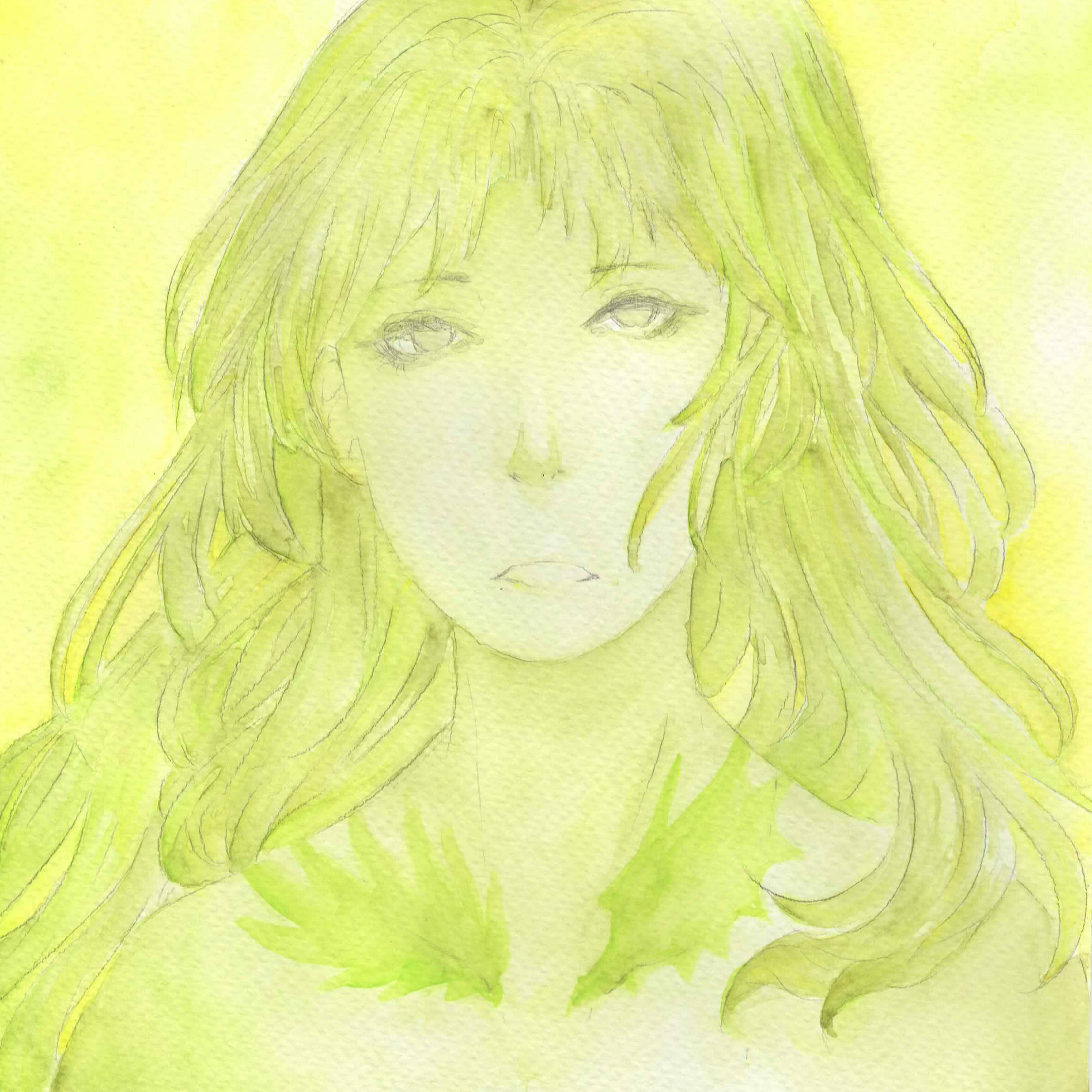
The keywords were Cynicism and Conformity. Once you become aware of the true nature of humanity, it’s easy to be disgusted, and want to live separate from them. People’s words drip with falsity and it is difficult to interact with other people, knowing that under the facade of calm they recoil with disdain at you. Nevertheless, in this world where it is mandated to act like you’re alright, there is no option but to suppress yourself and laugh stupidly, act dumber than you actually are.
- Yellow-Green & Yellow: I initially wanted green to directly oppose extroverted red since I’m extremely unable to relate to that, but decided that yellow-green was better at suggesting disgust than a more refreshing green. Yellow acts as the accent colour.
- Tattoo: Wings, one angelic and one demonic, on the collarbone. The presence of both good and evil is to represent the idea of skepticism, that there is no moral absolutism. It’s not quite the head portion, which was the intended place (for communication and intelligence), but the clavicle represents difficulty in flexibility.
- Red: Red is the colour associated with the sanguine, mostly because sanguine=blood but also because red is associated with energy. Simultaneously, red is a strong colour which relates to the idea of conformity, especially with the monochromatic colour scheme.
- Clothes: The original idea I had was that of a “uniform”, and after some designs I decided on a more military design (just for aesthetic). After a consultation, though, there was an unanimous agreement that it was plain, and so I reworked it to include more rectangular shapes for a geometric feel, and by extension that of a somewhat rigid shape.
- Red, Yellow-Green & Violet: The initial idea was red and green to show the direct contrast, but as mentioned before I shifted it over to yellow-green, and thus Joy suggested to create a split-complementary instead. The general idea is that of the inability to fully fuse with the red, where I scatter in complementary hues of introversion.
- Subject: The hair and sensory organs. The hair is flouncing cheerily, alongside the eye, ear and mouth, representations of communication. That the facade is not seen while those organs are floating randomly is a suggestion that this is unnatural to me, however.


Choleric (Yellow): Associated with restlessness and hyperactivity.
The keywords were Seriousness and Efficiency. In a fast-paced world of cruel productivity, those who are serious are bound to exhaust themselves. Many a time have I found myself in a position where people who don’t care don’t bother to do anything, and those who know what must be done end up crying alone as they work endlessly, because there is no other option open to them but to keep going at the cost of their own happiness.
- Red & Orange: In this context, red represents resolution in terms of being committed to what you have to do. Orange acts as the accent colour.
- Tattoo: Sharks on the hands. The shark is often associated with determination and power, and by extension that of honing in on what you have to do. The hands are often associated with work.
- Yellow: It was initially an ochre colour, though I had to use watercolour to shift the hue back to yellow since it was beginning to tend towards yellow-orange. The yellow represents energy once more, to bring across the idea of speed and efficiency.
- Clothes: Like with aforementioned consult, it was rather plain and I did the same process to upgrade it. I began with the general idea of sharp ruffles (example), and eventually ended up with sharp, multi-directional scribbles. I felt that the sharp angularity in general would bring across a somewhat sleek feel to the clothes to suggest the idea of speed.
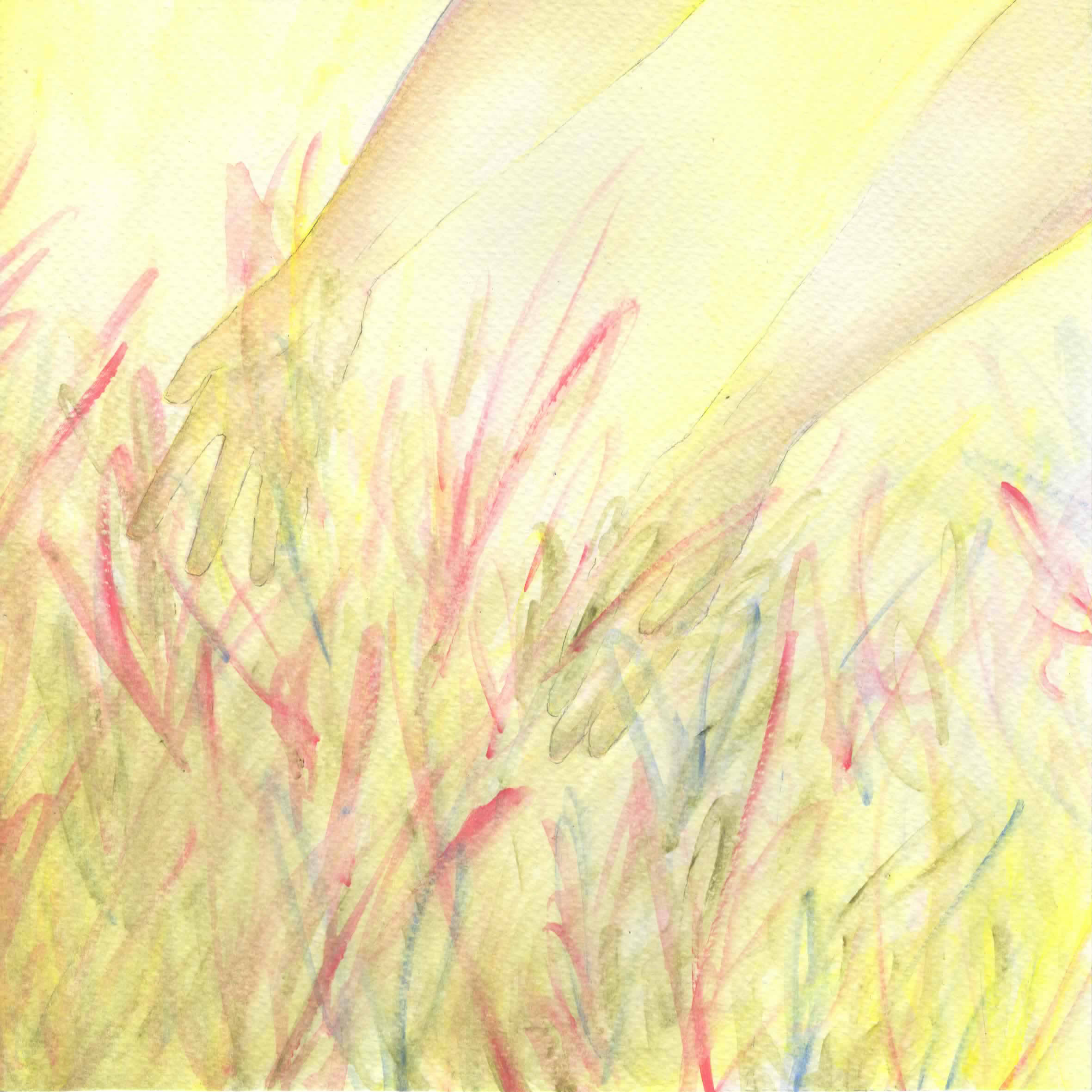
- Yellow, Red & Blue: It was initially a split complementary of yellow, red-violet and blue-violet, but after Sanguine shifted to being a split complementary, I shifted this to a triadic colour scheme. This is due to that I find that those who work restlessly are likely scattered and all over the place, more messed up as compared to those who are struggling to be what they are not (a more direct contrast), and as such there should be more tension in Choleric than Sanguine. Yellow dominates to show that of being dominated by Efficiency, with red and blue to suggest confusion in that tiredness.
- Subject: Hands reaching out to random scribbles. I went with scribbles to suggest the idea of chaos, and the hands being open to that is to imply the idea of giving in to just handling all of those problems.


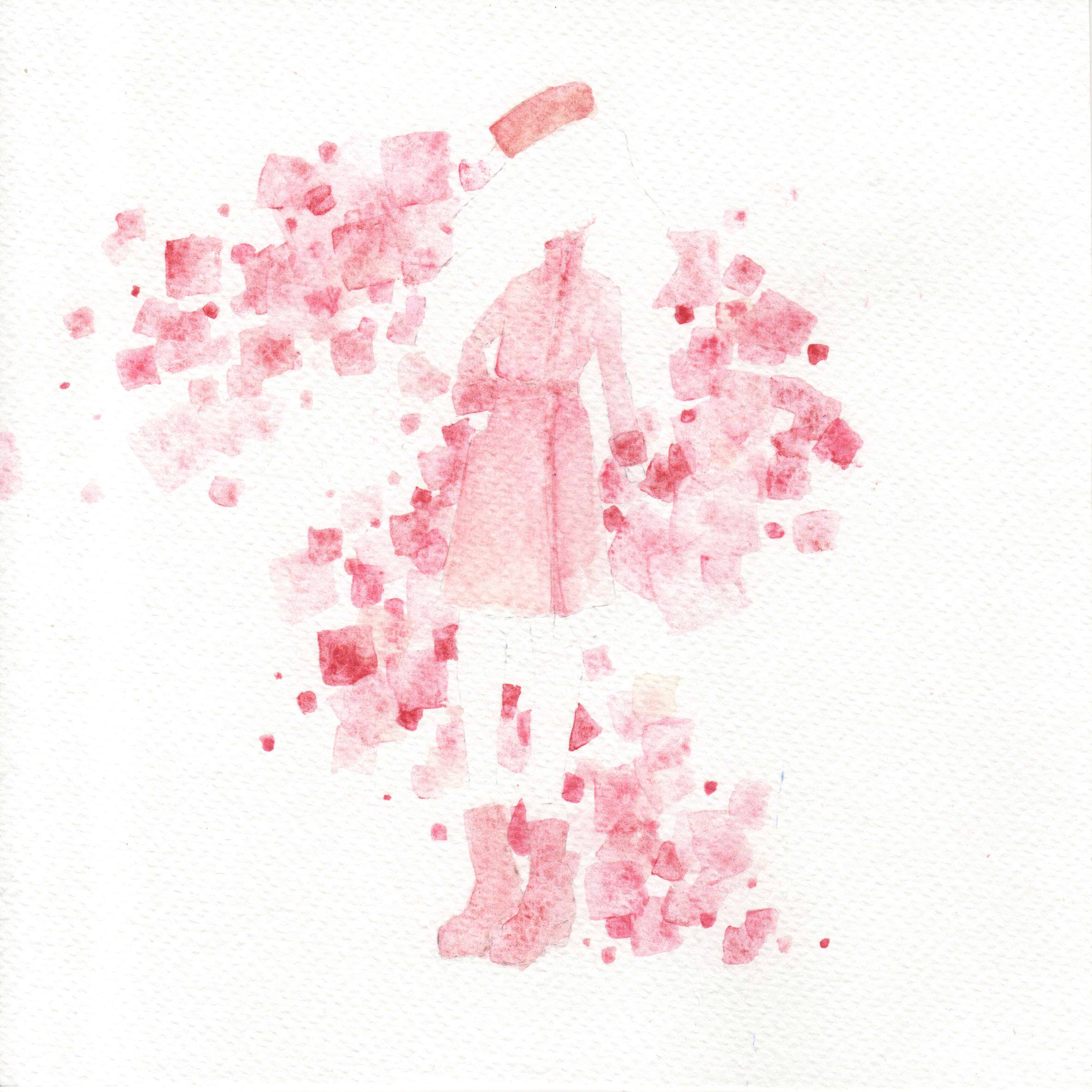
Melancholic (Black): Associated with sadness and introversion.
The keywords were Sensitivity and Uncaring. Joy advised me to shift from Black to another colour to avoid monochrome harmony, so I went with violet to create an overall double complementary. For those of sensitive natures, we find that even the slightest brush of shoulders without an apology is something painful, a symbol of rejection. And yet, it must take a certain level of ego to feel that you deserve more, when you are such an unimportant creature, and these thoughts which flow into each other turn you into a creature which dives deep in and hides from everything.
- Blue & Green: Melancholy colours associated with sensitivity. Green acts as the accent.
- Tattoo: Flowers on the back. The flower is associated with delicacy, linking with that of sensitivity. The back is often associated with burdens.
- Violet: Less about the colour’s meaning itself than its relative position to blue. Meant to represent just the slightest prod in a different direction.
- Clothes: In line with the idea of an uncaring world, I went with the idea of bindings. A corset, heels, choker, constricting lines… Overall, it ended with many lines pulling harshly, and also providing shape (conveniently).
- Blue: It’s monochromatic to represent how even that slightest prod causes one to retreat into oneself. Again, blue is a melancholy colour, now even devoid of green.
- Subject: A person lying in bed. It’s more a personal experience thing, but whenever I’m having a bad time I lie in bed for hours on end doing nothing but thinking negatively and ignoring everything and everyone.


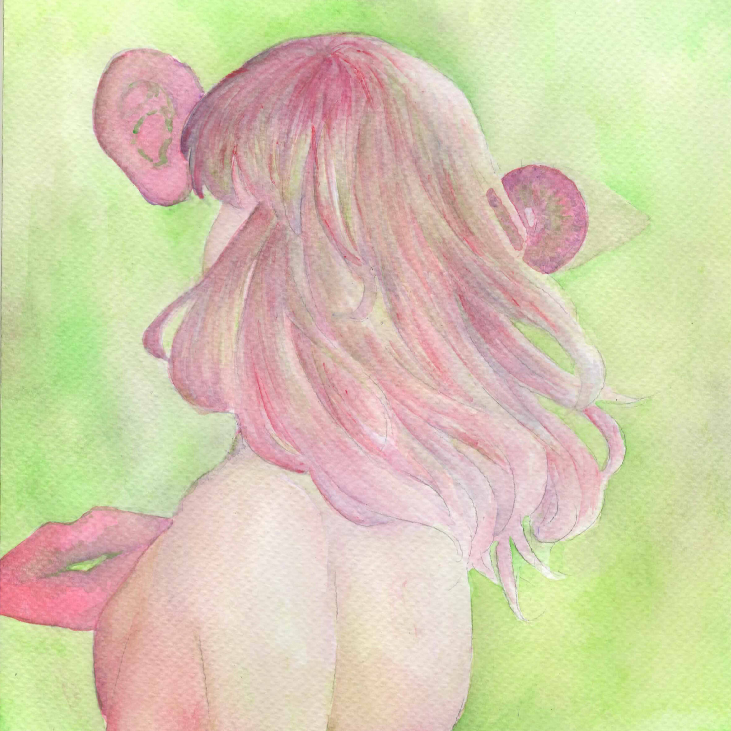
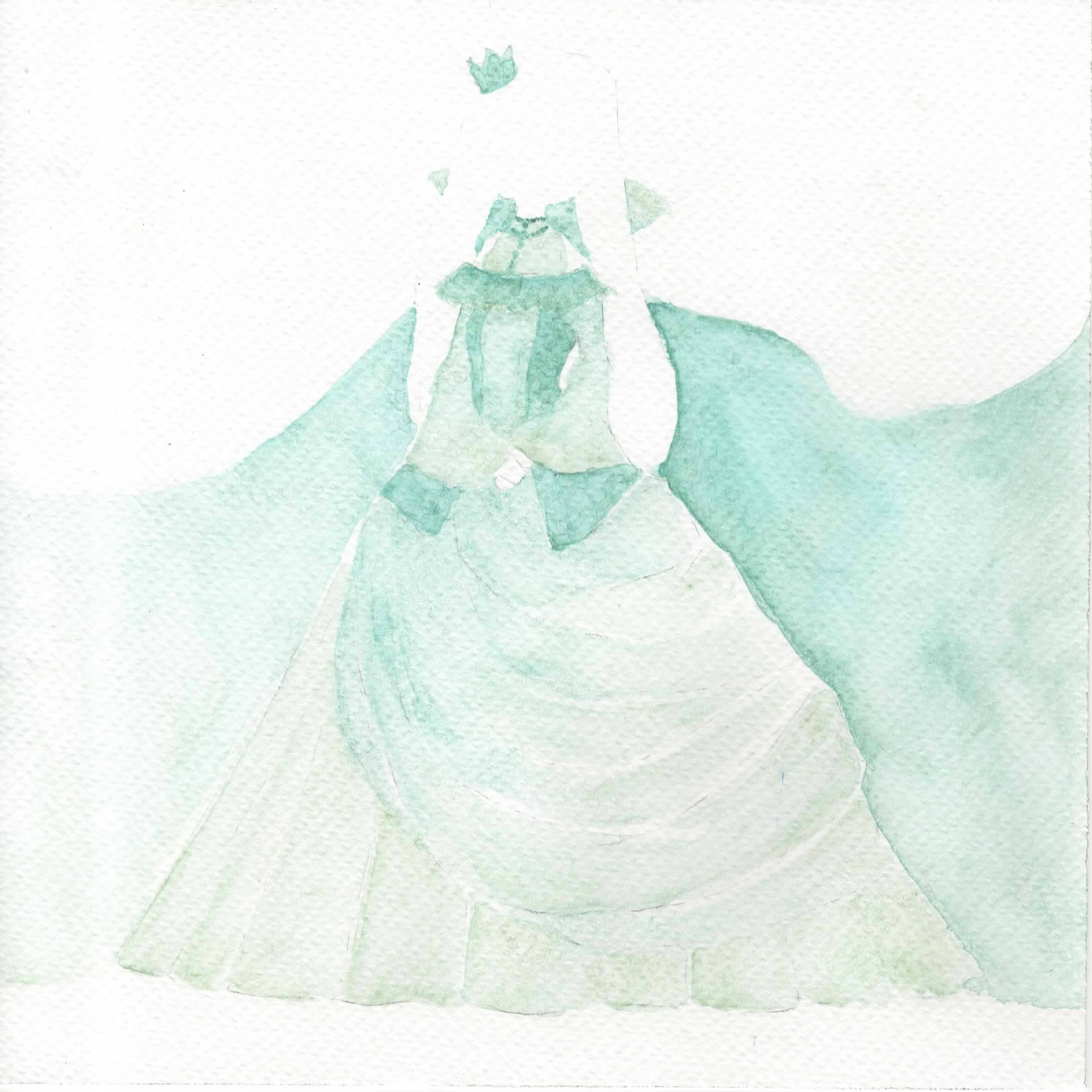
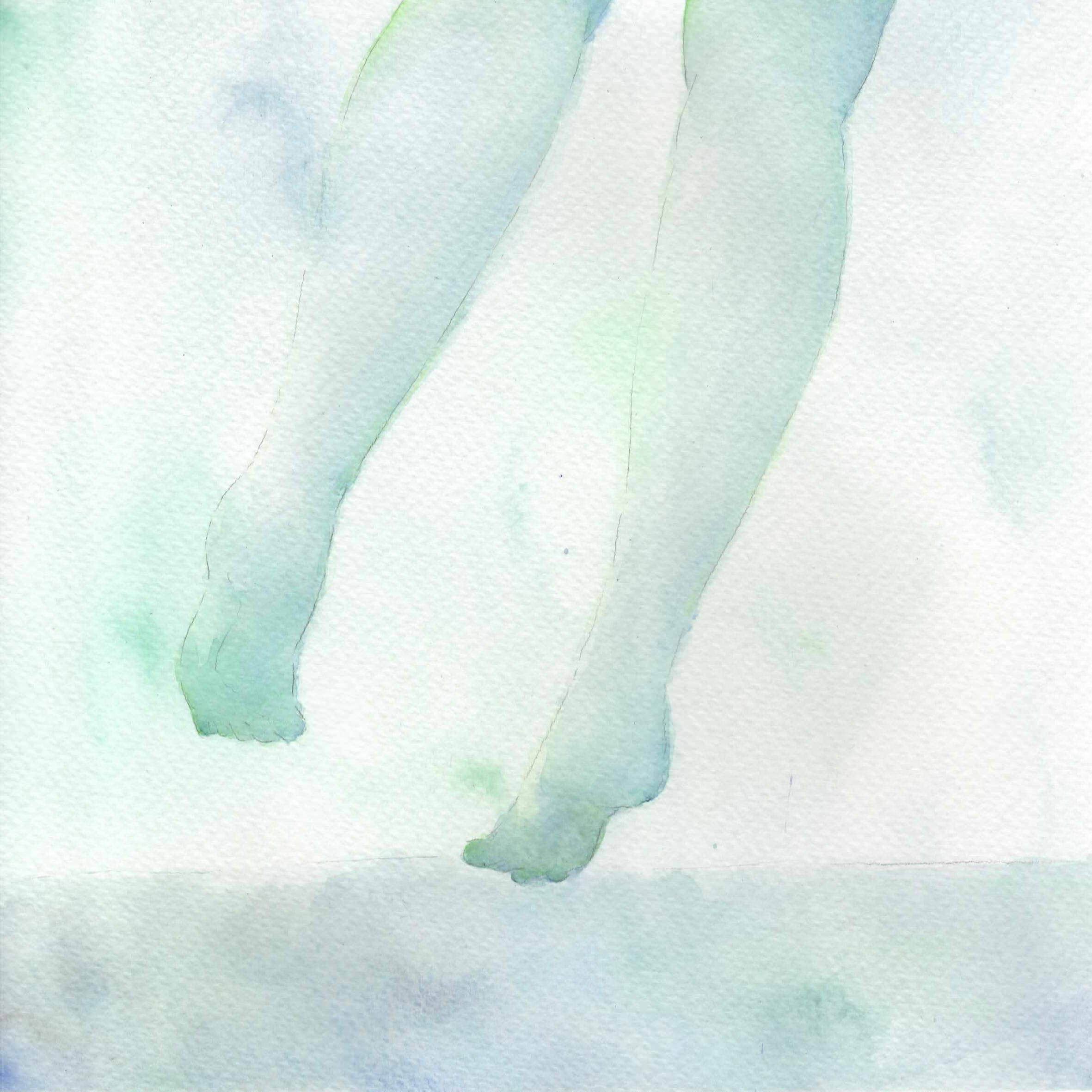
Phlegmatic (Green): Associated with peace and tranquility.
The keywords were Introspection and Diversity. You can think all you want, feel that you are being forced to conform, or made to work excessively, or despised by everyone, but in the end, you must realise that all that doesn’t matter. The world is too wide, too expansive, that you are but a mere speck, insignificant. There’s no reason for you to fight against that truth. There’s no reason to try to keep forcing your way, and rejecting the world is just being difficult and hipster, and tiring. It’s easier to forget everything, and just be resigned to that existence.
- Violet & Blue: Colours of mystery, spirituality. It brings across the ideas of introspection in being colours of independence and wisdom. Blue is the accent.
- Tattoo: Mirror on the leg. The mirror links to the idea of reflection, and represents looking into oneself. The leg is often associated with the ability to move.
- Green: Represents nature and the natural state, as well as being a calming and fresh colour.
- Clothes: The overarching idea was a foreign, regal dress of a wide long skirt. It represents that of the foreign and unknown, suggesting that the world is a wide place.
- Green & Blue: An analogous harmony to represent a Self and World that can finally come together harmoniously. As a result, too, blue is featured from the World, and Green from the self, where these are natural and calming colours.
- Subject: Legs walking on water. The legs represent moving forward, much unlike the stationary nature of the Melancholic, with the water representing clarity as well.
Finally, I always arrange the 4 rows as such, since my personal policy as to how to deal with my existence followed that sequence. I tried to entirely change and failed, I tried to distract myself and failed, I tried to end it all and failed, and now I’m here, resigned and just accepting, because I’ve realised there’s little meaning to denying this existence.
Extra process documentations
In terms of artist references, I thought I’d divide it up more comprehensively based on what I referred from them.
- Style: For the 1st column (the facades and tattoos), I went with Mayumi Konno, in her emphasis on the female facade together with “something else”, like flowers, hands, etc. For the 2nd, I went with Koyamori‘s style of using blank space for the human form. For the last… I didn’t really follow anyone. In fact, all of them are my own styles, adapted from other artists.
- Technique: My ultimate guide in watercolouring has always been Fish, who taught me everything from paper to brushes to granulation to washes. Basically, for the past few years I’ve studied watercolour through her posts, which is why I can at least decently paint. Also, I learned how to make paints from Yue!
- Colour harmony: A lot of my favourites use analogous for shading each object, then complementary hues to contrast objects, so it was hard. I think Koyamori is a relatively good reference though, for using a smaller palette. Halfway through the project, too, I found Eppao who is pretty helpful in terms of monochrome and positive/negative spaces. Unfortunately, I tend towards less vibrancy, as well as more blending than solid forms, so I deviated rather heavily, but the colours were nevertheless nice.
Also, I have some experience with watercolour and making paints, but not so much with gouache. Initially I wanted to try oil paints to contrast water and oil, but had to give it up after I realised that it was drastically different from watercolour, generally difficult to handle in terms of lack of drying speed and lack of translucency, impossible to be kept in cakes like watercolours (and thus I would need tubes), and I couldn’t determine if they were well-mixed since I rarely set eyes on oil paints.


I don’t have a video of me making the watercolour with gum arabic, but here’s an older video of the first time I did it (I added too much binder, unfortunately, but learned from the experience). It’s basically the same as with linseed oil, just that you don’t need turpentine or the like to dilute it.
I also learned the hard way that there’s little need to tint watercolour since dilution with water would already make it a lighter colour. I did, however, end up mixing a lot of paints to create shades, and in-betweens like red-orange, blue-green, or various hues of violet.


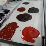

This is my palette. As a consequence of experimental colour mixing, I ended up running out of space. The colours were tested on the borders of the paper I used which was outside the frame of the pieces. I’ve attached each individually in my visual journal since it’s a little difficult to upload them.


Overall comments were that it needed to have more shading to fully bring out details, which I suppose, yes, is a very common problem with me, especially where I cut corners once I’ve determined it’s sufficient to avoid spending more time than necessary. No matter how much I layer it never quite seems to darken well, especially with brighter colours like yellow.
![[Project 3: Ego] Fangirling 2k17](https://oss.adm.ntu.edu.sg/a170027/wp-content/uploads/sites/1810/2017/10/koya-1.jpg)


