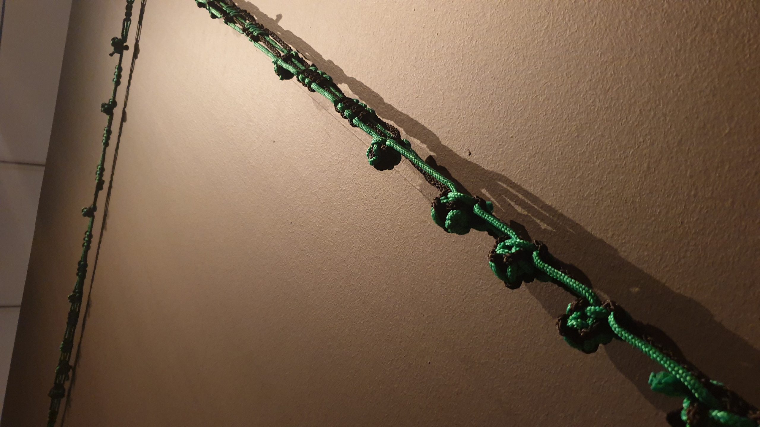
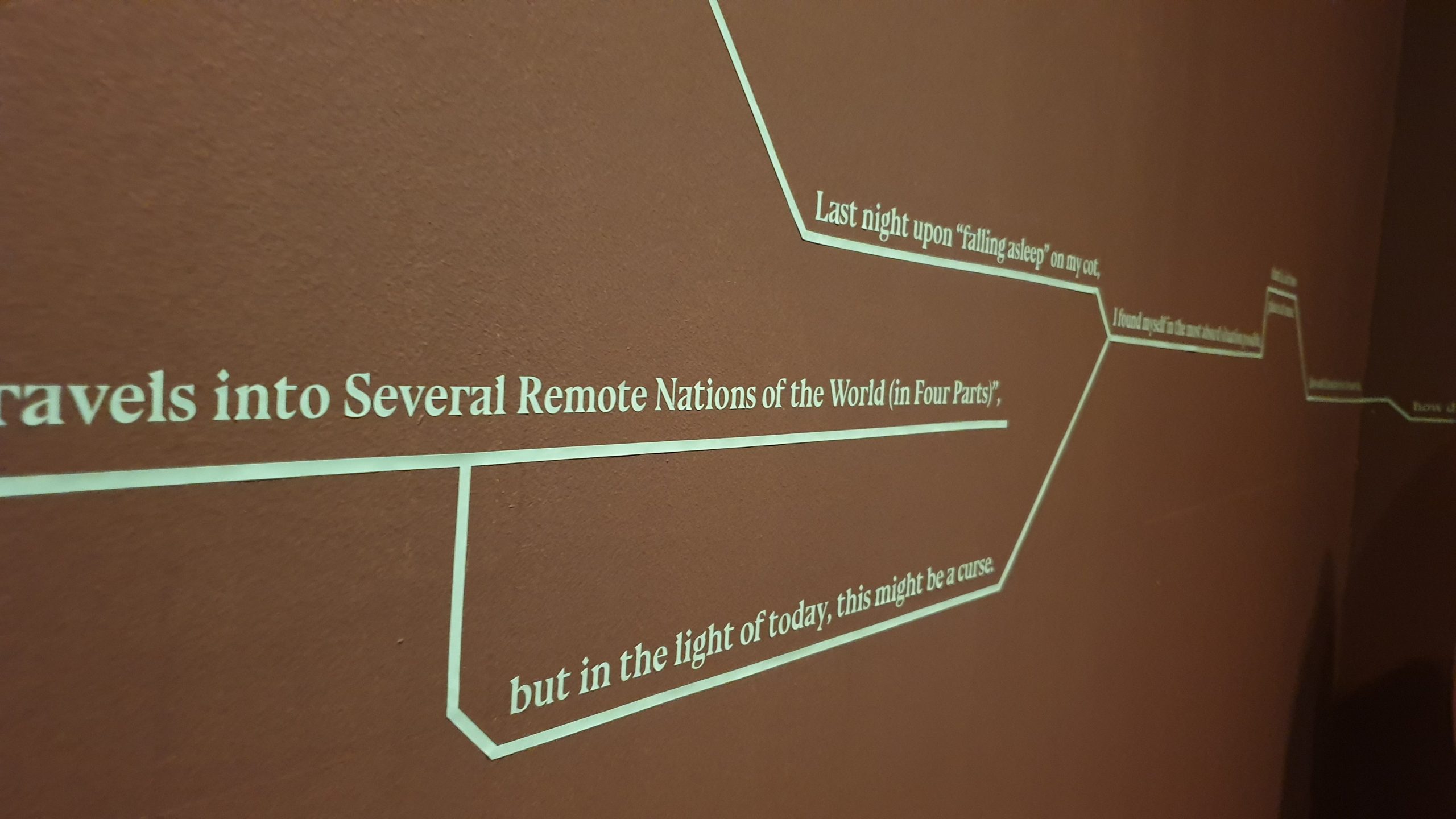
The most evident and most flattering component of the exhibition, in my opinion, is the visual continuity. You have lines of text running across the walls, lines of rope trailing across the rooms, lines of wires scattered all around.
My love/hate relationship with this particular knotwork doesn’t change how well it compliments the theme.
Even wires appear to play into this.
ON THE MACRO LEVEL
As I’ve mentioned before, I think it’s quite evident that the overall Singapore Biennale theme is intentionally designed to be broad and vague, such that practically any artwork can justifiably fit within it. So, I won’t bother going into depth on how it fits the theme: besides, the time and/or movement-based link between “future of islands” and “every step in the right direction” is pretty clear.
Tomorrow Is An Island, as inland, a sin land is an artist-led project that speculates on the future of islands, deep time, the fate of ‘crisis’ as a frame of our predictions and conceptions of future time, and the exchanges between bodies and cities. The title deploys a sequence of anagrams that rescrambles with each new phrase, suggesting that the ways in which the next moment could retain recognizable components of the present but to disruptive effect. (link)
Nevertheless, the existence of the secondary theme distinguishes this exhibition from that of Gillman Barracks. This secondary theme of “Tomorrow Is An Island, as inland, a sinland”, is exemplified by two characteristics.
Firstly, the artists are all of “islands”. In this context, the two islands are Singapore and Switzerland. While a bit of a stretch, it’s justifiable when considering how small both are in comparison to nations like China or the United States.
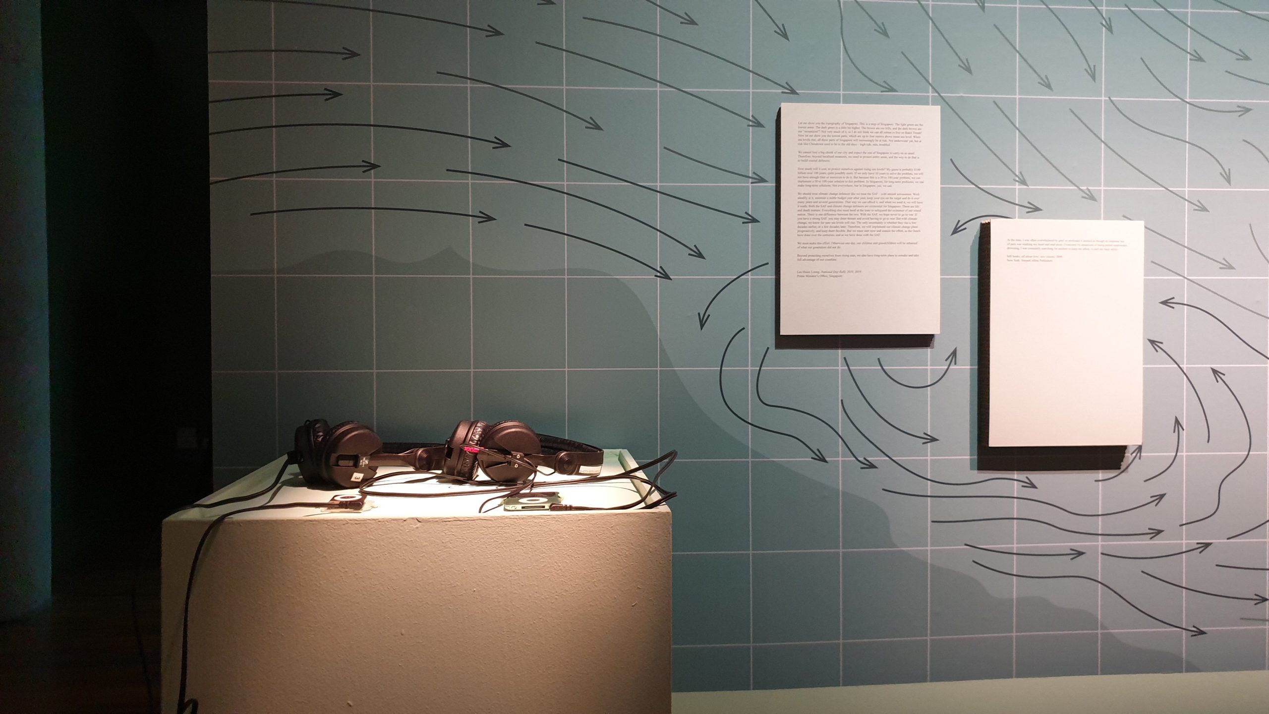
Secondly, many of the works focus on systems, sequences, the like, as exampled by the shifting anagrams. The “visual continuity of lines” play into this. All the works also play with this in various forms, be it the shadows cast onto the floor, the shifting sediments, the flow of sounds and videos, so on.
For example, an (un?)intended (mis?)placing of the projector causes lines to manifest on walls.
Of course, this consolidated theme is possible only because of the small size of the exhibition. A bigger exhibition would inevitably have to resort to a generalised theme, to be able to cover everything.
ON THE MICRO LEVEL
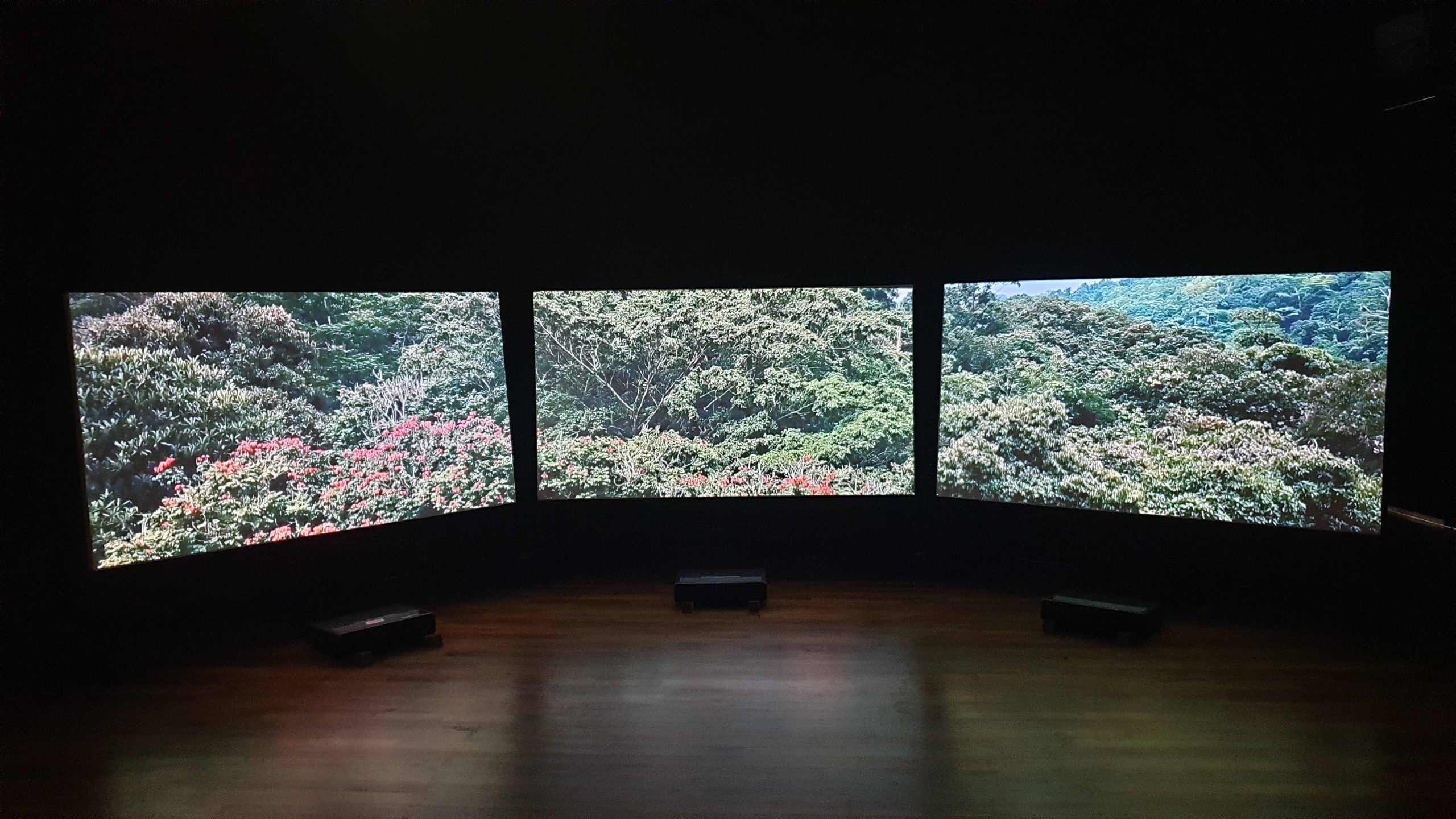
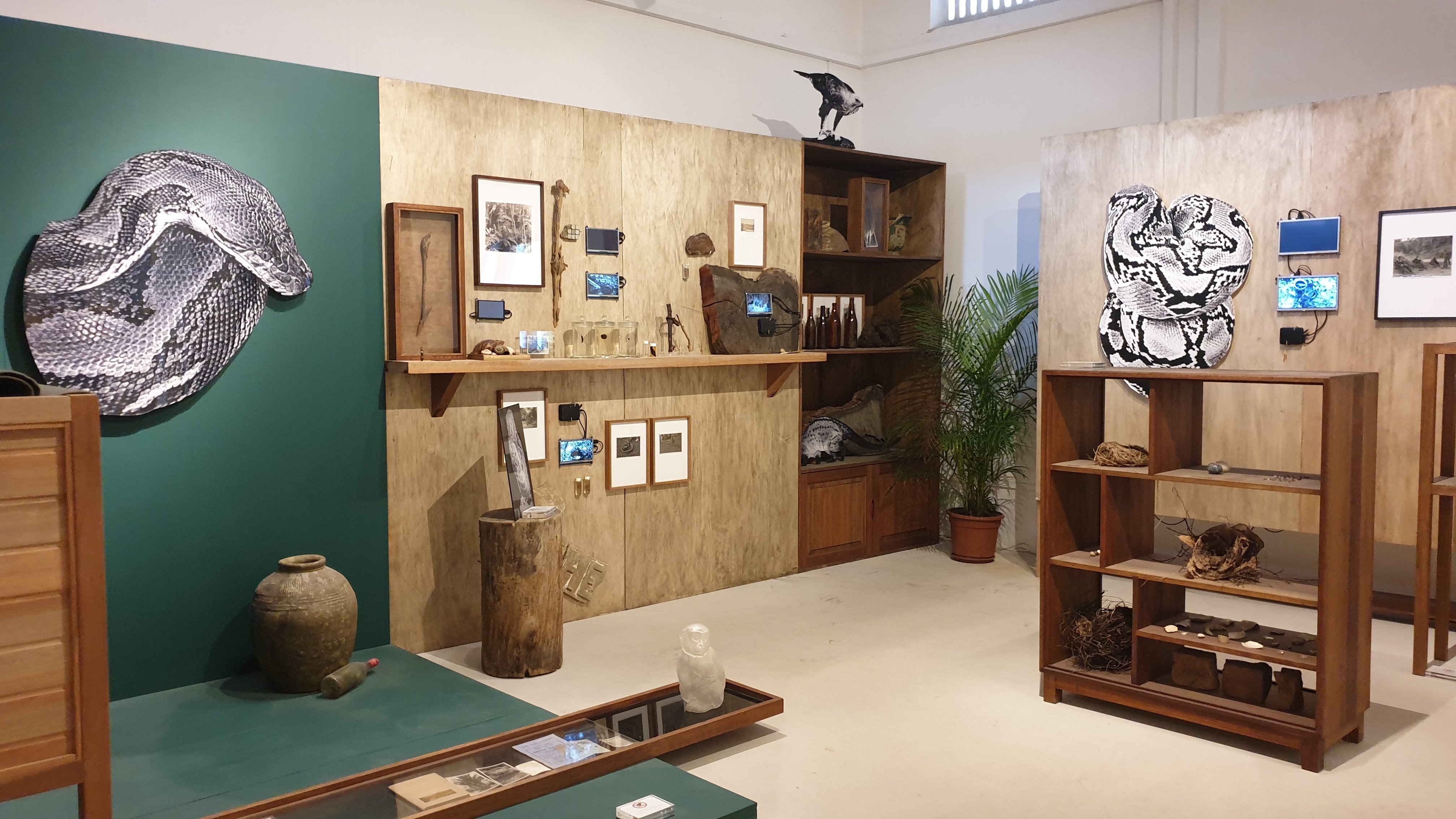
The most eye-catching work, for me, was Forest Tales and Emerald Fictions by Monica Ursina Jäger.
An artist-in-residence with NTU, her presented work focuses on the “shifting topography of Singapore and Southern Malaysia”. Consequently, much of it involves urban infrastructure and natural scenery. Here’re videos: the first has the accompanying audio (from headphones), and the second, details close up:
Regardless, its attractiveness is due very much to the curation, where this work is complete and isolated. The leftmost area feels lacking, where I was there for the opening night, and thus can’t disassociate the “absence of the performance” from an “absence in the space”. The first area is slightly awkward, where it seems to contain “everything which doesn’t fit in the other rooms”.
As such, the singular space provided to this work stands out, where it feels intimate: there’s a seating area, the screens don’t feel overwhelmingly magnificent, the space is dark. Also, the setup is interesting, where it’s not even screens, and the throw distance is exceedingly small:
The use of 3 screens than a single and/or curved screen contributes to the low-fi aesthetic
Same for the projectors, and the fact that it’s not even really screens.
For me, the biggest takeaway is probably on how limited resources can actually be a boon. After all, it’s easier to consolidate with a smaller pool, and easier to know what you can’t do. At the same time, however, one must be aware of where they ought to allocate resources, such as in building walls and shelves, than trying outright to aim for complete minimisation.
*inserts a very typical project management picture from here*
Here’s a short summary to get us all on the same page.
Chapter 2 introduces us to aspects of project management. It first establishes a difference between goals and objectives, where goals are shared across all projects while objectives are unique to each project. The chapter also claims that all projects have 6 goals to manage, with 5 phases and 6 activities during the process.
Chapter 5 further delves into project planning. This covers the necessities of planning, the iterative process of planning, fishbone-sque breaking down of tasks, and so on. It also goes into 6 objectives of the project work plan, and details regarding each objective, as well as how to document said plan.
THINGS WHICH I’M INTRIGUED BY
The 6th goal is incredibly interesting to me, of “meeting everyone’s expectations”. It’s surprising to see that the human relationships between you, the clients and the employees is as important as it is. That’s also one of my weakest points, in balancing my happiness, with the happiness of others. Unfortunately, the book can’t give much information, since this is a very situational goal, but it’s still good to take note.
The only solution is probably practice. I’m very sorry in advance to every person who will have to put up with me.
The project manager’s obligation to fulfill other responsibilities is also concerning, especially in small projects, and especially where they’re expected to be generalists. After all, the way companies usually work is that you start as a specialist in a discipline anyway, such as “Junior Graphic Designer”. No one gets directly promoted to a more generalist role like Visual Design Executive. In other words, you need both depth and breadth.
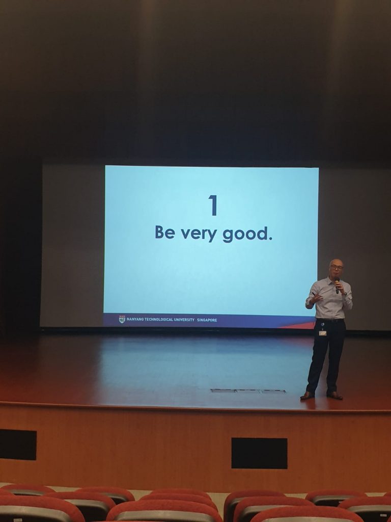
The only solution, probably, is to “be good”.
how to get job, wow! i can’t believe!! it was so simple all along!!
NOT VERY IMPORTANT THINGS WHICH NEVERTHELESS MAKE ME SALTY
Something which really gets to me is the artificial division of goals into 6 categories. This is because I feel that many of the goals can be subsumed under a similar header, such as “To reach the end within the established limitations”. This would easily cover budget, time, and safety, where these are limitations which must be adhered to. It’s not a major issue, since it IS important to eventually expand on these different aspects, but it’s just conceptually annoying for me.
Something which also gets to me is their definition of efficiency. That, again, is probably a linguistic difference: when I was taught (the equivalent of basics of) project management in my extracurricular activities, efficiency was lauded over effectiveness, where effectiveness was about being successful, but efficiency was about being successful with minimal resources. I guess it’s not a major issue either.
A lot of the artworks were “interesting”, “cool”, and “pretty”, such as Sokchanlina’s Letter to the Sea. That’s about it, though.
I’m very sorry for being uncultured trash, but in my defence, most of it felt like creative documentations, without even a desire to drive people to act upon the tackled issues. All we really do is watch, and lavish praise unto it, without even needing to care too much about how nature is being eroded, or how communities are marginalised, et cetera.
Robert Zhao Renhui’s Queen’s Own Hill and its Environs
Zen Tang’s Escape Velocity
Lim Sokchanlina’s A Good Event in Tokyo
I think that’s alright, where life would be tiring if everyone was constantly trying to make you think (and feel) the way they do, anyway. A side note is that something like a pop-up museum at the train platform would be pretty cool. After all, that would be an easy way to “be seen”, since little engagement but “looking” is needed. It’d really change the way people treat mundane moments like transit, too.
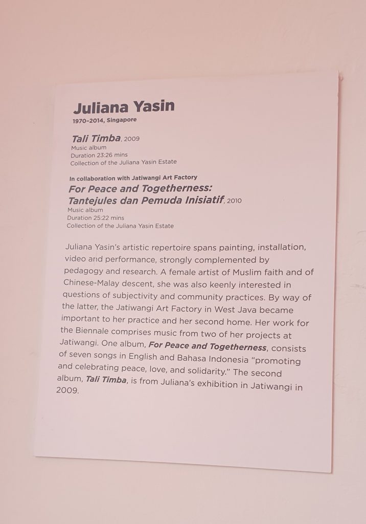
JULIANA YASIN
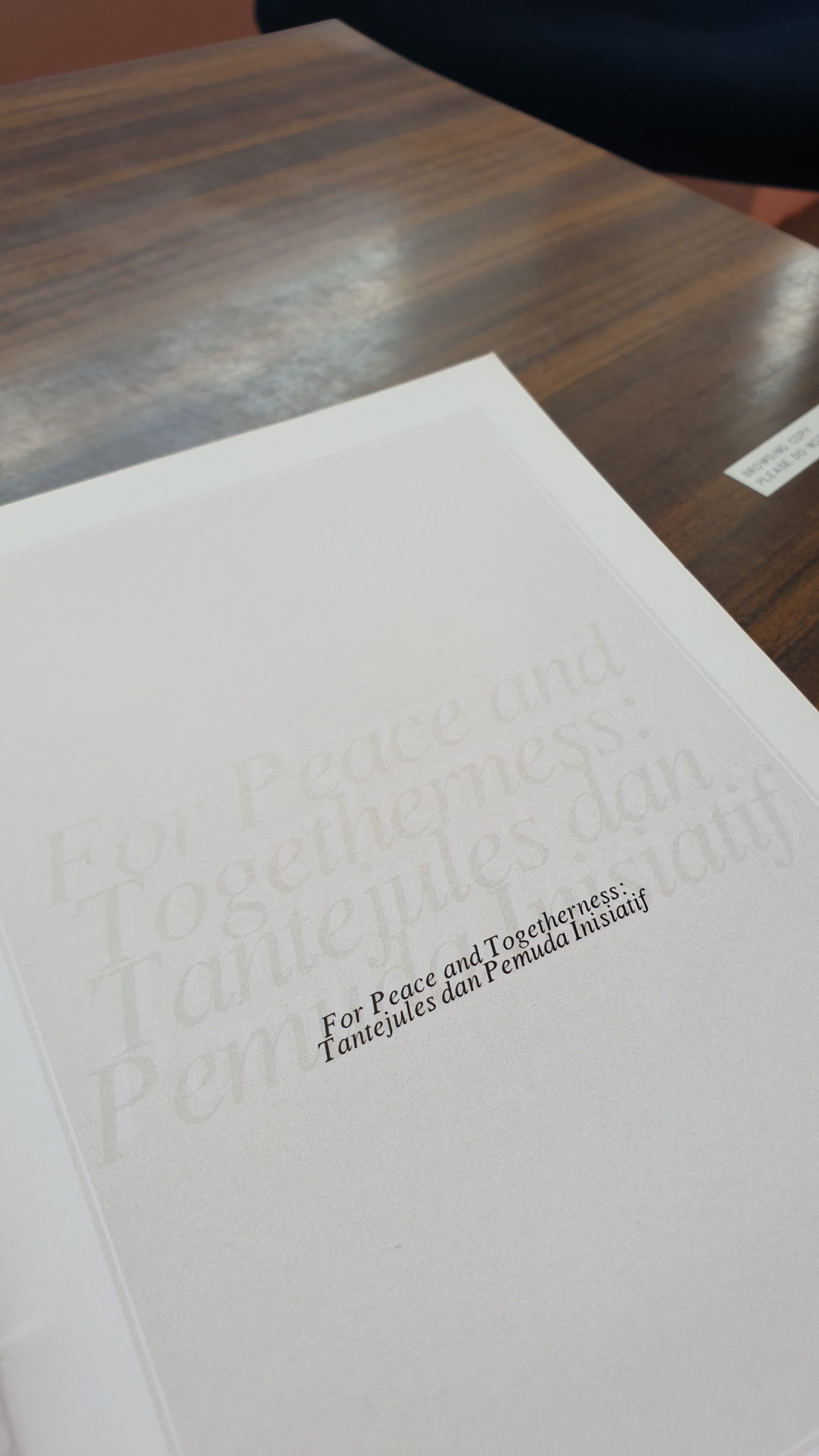
In any case, because of that, I found, may she rest in peace, Juliana Yasin’s work more intriguing. What she presented was Tali Timba (2009) and For Peace and Togetherness: Tantejules dan Pemuda Inisiatif (2010). (link)
Unlike the rest, her work was an entire experience which seemed made for the space it occupied. You can barely tell that it’s an artwork, where it just seems to be a sitting area along an aisle (not even within the gallery!), with background music not unlike the kind you’d hear at a casual hangout in the nighttime.
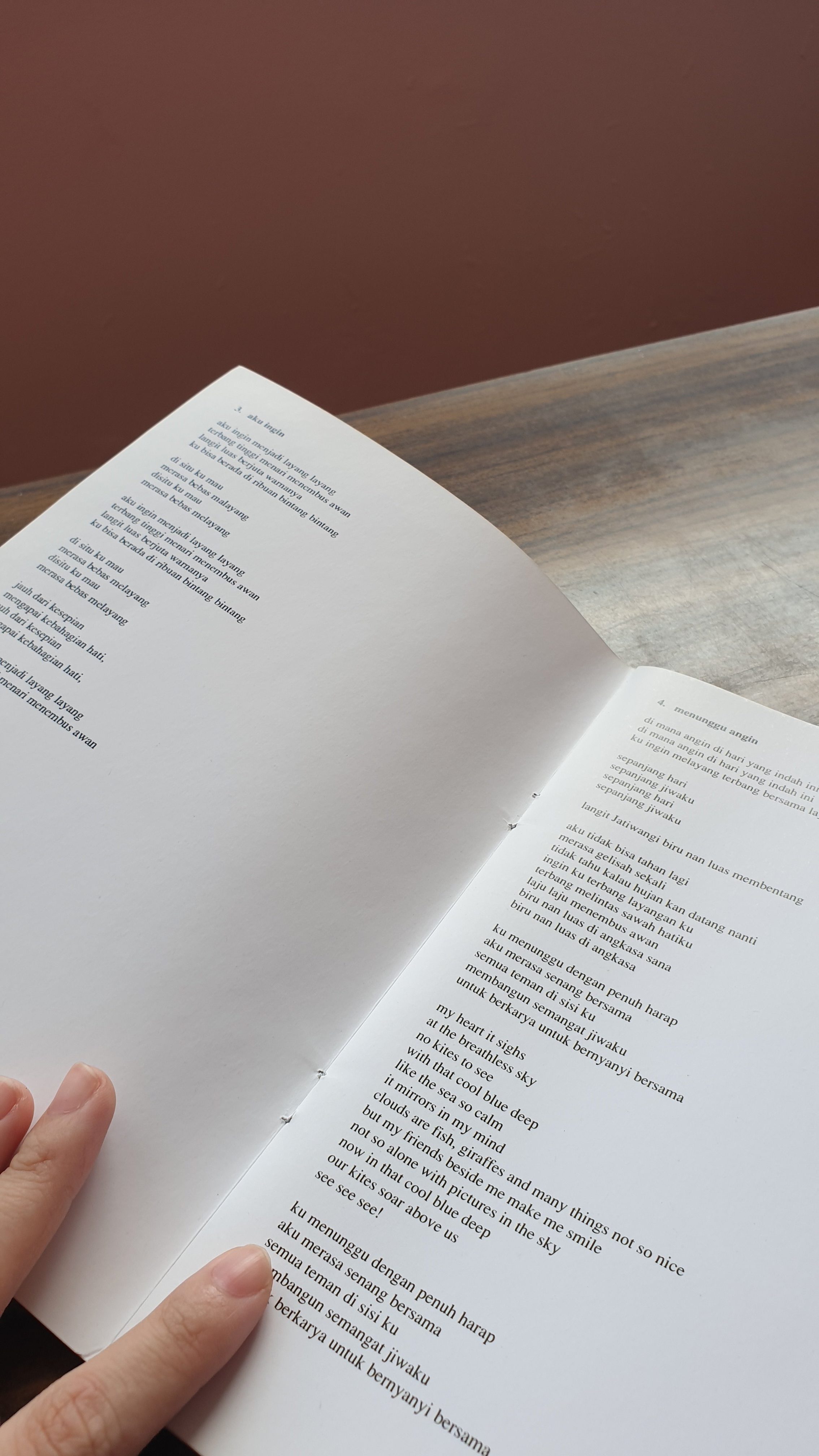
You only really realise that it’s the music which is the artwork when you read the wall plaque. It’s also supported by the lyrics booklet on each tablet, held down by a stone. I think that’s a plus point: most works demand your full attention, in forcing you to watch it, or interact with it, so on. This work, however, encourages you to just sit back and relax, with the music as a background accompaniment, than something to pay attention to specifically. For example, I ended up sitting and chatting with Dan Ning & Ying Hui about things that were totally not relevant to the artwork at all.
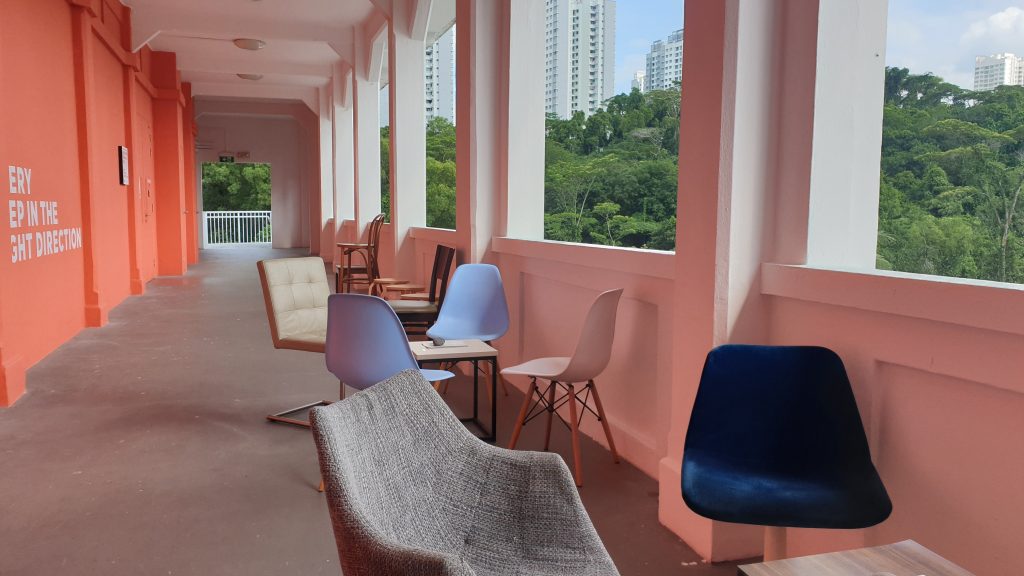
It’s nevertheless still easy to feel the vibes coming from the music, which is quite low-key and country, the kind of thing you hear on the streets from a random busker. That’s enough to get the intended ideas of peace and harmony across, especially when matched with the pretty pink of the corridor, and the view (which is, admittedly, not very good, since the wall is too tall to see much.)
Knowing the context also helps, where her artwork was created in relation to the Jatiwangi Art Festival. Said festival is about celebrating “contemporary art as created within everyday life”, making her music a homage to the less-urbanised life of those living in Jatiwangi. As a result, some of the lyrics are in Bahasa Indonesia, catering to the ethnic Malay population.
It might thus have benefitted from being presented at the nearby cafe and/or ice cream place instead. When we went there, there were many people chilling and drawing. Surely, there would have been a greater audience there, than where it was located, in a place where people wouldn’t really stop.
ABOUT MY FYP
Thinking about this and Celine’s Spatial Composition 13, it may be the case that I’m subconsciously leaning towards an FYP which “supports the exhibition”, than an FYP which “demands attention”. After all, a lot of the entire FYP exhibition is about presenting what each student cares about, which forces the audience to become invested in everything. As such, I might want to make something which reduces the information overload, than add to it.
I think that’s something I care about: filling the spaces which need to be filled. But that’s also hard, because I’m still pretty selfish: if FYP is about showing what each student cares about, I’m very sorry to say that I may or may not care more about having my own space, than working with gaps in others’ spaces.
Also, something like that would require a lot of coordination: I’d need to see what everyone is doing, and observe what kinds of issues people usually run into at FYP exhibitions, to try to make a solution.
Much of social practice art critique is directed towards how it nevertheless supports capitalism, than actively helping the community. So, being curious, I looked for an example from post-war, Soviet-controlled Central Eastern Europe! (It doesn’t have anything to do with capitalism though.)
Something to take note is that the works of Krzysztof Wodiczko is often described as socially-engaged, socially-intervening and socially-minded. However, the specific term “social practice” almost never comes up, likely because it’s a relatively new term. As such, his work may not compare to things like Rick Lowes’ Project Row Houses or Marjetica Potrč’s Dry Toilet, which specifically involves designing objects for contextual use.
PERSONAL INSTRUMENT (1969)
As found at https://science70.tumblr.com/post/184811068364/krzysztof-wodiczko-personal-instrument-1969
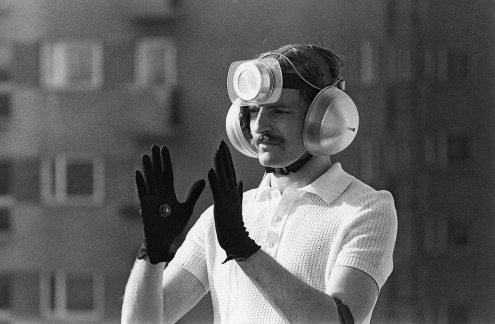
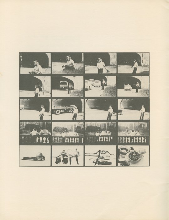
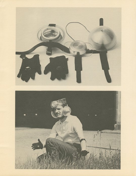
This artwork is one of the first interactive wearables to target the issue of freedom in an oppressive state. At that time, the artist, Krzysztof Wodiczko, was inspired by Vladmir Mayakovsky‘s claim that “the streets [are] our brushes, the squares our palettes”. In other words, art relies on the surroundings, and is not a purely isolated piece. At that time, too, Poland was under an authoritarian communist regime, wracked by lack of freedom, poverty and poor living conditions. Harsh treatment, detention and executions were hardly uncommon: One could not speak out against the government for fear of terrible repercussions. At best, they could submerge their hidden messages within a veil of unmeaningful speech.
(Images as found at https://artmuseum.pl/en/performans/archiwum/2519/127280.)
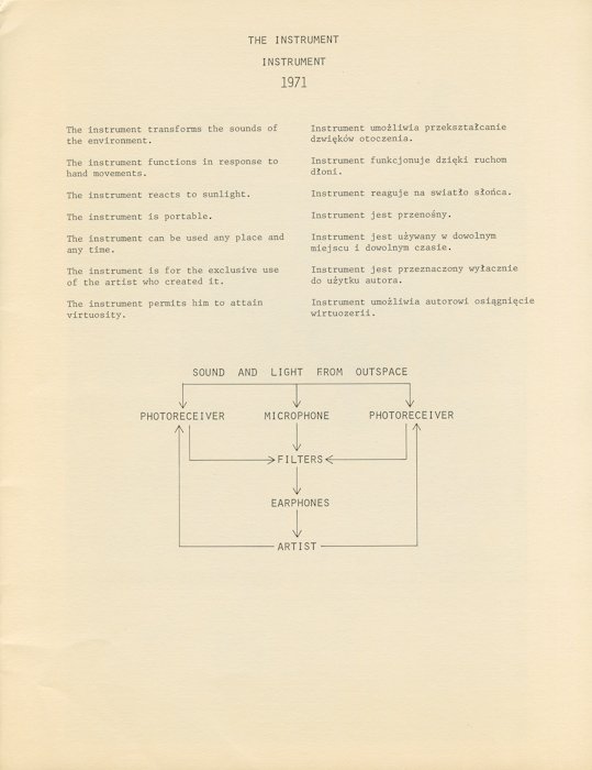
Consequently, the interactive wearable aimed to present a state of “listening selectively” while remaining voiceless, where the only available freedom was what one chose to filter in or out. Equipped with photoreceivers and a microphone, the wearable was thus capable of modifying the received sounds, in relation to hand gestures by the wearer. As stated by the artist himself, too, it was designed as an “appliance” with “expressly defined function”, in such a way that it could act as a potential solution to the social problem of political voicelessness.
ITS RELATION TO SOCIAL PRACTICE ART
Where the intention involves the betterment of society in the face of a social and political issue, Personal Instrument has the makings of social practice art. Despite that, there are many ways in which it does not qualify.
For one, it was built for “the exclusive use of the artist who created it”. Though Wodiczko said, in hindsight, that “the whole Polish society should have been equipped with a device of this kind”, it simply never happened. This has the impact of that it honestly didn’t help society at all. For two, it still tends towards representing the issue, than solving it. I highly doubt that being able to modify surrounding sounds with your hands has much implication on improving the problem of political freedom. Again, little impact on improving society.
Alien Staff (1992-present), a later work by the same artist. It was designed to provide immigrants with a tool to share their experiences, and has multiple iterations due to its popularity in the West. As found at https://ablersite.org/2010/10/11/alien-staff-its-virtual-its-prosthetic/
There are hints of that it is simply an unrefined first foray, especially when compared to later works (like above). Nevertheless, I don’t think that it is simply a problem of poor design conception. This is because there were severe design limitations. For example, that he built this anti-state piece during his tenure at a state-operated organisation. Or, that he was exiled from Poland soon after by the government, without any justification given. Simply put, it’s hardly ideal to be advertising anti-government art in a context of large governmental control. While many of his later works have multiple iterations to improve the design, too, Personal Instrument likely couldn’t get that same treatment due to 1) the sensitivity of the content for the government, and 2) that Poland is no longer under an authoritarian regime anyway.
From this, perhaps it could be said that a supportive environment is ironically needed as well. Not only must there be an existing social problem, the society must be able to accept critical views of that problem. Some of his later works, for example, had a greater impact in terms of visibility, where it could be openly paraded around to make rich people uncomfortable:
Homeless Vehicle (1987-9), as paraded by a homeless man on the streets of New York. The work is not only a representation of the problem, it also acts as a real shelter in which a homeless person can stay. As found at https://culture.pl/en/work/homeless-vehicle-krzysztof-wodiczko
As mentioned above, Wodiczko’s works are still “not about solving individual problems, but about bringing out, exposing, manifesting the social needs which they respond to” (Musielak, 2015). Instead, he subscribes to is something known as Interrogative Design, or Scandalising Functionalism. These terms refer to a form of functional design which is scandalous by its very existence, because the problem it’s addressing should never have existed at all. While this contradicts the requirement of social practice art to solve the problem than show it, it does raise a pertinent issue: that any artistic solution still wouldn’t be able to solve the key cause of the problem. As shown in the previous article, for example, Project Row Houses is an ideal which can’t accommodate the true scale of the housing issue. Similarly, building more Homeless Vehicles doesn’t change the fact that the system itself is generating homelessness.
In which case, perhaps social practice art doesn’t need to answer a problem. Instead, it might merely need to provoke revolution, in rousing sufficient feelings to bring about change which stops the problem at its source.
REFERENCES
Davis, B. (2013). A Critique of Social Practice Art. In International Socialist Review, Issue #90. As found at https://isreview.org/issue/90/critique-social-practice-art
Galliera, I. (2017). Socially Engaged Art After Socialism: Art and Civil Society in Central and Eastern Europe (Book Review). As found at https://artmargins.com/shaping-democratic-notions/
Krzysztof Wodiczko. For Culture.pl. As found at https://culture.pl/en/artist/krzysztof-wodiczko
Krzysztof Wodiczko – Personal Instrument (1969). For Muzeum Sztuki Nowoczesnej. As found at https://artmuseum.pl/en/performans/archiwum/2519?read=all
Sheets, H. M. (2020). A Monument Man Gives Memorials New Stories to Tell. For The New York Times. As found at https://www.nytimes.com/2020/01/23/arts/design/Krzysztof-Wodiczko.html
Davis explores the subject of social practice art in this article. Historically, it has ties to the revulsion associated with the traditional conception of art: of commodification, elitism and meaningless aesthetic. Rather than reflecting the problem, it is contended, art should solve it instead. This, however, compromises the definition of art. After all, such a conception blurs the lines between art and things like social activism, or everyday happenings.
As found on projectrowhouses.org. An example of an artwork stated in the article.
What was striking to me was the distinction between living as form and forms of living. Admittedly, I understand that it highlights a difference in the order of derivation, but not what that precise difference is meant to be. Let me nevertheless make an attempt.
The connection of living and form is championed in Living as Form, a collection of essays by art critics and theorists. Of particular interest is that by Nato Thompson, a curator who celebrates the idea of Living as Form. He associates almost any “vague aesthetics of social uplift” with this, including even un-choreographed responses to Obama’s election. In the book, specifically, he identifies life as something which is
Anti-representational, in being the subject itself than having intentionality towards it,
Participatory, in allowing for interaction with participants,
Situated in the “real” world, in having a spatial component than intangibility, and
Operating in the political world, in having subjects and making impacts related to potentially political issues.
Form is further identified with the sensible qualities of an artwork, where this can include mediums like clay, or gatherings of people. We see, however, that form loses meaning in relation to its concept, where an absolute form can be “criticized, disintegrated, assembled”. Even forms of living, then, can be treated in such a manner.
The distinction, then, is that forms of living refers to styles which emphasise the sensible qualities of their artworks. Living then becomes something artificial, designed only for the sake of aesthetic and commodification. Living as form, on the other hand, emphasises a sort of sincerity. Where it directly relates to life, it is the concept which precedes, and naturally manifests a suitable form.
The article is meant to praise living as form, and of course has good reason to do so. After all, we are rapidly shifting away from a world which appreciates form, into one which appreciates concept more. Nevertheless, it may perhaps still be too hasty to reject form altogether. As stated in the article, form will nevertheless be necessary for even social practice artworks to survive in a capitalist world: the Bank of America likely doesn’t care about the concept behind Project Row Houses, as opposed to how good it looks for their reputation.
Another crucial point is that any regular person’s first contact with an artwork will likely center around the form, than the concept. This is because artworks which are mean to be “real” are situated in environments where they can have a proper impact, than places like museums (which emphasise their visual quality). The typical bystander, however, is unlikely to have awareness of the meaning of an artwork, or even if it is an artwork. It will be solely judged based on its form. On one hand, this could be good in that the artwork attains a sort of anonymity, in blending so well with its environment that it fulfills its objectives of meaningfulness without emphasis on aesthetic quality. On the other hand, it further complicates what it means to be art. Wouldn’t the bucket in my house then be art, in a way not unlike Morrison & Fukasawa’s conception of Super Normal? It’s anti-representational, it’s participatory, situated in the real world, and allows me to draw water, a very political issue. As implied in the article, is it really alright to distinguish art and not-art based on the initiator’s self-imposed status as an artist or not-artist?
Personally, I don’t believe there’s an answer, nor that it is particularly important. It’s a matter of semantic, and I highly doubt that any conceptual error here on the meaning of art would majorly impact the subsequent implications. Or it might. I’m uncertain.
DESIGNING FOR THE DIGITAL AGE
Design, as claimed here by Goodwin, is a craft. He further acknowledges the capacity for design to be an all-encompassing term, but nevertheless limits it to the “visualisation of concrete solutions”. Additionally, such design is limited by real world constraints, such as time and money.
In an attempt to further narrow the scope, he focuses specifically on digital design, and its aspects. Goal-directed design is championed here, where the concept is the starting point, and what drives the entire design. It is further supported by components:
Principles, referring to general rules (which apply in most cases) for the design,
Patterns, referring to repeated rules on what works (and doesn’t) in specific conditions,
Process, referring to how the design is generated through things like research and modelling, and
Practices, referring to how the project is efficiently managed.
Processes, as the book’s main focus, is elaborated on in great detail. In simple terms, the design must be justified by research into what people need and want, and how that translates into a particular form. This can include the use of personas and scenarios to test the design, or even actual usability testing. In any case, the design, as something to be used by others, cannot exist in isolation, based solely on the designer’s whims.
Personally, I’m fascinated by the implication of design as something universal. Obviously, analog design is comprehensible enough, but everything as design? It’s not impossible; plenty of people celebrate the bucket as a simple yet modest design. But what kind of implication would that have? Would that mean that Aristotle is right to say that everything has an innate purpose towards which it strives? And, if we accept this teleological stance, what does that mean for us, as beings which are designed? (This is probably the realm of Value Theory, and so I stop here.)
There’s something fascinating about the idea of principles and patterns as well. This is because they can change over time, depending on the norms of each era. It was once normal, for example, to type with a number pad. Now, hardly anyone is expected to press 44 444 8443377733. It became a principle that mobile phones use a keyboard, out of nothing but convention (and convenience, maybe?). This might mean that a kind of dictionary and/or archive must be held, to track present trends in what is acceptable and not.
OVERALL THOUGHTS ON BOTH, PERHAPS?
The separation of design and art in the second article is also somewhat concerning for people like us. What does it mean to major in Design Art, when the two don’t necessarily coincide?
This is also related to the first article, where most professors emphasise concept, and can accept an incomplete form. While on exchange, I discovered that 100%-design clusters often take design to mean that even the problem to be solved is raised by users, through interviews and surveys.
My take-home exam for a user experience principles course. Note the different terminologies, which follows the Nielsen Norman Group style.
User Flow, as introduced in Interactive I.
Here, however, much of our creative liberty is retained. Most projects are based off “what I want to do”. which sometimes (but not always) includes “what I think people need”. Note that it is about “what I think”, than “what I have ascertained”, too. Even so, most project presentations turn out fairly well, with no major obstructions to user experience.
Something that Shah said before also stands out here, where he suggested that we are not necessarily inferior to computer science students: while they have a better understanding of software and how to actualise a concept, we have a better understanding of the concept itself. In other words, we’re more likely to think of ideas, but less likely to be able to execute form. (Many exceptions exist, like Angela He. Either way, this is why collaborations between artists and engineers exist.)
Does this mean that the aspect of the artist, in fact, supports the aspect of the designer, in allowing us to ideate something relevant to the user? Or does this mean that we still have more that we can be doing, as designers, to eliminate even minor obstructions?
As always, I have no answers.
The readings, and their links:
Davis, B. (2013). A Critique of Social Practice Art. In International Socialist Review, Issue #90. As found at https://isreview.org/issue/90/critique-social-practice-art
Goodwin, K. (2009). Chapter 1: Goal-Directed Product and Service Design. In Goodwin, K. Designing for the Digital Age, pp. 2-13. As found at https://oss.adm.ntu.edu.sg/19s2-dm3010-tut-g01/wp-content/uploads/sites/9263/2020/01/CH01_Digital_Age_Goodwin-1.pdf
Thompson, N. (2012). Living as Form. In Thompson, N. (ed). Socially Engaged Art From 1991-2011, pp. 16-33. As found at http://cp.art.cmu.edu/wp-content/uploads/2014/12/living-as-form.pdf
![[W10PDaP] on the adm gallery](https://oss.adm.ntu.edu.sg/a170027/wp-content/uploads/sites/1810/2020/03/20200319_134450-1-825x510.jpg)


![[W7PDaP] on the assigned reading](https://oss.adm.ntu.edu.sg/a170027/wp-content/uploads/sites/1810/2020/02/PMP-Certification-825x463.jpg)
![[W6PDaP] maybe i have a thing for chairs](https://oss.adm.ntu.edu.sg/a170027/wp-content/uploads/sites/1810/2020/02/20200220_160816-825x510.jpg)

![[W4PDaP] Social(ism) Practice Art, but there’s no socialism only oppression](https://oss.adm.ntu.edu.sg/a170027/wp-content/uploads/sites/1810/2020/02/merlin_167548860_6543ca56-5a52-497c-bfe0-b472b873380b-superJumbo-825x510.jpg)

![[W2PDaP] Assignment](https://oss.adm.ntu.edu.sg/a170027/wp-content/uploads/sites/1810/2020/01/10021443-Nato-Thompson-Living-as-Form-Front_1-825x510.jpg)


![[PDaP] W2 Biennale & Night to Light Presentation](https://oss.adm.ntu.edu.sg/a170027/wp-content/uploads/sites/1810/2020/01/7b-825x510.jpg)