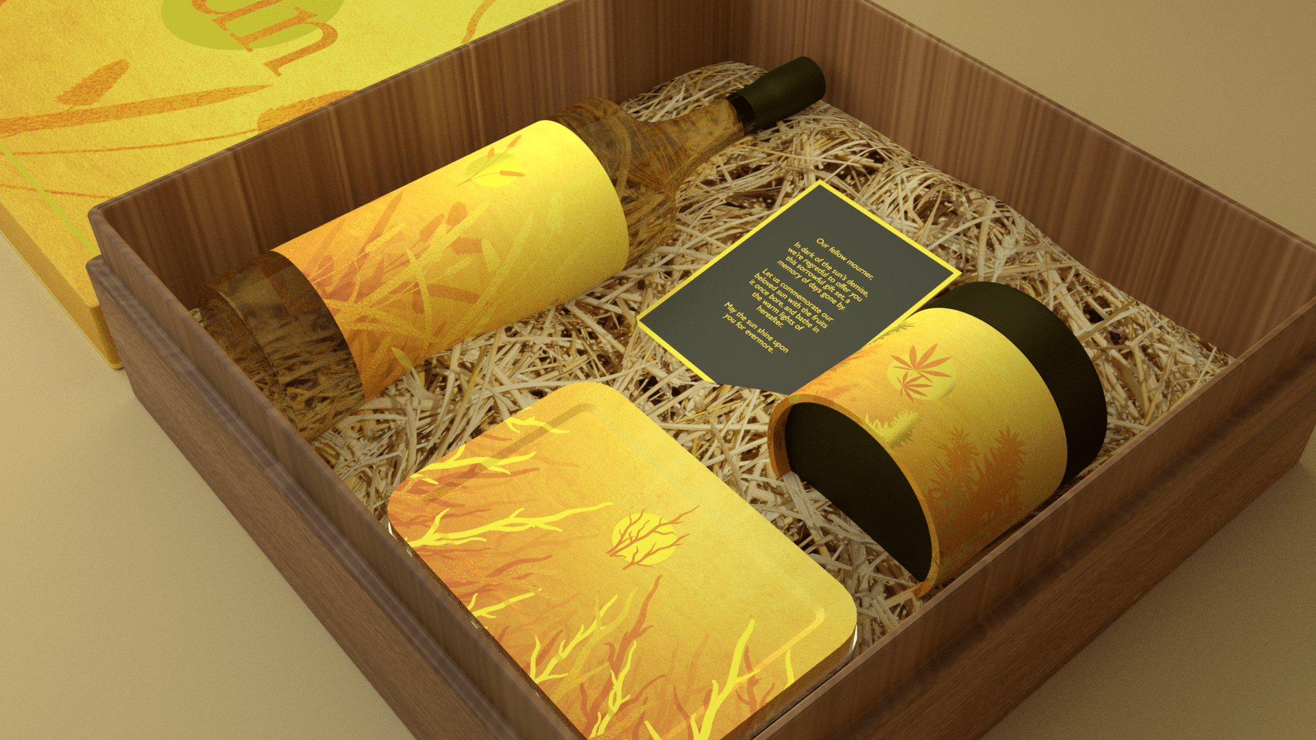
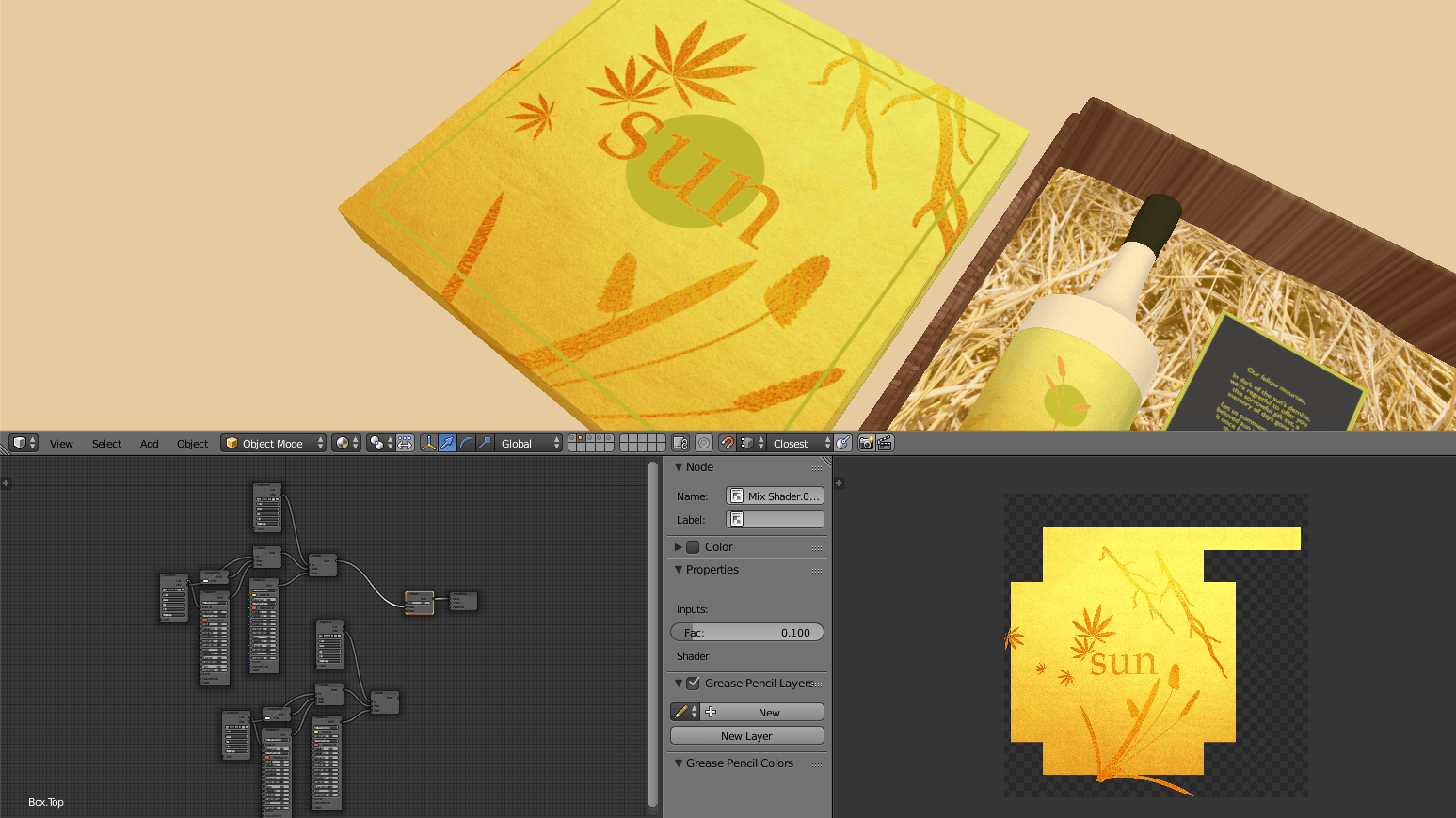
A low-fi turnaround to get a sense of the gold, where proper rendering takes insane amounts of time which I won’t bother with:
A LITTLE SUMMARY TO REFRESH
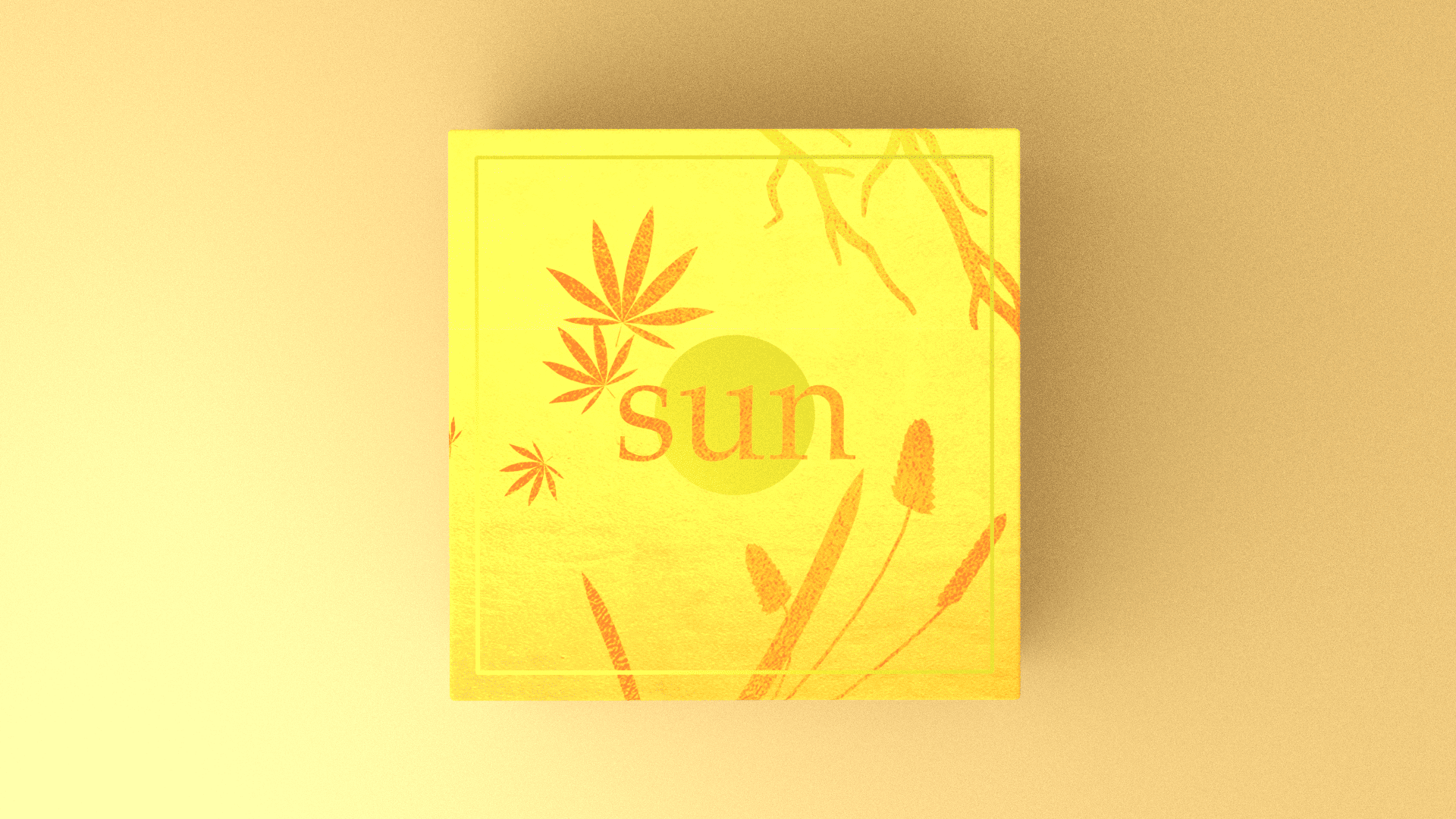
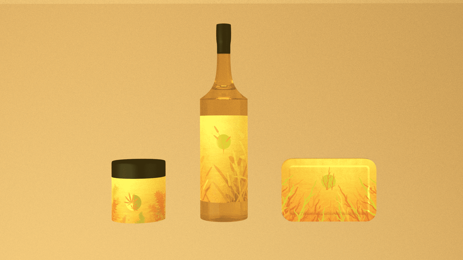
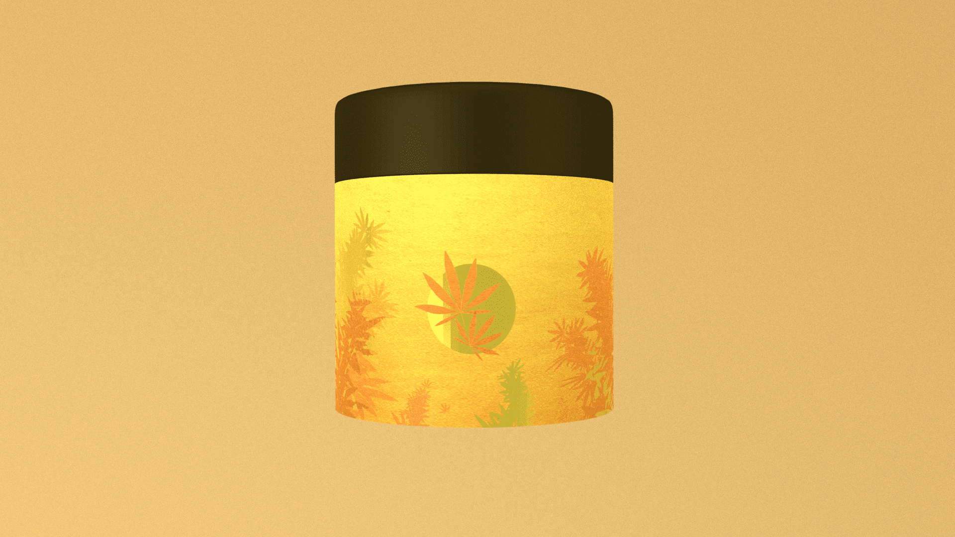
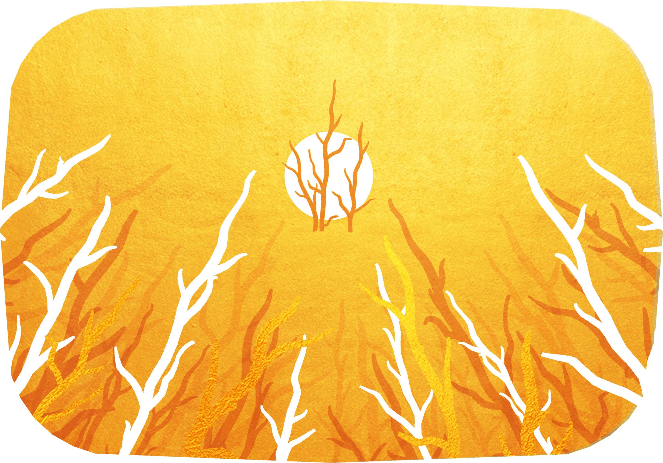
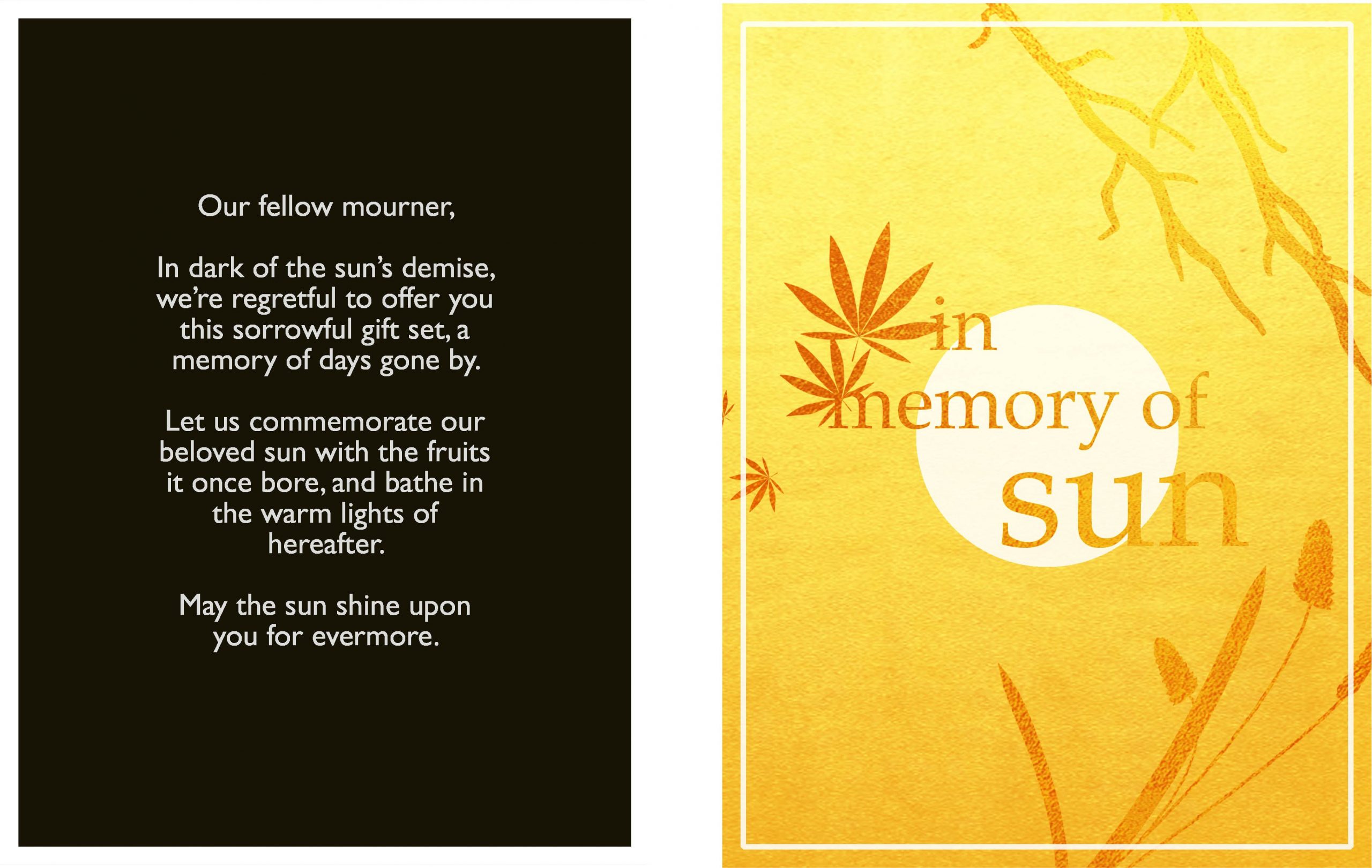
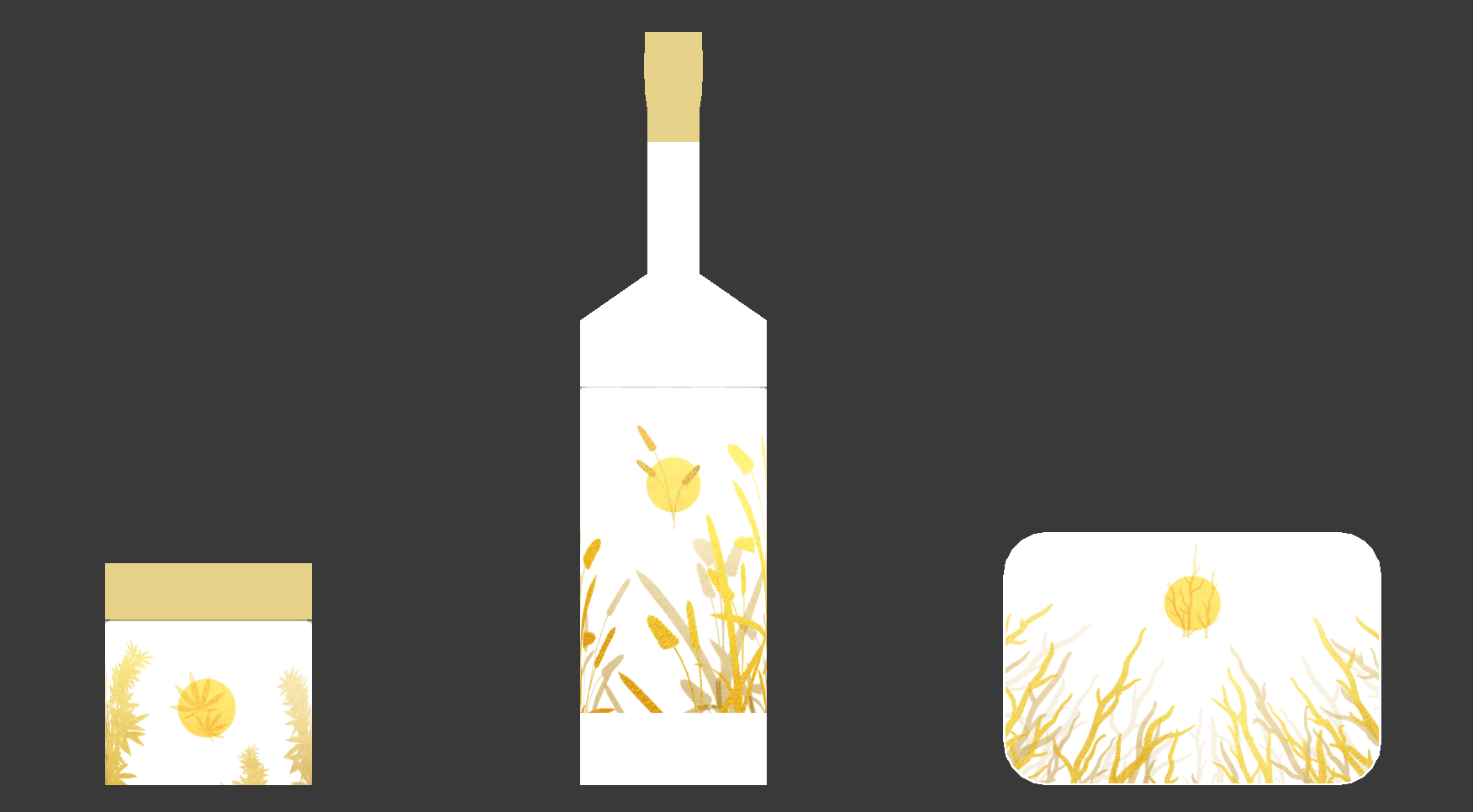
In Memory of Sun, otherwise known as the sun is dead, time to drink, smoke weed, and die. To mourn the sun, a wistful gift box of commemoration.
Have some alcohol decorated with the forlorn memory of when we used to have fermented grain mash; weed, with the plaintive memory of when cannabis still grew; immolation kit, with the distant memory of when tinder was abundant.
A LITTLE MORE PROCESS
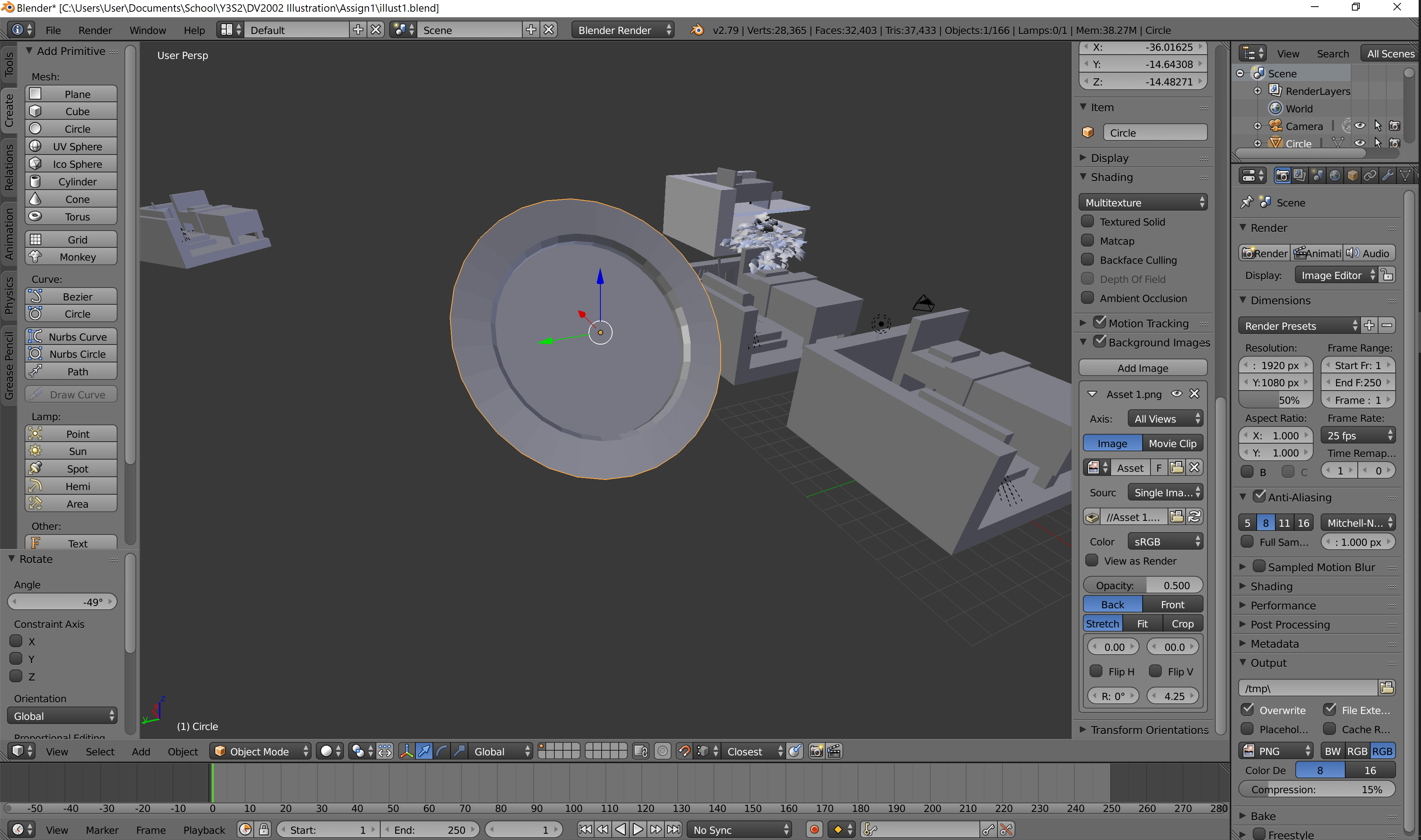
Following from previous week, I tried to use free mockups. As suspected, though, it was really hard, where mockups are flat images (which have really weird texture breaking for non-flat surfaces. Also, they don’t have 360° to show off the entire illustration. So, original models it is!
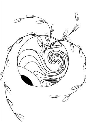
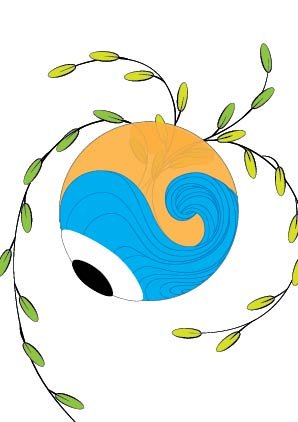
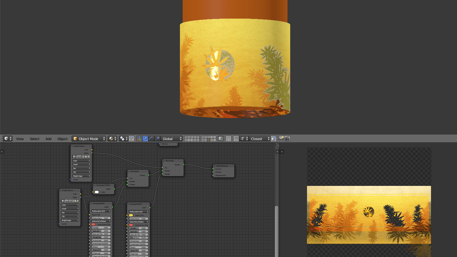
White means transparent, which means gold is overlaid:
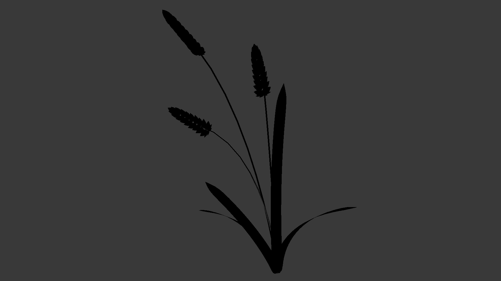
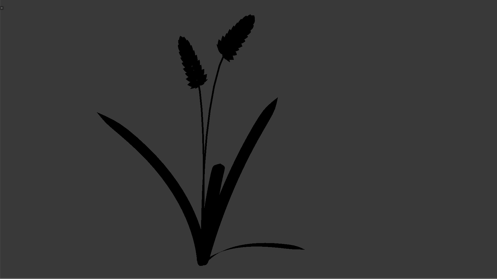
Defining the position of sun, and manually inserting pieces
Adding layers, and imprinting the “key visual” onto the sun
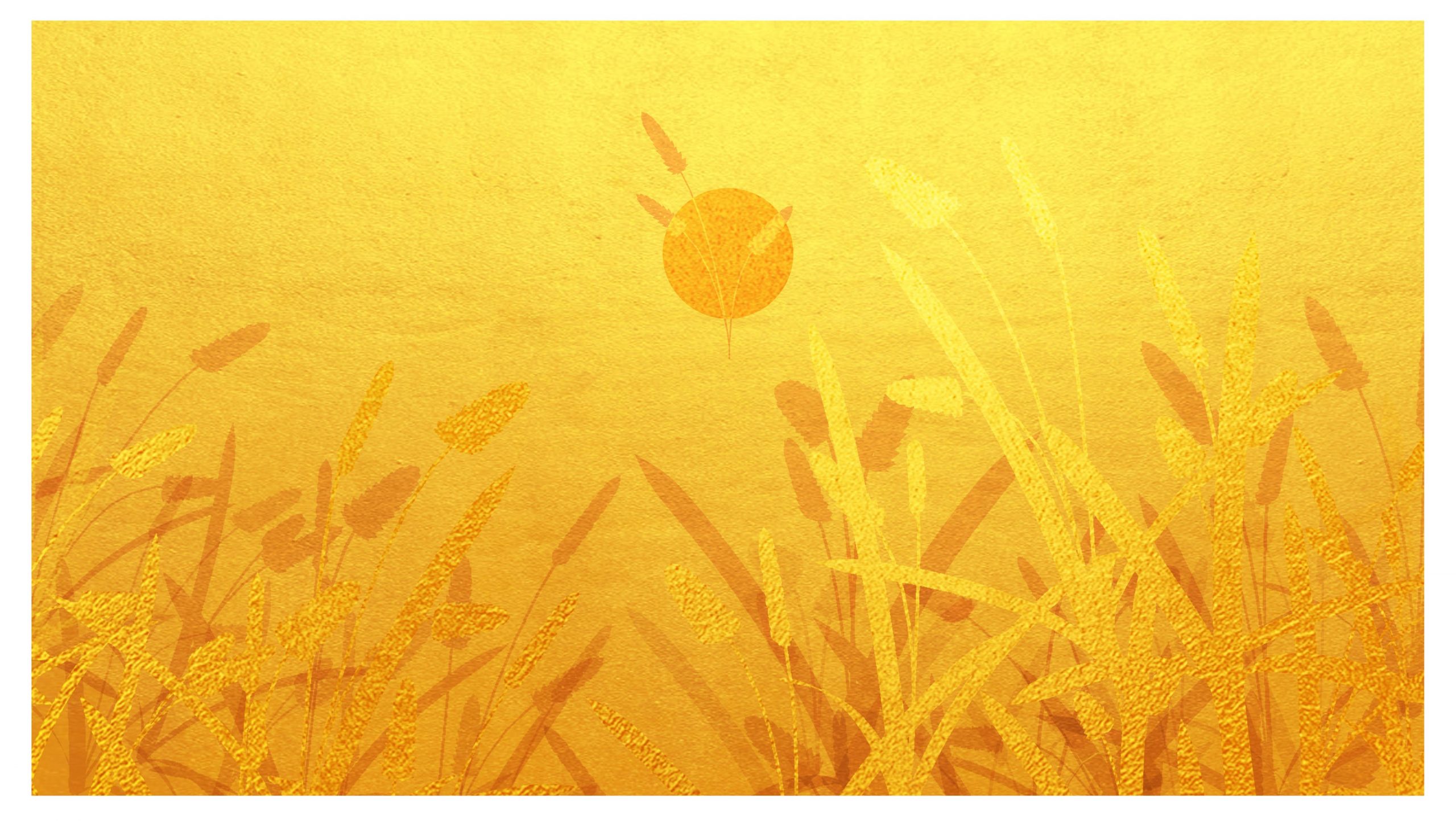
Adding gold overlays, shifting values around for proper depth
Placed onto items as a test! White feels great as well, even if it isn’t appropriate.
Adding background colours
Preparing for gold overlaying; this means shifting some colours around, and using black to demarcate areas to be masked
Using nodes to get the gold overlay (at this point, I’m very glad that I’ve decided to use original models, because this isn’t possible on mockups)
Getting supporting textures (wood, glass, etc) done through nodes, and lighting, and rendering
Incidentally, each piece is just a collage of, like, 3 models, of which I grabbed different angles for a pretense of variety, then magic wand.
Something I’d have liked to do, but eventually deemed pretty not-important-enough, is seamless illustration for the cylindrical ones.
The animated GIFs are too big, but here’re links for Gwen and I! (Please. They’re necessary.)
Me
Gwen P1
Gwen P2
Gwen P3
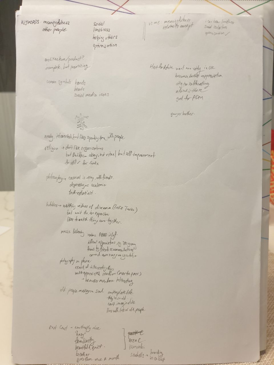
PROCESS: COLLECTING DATA
The initial point was an interview with Gwen. We hardly knew each other, and thus asked a few questions each via Telegram. Other than that starting point, we also took various free time opportunities in class to converse, getting a general sense of our various opinions. This included, for example, thoughts on things like religion and philosophy, as well as hobbies and reasons for it.
Part of the initial conversation.
Based on the results, I identified key words, and compared traits against myself. The conclusion was as such (Gwen / Me):
Social / Independent
Emotional / Practical
Country / City
Efficient / Analytical (? based on our working styles, where she seemed much more put-together)
3rd Personal / 1st Personal (in terms of how I perceive us, since I see myself from within myself, while I see Gwen from her outside)
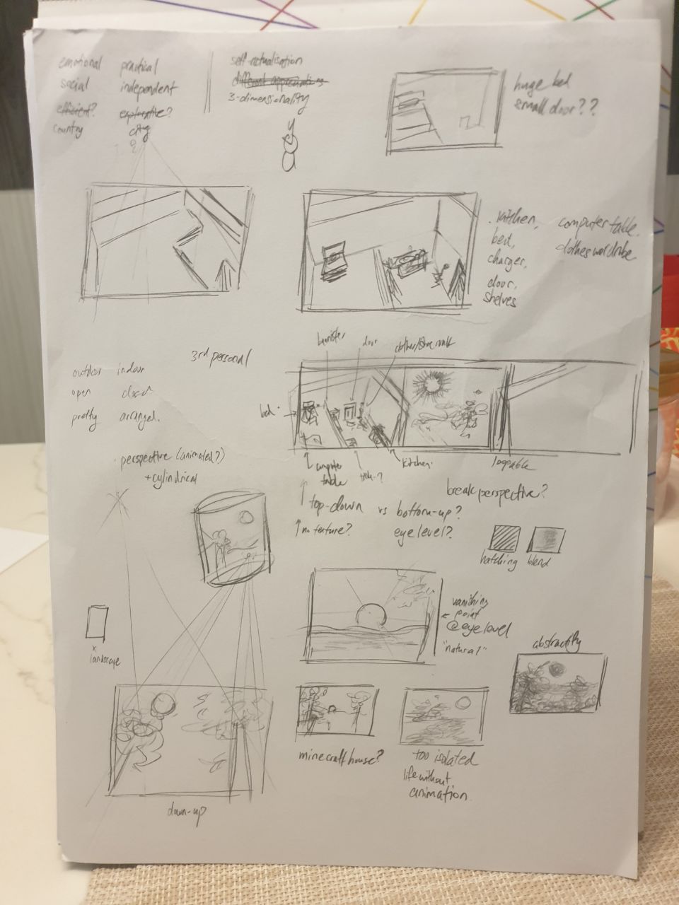
This translated into the following decisions, where I believed these to most aptly display our differences:
Outdoor / Indoor
Open / Closed
Natural / Constructed
Painted / Modelled
Curved / Cubic
Nevertheless, there were many points where we aligned, such as our perspective on self-actualisation, and our varied interests. As such, I also considered the use of Perspective than Orthographic, to represent that 3-dimensionality. Also, for our portraits to Seamlessly Intersect, such that the portraits (and us!) can be connected without any issues.
I also checked out relevant images to whatever Gwen had mentioned in our talks, in an attempt to acquire a moodboard of sorts. These images were also set to greyscale, to avoid colour bias due to the limitations of the assignment prompt. Here’re the images:
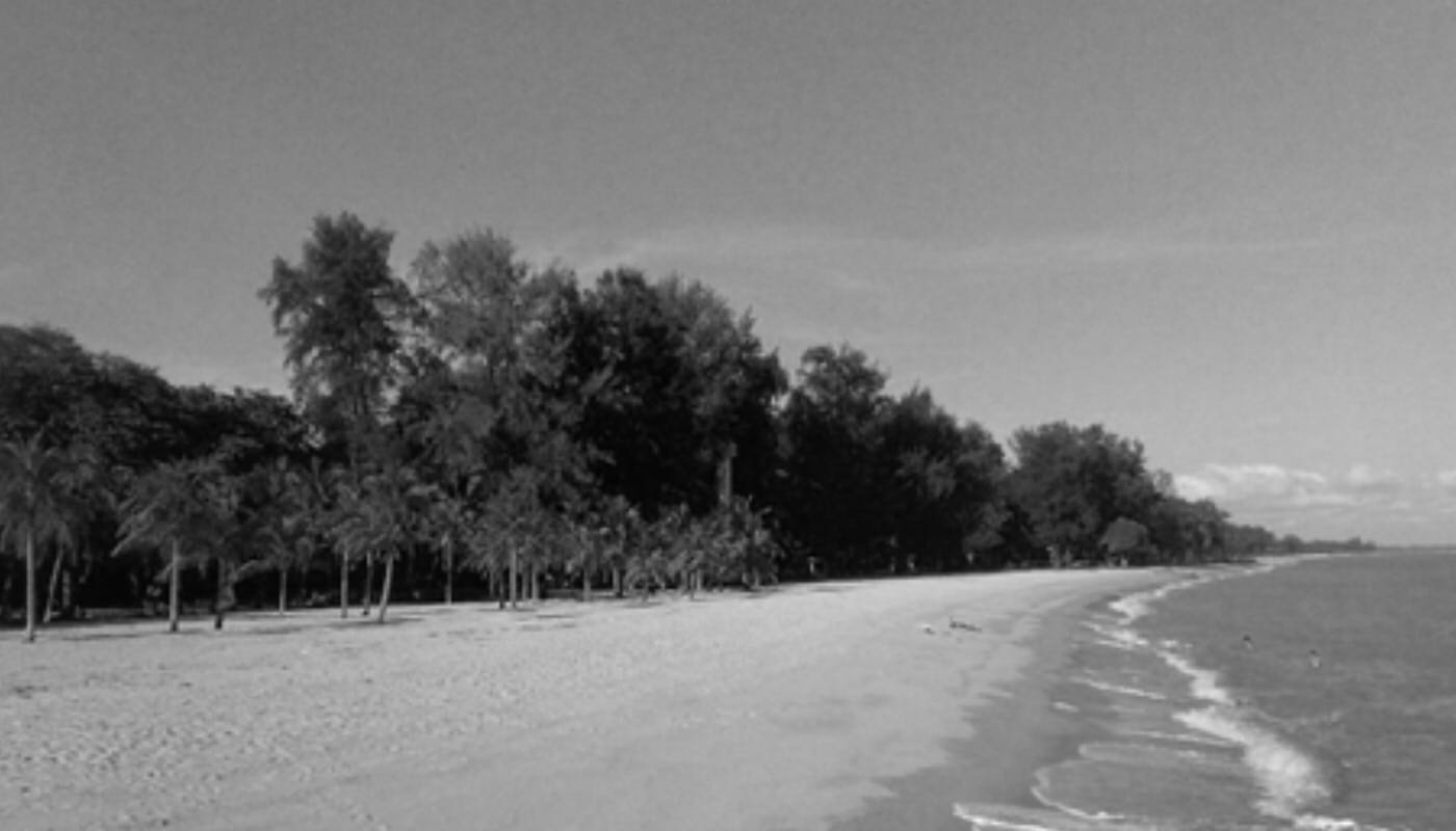
East Coast Park, where Gwen enjoys her time off, because it’s peaceful. https://www.nparks.gov.sg/gardens-parks-and-nature/parks-and-nature-reserves/east-coast-park
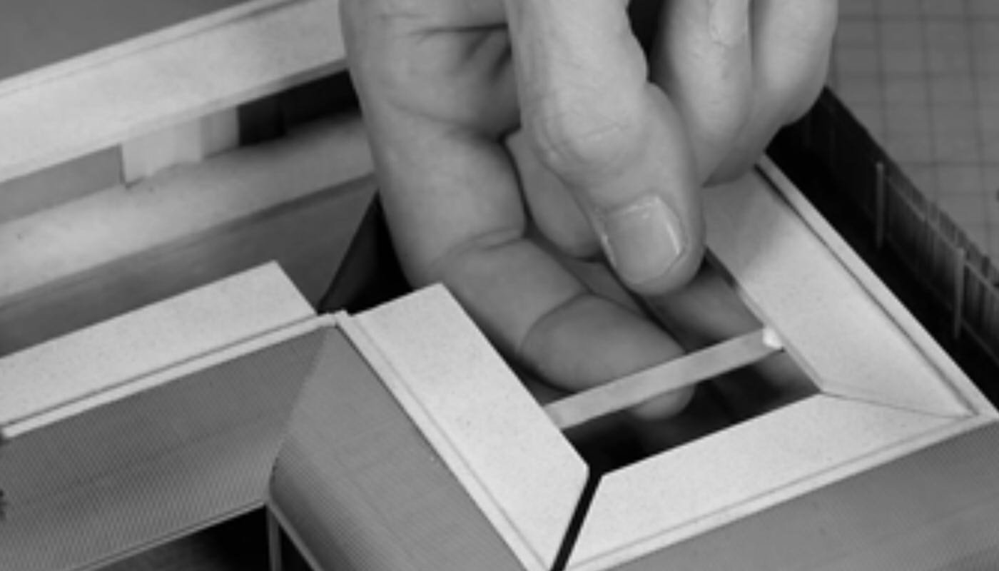
A diorama process, where Gwen is fond of watching “things come together”. https://www.youtube.com/watch?v=MYJzMUFeE20
Hertfordshire, where Gwen intends to have her exchange due to her fondness of the countryside. https://www.telegraph.co.uk/travel/comment/hertfordshire-county-underrated/sss
PROCESS: CREATING THINGS
As my approach doesn’t quite look at specific events or items, I surmised that it would be best to rely on emotion evoked through a scene, than symbolic objects. This, as would later be affirmed in class critiques, made it difficult to create an illustrative piece that was concise in its meaning. Here are some samples of the earliest compositions, which look like shoddy attempts at still life drawing:
A starting page, with keyword identifications
Attempts at landscape scenes
More attempts, and gradual delve into current form
Sketches for Gwen
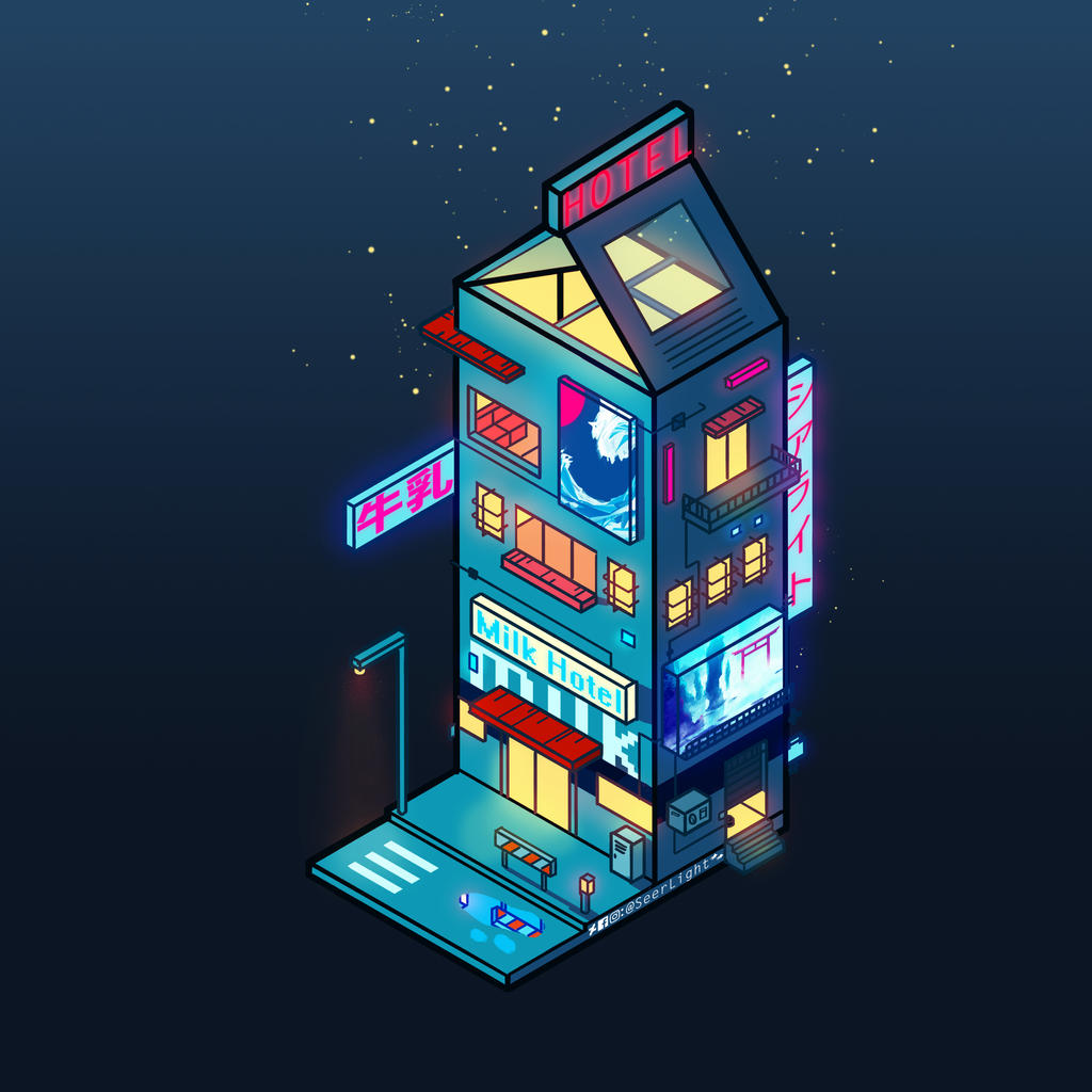
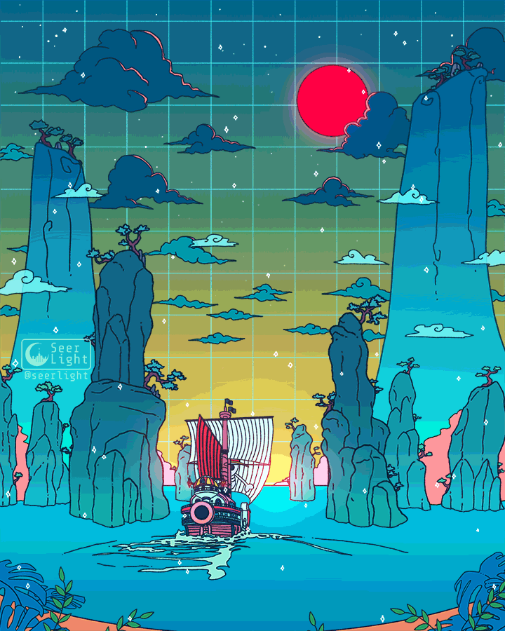
Consequently, I looked for ways in which other illustrators display “spaces”, while still being distinctive and clear. While I looked at avarietyofsources, my primary inspiration was Ronald Kuang / SeerLight, who often uses geometrical shapes and gentle colours to depict locations.
By SeerLight, an example of the milk carton shape used to suggest a building. As found at https://www.deviantart.com/seerlight/art/Cyberpunk-Milk-755347124.Also by SeerLight. Subtle animations are also a trademark of his. As found at https://www.deviantart.com/seerlight/art/To-the-next-adventure-815132728
Thus, I decided that the best way to represent our distinctive traits was to use a contrast of Organic / Geometric shapes. This way, the very form of the elements is an indicator of our characters. Additionally, this means that, when using animation, I can use the same shape to represent various different items, retaining a proper focal point without cluttering the composition.
PROCESS 2
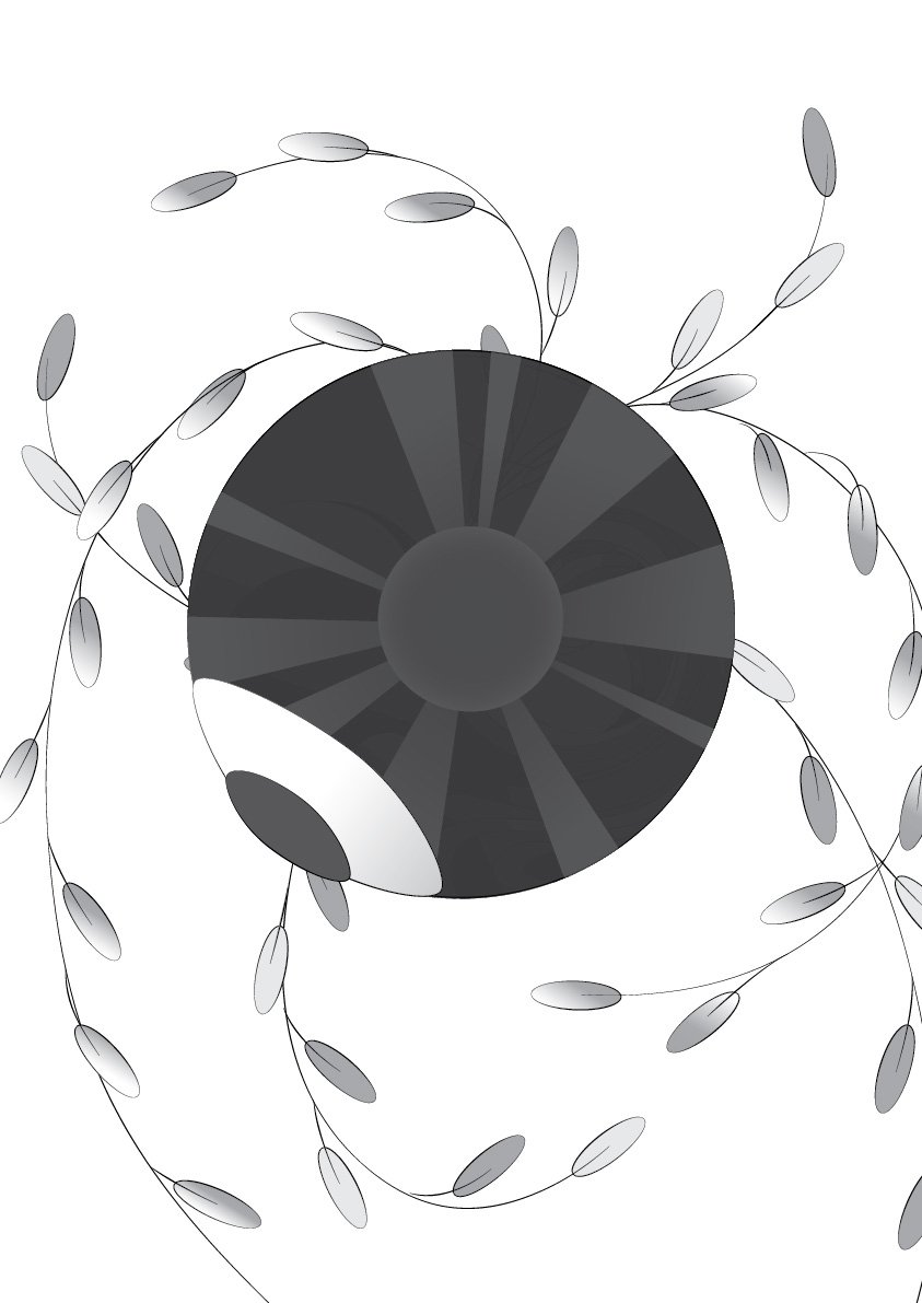
I did mine, of the geometric, in Blender, where orthographic drawing from scratch is not my strong suite. It is made of cubes, cubes, and only cubes, a call to my comparative rigidity and practicality. After which, I traced it on Illustrator.
A later version, where I began to consider the use of scale to indicate significance of objects, and removed various things which weren’t necessarily “important”.
I considered a plate, but ditched it for a tray, since the circular shape would never work. (Also why there is no spoon.)
The biggest object is the bed (of course!), followed by the computer, and then the cutlery. It’s a representation of my 3 priorities: sleep, Internet, and food. I placed the door as a counter to the struggle for dominance: unlike those 3, the door is verily small, an indicator of just how much I hate to go out. The animation is much simpler compared to Gwen’s, but feels oddly apt: Much of it is just repetition without significant changes, just like much of my everyday life as I hide out at home.
The line-only draft.
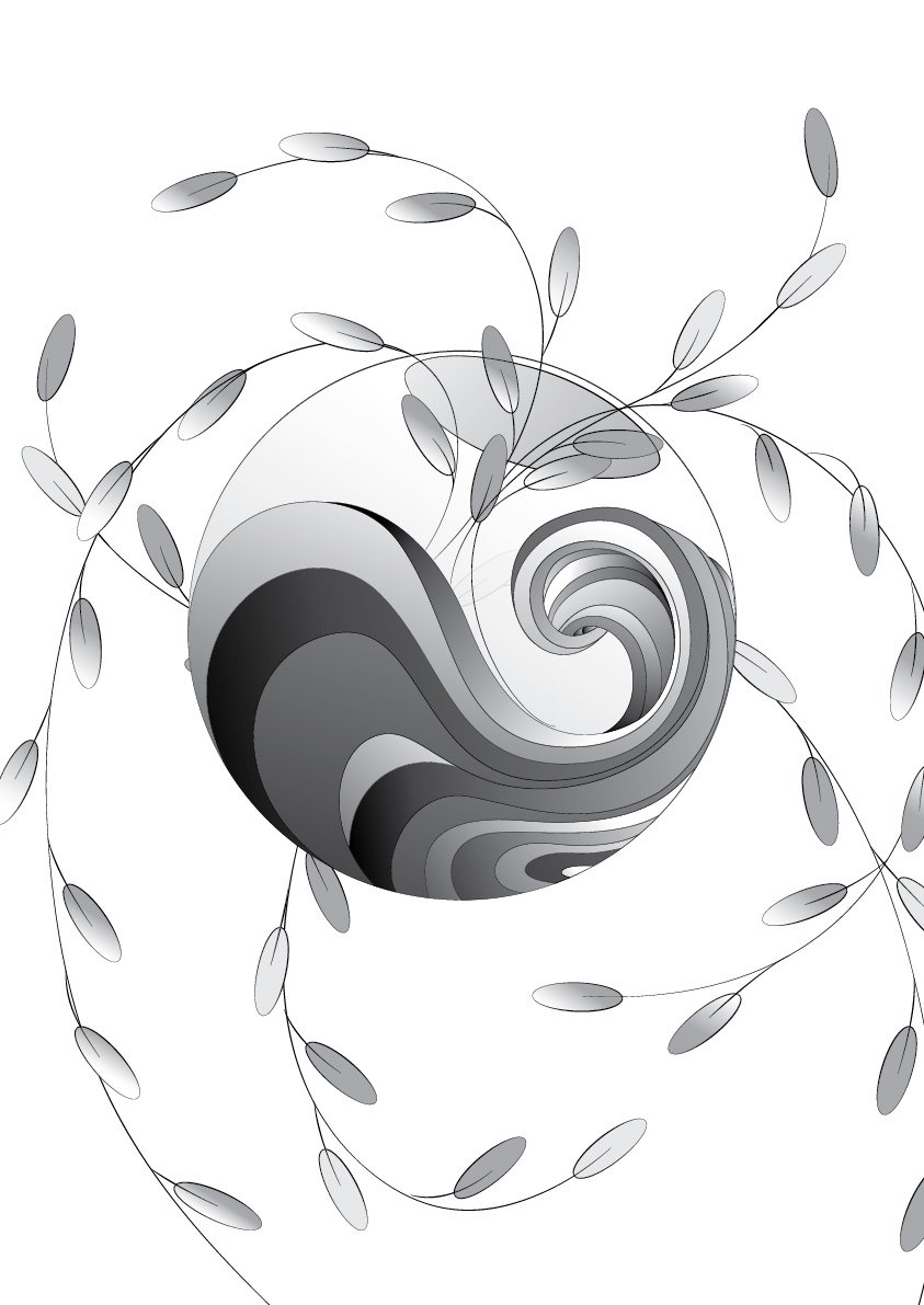
Gwen’s features curves, curves, and only curves. Since she appeared to be someone rather emotional, and almost spiritual, I placed many of the things she enjoys seeing, such as the sun, plants, waters (the sea), and the bowl (for plants, but also for fish sometimes). When I mentioned this to her, however, she hastily said that she only enjoys watching, as she’s terrible with keeping things alive. Consequently, I added the eyeball, a manifestation of her gaze. I’m blessed that all of these use the circle as a base shape. Thus, the animation can encompass all, by having the circle change from being that of a “bowl”, to that of the “sun”, and the “eyeball”.
With base colours, until I remembered.
All in all, I’m surprised that the lack of colour wasn’t a major problem. Nevertheless, the sun on Gwen’s portrait is tragically misaligned, probably because I failed to set the origin point properly. It’s only my second time using Adobe Animate, oof. Also, I feel like the eyeball might not have come across very cleanly: in hindsight, it might have been better to have it centralised than facing the side, where it’s rather difficult to identify what it’s supposed to be.
Perhaps the approach I took wasn’t necessarily the best, either, since I focused on the dichotomies between both of us, than seeing Gwen for who she is. While it helped in the eventual creation of the Organic / Geometric division, it might be worthwhile to try seeing others as they are, than as compared to me.
![[W13IfD] Final, and a little more process](https://oss.adm.ntu.edu.sg/a170027/wp-content/uploads/sites/1810/2020/04/render02-min-825x510.png)


![[W10IfD] a final post for assignment 2](https://oss.adm.ntu.edu.sg/a170027/wp-content/uploads/sites/1810/2020/03/ifdimgfina3-638x510.jpg)


![[W4IfD] Assignment 1 Process & Final](https://oss.adm.ntu.edu.sg/a170027/wp-content/uploads/sites/1810/2020/02/finaaaa-0222-776x510.jpg)