W4 Project 1: My Line is Emo

I’m unfortunately a very trigger happy person (this always, inevitably works against my favour), so all emotions focused a lot on natural forms, where I didn’t control much as opposed to trying to aim for a certain state while making, and letting the marks turn out as is (as long as it generally looked ok).

The key ideas were both of these:

  • Emotion quality

For me, emotions are often not clearly separable. To avoid too many visual similarities, I narrowed the quality of each emotion down based on 3 overarching criteria: intensity, protractedness and frequency. Intensity is associated with the strength of the emotion (typically once-off and large), protractedness, with the duration of the emotion (typically underlying and mild), frequency, with the occurrence rates of the emotion (typically short-lived and mundane).

  • Binary opposition

With three defining criteria, I decided to try to represent feelings sharing similarities, and work on using the contrast between both to bring out each other. Also just that 3 criteria and 6 emotions meant 2 emotions would have to share the same spectrum anyway. The linking quality is typically the paper, and the general shape of each mark.

Consequently, the final emotions were as follows:

From left to right, up to down: Love, Anger, Shock (Fear), Shock (Surprise), Bliss, Melancholy
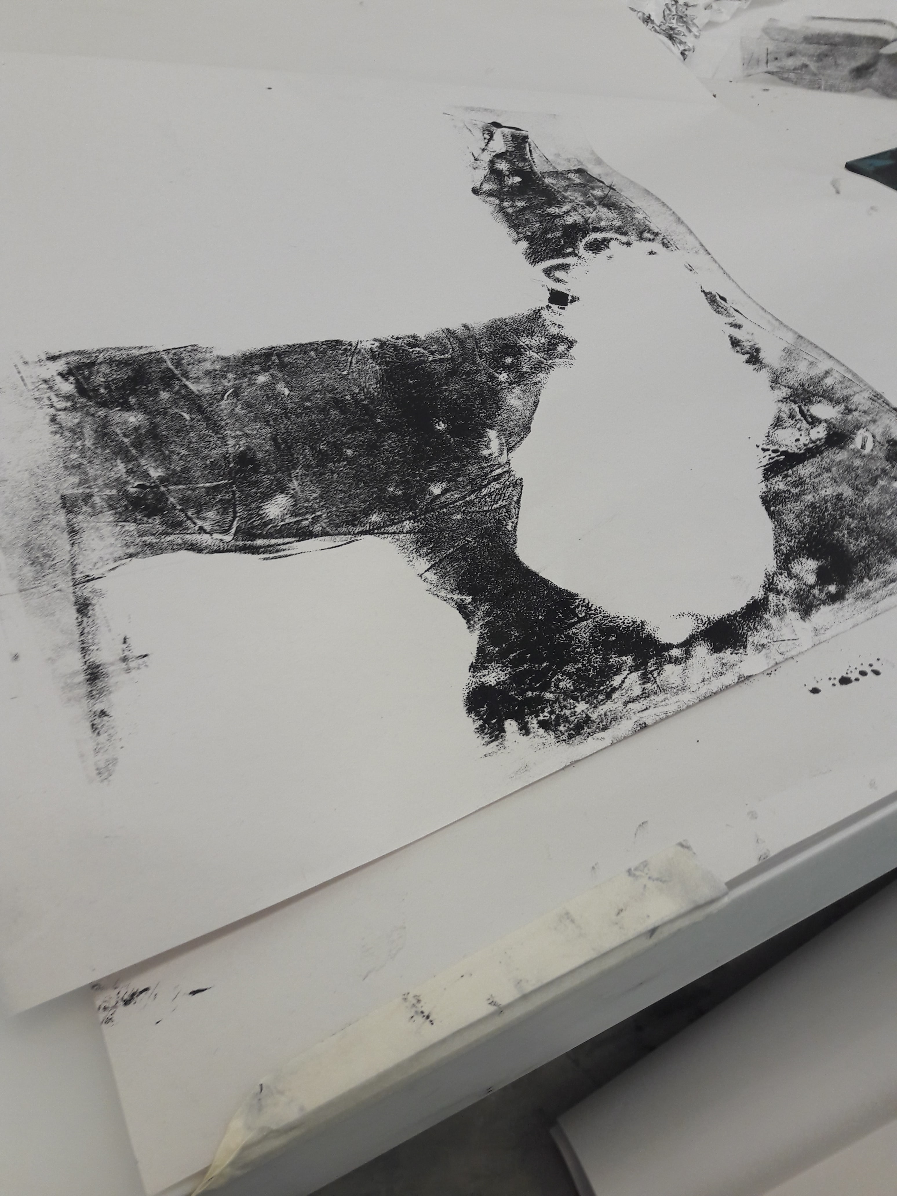
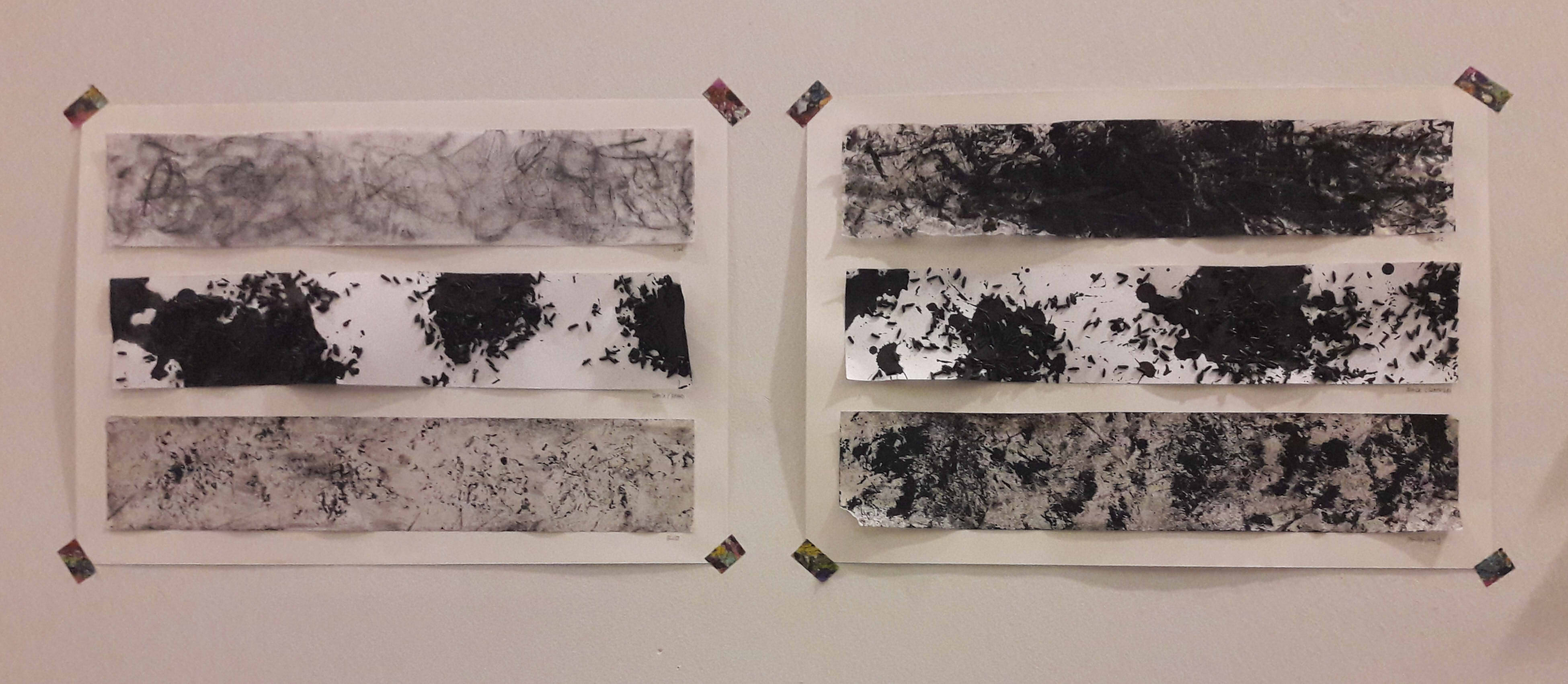
Love & Anger

Both are on tracing paper. I wanted to try gouache/cold-pressed watercolour paper for the texture and whiteness, but it worked really badly with crushed paper (what I presume is named froissage). Seeing ink seep through the tracing paper, I decided to go with that instead, firstly because aforementioned would actually worked, and because the idea of anger literally overflowing and staining was kind of interesting to me.

The key term is intensity, where these feelings are immense and overpowering. (As a byproduct, neither were renamed, since I couldn’t find a better word to describe this all-encompassing emotion.)

  • Intensity: Only one point of focus. Centralised to reiterate the idea of singularity
  • Immensity: Reflected in large concentration of positive/negative space
  • Overpowering: Overflowing from the focus, spreading out

Differences:

  • Both were pressed onto linoleum, but anger was pressed while there was a lot of ink, as opposed to love, which was pressed after I had dabbed off the ink (to have a much lighter imprint)
  • The focus is white for love, as opposed to black for anger (colour association). By extension, love features lighter colours (made by diluted Chinese ink) as opposed to anger, which used normal ink
  • Love features swirly, smooth lines (automatic drawing with fingertips and diluted Chinese ink/leaf on linoleum), as opposed to jagged lines for anger (froissage/automatic slashing on ink with brush held with a fist)
  • Paper for anger is crushed, as opposed to paper for love. Also, ink face is facing outwards for anger, as opposed to for love (smooth surface), and love actually has a 2nd layering of white paper underneath as opposed to anger

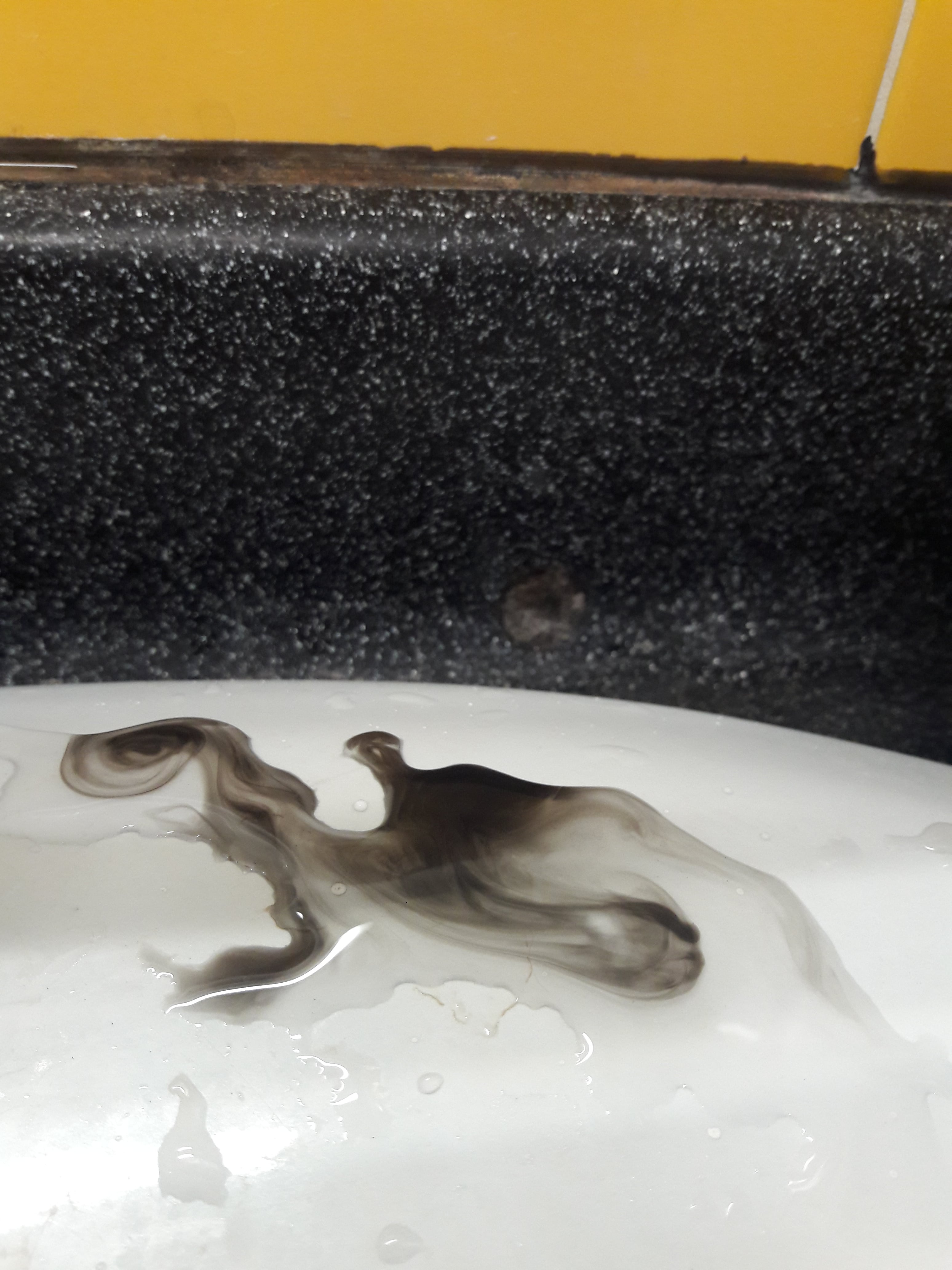
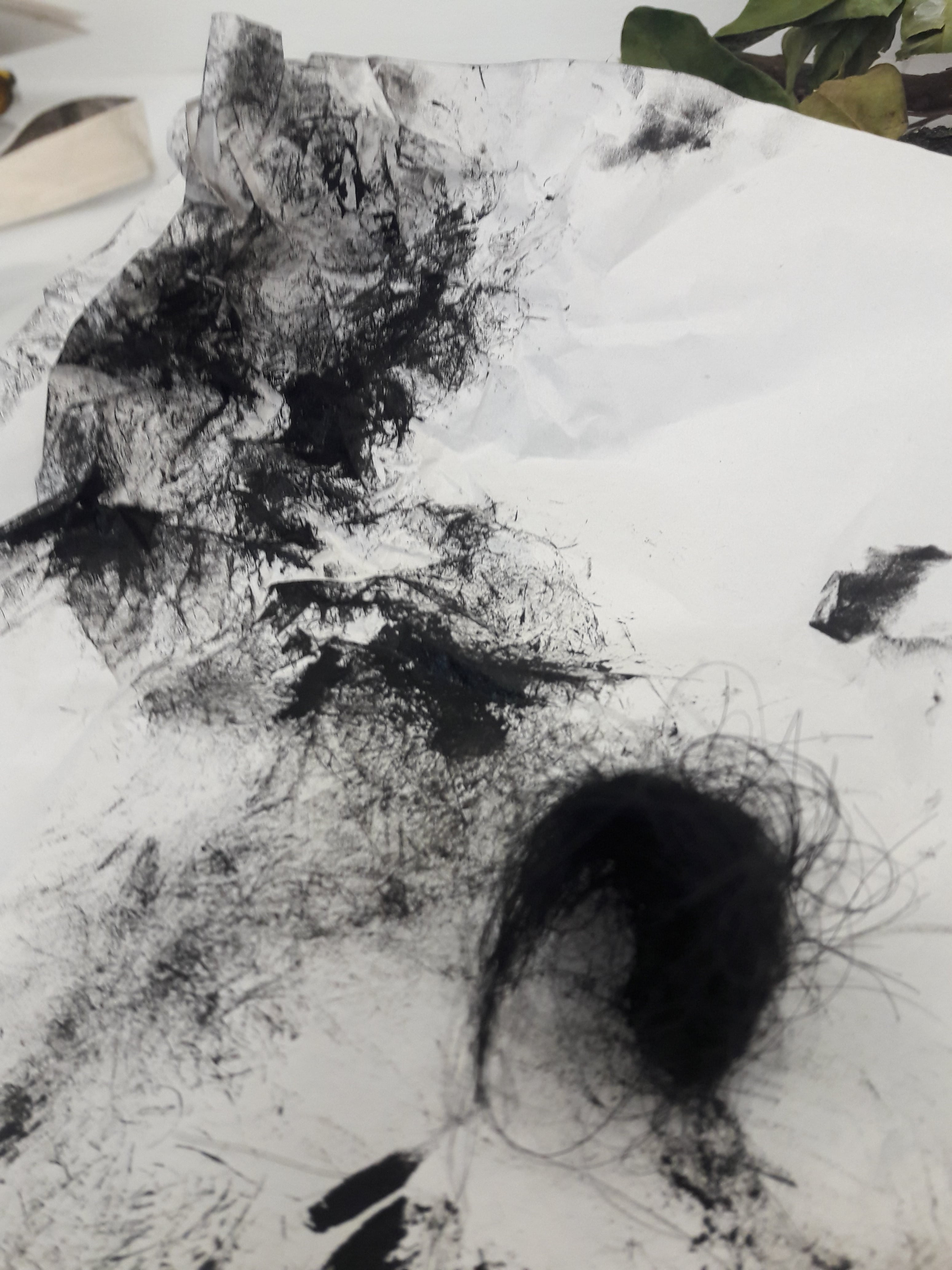
Shock (Fear) & Shock (Surprise)

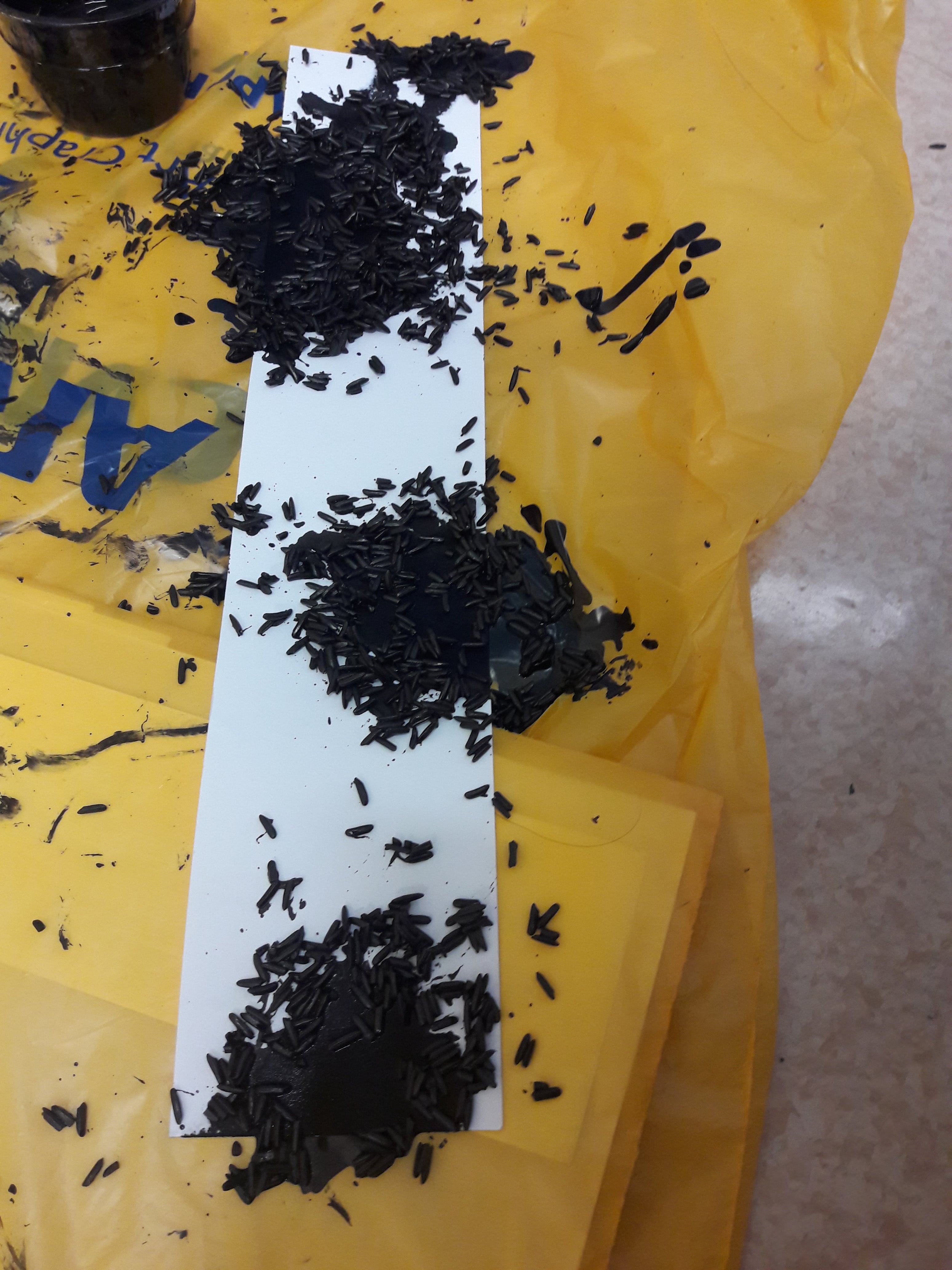
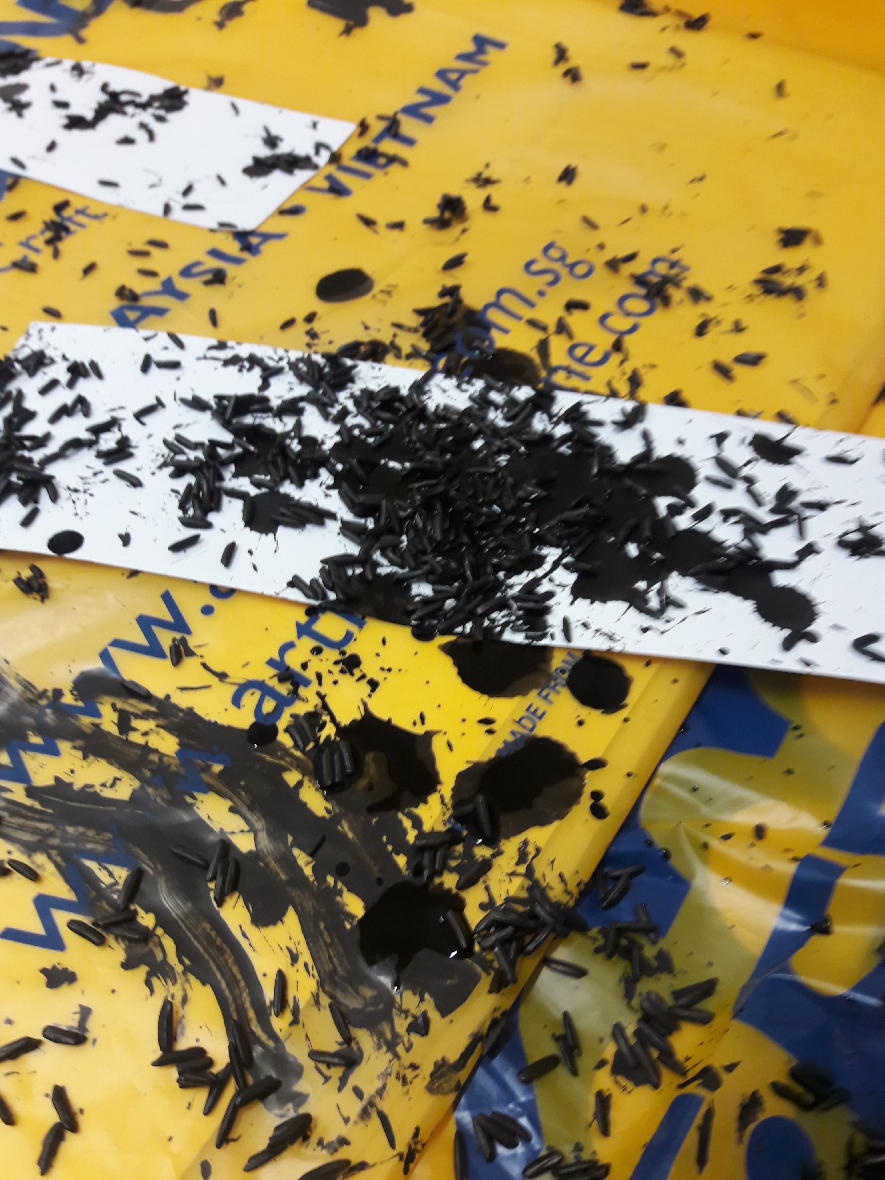
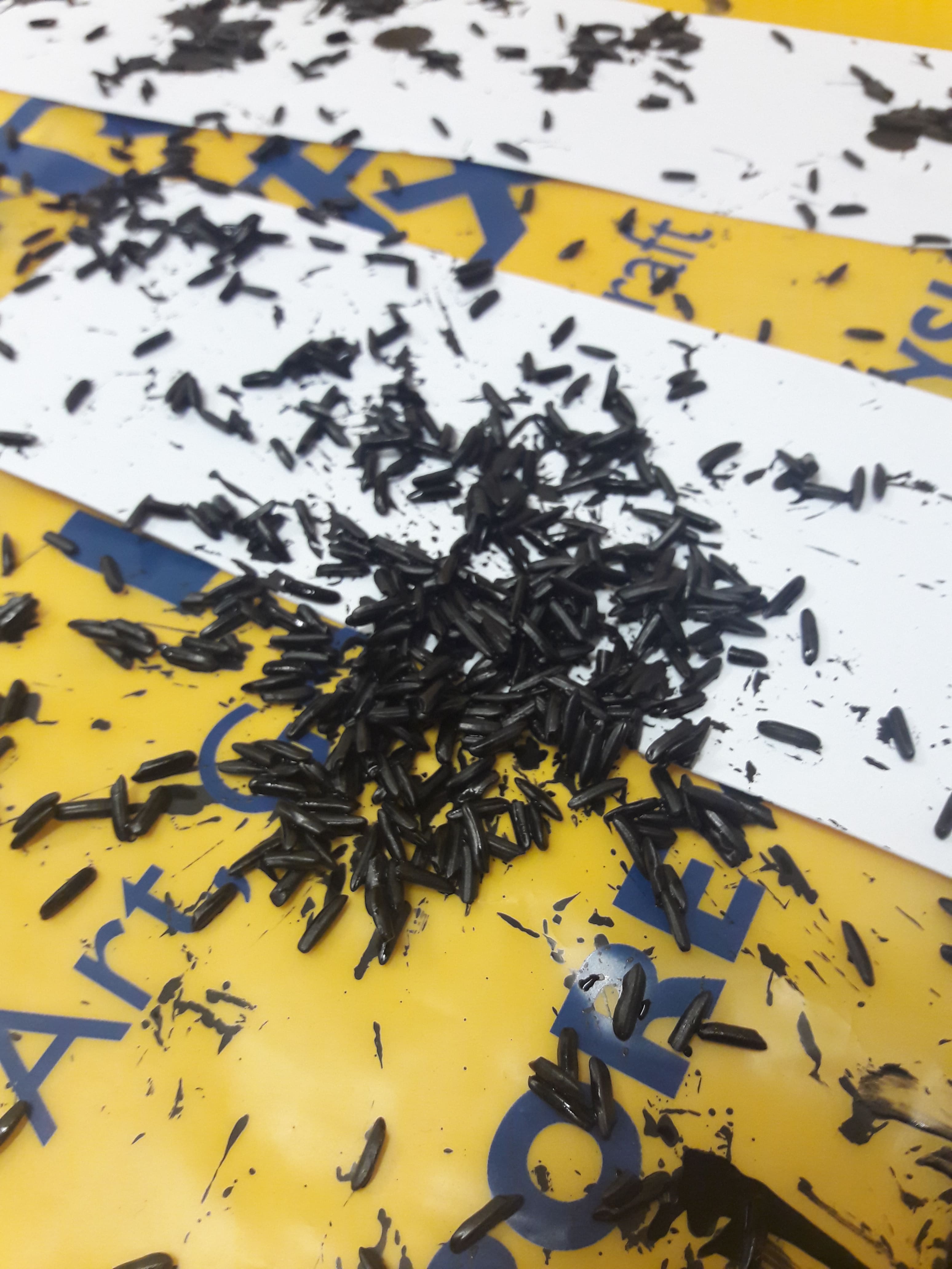
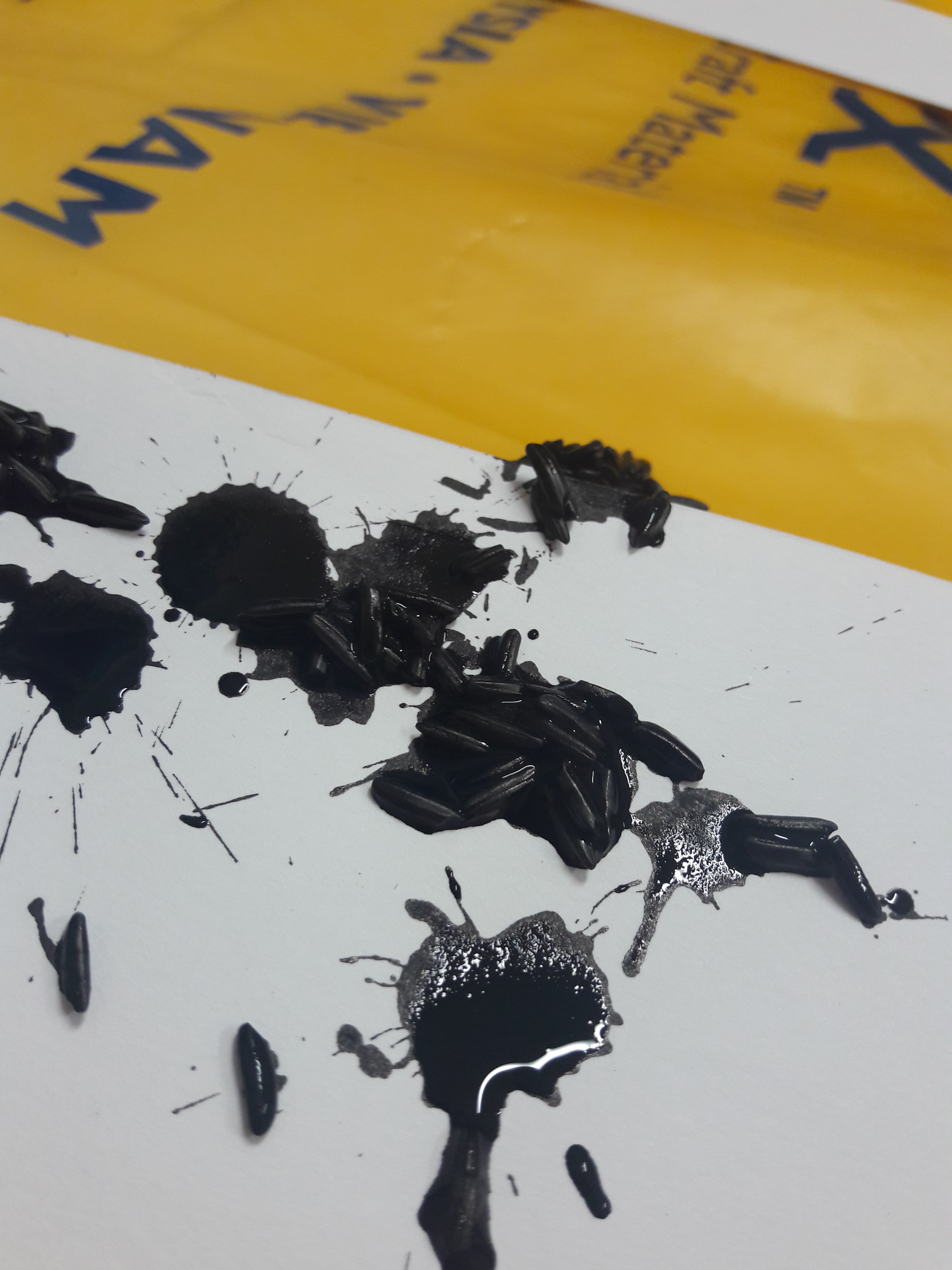
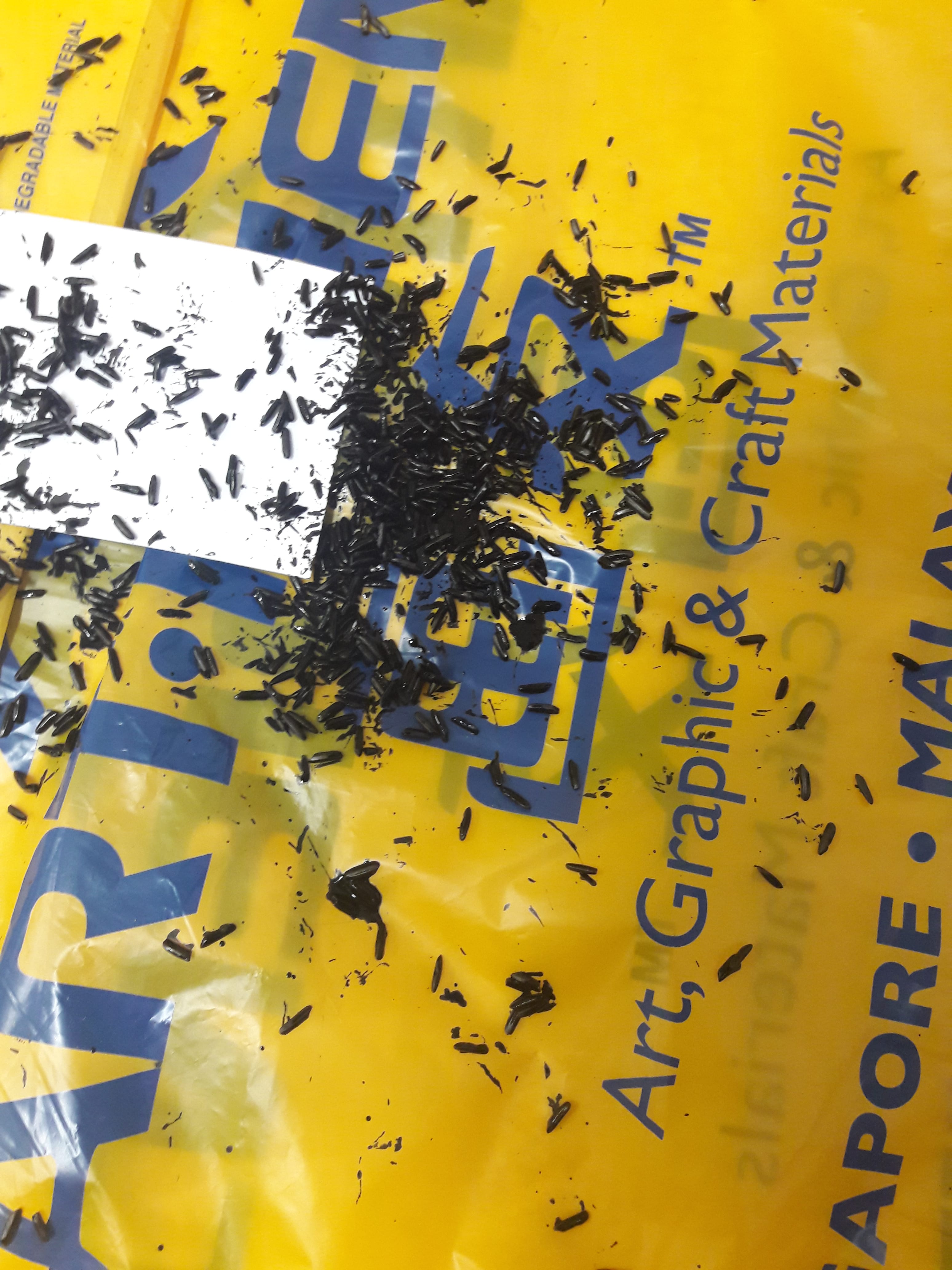
Both are on cartridge paper. I wanted to emphasise the intensity and shortlivedness by having very white paper to show the contrast between feeling and unfeeling. (The paper scrunched up and made it difficult to paste the lines though, especially where if I bent it excessively rice would fall off.)

The key term is frequency, where they’re of a relatively strong but short-lived nature, e.g. a jumpscare. (I opted to use shock for both purely because I have literally never felt surprise without some form of fear.)

  • Frequency: Unlike Anger & Love, multiple points of focus
  • Strength: Not as powerful, but still relatively strong emotions, hence still featuring foci
  • Short-lived: Small splatters, lack of grey as opposed to absolute black and white

Differences:

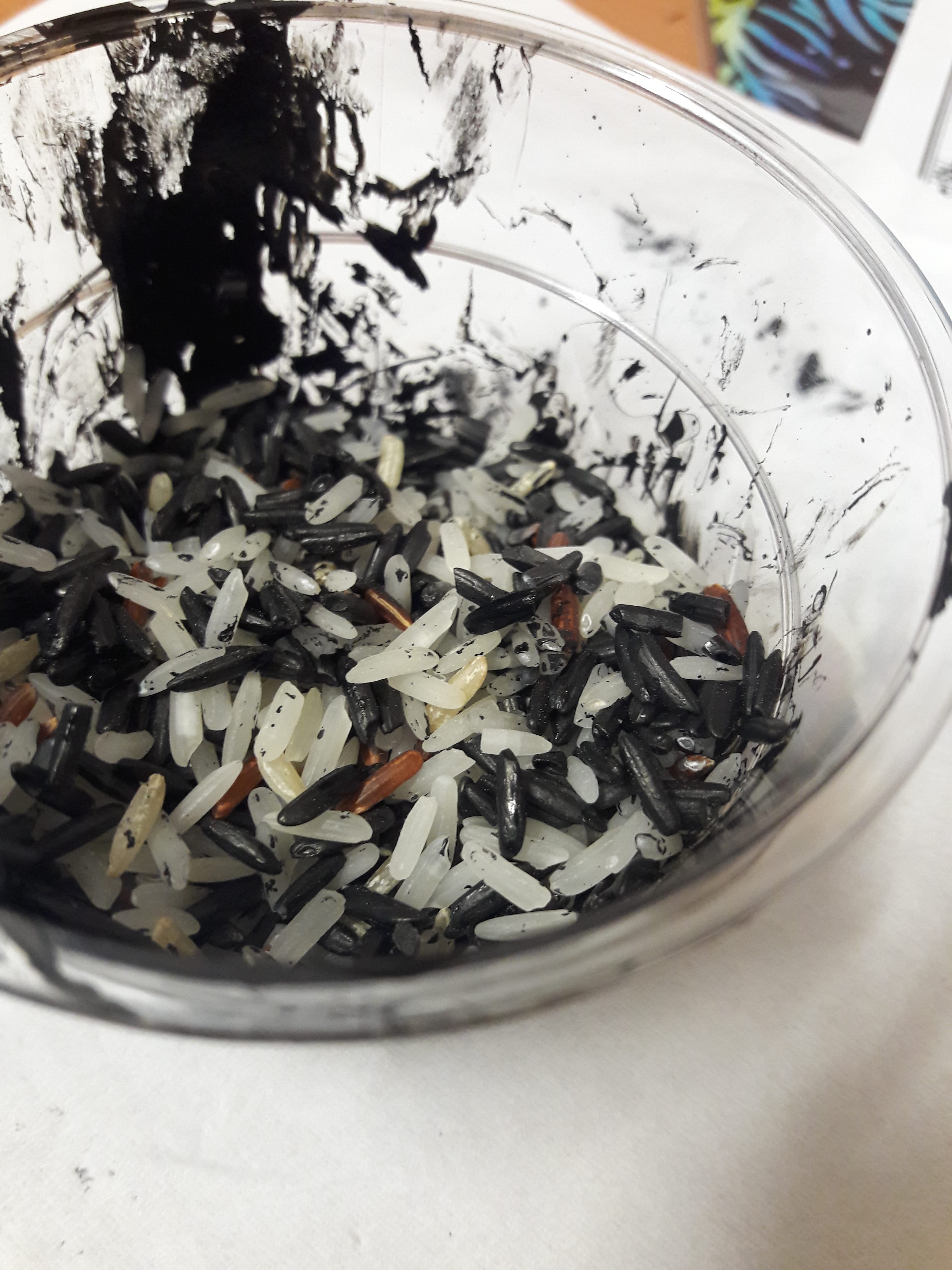
  • Both used rice to have the graininess reflect the antsy, fuzzy feeling of shock. However, fear has the rice mostly at the edges of the foci to reflect the sense of defensiveness of encircling oneself that arises with fear (protecting), while surprise has the rice centralised to reflect the sense of tenseness of recoiling (contracting)
  • For both, I soaked the rice in ink, and slabbed on ink perpendicular to the paper itself. For fear shock, however, I slapped the rice on from a “me kneeling on the floor” height, versus surprise shock which was from a “me standing on my bed” height. Again, to reflect the different between containment and outward spreading.
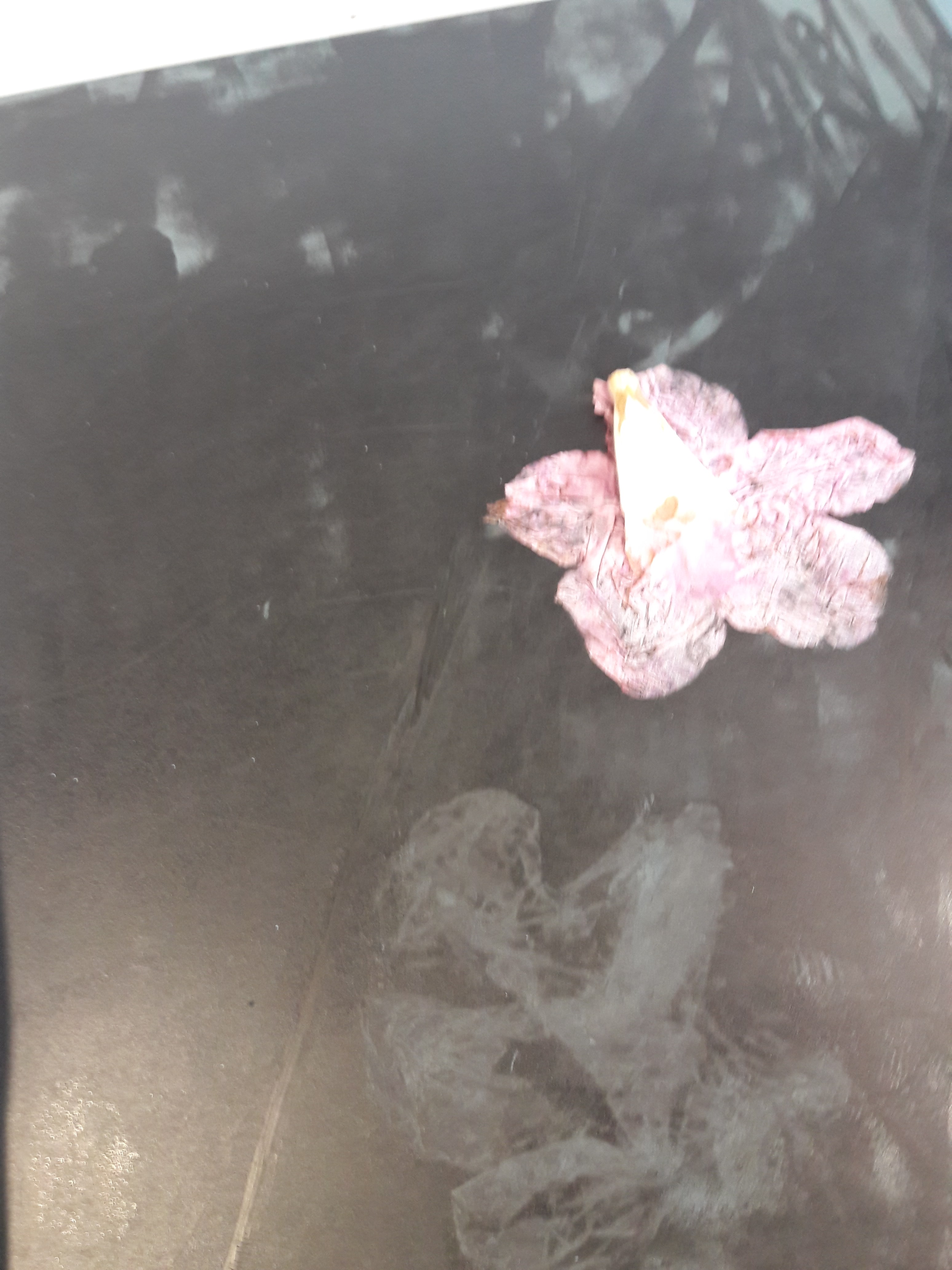
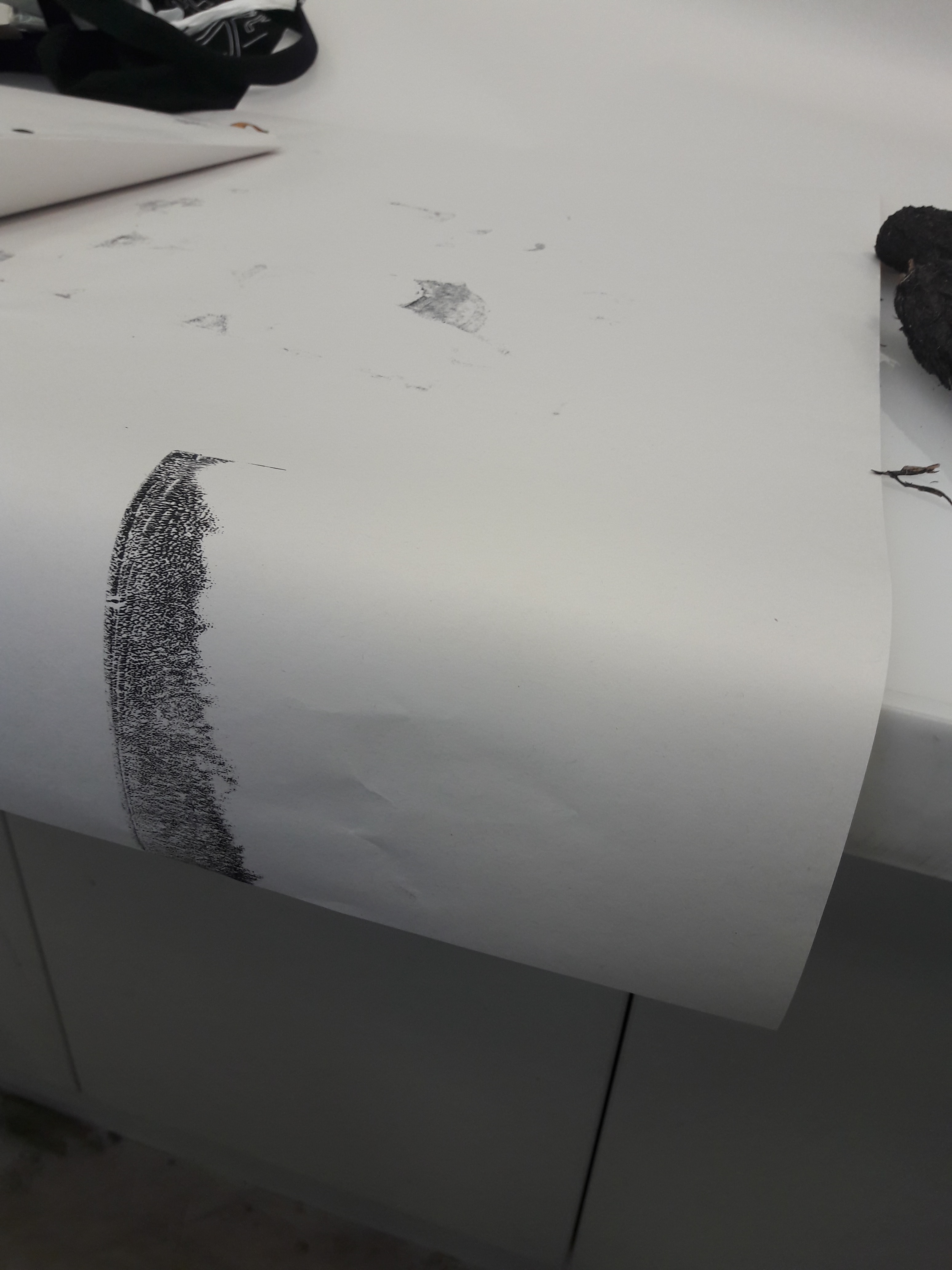
Bliss & Melancholy

Both are on newsprint paper. This paper was vaguely not-white, which I wanted for the dullness of the feelings.

The key term is prolongation, where emotions are mostly dull and weak (i.e. the after-effects of a trigger event, or unconsciously occurring feelings).

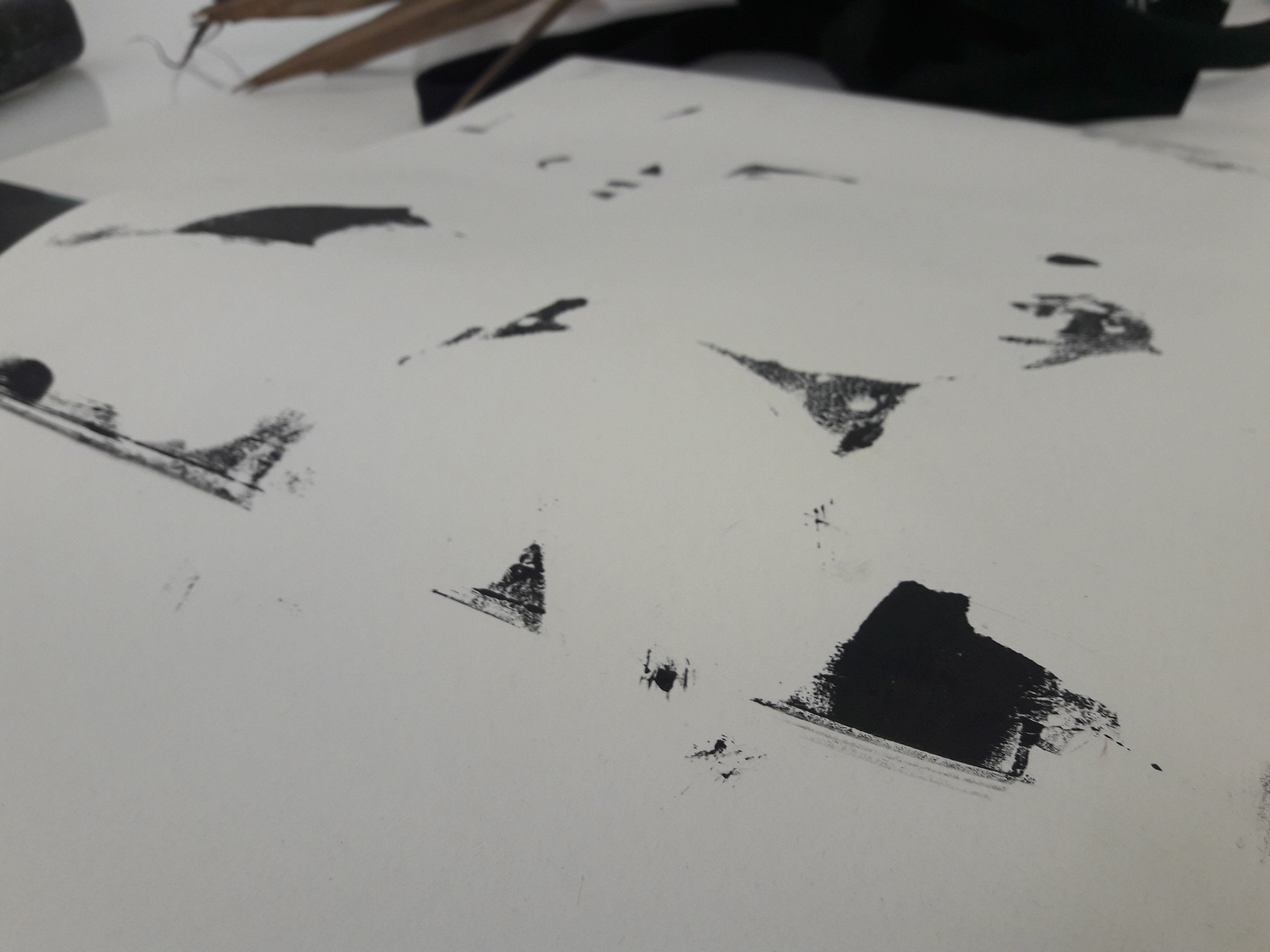
  • Prolongation: Reflected in consistency of repeated patterns. Underneath is a bordering layer of brayer rolls, on top, pressed shapes with linoleum, even more on top, hand-pressed flowers
  • Dullness: There is no focal point, with multiple layers of unrecognisable and indistinguishable marks
  • Weak: Colours are generally in the grey zone, than absolute black or white (also assisted by paper colour)

Differences:

  • Both used brayers as the base layer, but bliss used a lighter-coloured, wiped brayer as opposed to melancholy’s darker (but also wiped to prevent too dark) brayer rolls
  • Both used pressed shapes, but bliss used linoleum pressed with objects still present (i.e. creating white areas) as opposed to linoleum pressed WITHOUT (i.e. creating grey areas).
  • Objects were pressed onto white areas of bliss to avoid too much lightness, but pressed onto melancholy to result in darker colours

Overall, I think Joy was perfectly right in talking about craftsmanship when it comes to me. On a physical level, I never quite figured out how to flatten the paper while keeping the rice still stuck in place, and on an intangible level, I still feel like I couldn’t express what I wanted. Partially because my definition of abstract involves the absence of recognisable forms, or of representative qualities, as opposed to absolutely indiscernible forms, partially because I probably didn’t study or experiment enough, partially because my technical skills are w e a k. I suppose for the next project I should set my standards lower considering I don’t have enough technical expertise to actually meet whatever unreachable definitions I will set, and get over my general skepticism for copying artists.

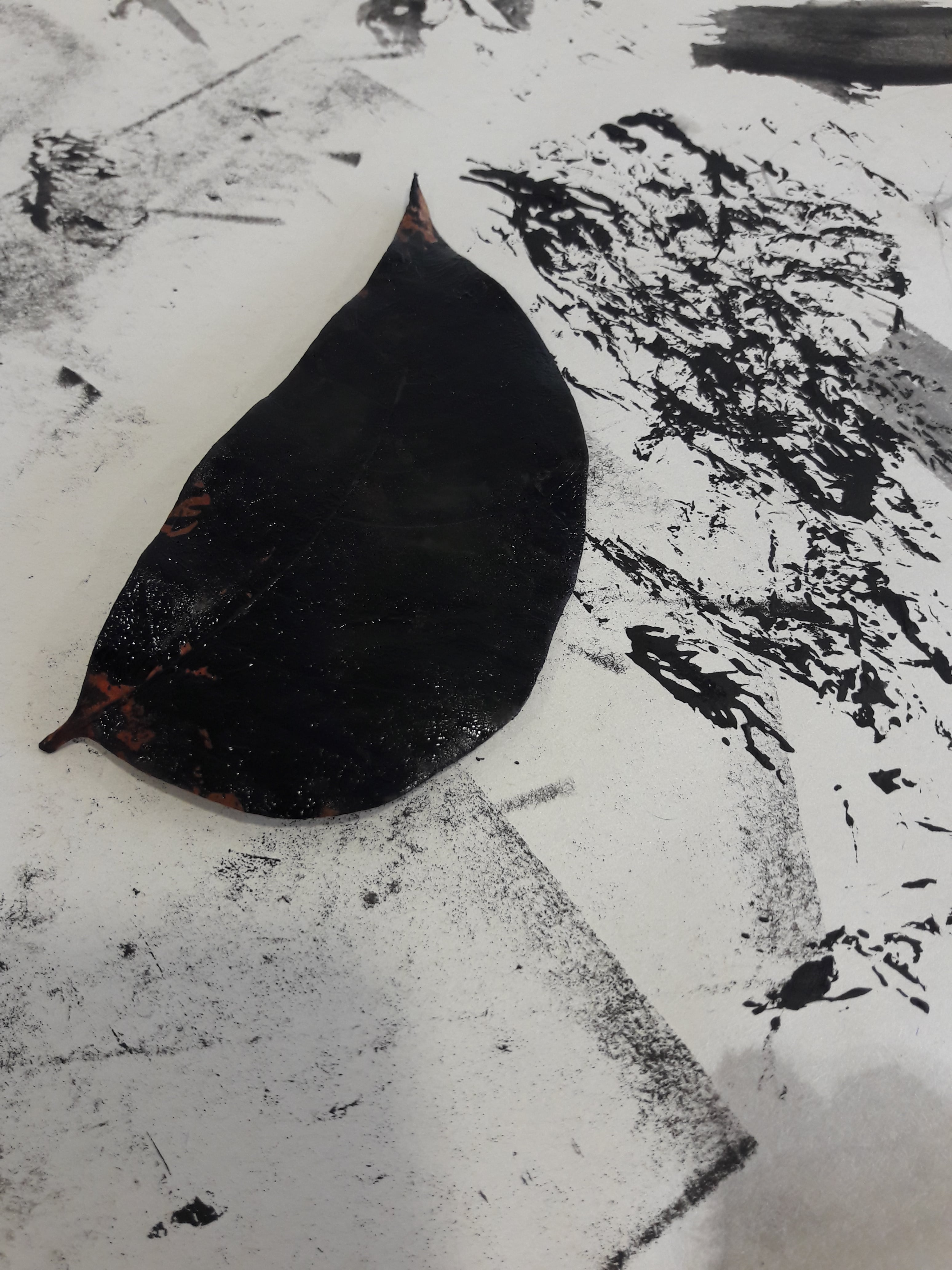
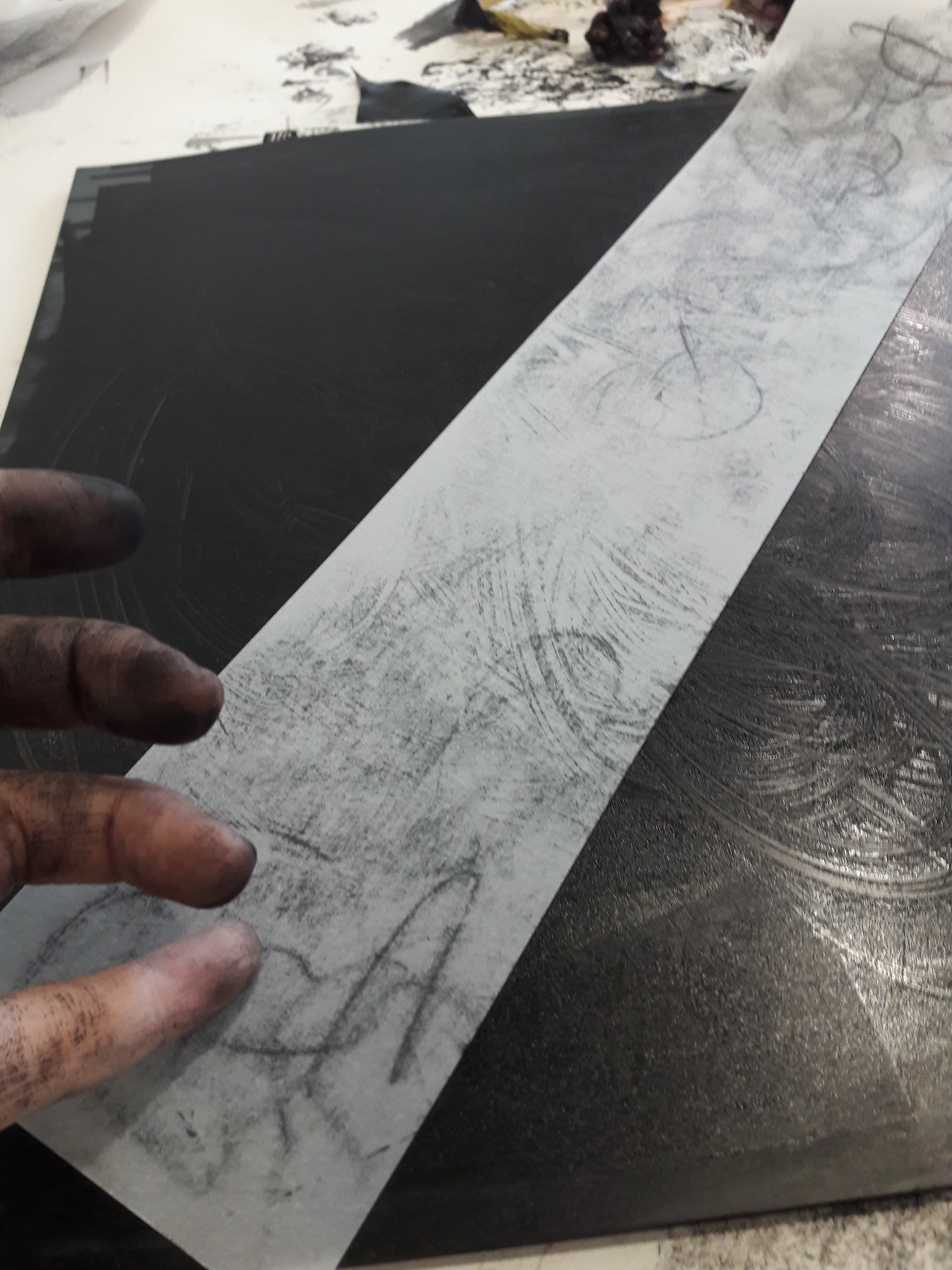
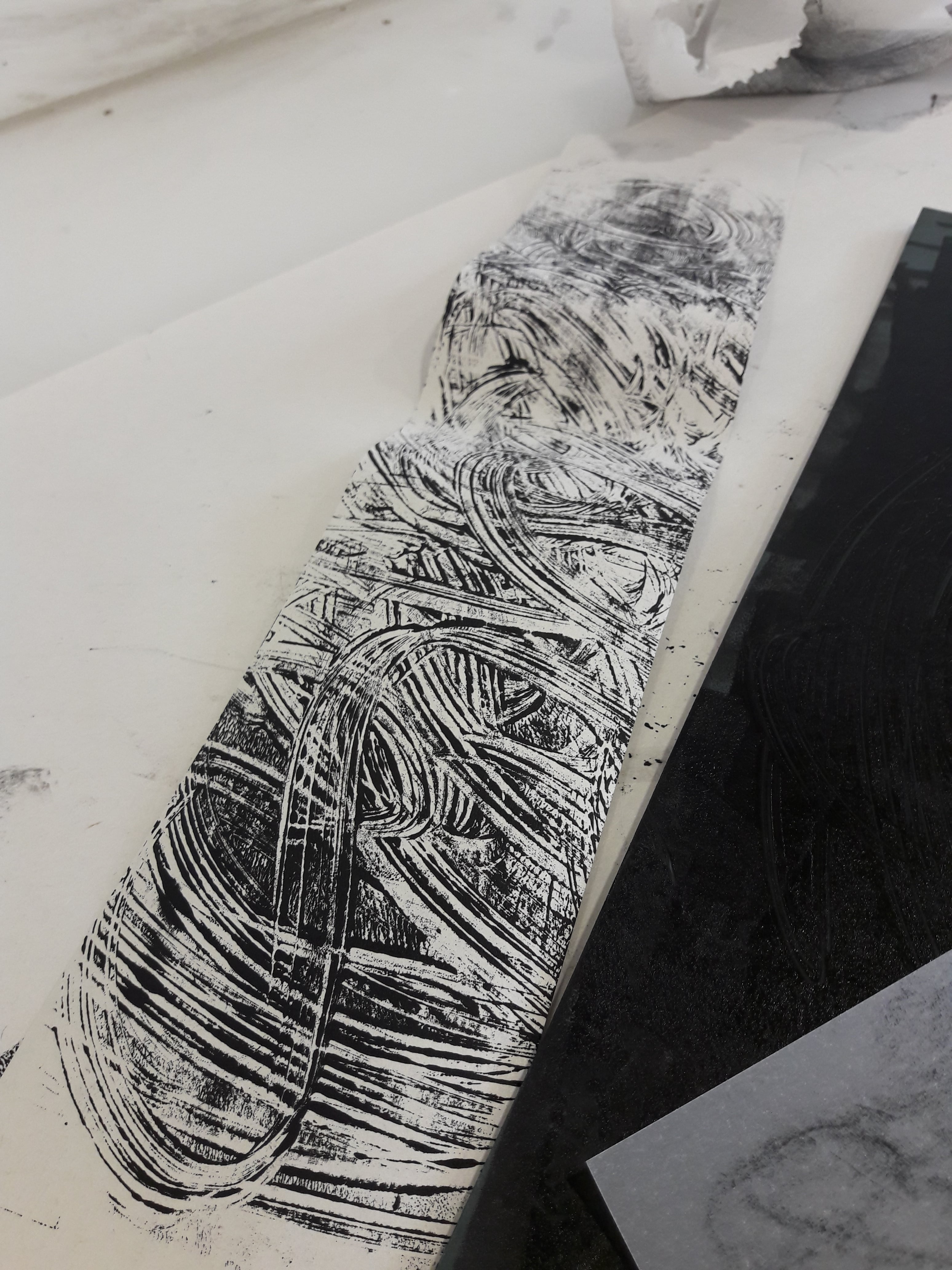
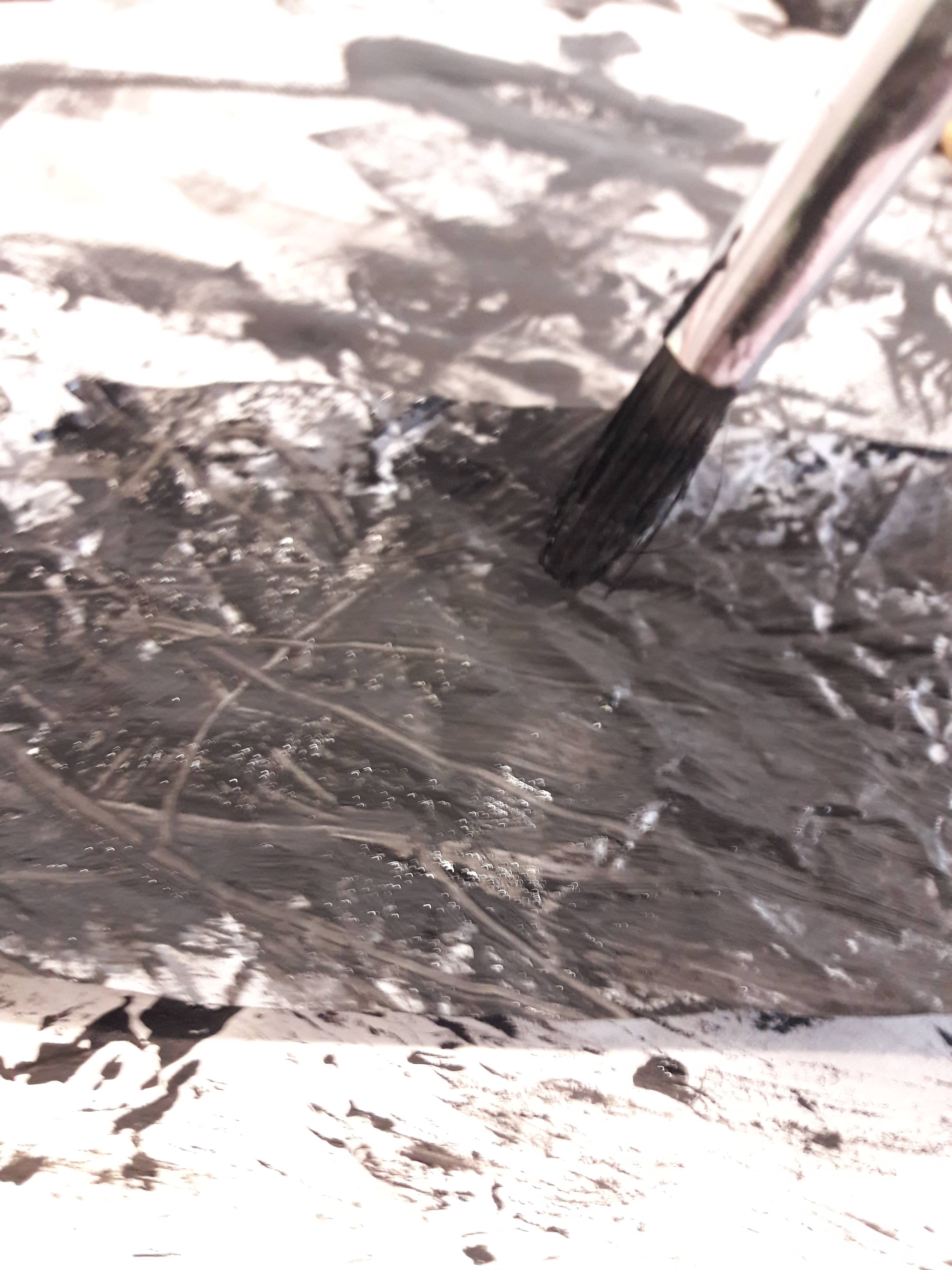
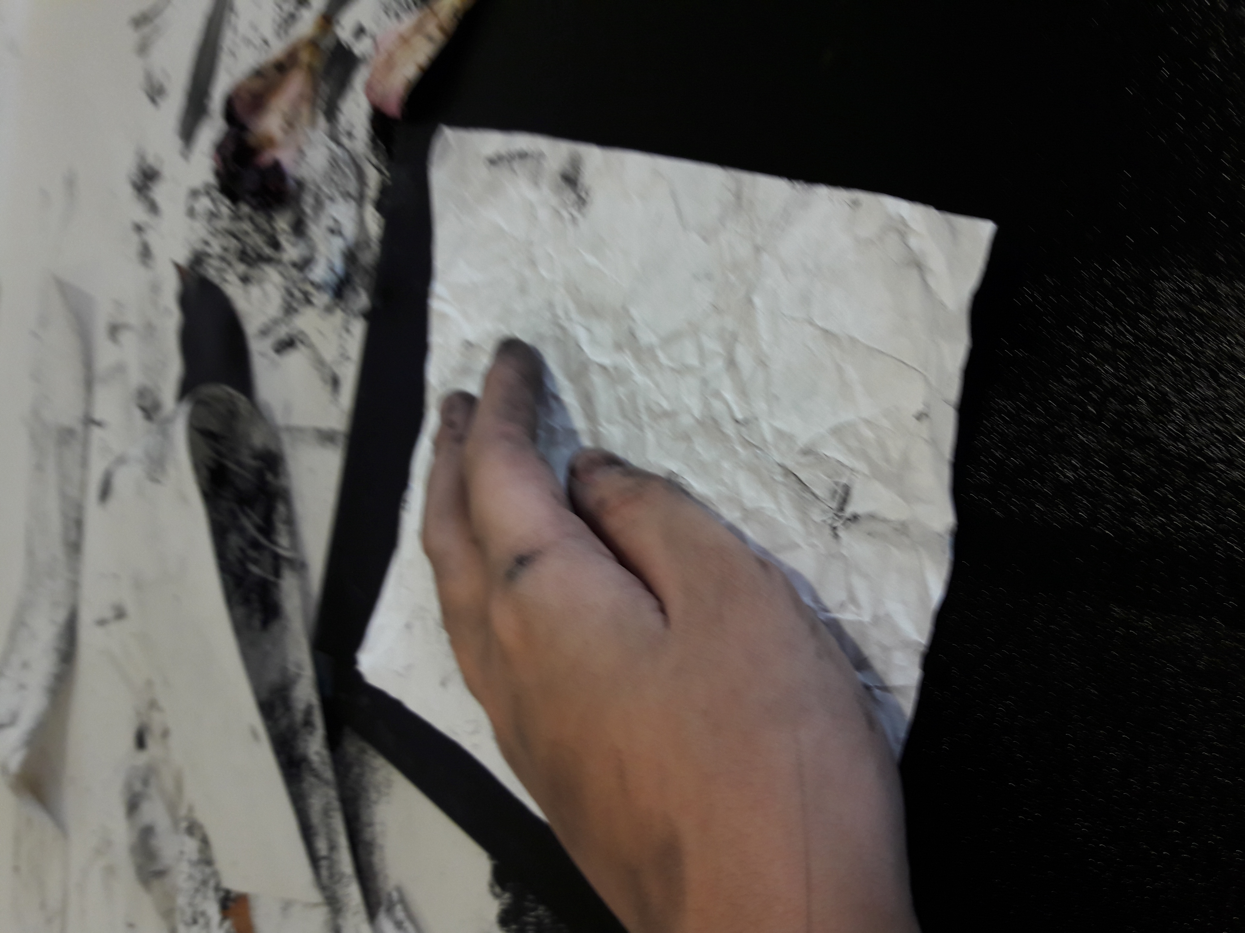
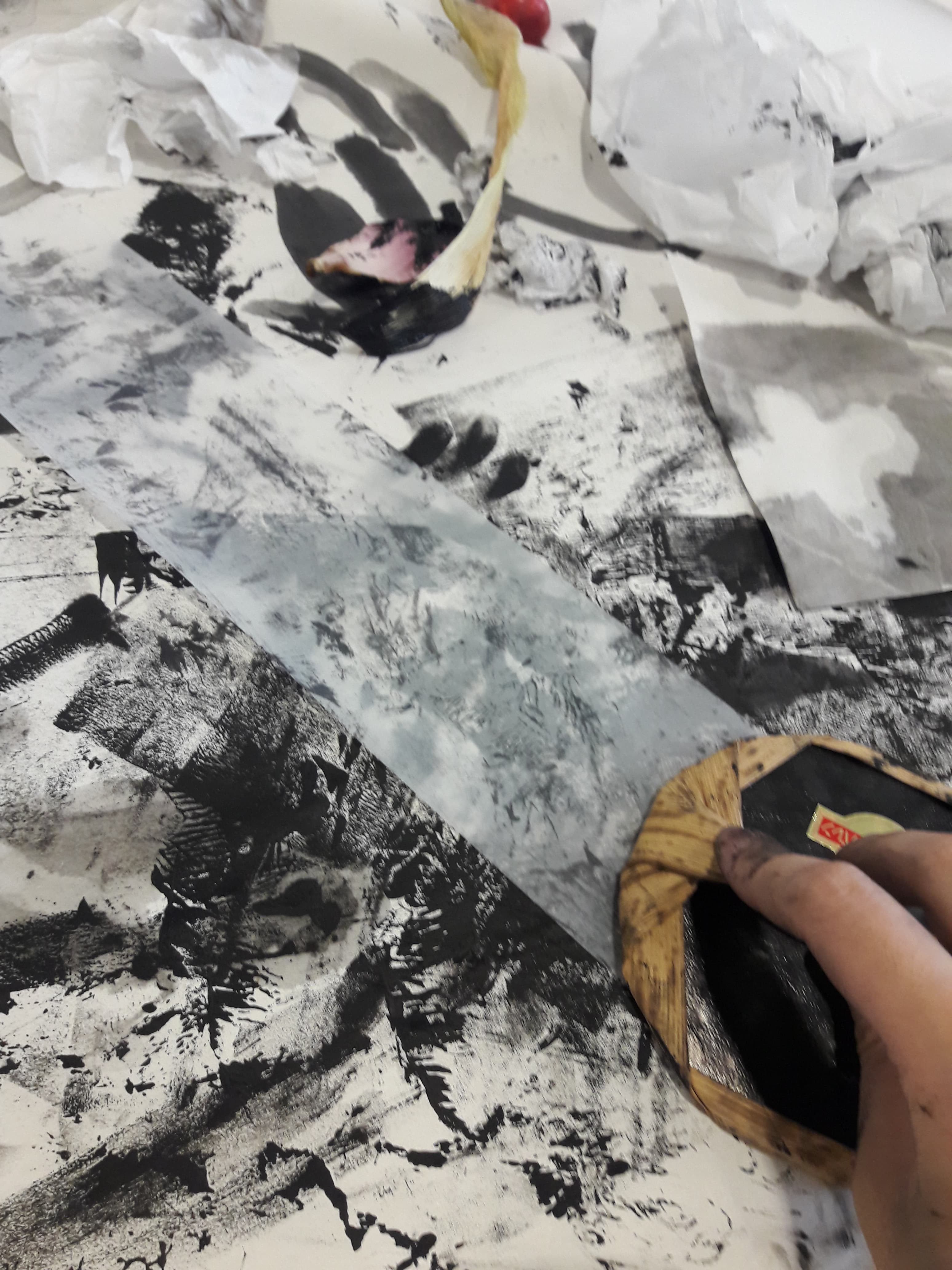
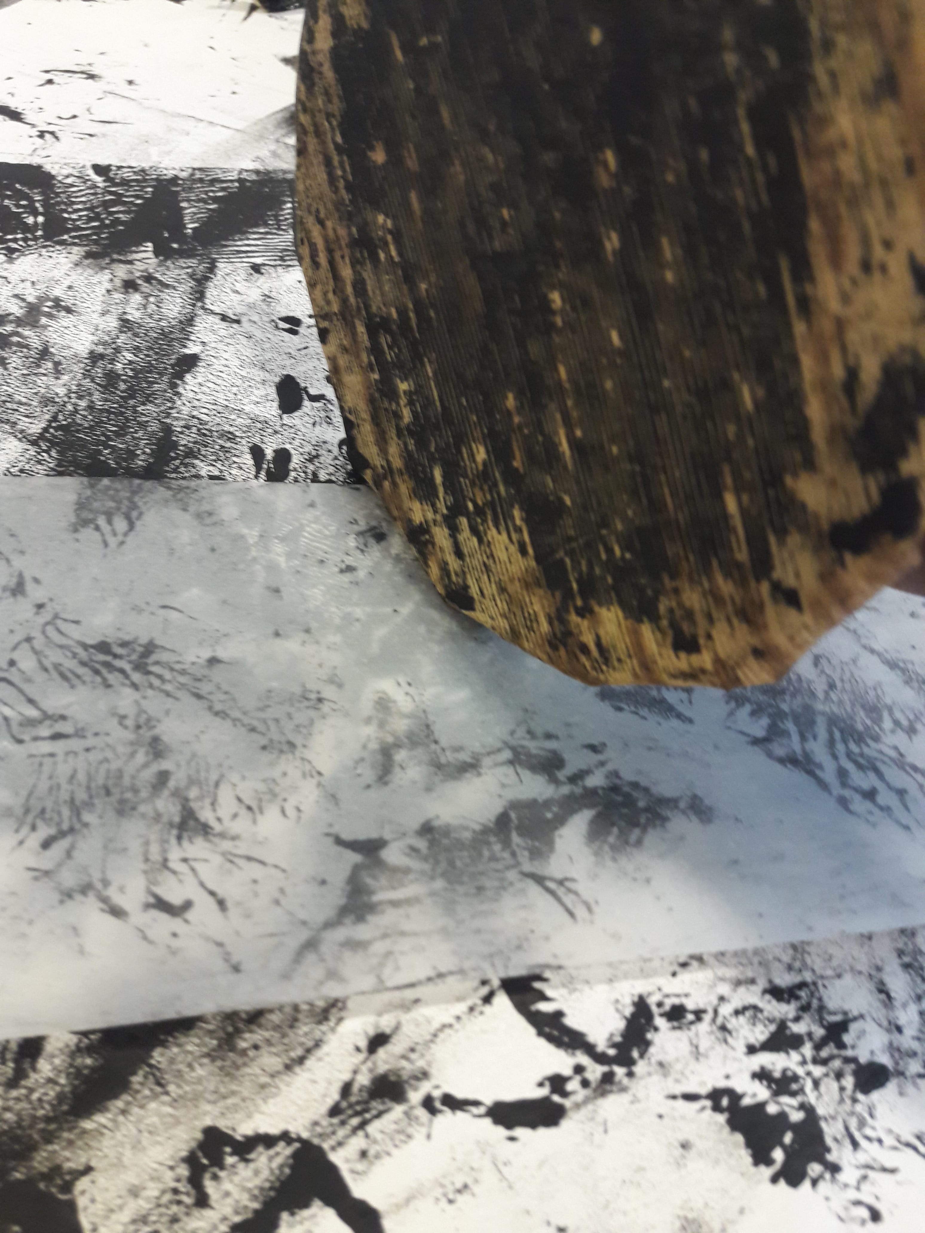
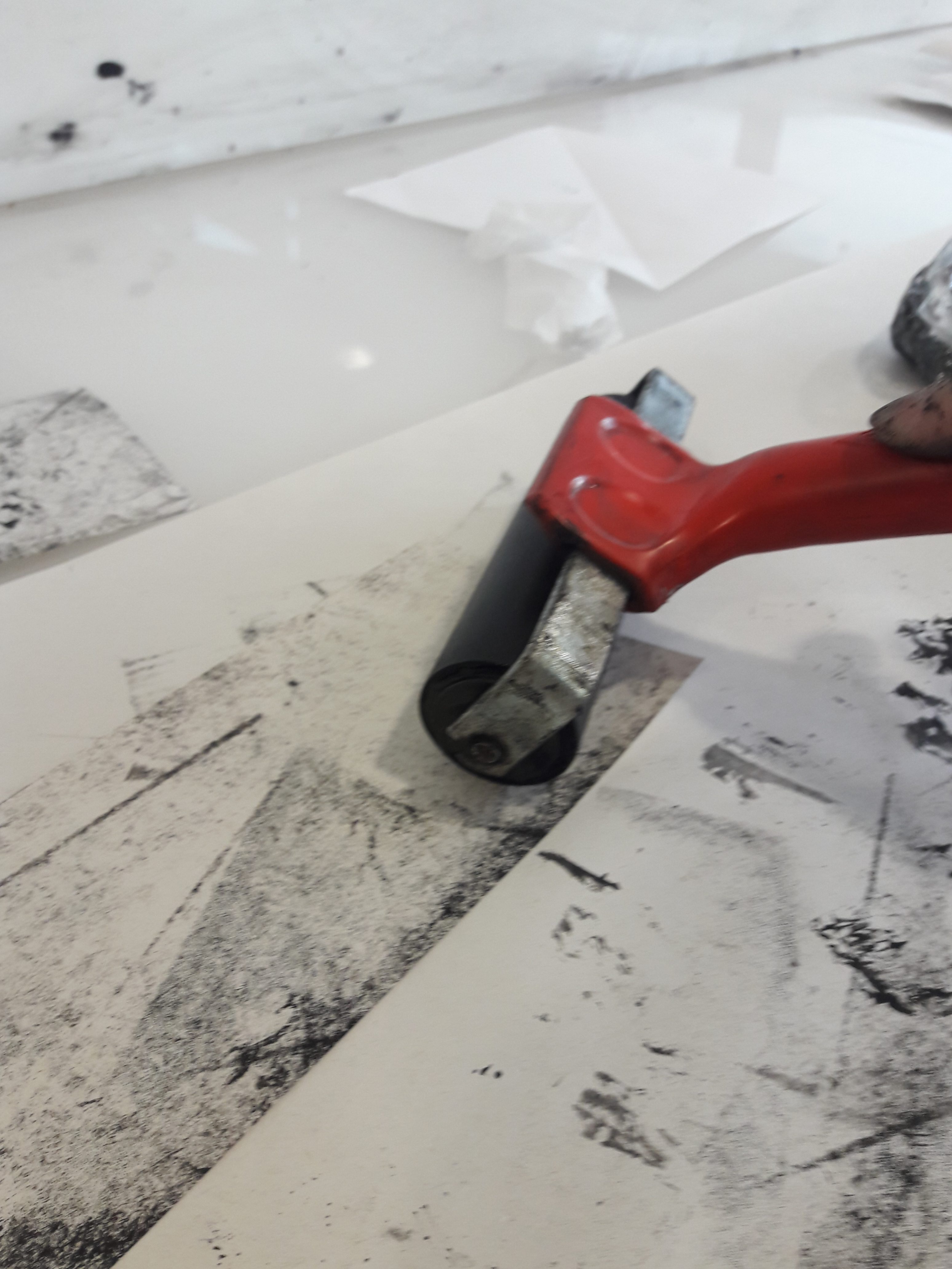
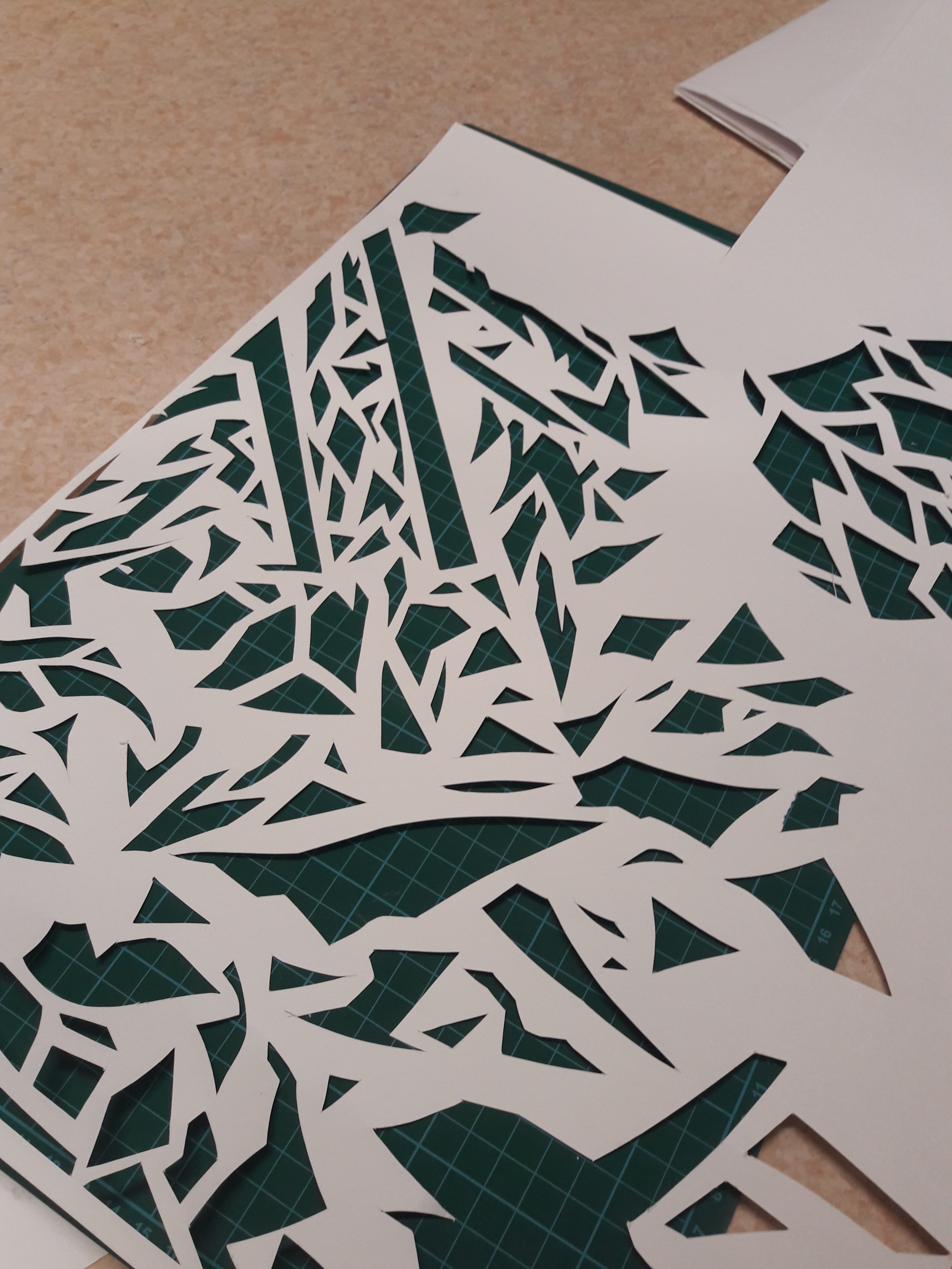
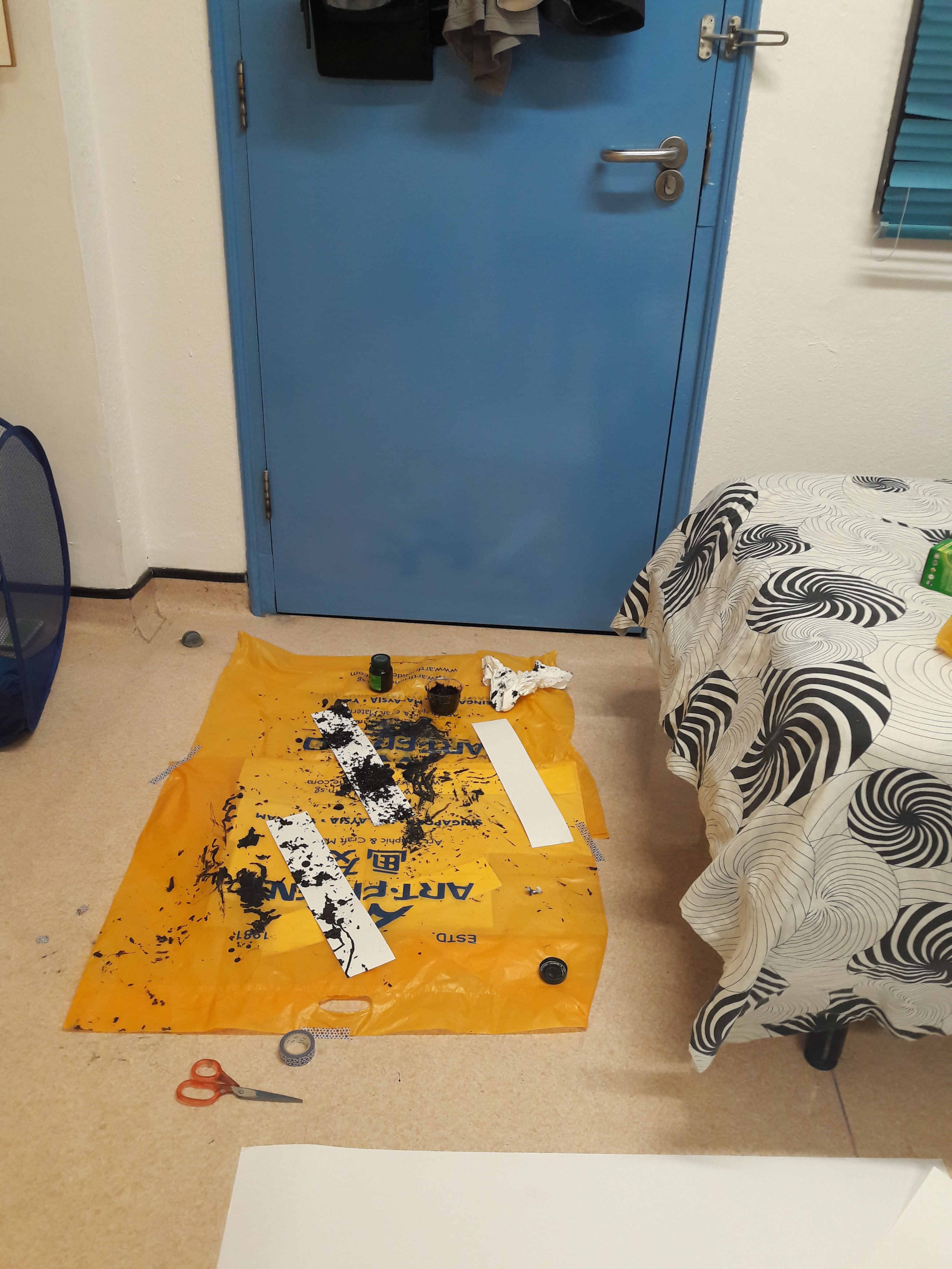
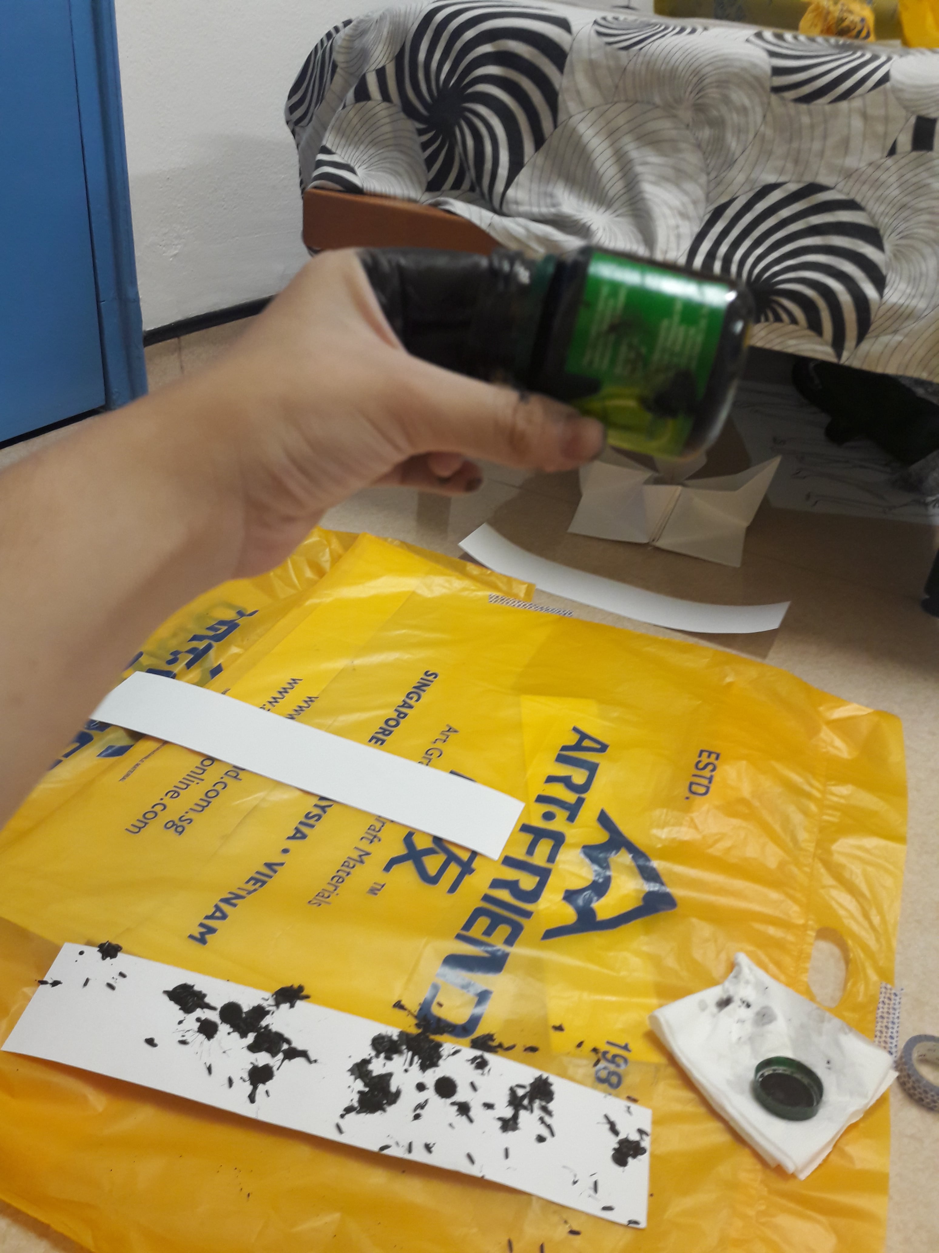
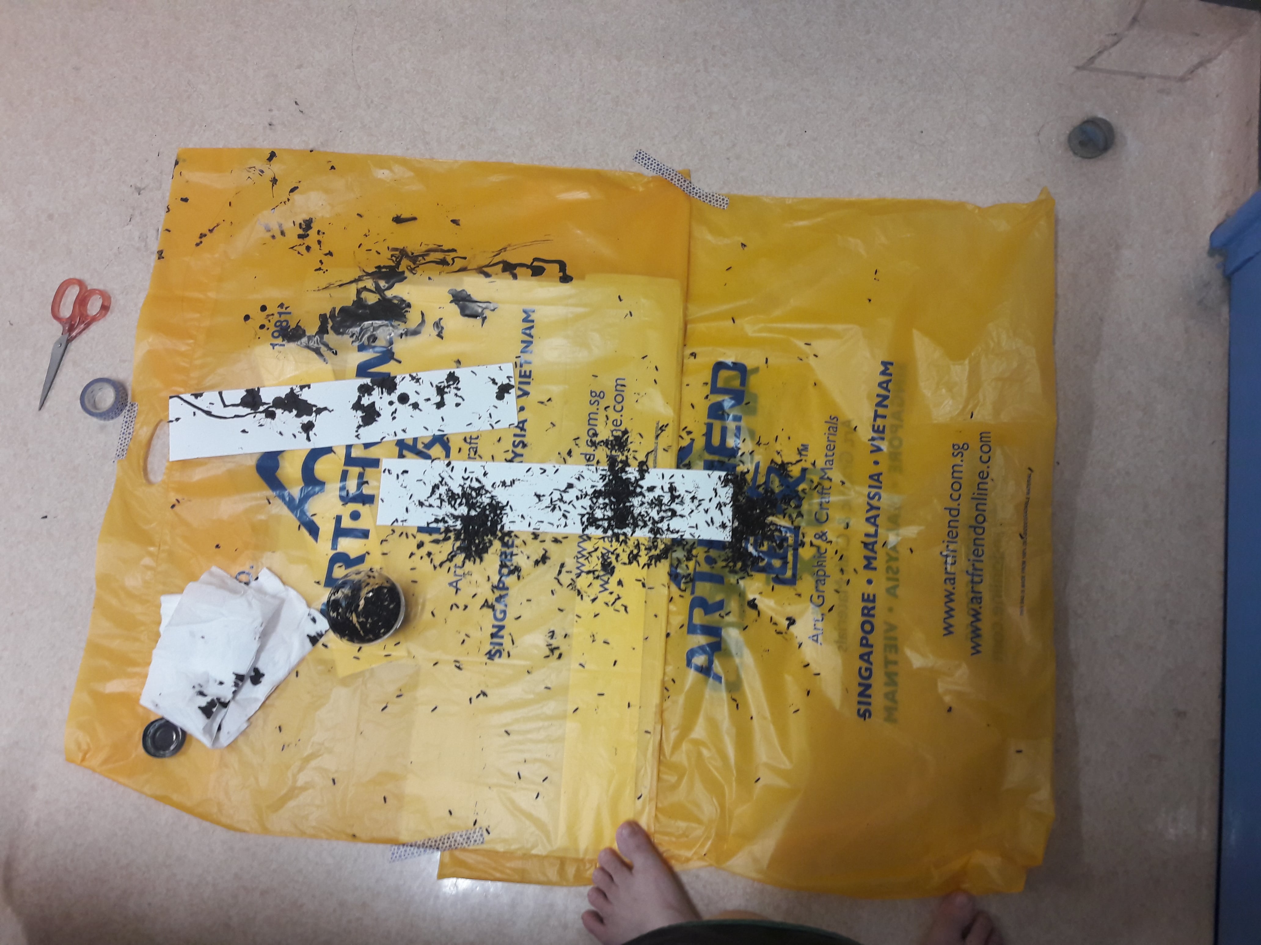
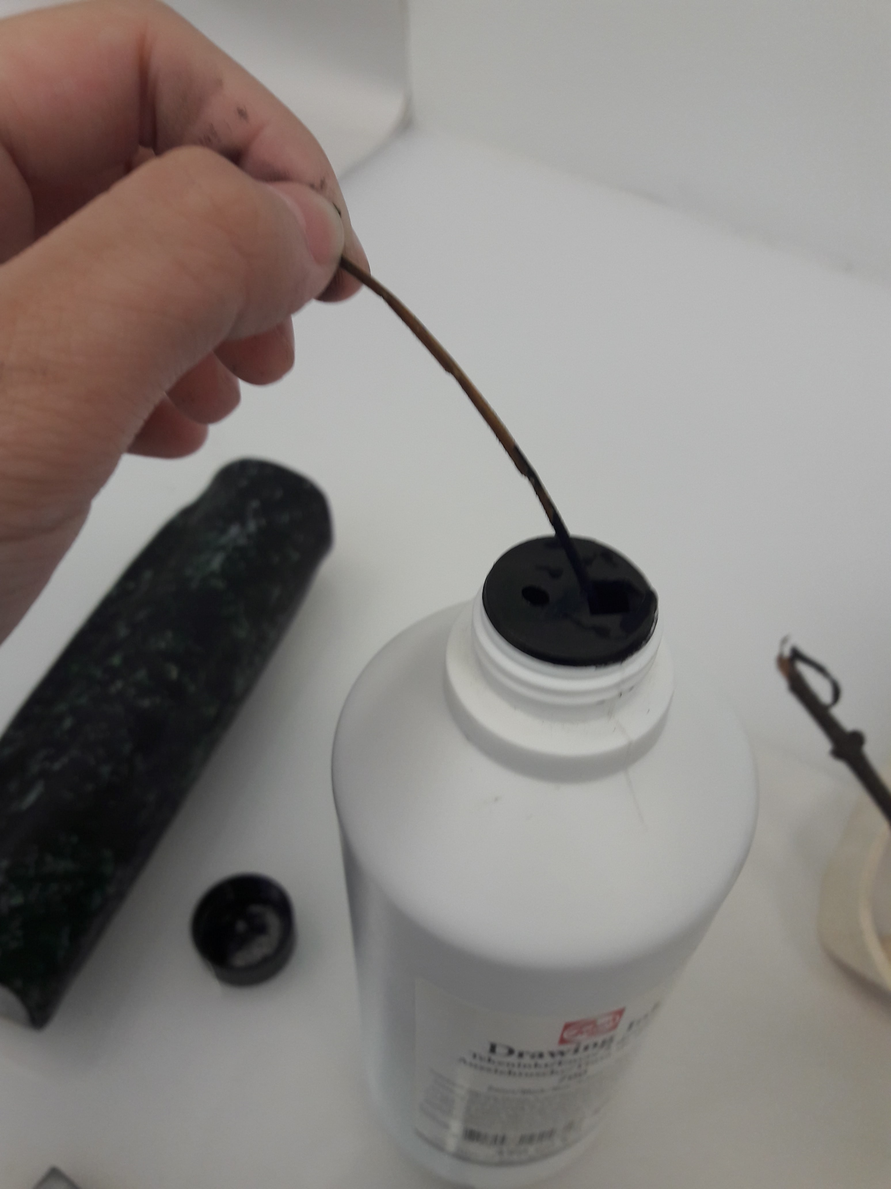
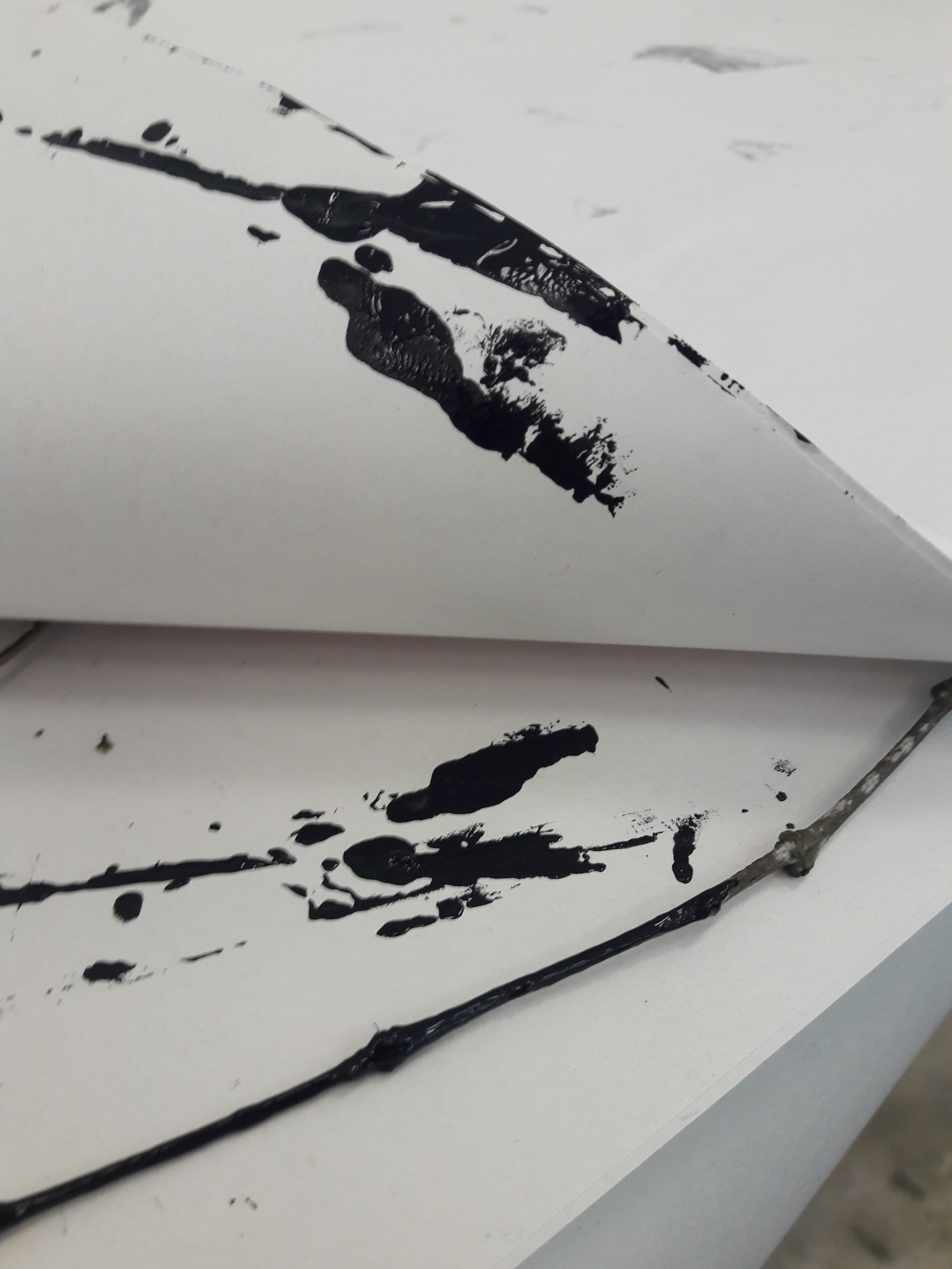
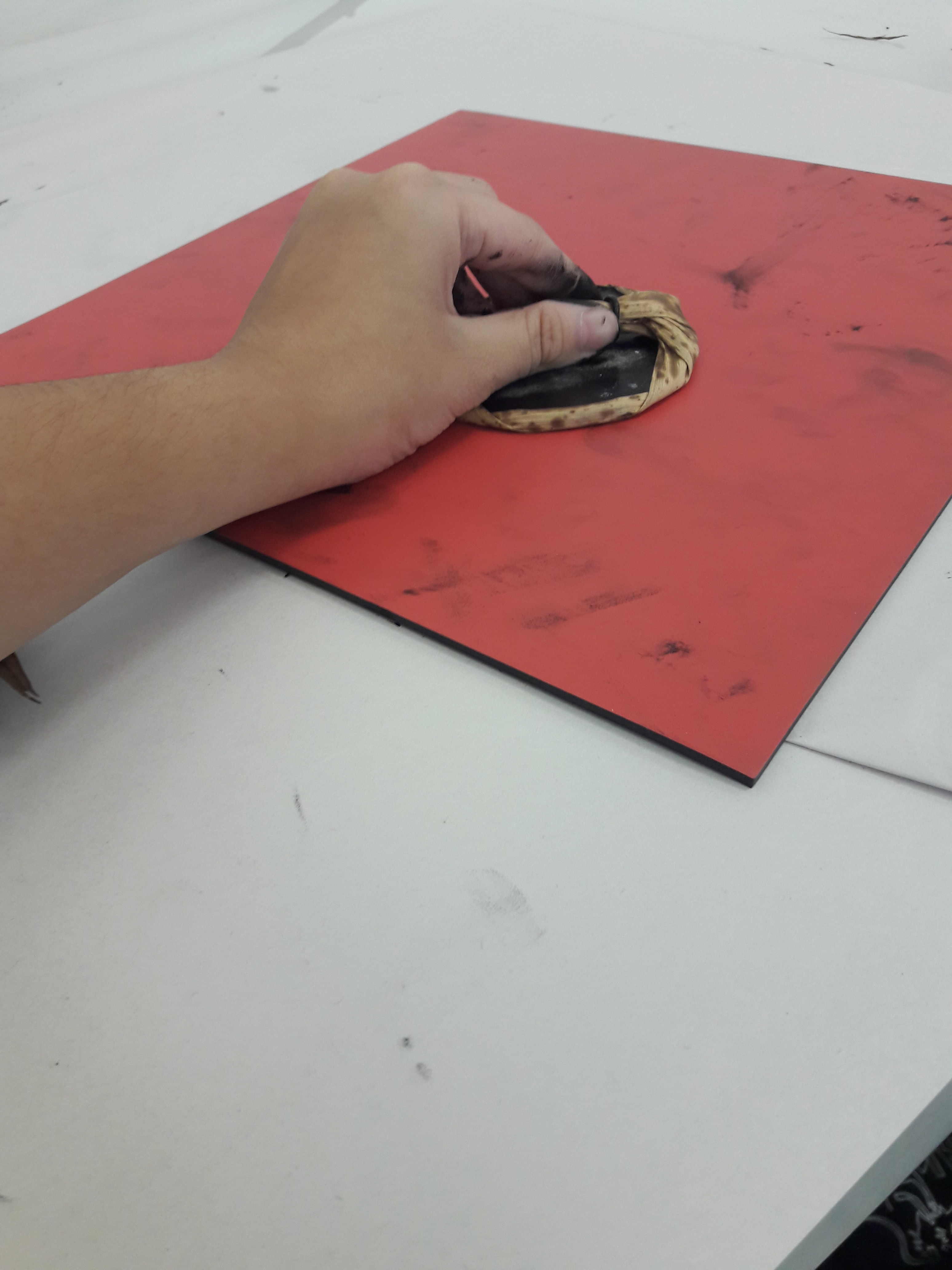
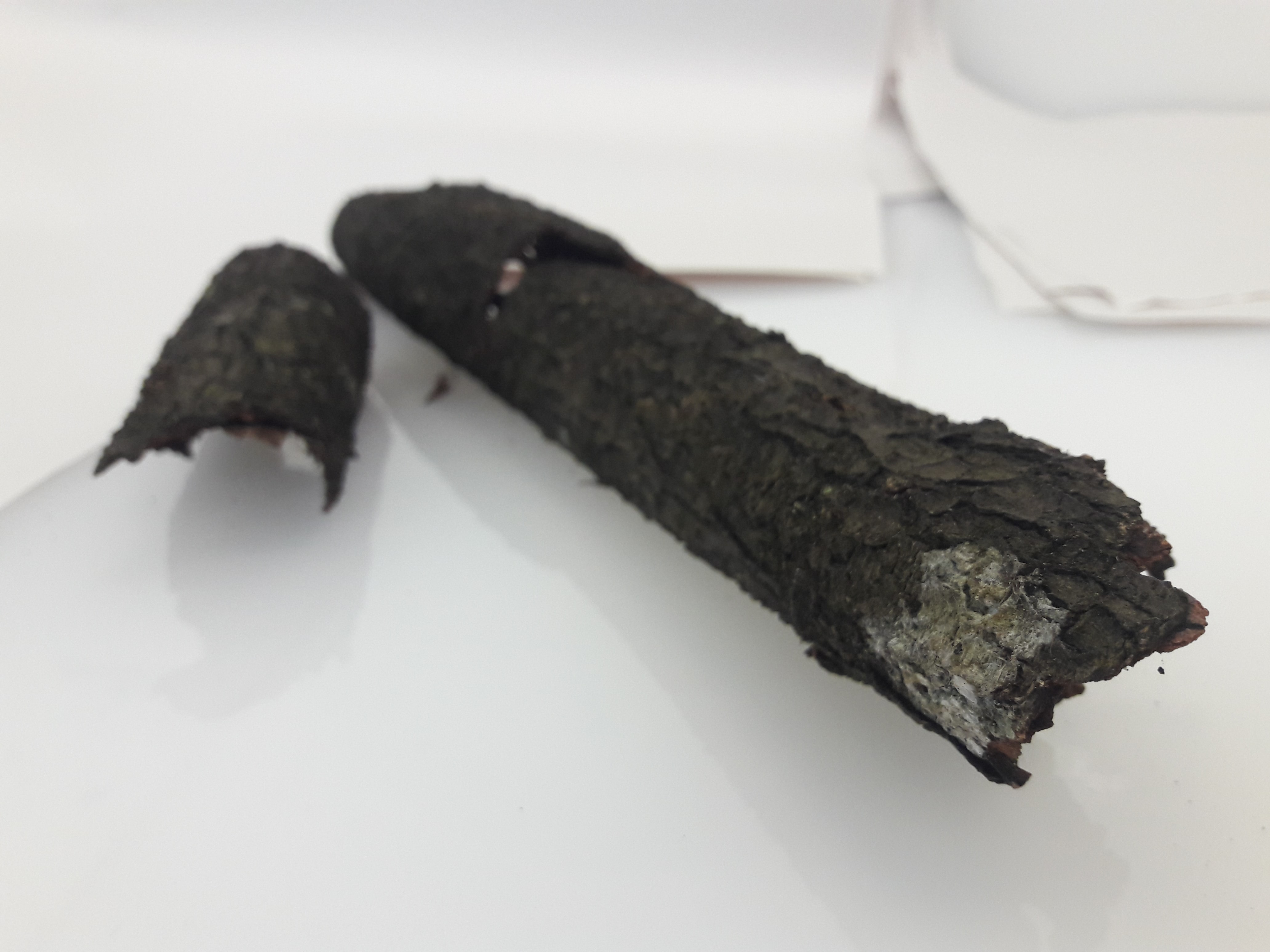
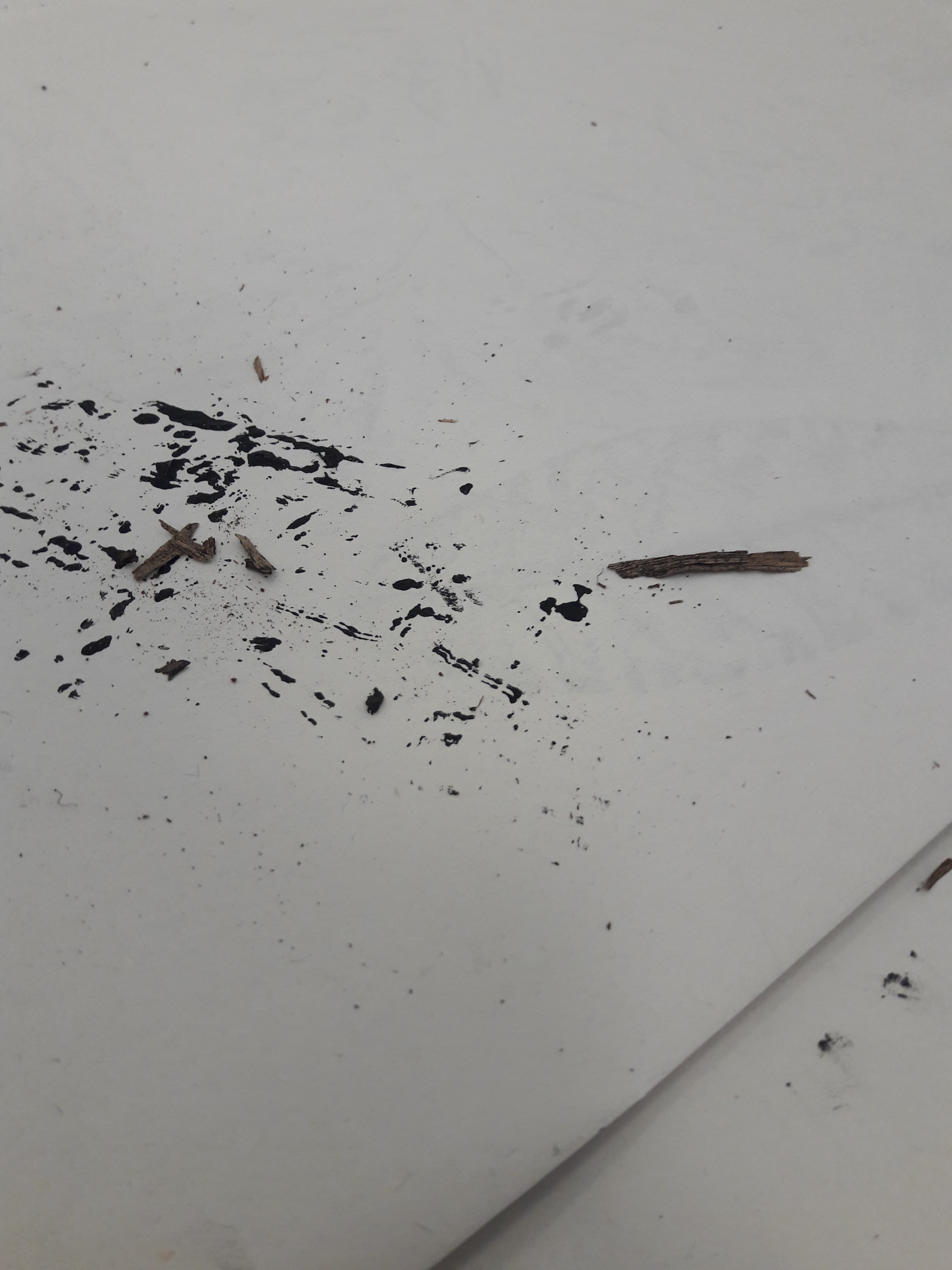
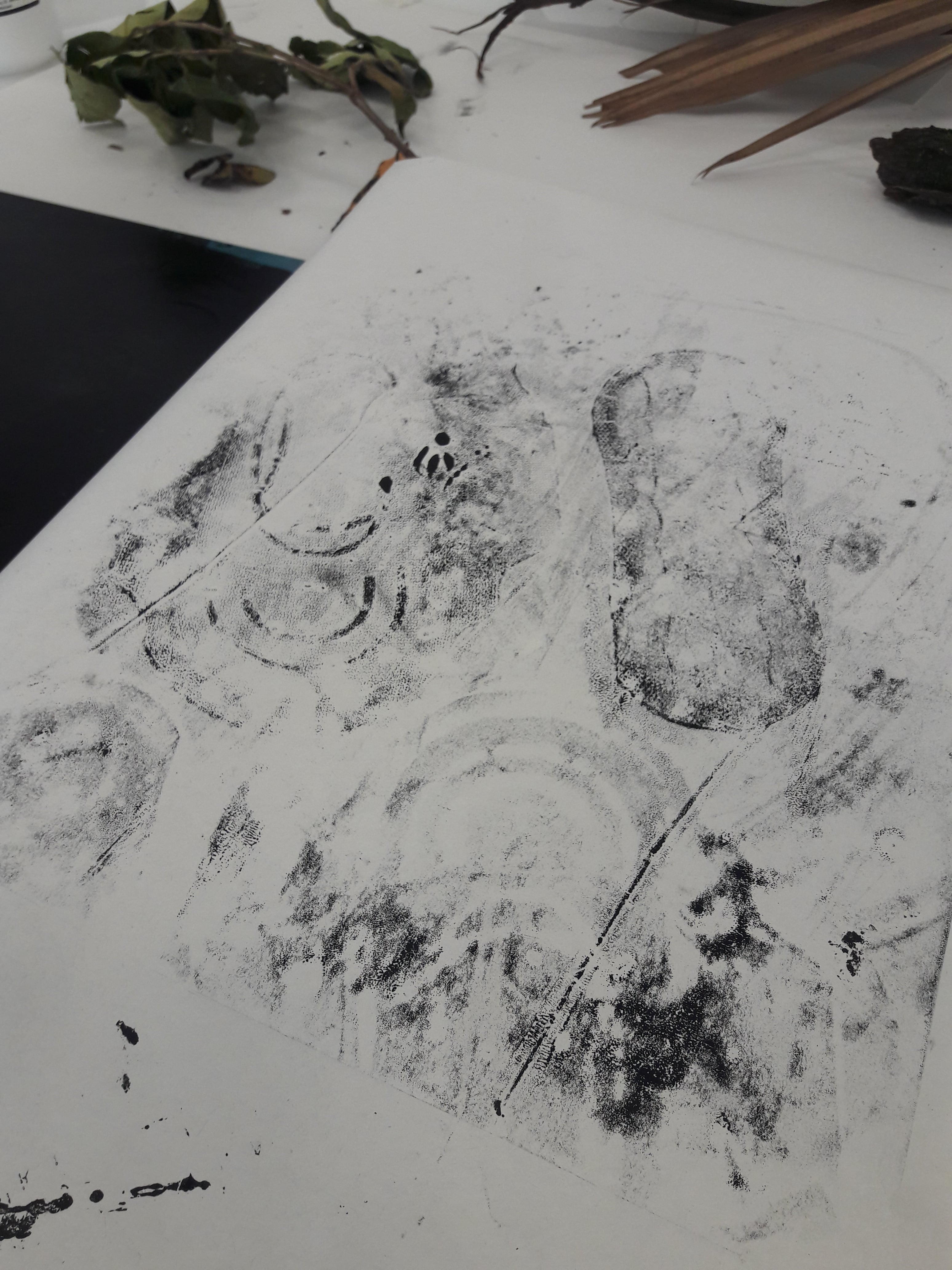
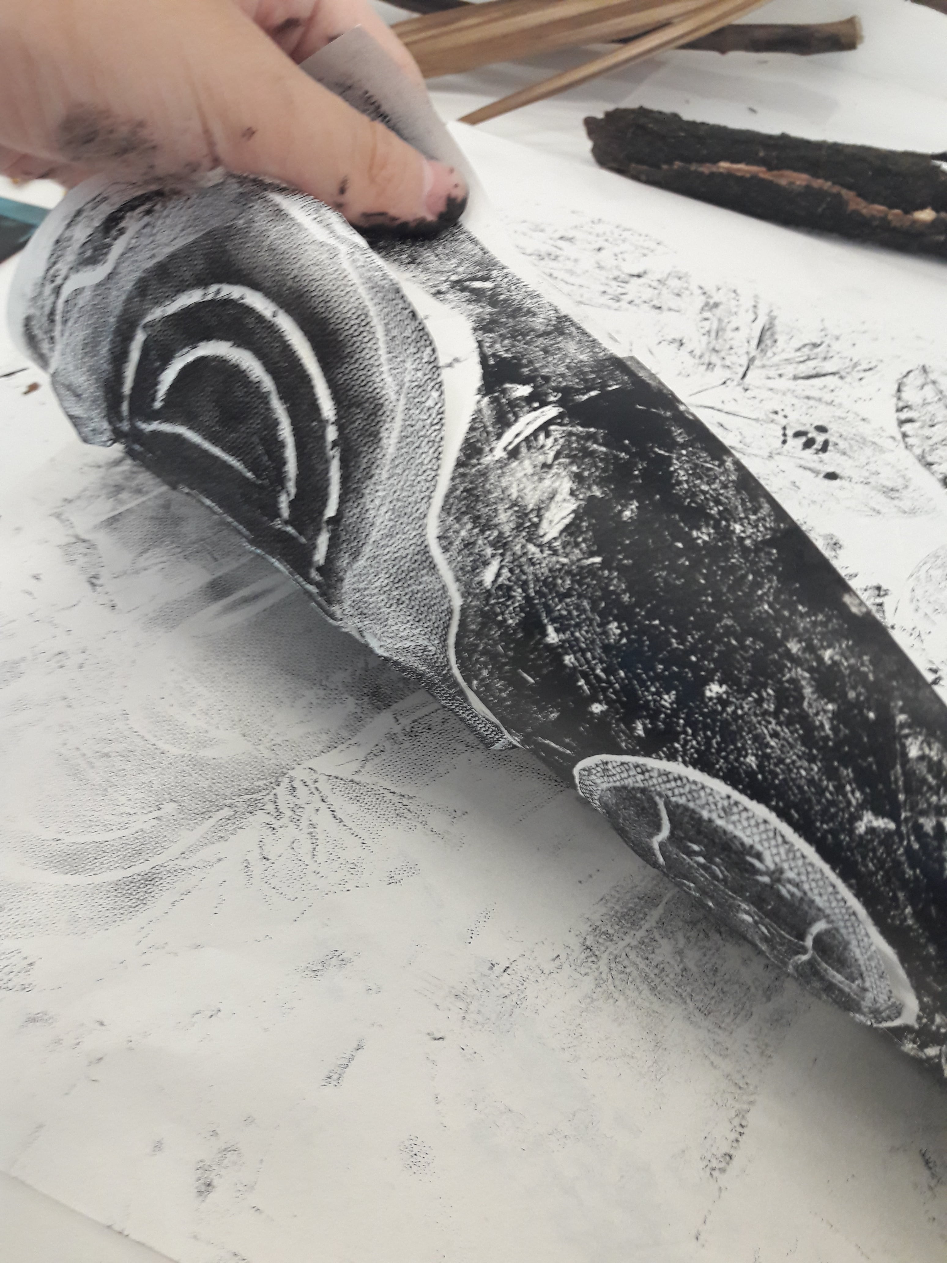
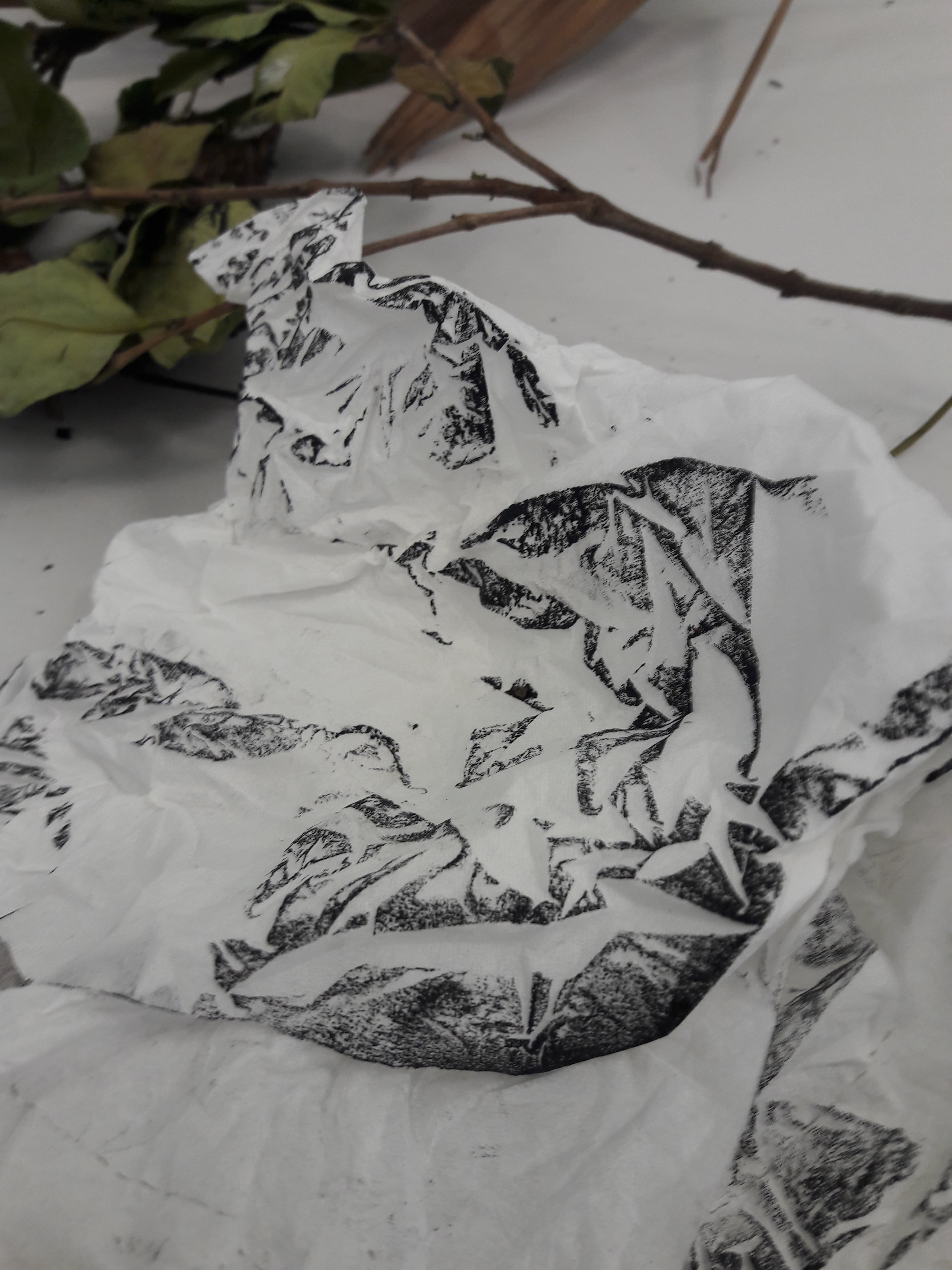
(A bunch of photos and 1 video from throughout Week 3 while working on this)

W2 Mark Making~

For Lesson 2, we engaged in mark making, also known as “use whatever you have with ink to create random things”. For convenience’s sake, I mention the material, methodology and conclusion for most of the results. Hopefully that will help if you’re reading this to gain inspiration. (Unless otherwise stated, all of the things I tried were unconscious decisions, where I randomly did whatever I felt like doing.)

Opting to work in a logical order, I began with my plant-related items, branches and leaves. These were picked up around school, mostly. (A humorous anecdote involves me holding my freshly-picked branches at the CCA fair, and a girl complimenting me on my “nice accessorising!”)

Initially, I attempted to mark by having the paper pressed from above onto the linoleum with branches and leaves. Sadly, I may have overzealously placed too many items, resulting in a tragic lack of… Anything.

I tried.

I quickly surmised that this style does not work well with my leaves, because it’s good for emphasising positive and negative spaces, and the unique edges, but not so much on the textures. Consequently, I attempted using the inked leaves directly, like a stamp of sorts. (After the initial tameness, I went more into trigger-happy leaf actions)

Material: Leaf

Methodology: Painting leaf with ink, pressing onto paper, piak-ing onto paper, circular wiping with leaf on paper

Conclusion: I like how the leaf has a certain symmetry, with the veins being the most prominent and forming a sort of skeletal shape. But I think it’s even more intriguing that, with sufficient pressure while circular wiping, the leaf loses most of its unique qualities (possibly because the ink dried too) while making nice arcs (when properly turned).

I had brought my own drawing ink as well, so I attempted to use a twig with it, like some sort of dip nib. Surprisingly, it became weirdly effective as a makeshift calligraphy pen when placed almost parallel to the paper.

Material: Twig

Methodology: Dipping twig in drawing ink, then grazing surface of paper with tip and side of twig

Conclusion: It’s difficult to control, but the variation in line quality is superb. The more it’s laid parallel to the paper, the thicker the stroke, and when filed to a point, a thin line. Sort of like what we learn in Foundation Drawing about hard and soft edges.

I tried this again with a different twig, and folded the paper to make space, while dumbly forgetting that wet ink would definitely transfer.

At least it looks kind of nice.

To my horror, the linoleum had bits and pieces of wood and natural sediments on it, and so I attempted, vainly, to lightly scratch it off the ink with a leaf. Note that “lightly” should never co-exist in a sentence with “I” in it, because I’m a “go big or go home” type, and my self-restraint is very low. I gave up trying to maintain an even spread, and opted to just use that to make more marks.

Yeah, I don’t really think that’s how it’s meant to be done, but it works.

It turned out pretty nice in my opinion.

Material: Another leaf

Methodology: Scratching linoleum mindlessly, then pressing linoleum onto paper

Conclusion: The scratching pattern was very random, but I guess I tend towards circular motions. I like the mess of scribbly lines, especially against the unwashed linoleum with pre-existing textures. Especially because I was messing around doing it, this pattern gives me a vibe of energy.


Next, I tried using the texture of the tree bark (?). This didn’t work out particularly well since it was difficult to apply sufficient pressure to make interesting marks without breaking the bark, but there was an attempt.

Material: Bark

Methodology: Painting bark with ink, then rolling bark on paper

Conclusion: I mean… It was an underwhelming result. I’m mostly disappointed. Maybe I should have tried pressing the paper onto the bark than the bark on the paper for more effect. Or slabbing on more paint.

After all the plant-related items, I went into the more outrageous items (this next item is going to be awkward). For this, I did it the typical way, i.e. putting the material onto the linoleum, then pressing onto paper, then separating the linoleum and material and pressing both onto the paper separately.

Material: ……………. Girls will know

Methodology: Pressing linoleum + materials on paper, pressing linoleum (without materials), pressing materials (without linoleum)

Conclusion: After the initial disgust, this actually has a fairly interesting texture, and shapes. You can see the vaguely porous surface, and the patterns on it. While it’s absorbent, when pressed sufficiently the ink comes out only lightly, so it’s not as high contrast as the rest.

Other things I quickly tried before time was up was bubble wrap, various papers (tissues, toilet paper, Scotch Brite paper), and hair (acquisition of this material involved vaguely repulsive cleaning of a communal bathroom).

Material: Bubble wrap

Methodology: Wearing the bubble wrap like a glove and slapping it around the paper

Conclusion: I personally think the most interesting part is how the bubbles aren’t of even surface texture (I don’t know why I expected perfect circles, actually), and it provides a nice consistent pattern of evenly-shaped circles.

Again, I tried traditional pressing!

The tissue after being used
Result of aforementioned

Material: Scotch Brite paper, tissue paper, toilet paper, hair

Methodology: Pressing

Conclusion: Again, I don’t find this technique particularly interesting, especially since all of these items don’t have particularly interesting outlines. Perhaps if I used something which was bad at holding ink, so it’d leak through?

(Look, I went through a lot of internal turmoil to get this hairball, so I might as well maximise it.)

Material: Hair

Methodology: Soaking in ink, pressing and rolling it around

Conclusion: I liked how the density of hair showed clearly, with black splotches where there was a lot of hair, and stringy lines for stray hairs. Also how… Centralised it is, in having a core and then the hairs coming out

Somewhere at the start, I also decided to line the table with newsprint paper to avoid excessive staining. I also later discovered this also served as a bizarre way of mark making, and a convenient way of wrapping everything up when it’s time to go.

Hence, while clearing up, I took the opportunity to do some final marks:

(Had more fun than I probably should have…)

I tried to not waste ink by making more marks with it. I wasn’t too interested in yet another normal print, so I tried crumpling the paper.
Close up

I really adore how it looks like branching veins. And on closer inspection, like a landscape, especially when combined with the 3D aspect of crumpled paper. Next time I might want to consider varying the level of crumple, since for this I was really extremely thorough in crumpling it to tiny bits.

Here’s where I accidentally touched my linoleum with newsprint…

Me, wiping down my hands as best as I could. I like how it’s still textured, rather than smooth like if you were to wipe down a brush.

Where I tried to wipe down my used linoleum again. You can really see the straight edge of the linoleum.

Finally, a threnody for an abandoned item, my uneaten vegetables. As a person of dubious morals, I attempted a zero waste lifestyle by saving them for class. Unfortunately, they rotted. May they rest in peace.

RIP.

It was a very fun experience, but I still haven’t really analysed what these marks make me feel, and how, meaning I’m no closer to completing Project 1 than last week. Will probably try to do that in a separate post later, when I get back the physical papers.

W1 Research (Cy Twombly)

This is a post about an artist from the list of artists for the Project Brief, Cy Twombly. I think his name is very “twirly”? In terms of the sounds, though a fun fact is that he’s actually called Edwin.

The work I’ll be looking at specifically is Quattro Stagioni (ITA; Four Seasons) (fun fact, Googling the Italian name gives you pizza). Some basic information to set the context, is that it was:

  • Worked on while he was living in Italy
  • From when he was around 65 years old
  • Completed between 1993-94
  • Done with acrylic & oil paints, along with pencil and crayon, on four canvas
Photograph from https://theartstack.com/artist/cy-twombly/quattro-stagioni

Personally, I find it useless if I just copy and paste what I understand by reading reviews by others online, so I will attempt to interpret it on my own. This will hence is incredibly speculative, and you can instead skip to this link for a professional summary which won’t be as longwinded.

For me, I feel like some of the most prominent characteristics which stood out to me were

Name

To start off, I found the preference for the Italian name intriguing. Did you know that he is an American, and only moved to Italy when he was about 30 years old? Wikipedia states that he was an avid pursuer of “romantic symbolism”, and in my opinion this is a way in which it is reflected: Italian is a language associated with love and beauty, especially when it is also not a native language, such that it has the exotic charm of the foreign. However, the official name of the work is never confirmed as to if it’s the Italian or English name, and I feel that that, in a way, also reflects the universality of the seasons, that it transcends physical borders, still “works” no matter what language is used.

Colour Choices

On a less Meta level, the colour choices are rather striking to me. When I look at it, I instantly identify that it has to do with a presentation of nature across seasons, possibly because the colours are mostly naturalistic colours than seemingly-synthetic colours.

Most of the canvases are minimally painted with a base coating of bluish-white, and feature the colour yellow in various shapes and extents. I feel that that’s a way in which Twombly seeks to unify the 4 canvases, and by extension, solidify the idea that the seasons are ultimately connected even if the form changes (i.e. the yellow and bluish-whites don’t maintain a constant shape across all canvases). In hindsight, perhaps the yellow is reflective of the sunlight, and how it highlights features, while the bluish-white indicates the sky.

Yet, to offset the idea that all seasons are the same, he uses different main colours for all canvases. Spring is associated with crimson red and summer features only yellow, while winter has a dark green. Autumn is the most colourful, from crimson red to magenta to dark green and blue.

I find this puzzling, personally, since it goes against many of the ideas I associate with seasons.  Winter is often associated with barrenness, but here, the dark green gives off the suggestion of flourishing evergreen conifers (basically, Christmas tree trees), surprisingly also another sensible way to look at winter.

Photograph from https://pxhere.com/en/photo/120067

I consider summer a season for the thriving, yet unexpectedly there is nothing but the “sun” and the “sky”. Perhaps it’s because Italy is a Mediterranean country: supposedly, in that part of the world, summer is associated with dryness, and hence potentially barrenness. Even more challengingly, I would associate spring with beginnings and renewal, and henceforth pastel colours to represent that budding nature. Here, however, it’s red, for what I presume are flowers. Could this be another way of seeing the seasons through an Italian context? Red poppies, maybe, which are supposedly the first flowers to begin blooming according to this site, and which are associated with sleep and remembrance. Spring, the time in which flowers awaken from sleep, a remembrance of former glories.

Photography from http://point-of-no-23.livejournal.com/989036.html

Autumn, however, seems to make a lot of sense for me somehow: it is the season of change, and that is reflected in the harmonious union of various colours, reds and greens of fall leaves as they blend together.

Shapes

I personally find Autumn the most aesthetically pleasing, not just due to the colours, but also the shapes used. It’s not something I can explain, but I really like the variations in marks, from paint flowing down by gravity to brush strokes to aggressively-rubbing-brush-bristles-against-canvas (forgive the wording, I have no knowledge of painting techniques). There’s even a few markings which resemble little branches with berries on it.

All the canvases have rather different types of markings as well: Spring features repeated shapes of a horizontal line intersected by multiple vertical lines (I’d still like to think those are poppies, but it’s a very stretched notion); Summer, blotches with the paint flowing downwards; Winter, what appears to be a paintbrush haphazardly brushed in short strokes. I still don’t quite understand the reasoning behind the shapes of the marks, though, so maybe I’ll try to think of how they make me feel.

Autumn… Feels haphazard, like a mess of various different markings. That probably ties in with the idea of Autumn being the season of change. Again, Winter resembles wintry trees to me, with the rough leaves in the shape of a Christmas tree. Summer remains a mystery to me, but it makes me feel somewhat lethargic, like the paint rolling down lazily. Spring, too, is an enigma, it feels rather crisp, possibly linking to the idea of spring as a season of rebirth.

Negative Spaces

(I won’t really discuss negative spaces, which seem mostly to be a decision of minimalism in focusing on key shapes than attempting to illustrate in full detail.)

Words

Something else which remains puzzling to me is the presence of words. Autumn is clearly labelled, albeit in crooked handwriting, while Summer (and possibly Spring) features illegible chicken scratch. What do I make of this? Nothing, maybe. Maybe Autumn was labelled for the pure fact that he worried that people would not be able to identify it correctly without assistance, due to the vibrancy one might associate with other seasons.

Arrangement

In which case, Autumn may be the most important canvas of them all. After all, it is not always arranged in the order we always assume: Spring, Summer, Autumn, Winter. There is another order currently being used in the Tate Art Gallery, that of Autumn, Winter, Spring, Summer (this is allegedly his preferred order). Again, I am clueless: this may simply be a personal preference, where he sees autumn to be the “first” season unlike typical opinion.

In The End

Reading actual reviews, I somehow managed to understand about 35% of the ultimate message despite getting the interpretation all wrong. I’m not surprised to see that I was incredibly off the mark in terms of interpretation, where many artistic choices were in fact shaped by Twombly’s personal preferences: for example, Autumn was inspired by Italian wine harvests and is meant to invoke a sense of relaxation. (Also, the shapes in Spring are supposed to emulate Egyptian war boats, which I still can’t see clearly.)

Image from http://www.hobbyworldinc.com/woodship79.html

All in all, I’d say the most crucial takeaway is that of “individual input”. It seems like a lot of the choices behind the paintings are driven by Twombly’s personal opinions, experiences and knowledge, which deviates wildly from my own, and as such I find it difficult to comprehend what he sees, relying on my own perception to form a meaning for myself based on my own experiences. I admire his ability to shrug off universal assumptions to input his own unique way of perceiving the world, though somewhat at the cost of understanding (or it could just be me). I suppose the key would be to balance between the standardised definitions set by the world, and one’s own meanings formed by personal insights.