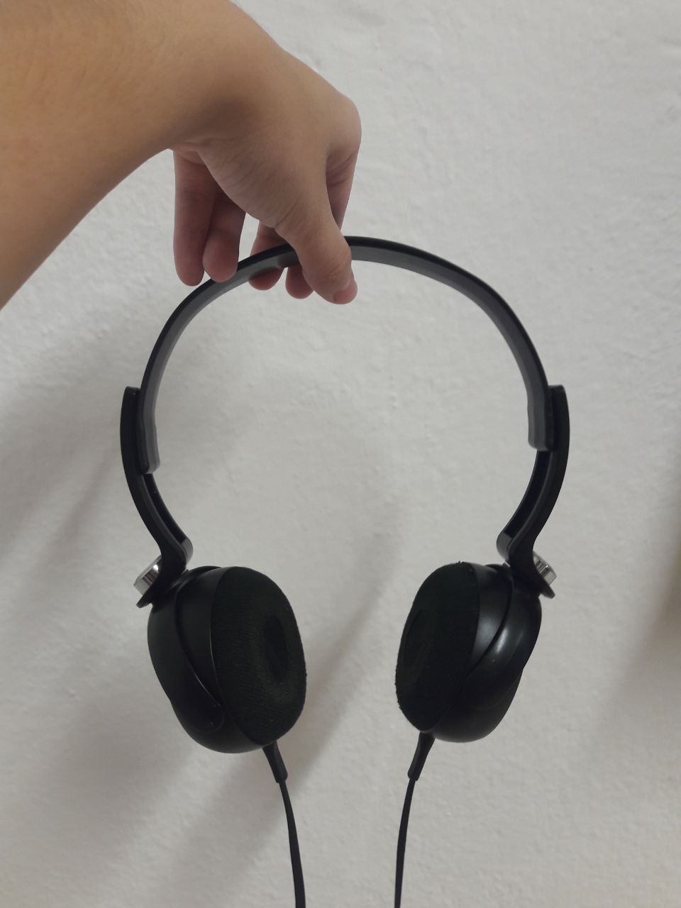
For the lesson, I brought my headphones, which was a decision mostly influenced by an overwhelming number of standard-shaped items, and the fact that my headphones are in fact quite a comfortable accessory which I like to bring everywhere.
Personally, what I noticed first was
- Colour
- Symmetry (and Flatness)
- Positive/Negative Spaces (and Circularity)
Other things that Cheryl (Ms. Heng? I’m still not used to the first name thing) raised, which I didn’t really notice, was the texture, and proportions AFTER extending it (I guess you don’t think too much about changing the state when you’ve been using something in a certain state for too long).
In terms of colour, it’s predominantly black, with silver as the subdominant colour. I find that there’re different silvers as well, with the silver button(?) being subdominant by virtue of how bright and reflective it is (I personally feel like it’s so bright that it’s trying too hard to be dominant, which really irks me). The SONY words are also subdominant by virtue of size (it’s a much more tolerable silver to me), and the silver linings are so dull they’re effectively subordinate. The model name is mostly just irrelevant by virtue of size.
Cheryl also noted that the black varies in terms of texture, which was such a prominent point that I mentally slapped myself for not seeing it. There’s the matte black of the headband, as opposed to the glossy black of the earpieces (I’m not too sure what to call the black of the wire, but it resembles the matte more). After extending, a lot of rule of third comes into play: the headband makes up 2/3 and the earpieces 1/3. The silver button(?) is at the 1/3 mark, and the model name is also at the 1/3 mark, along with the extension marker.
Symmetry is also a prominent feature to me, where it’s obviously a practical decision, but also makes it look harmonious. This symmetry applies from practically all angles. If the earpieces are turned accordingly, the headphones also allow for a flat plane from almost all angles too. (Incidentally, this is something I enjoy about the headphones, that it can lie flat around my neck and it can be flatten and kept.)
Something else of note is also the contrast of positive/negative spaces. The headband traces a circular shape which isn’t filled, and, fun fact! The radius of the void is roughly the diameter of the earpiece. Meaning, twice the size. What I DON’T like, however, is how all the shapes are all similar. You have circular earpieces, circular negative space, circular button(? it’s not actually a button but I have no other word for it), and it’s incredibly overwhelming. Perhaps it was intended for a sense of unison, so I might just be the outlier.
(I do like the flat wire though, even if the headband shares a similar shape too.)

(There’s some stuff in the 2D sketch which I didn’t cover above since it was all mostly straightforward, so if you’re feeling up to it you can see as above.)
If there’s anything I’ve truly learned from Lesson 1, though, it’s that you shouldn’t make assumptions. It’s sorely disappointing to have nothing to be critiqued on because you misinterpreted the limits of the prompt (and didn’t clarify it!) so I shall have to make an effort to work on that.
I was given the theme of X Y Z axes, and 1. I assumed you couldn’t use adhesives and could only stack 2. I assumed you could use all 3 together to form 1 bigger picture, hahaha hahah a ha…. ha………………………….. Needless to say, I failed magnificently. So I redid the models. Here they are! (While I had the foresight to use my hoard of A2 paper, I severely overestimated its ability to accommodate the dimensions… Time to hoard A1 instead)
While making them, I tried to keep in mind the various comments Cheryl gave in class to everyone, on trying to avoid using boxes with dimensions which matched, flushing boxes to each other, rule of 3, ignoring colours for now, et cetera. On a personal level, I also tried to avoid using similar boxes, similar here having the same meaning as for similar triangles/rectangles/et cetera.
(Note that the distinction between the subdominant and subordinate is not particularly clear, where this was the only configuration I could make where the boxes were of varying dimensions, at the cost of being able to use size to differentiate dominance. I probably need a better box collection. Or to learn to prioritise.)
|
|
|
|
|
|
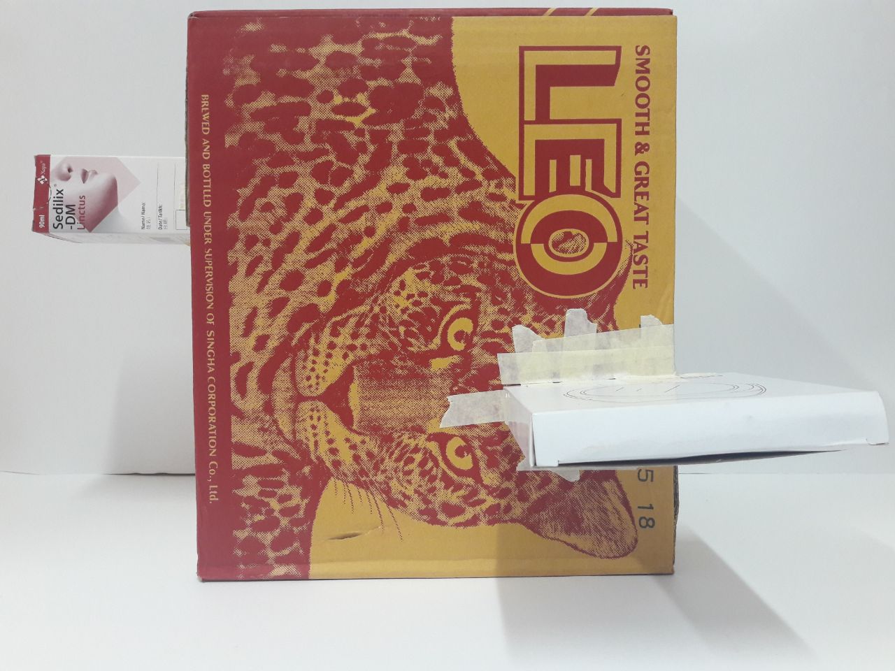
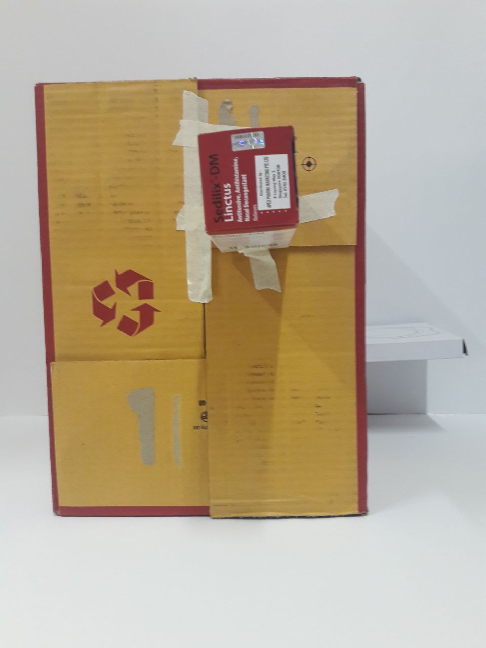

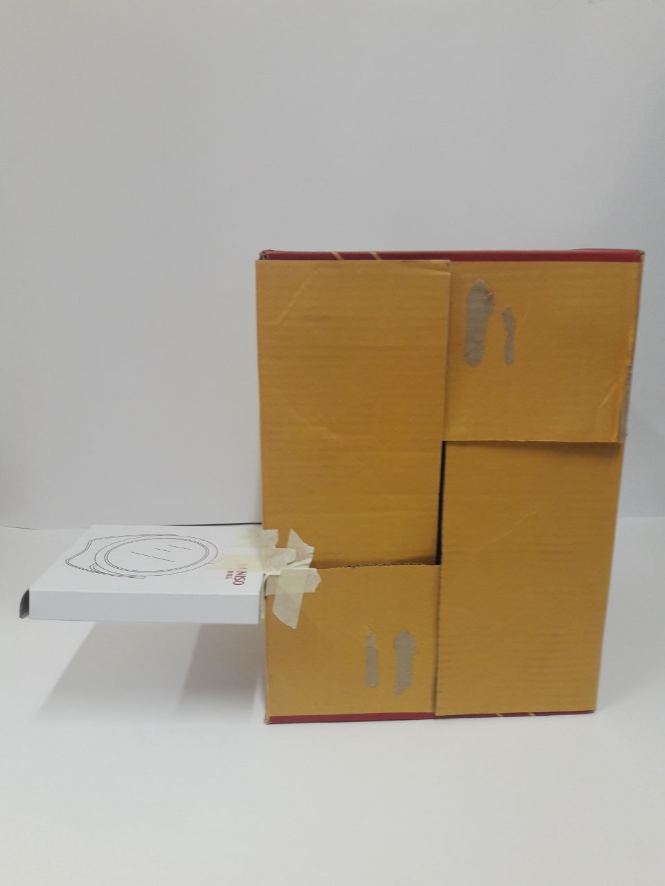
Dominant: Leo (L)
Subdominant: Mirror (S)
Subordinate: Medicine (XS) (but I think the longer width makes it almost equal size, in terms of volume, with the fairly thin mirror box)
For this, I tried to go with a more “random” feel, by spreading out the placement of boxes. That the other two boxes tend towards different edges of the dominant makes the dominant provide “height”, while the 2 other boxes jut outwards in different directions to form the other 2 axes. For no particular reason, I went all out on rule of third, so the mirror and medicine boxes are placed on 1/3 of the dominant box. 1/3 of the mirror box is not in contact with the Leo box either. (I personally find it boring, but that’s life I suppose.)
|
|
|
|
|
|
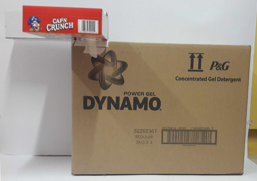
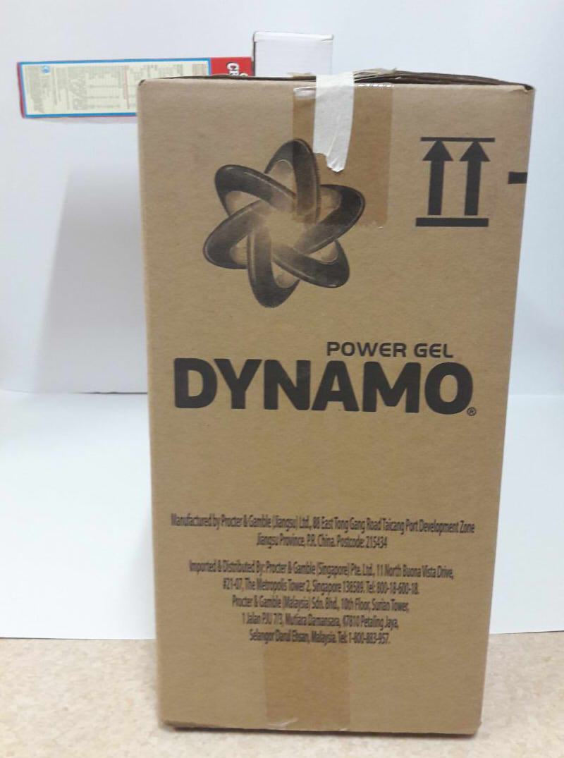
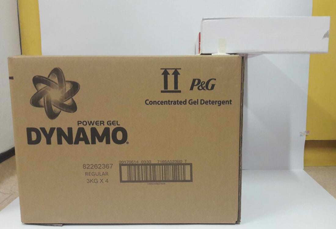
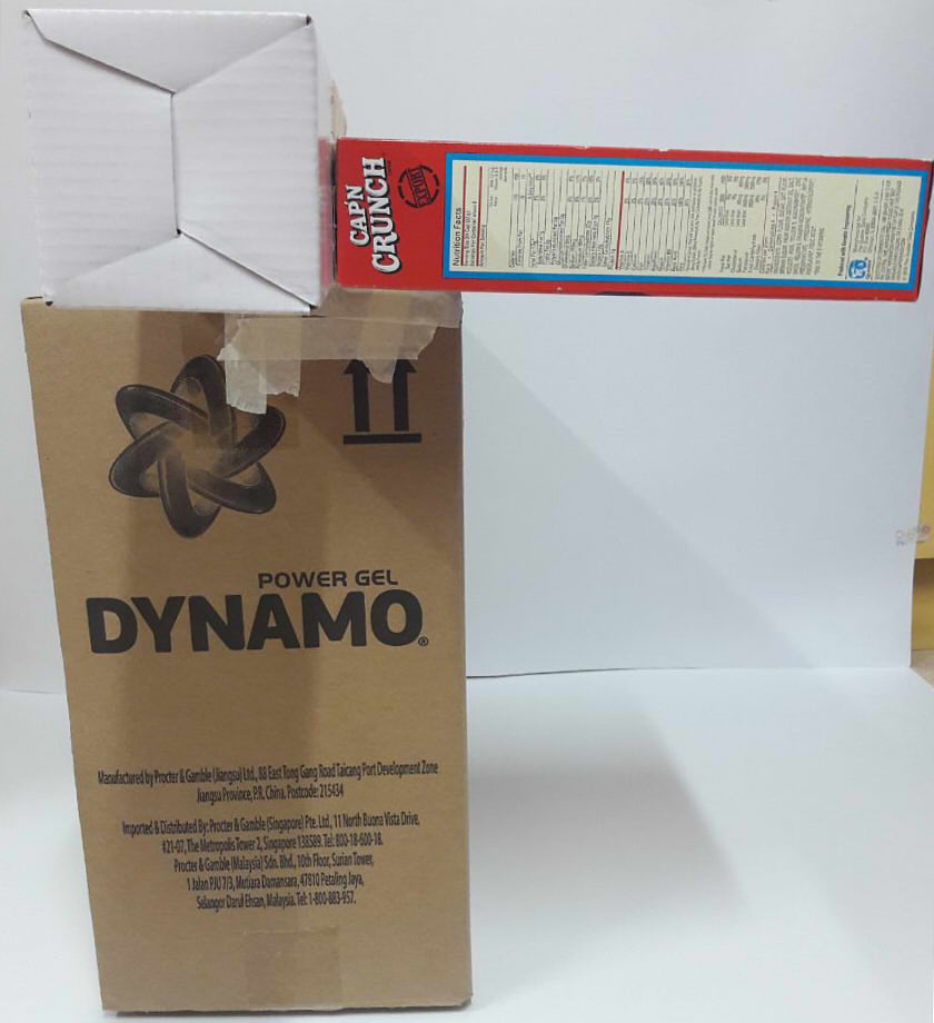
Dominant: Dynamo (XL)
Subdominant: Cap’n Crunch (M)
Subordinate: Whitey (M) (same issue. less length, but more height and width to make up for it)
For this, I neglected the recommendation to not flush boxes (a fair point, because the sheer amount of mass there is really drawing attention away from the dominant), but I wanted to try making an “origin”, the point of intersection for axes. I considered stacking all 3 on top of each other instead to form the point (while still having Crunch and Whitey jut outwards), but I felt like that would accentuate 1 axis far more than the others, so… In hindsight, though, the dominant is so big that it already makes 2 axes quite prominent, and leaves 1 severely lacking where the other boxes are unable to provide the same level of support, and especially where Whitey is making the already long length even longer. I have no idea how to rectify this, but to be fair the very poor selection of boxes and even more poor decision to flush the boxes had long screwed this one over. It’s always good to know what doesn’t work, I guess!
I’m atrocious with anything involving more than flat planes, so 3D is really looking to be a challenge, but I… Shall do what I can. Which is not a lot. But, as McEwan once wrote, “the attempt was all”.
I think En Ci, the reason why you feel that the SD & SO boxes don’t contribute to the overall composition is because Dominant is precisely too over-bearing. You might find it easier to work with a smaller ” D” box. Best of luck & keep trying 🙂
I can empathise with you over your ” abhorrence” for the over repetition of circular shapes in your headphones. (Ie. Cluster of similar volumes) But other than that, I think it is rather well designed & not as ” flat” as you think.