
Bright illustrations in a dark world; that kind of contrast would surely be heart-wrenching. In Memory of Sun is the overarching theme, with a tagline which may or may not be the sun is dead, time to smoke weed, get drunk, and die.

The illustrations would thus, obviously (?), be for things like 1. weed packages, 2. alcohol bottles, and 3. self-immolation kits. Parts of a gift hamper for the anniversary of the sun’s death, for you to go out with style! At your own discretion, than hypothermia or oxygen deprivation!
Establishing the tone
One of the things I used to get started was experimenting with the colours, through a 10 minute digital painting exercise. What I’ve concluded is that I think the first works best, where the warm, analogous colours are much better at providing a sense of harmony and softness.


In other words, if you’re already living in a dark world, I feel like the first would make you feel most crushed. After all, your environment already serves as a high contrast to the illustration: there’s no need to actively incorporate it into the image.
User personas
Here are user personas to express what I mean. Incidentally, I’ve realised that things like trait spectrums are useless for my understanding, so I’ve neglected that entirely. Instead, I focused on “how the death of the sun has affected them” (Ironically, I’m seeing a lot of Anna-like behaviour amongst NTU students right now.)
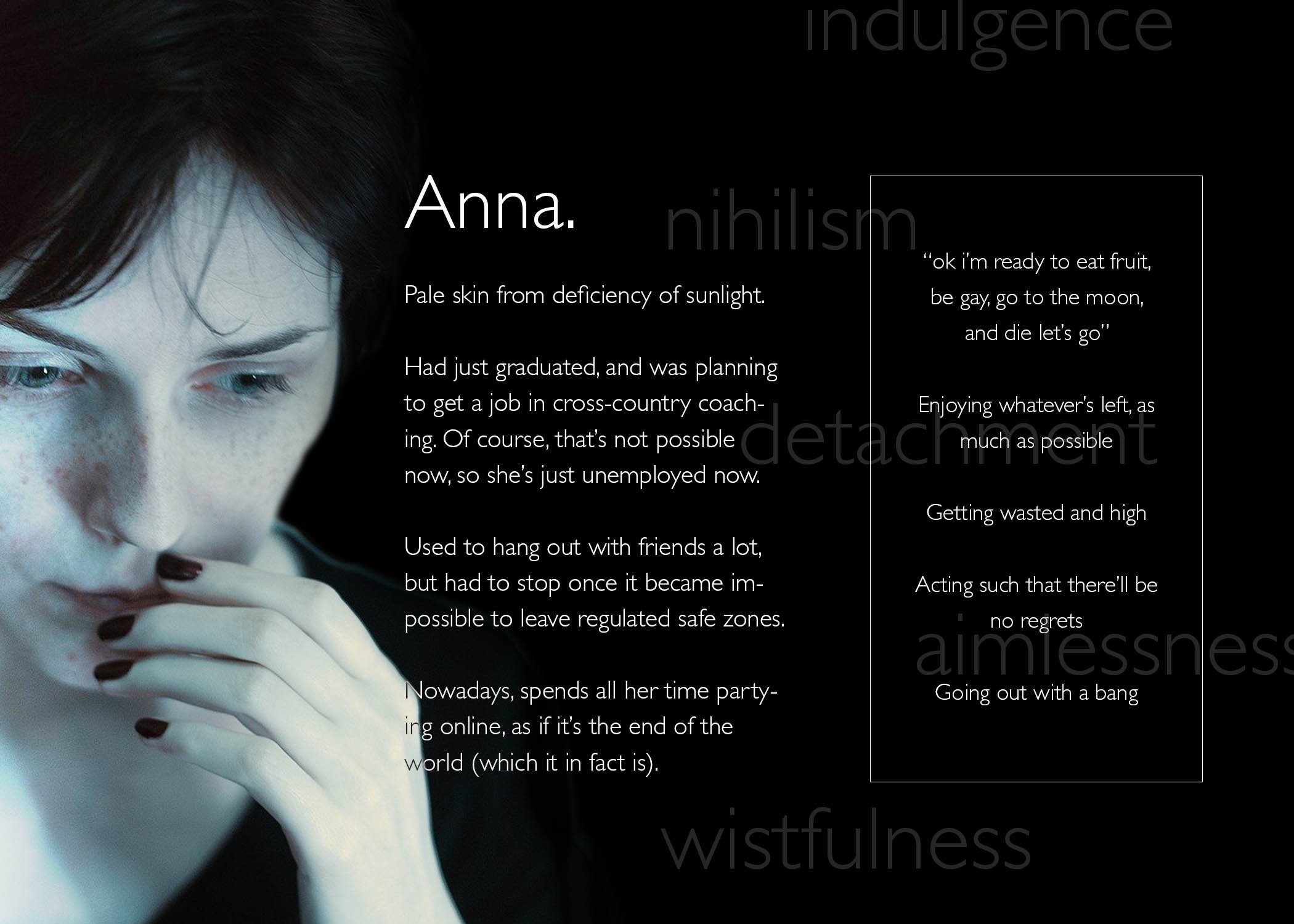

This means that I can go all out on creating a memorial of the sun which is fully focused on its wistful past glory, its overwhelming yet gentle radiance:

Two drafts for illustrations
To get visual continuity, I considered what Lisa mentioned in class, about extensibility. As such, I looked into similarities and differences between each item, to get an idea of what I can differentiate or not. For me, this similar factor was the fact that they’re all derived from organic plant matter:

This is exacerbated by that plants rely heavily on the sun for sustenance, so it ties in pretty nicely, that these products of the sun will similarly go extinct.
As also implied above, I did some research into the relevant forms.
For the 3 items, I learned a surprising amount about variations in weed and alcohol package shapes. I actively tried to choose 3 shapes which would be markedly different, i.e. a rectangular than cylindrical alcohol bottle, and a stout than elongated weed container.
For the plants, I searched up how they grow; it may or may not be evident that I have a much clearer idea of the forms of grain, than the forms of weed. I struggled a little with tinder, since tinder is an umbrella term which can consist anything from tree bark and fibers, to dry leaves and seeds. Thus, I picked whatever would be the most visually intriguing / easiest to fit into the extensible template.
The first draft
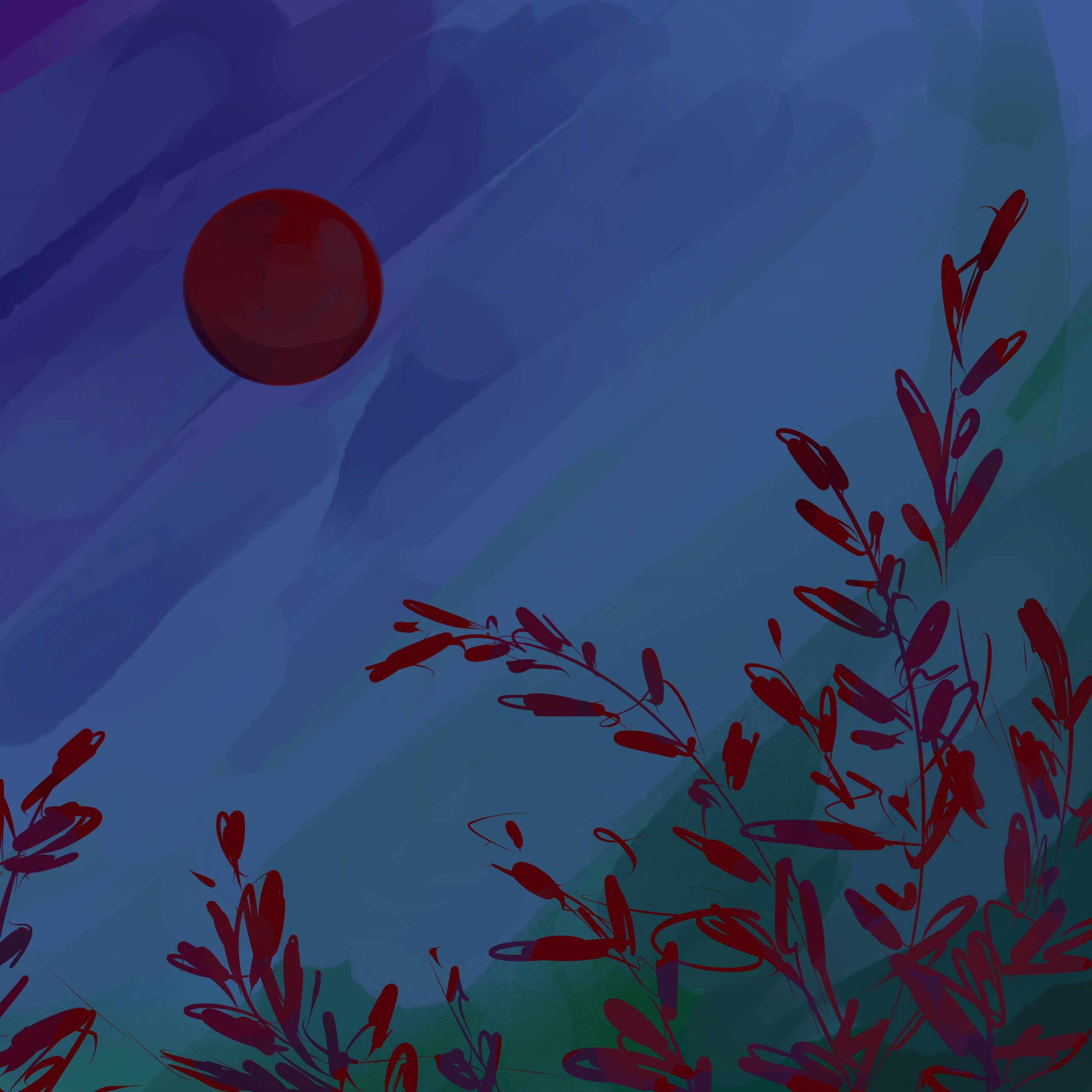
This one is basically of scenes of the relevant plants with the sun. While my initial thought was of just a scene, I later considered a down-up perspective, since it conveys the idea of growing “towards the sun”, than just a side view.
It’s easy to apply to grains and cannabis. It’s a little harder to apply to tinder, where I don’t think it’s apt to include the entire tree: after all, trees are visually dense, and has multiple components like wood and leaves, all of which can have different meanings.
As such, I tried focusing only on dried leaves, as can be seen:

The weakness of this, in my opinion, is that the sun takes a very minor role in the composition. It’s kind of like how the sun is used as a contrast to the main object in stereotypical Asian–styled illustrations. Which is a style I do enjoy, but which may not be apt, where the sun should probably be the focus.
Ways to keep this composition while emphasising the role of the sun might be things like a) dyeing everything in orange hues, b) increasing lens flare, or even just c) exaggerating the size of the sun.
The second draft
This one tries to tackle the issue of the first draft, where the sun becomes a focal point. I notice that depictions which properly capture the sun’s radiance often focuses on negative space, such that the sun itself is empty space: instead, it’s the presence of darkness around it which makes it shine.
The plants are thus used only to fill surrounding space, and honestly I was thinking of tamago kake gohan when I made this:

What I don’t like about this version, though, is that it doesn’t make use of the forms of the plants. That works for tinder, where wood is flat anyway, but it feels sad to not see stalks of grain, or cannabis extending towards the sky. That makes it kind of boring.
The biggest issue
In both cases, I think the biggest problem is that I don’t really know how to render the sun’s radiance. After all, that kind of asymmetrical glare seems easier to capture in photography, or a painterly style? And, without it, I don’t think I could get the kind of brilliance and softness that I want?
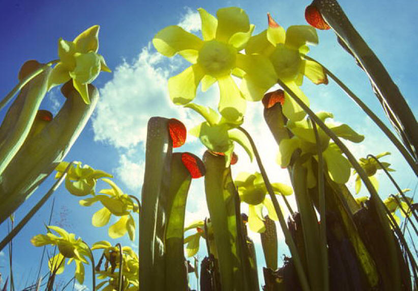
The closest I’m seeing is something like this, but even this feels kind of, too clean.
Some stuff i used