VAROOM MAGAZINE
A magazine published by the Association of Illustrators (AOI), it was likely named after Roy Lichtenstein’s 1963 pop art painting. And, of course, its contents regard the field of illustration.
Typically, a magazine revolves around a selected theme, such as Empathy or Muse. It is then made of articles which consist of an illustrator’s discourse on that subject, accompanied by their illustrative works. Articles are thus often about illustrations and illustrators, of which has some convergence to the theme.
The first type of article regards the style of a single illustrator. Articles of this kind do not address a single work, as opposed to the thoughts of the illustrator. As such, it would focus more on the illustrator’s approach to illustration as a whole, than to each individual piece.
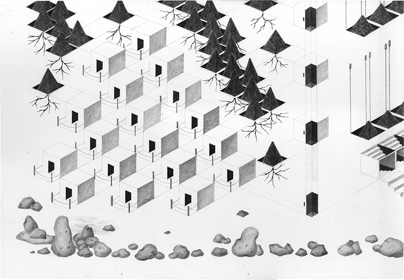
An example is Wei Shao and her insights on urban spaces in Issue 40 (Fantasy). While a seemingly realistic topic, it is her illustrations which bring out the fantastical nature of this subject, where the use of exaggeration, geometry and repetition bring out the surreality of our current urban organisations. In fact, her opinions on this topic are often reflected in all of her works.
A similar, but slightly different type of article is that which follows the process of a single work. Unlike the previously-stated type, this kind of article allows more insight into the making of a highly-detailed piece, than into the general workings of an illustrator.
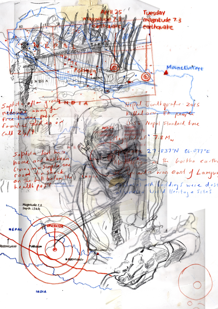
Reportage: After the Earthquake, for example, discusses Reflections, a project by Harry Morgan. It was intended as a way to raise awareness of the Nepali earthquake situation, with its link to the theme of Issue 33, Collaborators, being encompassed in its cross-media and cross-persons medium. The article thus focuses on the this project and the processes behind it, than Harry Morgan’s personal style.
It is my opinion that the target audience is anyone with an interest in images and the process behind it. Varoom themselves seem to have a similar opinion, but expand on it more, by claiming to be “for creators, commissioners and lovers of great image-making”. In other words, creators who seek inspiration for their own works, commissioners looking for existing creators and/or ideas on what to commission, and lovers who’d just like to know more.
What I find most inspiring is how thematically-relevant the articles stay. Often, themes are designed to be as broad and inclusive as possible, so as to attract a wide range of contributors. As a result, however, the links between the theme and contributions tend to be weak at best, and superficial at worst. This isn’t the case for Varoom, where the editor’s efforts are evident: even words aren’t really needed, to see the link between each illustration and the theme. I admire that very much.
The takeaway, too, is to make something which is self-explanatory, such that even the form alone is enough to identify the theme.
EDITORIAL ILLUSTRATIONS
- What do you find inspiring?
- What medium/s do they use? (Traditional, Digital, Mixed)
- How do they creatively interpret the text for the article?
I follow a lot of illustrators, but none of them do editorial illustrations, surprisingly! After some reflection, I felt like the reason why was because the illustrators I follow tend to have personal styles and subjects which they enjoy illustrating, which doesn’t always match with the requirement of “commercialisation”. For example, loputyn has certain symbols she constantly employs, such as nude girls, in pursuit of the theme of “unity”, which could hardly be used as an editorial illustration.

Also, I think the “flat illustration” style is nice in its own way, since it’s clean, professional, minimal, and about everything that a client would want. But it’s somewhat overused, to the extent that it looks somewhat boring. So, here’s a list which actively avoids that.
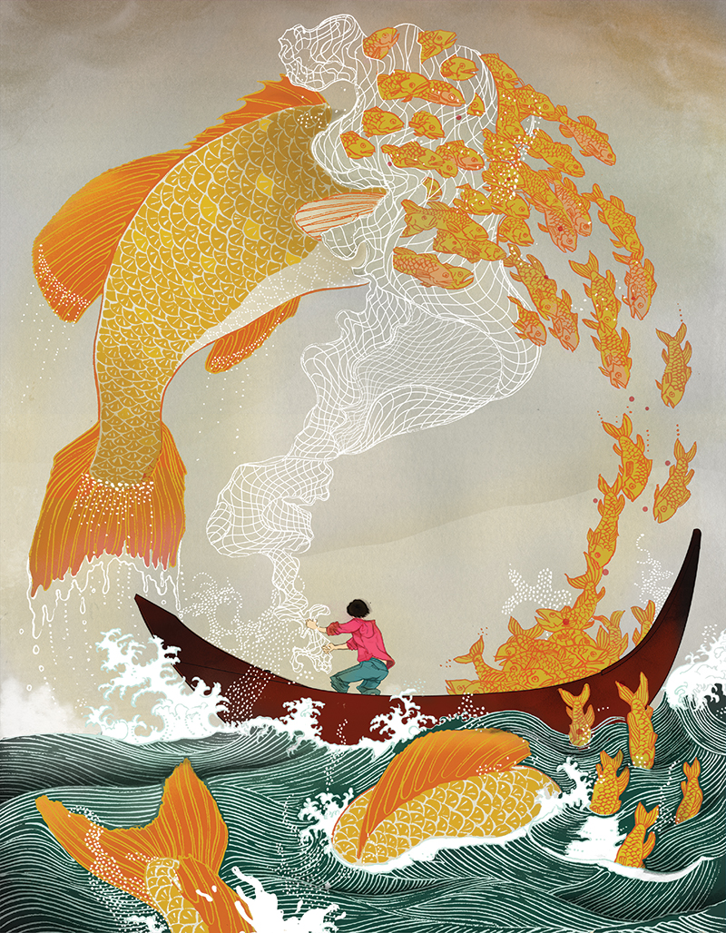
His style reminded me of litarnes, whom I’m already a fan of. What I adore is the use of linework as texture, which also helps to maintain a simple colour palette. For example, that the small fishes are exclusively the same hue of orangey-yellow, with the reddish-orange lineart providing sufficient support to negate the need for shading. (His apparent fondness for Asia-related styles and images is also something I can get behind.)
Something which may or may not be a weakness is how the illustration is composed such that it can stand alone. I appreciate the piece far more for its technical beauty, than for its relevance to the article. In fact, the link isn’t quite clear until I know what the article is about: only now do I comprehend that the illustration depicts how large-scale fishing can have negative effects on the environment. At the same time, it’s a nice way of depicting a message without being too direct about it, allowing for some creative and fantastical elements.
It seems that Chin tends to draft in pencil, before scanning it in and working in Photoshop and Illustrator concurrently. A cleaner version might be done in Illustrator with the Pen tool, then ported over to Photoshop to “soften” the image. For example, the shape of the boat might be done in Illustrator, with a tool, but the colouring in Photoshop, by hand.
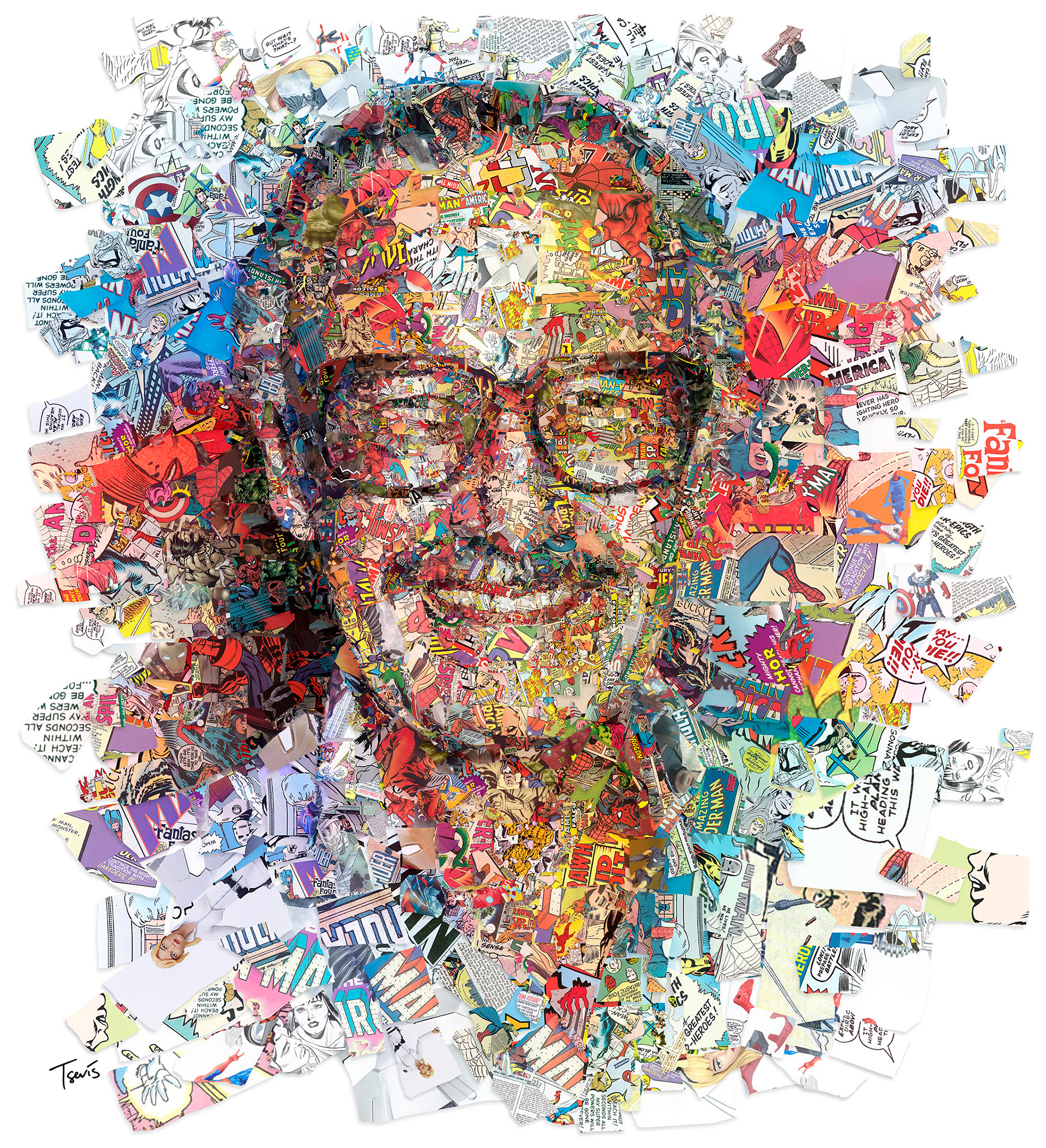
What I enjoy most about Tsevis’ works is that the link to the text is always immediately evident. This, of course, is because his editorial illustrations always depict the subject directly: in the above example, he presents Stan Lee’s portrait, which is something that the audience can recognise easily. He thus easily bypasses the possibility of an illustration being too complex to understand, through simplicity.
Even so, his works can be distinguished from photography in that the colours and building blocks of his compositions always add another layer of meaning. He composes Stan Lee’s face out of clips from comic books, and uses vibrant colours as an representation of Stan’s bright personality; for someone like Obama, he uses statistical numbers, and the dichotomy of blue (Democrat) and red (Republican).
I’m also fairly sure that he does these digitally, where he was inspired by things like ASCII & pixel art. Still, it would probably be possible (but tedious) for it to be analog.
(Also, it’s wonderful to see how the illustration blends into the article itself, where the article similarly uses the triadic colour scheme.)
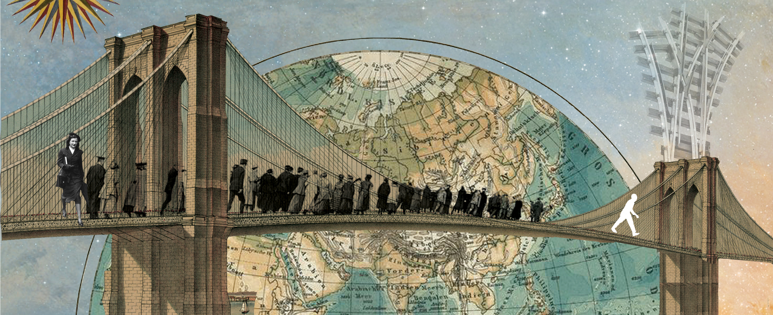
Another collage-type style, where Snow disassembles and reassembles different parts of different images. This is also admirable to me, where drawn illustration can be somewhat easier: you can control every aspect, from the forms to the colours. For collages, you have to painstakingly find some existing thing which can be repurposed.
At the same time, it combines the merits of photography and illustration. In the above example, the use of technical drawings and photographs make the piece surreal yet professional. This is also supported by the muted colour palettes favoured by Snow. As a result, we see how most of his editorial clients tend to be from magazines for adults, about fairly serious and/or retro topics. There’s an obvious target audience going on here.
This is another case of something which can be done through analog means, but I again think he does it digitally. It would be difficult to get the cleanliness he does, otherwise.
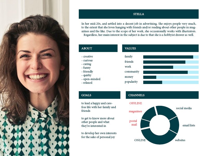
USER PERSONA
Probably, something like this. In other words, someone who is curious about other people, and loves to read about their thoughts and experiences. Also supported if it’s someone who already has exposure to the field of illustration, whether in their workplace, or as a hobbyist themself.
REFERENCES
- Varoom. At Association of Illustrators. (link)
- Varoom magazine is changing the perception of illustration in the creative industries. Jyni Ong. At It’s Nice That. (link)
- Marcos Chin: The Illustrated Man (link)
- Charis Tsevis (link)
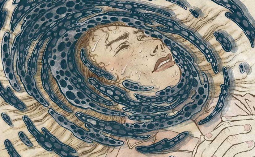
- Featured Image is from Yuko Shimizu for an article on nightmares, who I totally did not talk about, but I also admire her work, just more of her illustration than editorial illustration specifically