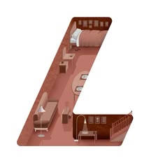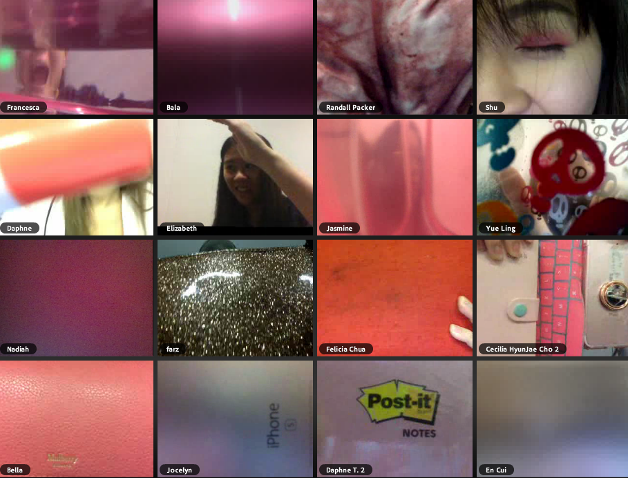

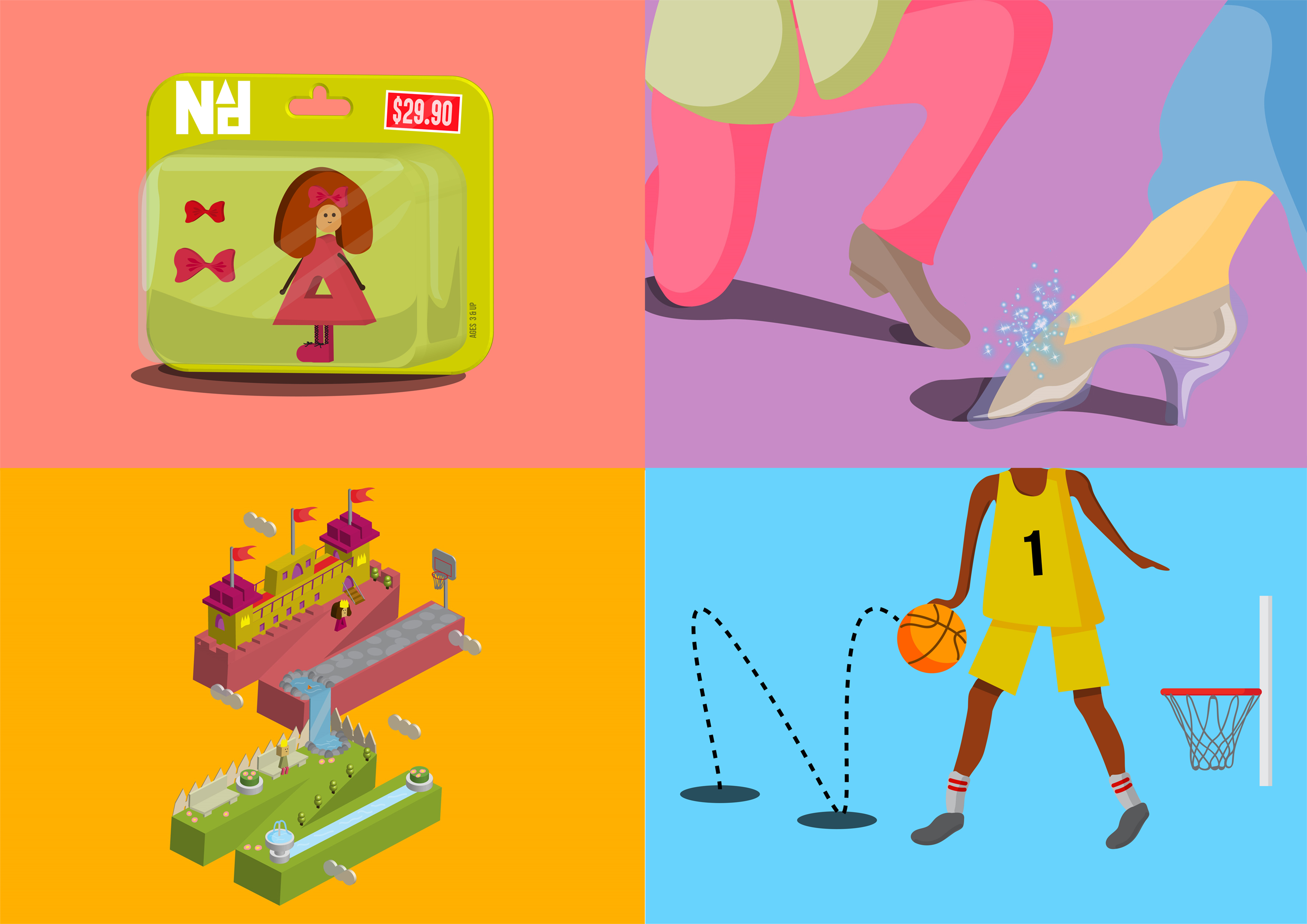
My final 4 compositions!
To reiterate, my concept for this project is “CHILDHOOD“. The occupations chosen come from the perspective of a child. Thus, some nonsensical, non-existent and fairly childish jobs. Read more on why I chose that concept here!
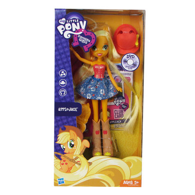
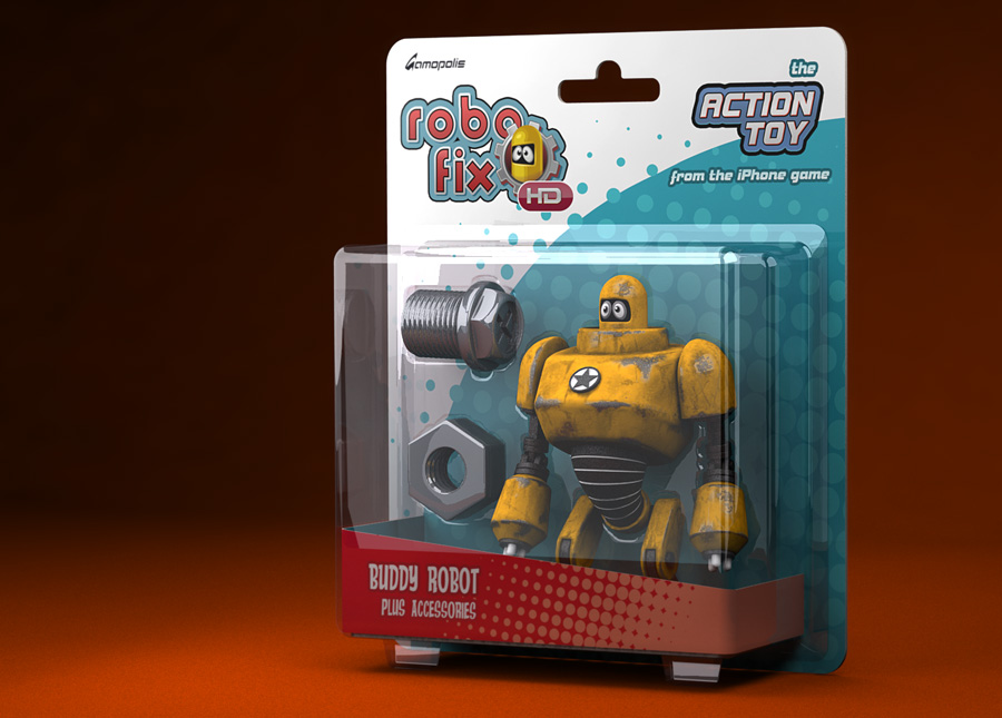
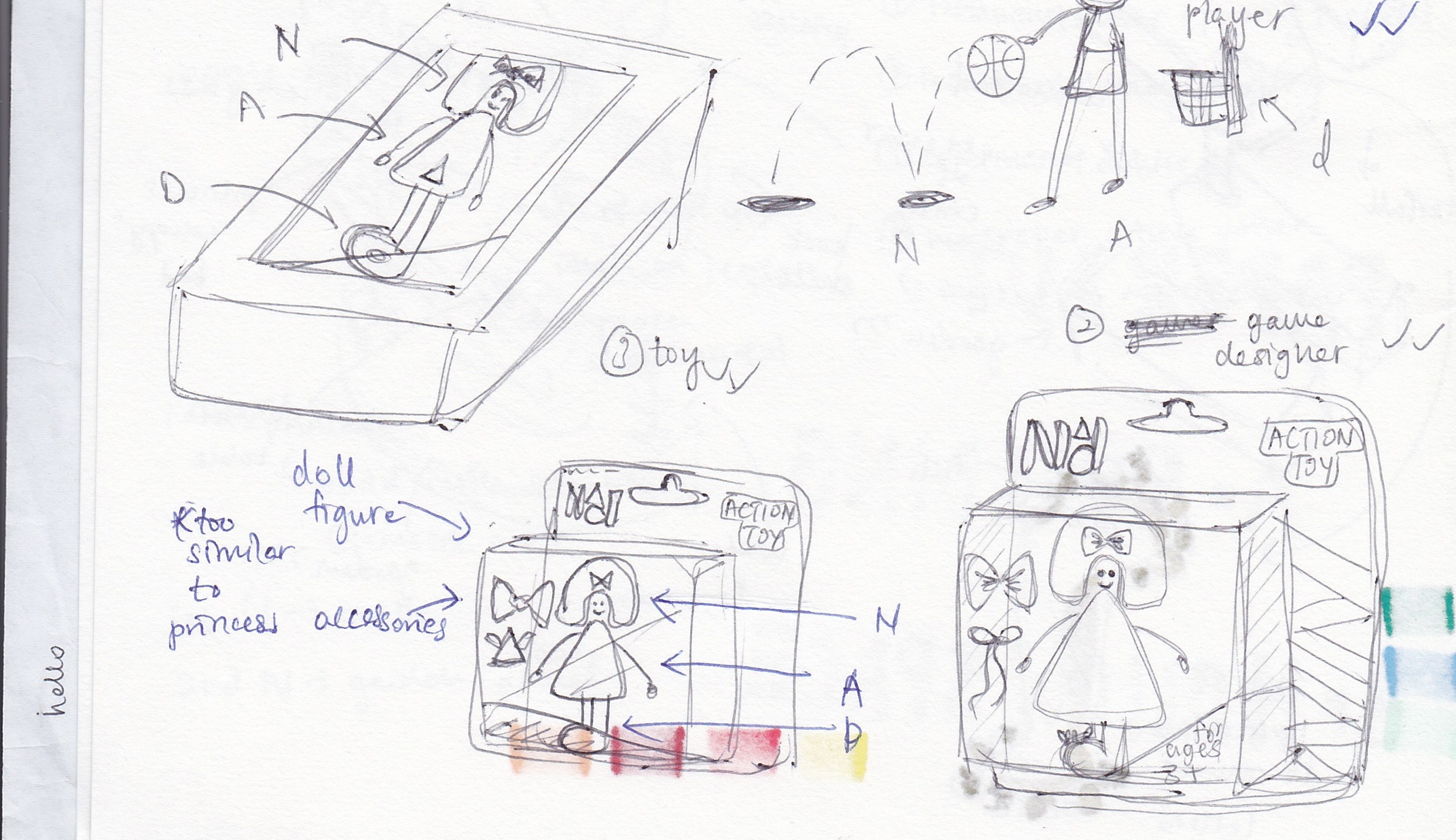
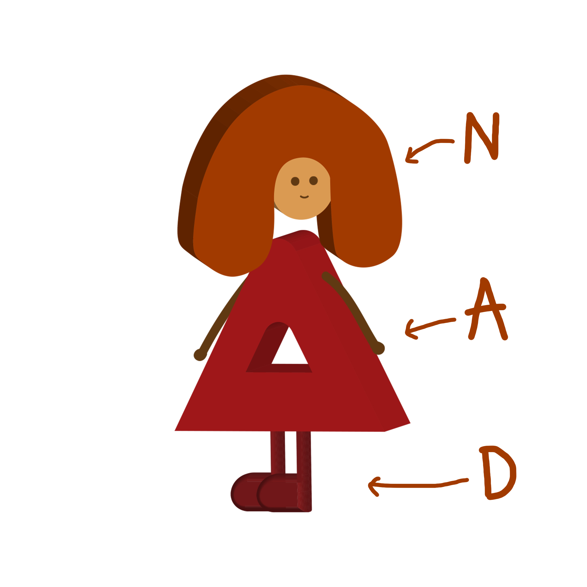
ONE – TOY FIGURE
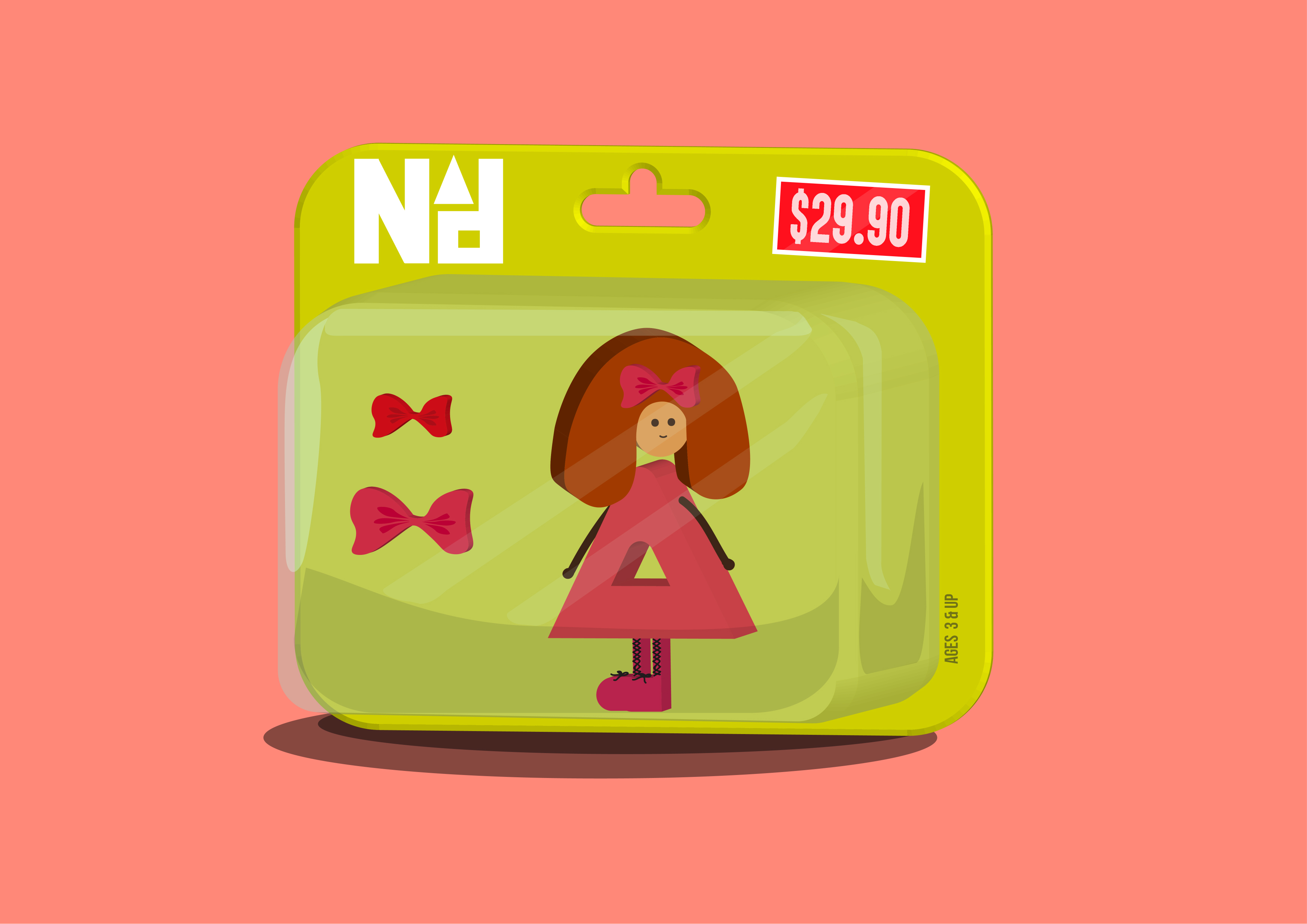
This idea stems from the notion that children do not know what purpose a job serves. I’ve heard kids saying “When I grow up, I want to be a lion”. That’s not possible now is it? This basically works around the same idea. It’s not possible to become a toy figure but that’s what they want to be. So, here we are. I manipulated “nAd” into looking like a doll-like figure. This composition is kind of like a game of “Spot the letters” which is why I did not make the letters too evident. The letter “n” is represented through the hair, “A” through the dress and “d” subtly through the shoes. I want to keep the figure as the main focus thus I kept the accessories around it pretty simple.
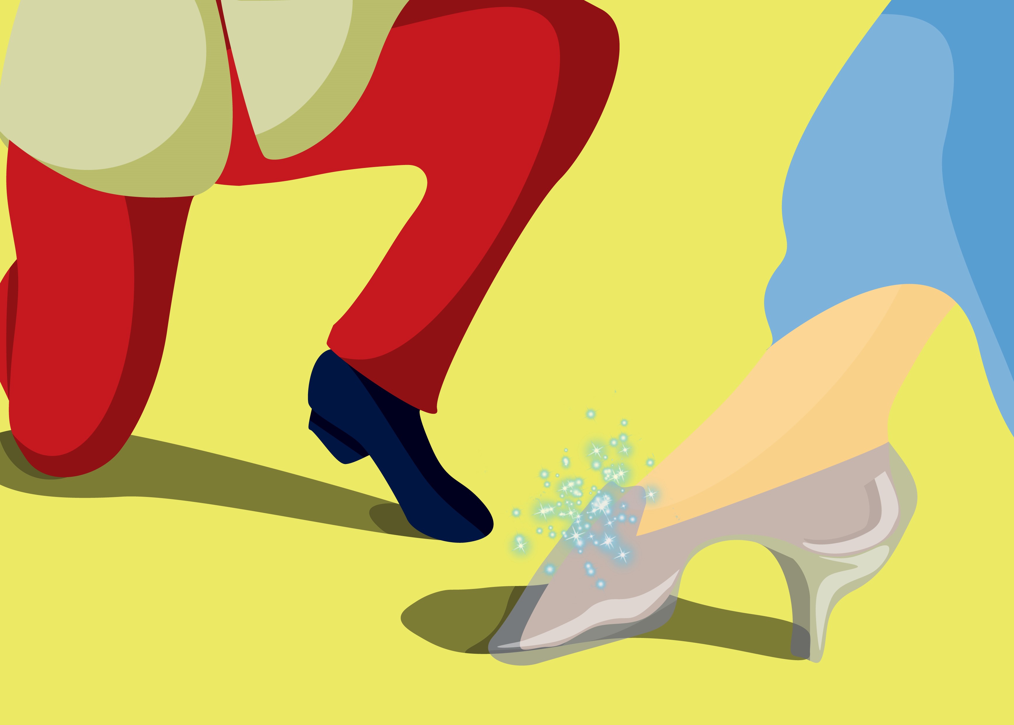
TWO – PRINCE/PRINCESS

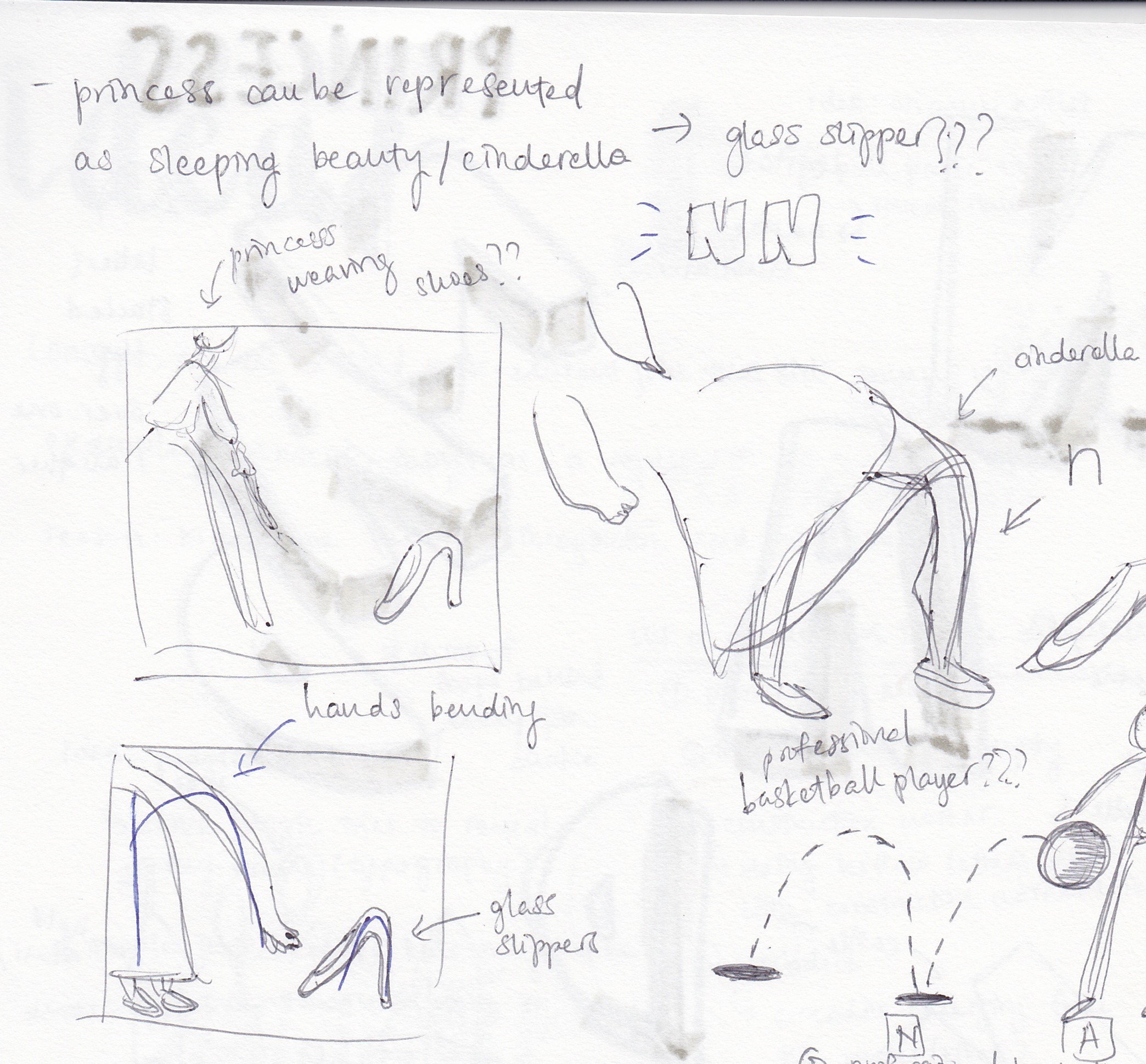
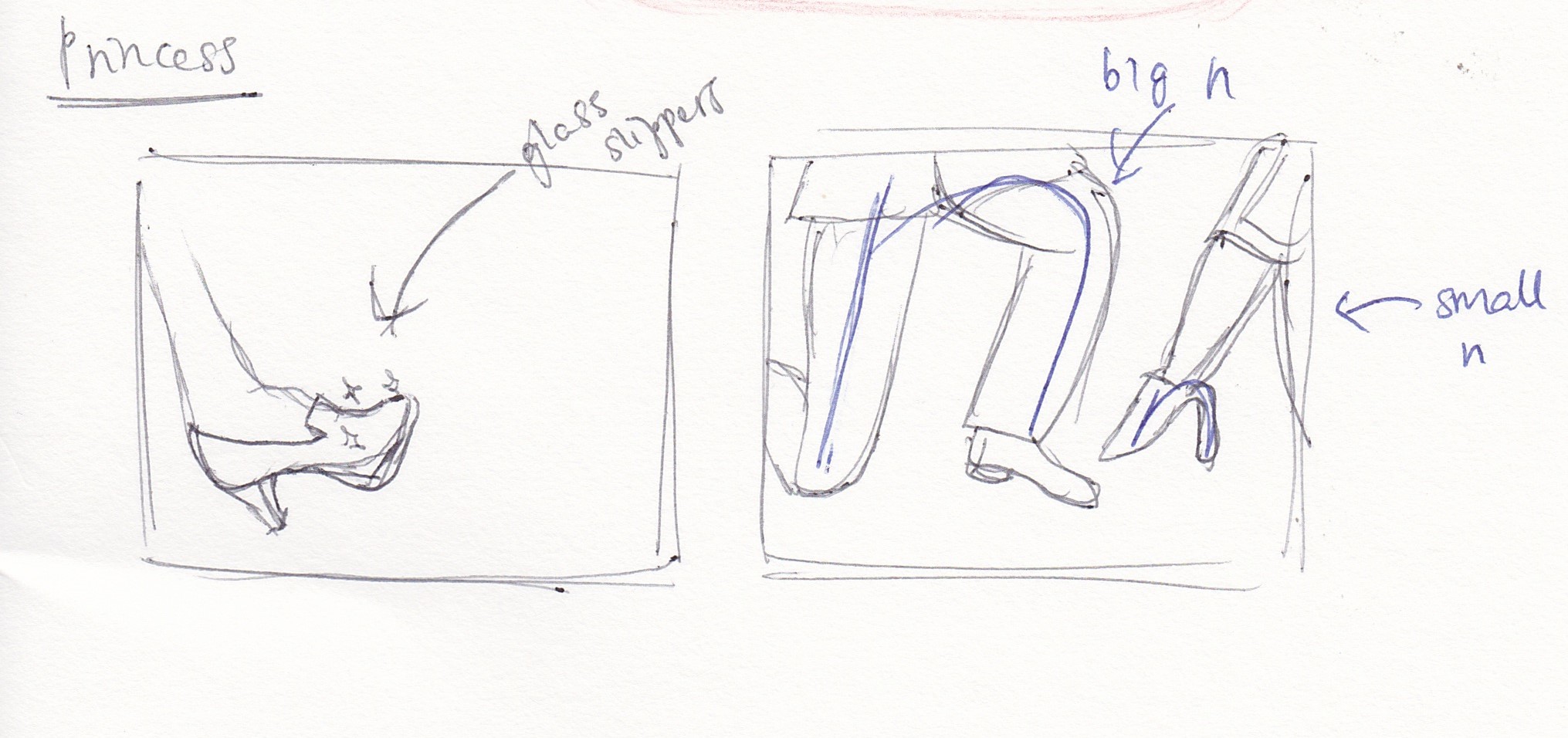
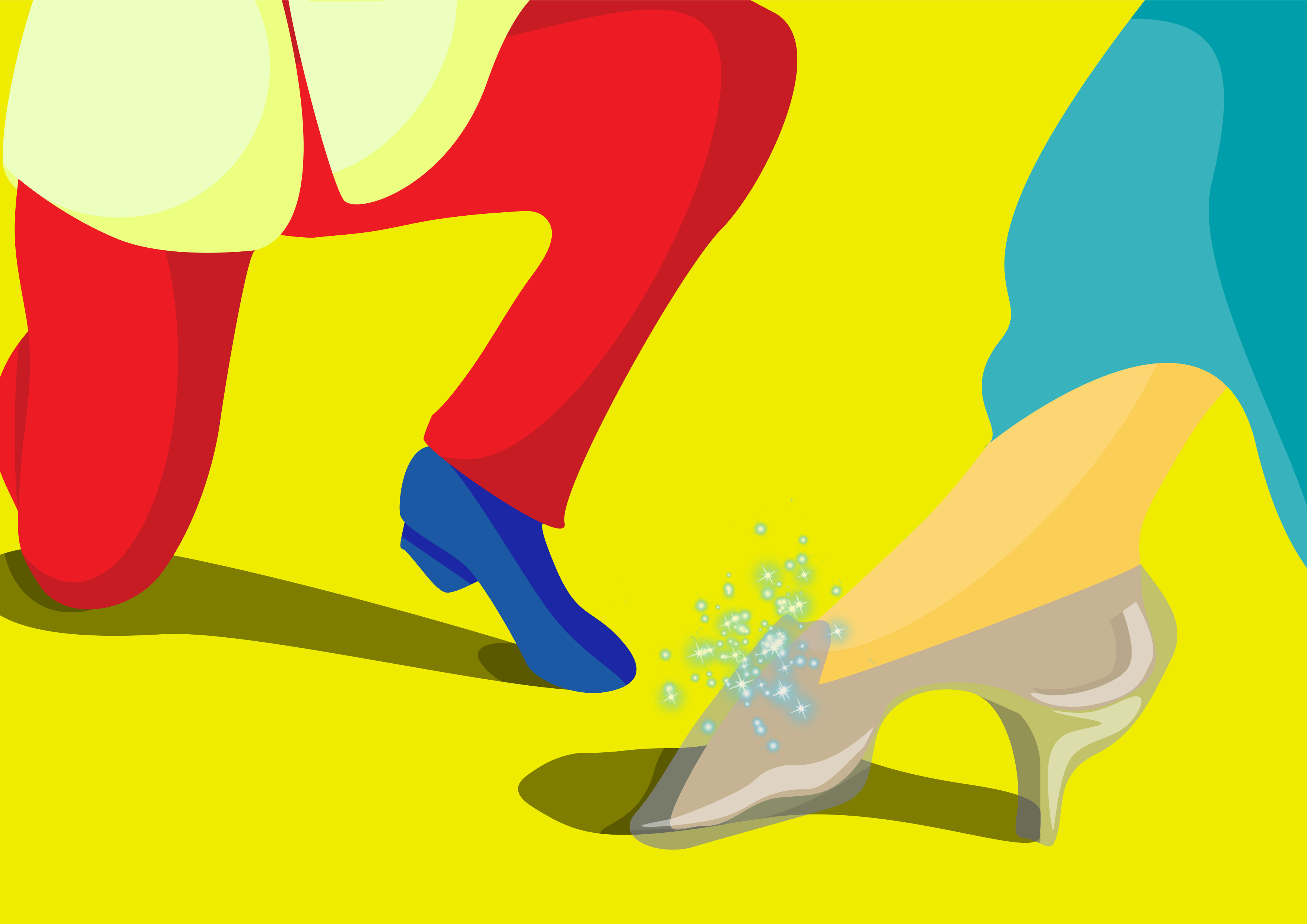
This is similar to the previous “occupation” in terms of its craziness. However, it is possible to be a prince or a princess. Even if you’re not born into a royal family, it is possible to marry into one sooo hehe. Sign me up! Anyway, as you can tell, this illustration depicts the famous scene in the classic Cinderella movie where she finds herself to fit the glass slippers. This idea was suggested to me by Mimi. I manipulated the glass slippers into looking like an “n”. The prince kneeling down also shapes into another “n”. Together, it makes up “nn” which is my initials. I chose to present the job as both a prince and princess because hey, equality!
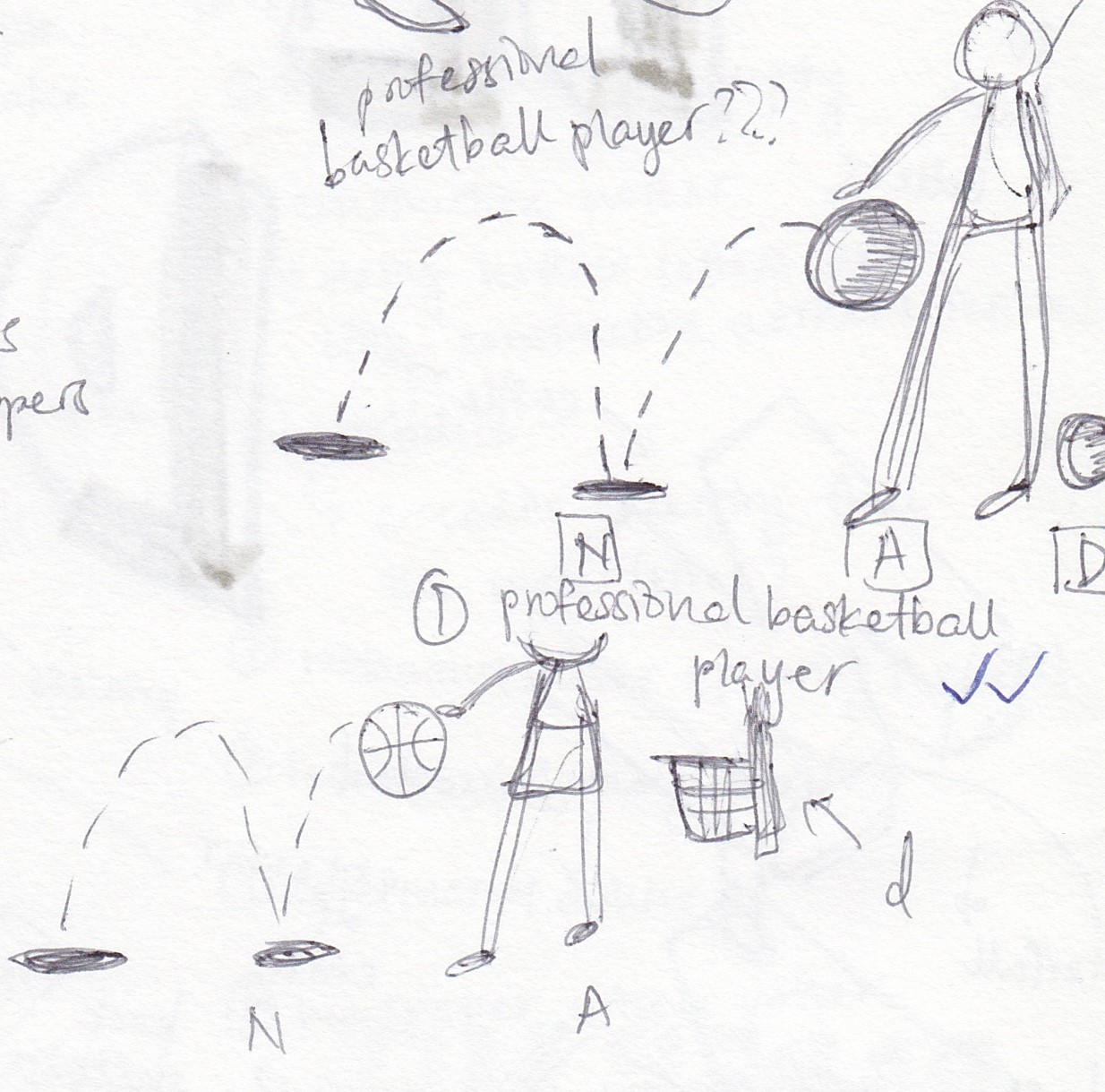
THREE – BASKETBALL PLAYER
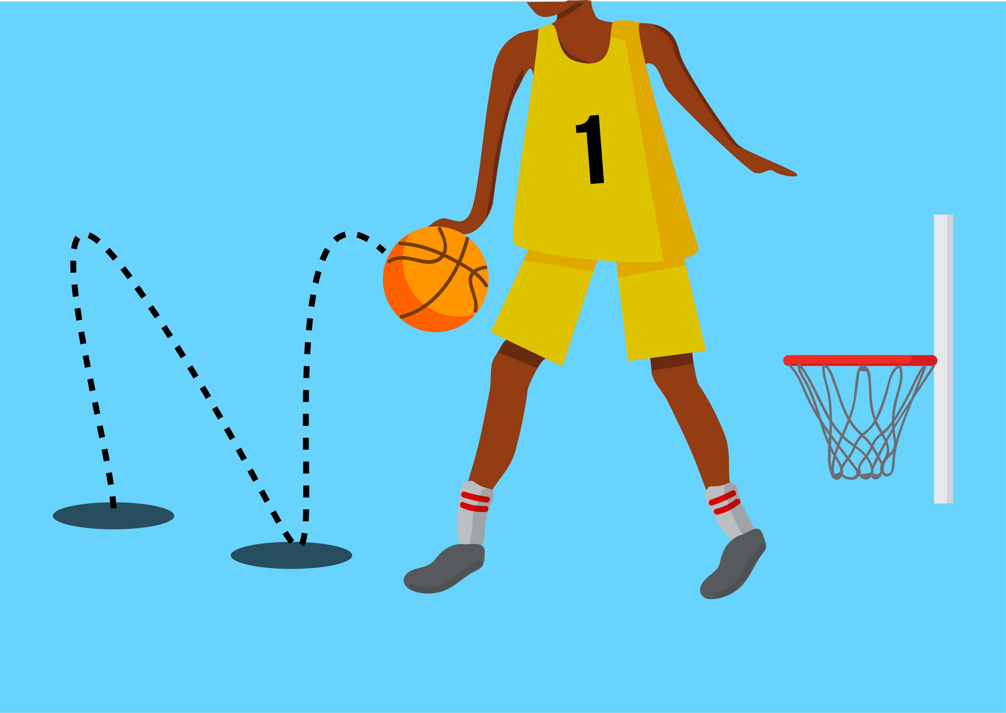
In primary school, I knew of a lot of my friends who aspired to be a basketball player. Not relatable HAHA. Sports CCAs in primary school were very limited in my school at least. For me, it was between soccer and basketball. I chose basketball because I thought the hoops would make quiet a decent letter “d”. I gave the ball a bouncing effect by drawing the trace behind it which I shaped into the letter “N”. Basketball players are generally really tall and have long legs so I thought the legs can be manipulated into a big capital “A”. Put it altogether and you get “NAd”.
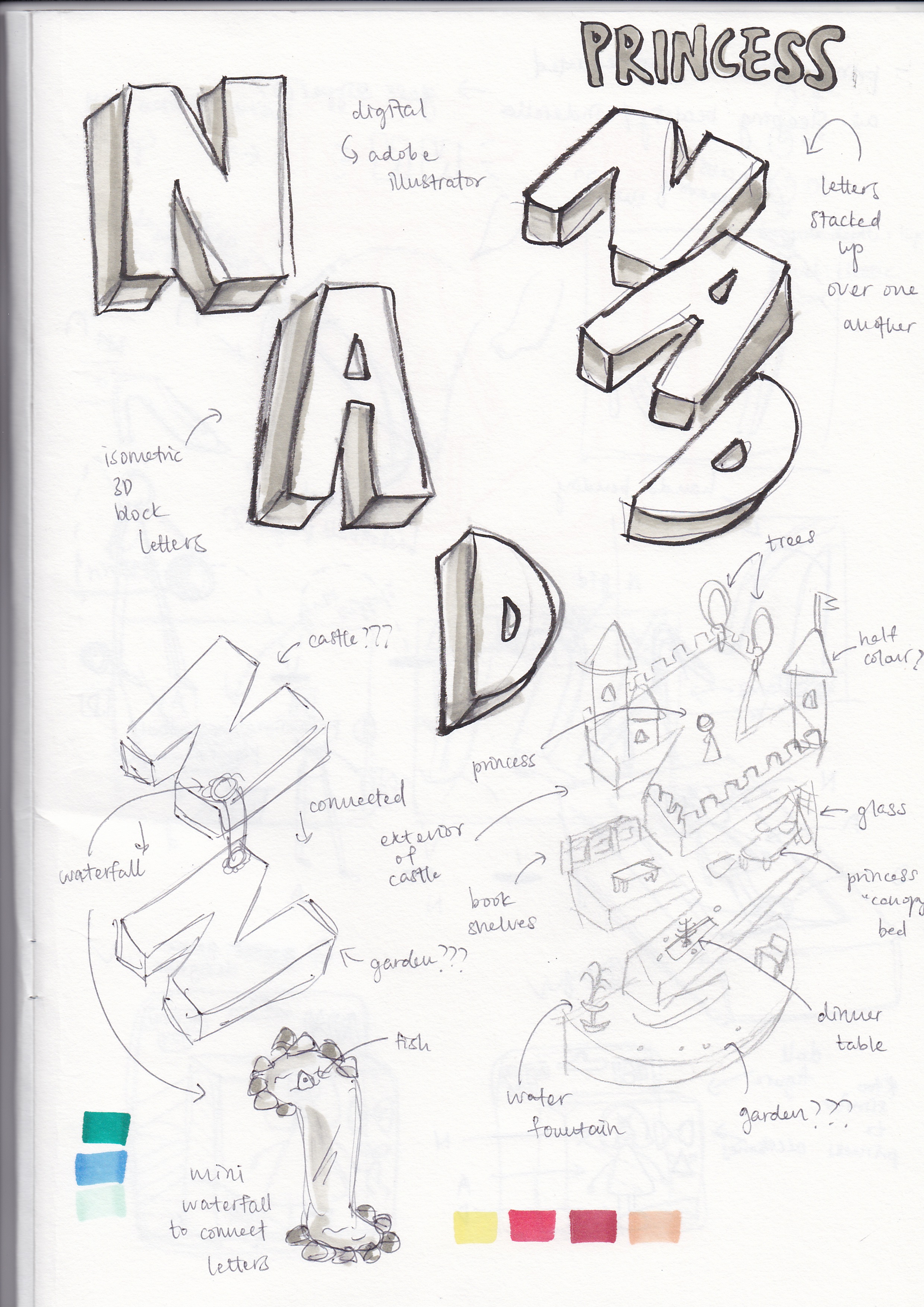
FOUR – GAME DESIGNER
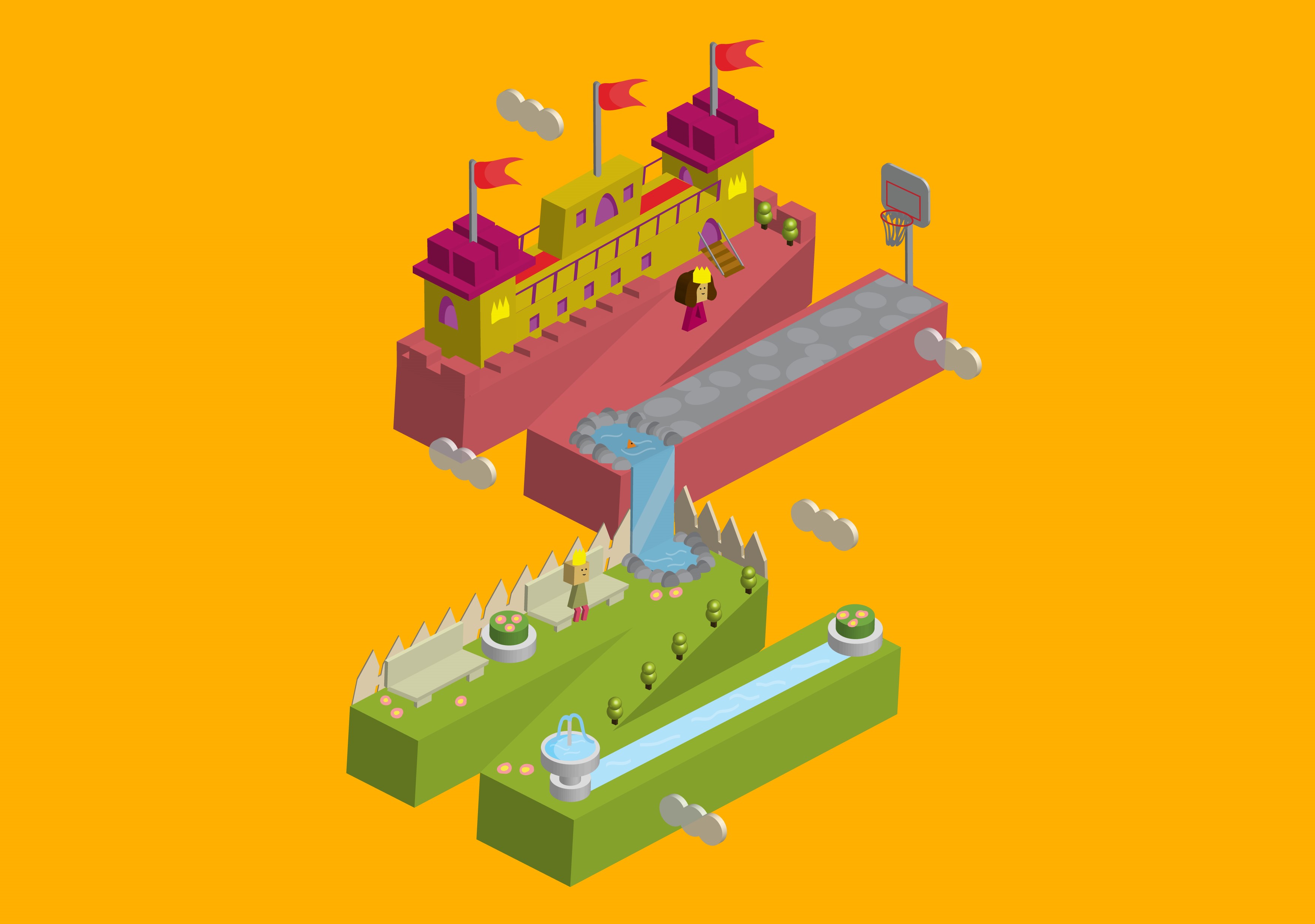
I used my initials again as a platform for the rest of the elements. I connected both letters with a mini waterfall so as to avoid them looking too distant. I emulated Crossy Road’s block-shaped items into my game design depiction. It took a lot of extruding and beveling in Illustrator. All games consist of a setting and characters. Here, I set the game in the world of a princess hence, the castle and a beautiful little garden. In the garden sits a prince which if you notice, is the same one in my previous composition because of the same colour of clothes. In front of the castle is actually the toy figure who is accessorized as a princess. If you can’t tell already, I wanted a little bit of all my other compositions to be in this “game” that I designed thus the additional basketball hoop on the top “N”.
♡ ♡ ♡ ♡ ♡ ♡ ♡ ♡ ♡ ♡ ♡ ♡ ♡ ♡ ♡ ♡ ♡ ♡ ♡ ♡ ♡ ♡ ♡ ♡ ♡ ♡ ♡ ♡ ♡ ♡ ♡ ♡ ♡ ♡ ♡