

The theme I got was Asymmetry.
Asymmetry means uneven in distribution or lack of equality.
We can exploit asymmetry, using it to draw attention to areas in the design or to convey dynamism or movement. Having asymmetry in our work, it helps lit up the artwork.
In this Pandora Box assignment, we were to use 3 boxes to represent our theme in our composition. There are some things that we have to be aware of is all the three boxes must be able to be seen on all views. The dominant (D), subdominant (SD) and subordinate (SO) volumes should stay constant on at least 4 different views.
Process and Development
Process model 1
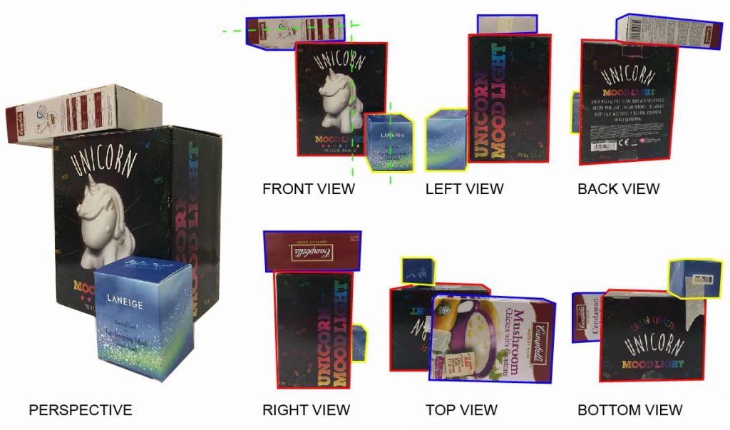

- Dominant (D) RED
- Subdominant (SD) BLUE
- Subordinate (SO) YELLOW
- Principle Axis GREEN DOTTED LINES
For my first model, I make sure that all the 3 boxes can be seen from all 6 the views. I placed my SO and SD at the mid point of D. However, some of the sides do not show the consistent D,SD and SO.
Process model 2


In this composition, the boxes are all position at the mid point of D. I tried using a smaller SO box in this composition. So that SD and SO will not be so similar when it is being viewed in other sides. However, SD and SO still looks quite smaller on the left and right view. And SO box could not be seen at the bottom view
Process model 3


I tried placing all the boxes at a side to create lack of equality . I also applied rule of third technique, SD and SO boxes are placed at one third of the fraction. This composition has more depth and D, SD and SO are more cosistent in this layout.
Process model 4


In this composition, I placed the boxes perpendicular to each other. SO and SD are consistent at 4 views. However, the SO could not seen on the right view. I like this composition most, it has more interesting views as compared to the previous compositions.
Final Model


If i were to remove the SO in this layout, it will be symmetric. Which creates a very balance, very expected composition. However once I add in the SO box, the whole composition lits up. The first thing that we will notice is the SO. Our eyes will naturally be drawn at the focus and then goes around to see the biggest boxes later on. In which it also creates hierarchy.
Since the focus is on the SO box, it is the magic to my composition. I use gold to emphasis on it. While I use a more neutral colour material for my D and SD material. D is concrete while SD is glass.
Applications

A large application could be a submarine. Dominant being the main body. While the Subdominant could be the masts with cameras mounted, replacing the traditional optical periscopes. And the Subordinate is the control room, where people could enter.

A smaller application could be a stationary holder and a digital clock. The Dominant is to hold larger items, such as pens or ruler. Sub dominant is to store slightly smaller items like glue or eraser, it also acts as a digital clock. And lastly the subordinate is to store small items such as paper clips and rubber bands. It is very important to have a stationary holder on the desk, it helps to keep the table neat and tidy. Having a clock also helps to keep track of the time.
Reflection
When I started this assignment, I was very confused and I had trouble trying to differentiate the Sub- dominant and Subordinate.
I learn from my friends work and consultation, which allows me to look more closely at shapes. And understand how the sizes complement as Dominant, Sub- dominant and Subordinate.
After this assignment, I am able to apply the design principles and to identify them. I also realised that the things around us all had design elements. The final model allowed me to look at model not just as it is, but to imagine it as an application. I had to be creative and think out of the box.


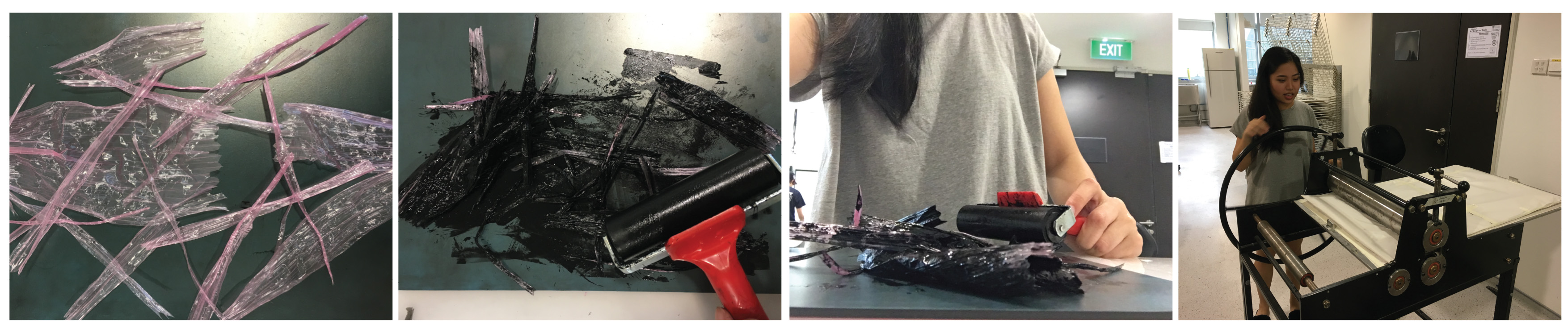
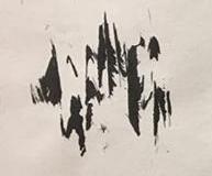
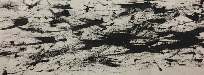
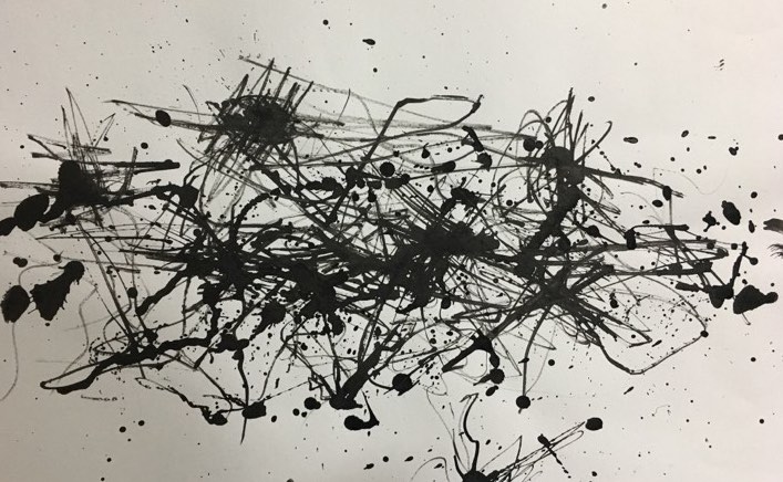
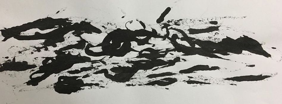
 Made use of the side of a bottle cap to create the harsh strokes. It reminds me of anger too. The strokes are of different directions, which shows anger.


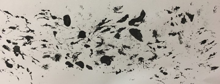


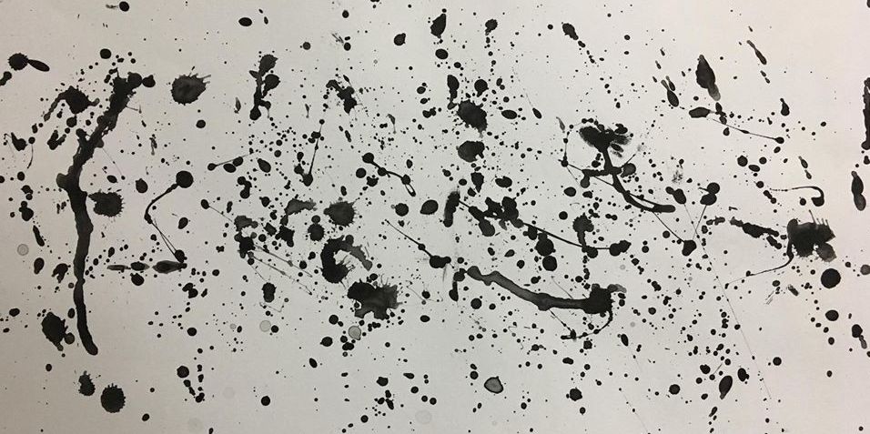
 After the first experiment, I tried to improve it, by blowing the bubbles on the paper itself. For the previous experiment, I used dye. The colour came out not as vibrant as I like it to be. So for this work, I tried mixing chinese ink with soap and dilute it with water. I then blew the individual bubbles on the paper itself. As the bubble pop, it creates the bursting effect.
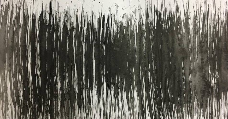
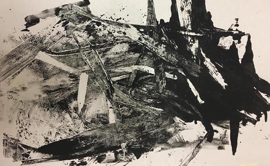
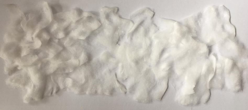
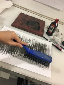 I found a brush in to classroom, I took it. First i wet the brush and dipped it into the chinese ink. Then using a little strength to brush it in a up and down motion. I like how the wet brush smudge some area of the work.
