This project was one of the toughest I have encountered as graphic design was “new” to me. Conceptualizing was more difficult as compared to execution. I have a few learning points to take note of in future when I work with print and it’s concepts.
Research
Based on a list of a few occupations and some imagery that appeared on my mind. I realized that I haven’t been exercising my imaginative and creative muscle in my conceptualisation. Partly because of my fixation on a certain type of aesthetic.
I have decided to read up on typography

The main takeaway was the archetypes of typefaces and how it was used in many different contexts. It covered a brief history of how typography came to be, how it evolved and now categorized in it’s respective typeface. Overall an interesting look at placement of letters and how it looks like together. A reminder to read further on typography.
For Inspiration I looked to Peter Jenny’s series of books, this specific one caught my eye. The Learning to See series takes a look at formal elements of art in everyday life.

Here are some snippets of the book I enjoyed
Additionally we learned about Pareidolia, which is
“A psychological phenomenon in which the mind responds to a stimulus, usually an image or a sound, by perceiving a familiar pattern where none exists.”
-Wikipedia
Also know as the alphabet project, it was about spotting letters A-Z in everyday objects.

Therefor what I understood from all the exercises were to get viewers to realize the underlying letters in our life and manipulate them for image making.
Here I looked at the form of the letters L,O,K, E and M, U and N. Some more fluid than the other.

Initial Ideas for Bontanist


I realized I centered my illustration based on botanical illustrations from the 18th century which was essential to the botanist research. Which does not embody the occupation of a botanist as a whole. Therefore idea aborted.
(Above images are not mine and belongs to respective owners)
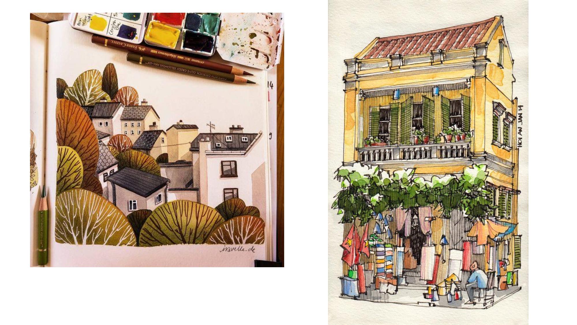
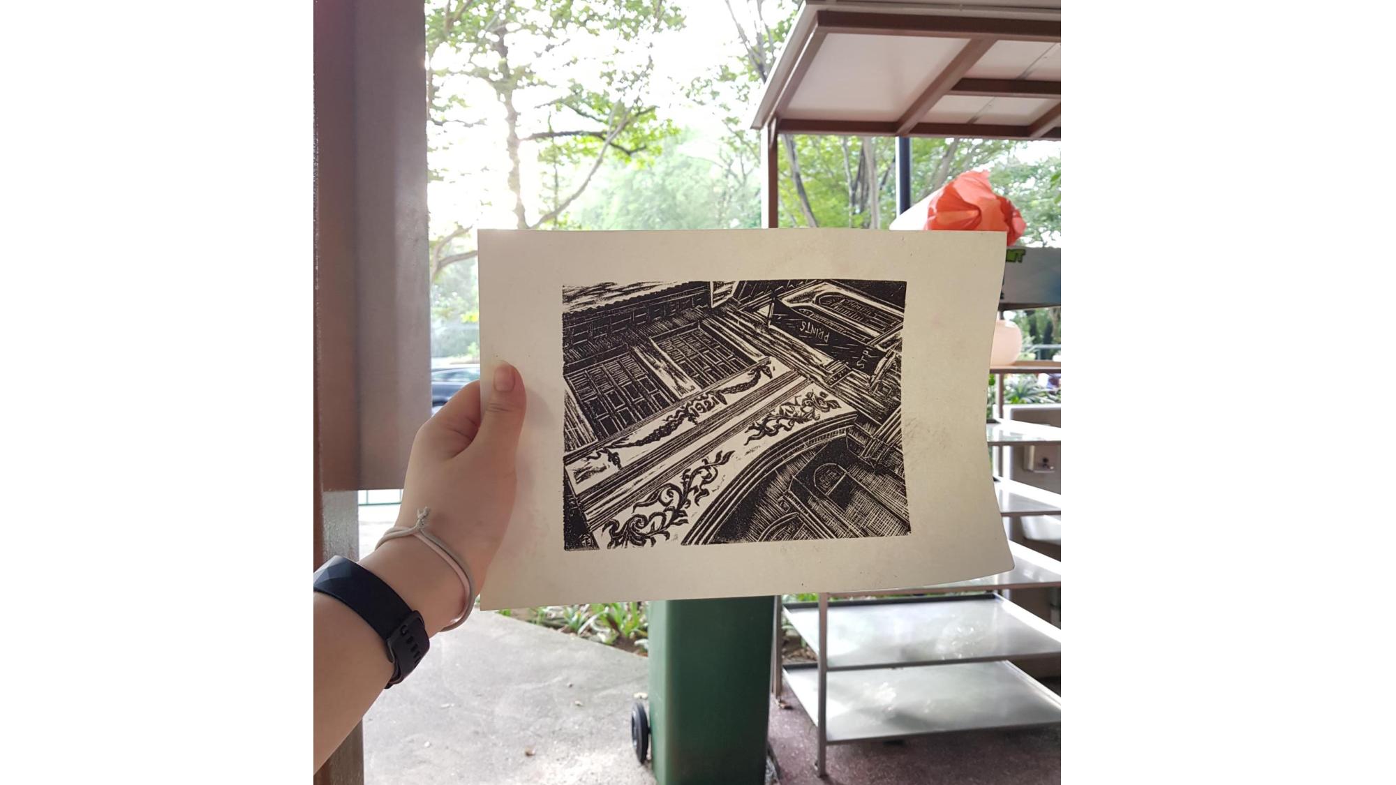
Interior Designer

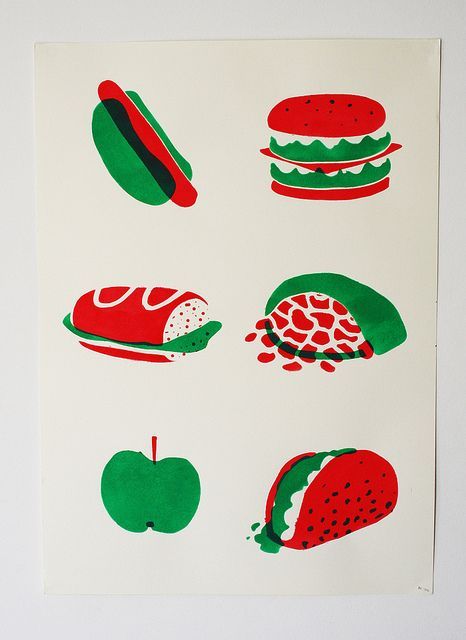
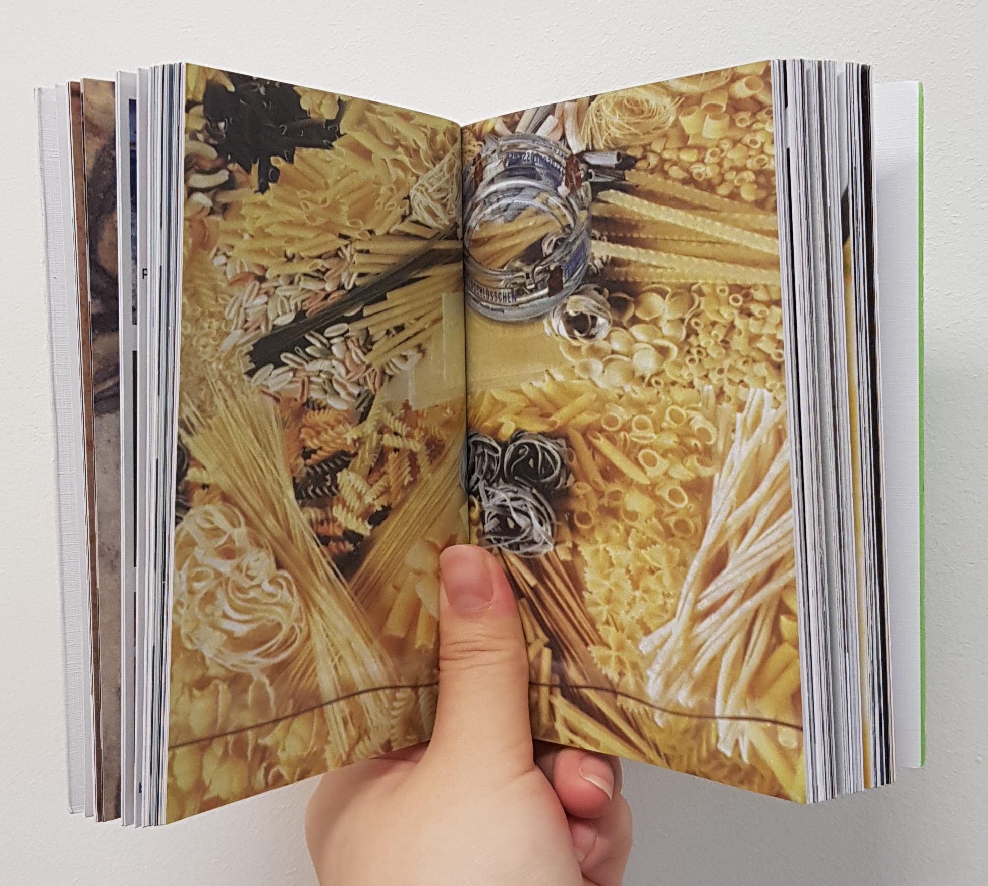
Chef-to-be

At this point I realized that I am consciously placing elements together to form letters, not really like Pareidolia where the words are not subtle but in fact, it was a very direct way of presenting the letters to the audience.
Therefore coming up with my first piece as a florist as I like the more flowery elements as compared to the scientific part of a botanist

Other ideas for font usage and placement of letters


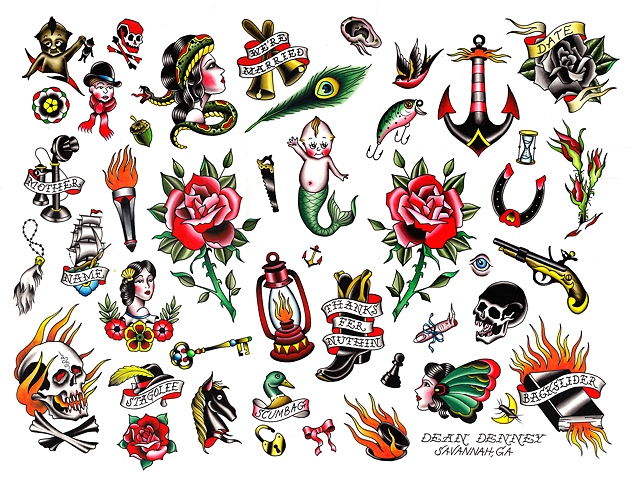
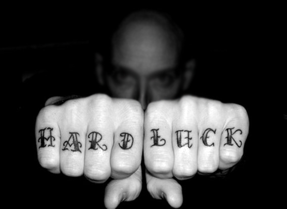
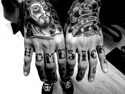
Tattoo Artist
Realising that some typeface has a present context behind it, such as traditional styled tattoos.
(Above images are not mine and belongs to respective owners)
Sketch

Final

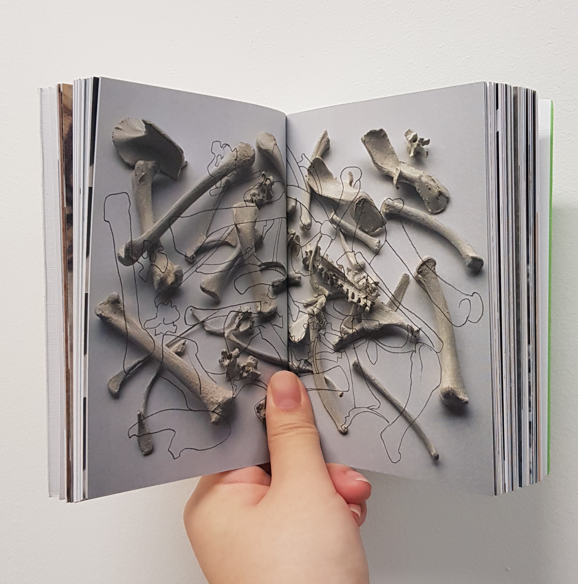
Criminal Investigator
Was interested in creating a narrative with the medium of tracing paper and mixed media and therefore I experimented with creating a bullet hole effect through the tracing paper.


I then resorted to printing the elements on the tracing paper which when combined eventually did not show my name LOKE. Therefore I had to remake a final illustration.


The placement is still a little awkwardly placed.
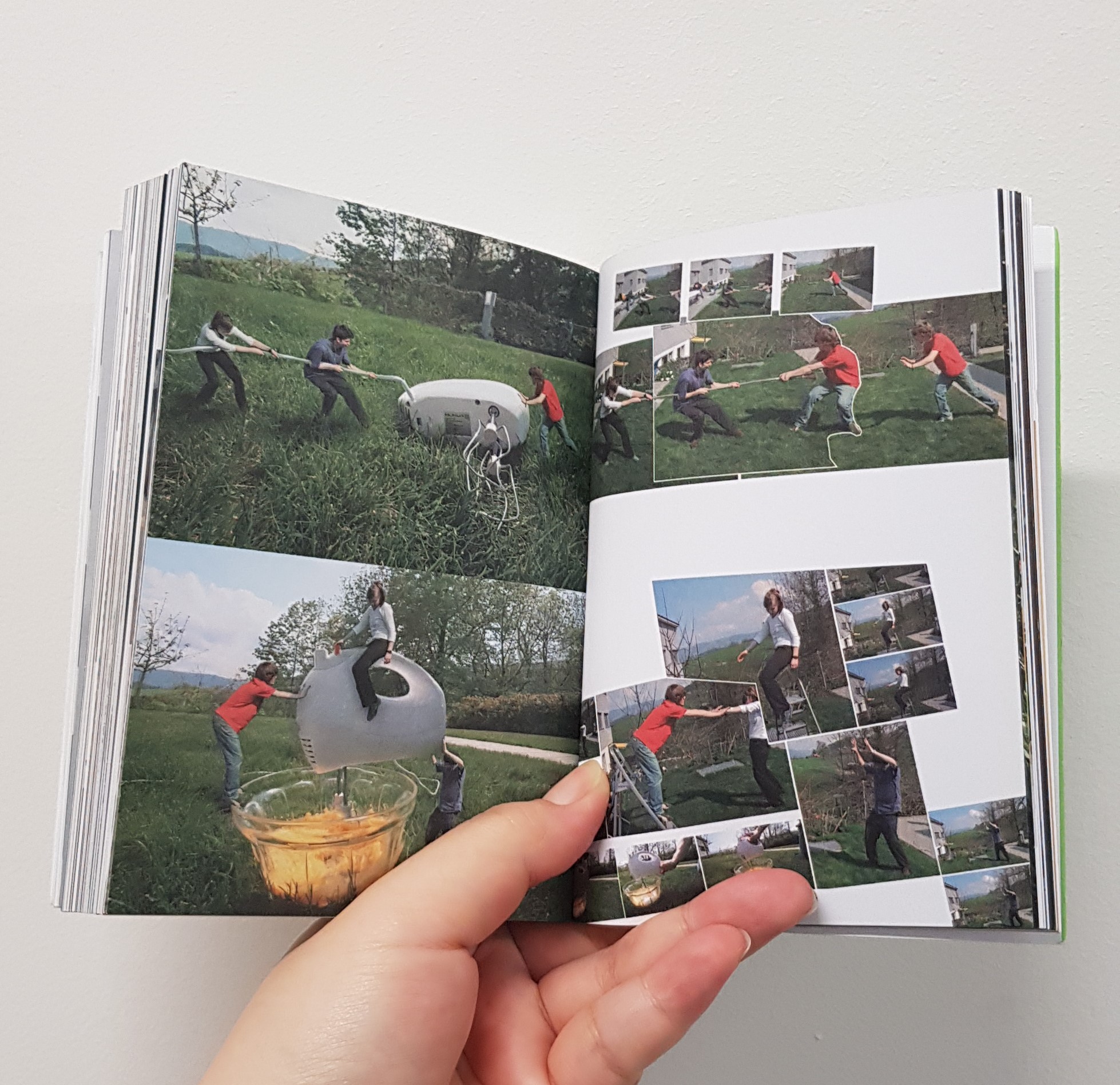
Fashionista
Mainly thinking of how to form the word M,U and N with any fashion goods. These are my sketches.

Inspired by Malika Favre’s minimalistic use of gestalt.
http://malikafavre.com


That, did not turn out too well. Need better use of space and three dimensionality.
Overall. I felt that I focused too much on the concepts and should have executed more of my plans. It was, very challenging.