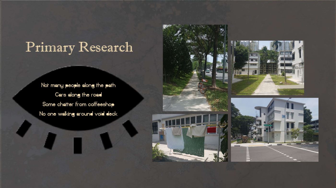
At first glance, Tiong Bahru has a neighborhood like any other in Singapore. At a glance.
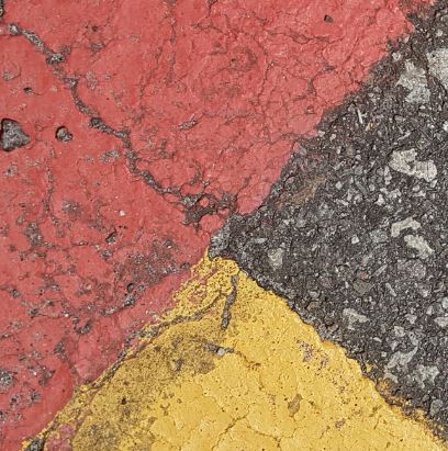
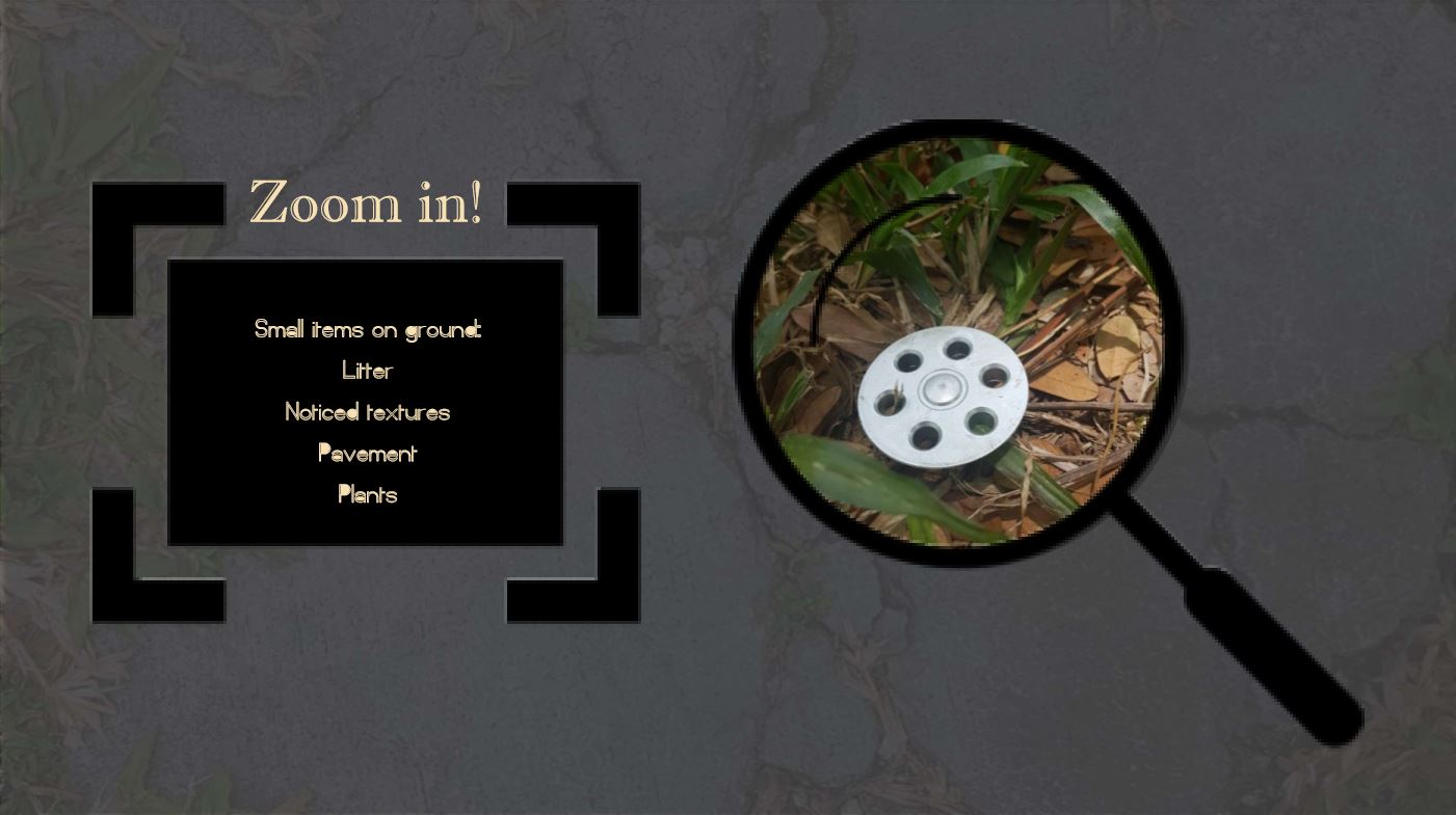
Upon closer inspection of its facade, a whole new assortment of visuals and perspectives open up to you. I found my eyes drawn to every crack in the sidewalks, every vein on leaves, and every scratch on rusted metals.
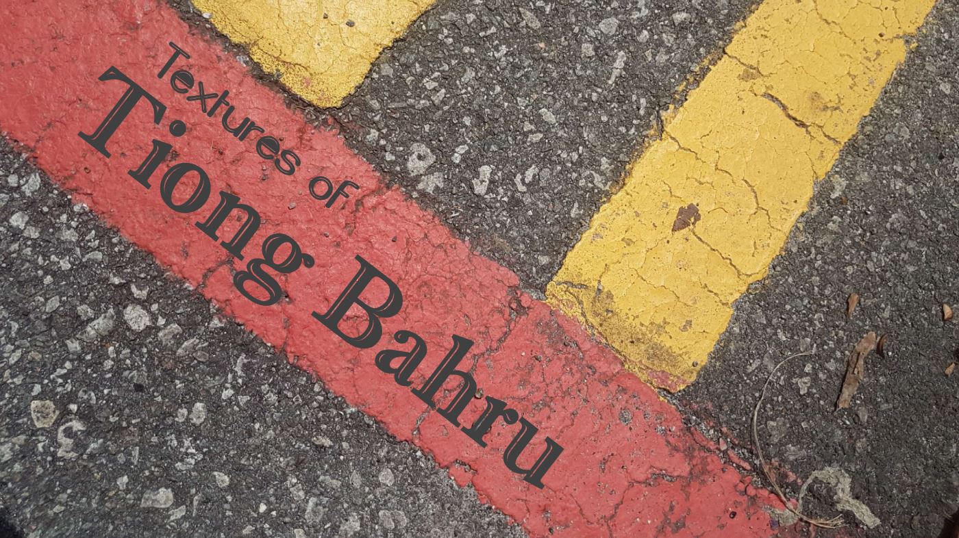
Showcasing these textures is thus the main aim of my zine’s de-zine.
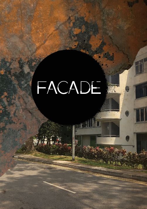
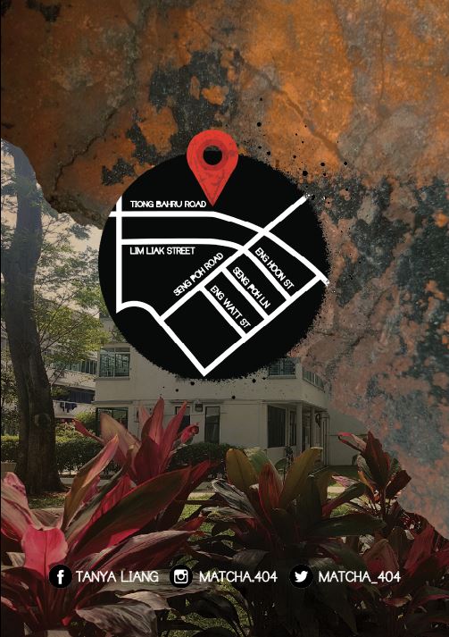
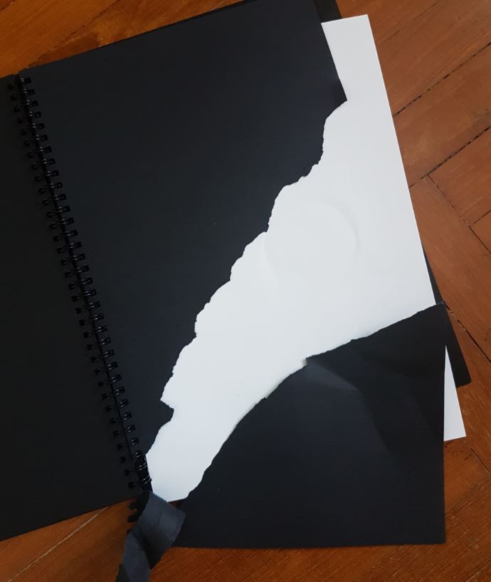
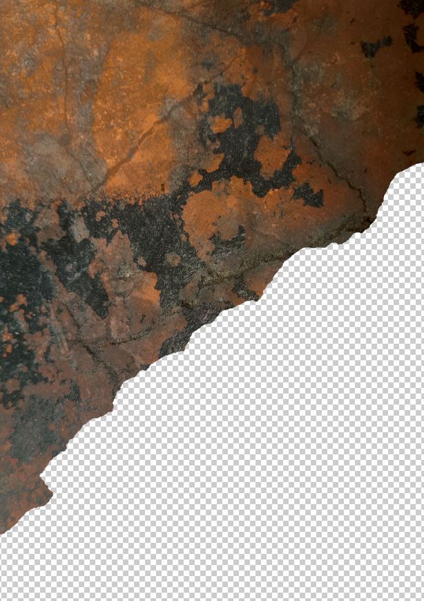
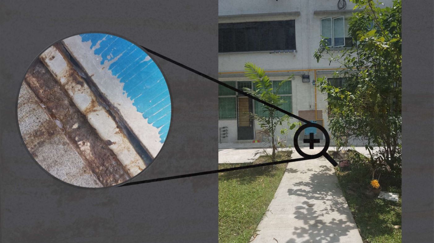
For the cover page, two images were used; a location shot and a close up on a rusted metal plate. To emphasise the theme of textures, I teared paper and photoshopped the texture to fit jagged outline.

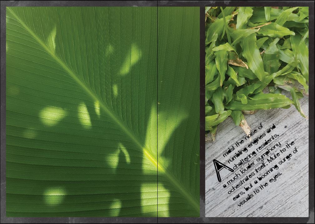
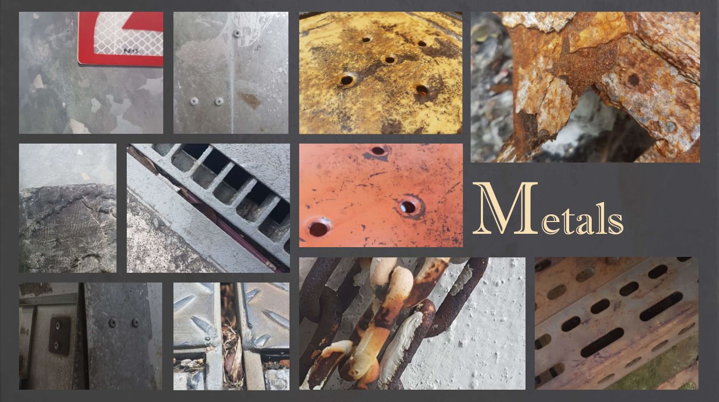
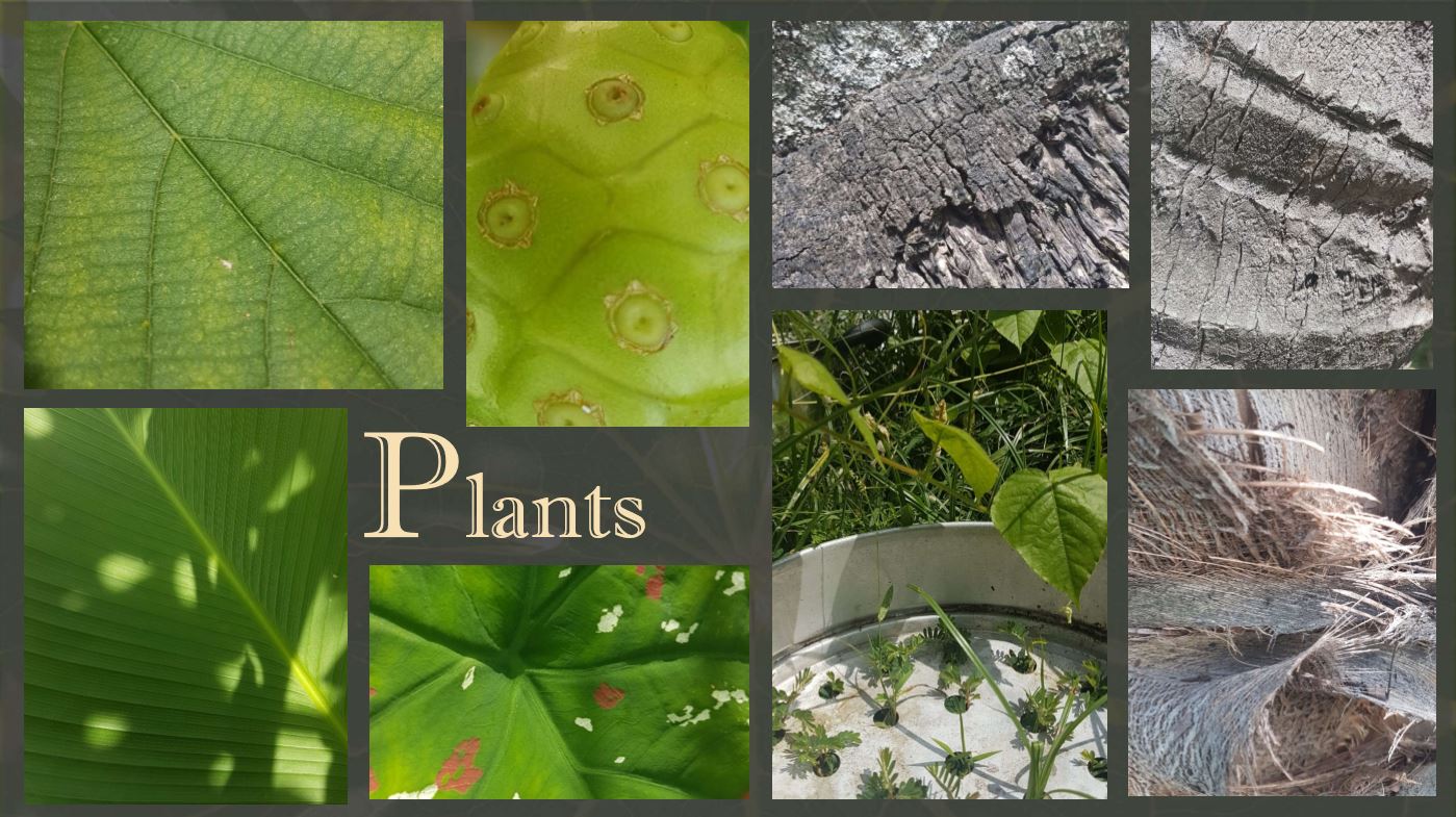
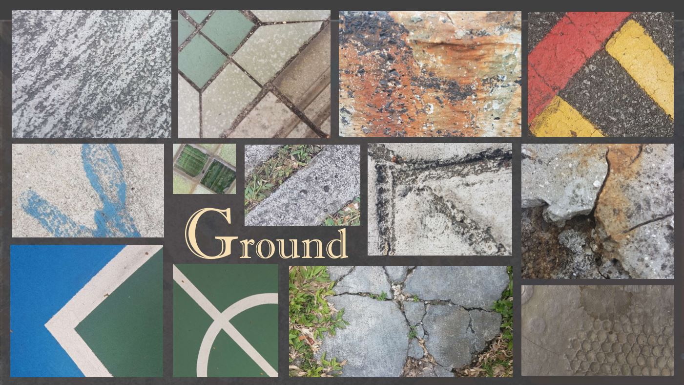
As for pages in between, each spread was used to show textures of different materials; plants, metals, and concrete. Each segment also has a colour theme to give the zine a more vibrant look (green, yellow, and blue respectively). The texture images take up almost the entire page, leaving a thin border around the. A layer of a stained piece of black paper was added beneath them, which helped better frame the images. Asymmetry was applied to emphasise the hierarchy of images. For instance, for the plant textures segment, eyes will first land on the left image, then to the grassy part of the image on the right, and finally down to the text.
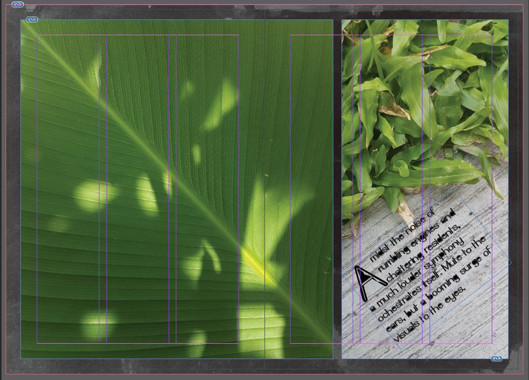
I also tried playing with diagonals while arranging the images. For example, the stem along the leaf cuts across the image from top left to bottom right, and through the gutter in between, links to the next image where the direction of the lines on the pavement reflect that diagonal. Though a reflection, it is also off center, giving that off-balance look.
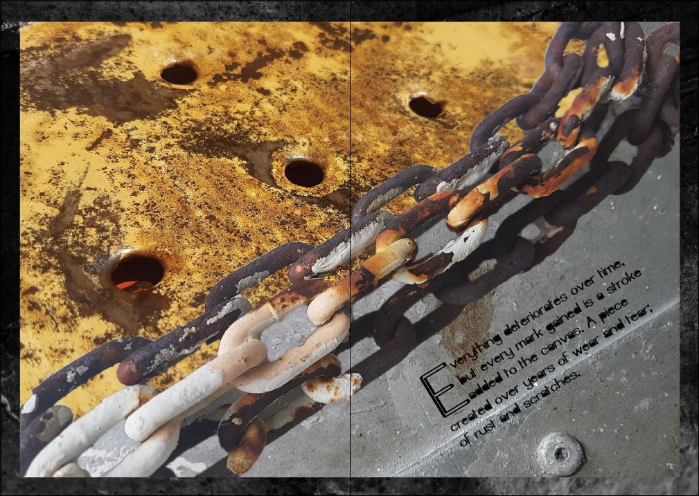
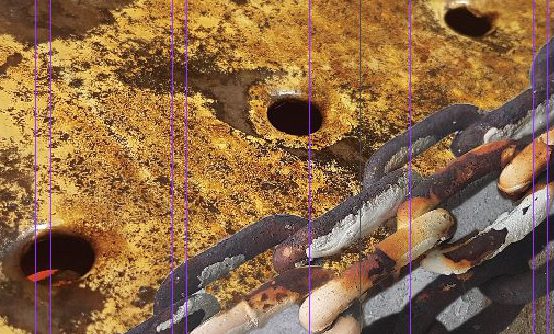
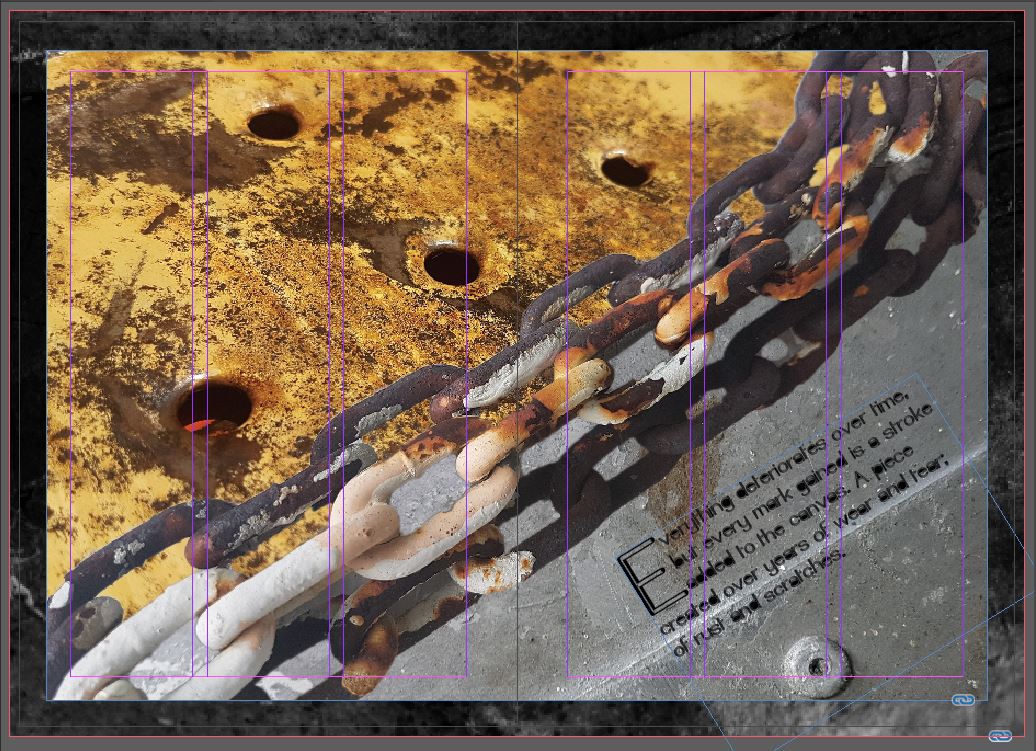
As for the metals spread, I went for a complete diagonal split across the two pages. Instead of just having two images with a crisp line down the center dividing the two, I added an image of rusted chains in between to segment them.
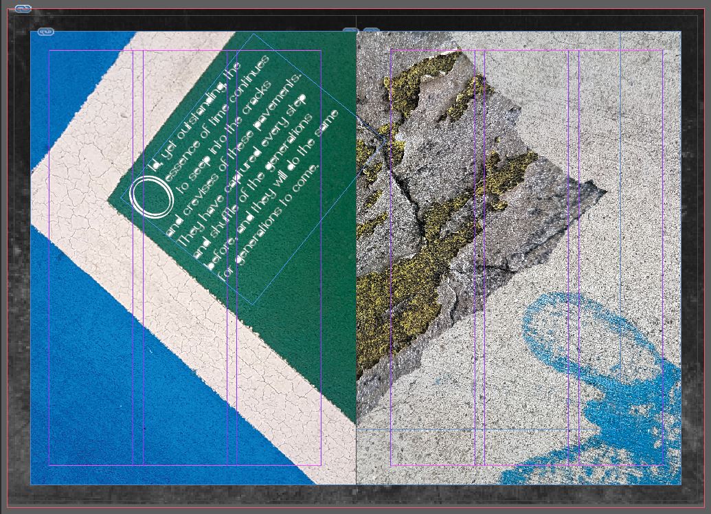
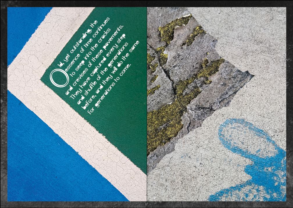
For the concretes, I used a symmetrical layout. The image on the left page is of a tennis court corner, and to reflect it on the other page, I tore another piece of paper to create the shape. I then masked a cracked stone texture to fit within that frame, and for contrast, added a plain pavement texture underneath it, keeping to the segment’s theme.
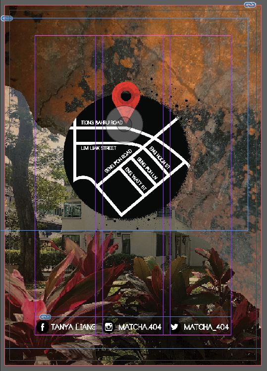
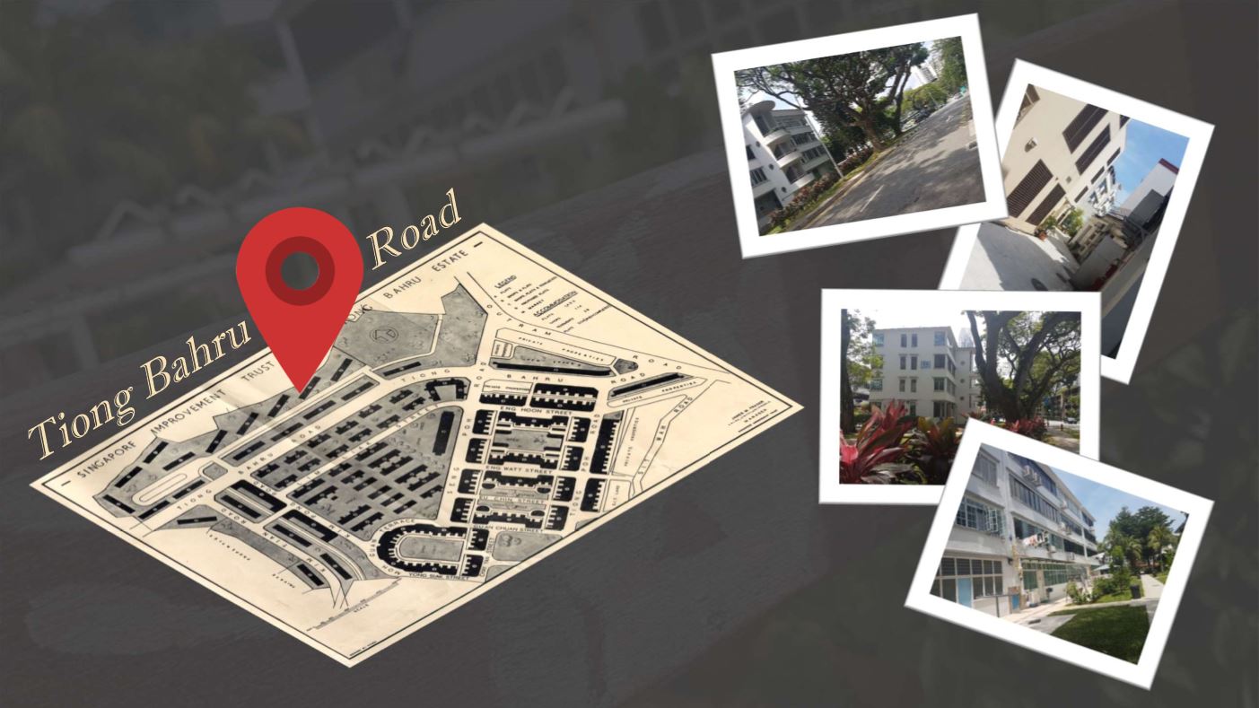
Finally, for the back cover, I used the same layout as the cover, reflecting the metal texture and using a new image showing a different angle of the building. The map of the location is also added, using the same circle background as the title’s. And with the social media handles added at the bottom of the page, the zine is done!
Design references:

Candy Chemist
Firefly Mechanic

Secret Stasher

Tear Stain Remover

Now that we have all the jobs and their essences figured out, time to piece them all together!
1. Candy Chemist
Tanya, testube; both start with the letter ‘t’. What a coincidence, it must be fate.
I started off with a test tube rack as a base for the ‘T’, giving it a wooden texture to mimic the real thing.

Next up is the testube. I couldn’t find one of the right shape and angle that was also available in high resolution, so drawing it out with the pen tool was the next best thing. I added some reflective streaks on a translucent base to make it more glass like.

Now, for the content. To show the candy part of this, I gave the liquid inside the test tube a candy cane look.

It looked alright, but a little flat, so I masked a caramel swirl-ish pattern over it, adjusting the translucency a little so as not to cover the candy cane pattern.

I like how the test tube turned out, especially since you can see through it like actual glass.
![]()
For the ‘M’, I used a beaker as the base, using the same technique I used for the test tube.

I then gave its content a pink base, and then an ice cream texture (yes, ice cream is a kind of candy because it’s sweet and yeessssss).


I also added a tube to the ‘M’ for added candy flare. I used the paintbrush tool to get out the line of the tube. Next, I outlined it to covert it into a shape. Then I use the knife tool to segment the tube before colouring it like an unrolled rainbow lollipop.

And with that, I added shadows, a stone table, like that of a kitchen island, and simple wall texture for the background.

2. Firefly Mechanic
By using the pen tool and creating shapes, adjusting their structure as I went, I used the build of a firefly for the base of my ‘T’,

and where the glowing butt should be, I replaced it with a light bulb.

Just like a firefly’s butt, this light butt (whoops, I meant bulb) should also glow, so I duplicated the shape of the bulb and gaussian-blurred it to give it that effect.

Lastly, I added some gears to its back for a mechanical look.

As for the ‘M’, I gave it a side profile of a firefly as the base, starting off with gears as the mid-point. I also added the back legs and attached them to the gears.

The upper part of the firefly body was then added, the front legs being straight as to resemble the legs of a LED light.

The same steps were applied to the LED to give it a glowing effect.

Finally, for the background, I added a blueprint texture, and to make it look less flat, I created a vignette that better frames the initials.

3. Secret Stasher
For this piece, I wanted to try using traditional media. I used a black piece of paper and gold and silver pens and markers. I chose black paper to bring out the feeling of secrecy; hiding in the dark. The gold and silver are shiny and give that metallic look of locks and keys.
The two initials are mainly made out of keys, locks, and red wax, and the M is positioned on a black safe box that is chained up with black chains (so as to not overpower the other brighter colors).

I also used a white pen to create highlights on the keys, locks, and chains, enhancing the metallic texture of it.

As for the red wax, I used a chinese marker to colour it in, I had to colour the area with the gold marker first, otherwise the red wouldn’t be as vibrant as it should be.

Once all the drawing and colouring was done, I scanned it so that I could give it a texture using Photoshop. I used a collage or articles from magazines as the texture, because magazines have a lot of gossip, but in this case, the gossip is being kept secret and safe.

I also tweaked the colours, saturation, and levels a little to make the final image darker and more vibrant, balancing the exposures of the drawing and texture.

4. Tear Stain Remover
Traditional media was used for this piece too, mainly watercolours. I started off by drawing out the initials and covering the with tape to prevent the watercolours from staining them. I used an xacto knife to cut away the access tape along the edges of each initial for a more precise outline.

Peeling away the tape was quite satisfying 🙂

After that I continued using watercolours to paint the insides of each initials; yellow for the sponge and pink for the squeegee. Both these colours are generally more on the positive side, yellow being positivity and pink being tenderness. I then outlined the initials with a thin marker to define the lines lost under the paint.

For slight effect, I added a little bit of dripping blue watercolours below the area cleared by the squeegee, making sure to cover the cleaned area with tape again.

I scanned this one too, and for its texture, I added a picture of crystalised tears viewed from under a microscope. The image I got was that of tears of grief.


After that, I proceeded to edit the colours and all again.


Ever thought of a weird job that you want which also doesn’t exist?
Me neither, but I now have four of ’em.
For this project, all of us have come up with new and interesting jobs, extract the essence of them, and infuse that with a name or initials that represent us.
So, here are the four jobs I’ve thought of for myself:
1. Candy Chemist

I’m sure there’s a job like this in the real world, but ‘Candy Chemist’ probably isn’t the correct term.
Anywho, by my interpretation, I feel that the essence of a candy chemist would include items like test tubes, beakers, colourful liquids, and of course, morsels of sugary goodness.


For the font, I feel a serif one would reflect the seriousness of a chemist, and I want to try making it look semi-realistic through the use of textures and masking.


2. Firefly Mechanic

I’ve never seen a firefly in real life, so this job would be the perfect opportunity to shed some light on how their glowing butts work.
To show the mechanic side of this job, I picked out, circuits, blueprints, and gears as the main key elements.


As for the firefly part, all I could think of was their glowing butts, so, light bulbs and LEDs.


For the texts, I want to try going for a 2D vector style (simplistic and flat like a blueprint), and add layers for the various ‘components’ of a firefly.

3. Secret Stasher

When told a secret, I manage pretty well in not divulging it to the world. I keep them all to myself in a little safe, locked up nicely for added security.
This secured stash of secrets can be boiled down to items such as safe boxes, locks, keys, chains, and wax seals.


For the font, elements such as the keys and locks will be merged together to form the letters (not just arranging them as they are, but distorting them a little to fir the shape of the letter).

4. Tear Stain Remover

As much as possible, when a friend of mine is down and need some comfort, I’ll be their listening ear and try to cheer them up. They may have cried, but I’ll fight water with water and wash away those tears.
Obviously, cleaning is a big part of this job, so a few of the essential items would be sponges, squeegees, bubbles, and water.


My first instinct was to do this piece using watercolours, and the fonts will be in a cartoon-ish style.


