Project 1: Picture Story – Curating Self

Task 1 – Object and representation of self

I bought my first camera using my own savings as a motivation and push to develop my photography skills further. Over the years I have slowly developed my photography skills by collaborating with various people in the photography industry as well as being able to work with different models and strangers that wouldn’t mind me taking photos of them. It has become a platform for me to socialise and open myself up to others, and when I work with others, not only do I learn and get to know them, I also get to know myself, my own limits and discoveries.

The camera grows with me, like how I always try to improve myself as a person, I also try to improve my photography skills. It has changed how I see things, like how my eyes will seem to frame objects and environments even when I do not have the camera with me. It has become something that I have been known for lately – a photographer – and it has become part of my identity.

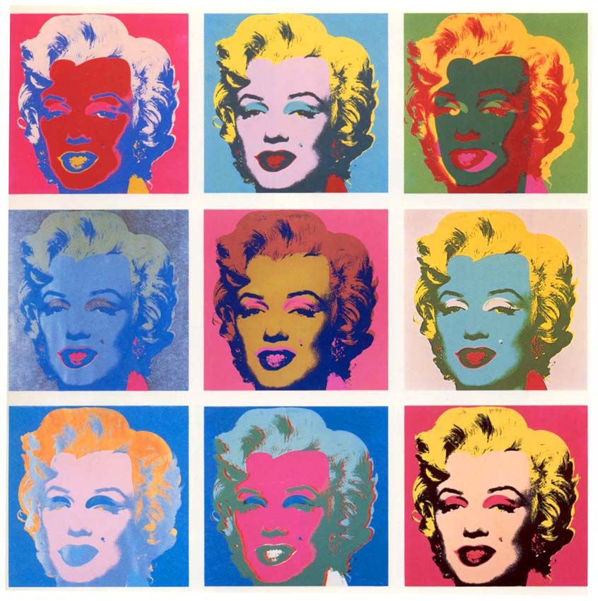
I tried to achieve the style similar to Nan Goldin for this task by trying to include shadows and strong lighting in the photograph.
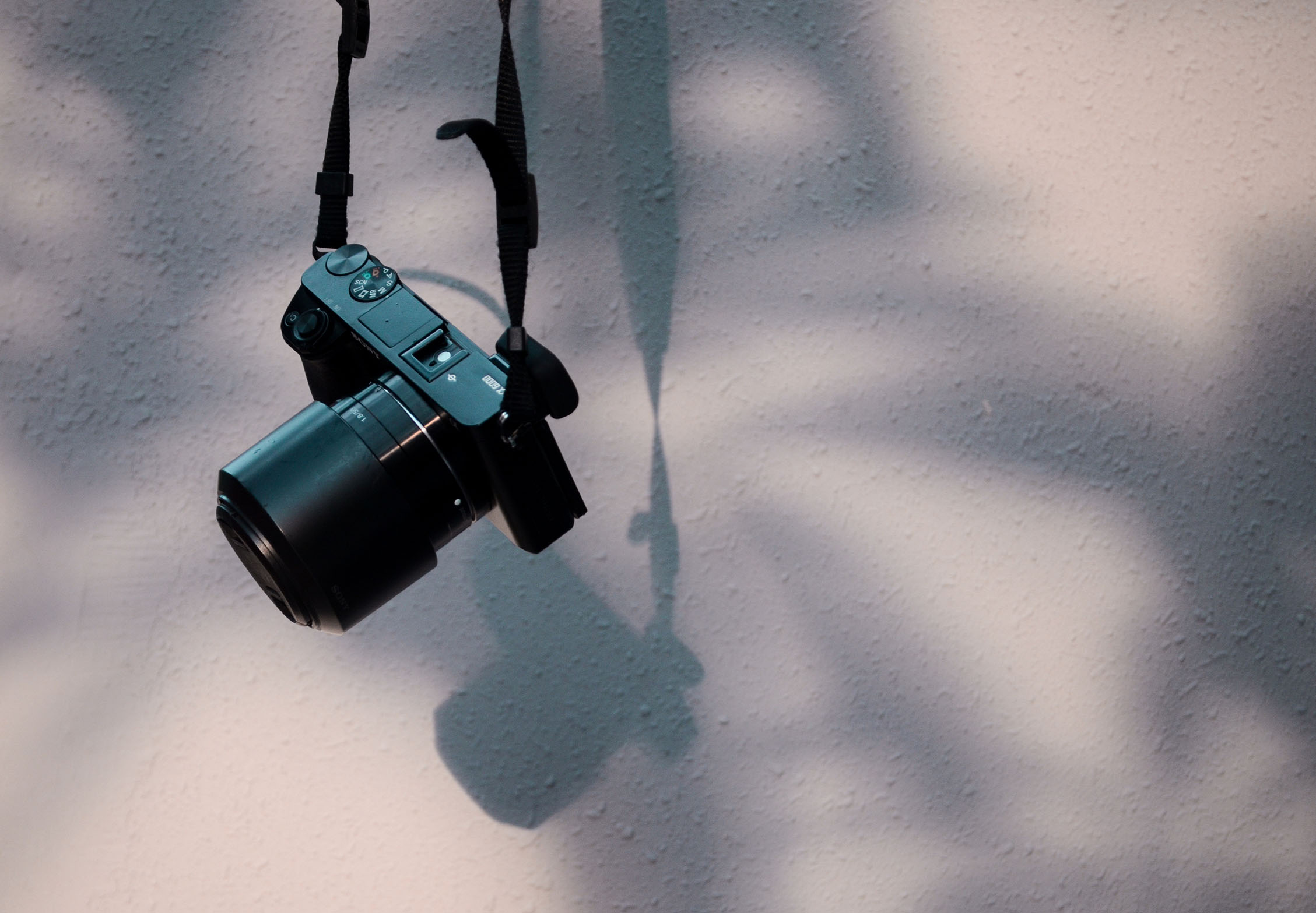
Fig 1.1

Figure 1.1 shows the camera against a neutral wall that has shadows of plants on it. It represents how I started my photography journey by taking pictures of plants, and nature and the environment.

Fig 1.2

In Figure 1.2, the use of light acts like a spotlight. The photographer is now in frame, in focus.
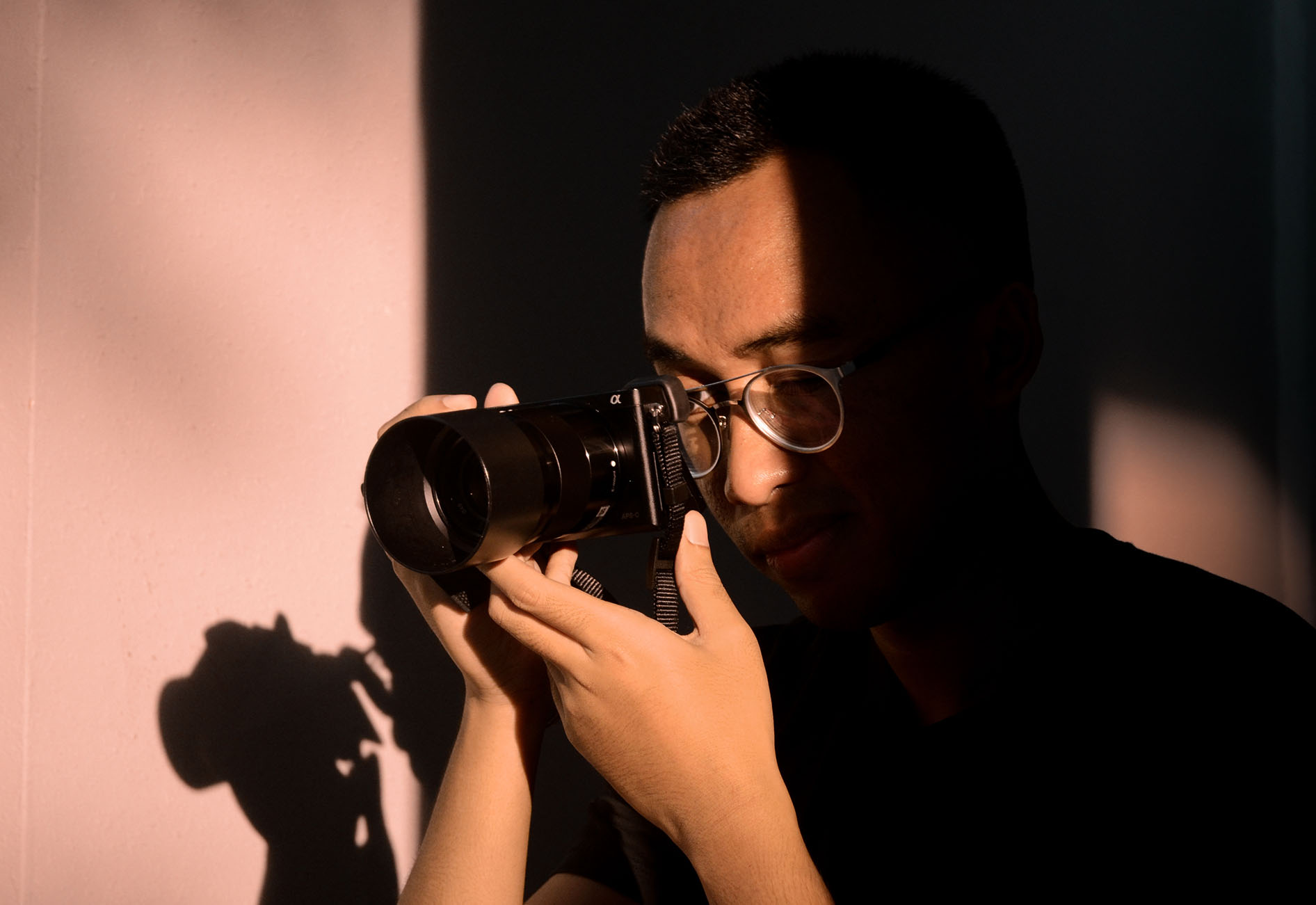
Fig 1.3

In Figure 1.3, i try to make it look like I’m an emerging photographer with the play of shadow across my face. The shadow of the camera in the background also symbolises the different cameras that i have worked with to make the photographer I am now.

Task 2 – My World

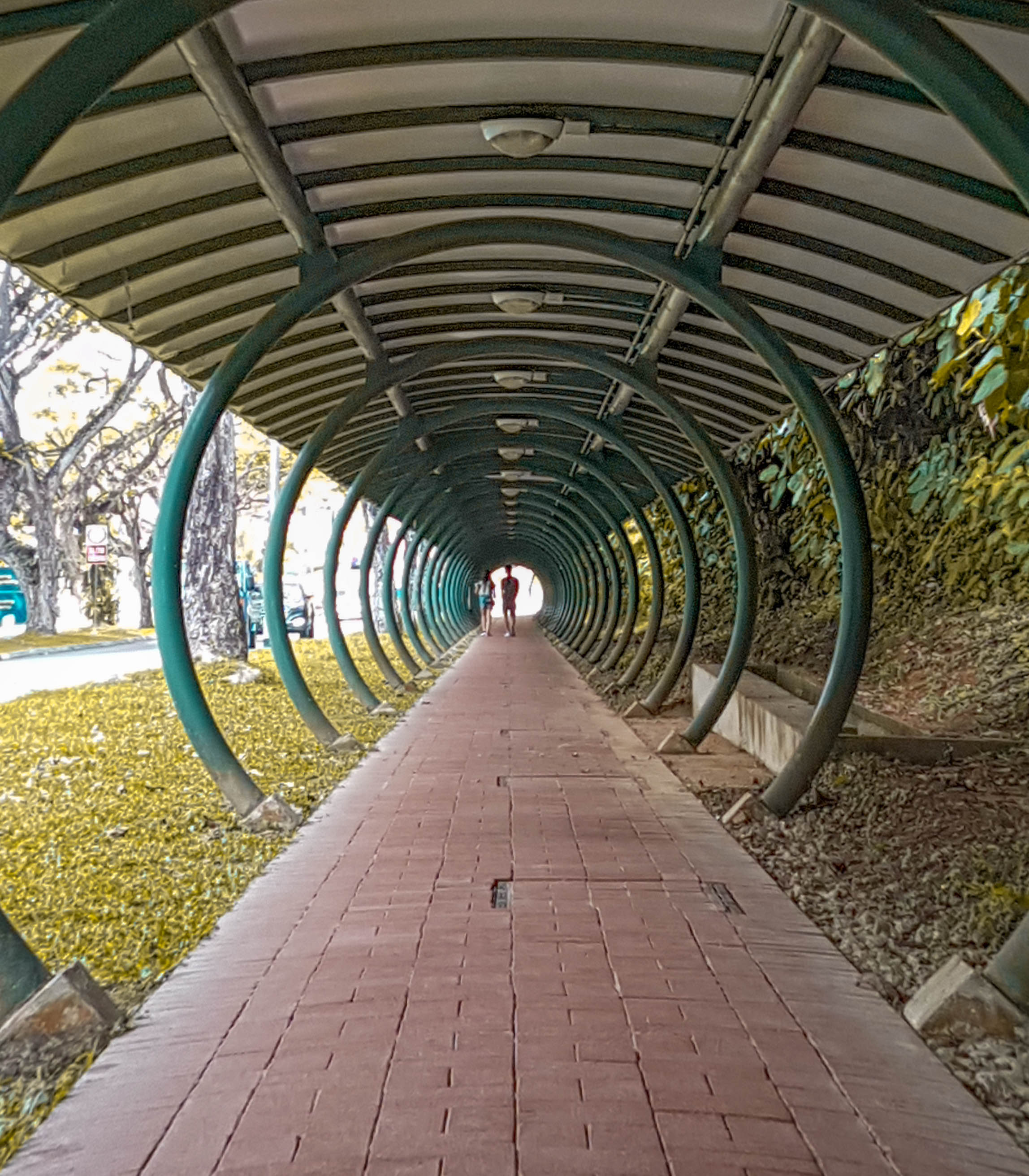
The location that I have picked is my polytechnic – Temasek Polytechnic, specifically the School of Design there. I chose it as a location as I feel like that is the place where i truly feel like i found myself and where i kickstarted my design journey.

Before I joined the school, I did not know what graphic design was or what the design industry was all about. All I know was that I needed to go towards an artistic direction in life because that was the one of the subjects that I was performing well in. Most of the people around me had no similar interests as me and i felt like i was alone in trying to pursuit something that i would love to do. No path ahead was clear to me at that time.

So I got to know about Temasek Polytechnic School of Design from my older sister, who was then doing Interior Design in that school. She felt like that was a good place to take my next step in education and Temasek Polytechnic has a well-known Design School. So after much contemplation, I decided to go for it, and jump into the industry.

That was a decision in life that I could not forget. When I was in school, I felt like I was among people that I could relate to. I wasn’t the outsider anymore, but rather part of a big family with the same mindset and thinking. Finally somewhere that I could fit in, somewhere I could be myself.
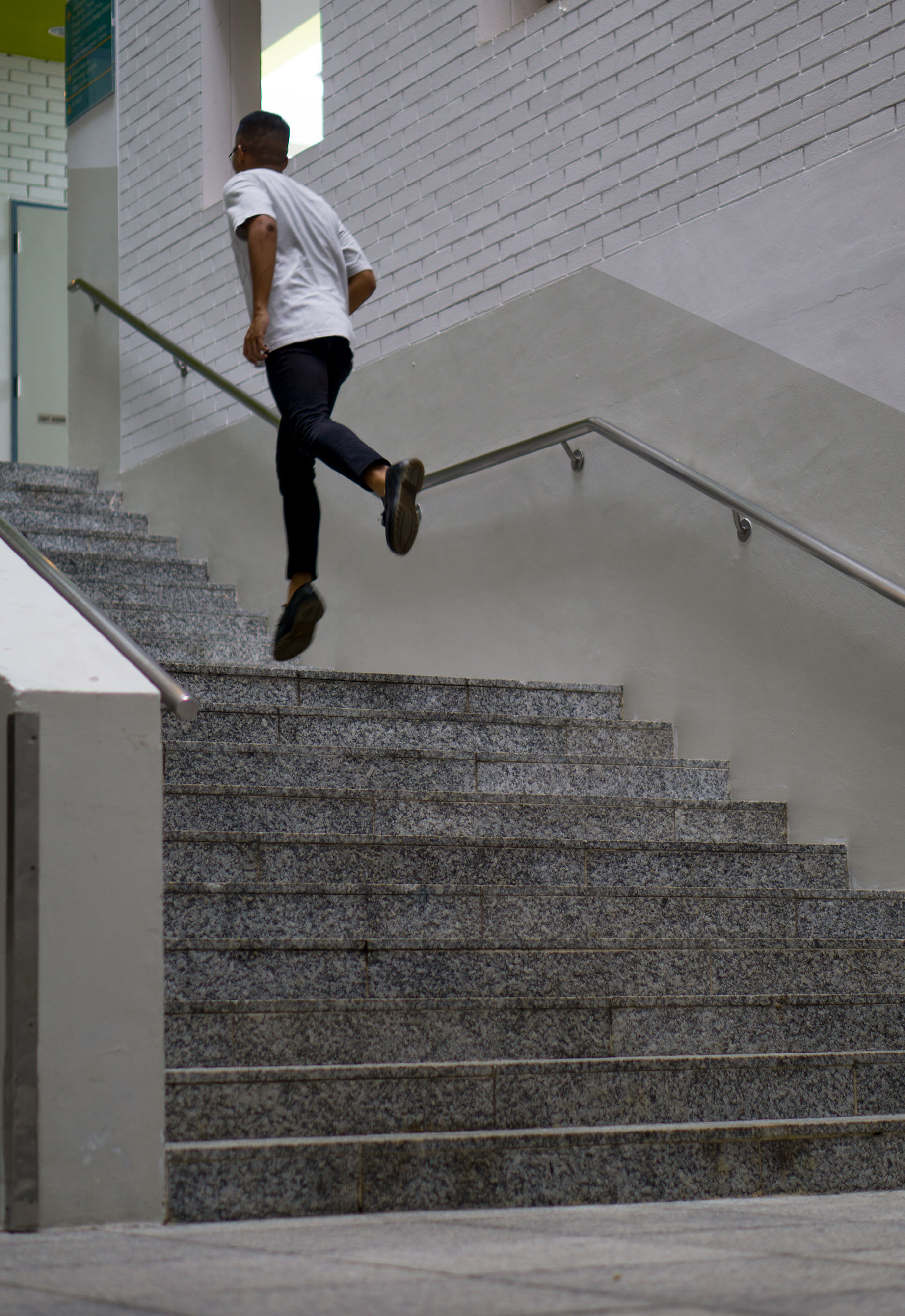
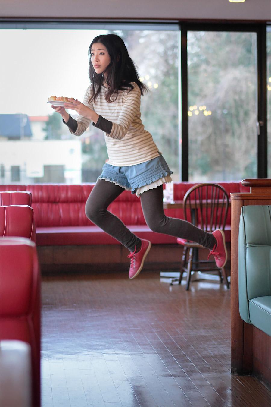
Fig 2.1

Figure 2.1 shows a common area in the school where designers go up the stairs to go to class. I’m shown leaping or jumping in the photo in this series, similar to Natsumi Hayashiara, as it symbolises me taking a leap into the design world. It also shows motion and movement symbolising the constant fast-paced lifestyle of the design industry, rushing to places for deadlines and submissions.
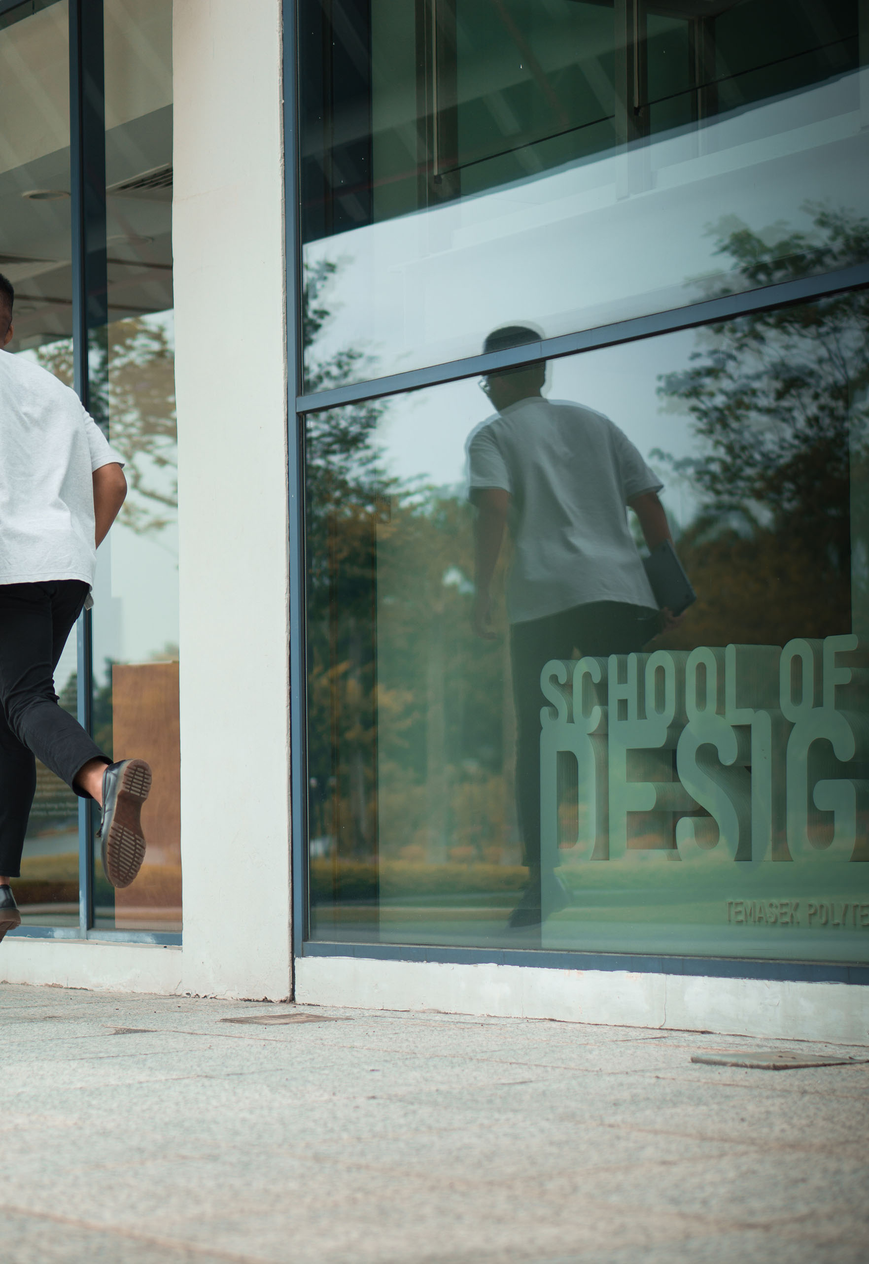
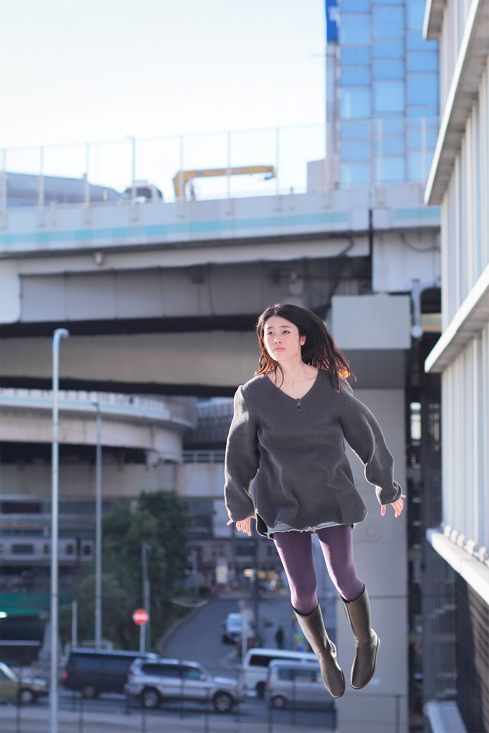
Fig 2.2

Figure 2.2 is a shot outside of the school and also shows me leaving the frame of the photograph. It symbolises me leaving the school. A reflection of me can also be seen in the glass window symbolising the school being my past, and my thoughts and memories are still with the school.
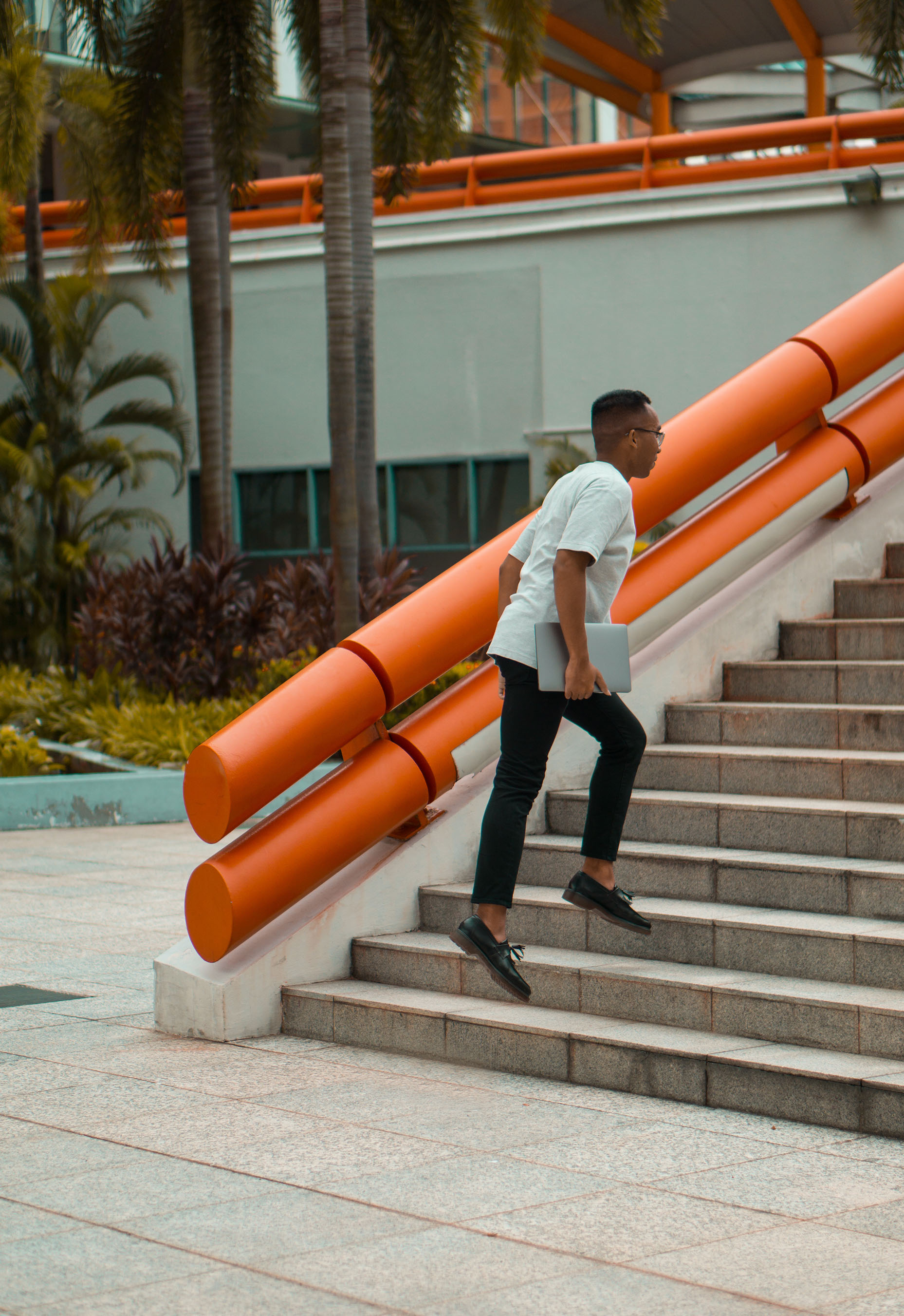
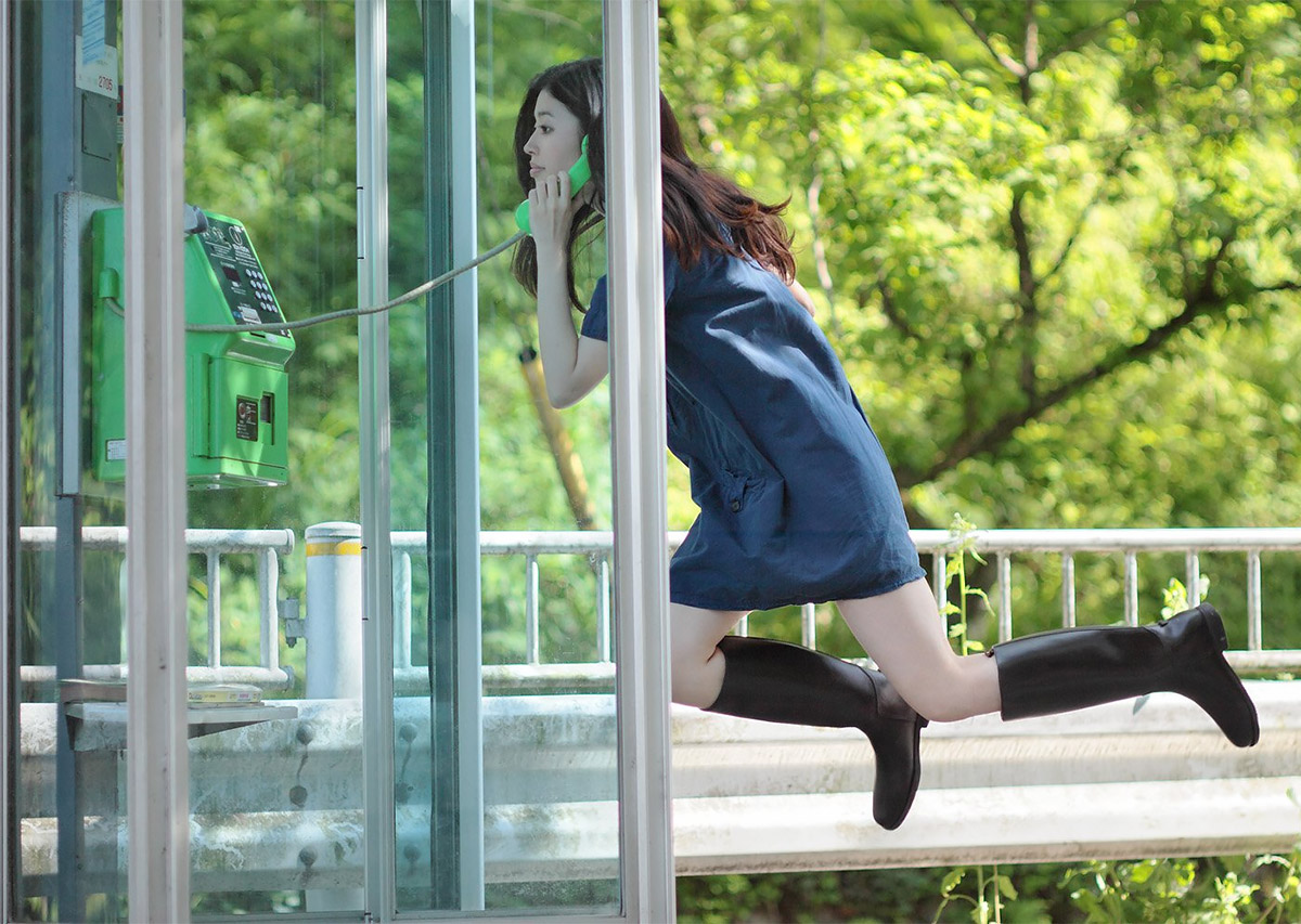
Fig 2.3

The vibrant colours in Figure 2.3 shows that a designer creates a colourful and interesting world. The upwards staircase motion shows my upwards journey to be a better designer.

The most challenging part of this assignment is the definitely the fact that I cannot fully be behind the camera the entire time. Taking pictures of myself is already a challenge by itself. I am unable to know how the frame will look like when the shot is being taken since I have to be the one in frame. Hence, I feel like this assignment is a real challenge and i wasn’t able to showcase my full photography ability.

Project 1: Research & Process

The first object that comes to mind when choosing for the assignment is my camera as it is my hobby and something I have picked up recently. It is something that I would go to if i needed some thing to do to get away from work or to fill in my free time.

For location, instantly the first thing that came to mind when thinking of a place that is significant to me is my polytechnic – Temasek Polytechnic. Just like the camera, my polytechnic is a place that I will forever remember and will always go back to, even years after graduation. It has become a second home for 3 years, and will always be.

It would be great to feature the item and the location that both helped to create and sculpt the person I am today.

Inspirations

I never knew Nan Goldin until I saw her name in her brief. When I first saw her images, I would think that the photos looks a little over exposed, and like someone used the flash too directly at the subject. But when I looked at it again, it actually makes the photo look interesting and artistic. The flash actually creates a focus on the subject, creates shadows on the others elements in the background.

I have always inspired to create similar works to Natsumi Hayashiara. I first got to know her from a colleague during my National Service, who was inspired by her as well. I really think her photos are really interesting in a way that she tries to fit the concept of her floating in photos into her daily lifestyle. It creates a boring mundane chore look really amazing and unique, making you think and look twice at her photos.

3D Object, 2D Analysis

The 3D object that i have chosen for my 2D analysis is my USB-C Hub Adapter that i got for my Macbook Pro.

Why did I get this object?

I got this object over other adapters because it is uniquely designed and has a modern look that other adapter don’t seem to have. It is compact and does not have any wires sticking out so its easy to carry around and looks neat.

Shape

The design of this adapter complements the object that it was created for which is the Macbook Pro. It has a similar design with the laptop, rounded rectangle if viewed from the top, and rectangular if viewed from the sides.

The adapter if viewed from the top surface is a rounded rectangle

If viewed from the side, the adapter is a rectangle.

Colour

The colours are also the same with the Macbook Pro, which is space grey, hence when it is attached to the macbook Pro, it does not stand out or look odd, but instead it blends in seamlessly with the device and looks like it is part of it.

The adapter next to the Macbook Pro

Symmetry

Without the protruding parts, the adapter is symmetrical vertically and horizontally if viewed from different angles. However, when including the protruding parts, the object becomes asymmetrical instead and is only symmetrical from the sides (ignoring the concaving ports and just looking at the shape of the object)

Line shows possible the axes that would form the symmetry

Proportions

If comparing the ratio of the size of the protruding parts and the body of the adapter, its is 1: 56. Meaning to say the protruding part would be an XS, while the main body of the adapter could possibly be an L.

The boxes showing how many times bigger the adapter’s body is as compared to the protruding part

Voids

At first glance, it may look like the protruding parts of the adapter is awkwardly positioned. If you divide it into half, the protruding parts would seem like they are in the middle of the first half. However, if you further divide it into four sections, it goes back to looking awkwardly positioned in the first and second quarter sections. BUT, if you divide it even further into eight sections, it would seem that the protruding parts is placed nicely in the second and third eighth sections.

The blue line marks the point where it is divided into two.
The red lines shows where it is divided into four.
The yellow lines shows where it would divide into eight.

Making a Mark – Research

What is mark-making?

A simple Google search led me to a simple definition on ThoughtCo.com:

“Mark making is a term used to describe the different lines, patterns, and textures we create ​in a piece of art. It applies to any art material on any surface, not only paint on canvas or pencil on paper. A dot made with a pencil, a line created with a pen, a swirl painted with a brush, these are all types of mark making”.

From my own understanding, mark making is creating visuals using any form of medium. Artists also use different techniques of mark making as a way to express their thoughts and emotions into their artwork, giving their artwork more depth and meaning.

Mark-making techniques

Monoprint

In the dictionary says that monoprint is a single print taken from a design created in oil paint or printing ink on glass or metal.

Basically, a monoprint is a single impression of an image made from a reprintable block that has textures or design etched or created on it. There are many different methods of monoprinting.

Below is a video of a simple technique of monoprinting, where the art is “transferred” over to the paper after the art work is created on a surface.

Here is a similar method, but now uses reductive monoprint, where certain shapes or patterns are laid on the surface and when paint is applied, it covers the other areas but not where the shapes or patterns are, creating a negative space and capturing the shape in the process.

There are many other methods of monoprinting, but generally the idea of “capturing” a shape, texture or design of an object, and transferring it onto a paper or surface is similar.

A famous monoprint artwork would be Andy Warhol’s monoprint of Marilyn Monroe:

https://i.pinimg.com/originals/a5/3d/5a/a53d5a9cc7a419a6ef8b4f47881a1137.jpg

In my opinion, monoprinting is a doable method of mark-making, but it requires quite some creativity to know what sort textures and tools used and the positioning of those objects that is suitable for the artwork.

Fumage/smoke painting

Fumage is a technique in which impressions are made by the smoke of a candle or kerosene lamp on a piece of paper or canvas.

Some artists would leave the artwork as it is after painting it with the smoke/fire. However there are other artists that would use various tools to create textures or bring out the shapes of the designs in the artwork.

I would say this method of mark-making would require ALOT of practice and very much coordination of both hands and the mind, but if this technique is mastered it would create really beautiful and unique artworks.

A well-known artist that uses fumage would be Steven Spazuk. Some examples if his works are shown below:

http://madeinshoreditch.co.uk/2016/02/17/fumage-steven-spazuk/

http://madeinshoreditch.co.uk/2016/02/17/fumage-steven-spazuk/

Frottage

Frottage is the technique or process of taking a rubbing from an uneven surface to form the basis of a work of art. Basically, in rubbing a medium on paper that is layered above a textured object, in captures the texture and shape on the paper.

An example of frottage would be a work by Max Ernst, which he layered papers on wooden floors and rubbed the paper with soft pencils.

http://www.tate.org.uk/art/art-terms/f/frottage

Making a Mark (Prelude)

Took quite some time to think of an item for mark making, but i decided to use ramen/instant noodles. I think that it would create an interesting pattern, and different outcomes if used when it is still hard, and when it has already been softened.