What is Ikebana?
A quick search leads me to a site with the definition:
“Ikebana is the Japanese art of flower arrangement. It is more than simply putting flowers in a container. It is a disciplined art form in which the arrangement is a living thing where nature and humanity are brought together. It is steeped in the philosophy of developing a closeness with nature”
The name comes from the Japanese ike, meaning ‘alive’ or ‘arrange’ and bana meaning ‘flower.’ However, Ikebana is seen as more than just decorative, it is a spiritual process that helps one develop a closeness with nature and merge the indoors and outdoors.
Ikebana is an art form associated with meditation. Alot of ikebana artists create the arrangement in silence.
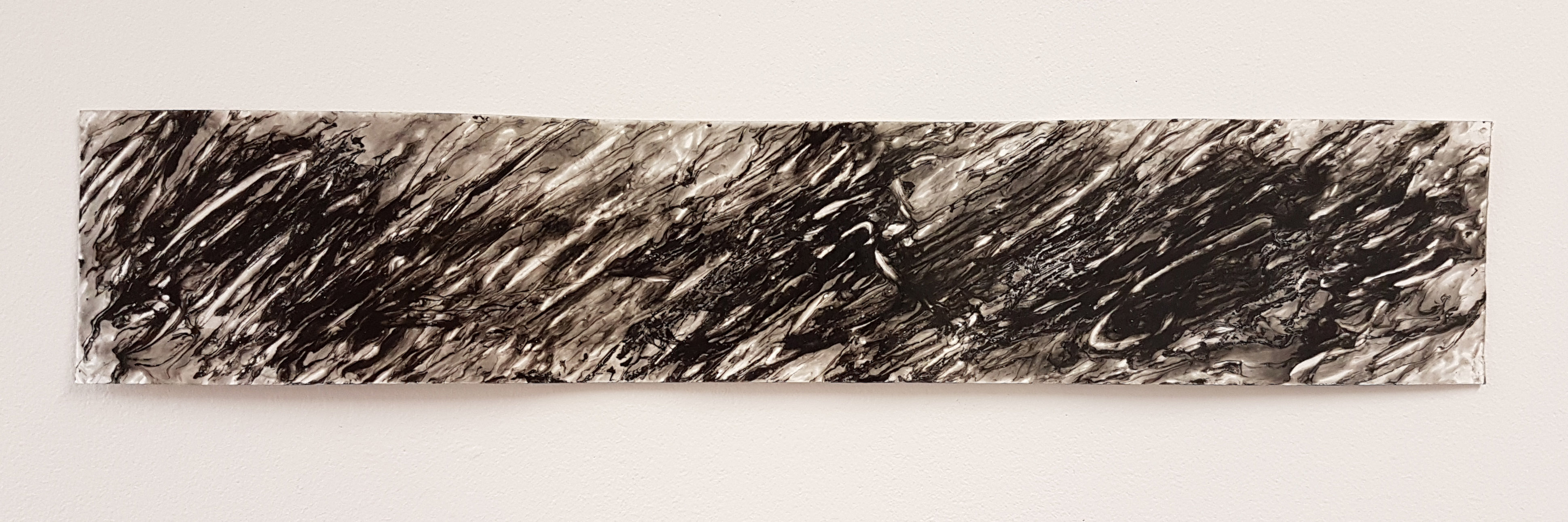
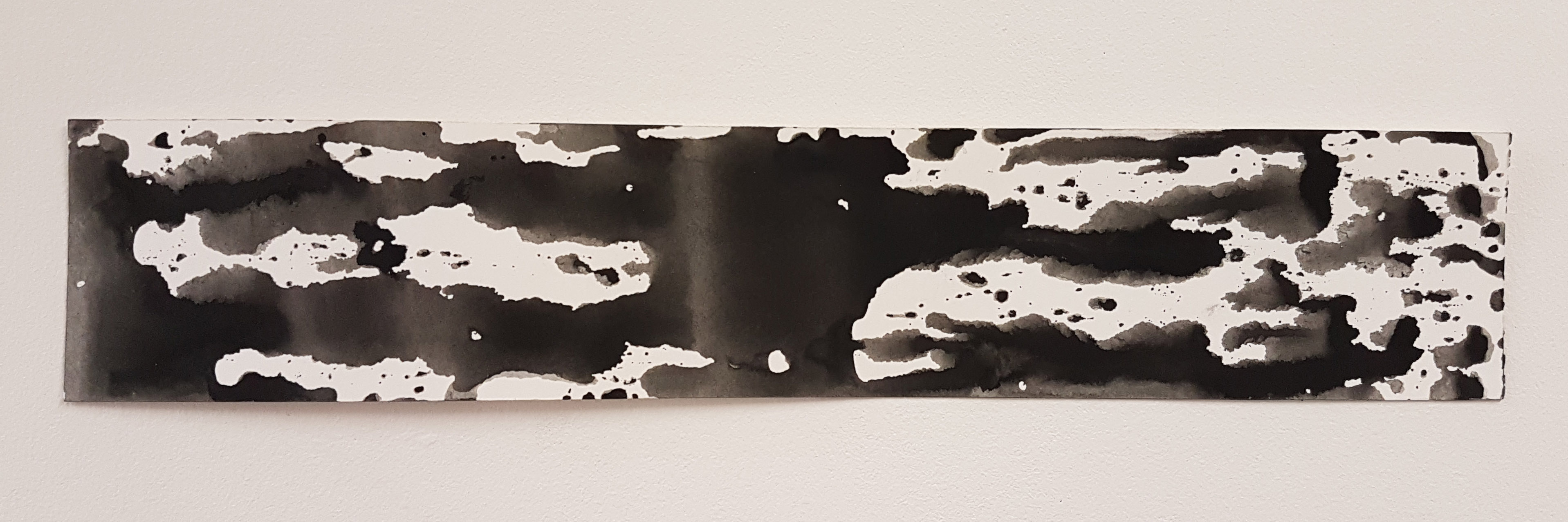
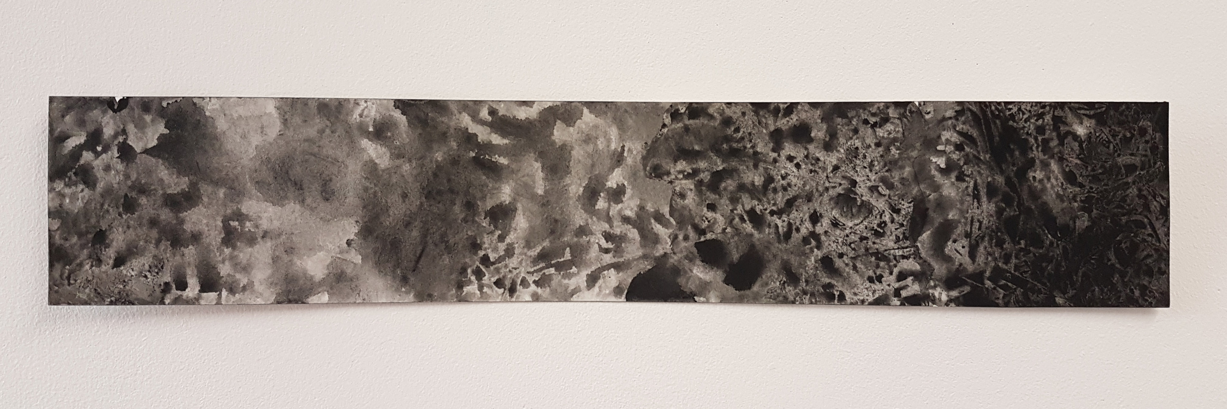
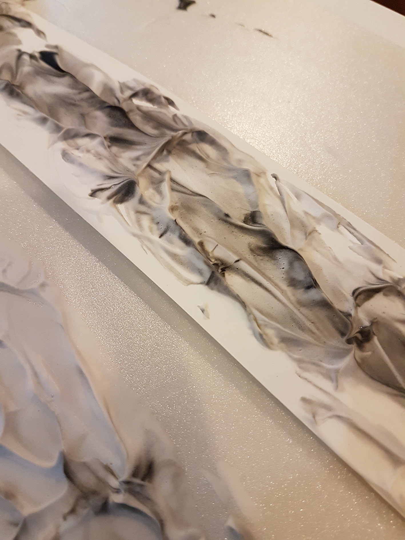
There’s lots of play with nature – various forms of flowers, branches and leaves. Even different forms of wood, rocks, and vases are used in forming beautiful arrangements:
https://www.veniceclayartists.com/ikebana-nirvana-japan-floral-arts/
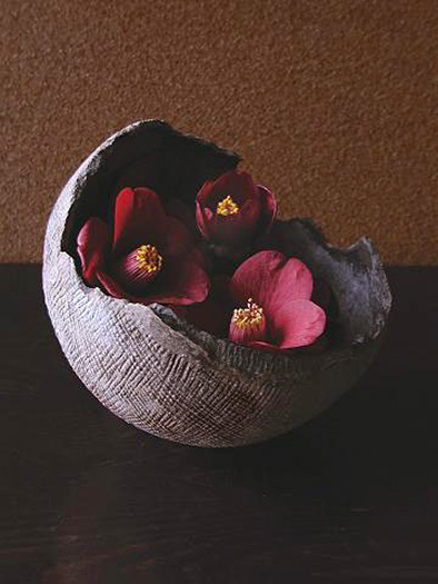
https://www.veniceclayartists.com/ikebana-nirvana-japan-floral-arts/
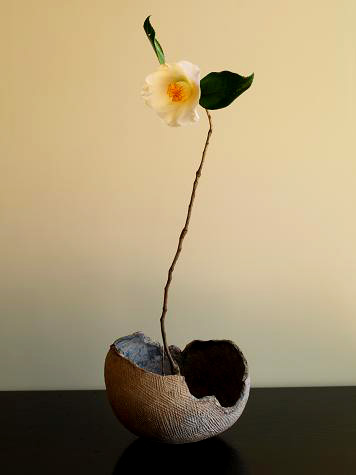
https://www.veniceclayartists.com/ikebana-nirvana-japan-floral-arts/
Science of Taste
There are different types of tastes:
- Bitter
- Salty
- Sweet
- Sour
- Savoury
And then there’s science behind taste, based on our senses. Example the crushing sound of grinding coffee beans, to the smell of the coffee powder, to the taste of the coffee itself.
Our expectations of what something tastes like is from what we see. Some examples:

Something red would tell us that it is sweet
Something green and it could be sour.
Black is going to be bitter.
It is also found that something would taste sweeter if it’s placed on a round plate, as compared to if it placed on an angular plate.
Here’s a video I found describing the science behind taste.
How the Brain Constructs Flavour
75%-95% of what we really taste is from our sense of smell. There are different ways in how the brain identifies the taste of an object.
- Anticipation – A flavour experience may begin with a past meal. The memory leads us to crave the flavours to come.
- Sensory Overture – The brain begins to break down the flavours as it approaches the mouth by its colours, shapes and the smell.
- Sounds – When we chew the food, is the food chewy or crunchy, and further gives the flavour of bitter, sweet, sour, etc.
- Merge to create flavour – All the previous steps combine and form flavour. The brain then remembers the flavour and prepares it for the next experience.
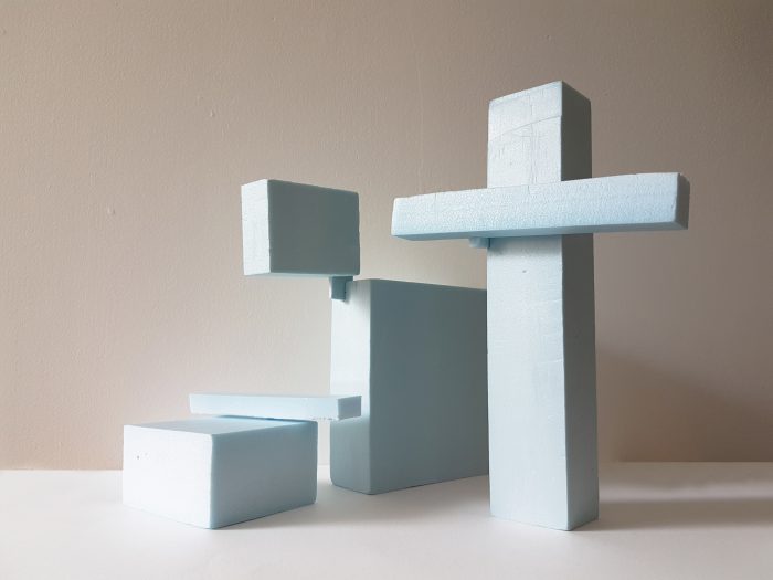
3D Sketch Models & 2D Sketch Analysis
We were to do up some sketch models based on spheres, cones and cylinders. Some terms to take note of:
- Independent is if the object is tilted less than 45° and can stand by itself
- Dependent is when the object leans on something to stand
- Precarious is when the object is more than 45° and can drop but still stands.
The sketch models also should not show any right angles and should be able to see all 3 shapes from any sides and angles.
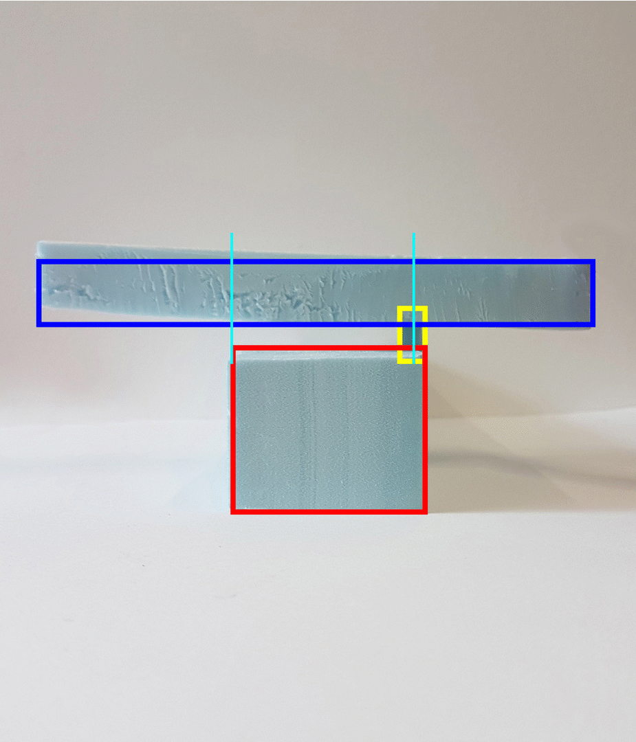
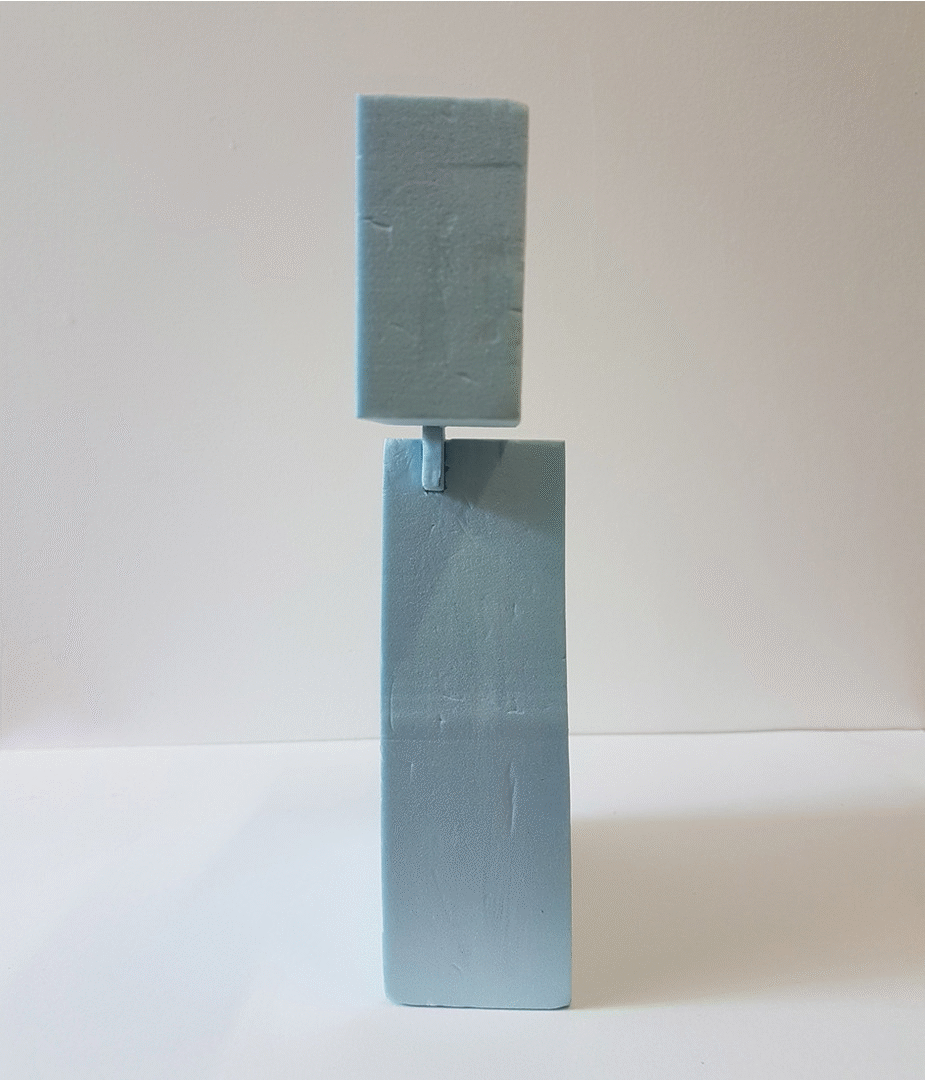
Model #1

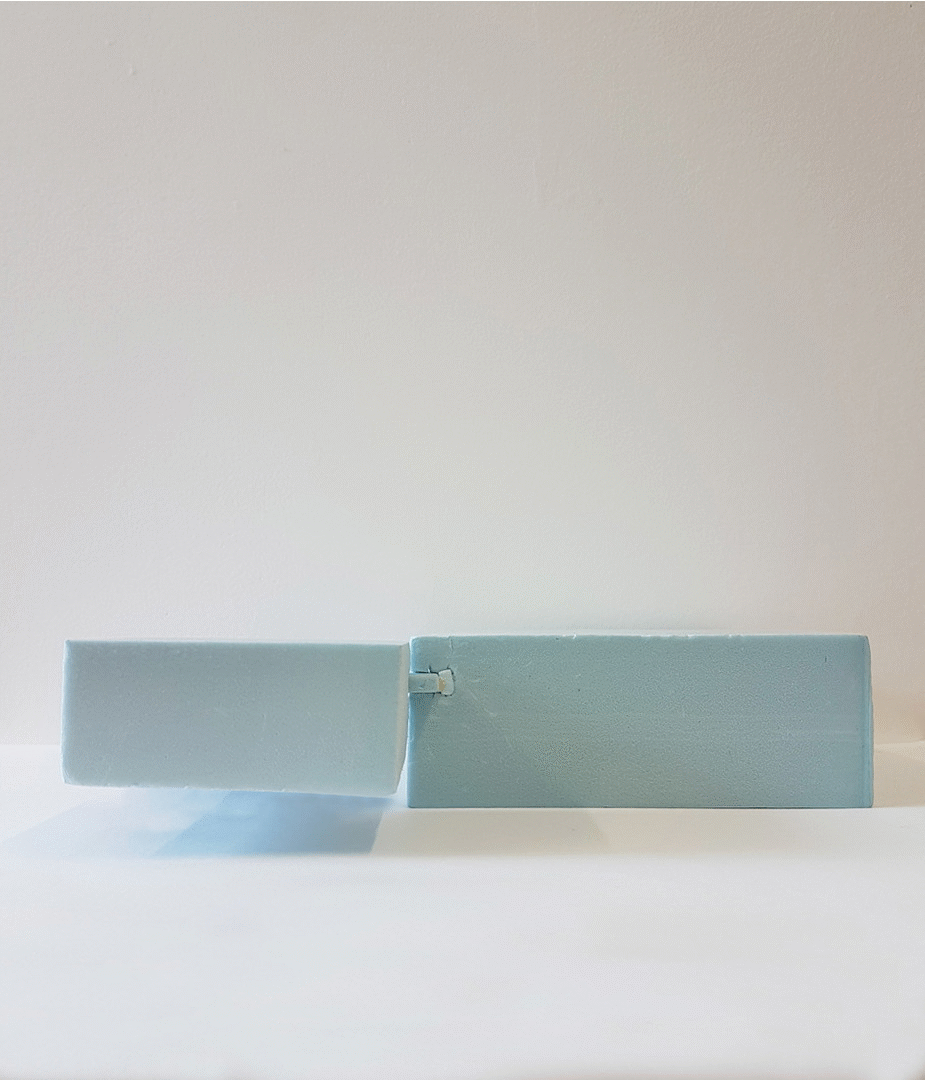
Side View
Top View
Front View
Legend
- Red – Dominant
- Blue – Sub-dominant
- Yellow – Subordinate
- Green – Principle Axis
Here I tried to make the cylinder balance on top of the cone, and at the same time make the sphere which is attached to the end of the cylinder hover above the ground, creating a sense of tension in the model. However, after creating the model, I find that the dominant, which is the cylinder, is not dominant enough, and in a way competing with the cone for dominance.
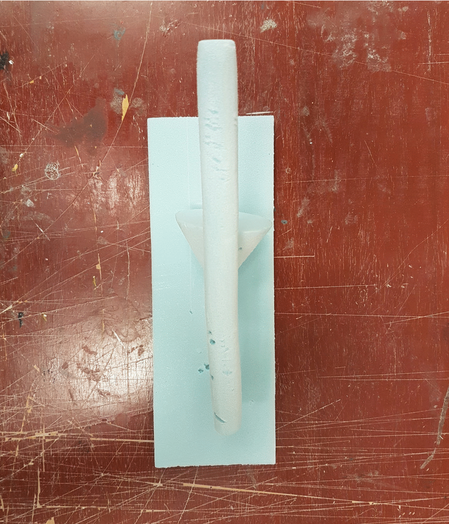
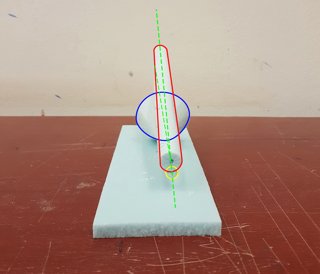
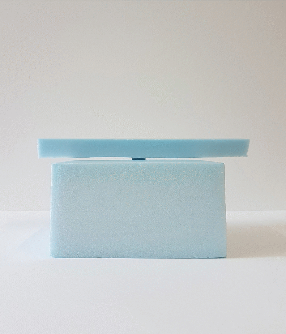
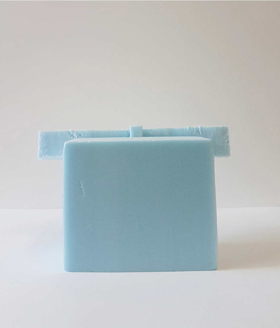
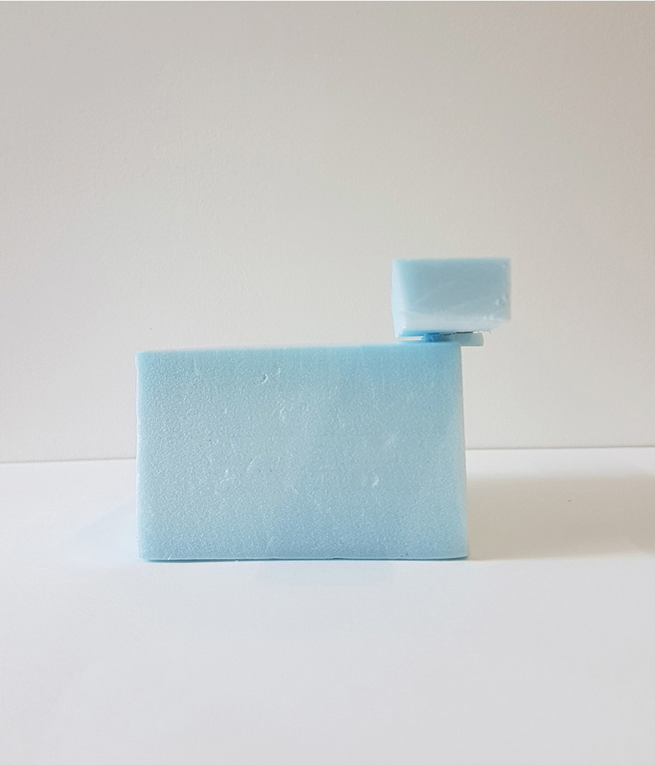
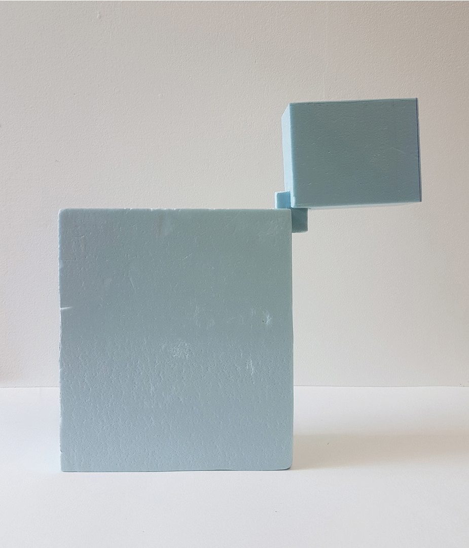
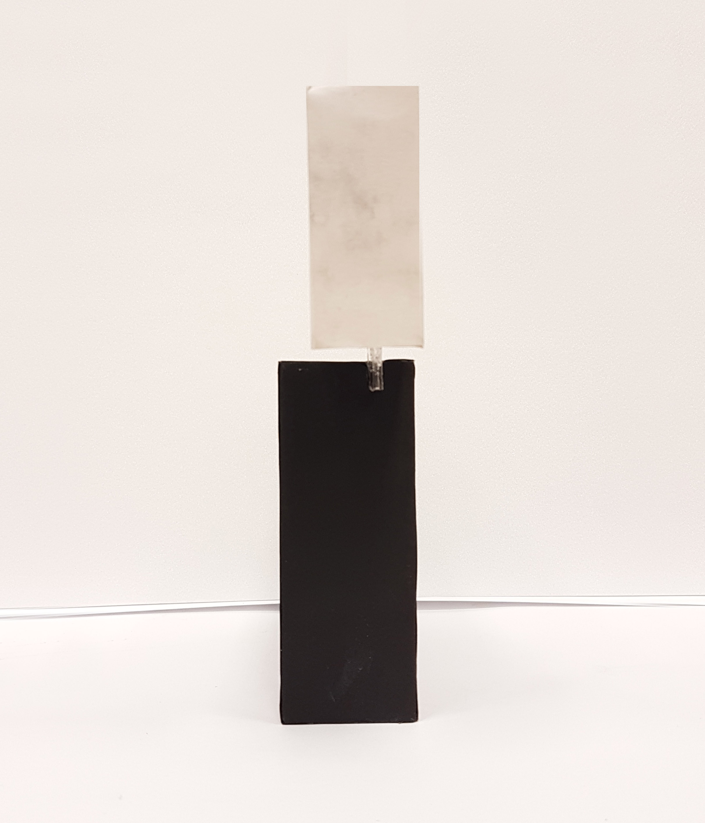
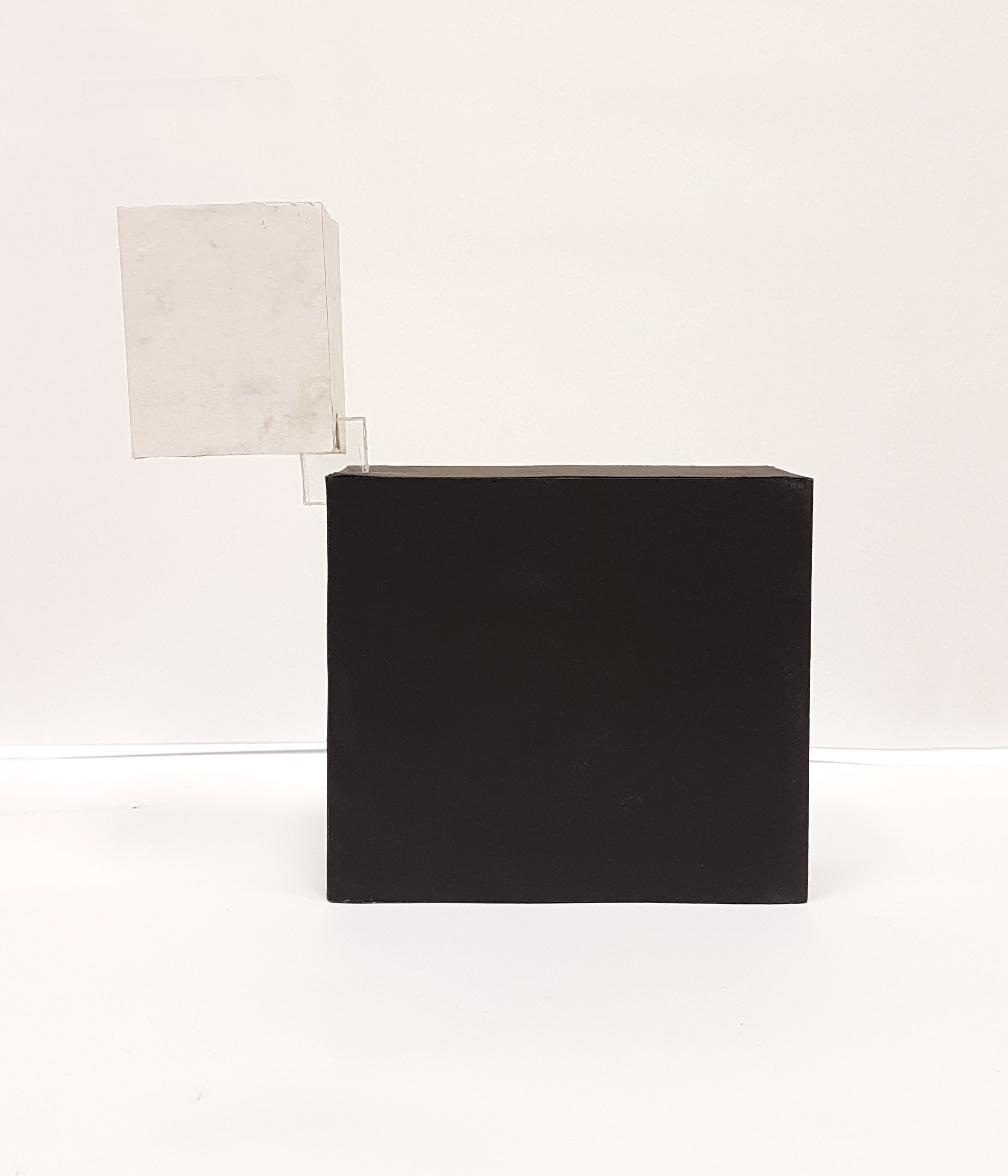
Model #2
Front View

Top View

Side View
Legend
- Red – Dominant
- Blue – Sub-dominant
- Yellow – Subordinate
- Green – Principle Axis
In this model, I tried to pierce all 3 components while on top of each other. It starts with the subdominant sphere at the bottom which is pierced by the dominant flat cylinder. A small cone pierces the dominant near the top, with the heavier side of the cone weighing down against the tilting motion of the whole model, creating a sense of counterbalance.
SEASON: SPRING
We were given (or randomly picked from a box) one of the four seasons for the theme of this project. I got Spring.
Spring Mindmap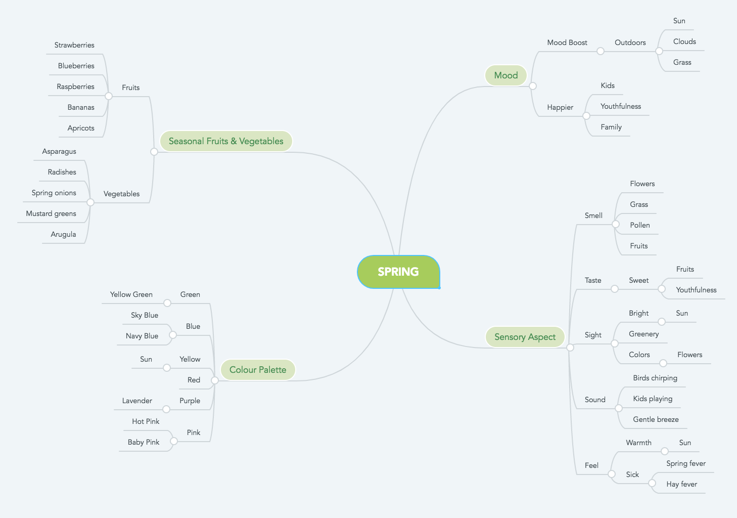
Click here to view larger mindmap
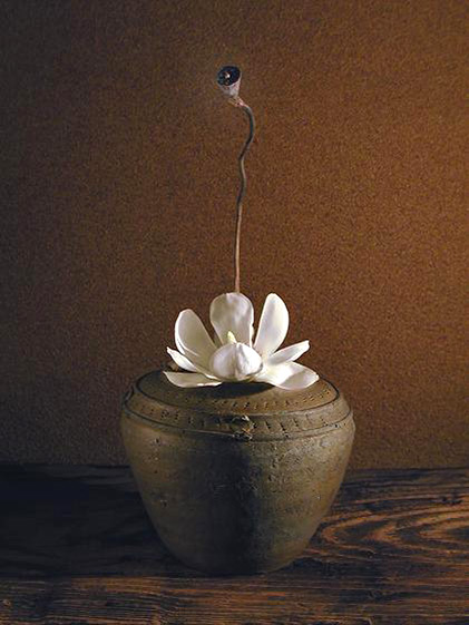
Final Concept
For the concept for the final model which includes the ikebana element to represent spring, I have gone with the idea of the Spring Equinox.
An equinox is a moment in which the plane of Earth’s equator passes through the centre of the Sun’s disk, which occurs twice each year. On an equinox, day and night are of approximately equal duration all over the planet. The spring equinox is the first day of spring after months of winter.
Using that idea of the equal duration of the equinox, I would create something that has a balance of two opposites which also creates contrasts with each other. And since it’s the spring equinox, I would like to represent both winter and spring, two different seasons, both with different meanings, one coming right after the other.
In a sentence: “The end brings about new beginnings”
The contrast of winter and spring is like death and life. Plants die during winter but bloom in spring. The colours also contrast with each other with winter having a lot of monochromatic and neutral colours from the blacks to whites, but spring has a lot of bright and vibrant colours. Two different seasons and the different ways to show and represent the equinox.
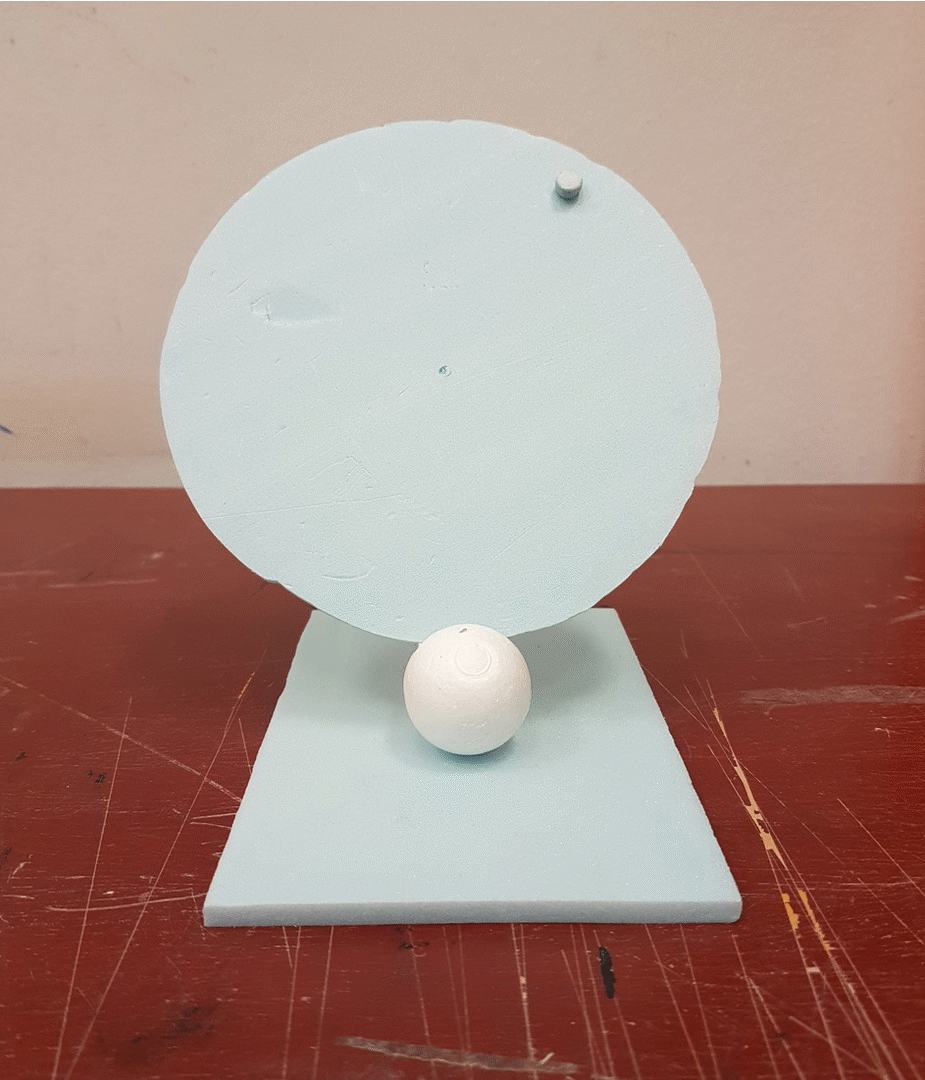
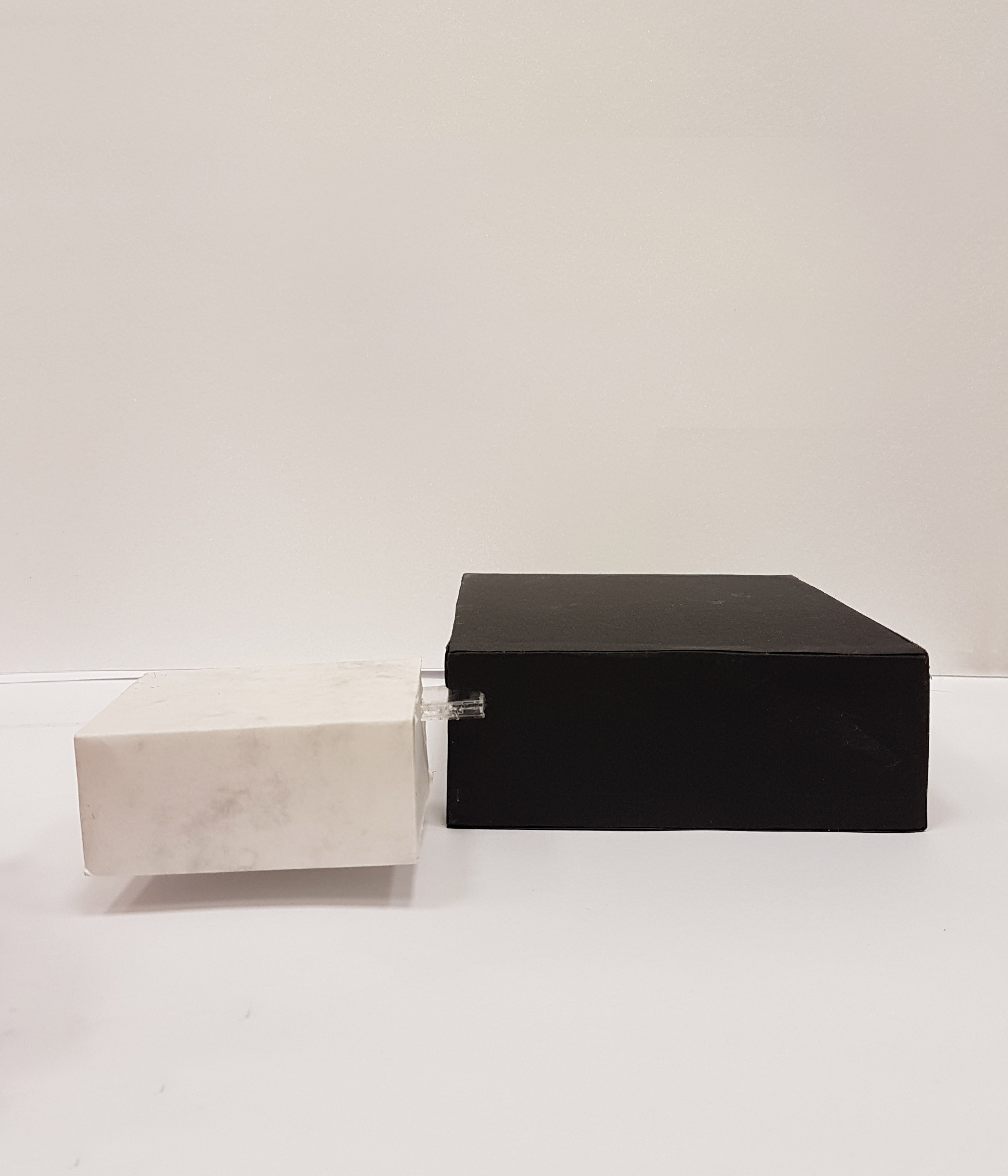
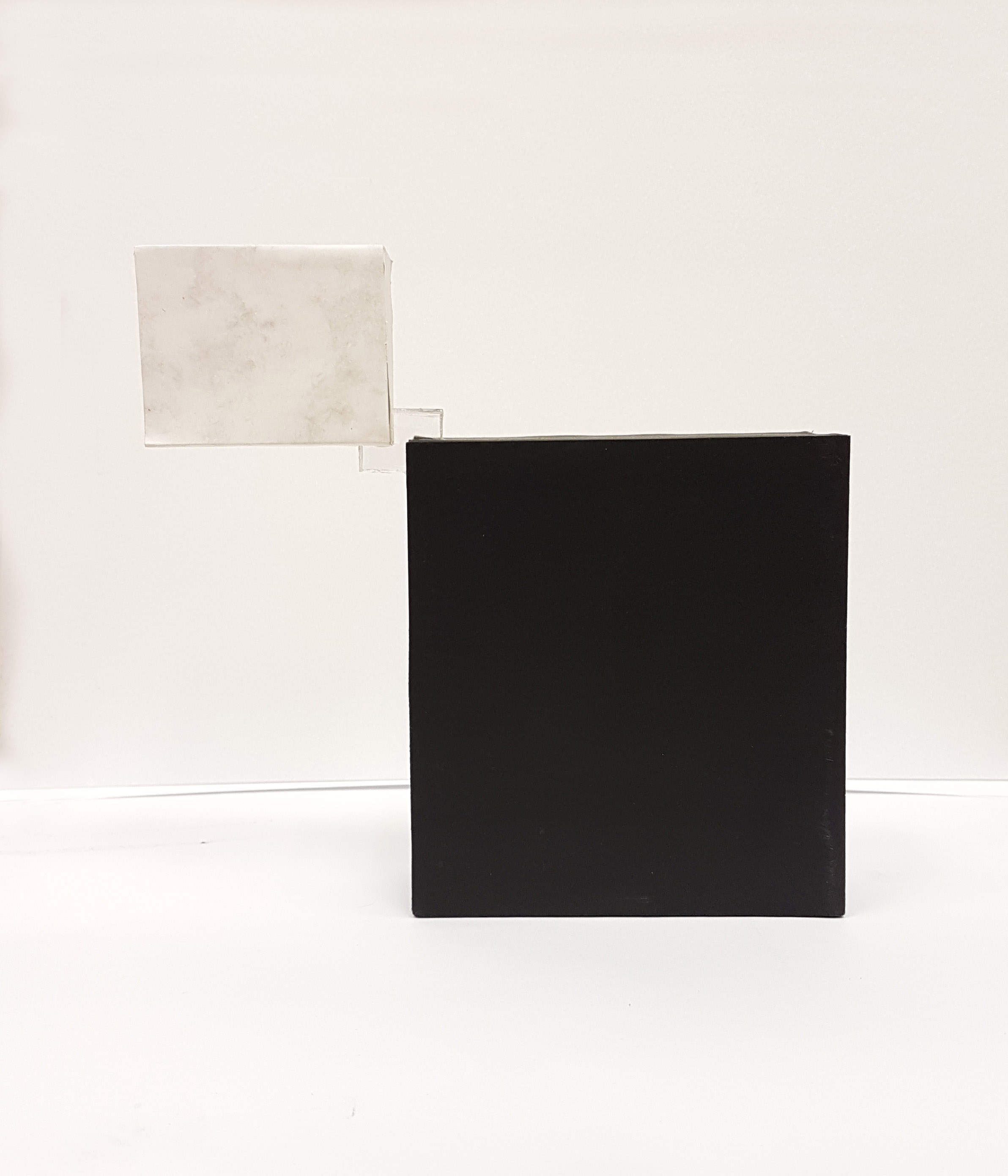
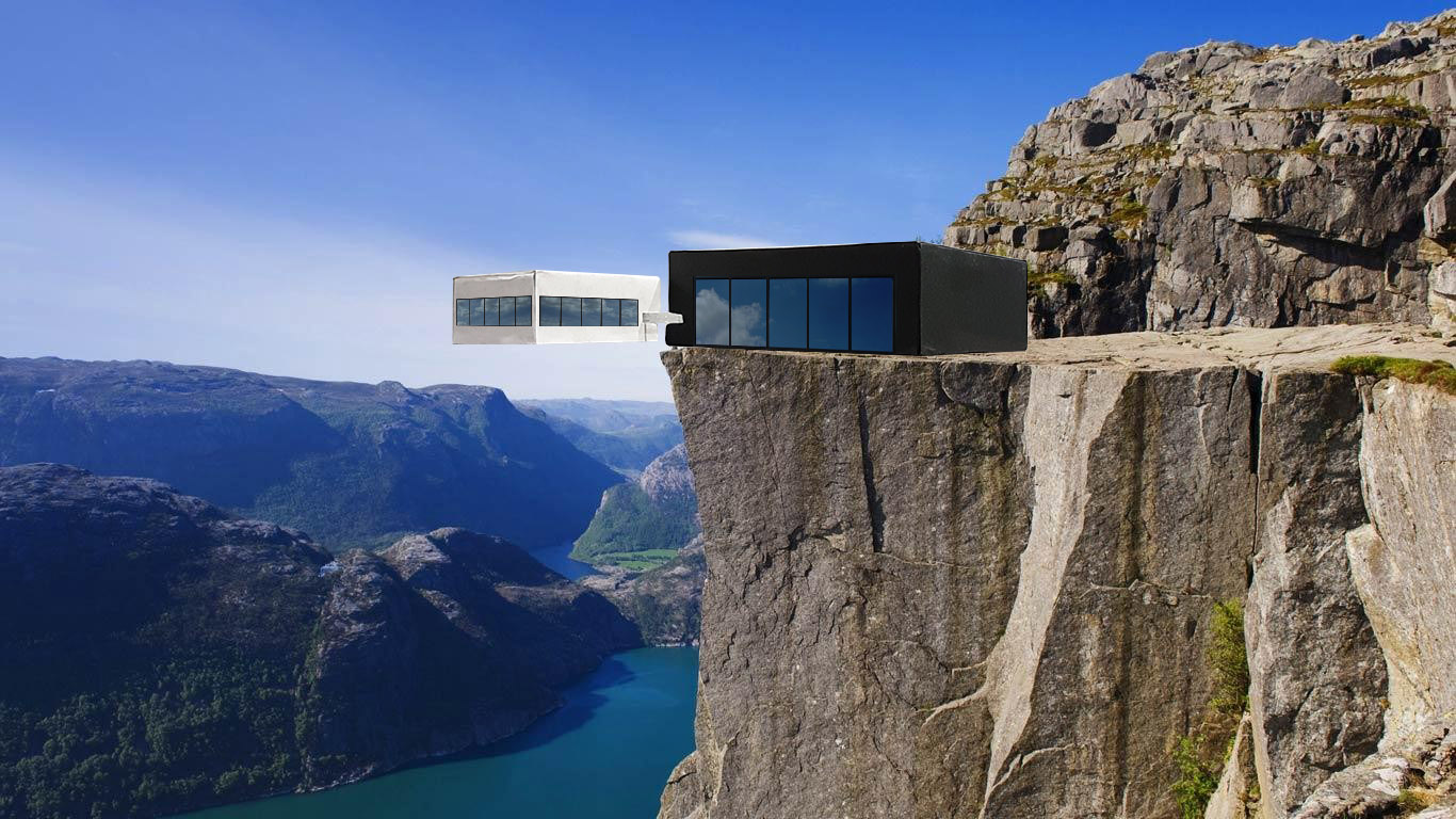
Final Model
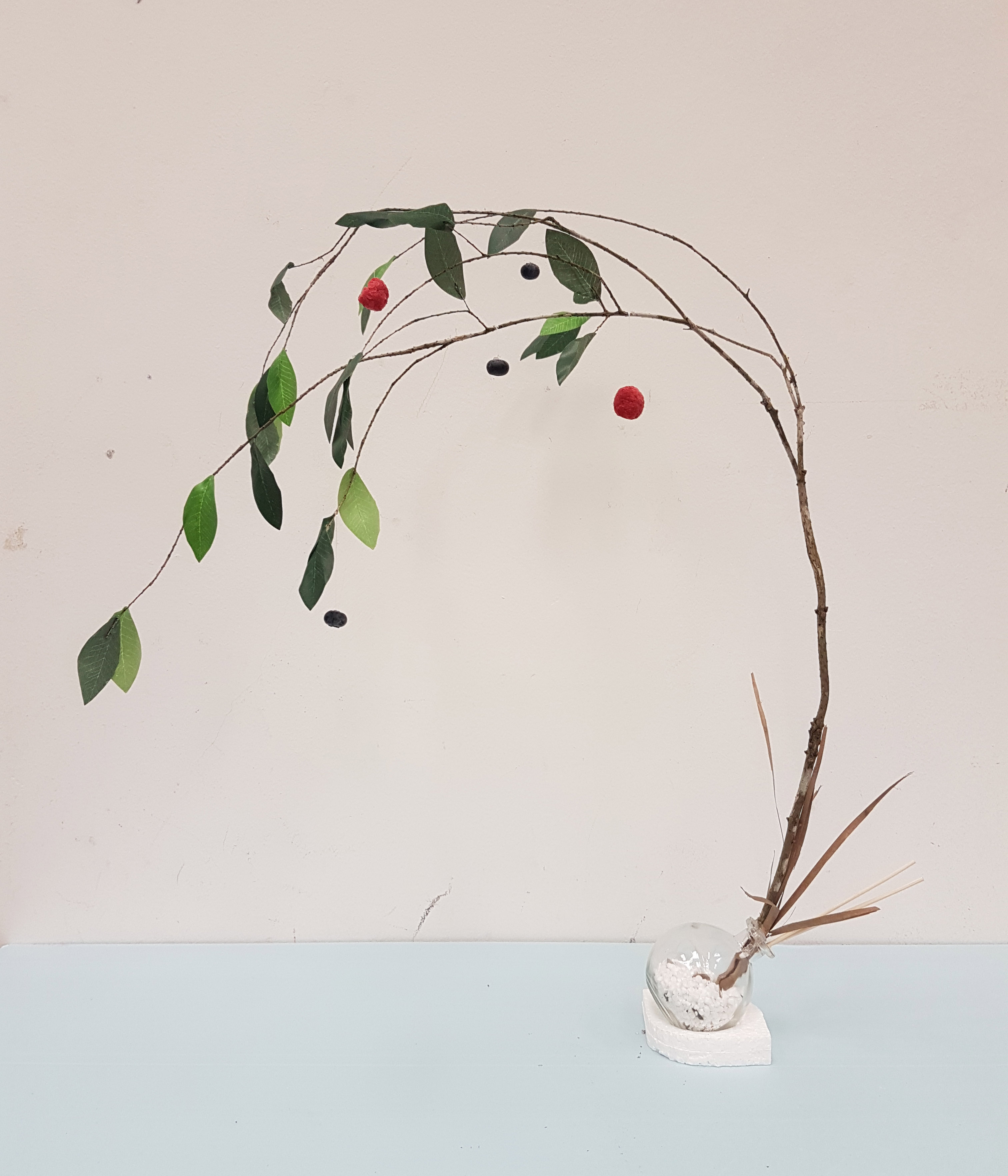
Side View
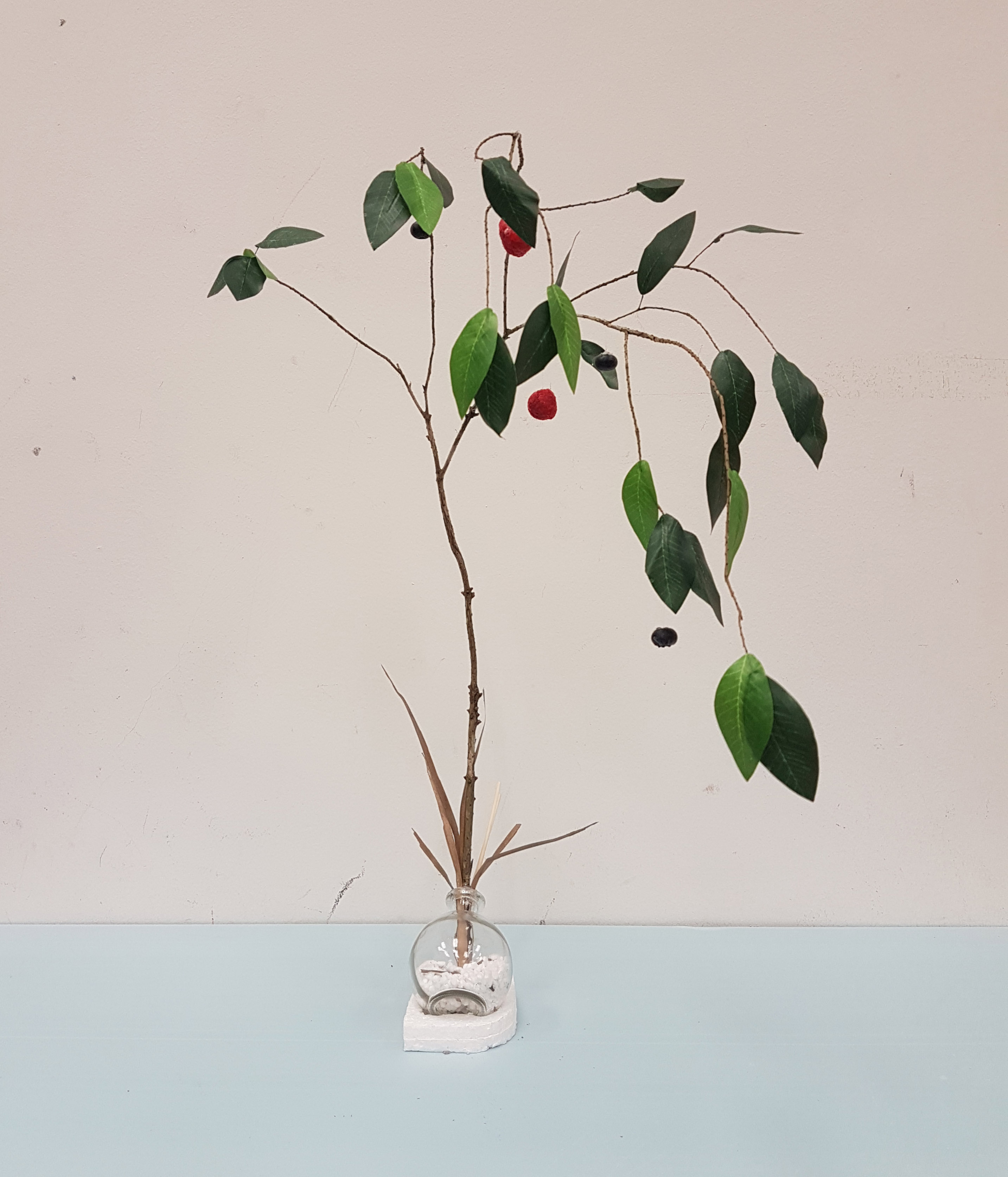
Front View

Back View
I pick up the characteristics of my Sketch Model #2 where the components of the model are stacked up on top of each other all stacked on top of the subdominant sphere.
The dominant in the final model is the branch itself, which can be considered as a cylinder, carrying/containing many subordinates near the top, represented by the fruits (blueberries for spheres, and raspberries for cones). The subdominant as mentioned is the glass spherical pot.
The branch starts off growing sideways out of the pot and it curves against the direction of the falling motion of the branch, hence creating a sense of counterbalance.
The idea here is to represent the end bringing about new beginnings, with the glass spherical pot containing snow and dead leaves representing winter and death. The branch growing out of the pot with leaves and berries growing towards the end represents life and spring that comes after winter.
References:
- http://ngm.nationalgeographic.com/2015/12/food-science-of-taste-text
- http://www.businessinsider.com/how-many-different-tastes-are-there-2014-7/?IR=T
- https://www.ftd.com/blog/design/ikebana
- http://www.telegraph.co.uk/news/0/first-day-spring-2017-interesting-facts-vernal-equinox/


 The feeling of great fascination, somehow creates explosions and fireworks in your head, in a literal sense: mind blown. (Would have used that word instead but its not in the list.)