Ideas
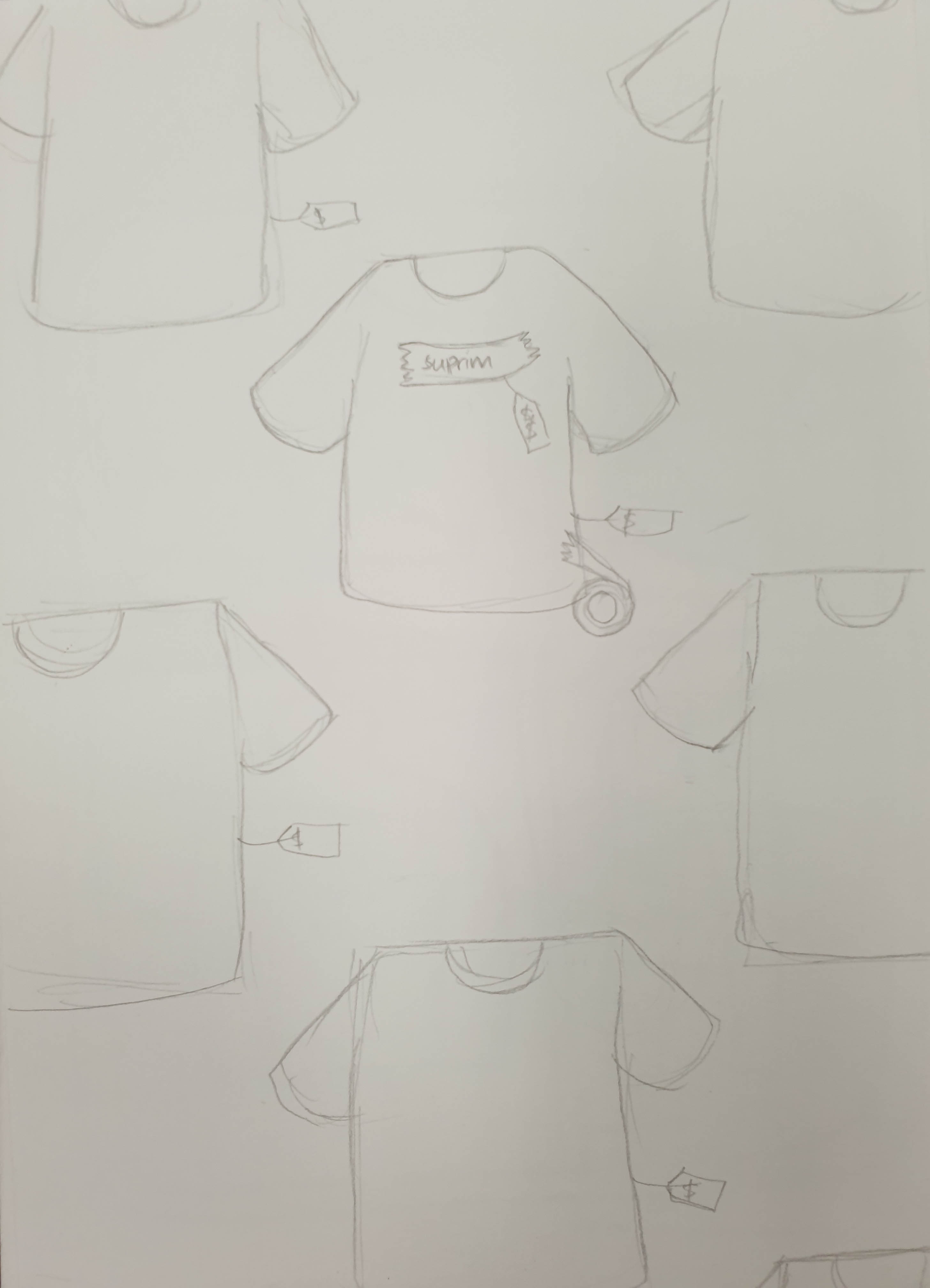
For the first idea, I was trying to go with the idea that just because a brand putting its presence into simple things like a plain t-shirt, it just becomes more expensive. So people are actually paying for the brand, rather than for function.
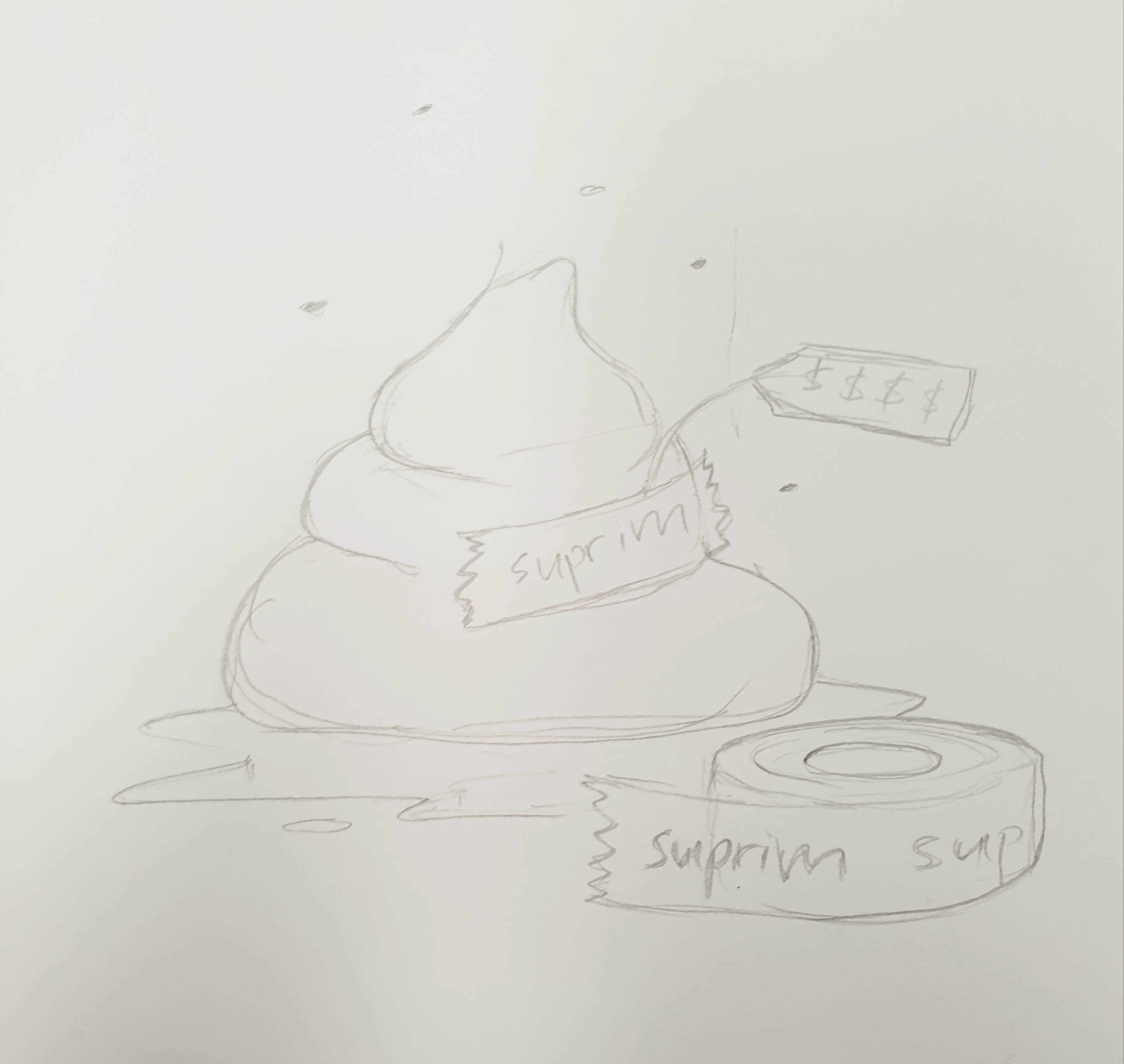
For the second idea was inspired by the Supreme Brick, but more to the idea of random items with brands putting their presence on it and selling the random items at a higher price.
The third idea is an assembly kit or a starter kit to be a Hypebeast.
I decided to go with the second and third idea as it is closer to the message that I want to convey through the illustration.
So initially I decided to combine the idea of random items with brands on them with the assembly kit, but the idea of having an assembly kit with random items would not make sense at all. So I decided to retain the items that make someone a Hypebeast. So the way that I would combine it is that both items, the random and the Hypebeast items, will still be there rather than having one replace the other.
Design References
For the illustration style, I decided to go to a more digital line-work and flat-lay as I felt like it would be a good way to represent the items that I would want to illustrate and also I think it is a good way to show the details within the items.
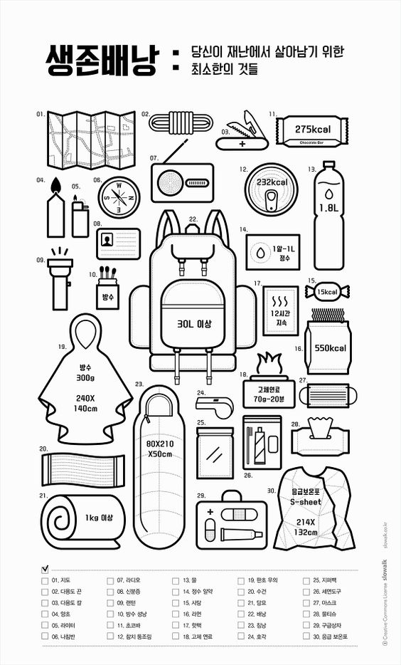
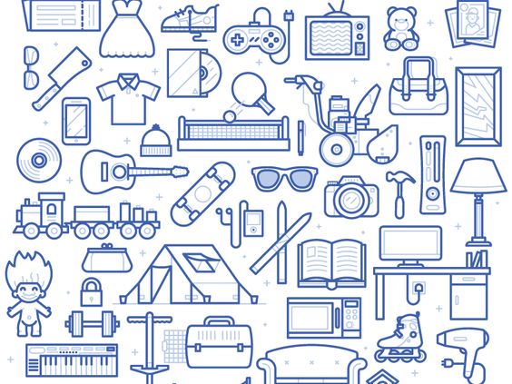

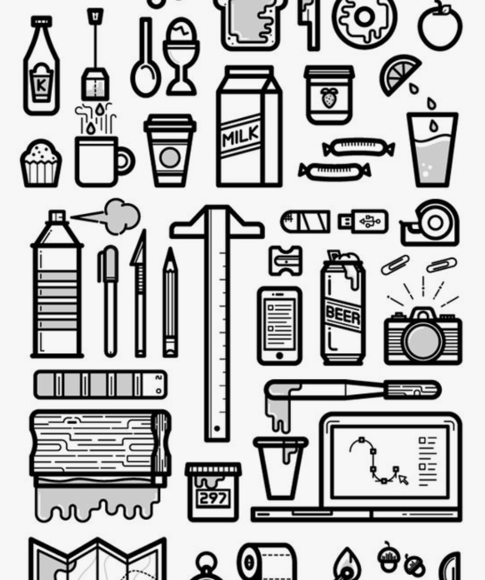
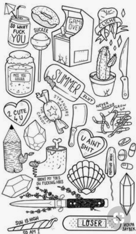
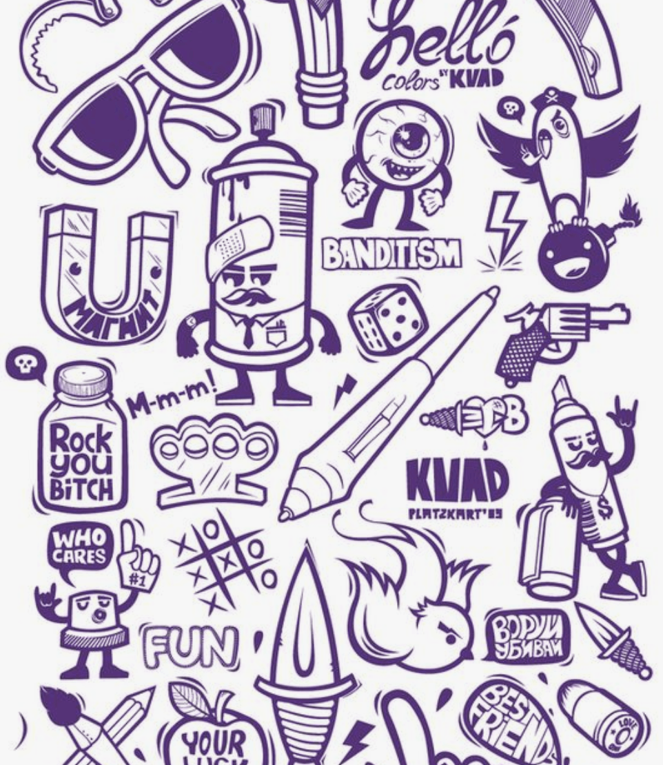 I was also thinking of whether to do it in a more static format or a more dynamic illustration
Development
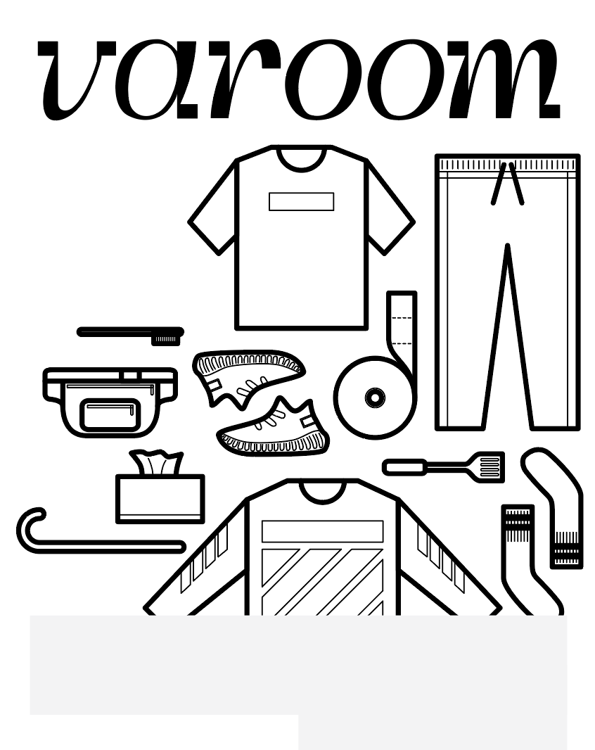
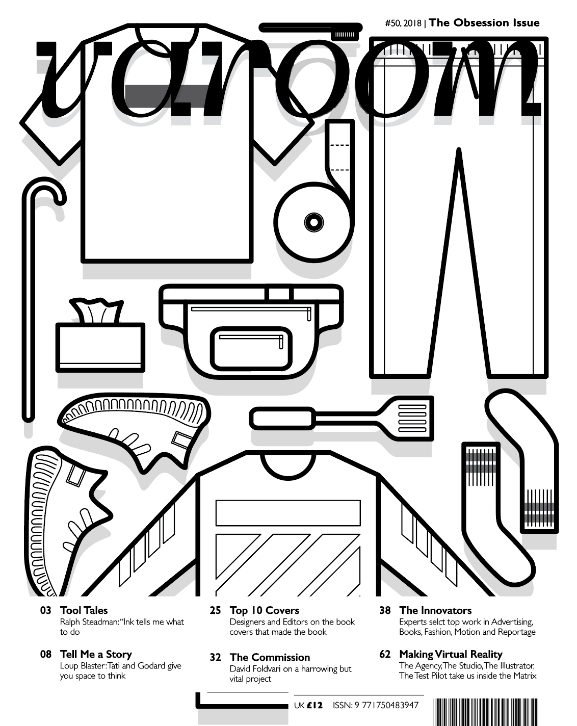
As for the initial design, I found it difficult to represent the brands, without having to put the brand logos itself. I tried to design the items based on what they are known for and their graphics that they normally include in their products, like the stripes in Off-White, and the bar in Supreme. But still, I felt like the items are still not well represented. In the end, I decided to proceed by adding the logos to it, which is seen below.
As for the colours, I would want to keep it neutral as I am putting a lot of brands inside, and I wouldn’t want any of them to stand out more than the other, and it would be quite chaotic to have a lot of colours in it. I also wanted to have almost like a template approach, like a flat drawing in fashion design where the colours don’t matter yet. Can also say that I having a neutral approach in this situation as these millennials are free to decide how they spend their money and does not directly affects me.
Final design
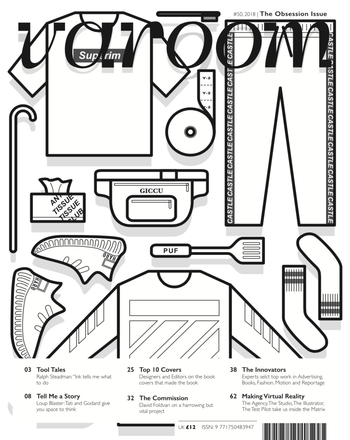
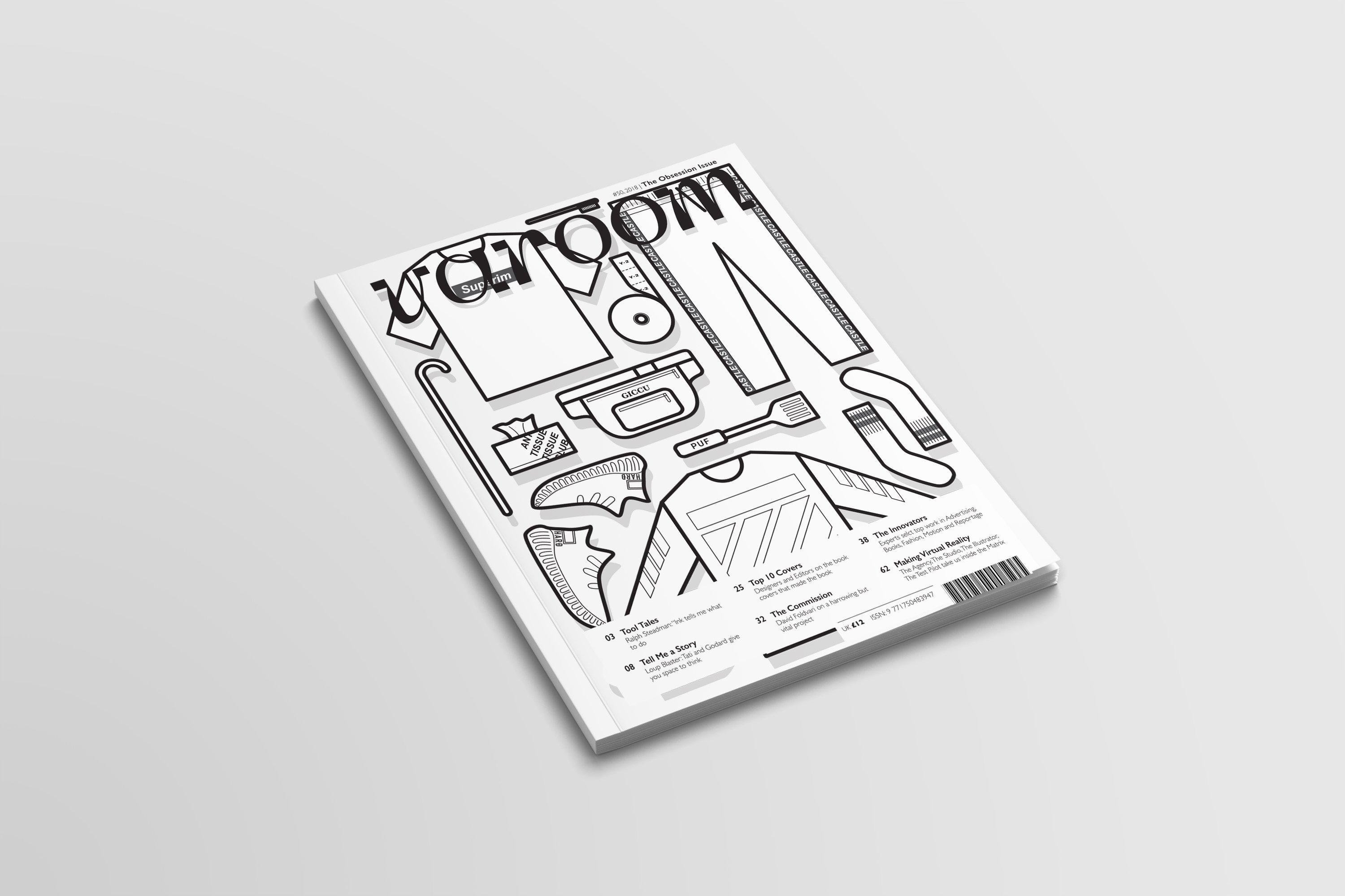
To add the logos, I have to tweak it a bit so as not to get into some copyright issues. Both items, the random and the Hypebeast, are present so that at first glance, it may just look like another flat lay of Hypebeast items, but when you look harder or look again, you can actually notice that there are random things in between.


You must be logged in to post a comment.