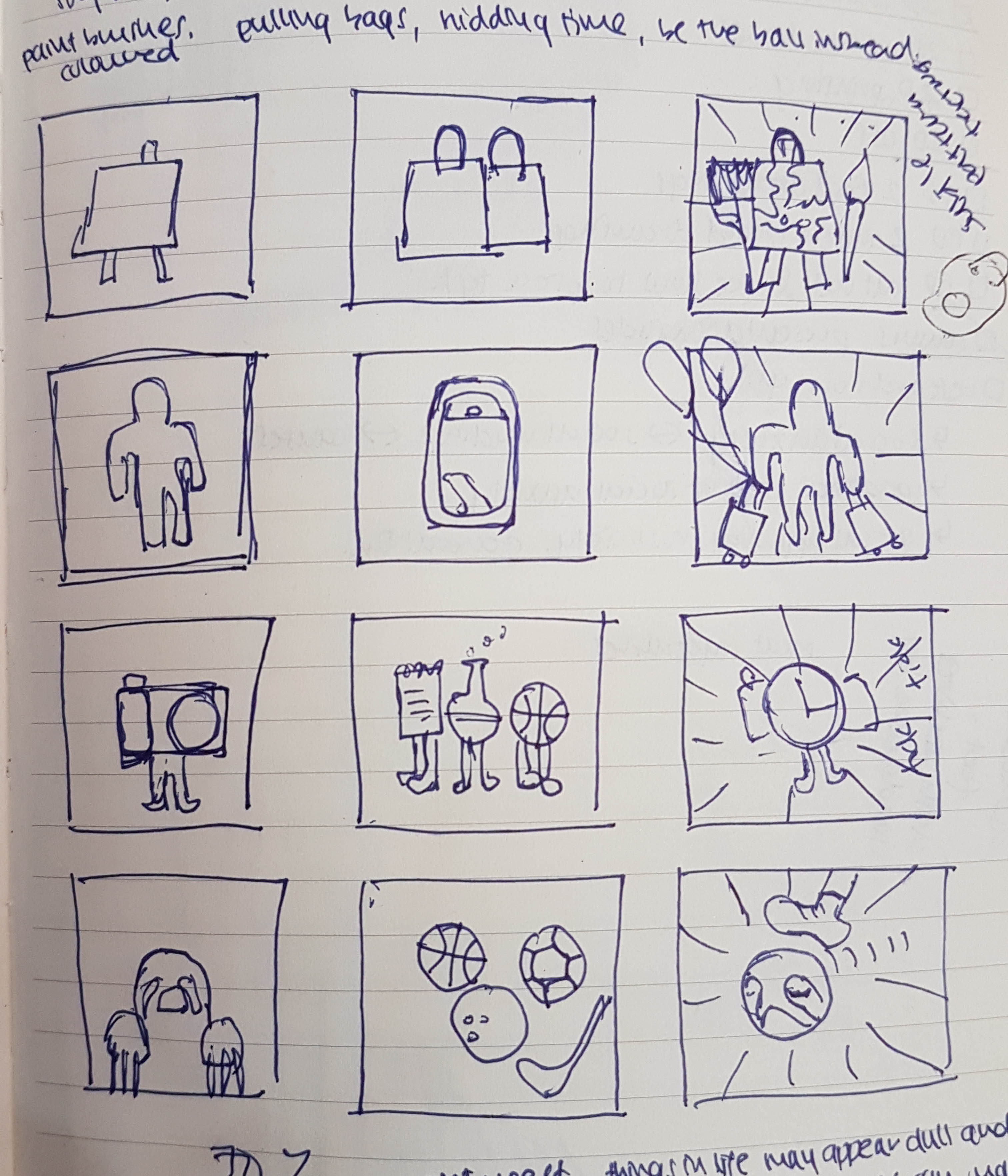
We have reached the last project for Foundation 2D. For this project, we are to create 12 image compositions (4 sets of 3), where one image representing yourself adds with another image that represents a situation which will then form another image.
Me + Situation = Imagined outcome
For this project also, we are finally allowed to use colour. With that said, we have to show our understanding of the use of colours and the colour theory in our compositions.
Me and the Situations
So before we go into the compositions, we have to decide what or how to represent “me” and what sort of situations to put “me” into. To think of the different representations of myself, I think of how I see myself in life, my hobbies and my interests. And to think of the situations, I thought of things that happen in my life, short or regular, that I think would have a good way to represent or situations that have created an impact in my life.
4 representations of “me”
- An empty canvas – I chose it to represent my interest in art and have always been involved in art since I was very young. Empty, because I am still looking for a style that truly represents me.
- The sculpture “Kouros” – I learned about this sculpture in an Art History class. The sculpture is one of the early attempts to create a human. It is imperfect and can be improved, which represents me – imperfect and can/willing to improve.
- A camera – This item would definitely represent my hobby which is photography.
- A sloth – Well, this is the best default representation of me. When I am not designing or out taking photos, I very much love to sleep and sloth around, literally. I am also a late bloomer. It used to take me a much longer time to grasp something compared to others.
4 Situations
- Family gatherings – No matter how much I hate it, I have to go through it. Every year. Most of the time I will wait for time to pass and I just cannot wait for it to end.
- Shopping – Either window shopping or with the intention of buying something, retail therapy is one of my favourite pass time. I will normally put in the effort to dress up to go to town and meet up with friends to chill till evening.
- Travelling – It is a yearly event to travel with my family and it becomes a time to unwind and just not think about work or school.
- Sports – I really hate playing sports. I could just be one of the most unsporty guys out there. I really hate it since young and I really really hate PE lessons.
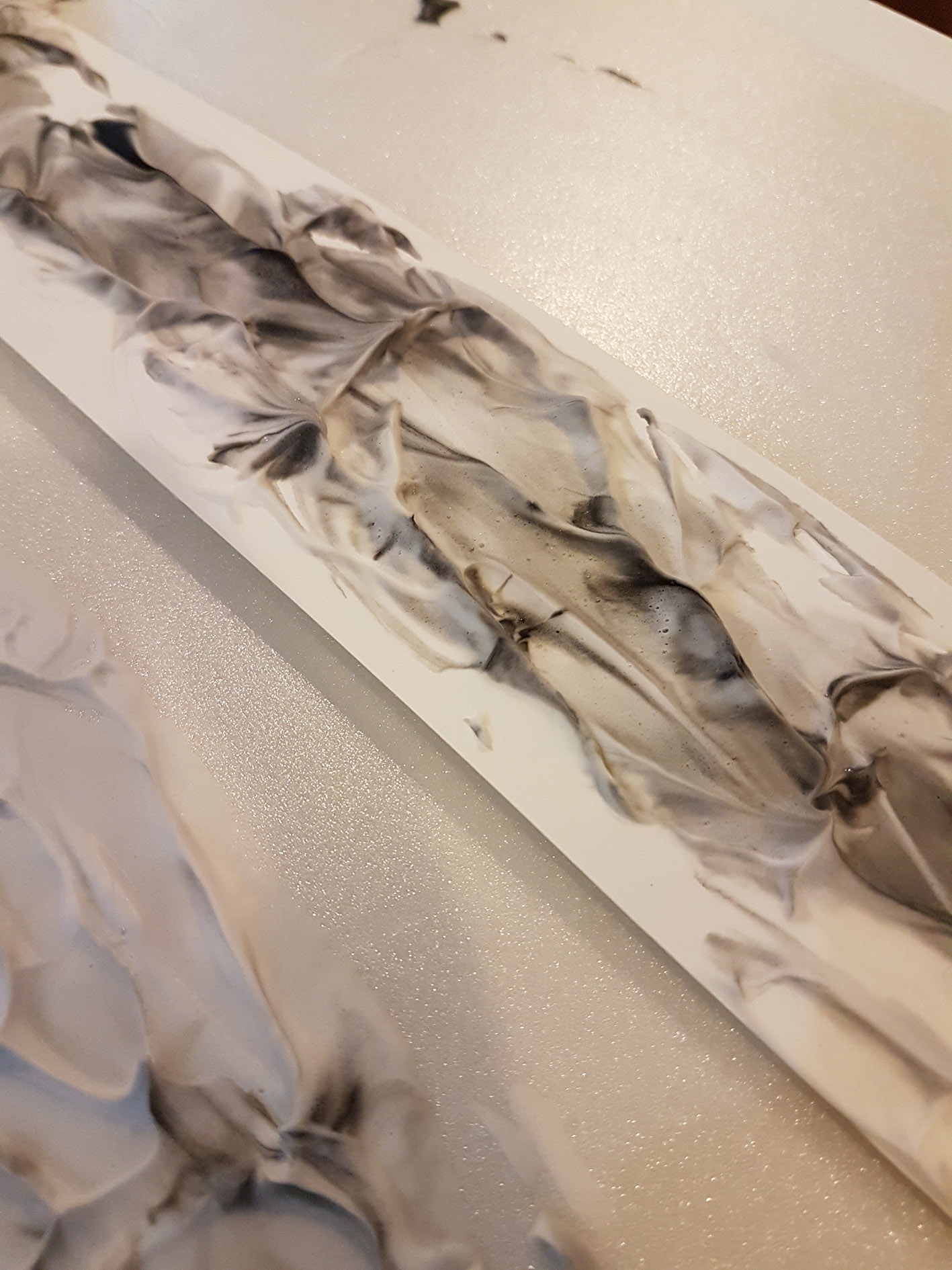
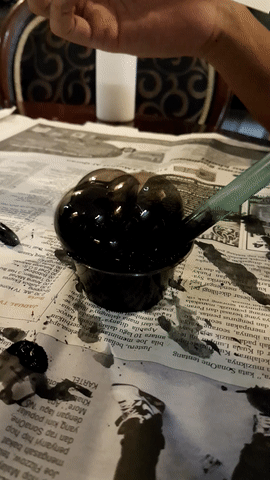
Draft
The Designs
There are 4 sets of 3 designs, 12 designs in total. Each of the 4 sets, as mentioned earlier, has a design that represents “me”, followed by a design that represents a situation, which is then followed by a design that represents an imagined outcome.
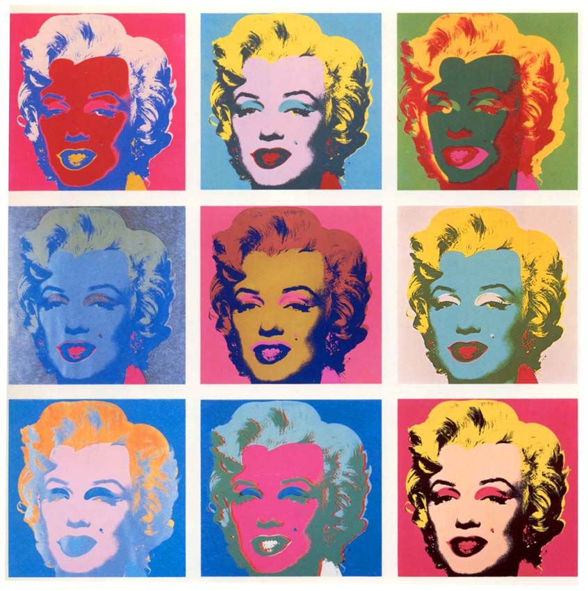
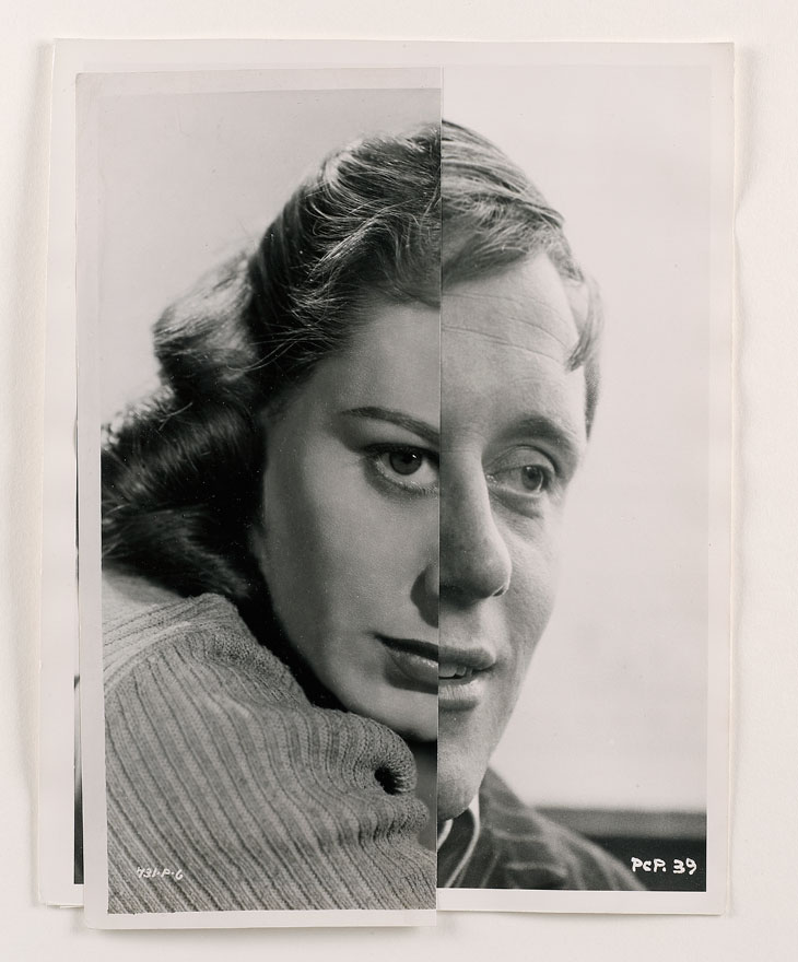
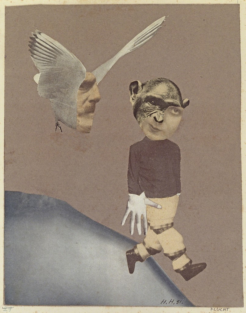
I am also going for the vintage-style digital collage, inspired by Hannah Hoch’s works. So my designs will have several images which if combined creates another image. The images will also be blurred slightly and have grainy noise added to it to add to the vintage look that I am going for.
I am going for an achromatic colour palette as I feel like I have a dull life at that colour palette would the best way to represent it. It also adds contrast to the background which will be coloured. The background will be coloured instead of the objects to represent how each situation and element represents and contributes to my life in general rather than the objects specifically.
First row
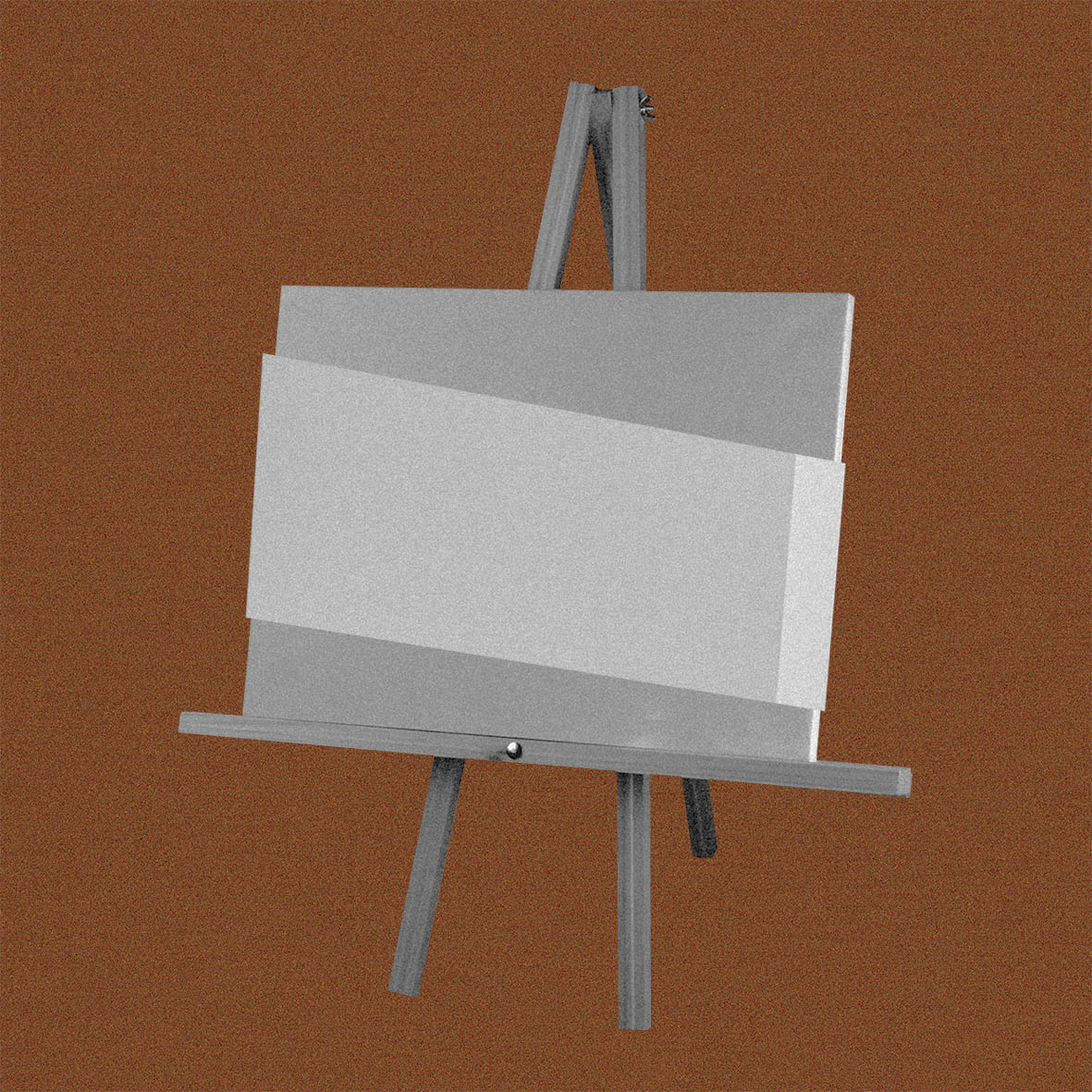
The first “me” is represented by an empty canvas. It represents my artistic side as well as me still looking for a style that represents me. In a way, I’m an open empty canvas.
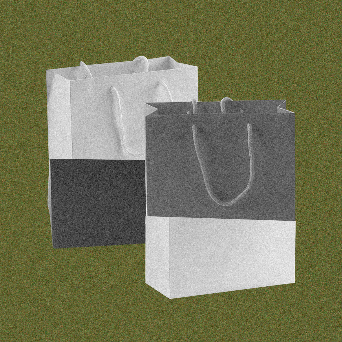
The first situation is shopping, represented by shopping bags. It is something that I do occasionally during my free time, either for window shopping or with the intention to actually buy something.

The imagined situation is actually me, what used to be an empty canvas has now been painted on, representing me having found a style. So what contributed to the style are the other elements in the design. On the right side are paintbrushes which represent my friends who normally help to influence the style that I go for. While on the left are artist’s palettes with handles which represent shopping bags, the “paint” that style or design the canvas.
Second Row

The second representation of me is with the Kouros status. I learned about this statue in art history class which is one of the first attempts by artists to create a sculpture to represent a perfect human being. As nice as it looks, it is still imperfect and there are many more improvements that can be made, which are the many improvements that take place throughout history. Which in turn represents me in life. I am still not “ideal” or “perfect” in a way. What I am now can be further developed and further improved over time.
 The second situation is travelling, represented by the aeroplane windows. It is a family past time to travel overseas together every year. There is a view of the Nyhavn in Copenhagen through the middle window to represent my most recent travel there, which will then follow up to the next design.
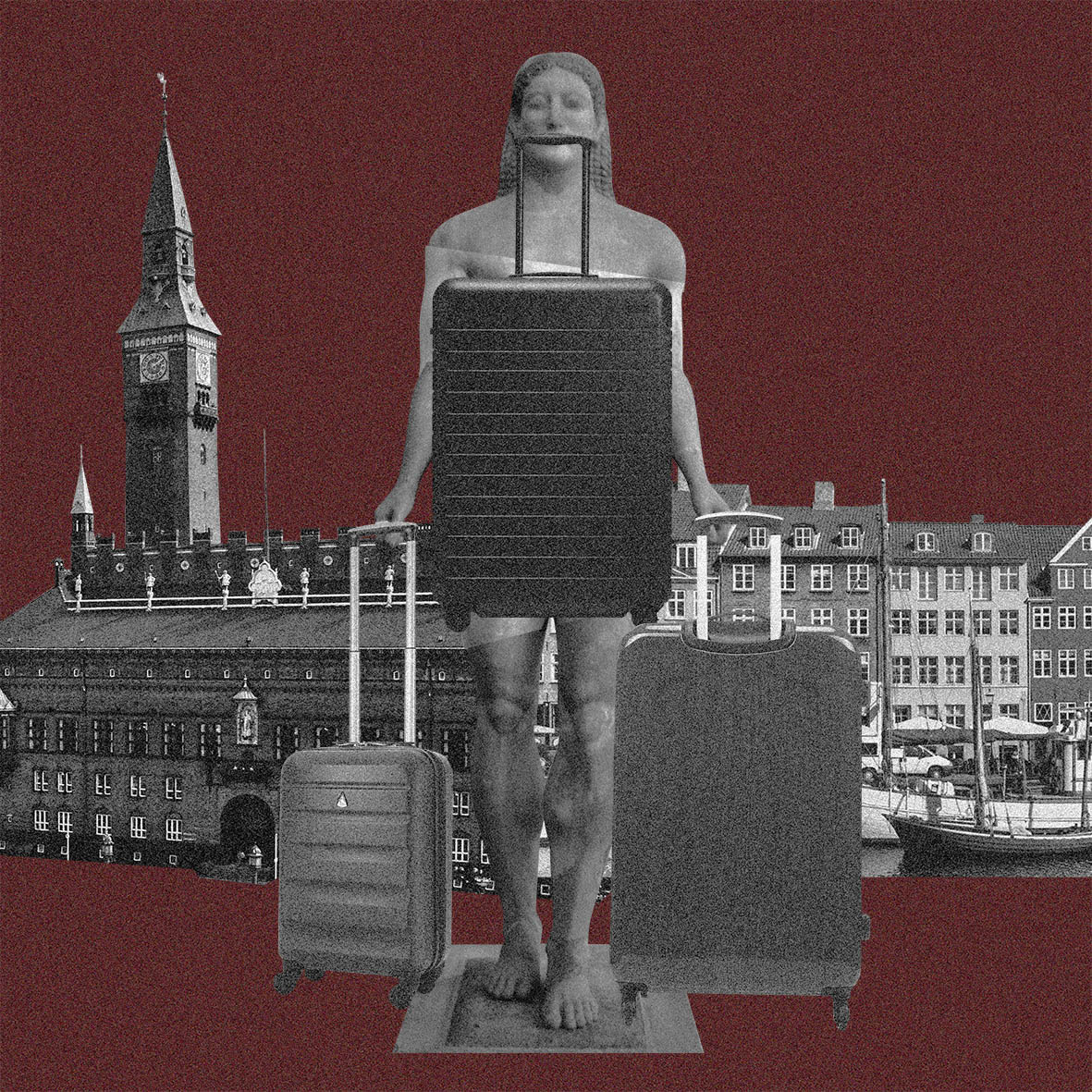 For the imagined outcome is that me, the sculpture, end up carrying all the luggage bags during the trip. This actually happened during the trip with my family to Copenhagen where I was the only child there and I had to carry my parents and my own luggage bags.
Third Row
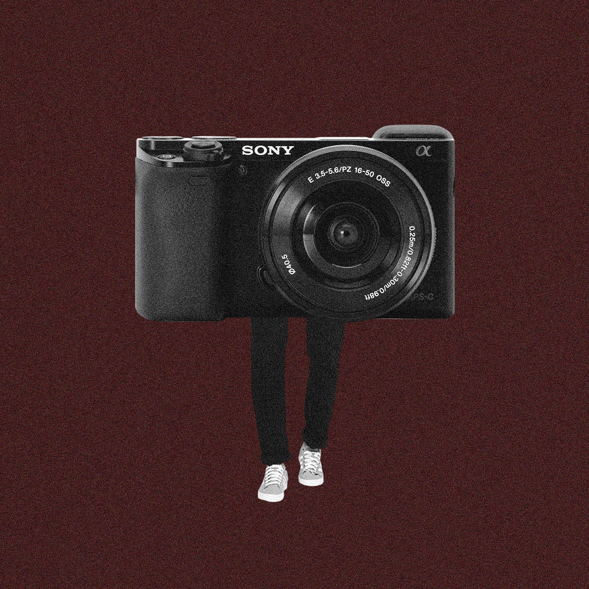 For the third representation of me, I have chosen the camera because it is the best way to show my passion which is photography. So I combined the camera with human legs to represent “me”.
The fourth situation is with my relatives. Either during the festive season or during family gatherings, socializing with my relatives especially distant relatives is not something that i like to do.
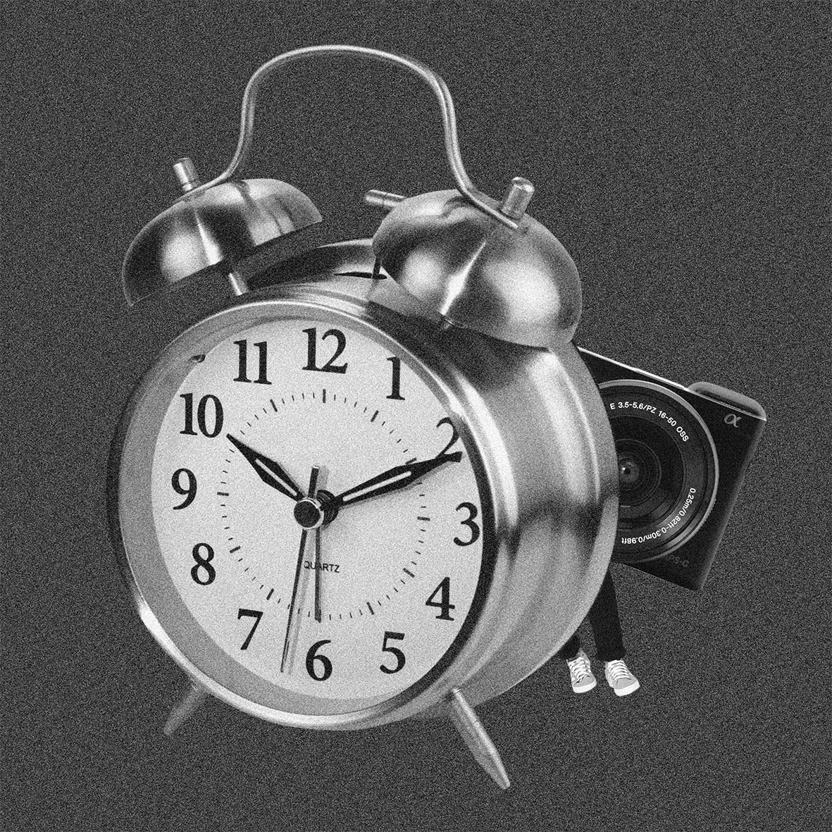 So for the imagined outcome is me, represented by the camera and legs like the first frame, is hiding behind time. In a way, I am waiting for the time to pass.
Fourth Row
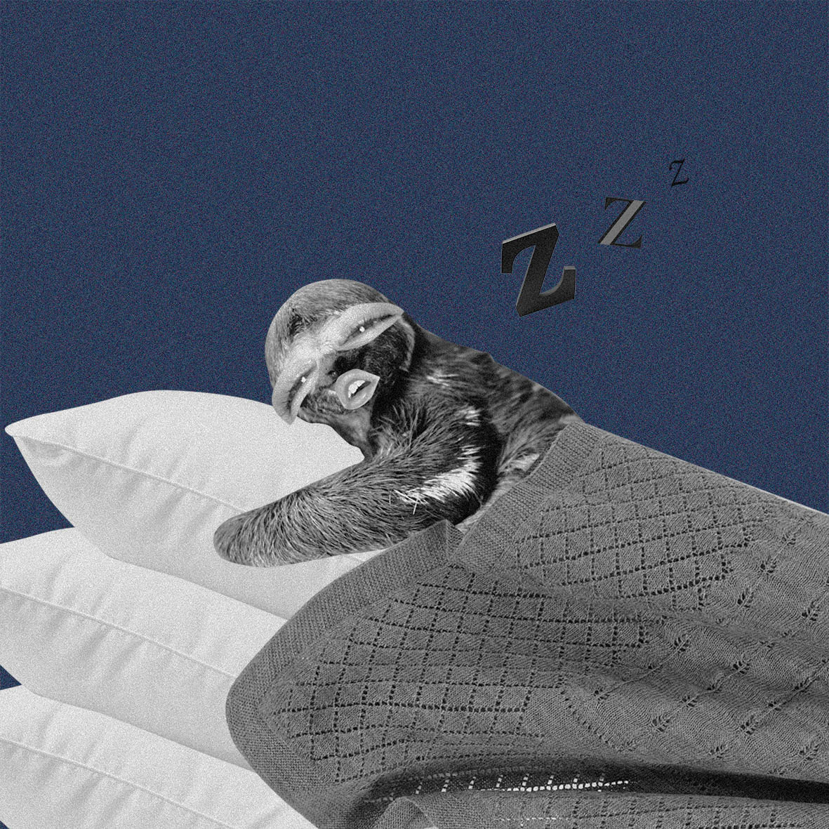
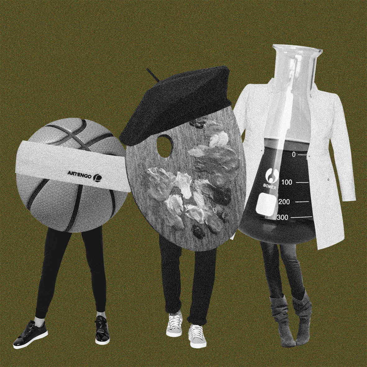
For the last design, I chose a sloth to represent me in my default mood. Sleeping and just being lazy is just me when I am not doing anything. So in the design, there is a sloth with sleepy eyes and mouth sleeping on a pile of pillows under a blanket and a couple of Zs floating in the air.
 The last situation I picked is sports. It was one of the lessons during primary and secondary school that I really hate and makes me realise that I am not a sporty person and that I cannot do sports.
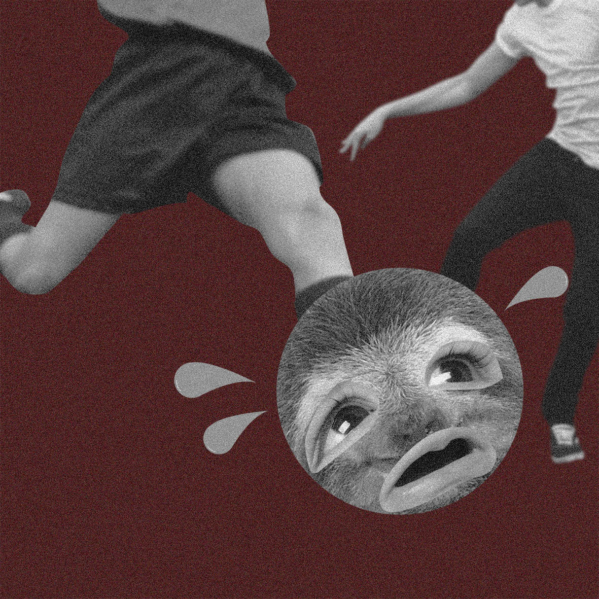
So to represent my hate for sports, I put the sloth in a situation where the sloth became the ball and is being kicked around with a worried and terrified face.


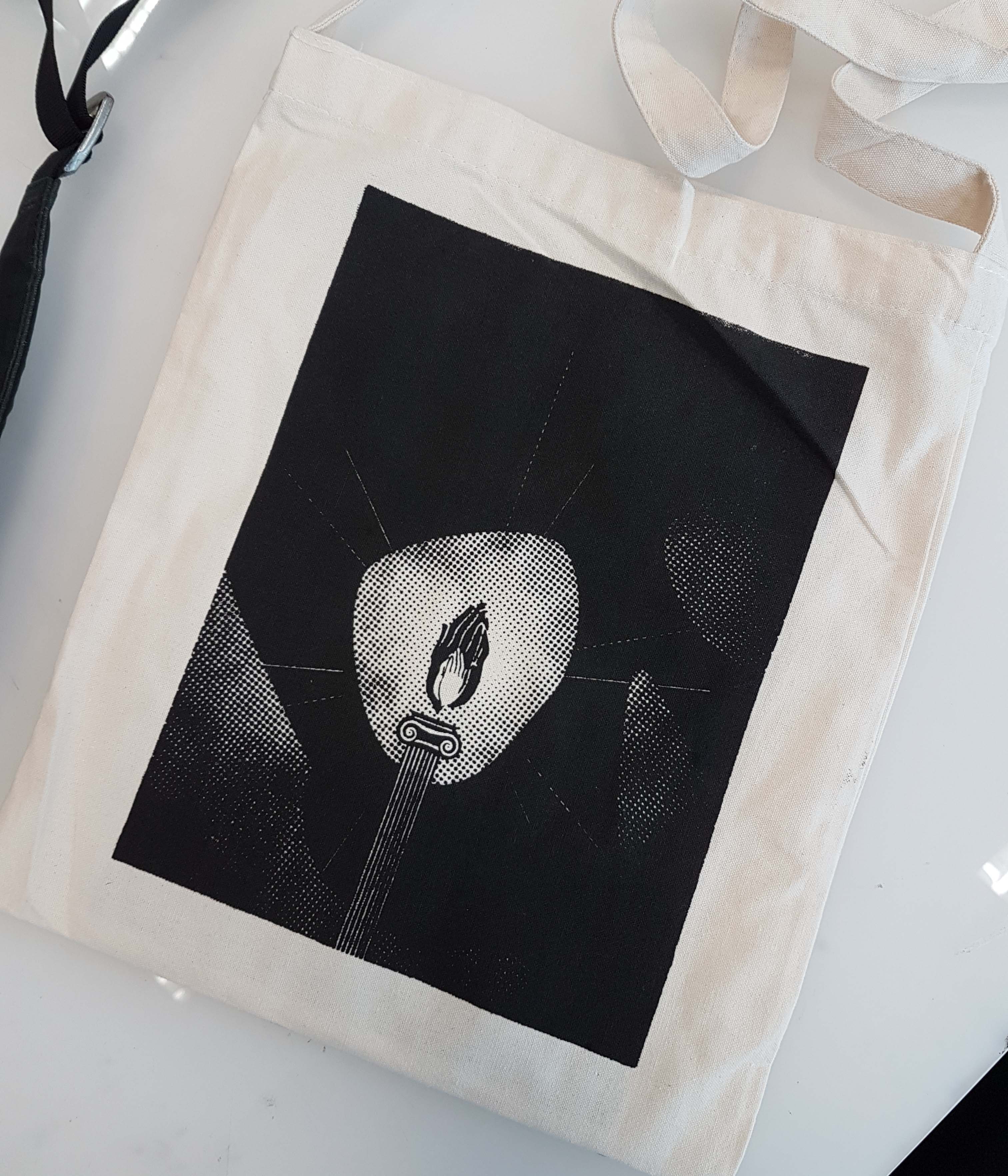


 The feeling of great fascination, somehow creates explosions and fireworks in your head, in a literal sense: mind blown. (Would have used that word instead but its not in the list.)