
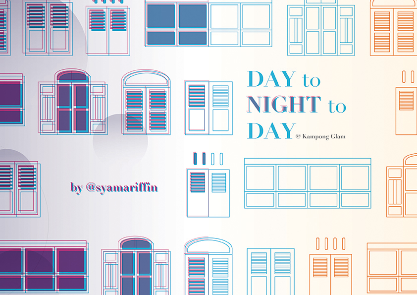
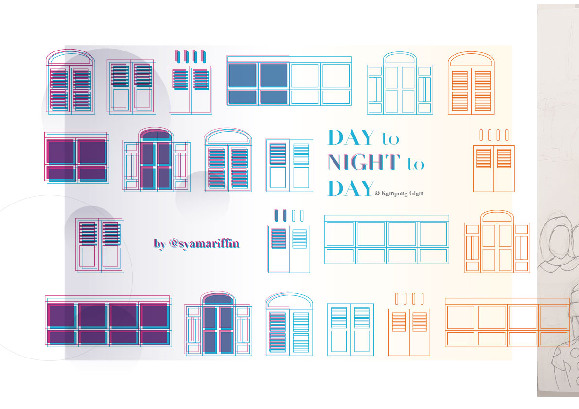
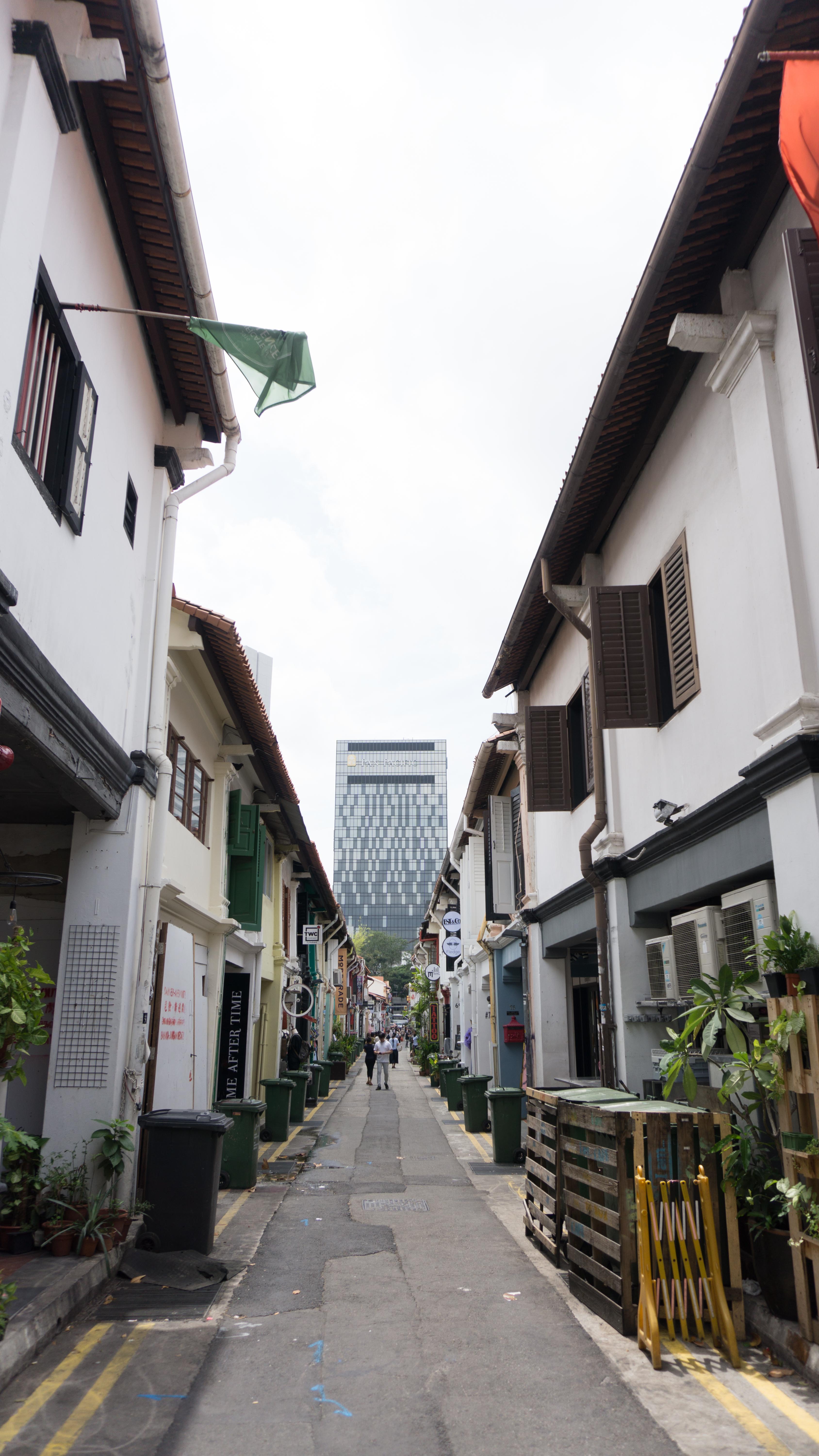
This design of the zine is to feature the two different sides of Kampong Glam – the day scene and the night scene. The zine is titled “Day to Night to Day @ Kampong Glam” to explain how the events in the area happen in a cycle — one after the other — despite the entirely different scenes of day and night.
The idea is the showcase the different prominent elements that one would notice when he/she goes to Kampong Glam in the day and in the night. From my research, I found that both the day and night are entirely different scenes, and I would like to show these 2 differences and how both of them are connected and complements each other in the zine.
The Zine
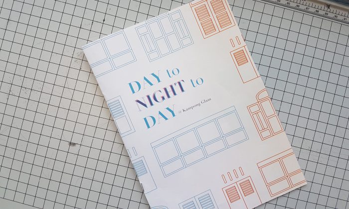
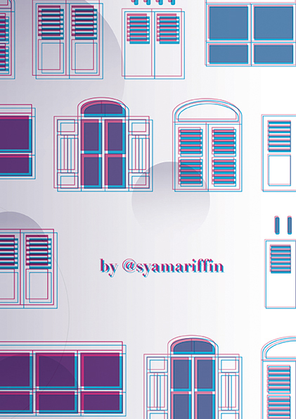
Cover
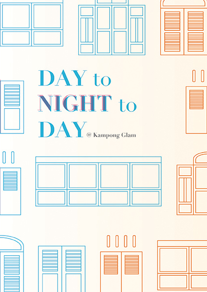
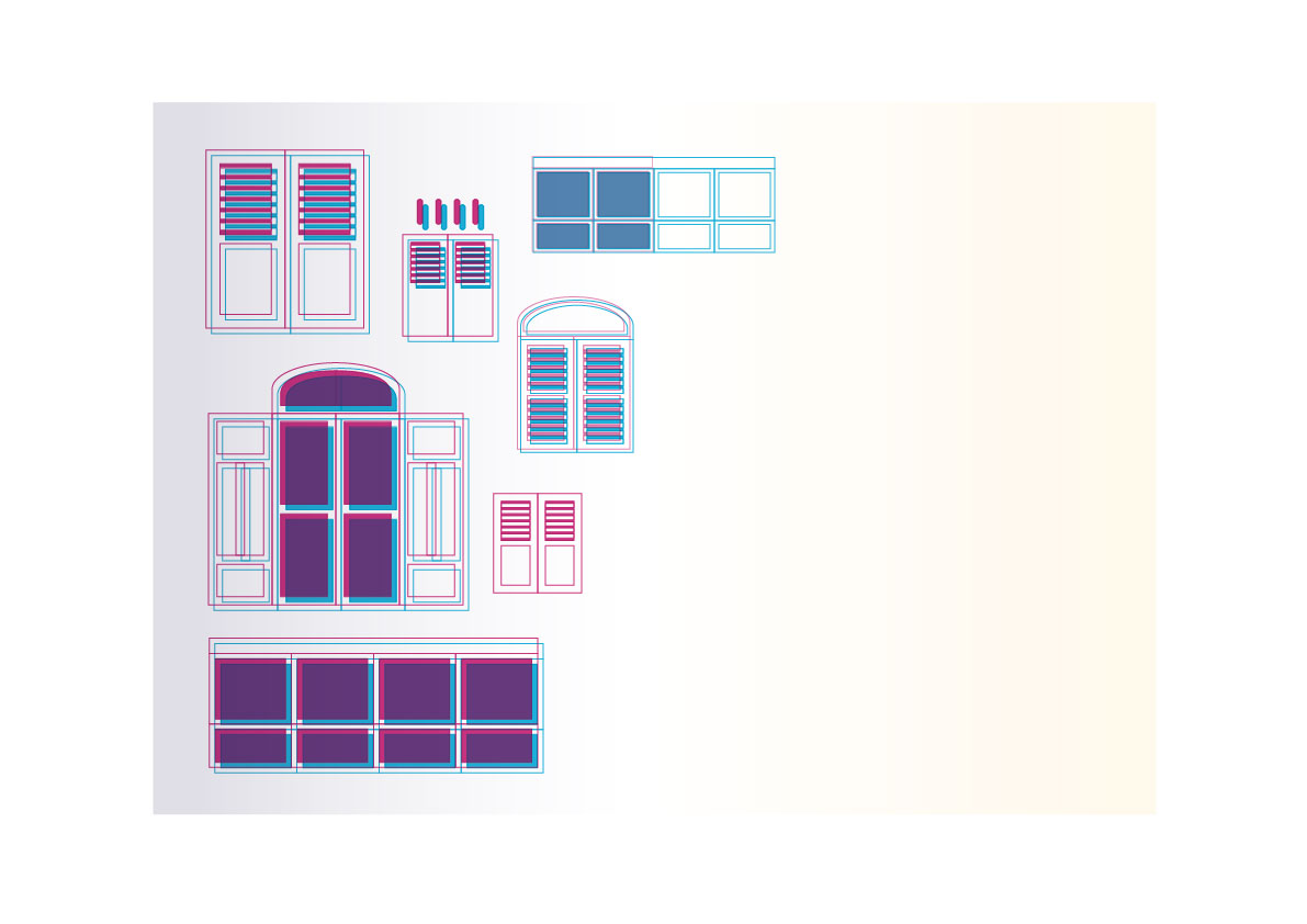
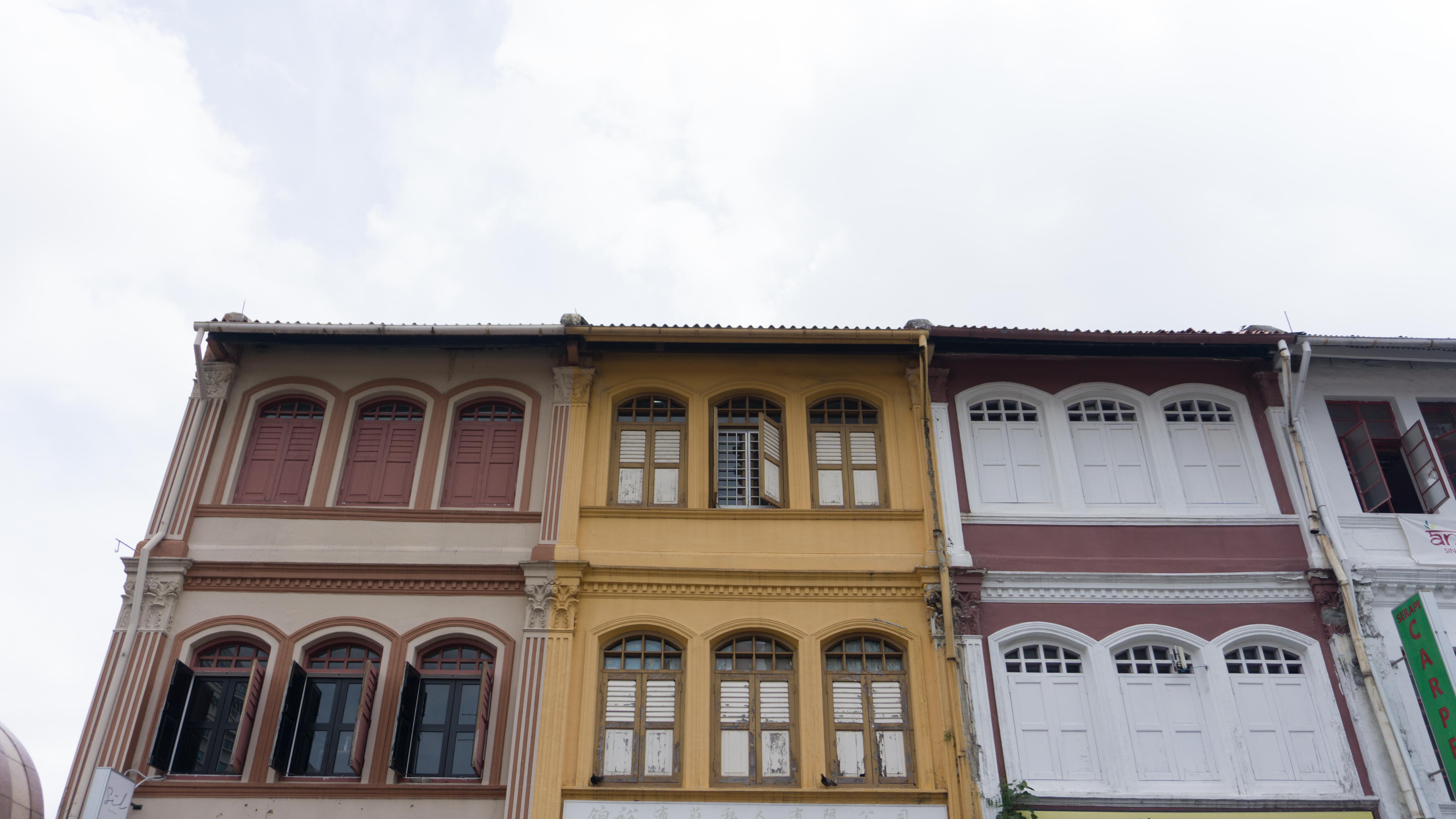
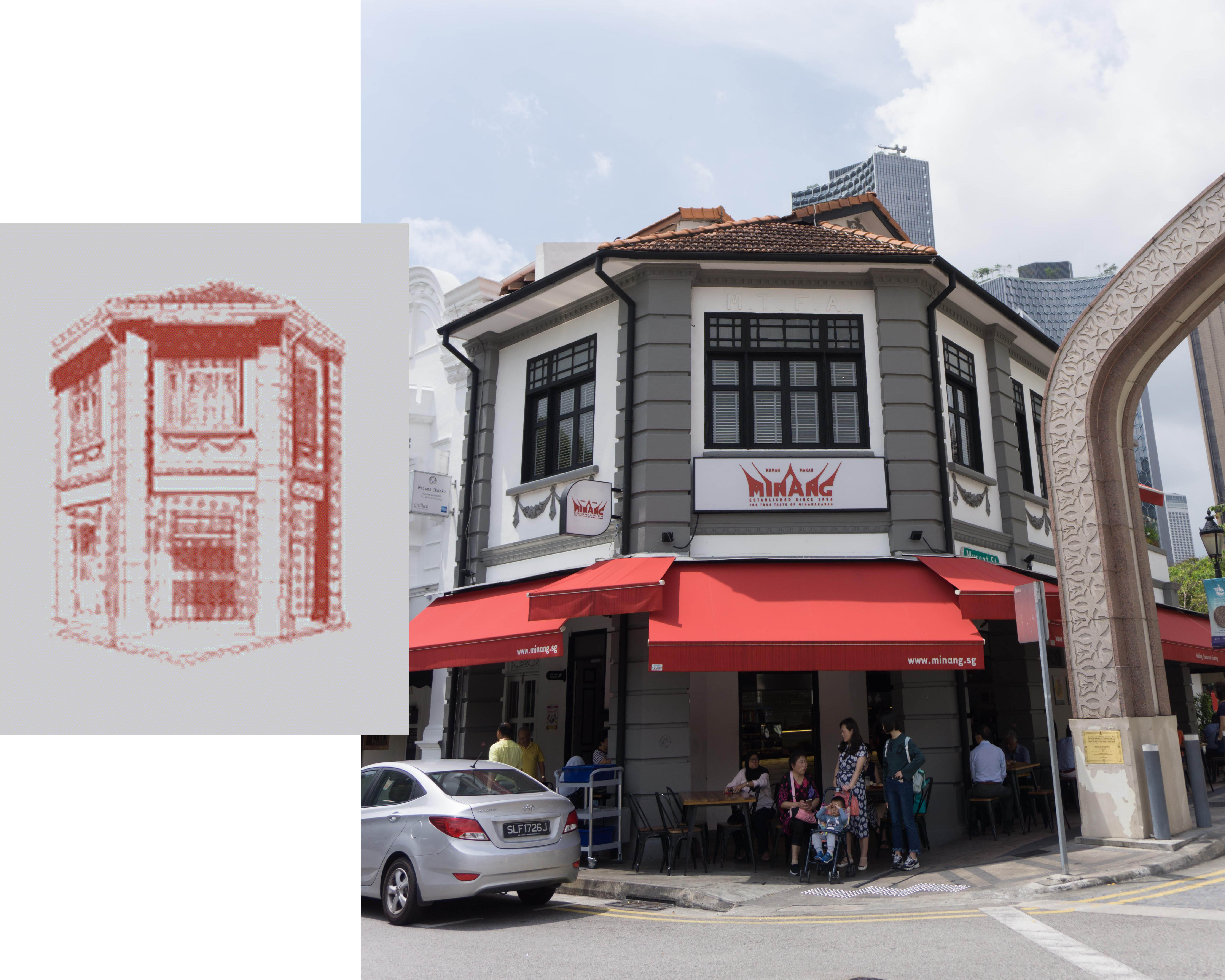
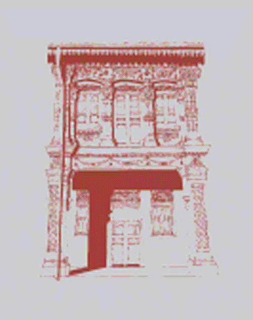
The reader will be first introduced to the day scene, which is the front cover. What better way to introduce Kampong Glam then with a prominent feature of the place — the shophouses. So I represented that using the different styles of shophouse windows.
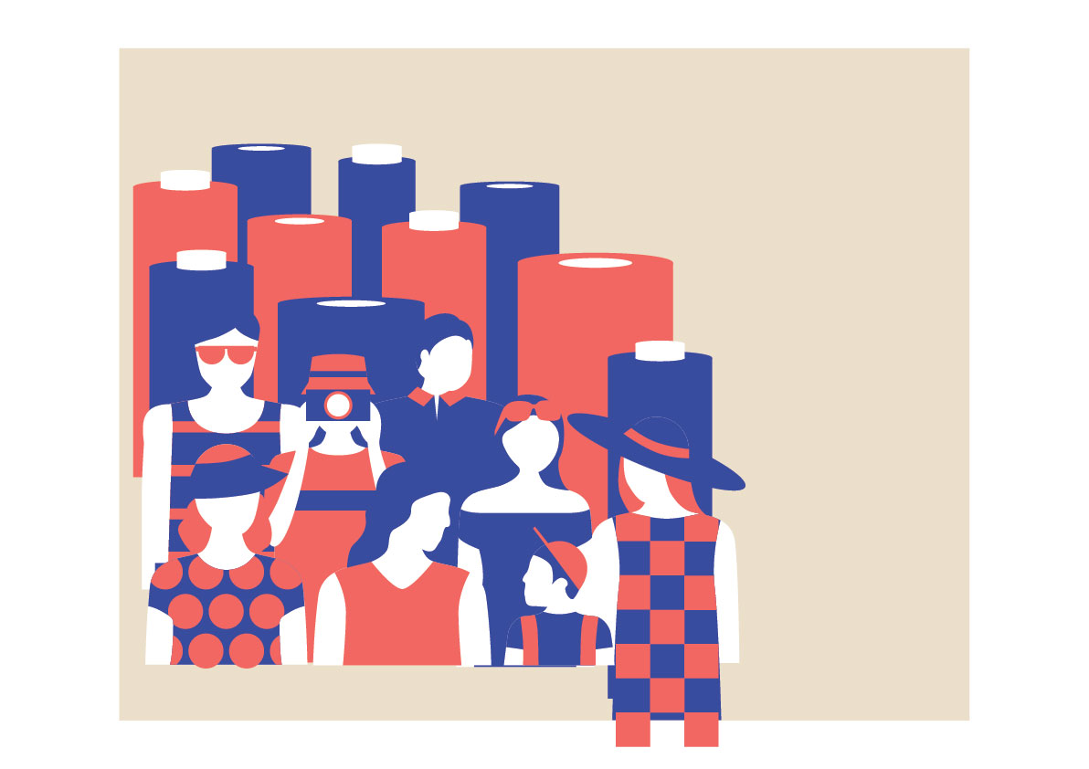
First Spread
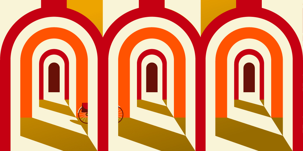
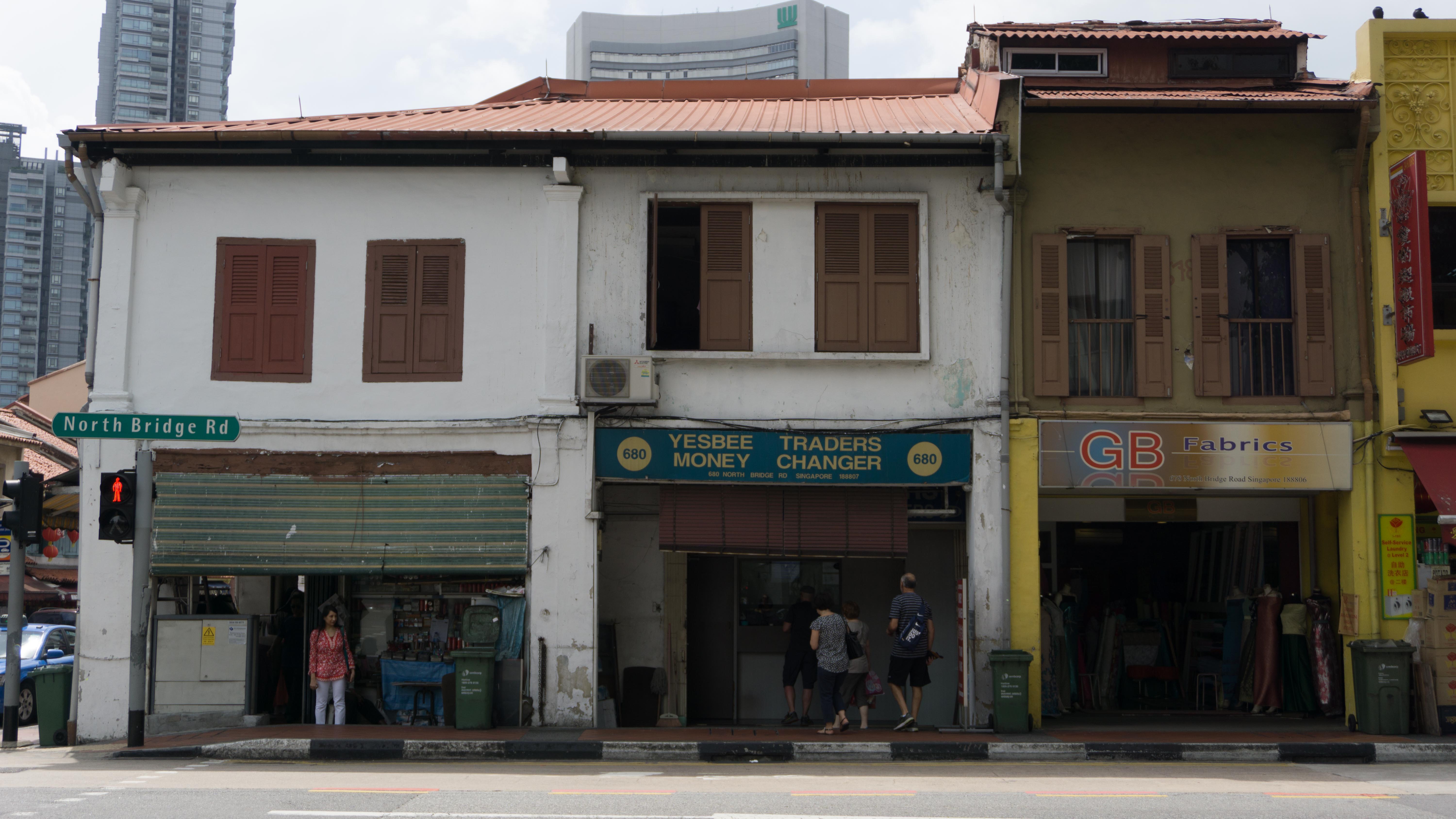
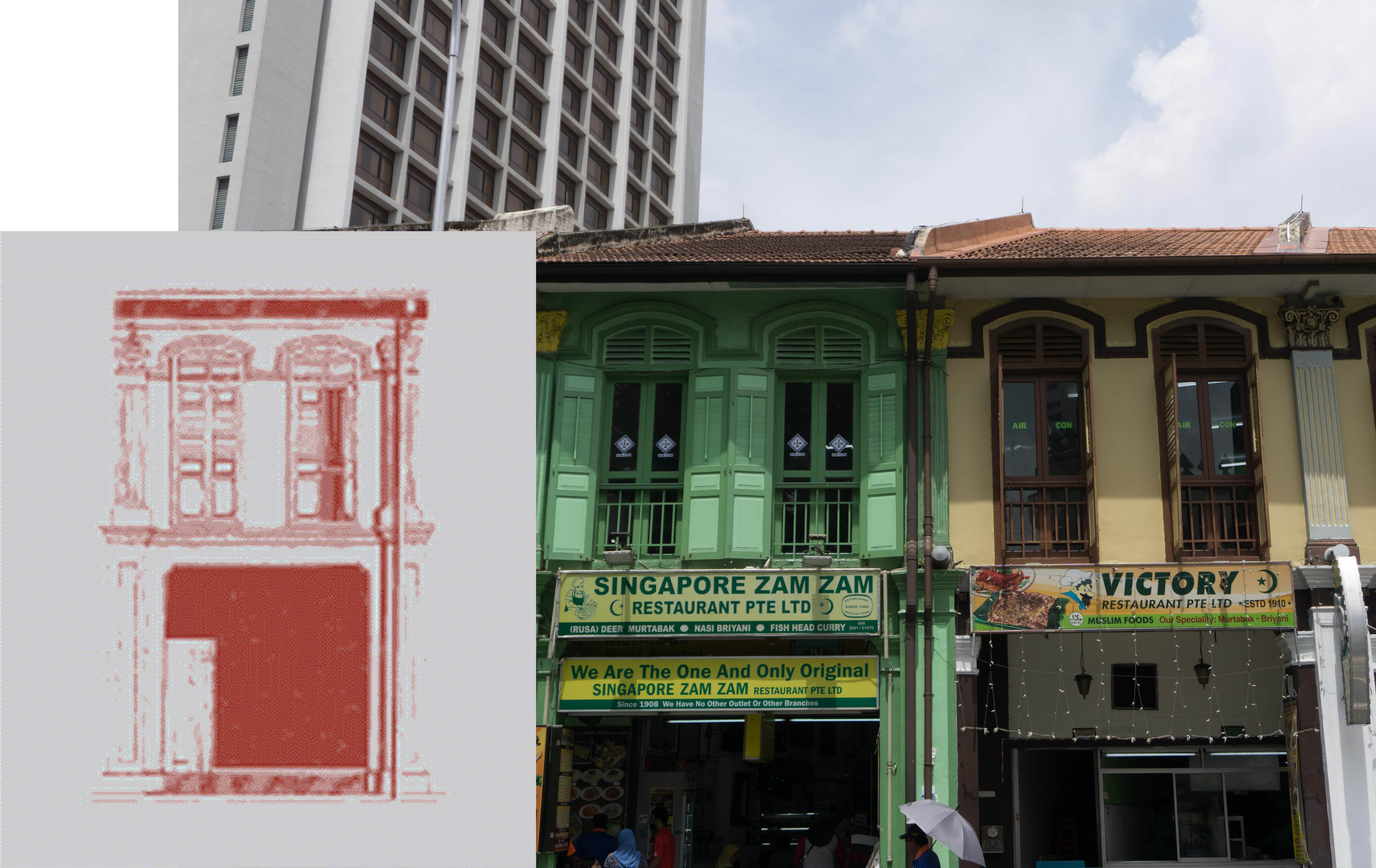
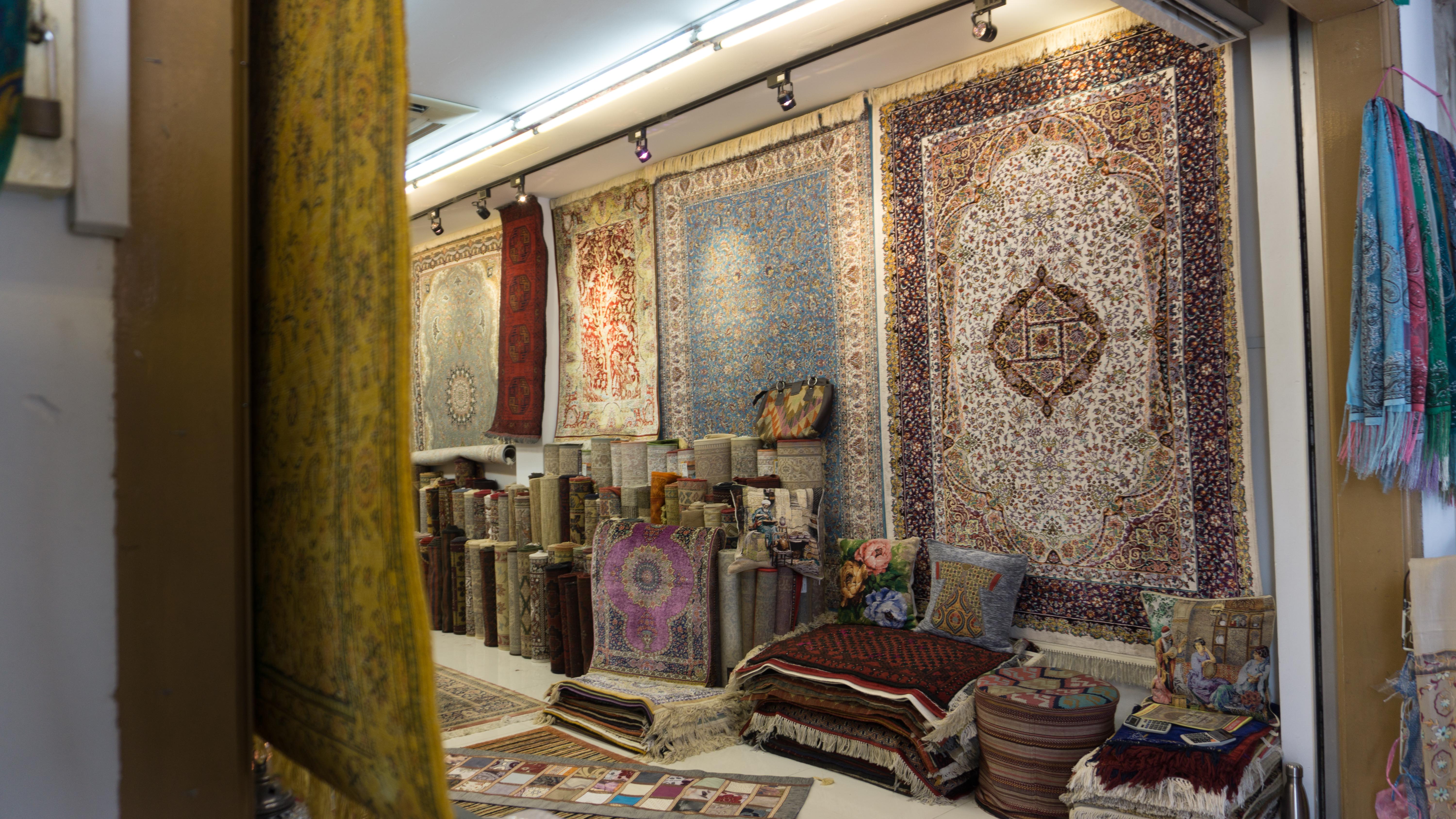
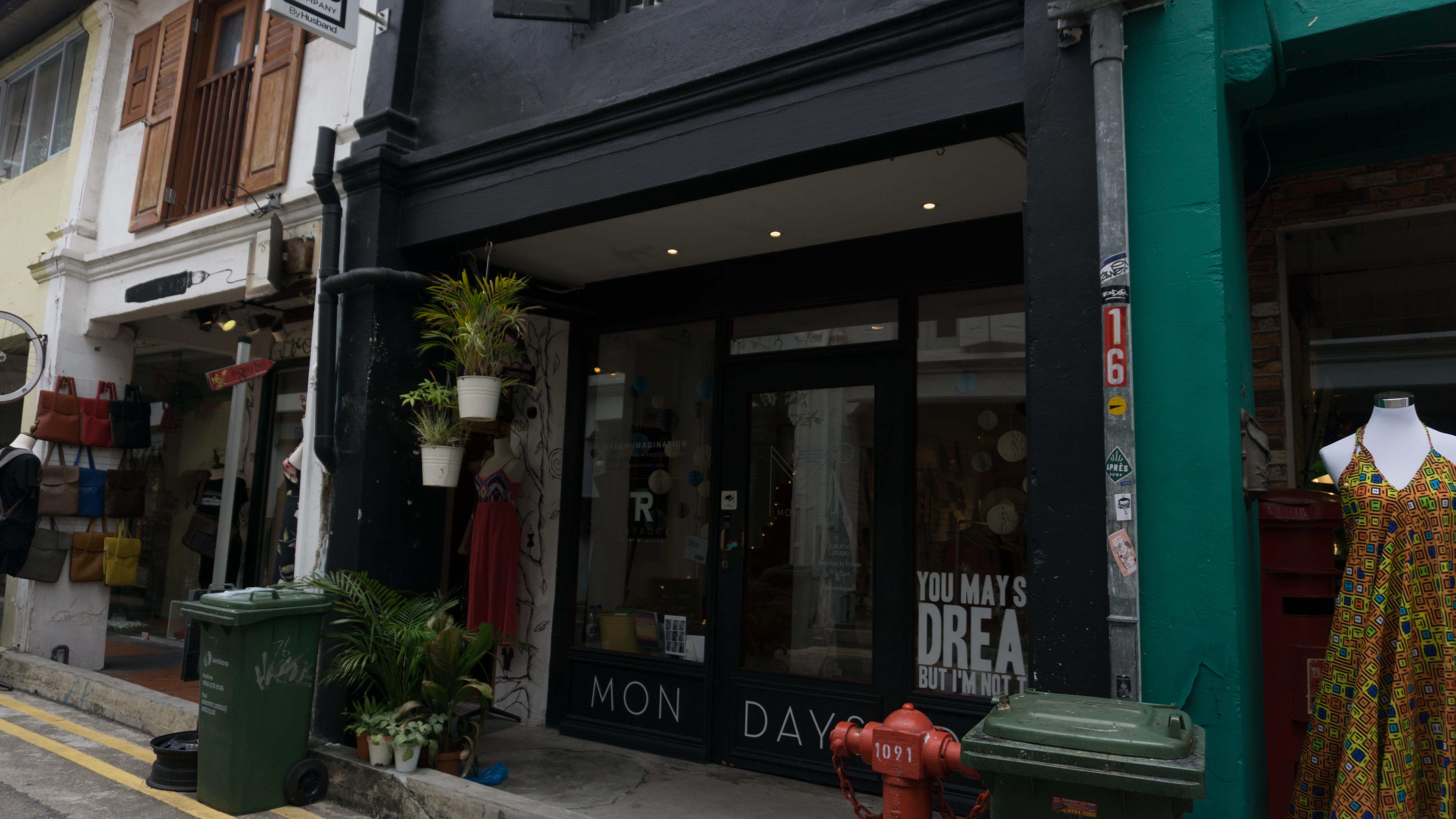
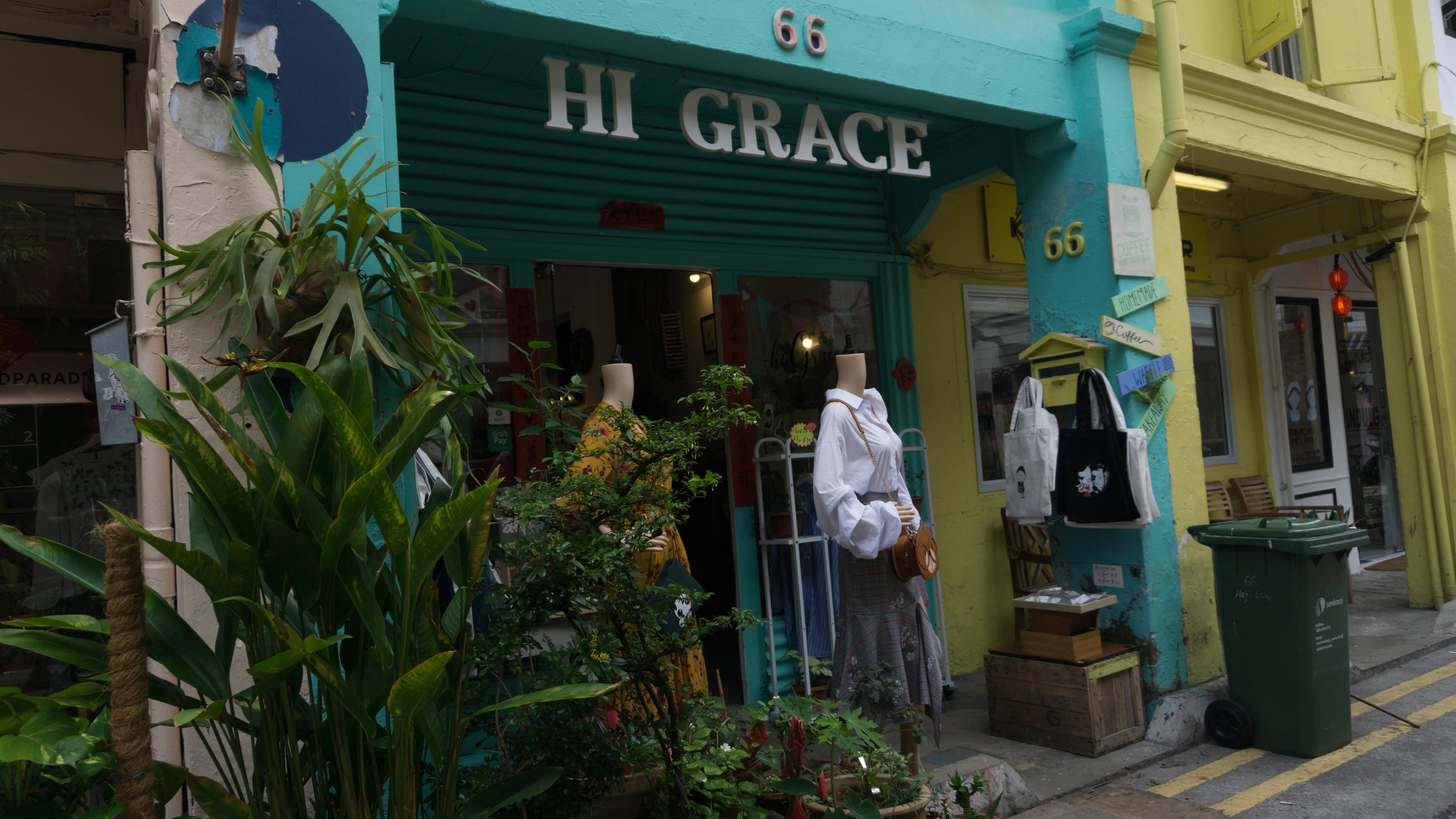
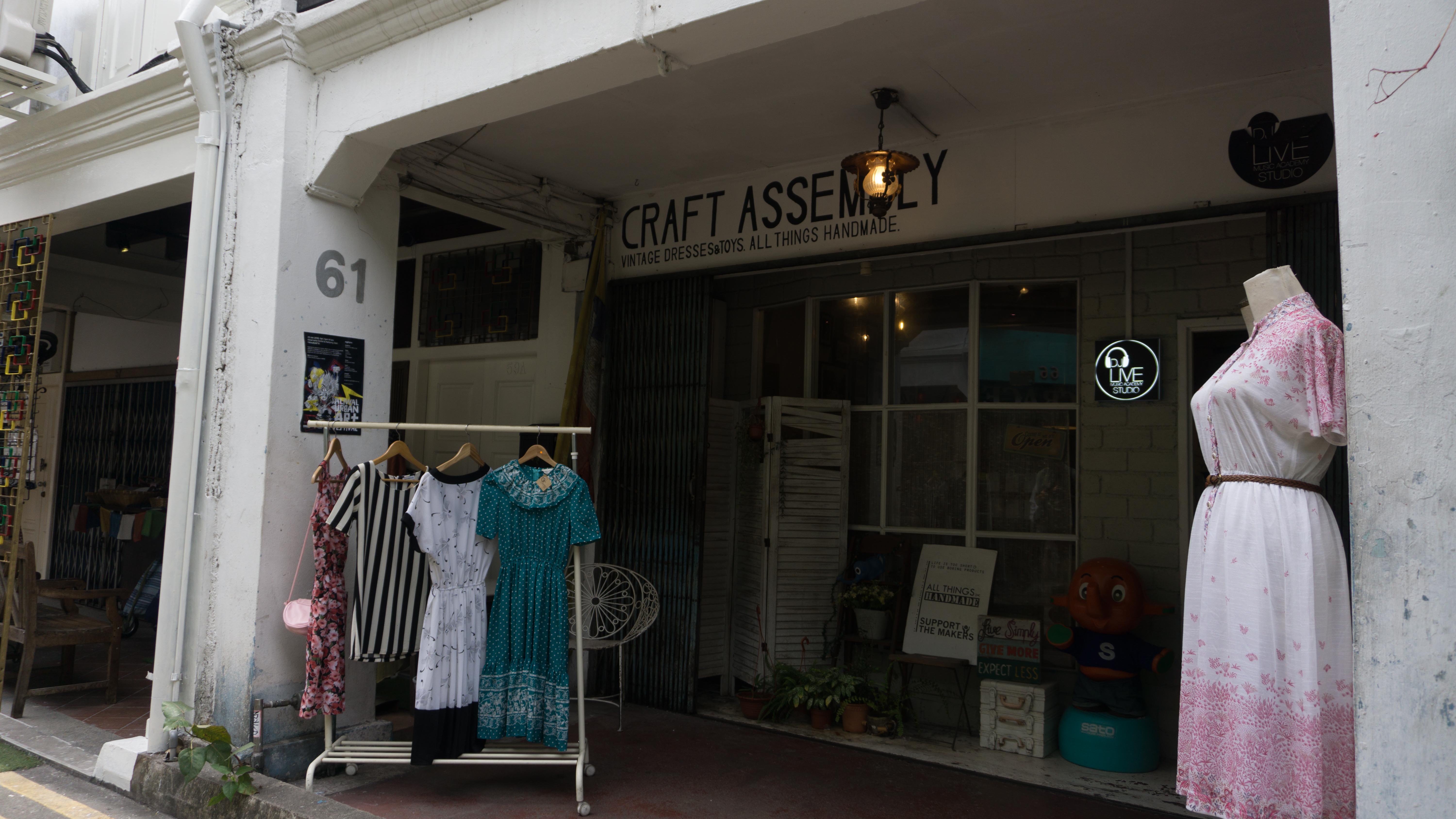
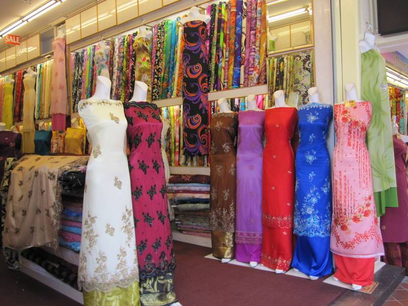
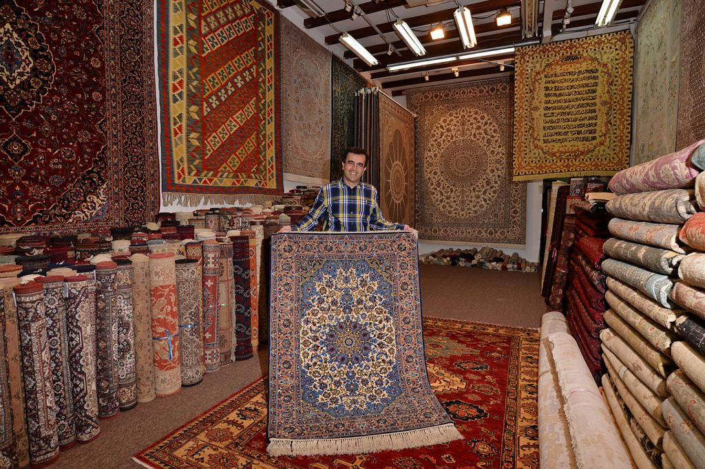
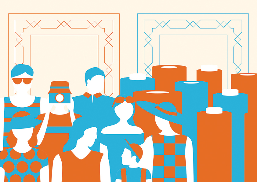 For the day scene, it would show the happenings that would you see during the day. Groups or tourists and tour groups would roam the streets, which can be seen on the left side of the spread. The other feature that can be seen during the day would be the retail shops selling fabric, textiles and carpets, which can be seen on the right side of the spread.
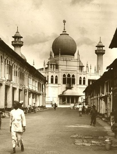
The two rectangular patterns on the top of the spread are to represent the long corridors along the shophouses and the patterns on it are similar to those that can be found on the Sultan Mosque, which is the most prominent building in Kampong Glam.
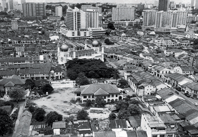
Most tourists can be found coming to Kampong Glam during the day
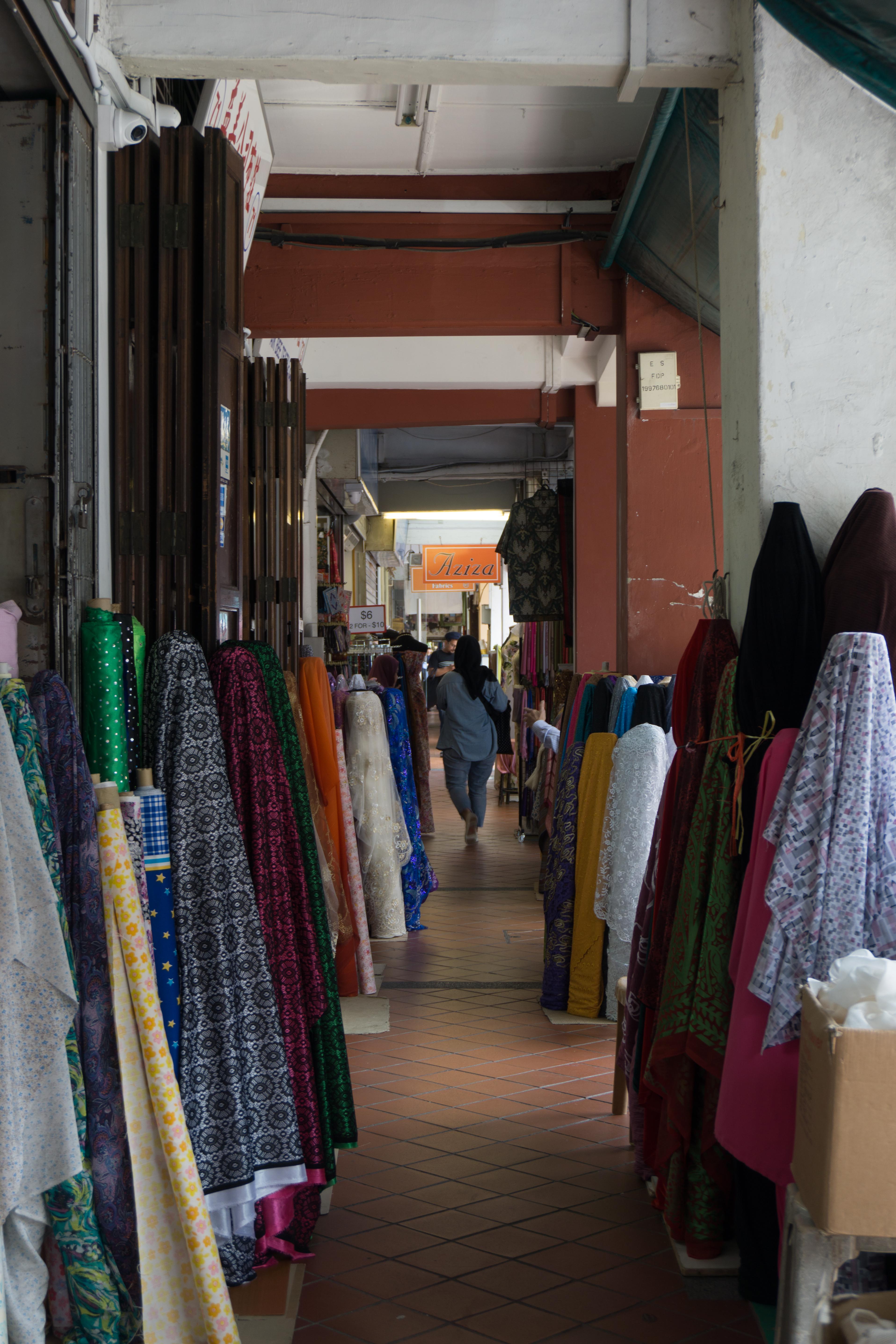
The many rolls of fabrics and textiles, a common sight at the shops at Kampong Glam
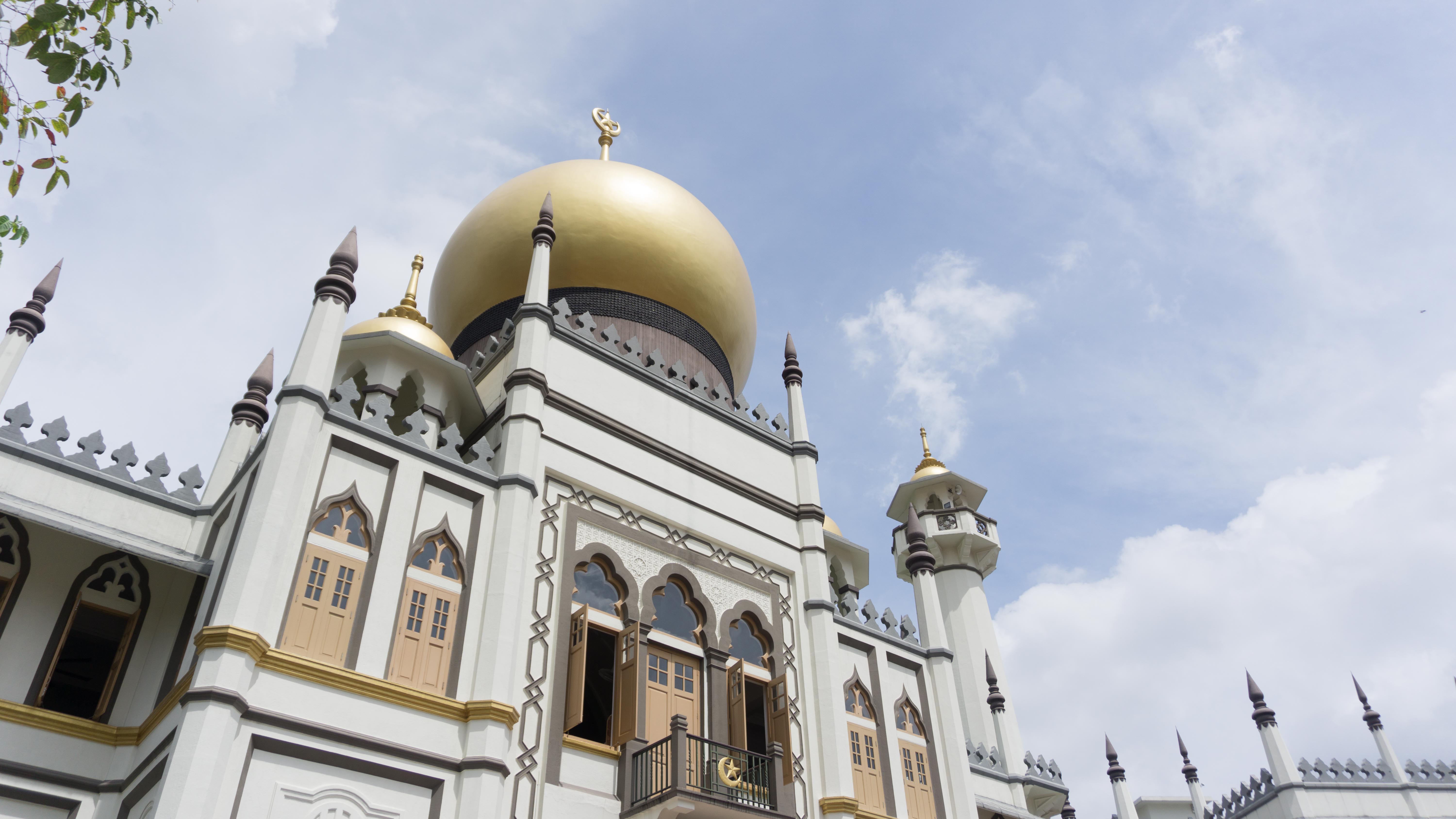
The patterns on the Sultan Mosque which is used in the zine
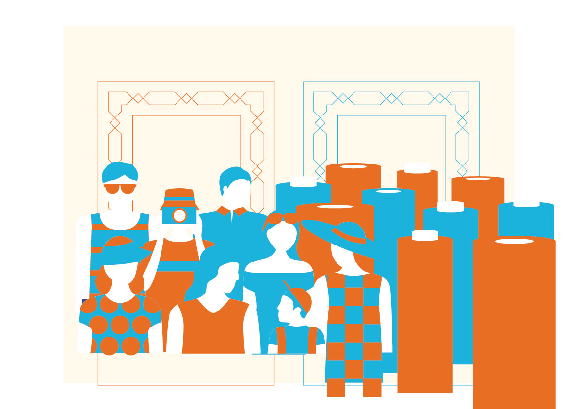
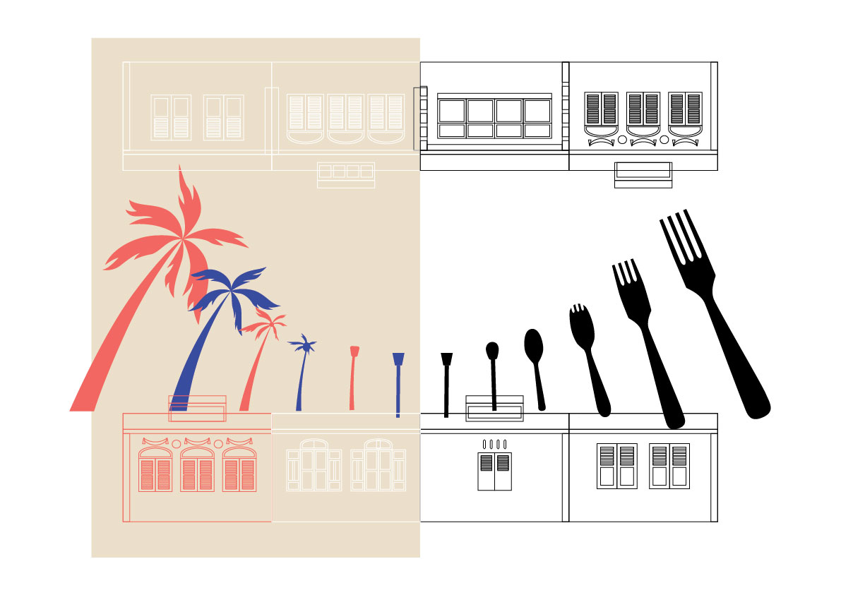
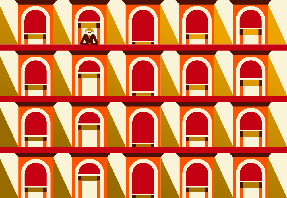
Middle Spread
The middle spread would be the most important spread as it shows the transition from the day scene to the night scene. I tried to make both the design styles from both scenes to blend as seamlessly as possible together.
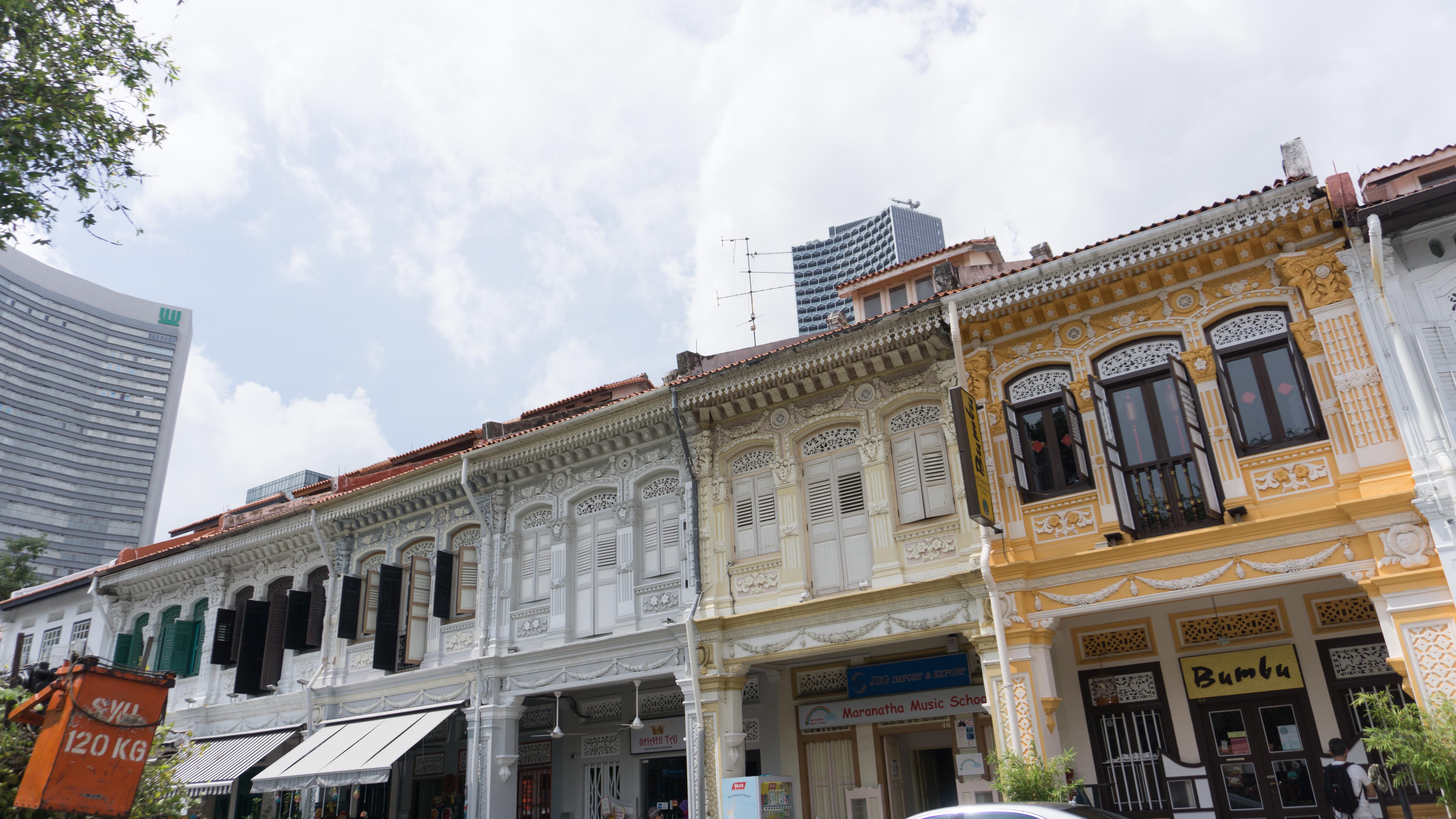
The two rows of shophouses, at the top and bottom, are to show the other prominent thing about Kampong Glam that can be seen in both the day and the night, which is the shophouses. In a way, it shows how the shophouses come in rows alongside each other at Kampong Glam.
Other than the colours, the elements in the picture also form a transition. It starts off with the palm trees, which is one of the elements at Kampong Glam that has become part of the place’s identity (normally complements the Sultan Mosque), which will transform to what looks like the shape of a lamppost, another element that would appear in both day (even though it is not used) and night, and transforms again into cutleries, showing that the food scene is more active at night and is one of the more major activities that happen at that time.
There is also a sense of symmetry in this spread to help support the idea of transition and balance.

The palm trees which almost always complements the Sultan Mosque
One of many shophouses that fill Kampong Glam in rows
The food scene is more active at night.
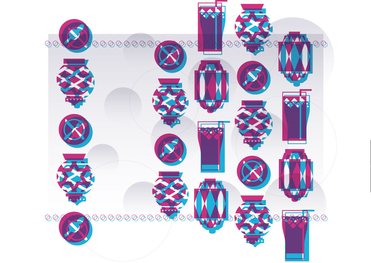
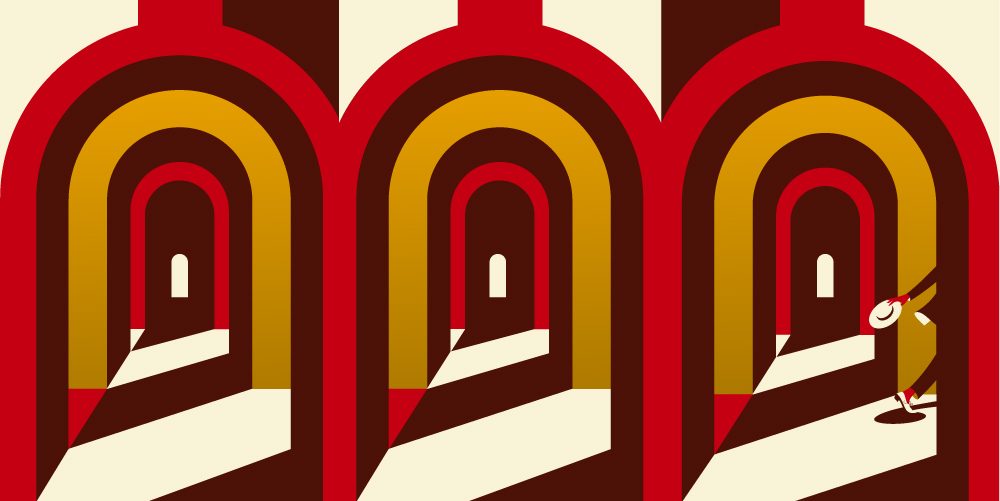
Last spread
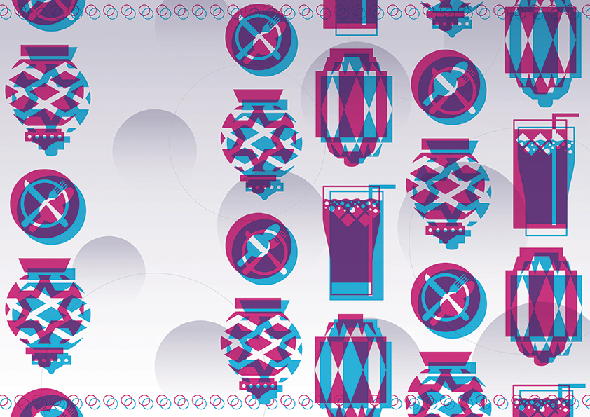
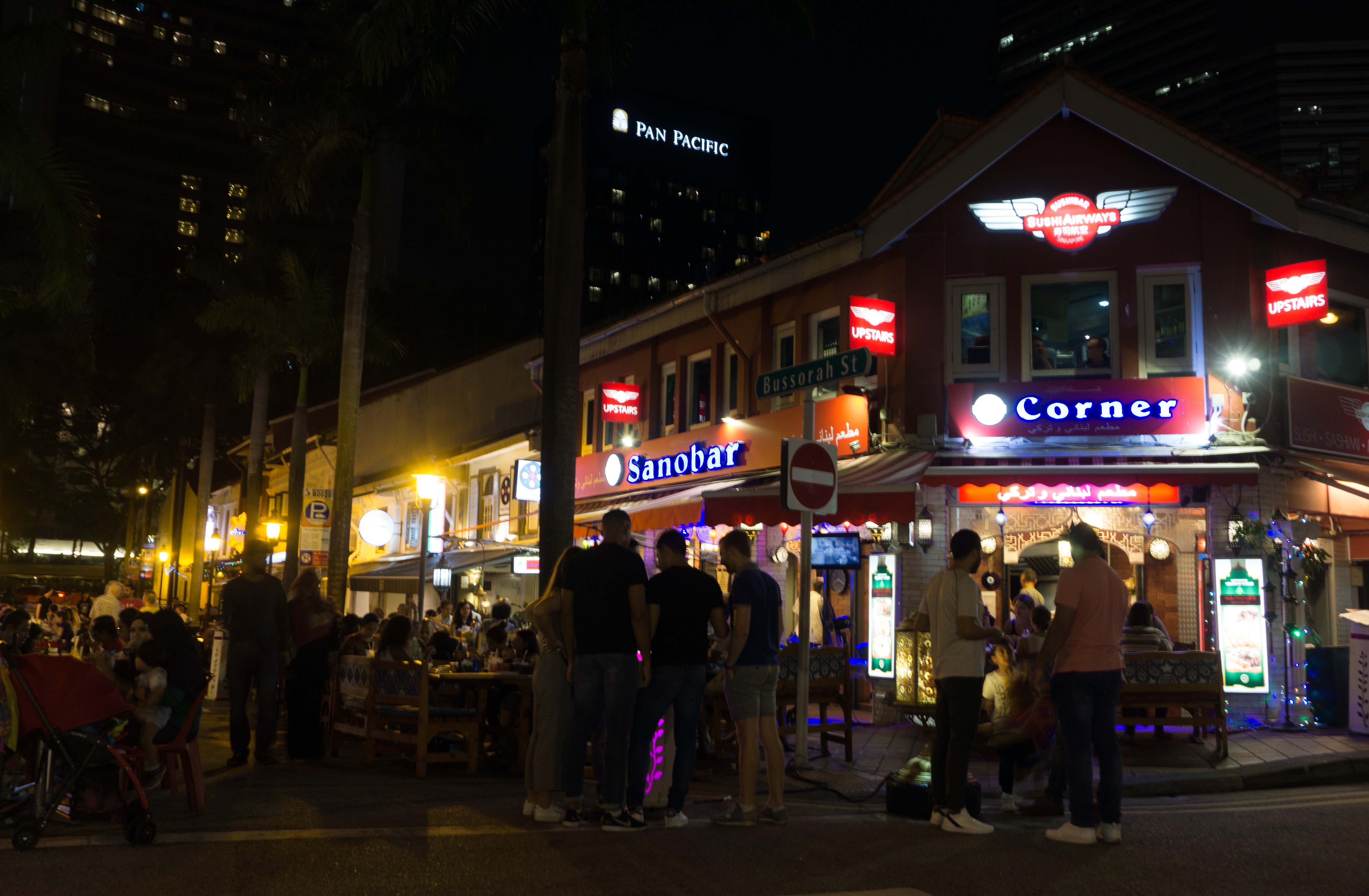
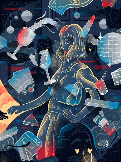
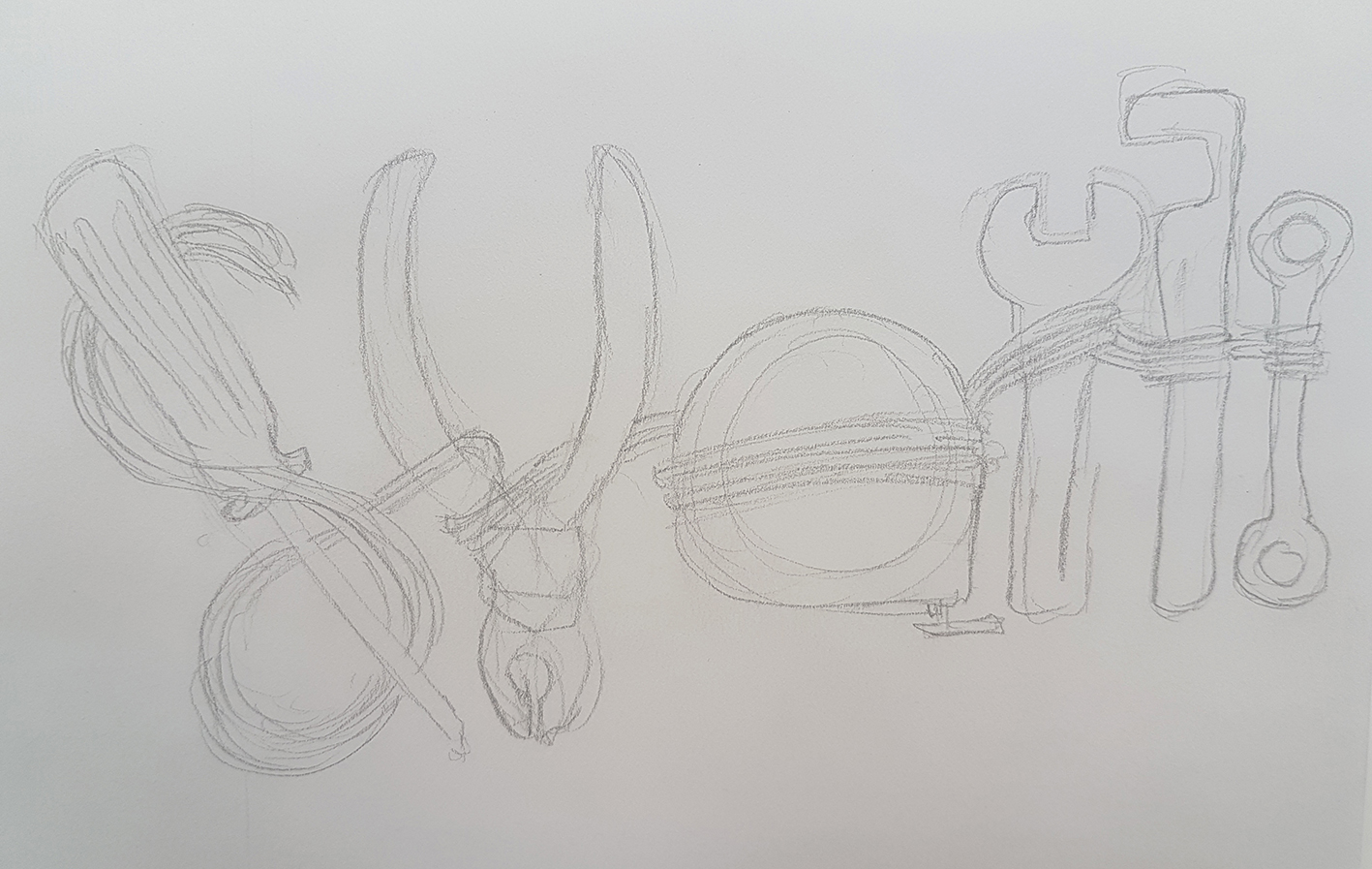
The last spread is the night scene. I would try to make this scene different from the day scene. The illustrations are mainly a repetition of the same illustrations, just taking turns overlaying and switching of colours. They are illustrations of the prominent things at night, which is the food and drinking scene and the many exotic lanterns that come in both circular and rectangular shapes with many different patterns on them.
Other than the entirely different colour scheme, the illustrations here overlay each other but off centre by a bit to form like a double image, which is an element I discovered at night where the lights form double shadows, most of the time coloured, creating double coloured shadows.
The circular features in the background and the background itself has a gradient element to it to show the down-up lighting that can be found on some of the buildings at night. So here I make the gradient in a way that is lighter from the bottom to help express this.
The overlaying circles at the top and bottom, however, are the lights that I find lining some of the buildings and arches of some restaurants and shops.
Double coloured shadow formed on the wall at night

Down-up lighting on the buildings at night

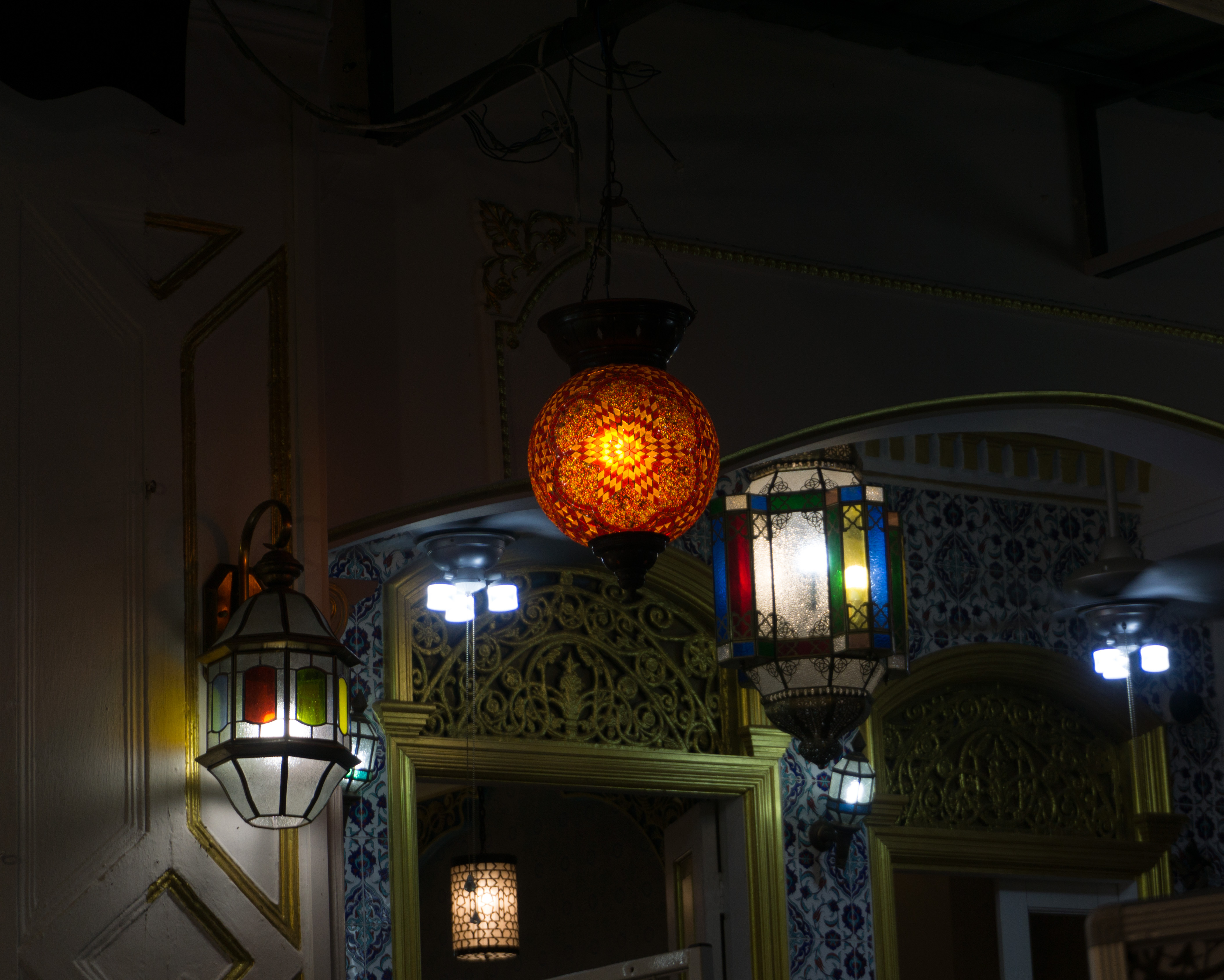
The many different styles of exotic lanterns
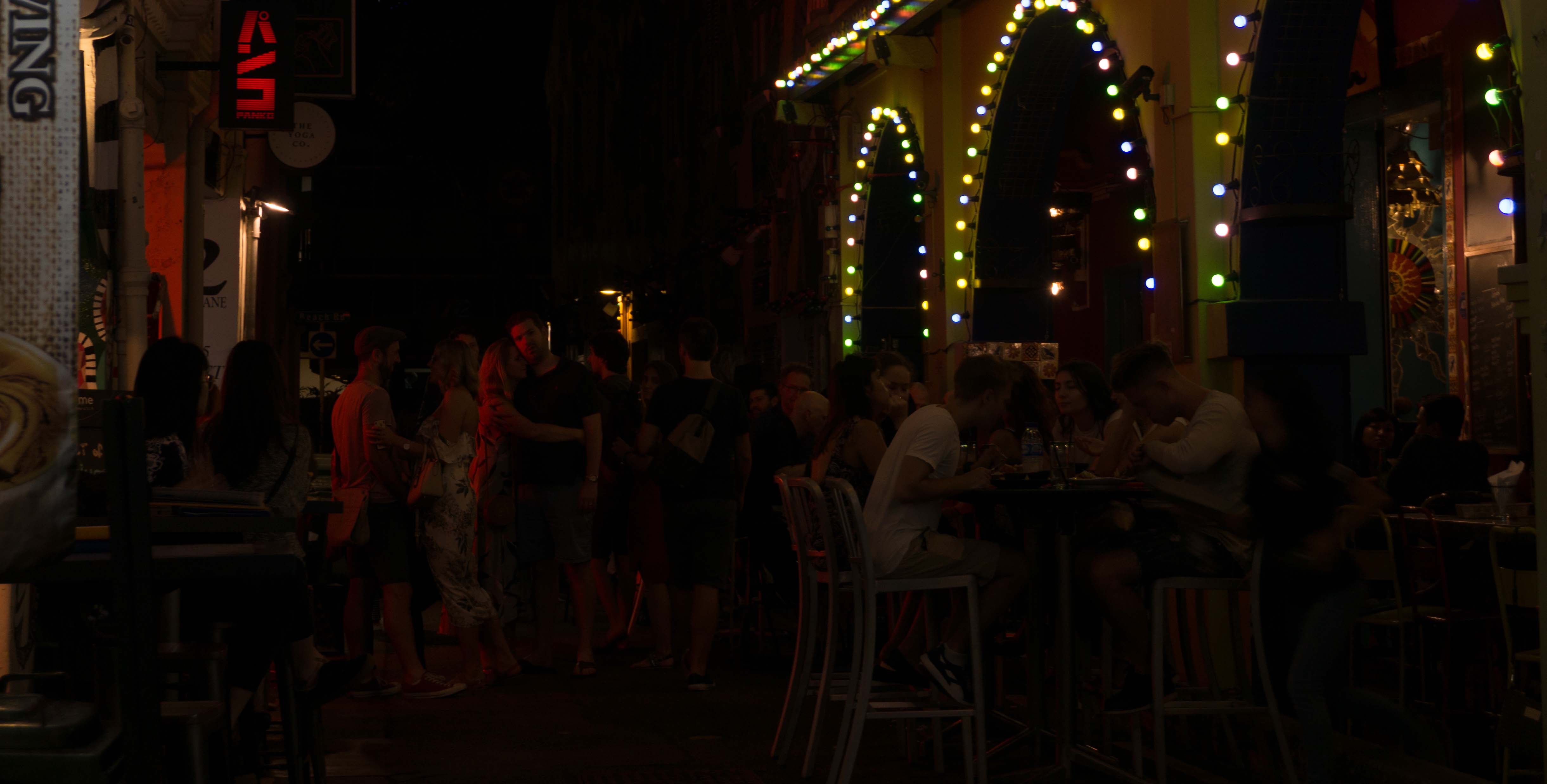
The drinking culture, and the rows of lights lining the arcs at a bar
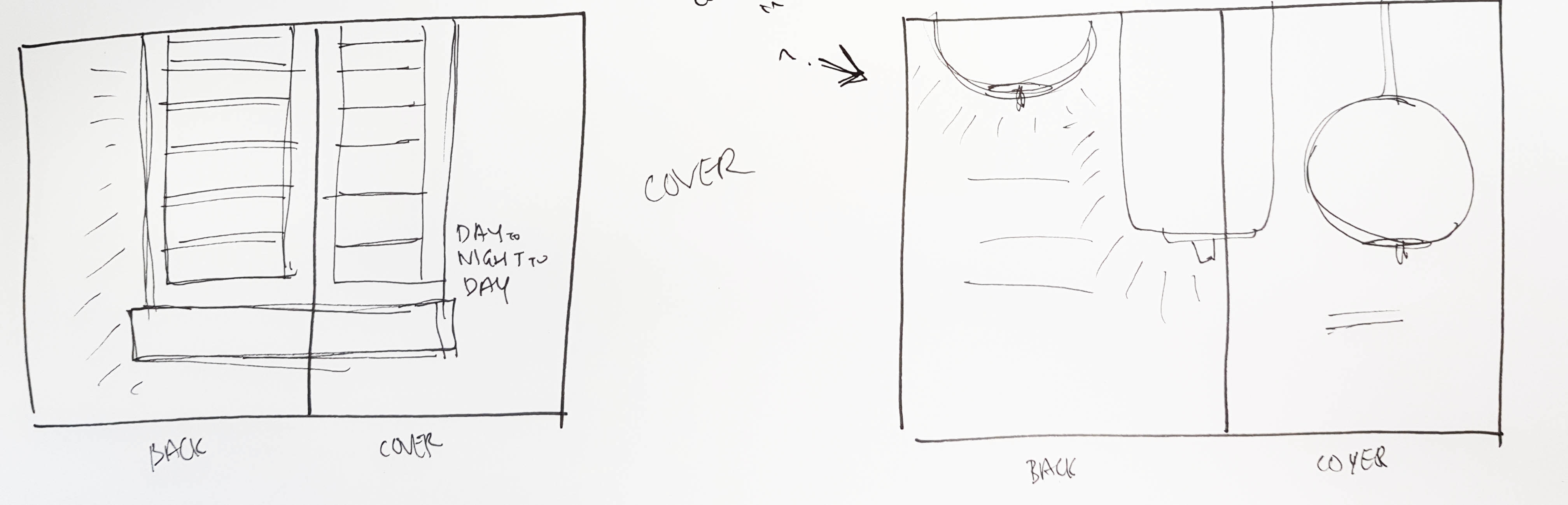
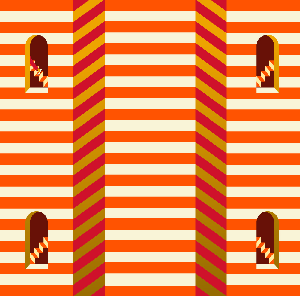
Back cover
So what comes next after the last spread? The reader would normally flip to the back cover, which is also the night scene. The back cover is similar to the front cover only with the elements of the night.
Wait a minute…
Something looks funny on the back cover. It looks like the design for the night scene decreases or lightens up towards the right.
If you open up the back and front cover into a spread you can see that it forms another transition…
 There is another transition here, hidden if the reader does not open up the cover and back cover into a spread. The night scene transforms back to the day. This is how it goes back to the title and the idea of the day and night scene is in a cycle, how one comes after the other, even though both are of almost opposite styles.
Styling
Design Style
I chose to do flat illustration as it would allow me to create a clean style that would be easy and simple to understand. It would also allow me to do a clean overlaying of illustrations which is what I did for half of the zine to show the night scene.
There are also line works used in the design as it would help to lighten the spreads, in a way giving the reader a breather while flipping through the pages. It in a way prevents the spreads from looking too cluttered and filled.
Colour Scheme
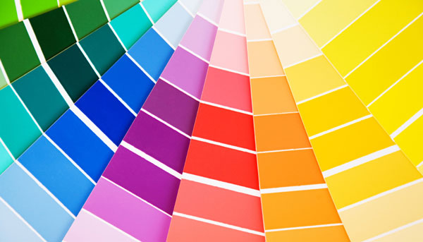
I used the main colour blue which is consistent throughout the zine. I used blue as it is a cool and chill colour, in a way to represent the pretty chill culture and vibe the Kampong Glam has in both the day and night.
In the day I used its complementary colour — orange. It also helps to make the day scenes look bright like the day and also to represent the warmth during the day.
In the night, however, I used one of the blue’s triadic colours — a hue of purple. The other triadic colour was a hue of yellow which I did not find suitable to be used for a night scene. The hue of purple helped to support the night scene more. It gives a sort of mystery to the illustration too.
My Thoughts
The first challenge would definitely be trying not to make the zine look like a brochure for Singapore Tourism Board. The location I got is Kampong Glam. It IS a tourism spot. So no matter what I do at first, it would definitely look like a tourism brochure for the location. So it took me a while to find a direction that would be away from that. It took me 3 weeks actually and I was still unsure about my idea.
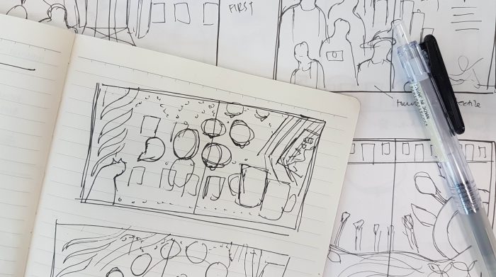
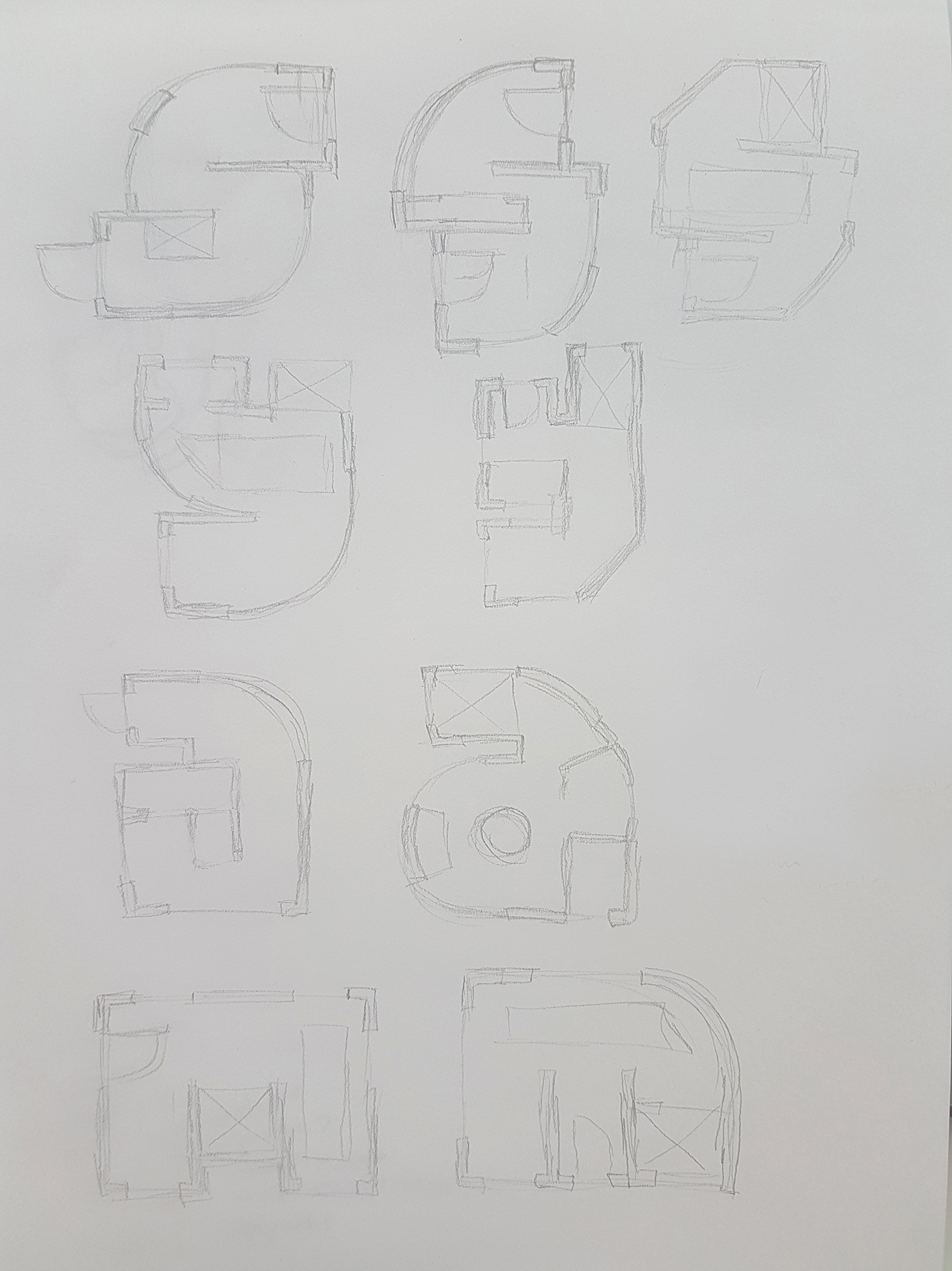
Closing in to the actual supposed production time, I finally got my idea for the zine. With not much time left, I got to the production and sketches as soon as possible. The next challenge for me was laying out of the zine. I found it hard to make the illustrations into a layout since most of the laying out that I am used to involves the use of images and photographs. I had to consider laying out and experimenting with design principles and colour theories. It took me a lot of sketches and ideation to get to the final one that ended up in the zine.
Then the illustrations took a long time to design and illustrate. When alot of my friends actually tested prints and are done with the layouts, I was still attempting and trying to complete my first spread. So I panicked abit but I still tried.
The end product is not my best. I know that. If there was more time I would definitely attempt other layouts. Maybe more detailed illustrations and experimentation. But I was definitely still happy with the comments and remarks that I got from my peers.


