The Bag Project – Soft Goods Assignment

For this assignment, we are to create an object out of soft material, like fabrics, but make the prototype using paper. So I had the idea of creating something that would be useful for my profession as a designer.

Deciding on the product

Before actually getting into the technicality and the actual making and sketching, I would have to decide on what to make first. I would want to make a bag, but there are many types and for different purposes.

I thought of making a box-shaped bag as that is a common type of bag that I see being carried by designers.

Another common bag that I see is the tote bag, which is convenient for designers, but when it comes to weight, it gets a little heavy on the tote bag for one shoulder or one arm to carry.

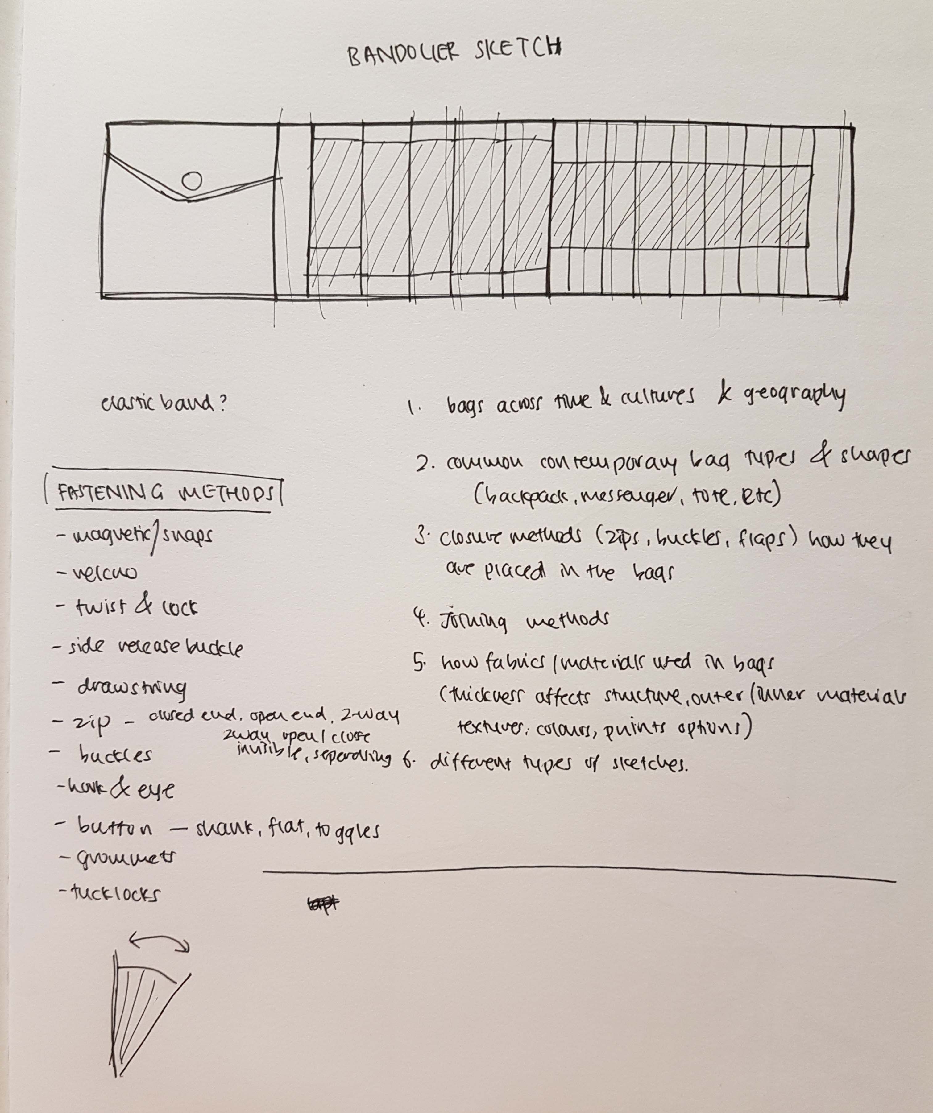
There was also an idea of making a form of the bandolier, which is something that the military would use to carry bullets and ammo, but instead of carrying those, this bandolier would be carrying designer or artist tools, like drawing pens or pencils, and a compartment for the smaller stuff. But then I would think that it could be a bit over the top and unnecessary.

So I decided to stick to the first idea which is the box-shaped bag as I think that would be the most practical to make.

Getting started

Now that I have the idea of the bag in my mind, I would then start to list the things that could be featured in the bag design. These things would be useful for the user of the bag – useful for the designer using the bag.

Parts of the bag:
  • laptop slot
  • EZlink card holder/slot
  • thumbdrive slot
  • A4/A4 sketchbook size
  • A2/A3 roll holder
  • penknife/cutter slot
  • pen holder
  • bottle slot
  • ruler slot

(These are just initial ideas. Some of these ideas get scrapped over time)

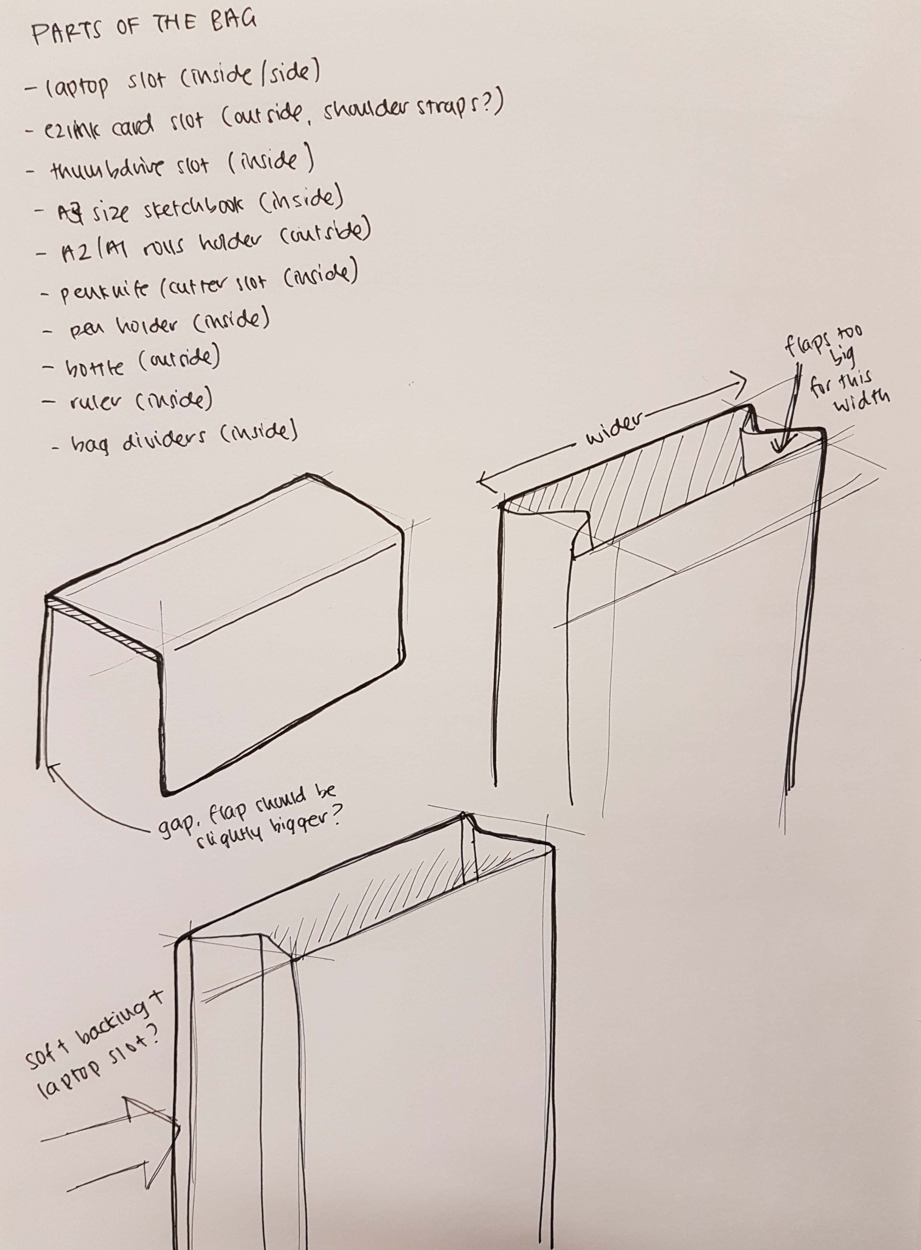
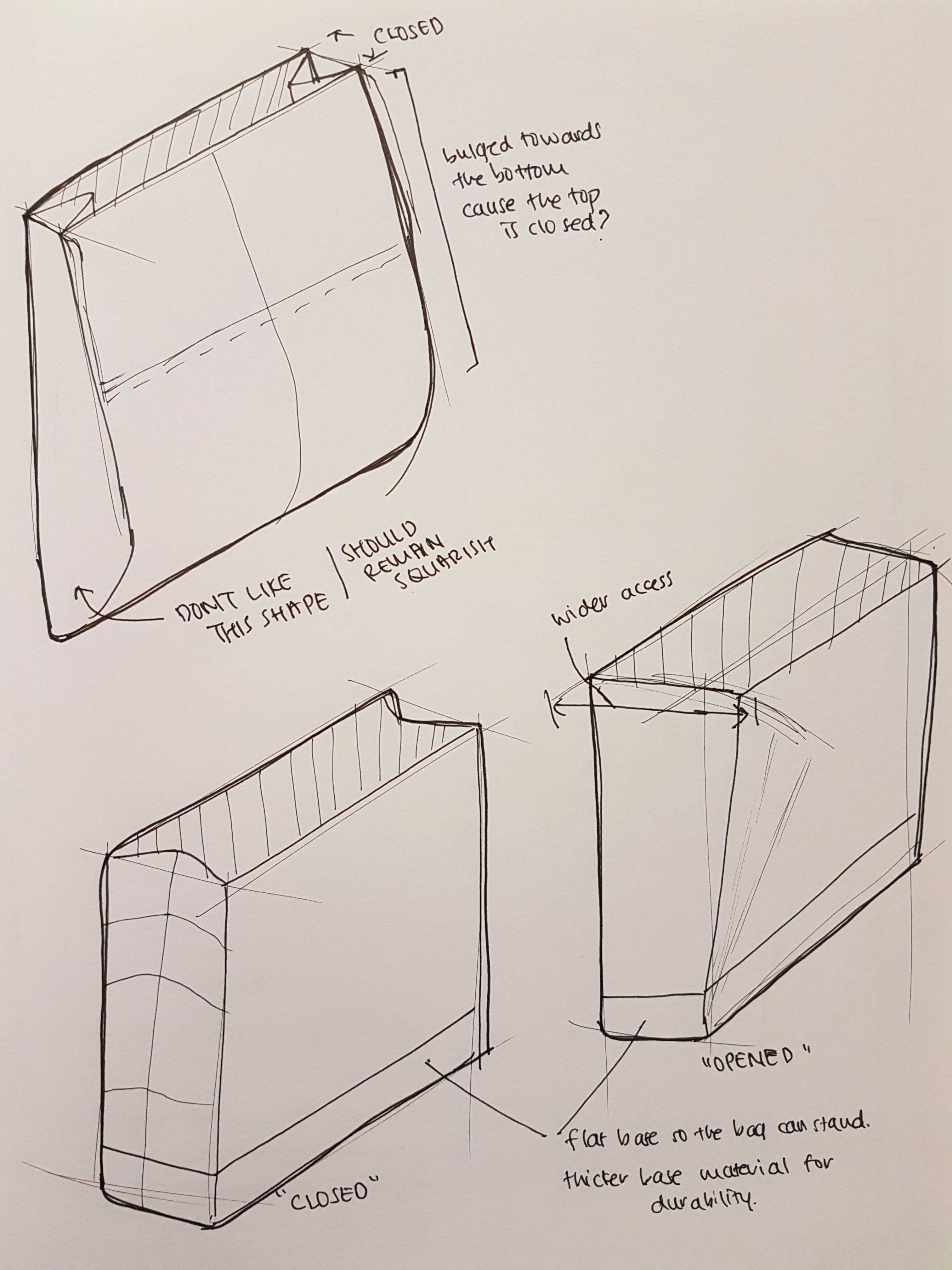
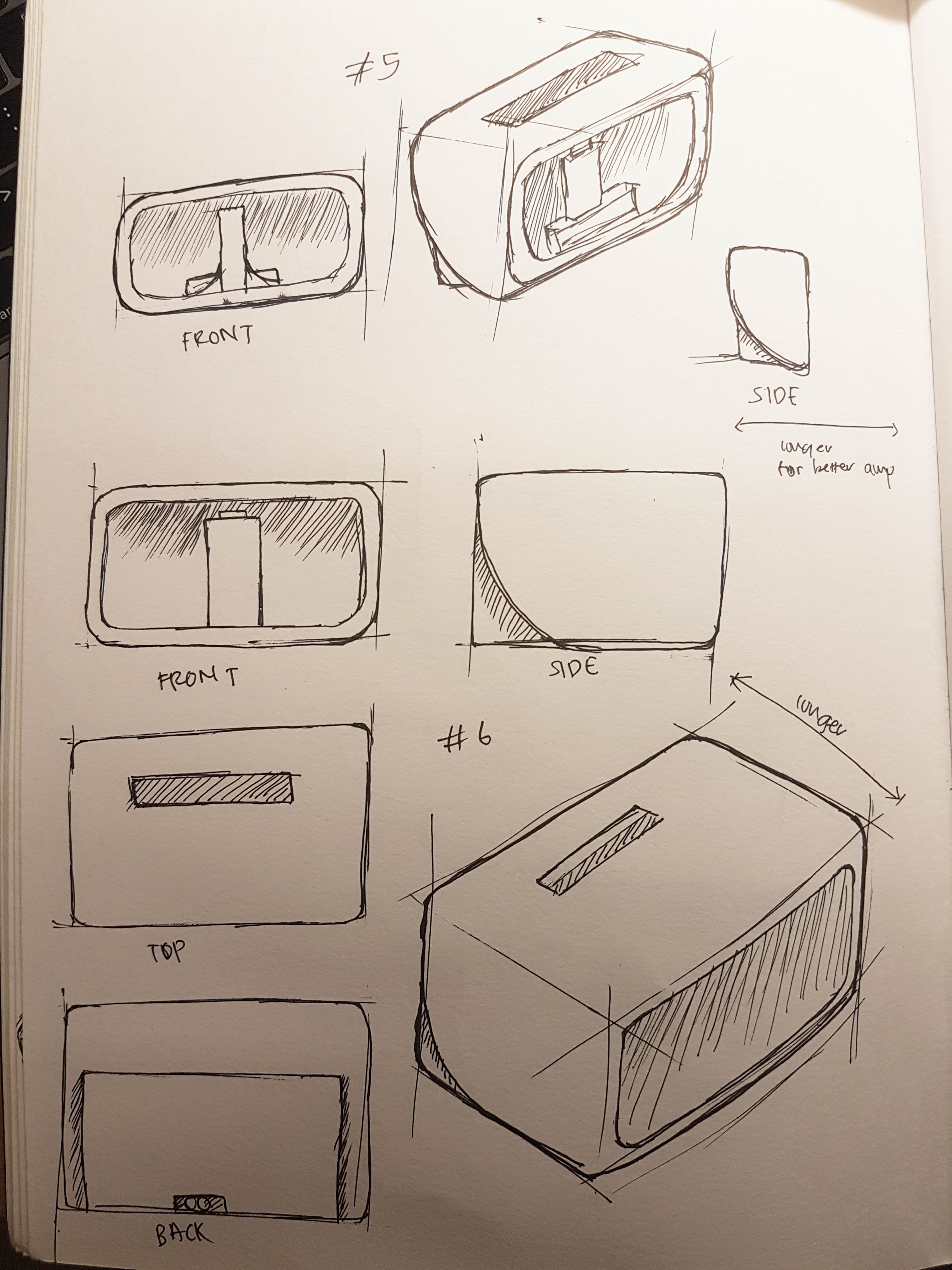
I also started to play around and reconfirming the main shape of the bag. How it is closed and how it is going to open up. So I decided to make the main body of the bag able to open up bigger for easier accessibility of the user.

Exploring the different parts

After listing down the different compartments needed, I start working on them.

Laptop slot

The biggest and main slot would be the laptop slot. Here I try to list down and sketch out the different ways the compartment or the laptop could be kept in the bag.

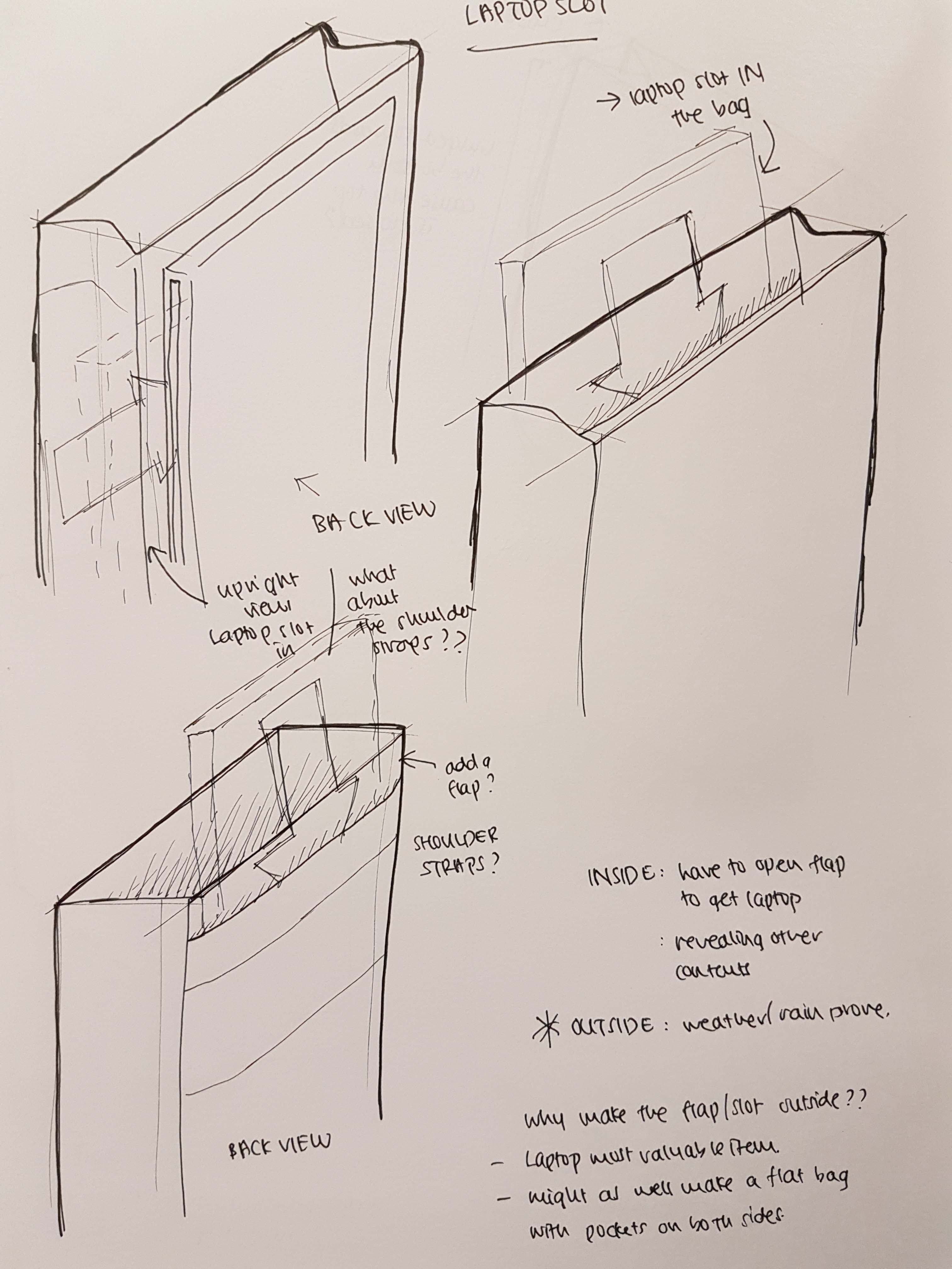
I chose to stick with the inner laptop slot compartment as it would be safer for the laptop.

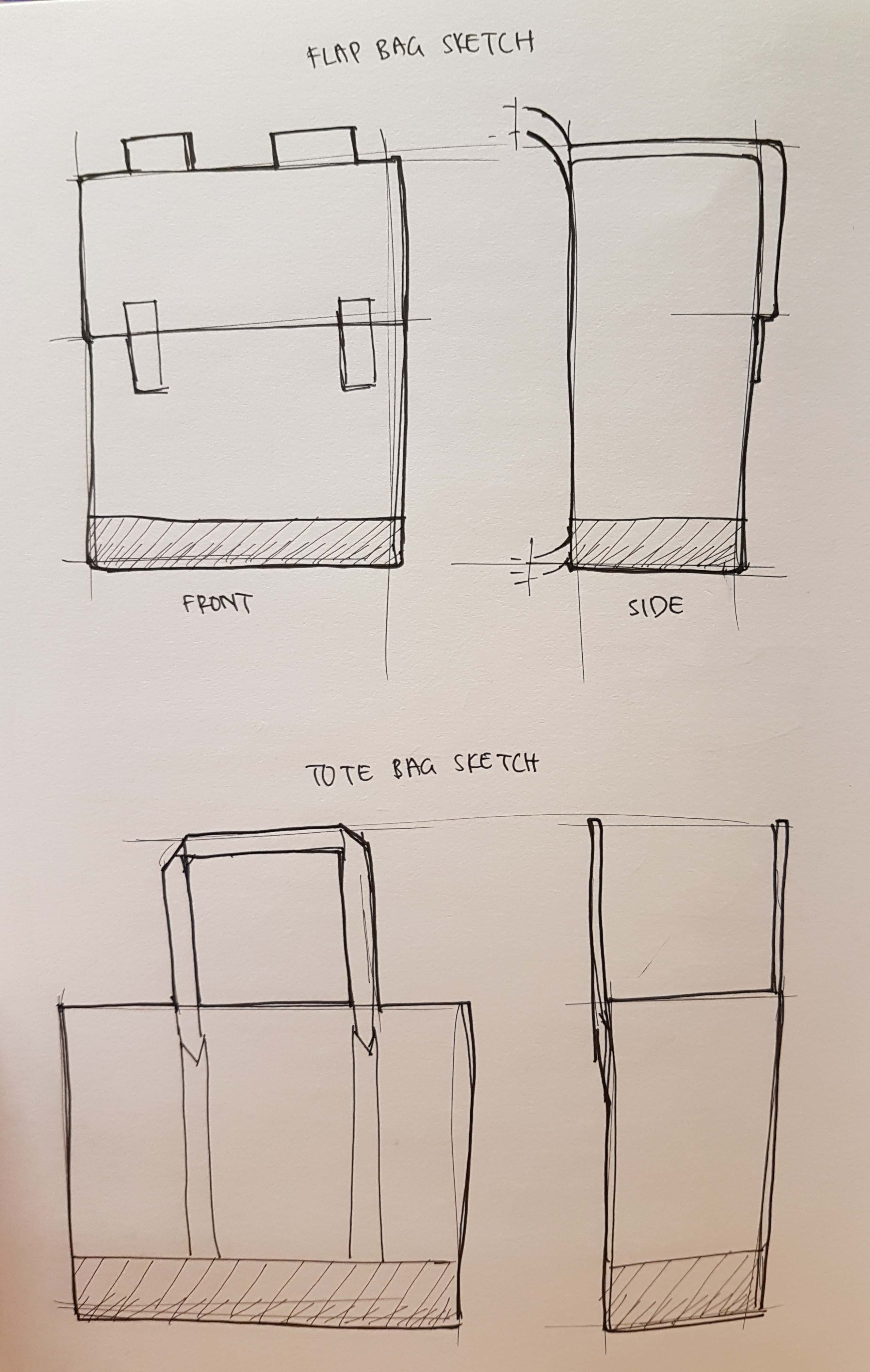
Bag flap and closure

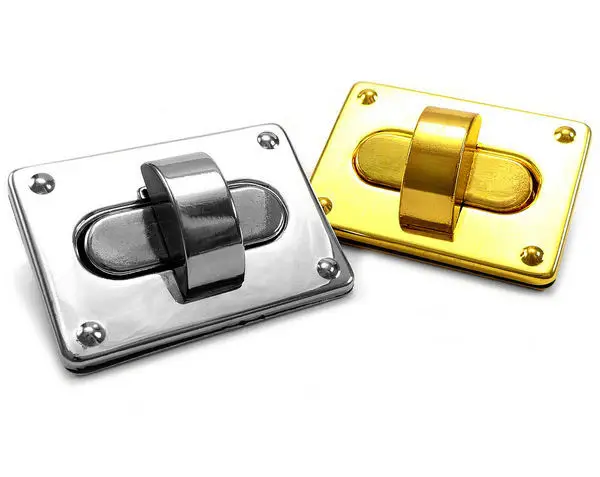
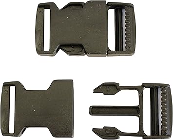
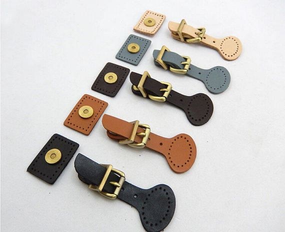
With the box-shaped bag in mind, it comes with the flap. So here I try to explore the different types of closure for the flap, like magnetic snaps and hook & eye.

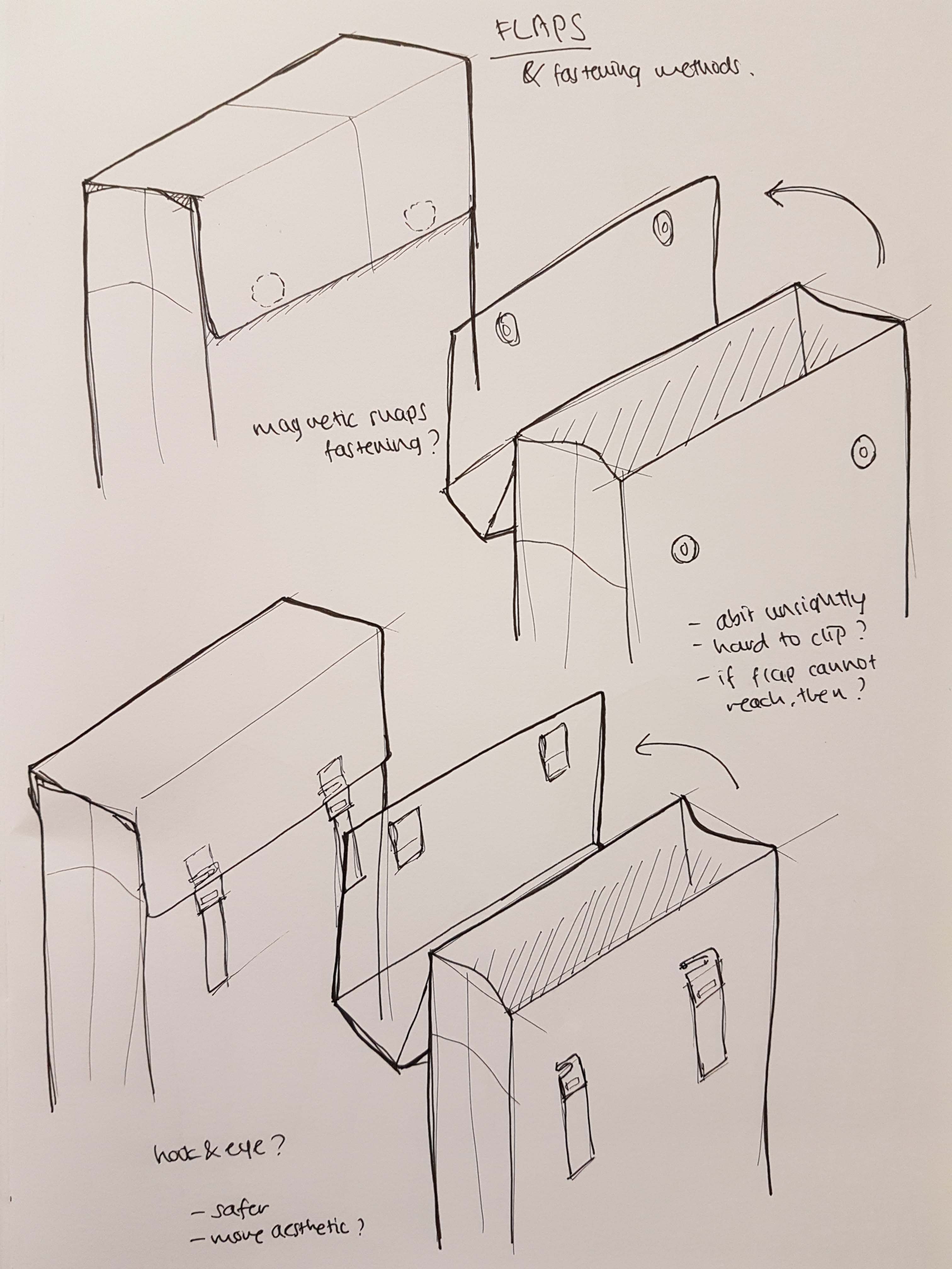
I decided to use the hook & eye method as I would think that the magnetic snaps would wear off after a while and it would be hard to connect the snaps together under the flap.
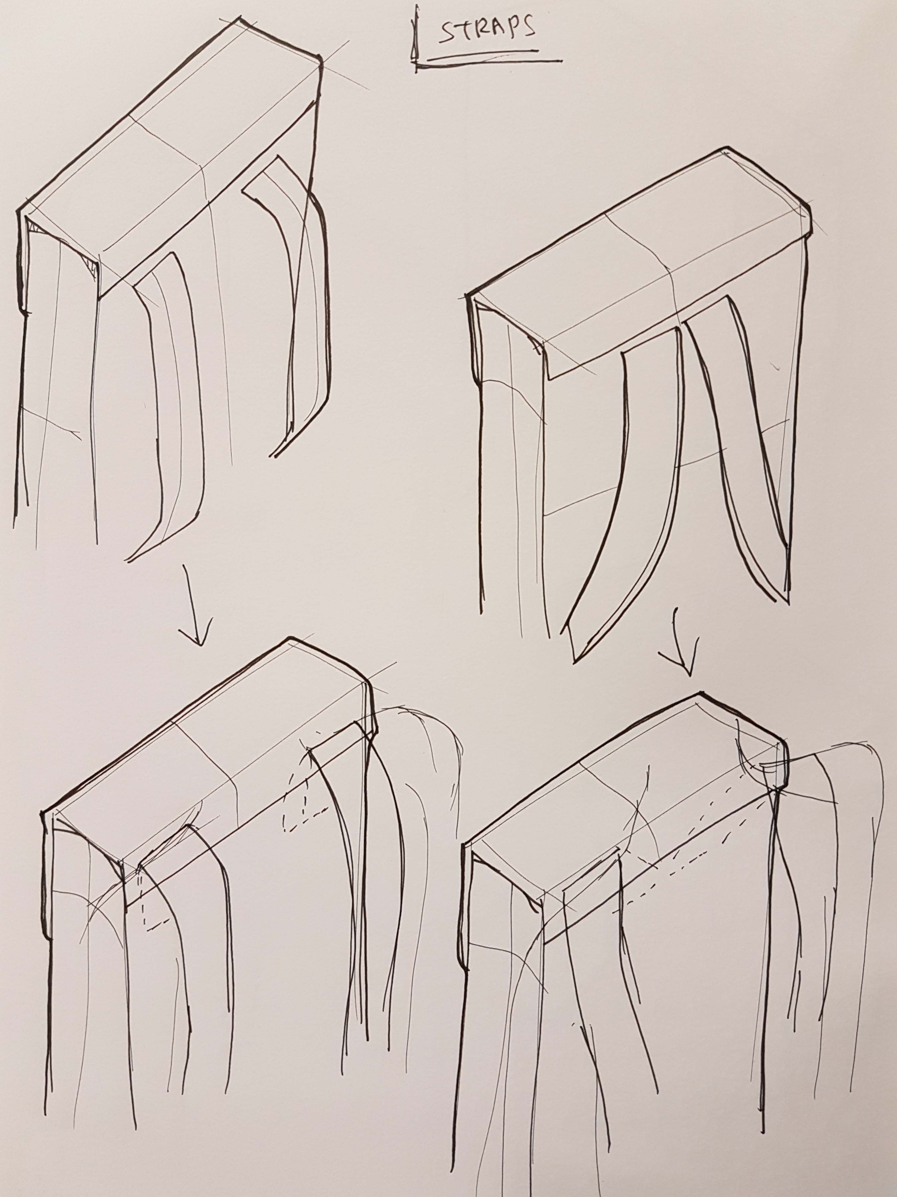
Straps

Here I was exploring the bag straps, with my horrible sketches. But it is mainly to see how it would look like.
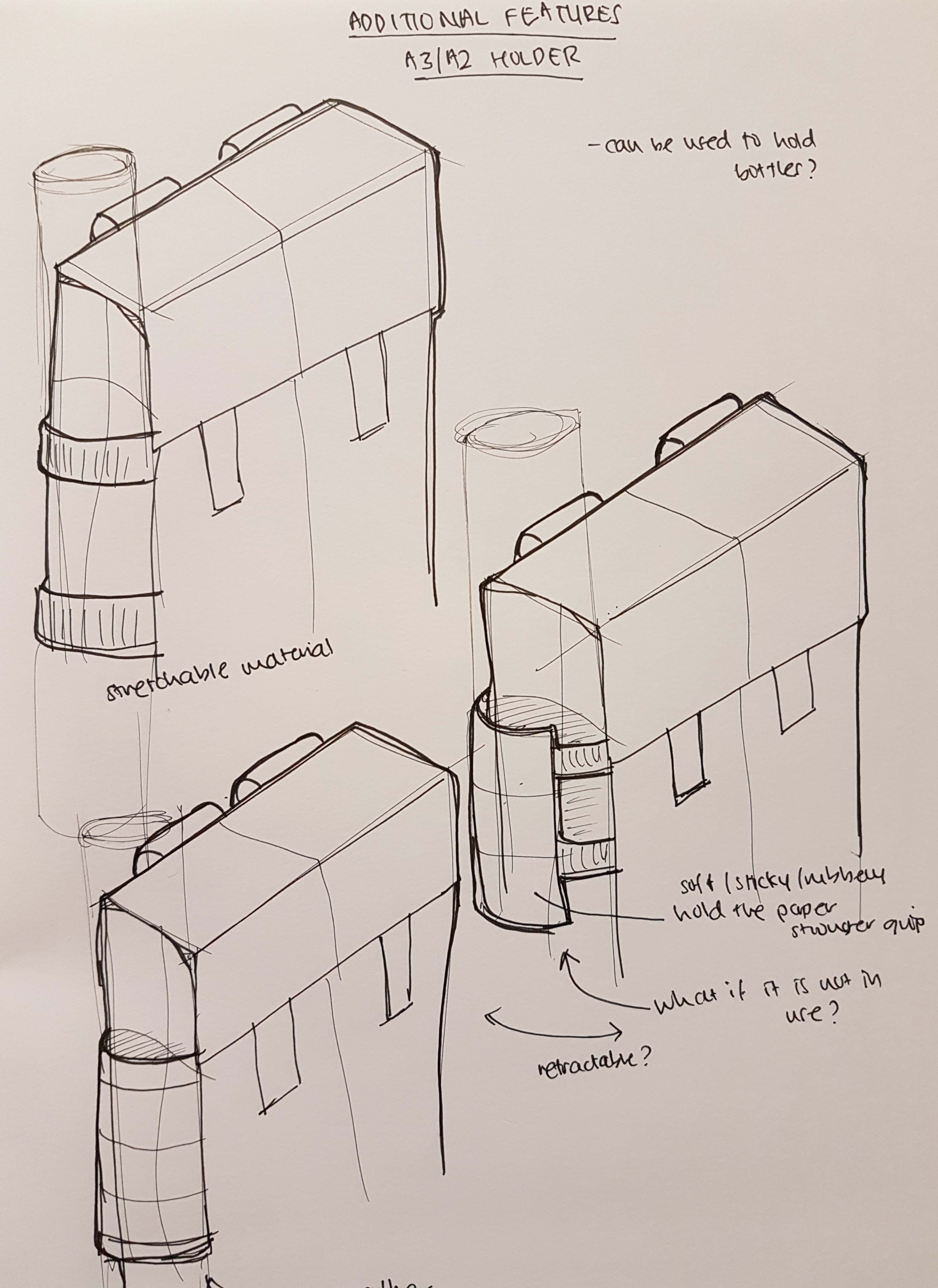
A2/A3 holder

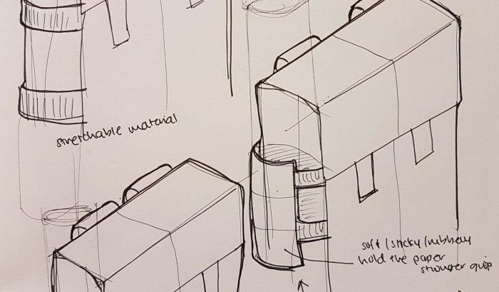
Here I try to see which is the better way to place the A3/A2 paper holder. I was taking into consideration the fact that the bag’s main body can be opened wider. So when that happens, the sides are affected, so the material of the holder would need to be stretchable.

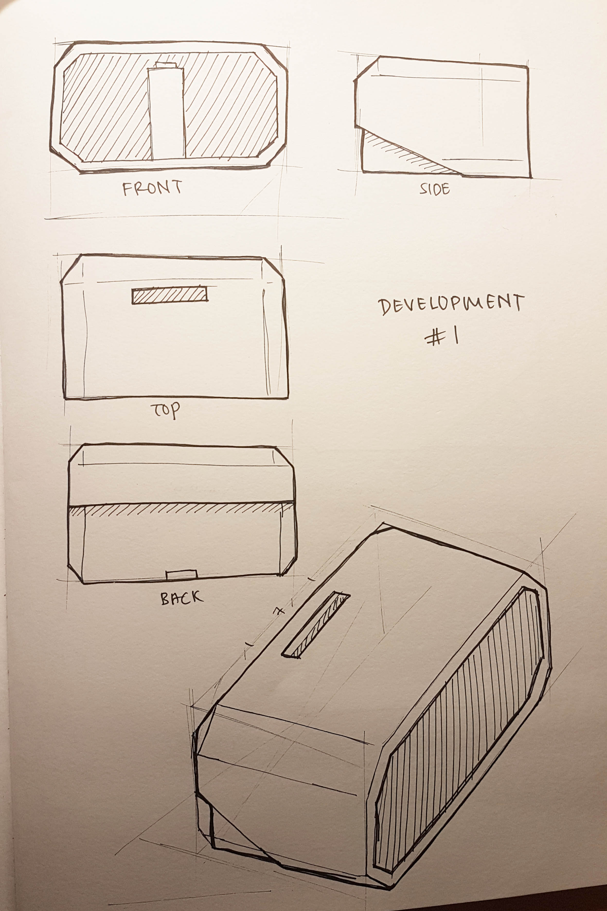
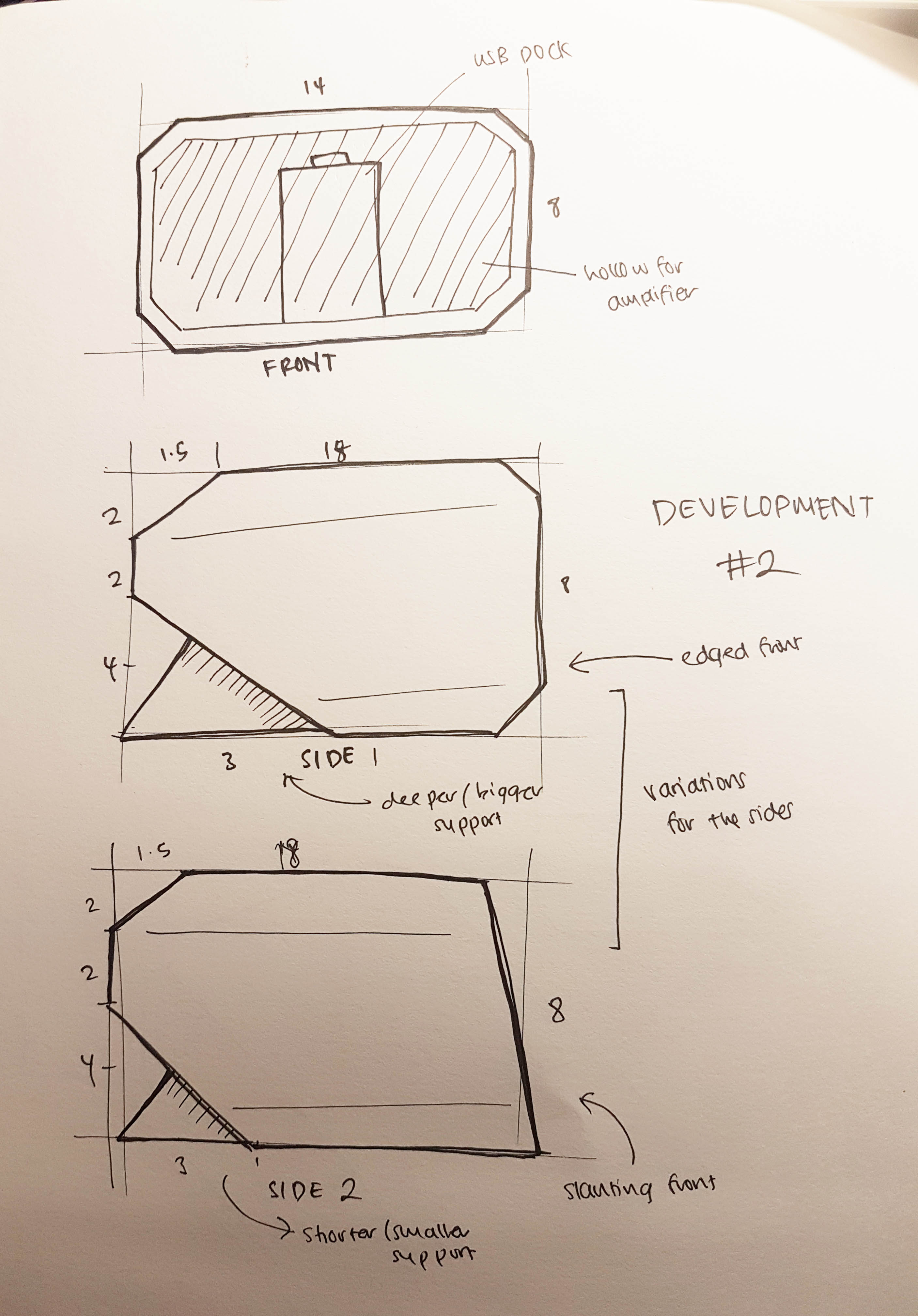
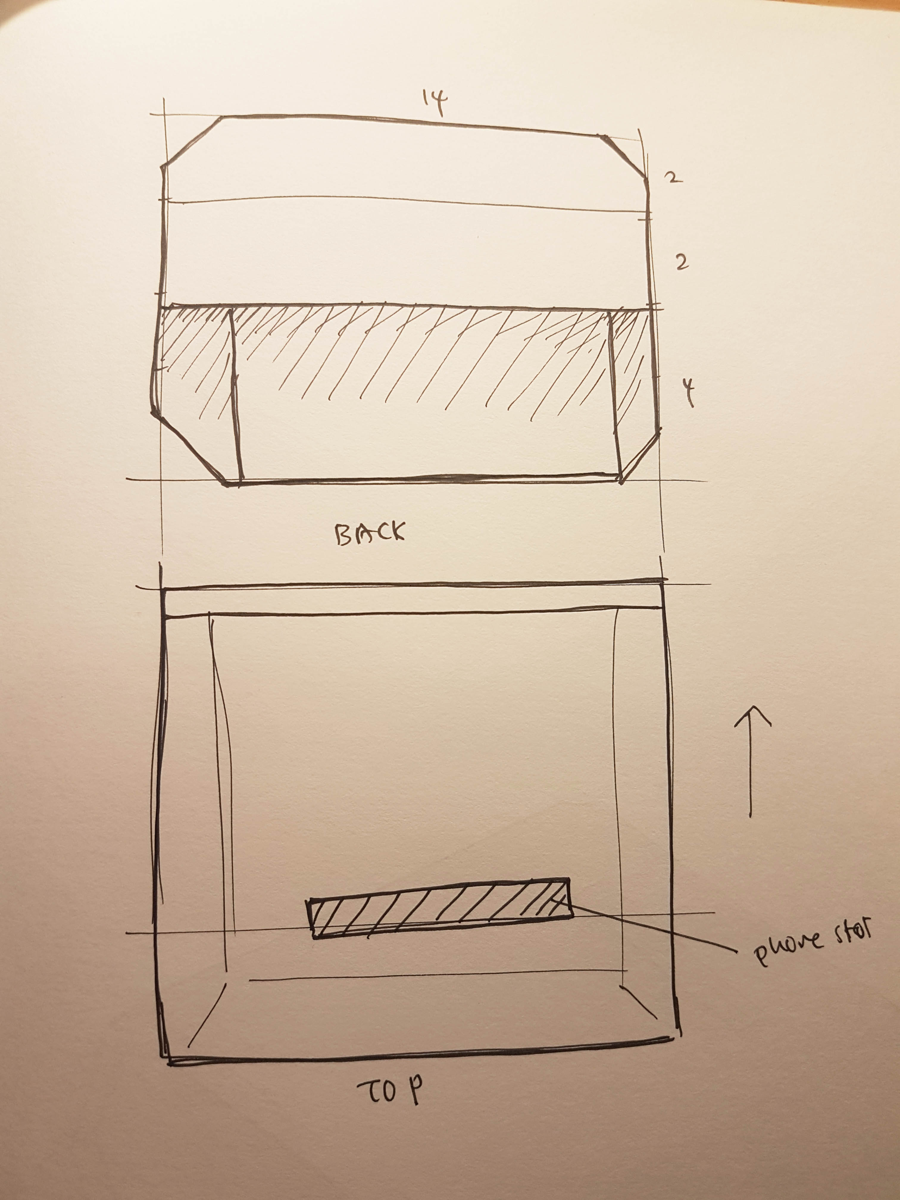
Re-finalising the final look

Now with most of the different compartments and parts finalised, I would redraw the final look so that anything that I was to add on from there is based on this look.

More compartments and parts

With the final look refreshed, I added in more compartments and parts

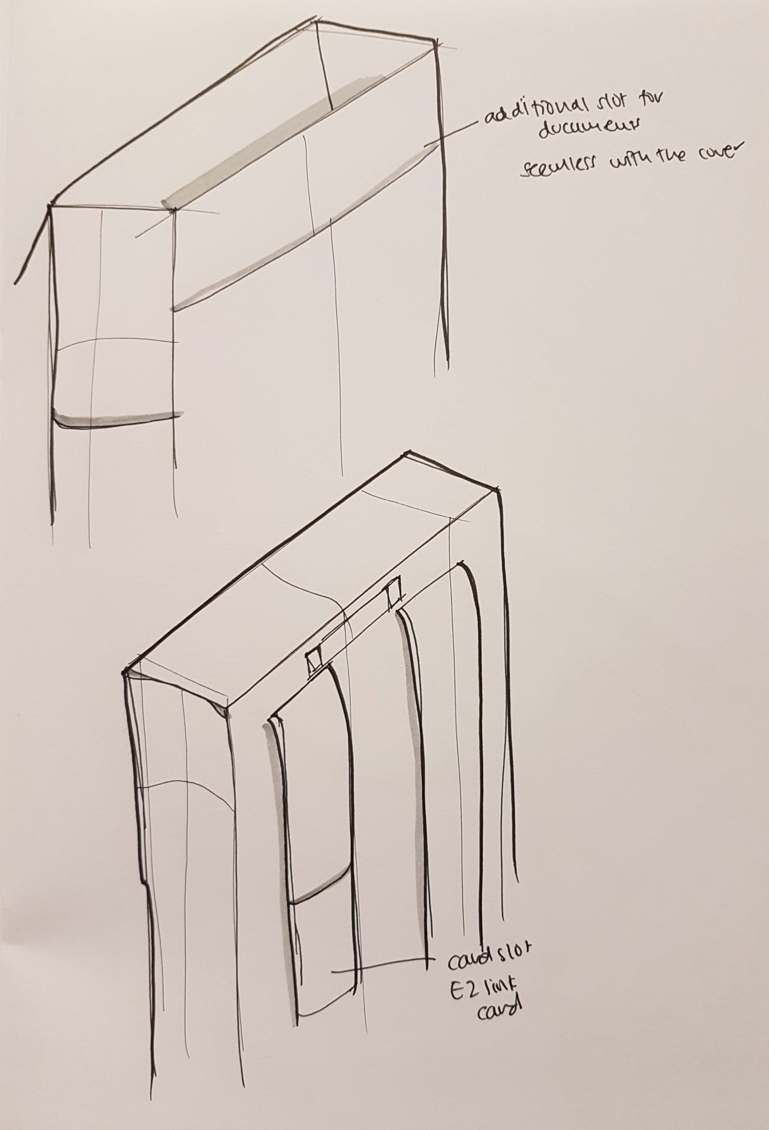
Additional slot & EZlink card holder

These ideas didn’t make it to the final look, but it was some of the initial ideas I sketched out.
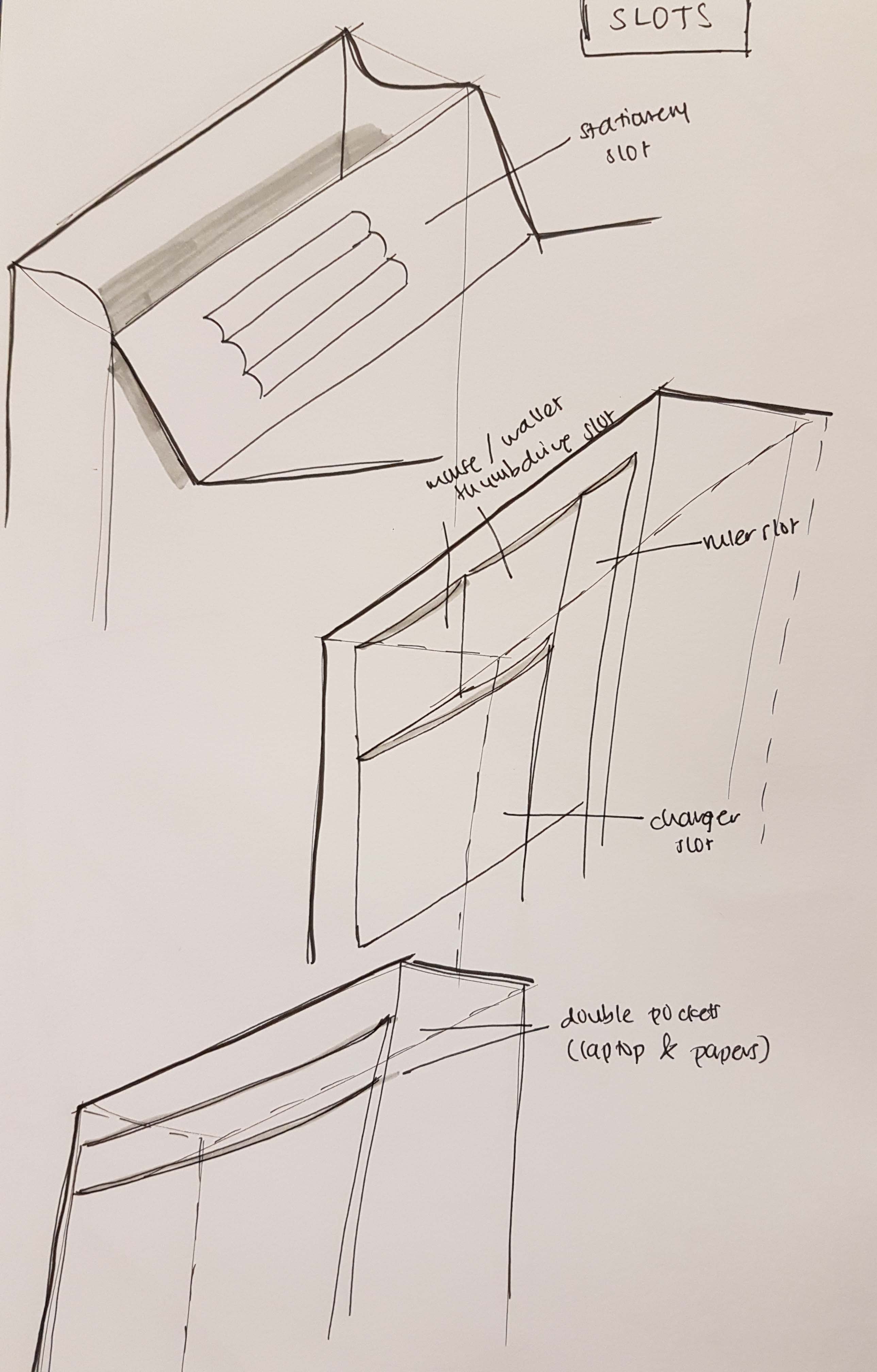
Stationaries slot

Some other slots that I included are sketched out.
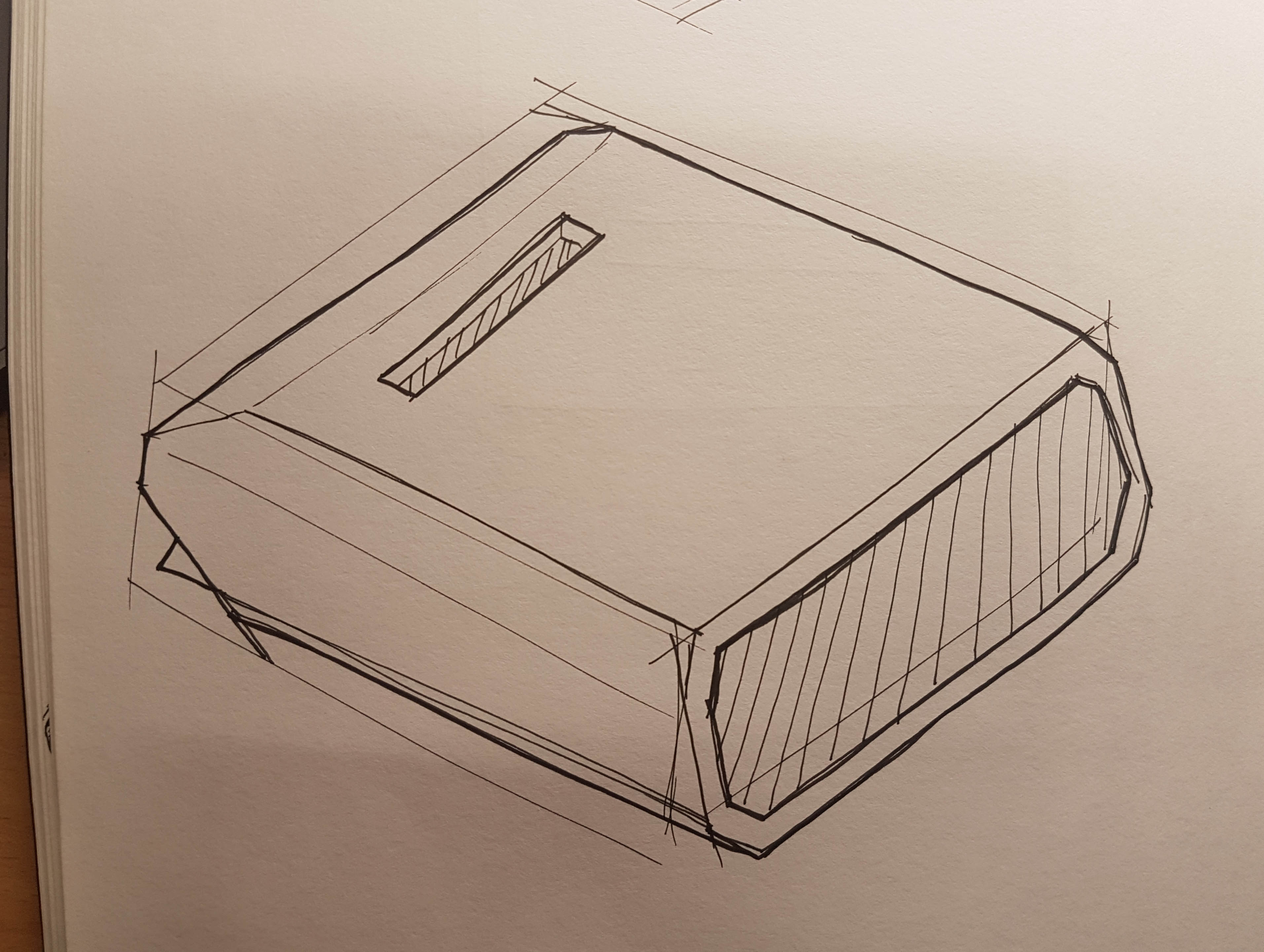
Final look

With all the compartments checked off the list, I finally came up with the final look for the bag.

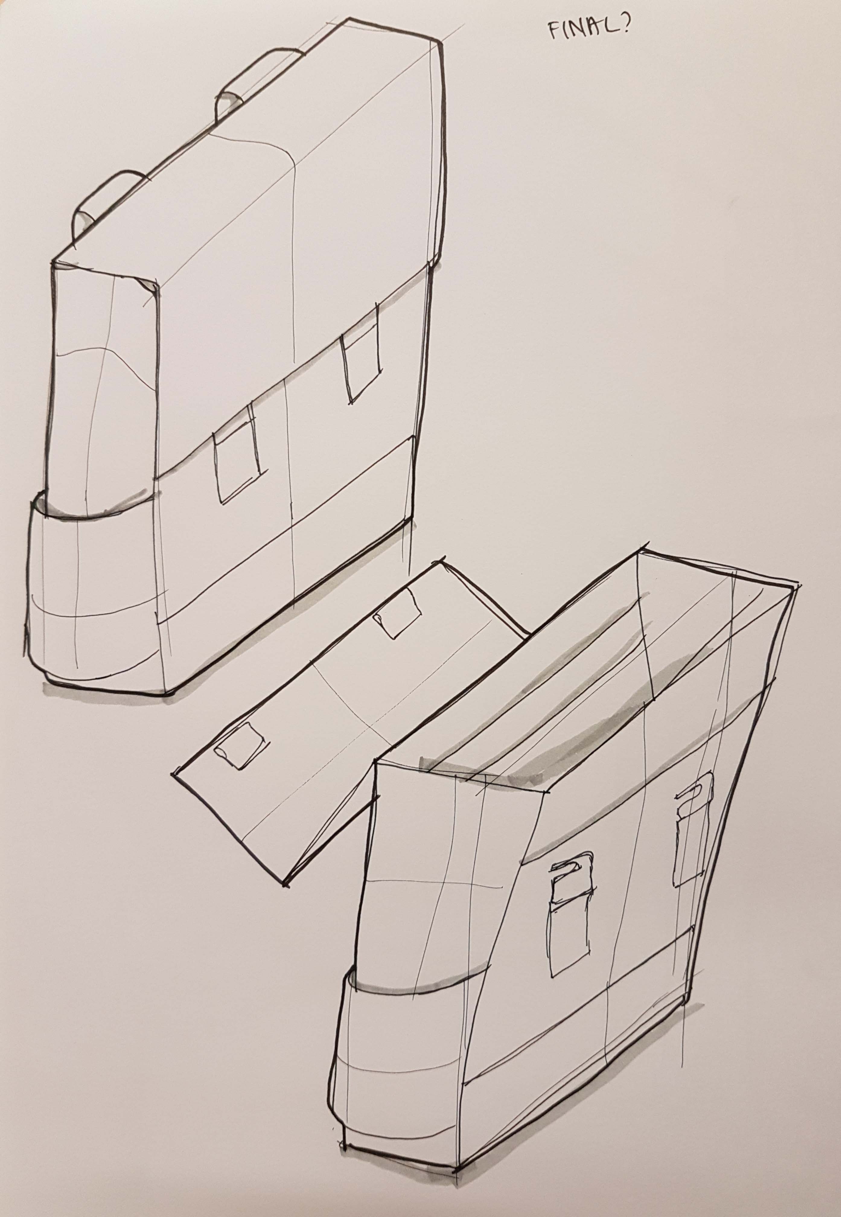
I do keep in mind that the look of the bag might change as I am making the bag.


Making the bag

With the final look sketched out, I can finally start making the bag.

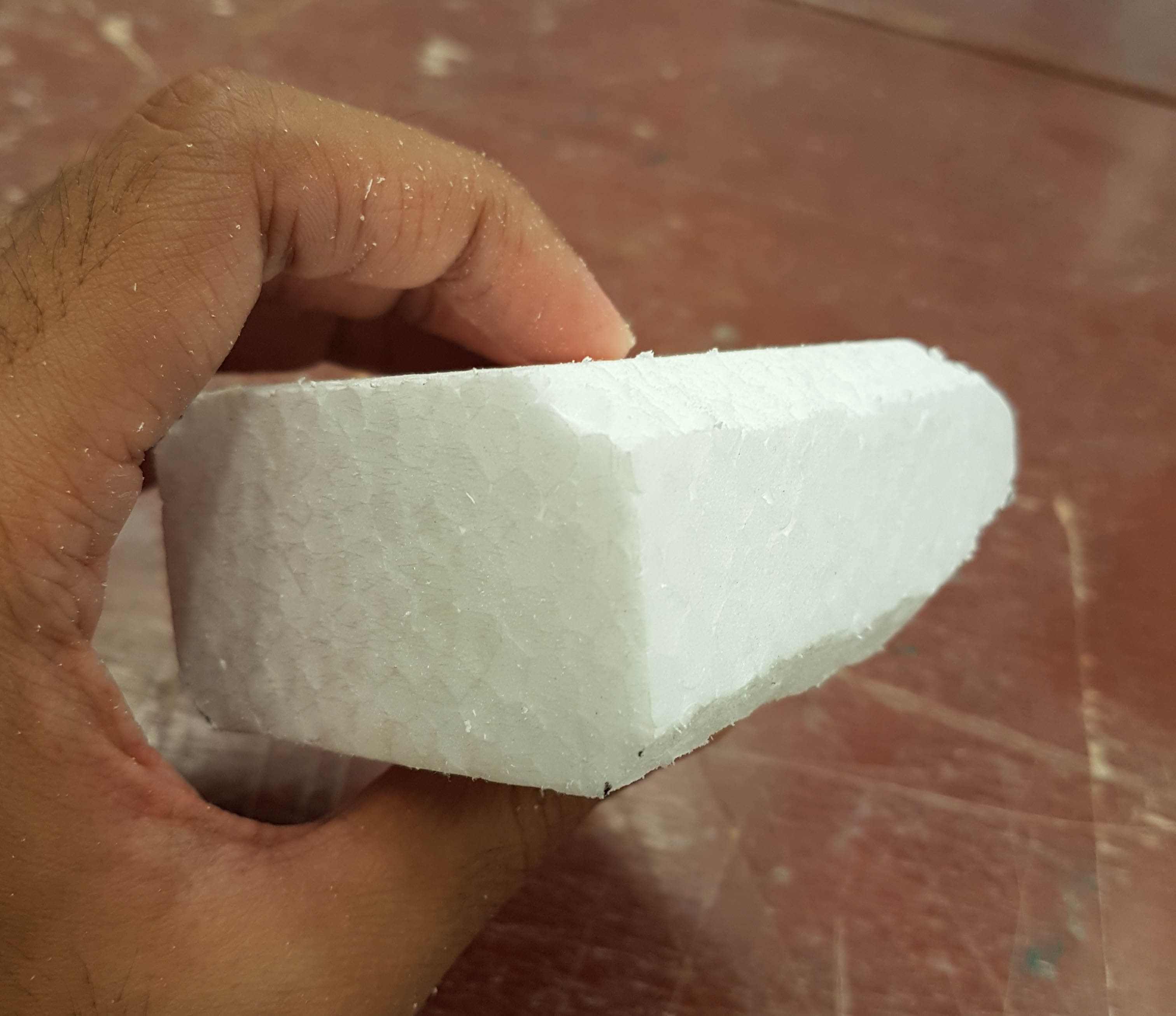
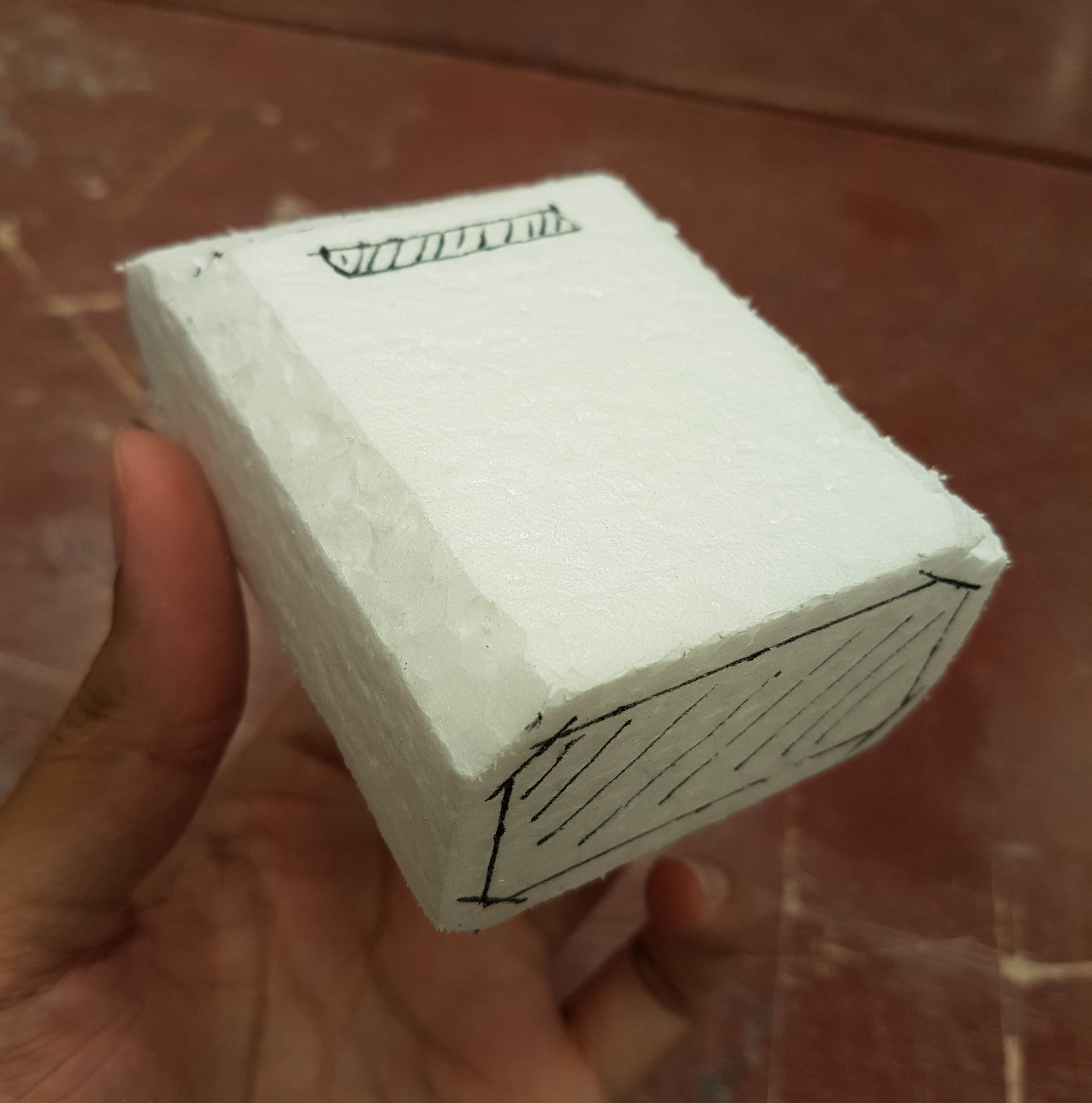
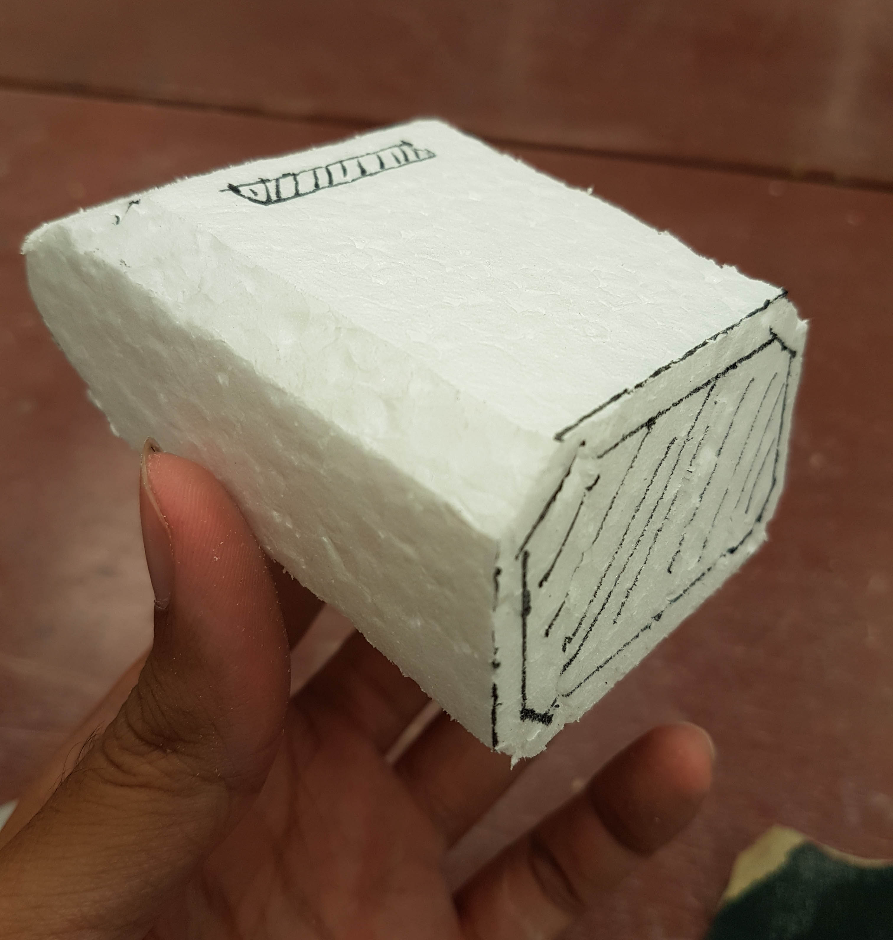
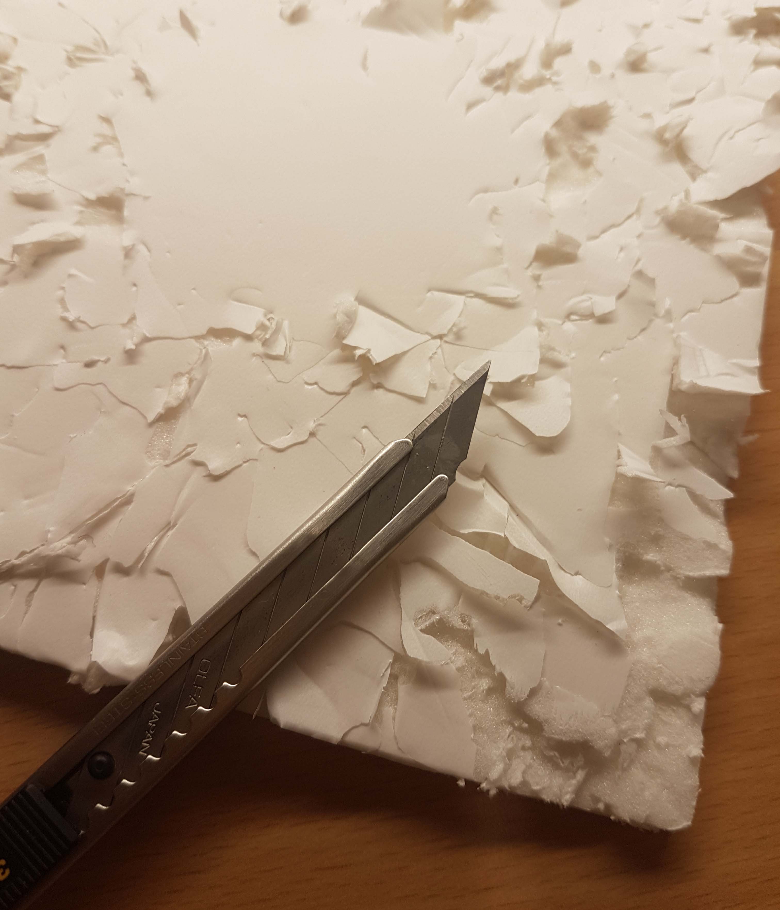
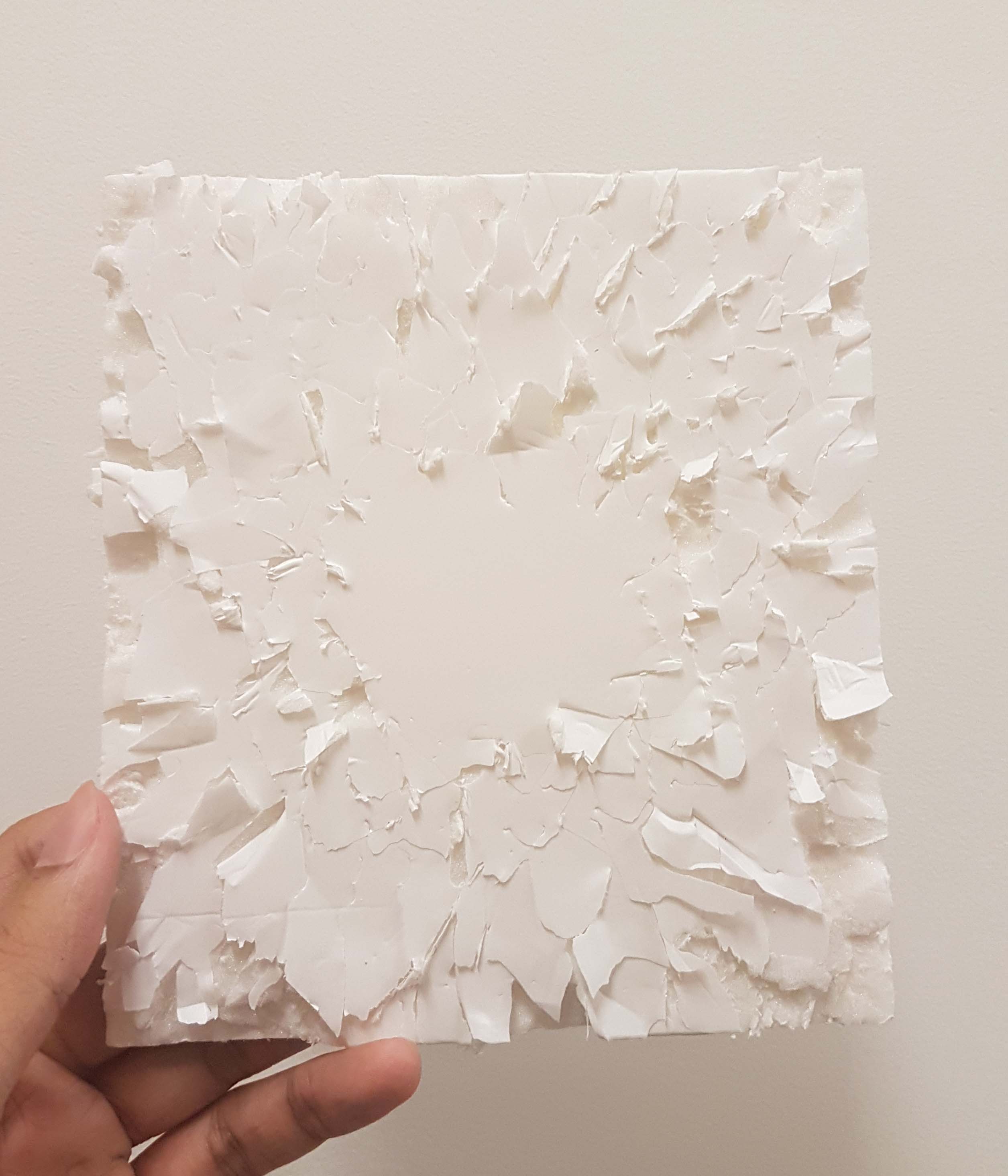
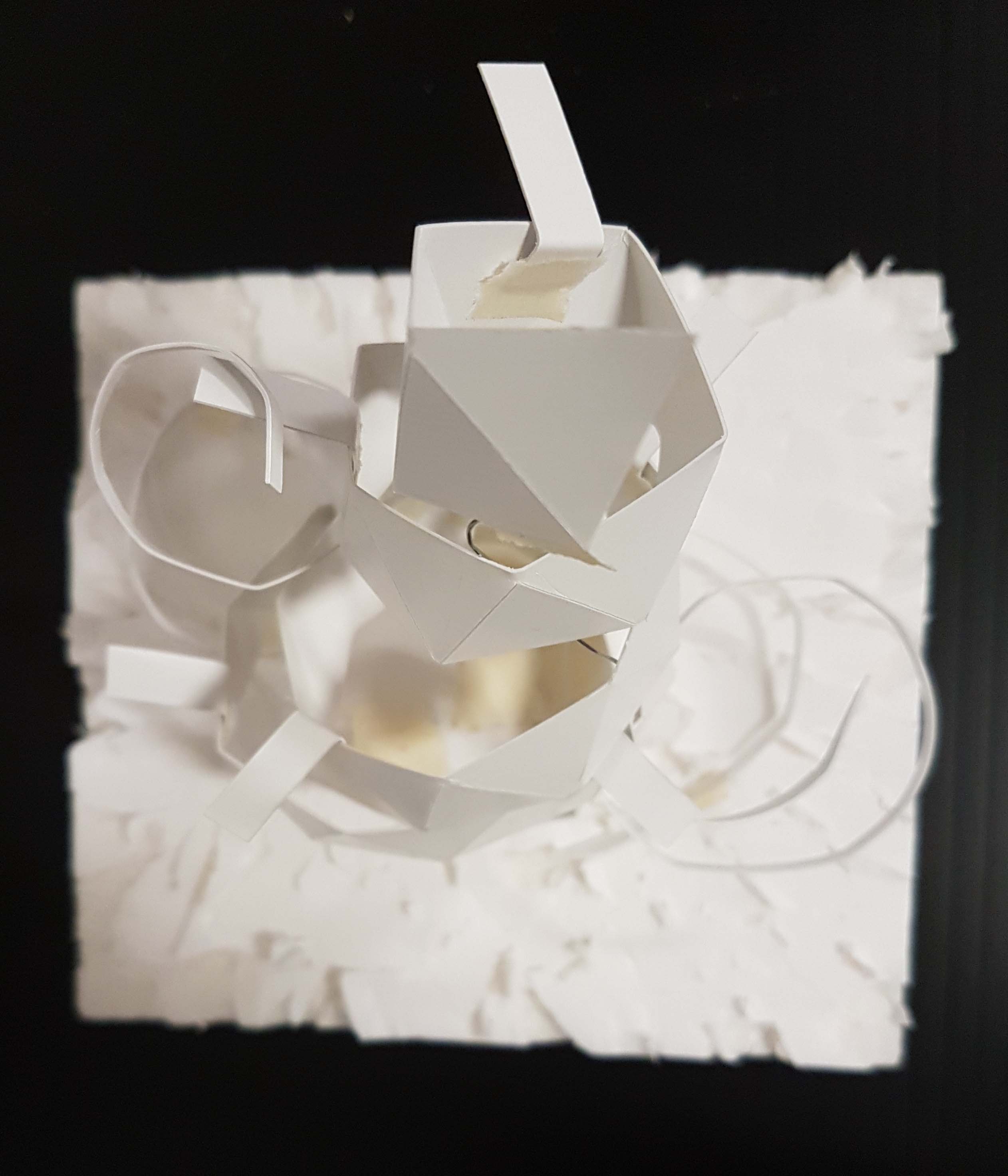
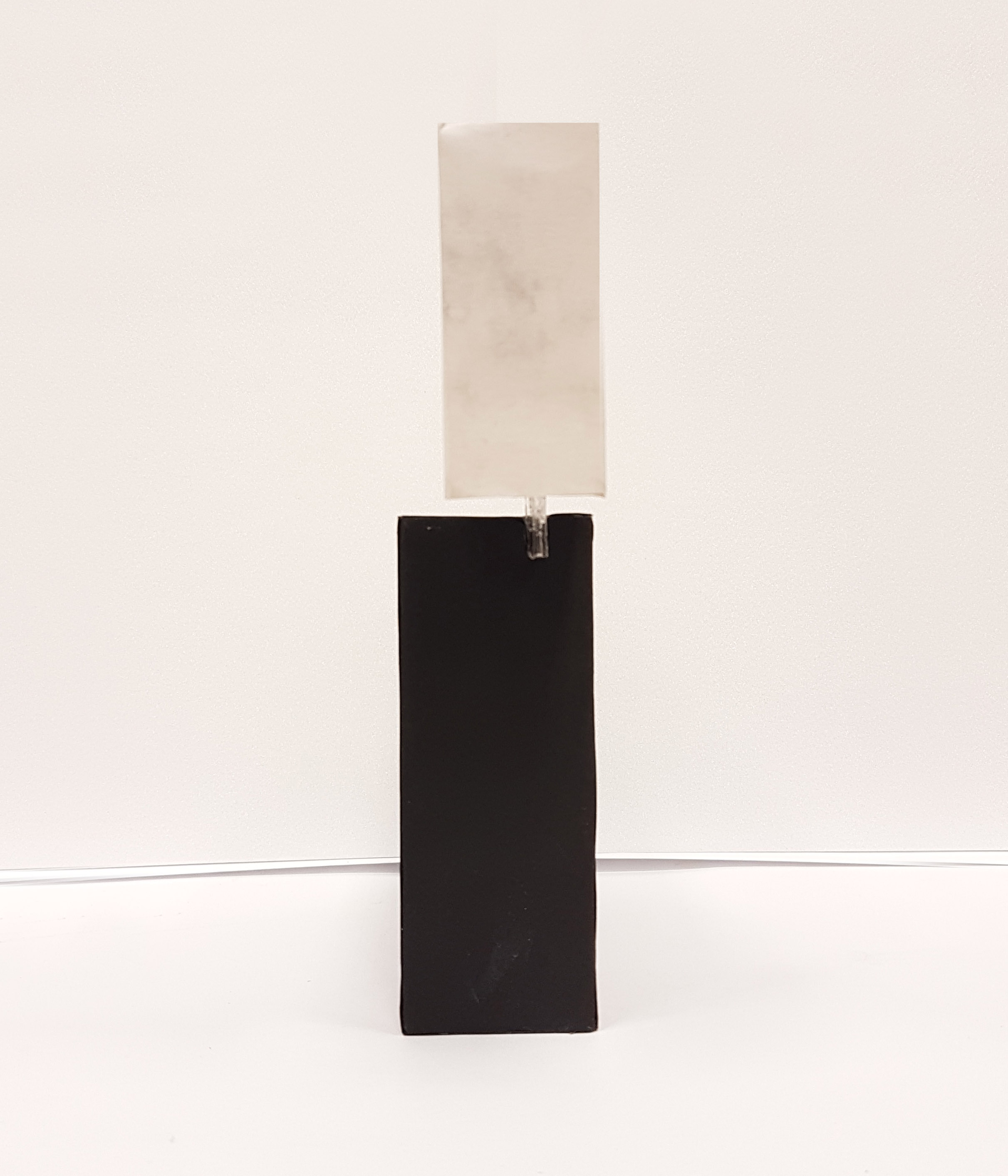
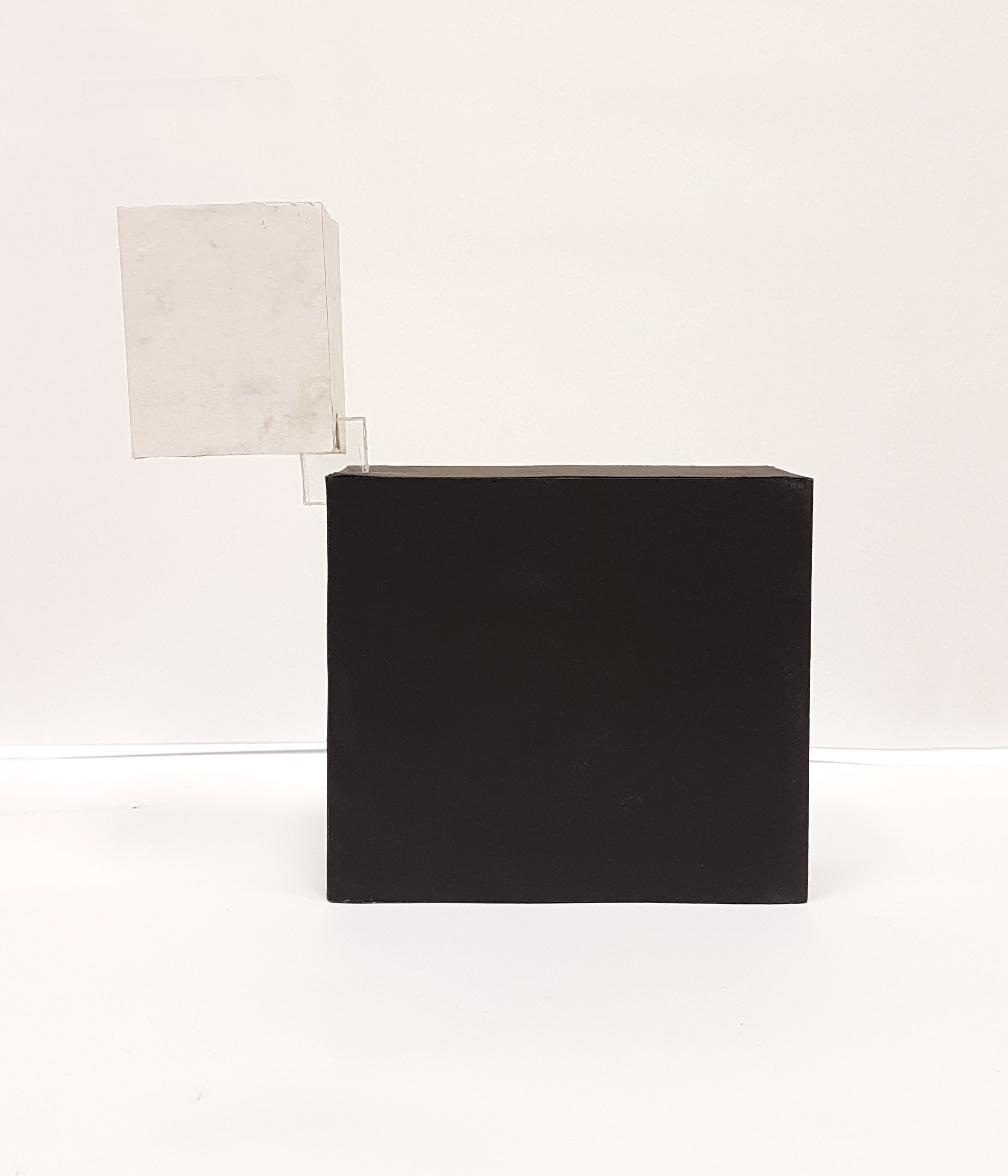
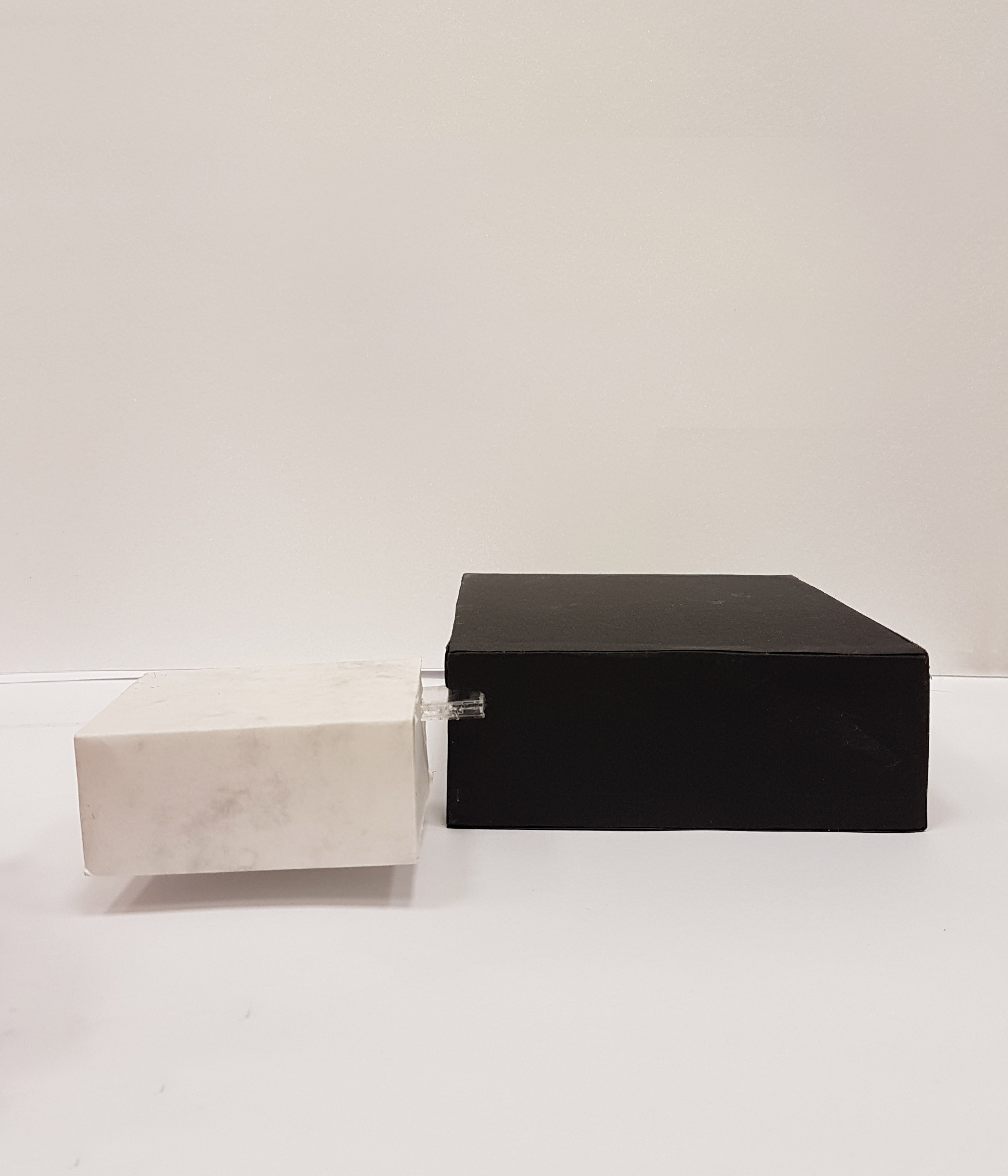
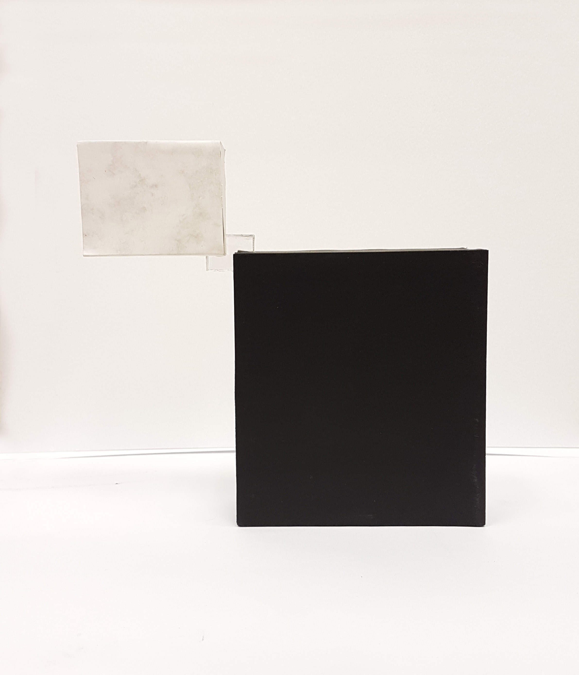
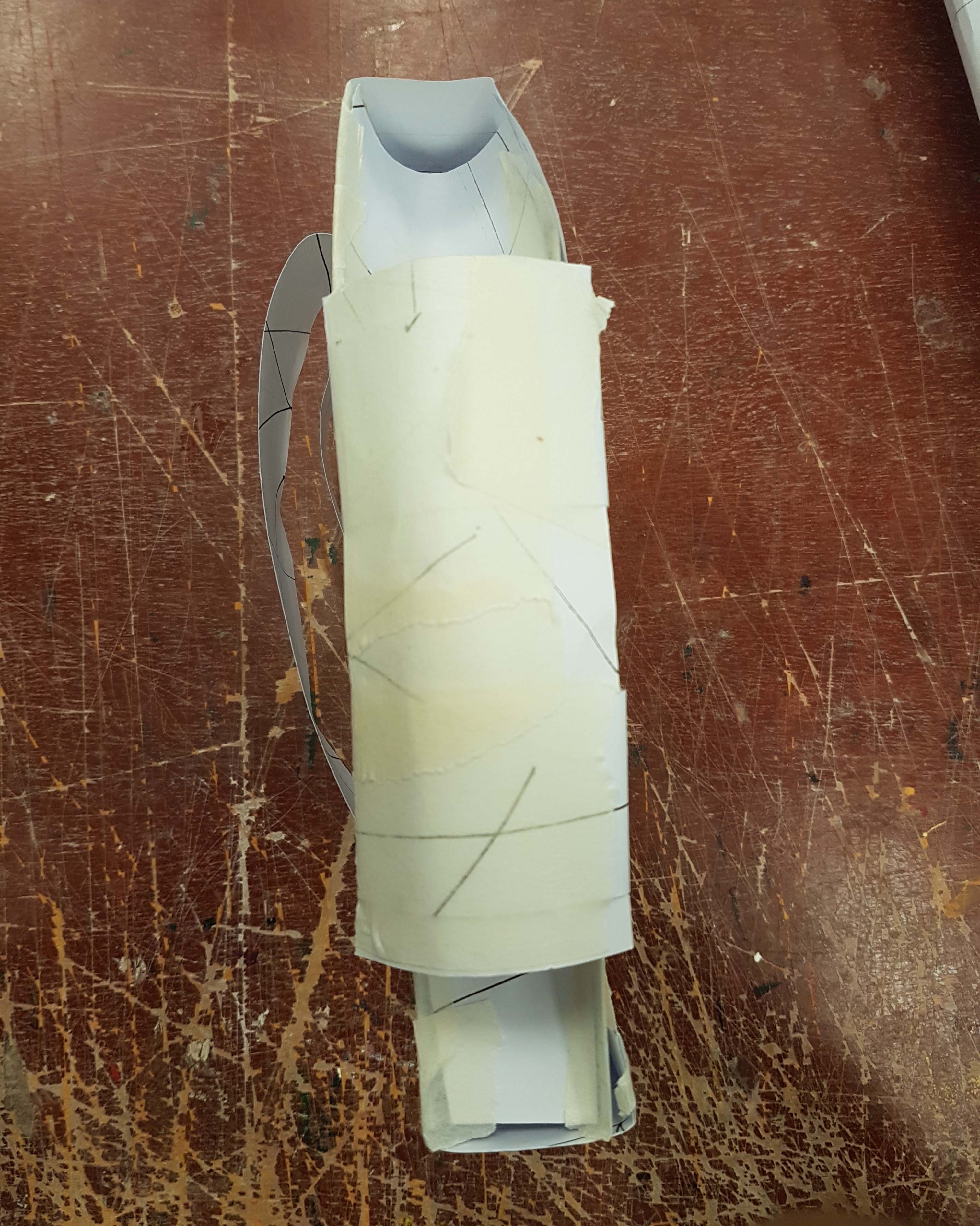
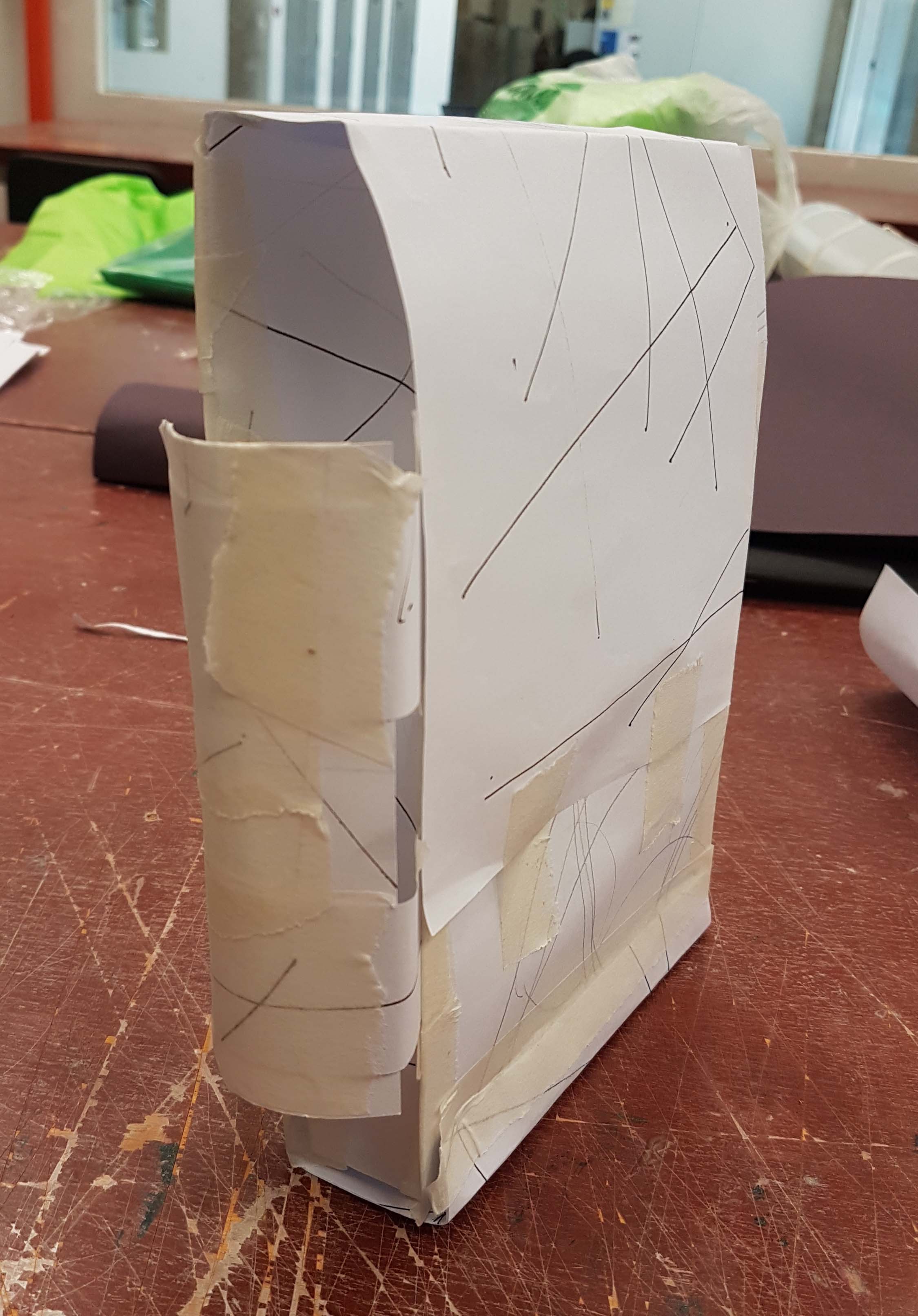
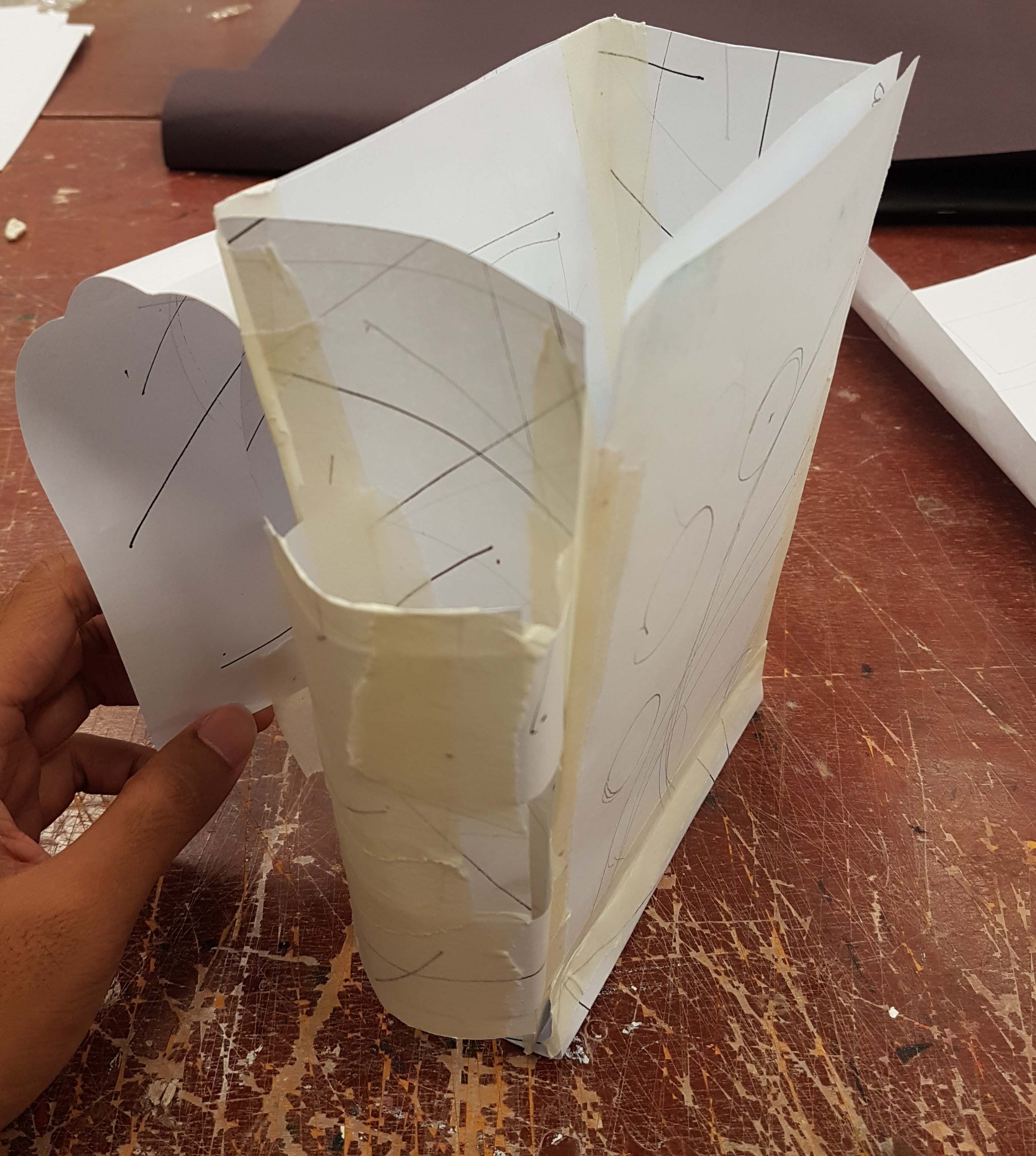
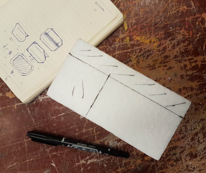
Smaller-scale prototype

Before I make the prototype out of the real intended material, I made a simple paper prototype of a smaller scale to see how I am to make the bag if it is in a fuller scale, see if the different parts of the bag can actually work when put together and also to have a physical feel of the model in my hands.

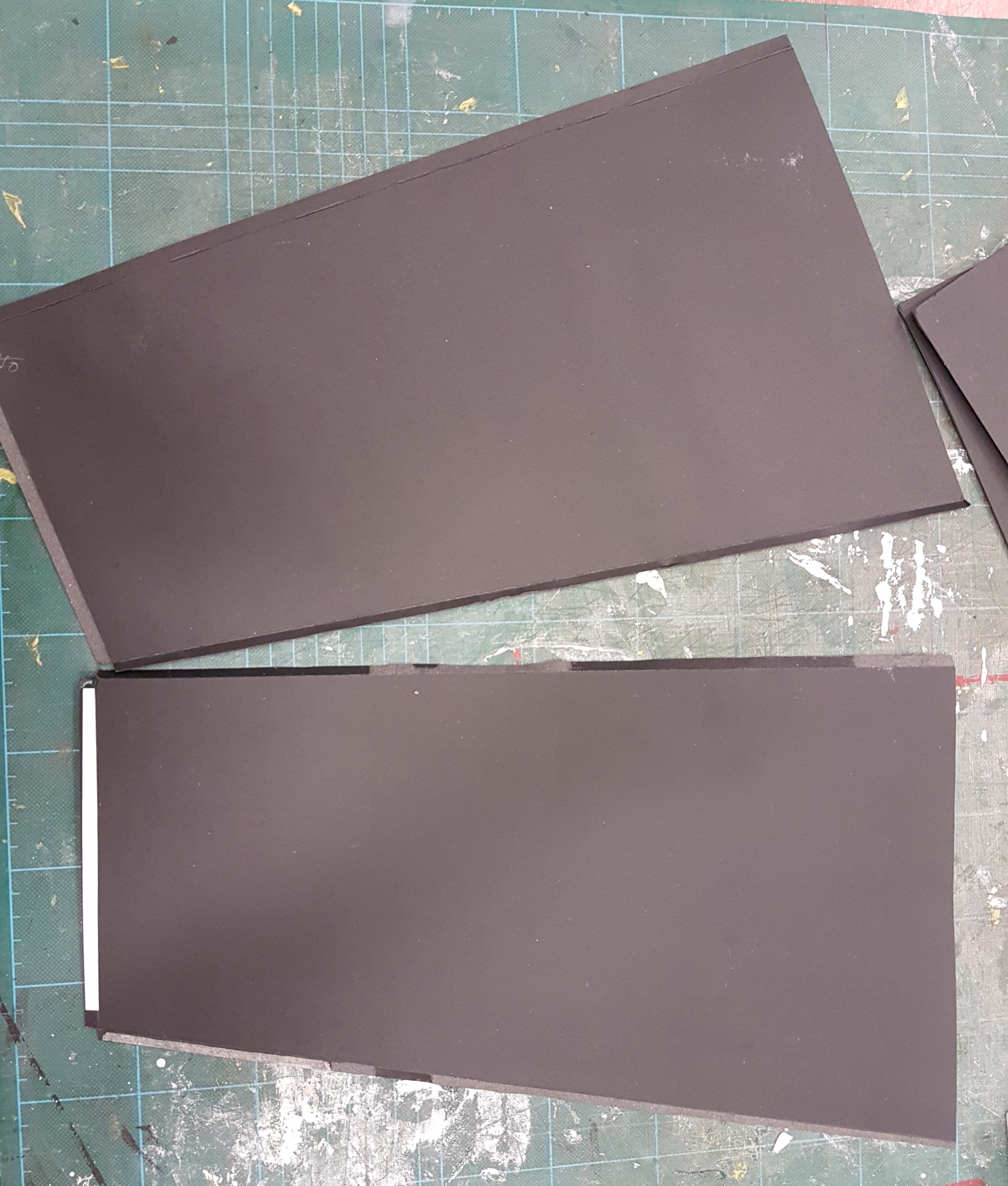
The “real” prototype

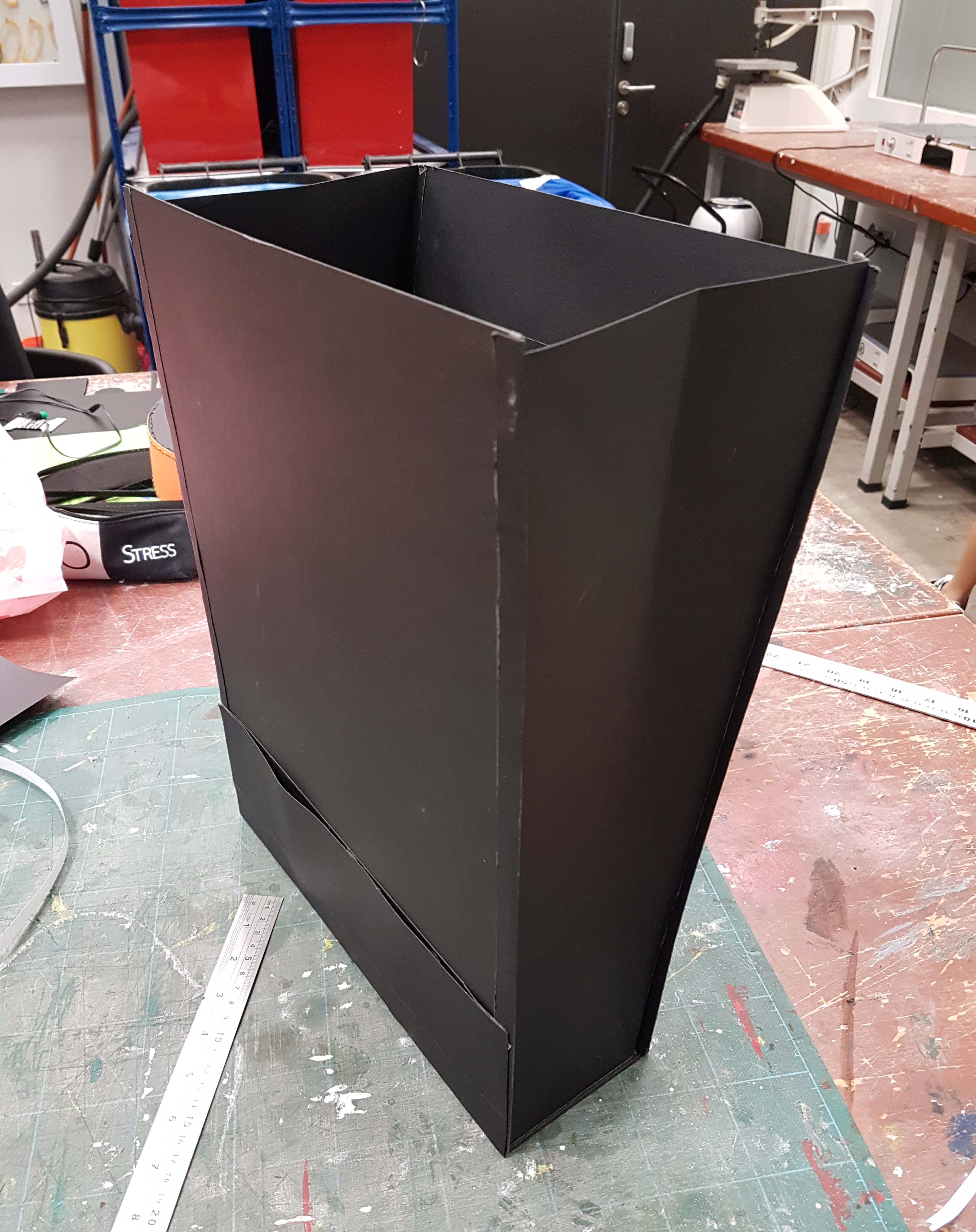
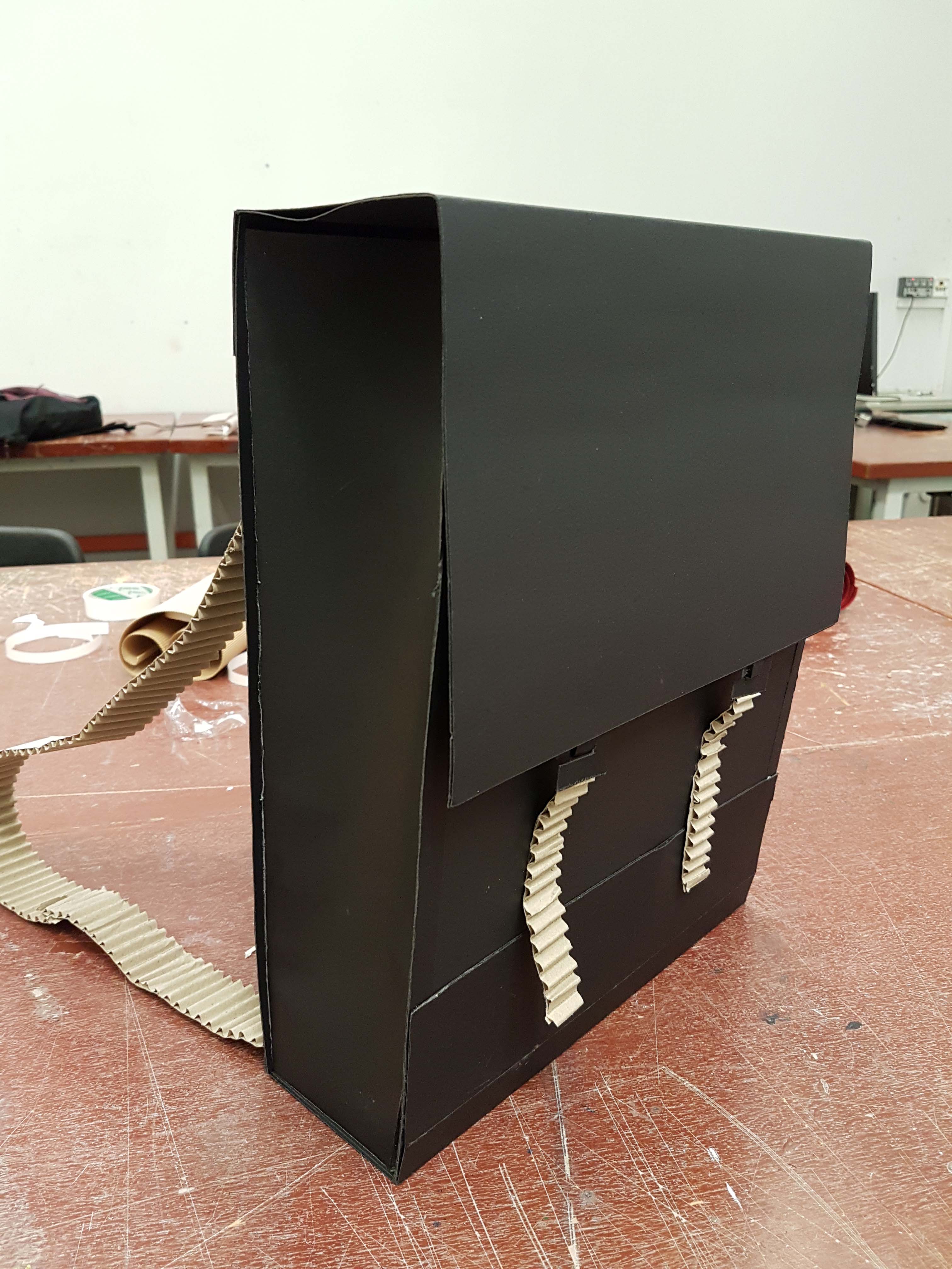
I would finally get to start making the prototype using the intended materials, which is black recycled paper. I chose this material as it has a similar matte look to the REAL material that would have been used which is black leather.

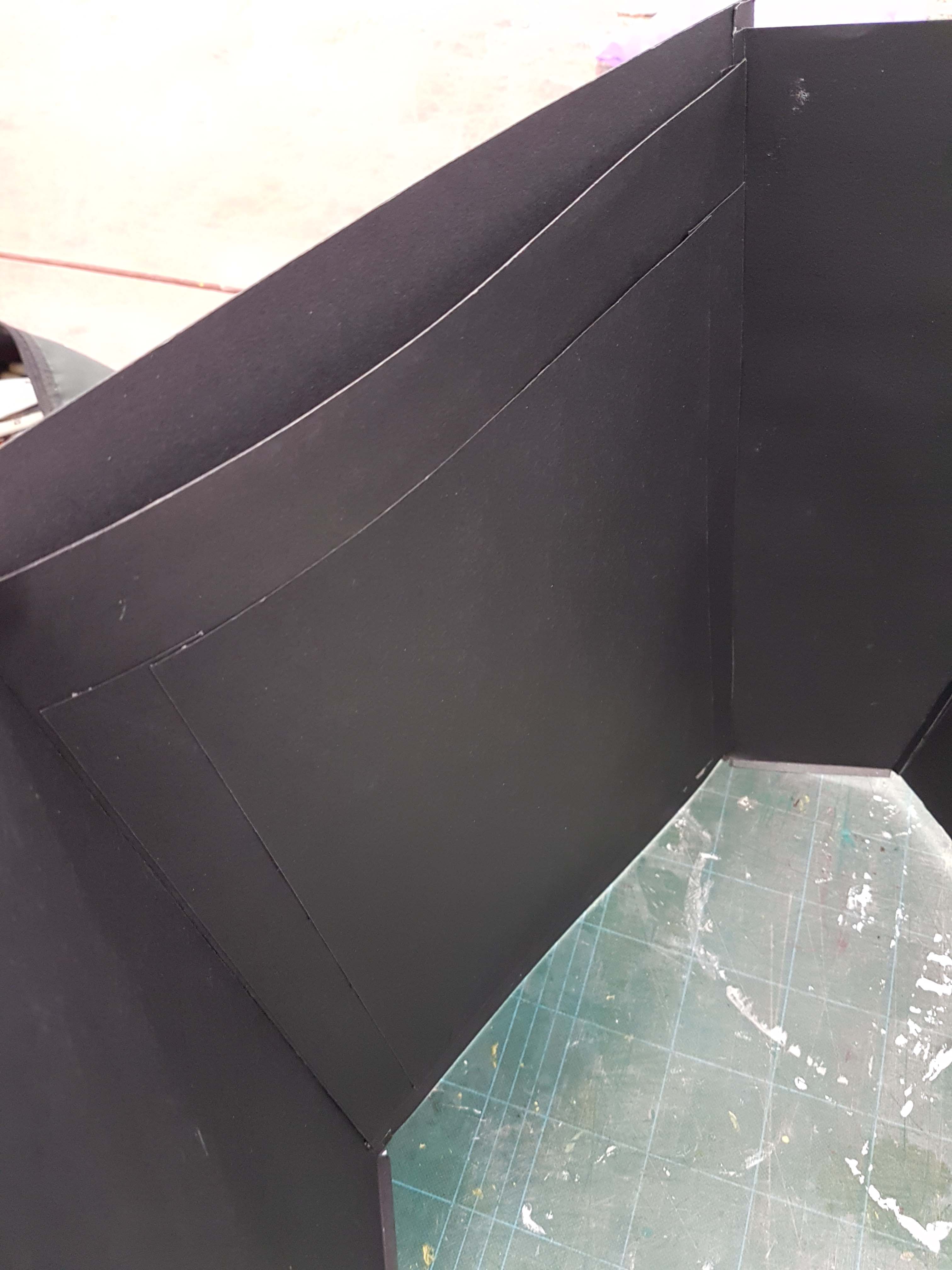
I would start off by making the main body of the bag. However, the paper material is still much thinner than the synthetic leather so I had to double up the paper so that it will be much stiffer and stronger.

I would cut out the main shape of the bag first. As the bag can be opened wider at the top for easier access of the contents, the sides of the bag are cut slanted where it gets wider towards the top.

For the width of the bag, I just used the measurements of a 15 inch MacBook and added a few centimetres to it so that I would know that it could fit such a device and also that there is no problem when it comes putting in a 13-inch version.

Initially, the bag was too thick when I put all 4 sides together and it looked like those bags carried by the food deliverymen. So I disassembled the bag and trimmed a few centimetres off for the sides.

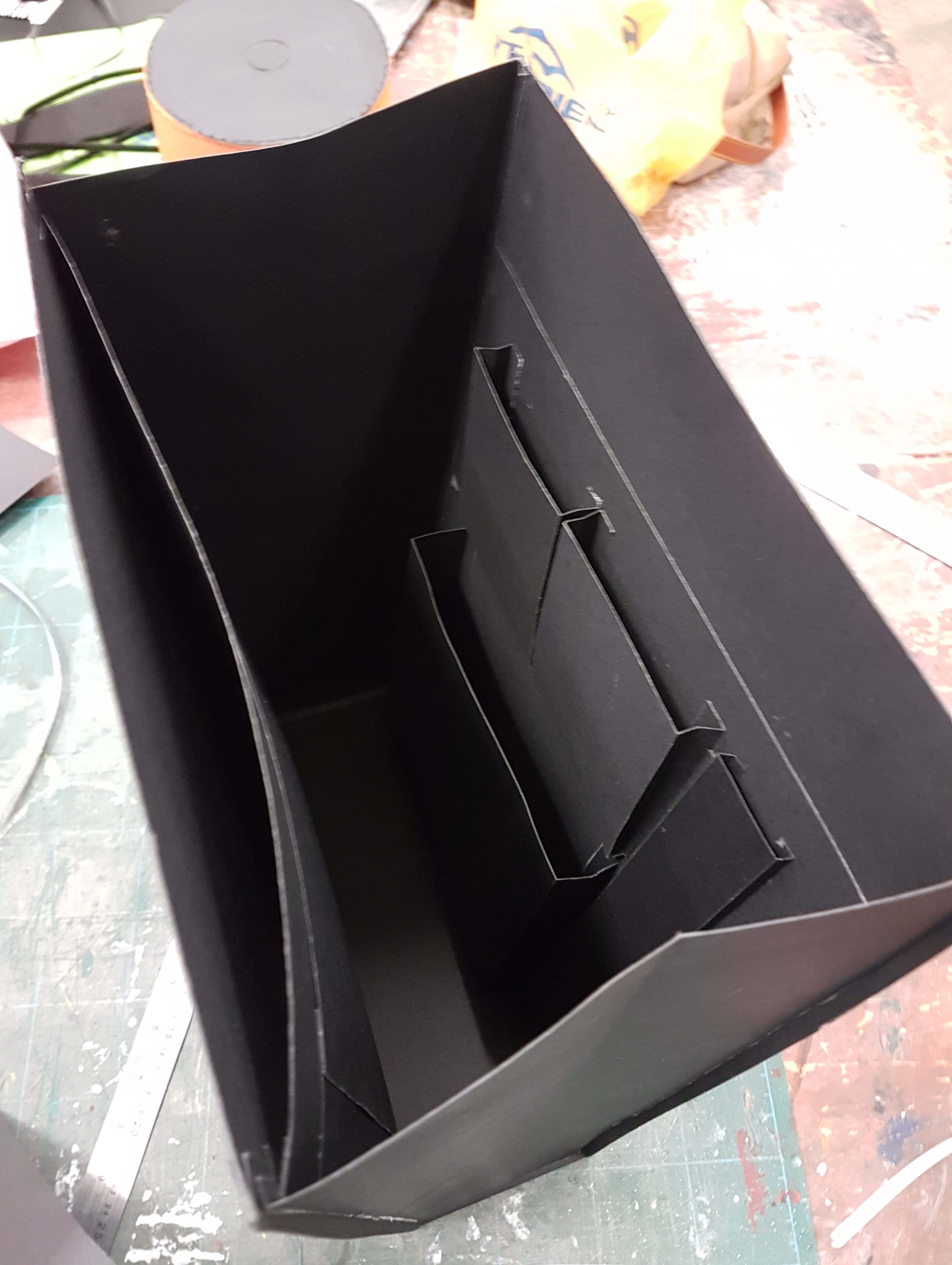
With the main body of the bag confirmed, I would start adding the different compartments of the bags inside before I seal off all 4 sides of the bag. There was also trial and error for this as the first compartments that I made were too tight for the objects so I had to make the compartments thicker or wider. Some compartments also have a similar method with the bag itself where it can be opened wider at the top so to have easy access to the contents.

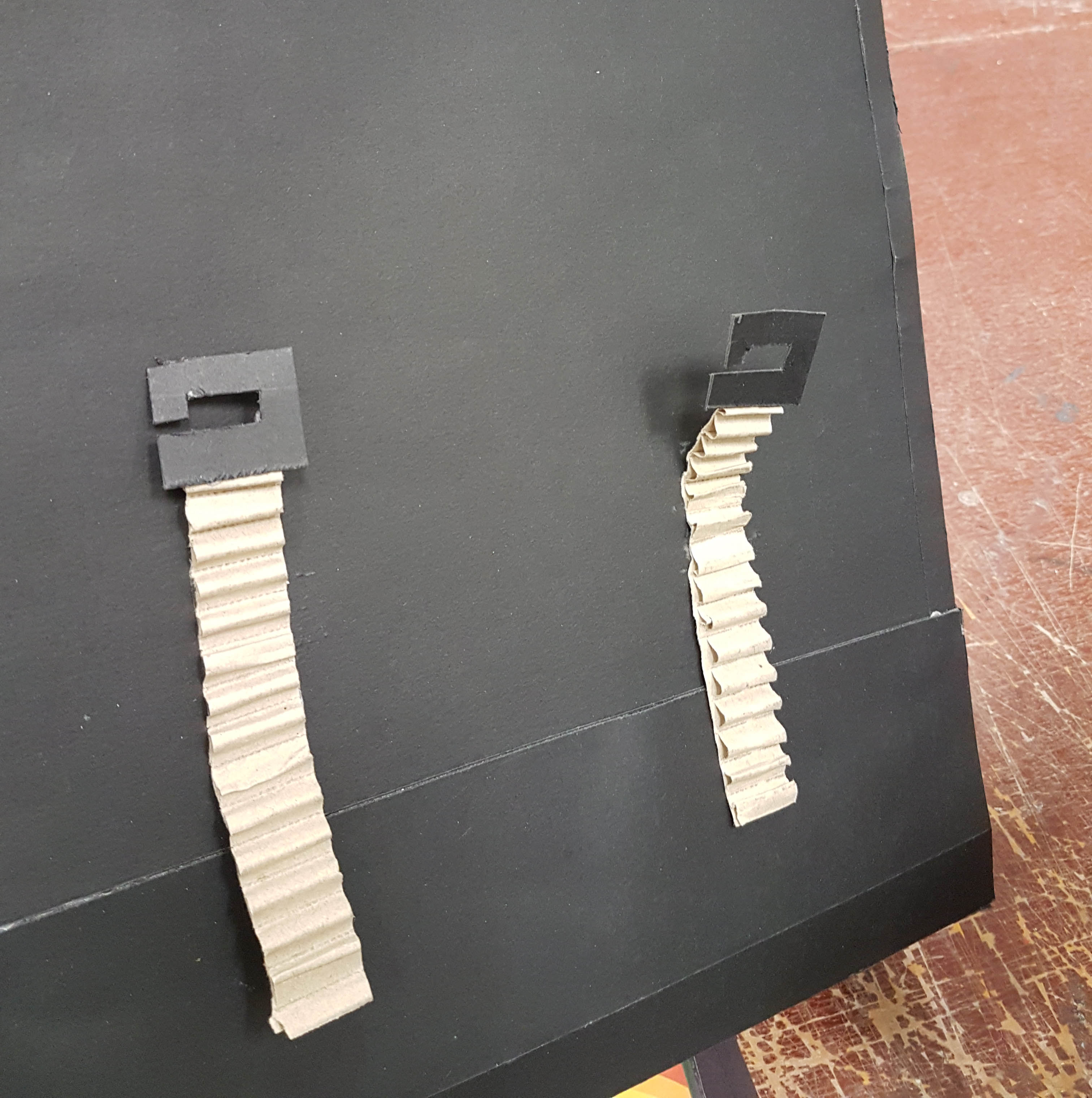
As for the straps, I find this the most challenging as the straps have to be easily wearable compared and at the same time won’t look too floppy or long when being worn. Since it is only a prototype, the mechanism of the bag is not implemented yet.

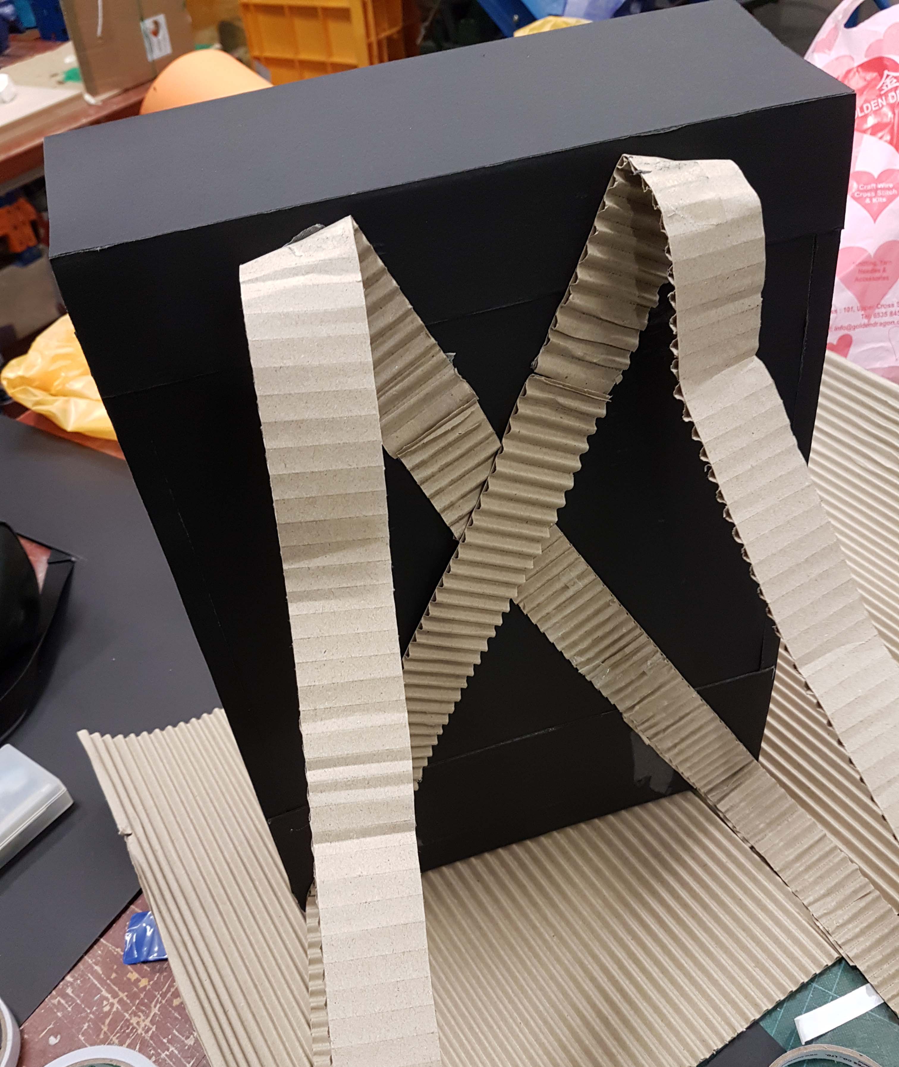
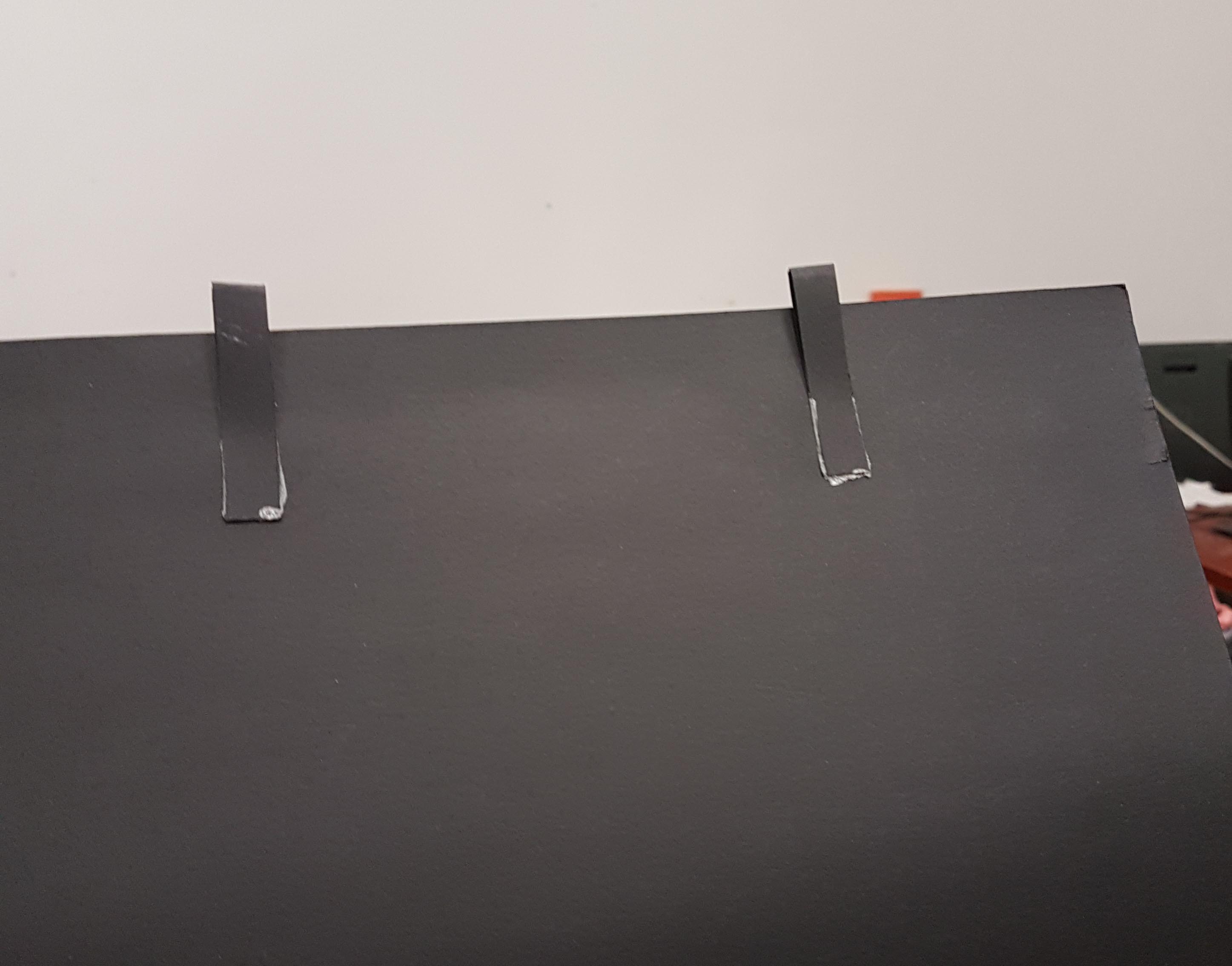
For the hook and eye method, I double up the hook and eye so that it will be stronger. but the read material for the hook would be using metal.

Final Outcome

Even though the final bag looks a little different from the sketches and has its minor flaws here and there, I am still pretty happy with it. I actually had the intention of making into a real bag with real materials, but I think I would just ruin it as I don’t think I have the right skills for making a bag. Would be cool though!

Types of Bag Fastening and Closure

Zippers

Image result for plastic and metal zipper

Types of standard zippers

Image result for invisible zipper

Invisible zipper

Image result for closed end zipper

Difference between open and closed end zippers

  • Open-end can have the two sides separated (eg, jackets)
  • Closed-end still attached at the bottom (eg, jeans)
Image result for 2-way zipper

Two-way zippers

  • Two-way open zippers can be opened from the bottom and top, and can also be separated. The function of both open and closed zippers
  • ‘O’ type zippers split in the middle
  • ‘X’ type zippers split at the ends
  • ‘R’ type zippers have functions of ‘O’ and ‘X’ just that it cant be separated

Image result for bag zippers

Normally placed at the top part of the bag where you want it to close.


Magnetic Snaps

Related image

Magnetic snap

Related image

Normally place on a flap, with one on each side.


Hook and Loop

Image result for velcro

Standard hook and loop, also called hook and loop

Usage
Image result for velcro on bags

Hook and loop for clutches

Image result for velcro straps

Hook and loop strap, to hold something together or join a flap together.


Twist & Lock

Image result for twist and lock bag

Standard metal twist and lock

Usage of twist and lock

Image result for twist and lock bag


Side Release Buckle

Image result for side release buckle

Standard side release buckle

Image result for bag buckles

Modern side release buckle

Usage of side release buckles
Image result for side release buckle bags

Over the bag flap

Image result for side release buckle bags

Under the bag flap


Drawstring

Image result for drawstring bag

Standard drawstring bag


Buckles

Image result for bag buckles

Normally comes with a magnetic snap

Image result for buckles

‘Hidden’ buckle style

Usage
Image result for buckle bags

Double buckle style with a magnetic snap


Hook & Eye

Image result for hook and eye

Standard hook and eye


Image result for hook and eye bags

Mechanism style


Image result for hook and eye bags

Normally seen in pants


Buttons

Image result for buttons

Flat buttons

Image result for toggle buttons

Toggle buttons

Image result for shank buttons

Shank buttons

Usage
Image result for buttons bag

Usage of flat buttons

Related image

Usage of flat buttons


Tuck lock

Image result for tucklock

Usage
Image result for tucklock bags

Sometimes comes with a locking system

Mobile Phone Dock and Speaker

The assignment is to create a phone dock that also has a speaker function. So as usual, before I start on the model itself, I went to look for inspiration and ideas.

Some ideas and inspirations

A dock with a clock element added to it (https://www.pinterest.com/pin/72409506488637032/)

Amplifier style

I was leaning towards making an amplifier instead of a speaker as I think that it would be more practical and I could see myself making it, rather than a speaker which is more technical with all the wiring.

A wooden phone dock that also acts as an amplifier (https://www.pinterest.com/pin/134052526387512858/)

An amplifier where the sound goes to the side instead of the front (https://www.pinterest.com/pin/450641506447976288/)

Early Sketches

So I started sketching my first ideas, for both the normal speakers and the amplifier kind.

These are some of my early sketches, but they basically look like some random basic shapes that just functions as a speaker and dock. They look very normal and probably already been mass produced before.

My idea of all these early sketches is to get these out of my mind first. Normally these ideas are very normal and what first comes to mind when approaching a brief. Most of the ideas are probably average and not much thought comes into it.

Sketches Development

I have decided to go with the last amplifier idea but I was still configuring the shape and size of the object. I have also decided to make it more angular instead of rounded as I think that it is more interesting.

I think that my first development looks good however I think that the model is too wide and short, and at the same time is it too low in my own opinion. So I decided to make those improvements in my next development.

The Process


間 MA’s Very Obscure City of Voids (Part 2 – Group Mood Box)

After looking at all the sketch models of the group members, we are then tasked to create a final mood box for our sound(s).

Sabrina’s mood box (Sound 1)

Rebecca’s mood box (Sound 2)

Syam’s mood box (Sound 2)

A recap of the sounds:

Sound 1

Sound 2

As a group, we have decided to combine both sounds into one mood box as we find that both sounds are contrasting against each other and it would be nice to show two contrasting sides in one mood box.

Draft

We plan to split the two sounds to represent 2 separate sections, to represent separate “cultures”. Sound 2 will be the surface, where it is peaceful while Sound 1 will be sort of underground, in contrast, and the opposite of Sound 2, where it is more chaotic.

Top section

Top section in the dark

The top section of the mood box represents Sound 2, a textured surface is used to represent the rough dominant sound, while sticks of the same height are used to represent the sub-dominant sounds. It is also placed in a circle to represent the repetition or loop of the sound. The silver rings of different height and size represent the 3 tones of subordinate sounds.

Bottom section

Bottom section in the dark

For the bottom section that represents Sound 1, a textured cone structure is used to represent the rough subdominant sound, while the gold spiral is used to represent the dominant alternating tones. The 2 spheres represent the 2 subordinate sounds.

Overall view of the 2 sections of the mood box

Overall view of the mood box in the dark

The 2 sections are somehow in opposites and in contrast to each other. The upper rings are silver while the lower spiral is gold. The main upper wooden structure is straight and uniform while the lower cone is irregular.


間 MA’s Very Obscure City of Voids (Part 1 – Individual Mood Box)

For this project, we were tasked to record sounds by playing musical instruments. From that sounds, we had to use the visuals from the sound and create modular structures.

Modular Structures

Modular structures can be considered a group of different forms or structures that are joined together to create one larger structure. The different components are called modules, hence the term modular. In other words, modular structures is an accumulation of different forms in one structure.

Examples of modular structures

Sounds

As a group of 3, we recorded two sounds where one of them will eventually be used to create our models.

Using a set of metallophones, a pair of rhythm sticks and two textured slabs, we created two sounds that are both different in terms of the usage of the instruments as the Dominant, Sub-dominant and Subordinate.

  • Dominant sounds are the ones that have little or almost no gaps between them. Something that is played most frequently compared to the rest.
  • Sub-dominant sounds are the ones in the middle. It is neither the least frequent or the most frequently played sound
  • Subordinate sounds are the sounds that are least frequently played. They are the sounds that have the longest gap in between. Most of the time they are long sounds, as in sounds that would echo or ring before it stops.
Sound 1

So in this sound, even though it is not played first, the dominant, which is the metallophone, constantly playing even though it is 2 different notes. The subdominant is the texture slabs, crashing into each other but less frequent to the metallophone. The subordinate sound is the rhythm sticks, played the most frequent with a double tap.

Sound 2

The sound started with the two textured slabs rubbing against each other forming the dominant sound. The rhythm sticks, tapping at a constant rhythm is the sub-dominant. The subordinate sound is the metallophone, playing at an increasing tone and repeat, while still having the longest gap in between, being played the least frequent.

The sound that I will be going with is Sound 2. I chose that because there is a difference in the 3 different sounds that can help picture the structure better. The different sounds also create individual stories/structures even when each of it is played by itself.

Sketch Models

To turn the sounds into a structure, I have decided to see how each sound could be represented and then combine all 3 features into one modular structure.

For the dominant, I would picture it being something rough, like a rough textured surface. So I have decided to make it into the base of the structure, being a rough irregular ground surface.

Used the penknife at an angle to create rough and irregular texture

End result

Before I start on the subdominant, I would say that the subordinate sounds like glass or icicles, something fragile, so it would be represented by something transparent. It also has an increasing tone so I have decided to represent that by showing an upwards rise or something that climbs.

The subdominant to me sounds like footsteps. Combining with the elements from the subordinate, I would represent this by creating stairs that go upwards.

The entire composition of the sound sounds like an adventure through a cold and silent environment. So I would like to keep the whole structure simple as if it could echo, and use of transparent elements to show fragility and that it is made of ice or glass.

Final sketch model

Top view of sketch model

Mnemosyne’s Scent (Part 1 – Planes and Plastic)

For this assignment, we are tasked to create planar sculptures, out of plastic, based on a pleasant and unpleasant smell from our past and memory.

Paper sketch models

Before we start on the project, we were to create paper models exploring different planes using art cards, keeping in mind the dominant, subdominant and subordinate.

Sketch Model 1

Top View

  • Red – Dominant
  • Blue – Sub-dominant
  • Green – Subordinate

In this model, the dominant is a large curved plane that curves both sides with tapering at both ends. The subdominant is a broken plane in a form of an arc that goes over the lower part of the dominant. The subordinate is a small flat plane that is that is attached closer to the lower end of the dominant.

Sketch Model 2

  • Red – Dominant
  • Blue – Sub-dominant
  • Green – Subordinate

For this model, the dominant is a curved plane that tapers at both ends but goes horizontally instead of vertically. The subdominant is a narrower curved plane that goes into the dominant and spirals more towards one end. The subordinate t is a supposedly a straight plane that is attached to the subdominant near the spiralling end.

Scent and Memories

It is proven that smell can trigger memories, both bad or good memories when we encounter smells that we have smelled before. We can also be used to smells even before we are born. For example, babies or even during pregnancy who are exposed to cigarette smell will be used to the smell when they grow up.

Companies have also even used the power of smell to lure or trigger memories of the public. Like the smell of money or food, some scents can help lure customers into the shops or malls as it has triggered a good scent that would probably be linked to a good memory of the customers, or just scents that smells good for them.

In contrast to that, however, in warfare, some countries have even tried to counter their enemies by placing bad smells, or what they call stink bombs, so deter the enemies.

Visualising smell

Though most of us would visualise the smell to be this misty, smokey visual that we see a lot in the cartoons or movies, smell actually travels in a cloud when in the air.

Viscosity is something to take into account when visualising smell. Like how honey is more viscous than fruit juice. Water is more viscous than air. So it depends on what type of medium you would want to have smell be at.

The Scents

Since different smells trigger different memories, we were then to pick out two scents that trigger an unpleasant and a pleasant memory.

Pleasant scent

The pleasant memory that I have chosen is the smell of Tiger Balm ointment. I chose this scent because I like the smell of old traditional medicines and it reminds me of when I live with my grandparents and this would be the smell of their room and in turn reminds me of them.

Unpleasant scent

My chosen unpleasant smell is actually the smell of Febreeze. Ironically, I don’t find it a good smell. I do not like the smell of artificial fragrance. Another thing would be that it reminds me of during my National Service, when the guys used Febreeze to spray their sweaty uniform, thinking that it would make it smell better, but it actually just made it smell worst.

Plastic Sculpture

It is actually the first time as a class using plastic to create our models, and actually, the first time in my life doing it too. There are different tools that actually help form the delicate actually delicate plastic, like the heat gun and the soldering tool.

There are 3 main components to the sculpture – the center stick, the transparent spiral, and the green strip.

The center stick represents the memory and in the way the brain stem, which goes upwards. It also looks like a lingering strip of smoke.

The main feature, which is the spiralling transparent plane is the pleasant scent, which goes around the stick as if it is something that follows you in your memory.

The green strip represent the unpleasant scent. It has holes in it to create a sense of discomfort when you look at it or feel it.

The transparent spiral is bigger than the green strip because since it represents the pleasant scent it would be something that we would want to remember more.

Conclusion

Creating a sculpture from something you cannot see is actually very challenging. Theres no base form that you can refer to. Using plastic to create a sculpture is already hard enough as sometimes it instantly melts with the use of the heat gun. It can be very unpredictable even though you have something in mind or some other form you want to achieve.

___

References

Gaia’s Ikebana – Spring

What is Ikebana?

A quick search leads me to a site with the definition:

“Ikebana is the Japanese art of flower arrangement. It is more than simply putting flowers in a container. It is a disciplined art form in which the arrangement is a living thing where nature and humanity are brought together. It is steeped in the philosophy of developing a closeness with nature”

The name comes from the Japanese ike, meaning ‘alive’ or ‘arrange’ and bana meaning ‘flower.’ However, Ikebana is seen as more than just decorative, it is a spiritual process that helps one develop a closeness with nature and merge the indoors and outdoors.

Ikebana is an art form associated with meditation. Alot of ikebana artists create the arrangement in silence.

There’s lots of play with nature – various forms of flowers, branches and leaves. Even different forms of wood, rocks, and vases are used in forming beautiful arrangements:

https://www.veniceclayartists.com/ikebana-nirvana-japan-floral-arts/

https://www.veniceclayartists.com/ikebana-nirvana-japan-floral-arts/

https://www.veniceclayartists.com/ikebana-nirvana-japan-floral-arts/

Science of Taste

There are different types of tastes:

  • Bitter
  • Salty
  • Sweet
  • Sour
  • Savoury

And then there’s science behind taste, based on our senses. Example the crushing sound of grinding coffee beans, to the smell of the coffee powder, to the taste of the coffee itself.

Our expectations of what something tastes like is from what we see. Some examples:

Something red would tell us that it is sweet

Something green and it could be sour.

Black is going to be bitter.

It is also found that something would taste sweeter if it’s placed on a round plate, as compared to if it placed on an angular plate.

Here’s a video I found describing the science behind taste.

How the Brain Constructs Flavour

75%-95% of what we really taste is from our sense of smell. There are different ways in how the brain identifies the taste of an object.

  1. Anticipation – A flavour experience may begin with a past meal. The memory leads us to crave the flavours to come.
  2. Sensory Overture – The brain begins to break down the flavours as it approaches the mouth by its colours, shapes and the smell.
  3. Sounds – When we chew the food, is the food chewy or crunchy, and further gives the flavour of bitter, sweet, sour, etc.
  4. Merge to create flavour – All the previous steps combine and form flavour. The brain then remembers the flavour and prepares it for the next experience.

3D Sketch Models & 2D Sketch Analysis

We were to do up some sketch models based on spheres, cones and cylinders. Some terms to take note of:

  • Independent is if the object is tilted less than 45° and can stand by itself
  • Dependent is when the object leans on something to stand
  • Precarious is when the object is more than 45° and can drop but still stands.

The sketch models also should not show any right angles and should be able to see all 3 shapes from any sides and angles.

Model #1

Side View

Top View

Front View

Legend
  • Red – Dominant
  • Blue – Sub-dominant
  • Yellow – Subordinate
  • Green – Principle Axis

Here I tried to make the cylinder balance on top of the cone, and at the same time make the sphere which is attached to the end of the cylinder hover above the ground, creating a sense of tension in the model. However, after creating the model, I find that the dominant, which is the cylinder, is not dominant enough, and in a way competing with the cone for dominance.

Model #2

Front View

Top View

Side View

Legend
  • Red – Dominant
  • Blue – Sub-dominant
  • Yellow – Subordinate
  • Green – Principle Axis

In this model, I tried to pierce all 3 components while on top of each other. It starts with the subdominant sphere at the bottom which is pierced by the dominant flat cylinder. A small cone pierces the dominant near the top, with the heavier side of the cone weighing down against the tilting motion of the whole model, creating a sense of counterbalance.

SEASON: SPRING

We were given (or randomly picked from a box) one of the four seasons for the theme of this project. I got Spring.

Spring Mindmap

Click here to view larger mindmap

Final Concept

For the concept for the final model which includes the ikebana element to represent spring, I have gone with the idea of the Spring Equinox.

An equinox is a moment in which the plane of Earth’s equator passes through the centre of the Sun’s disk, which occurs twice each year. On an equinox, day and night are of approximately equal duration all over the planet. The spring equinox is the first day of spring after months of winter.

Using that idea of the equal duration of the equinox, I would create something that has a balance of two opposites which also creates contrasts with each other. And since it’s the spring equinox, I would like to represent both winter and spring, two different seasons, both with different meanings, one coming right after the other.

In a sentence: “The end brings about new beginnings”

The contrast of winter and spring is like death and life. Plants die during winter but bloom in spring. The colours also contrast with each other with winter having a lot of monochromatic and neutral colours from the blacks to whites, but spring has a lot of bright and vibrant colours. Two different seasons and the different ways to show and represent the equinox.

Final Model

Side View

Front View

Back View

I pick up the characteristics of my Sketch Model #2 where the components of the model are stacked up on top of each other all stacked on top of the subdominant sphere.

The dominant in the final model is the branch itself, which can be considered as a cylinder, carrying/containing many subordinates near the top, represented by the fruits (blueberries for spheres, and raspberries for cones). The subdominant as mentioned is the glass spherical pot.

The branch starts off growing sideways out of the pot and it curves against the direction of the falling motion of the branch, hence creating a sense of counterbalance.

The idea here is to represent the end bringing about new beginnings, with the glass spherical pot containing snow and dead leaves representing winter and death. The branch growing out of the pot with leaves and berries growing towards the end represents life and spring that comes after winter.

References:


Magic

So whats magic? A quick online search will bring me to the definition:

The power of apparently influencing events by using mysterious or supernatural forces.

To put in context and my own understanding for this 3D Assignment, the object created has to be something unusual, definitely something that should defy logic and supposedly impossible, or to put it simply – magic!

Process & Development

Model #1

The idea of the first model is a vertical Dominant, with a horizontal Subdominant, that looks like its “magically” floating there but it is actually held up by the small Subordinate. The Subdominant is also help up at the one-third point of the Dominant, while still looking quite balanced as a whole.

Front view

Top view

Side view

Legend:

  •  Red box  – Dominant
  •  Dark Blue  box – Sub-dominant
  •  Yellow  box – Subordinate
  • Green dotted line – Principle Axis
  • Light Blue dotted line – One-third sections

Eventhough i feel like this model has a really good principle axis, I did not proceed on to use this model as I feel that the Subdominant and the Dominant are too closely and similarly shaped, and it almost looked like they are competing to be Dominant. I also find it hard to make the Subdominant to stay in a horizontal position without it tilting.

Model #2

For this model, I started from the Dominant first and worked with smaller pieces accordingly to fit with the Dominant. I had to keep cutting the Subdominant and Subordinate smaller and smaller until the sizes you see below. The idea here is to make the subdominant “levitate” on top of the Dominant.

Front view

Bottom view

Side view

Legend:

  •  Red box  – Dominant
  •  Dark Blue  box – Sub-dominant
  •  Yellow  box – Subordinate
  • Green dotted line – Principle Axis
  • Light Blue dotted line – One-third sections

Eventhough I liked how symmetrical this model is, from the top view (not shown here) the Subdominant is visually overpowering the Dominant, so theres alot of confusion and conflict on which is the Dominant. The Subdominant is also hard to balance on the Subordinate, an it tilts and touches the Dominant, defeating the purpose of it trying to look like its “levitating”.

Model #3

This is my chosen final model as I feel like it suits the word “magic” and it fits the Dominant, Subdominant and Subordinate well. The idea for this model is, the Subdominant is floating diagonally to the Dominant, but is actually held up by the Subordinate.

All 3 pieces are also wedged together, at one-third position of each piece. The Subordinate is wedged at the one-third position of the Dominant, while the Subdominant is wedged its one-third position by the Subordinate (as seen by the Front view below).

Side view

Front View

Top view

Legend:

  •  Red  box  – Dominant
  •  Dark Blue  box – Sub-dominant
  •  Yellow  box – Subordinate
  • Green dotted line – Principle Axis
  • Light Blue dotted line – One-third sections

To further develop it into the final model, the right materials would have to be chosen.

Materials

I decided to look at what materials would be magical. So I started to look at materials that are known to have magical properties.

Black granite

First material is black granite. Other than the fact that it is known to have “magical”  healing properties, I would use this as the material for the base or rather the Dominant as I would think that the Dominant should be a dark a heavy material to show the stability of the whole model.

White marble

The next material I found is marble. A search on the material got me to the description for marble:

This mineral is used to provide both clarity and states of “suspension” in both meditation and tantric activities. Provides for strength of self control and mastery of thought. It enhances the powers of serenity. Marble can provide the “good common sense” in matters of the home, heart and one’s constitution. Allows for total recall of dreams as well as, provides protection, stability and structure both in the physical and emotional mind.

I have chosen marble for the Subdominant as I would like to feature a heavy material on floating diagonally to the Dominant, to make it seem like an impossible thing but also “magical” at the same time.

Glass

For the Subordinate, I have decided to use glass as a transparent material to make it seem like the Subdominant is really levitating away from the Dominant.

Also both the black marble and the white granite would be contrasting colours against each other, somewhat repelling the two objects away from each other, hence causing one of them to “levitate” away from the other.

Final Model

I could not get the right materials for the models, so I got transparent acrylic to replace glass, matte black paper to replace black granite, and white marble paper to replace white marble. I wrapped the papers around the foam shapes, and cut the acrylic accordingly.

Front view

Side view

Top view

Side view 2

Application

One large and small application for the final model would be:

Bedside table clockA small application for the model would be a bedside table clock. The Dominant could be the main clock itself, with all the buttons and the digital face. The Subdominant, supported by the Subordinate can be a nightlight, activated with a button.

Observation Deck

A large application for the final model could be an observational deck. It could be located at a cliff, with the Dominant being the main entrance and the main center of the attraction. While the Subdominant, hanging over the cliff edge by the Subordinate, will be the observation deck itself, creating a thrilling 360 degree view of the area.

3D Object, 2D Analysis

The 3D object that i have chosen for my 2D analysis is my USB-C Hub Adapter that i got for my Macbook Pro.

Why did I get this object?

I got this object over other adapters because it is uniquely designed and has a modern look that other adapter don’t seem to have. It is compact and does not have any wires sticking out so its easy to carry around and looks neat.

Shape

The design of this adapter complements the object that it was created for which is the Macbook Pro. It has a similar design with the laptop, rounded rectangle if viewed from the top, and rectangular if viewed from the sides.

The adapter if viewed from the top surface is a rounded rectangle

If viewed from the side, the adapter is a rectangle.

Colour

The colours are also the same with the Macbook Pro, which is space grey, hence when it is attached to the macbook Pro, it does not stand out or look odd, but instead it blends in seamlessly with the device and looks like it is part of it.

The adapter next to the Macbook Pro

Symmetry

Without the protruding parts, the adapter is symmetrical vertically and horizontally if viewed from different angles. However, when including the protruding parts, the object becomes asymmetrical instead and is only symmetrical from the sides (ignoring the concaving ports and just looking at the shape of the object)

Line shows possible the axes that would form the symmetry

Proportions

If comparing the ratio of the size of the protruding parts and the body of the adapter, its is 1: 56. Meaning to say the protruding part would be an XS, while the main body of the adapter could possibly be an L.

The boxes showing how many times bigger the adapter’s body is as compared to the protruding part

Voids

At first glance, it may look like the protruding parts of the adapter is awkwardly positioned. If you divide it into half, the protruding parts would seem like they are in the middle of the first half. However, if you further divide it into four sections, it goes back to looking awkwardly positioned in the first and second quarter sections. BUT, if you divide it even further into eight sections, it would seem that the protruding parts is placed nicely in the second and third eighth sections.

The blue line marks the point where it is divided into two.
The red lines shows where it is divided into four.
The yellow lines shows where it would divide into eight.