Task 3: Applied Illustration (Final Outcome)

Final Design Outcome

The finalised graphics for each of the regions:

Deliverable 1

Event poster

The first deliverable is an event poster

Deliverable 2

Store sign

Store sign

Deliverable 3

Apron design

Deliverable 4

Paper bag design (exterior)

Bag design (interior)


Task 3: Applied Illustration (Research)

For this assignment, we are to create a series of illustrations for a fictional event, which could be anything. The deliverable is are themed illustrations of at least 5 illustrated items, which at least one of it has to be 3D.

First approaching this project, even though the project could be literally about anything, I would think having a more realistic approach is more suitable for the long run in terms of portfolio. I think to design for a fictional but realistic local event looks better for a portfolio than an invitation for an outer space birthday party.

The even that I decided to go for is a festival or a market with participants from the different towns in Singapore. It shall be called Singapore Township Festival. As the name implies, the festival is all about food and handmade items, in a sense promoting local produce and crafts and at the same time, the Singaporeans love for food.

The idea is that every town would have its own design or graphics, but the styling from all the graphics from all the towns could come together and look like it’s from the same event.

The graphics would be a visual representation of the history of the town, where the name derives from, or any urban legends that are linked to the town.

I can’t possibly do the designs for ALL the different towns in Singapore. So I decided to pick the 5 different regions in Singapore :

  • North
  • Northeast
  • East
  • West
  • Central

South would generally be referred to the smaller islands south of Singapore.

The reason why I chose these towns is that they are more recognisable to the public and have been there longer than a lot of the newly developed ones.

Pattern Research

Since the illustration is more of a secondary graphic only as a supporting visual element for the different towns, I figured the illustrations should be more of a repeated pattern, where a visual element of the town is repeated to create a pattern.

40 Islamic Art vector patterns. Islamic art is so mesmerising and impressive that I was intrigued to study it and work on some patterns! I am really happy with the results of these fourty elegant geometric patterns, which above all offer editable vectors that you can adjust to your project's needs. It is a lovely collection of both highly complex and more simple patterns that can give your designs a sophisticated look and a classic beauty that offers you so many creative play options (look at40 Simple Line Geometric Seamless Vector #PatternsIllustration of seamless gold geometric retro pattern vector art, clipart and stock vectors. Image 17969108.Free Vintage Coloring Book Pages | Retro Patterns Geometric Design Vintage Wallpaper Seamless Background

North

Most of the towns in the North is named after (or has links to) a guy named Nee Soon, such as Yishun and Sembawang. He made his fortune from his pineapple and rubber plantation, hence the reference will be from these 2 items.

Image result for pineapple skin

Pineapple

Image result for rubber plantation

Rubber plantation

I combined the repetition of the pineapple with the lines and the collecting container of the rubber plantation.

Northeast

Northeast long ago were mainly fruit plantations. Even the term Punggol means to “throw sticks at fruits so it falls”. Now towns like Sengkang and Punggol has sea themes to them, hence another element to combine it with.

I combined waves and added a hanging fruit in it. When repeating the waves, it forms like a vine with fruits growing out from both sides.

Central

Inspired by the story of how Bukit Merah got its name.

Image result for hill

A hill

Related image

Story of Bukit Merah

Combined the idea os the shape of the hill, the repetition of the banana stems used to build the wall, and the sharp nose of the swordfish into one form.

East

Inspired by the Tampines/tempinis plant.

Image result for streblus elongatus

Included shapes of the leaves and the fruit of the plant.

West

Most of the west is known for its industrial area, and back in the day, Jurong is actually part of the Silk Road.

Image result for cooling towers

Cooling towers

Included the form of a ship and some cooling towers into the form.


Assignment 2: Editorial Illustration (Part 2 – Development and Final)

Ideas

Idea 1

For the first idea,  I was trying to go with the idea that just because a brand putting its presence into simple things like a plain t-shirt, it just becomes more expensive. So people are actually paying for the brand, rather than for function.

Idea 2

For the second idea was inspired by the Supreme Brick, but more to the idea of random items with brands putting their presence on it and selling the random items at a higher price.

Idea 3

The third idea is an assembly kit or a starter kit to be a Hypebeast.

I decided to go with the second and third idea as it is closer to the message that I want to convey through the illustration.

So initially I decided to combine the idea of random items with brands on them with the assembly kit, but the idea of having an assembly kit with random items would not make sense at all. So I decided to retain the items that make someone a Hypebeast. So the way that I would combine it is that both items, the random and the Hypebeast items, will still be there rather than having one replace the other.

Design References

For the illustration style, I decided to go to a more digital line-work and flat-lay as I felt like it would be a good way to represent the items that I would want to illustrate and also I think it is a good way to show the details within the items.

I was also thinking of whether to do it in a more static format or a more dynamic illustration

Development

First draft

Initial design

As for the initial design, I found it difficult to represent the brands, without having to put the brand logos itself. I tried to design the items based on what they are known for and their graphics that they normally include in their products, like the stripes in Off-White, and the bar in Supreme. But still, I felt like the items are still not well represented. In the end, I decided to proceed by adding the logos to it, which is seen below.

As for the colours, I would want to keep it neutral as I am putting a lot of brands inside, and I wouldn’t want any of them to stand out more than the other, and it would be quite chaotic to have a lot of colours in it. I also wanted to have almost like a template approach, like a flat drawing in fashion design where the colours don’t matter yet. Can also say that I having a neutral approach in this situation as these millennials are free to decide how they spend their money and does not directly affects me.

Final design

To add the logos, I have to tweak it a bit so as not to get into some copyright issues. Both items, the random and the Hypebeast, are present so that at first glance, it may just look like another flat lay of Hypebeast items, but when you look harder or look again, you can actually notice that there are random things in between.

Final mockup

Assignment 2: Editorial Illustration (Part 1 – Research)

The second assignment requires us to do an editorial illustration for the bi-annual publication, Varoom. We are also to do the illustration based on one of three themes:

  • Style
  • Empathy
  • Obsession

The illustration will be used as the cover of the Varoom magazine. So to begin this work, I would start my research on Varoom’s work.

According to the AOI – Association of Illustrators:

Varoom is the globally leading illustration magazine featuring a unique combination of industry insight and critical analysis of the field of illustration. It is a unique publication commanding a global audience commenting on and discussing the contemporary illustrated image in depth. It features interviews with illustrators, image-makers and designers as well as critical articles by leading commentators.

It is interesting to see the various illustrations featured on the cover of the magazine. Opens up my mind to the many different illustration styles and concepts there can be. Below is a sample of one of their latest publications:

More on the assignment…

What is an editorial illustration?

According to Udemy:

Editorial illustration is artwork created in response to written text, usually an article in a magazine, newspaper, or blog. In this course, we will focus on how to analyze a text, develop a unique idea, and communicate that concept visually as a partner to the article. Editorial illustration is an exciting field because it allows the illustrator to inject their own opinions and unique voice into the work. We’ll focus on how to inject your own personality into your expressive illustration while still communicating your concept and illuminating the written word.

Some samples of editorial illustrations:

Illustration by Stephanie Wunderlich

Illustration by Agathe BB

Illustration by Joe Magee

Illustration by Sebastien Thibault

Images from Agoodson.com, and more of the details about editorial illustrations can be found there too.

So which theme am I going for?

  • Style
  • Empathy
  • Obsession

When given these 3 options, the first theme that struck me was Obsession. Mainly because I don’t have enough experience in the feeling of empathy and I definitely have not much understanding of style. Those 2 themes are fairly broad and I believe that it would require much understanding of empathy and style before being more specific on what kind for the assignment. I went on with obsession as I felt that it is more relatable and is easier to understand.

So specifically to obsession, I would want to do obsession over Hypebeast clothing and items. There is a recent trend among the younger millennials where they tend to want to buy all the latest and hyped clothing and flaunt it when they go out or on social media. I just find it annoying and interesting how this thing developed in recent times and effects only a certain generation.

The term Hypebeast was initially from a website which main intention from the creator is to be the place to go for updates on the latest sneaker trends in the market. Somehow the brand expanded into promoting other types of clothes and the latest street culture that brands offer, hence the term Hypebeast refers to the culture or someone who is up to date with the latest clothing of culture trends normally promoted or sold by the up-market brands.

More on what Hypebeast is about here, on their own website.

More on the topic of obsession over Hypebeast stuff, there was a time when one of these brands, Supreme, came up with a brick that they launched as a humorous way to joke about how their customers and the market would buy anything that has the word ‘supreme’ written in a red box-shape just to remain in trend. They also made a lot of other items with the Supreme-red and the logo printed on it, and it almost became like an icon of mocking putting brands on random items but people would still buy them.

More on the Supreme brick here, by Highsnobiety.

So I got the idea for the assignment, I would want my illustration to be based on that idea of having brands putting their logo on random items and people would still buy them because they are so obsessed on trying to remain in-trend by buying all the Hypebeast stuff.

Target Audience

The audience of this illustration will firstly be these millennials. This is because they are mostly the ones who are having this obsession. Maybe it would help them realise that what they are doing is really silly.

User Persona

Moodboard

I was planning to go for a neutral look, almost not representative of the items and the brands so that none of it stands out more than the other, that’s why I went for the monotonous black and white also so that colour meanings will not play much of a role in the illustration. I also plan to use a flat lay and more static than dynamic so that it is clear and to the point.

Assignment Task 1: Stylised Self Portrait

The task is to create a stylised self-portrait of me with the concept of visual narrative or visual storytelling. The illustration should be more stylised rather than realistic.

I began researching on some concepts and ideas from other designers to have a rough idea and direction to go for with my portrait.

Retrieved from https://dribbble.com/shots/2513316-Paperclip-Festival/attachments/495007

Retrieved from http://www.studiograson.com/

Retrieved from https://www.ui.cn/detail/255163.html

Most of my references that I ended up looking for would feature a central figure and also alot of flat graphics, may some subtle gradients. These choices were made to help describe most of my choices when it comes to designing, where I like to centralise and have symmetrical layouts, and also flat graphics so that it is not so distracting.

Wordlist

To help out with deciding on what should be inside the self-portrait illustration, I wrote down a list of words that best describe myself.

  1. I love doing photography. Both capturing portraits and landscapes.
  2. I have been wearing spectacles from a really young age. And my lenses have always been really thick.
  3. My family thinks I 2 sides to my personality. A hangry (hungry+angry) and a happy side.
  4. I love the outdoors.
  5. I love road trips.
  6. I love cheesy foods.
  7. I love the sky gradients.

From the wordlist, it’s time to visualise and sketch them out and include my face into it. Here are some of the initial sketches that I have done:

Sketch #1

For the first sketch, I drew myself with glasses that contains the two things that I shoot, landscapes and portraits. The glasses were also drawn thicker as to emphasize the thickness of my spectacles. I drew some pizzas in the background, disguised as mountains to show my love for food and also my love for the outdoors. The colours are not included yet but I was planning to use the sky gradients of the evening to colour the background and the sky.

However, overall I found that the contents in the illustration were a little too equally-sized and there is no hierarchy or contrast in it, despite not having colours yet. And the feedback I got from my peers was that I should emphasize the focus on the face or at least have leading lines towards the face. I also felt like there could be more added to the portrait, other elements, that would make the portrait more wholesome.

Sketch #2

For the second sketch, I retained some of the elements from the first one and also added on and improved on it. The glasses and thick frames remained but I made them bigger. I made the mountains normal but to emphasize on the cheese, I made rivers and waterfalls of cheese instead. There are also shavers at the sides of my heads to show how I am almost always cutting my hair short and shaving the sides for almost all my life.

I proceeded to illustrate in Illustrator based on this sketch and modified accordingly as I go along.

Digitalising Process

As I started digitalising the sketch starting off with the background, I realise that it starts to become too chaotic because I included both the colours for the evening and the morning skies. So I decided to focus more on the evening sky — the purple.

I also then decided to remove the black portions of the sky as it would become too distracting when I start to include the mountains at the bottom of the portrait.

I thought I was done with the portrait and I felt that the cheese strings were too distracting and it cuts off the directional lines to the face. I decided to frame the portrait up using a plane window for my love of travelling. It felt like it would somehow reduce the amount of space between the sides of the page and the face so it would be more focused.

I then looked back at the progress and the overall look and felt that the sky gradients are not well represented, so I decide to insert back the gradients.

Lastly, I now feel like the cheese strings are just floating around and should not be attached to the sky gradients. So I decided to attach the cheese strings to the plane window instead.

Finalised design
  • The peeling of the face shows how i have 2-sides to my personality, the hangry and the normal, so when you peel the face you could see the mouth eating a string of cheese, satisfying the inner cravings.
  • The strings of cheese all around the portrait shows my love for cheesy food
  • The monotone self-portrait contrasts against the colourful background and also show the monotonous and “uncolourfulness” of my life.
  • The airplane window frame shows my interest in travelling.
  • The colourfulness of the background shows my love for the twilight sky gradients in the evening
  • The thickness of the glasses also represents my thick glasses from childhood and also to represent camera lenses for my passion in photography. Each of the lens has something inside, showing landscape and portraits.
  • The bottom part of the background shows trees to show my love for the outdoors.

Sousveillance

The term sousveillance derives from the word “surveillance”, where sur means above while “sous” means “below”. Putting it together, the word basically means to see from eye-level, no longer from the “eye in the sky” perspective which is from the lampposts and ceilings. In a way, surveillance is used by people with authority on different occasions such as a museum security, police car, or even a taxi driver, but with sousveillance, it gives the power to the people. The normal average people. Whoever that has a camera or a recording device with them would be considered as sousveillance. So this time, the museum visitor can record whats happening in the museum. The civilian car could record a road incident.

Now that anyone can record anyone or anything, there is the issue of interfering with the privacy of others. It would be really rude if one records someone else without his or her permission. It is an invasion of privacy. However, with this aside, it is still useful in ways to get different perspectives of the same situation. For example, someone could use sousveillance to prove that a person of authority is misusing power. Someone could even get different perspectives on an incident such as a road accident, on angles that maybe surveillance could not reach.

In conclusion, there is the positive and negative side of sousveillance. But as compared to surveillance, sousveillance has given the power to the average citizen which could be useful in certain situations.

Image Making Through Type (Part 4 – Final Outcome)

The Interior Designer

For this design, I stuck with the elements and design similar to the ones used in making the floorplans of houses and spaces. I used the shapes for the types of furniture and the variations of thickness used for the walls and windows.


The Confectioner

For this, I joined all the 4 letters together as if they are made from the same base. Then I “overlayed” or “layered” each of the different letters with a different coating.

  • Bubblegum for the “S”
  • Chocolate and nuts for the “Y”
  • Glazed doughnut and strawberry icing with rainbow sprinkles for the “A”
  • Candy coating for the “M”

Art direction wise I tried to stick with the more detailed illustration but the outlines and generally all the same thickness.


The Radiographer

I tried to make it look like a real X-ray scan with the bones and things in the body being the more prominent part of the design, while the skin and outer layers of the “body” being more to the faded side, almost not visible.

I added grainy texture and blurred it overall so that is it not too clear and more like a real x-ray scan. I also added more textures and erased off some parts of the bones to make it more realistic.

Also, I have added a little humour into the work, like a fractured bone and a mouse running in the skull.


The Contractor

Seeing that it is a flat design approach, I tried to get as many details into the design as I can. I used the bright colours yellow, orange and red because these are the colours that are commonly used in construction sites. I have also added shadow in the back so as to make the type stand out.

Image Making Through Type (Part 3 – Art Direction and Colour Scheme)

With further remarks from peers and others based on my first drafts, further changes are made, mainly in the art direction and the colour scheme.


The Interior Designer

Art Direction

For the art direction, I plan to follow as closely to a real floor plan as possible to make it look like it is real. The thick borders on the outside, followed by a thinner inner wall and also the really thin furniture and doors. I also will try to stick to the style used for the windows and doors.

Colour Scheme

I will make the design black and white as most of the floor plans I found are in black and white. I have decided to not go for the blueprint design as I was told that that direction is overused.


The Confectioner

Art Direction

Illustration by Julian Burford (http://www.julianburford.com/client/)

Illustration by Mackenzie Child (https://www.mackenziechild.me/)

Since this will be the more colourful works among the 4, I have decided to go for something more fun and friendly, so I will be doing illustration based. As seen above, it looks very quirky with thick outlines, and details include the highlight and shades in close colours. I will also try my best to get as many details into the illustrations as possible to make it look more interesting.

Colour Scheme

This colour scheme is most important as it involves a lot of colours. So I had to look at the different individual sections of the type for colours, but I have decided to stick to the pastel colour scheme as it will appear most friendly and pleasing for the candy-like theme.


The Radiographer

Art Direction

The art direction for this is pretty straightforward – the x-ray. Again, I try to stick as closely as possible to the original x-ray so that it is clearly represented. As mentioned in the previous post, the x-ray concept has 2 layers – the inner and outer layer. The outer layer is more faded as compared the inner layer that is much brighter, almost neon-like.

Colour Scheme

For the colour scheme, I will stick to the blue-ish colours of the x-ray. The thicker areas would appear whiter while the outer layer will be more faded and dark. Anything that I would want to stand-out would be among the brightest.


The Contractor

Art Direction

I would want to attempt a flat illustration style for this, as compared to The Confectioner, which is more detailed. At the same time, flat illustration should try to capture as much detail as possible.

Colour Scheme

Black and yellow used on a toy crane (https://www.amazon.co.uk/Caterpillar/pages/1656735031)

Yellow and black used on a construction website (https://www.freepik.com/free-photos-vectors/excavator)

For the colour scheme, I thought of using the black and yellows as they are common colours used in construction sites. It is also contrasting and striking.


Project Ego – Research

We have reached the last project for Foundation 2D. For this project, we are to create 12 image compositions (4 sets of 3), where one image representing yourself adds with another image that represents a situation which will then form another image.

Me + Situation = Imagined outcome

For this project also, we are finally allowed to use colour. With that said, we have to show our understanding of the use of colours and the colour theory in our compositions.

Colour Research

Different colours play a part in giving different meanings in design. It can be used as a symbol to represent different emotion in art.

  • Red – used to represent danger, anger and violence. It can also be used to represent love and passion.
  • Orange – used to represent creativity, passion, energy & endurance
  • Yellow – Life, energy, hope, wisdom, happiness
  • Green – Growth, health, envy, inexperience
  • Blue – Calming, freshness, purity, hygiene
  • Purple – Royalty, wealth, power
  • Black – Death, mourning, witchcraft, evil, fear
  • Grey – Boredom, decay, old age
  • White – Peace, purity, goodness

Knowing all these, I will implement the colours into this assignment to represent the different emotions that are represented in each artwork (square).

Artist Reference

So we are to look for 3 artists with styles that we could use in our works and pick one from the 3 that we would like to use as a reference.

I was planning to do digital collages for my works as I feel like trying that out and it would be interesting to see how it is used to represent the different elements in each composition.

Man Ray

The first digital collage artist that I found in Man Ray. I find that his works are mainly real images, somehow overlapped or manipulated with another image, creating a really interesting composition. Some of his works look like it is a double exposed photo.

Max Ernst by Man Ray (1934). Image from https://www.pinterest.co.uk/pin/423056958727760690/

Eventhough I think that his style looks great, I think it would be too much of an effort to recreate it into my compositions.

John Stezaker

I really think John Stezaker’s works are unique to himself. Most of his works are a composition of two or more portraits or faces and combined seamlessly into one face or portrait.

Marriage L by John Stezaker (2007). Image from http://www.saatchigallery.com/artists/john_stezaker.htm

Marriage VIII by John Stezaker (2006). Image from http://www.saatchigallery.com/artists/john_stezaker.htm

As much as I think his works look great and unique to his own, I think it will be hard to express other elements in the composition that does not involve portraits or faces.

Hannah Hoch

The last of the digital collage artists that I came across is Hannah Hoch. Her style of collage is mainly combining different cut-outs of images and creating another image from them or just creating a composition from it with each cut-out representing an element in the composition.

Flight by Hannah Hoch (1931). Image from https://www.artsy.net/artwork/hannah-hoch-flucht-flight

Hannah Hoch will be the artist reference that I will be using for my works because I feel that it is an interesting way to represent the elements in each composition and the overall look and feel gives a unique look to it.

References

Project 2: Forrest Gump

Movie Quote 1: “Home is behind you, the world is ahead”

To me, this quote means that for one to grow, they should leave and move on from what they are comfortable with to take on other challenges, learning and developing new skills while at it.

The main feature of the design is the footsteps leading towards the top right of the picture. “Home” here is represented by the welcome mat which can normally be found at the entrance of houses. The mat, however, is upside down, meaning that the person is leaving home instead of entering.

The footsteps are shown slowly increasing in size as in goes further and further away from “home”, symbolising the person’s growth as he continues on to the outside world. The footsteps are also seen slowly changing into leaves, representing the person’s slowly immersing his or herself into the outside world, having a deeper understanding and eventually being part of it.

The nature details on the left and right side of the design also increase in size from the bottom up symbolising the increasing challenges and obstacles but at the same time the increasing knowledge as you get further away from “home”.

Movie Quote 2: “The world is not in your books and maps, it’s out there”

In my opinion, this quote means that for someone to truly experience and know the world, he should go outside and not learn just through books.

To represent books and maps, I first thought of a library, a place where you can find books and maps and generally a place where someone goes to look for information and learn about things. So the main feature of the design is actually shelves, with books represented by doors, supporting the saying,”Books are doors to another world”.

The books and shelves fall into the gap in the middle, with outer space in the background, symbolising “out there” in the quote. Overall giving the meaning that to know more about the world, you have to look beyond books and go outside.

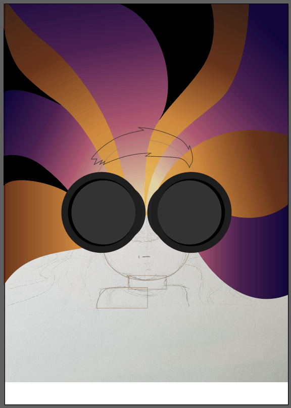
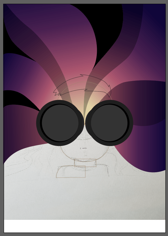
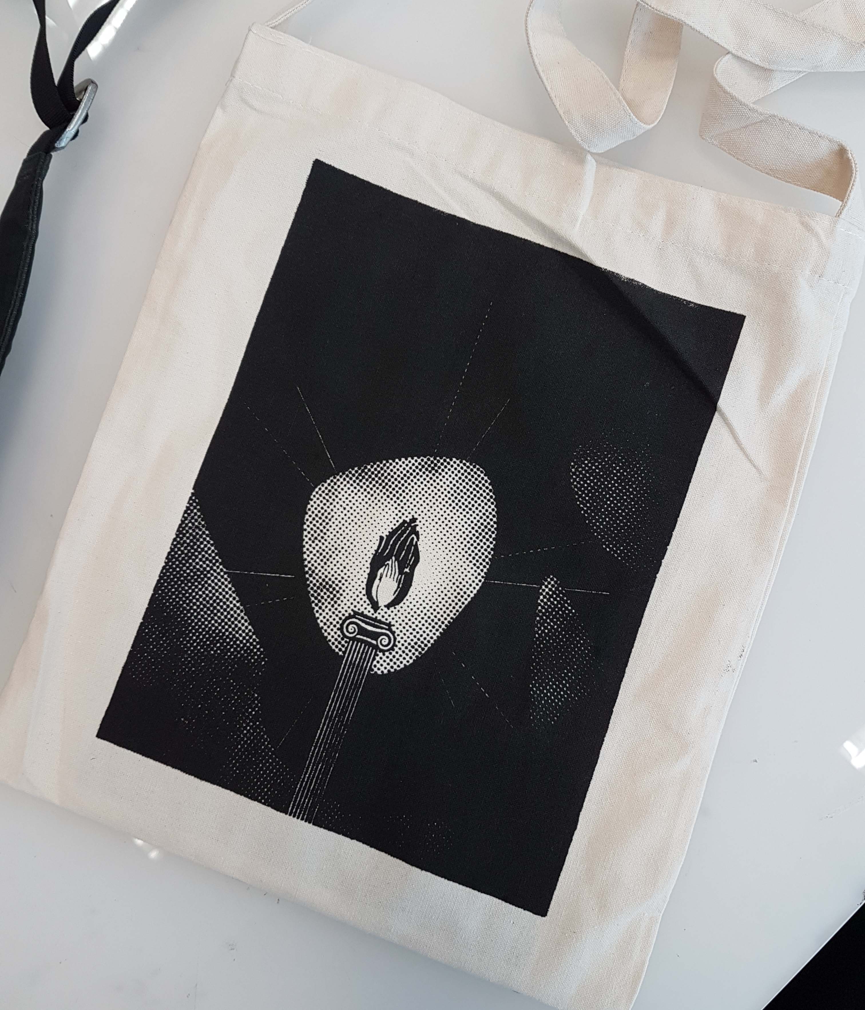
Movie Quote 3: “May it be a light for you in dark places”

This quote to me is the idea of having hope and staying strong when things go downhill in life.

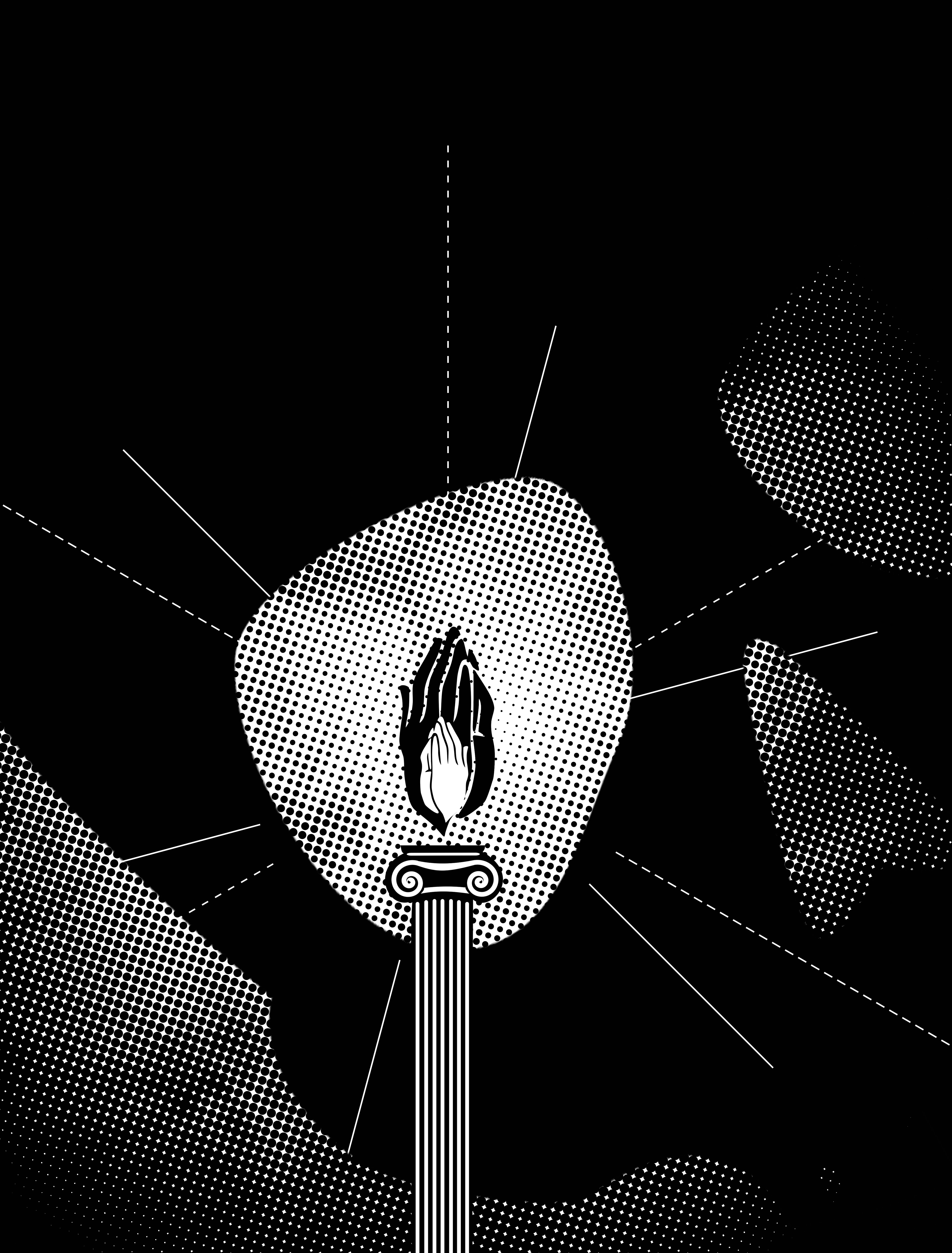
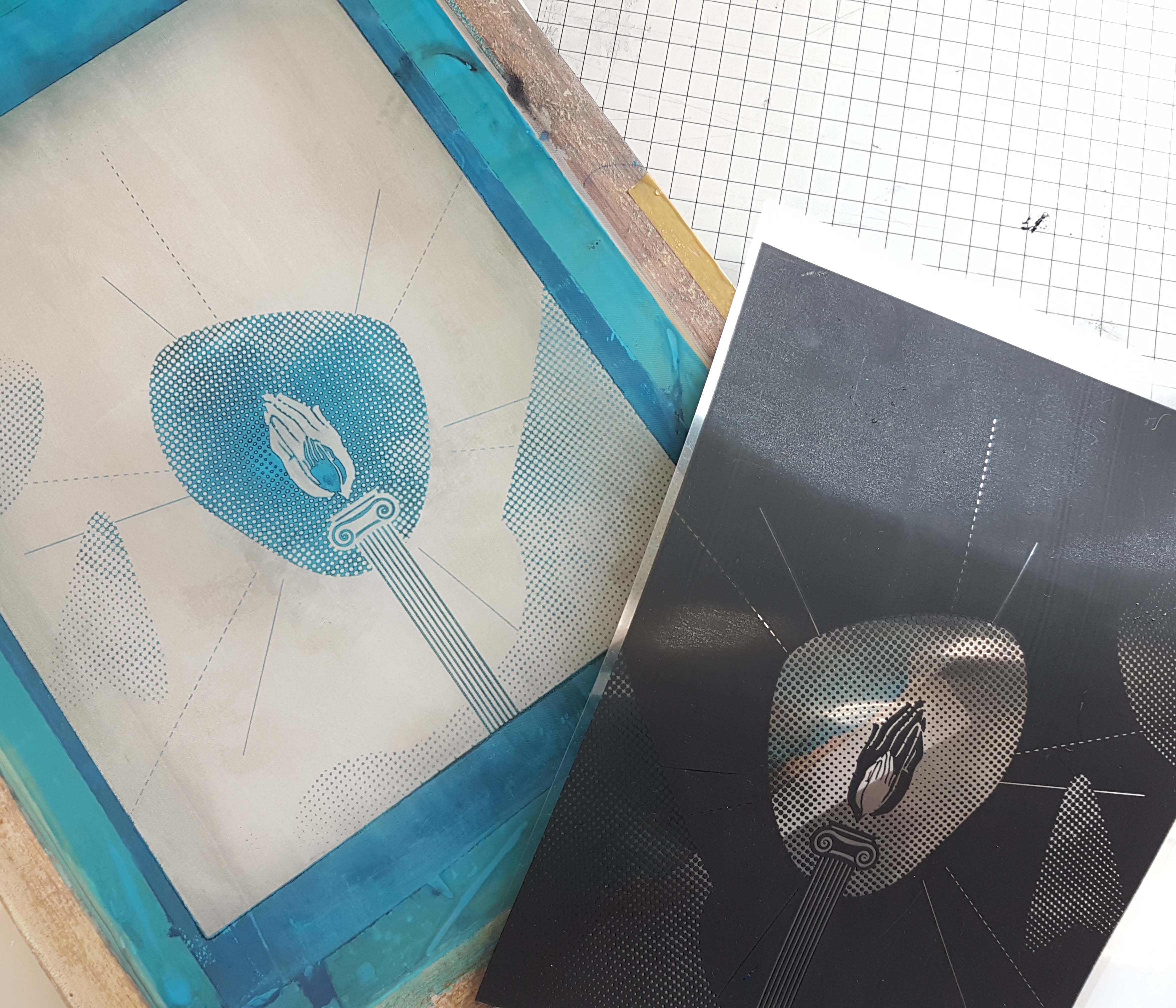
The main feature of the layout is the candle in the middle, with the candle flames made of praying hands, symbolising hope. The candle itself is represented by a pillar, symbolising a pillar of strength. Lines and dashed lines emitting from the candle flame creates a central focus towards it.

Darkness here is represented by the large use of black, and also the formation of the skull, symbolising darkness and death.

In the spaces, however, is actually an image of soft flowers (a little hard to see because of the colour halftone), symbolising light and peace that comes from hope (the candle flame)

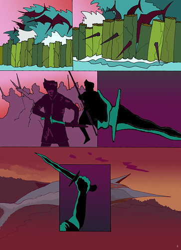
Quote 4: “You gave me peace in a lifetime of war”

There are two elements of contrast here, which is peace and war in the same sentence. In my opinion, the quote means someone helped to break someone who was built for war and rage by giving them peace.

An hourglass containing different types of weapons used through the ages, ranging from swords to tanks and fighter jets, which symbolises “lifetime of war”.

If you look closely at the top right, there is a dove, symbolising peace, formed in the negative space formed by the weapons. The dove is released by the pair of hands at the bottom left, which smashed through the hourglass, symbolising “breaking of the lifetime of war”.

The left side of the background is actually chaos caused by war, but once the dove breaks through the hourglass, the background is pure white on the right side of the picture, symbolising peace.

Silkscreening

I have decided to go with the design for Quote #3 as I think that it will look best when silkscreened on the tote bag.

The screened design and the transparency

After creating the digital design, we were to print it out on two transparent sheets and align both of them together.

After that, we were then told to prepare the screen by spreading the photo emulsion on it. Firstly, we have to wash the screen to clear up all the dirt and dust on the screen. After the screen is dry, we spread a thin layer of photo emulsion on both sides of the screen.

Once both sides of the screen have a smooth layer of photo emulsion on, it is put aside to dry once more.

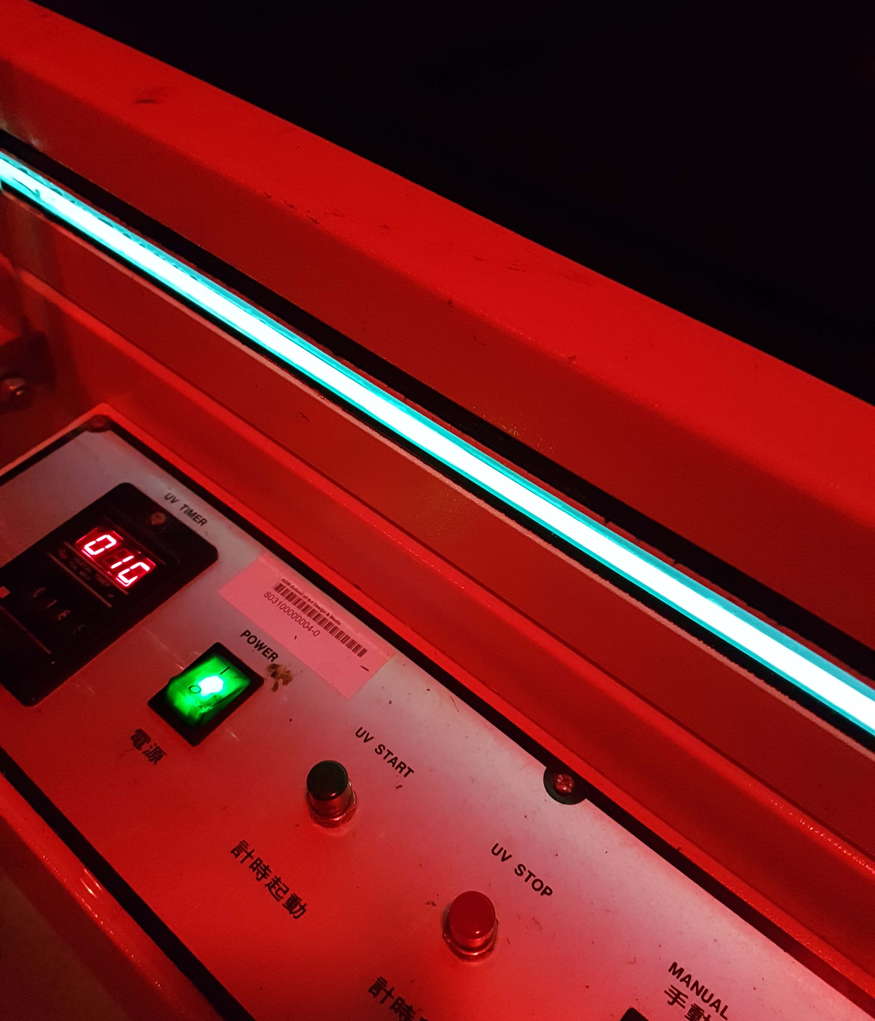
Once the emulsion has dried on the screen, we place the transparency with the design on it onto the screen and put it into the machine to transfer the design from the transparency onto the screen. The transparency needs to be inbetween the screen and the machine for it to be successful.

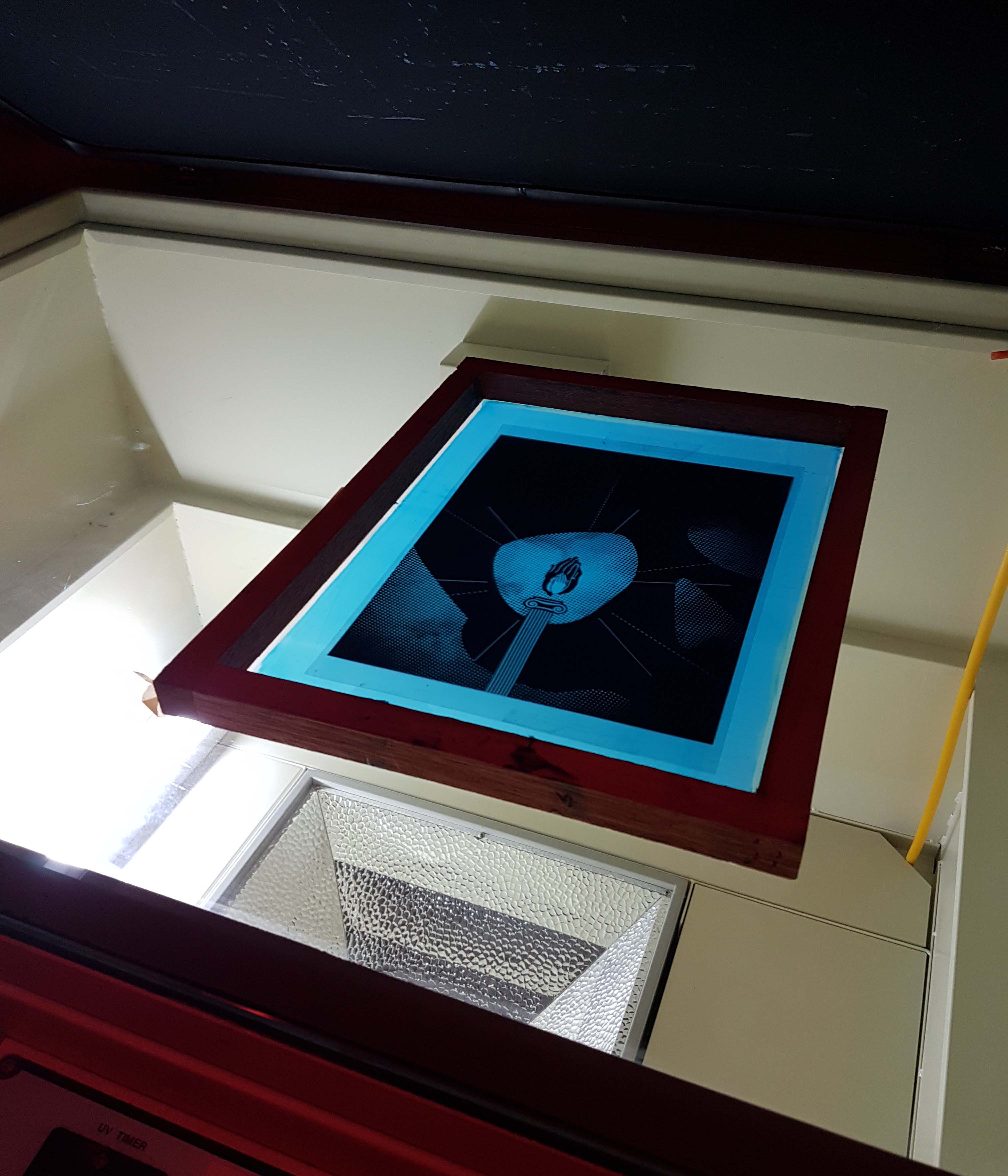
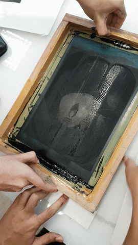
Wash off the emulsion from the screen so that the design will be more clear and the screen is ready to be used for silkscreening. The design, however, will be inverted, in a sense that, the black printed areas will be a negative space, while the negative space on the transparency will be “printed” onto the screen. Put it to dry again.

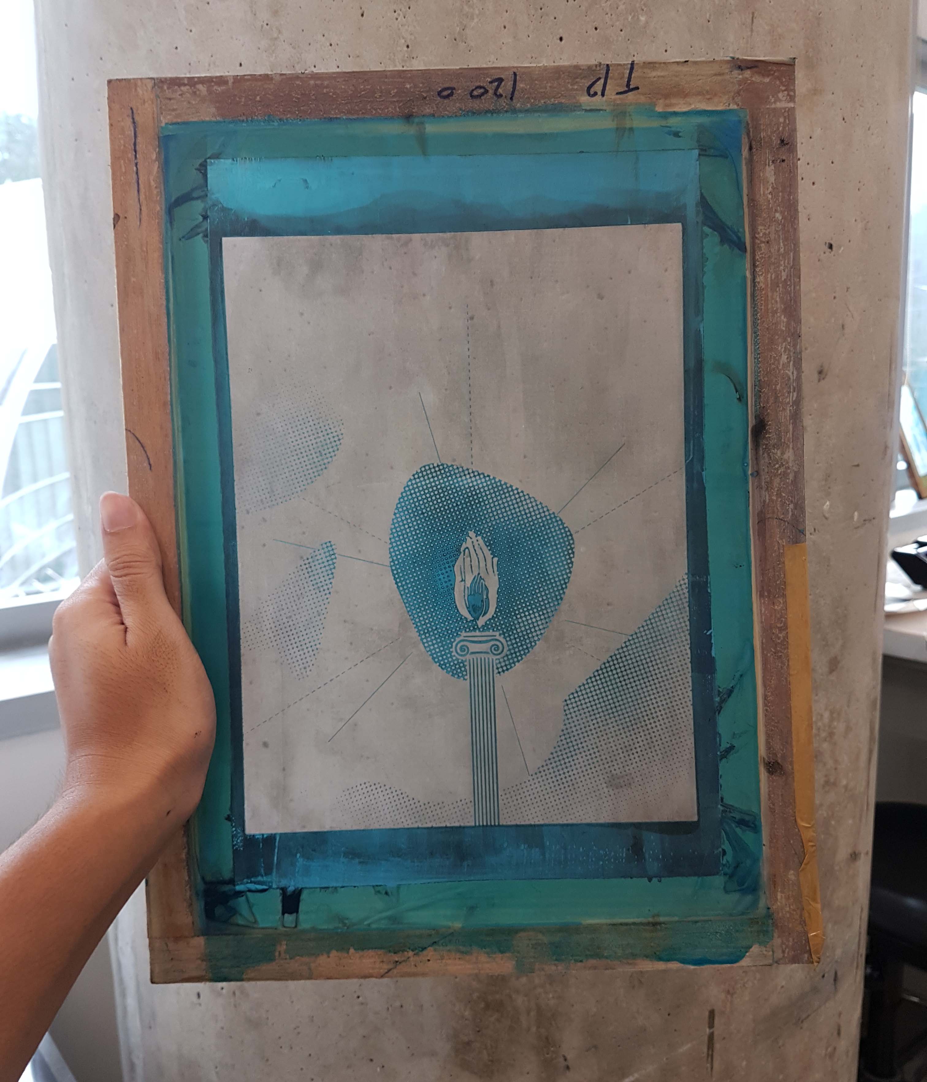
Screen with the design, after washing.

Once it is dry, place the desired surface to print the design onto a flat table. Then lay the screen flat onto the surface, with 4 coins attached to all 4 corners of the screen. This will allow the screen to not touch the surface while and after the design is printed.

Once all of these is prepared, spread a sufficient amount of paint at the top of the screen that is not touching the design. If your design has more negative space, use more paint.

Spread the paint at the top of the screen

Get a squeegee and hold firmly with both hands. Have a friend to help hold the screen firmly in place. When ready, use the squeegee and spread the paint downwards across the screen until the bottom. If you missed a few spots, turn the squeegee around and spread the paint back upwards, till all the spots have been covered. Should not spread too many times (personal experience, once or twice is good enough) as the design printed will turn out really dark and will lose a lot of details.

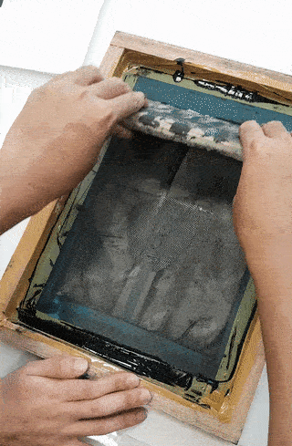
Hold down the surface (paper or in this case the tote bag) and carefully remove the screen.

Finalised print: