Project 2: The Bromise.

Groupmates: Clemens, Joy, Nick and me.

‘A “bromise” was made before a friend went off to try and pursue a career in music but everything started to go downhill from there. From failed auditions to a break in a relationship. At his lowest point, he seeks help from someone who has always been there for him even before his journey began. But did he keep his promise?’

(Bromise: Essentially a promise you make to a bro. One that you can never break. ever. Stronger than a promise. – Urban Dictionary)

The Process

The task was to create a photo story based on someone whom you have lost touch. So getting together with my groupmates, we thought of coming up with tragic drama, initially.

Storyboard

Our initial idea was actually to start off with a present time looking at a photograph, having flashbacks of an event that is related to the photograph, and bringing back to the present time again, so it will all seem linked together. But after that, we sort of thought to scrap the idea of present and past scene as it was sort of redundant to the whole storyline which the main idea was to feature this friend’s life.

Another idea that we scrapped was the ending where the character, Jon, decided to commit suicide at the end when Nick did not answer his phone. To think about it, that idea was somehow too much and would not makes sense. It is more like we were trying to fit in a story with a suicide ending.

There were quite a few other scenes and last minute shifting there was added on or removed just to fill in the plotholes and make more sense in the film.

Artist/Film Reference

One of the film references that we used was the film Suzhou River by Lou Ye. I was particularly inspired by the use of black screens with dialogues in the film because I think that with just the dialogue and no visuals, the audience would be more focused on what the dialogue is about and also they are free to create their own visuals in their head.

Elements in the Film

There were quite a few elements that came to mind when creating this film as even the smallest detail could convey a huge part of the whole story.

Visuals

For the photographs, I tried to edit it in a way that the scenes with the character Jon in it will slowly desaturate as you progress on through the film. I did this to show the sadness and the downfall of Jon as he tried to pursue his dreams but went downhill instead. The scenes with Nick, however, remains the same throughout, no desaturating.

I have also thought of using the black screens as a way to split the different scenes in the film and also create more of an impact on the different sections of his life ending. Scenes that if joined together would not make sense and would be more abrupt. It also creates a breathing space for the audience.

Sound

There are 3 different sounds used in the film – sound effects, dialogues and background music.

For the sound effects, I tried to closely insert all the relevant sounds into the different scenes, like a door slamming, footsteps and even ambient sounds. All of these sound effects will make the scenes more realistic and will play an important role in joining all the images together to create the film.

The dialogues in the film are mainly to create and summarise the different scenes. For example, at the beginning of the film, the short conversation between Jon and Nick helps to summarise the bond and “bro-ship” between the 2 characters, which would take quite a long scene if gone with another direction.

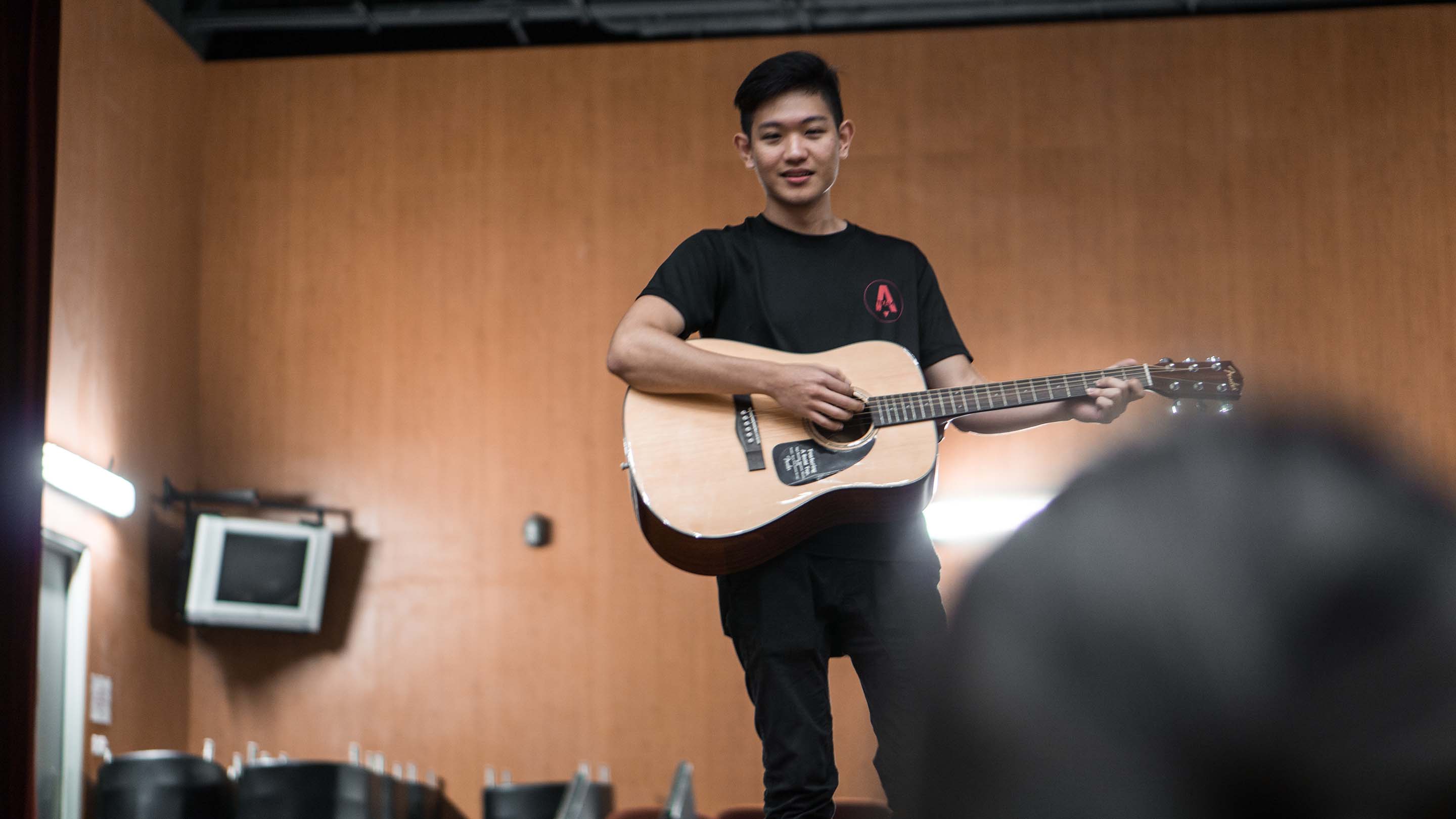
Lastly, is the background music. I would not consider it as ambient sounds as the background music actually plays throughout almost the entire film and also at the end. An acoustic guitar instrumental is chosen as a guitar is in a way symbolic of the main character, Jon. When the guitar music starts, it represents the start of Jon’s music journey, and when it stops, it shows how he feels like the end of his dreams. There is also no separate guitar sounds being played when in the scene he is playing one. This is because I would not want to create a clash in guitar music and also would not want it to be a determining factor in the story, like why he did not get the audition or did not receive good feedback when busking.

Conclusion

I was really really excited in creating this film as I have never actually created a film before but I have always had scenes play in my mind whenever I listen to music or look at images. This was a good assignment for me to try and express all those and really hoped it worked. Although i still feel like there’s so much i can improve on, like in terms of my concept and the missing plotholes, I still learned alot just using sounds and still frames to convey a story.

Making a Mark – My Line is Emo

Emotion: Love

When you’re in love, you get this bubbly feeling inside, but at the same time it clouds up your judgement and thinking. It becomes more intense the deeper you get, creating dark patches in your mind, dark emotions and thoughts slowly takes over.

Materials used: Chinese Ink, Washing Liquid, Bubbles, Straw

Emotion : Elation

In other words, great happiness.

The light feeling you get when you feel really happy, a burst of happiness out of your body. Tried to show it in the design in a way that the ink creates a light flowy pattern, all emerging from one point.

Materials used: Chinese Ink, Shaving Foam.

Emotion: Amazement

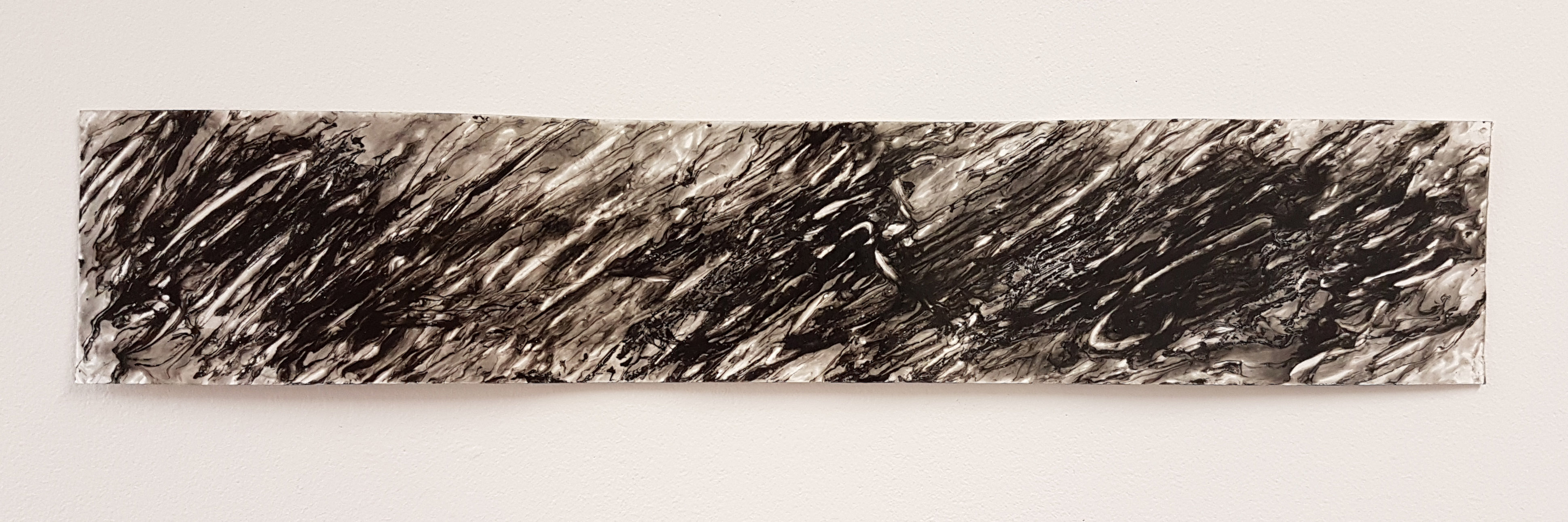
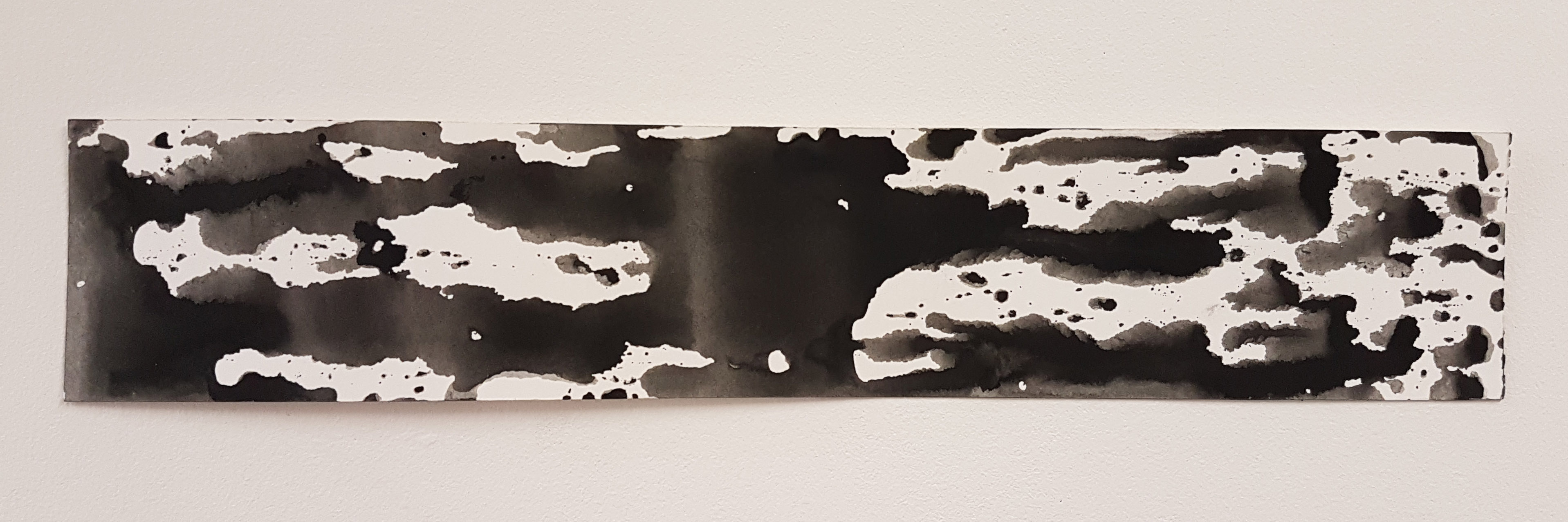
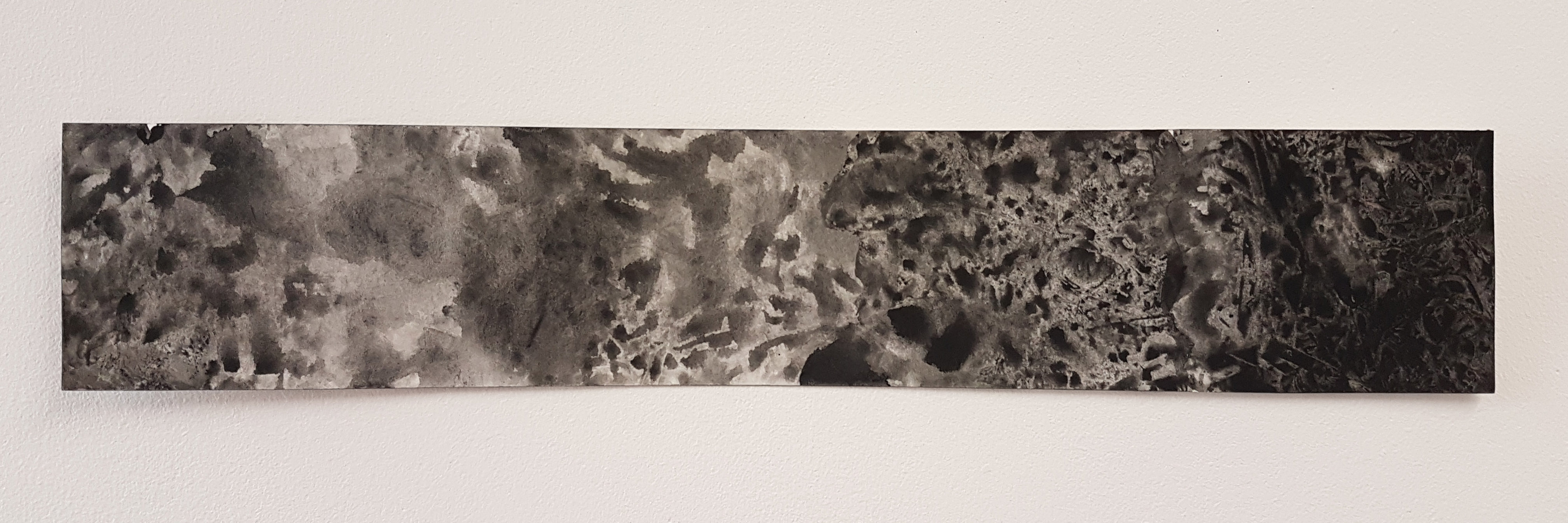
The feeling of great fascination, somehow creates explosions and fireworks in your head, in a literal sense: mind blown. (Would have used that word instead but its not in the list.)

Tried to show layers of “explosions and fireworks” by creating the patterns with an old bottle cleaner.

Materials used: Black Poster Paint, White Glue, Old Bottlecleaner.

Emotion: Rage

Inspired by the phrase, ‘beauty and rage’, from the song Ultraviolence by Lana Del Rey.

At first glance, it looks like a messy angry pattern. Nothing is clear, nothing makes sense when you are raging. However, if you look closely, there is a beautiful marbling effect created amongst the violent strokes, symbolising beauty in rage.

Materials used: Black Poster Paint, White Glue, Old Bottlecleaner.


Emotion: Sadness

Nothing is clear and nothing makes sense when your feeling really sad. The vertical black patches against the horizontal white spaces emphasizes on this uncertainty – your dark thoughts clashing with the positivity and hope, slowly taking over. The water effect created also further creates the somber and sad mood.

Materials used: Black Poster Paint, Water, Foam Board, Watercolour paper

Emotion: Fear

Inspired by nightmares. You cannot recall the dream exactly when you wake up, but somehow it still strikes fear when you have a nightmare. Everything is vague, dark and these nightmares always come in a misty and musty dream, soft and dream like, but unclear and dark.

Materials used: Black Ink, Water, Cling Wrap.

Making a Mark – Process

Emotion – Fear

Materials used: Black Ink, Water, Cling Wrap, Watercolour paper


I mixed water with ink to make it a little more watery, so its easier to play around, and then spread the mixture across the surface, in this case the watercolour paper strip.


I took cling wrap, and placed it firmly onto the inked surface.

Wait a while before you actually put it open, so it sets the textures and details a little.


I pulled out the cling wrap, and reveal the patterns created. i adjusted the clingwrap a little and place it on another area or any desired area on the surface to create another texture.

I left it to dry after I’m satisfied with it.


The Outcome:

Emotion – Amazement

Materials used: Black Poster Paint, White Glue, Old Bottlecleaner, Watercolour paper

This was an emotion that I thought long for. How can I show amazement?

Then I broke down the word and ended up with the word “mind-blown”. I instantly remembered the mind blown meme:

So I tried to recreate something similar.


I spread a mixture of white glue and a bit of poster paint evenly across the whole surface of paper strip.

(This by itself could be used as a method of mark-making, as I get to control the paint and glue mixture with my brush)


I then used an old bottle cleaner brush and dabbed into the paint and glue surface. I flipped and turned the brush to find a desired pattern for this emotion.

To get some areas darker, I dropped a few drops of poster paint to certain areas and continued to dab.


The Outcome:

Emotion – Rage

Materials used: Black Poster Paint, White Glue, Old Bottlecleaner, Watercolour paper

I was listening to Lana Del Rey’s Ultraviolence at that point of time, and was inspired to create something of beauty and rage.


Again, I spread a mixture of white glue and poster paint evenly across the watercolor paper surface.

I added more poster paint now to make it darker to convey a darker emotion.


But now, instead of dabbing the ink and white glue surface with the brush, I “angrily” brushed it while pressing into it hard.


The Outcome:

Emotion – Sadness

Materials used: Black Poster Paint, Water, Foam Board, Watercolour paper


I spread a mixture of black poster paint and water across the surface of a foam board. I realise the mixture does not spread evenly on the board no matter how much ink I applied. I noticed how it has gaps and watery patterns the poster paint creates.


I then placed the watercolor paper strip onto the paint and water mixture, and gently pressed the paper onto the foam board hoping to get the pattern printed onto the strip.


I slowly removed the strip from the foamboard, and the pattern is revealed.


The Outcome:

Emotion – Elation

Materials used: Chinese Ink, Foam Board, Shaving Cream, Watercolour paper

In other words, great happiness. I took several attempts to do this. The idea is to create something that has a lot of white spaces so it would not be too dark, and also to create something that has a light feeling to it.

I sprayed shaving cream across the foam board in the size slightly bigger than the paper strip.


I then dripped Chinese Ink on various areas of the foam. I only dripped a few inks as I would still want the end design not to be too dark.

Then I played around the ink drips with the back of a paintbrush, swirling it around to create the desired pattern.


I gently placed the strip on top of the foam with the desired ink design on it. I actually applied abit more pressure to get more of the details on the strip and not to leave any gaps.


I then gently removed the strip from the foam. The foam may look stretched and messy.


The design may look messy and grey now, but its not done yet. I took a scrap paper or squeegee and remove the foam from the paper, and the pattern is revealed!

The Outcome:

Emotion – Love

Materials used: Chinese Ink, Washing Liquid, Bubbles, Straw, Watercolour paper

Love was a tough emotion to think of, without making it too literal. So I tried to break down the word and think of what defines love…. so I ended up finding myself playing with bubbles.

I mixed Chinese Ink and washing liquid to make a bubbly mixture. I then blew into the mixture using a straw and the mixture started to bubble up with black bubbles!


I then took the paper strip and gently placed it on the bubbles while I was blowing it. I realise the faster I get it printed, the darker the pattern gets. If I wait a while, the pattern printed will be lighter.


The Outcome: