To show the transition of the day to night in my zine, I would pick out elements that stand out during the day and the night so to narrow down on what to show in the zine before even actually deconstructing it into graphic forms.
Things that stand out during the day:
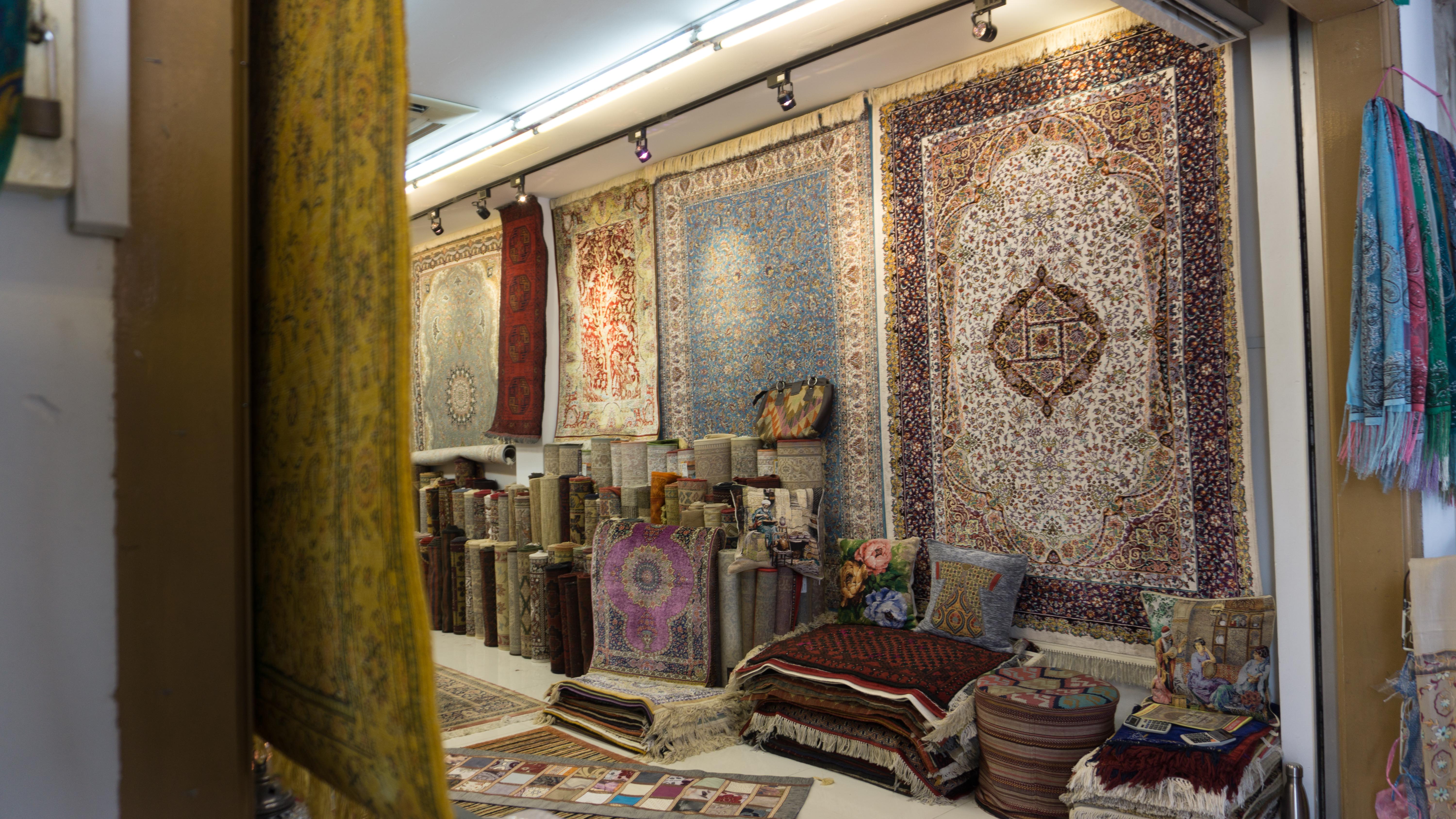
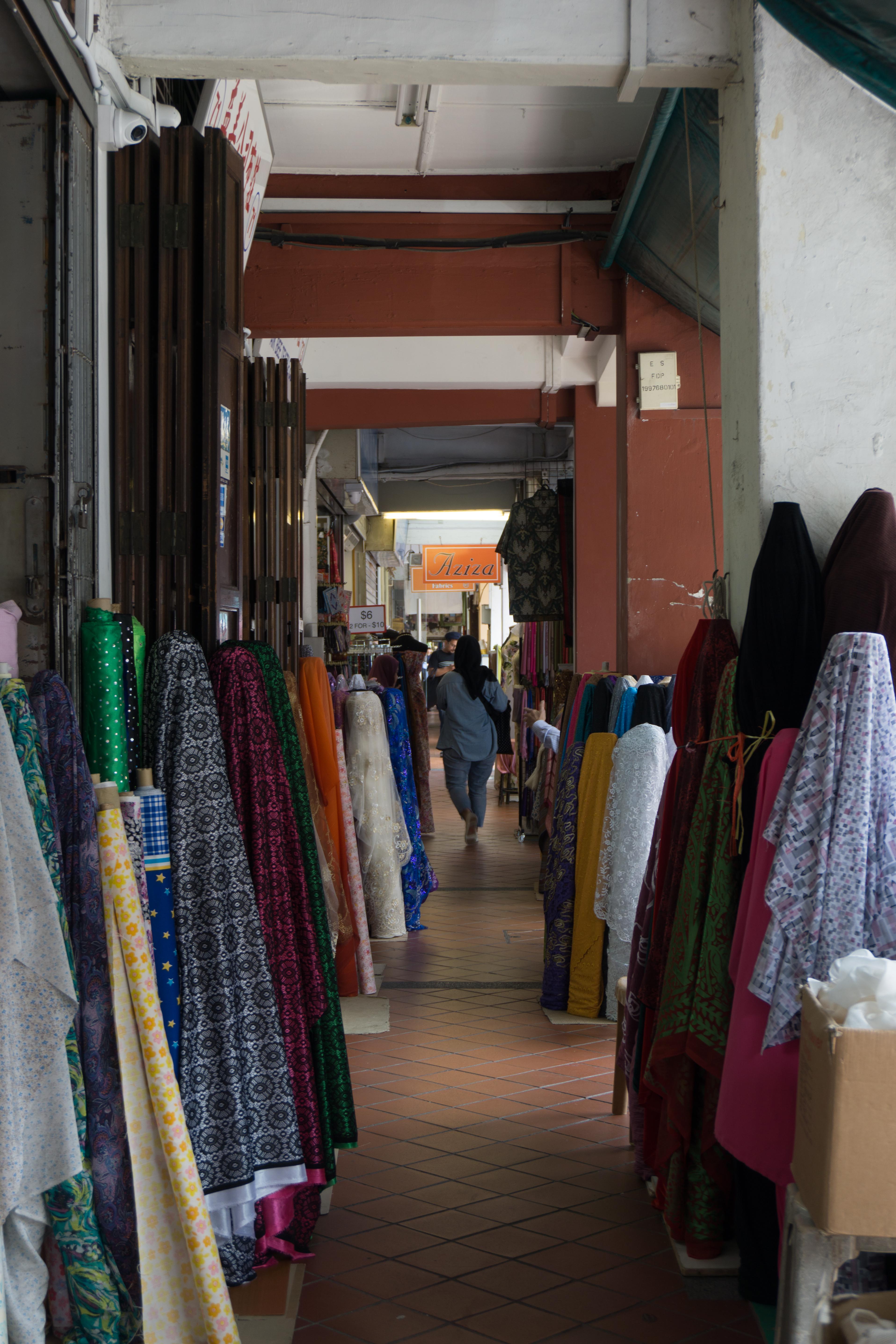
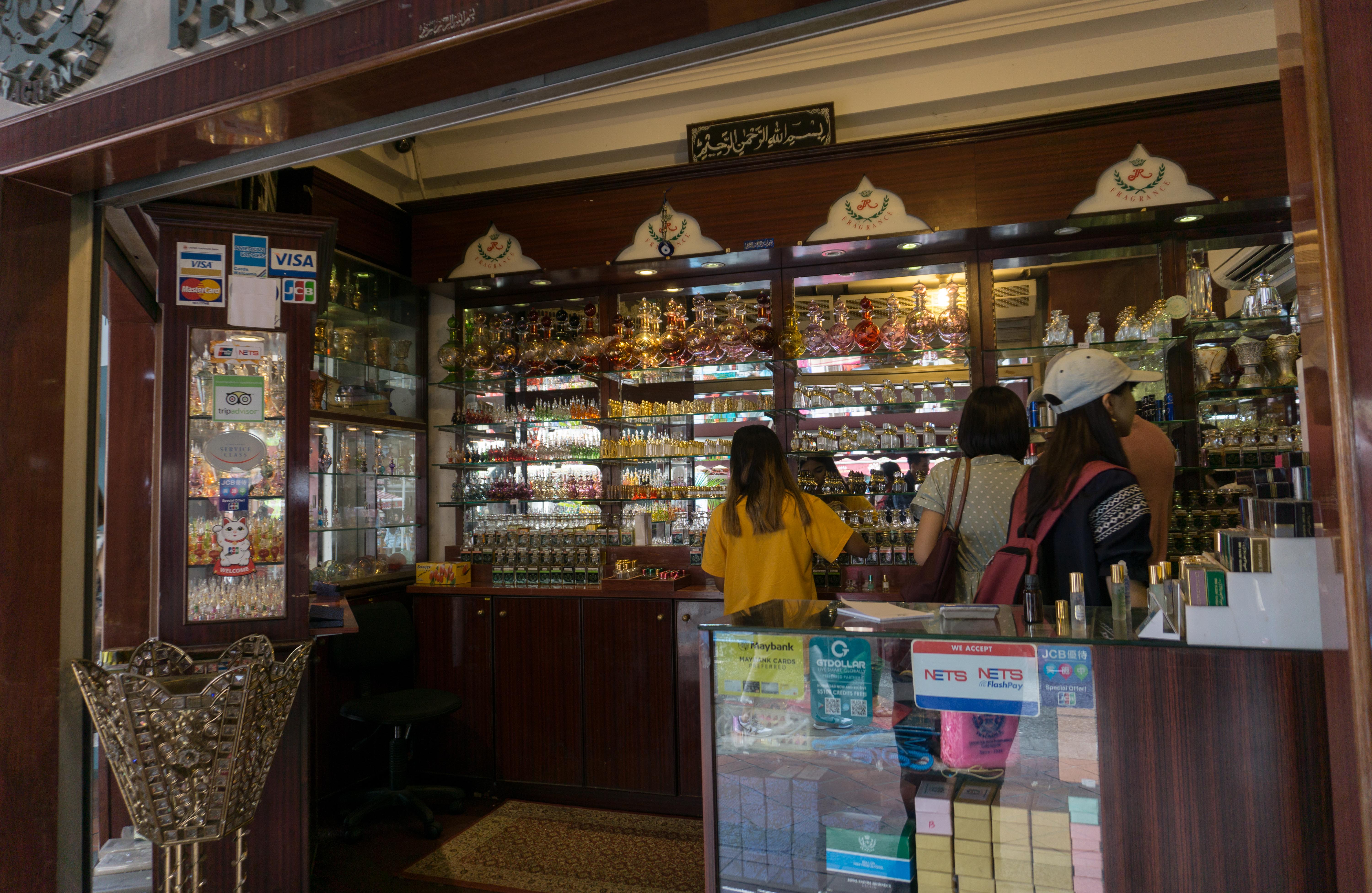
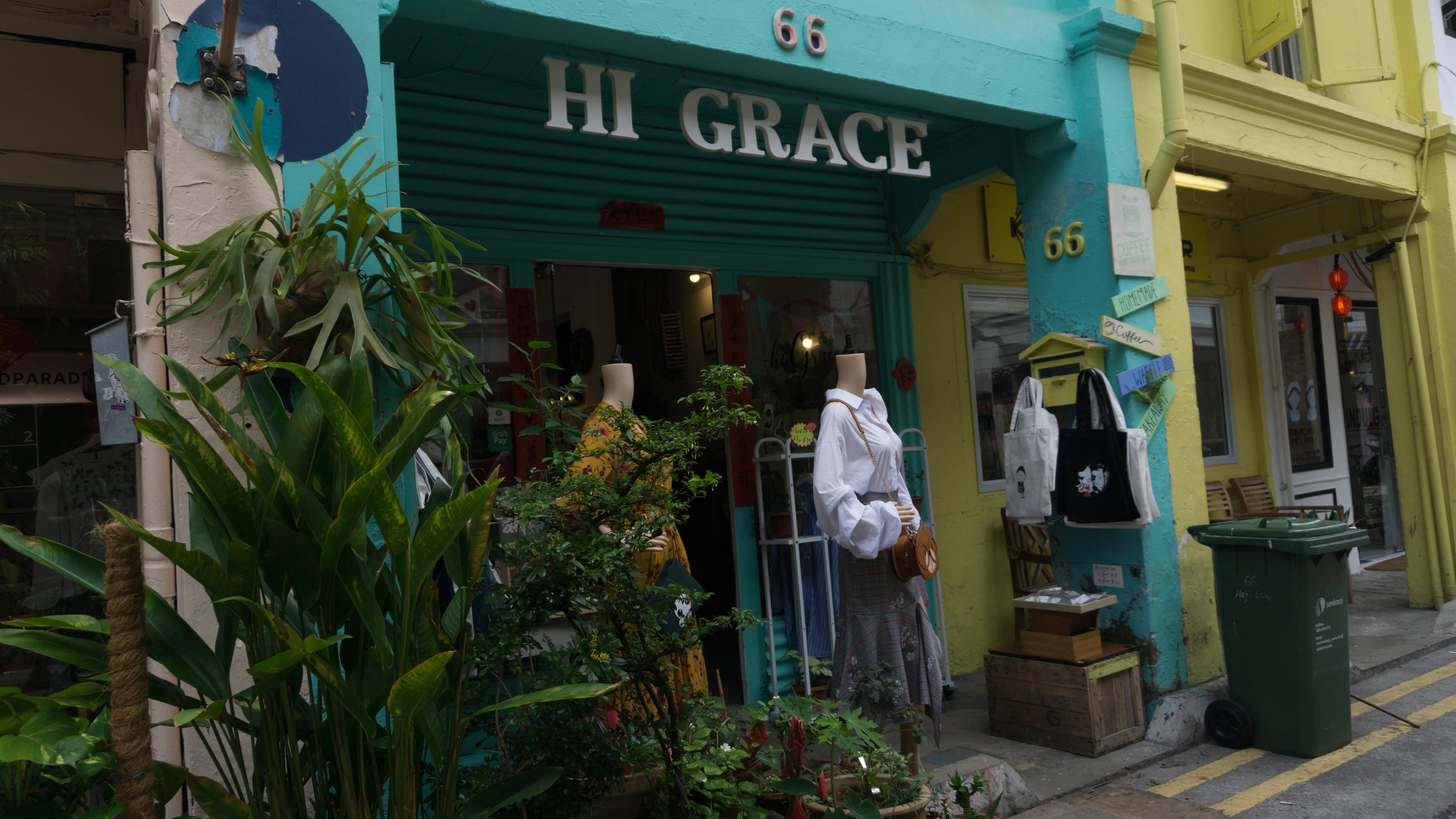
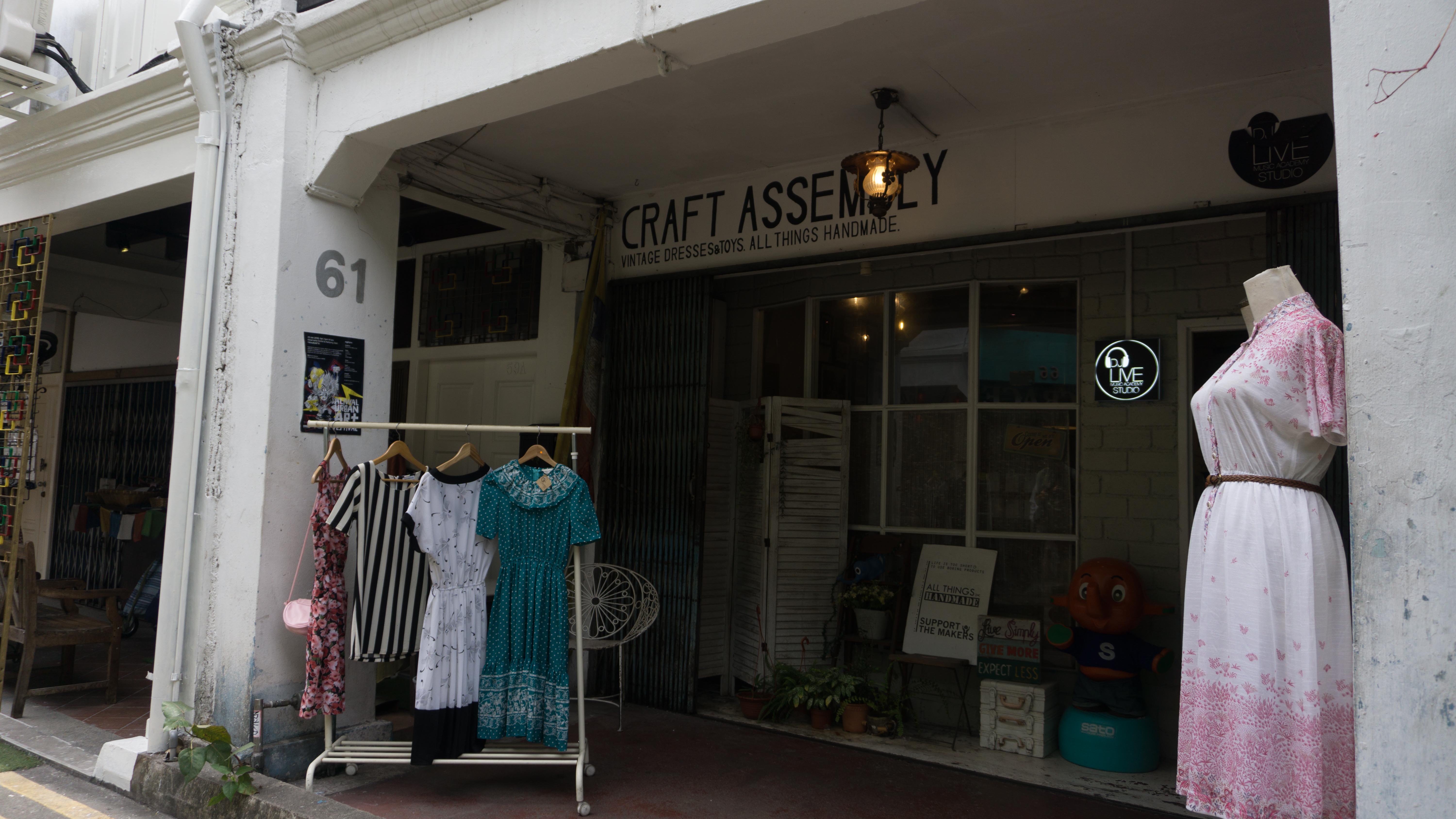
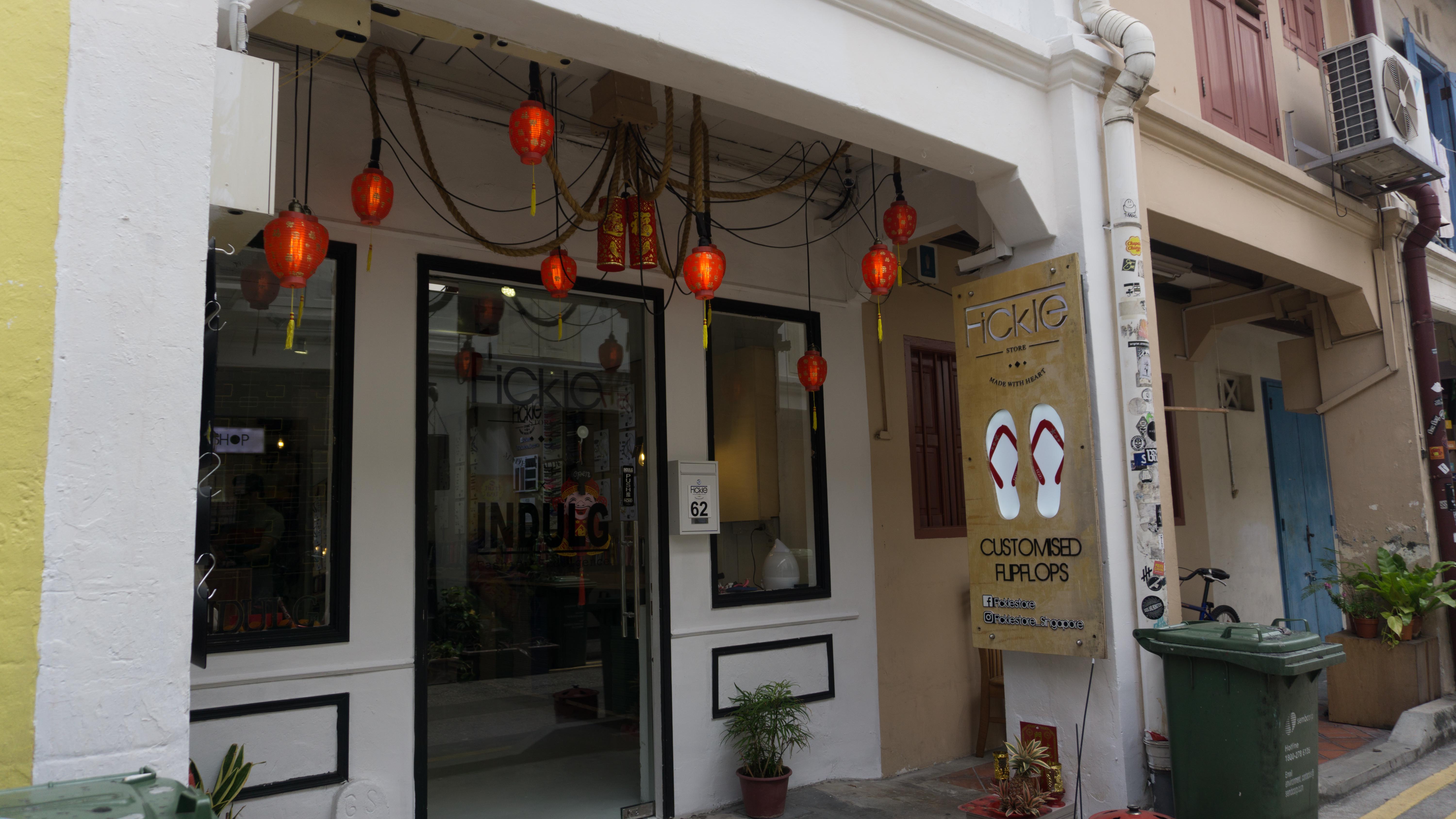
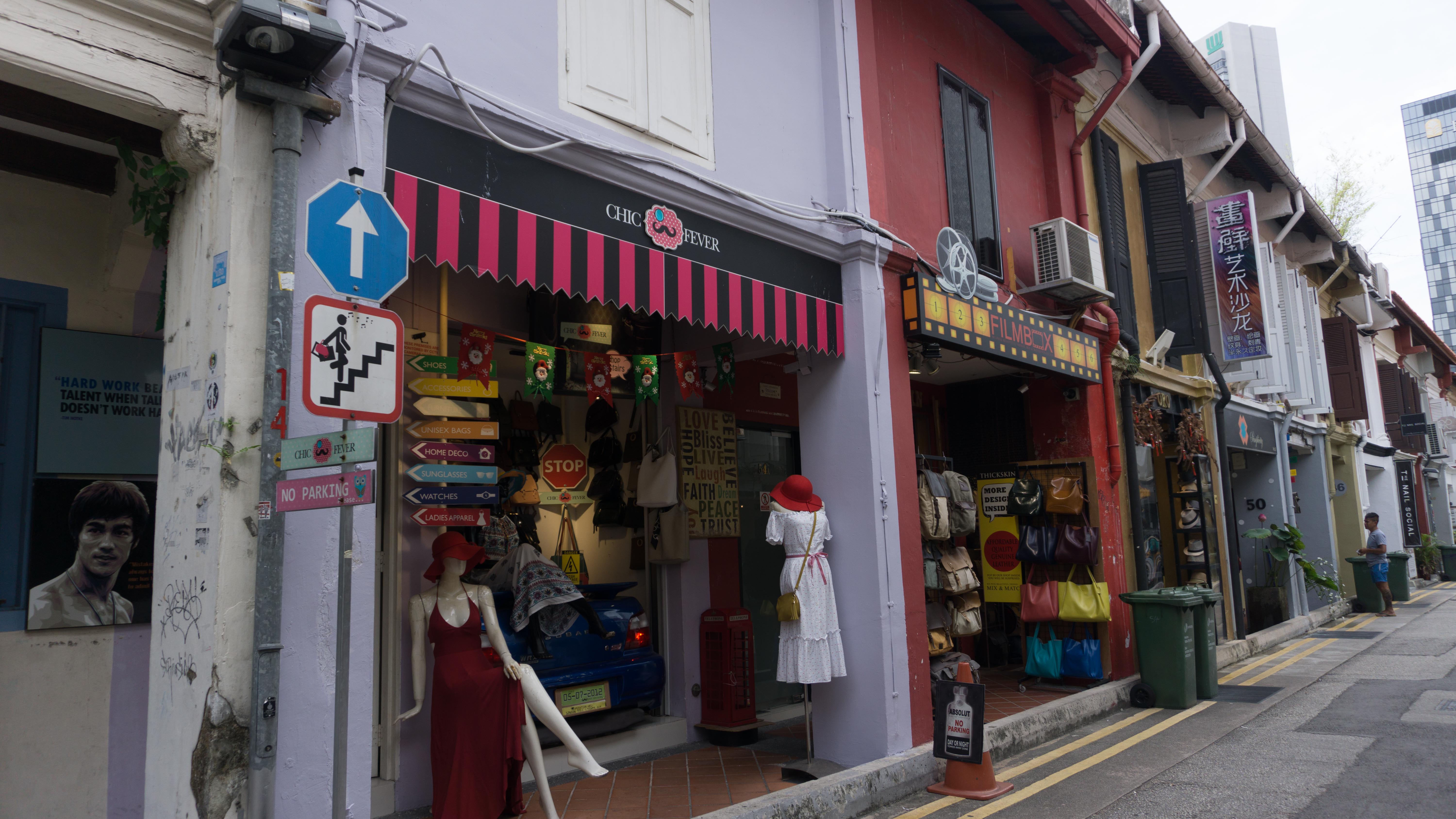
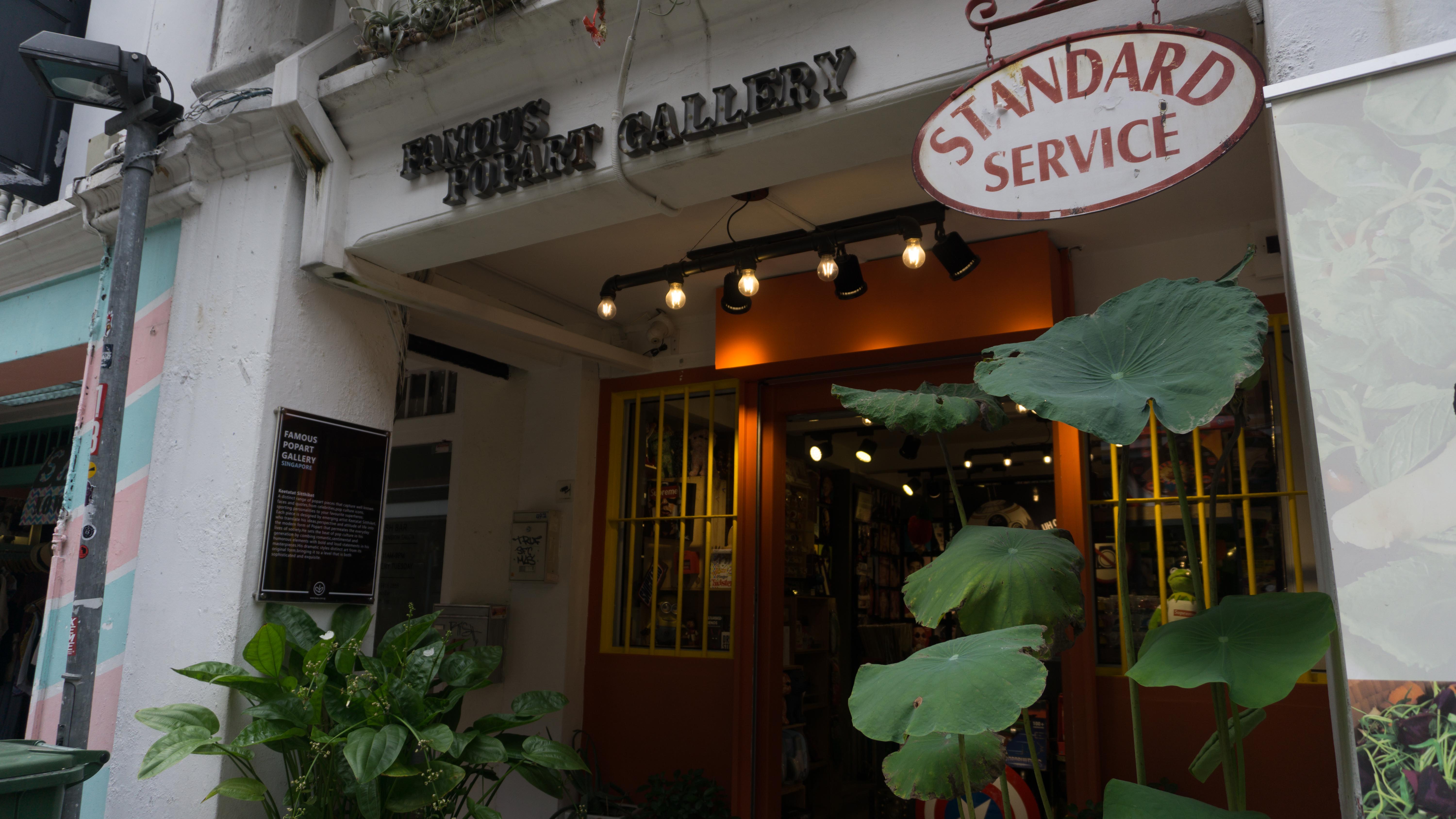
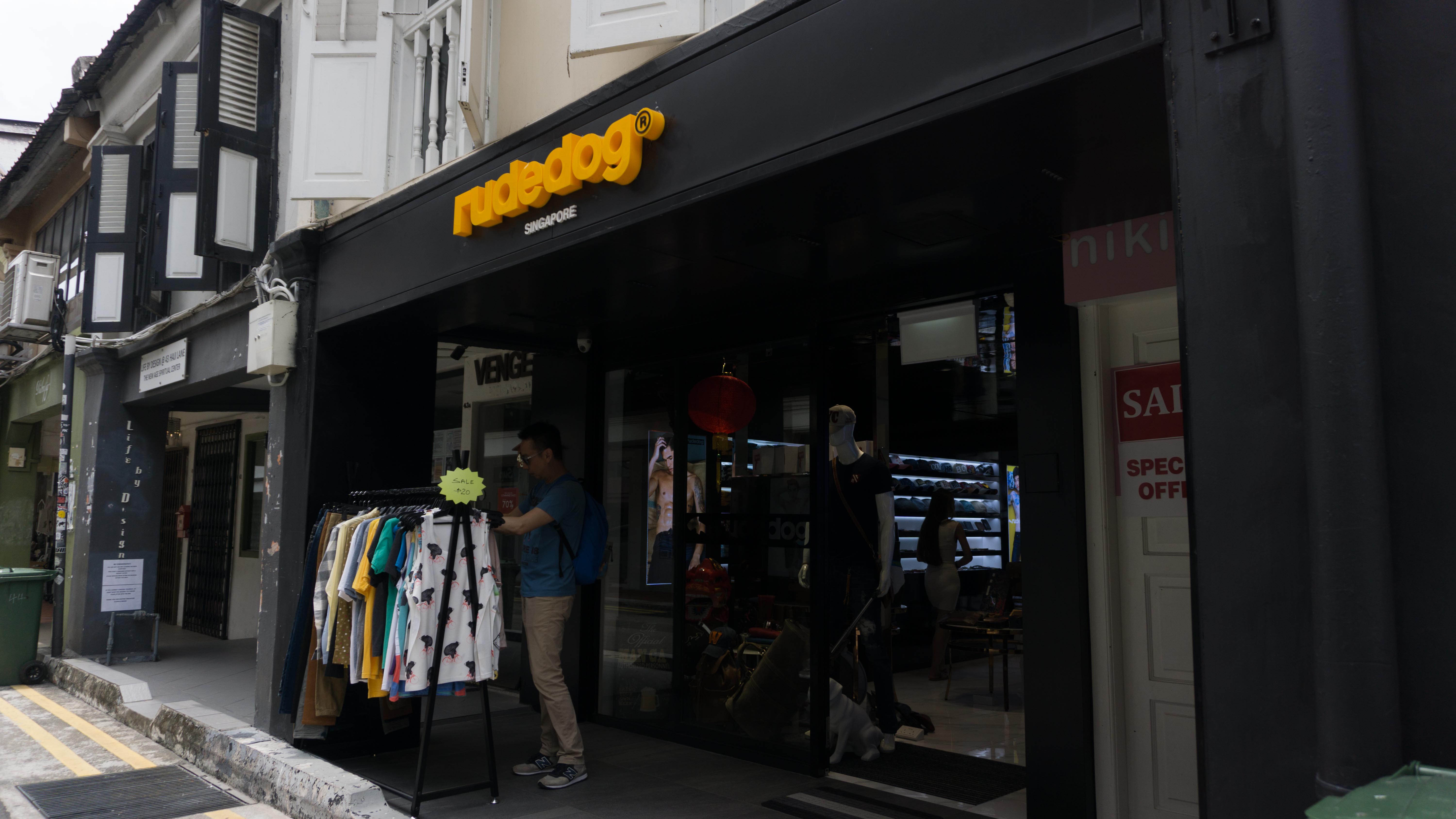
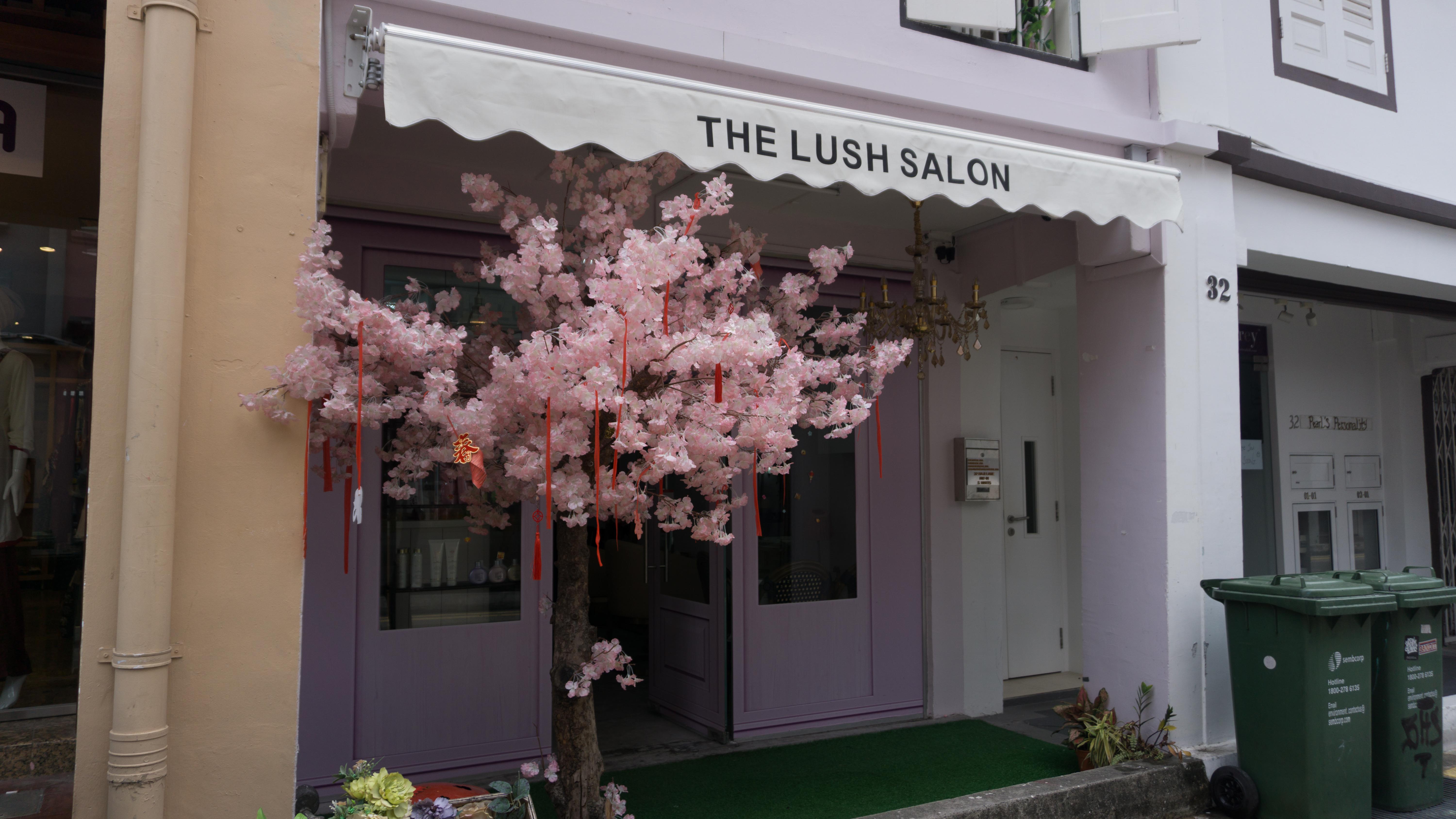
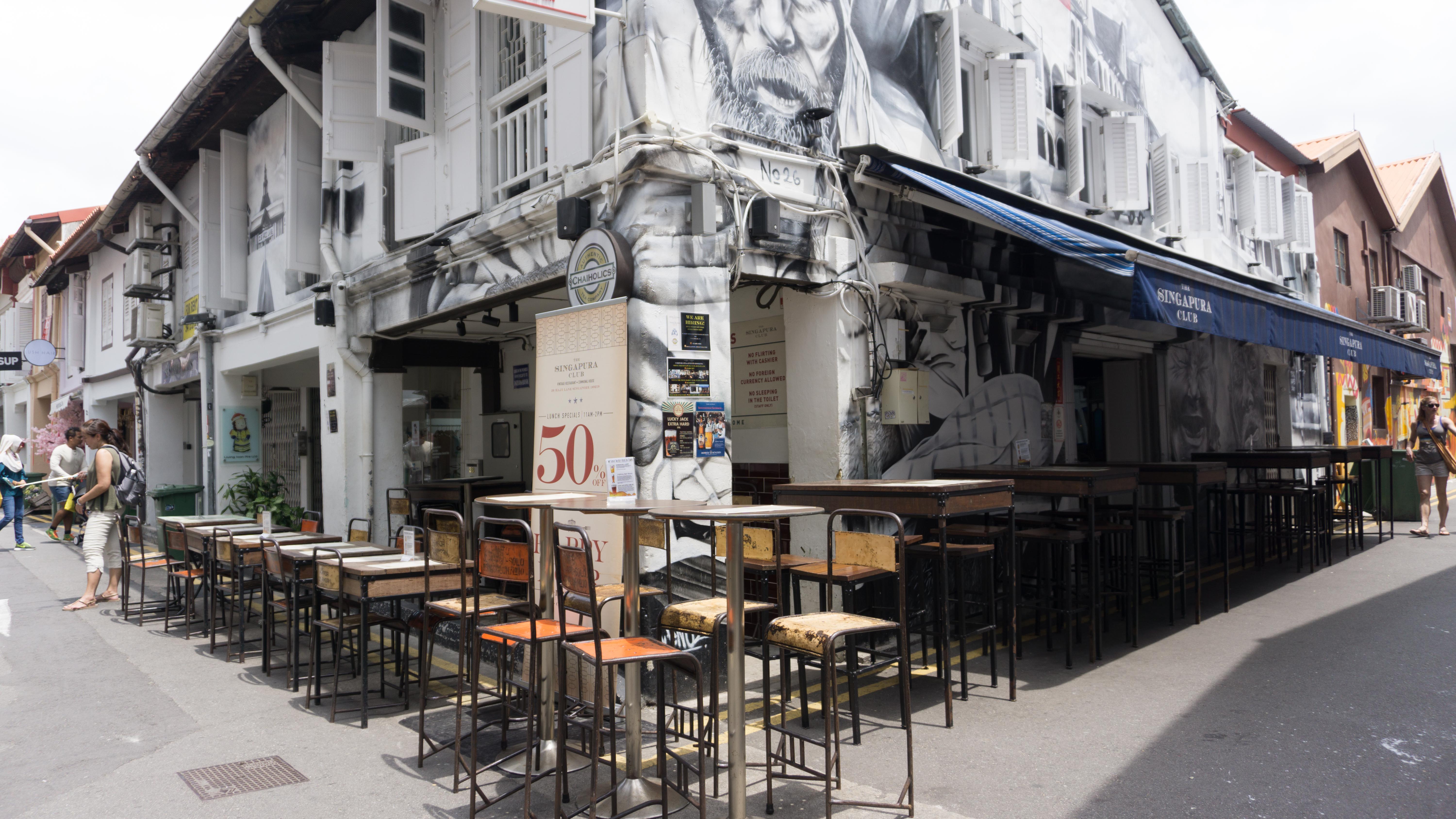
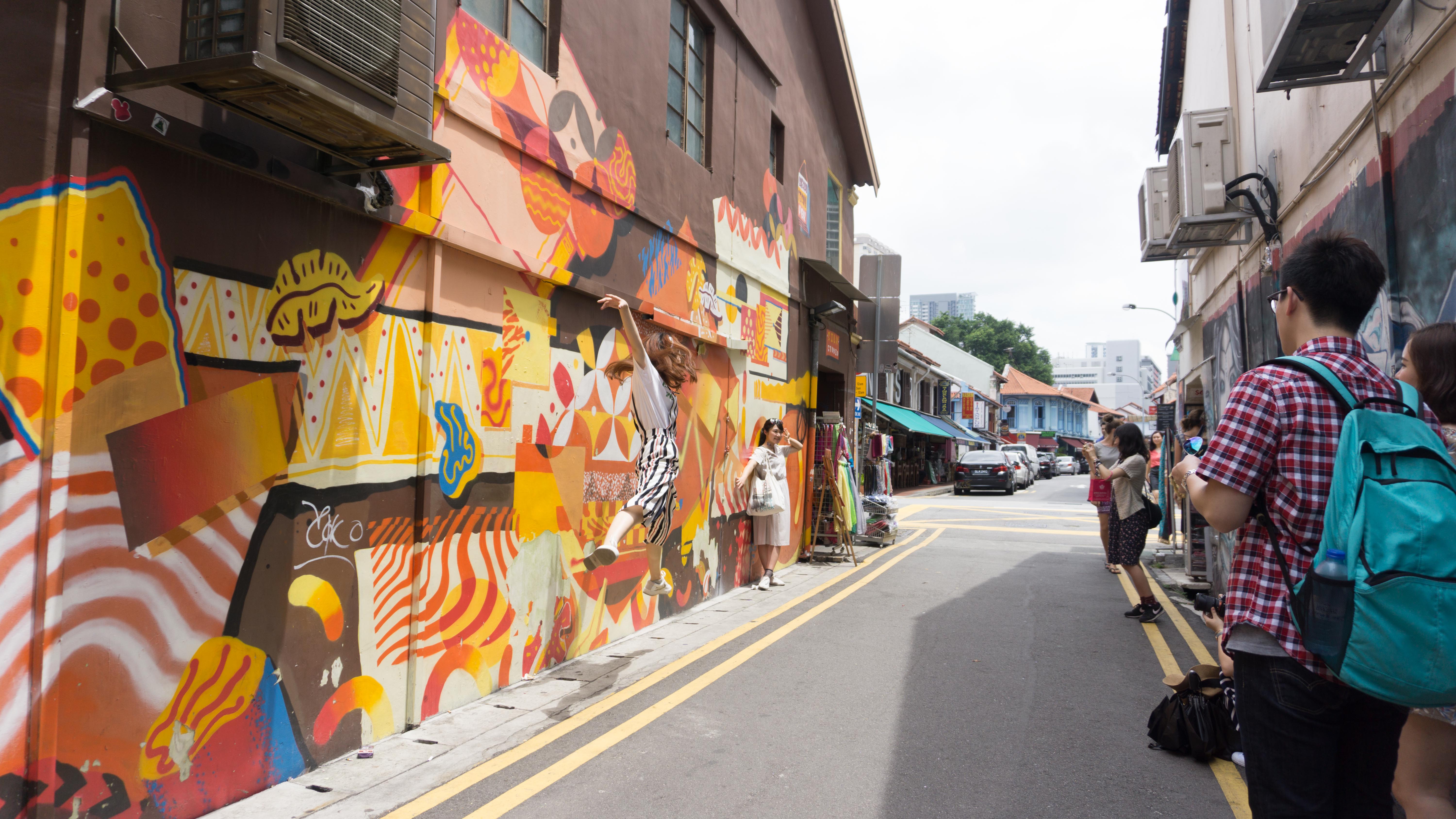
- retail shops (fabrics, carpets, perfume shops)
- eateries – not too many people except during lunchtime
- more tourists & tour groups
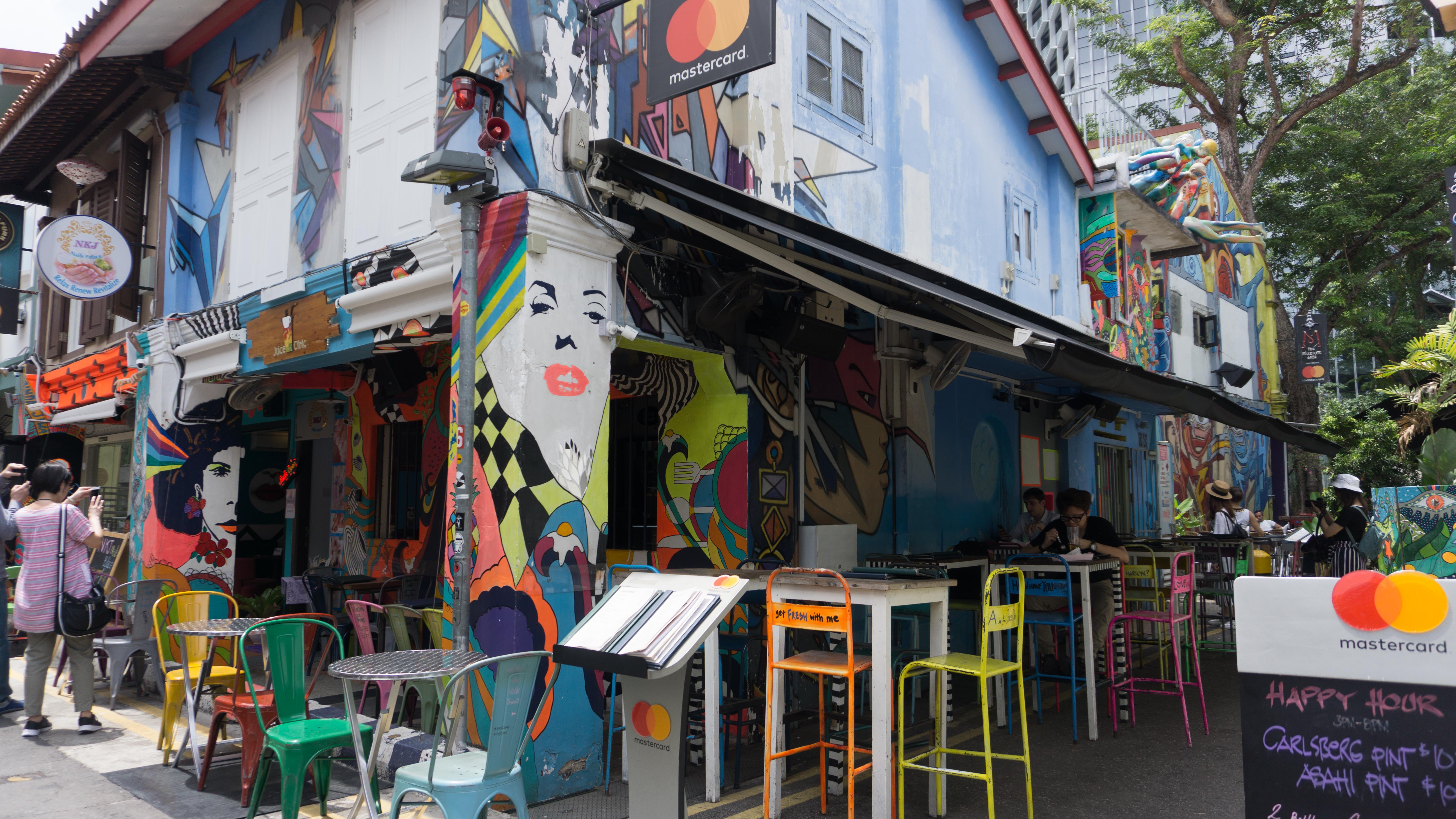
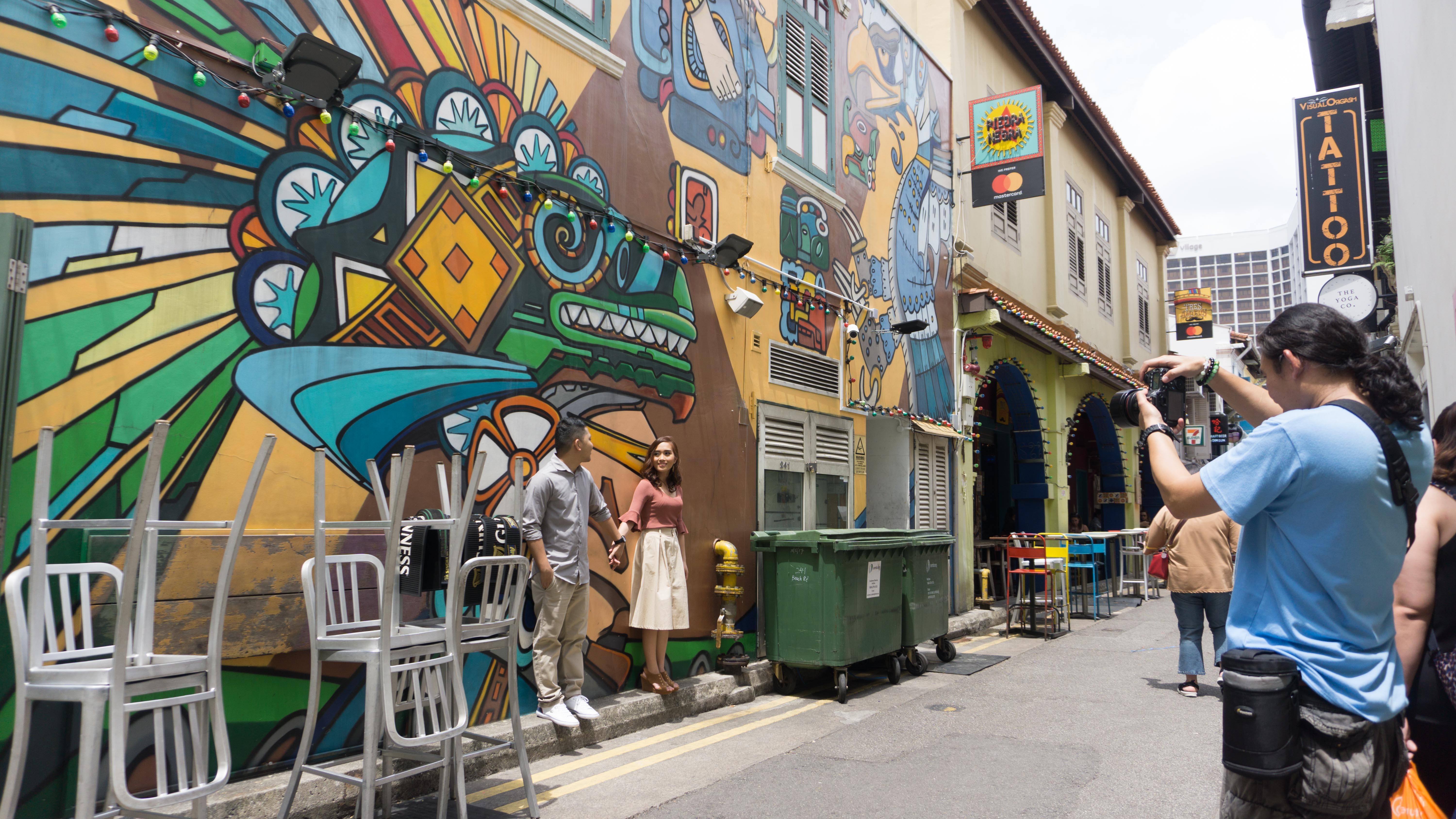
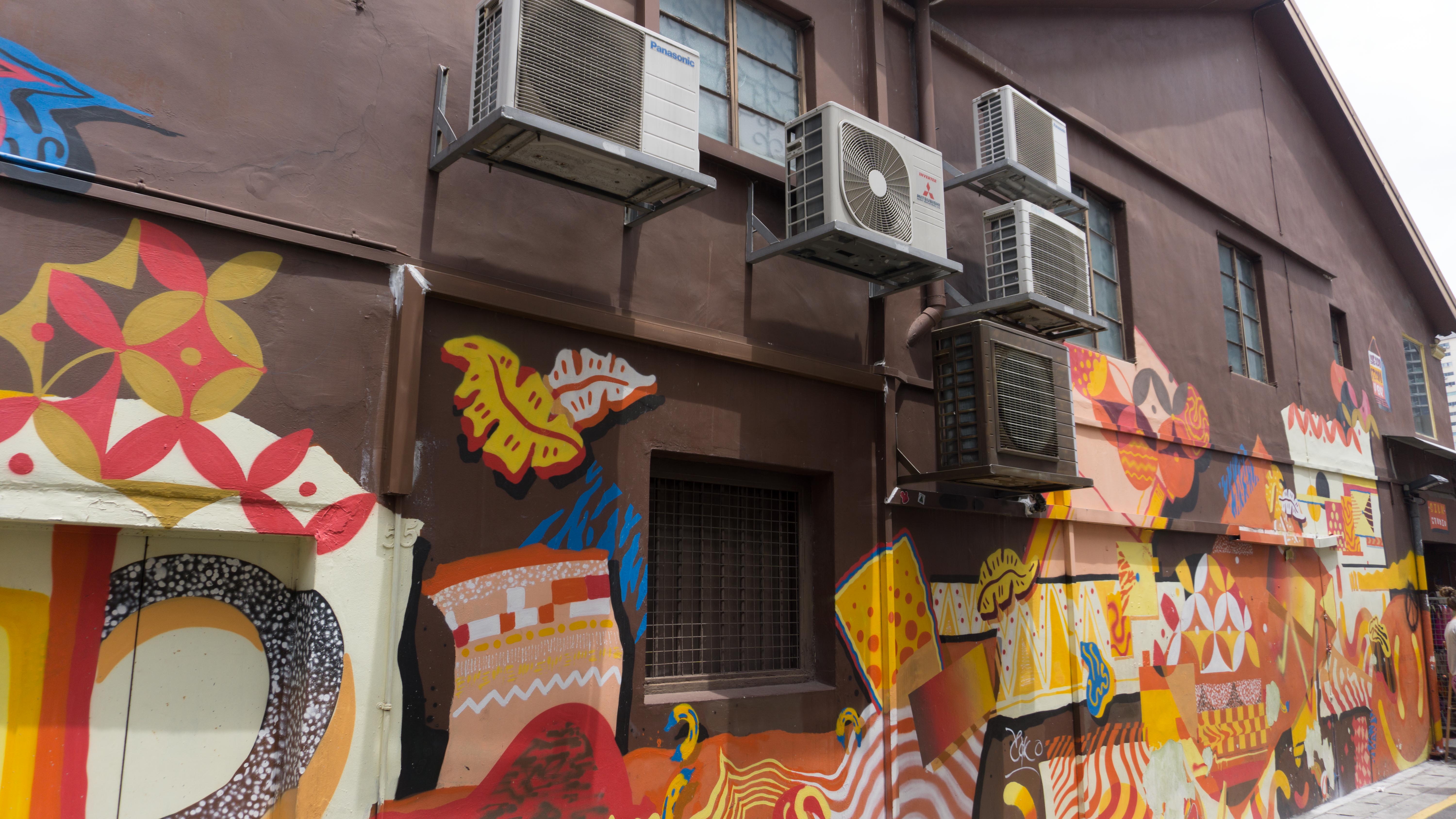
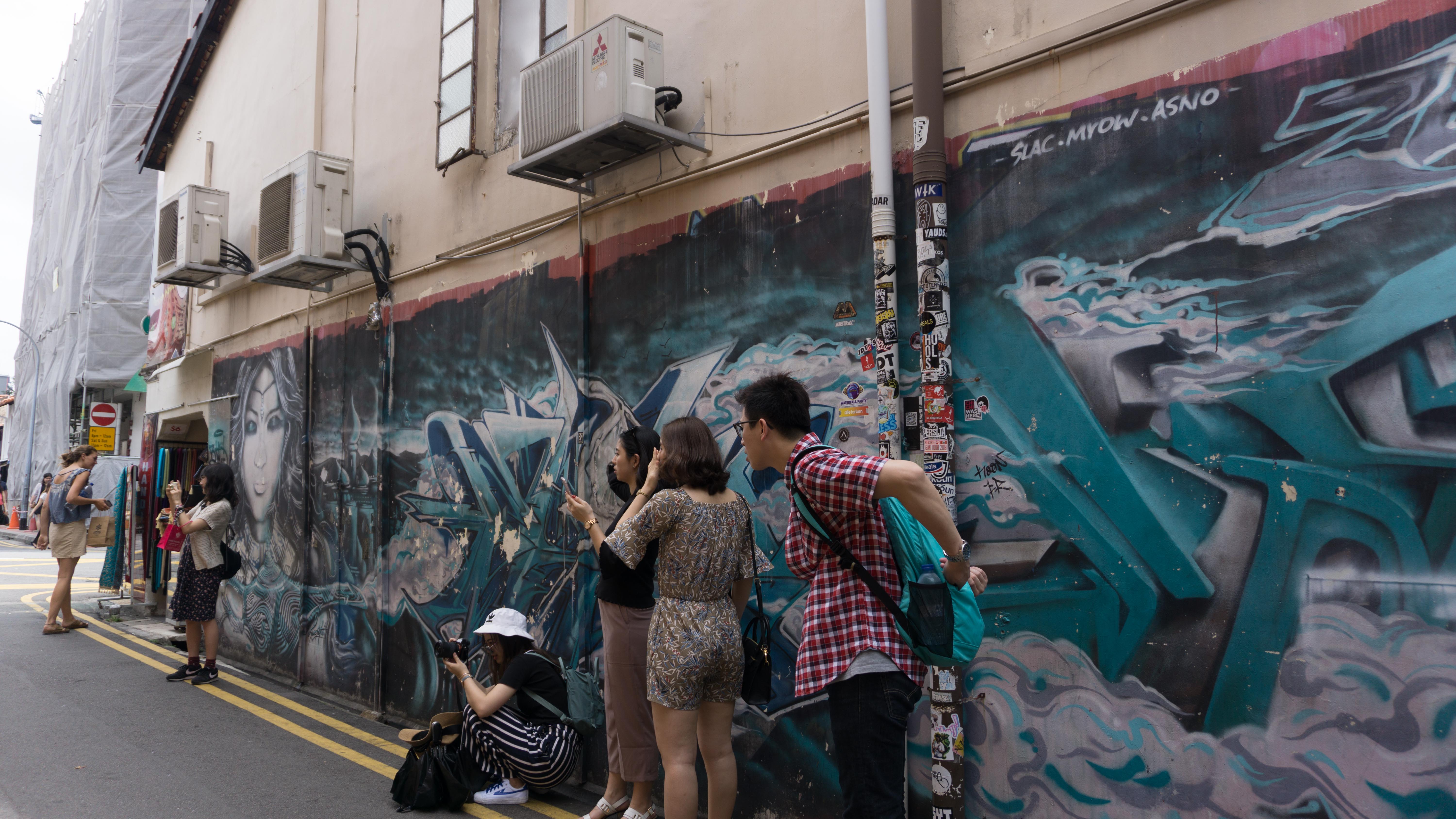
- graffiti (particularly stands out in the day, vibrant colours, tourist attractions
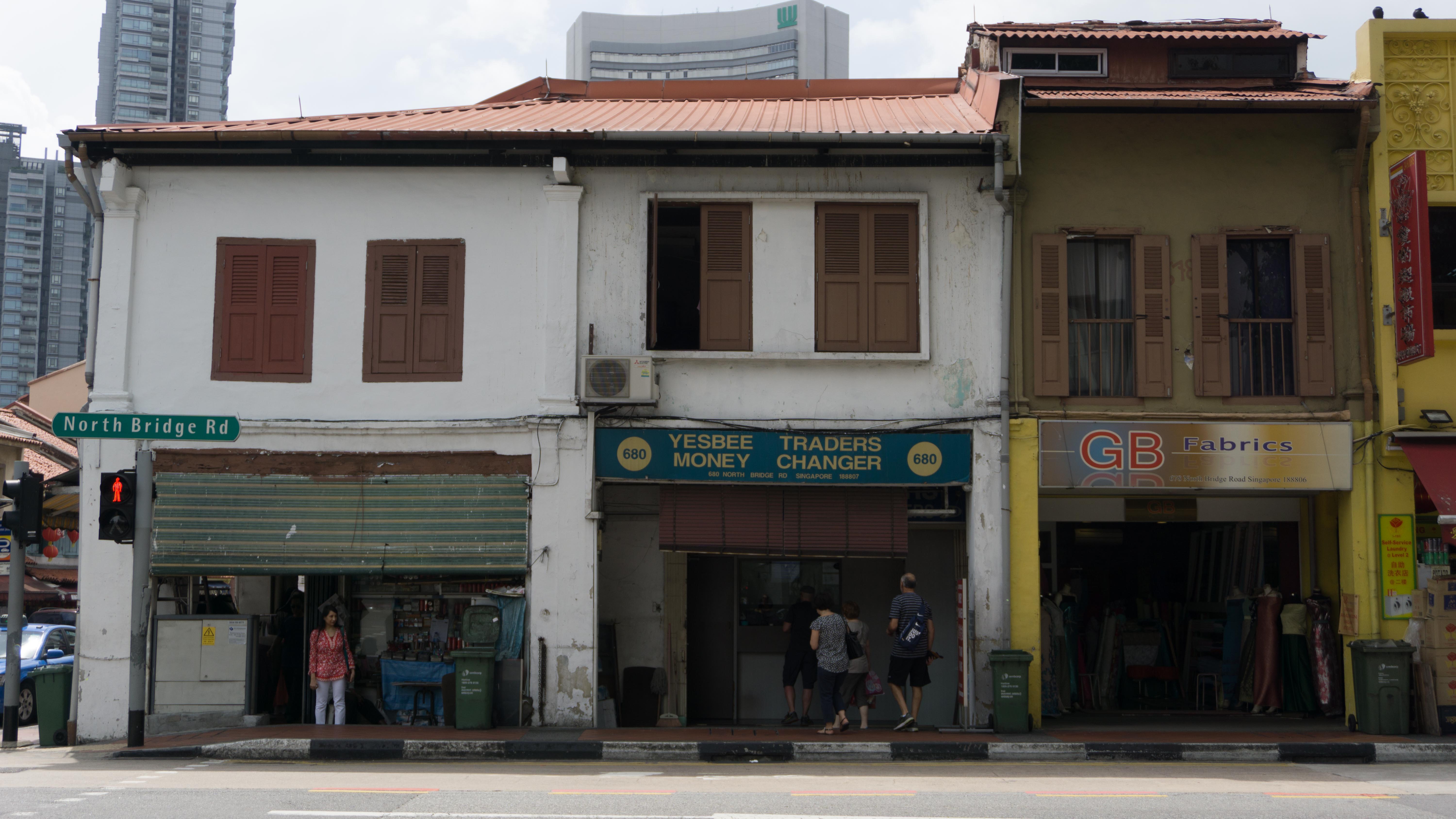
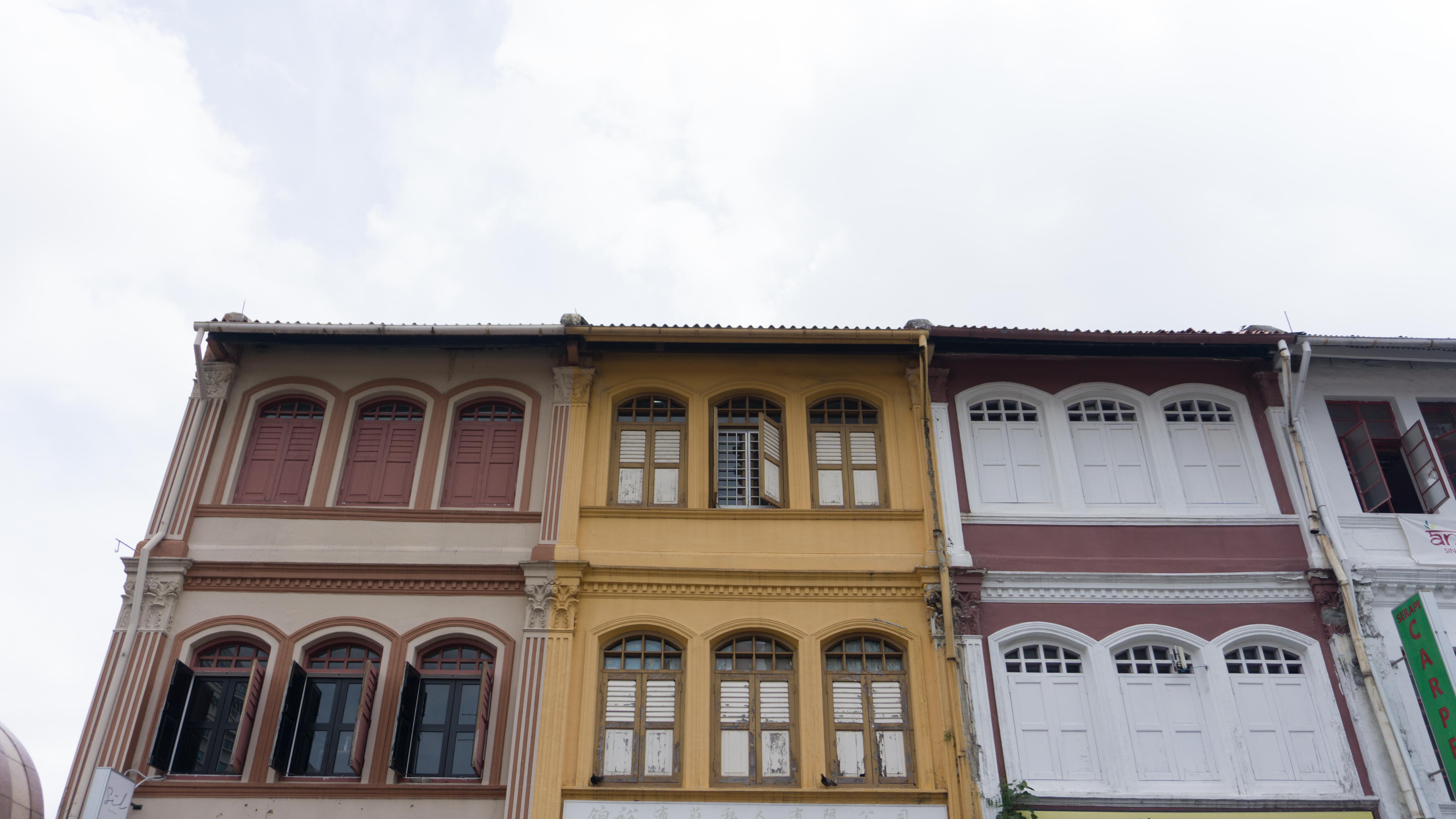
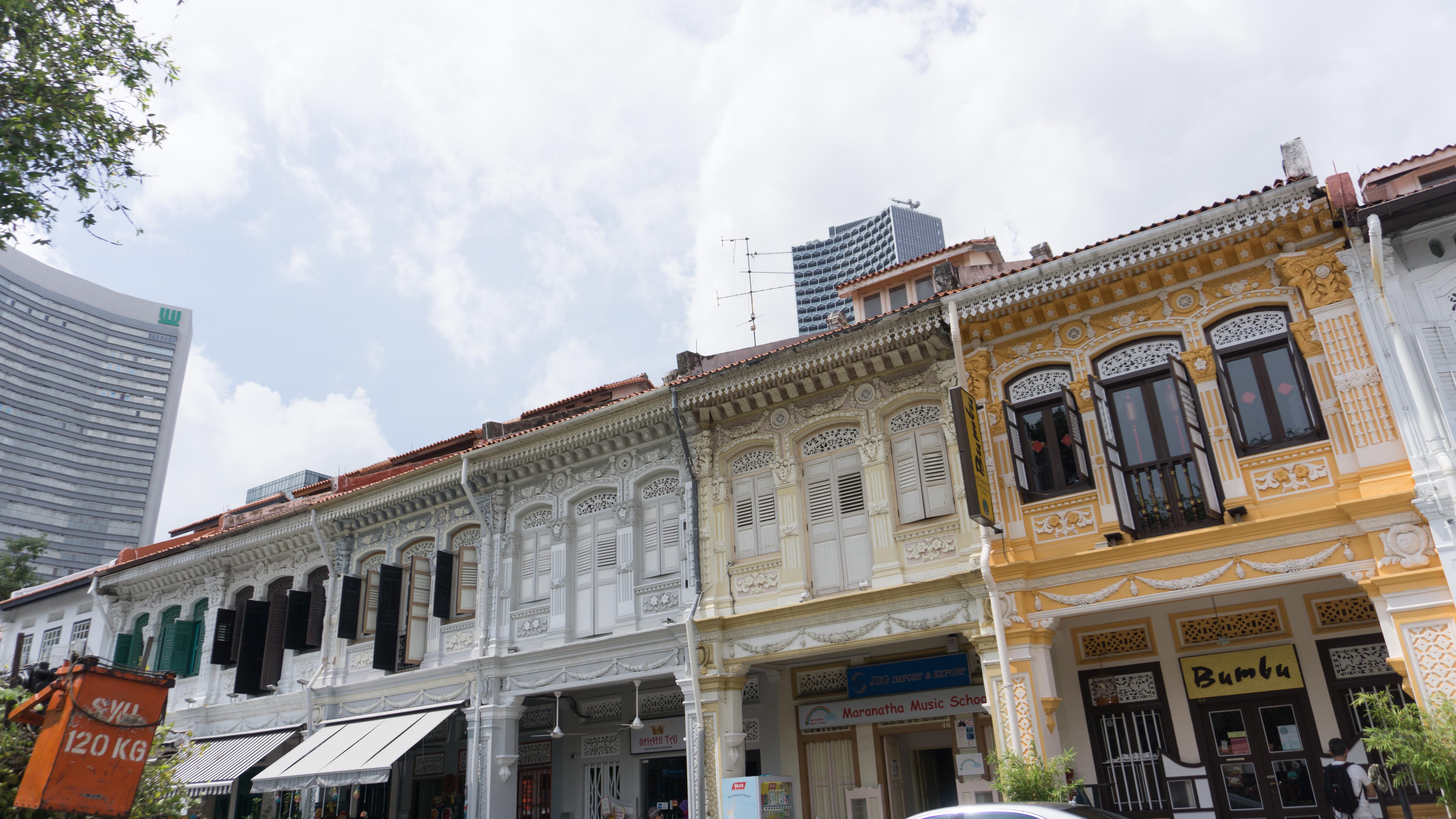
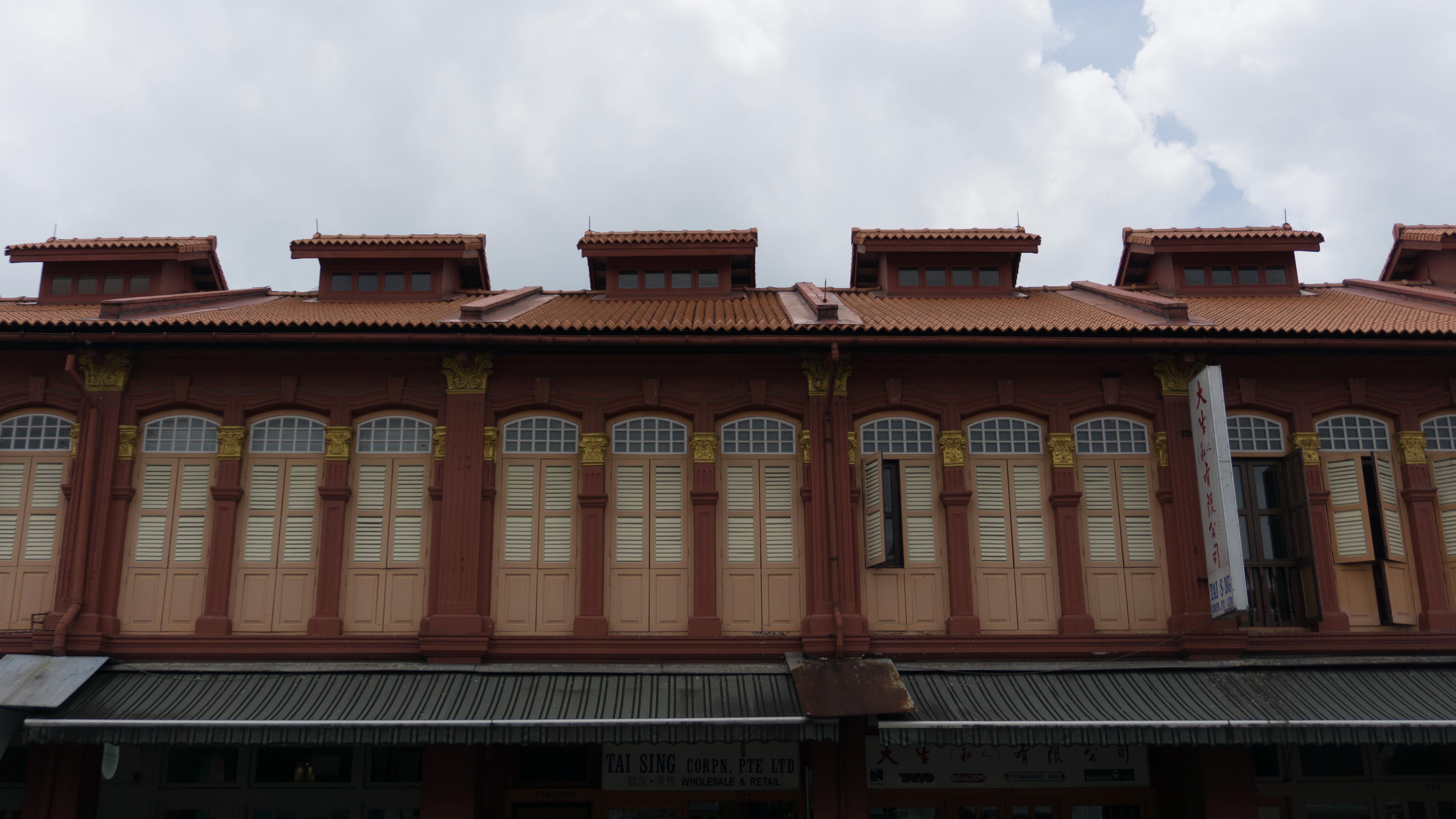
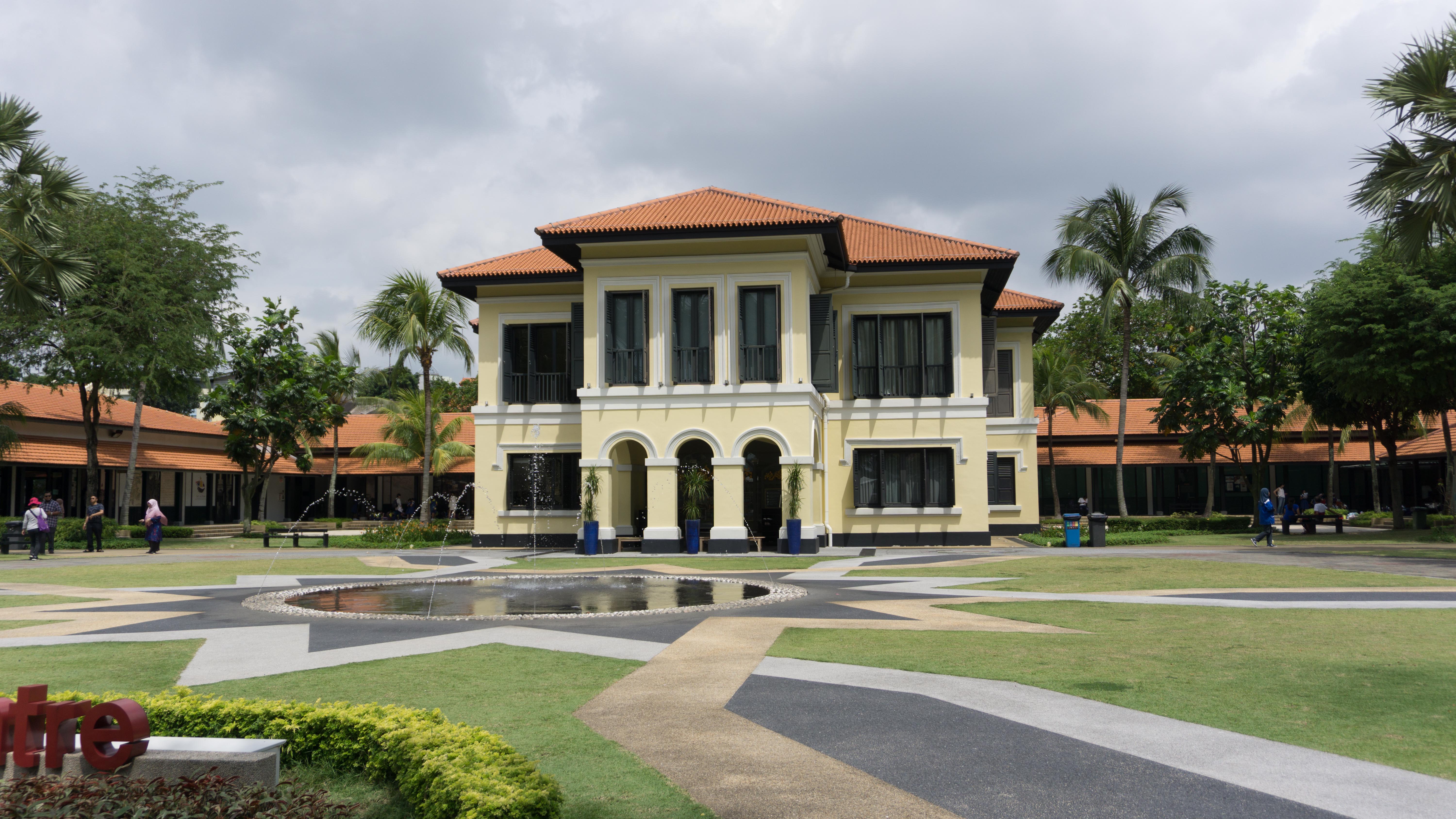
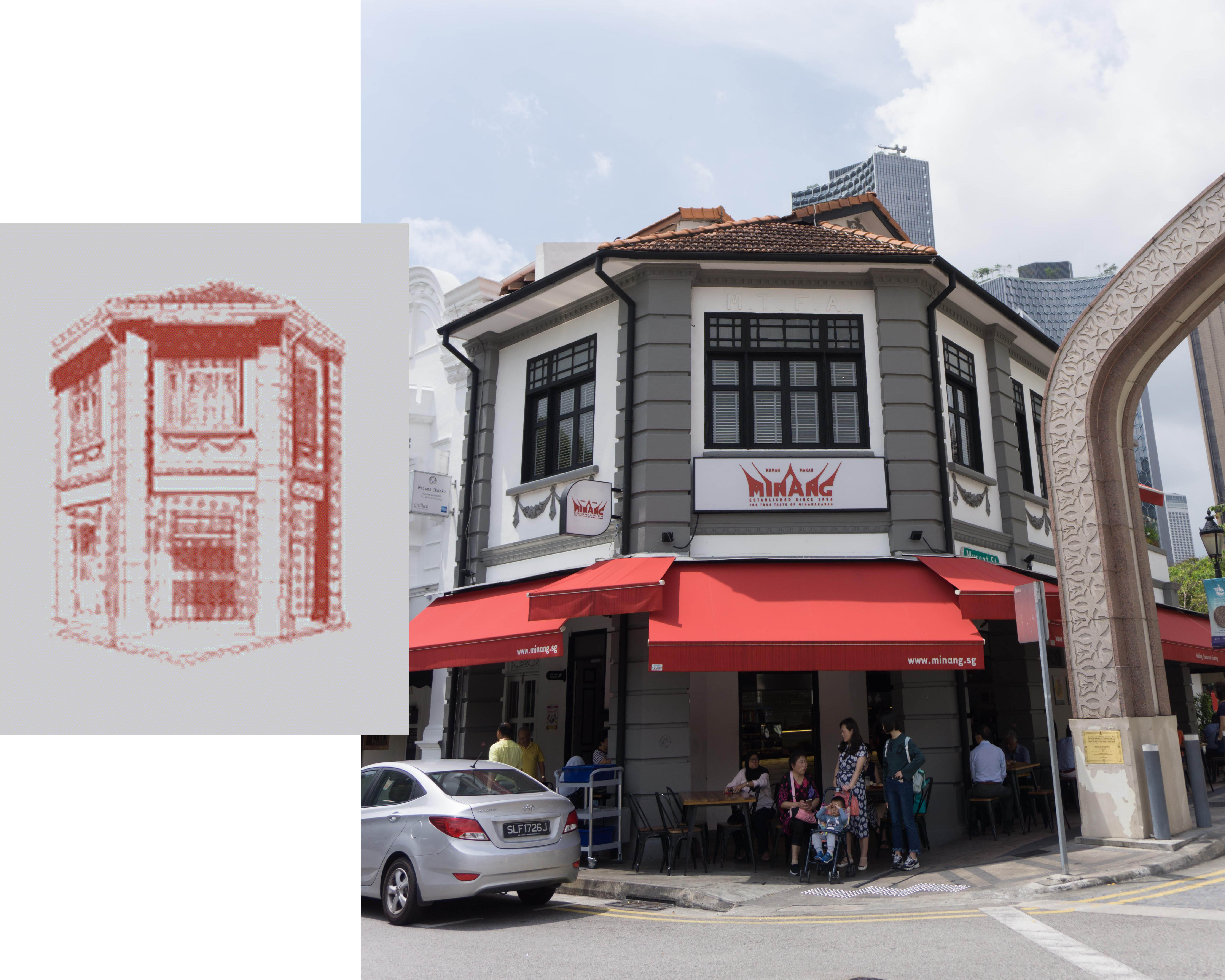
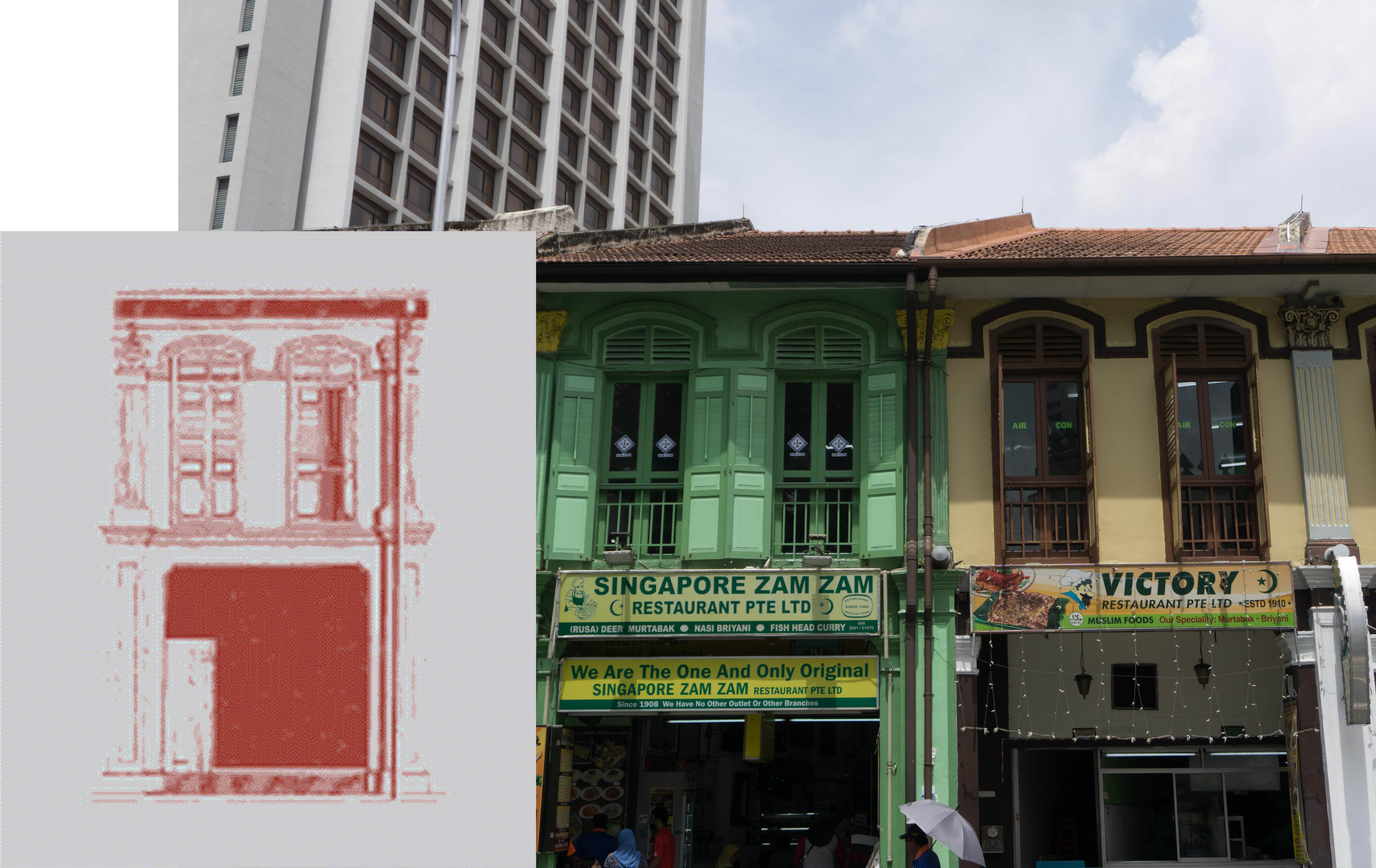
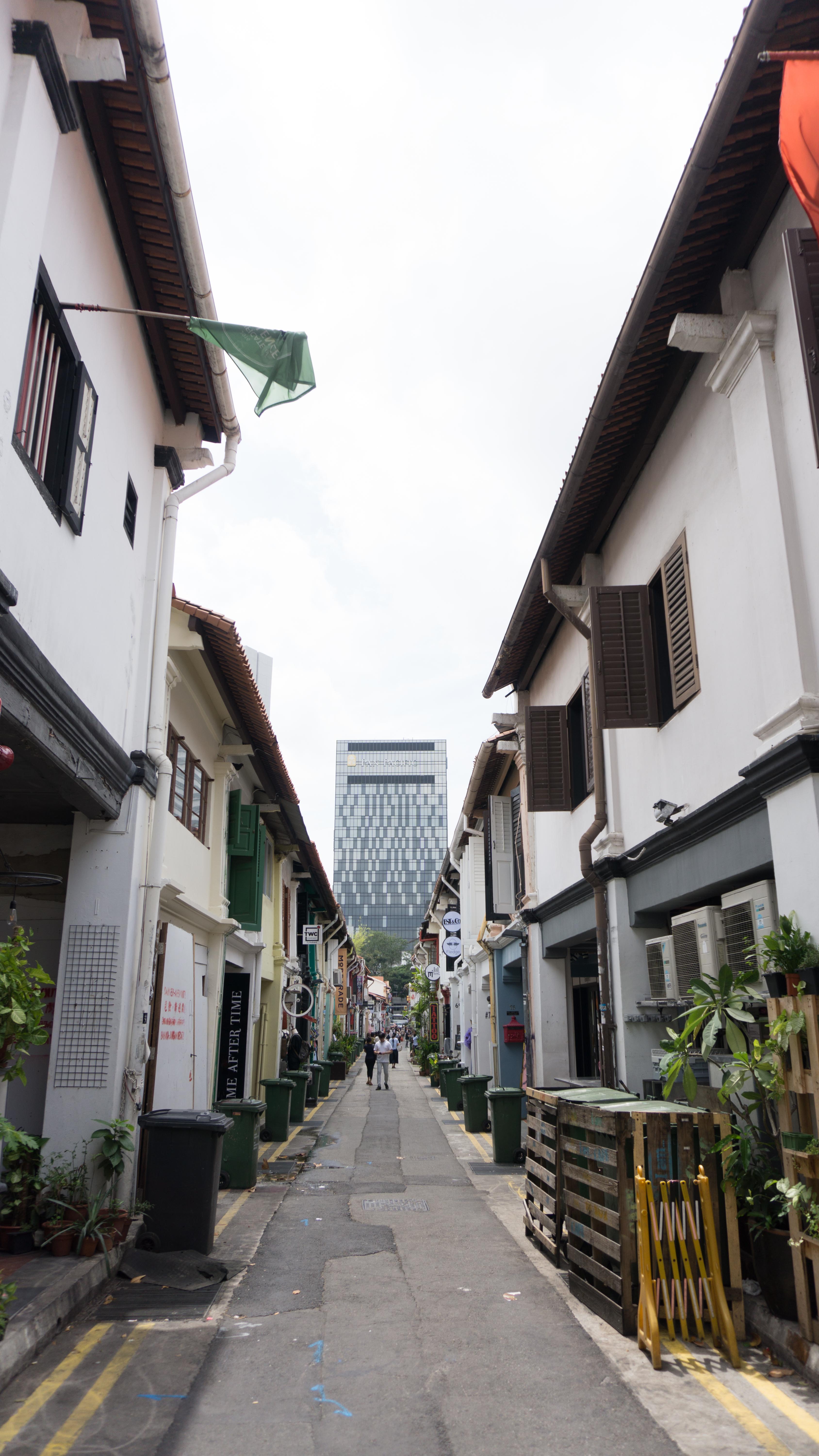
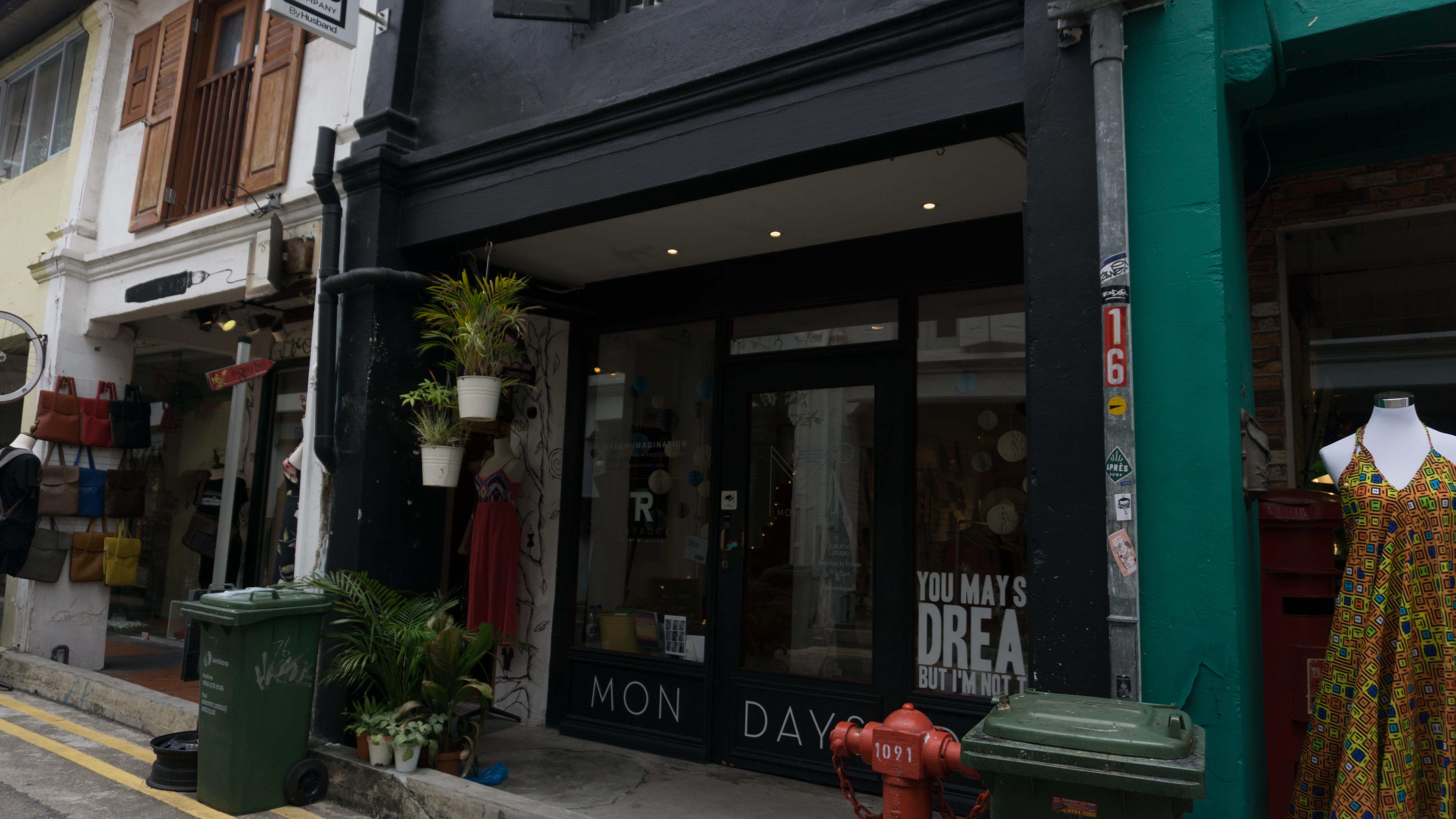
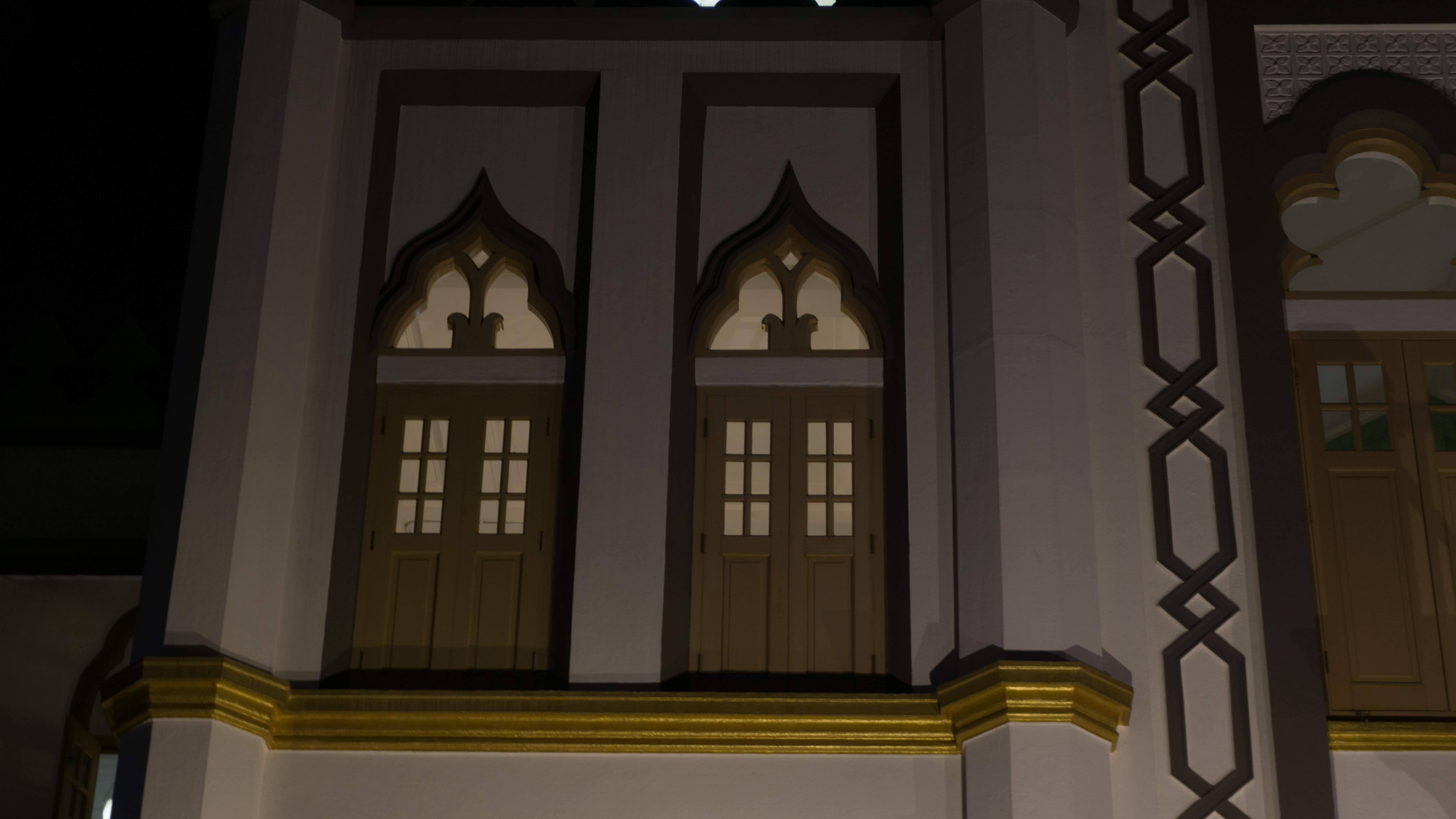
- shophouse windows (colours and patterns)
- palm trees
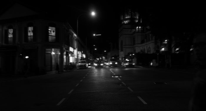
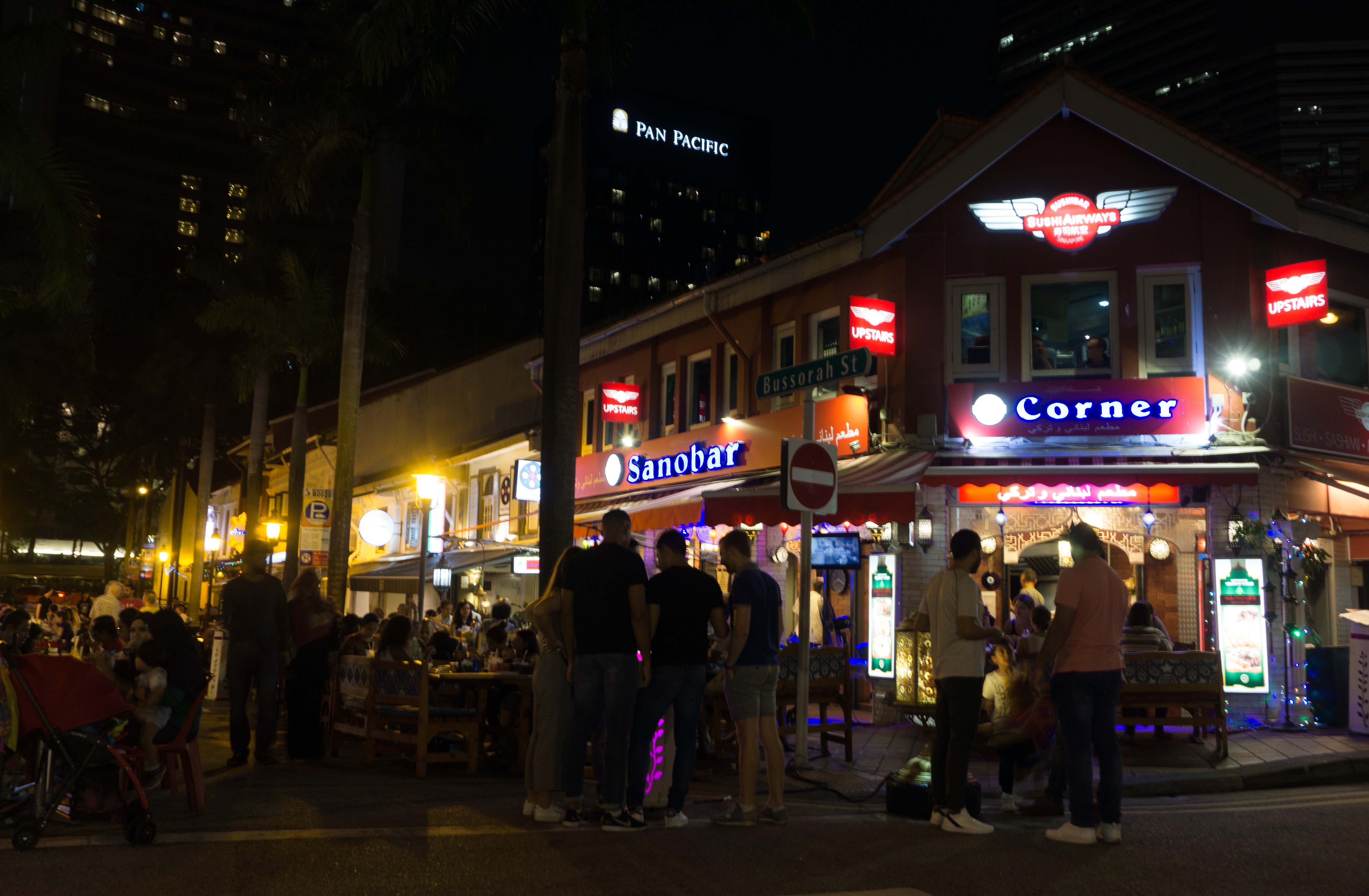
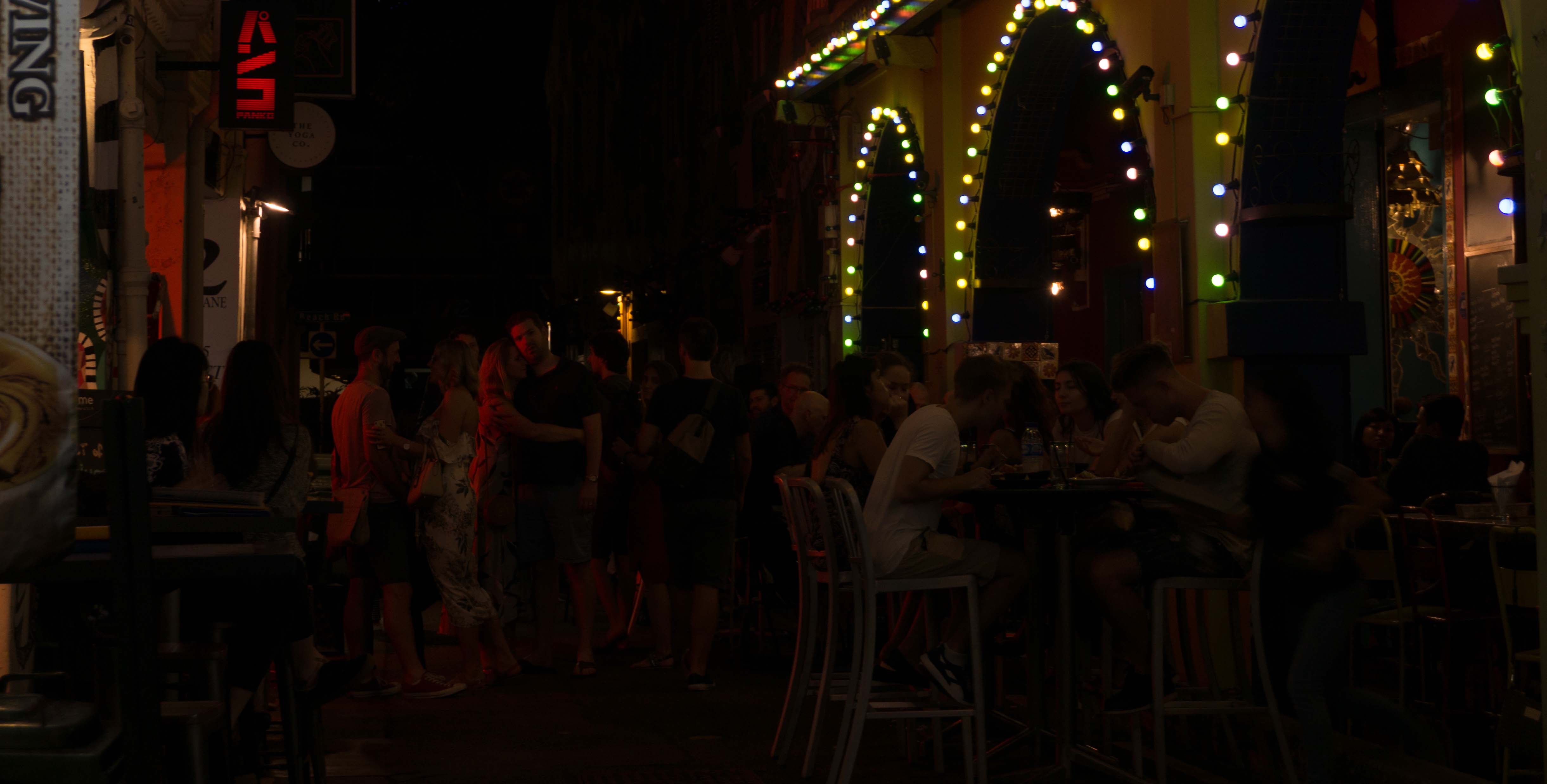
Things that stand out at night:
- pubs & bar
- eateries (more people compared to during the day)
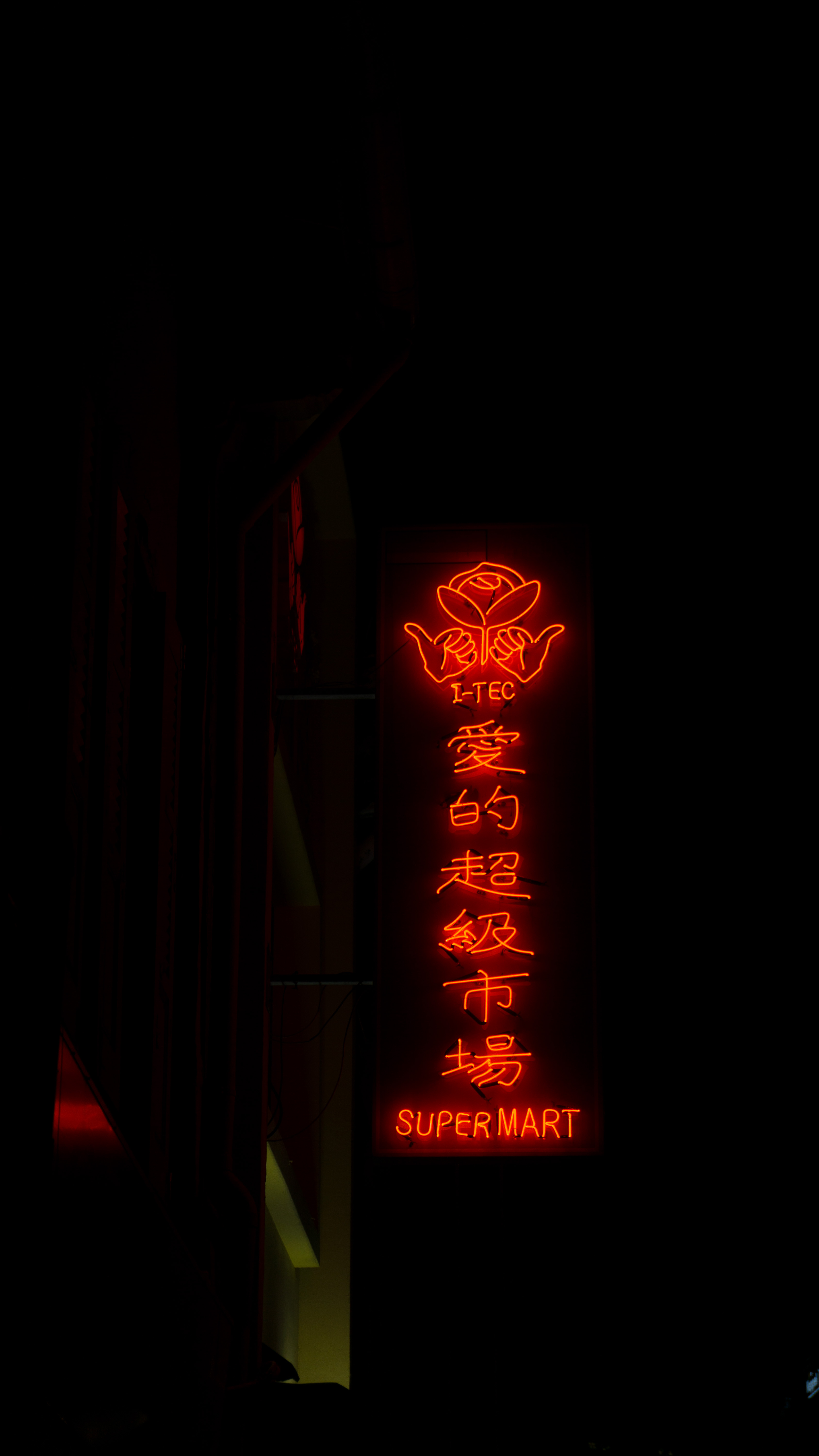
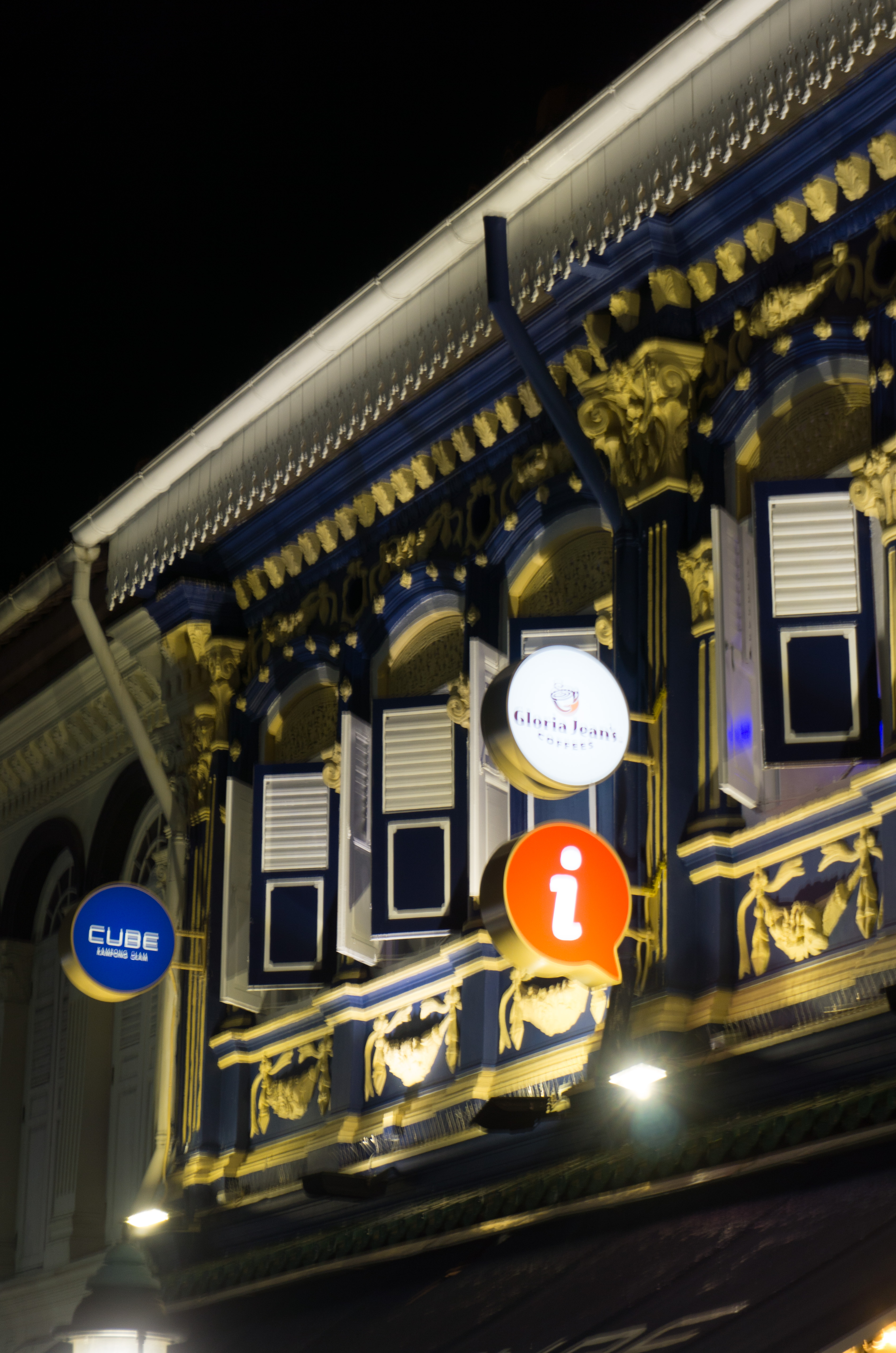
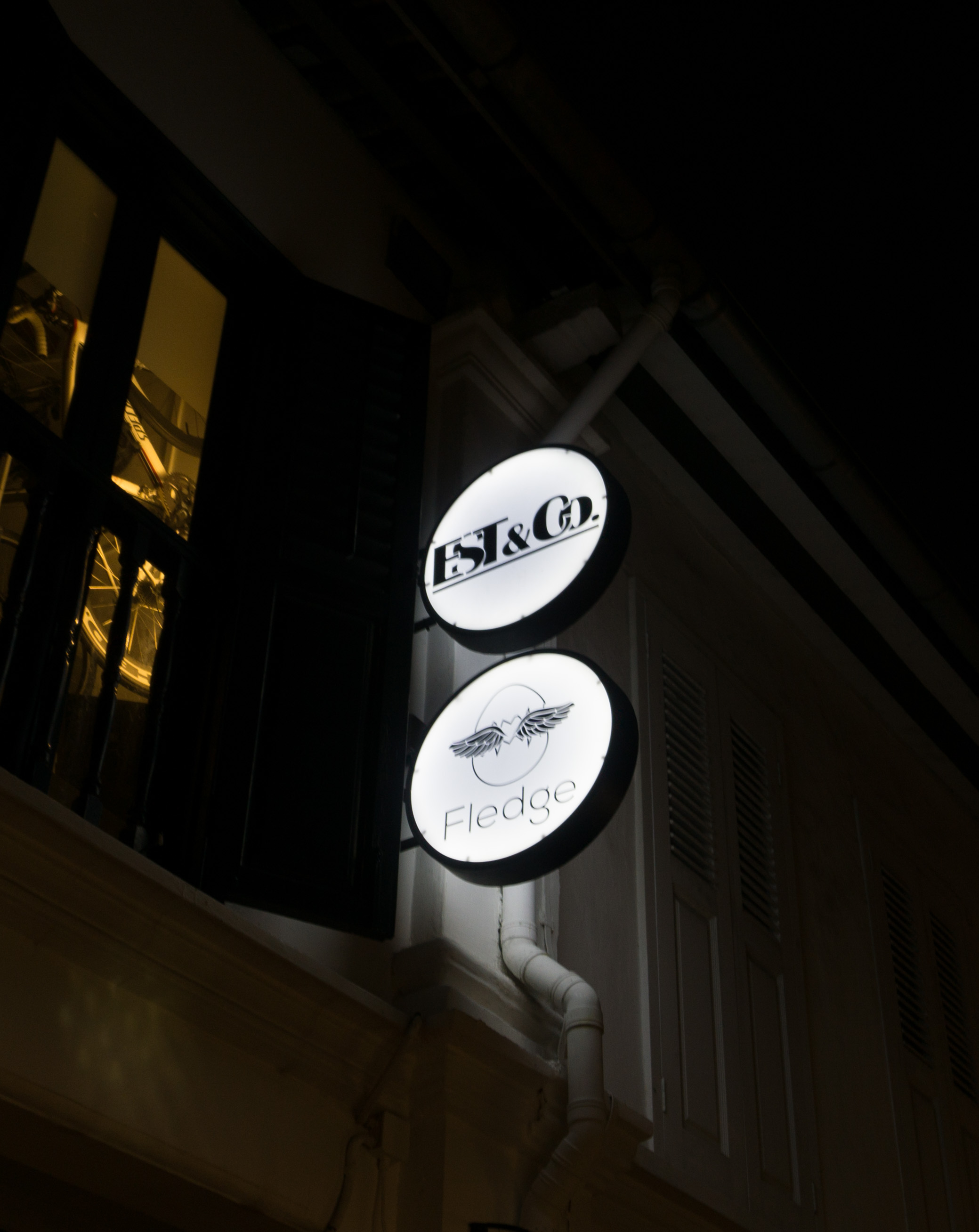
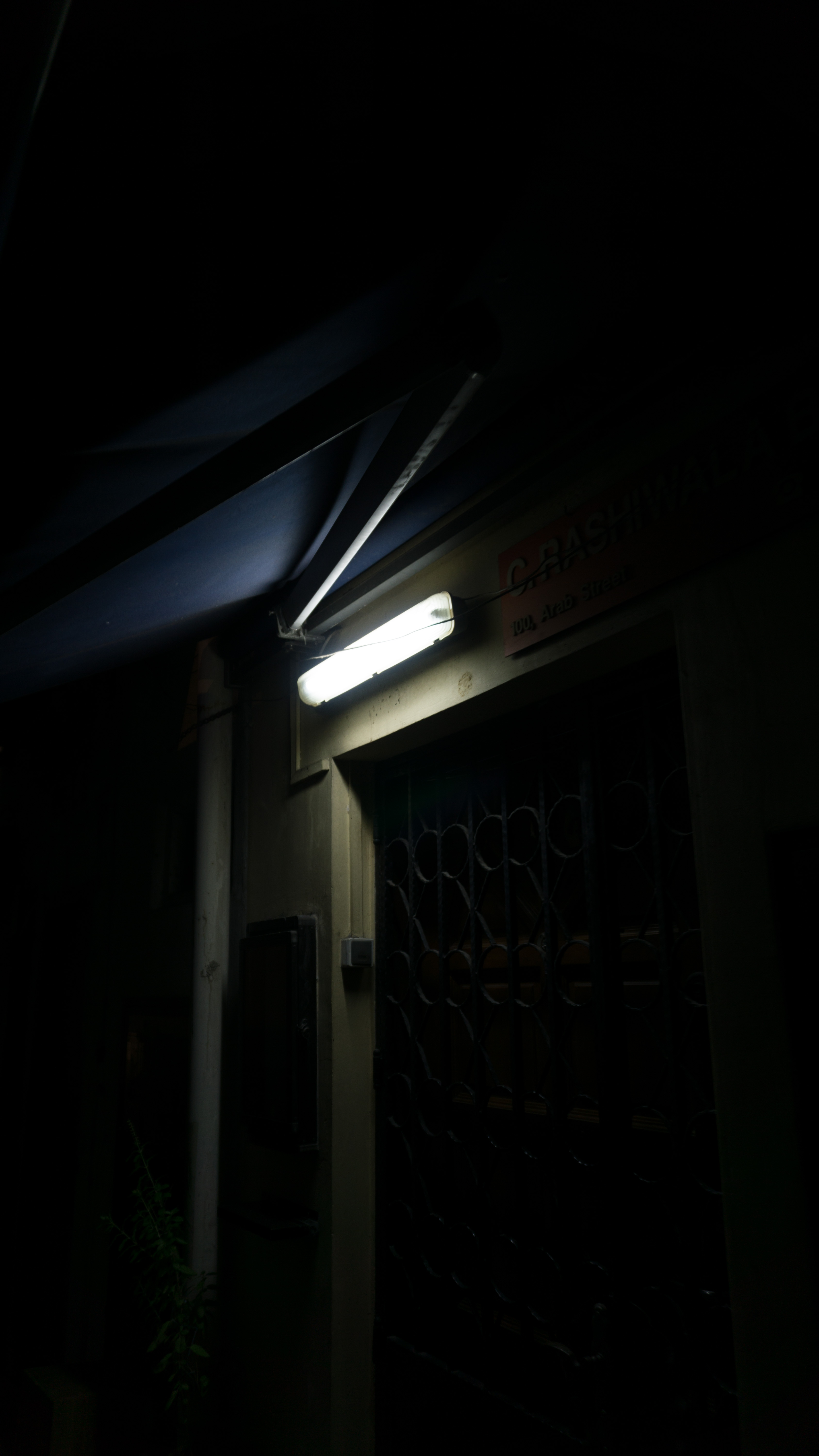
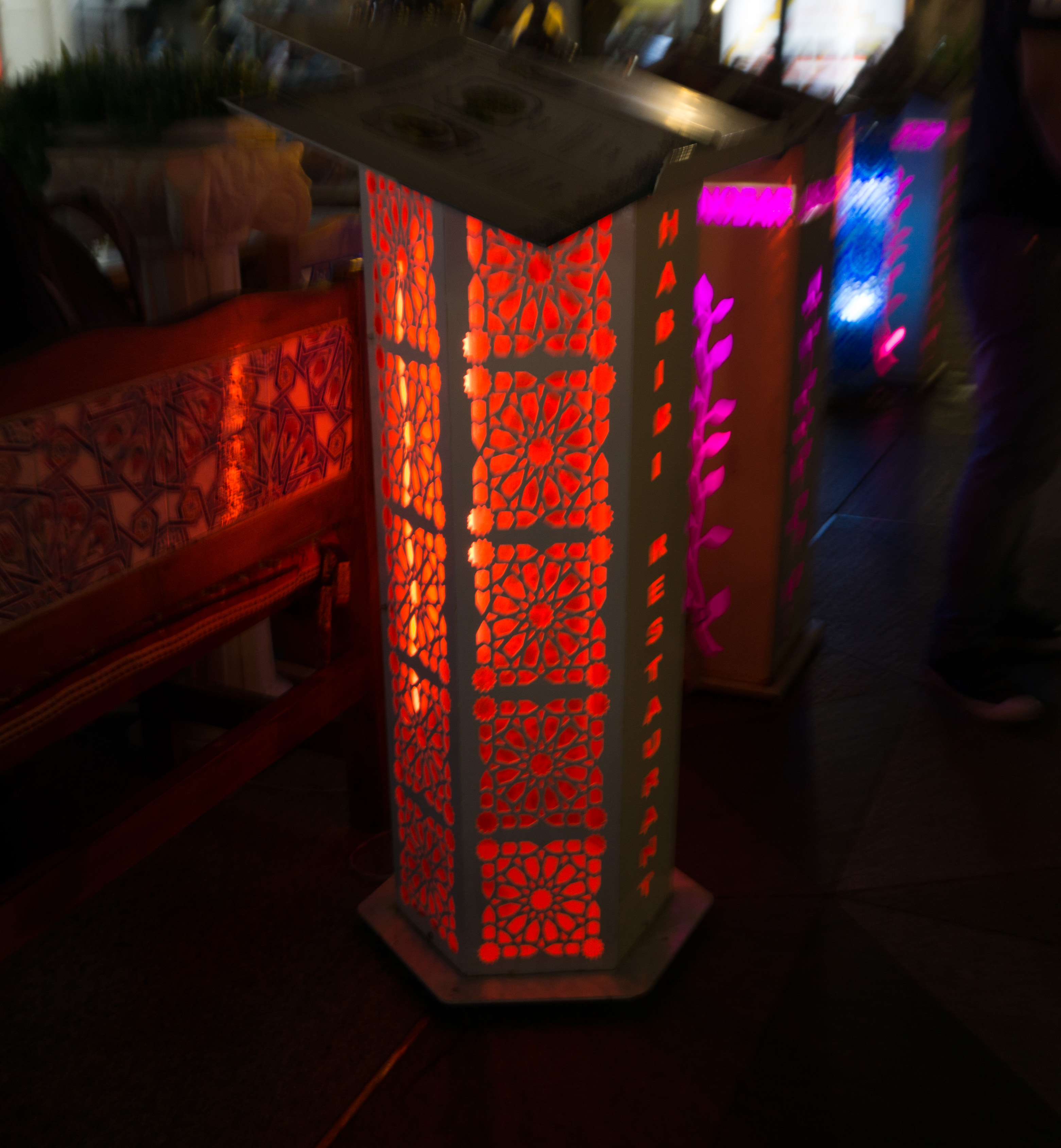
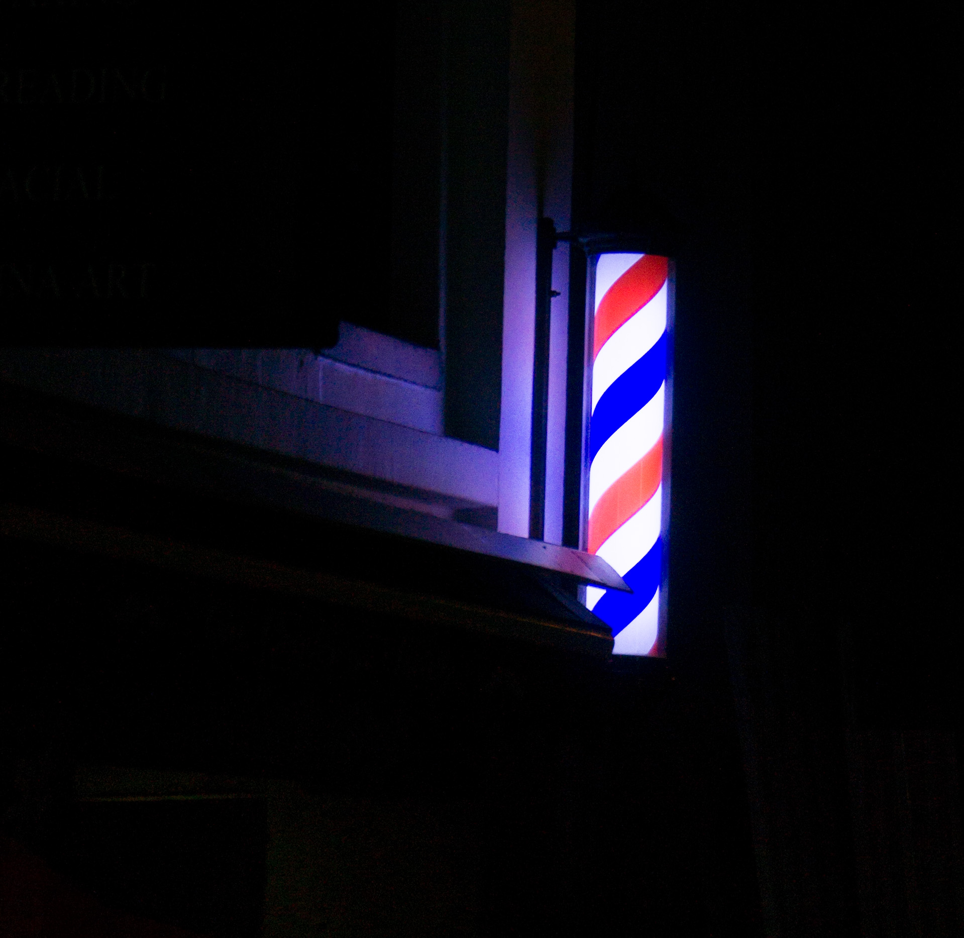
- signboards (colourful and bright, LED, alternating colours)
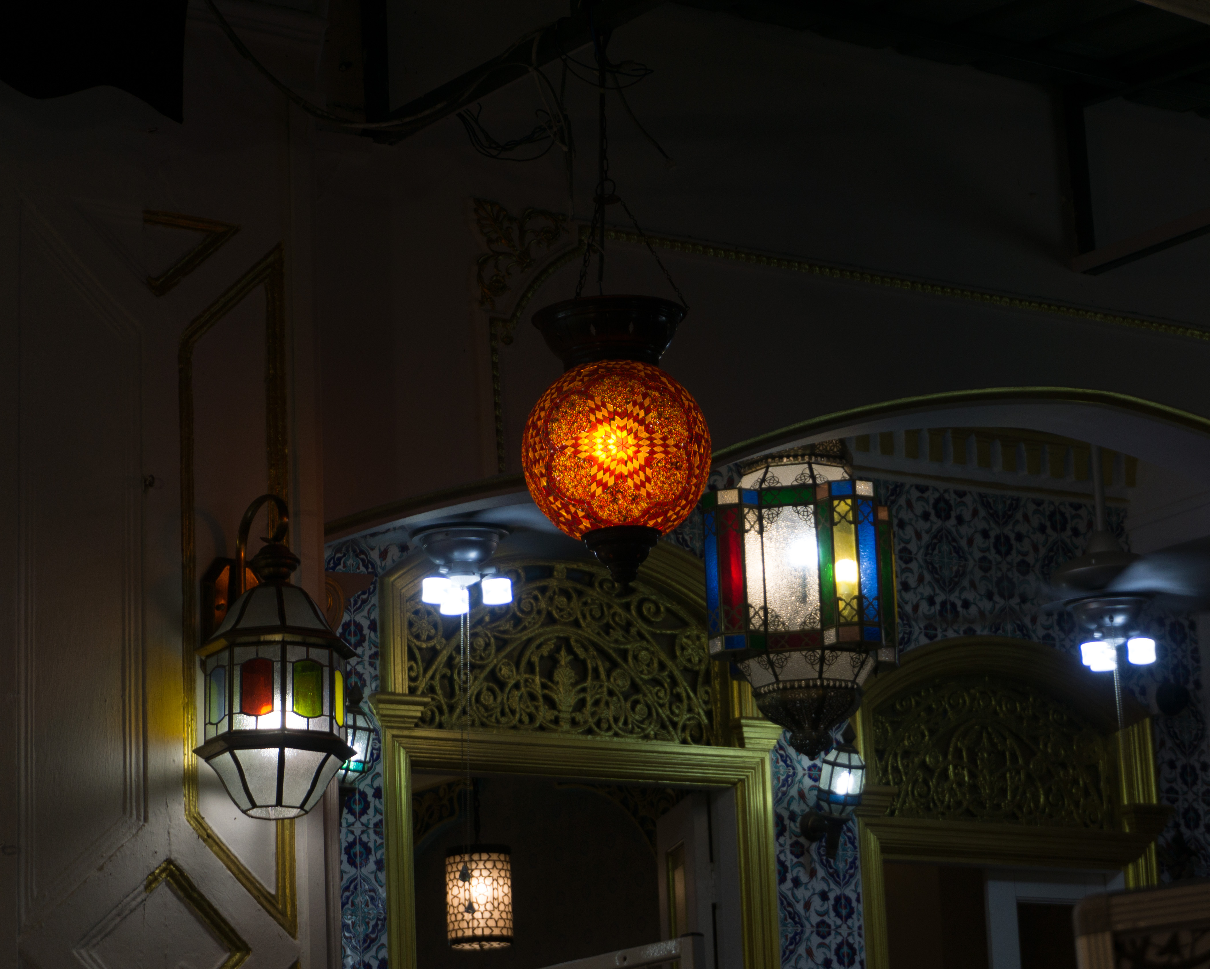
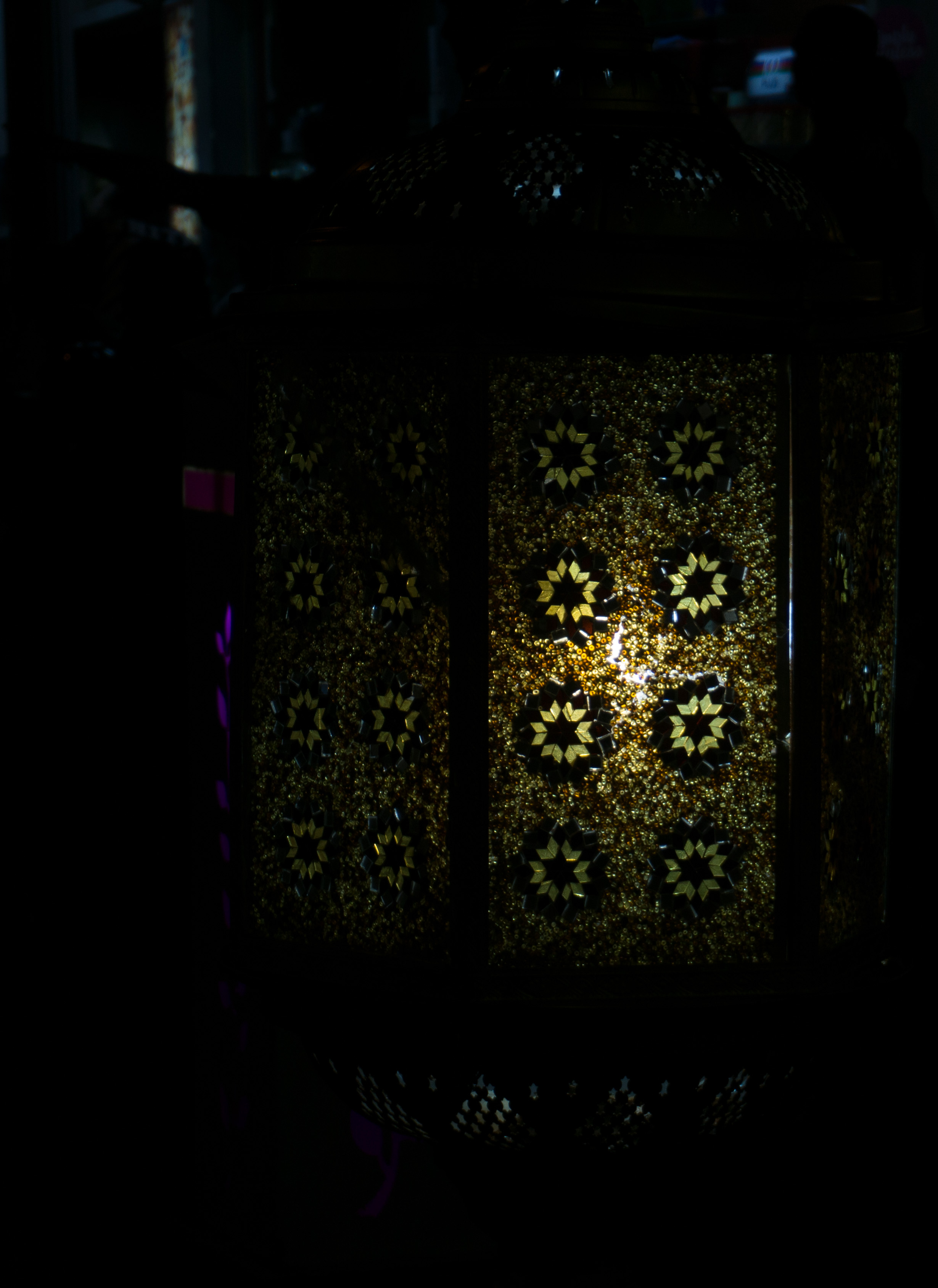
- lamps (exotic patterns, middle-eastern look)
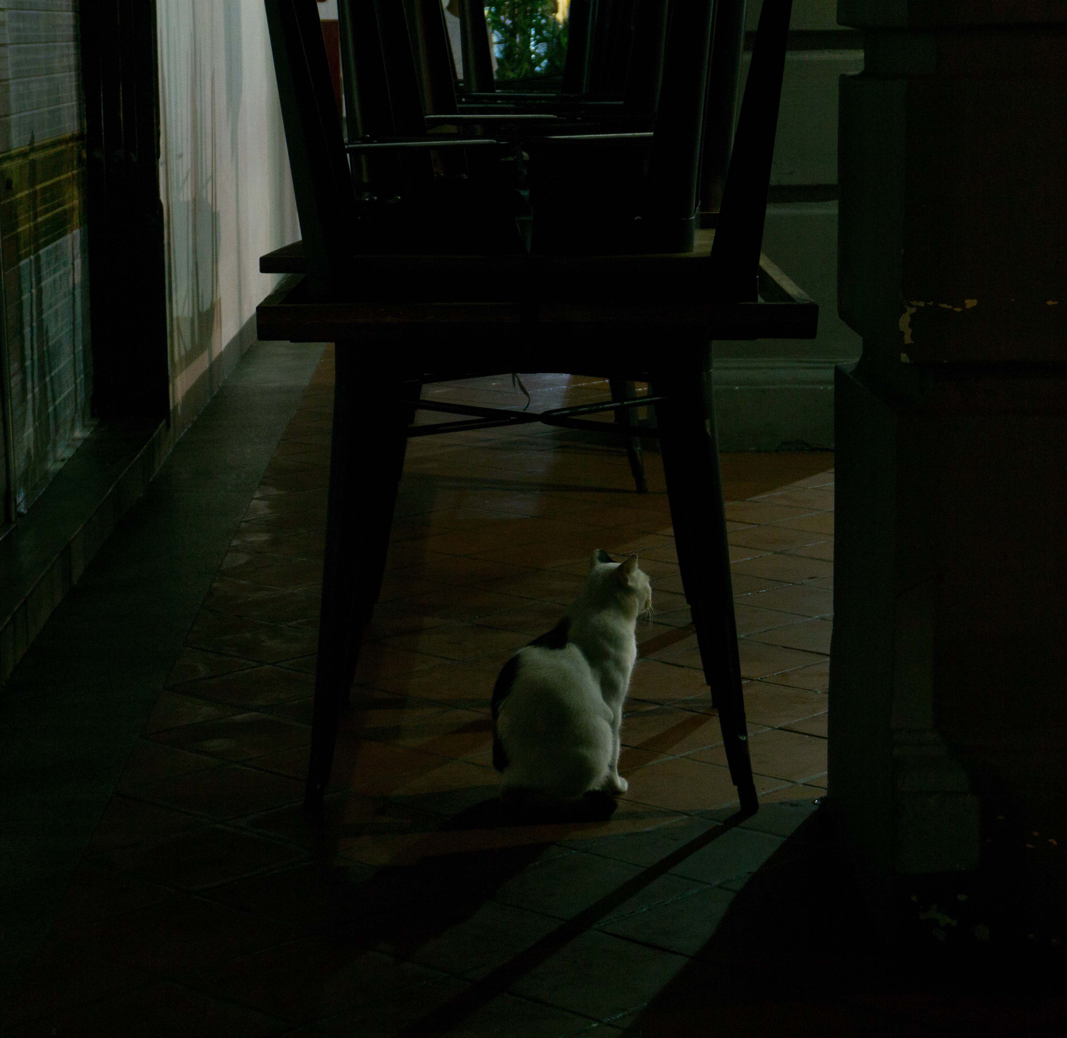
- multiple coloured shadows on walls (see more here)
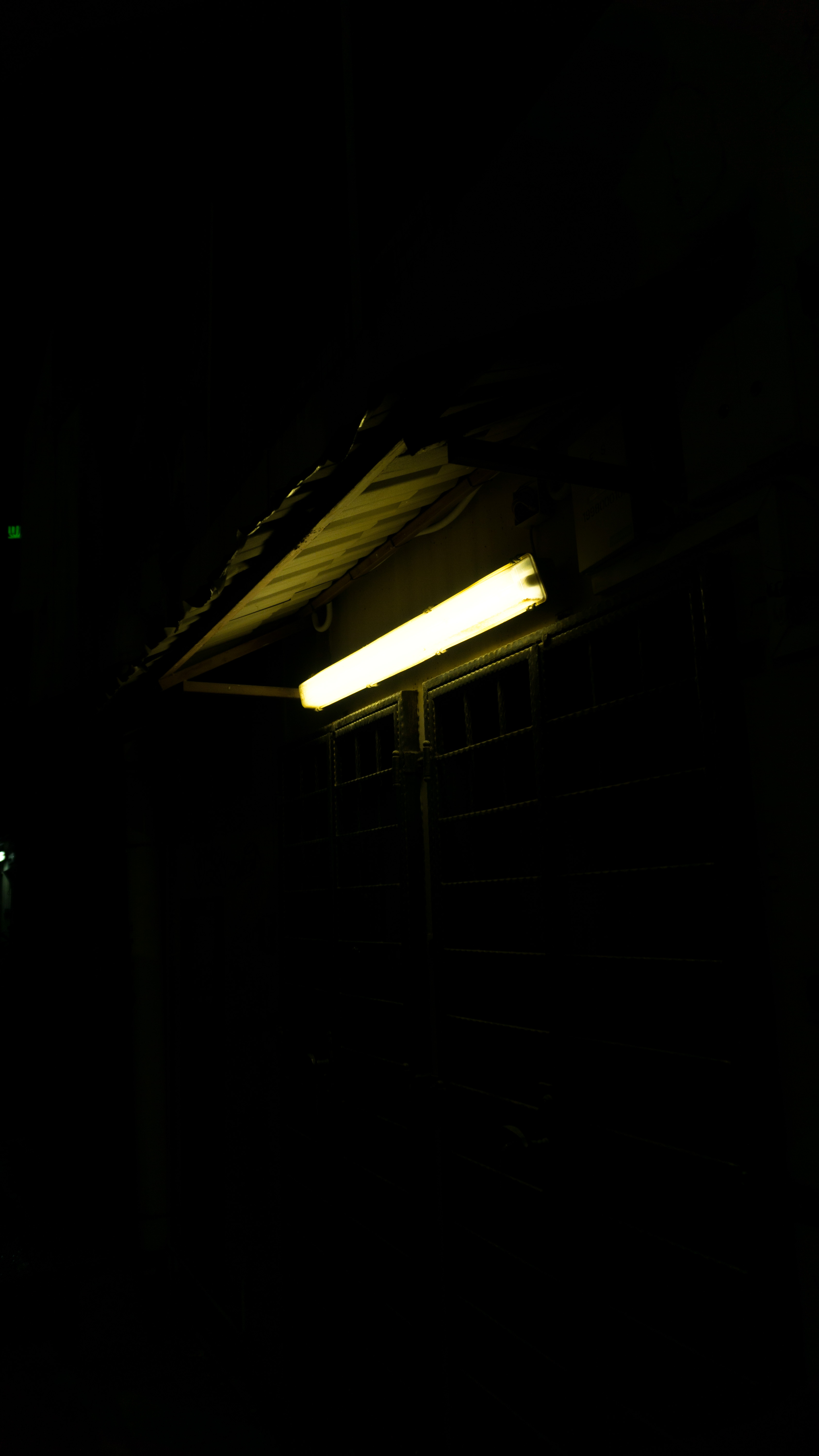
- lights from surrounding buildings
- ground-up lighting
Things that stand out throughout the day:
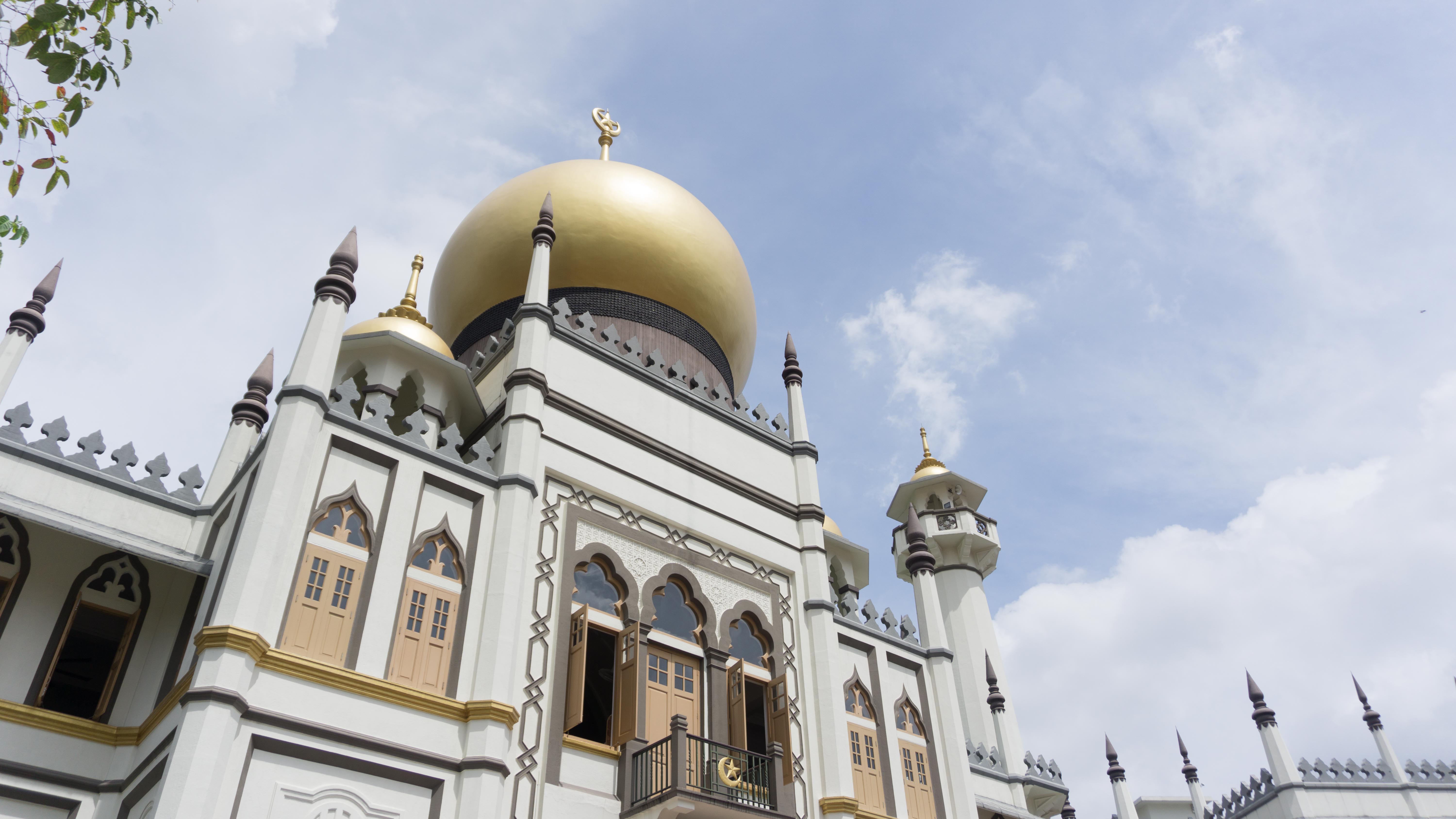
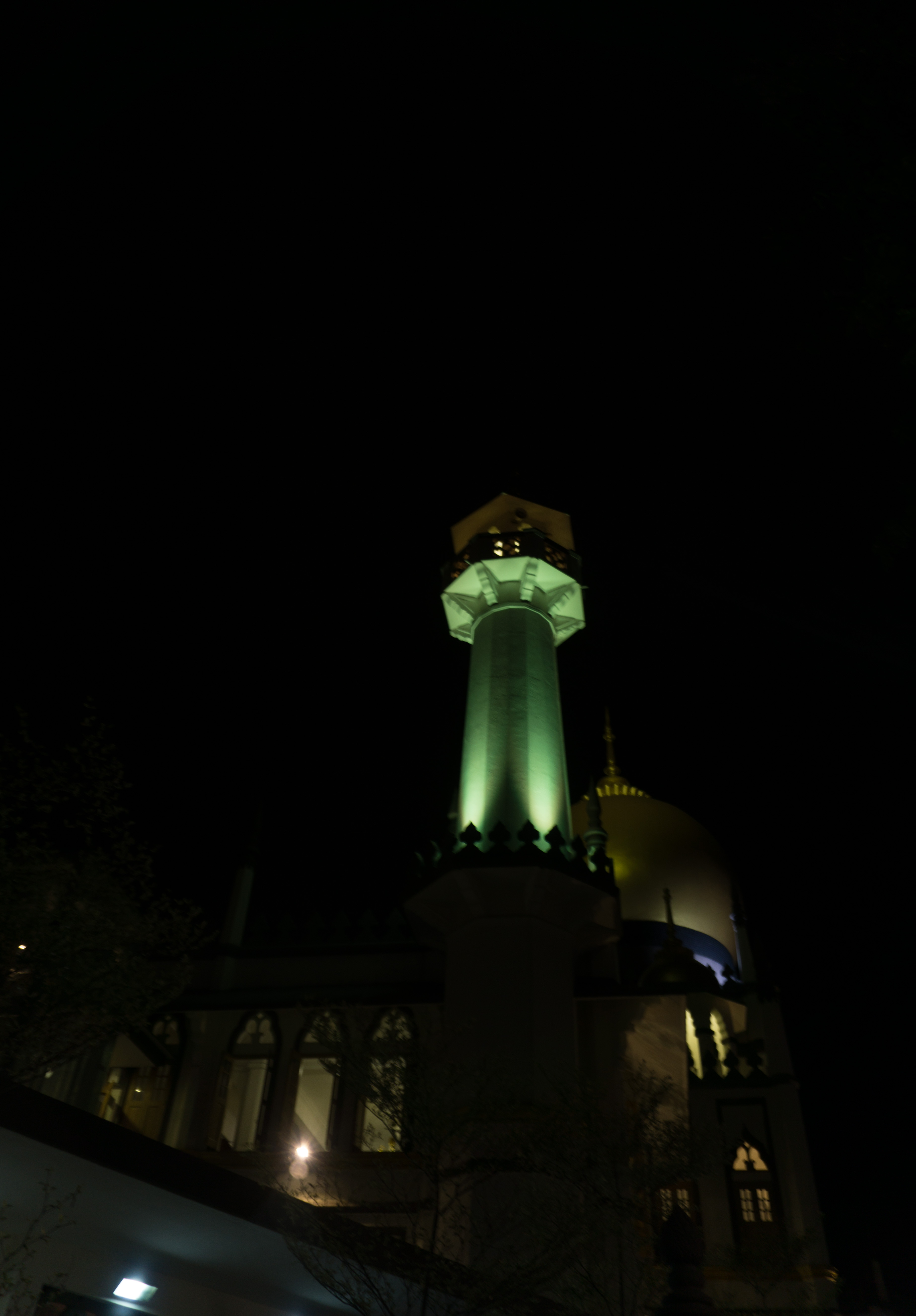
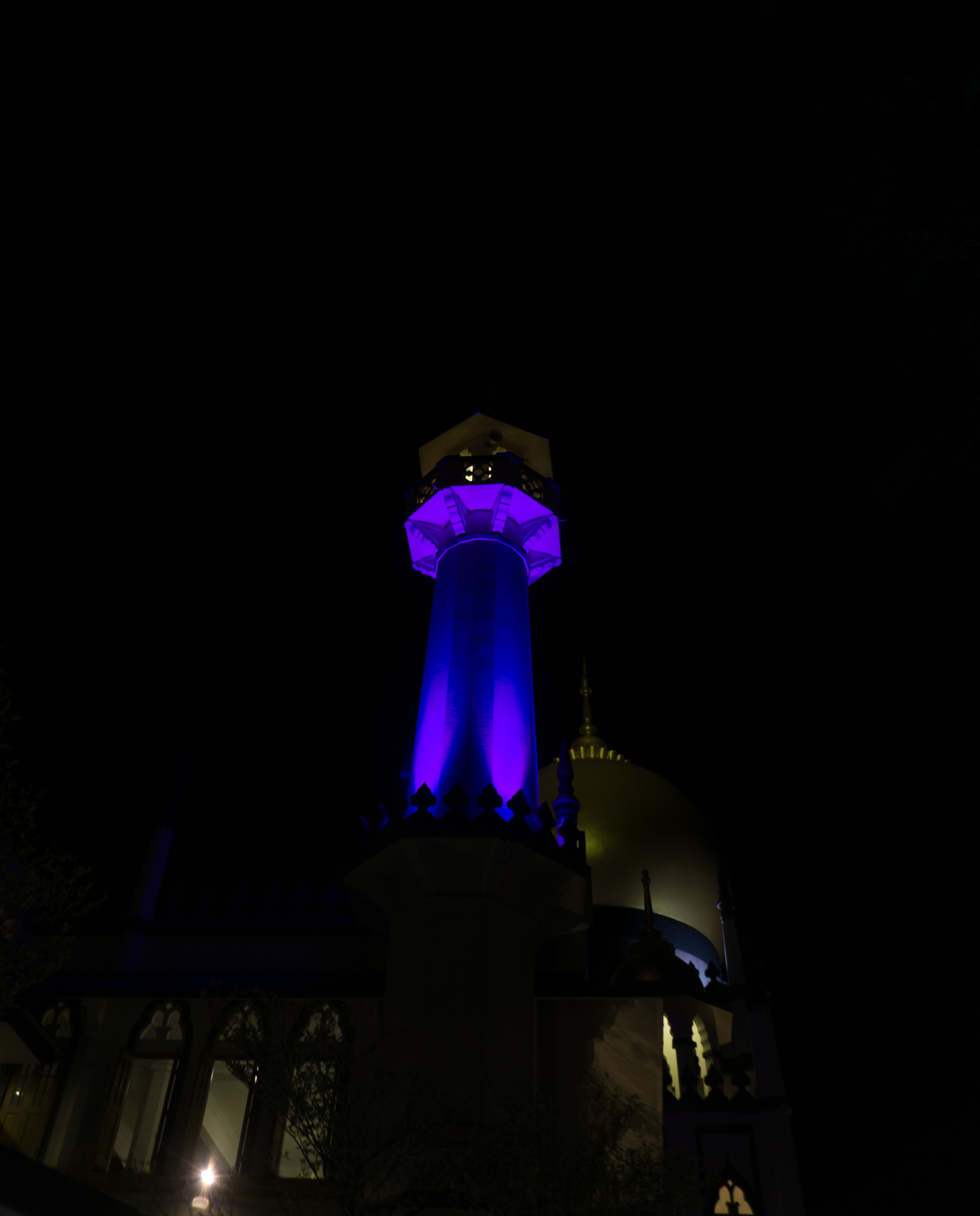
- the Sultan Mosque (a prominent feature in the day, lit up through the night)
Moodboard & Artist Reference
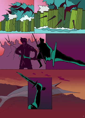
Since we are not encouraged to do photography style, I figured that I could use illustrations for the graphic forms of the zine. As for the type of illustration style, I would think of flat vector-based illustration as it would help bring out the play with colours and would also allow me to do overlays and layerings without it being too messy.
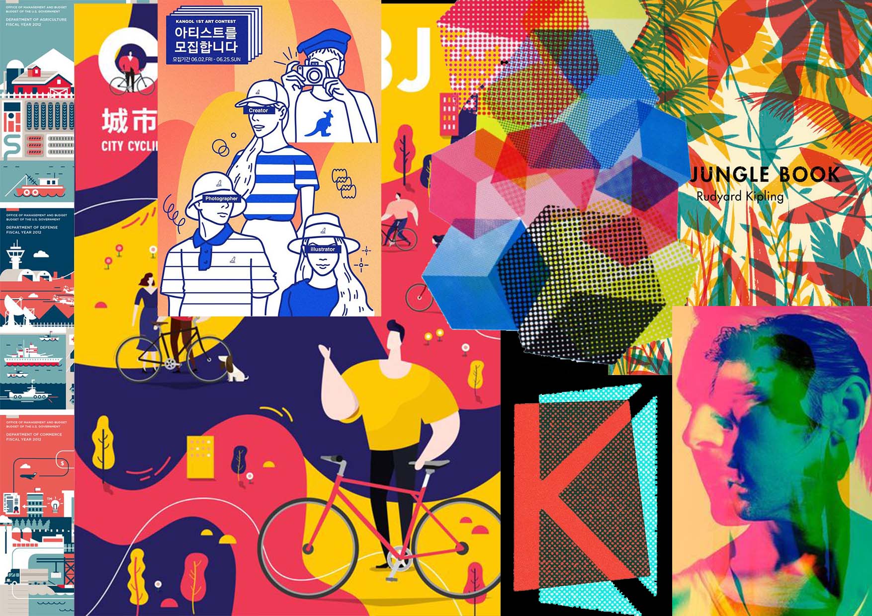
Artist Reference
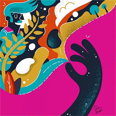
Malika Favre
One particular artist works that captured my attention as an inspiration for the zine is the works by Malika Favre. I loved how she used flat vector illustration and minimal use of colours and details but could create a variety of graphic shapes and forms.
I loved how even by using 2 colours (not including the white) the artist could form a crowd and many different people with minimal or very minor details.
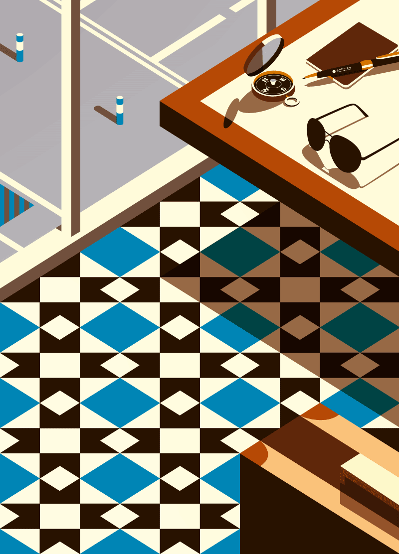
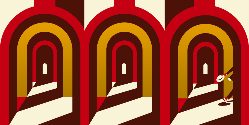
Part of the 3 illustrations under The Traveller series, I liked how the artist has used a similar pattern for the floor tiles as the patterns I spotted on some of the exotic lamps during my night visit to Kampong Glam. I could attempt to do something similar for my zine maybe.
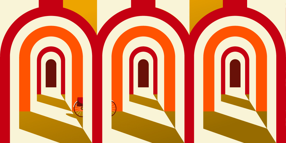
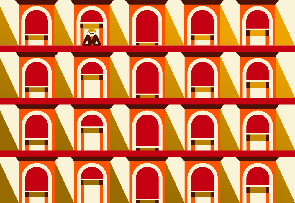
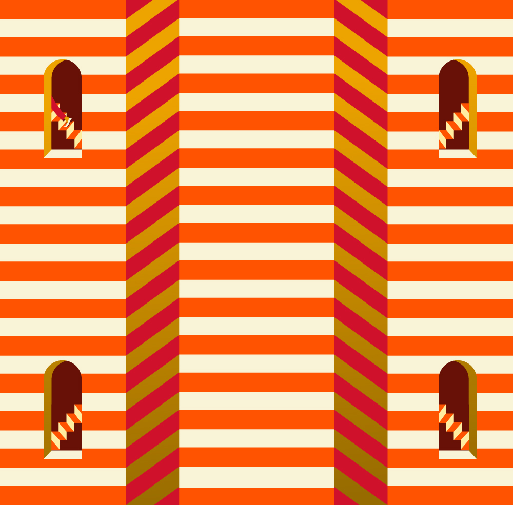
For this series, Christmas in Bologna, I could easily relate how the artist illustrated the windows, patterns and walkways with the many shophouses, walkways, and windows at Kampong Glam. I could possibly try a similar style for my zine for this.
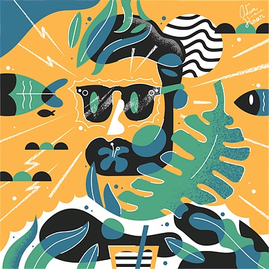
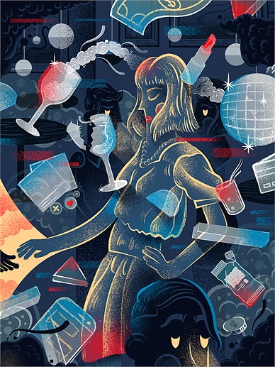
Adam Koon
Another artist work that I was inspired by is the works by Adam Koon. I particularly liked how he used irregular shapes to make the works look more fun and not rigid. His use of colours even though is also minimal still manage to make some of the elements in the works stand out more, hence, visual hierarchy. He has also added some textures and minimal line works in the works, making it stand out more and have a more overall impact.
Moodboard
Adding on to the artist reference, I have also created a mood board for the zine. As mentioned earlier, I plan to use flat vector illustration + use of vibrant colours throughout, which are the colours that can be seen in the graffiti and the shophouses at Kampong Glam. For the night scene, I plan to use a similar style but with a darker background. The illustrations will also begin to overlap and overlay each other, the effect which I found on the walls which is the overlaying coloured shadows. The colours would be more saturated and bright to contrast with the dark background.
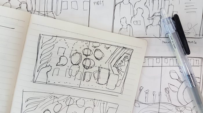
Laying It Out
Before I would actually deconstruct the content into graphic forms, I would lay out the content first.
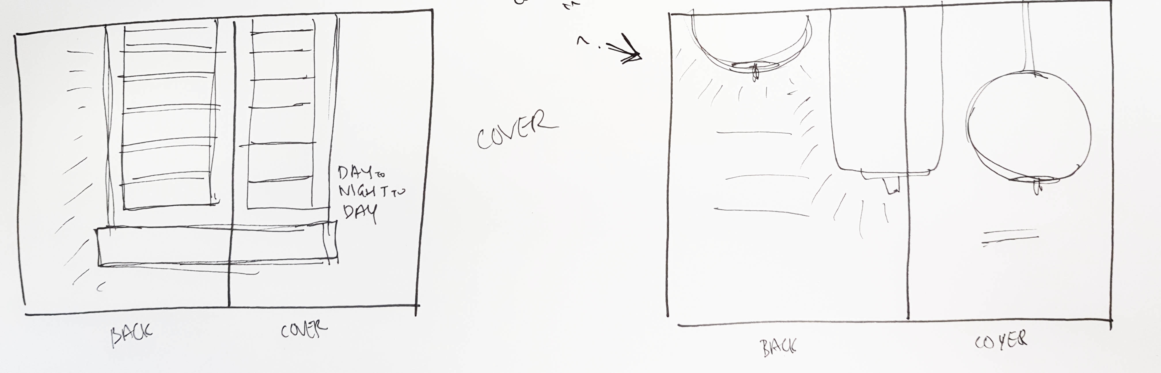
Front and back cover
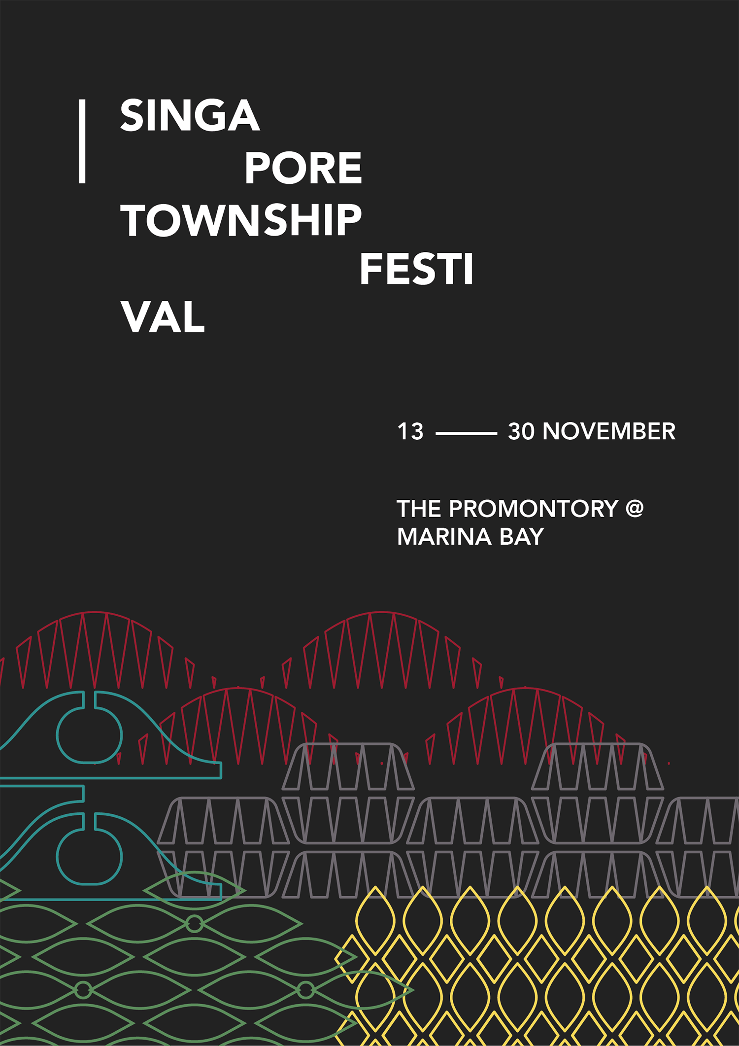
Since it will be a day and night zine, the front and back cover would be bright and dark respectively. So the readers would know that the book is about day and night, respectively. As for what is on the cover, I would plan to put what would be easily recognisable as something very Kampong Glam – the shophouse windows.
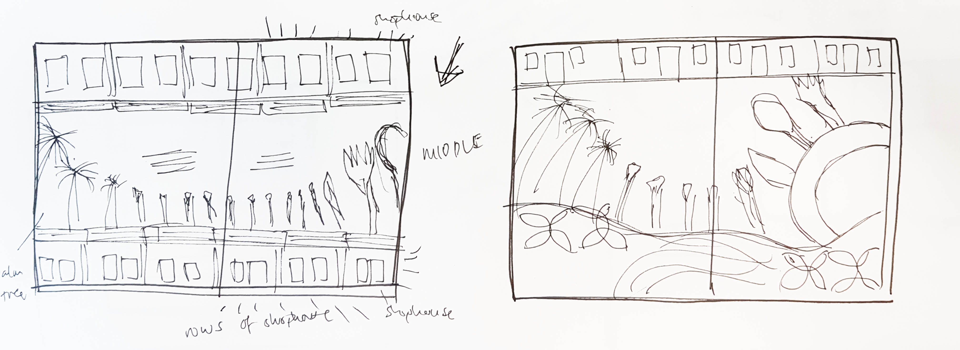
First spread
The first two pages would be to show what goes on in the day. So as mentioned earlier:
- retail shops (fabrics, carpets, perfume shops)
- eateries – not too many people except during lunchtime
- more tourists & tour groups
- graffiti (particularly stands out in the day, vibrant colours, tourist attractions
- shophouse windows (colours and patterns)
- palm trees
It would showcase what is prominent during the daytime.

Middle spread
The middle spread would be most important as it showcases how the place changes from day to night, which is the transition of Kampong Glam. The content would feature some of the elements from both day and night, in a way blending both together, hopefully seamlessly.
Last spread
In contrast to the first spread, the last spread would be showcasing what is prominent in the night. The pictures will be overlapped in a way to show the double imagery mentioned earlier.
- pubs & bars
- eateries (more people compared to during the day)
- signboards (colourful and bright, LED, alternating colours)
- lamps (exotic patterns, middle-eastern look)
- multiple coloured shadows on walls (see more here)
- lights from surrounding buildings
- ground-up lighting
 Comments on the first draft:
- give a thought about pacing & breathing space
- pages too cluttered and filled
- allow the reader to stop & rest
- front and back cover too minimal as compared to the inner pages
- include some design principles for the layout of the pages (middle spread is a good example/attempt)
- have direction and flow for the spreads
Links


.jpg)


 The Process