Image Making Through Type (Part 4 – Final Outcome)

The Interior Designer

For this design, I stuck with the elements and design similar to the ones used in making the floorplans of houses and spaces. I used the shapes for the types of furniture and the variations of thickness used for the walls and windows.


The Confectioner

For this, I joined all the 4 letters together as if they are made from the same base. Then I “overlayed” or “layered” each of the different letters with a different coating.

  • Bubblegum for the “S”
  • Chocolate and nuts for the “Y”
  • Glazed doughnut and strawberry icing with rainbow sprinkles for the “A”
  • Candy coating for the “M”

Art direction wise I tried to stick with the more detailed illustration but the outlines and generally all the same thickness.


The Radiographer

I tried to make it look like a real X-ray scan with the bones and things in the body being the more prominent part of the design, while the skin and outer layers of the “body” being more to the faded side, almost not visible.

I added grainy texture and blurred it overall so that is it not too clear and more like a real x-ray scan. I also added more textures and erased off some parts of the bones to make it more realistic.

Also, I have added a little humour into the work, like a fractured bone and a mouse running in the skull.


The Contractor

Seeing that it is a flat design approach, I tried to get as many details into the design as I can. I used the bright colours yellow, orange and red because these are the colours that are commonly used in construction sites. I have also added shadow in the back so as to make the type stand out.

Image Making Through Type (Part 3 – Art Direction and Colour Scheme)

With further remarks from peers and others based on my first drafts, further changes are made, mainly in the art direction and the colour scheme.


The Interior Designer

Art Direction

For the art direction, I plan to follow as closely to a real floor plan as possible to make it look like it is real. The thick borders on the outside, followed by a thinner inner wall and also the really thin furniture and doors. I also will try to stick to the style used for the windows and doors.

Colour Scheme

I will make the design black and white as most of the floor plans I found are in black and white. I have decided to not go for the blueprint design as I was told that that direction is overused.


The Confectioner

Art Direction

Illustration by Julian Burford (http://www.julianburford.com/client/)

Illustration by Mackenzie Child (https://www.mackenziechild.me/)

Since this will be the more colourful works among the 4, I have decided to go for something more fun and friendly, so I will be doing illustration based. As seen above, it looks very quirky with thick outlines, and details include the highlight and shades in close colours. I will also try my best to get as many details into the illustrations as possible to make it look more interesting.

Colour Scheme

This colour scheme is most important as it involves a lot of colours. So I had to look at the different individual sections of the type for colours, but I have decided to stick to the pastel colour scheme as it will appear most friendly and pleasing for the candy-like theme.


The Radiographer

Art Direction

The art direction for this is pretty straightforward – the x-ray. Again, I try to stick as closely as possible to the original x-ray so that it is clearly represented. As mentioned in the previous post, the x-ray concept has 2 layers – the inner and outer layer. The outer layer is more faded as compared the inner layer that is much brighter, almost neon-like.

Colour Scheme

For the colour scheme, I will stick to the blue-ish colours of the x-ray. The thicker areas would appear whiter while the outer layer will be more faded and dark. Anything that I would want to stand-out would be among the brightest.


The Contractor

Art Direction

I would want to attempt a flat illustration style for this, as compared to The Confectioner, which is more detailed. At the same time, flat illustration should try to capture as much detail as possible.

Colour Scheme

Black and yellow used on a toy crane (https://www.amazon.co.uk/Caterpillar/pages/1656735031)

Yellow and black used on a construction website (https://www.freepik.com/free-photos-vectors/excavator)

For the colour scheme, I thought of using the black and yellows as they are common colours used in construction sites. It is also contrasting and striking.


Image Making Through Type (Part 2 – First Attempt)

So I have to narrow down to 4 different jobs to proceed on with the project:

  1. Interior Designer
  2. Confectioner
  3. Radiographer
  4. Contractor

The Interior Designer

The first job that I decided to proceed with is an architect. So I started to look at what are the factors and elements that I could use for the design.

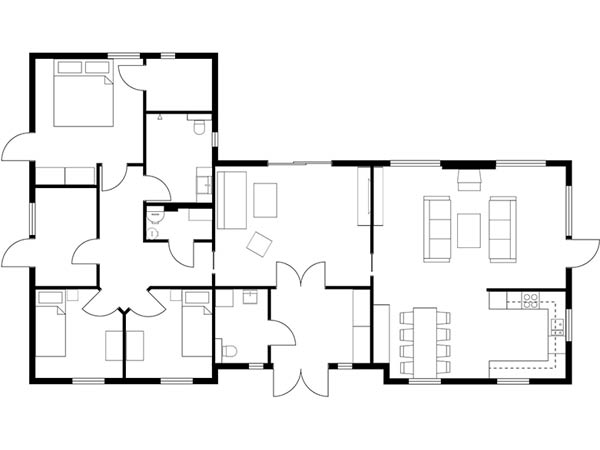
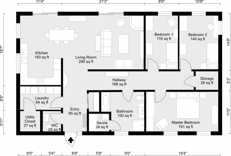
Blueprints & Floorplans

The first thing that comes to mind would be that architects use blueprints in their work. Sometimes it shows the side views of the structure or like a perspective view. In other times it shows the interior floorplan of the structure.

But if to decide between the floorplan or the blueprint designs, I think it would be better to use the floorplan design because it is more flexible in a sense that the floorplan can make out more shapes than a vertical structure/a side view of a building.

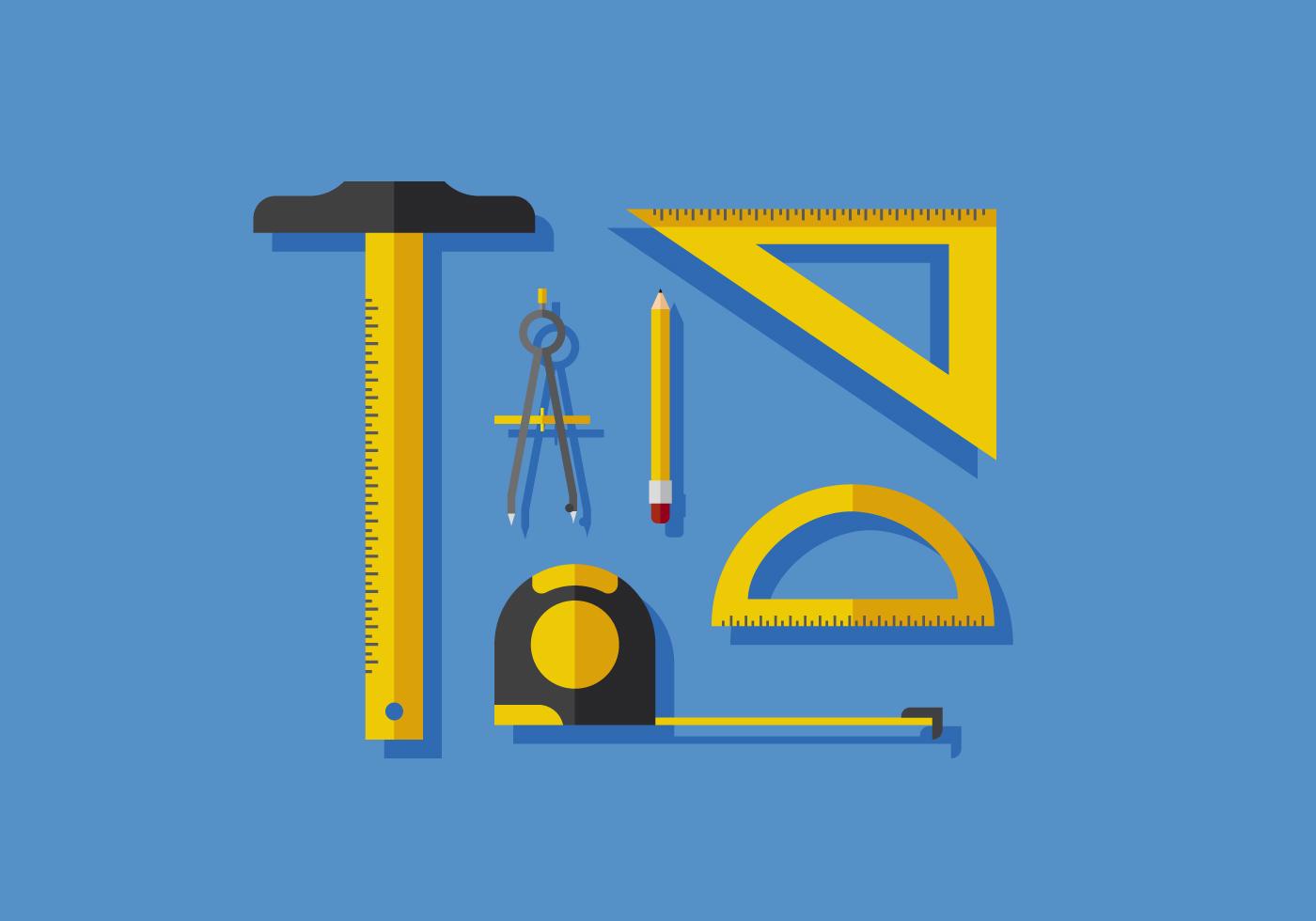
Interior Designer tools

Another way to attempt based on the interior designer is through the tools used by an architect. They have different tools used to form different shapes and to create different drawings.

Architect tools – such as the t-rule, compass, protractor (https://www.vecteezy.com/vector-art/144324-vector-architect-tools)

The tools are already in odd shapes, which can be used to form the different letters of my name already.
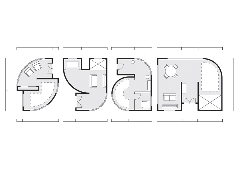
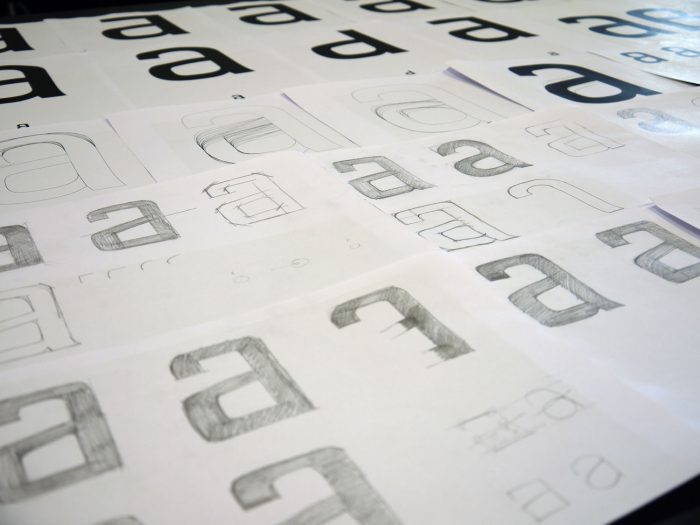
First draft

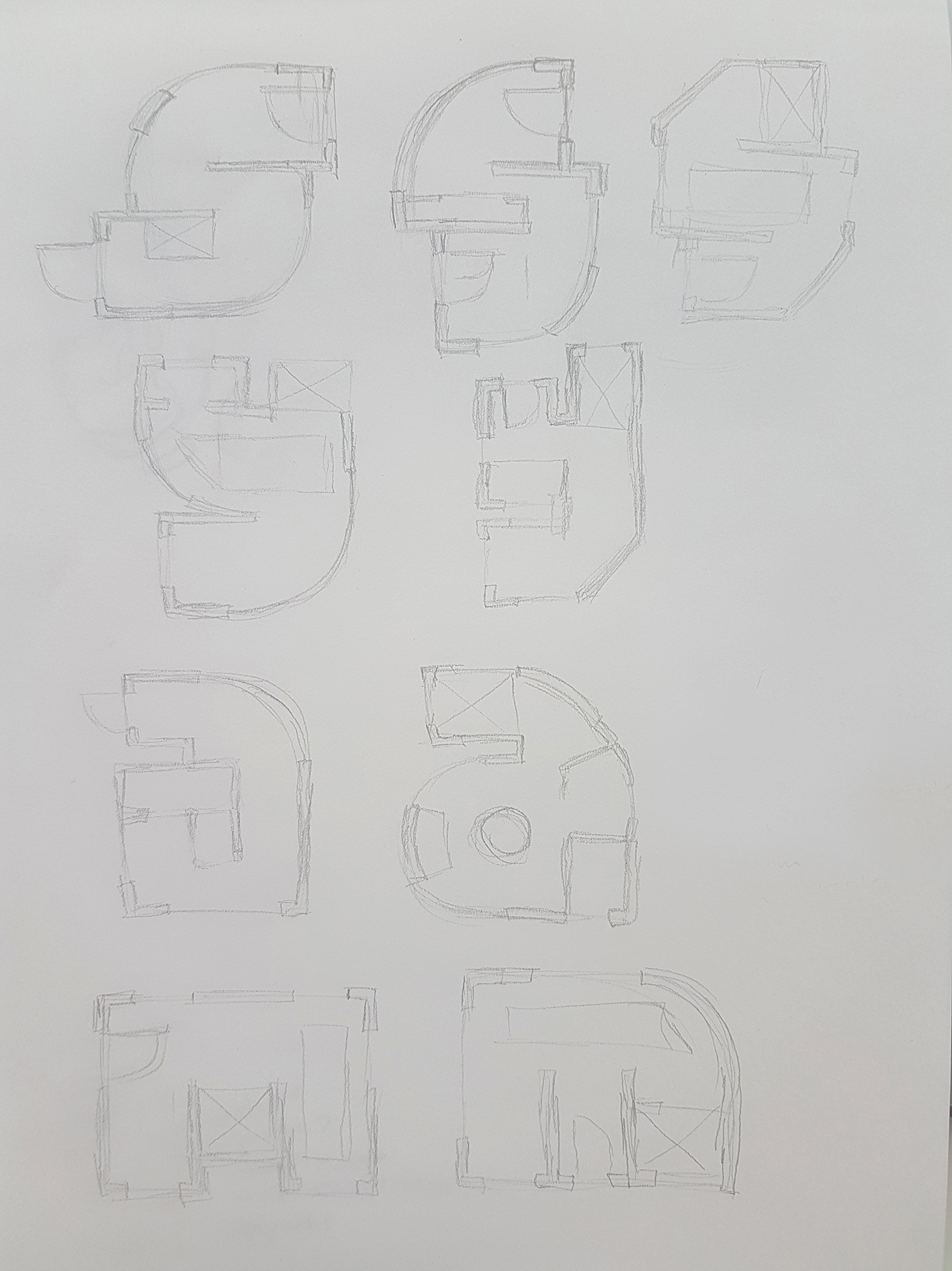
First draft for The Interior Designer

I tried to implement the concept of a floorplan into the letters. Still exploring the different forms, whether or not to make it angular or has more curvature.

Comments from peers & lecturer:

  • Floorplan design has been used too much by seniors, especially by using blueprints. So I have to stick to more of the interior design floor plan concept, which includes more of the interior contents of the structure so as to differentiate it from previous samples.

The Confectioner

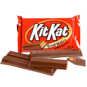
I thought of food, but the idea of using food as a chef cooking has already been taken and used. So I branched out from food to candy.
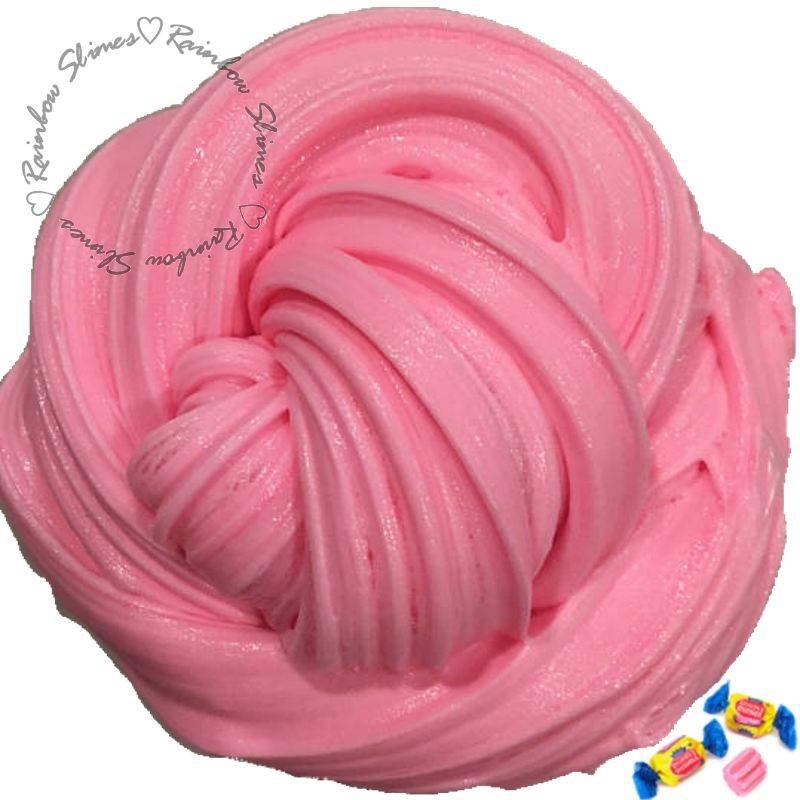
Types of candy

I guess the first step is to find out what sort of candy there is, and from there I can pick out the elements and work with them.

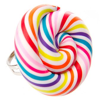
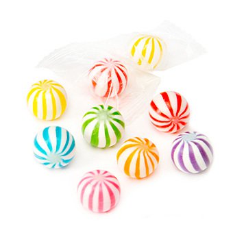
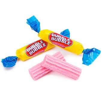
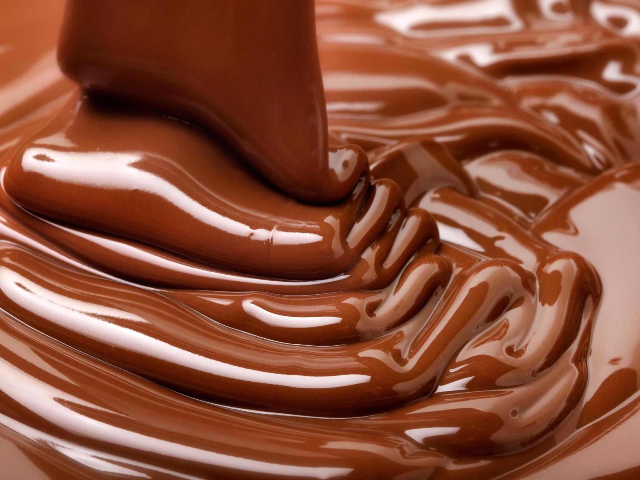
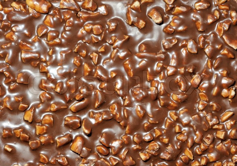
Patterns & Textures from candy

From the types of candy, I can try and pick out the different patterns formed and the textures from the different candy.

Bubblegum texture, can consider the art style too! (https://www.emaze.com/@AWRCLIRT/untitled)

And the list of textures goes on, but the idea is to maybe form the basic structure with the candy and at the same time have the textures in mind and implement them into the design.
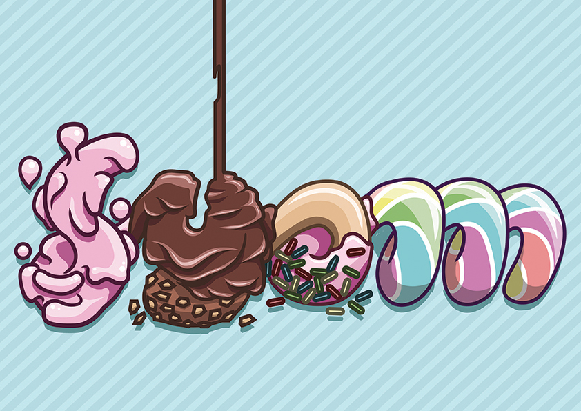
First draft

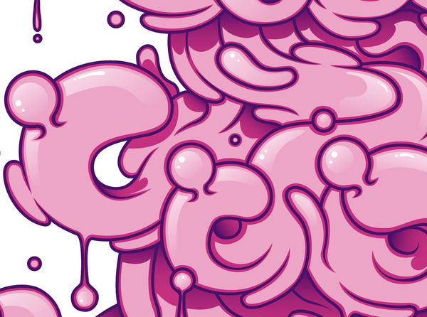
First draft for The Confectioner

So I tried to join all 4 letters of my name to show that the design is interconnected rather than separate units and I tried to make it seamless and flowy as if it is made from one line.

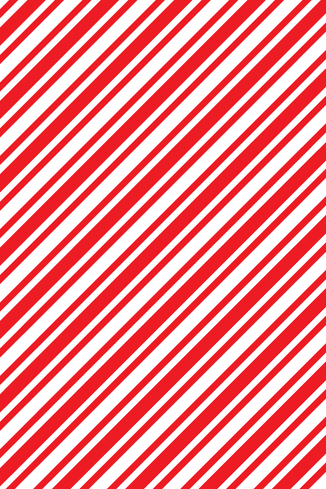
I implemented the different textures and patterns of confectioneries, starting from bubbly bubblegum on the “S” connecting to droopy and nutty chocolate for the “Y’, glossy doughnut with rainbow sprinkles for the “A”, and candy cane patterns and churros texture for the “M”

Comments from peers & lecturer:

  • I have to make sure that the connection is obvious and it flows seamlessly through all 4 letters
  • Try to get as many details on the texture to make it more realistic
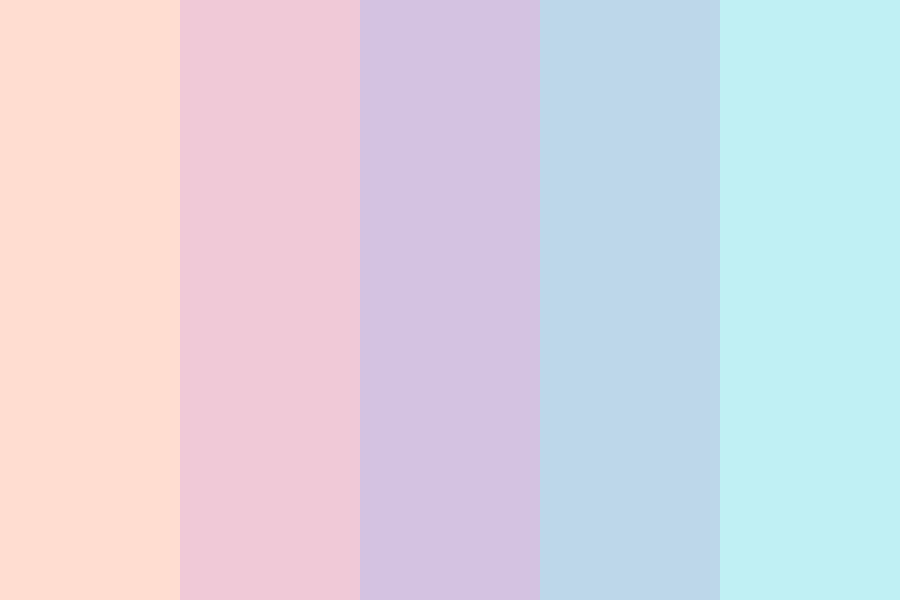
  • Colours have to be attractive (Pastel? Cannot use dark colours)
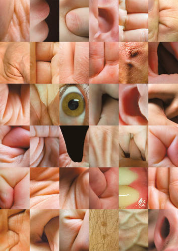
The Radiographer

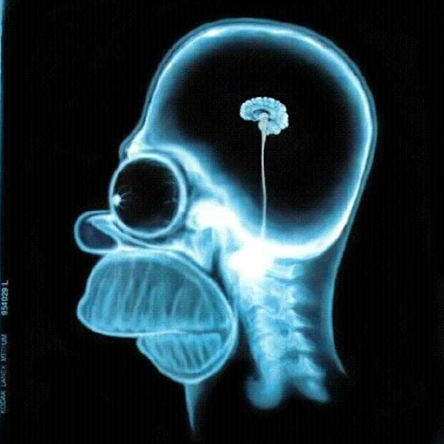
I thought of doing something based on the human body but seems a bit too normal or complicated. So I decided to stick to the human form but more of x-ray style.
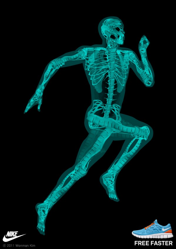
X-ray design

The idea of the x-ray is like thin neon lights but shows a faint outer layer while showing the inner object.

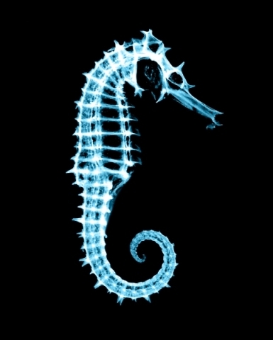
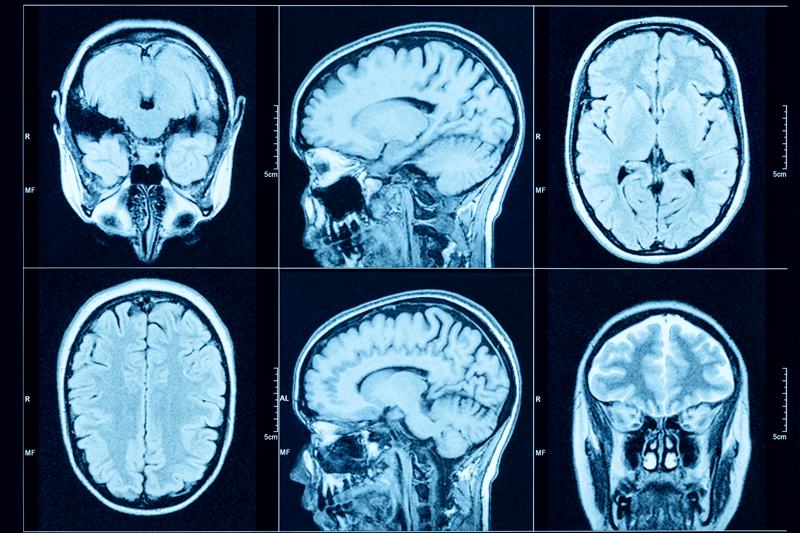
Body parts internal structure study

Another step to do is to look at how the internal structure of the body looks like so that it would look more realistic.

A possible concept that I thought of when doing this is that the inner layer could be just the type, while the outer layer shows something else. Or the outer layer could be the type, while the internal is showing something different.
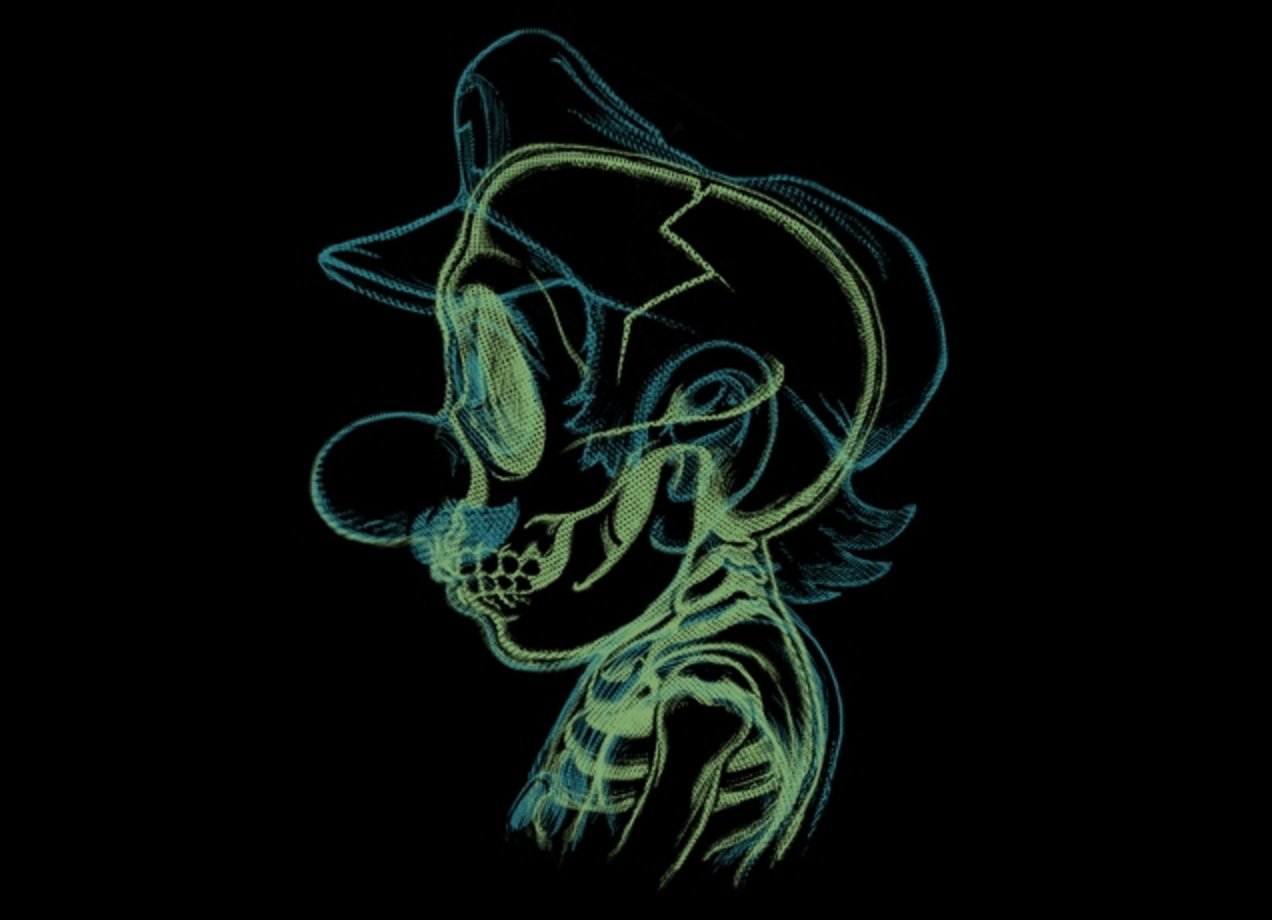
First draft

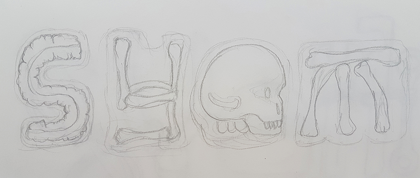
First draft for The Radiographer

For my attempt at this layout, I tried to implement the x-ray studies into the letters so that it looks like real bones and tissue in the x-ray. I also tried to make the outer layer of the letters look a bit different from the inner layers.

Comments from peers & lecturer

  • I could include bone fractures

Funny or dangerous objects inside the x-ray scans. See if I would want to convey a more serious tone or humorous tone
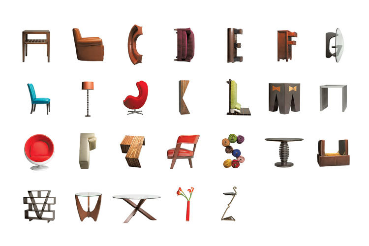

The Contractor

I wanted to do more of using real objects for this since I have already tried other styles for the other.
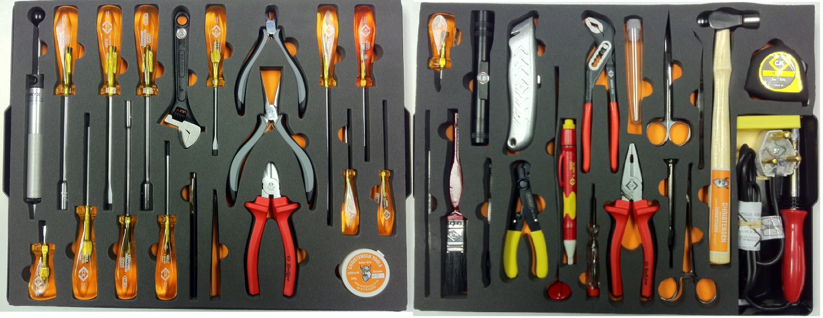
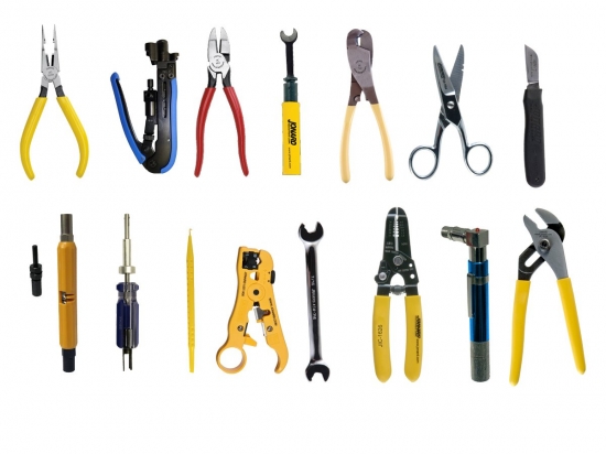
Contractor tools

So elements that I could pick up from the job of a technician is the tools that they use.

So the idea is to create the letters using the different tools of a technician.
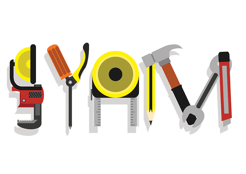
First draft

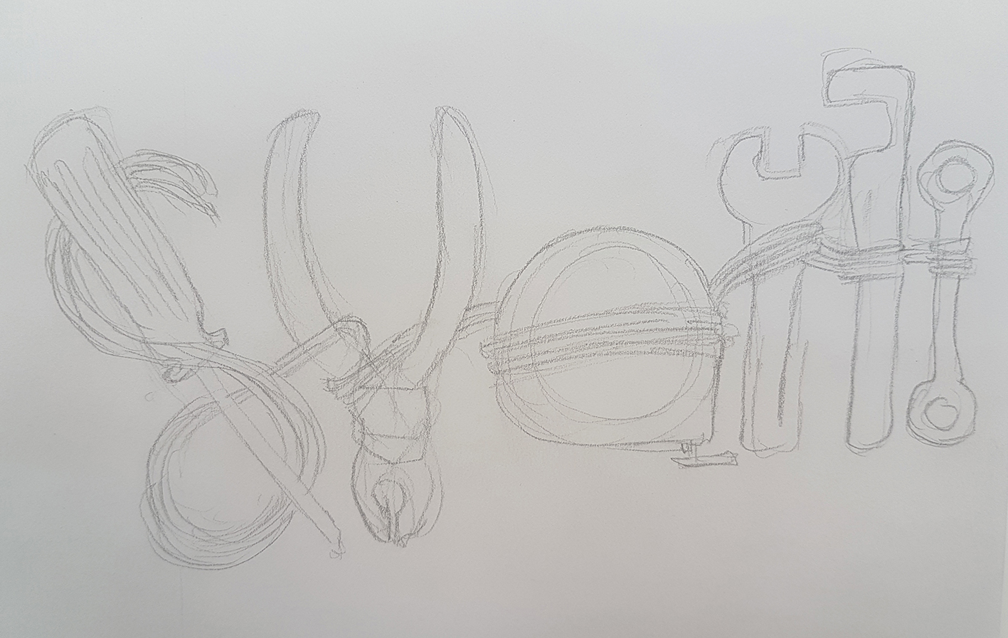
First draft for The Contractor

I tried to implement the tools into the formation of the letters, and I used wires to in a way join the letters together and also to form more of the curvy letters.

Comments from peers & lecturer:

  • The approach is too direct in a sense that the tools are used directly as the shape forms – like pareidolia
  • Lack of manipulation should have more
  • Combination of different equipment to form each letter, rather than using just one tool to form a letter.

Image Making Through Type (Part 1 – Research)

For our first project, we are to create type of our own name or initials to describe a job. So I thought of starting the project by looking at some examples of what the outcome could be.

Some examples:

The word “olive” formed by elements of the fruit (http://k7mcreative.com/wp-content/uploads/2014/09/exhibitions1.jpg)

The word “French” formed by coffee powder (http://jp22.r0tt.com/l_d0d31990-6084-11e3-b385-c37293e00022.jpg)

Basically, we are to create a type of our name by using elements from a job. Like using the tools of an artist (paintbrush, palette, etc) to form my name as an artist. Or use the equipment of a doctor (stethoscope, thermometer, etc) to form my initials as a doctor.

Pareidolia

Another way we are to look at this project and to help up with it is through a new term we learned in class: pareidolia. It is a condition where one perceives a pattern in random things. Like how we see objects formed by the clouds or the trees.

Examples of pareidolia:

Washing machine with a red cloth coming out forming a face, and a detached seatbelt looking like a face with the seatbelt strap being its tongue. (https://sadanduseless.b-cdn.net/wp-content/uploads/2017/04/face4.jpg)

But to relate pareidolia with the project, instead of seeing faces in items, we would have to look for letters and type in objects.

Some examples of pareidolia alphabets would be:

Alphabets formed by the different body parts (http://www.foerstel.com/wp-content/uploads/2014/09/9203.jpg)