Project 3 Thinking Sequentially, Impossibilities of Being

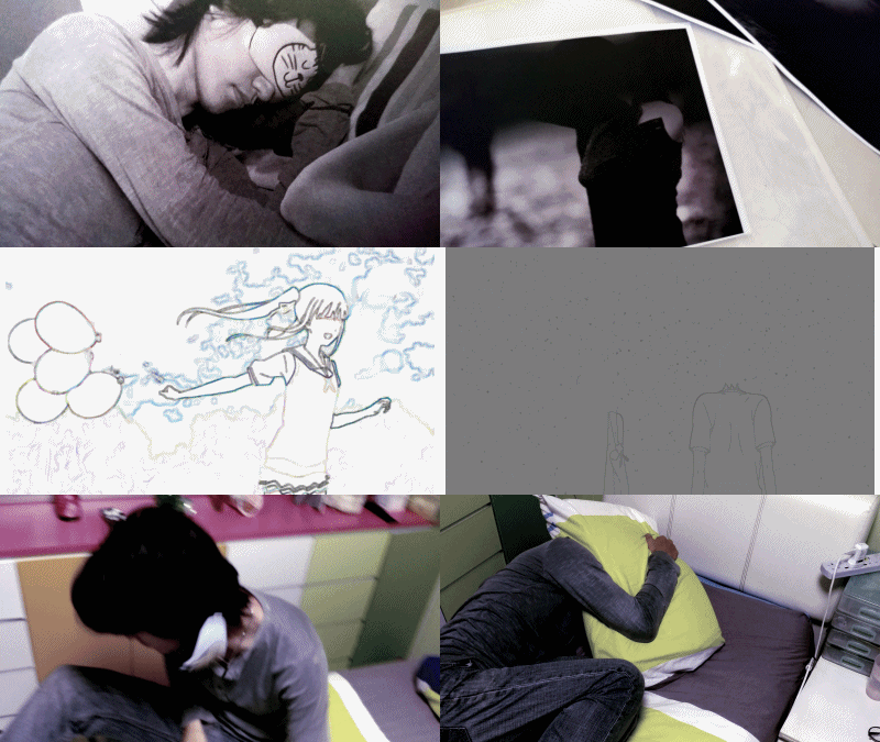
*Will upgrade to a video rather than a gif file soon*

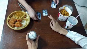
To start and to end the sequence with sleeping. In this project I took way more time than I should have sketching out the scenes I wanted and hence didn’t have enough preparation time to execute it. Originally the first and the last scene (right after the dream sequence) was the look almost the same, then similar to the first scene, it zooms out but to the character waking up instead and realising it was all a dream.

I wanted to play to the concept of a twist at the end, but due to the lack of execution time I had to simplify the dream sequence and make the best of what manpower I had available. It was in slightly bad coincidence the model I used had a recent breakup, hence reducing the manpower available, but I tried capture his emotions and feelings into this sequence to show how he feels.

I have mixed feelings ’bout this project. While it’s phrased to be flexible in content, the odd 90 frame restriction meant the sequence must have a slight requirement for content but we cannot fit too much into it. The storytelling prospects hence felt a bit constricted, hence I had to redraft many ideas until I got this one which could fit within 90 frames. Previous ideas involves waking up in alternate worlds, but the issue with those were that the frame count restricts the adventuring the character can do as well as they felt they lacked meaning and expression. If I had more freedom, in budget and requirements, I should be able to fine tune this further to emphasize more on the shock and impact after the character awakes and that he is still all alone.

Project 2 Text and Images – Before and After


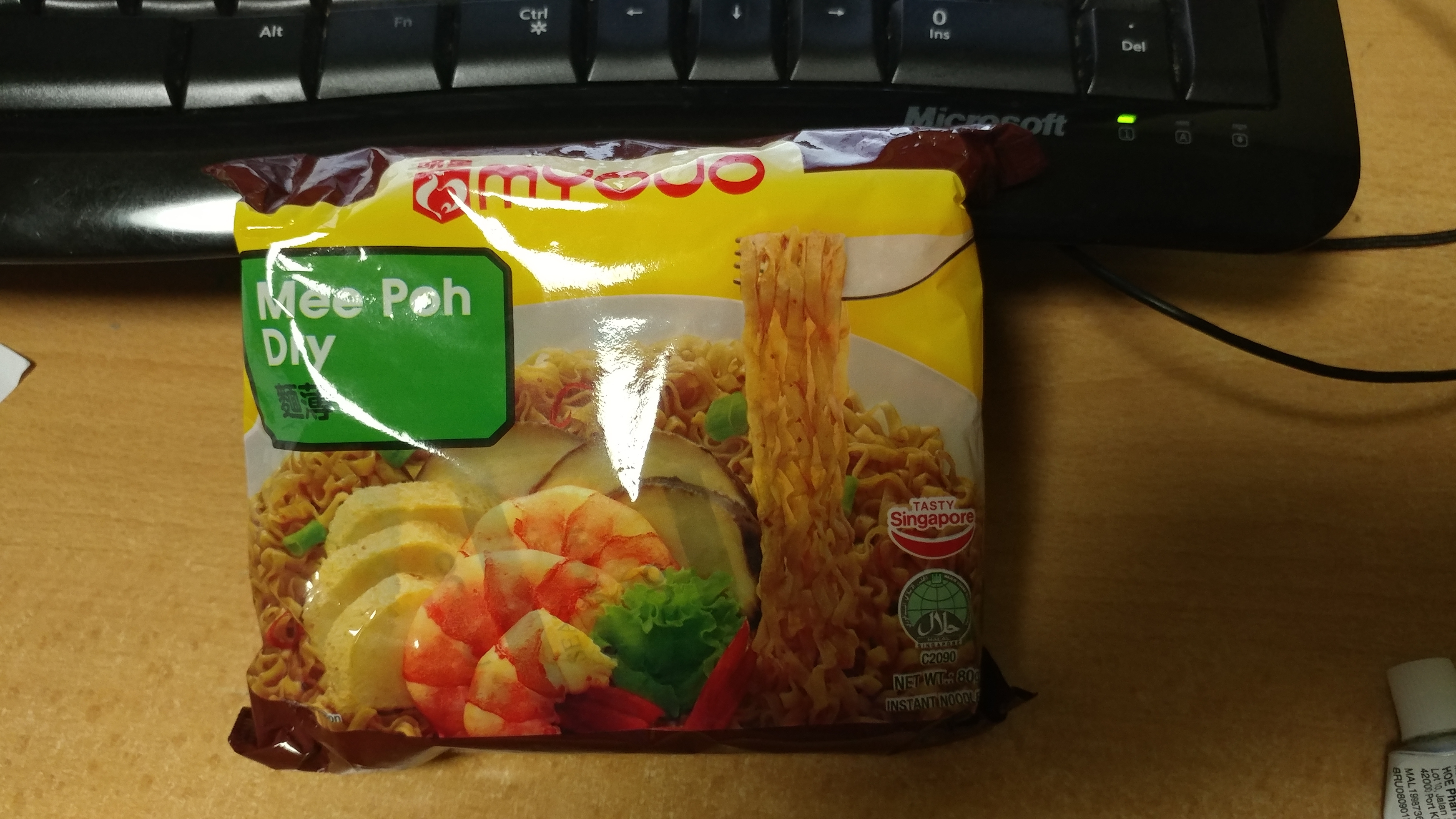
Project 2! This is the food item I obtained – Myojo Mee Poh Dry

The project involves text to express the item, specifically in the form of an advertisement.


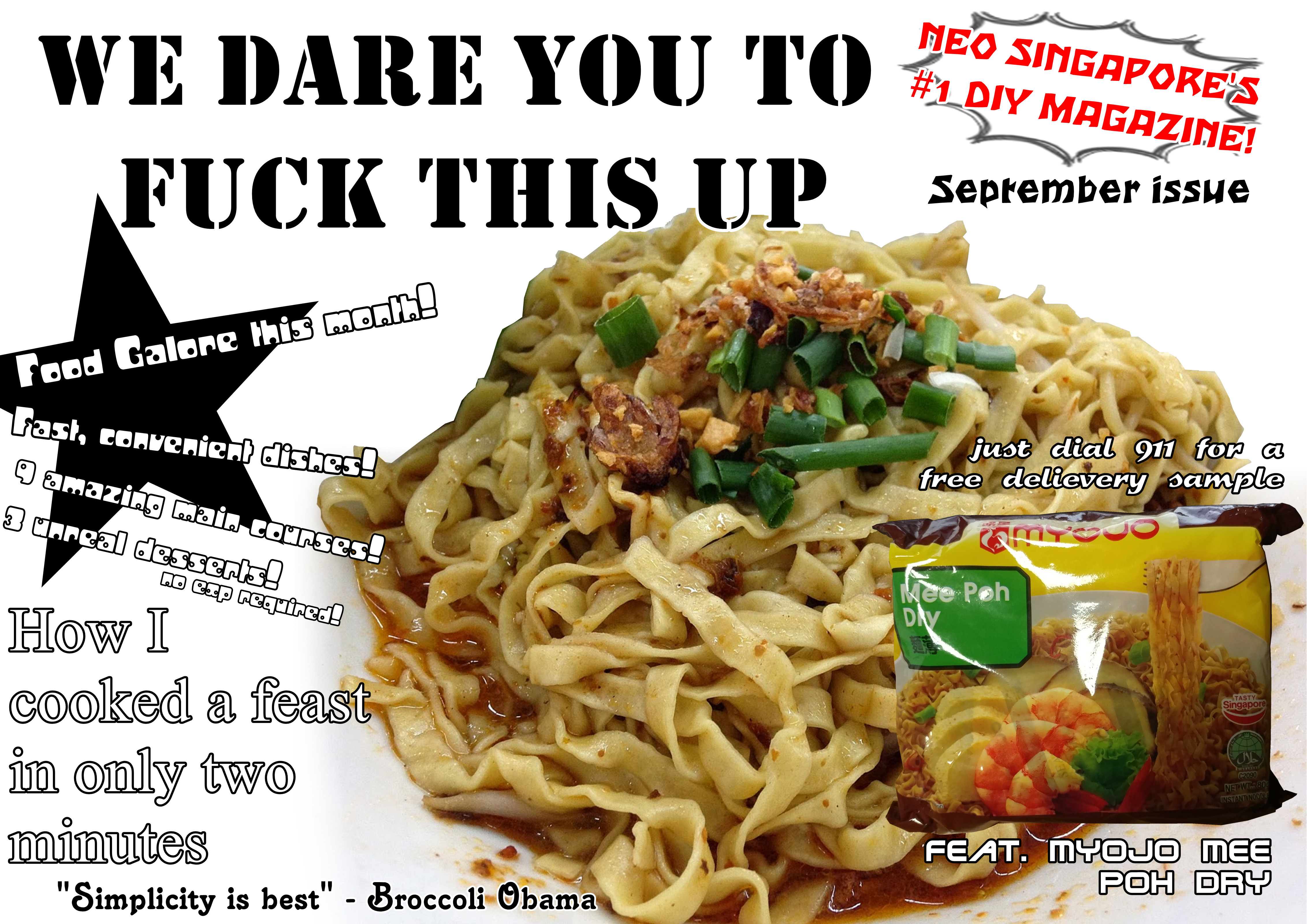
Here was the initial idea I proposed – Messy and vulgar, enhanced with a local touch. Here I was trying to bring out the elements of noodles rather than making a standard advertisement to sell the noodles. The elements I went with involved: Simplicity, Fast, Flexible, Convenient, Foolproof, and Subtle; these elements (except the last one) are spread across the suggestions of text.

The overall design was a mix inspiration of food magazines as well as food advertisements you might find in places like a hawker center. The food is portrayed in a rather simple manner, while words surround them, giving a bombardment of information. I tried to make it a mess, so the focus was not on the noodles, but on the text, hence to amplify the subtle element of noodles. After all, noodles is a very subtle dish by nature, the noodles are carbohydrates as a medium to make the soup or broth more filling and practical to eat.

The main issue however, is that while I try to bring out the subtle element of the noodles, I fail to present the advertising factor as they kind of contradict each other. Hence I moved on with a different design.

Revised, I decided to scrap the whole messy vulgar idea, and tried something more straightforward. The elements I decided to go with this time are the homeliness the local noodles variety present, and the portability of instant noodles. This time the noodles are presented on a china bowl with accompanying soup and chili. These objects give a sense of eating with family, eating at home. The idea I presented here is that while you might be elsewhere, for example living in a school dormitory, you can always bring these noodles along to emulate the sense of home. Since we have to have an image of the original item, I placed the photograph of the noodles at the end of the chopsticks. This makes it nicely put at the corner of the advertisement to accompany the words, as well as show that you can hold it with your chopsticks, showing the idea that it is a desired choice for a food product.

Overall the project wasn’t as “fun” as project 1 where we were more unrestricted in making whatever we want, but I do felt like I learnt more ’bout structuring text to complement and/or to compete with the image for attention, both fulfilling different possible objectives.


Project 1A – Strange Encounter

Final Submission

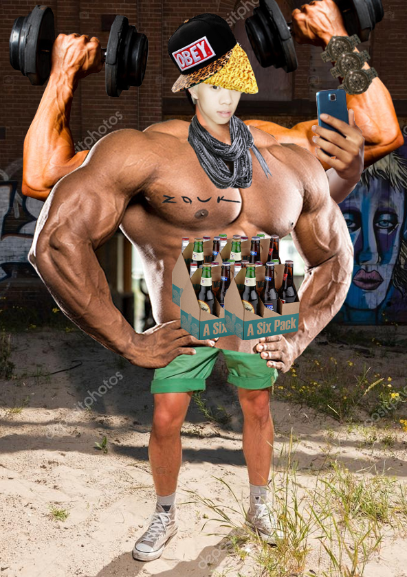
Without filters

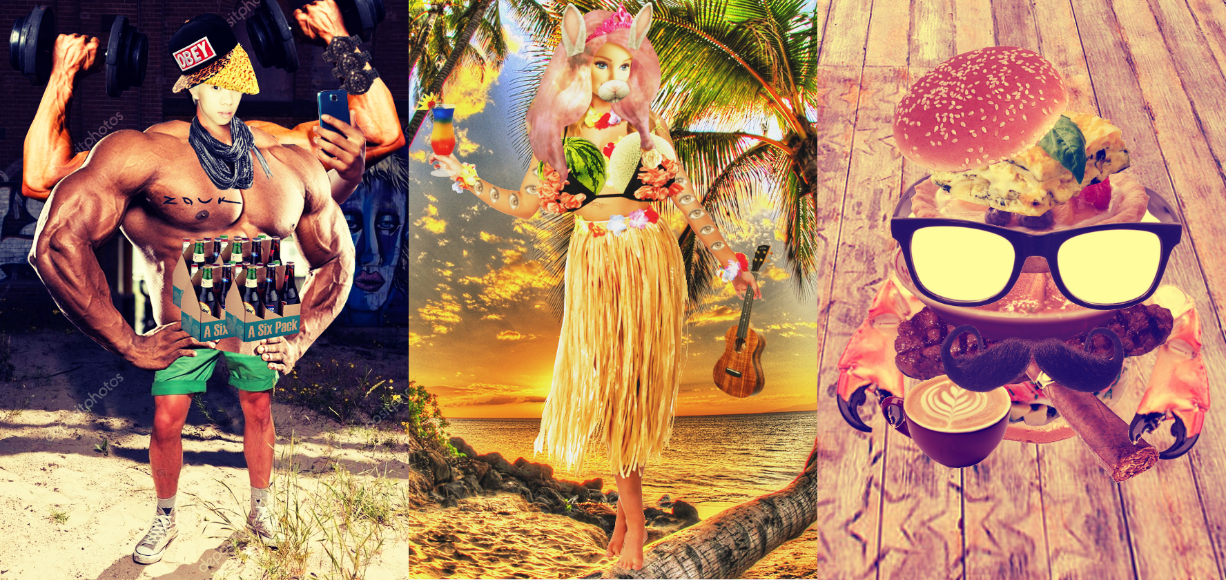
Taking a train and waking up in a strange world? What might this exciting event bring us and who might we encounter? The world I have chosen is the “fake” world of images, which was inspired by instagram photographs. In this world, individuals may customise their body to their liking, and appearances will demonstrate their personality and capabilities. Basically, it’s a world where appearances mean everything.

The first individual (which I endearingly dubbed fboii) has the image of a male who often works out at the gym, believes he is stylish and overall acts as a hipster. I placed various body enhancements such as the muscular chest, strong arms, and even the twenty-four pack to suggest his image of being powerful, he believes working out at the gym makes him almighty and better than others. To point to others his “superiority”, he has his fifth arm (yes he has five arms) hold a photo to take a selfie while the other four pose and lift weights. To further show how he is “different” from others, I picked out a location with graffiti’d walls to get the hipster sense. The watermarks on the location are placed to further emphasize on his attempts to be at somewhere “normal people” don’t appear at. Thus fboii represents the overly egoistic male who presents so through his body.

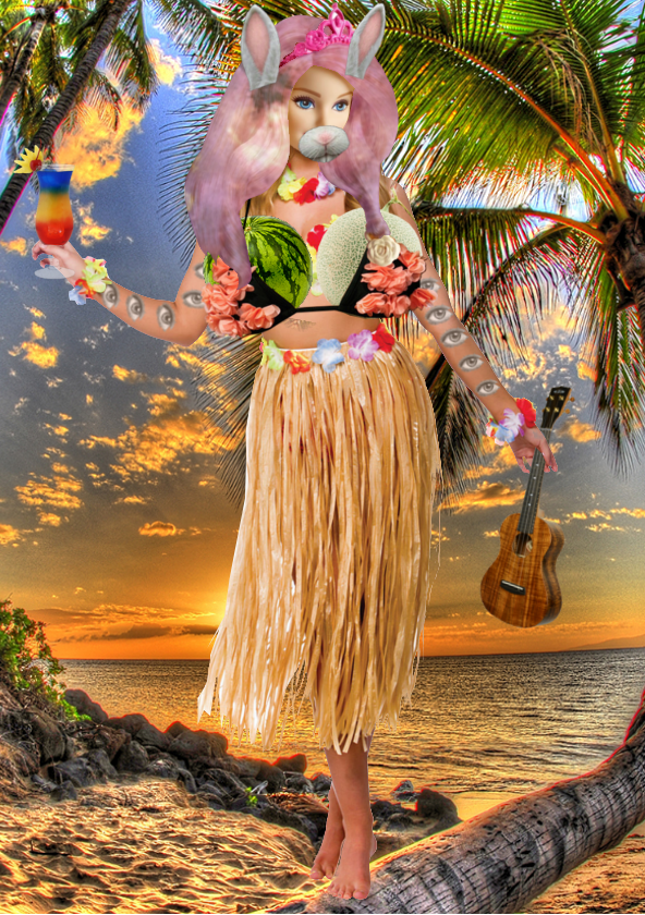
The second individual (which I conveniently dubbed fgal) is conceptually similar to fboii, after all they come from the same world. The individual enhanced their “melons”,  upgraded their face to a barbie-like one, and even have hair with the glimmer of the galaxy. The location picked was a fake-looking hawaiian beach, this shows her ability to travel and keeping up with the trends, complete with a cocktail in hand as well as a ukulele to show the hipster/popular hybrid. The eyes on her arms show that while she flaunts her appearances, she is keeping a close look at others to see if she has been outdone as well as what impression others have of her. Thus fgal represents the narcissistic female with a competitive personality that struggles always be updated with the times.

The third individual (which I lazily dubbed fburger) shows the type of people who only takes photos of food. This particular individual deems themselves a food critic,  someone of reputation and enjoys a large variety of food of no particular style. Hence the design is a mix of food items that you might not expect to go together, for example the fruit tart placed on the bowl of ramen noodles. I tried to give this character the café-hopping hipster feel so I supplemented the design with glasses and a mustache, which also makes the individual seem more anthropomorphic and blending in as a character better to go with the other two.

The project was interesting, I got to mix and match many elements of people and emphasized on stereotypes. The freedom to modify the characters and the world setting also allowed play on whatever we wanted, so I could create a “fake” world here, rather than only creating physical and less fictional sounding worlds. This project allows us to use body and visual elements to demonstrate features of characters to be inferred despite no other information granted, which is interesting and allows various experimentation and various results to be seen. It also seems great as an icebreaker project as we get to know one another’s thoughts on what kind of characters someone can create and what they can do. Overall a very fun project.

Project 1B Paradox Final Artwork – Fun at 2 a.m. (feat. my shadow)

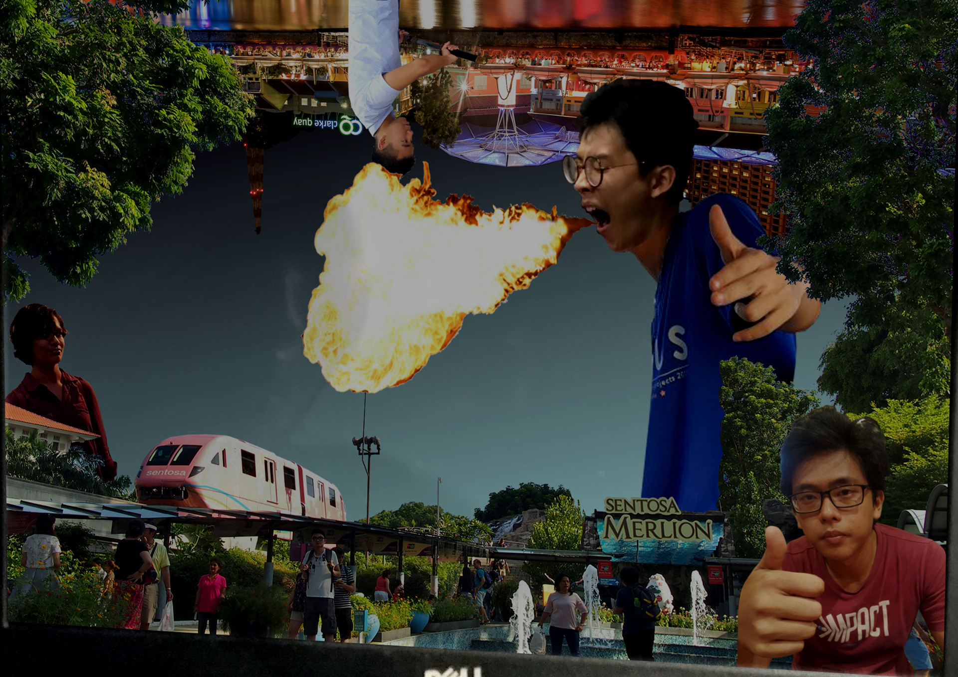
A continuation from the last project, we have a paradoxical image with us somewhere in it. Here I attempted to playfully hide my real location by creating various distractions in the image while I blend off into the background to hide. This image shown here was been projected to be cleaner than the physical version (which was intentionally done to make myself barely visible by the way) so I am more visible.

The first layer of paradox, is what is happening in the image. We have a person replacing the merlion, and he is breathing fire instead of projecting water as we expect. Also by comparing size and scale, he is a human of much larger size. The various other people that stand out from the crowd at the bottom also have their size and scale modified, some even in the foreground of the picture, showing less defined fabrics of space and placement. The top half of the image also depicts night and an upside-down Clarke Quay the night while the bottom shows Sentosa in the day. Some characters even seem to be interacting, such as the girl at the left cringing and backing off the flame, while others such as the dude on the bottom-right posing towards us, as if he knows we are observing them. The characters are also placed around the image, with the most blank space in the middle of the image, this is for implying there is no real “main focus” and the attention should be spread throughout, especially if you are actually looking for my location which was made less obvious.

The second layer of paradox involves me, who titled the work “Fun at 2 a.m.”. Contrary to the title, I was fairly tired and was not exactly having fun at 2 a.m. This image was taken as a reflection of me staring at a laptop screen while working on a collage to show paradox. Hence I am, in fact, the paradox.

The focus on the picture was made to be spread out as the image of me was spread over half of the screen. Thus to observe the paradox, one must open up their attention to see the big picture.

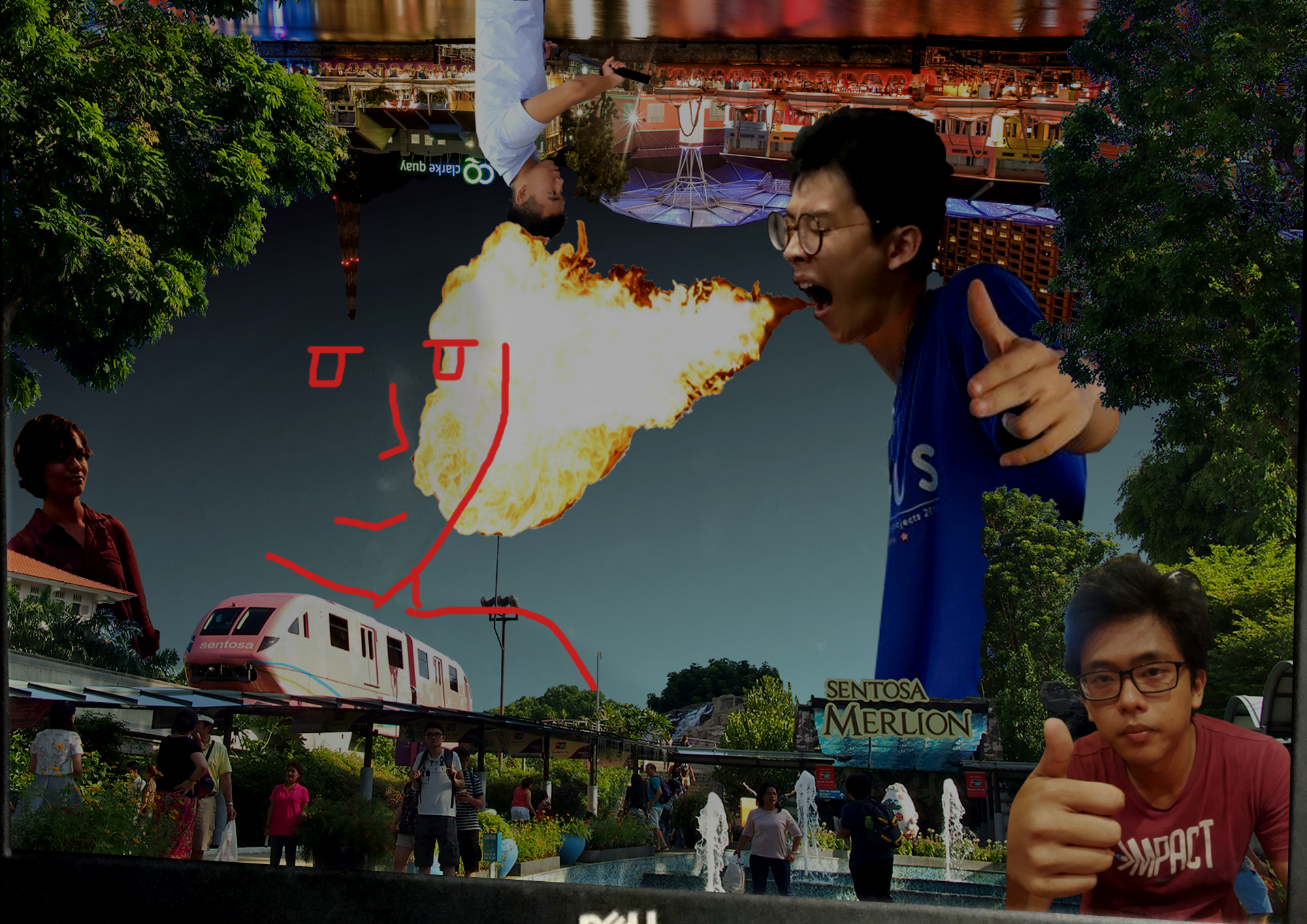
This project was overall pretty fun to play with. I know I did mention that working on it physically was not fun if I was worn out at night, but creating the concept was interesting. Personally I don’t like putting myself into art, so I cunningly thought of a means to portray myself as the focus yet not making it explicit. After all, where is the fun if everything is pointed out for you? Thus I purposely hidden myself so the class can have the first layer of fun to discover me (granted, it was pretty hard) before they get to experience another layer of fun as a explained my concept.

p.s. here is my btw if you haven’t found it 

Can you trust your memory? (updated)

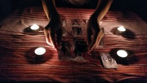
For maximum effect, do pay attention to the audio while observing the images, and do not rewind to previous images before you complete viewing the entire gallery. However, you may take your time to admire each photo before moving on.


Post class discussion:

Additional information on the story told in the first 7 images

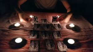
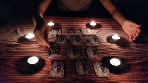
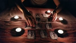
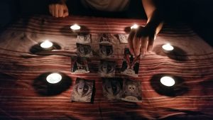
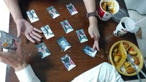
The pairs opened, in order:

The Fool & The Lovers

The Emperor (twice)

The Fool & The Devil

The Hanged Man & Death

The Hanged Man & The Lovers

The Devil & Death

The Fool, the main character of the story, wishes to get together with The Lovers. However such a path is blocked by The Emperor with has appeared before the two of them. As man, The Fool has no means to defying the Emperor, hence he searches out The Devil for aid. The Devil promises to grant The Fool’s wish, but at a price. The process to remove the Emperor out of the picture will be by Death. Agreeing to the deal, The Fool corrupts into The Hanged Man, which is also known as the traitor, for he has plotted to remove the Emperor. The plan has succeeded, and The Hanged Man now gets together with The Lovers. The Devil reappears however, and take his reward – the life of the pair.

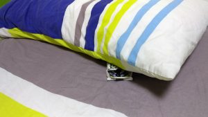
The variant story told in the 9th image involves forgetting the sinister plot by The Fool, and the roles of The Emperor and The Devil being swapped, hence The Fool has been knighted by The Emperor to slay the Devil, being the hero instead. The forgotten Hanged Man fate, was left by the bed where the dream occurred, abruptly cutting off into oblivion.

Sound Art Reading Assignment

What is sound?

Sound is a form of energy that creates the feeling of hearing. Sound exists in wavelengths and can be transmitted through all three states of matter before reaching our ears to leave an audio effect on us. Humans can hear sound waves with frequencies between 20 Hz and 20 kHz, and the frequencies can be adjusted to even have selective hearing to certain people or animals. Sound can be manipulated to create music.

How has it been use in culture and society?

The most basic usage of sound in society is communication. Starting from the lungs, humans can generate vibrations through the air past our vocal cords to create sound in the form of speech, singing, crying, laughing and such. Humans make use of sound to create communication alongside writing and gestures. Sound has also been used to create music, either via the human voice such as singing, or via instruments to by producing vibrations in sound tuned to something pleasant to one’s audio senses.

What makes it an art?

Sound is always around, but to appreciate it, one must learn to listen. Like any other art form, sound requires one to actively observe to gain an appreciation for it. By manipulation of sound, we can create sensations that make invoke different emotions similar to observing literature or art performed on physical mediums. Before the 1990s sound art was a type of experimental music and before “sound art” was made a term, sound art was even viewed as an extension of written poetry rather than an art of sound.

How does advancement in audio technology affect our sense?

Sound art used to be created by voice and instruments performed, but now with advanced audio technology we have recordings of sound, convenient playback of sound, even editing of sound. But however, even though technology has made sound art more commonplace and more easily accessible, it has also made sound art too easily taken for granted. One just needs to press the play button on a device to hear the recorded and edited audio which may have taken a long time to create, yet not appreciated in the least, unlike going to an orchestra in the past. Audio technology may have dulled our acknowledgement for the sound arts, unless one truly sits down to listen, and to understand and appreciate it.


Reading Assignment: Roland Barthes Rhetoric of the Image

What are some of the key questions Barthes aims to investigate in the article? 

Barthes aims to investigate the meaning of the image, how it portrays a message instead of being merely an analogical representation. He wants to know; how does meaning get into an image? Where does it end and what lies beyond the image?

What are some of the key terms/ concepts introduced and discussed?

In an image there are three messages: the linguistic message, the iconic message, and the literal message.

Linguistic messages are denotational and connotational, and can be extracted by breaking down words used to further extract meaning; these are generally found with the captions or labels on an image. The iconic message can also be referred to the connotational message; these are not obvious and require some some degree of understanding of the context of the message, as it is usually “coded” to be hidden on first glance. The literal message however, is not hidden, but rather clear and can be considered “non-coded” as the information is presented as is, and it may have symbolism presented in quite the literal sense.

Do you agree or disagree with his argument and point of view?

I agree that messages have their denotational and connotational symbols, as information can be held within an image not to be taken literally yet sometimes the choice of the image does give the literal impression of what message is being conveyed. By mixing these coded and non-coded messages, a sense of context is needed to decipher the accurate choice of meaning intended by the author, be it literal or metaphorical.

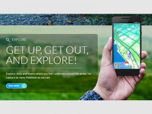
Provide a brief analysis (200 words) on an advertisement of your choice by using the terms/ concepts proposed by Barthes and discuss the role of text and its relationship with the image in the advertisement. Please include an image the advertisement in your post 
http://images.techtimes.com/data/images/full/259279/pokemon-go.jpg

This is an advertisement of Pokémon GO. The linguistic message here involves “Get up, get out, and explore!”; the message supports the agenda of recent Pokémon games that promote people leaving their home and walking around more, with the implied message that the agenda is for players to not stay cooped up in their homes and to find other people to interact with. This iconic message can be derived by observing the trends of more recent Pokémon games where there are an increasing amount of gameplay mechanics previously enhanced, but now even locked to usage of features that involve interaction with other humans.

“Explore cities and towns where you live – and even around the globe – to capture as many Pokémon as you can.” this message is literal as it puts emphasis on the marketing strategy used in from the early days of Pokémon: to go out and capture all 151 Pokémon to be the Pokémon master. This is also contextually correct as an linguistic message as Pokémon GO is an application that involves the user travelling to interact with Pokémon to attempt to catch them. Different towns and regions have different spawn rates for Pokémon which explains the part to explore various cities and towns to aid collecting the various different Pokémon; furthermore there are certain Pokémon that are region locked, and users can only collect them by actually travelling around the world. Therefore I believe through looking at the three layers of messages suggested by Barthes contained in a simple advertisement, we can consider and learn a lot more than what meets the eye.

Project 1a: Strange Encounter

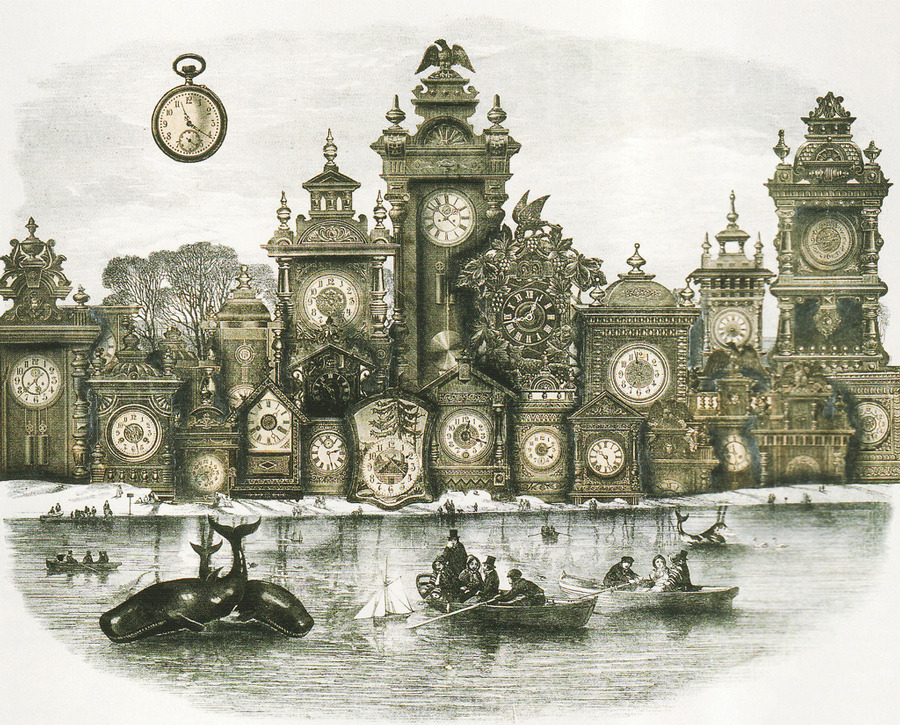
Credit: Adolf Hoffmeister

Found on http://payload.cargocollective.com/1/2/88505/1540318/Adolf-Hoffmeister–The-City-of-Lost-Time–1964.-Collage-on-paper_900.jpg

Adolf Hoffmeister created a work titled The City of Lost Time. Yet the setting appears to be a city full of clocks, but displaying different times of the day. What interest me about the work is that despite all these clocks available to tell us the time, the light, misty looking background make it hard to estimate a correct time of the day, coupled with the people seemingly travelling by boat, adding the appearance they are searching for the “true time”. What I really like is how the work suggests to us that too much information, especially contradictory ones will lead us further from the truth than one would like.

Credit: Matthieu Bourel

Found on https://lostcivilizations.files.wordpress.com/2014/11/90_mb_ubiquityserie_feelingstrange.jpg

Matthieu Bourel created a work where the top portion of a human was cut off, and replaced with a mathematical equation. What interests me about the work is that the lack of content in the work other than 2 main points, the equation and the nude body. It suggests that humans have nothing if stripped down other than their possession of knowledge. What I like about the work is that the image also has the impression that a mathematical equation is “rendering” the person, which can suggest that we have reached a digital age where a mathematical equation is enough to recreate a person, implying the high level of technology we have achieved, and how simple an average person can be in terms of their thinking.