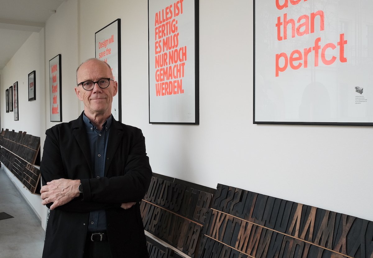
Erik Spiekermann is a German typographer, designer and writer, also the architect behind some of the best-known branding and visual identity campaigns of the past generation.
Photo credit: Norman Posselt
“If you ever take the train in Germany, everything you read was designed by us,” Spiekermann once said about Deutsche Bahn.
Erik Spiekermann is a designer who takes his work very seriously. When he is working he takes up a very different approach compared to his own life. Outside work, he’s more carefree, he enjoys cycling, does things without a plan, and goes with the flow; but when there’s the need to be serious, he will be.
He has talked about how he is normally 5 mins late to everything, but this does not apply when he works or has meetings. In one interview he talks about the math that if he is five minutes late, and there are 12 people waiting, that’s 60 minutes wasted. And it adds up towards a waste of money. So when it comes to work, he’s always 5 mins early.
Erik talks about how not all design are timeless, they are created to cater the specific need and situation. He was once asked about his favourite font, in which he replied that it is the one that fits a purpose he needs right now. In related works, the Austrian road network typeface was one he said he never really liked. He had to do a condensed version which ruins the type design, and that was the crux of making the tools: You don’t know what people make with them. But as a designer he has to take the job, lest someone else takes it and makes it worse.
Ultimately what I admire most about Erik is how human he is. He’s not like super designer whose mindset that is completely bizarre. He understands people, and his personal philosophies are human-centric. With meetings he’s always on time. And everybody who is not drives him crazy, because it’s rude and inefficient. Being on time is a sign of civility between two people. And he is a human who understands humans.

