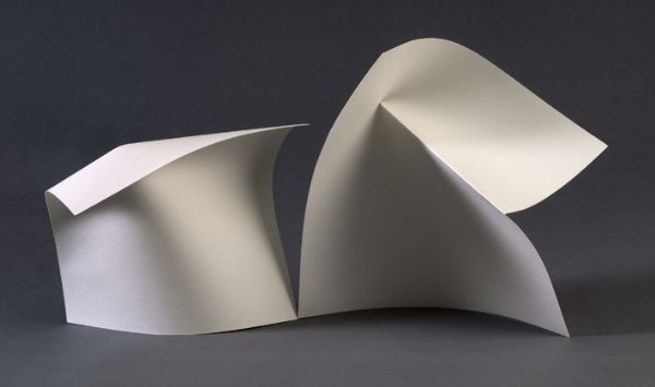
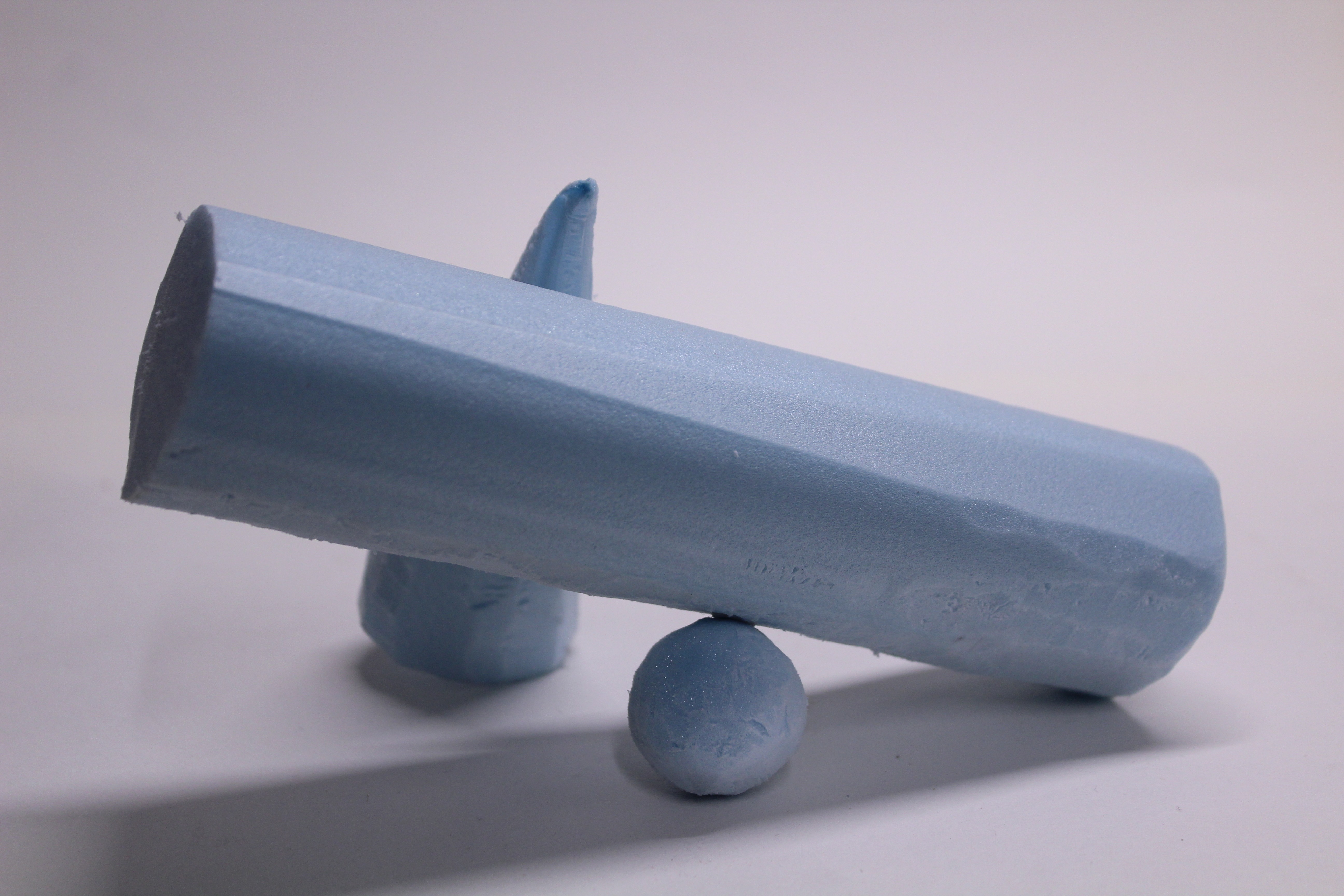
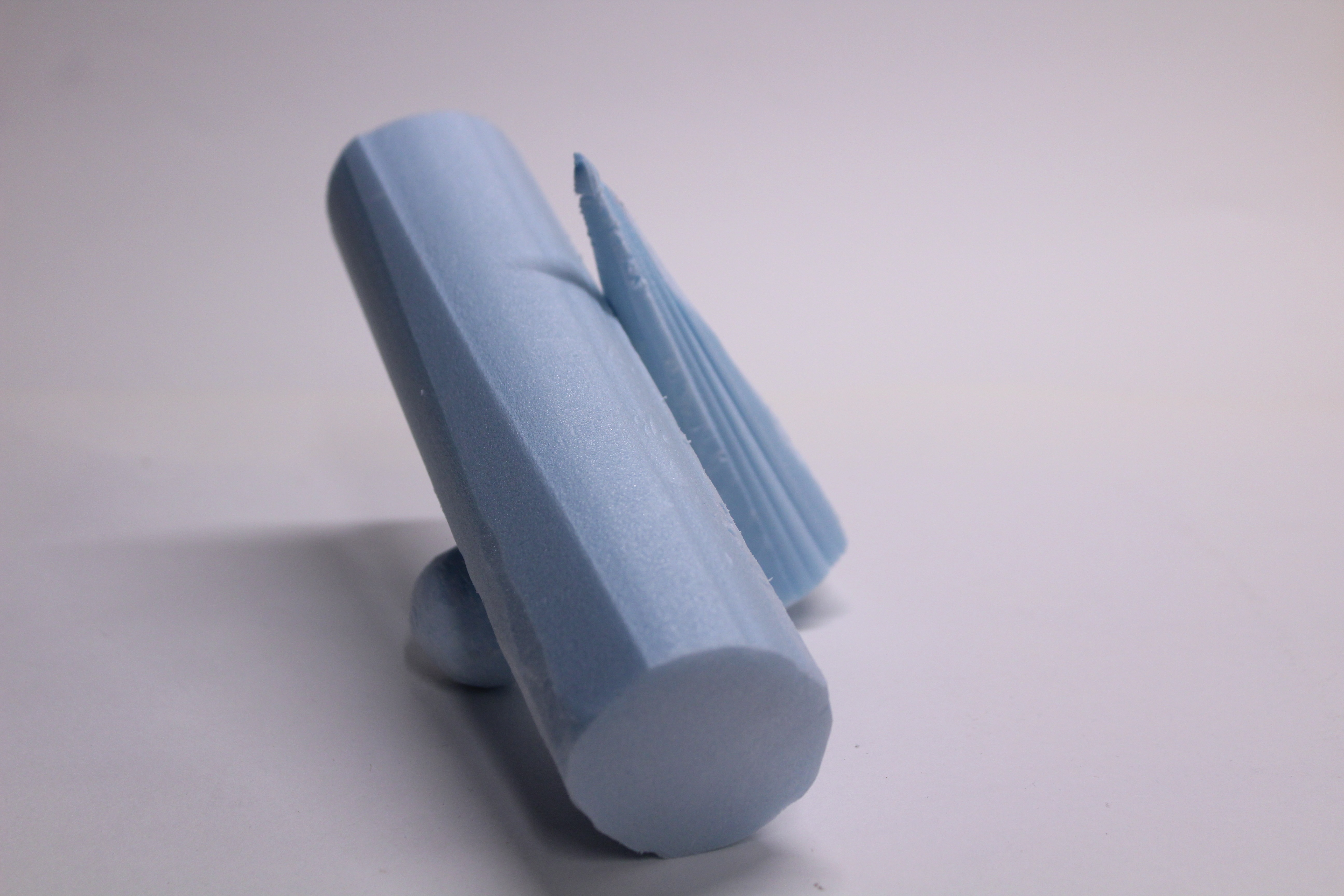
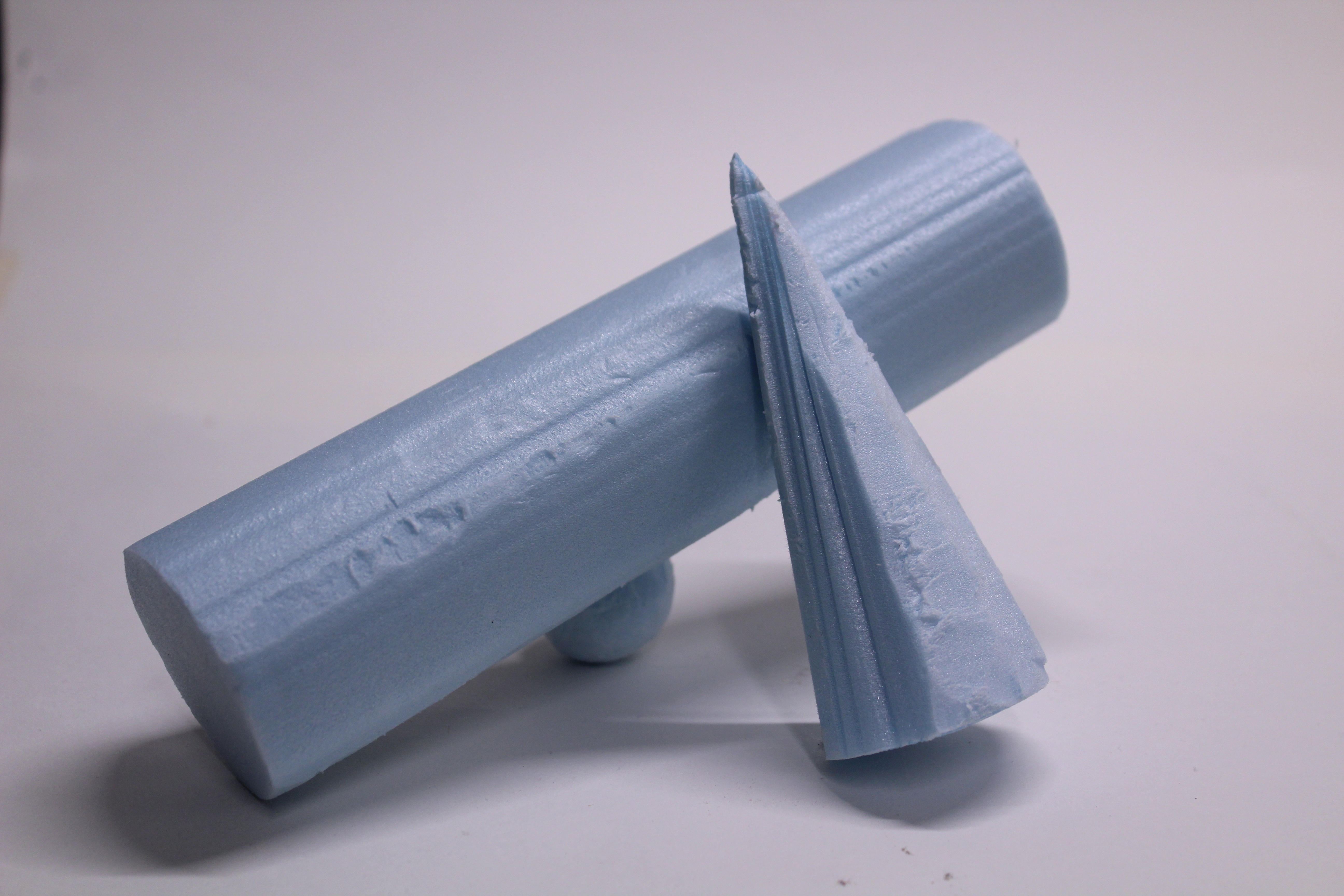
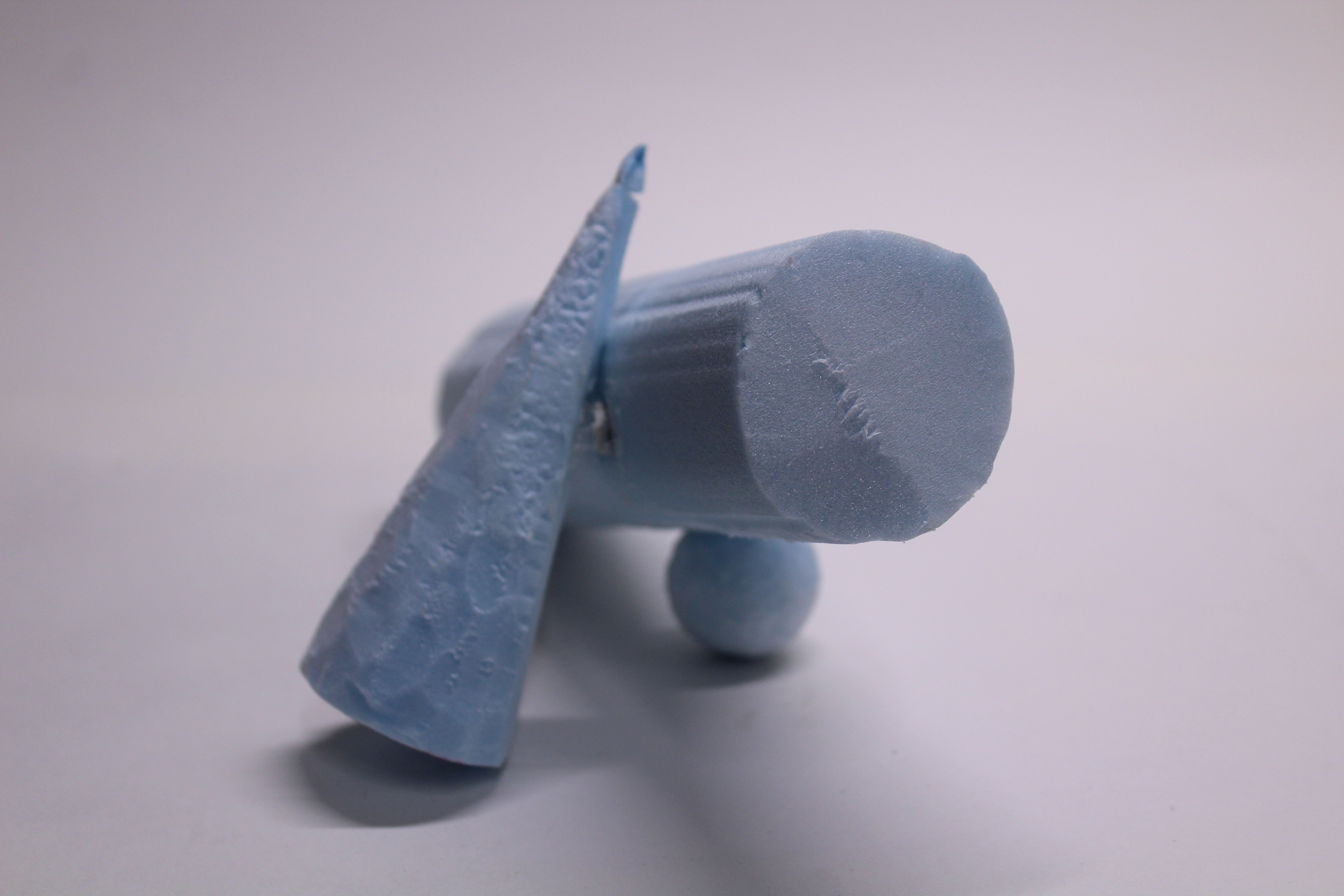
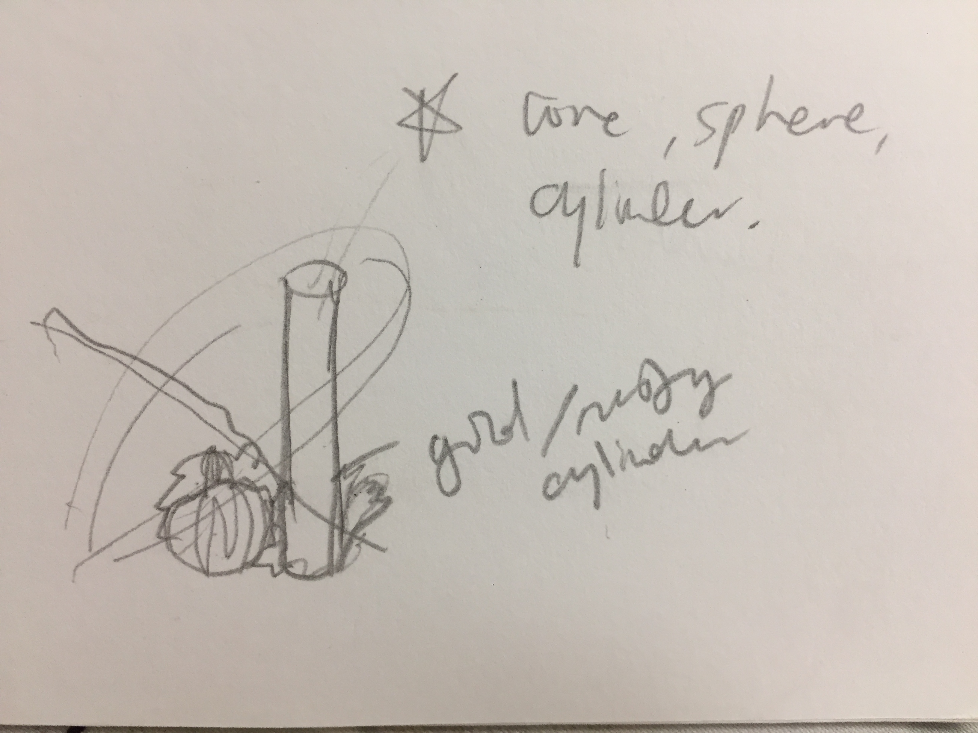
2 sketch models composed of a sphere, cone and cylinder. I played with the contrast between the diagonal axis of the cylinder in both sketch models and the smaller sphere and cone components.
MODEL 1
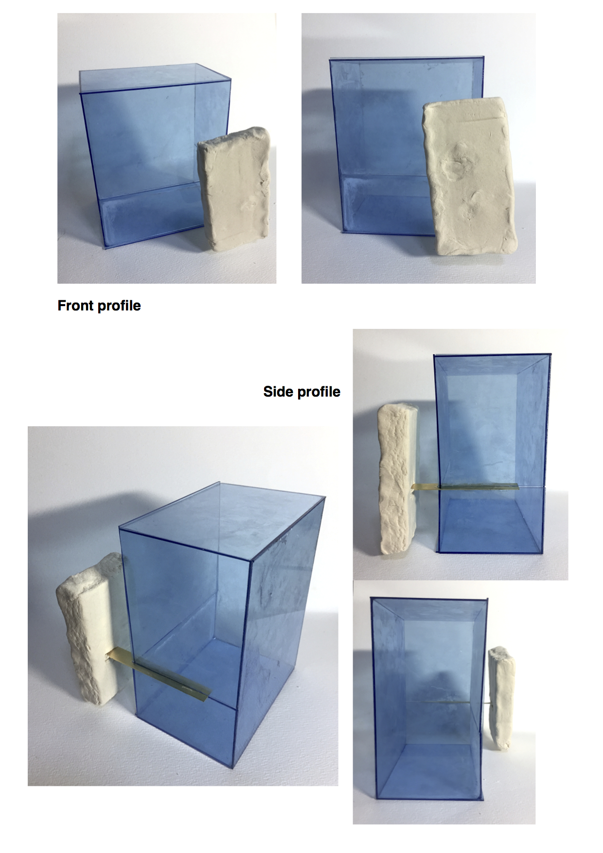
Side
Front
MODEL 2
Side
Front
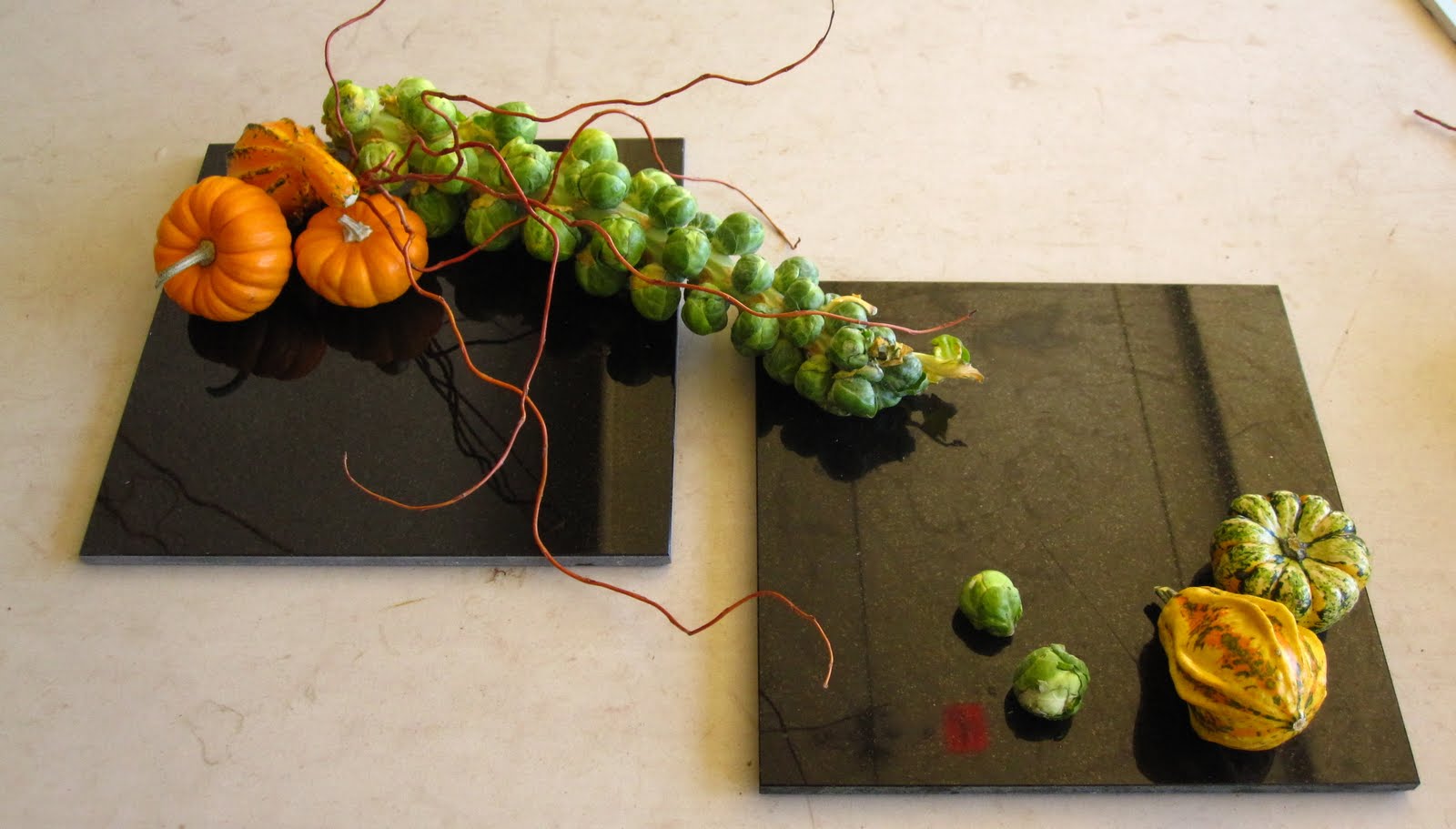
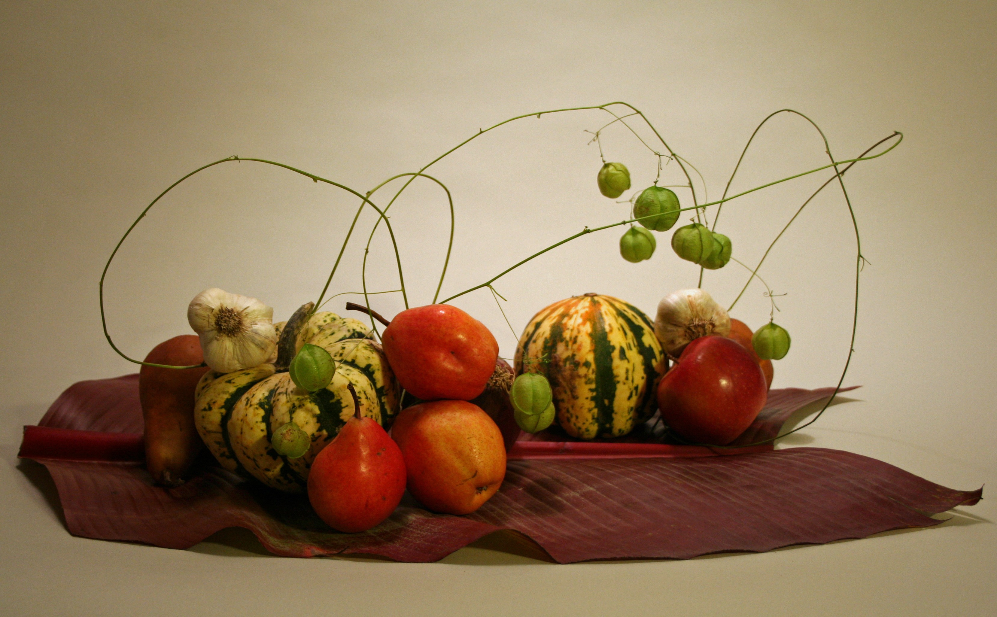
morimono ikebana
‘Morimono’ is the ikebana arrangement composed of fruits and vegetables.
I am more interested in the arrangement of spherical and tubular objects such as fruits and vegetables compared to the traditional medium of ikebana. Inspired by the vibrant colours and the use of a few elements to bring out the quality of the fruit or vegetable.
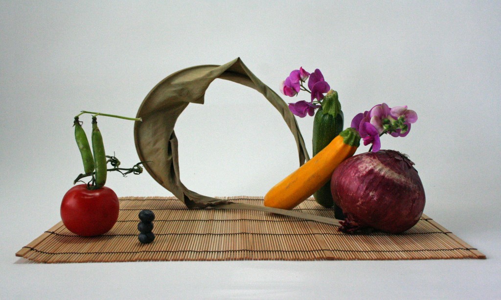
AUTUMN
Our task was to create a composition of 5 elements with one branch, a cone, sphere and cylinder each and “something else”. My picked theme was the season AUTUMN.
Concepts:
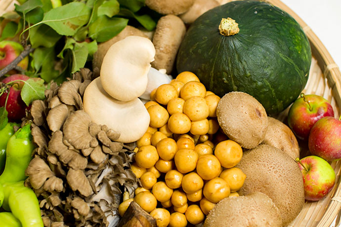
Going with the idea of seasonal produce and to tie in with the theme of ikebana, I sourced for autumn-harvested fruits and vegetables in Japan. I filtered out fruits and vegetables with warm colours (red, orange, yellow and brown) to fit in better with the theme of autumn.
Initial ideas: A morimono composition using autumn produce
Comments given – diagonals should be considered more, should not dive straight into ikebana arrangement
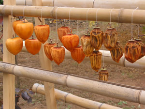
AUTUMN ACTIVITY – FRUIT DRYING
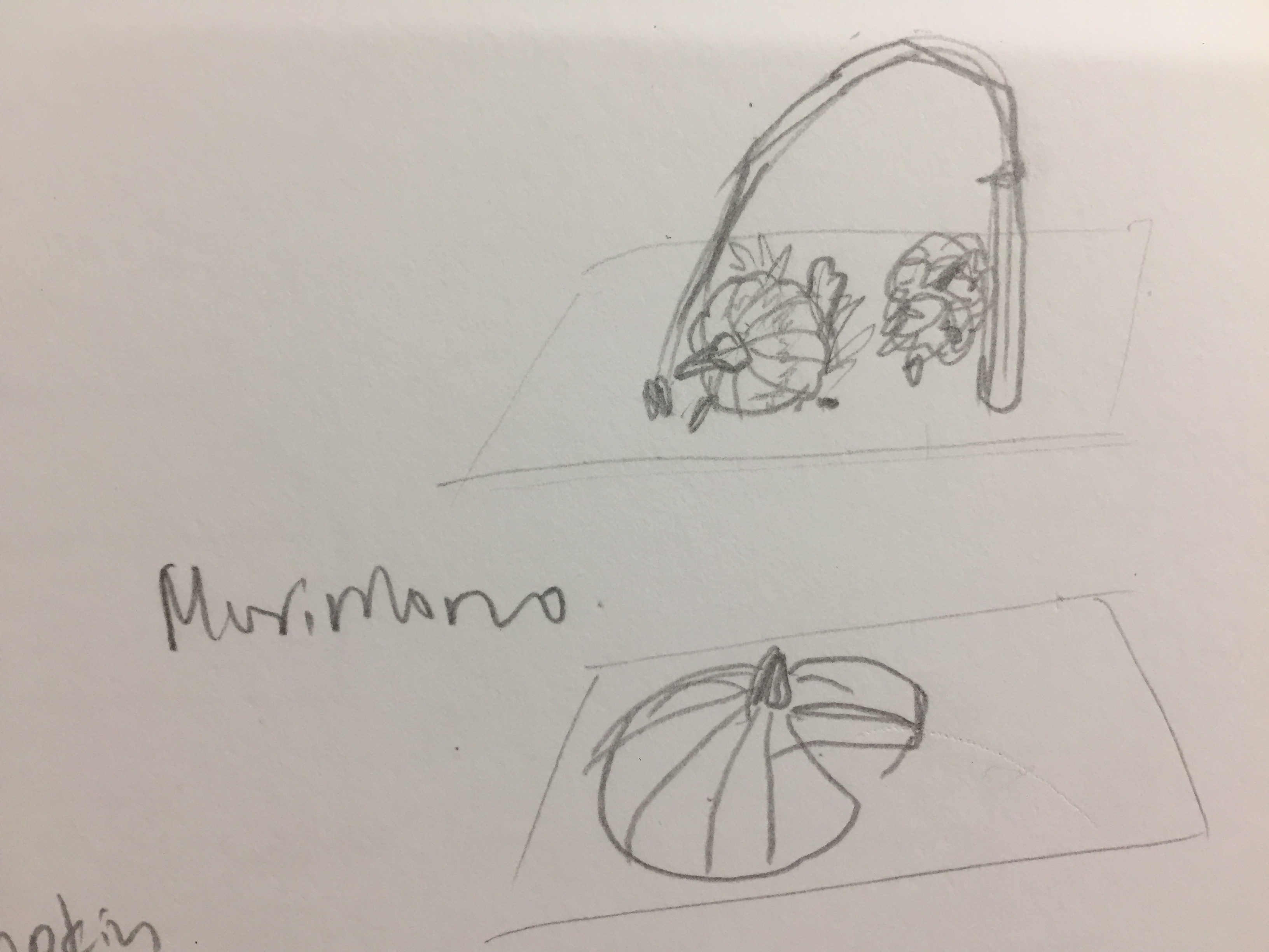
An autumn activity after the harvesting of persimmons in Japan is drying them. Persimmons are left out in autumn temperatures to dry to preserve and store through winter. The hanging action of the persimmon served to be the main inspiration for my ikebana compositions.
The individual hung persimmon serve as study of diagonals between the cyliner, cone and sphere equivalent of the fruit.
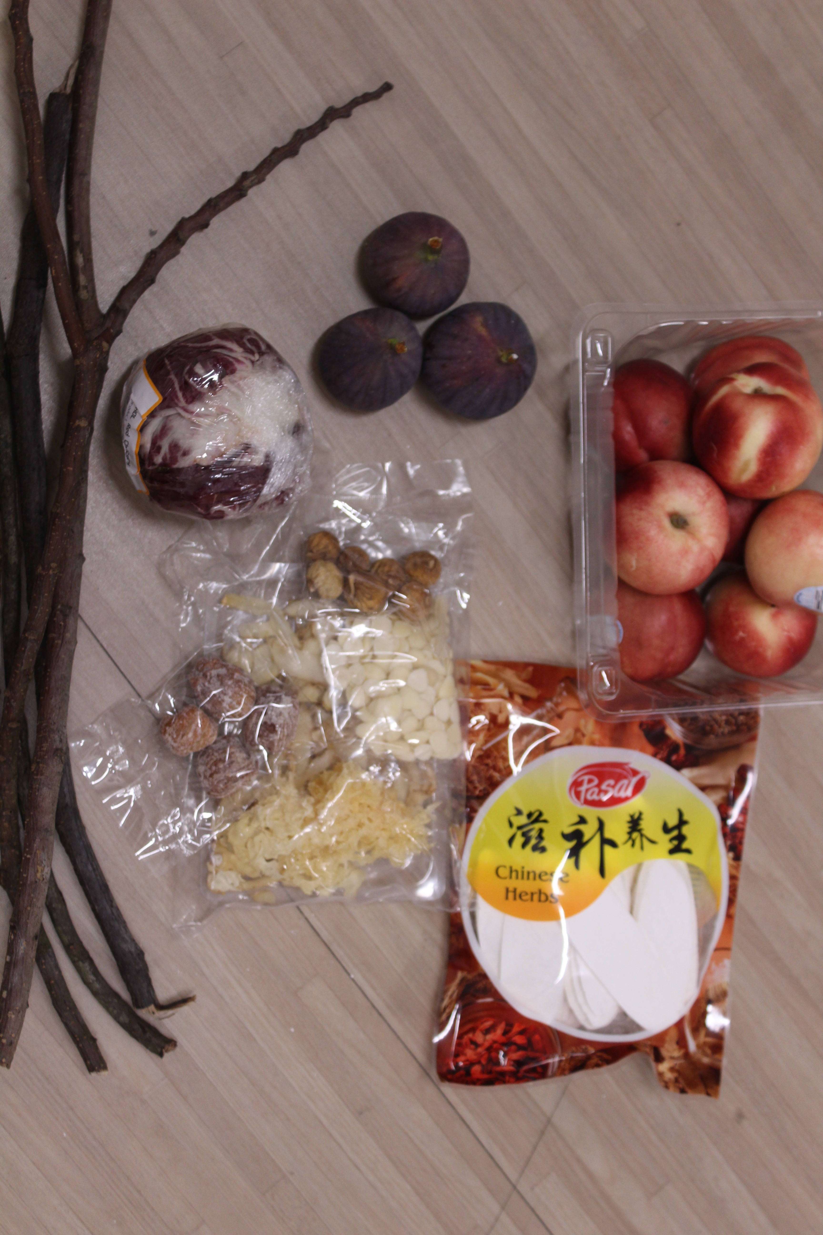
MATERIALS
I decided to capture the act of drying of autumn fruits in one composition, contrasting the fresh and dried fruit. The local supermarket didn’t sell fresh and dried Japanese persimmons, so I went with other autumn fruits that were in season – figs and nectarine (In the US). I bought some dried Chinese herbs that contain dried figs and dates.
For the branches, I picked out branches that are darker in colour to fit the autumn theme.
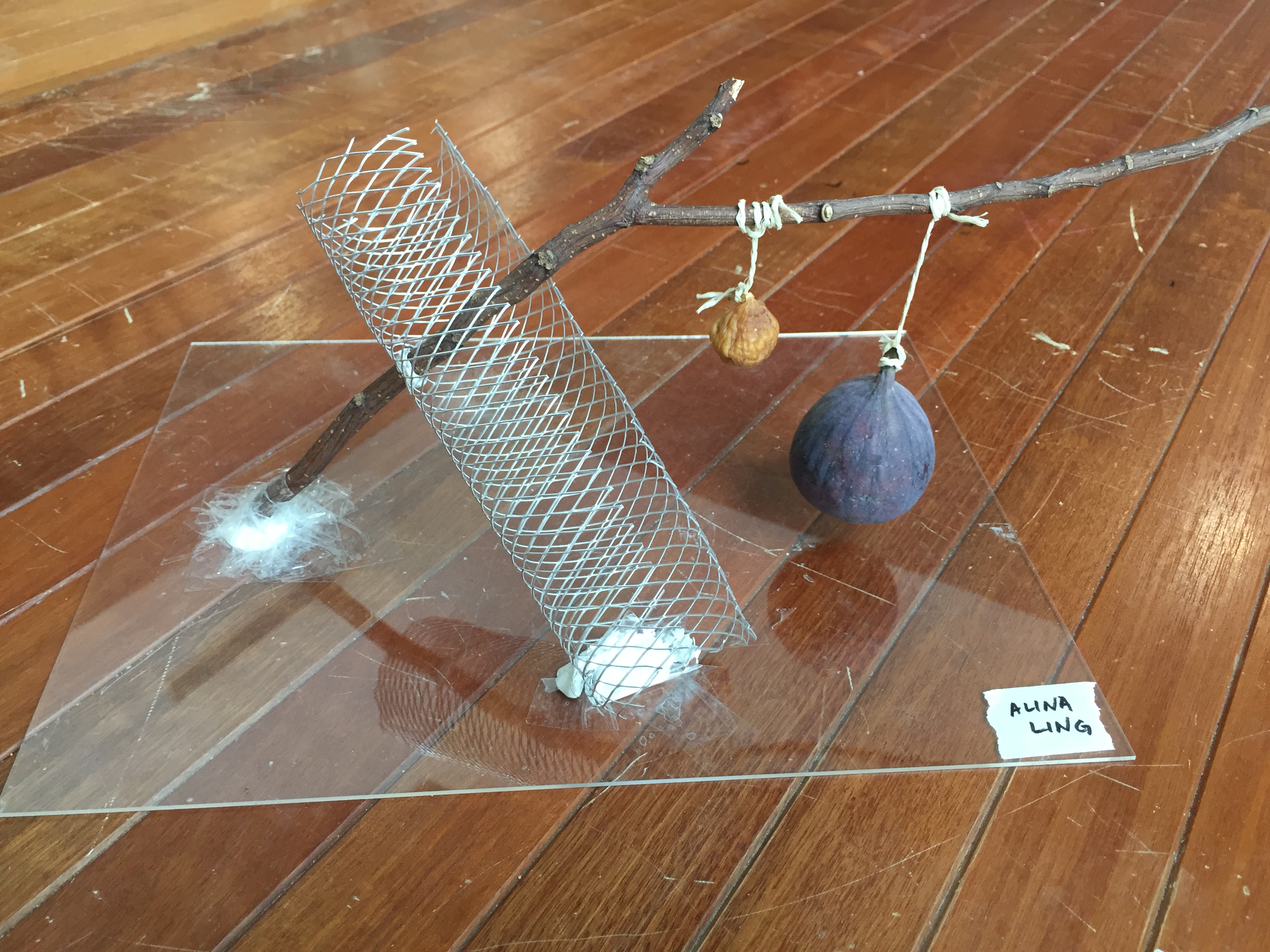
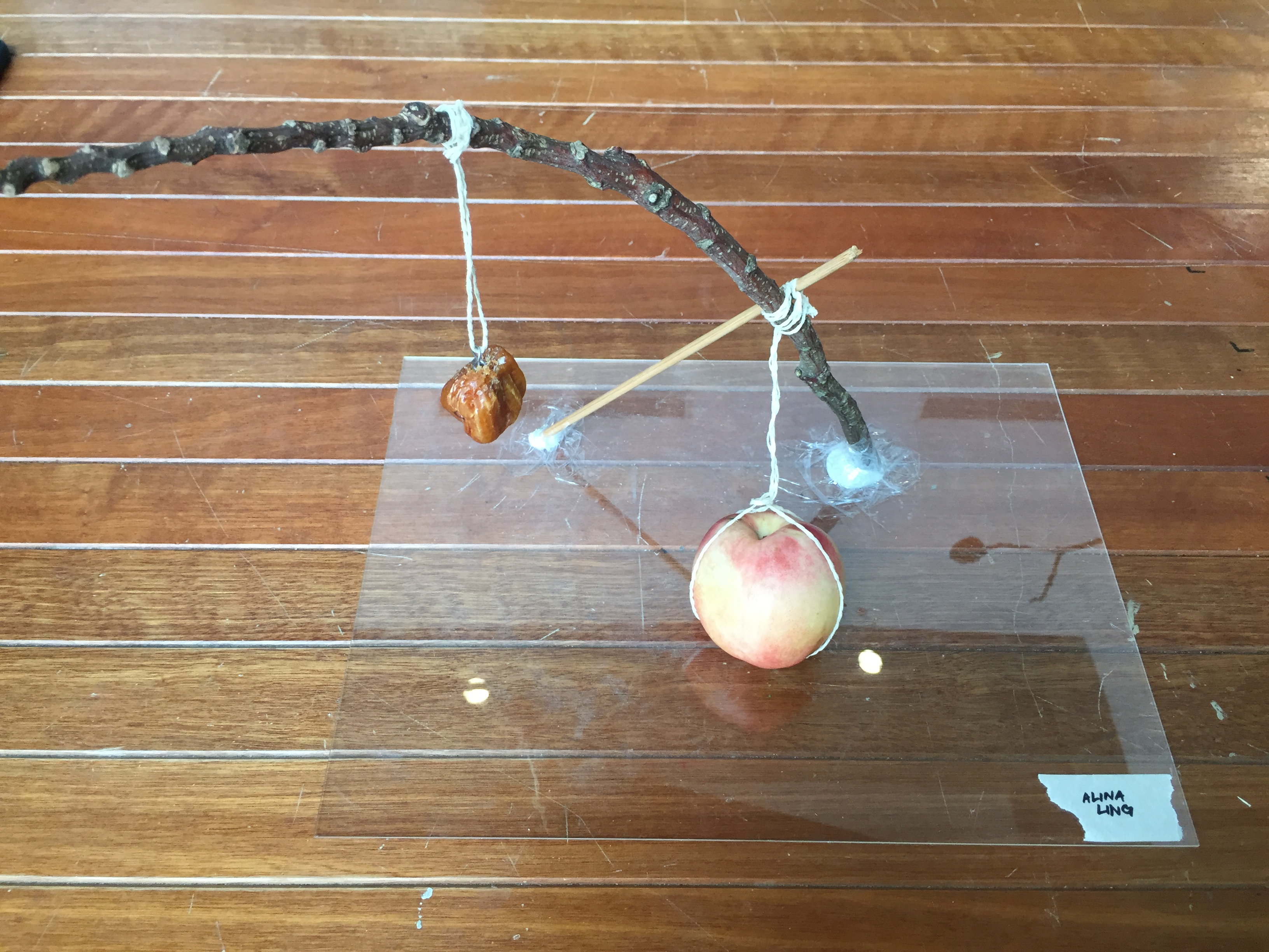
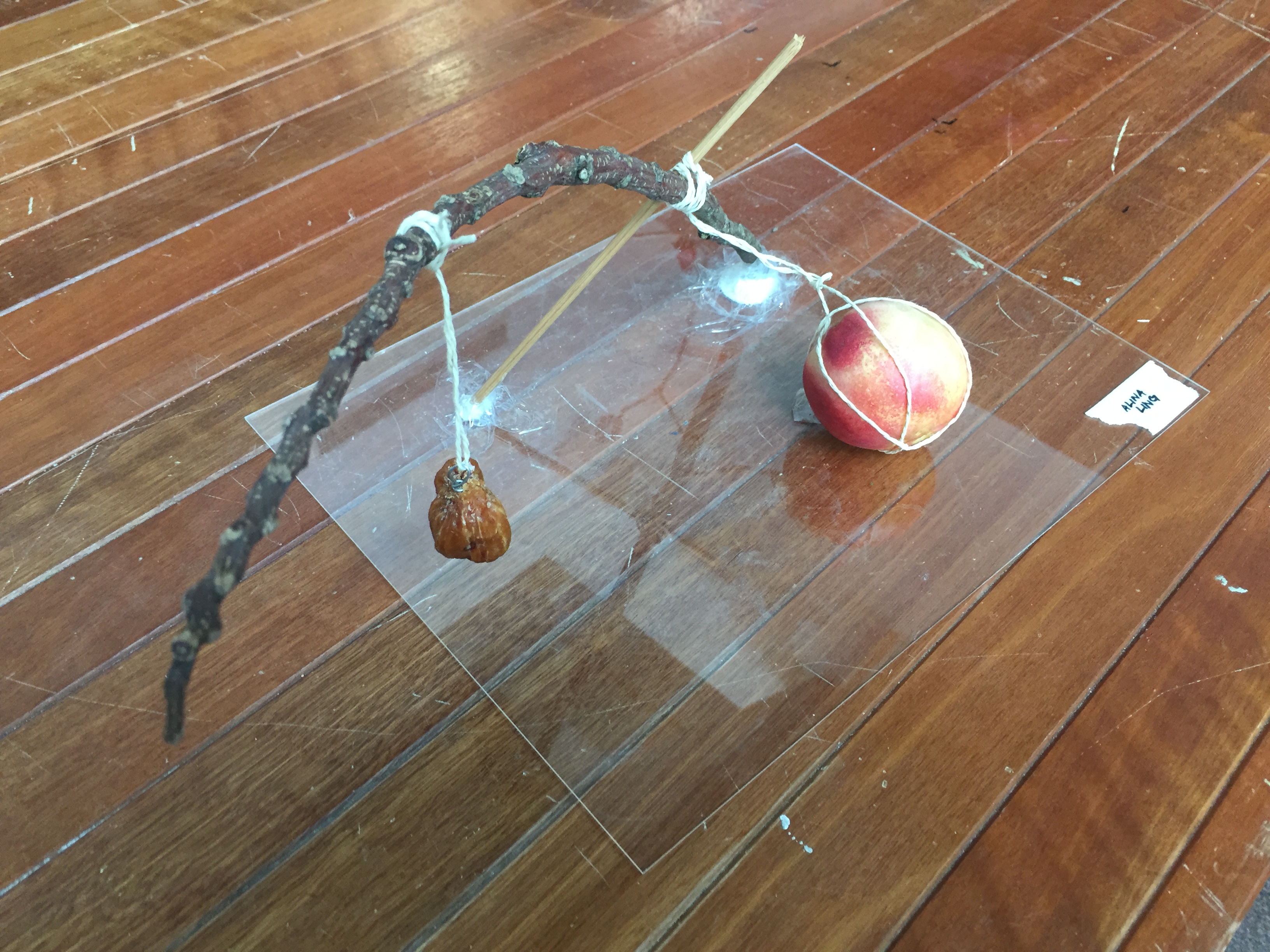
COMPOSITION 1 – figs
I used a wire mesh to create a netted cylinder to hold the branch diagonally. The fresh and dried are hung beside each other on the branch to create contrast between the act of gravity and the diagonal branch.
The act of hanging is established using string, similar to the ones used in persimmon drying. I chose to keep the composition simple and minimal to focus on the shape and action of the fruits.
Sketch Analysis:
Dominant – Branch
Sub-dominant – wire mesh and fresh fid
Sub-ordinate – string and dried fig
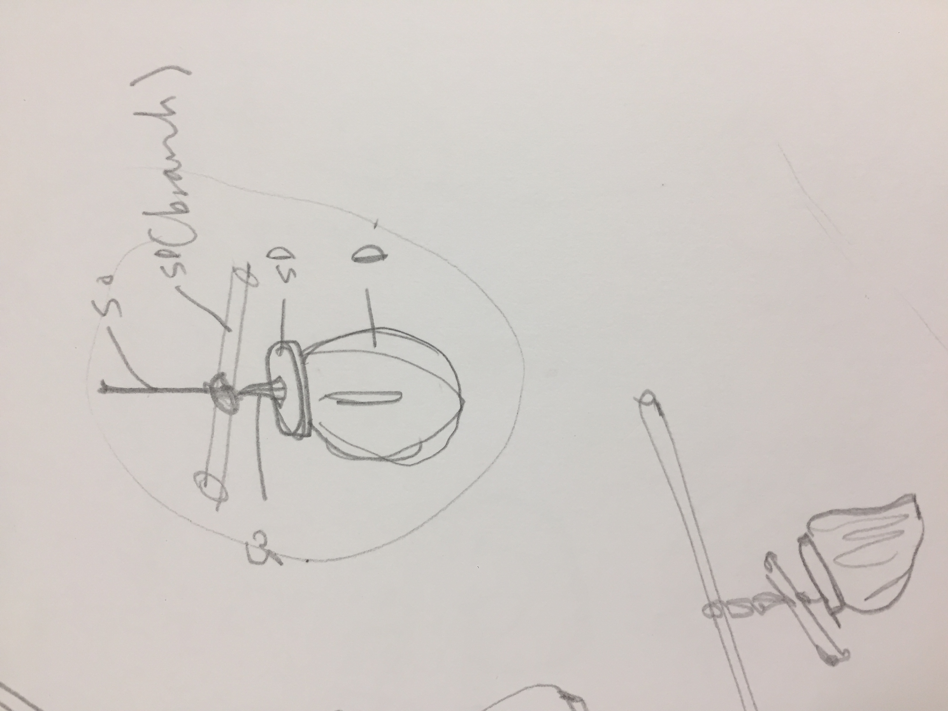
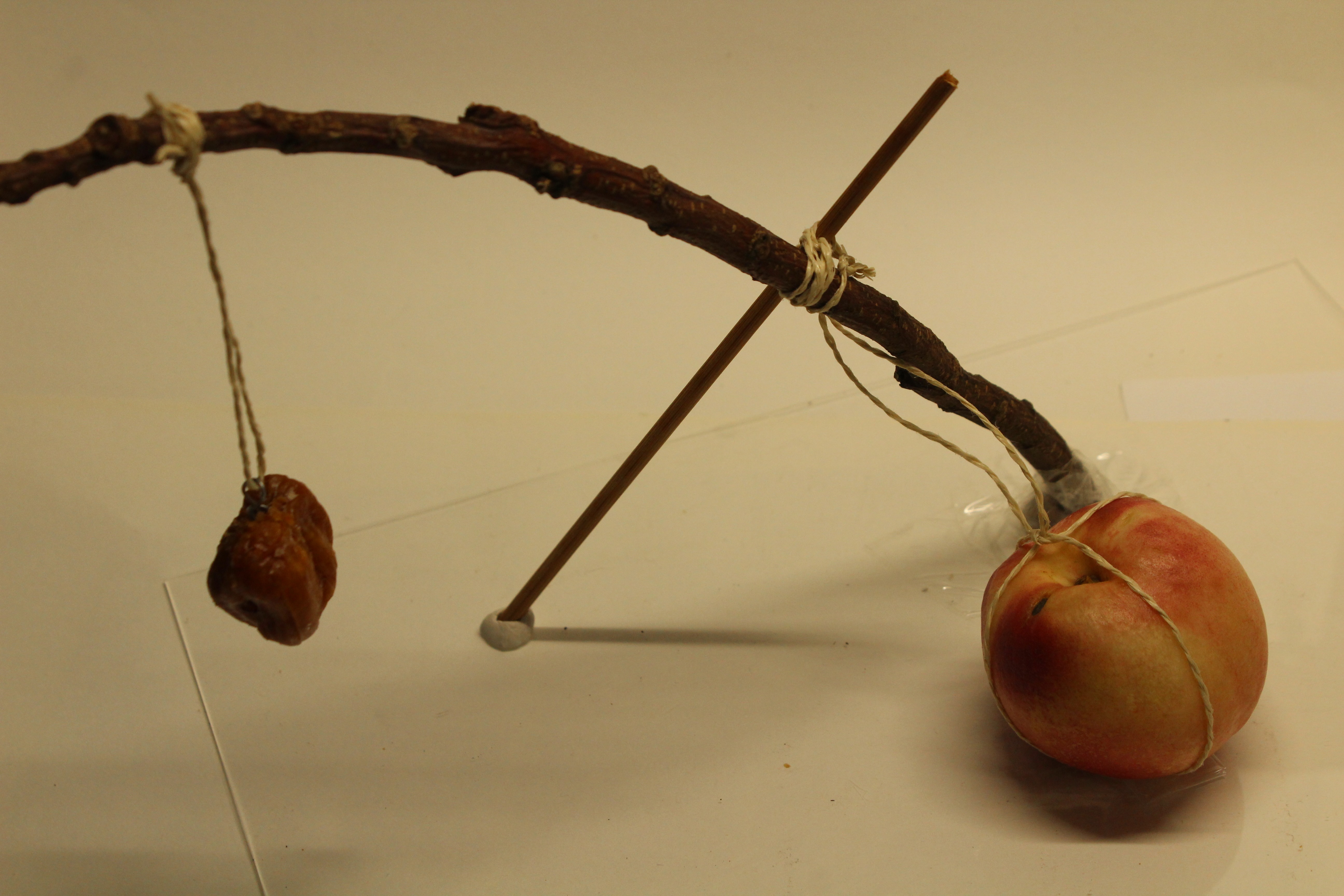
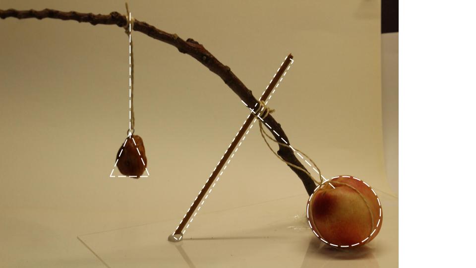
COMPOSITION 2 – nectarines & dates
I used the dried date to represent the dried version of the nectarine as they were similar in colour and relative size.
I played with the act of hanging of dried date with the fallen nectarine on the bottom. The diagonals of the branch and stick are interacting on one plane, while the lines of the string are on other intersecting planes.
ANDY: You think I don’t appreciate art? You think I don’t understand fashion? You think I’m not hip? You think I’m pathetic? A nerd? A lard-ass fat-so? You think I’m shit? Well, you’re wrong, ’cause i’m champagne, and you’re shit. Until the day you die, you, not me, will always be shit.
“You see us as you want to see us—in the simplest terms, in the most convenient definitions. But what we found out is that each one of us is a brain…and an athlete…and a basket case…a princess…and a criminal. Does that answer your question? Sincerely yours, The Breakfast Club.”
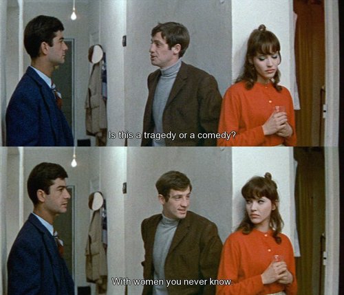
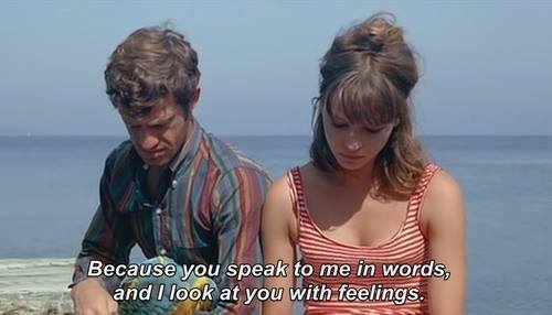
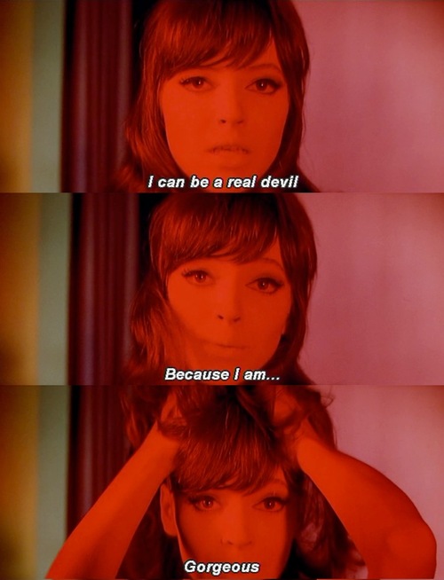
Une Femme est une femme (1961) – A woman is a woman
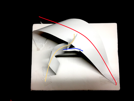
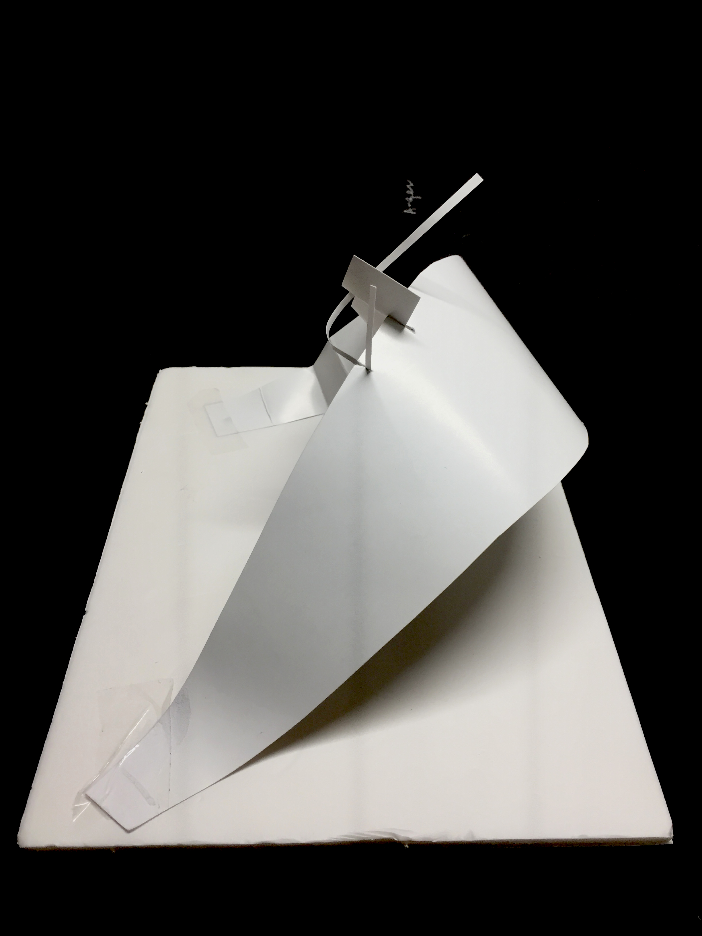
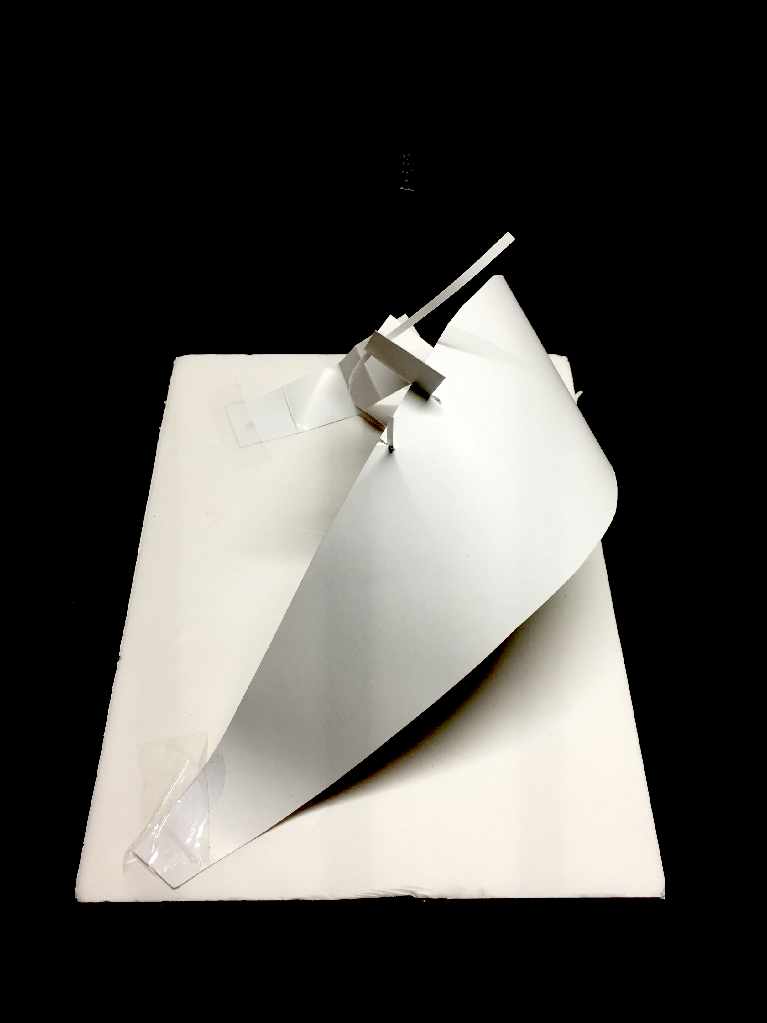
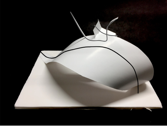
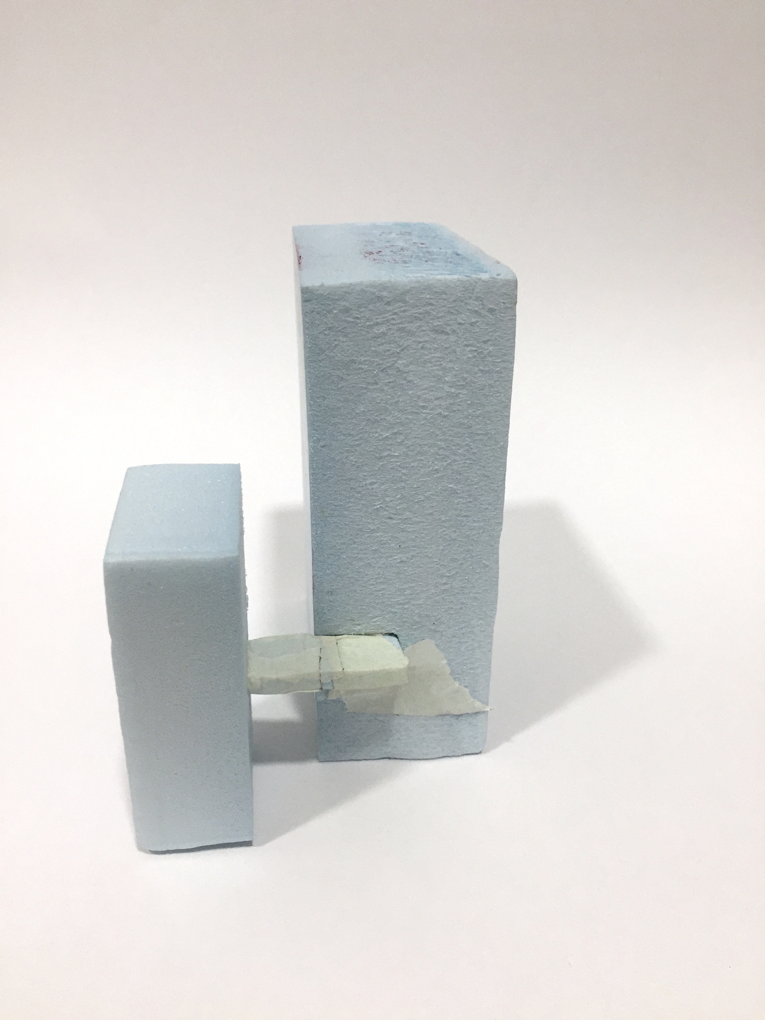
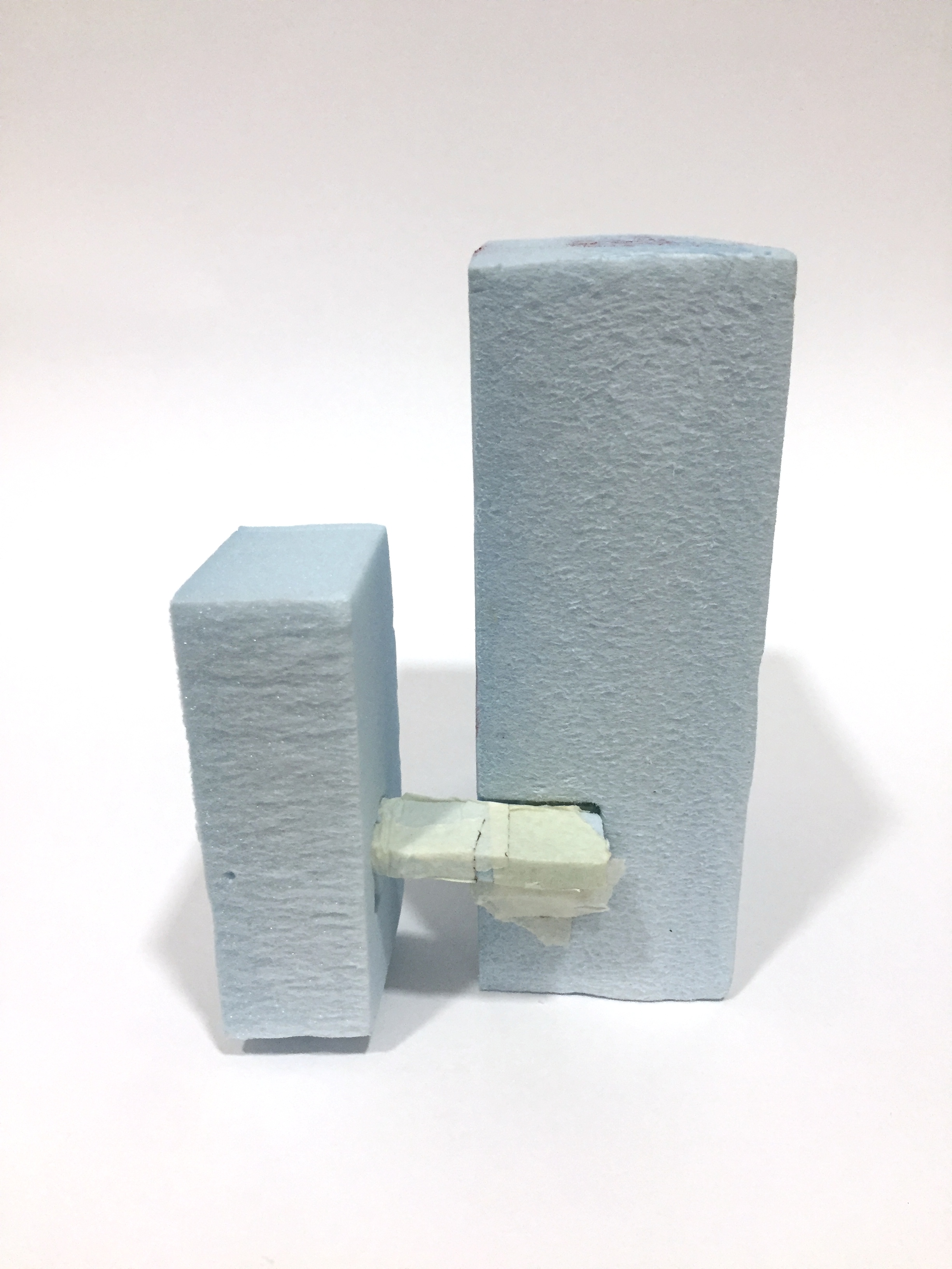
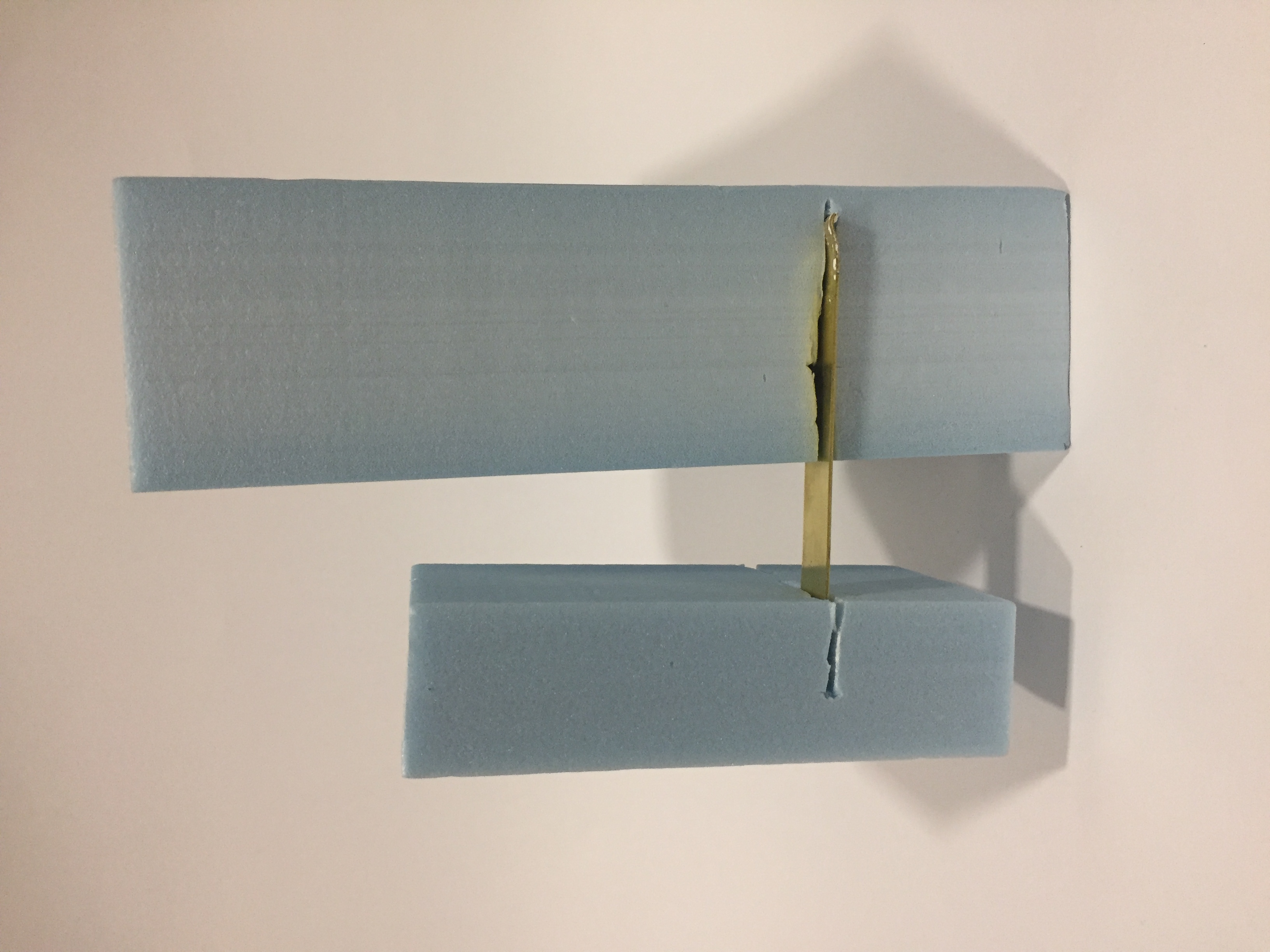
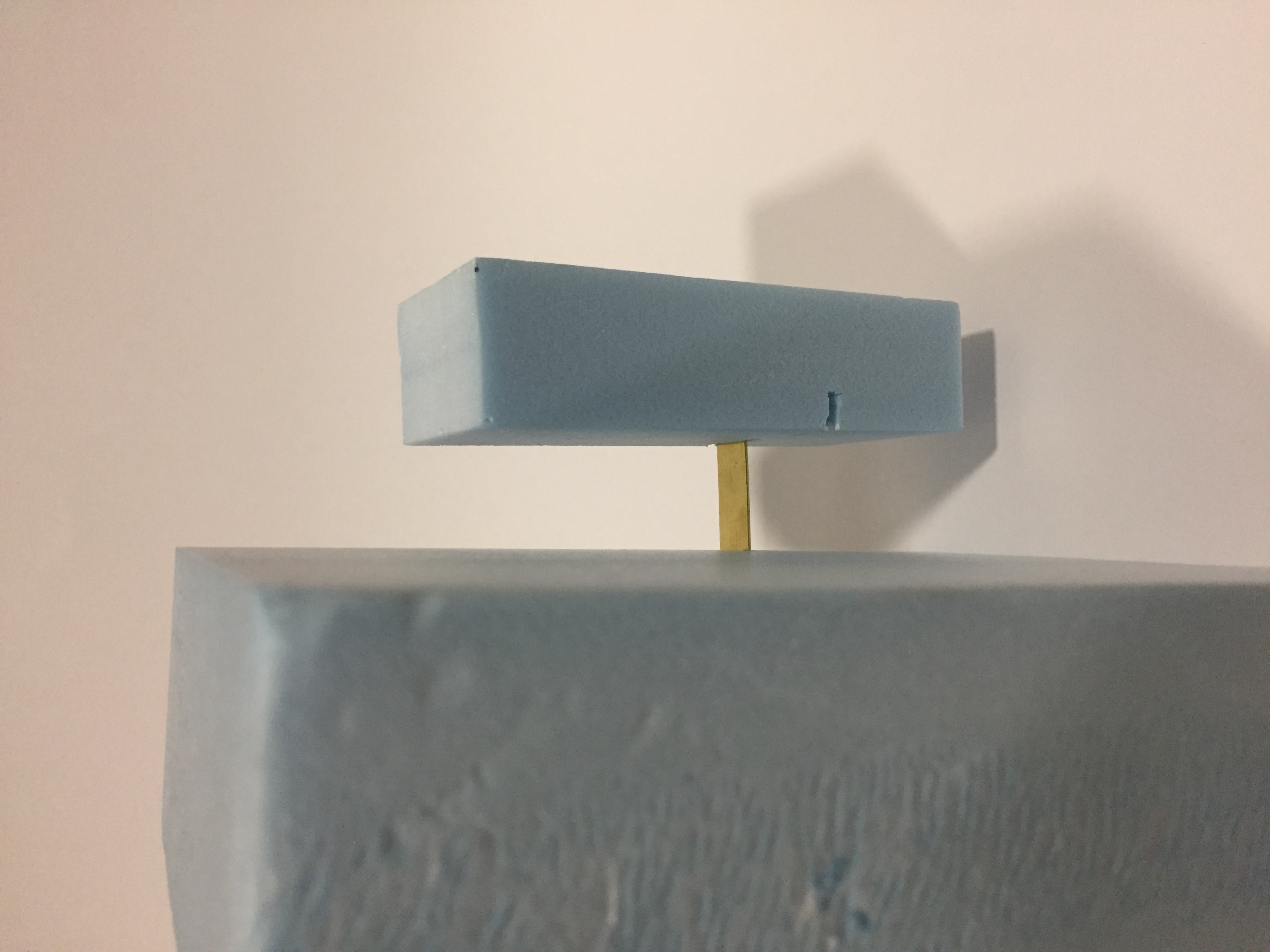
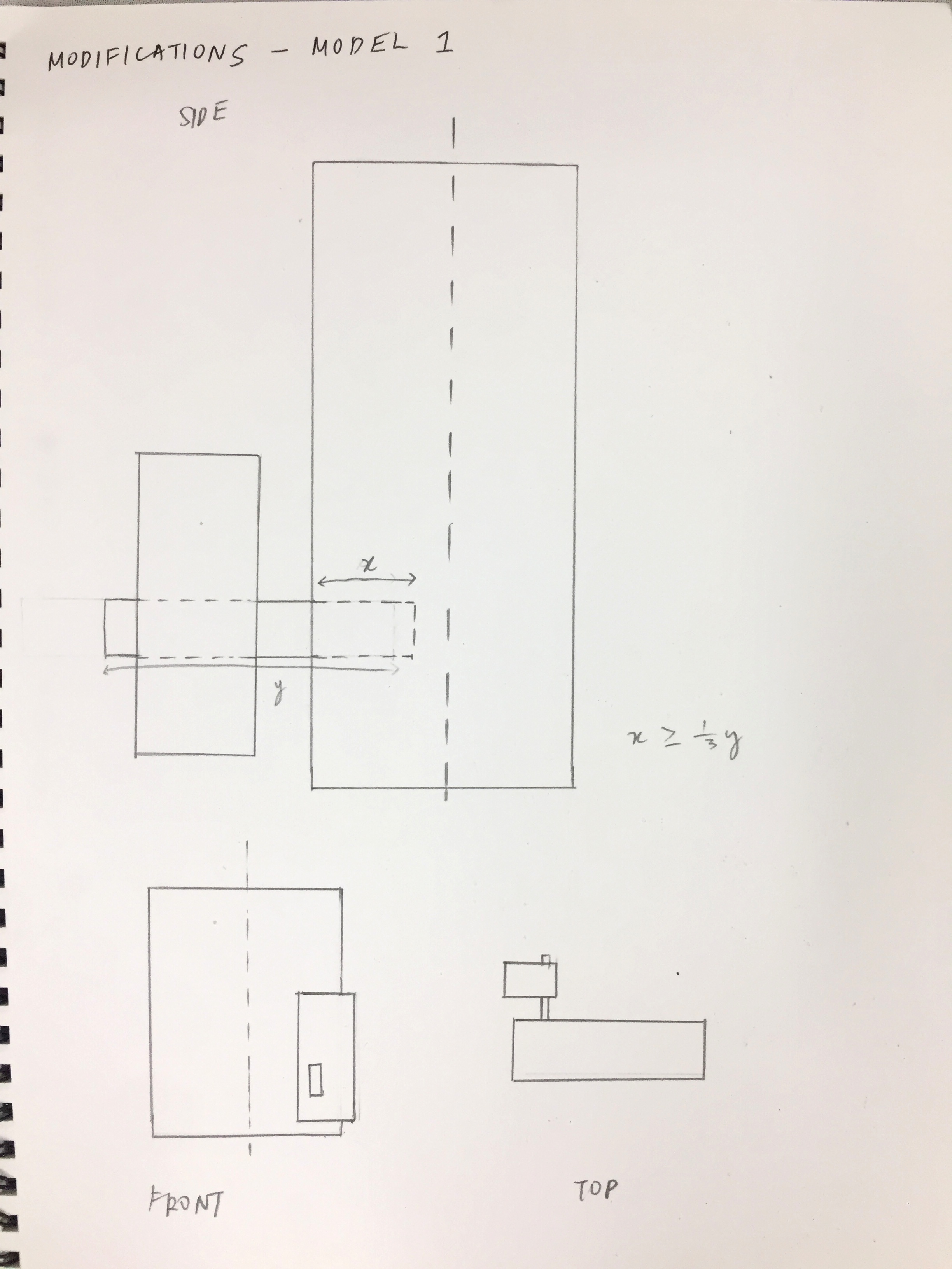
The sub-ordinate was made to pierced through the sub-dominant of the model, however, this made the model gain stability and lose the feeling of tension. Thus, I modified the model for the sub-ordinate to be horizontal and wedged by the side of the dominant and cradled by the sub-dominant.
Modifications:
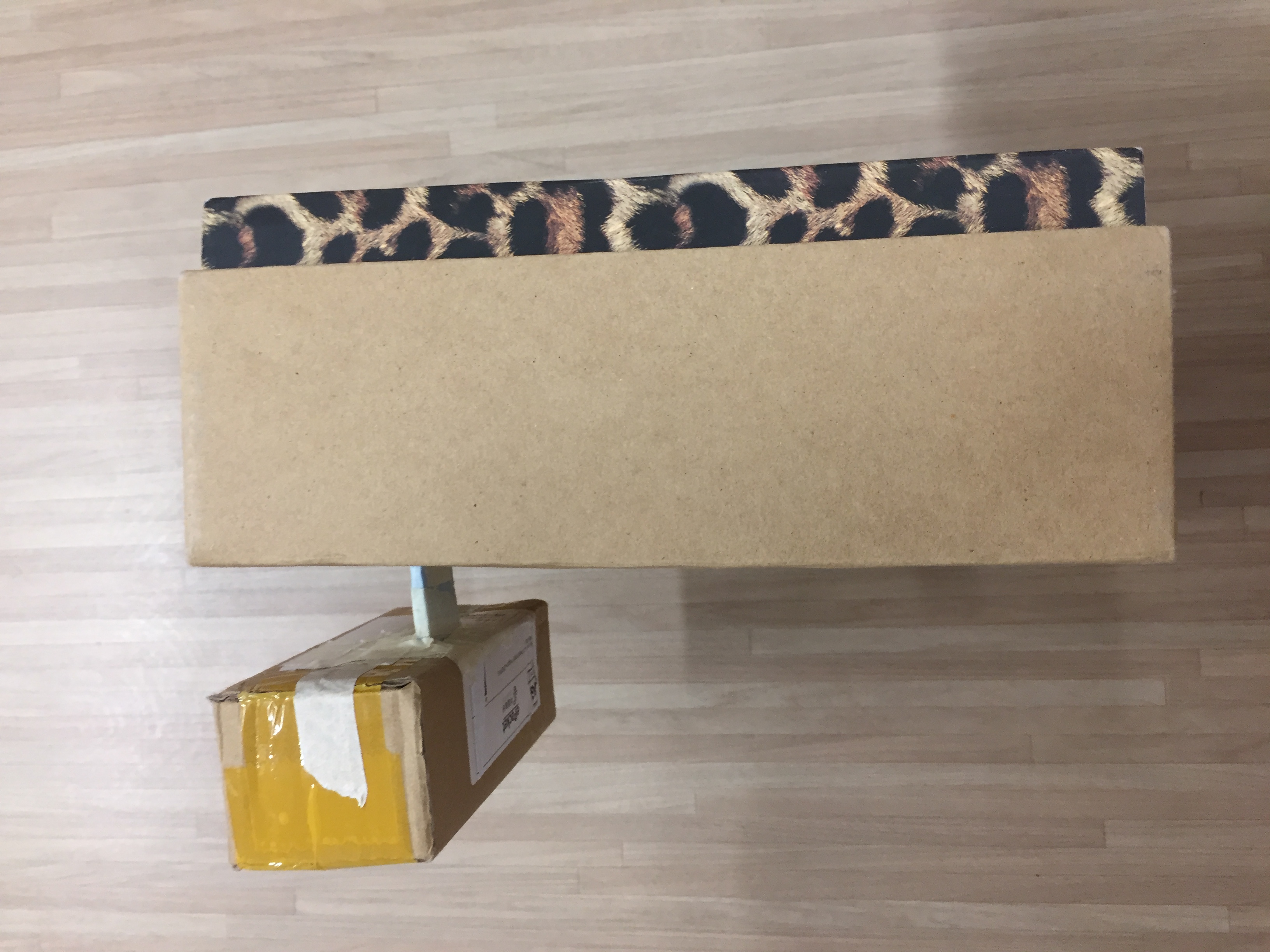
Materials used for final:
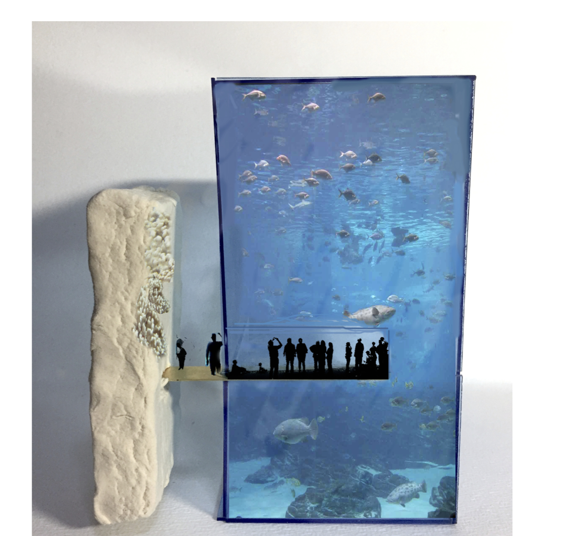
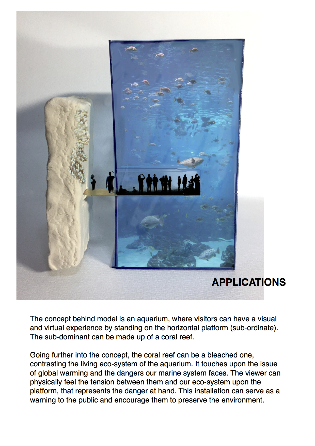
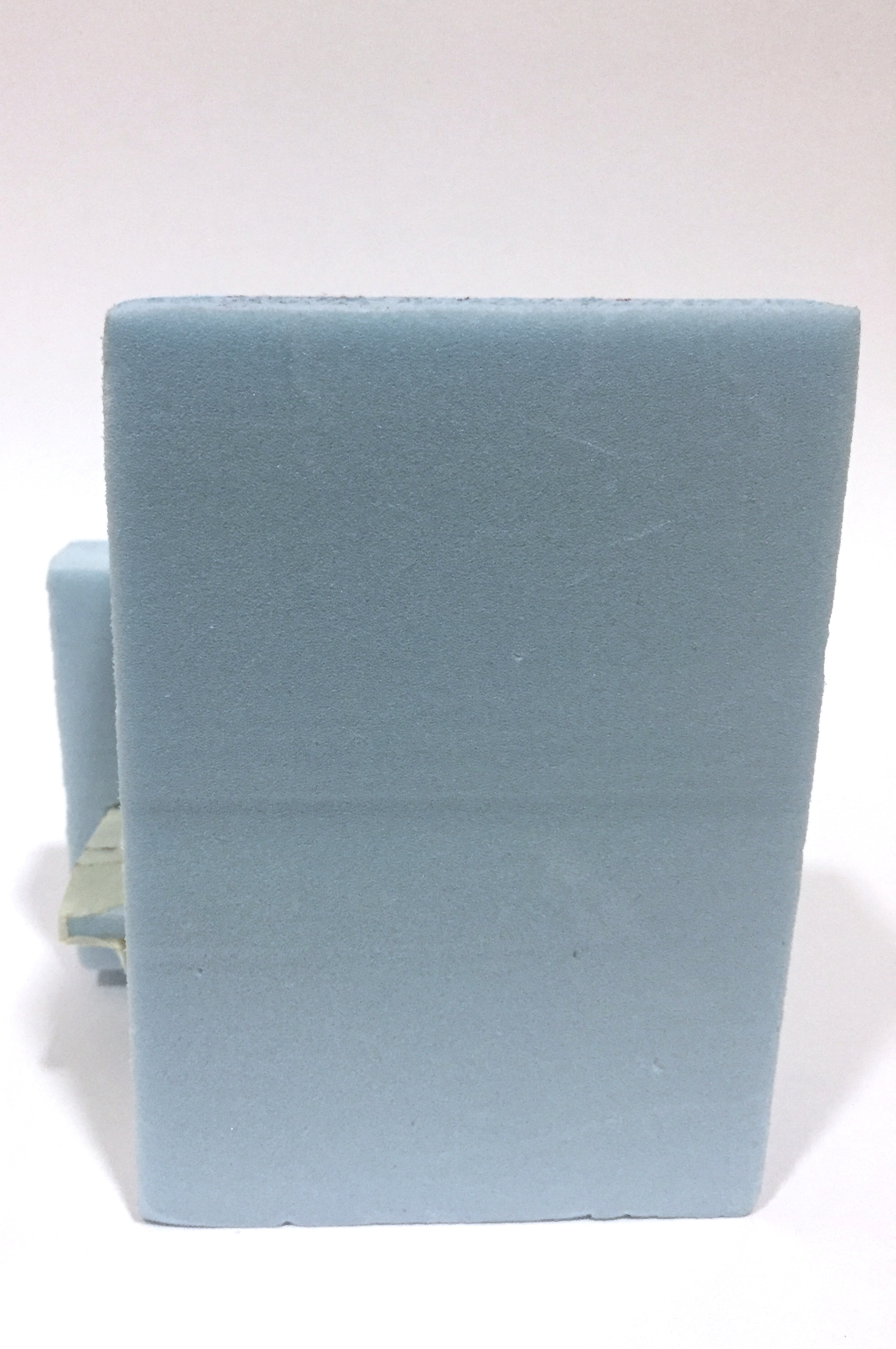
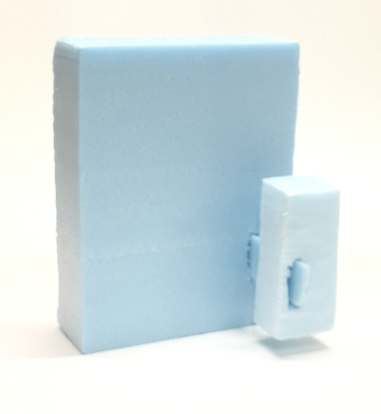
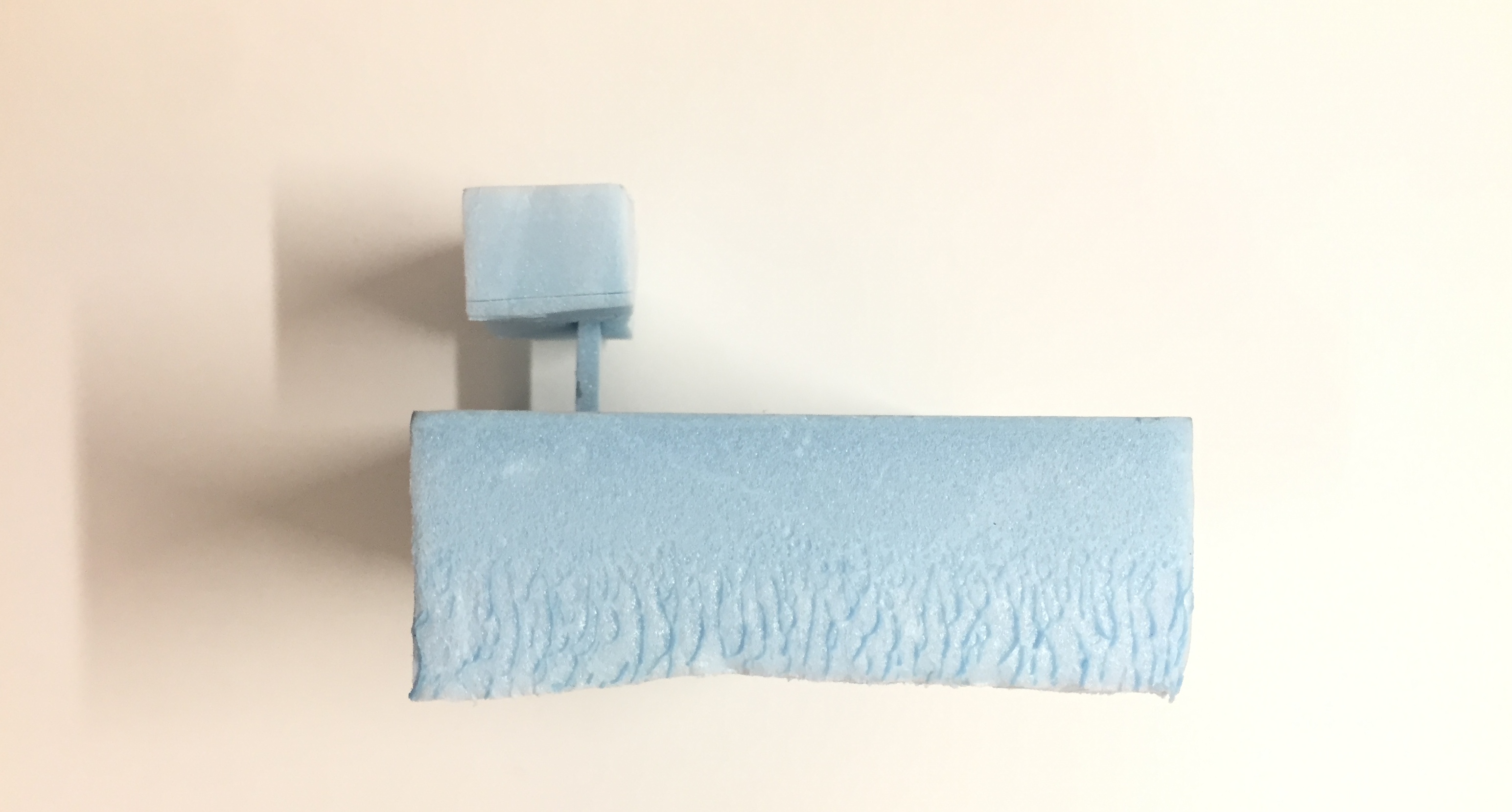
The sub-ordinate should be made thinner and made of a strong material to support the sub-dominant. I intend for the sub-dominant to be made of a heavy material (preferably stone or cement) in contrast with a hollow and lighter dominant, to intensify the tension. The dominant will be made using acrylic or wood.
Testing the effect of brass:
Brass was ideal to hold the sub-dominant and dominant.
Using plaster for sub-dominant:
I decided to use plaster for the sub-dominant as I wanted something heavy (initially, either stone or cement). As plaster is quick-drying, I chose to use it instead.
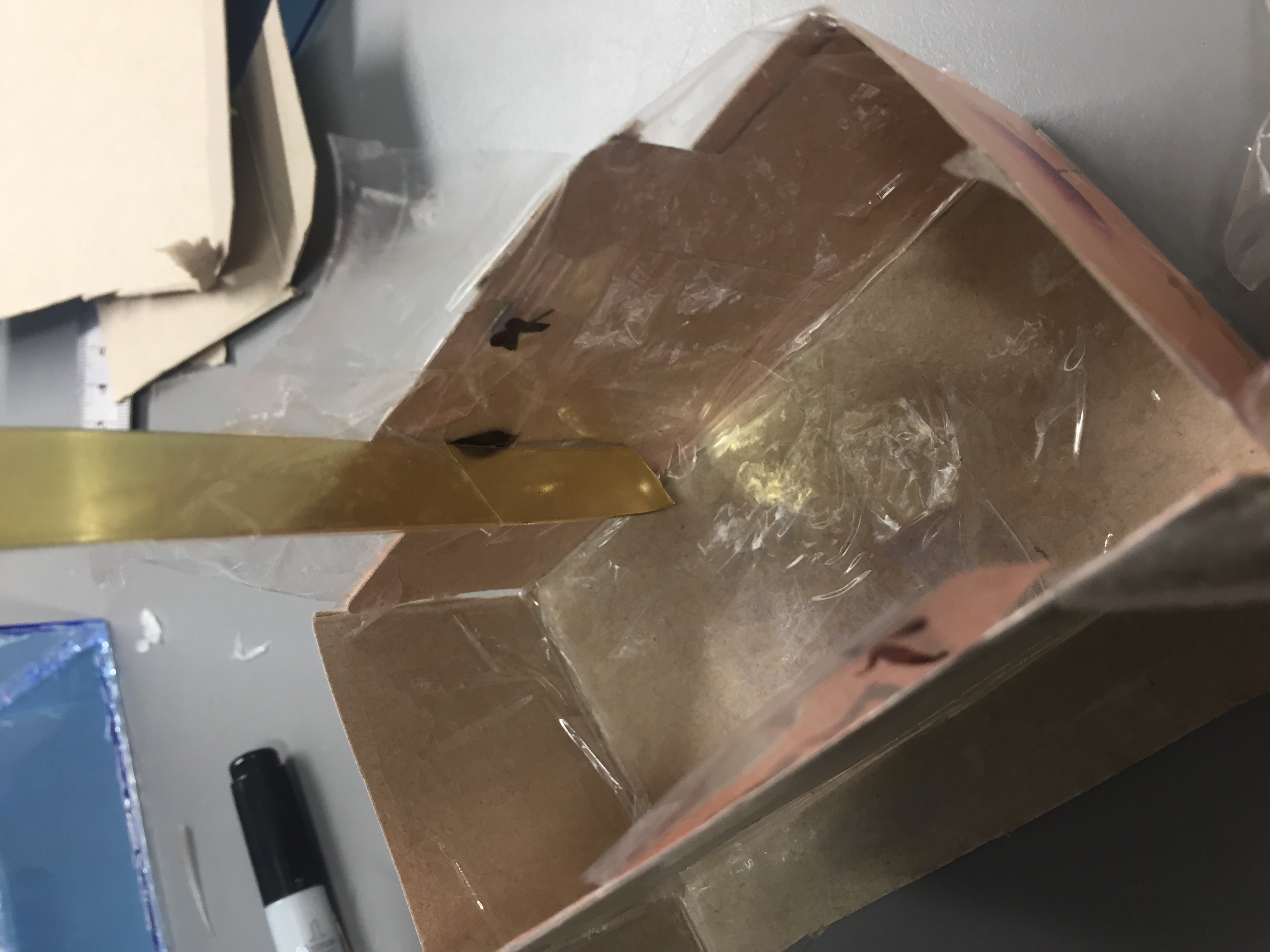
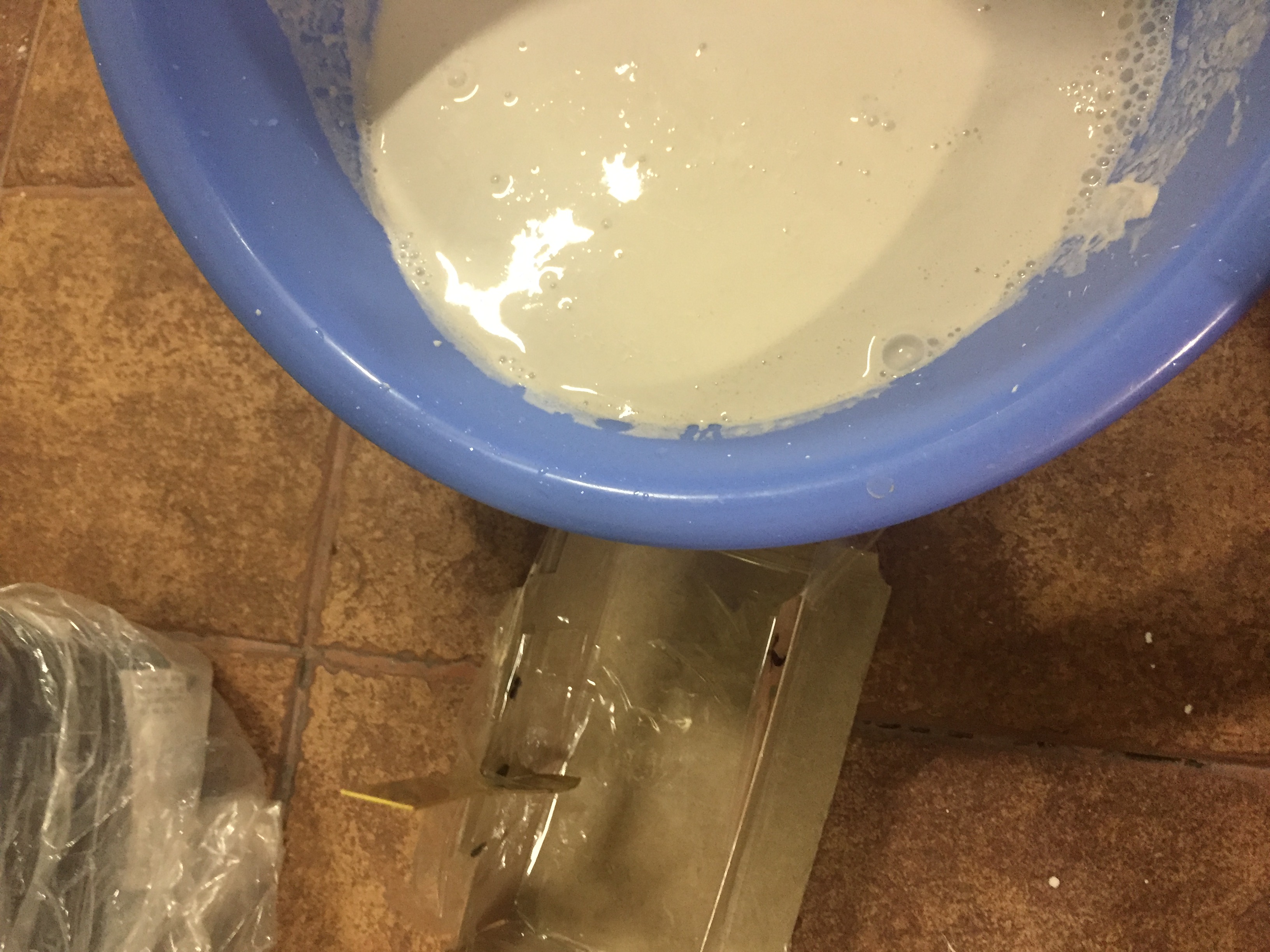
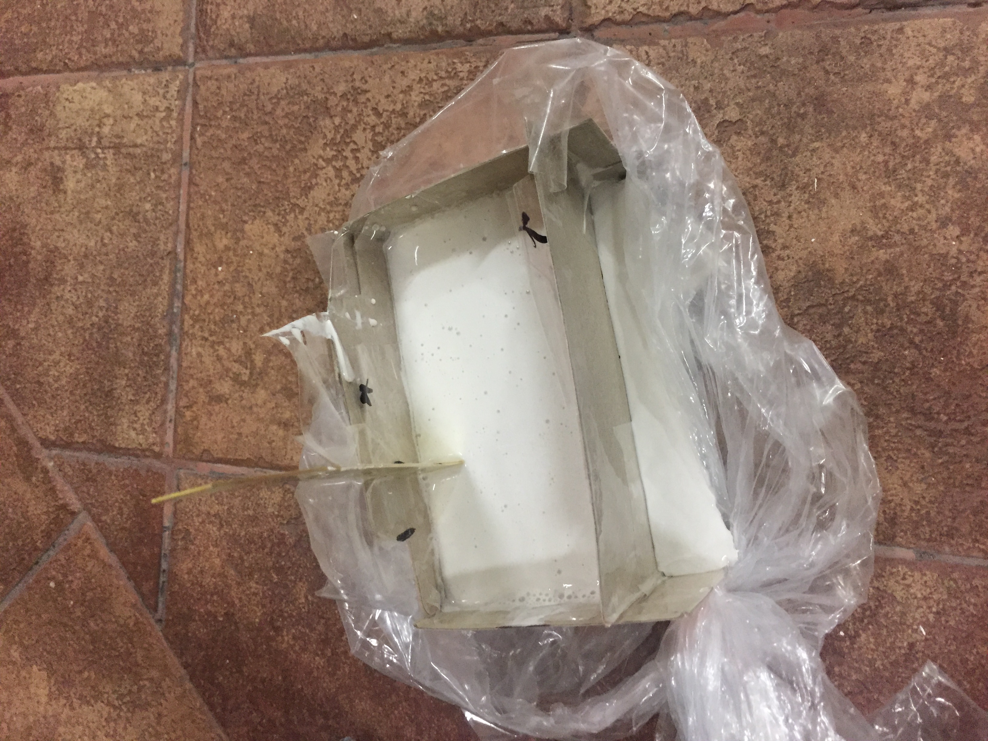
Mold for plaster castingAttaching the sub-ordinate onto the mould for cradlingPour plaster mix into mouldDry overnightTest model
The plaster was too heavy to be supported by the bass strip and hollow acrylic cuboid. Thus, for the final model, soft clay will be used to create the illusion of weight with similar texture to plaster.
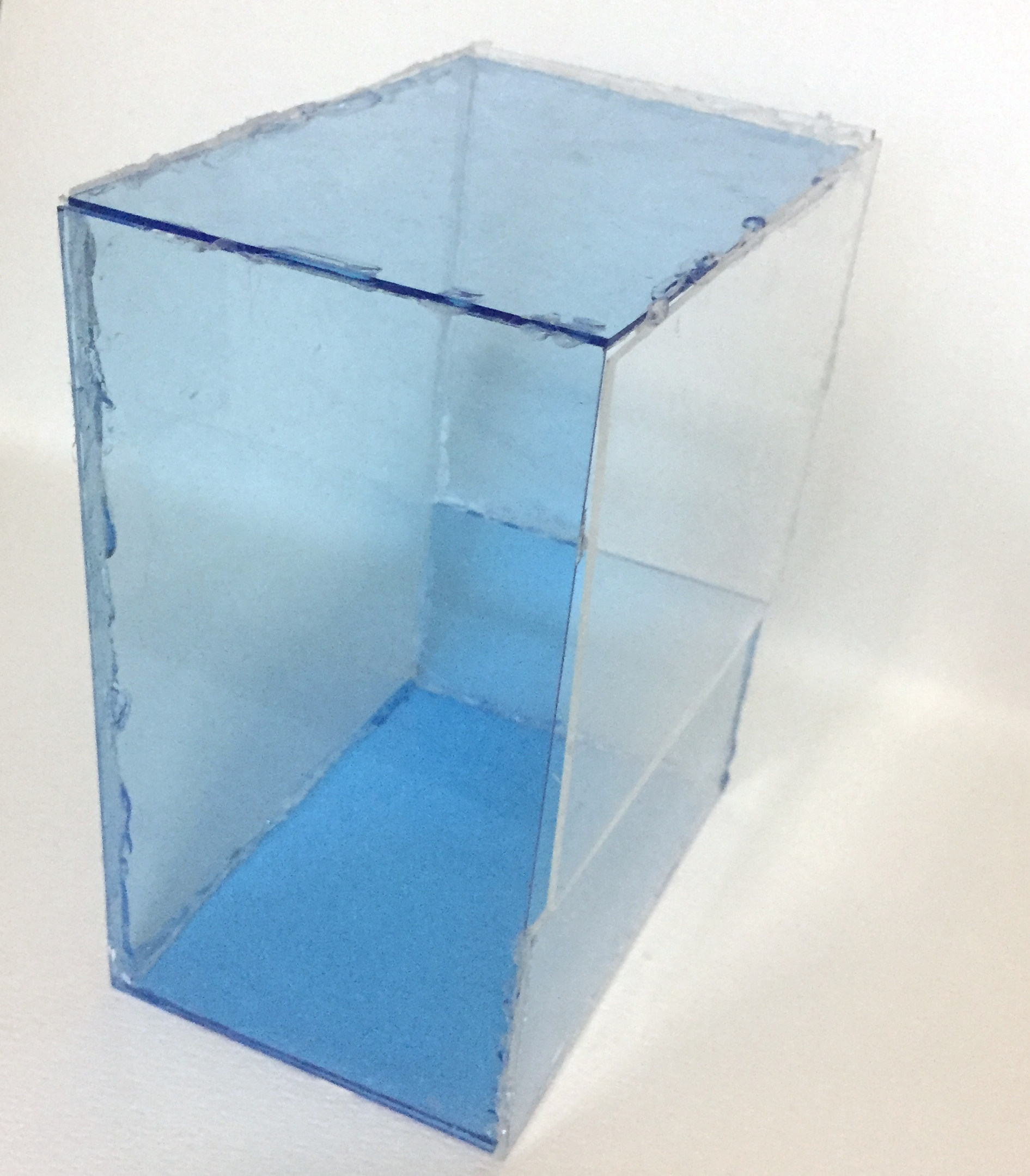
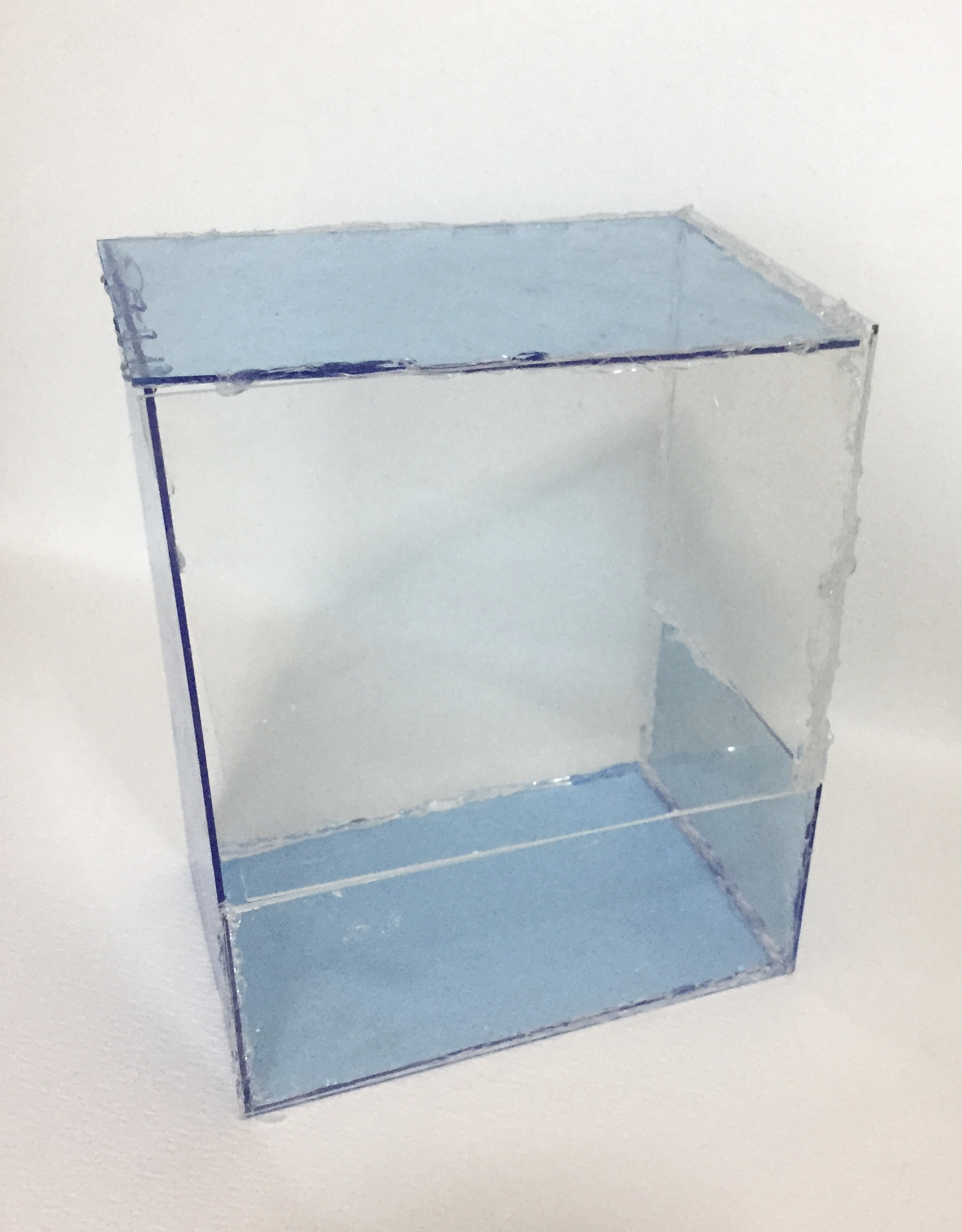
Acrylic box for dominant:
I tried using blue acrylic for the dominant (an aquarium). The finishing was not good as a glue gun was used. Acrylic glue will be used for the final.
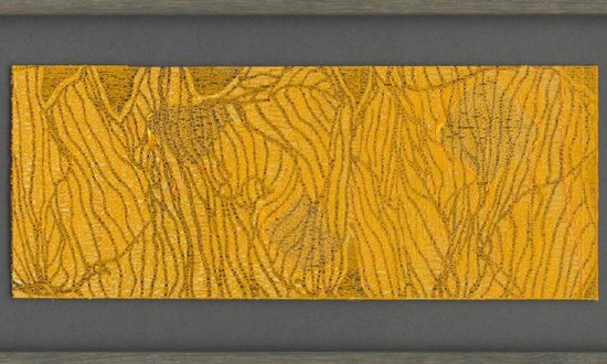
OVER-ARCHING CONCEPT – emotional quality of textiles
I have always been interested in the visual quality of textiles and believe that they do hold an emotive quality to them. According to “Emotional textiles: An introduction” by Alice Dolan and Sarah Holloway, material objects such as garments and textiles”provide a wealth of opportunities for reconstructing material vocabularies of emotion”. I aimed to recreate the two-dimensionality (prints) and three-dimensionality (texture) of textiles on a flat piece of surface using materials and mark-making tools involved in textile design and fabric-making.
INSPIRATION
Jan Koen Lomans is a fine artist who works with textiles to create his emotive, abstract compositions of the theme of nature. He assembles different fabric and textiles in each composition to capture the emotion using lines and texture. However, the use of colour impacts greatly on the emotion and that may be a limitation in my using of textile mediums for mark-making.
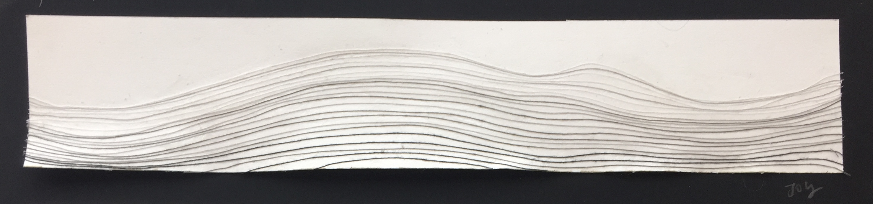
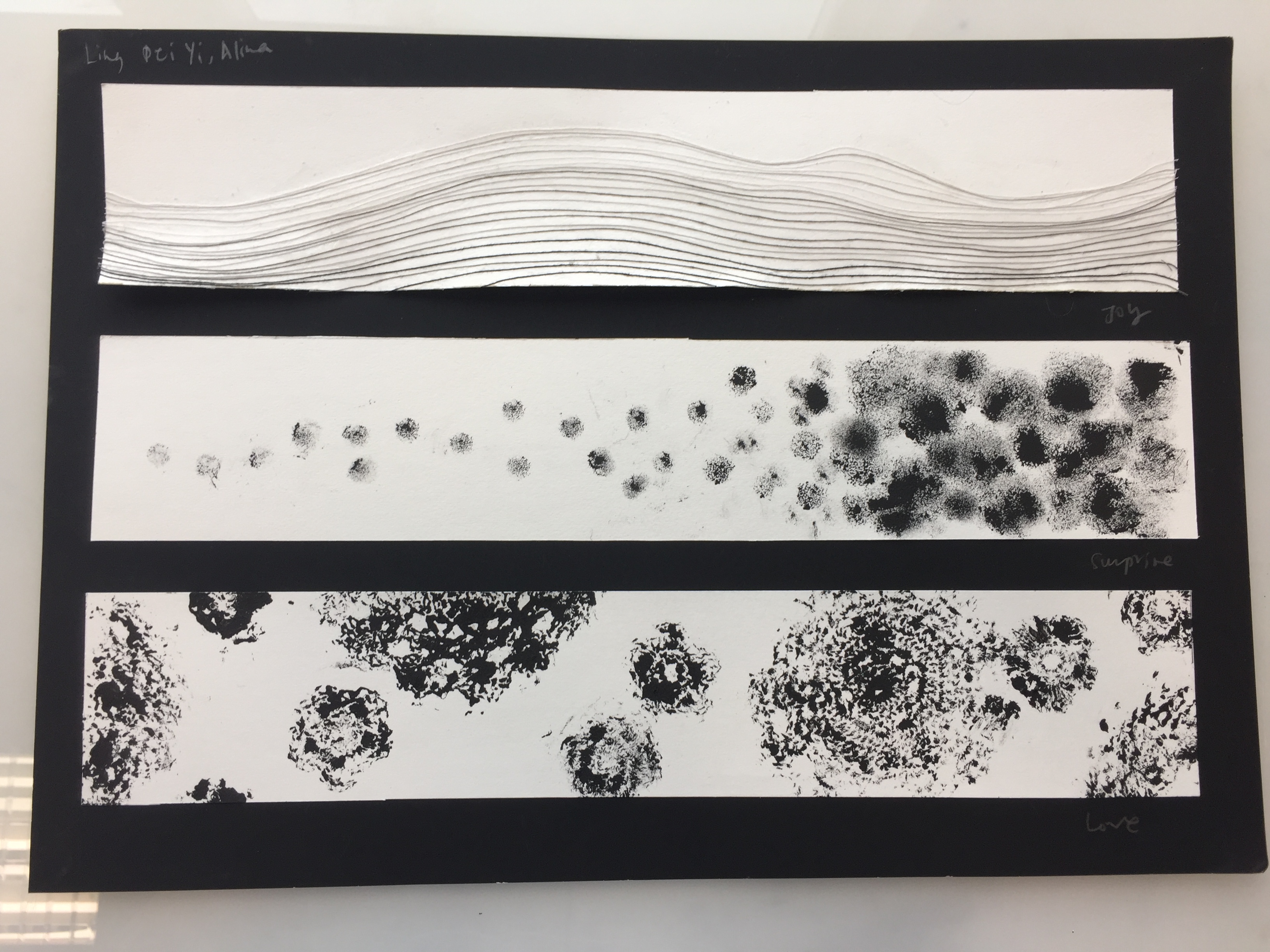
JOY
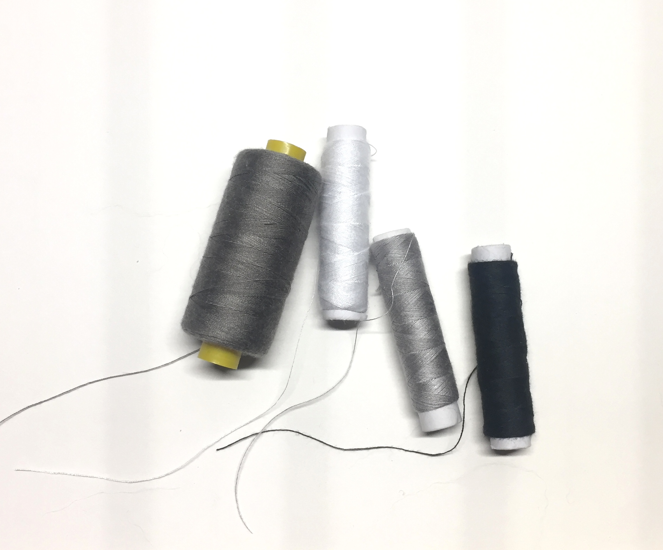
To me, Joy is silent, quiet and subtle. Flowing gently, I wanted to use the lines to convey calmness and the smoothness of the emotion. Inspired by the lines and folds of pleated cloth, I used thread as a medium and composed the movement line by line using fabric glue.
Using different threads of different colours (white and gradients of black), I tried to created the folds of these sculptural fabrics. Using space between lines to convey depth and volume, I tried to incorporated the three dimensionality as much as possible.
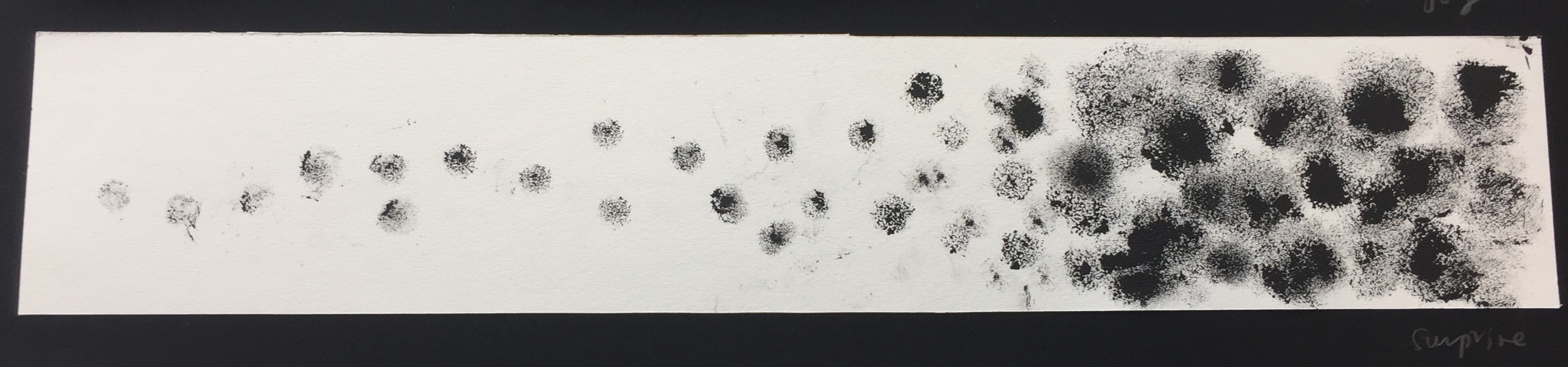
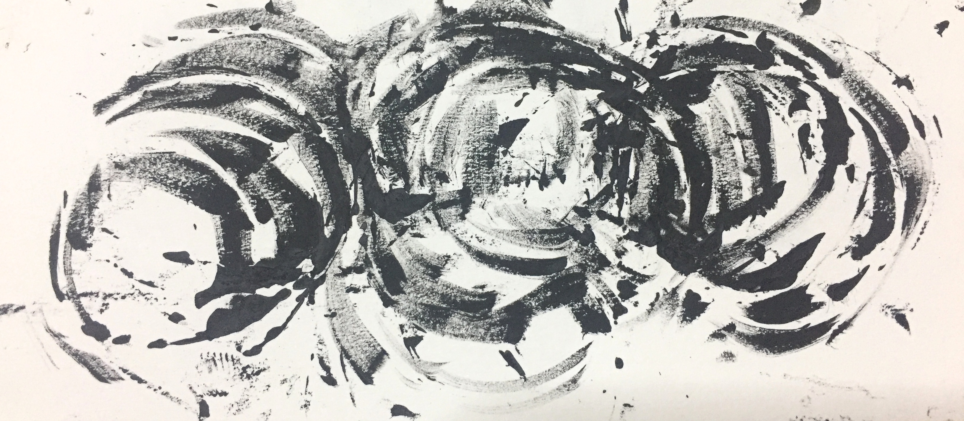
SURPRISE
Surprise has an obvious narrative, where elements are built up and then exploded in an moment. Inspired by Lomans’ textural use of the terrycloth (fabric made of tiny loops or protrusions), I sourced for similar material to imprint and to experiment with its texture.
I found tiny puffs of similar material of varying sizes and used them as a mark making tool with black acrylic paint. I also experimented with loose wool by fixing it upon the prints. However, it had more of an implication of decay than intended and thus was not used.
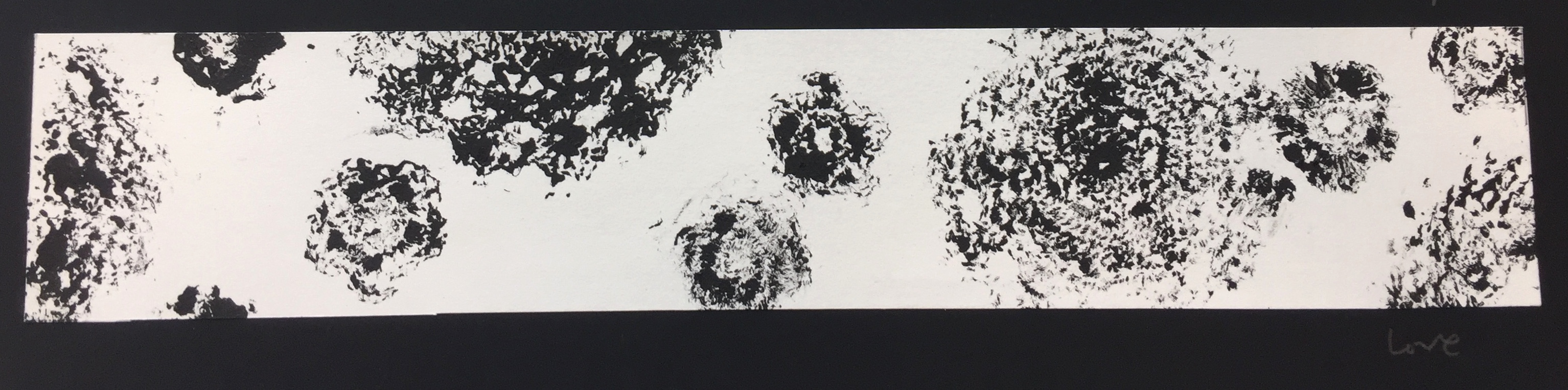
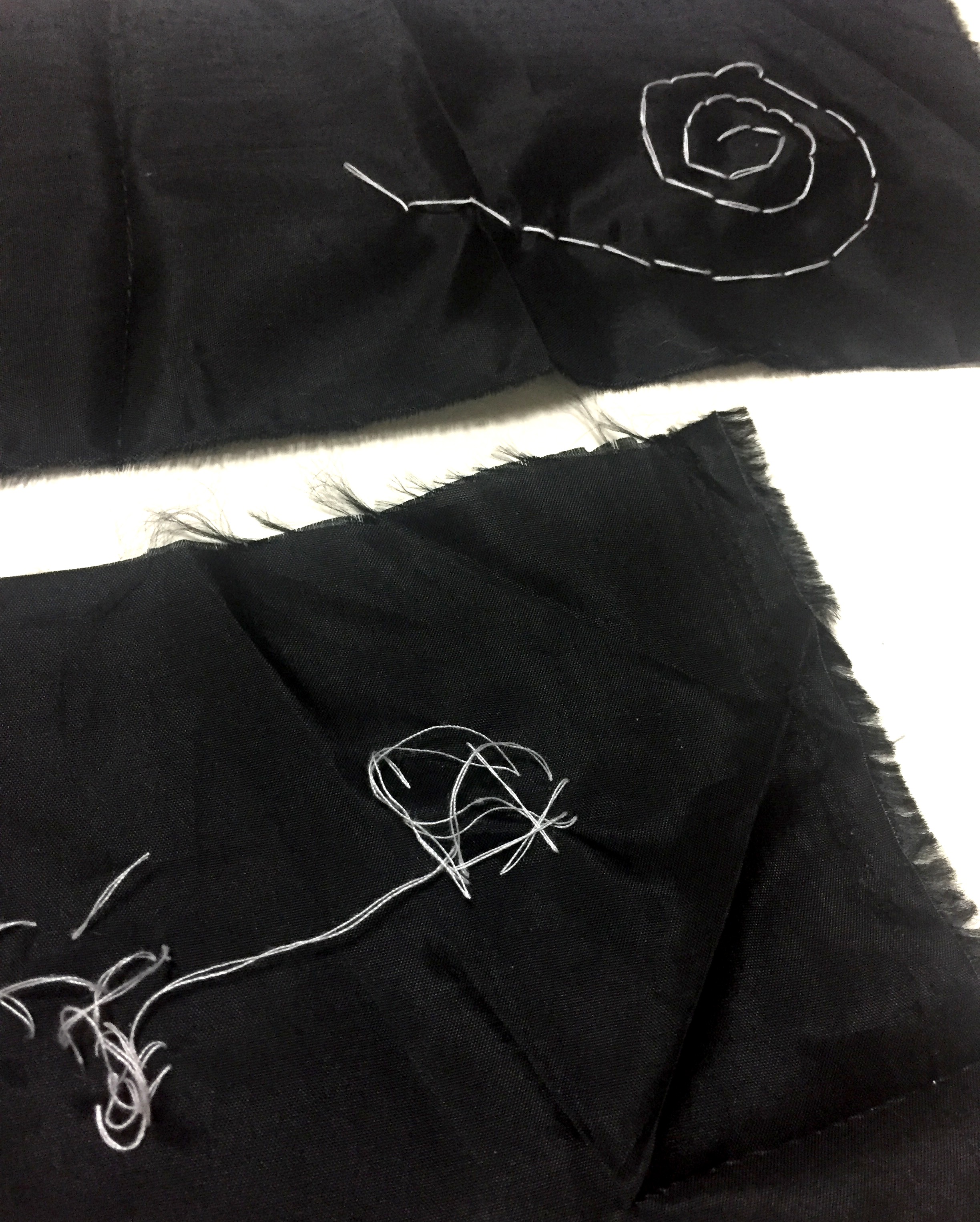
LOVE
Love is composed of prints made from crochet patches, a symbol of personal craft and maternal love. I feel like this print was not the most successful in its composition and does not capture the texture of the textile printed.
Crochet fabric
Initially, for the emotion of love, I worked with black satin fabric and embroidery with white thread. But due to incompetency of embroidery skills and time constraint, I was unable to create a print that could convey the emotion of love, an explosion of feelings, well. Thus, I used the prints made with crotchet instead.
.
Created using spunned wires and painted over with acrylic paint
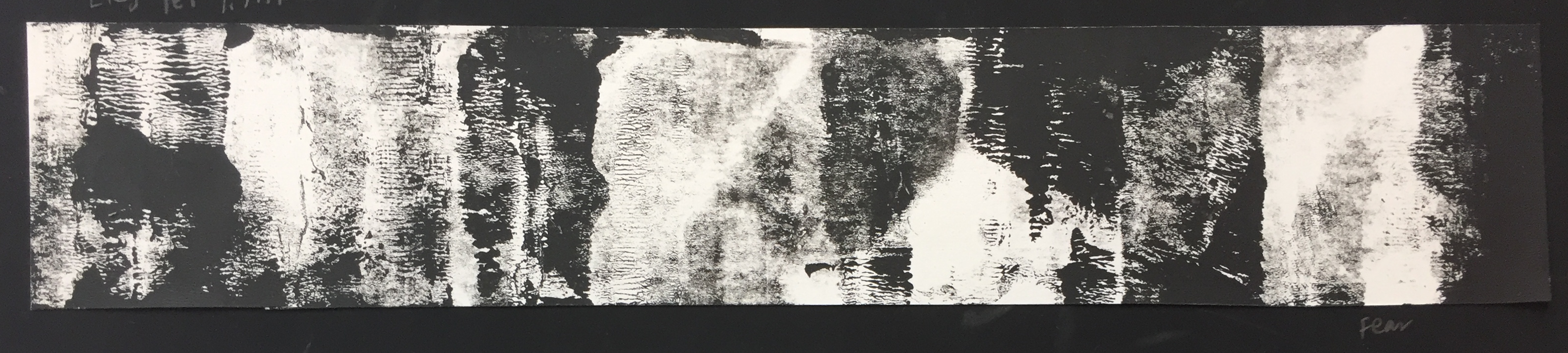
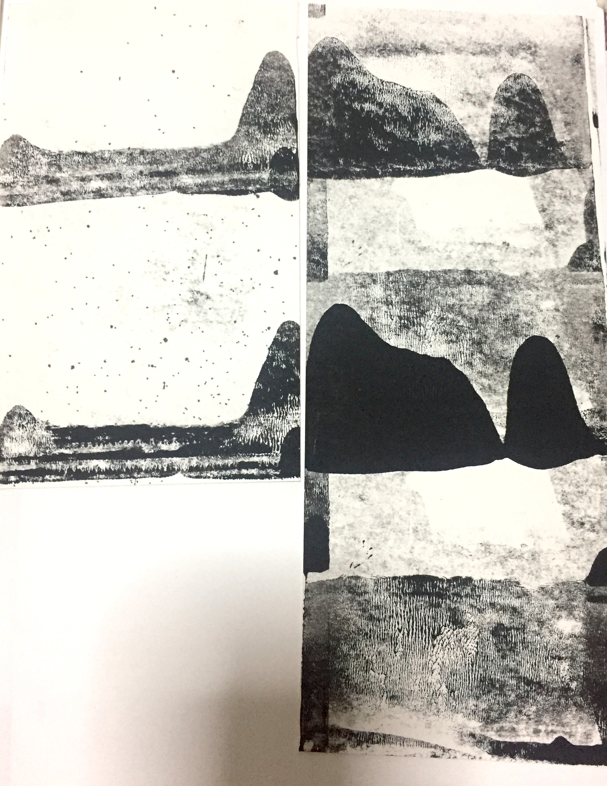
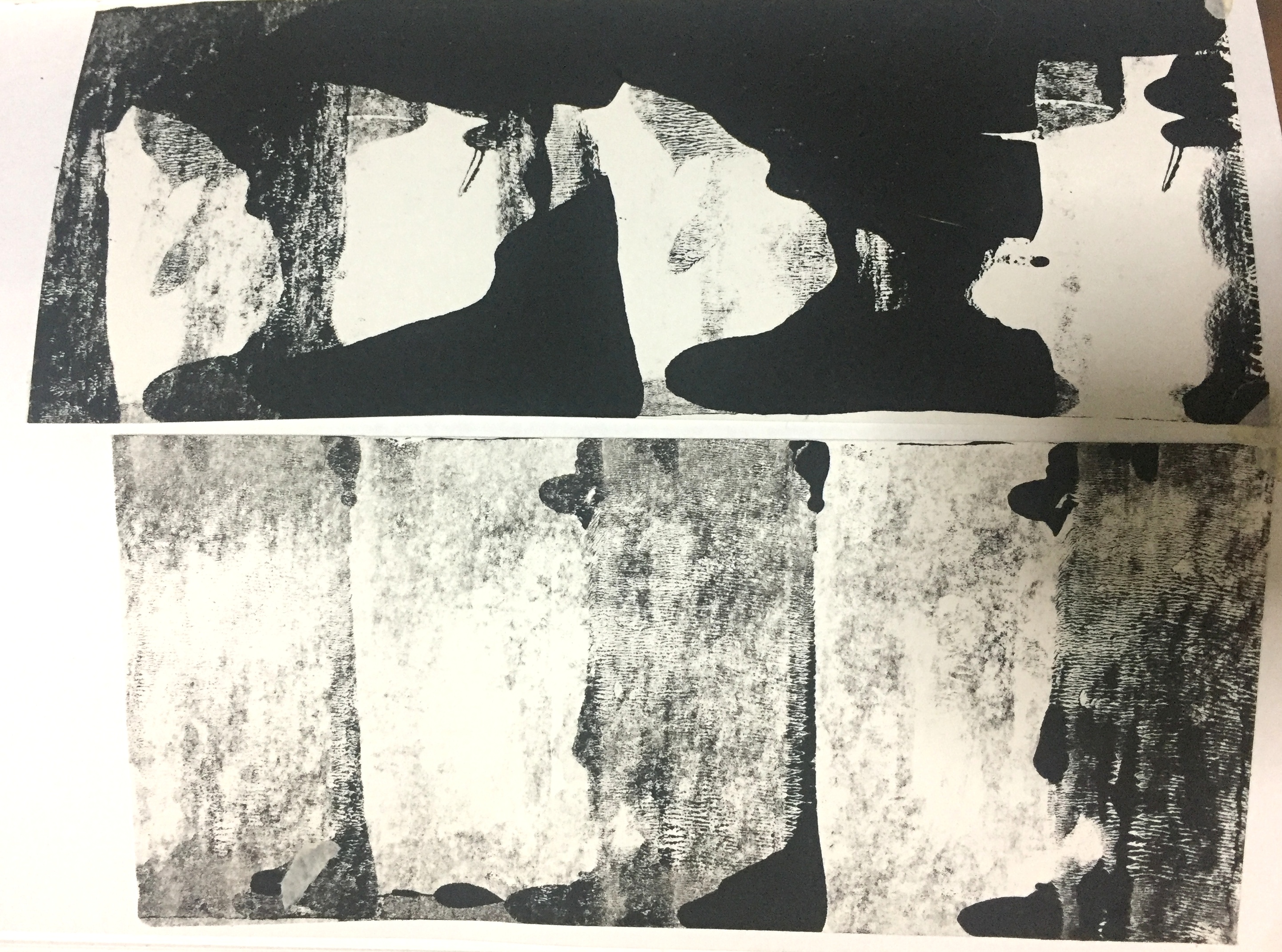
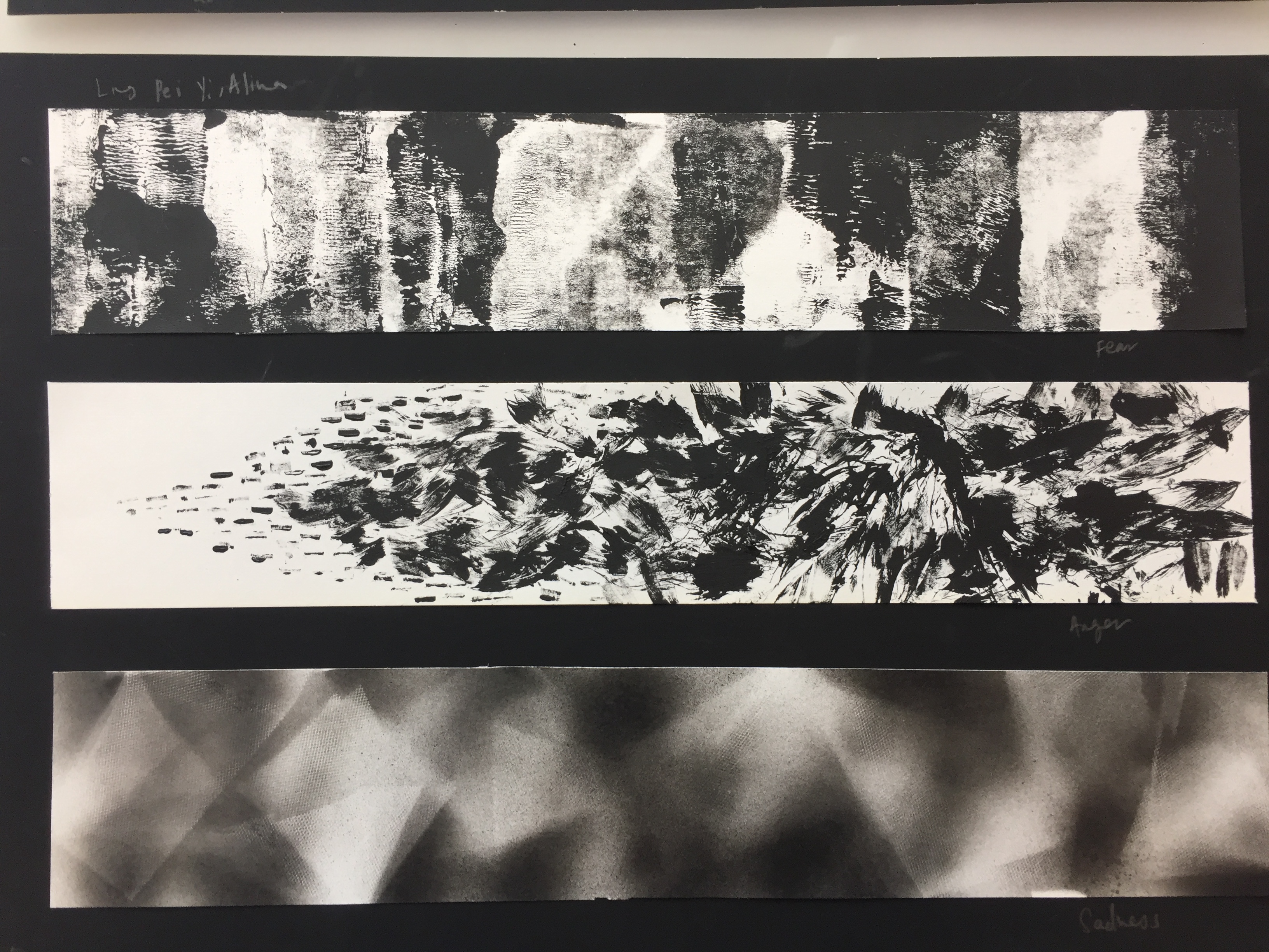
FEAR
Fear is made of repeated, contrasting prints of black and white coupled with textured line quality liken to fabric composed of thread. I intend for the quality of black and white film-noir films, where contrast between light and dark is used to evoke suspense or fear.
I used a roller, liken to the technique of a fabric press, where ink are rolled onto a surface to create prints.
Experiments with paint and roller:
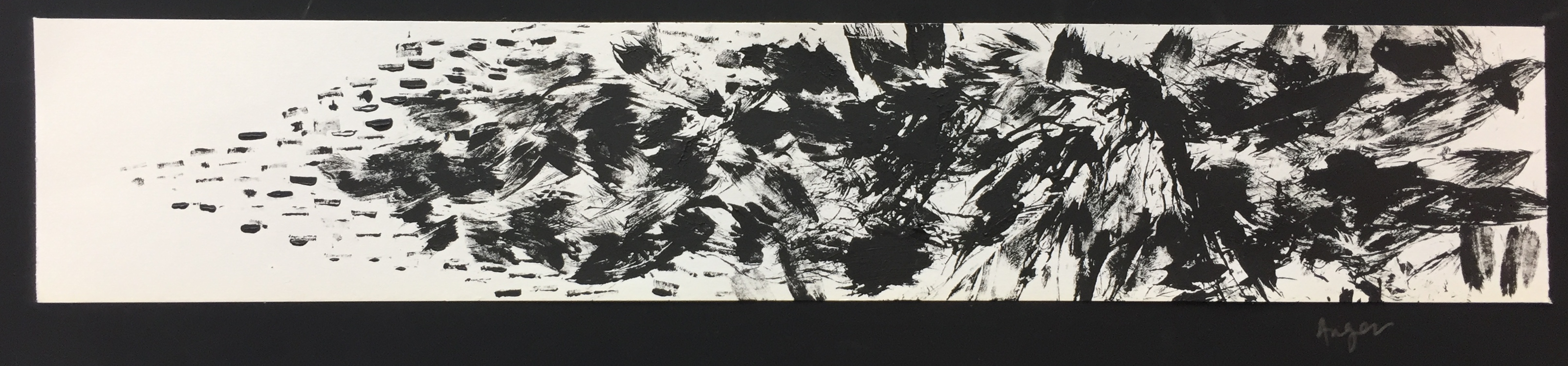
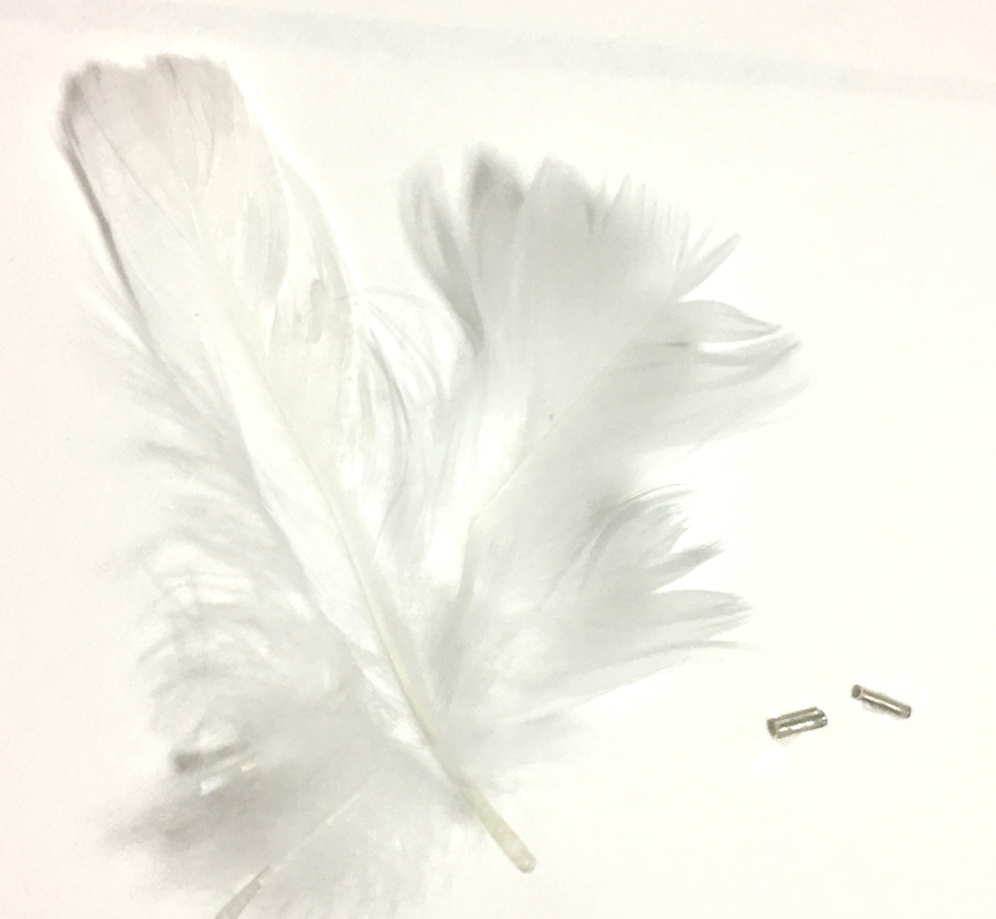
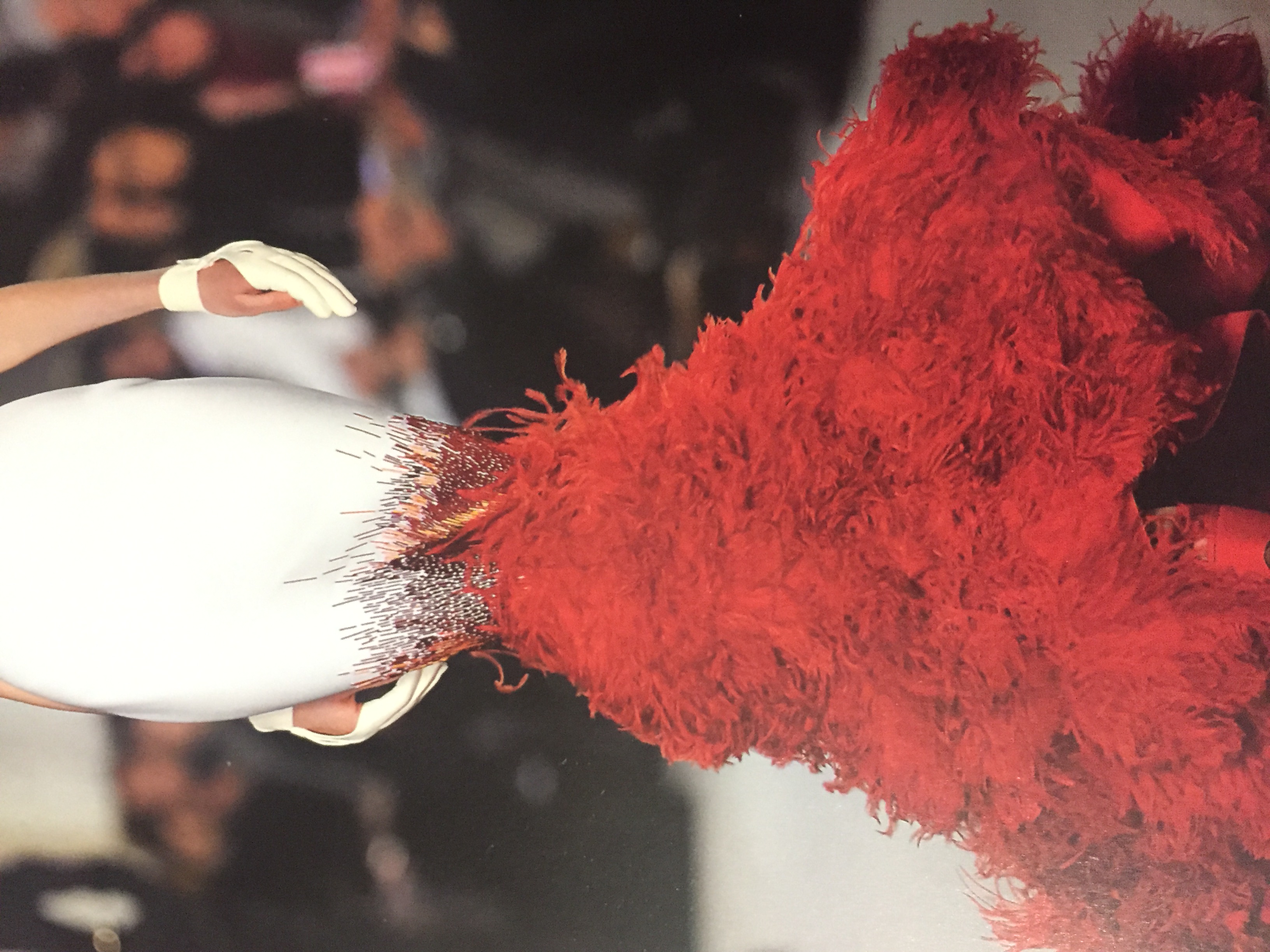
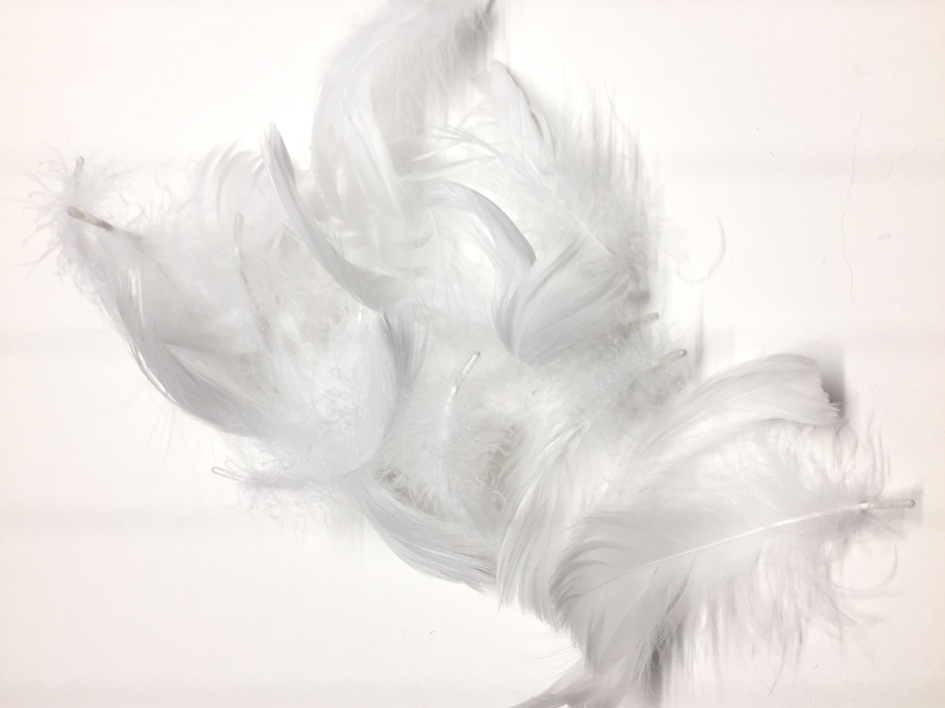
ANGER
Anger is the outburst of uncontrollable emotion that is triggered by the built up of tiny irritations. Tiny metal sequins and feathers were used as mark making tools, inspired by a textile design I found in a book.
Stephane Rolland, Summer 2012
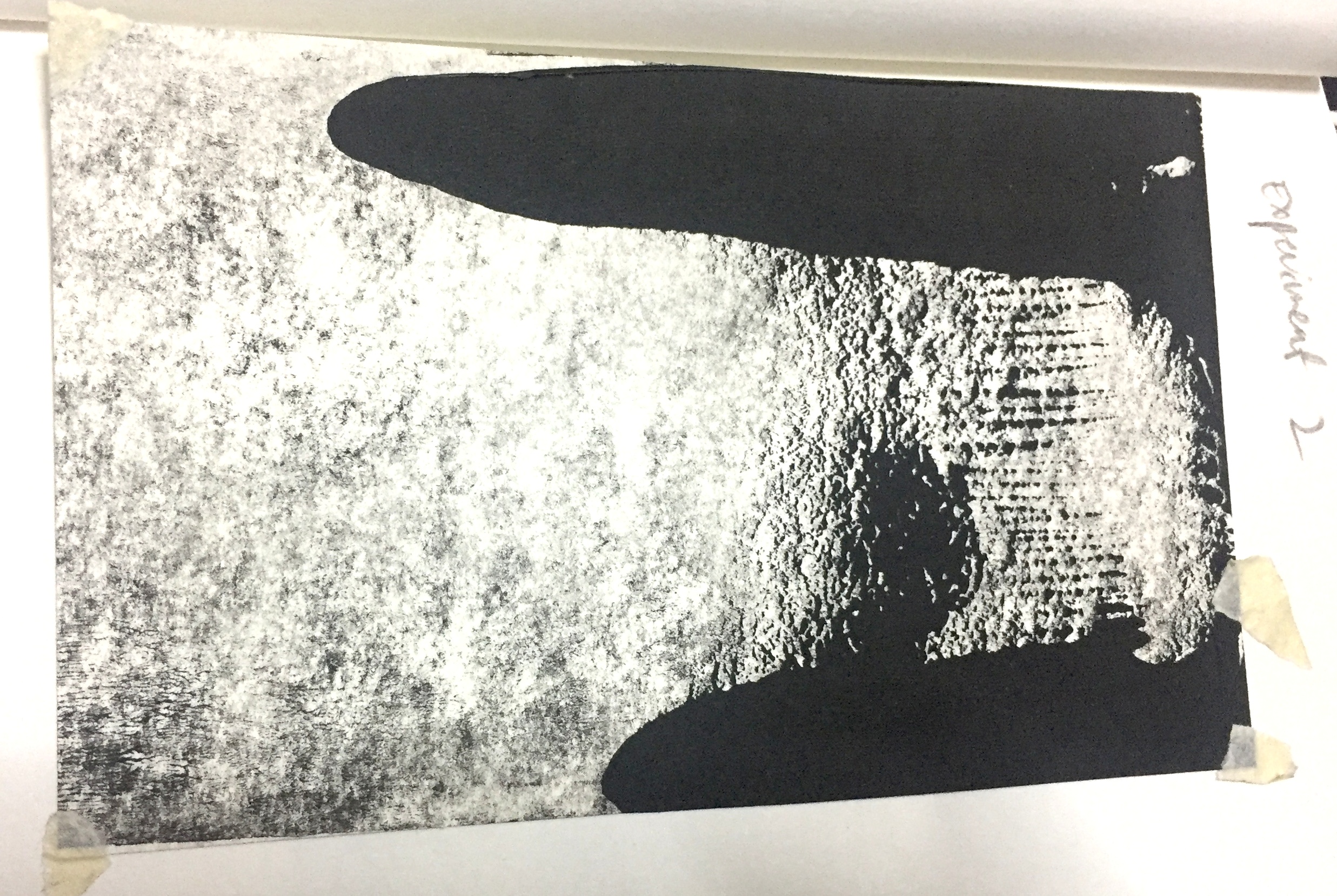
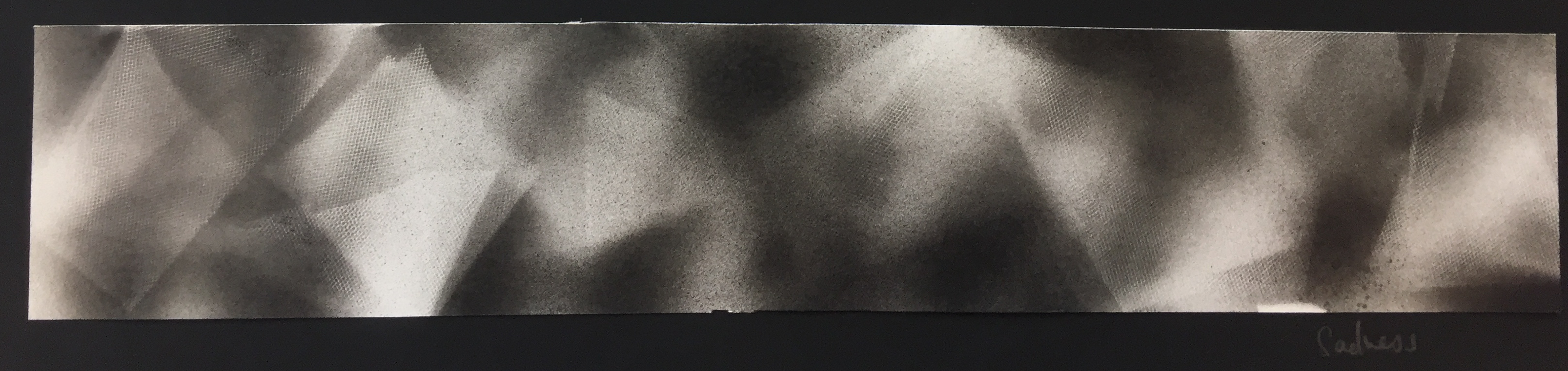
SADNESS
Sadness is experienced through a gloom around your life, where there is misdirection and uncertainty. I used spay-paint over tulle fabric to capture the darkness as well as to capture the print of the tulle fabric.
I experimented with other fabric but only the tulle was porous enough to recreate the print onto paper.
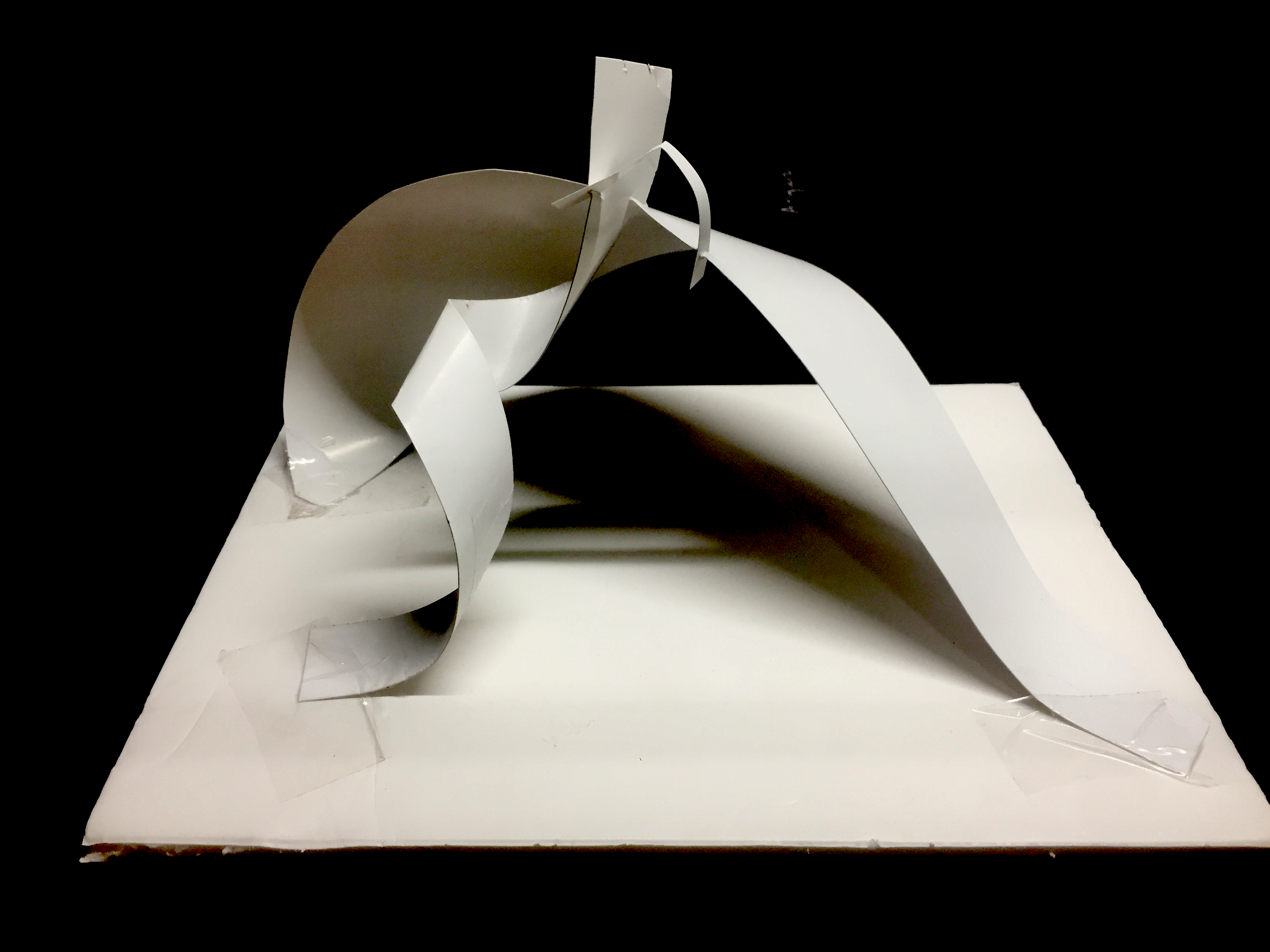
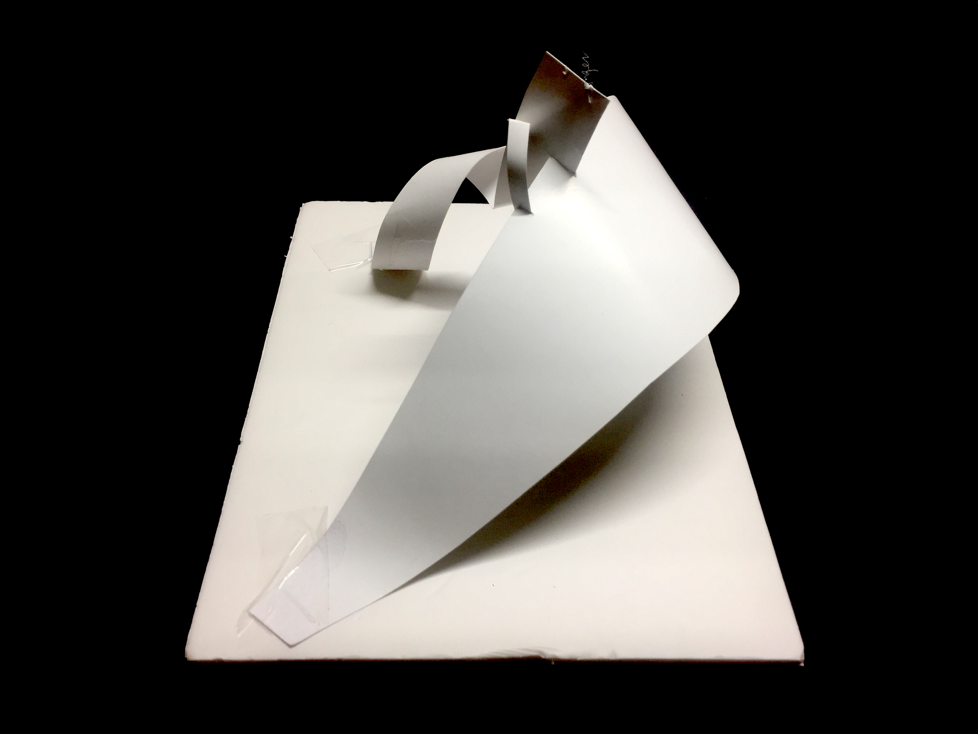
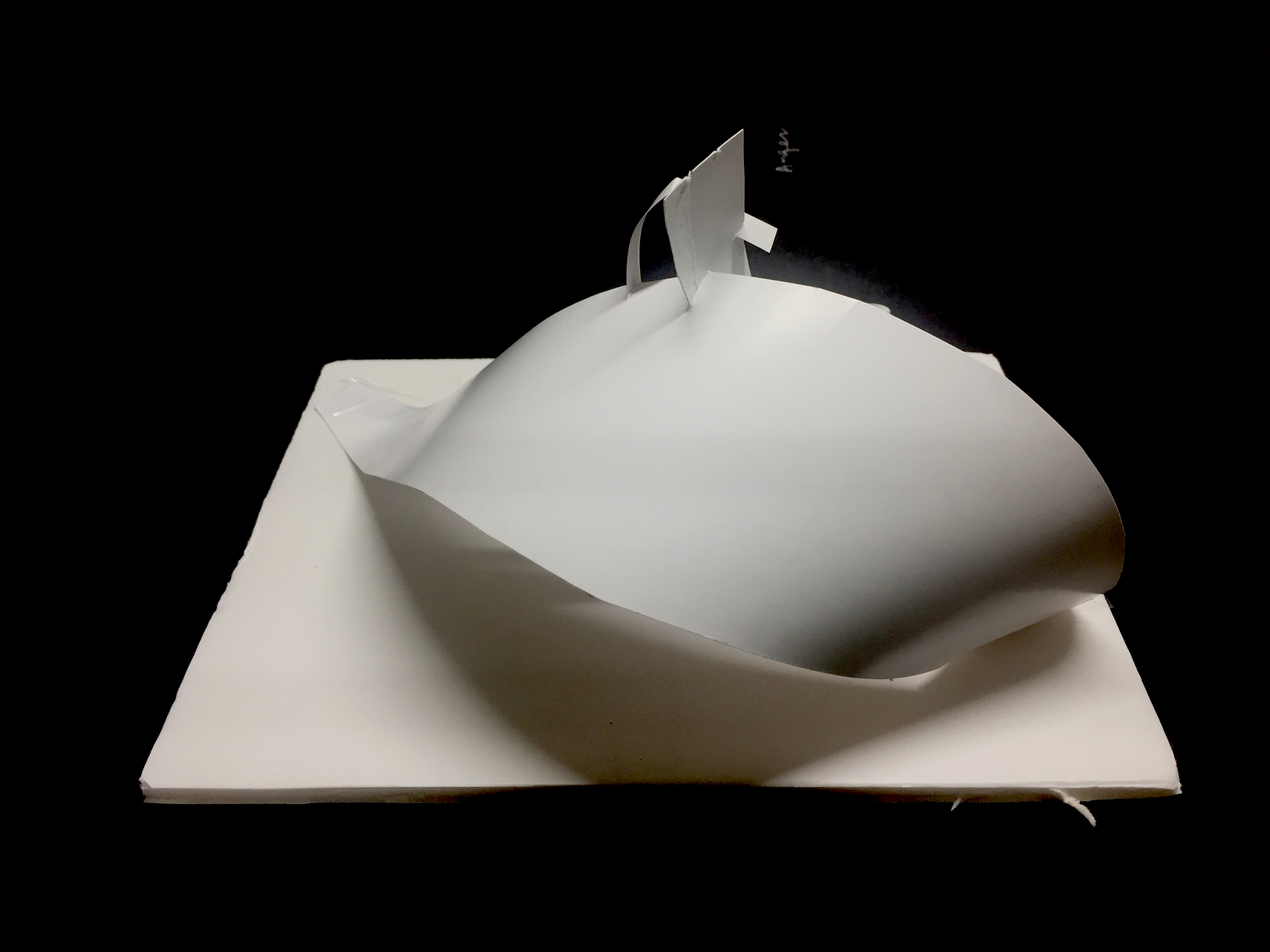
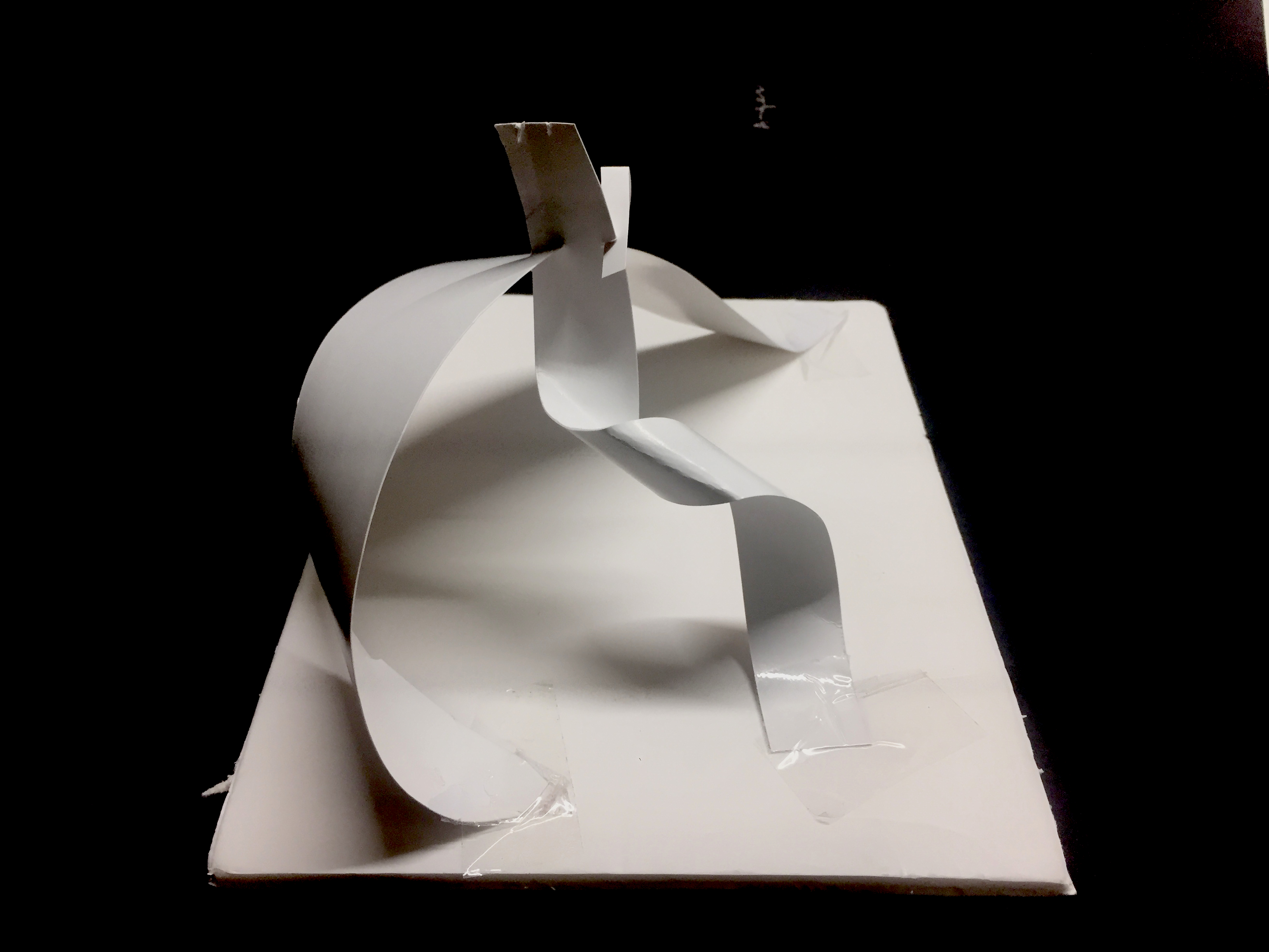
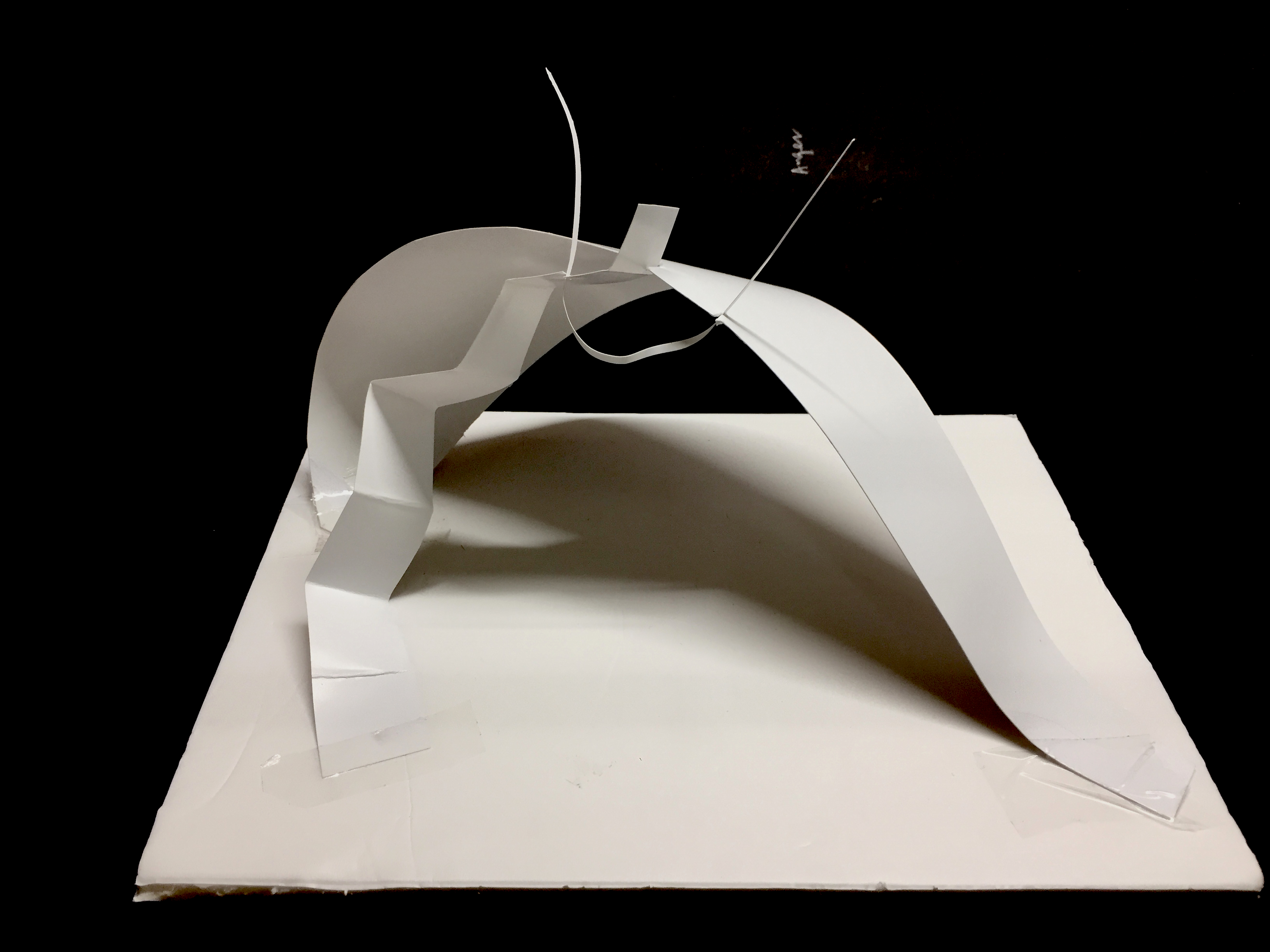
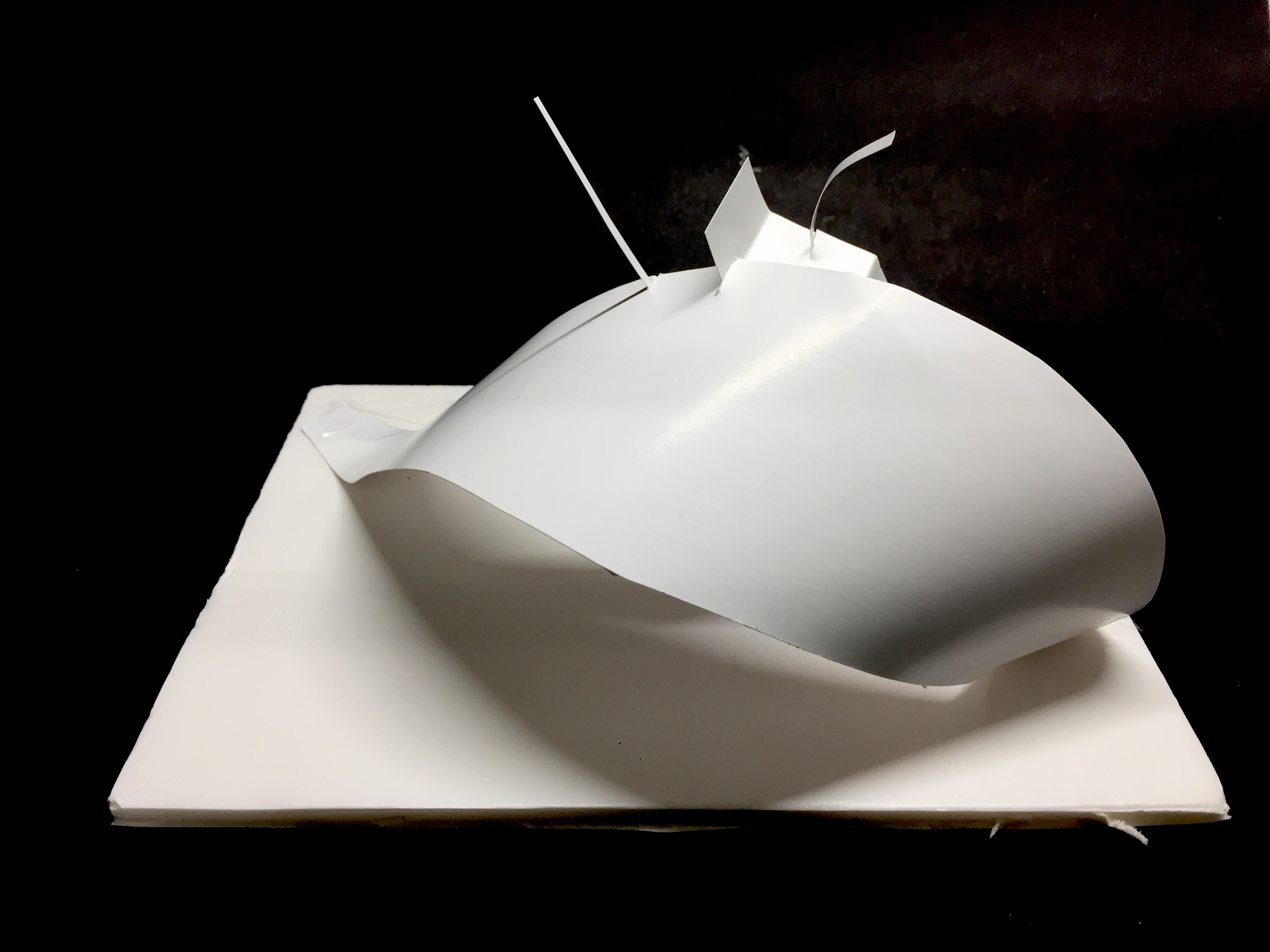
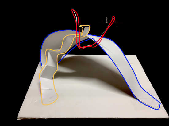
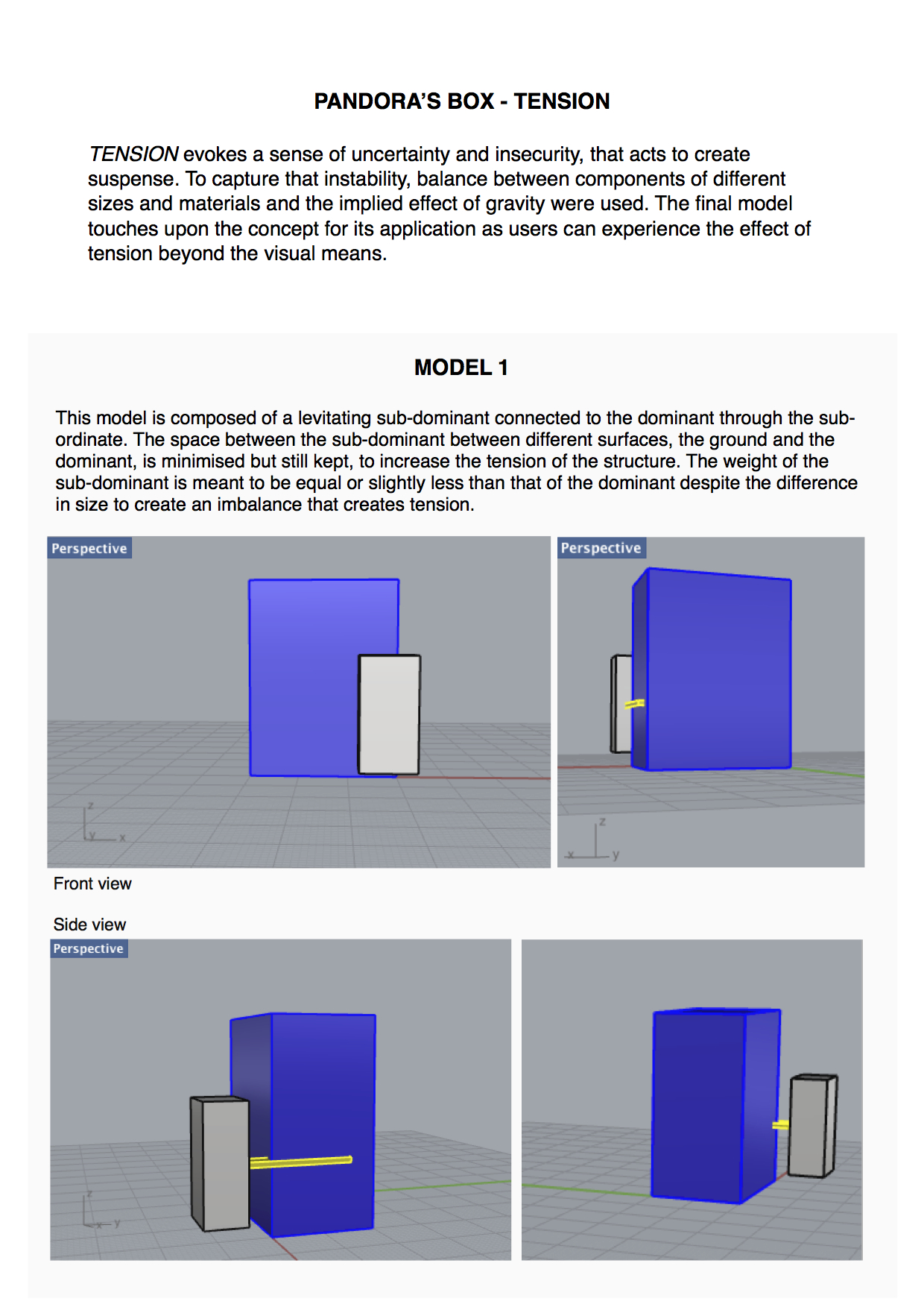
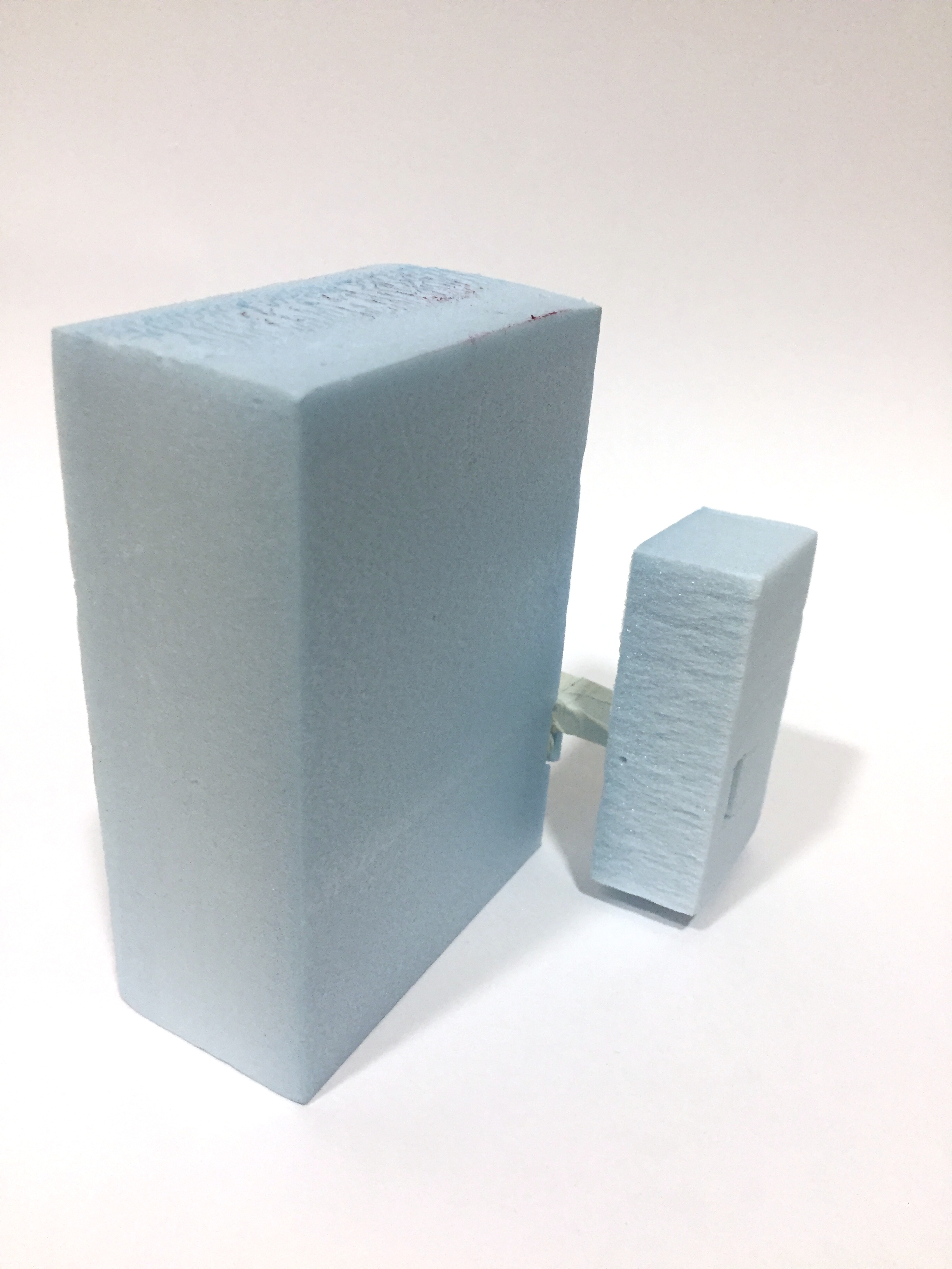
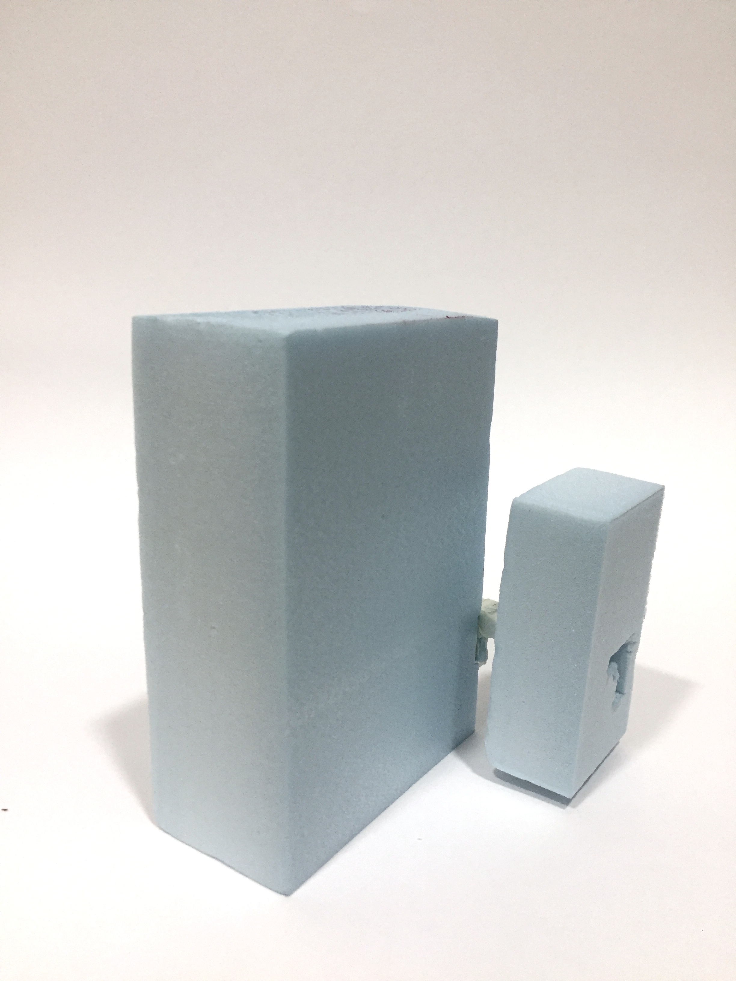
I defined tension as evoking a sense of uncertainty and insecurity, that acts to create suspense. Using the act of pulling by gravity, I gingerly balanced the sub-dominant component to slightly levitate above the ground, to create instability. The connecting sub-ordinate was asked to be as thin in width as possible to create the illusion of hanging and balance upon a thin surface, amplifying the tension of the floating component versus the rootedness of the dominant component.
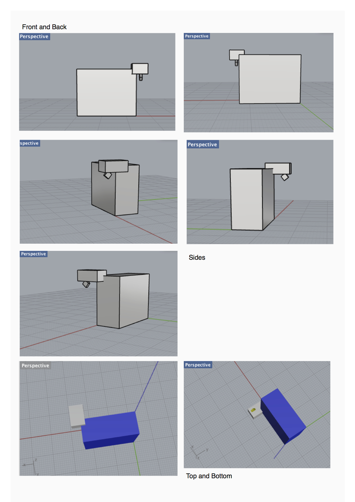
Front & Back view
Side views
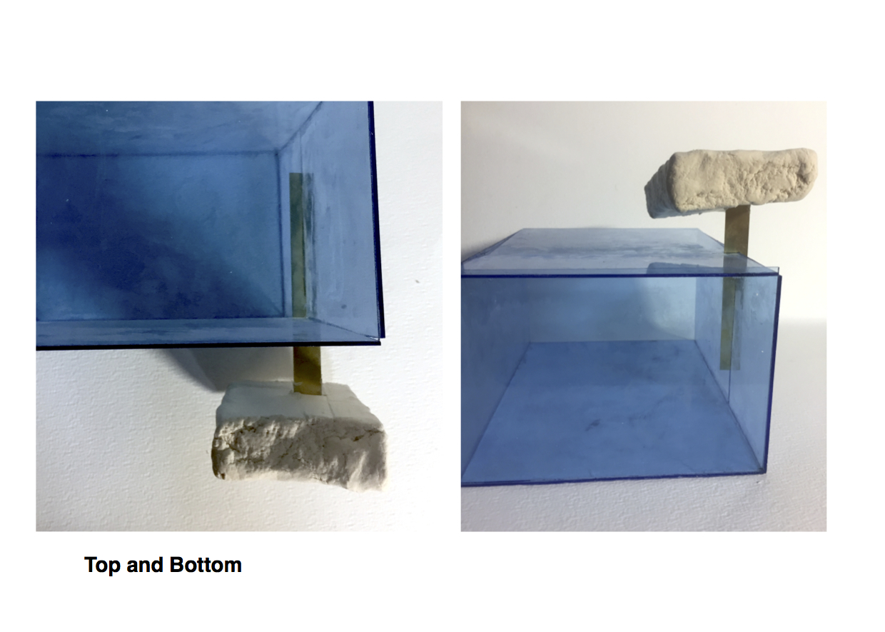
Top viewBottom view
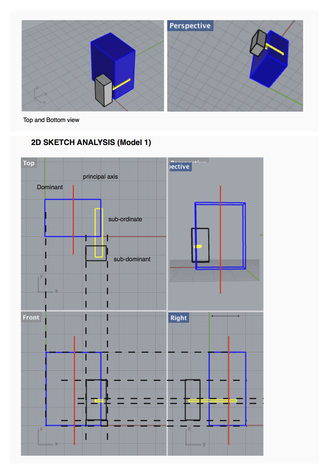
2D SKETCH ANALYSIS
Red- Dominant, Blue – Sub-dominant, Yellow – Sub-ordinate
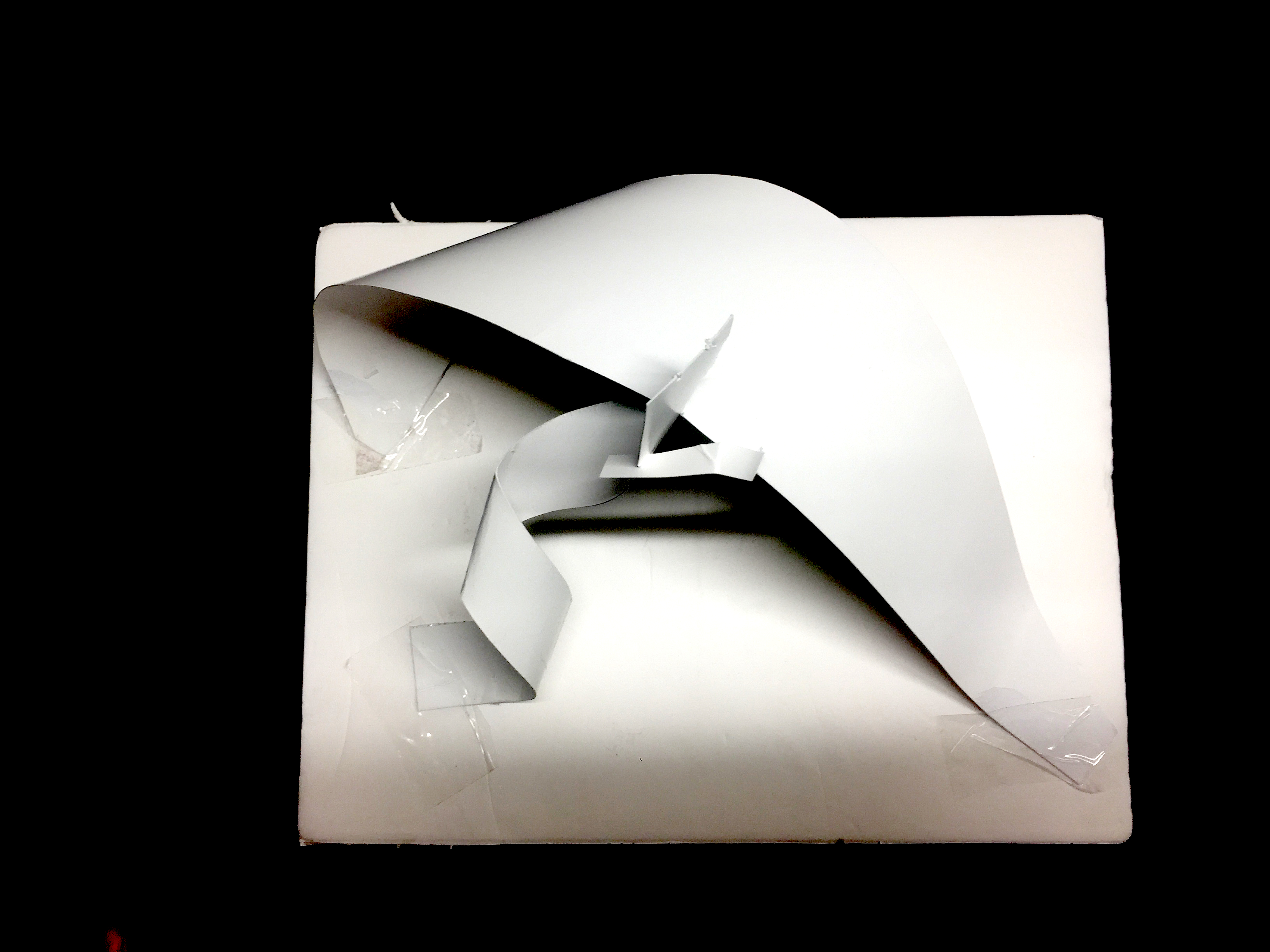
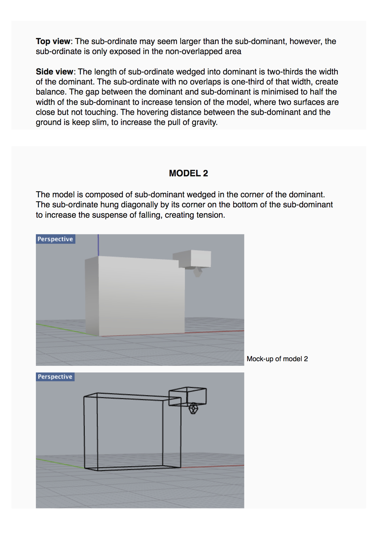
MODIFICATIONS
To compose a more complex structure, I used piercing by extending the sub-ordinate through the sub-dominant component. The subordinate is also wedged into the dominant surface.
Problem: By extending the sub-ordinate, it gives more stability to the structure but contradicts the theme of tension. Previously, the sub-dominant structure was hanging upon a point, creating more tension.
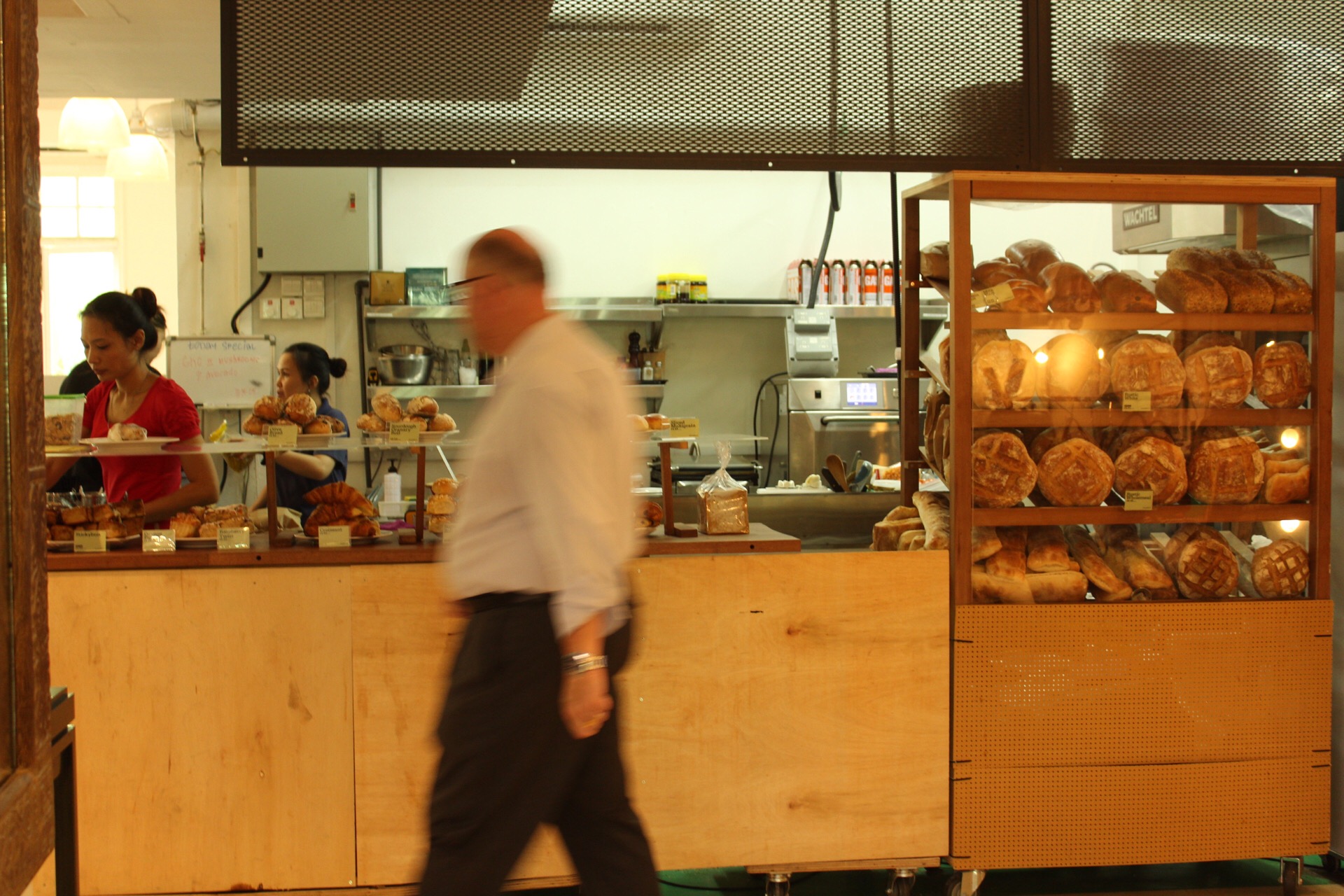
Baking of bread, grinding of coffee beans, the hustle of the lunch crowd, housewives gossiping and friends catching up
‘Man getting lunch’
‘Bread for sale’‘Lunch crowd’‘My corner’‘My table’
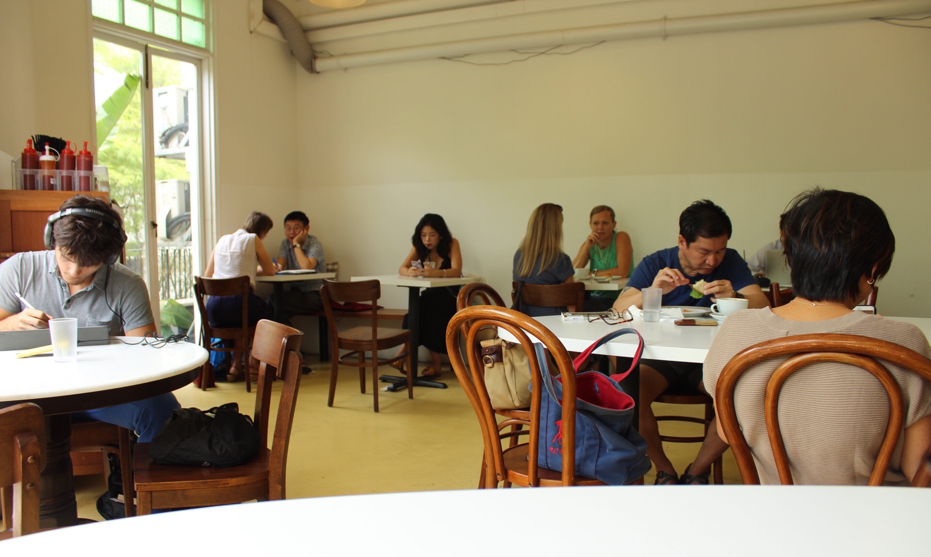
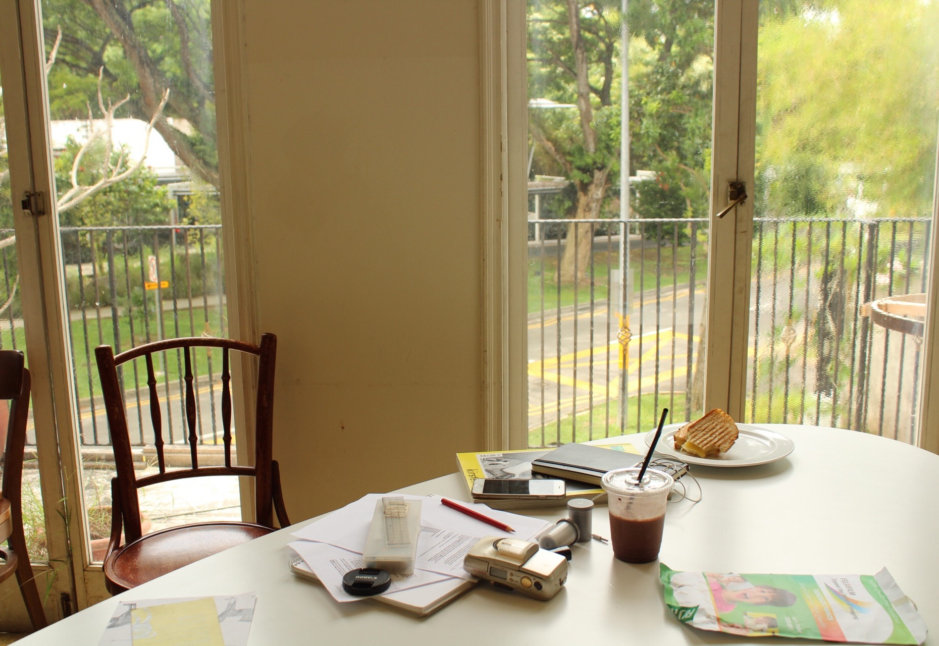
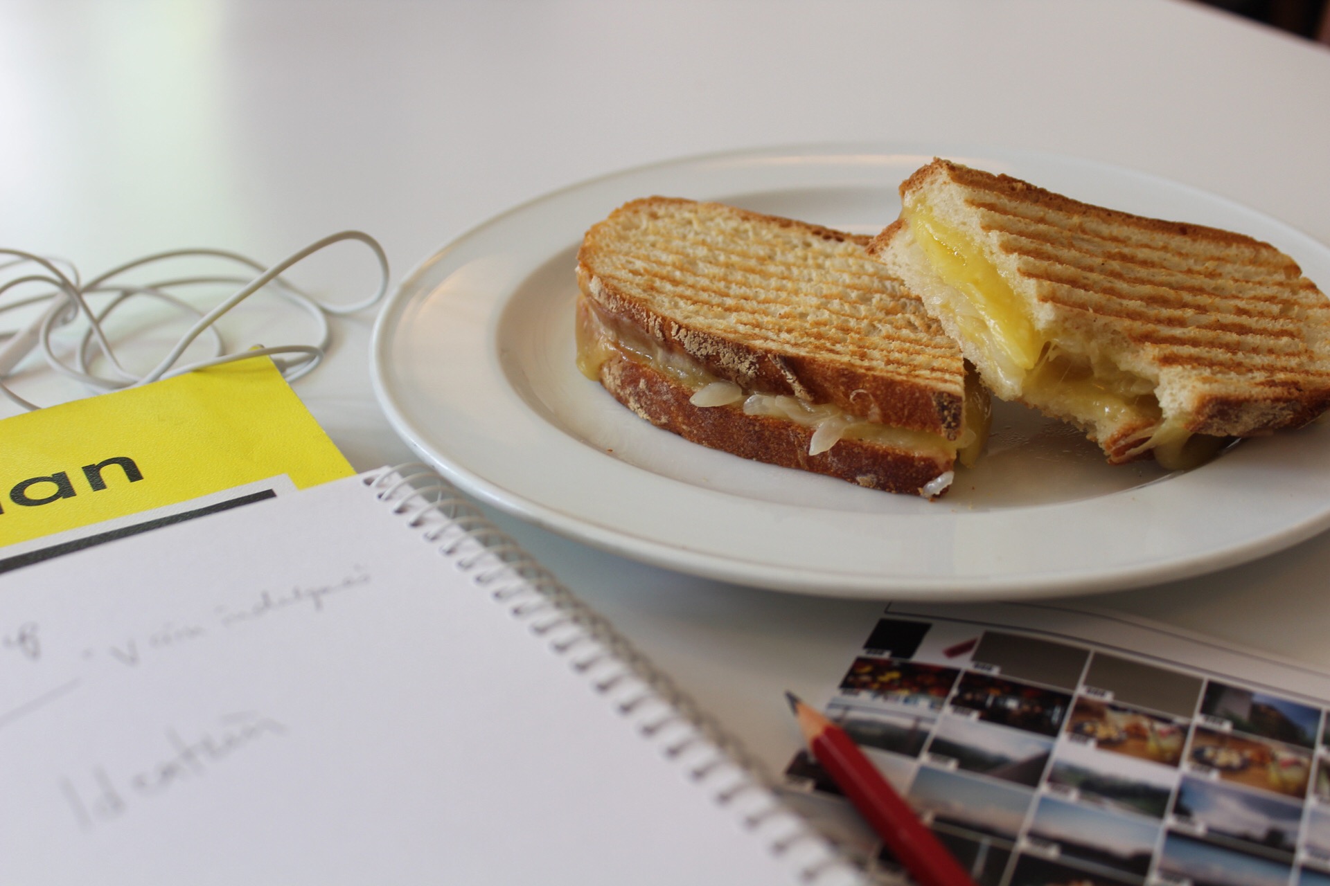
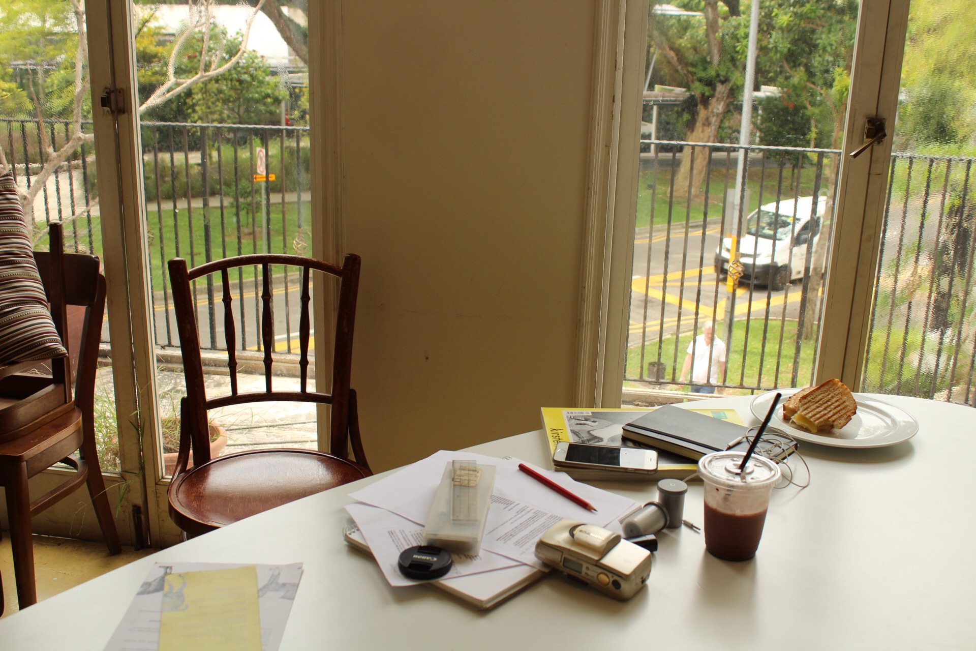
When I crave time to myself, I go to one particular breakfast joint at Cluny Court. Usually quiet, lunch is the time of the day where things speed up. I frequent this cafe when I need a place to think and generate ideas, usually in the afternoons when it is relatively empty.
However, the busy crowd is somewhat calming, knowing that they are busy with themselves, engross in their conversations or lunches. The hustle-bustle of city life affected even such small spaces where people come in for a just quick bite. For me, I spent hours in my table spot, usually marked by a drink or unfinished plate of food, doing work or just contemplating life. I feel incredibly comfortable in ‘my corner’.
Note: People are usually isolated despite having a large central table, contained within “their part” of the table or “their table”. The environment may encourage conversations between strangers but barely any are started.
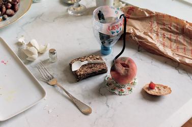
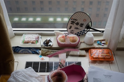
For My World, I chose a place I frequent due to its minimal interior and white walls that I find calming. I was inspired by Wolfgang Tillman’s photography series of still-lifes that mainly consist of a white environment and compositions of objects.
Using the natural light from windows, the photographs seem taken from a real setting when in reality the objects are purposefully composed in the shot.
Composition of objects I had with me on hand.
The images I took in “my world” consists of a tabletop in front of a window. While the objects are not arranged into a composition, I tried capturing the scene in that moment in time from a slight angle below eye level. I eventually cropped out additional details, such as the chair on the left to give it a cleaner look.
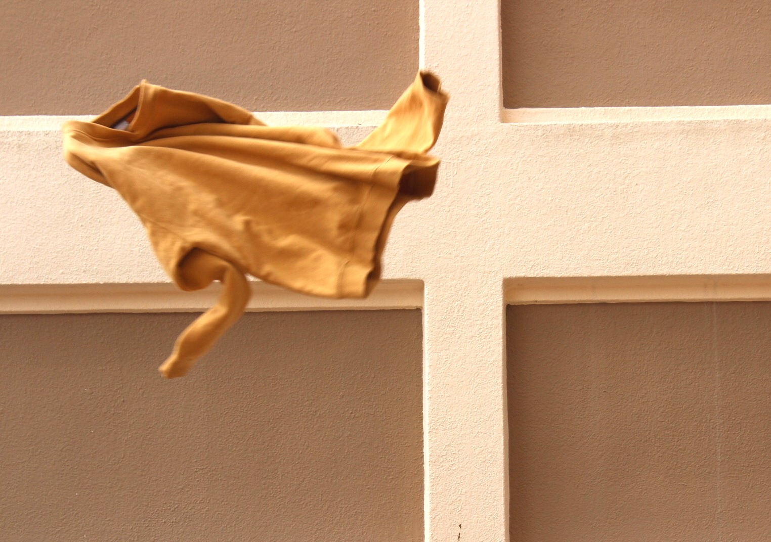
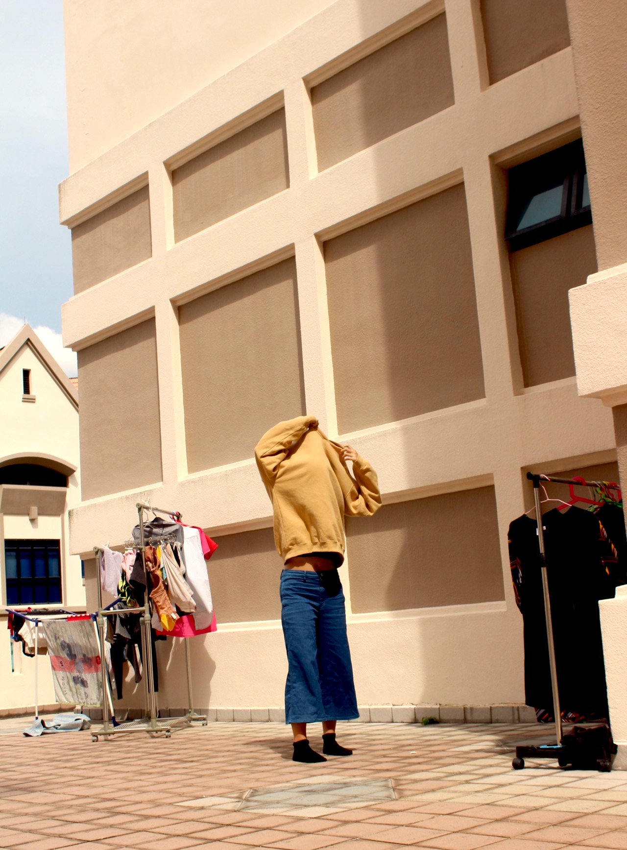
Series of photographs capturing the dynamism of apparels
The primary function of any clothing is to cover and for warmth, however, I believe there is more to apparel than that.
A body is a canvas, where one paints on everyday by deciding what to wear, how to match an article with another, which colour to illustrate their mood. In that lies the similarity to art. “You are what you wear”, outfits create one’s identity and express his or her personality through style. This is especially true for those who choose fashion as a medium to express themselves.
While clothes give identity, they can be used to hide oneself. Using them as a shield, thoughts are masked with the versatile medium. There is a paradox in that. Hiding the face in the images purposefully, I feel that using clothes to hide the state of mind is convenient at times.
Thus, I feel that a sweater encompasses both the quality of revealing identity through style as well as the literal meaning of hiding one’s body.
With the gap between high fashion and street wear becoming smaller, the oversized silhouette is seen coming back to trend. Valuing its modern aesthetic and form, I have been amassing a collection of sweaters and jumpers for myself despite its incompatibility with the weather. Through this mustard jumper, the dynamism of fashion that attracts me is captured through the fluid and expressive movement. The photographs capture the contour of fabric that loosely follows the form of the body. This piece of clothing serves as a symbol of the excitement fashion brings to my life.
‘Movement’‘Fleeting’‘Swaying’
‘Movement’ captures how the sweater folds and fits on a moving body. Hiding the face, the apparel takes over to create a pleasing form. The warm tones add to the contours of the fabric. Shadow casted is minimal to bring the focus to the interaction of the body and clothing while providing a bit of contrast to the light. ‘Movement’ is intended to display the freedom of the apparel and the comfort I feel in my”skin”.
‘Fleeting’ is a photograph of the sweater mid-air, just before disappearing out of the shot, capturing its contortion and dynamism.
‘Swaying’ is composed of myself, the oversized sweater as well as laundry drying in the wind in the background. The various colours and form speaks of fashion as a whole, being vibrant and beautiful at the same time.


