


Before starting my project, I did some research on font design. The idea of this project is to connect the job that I want to do with my name. I need to have four pieces of work. Since all these jobs are quite imaginary and unusual, I want to get some inspirations about the colour scheme and how to incorporate elements from these artists’ work.


For the first one, complementary colours were used which made a good contrast, and the background is pale pink which soften the whole image, making the C stand out. The choice of colours was very well done.
Speaking of the elements in the characters, since the theme of this work is about travelling, the designer used some local icons of the city and the transportation icon, which deliver the message effectively.
The gradient colour was also used and worked out very well, and I think it now has become a popular trend, so I think I will incorporate this technique in my design later.
I also like the right one because it also shows a very nice isometric view, it creates a cute and clear three-dimensional view for the audience, which I think is quite important and effective.
(From left to right- https://www.behance.net/gallery/41712999/Wanderlust-Alphabet-A-E, https://www.behance.net/gallery/22415553/Boundless-Space)

These two pieces of work all used analogous colours, which not only creates harmony but also crates depths(especially the right-side one). I think these kinds of colours are suitable for animation and illustration style. It is worth to try it out, see if it can work with my ideas.
(From left to right- http://unagrafica.tumblr.com/post/83535661806/visualgraphc-up-fly-and-float-nico-lopez, https://owengildersleeve.com/)


This is a series of work created by the designer, these are all Gif images, but these images themselves are quite good too. The isometric view created a good sense of space, which is suitable for her setting of restaurants, clubs and stores, as they are all actual spaces. In a way, she illustrated the space and put on key elements of these spaces, which conveys her idea successfully and efficiently. In other words, the choice of colour is also deliberate. For example, the background colour of the letter U is dark purple, which indicates the night setting, because clubs normally open till quite late.
(https://www.behance.net/gallery/37688847/SHOUUT-Illustrated-Type)

The retro style typos are quite nice, too. I found that the key element of this kind of design is that both of the designers emphasised the shadow in a very clear way. They normally use analogous colour schemes too, and also the texture was elaborated illustrated, the “G” on the right side conveys this idea very well. Something also needs to take note is that the top view of the G, which is quite interesting. It creates a position for the audience, making them feel like they are in the air. This is interesting and worthwhile to explore.
(https://www.behance.net/gallery/37688847/SHOUUT-Illustrated-Type, http://www.pristina.org/ilustracao/andrew-fairclough-is-kindred/#.XHOBuFMzZAY)

These two also convey the characteristics that I mentioned in the retro typo paragraph.
(https://inspirationhut.net/inspiration/great-little-place-tobias-hall/)

These are the colour schemes that I want to play with. Also, as I mentioned the dominant use of gradient colours and the idea of 3D space, the shadowing and highlights help to build up space, too.
Some possible jobs that interest me.


First attempt-previous design

Final Outcome
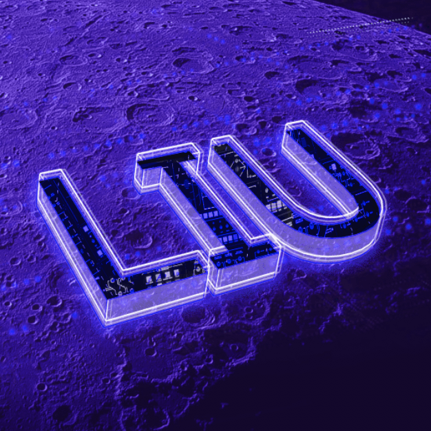
Visual elements- the moon surface which indicates the feeling of being in the universe, control panel on the spaceship, and the sign of target detecting, which helps to build up the environment. There is also a frame outside my name, which indicates that this is something that shows up on a screen of a spaceship. All these elements are used to convey the idea that I am a space traveller driving a spaceship, exploring my adventure in the vast universe.
Font-San Serif. I used the normal Arial, it is actually serif itself, but when it comes to all capital letters it automatically changed to San serif font. I chose this font because I want to have a clean and objective feeling, which is not too emotional.
The difficulty that I had was that initially, I did not convey my idea in a harmonious way, because the colour scheme looks a bit unsuitable.
Elements of the wedding- always link to heart, white dress, two people, bright bold colours etc, rings.


Final Outcome
I did not take many references for this one because I drew these up on illustrator. The frame is made by the lace pattern on the bride’s dress to render the setting.
I tried to make everything simple based on the rule- less is more. By drawing the gift, high heels, heart-shaped balloons and flowers to indicate that this is about the wedding.
What wedding planners do is just to create memories and happiness on the wedding, so I used a series of warm, strong, analogous colours to create a happy mood, but with the gradient colour inside the font to create a soft and sweet feeling. The diamond ring is a bit out of the colour scheme, which gives out a hint and also emphasises the setting, it is also quite cute acting like a tiny tail of the U.
The font that I used is Arial Round MT, the curve express a soft and cute idea, which is suitable for the wedding setting.
Elements about babysitter and ADM people.

I used the Cinema 4D to do the name part and some of the elements of ADMers, because I want to have the isometric view for this one, it is good to build models first then render them.


I drew the key elements using C4D, and the colour scheme is all pastel because I want to convey the dream-like softness for this job. Because babysitters are always gentle and most of their job is to make the baby sleep, and also the baby room is normally decorated with pastel colour wallpapers etc.
First attempt

It was not successful due to the colour. After rendering in the software, the 3D font still looks quite greyish, which did not convey the dream feeling at all and the background is also a bit strong. Additionally, the lack of elements is a huge problem because I don’t know how to link the idea of babysitting with ADM students.
Final Outcome
Firstly, for a babysitter, I must know what ADM people need. I think that is lockers, food and sleeping time, but also the vending machine is quite important too. Then what is the icon of ADM students? To me it is energy drink, invisible retro dressing code and cigarettes, sometimes with a pen or something. Then I put these elements to each character, and to make it more like ADM, I put the iconic staircase in, but for the harmony of the whole image I changed the colour.
To convey the idea of sleeping and dream, I added a pillow under the characters and also the cloud, but unfortunately, the implied meaning of that is to tell that this is more like a daydream, it is not true.
I’ve also lightened up the whole image to convey the dream feeling.
The font I used is still Arial capital letters because I think the sharp corners indicate the characteristics of each space and structure of the architecture.

For the beach, the elements are all about the sea, sky and the sand, which are quite easy to convey. But for the holiday, it is a little bit abstract, therefore I used the headphone to indicate the music therefore link back to the idea of the holiday.
There are also elements such as the umbrella, the coconut tree, and the sand castle to indicate the holiday and the idea of the island. It is viewed from above, the bird-eye view creating a feeling of looking down, so it is what people see from the aeroplane. The brown colour underneath each letter is the soil and the white outline illustrated the waves. The water drops around it were to show the movement and the vibes of the holiday.
Similarly, as the wedding planner, the round curvature was used to create a relaxing and enjoyable feeling.
The colour scheme is quite bold and strong, with a strong contrast and colourful elements to convey the enjoyable feeling.


Starting with rectangular shapes, playing with the concept of contract, stack and reflect. However, it is quite hard to show reflection within one single model, therefore I decided to interpret this idea later, which is when I will put a lot of models together.


But the rectangular shapes feel a bit tedious, therefore I tried with some triangular and uneven shapes, now it seems more interesting.

Based on the previous approach, I developed a more complicated and interesting model, and I quite like the shell-like shape. I decided that this one would be my final model.

After finishing the foam model, the next step is to do a latex model based on the foam one. It takes more than 3 days to finish the latex model because it needs to be done one layer by one layer. One layer must be totally dried before applying the next one.
When the latex model was set, I also needed to build a box based on the latex model, because when I pour the liquid into the latex, the plaster will release heat, the box was to keep the shape of the model and prevent inflation. I used the corrugated board as the material for the box. However, another problem is that some of the latex layers were uneven when it comes to the box, the corrugated board cannot align with the latex precisely.
Due to this problem, I decided to give up the idea of building the box, I will build a case totally around the model itself, therefore the shape can be more precise.

Initially, the first plaster model was not as perfect as I expected, there were quite a lot of bubbles. After testing for several times, I found that using a stick to stir the liquid before pouring it into the latex will make the outcome better.

Trying with different layout ideas. This is where I applied the idea of reflection.

Final silicon outcome, I need to cast the silicon model twice, otherwise, the silicon cannot be taken out of the box.
Another problem that I encountered is that there is about an overlayed area due because I cast twice, which required me to cut off some parts of the silicon shape by myself.


Story: A group of school friends, initiated an insta video call to talk to each other. Each of them started their days as normal, but they all found a piece of paper accidentally. They figured out that this was acutally a maze and they solved it together in the online space.
Location: ADM Basement
Objective: Making audience feels like a magic show, and emphasizing the importance of team work.
Outcome: Four people solved the maze together.
Experience:


Before & After adjusting the camera (left to right). The difference was clear, obviously, the right one looks more like a whole piece.
 scanned version of the finished maze.
Which project did you feel you had the most creative control? Why?
Which project had the most unpredictable outcome? Why?
Which project best illustrates the concepts of DIWO & Open–Source? Why?