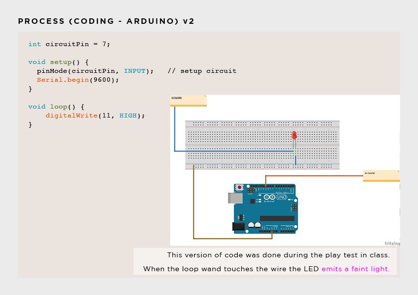
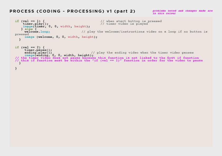
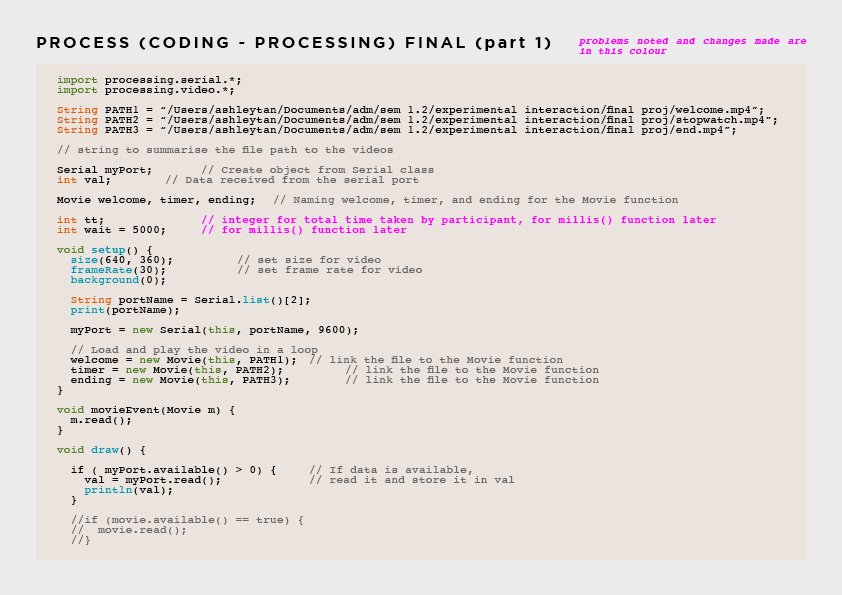
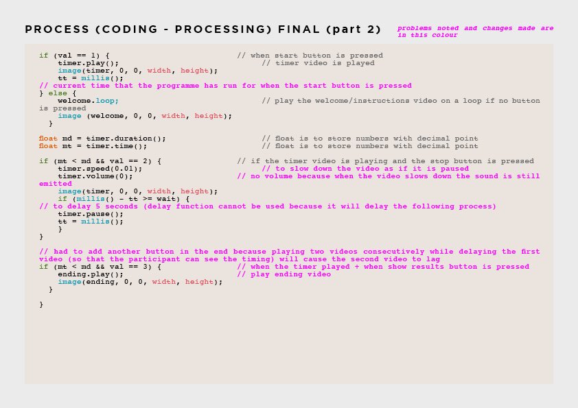
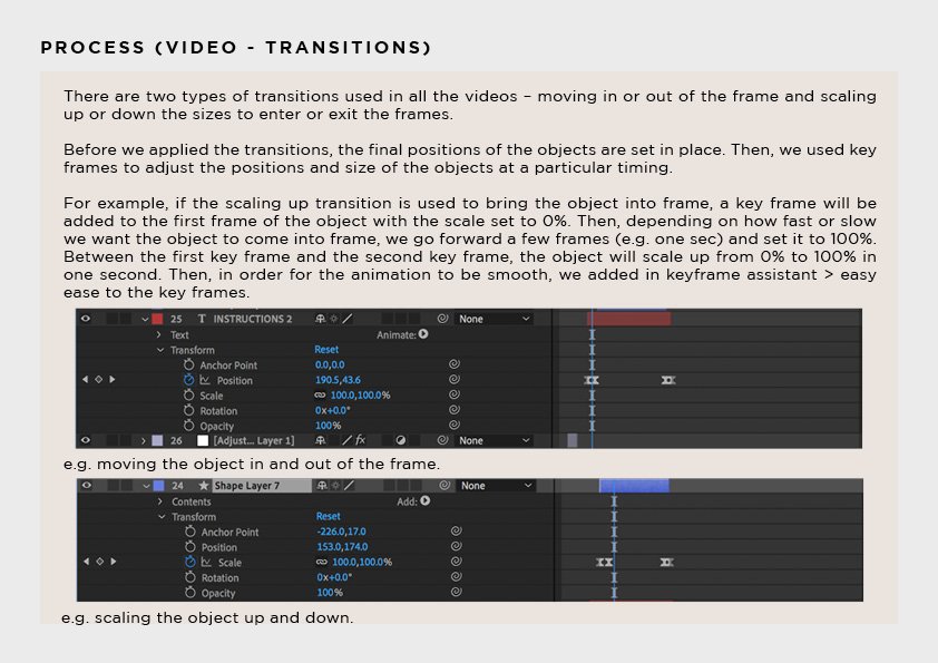
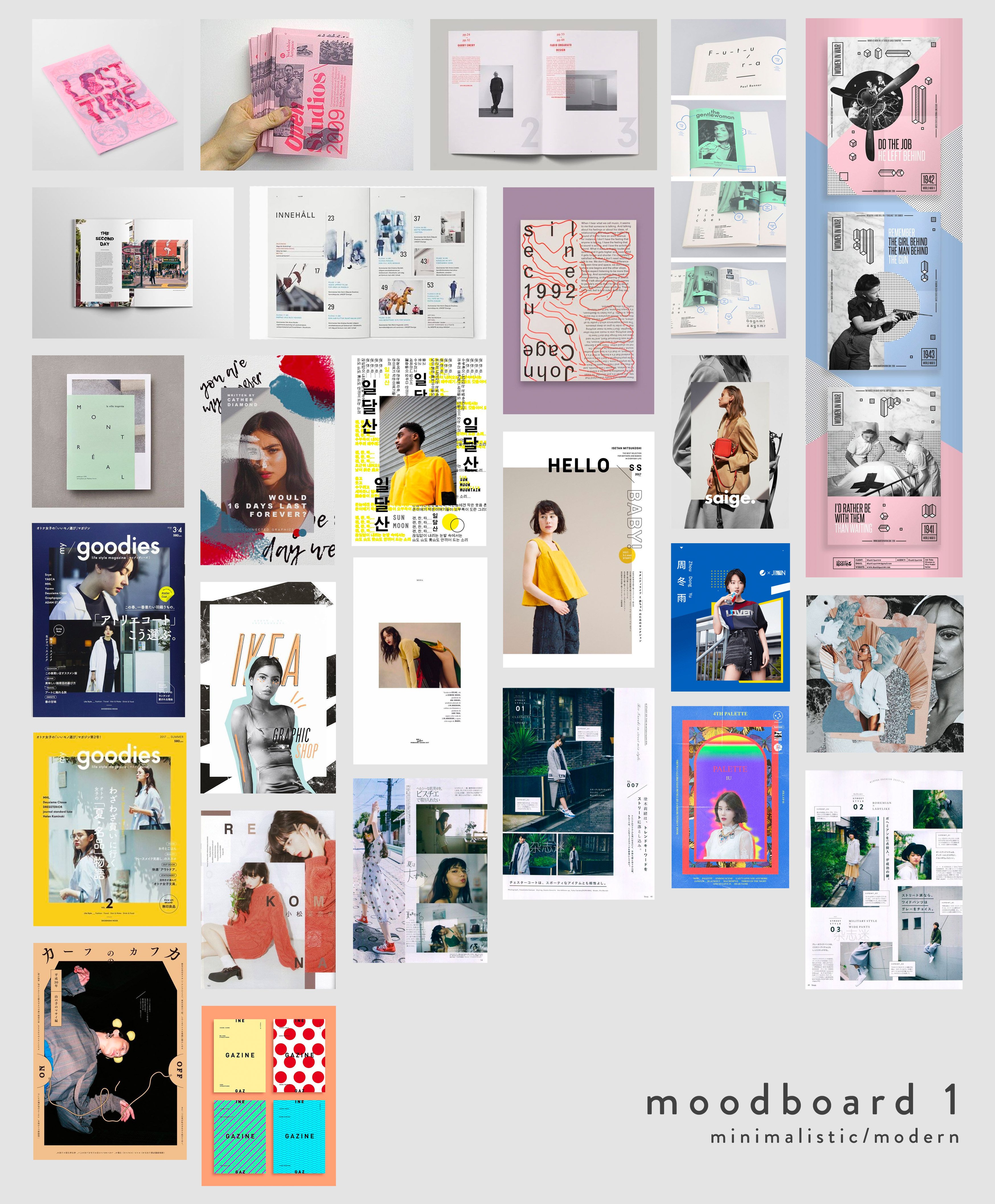
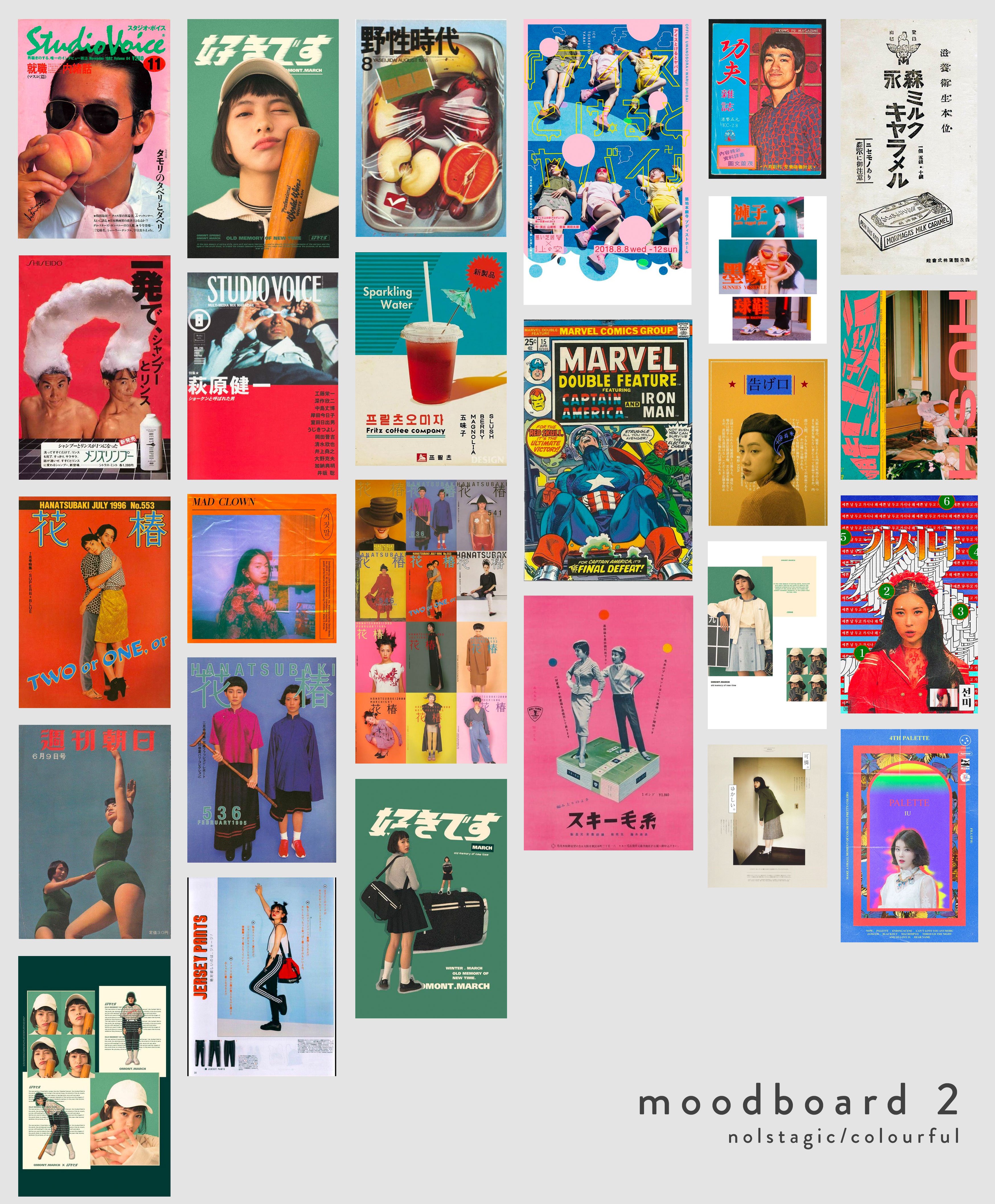
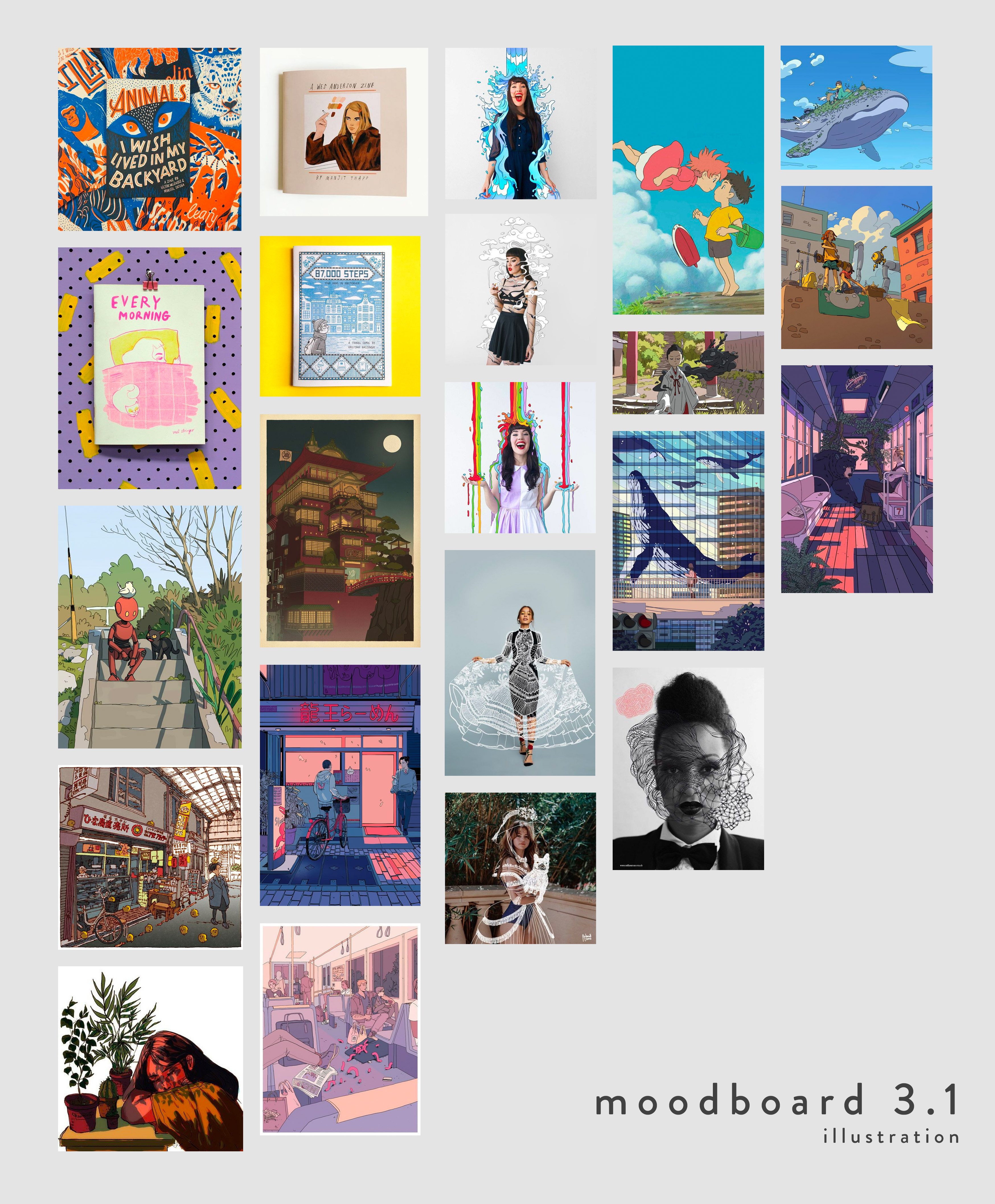
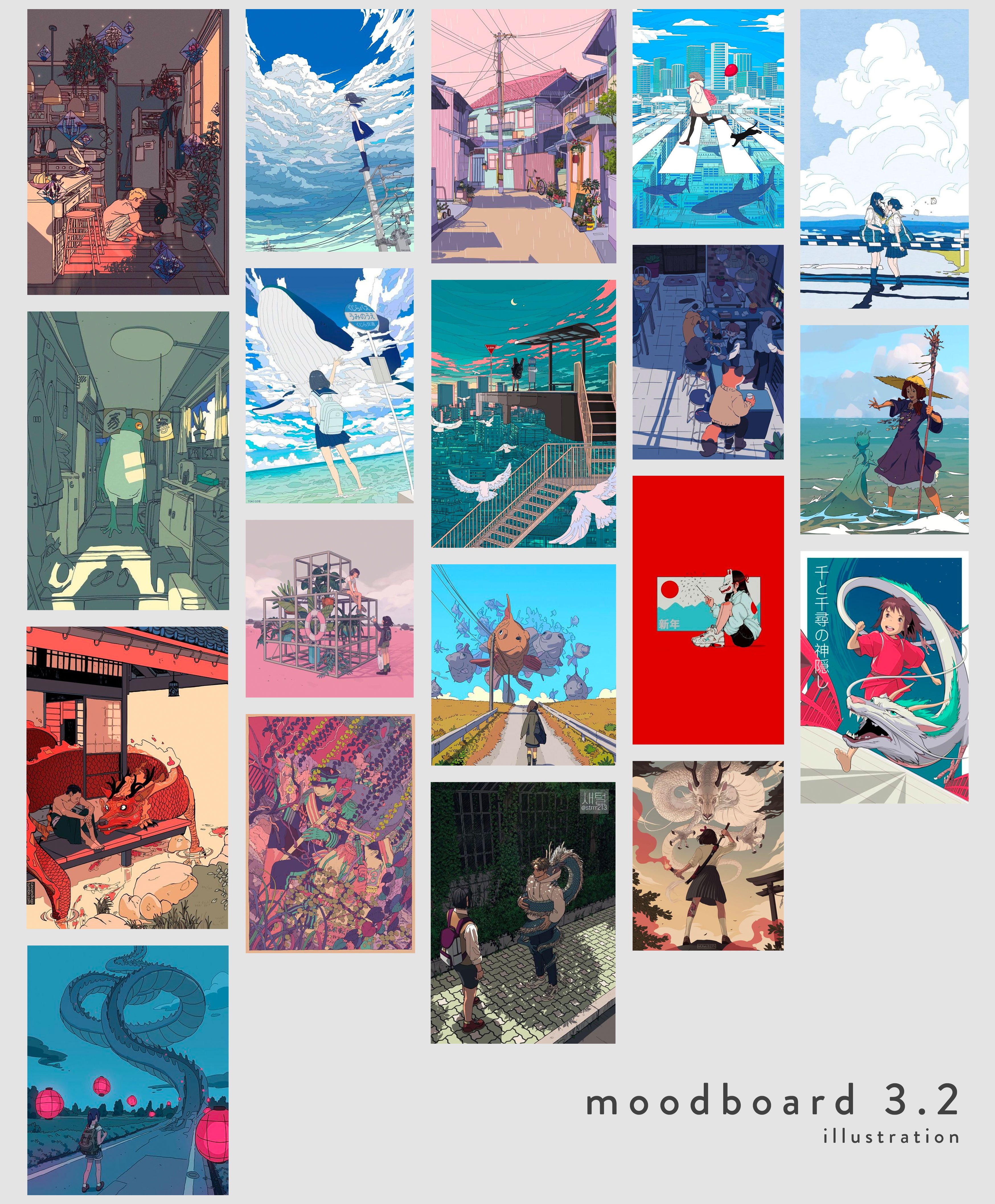
The initial ideas for the direction and theme of the zine were: Minimalistic, Nostalgic, or Modern. I also wanted to challenge myself to step out of my comfort zone. Therefore, I decided to create illustrations that are studio ghibli style (specifically spirited away) as it is my first time illustrating using the wacom tablet!
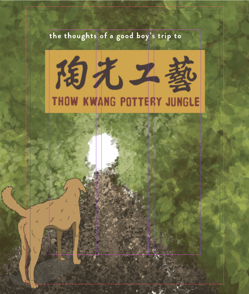
The cover page was based on the examples I found on my Pinterest at first. Then, after completing the other spreads, I decided to design the cover page to be part of the narrative so that it flows better.
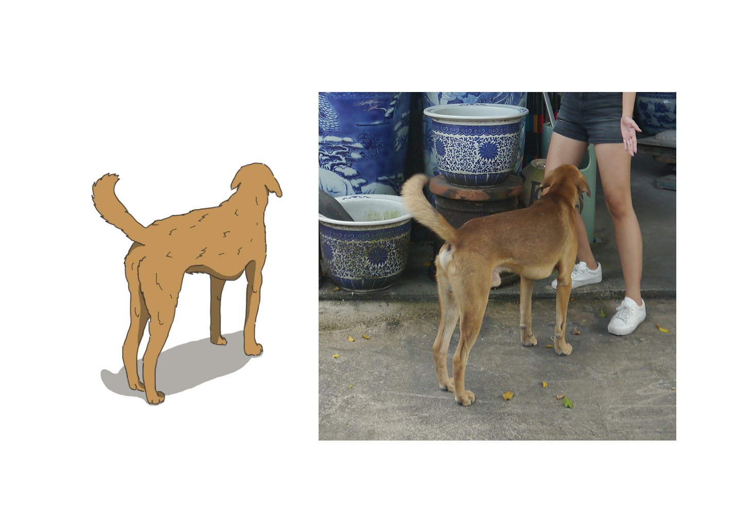
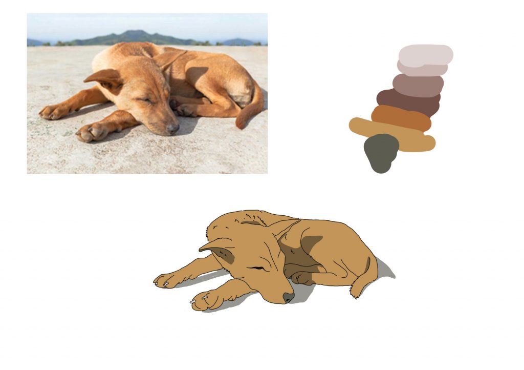
Asset 1: Dog
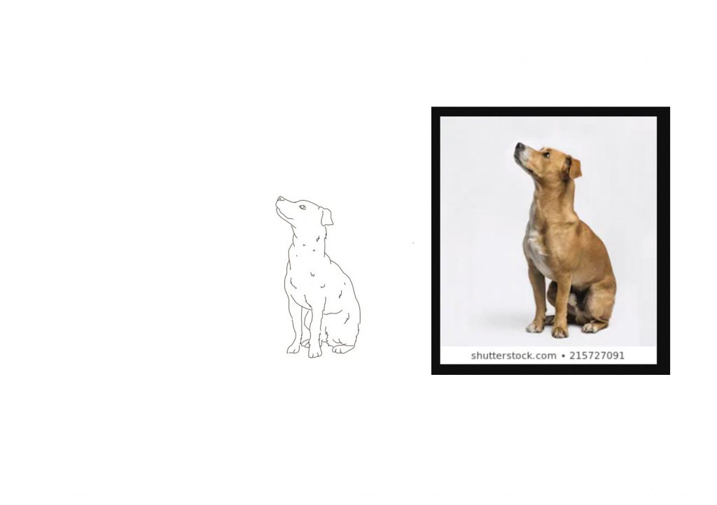
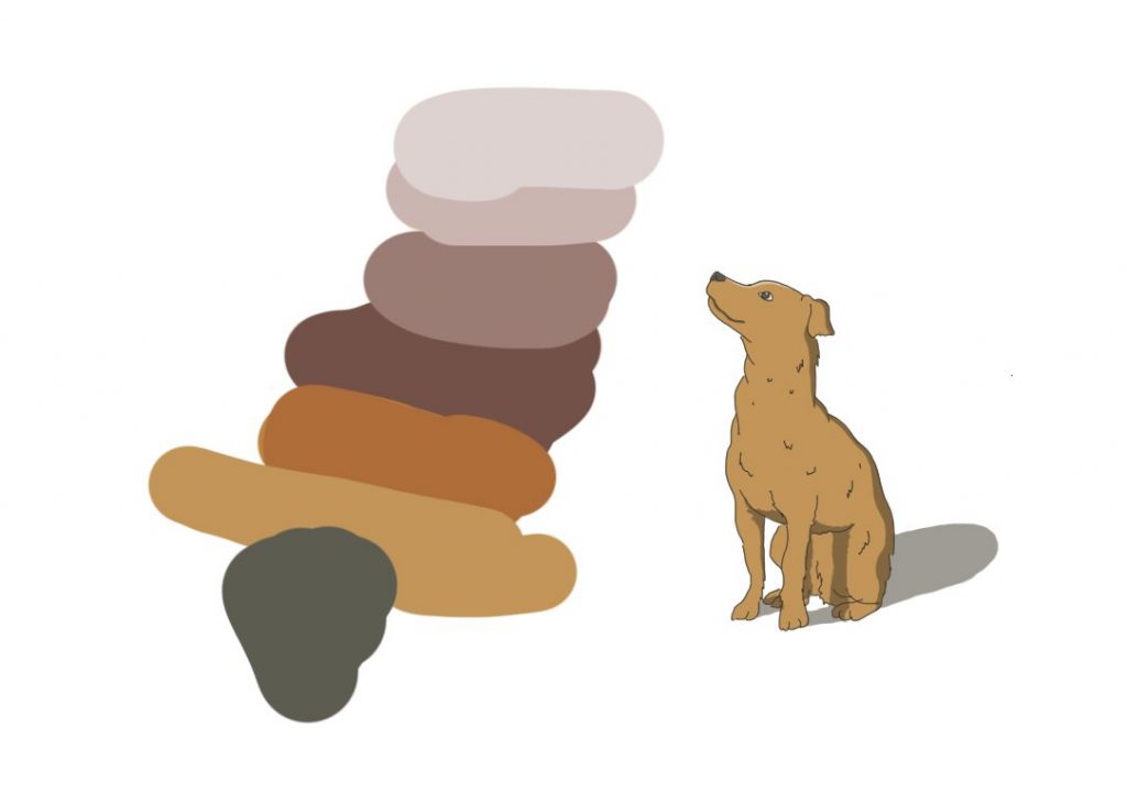
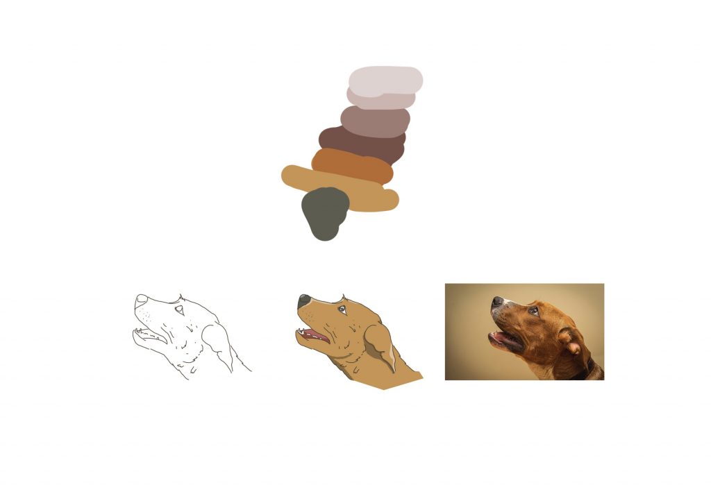
Firstly, the dog was based on the dog I saw when I was visiting the place. I first started out by outlining with a brush set to 100% hardness. Then, I coloured it referencing to the cel-shading method, where I first colour inside the outlines and finally adding a layer of dark grey set to multiply mode as the shadows. I used this method for illustrating all the dogs to show consistency.
Asset 2: Background
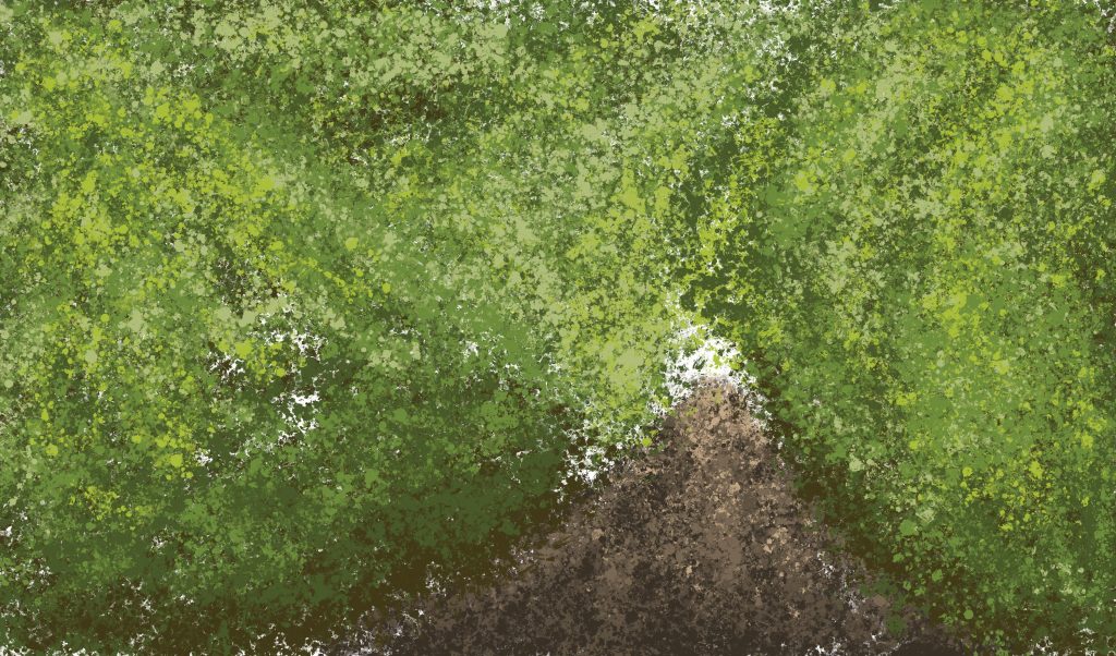
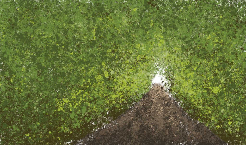
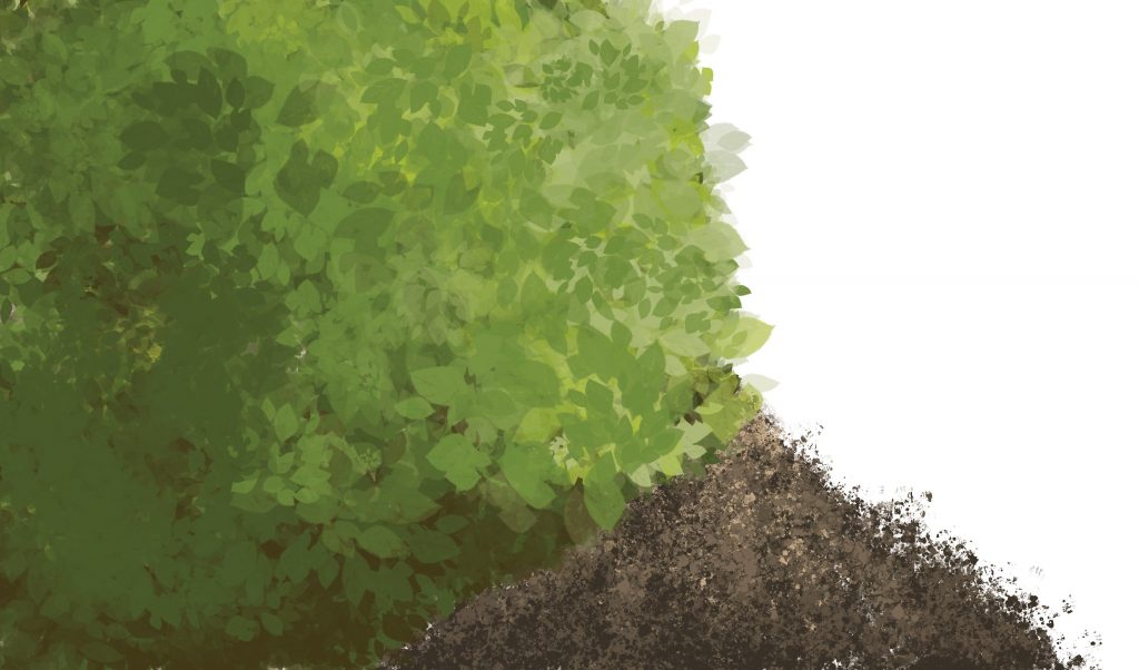
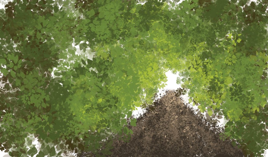
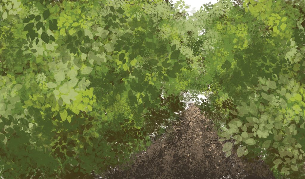
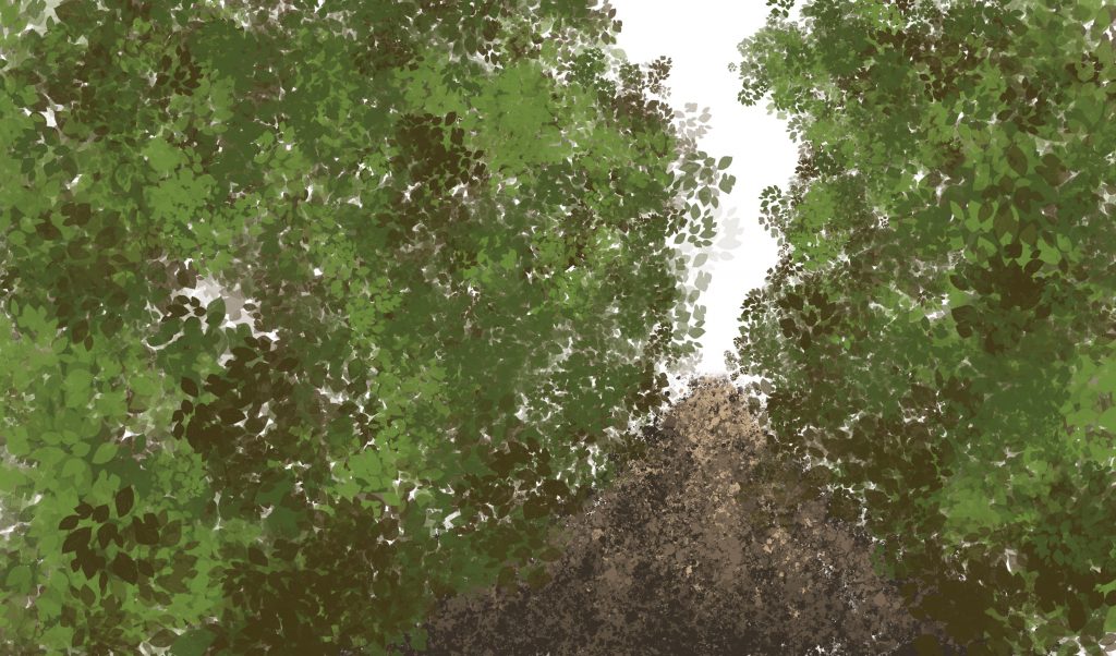
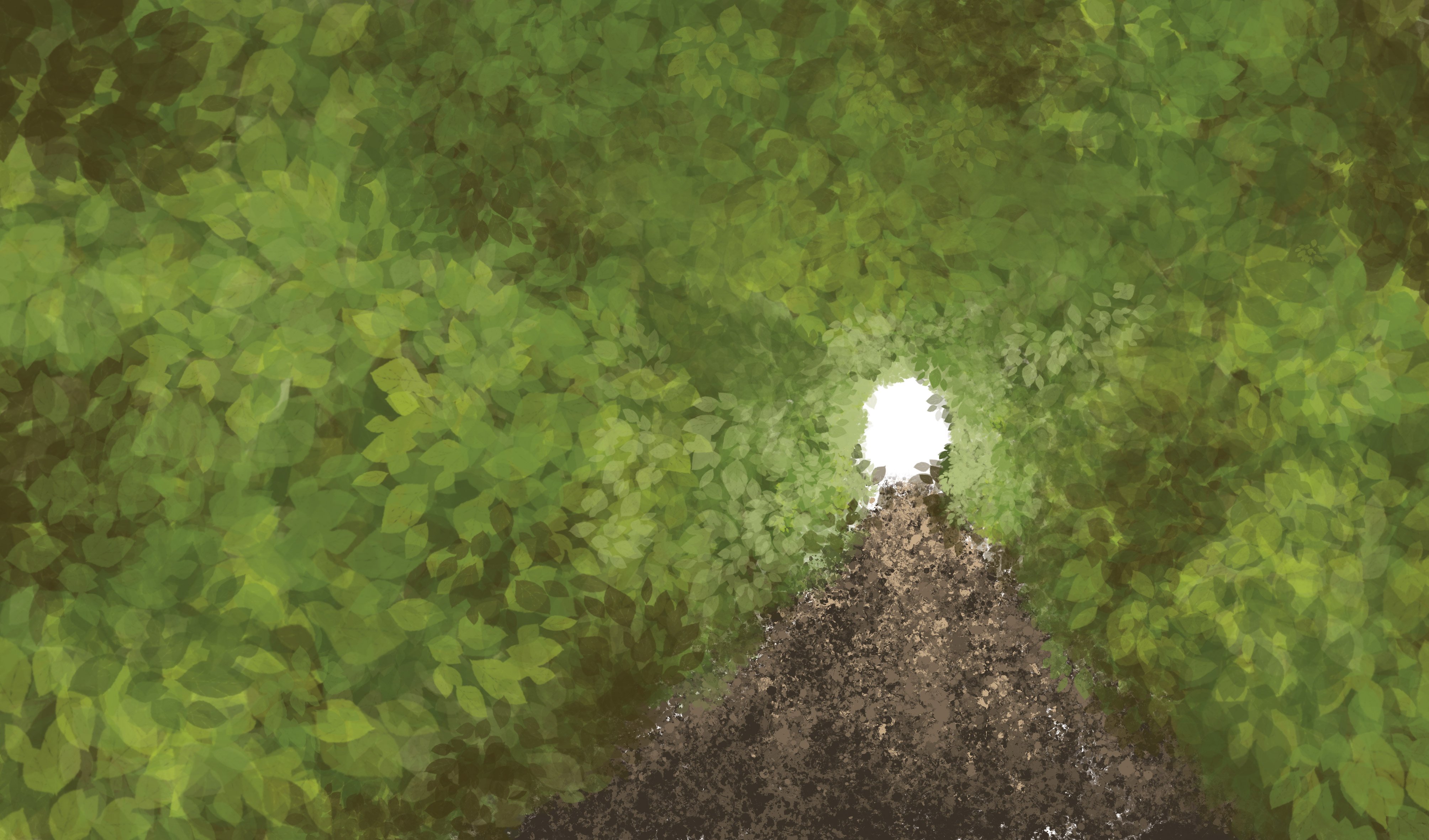
Then, I wanted to create a natural environment with trees to portray the nature of the place. I followed this tutorial and experimented with the lighting of the foliages.
v1 – foliage practice with photoshop built in brushreference photo
The following photos are me experimenting and testing out the lighting of the leaves. It looks VERY messy. I also used the photoshop built in leaf brush to make the foliage look more realistic.
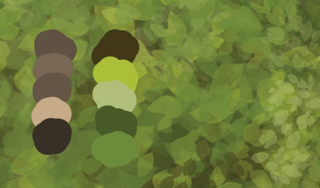
v2 – light from behind? (very messy!!!)v3 – light from the opening (better portrayal of the light but very messy!!!)v4 – used the leaf brush in photoshop (looks less messy!!)v5 – light studyv6 -light studyv7 -light studyv8 – final (bigger leaves in front and smaller leaves that are further away)the palette for the colours used
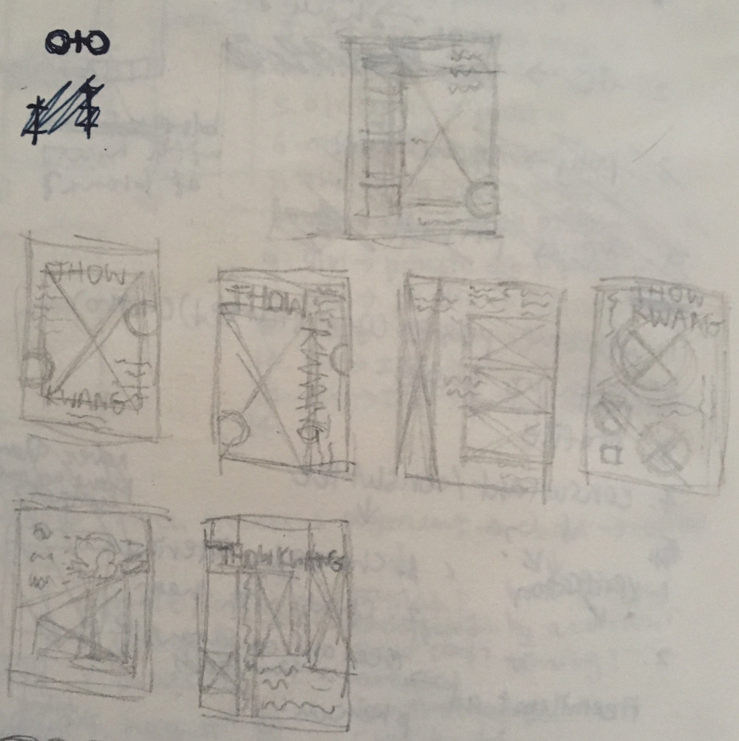
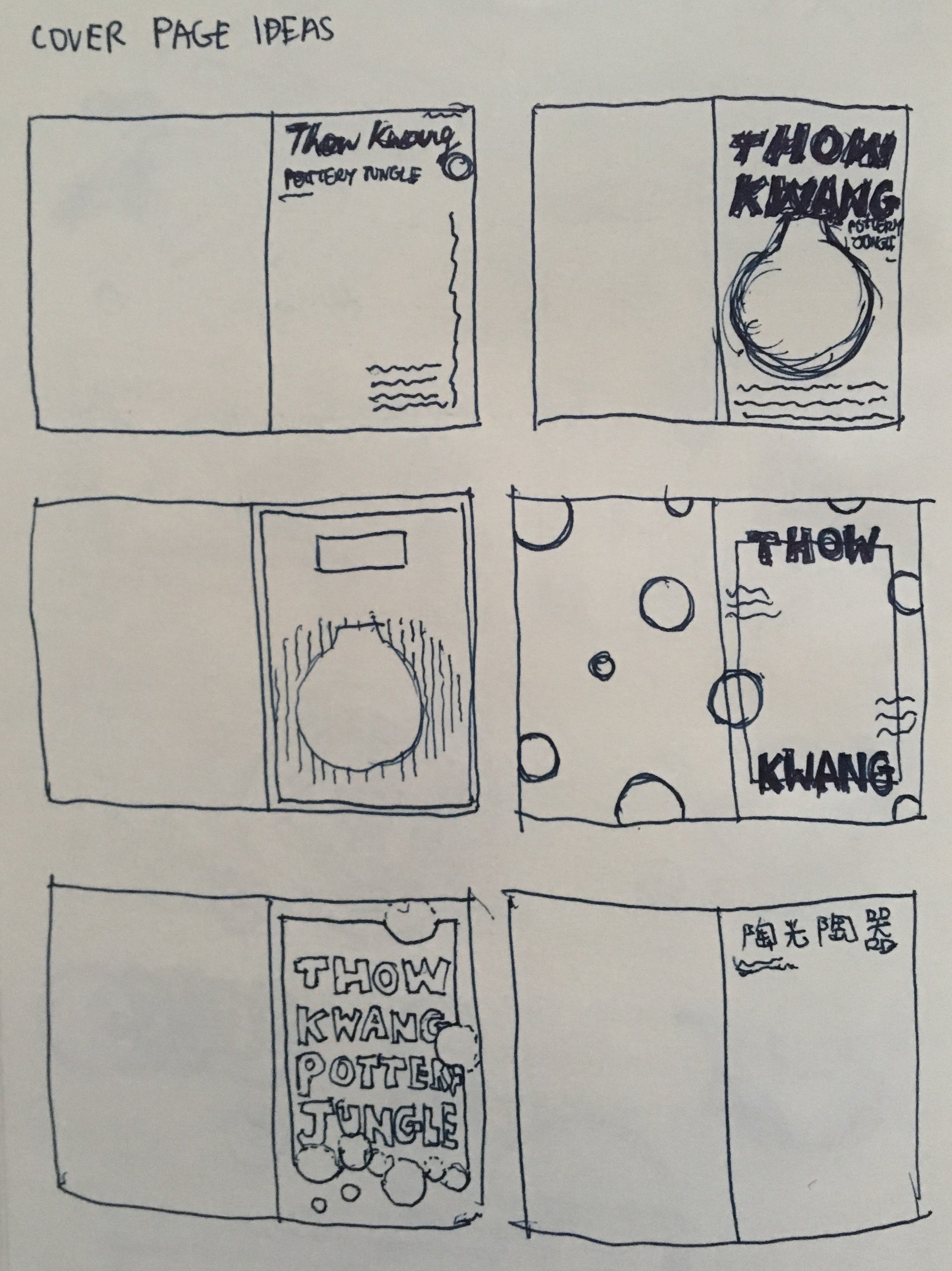
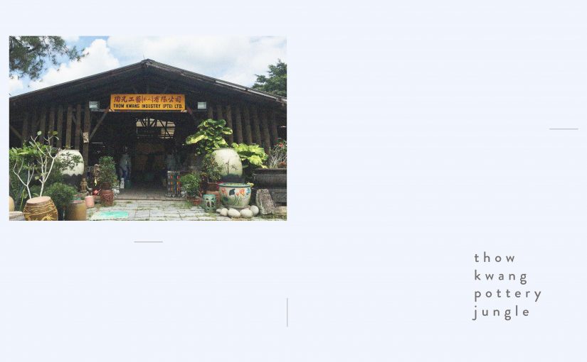
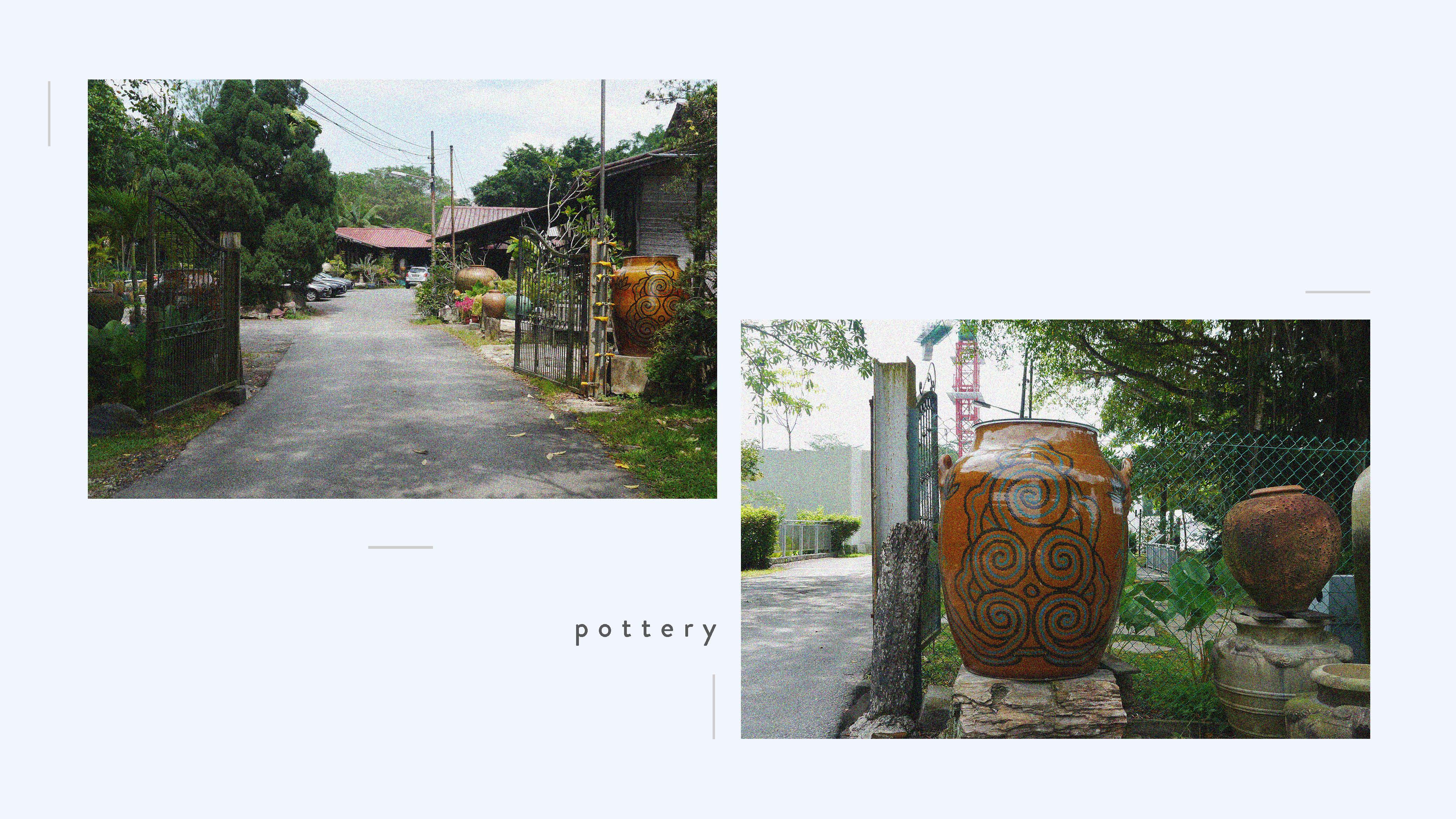
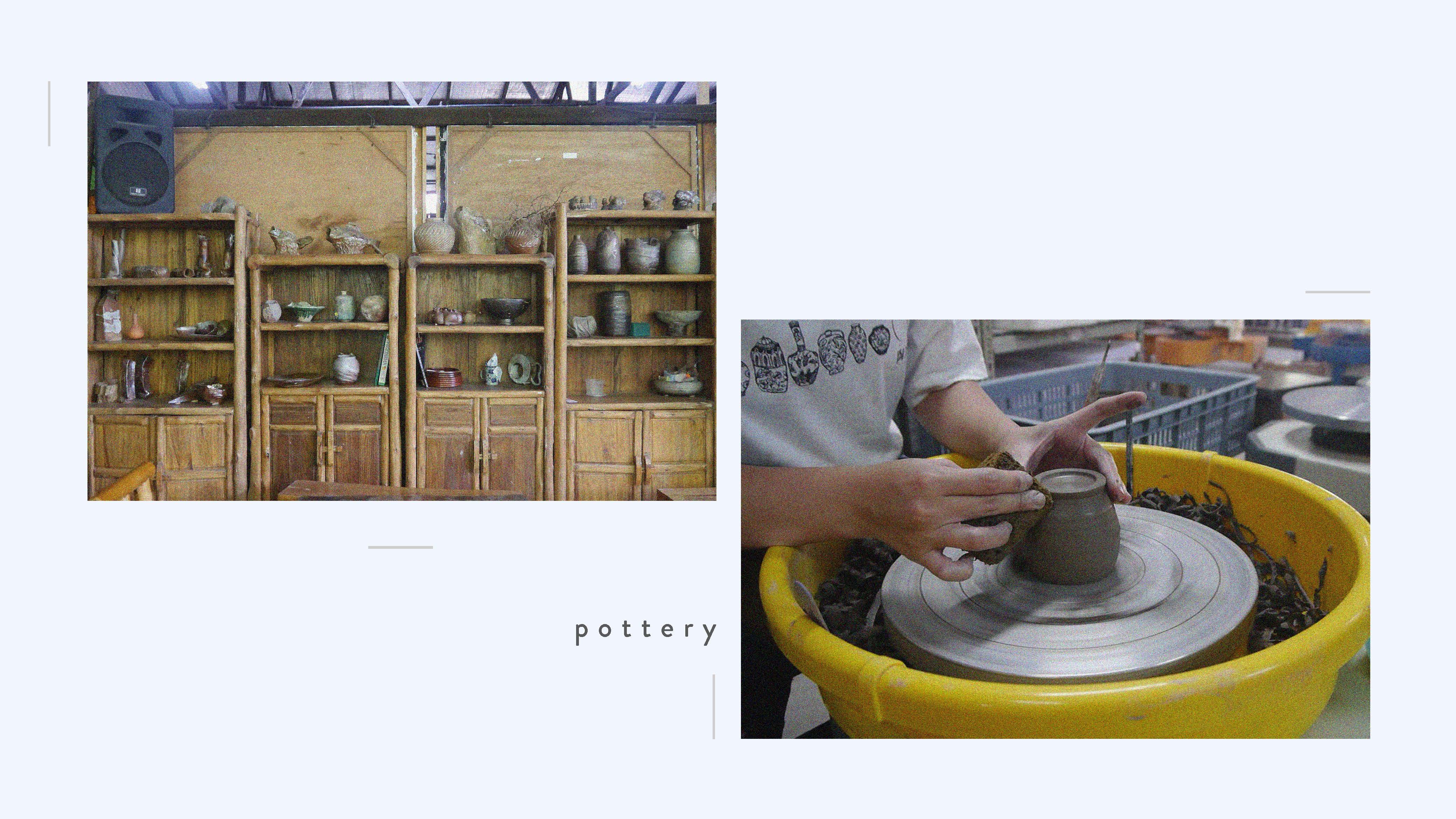
Asset 3: Signboard
I decided to use the original signboard on the cover page as I like the colour combination and the font that was used.
ref photo for the signboard
I then digitized the signboard by painting over the original photo on another layer.
v1 – blur and only says “thow kwang”!v2 – improved the sharpness of the edges and added “pottery jungle”
After preparing the assets, I assembled everything on InDesign.
“The thoughts of a good boy’s trip to” is aligned with the left column, while the signboard is centralized. I used Brandon Grotesque in Medium weight as the font throughout the other spreads as well. For the words used throughout the spreads, I increased the leading (space in between the base of the fonts) and kerning (space in between letters) so that it is easier to read.
I aligned my name with the left column on the back page.
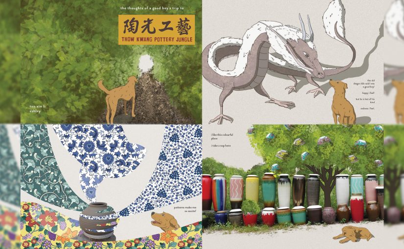
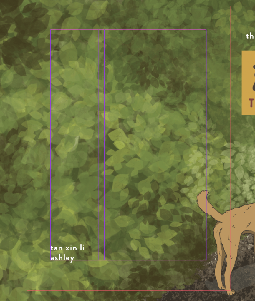
The cover page is the entrance to my zine, and thus I wanted to show that it is also the entrance to the place that I am illustrating. The dog facing the opening of the foliages and the leaves flowing towards the opening was meant to lead the viewer’s eye to it. There is nothing shown in the opening as I wanted to create mystery and anticipation as to what is waiting on the other end.
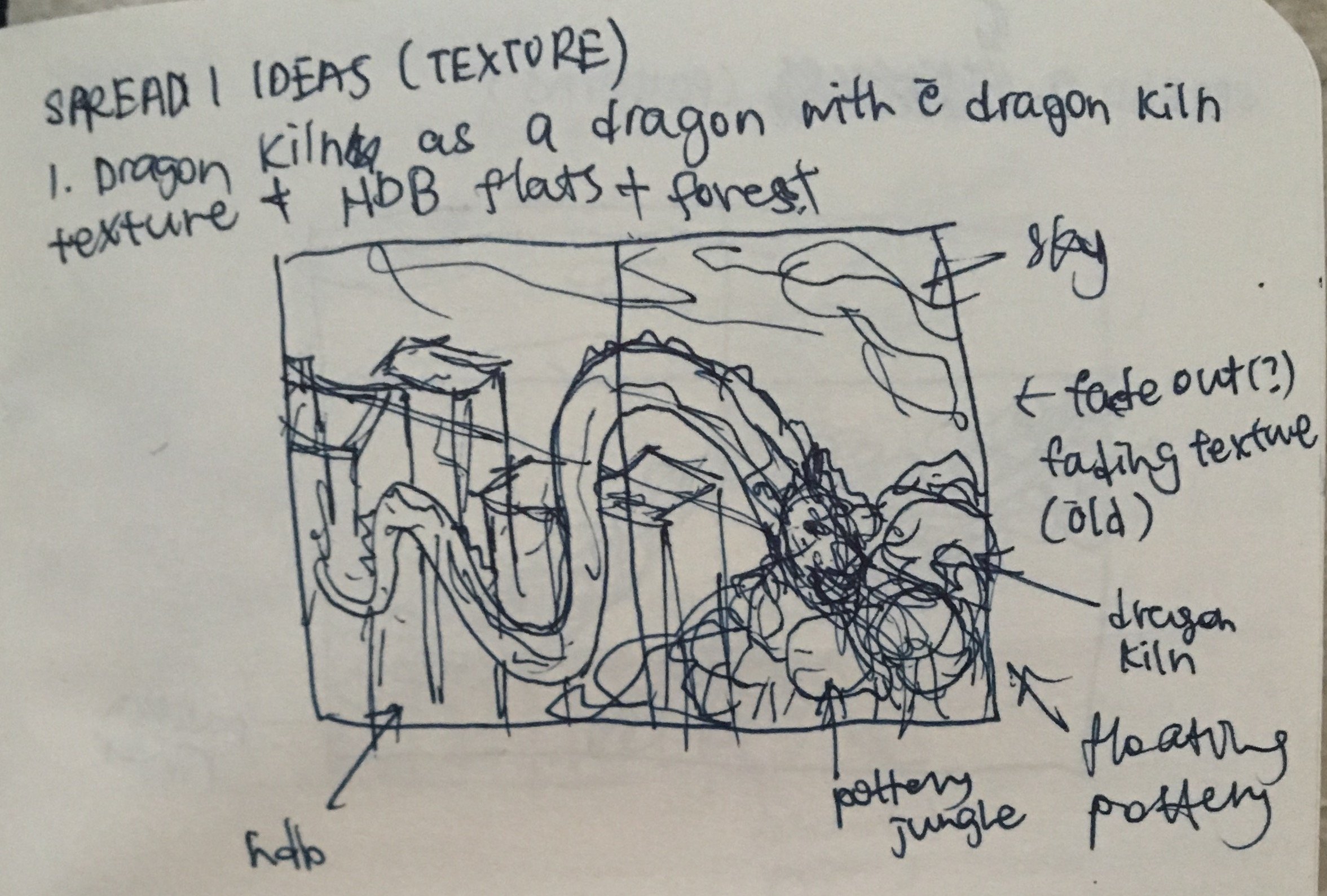
Spread 1: Texture
Asset 1: Dog
v1 – dog outlinev2 – colour filled in with the palette at the side
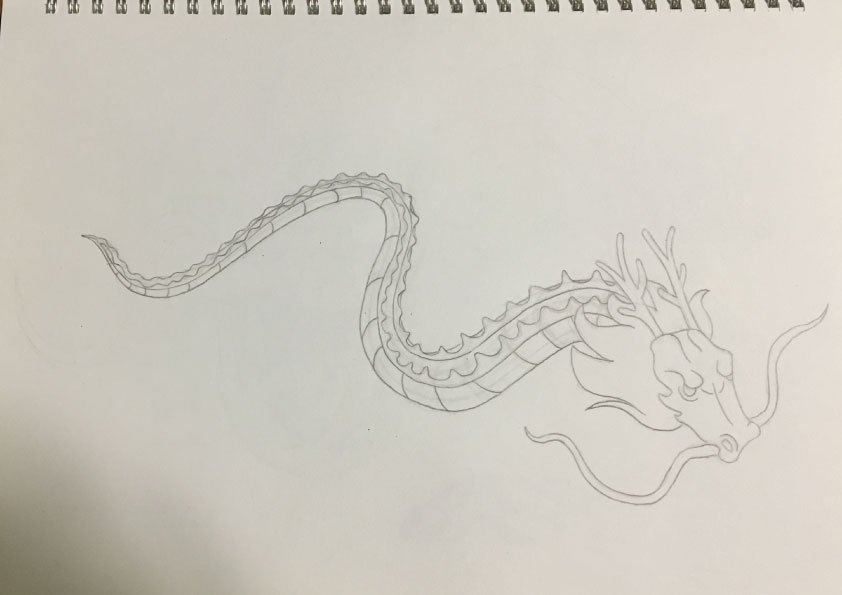
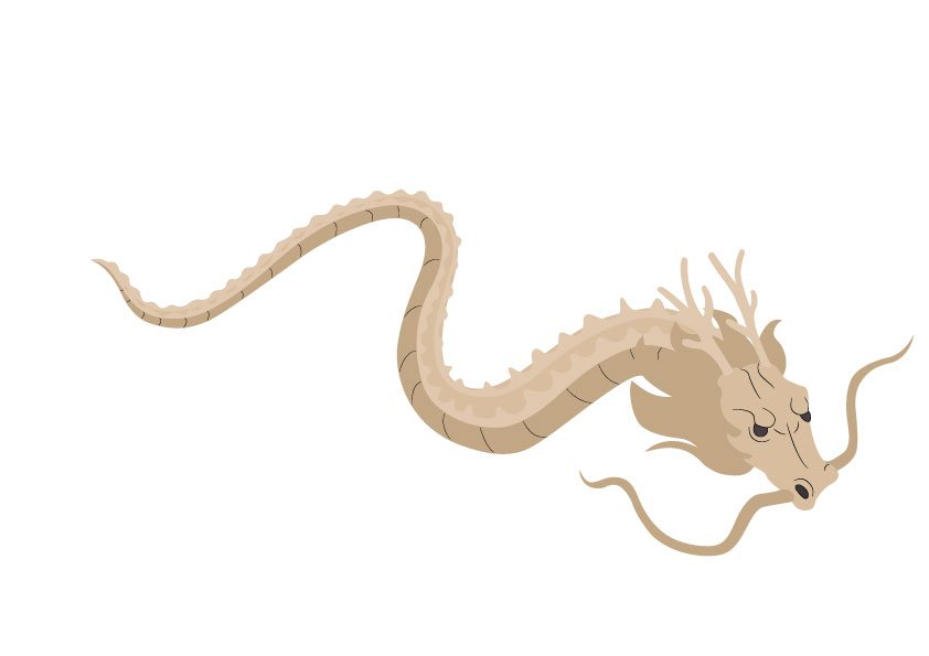
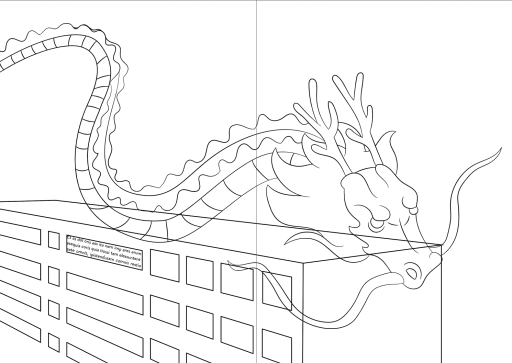
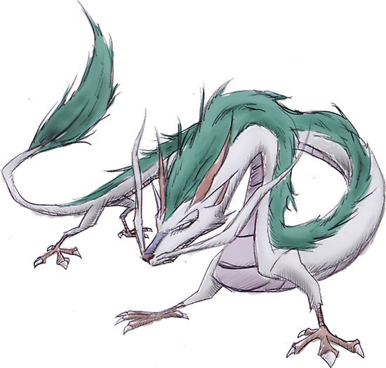
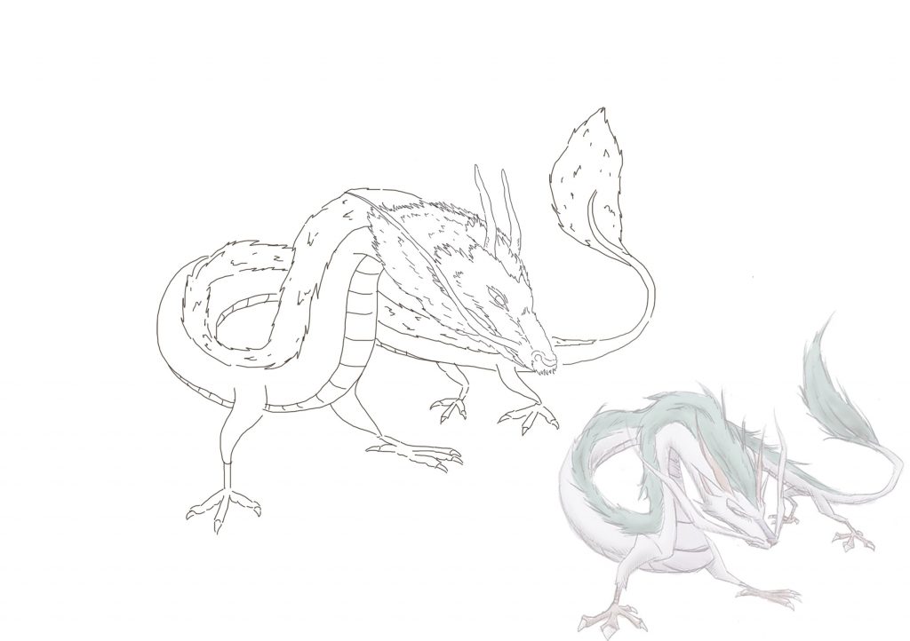
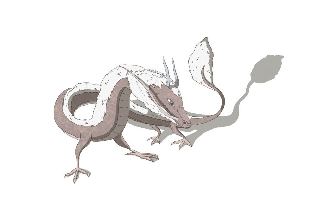
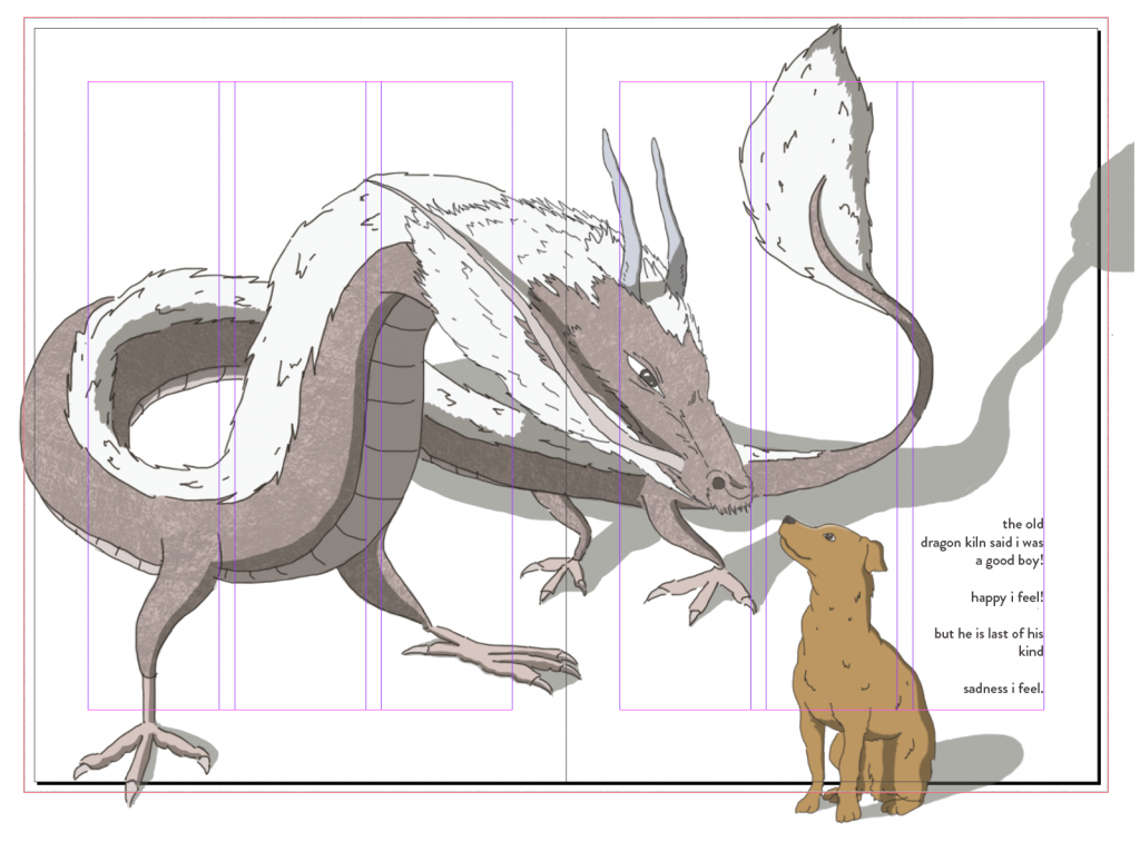
Asset 2: Dragon
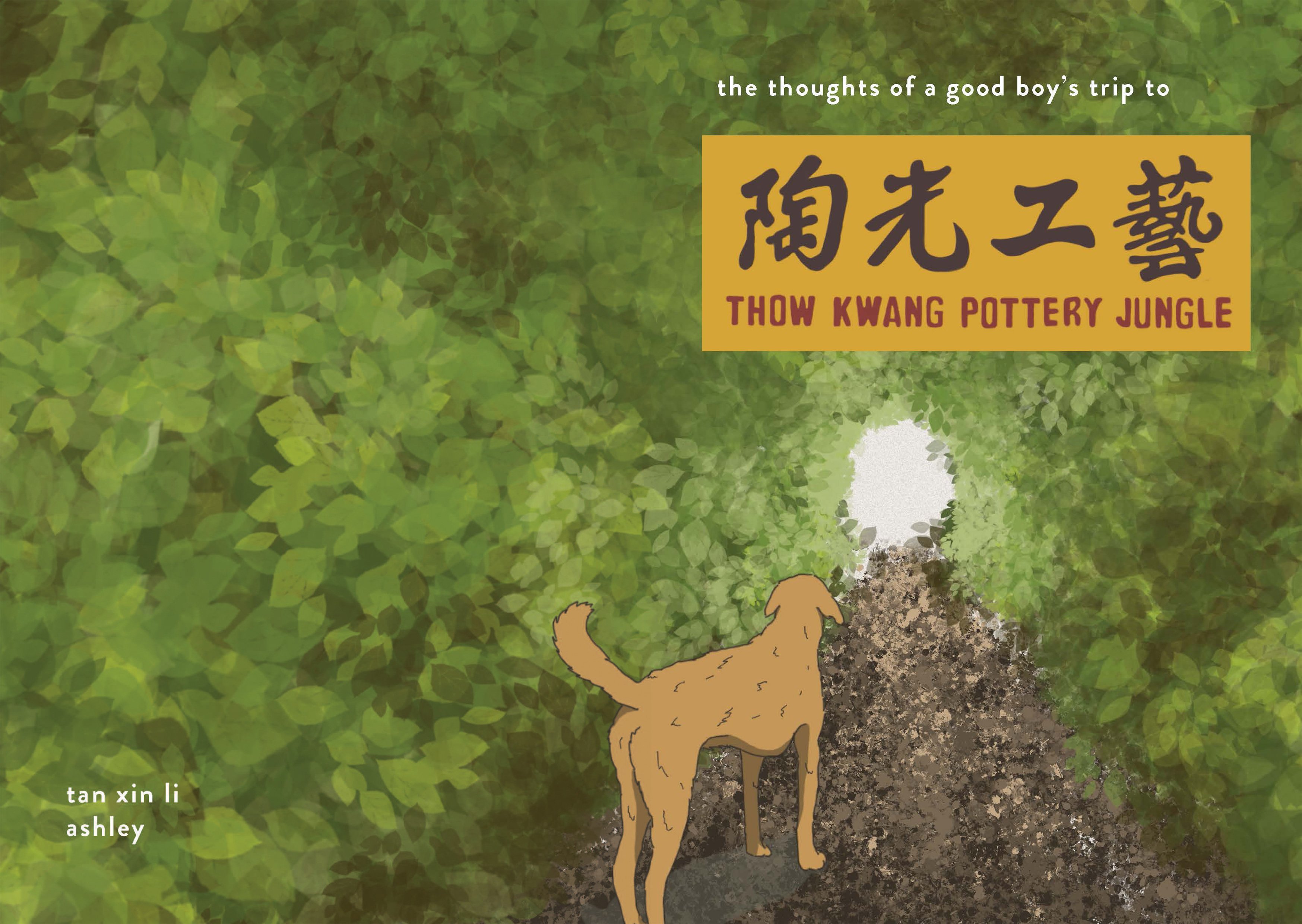
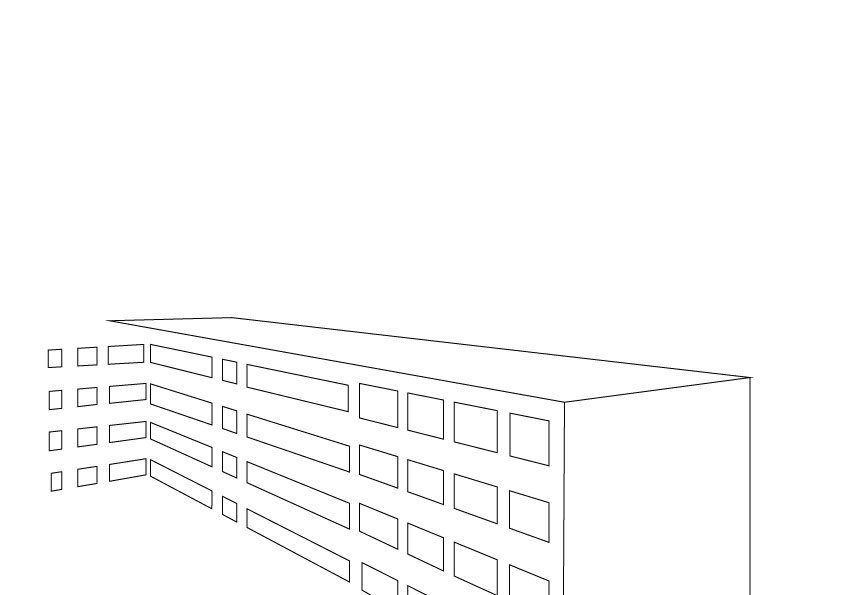
Initially, I wanted to portray the dragon traveling through the HDBs, as what most of Jurong would look like. However, I felt that there wasn’t a flow to the spreads in the zine. Therefore, I decided to add the character of a dog that is exploring the place. To add on, I imagined and crafted the thoughts of a dog traveling through the place. I thought it adds on to the fantasy/unreal/animated feel to the zine.
reference for dragon drawingv1 – dragon sketch
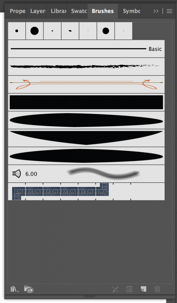
I created my own custom brush on Illustrator using the 3 shapes as shown on the left. I created the shapes first, then selecting a new art brush to create the brush. I only used these brushes for the initial stages of the dragon and the patterns which will be shown later.
v2 – dragon with custom brush
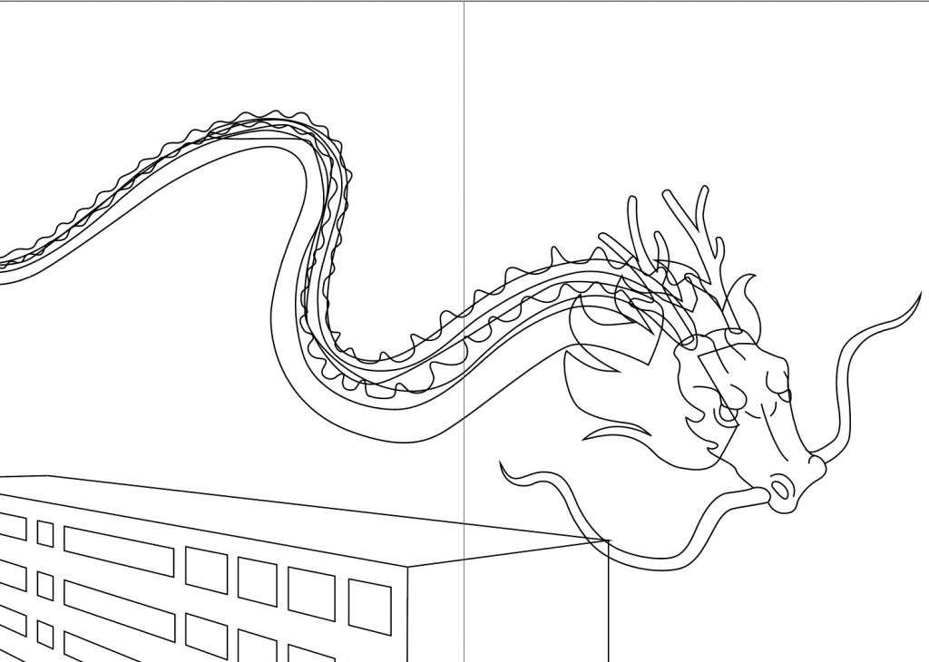
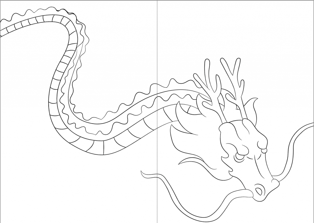
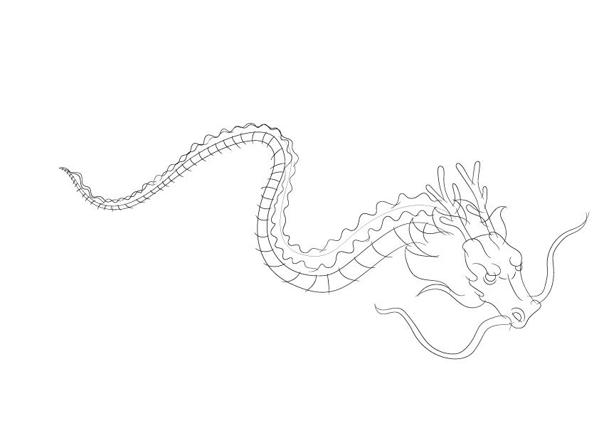
Initially, I observed that the outlines used in spirited away had sharp and thin stroke ends. Also, my initial drawing of the dragon does not have the same style as what was depicted in my mood board, thus I decided to redraw the dragon again as seen in v10.
v3 – dragon without outlineHDB outlinev4 – dragon & hdbv5 – dragon dominating the pagev6 – dragon dominating the page + HDB + text wrap for the windows
I also tried to redraw the dragon using a method that I learned while drawing the patterns in the next spread.
v7 – sketch before cleaning up with overdrawn linesv8 – after cleaning up the lines
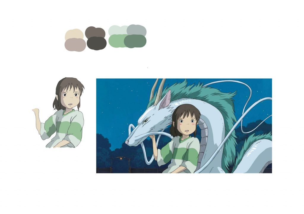
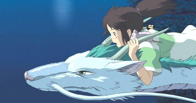
After not being able to achieve the style and feel that I want, I consulted my friend who is more experienced in illustrating digitally. He taught me the whole process of outlining, cel-shading, and painting shadows. In order to familiarise myself with the process, I practiced on illustrating Chihiro first, the girl depicted in the image below.
studio ghibli practicereference to dragon drawingv9 – drew dragon haku from spirited away
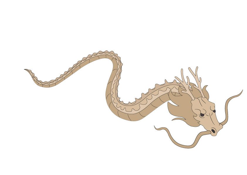
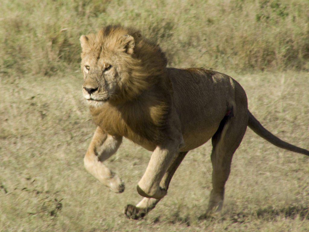
The dragon is too similar to what was portrayed in the movie. Therefore, I decided to add the mane of a lion to its hair.
reference to the mane/hair of the dragonv10 – dragon with the mane of a lionv11 – body testv12 – texture/colour test
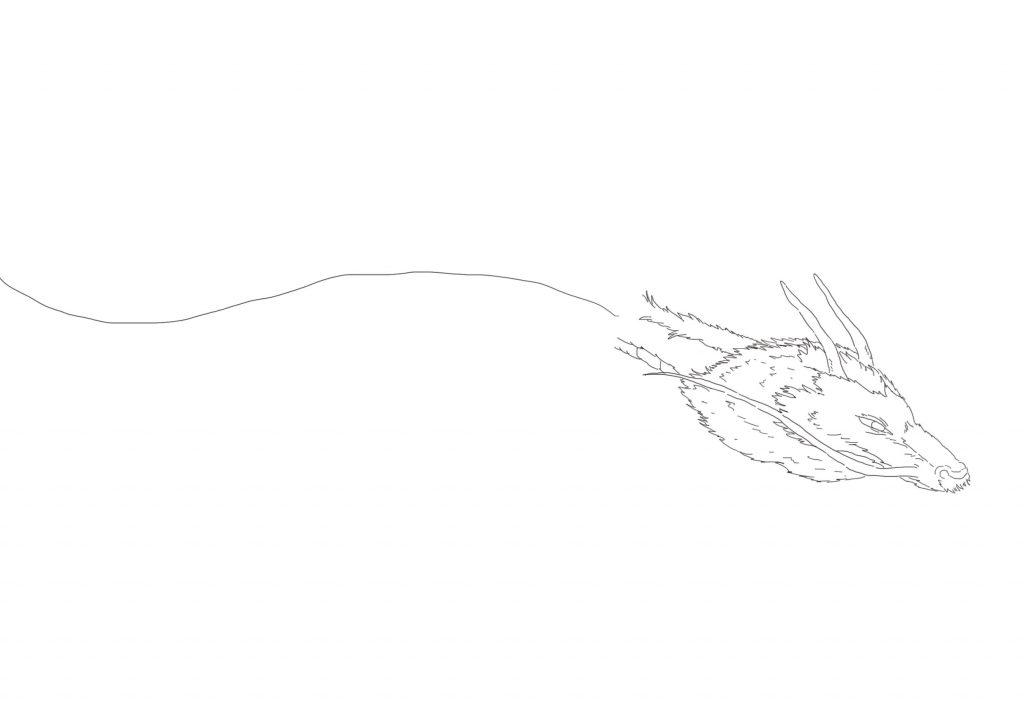
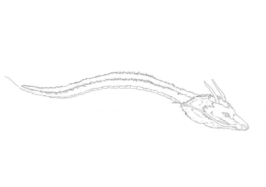
I decided to change the posture of the dragon as the body seems very short and is lacking movement.
reference to the posture of the dragonv13 – the study of the dragon’s posturev14 – the study of the dragon’s posturev15 – the study of the dragon’s posturev16 – the dragon’s final posture, drawn to look down at the dog
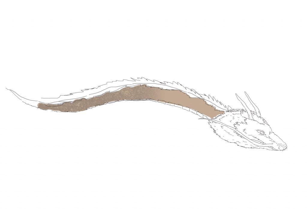
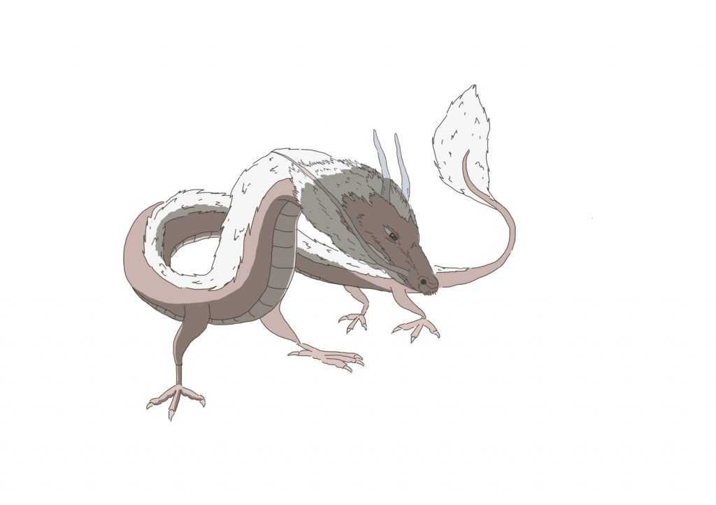
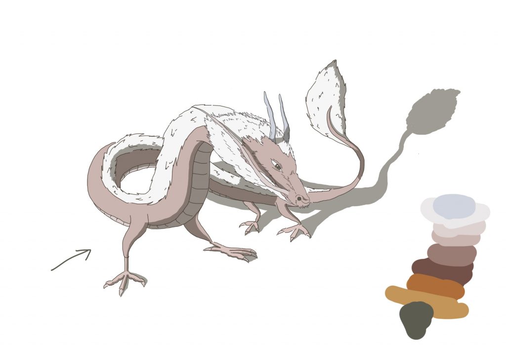
Then, I filled in the colour of the kiln and tried to get the right shadow. Also, the hair of the dragon is slightly off white to show that the dragon is old.
v17 – light coming from the backv18 – light from the front
After finalising with the colours and shadow, I added the texture of the actual kiln on the dragon using the method that was taught in the last project.
the texture of dragon kilnthe texture of the dragon kiln with a transparent backgroundv19 – the texture of the actual dragon kiln is added
After preparing the assets, I assembled everything on InDesign. The dragon is slightly cut off at the side to show the size, and to dominate the entire image. The words are aligned with the outer right column of page 3 and are aligned to the right side.
I depicted the dragon kiln as an actual dragon as I wanted to add an element of surrealness to it. I also wanted to depict the dragon kiln being the last operating one in Singapore. The dragon is shown to be welcoming to all, as seen by the text by the side, saying that the dragon said that the dog is a good boy, despite its fierce appearance. To emphasize that the dragon kiln in Thow Kwang is the last in Singapore, I added “but he is the last of his kind” and “sadness i feel” in hopes to evoke an emotion for the viewer.
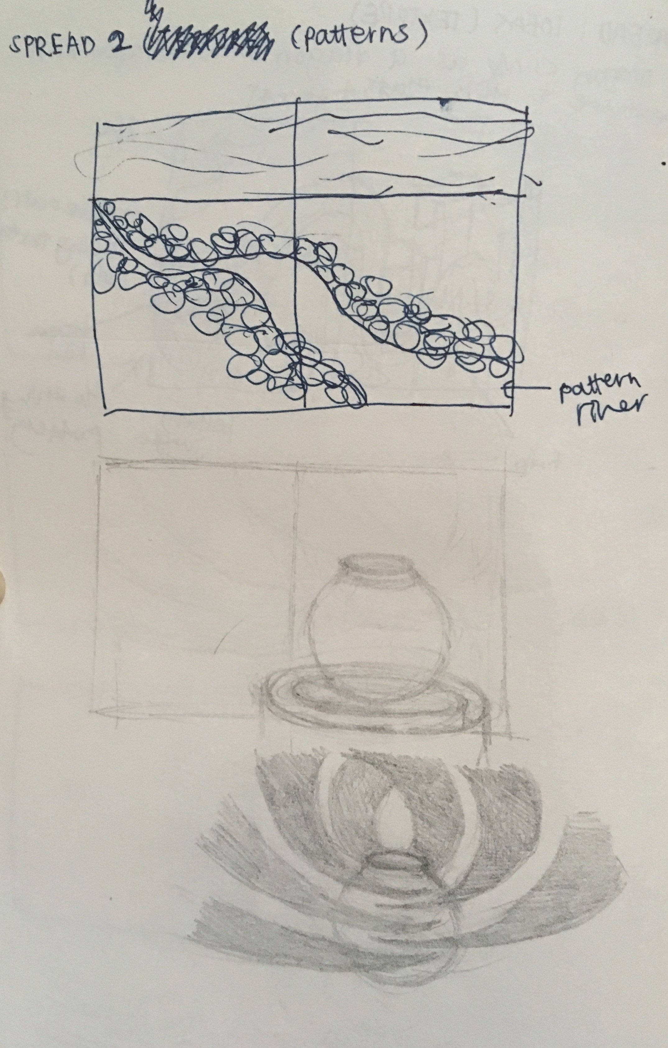
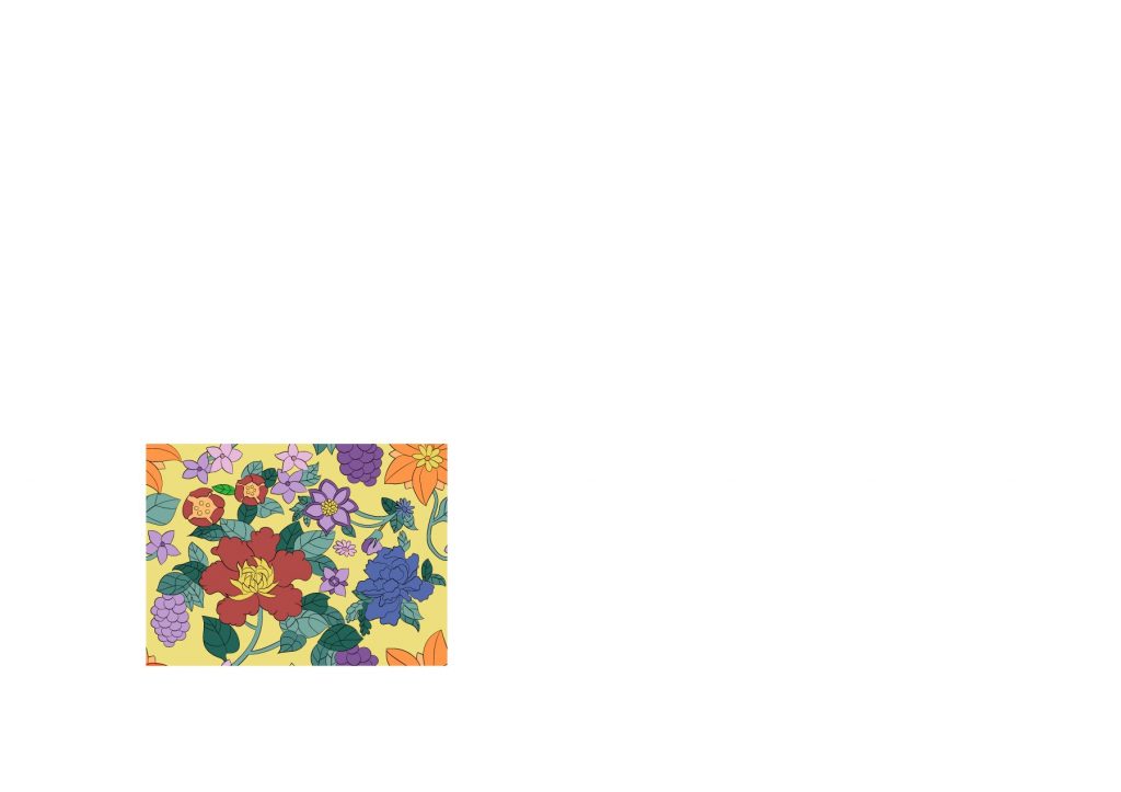
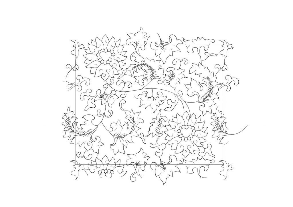
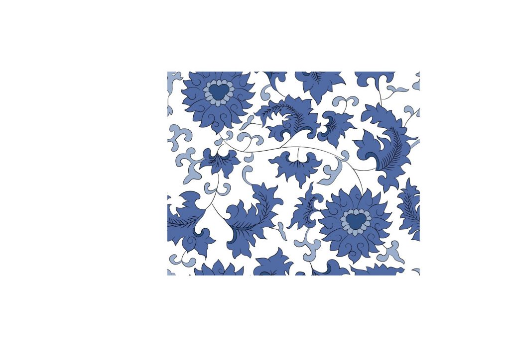
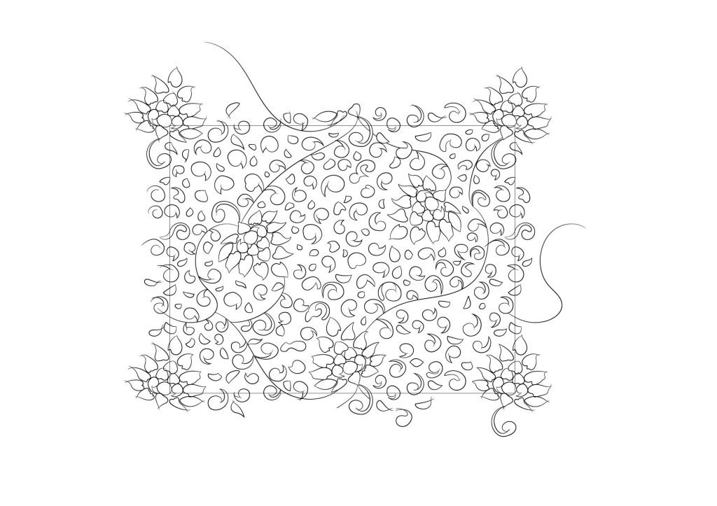
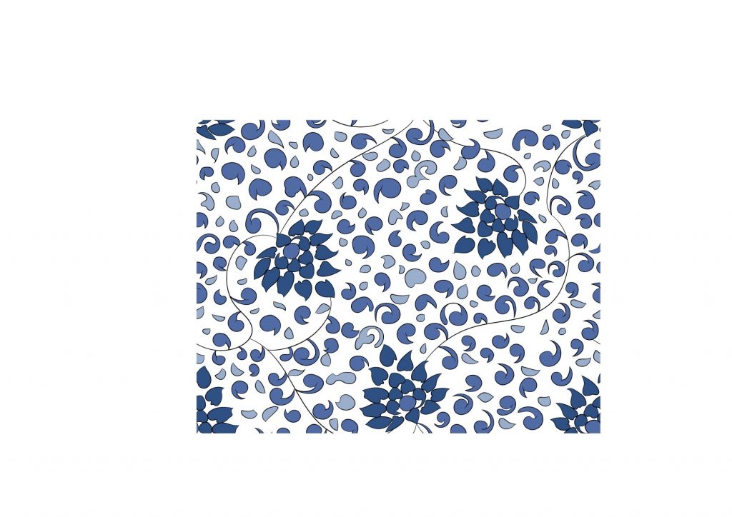
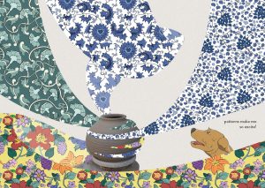
Spread 2: Pattern
The initial sketch was a river with patterns flowing through it. I chose a river because I remember seeing a river near the entrance of the place. However, there is no pottery element to it. Therefore, I decided to change it to the second design.
Asset 1: Dog
v1 – dog process
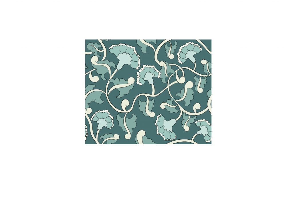
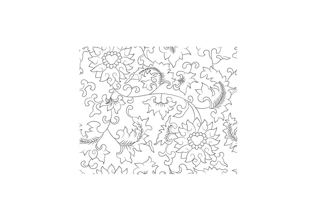
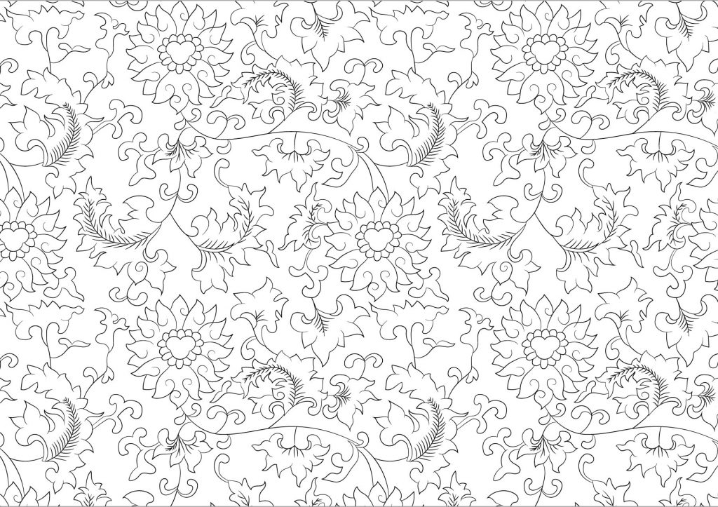
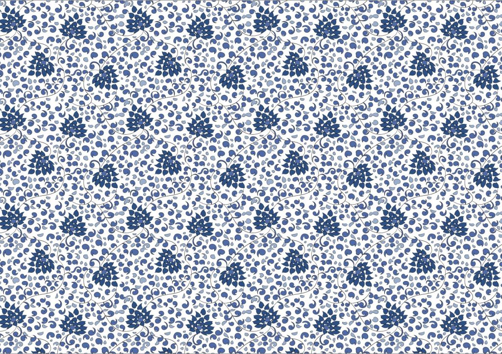
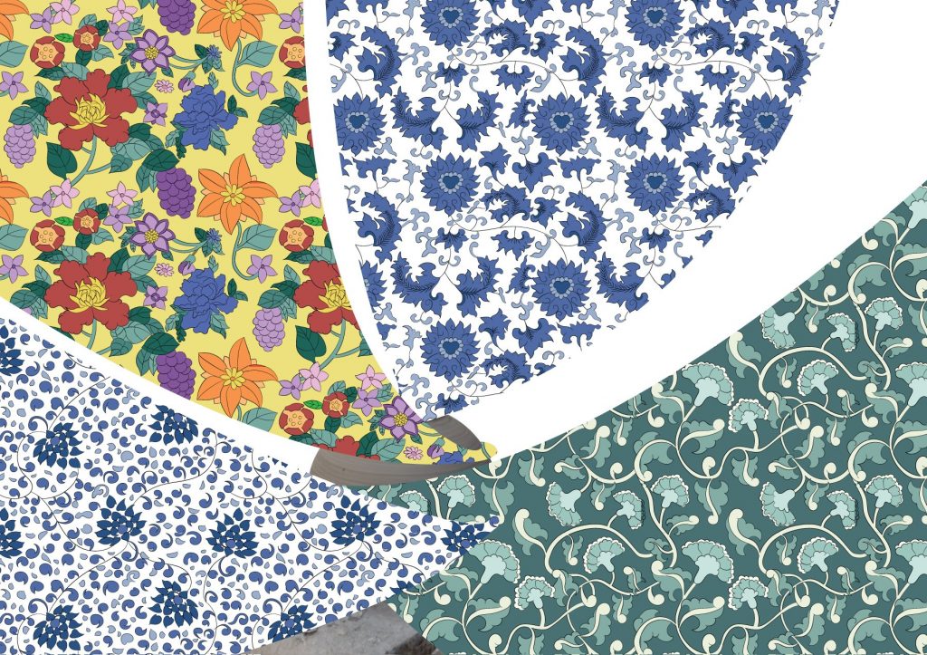
Asset 2: Patterns
I followed this tutorial to illustrate all of my patterns.
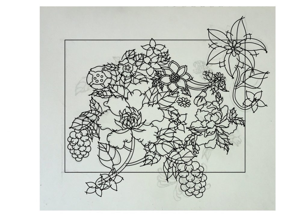
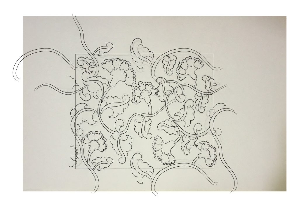
pattern 1 reference1 – sketch on paper
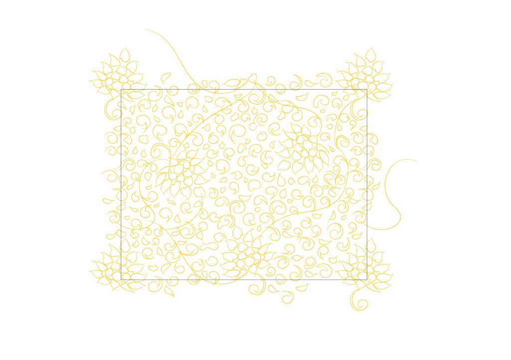
Firstly, I sketched out the pattern on paper. According to the tutorial, the lines are overdrawn so as to complete the space for the live paint function to work later on.
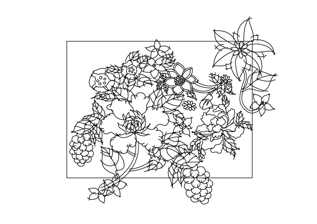
2 – digital sketch
Then, after digitally sketching it I adjusted elements that are in the corners in a way that it will flow seamlessly to the next if the same base image is placed next to it.
3 – digital sketch test
Before clearing up the lines, I always test whether any elements are overlapping each other, or if there are too much empty spaces.
4 – cleaned up lines
After finalising the elements, I did the following: Expand Appearance > Live Paint: Make > Live Paint: Expand > Ungroup > Ungroup. then, I deleted the overdrawn lines manually that are within the bounding box.
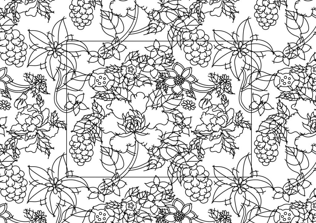
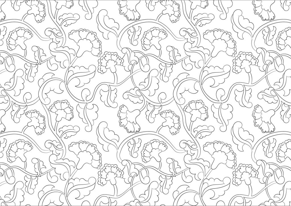
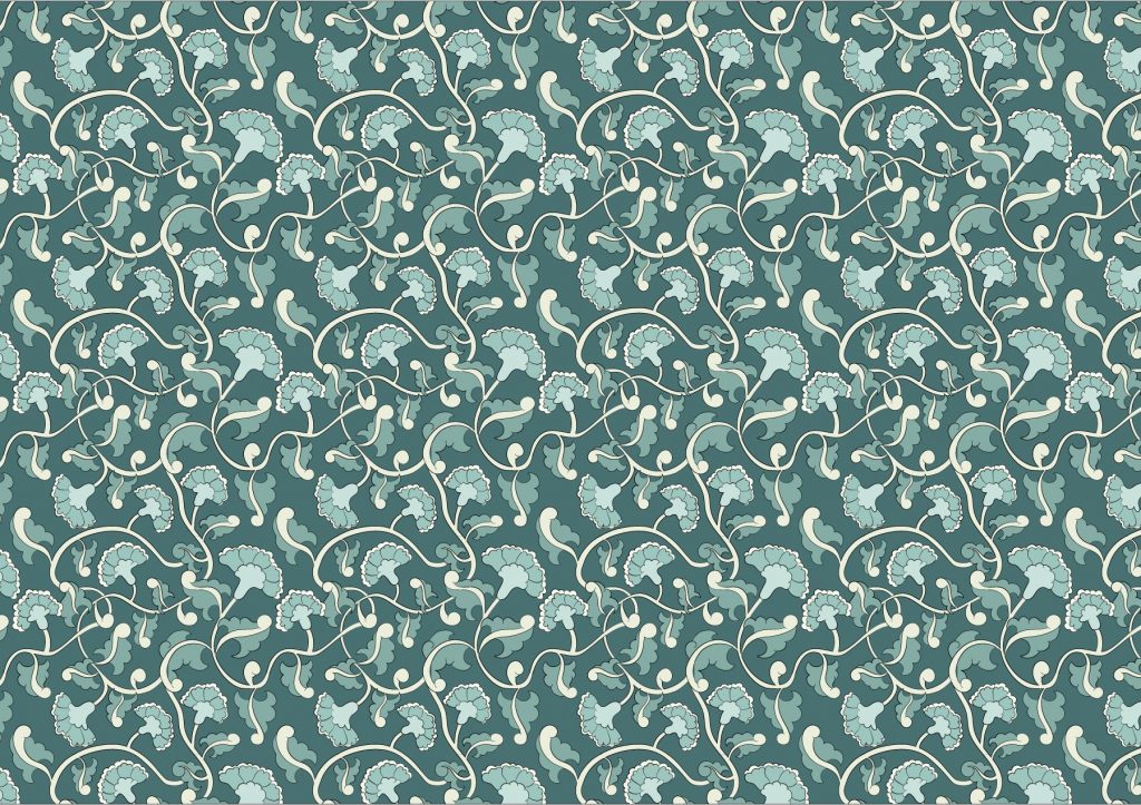
5 – base image for the pattern6 – pattern test
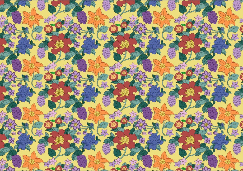
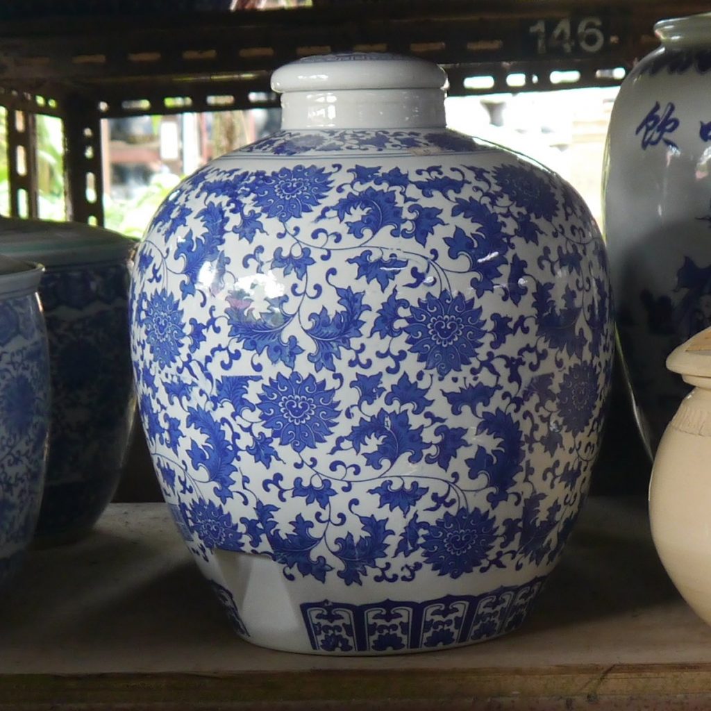
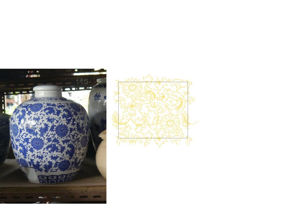
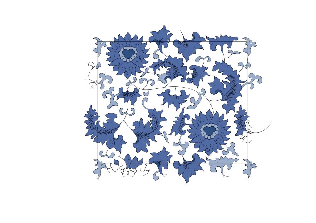
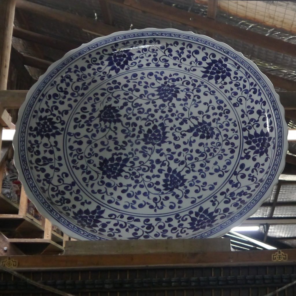
I then tested the pattern again to see if I missed out any overdrawn lines. Once it’s done, I followed the colours of the actual vase. I used the eyedropper tool to retrieve colour from the actual image, and then the live paint bucket tool to colour in the spaces.
7 – colour test8 – colour test (after adjustment)
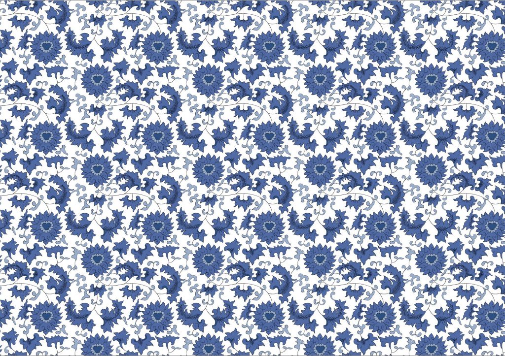
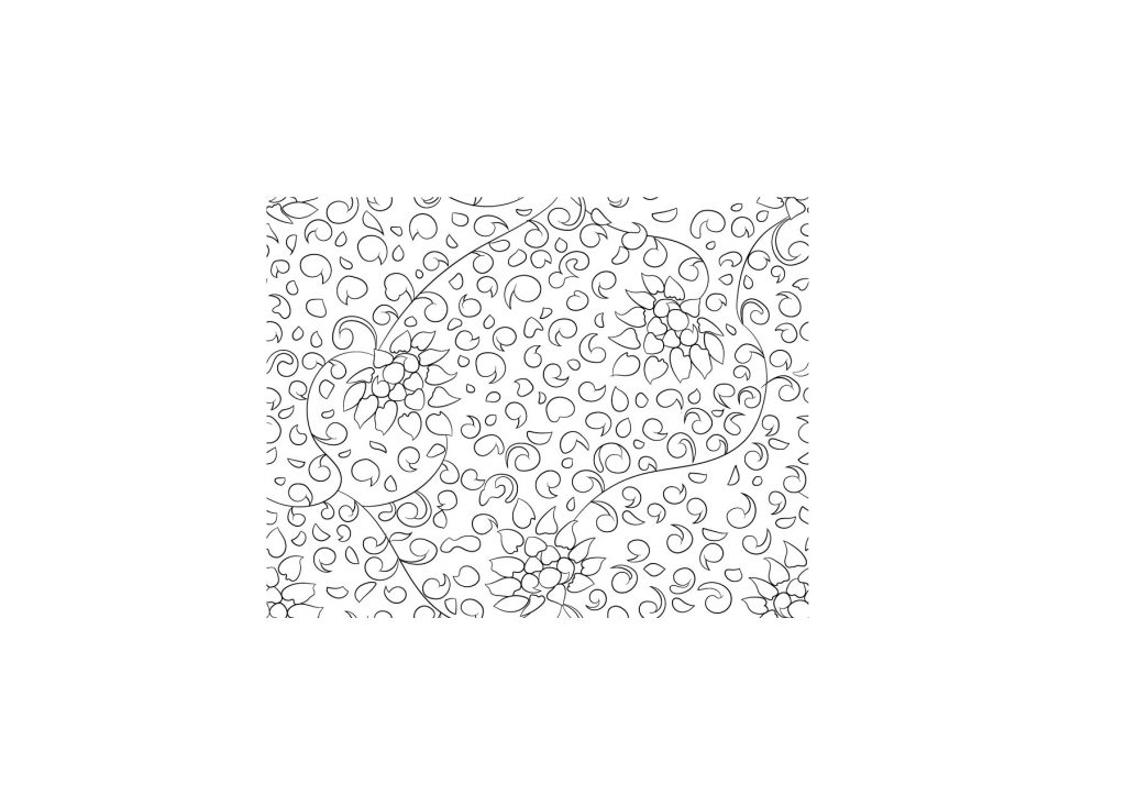
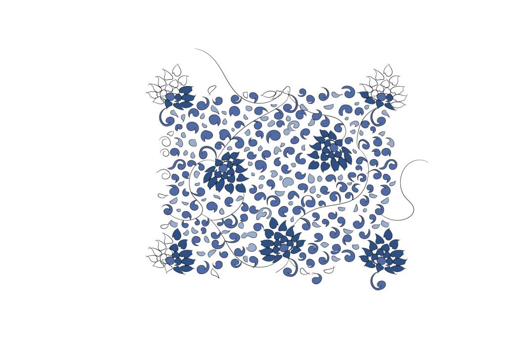
After placing the patterns on the shapes surrounding the vase, it was too big to see every element. Therefore, I decided to resize the base image of the patterns smaller.
9 – small pattern base image with colour10 – final pattern test with colour
The following patterns are done with the same method and process as mentioned above.
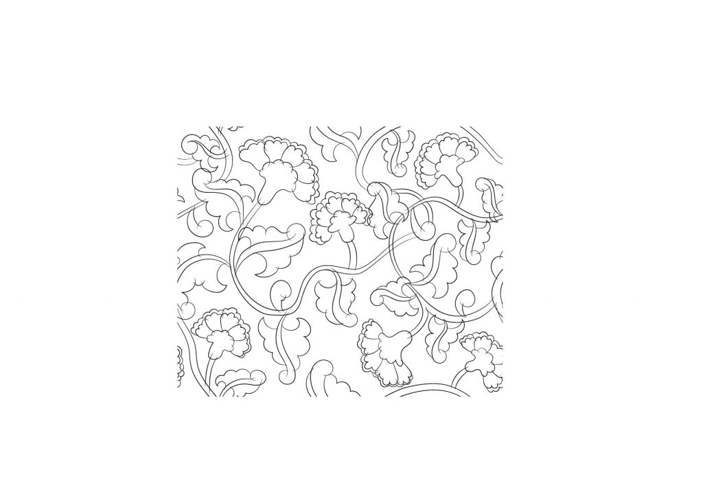
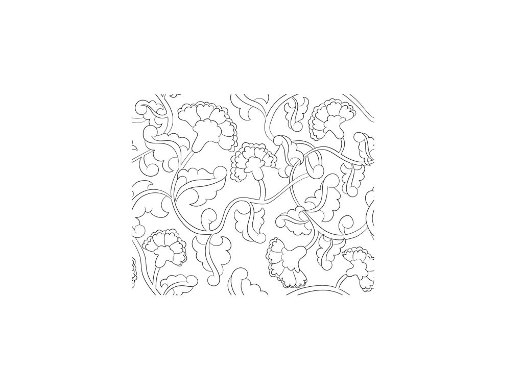
pattern 2 reference1 – pencil sketchdigital sketch (before clean up)3 – digital sketch test4 – cleaned up lines, base image for the pattern5 – cleaned up lines with colour6 – base image for the pattern with colour7 – pattern test with colourpattern 3 reference1 – digital sketch2 – digital sketch3 – cleaned up lines, base image for the pattern4 – pattern test5 – cleaned up lines with colour6 – base image for the pattern with colour7 – pattern test with colour
1 – digital sketch2 – digital sketch3 – cleaned up lines, base image for pattern4 – pattern test5 – cleaned up lines with colour6 – base image for the pattern with colour7 – pattern test with colour
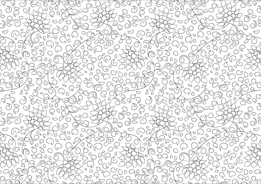
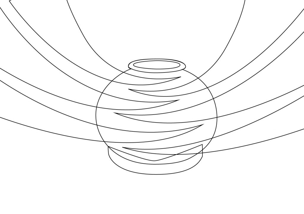
Asset 3: Pot
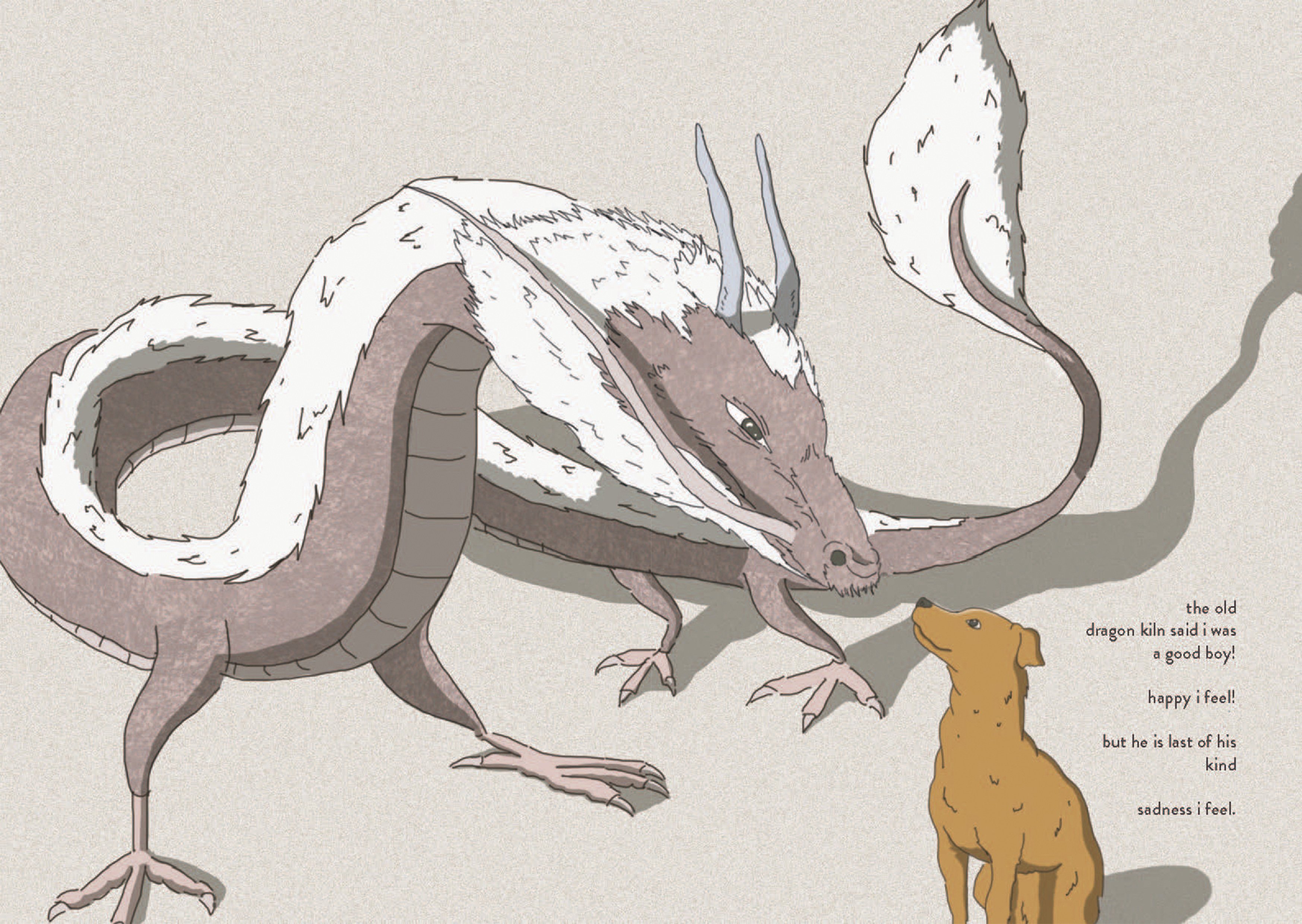
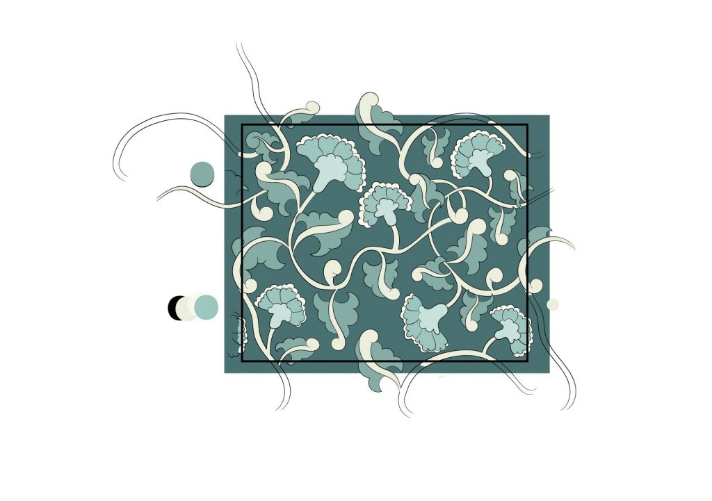
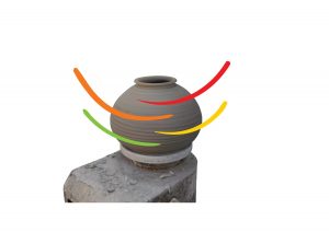
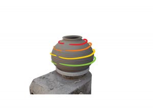
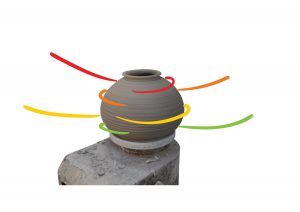
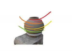
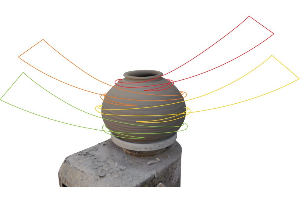
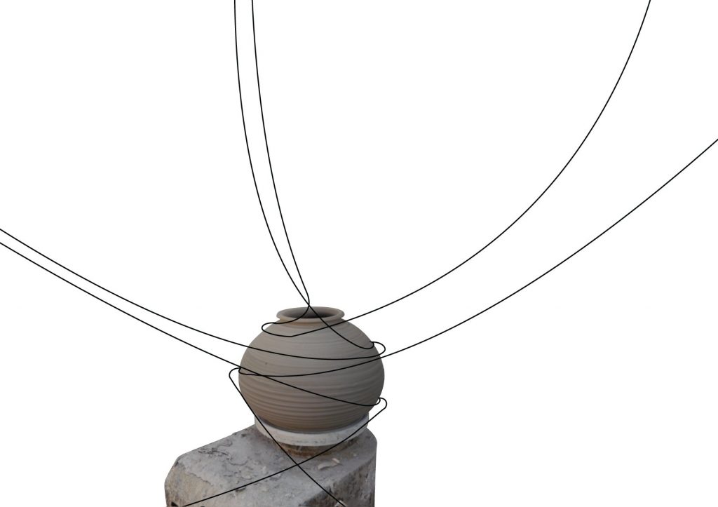
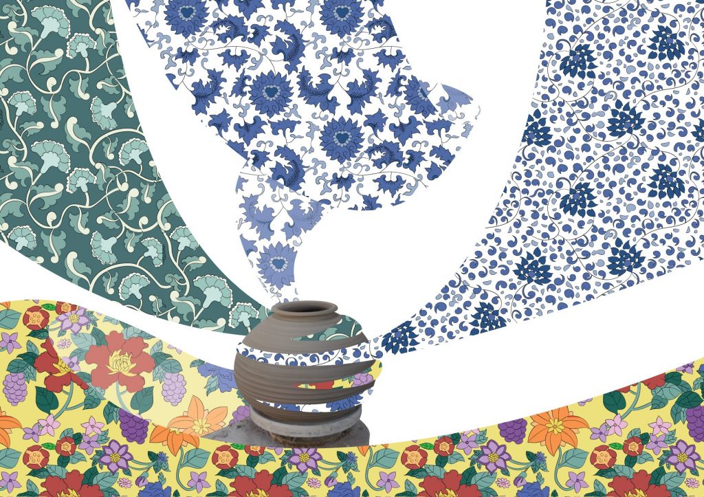
Inspired by wheel throwing that I saw when I visited the area, I wanted to show the patterns spinning out of the pottery when it’s spinning on the pottery wheel.
v1 my initial idea of the patterns flowing around the pot.
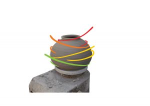
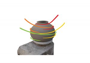
Seeing how the first draft not showing much movement, I decided to study the spinning again as shown below.
v2 – a better flow of movementv3 – smaller potv4 – covers the pot completely!!v5 – final versioninitial InDesign layout with text wrap according to the empty space
After preparing the assets, I assembled everything on InDesign. I placed the dog behind the patterns, and also added the text which is aligned to the right, on the right column.
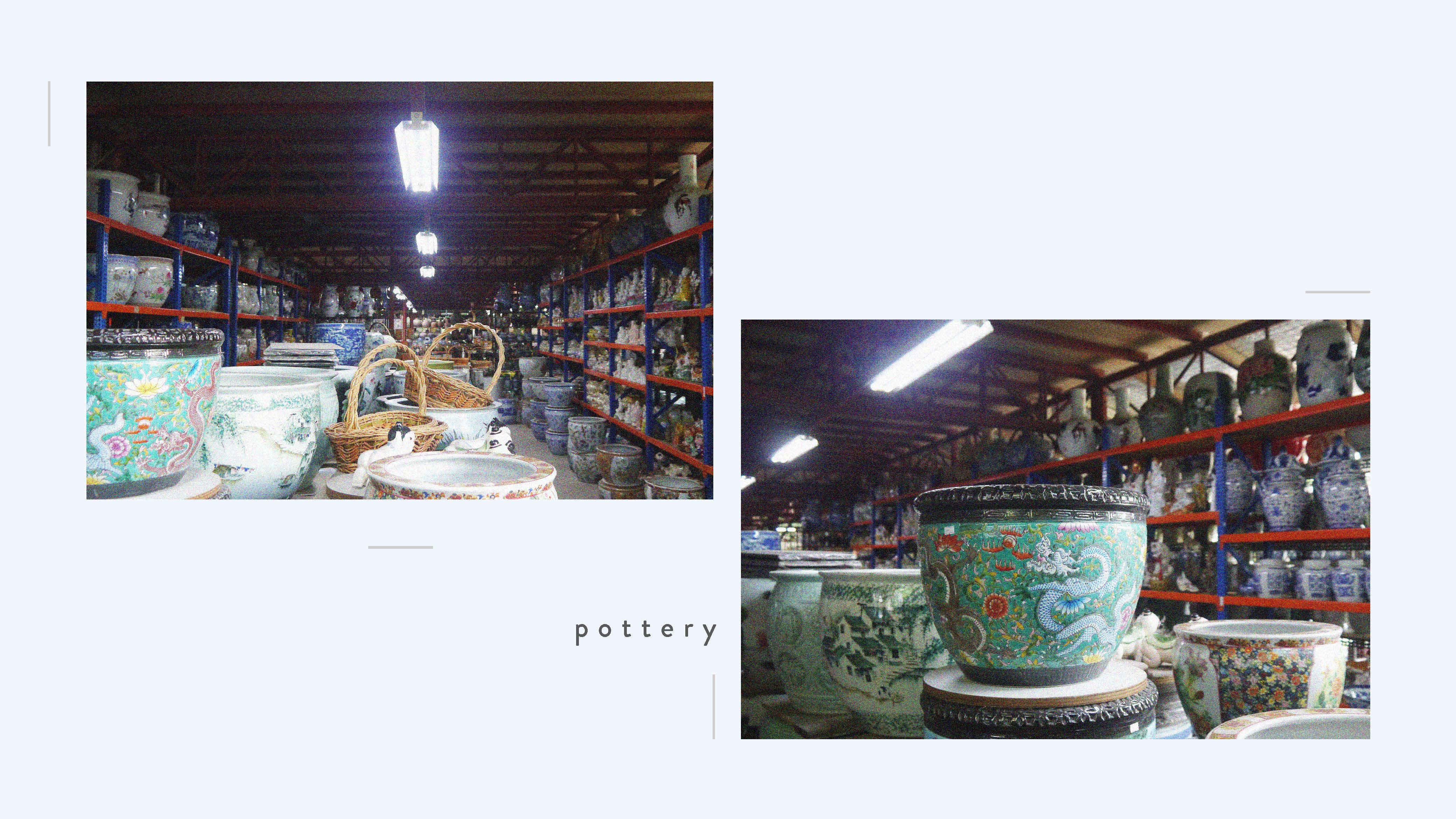
When I visited the place, there was an ENDLESS amount of pottery, with different designs and patterns. I wanted to showcase the patterns at Thow Kwang by adding a sense of surrealness to it through the patterns shown when it is spinning.
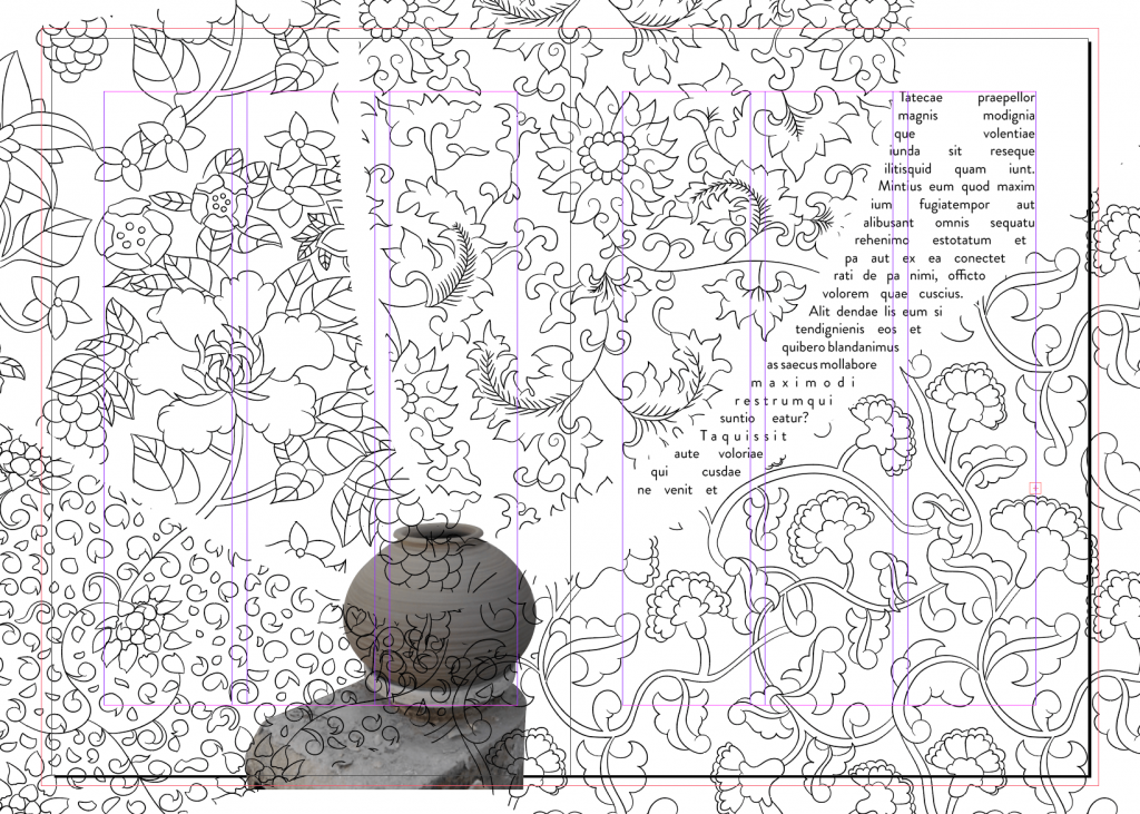
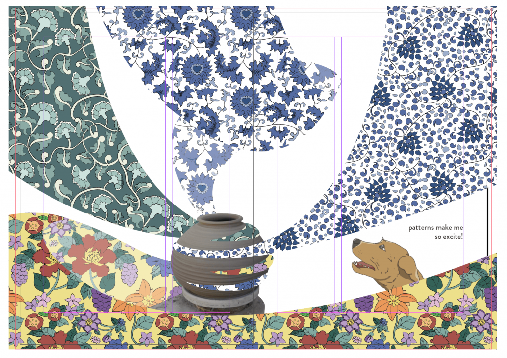
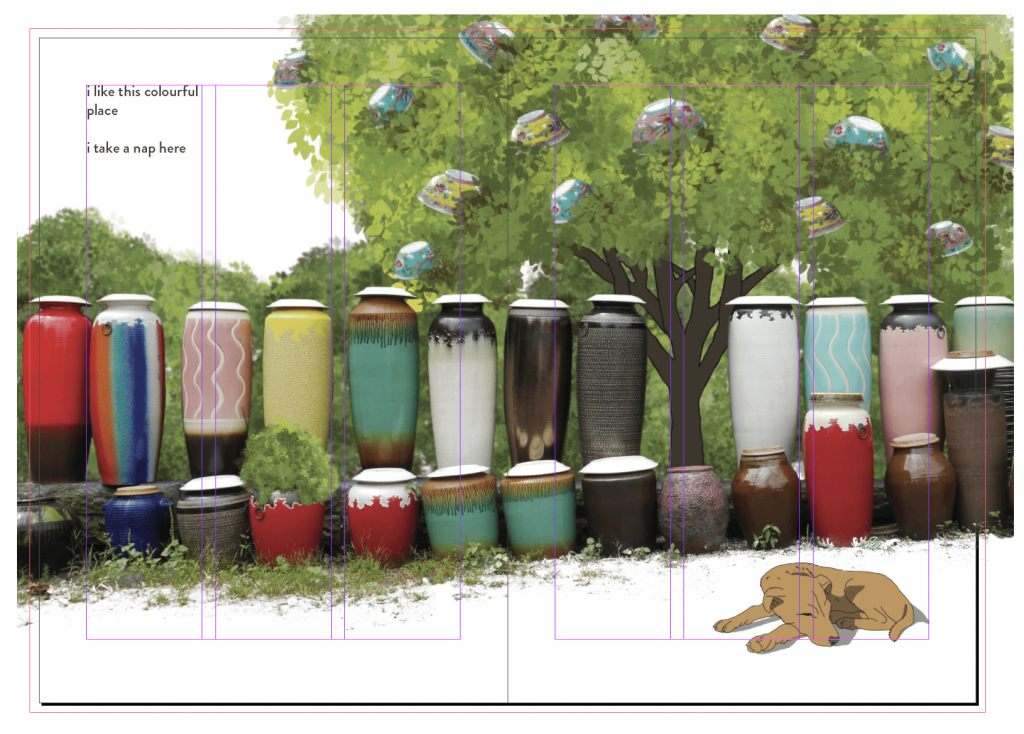
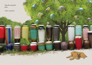
Spread 3: Colour
Asset 1: Dog
v1 – dog with sharp earsv2 – dog with droopy ears (changed the ears as the other dogs had droopy ears)v1 – pottery tree with text
The first version was done through my first draft when I haven’t added in the dog element into my zine. I wanted to show the pottery jungle literally as a jungle with trees with pottery leaves. However, I notice that it does not fit the theme for the rest of the spreads because it does not have much of an illustrated element for the trees. Also, it looks messy to me. Therefore, I decided to play around with other possibilities.
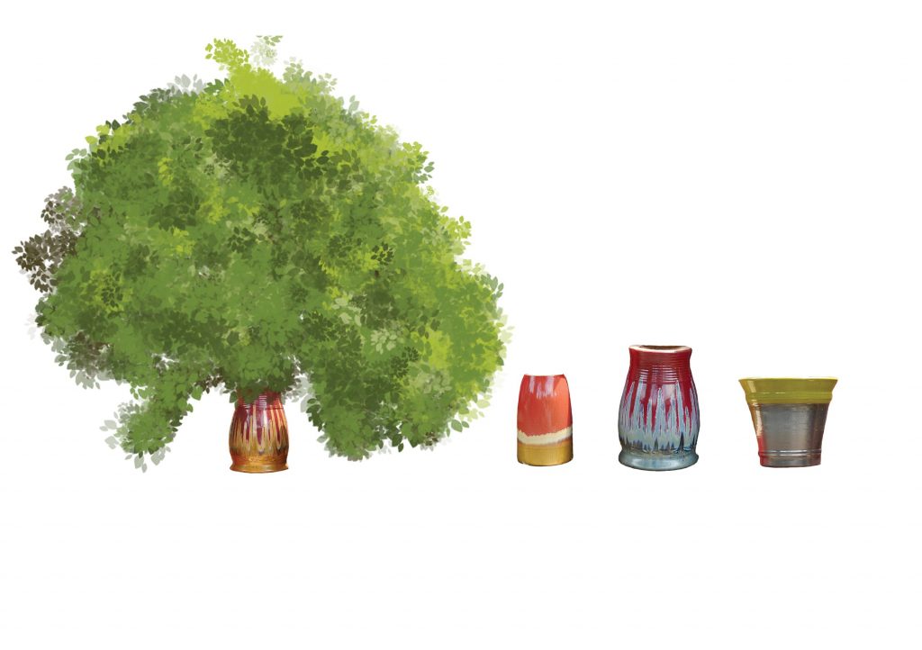
v2 – leaves growing out of potsv3 – leaves growing out of pots
Using the same leaf brush used for the cover page, I added leaves on top of the pot as I wanted to show the pot as the trunk of the tree. However, it looks more like leaves are coming out of the pot. So I decided to work on another idea. (I masked the background of the pots before adding the leaves.)
v4 – pottery + trees filled with pottery
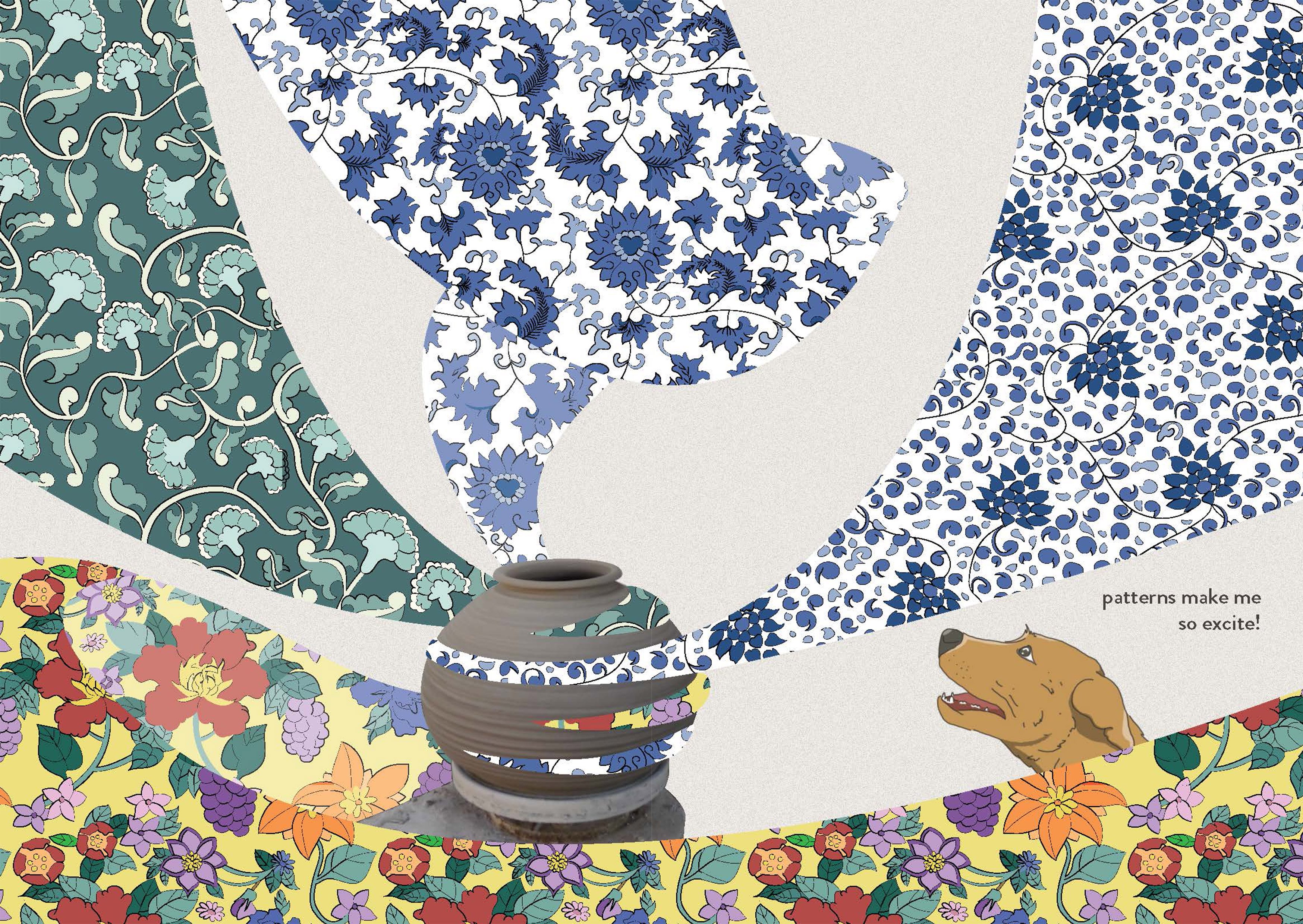
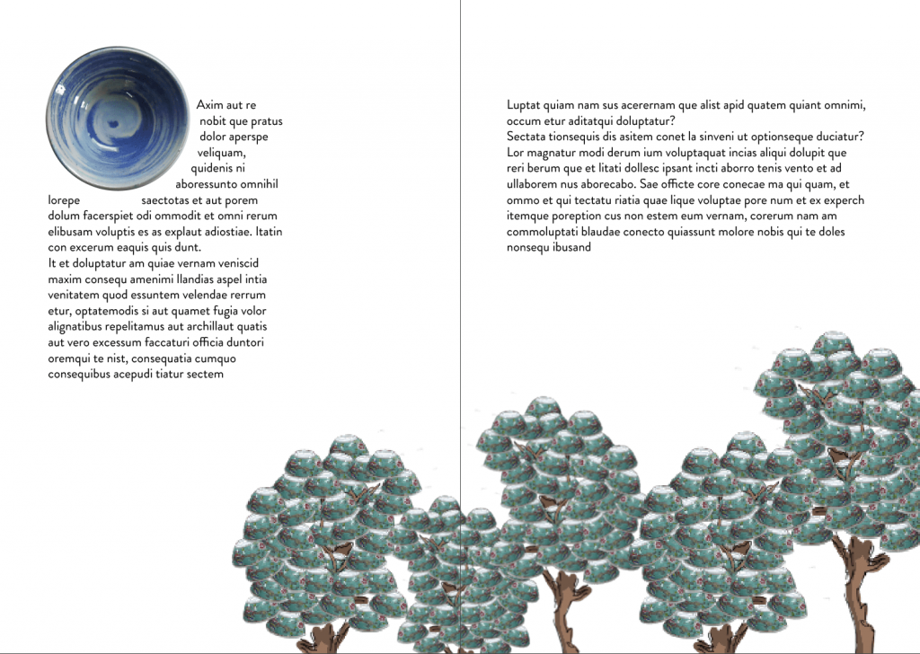
Instead of having pottery depicted as leaves, I included the pottery hidden in the leaves to show my interpretation of a pottery jungle. The leaves/bushes that are behind the colourful pottery are all applied with the Gaussian Blur filter to show depth and distance as things that are further away are usually less clear.
After preparing the assets, I assembled everything on InDesign. I placed the dog in the empty space in front and added the text which is aligned to the left, on the outer left column. Also, I made sure that my assets are all larger than the bleed so that there will be a consistent print.
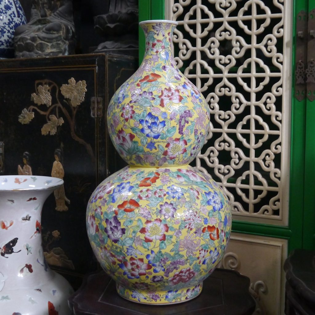
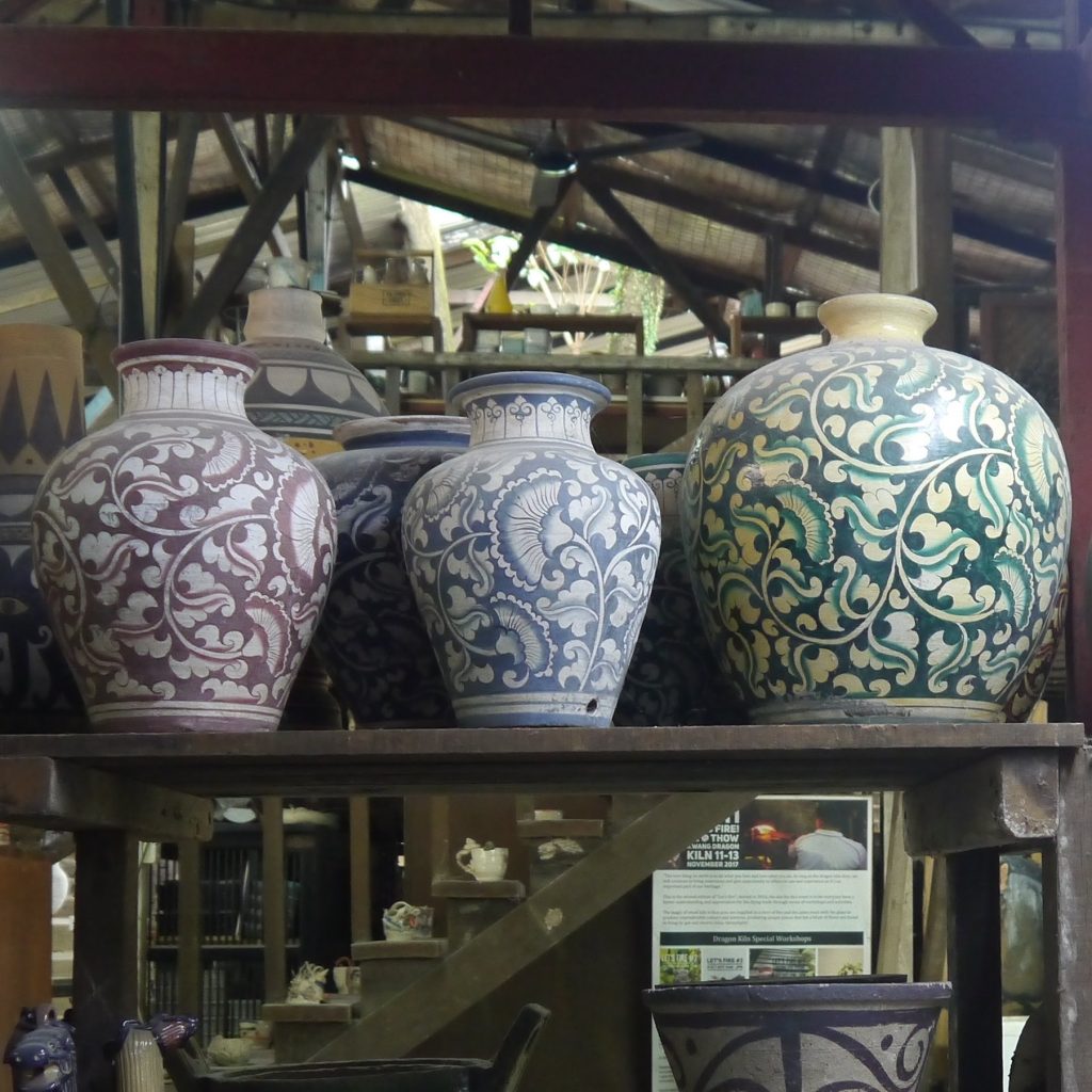
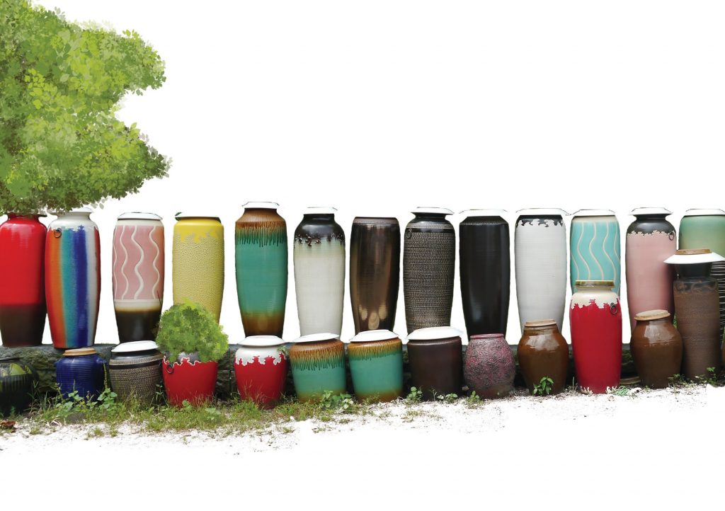
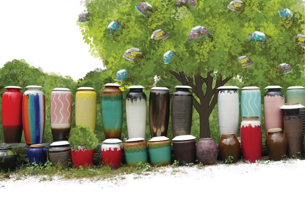
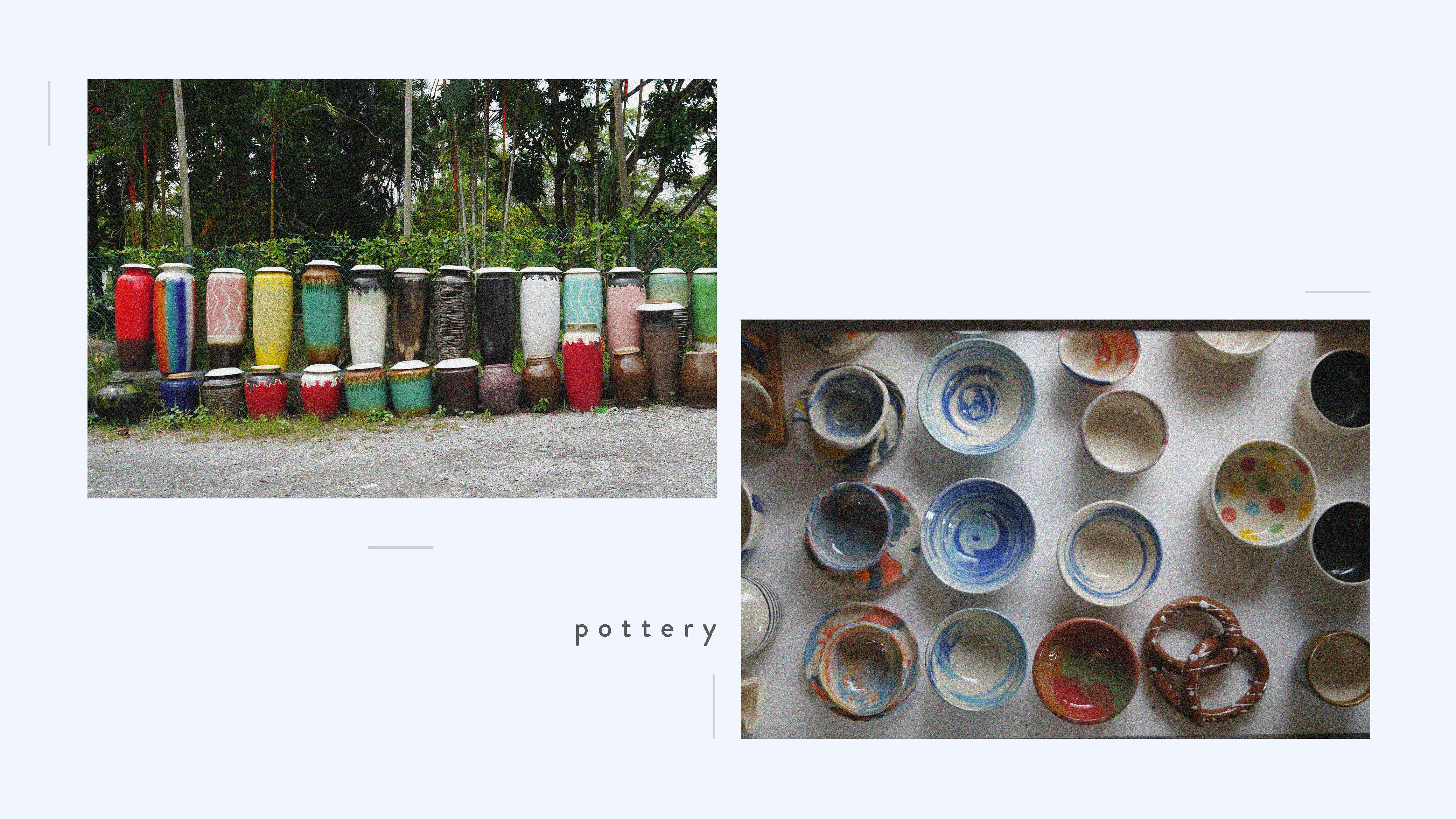
I decided to use the actual pots I saw in Thow Kwang to show the real colours of the place in this spread.
Texture
Finally, I wanted to add texture to the plain white background. I first created a shape and applied the inner glow effect to add a brown coloured noise. Then, I placed the shape behind all of the assets so that it does not affect the illustrations.
Reflection
In the past, I used to illustrate using the pen tool and drew basic vector objects. For this project, I wanted to learn something new and challenge myself to do something that I am not comfortable with or is particularly good at, which is drawing. I’m glad I did not give up halfway when I couldn’t find a way to illustrate the same style that I was planning to do. I’m grateful for my friends that helped me along the way be it teaching me how to illustrate using the tablet or giving me suggestions on how to improve the layouts. I am also grateful that I get to learn how to construct a booklet from scratch, and learning how to print using postscript. Overall, I’ve learned a lot from this project and am looking forward to more in the future!
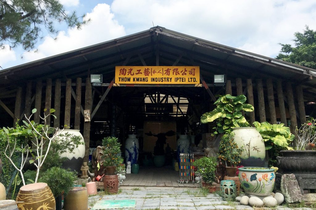
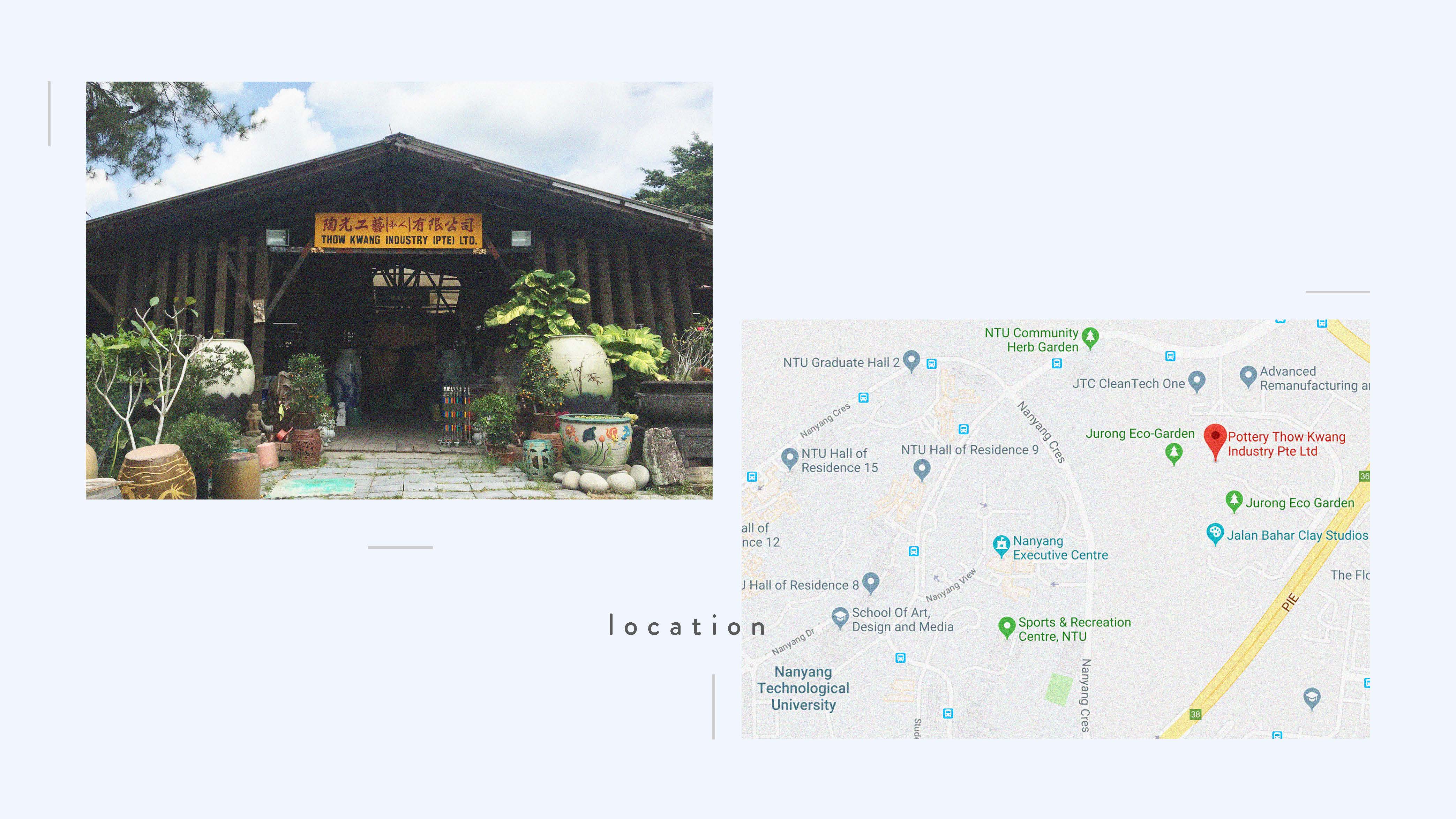
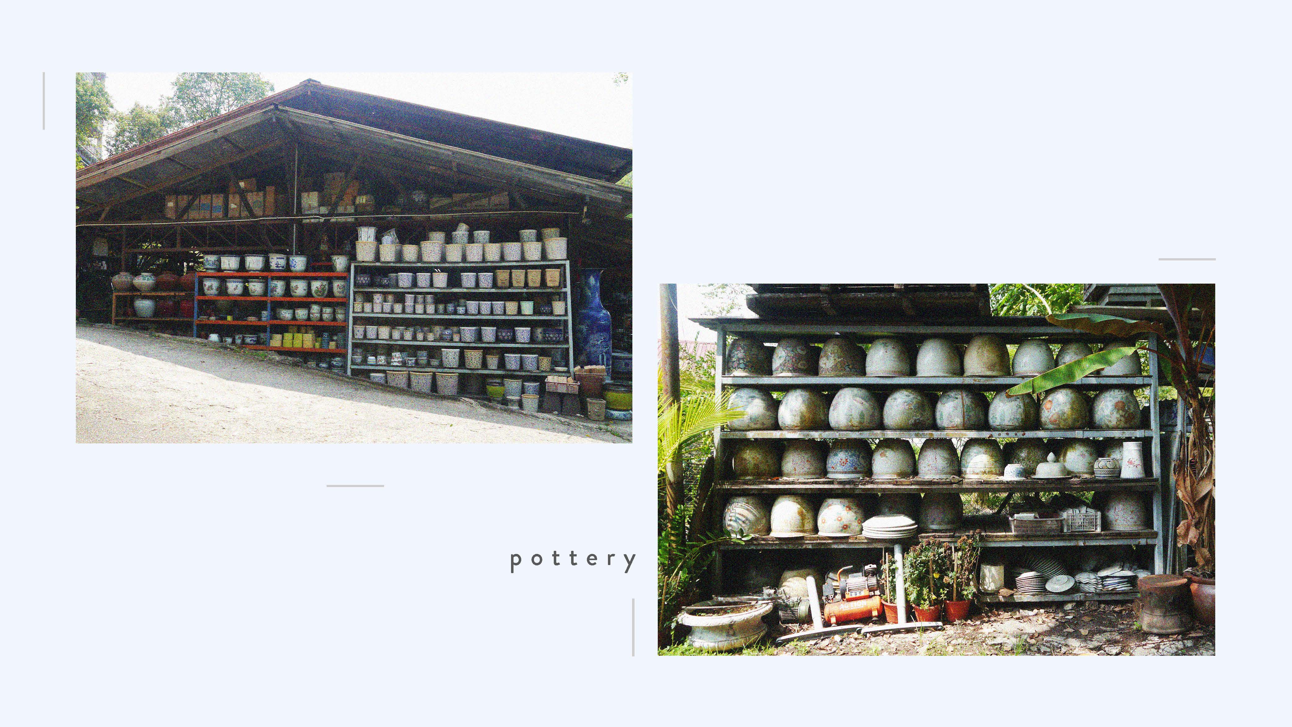
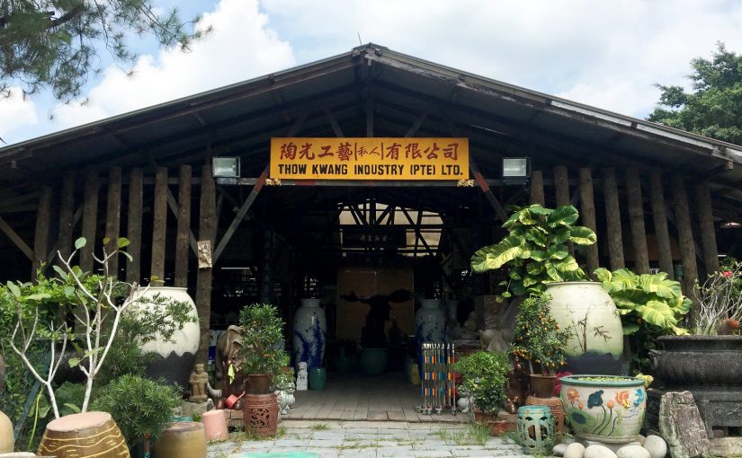
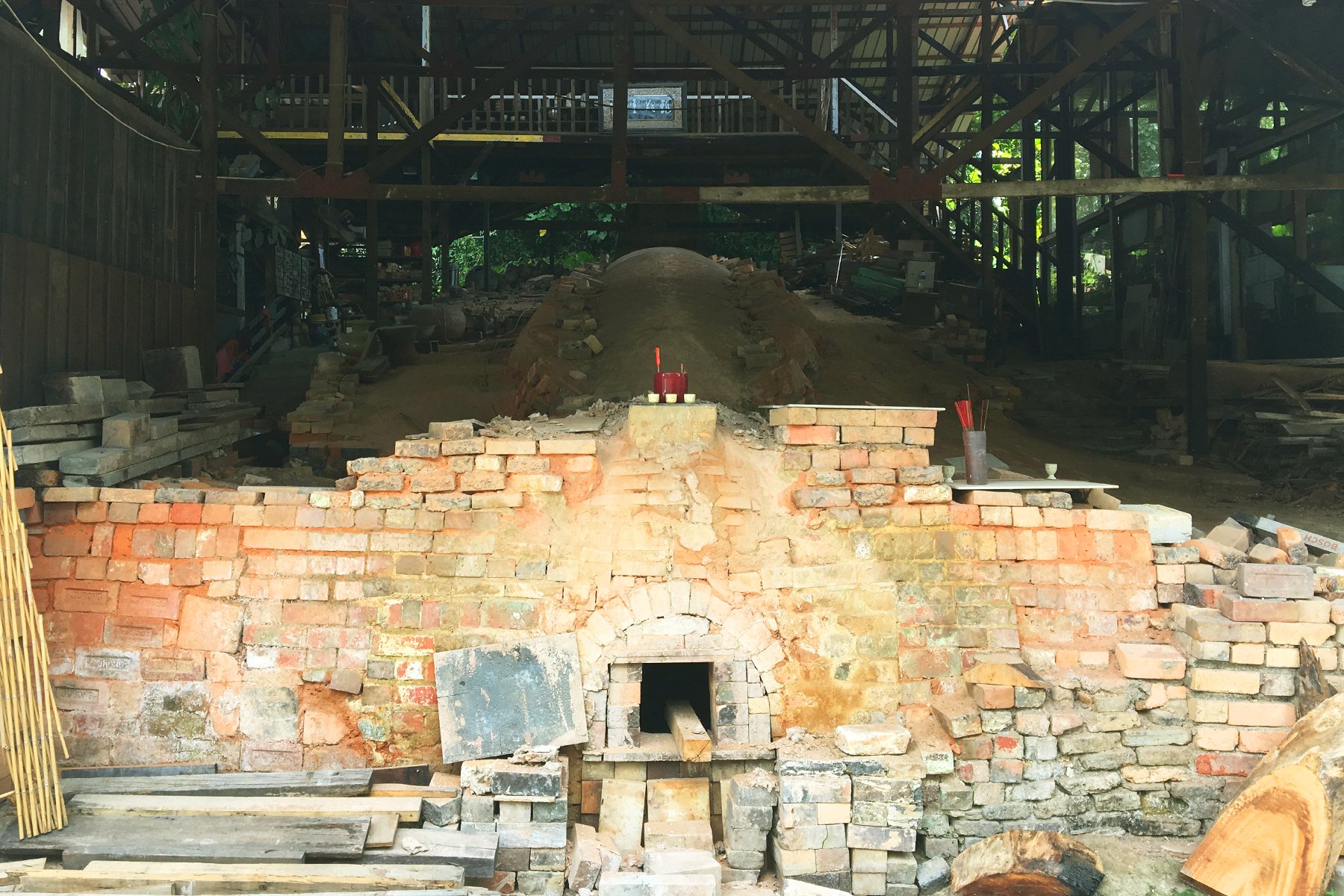
The location that I did for my zine is Thow Kwang Pottery Jungle which is located near my neighbourhood and NTU as well. The reason why I wanted to go somewhere which was not in my estate was because I wanted to explore what other areas in my neighbourhood that I haven’t been to. I wanted to find a place which was was special and unique only to the area that I am living in.
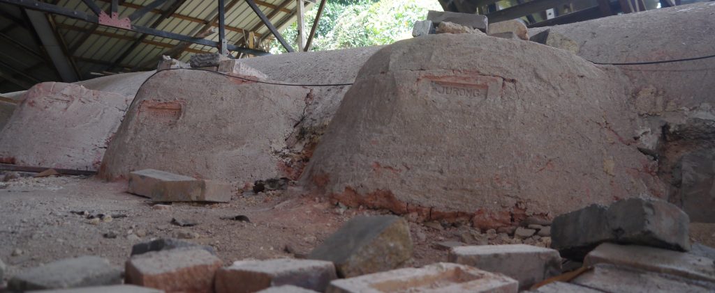
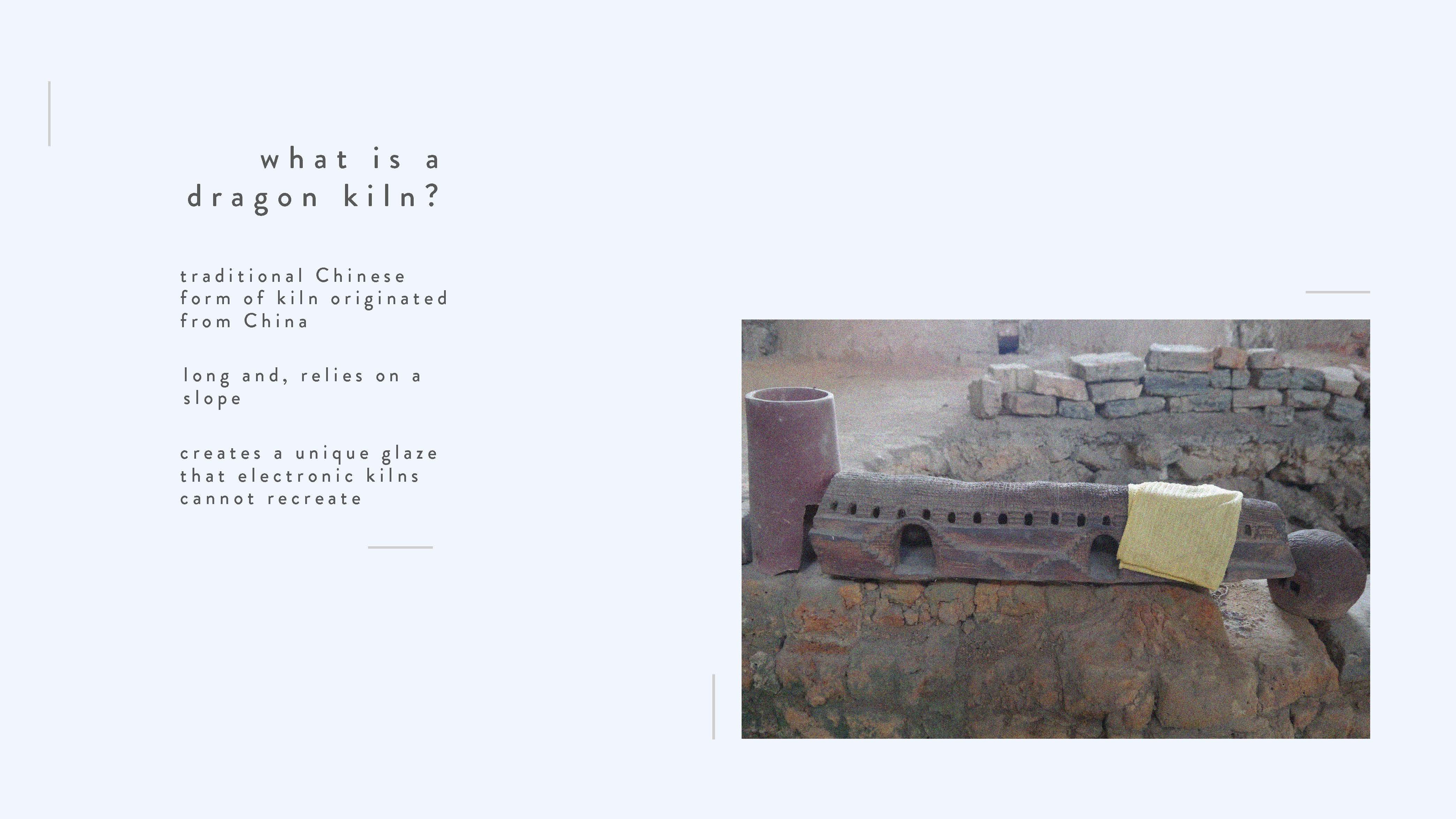
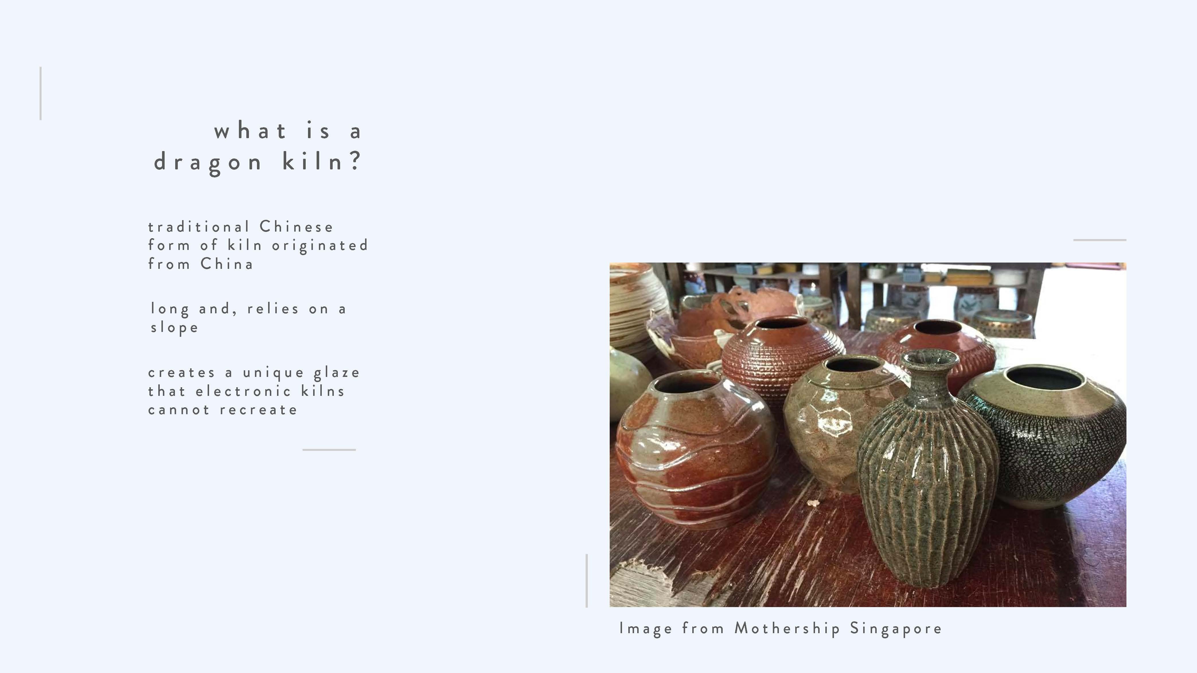
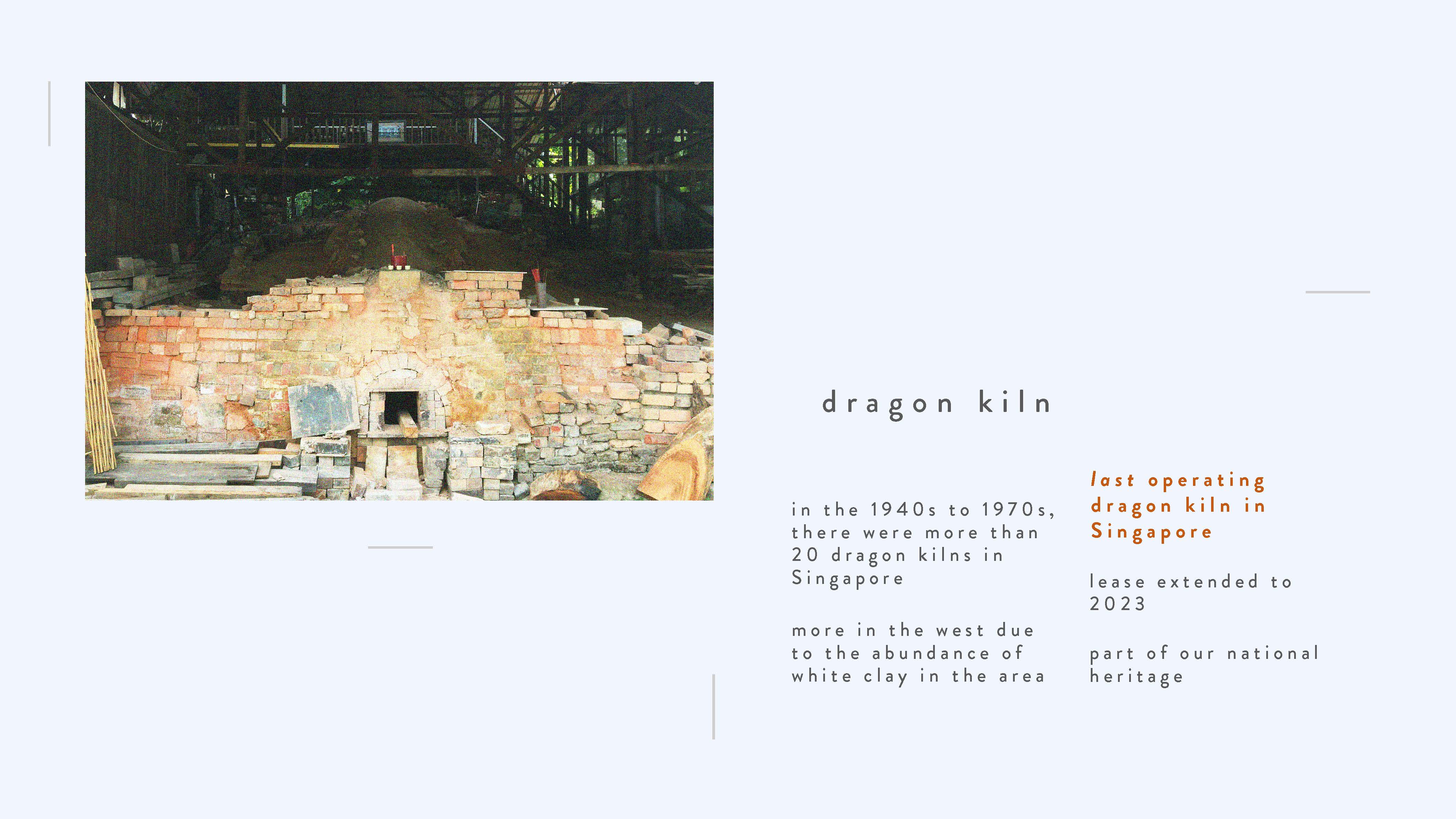
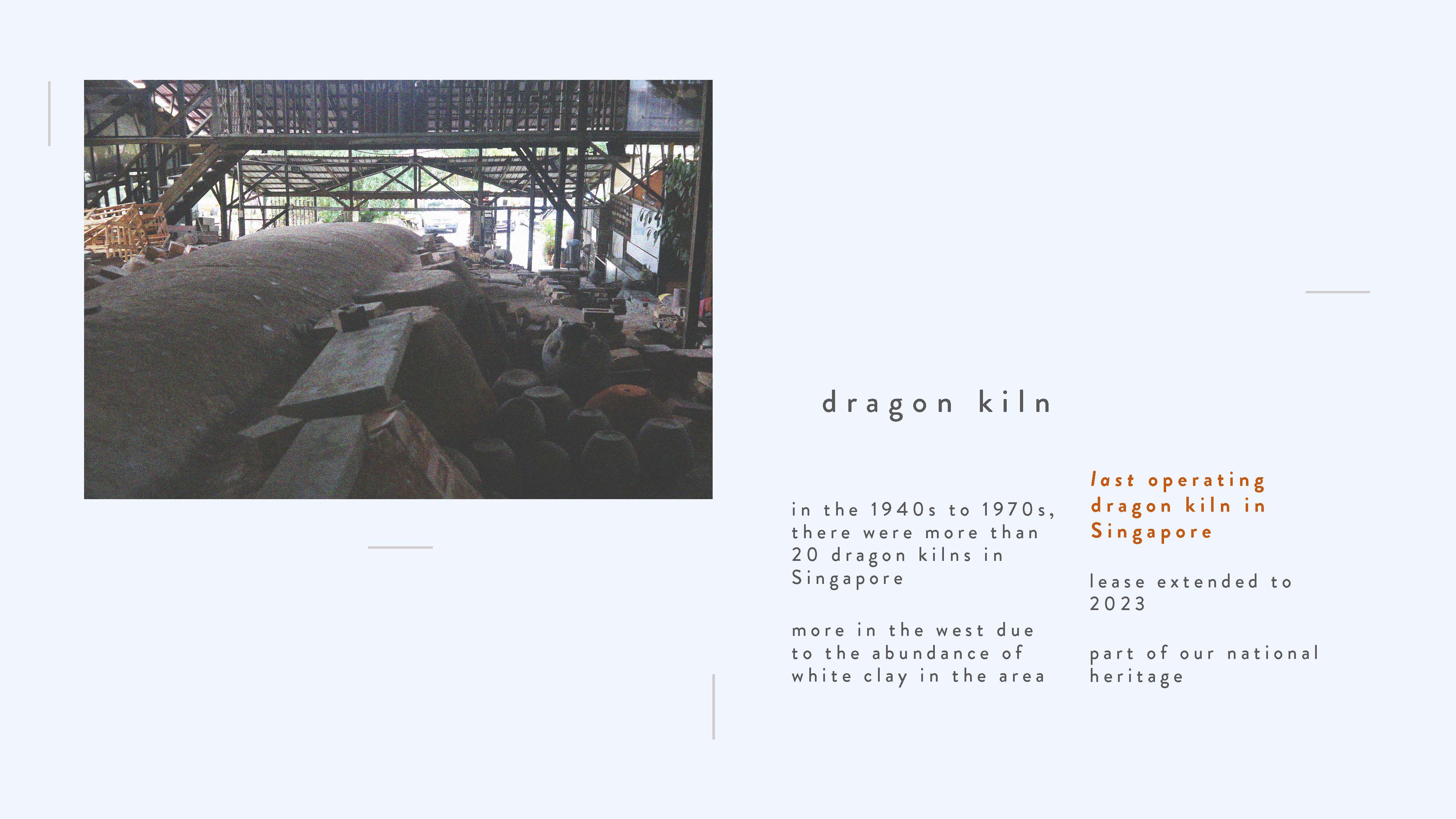
What makes Thow Kwang Pottery Jungle so special is the dragon kiln located in it, which is basically a really long traditional slanted oven for clay to bake into ceramics. Unlike electronic kilns, these dragon kilns take a lot of work, but it creates a unique wood ash glaze from the smoke coming from the wood that was used to feed the fire in the kiln.
There were more than 20 dragon kilns operating in Singapore from the 1940s to 1970s, but this area in particular in the west used to have more because there was an abundance of white clay found in this area then. For this family, they used to dig white clay out of their backyard, and that place that they dug from is now a pond at the back of the place which is quite interesting because I would just assume that it’s a pond for fishes instead of considering the history behind it.
Today, Thow Kwang Pottery Jungle is the only place that houses the last operating dragon kiln in Singapore. The lease is extended to 2023, but you never know what might happen in the future, as seen that the area was already surrounded by construction sites.
It’s important for us to actually visit and support this kind of old establishments because heritage places basically represent the past history and culture of a nation. They constitute together the architectural heritage of an area and it allows us, a different generation to experience and know our past.
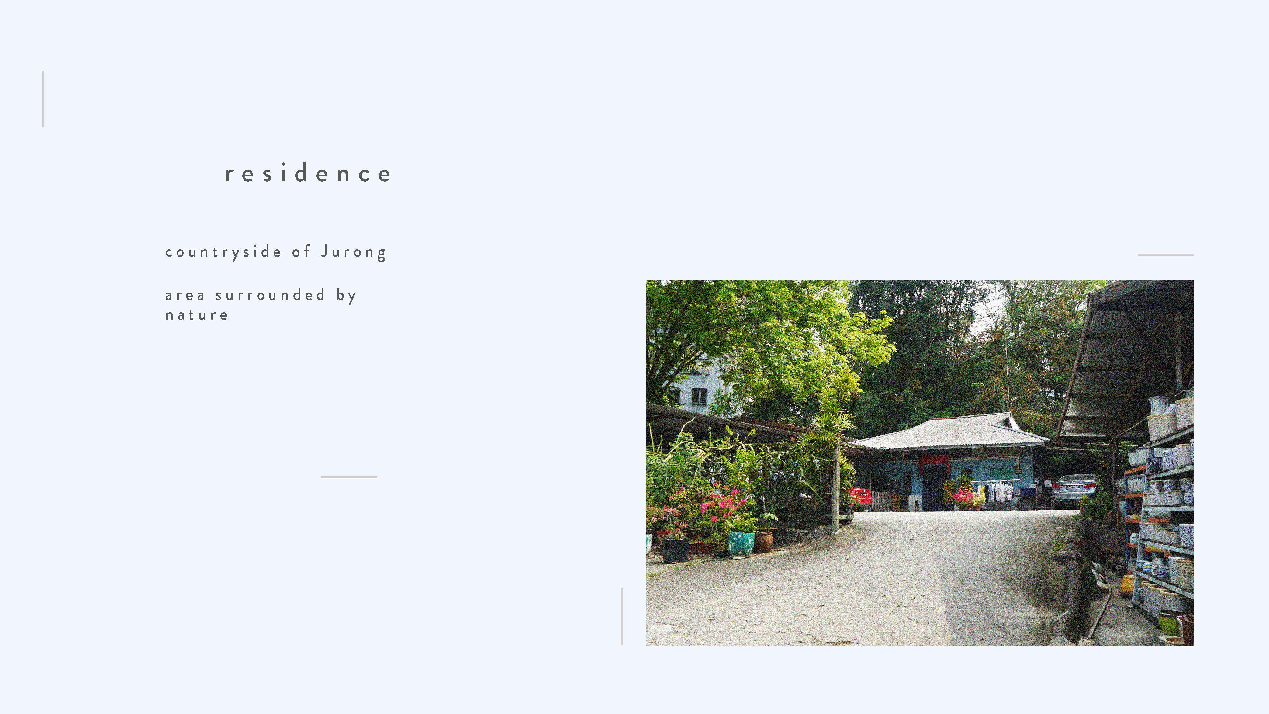
Unlike the tall concrete jungle of HDBs you find in Jurong, this place is really like the countryside of Jurong, where the owners still live in this kind of low-level kampong like house.
Also, this area is surrounded by nature. Literally, when walking to this place from the bus stop you have to walk past a forest. You see tall trees surrounding you instead of the normal commute of walking past tall buildings and a few trees when you travel through Jurong.
This place gives me a feeling of nostalgia and an appreciation for our heritage.
For my zine, I wish to showcase the place as a rare, traditional place of history that everyone should visit so as to preserve our heritage.
Hidden in the woods at a corner in the West, sits a dragon that breathes its fiery breath. We're talking about the Thow Kwang Dragon Kiln. The oldest of its kind in Singapore, the kiln comes to life only three times a year!
What is the main purpose of the concept of destruction in the arts?
Destruction is the action or process of causing so much damage to something that it no longer exists or cannot be repaired.
“Every act of creation is first of all an act of destruction.”
― Pablo Picasso.
With regards to the destruction in the arts, my personal interpretation of the quote from Picasso are of the following:
Image from https://www.pinterest.com/pin/453596993697960904/?lp=true
1. Destroying old ideas to create something new and of higher quality
An artist’s ideas and design process are constantly evolving, and without forgoing or destroying previous ideas, the artist would not be able to move forward to create something that is better than before. For example, a product designer will have to choose one final version to work on, forgoing and destroying the previous ideas
Image from http://www.mr-dt.com/materials/paperandboard.htm
2. Destroying the natural and original appearance of materials to create something useful
The original state is destroyed to be valued as a new product, for example, paper. It goes through the process of papermaking which completely destroys the appearance of a tree. Additionally, when we write or draw on the paper, we destroy the original empty appearance of the paper in order to create something that is of higher value to us.
Image from https://www.thisiscolossal.com/2018/10/banksy-painting-spontaneously-shreds/
3. Destroying one’s work to create value (to send a message, or to create social interactions, etc.)
Iconoclasm
Banksy is an anonymous artist and his works are worth millions at auctions. He installed a shredder machine in the frame of his painting and activated it once it was sold at the auction. It sends a message and creates discussion about art auctions, where artists don’t get much even if people are willing to pay for ridiculous amounts of money. The destruction of something valuable (to its audience) causes a panic at first but is seen as something more valuable now with more meaning attached to it.
The Destructive Tug-of-War game from the reading “Destructive Games: Creating Value by Destroying Valuable Physical Objects” is a game where each player places a money note into the laser cutter, and then tries to direct the laser into the other player’s bill. Despite destroying the note, many of the players came forward with positive responses saying that the destroyed note created social interactions with others as they use the destroyed note as an interesting topic to talk about.
According to the reading, it was mentioned that while the primary objective of engineering (or art) is to create, artists and researchers have occasionally reversed this main underlying principle and explored destruction. Therefore, they created destructive games as a way to explore destruction. It is defined as a game that results in an object that is owned by a player or a valuable object being destroyed.
The robot DESU 100 is named after the acronym of DEstruction and SUicide. It explores the question, “Are humans tempted to destroy robots?” The DESU 100 robot is a metal cube with an arm that moved autonomously when it drove around and played a melody to indicate its current destruction status. Next to the button on a pedestal is a label that reads “Please do not press”.
By pushing the button, the robot will hit itself immediately with its arm, giving a direct response to the player’s action. Besides the visual appearance of the robot, every user-controlled hit also changes the overall behaviour of the robot. The more damaged the robot is, the more destructive it behaves. Its arm starts to wave, to hitting the floor and eventually hitting itself. The melody gets less harmonic and the driving behaviour becomes less fluently, which strengthens the impression of destruction.
What effect does irreversible consequences have on the participants of the artwork?
Traditional games are worth playing because it produces a positive net balance; the value of engaging in the game is larger than not engaging in it. It produces enough value (which is fun) to justify the expense in time.
Unlike traditional games, physically destructive games contain events of material loss in the equation. These increase the risk of running into a negative net value. Therefore, a physically destructive game has to produce enough value to outweigh the loss from the destruction. According to the reading, these are the following qualities to construct an effective destructive game
1. Irreversible Consequences
It adds on to the excitement as the player cannot undo their actions. There is no going back once they decided to play the destructive game.
2. Destruction in front of an audience
To show that the destruction is intentional rather than accidental.
3.Using the destroyed object as a messenger
What kind of value is created from destroying the object? What kind of messages are sent to the audience?
Irreversible consequences engage the player to think about their actions in the case of DESU100. By pressing the button, the player contributes to the destruction of the robot. Knowing that the robot cannot be brought back to its original form, the participant has to think carefully whether they want to press the button.
For the first player, they can only assume that the intended consequence is the robot hitting itself by seeing the position of the arm. They press the button anyway to see what happens to the robot.
After seeing what has happened, the following players have the choice to damage the robot even further or do nothing. I would imagine one to question themselves whether they should press the button after seeing the robot hitting itself, or thinking that since the robot is already damaged, there is no difference whether they decide to press the button or not.
What value does destruction bring to the artwork?
Although the function of DESU 100 is to destroy itself, some of the participants felt sympathy for DESU 100, saying that it is cruel that it is forced to destroy itself. However, each player has a choice to press the button and the only obstacle is the instruction saying politely not to push the button (“Please do not press the button”). Participants still did it anyway as the satisfaction of pushing the button to watch the robot destroy itself outweighs not pushing the button and the sympathy felt for the robot.
This is because humans are controlled by two drives: The life drive (Eros) which strives for creation, and the death drive which strives for destruction. Fulfillment of the creation of destruction leads to the feeling of pleasure.
Therefore, it makes us question whether an inanimate object with perceived animacy deserves to be destroyed in order to feel a sense of satisfaction.
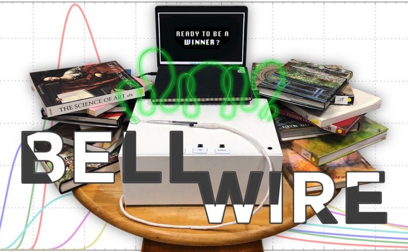
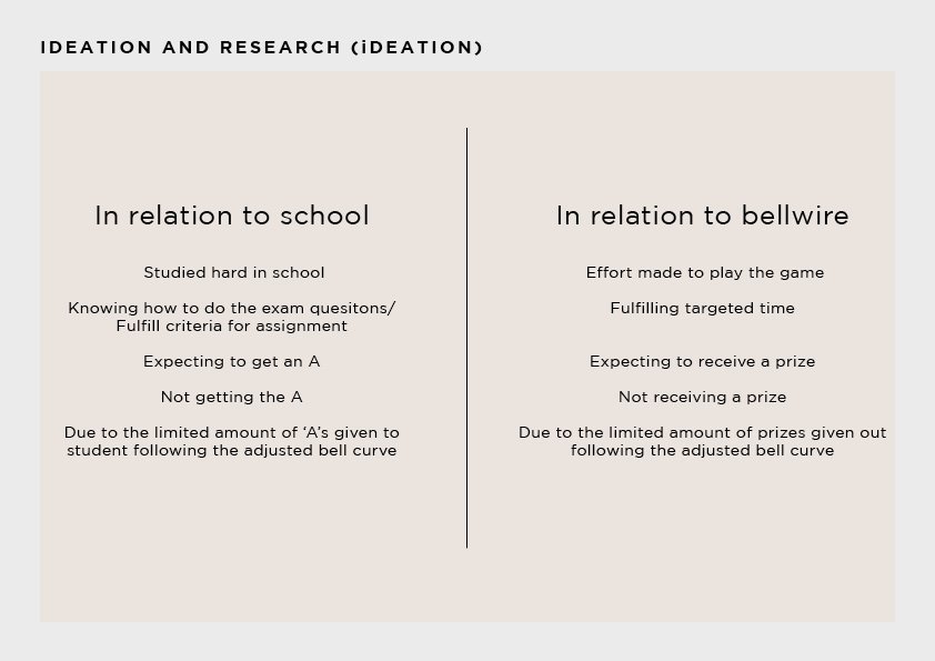
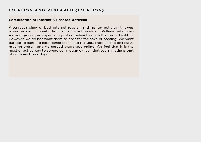
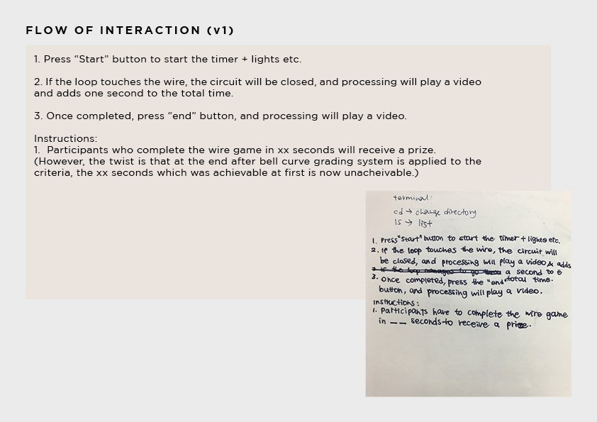
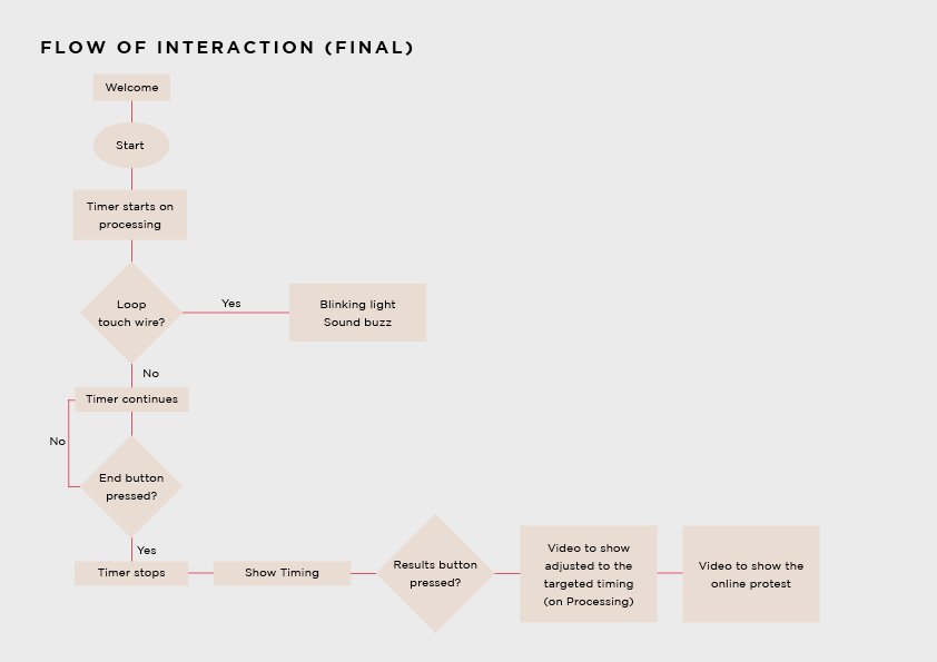
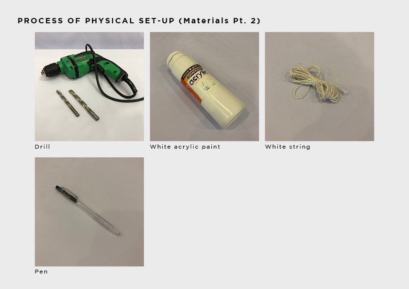
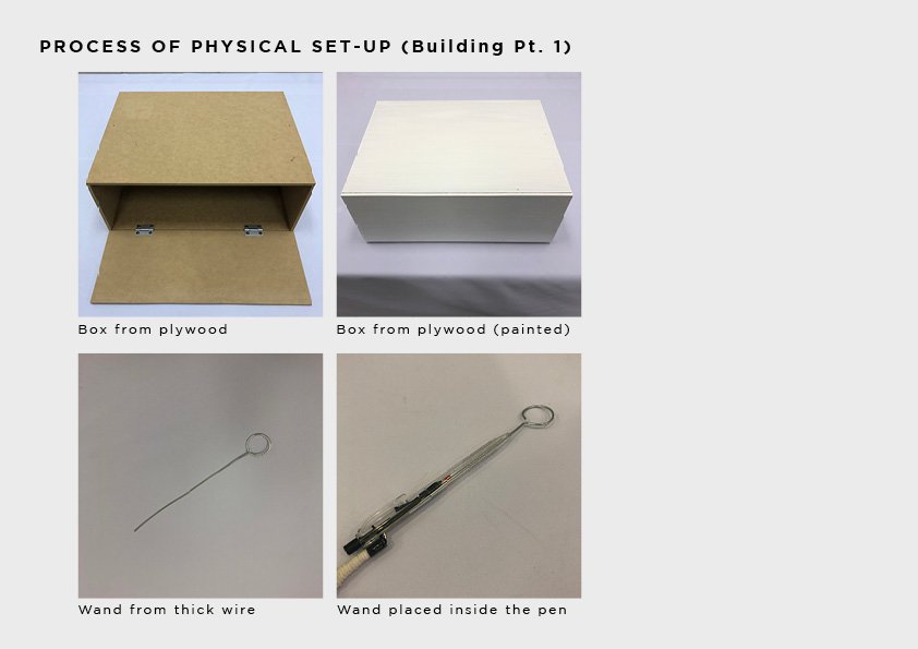
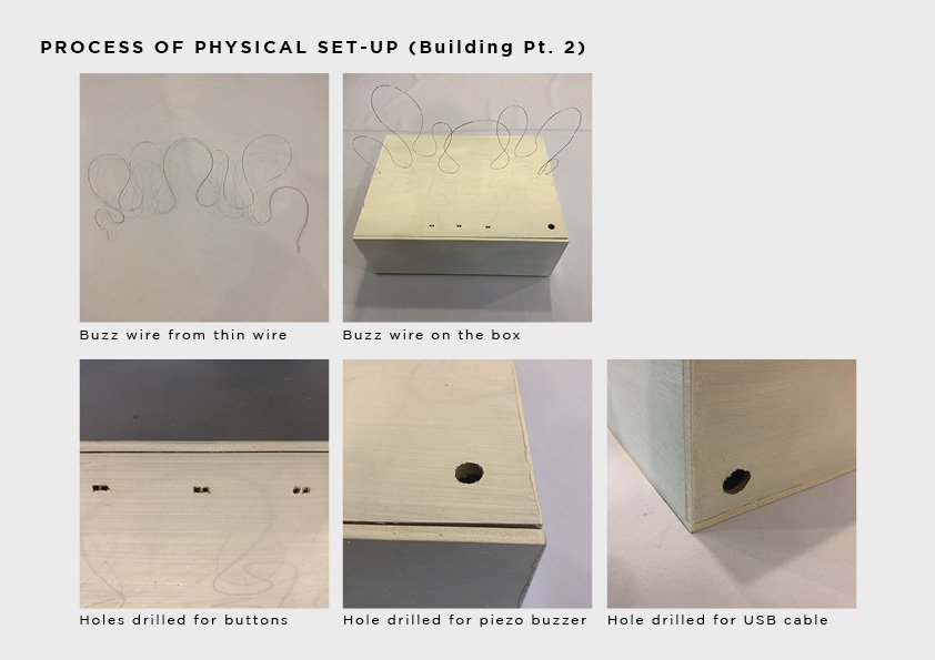
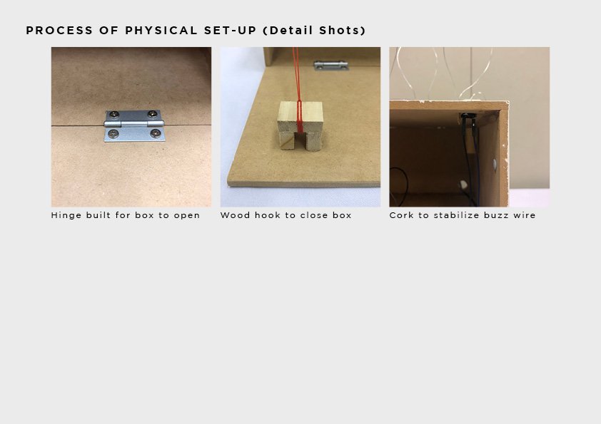
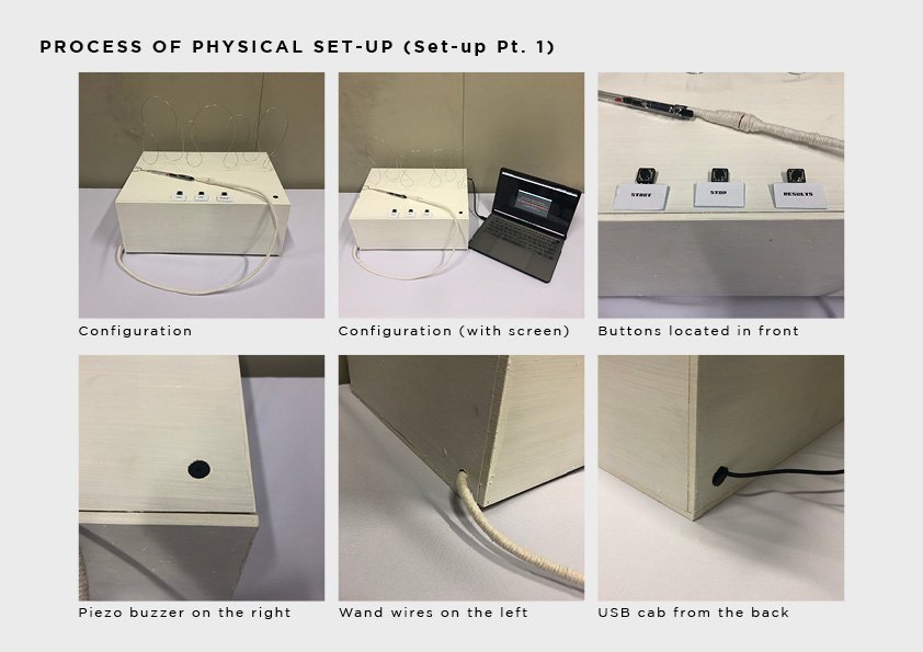
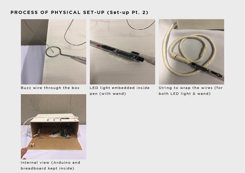
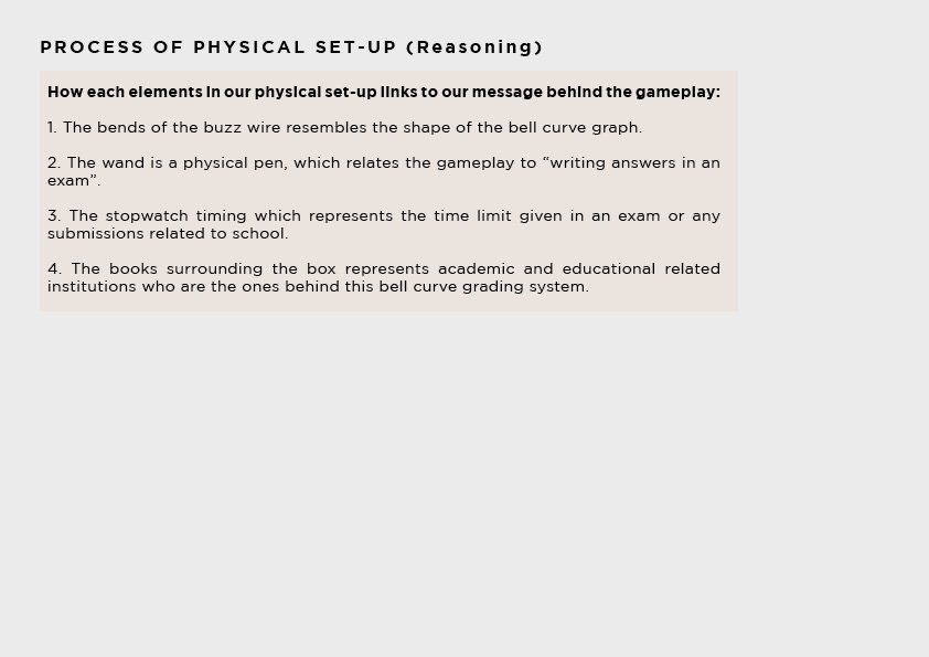
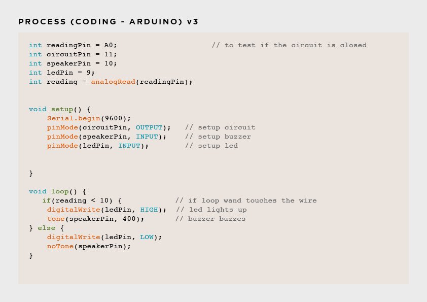
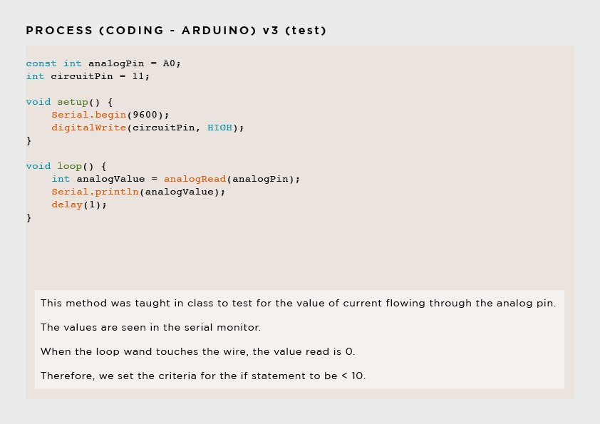
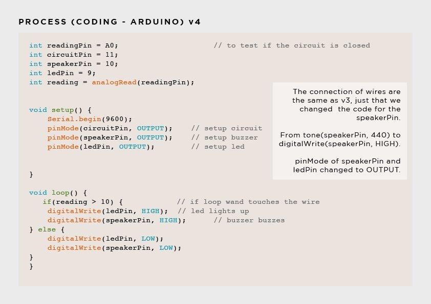
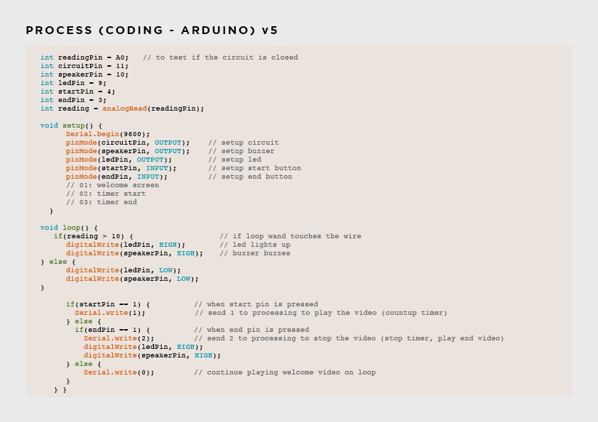
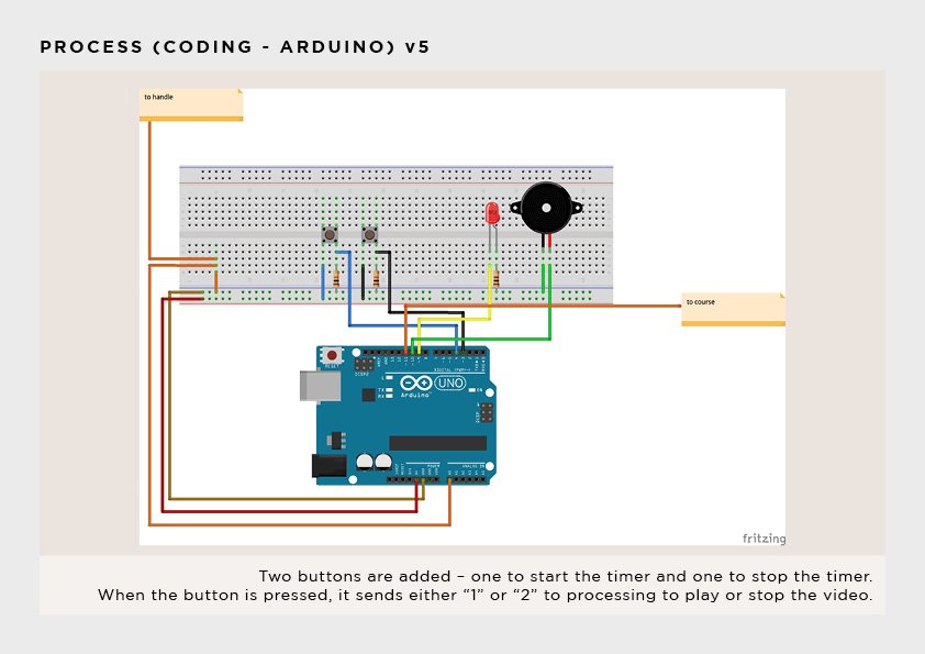
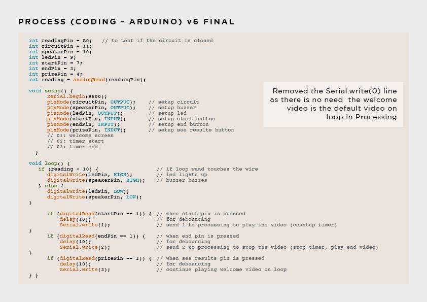
The participant will have to complete a game of buzz wire loop game and is promised a prize if they hit the targeted timing. However, the twist at the end after completing the game is the bell curve adjustment to the initially targeted timing. A participant who has managed to hit the initial timing will not receive a prize due to the adjusted timing. A participant who did not manage to hit the initial timing or adjusted timing will not receive any prize too. At the end of the game, we encourage our participants to protest online by posting a photo of our game accompanied with the hashtag “#stopcurvingmygrades” (may change the hashtag) to raise awareness of the bell curve system and also to advertise our game for more people to participate.
Is it for a single person to engage with your project or for multiple participants concurrently?
It is meant for one person at a time.
What is the interaction or situation you are creating for your audience?
We wanted to simulate the bell curve grading system which is present in our school. The participant puts in the effort to hit the targeted timing in order to receive a prize as promised by the system. It represents the effort that students put in in order to get a good grade and recognition for their efforts. The adjustment at the end of the game represents the bell curve grading system, which limits the amount of As that is given out to students. By engaging our participants to protest online, it is a form a DIWO, where we work with the participants to spread the message.
What is the intention of this interaction?
We wanted the participants to experience the unfairness of the bell curve grading system which is present in many of the schools today. After experiencing, we wanted the participants to work together with us to protest online, so as to raise awareness and to express our unhappiness of the system.