Project 1: Image Making Through Type (Process)

Initial Ideation

To guide the common theme of my jobs, I thought of using the four natural elements: Water, Earth, Fire, and Air, as the main component of each job.

Then, I combined it with jobs that I have worked before which adds a twist/special element to the original jobs.

Initial job ideas/sketches:

1. Burnt Toast Scrapper

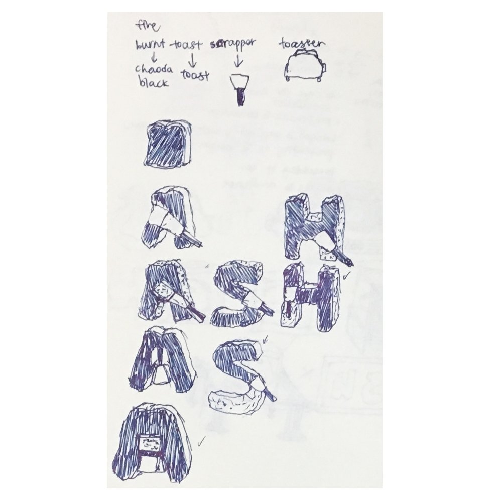
I combined the element of Fire and the job of working at a bubble tea shop that also sells toast.

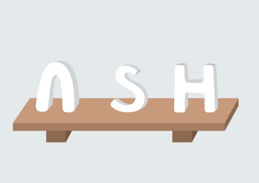
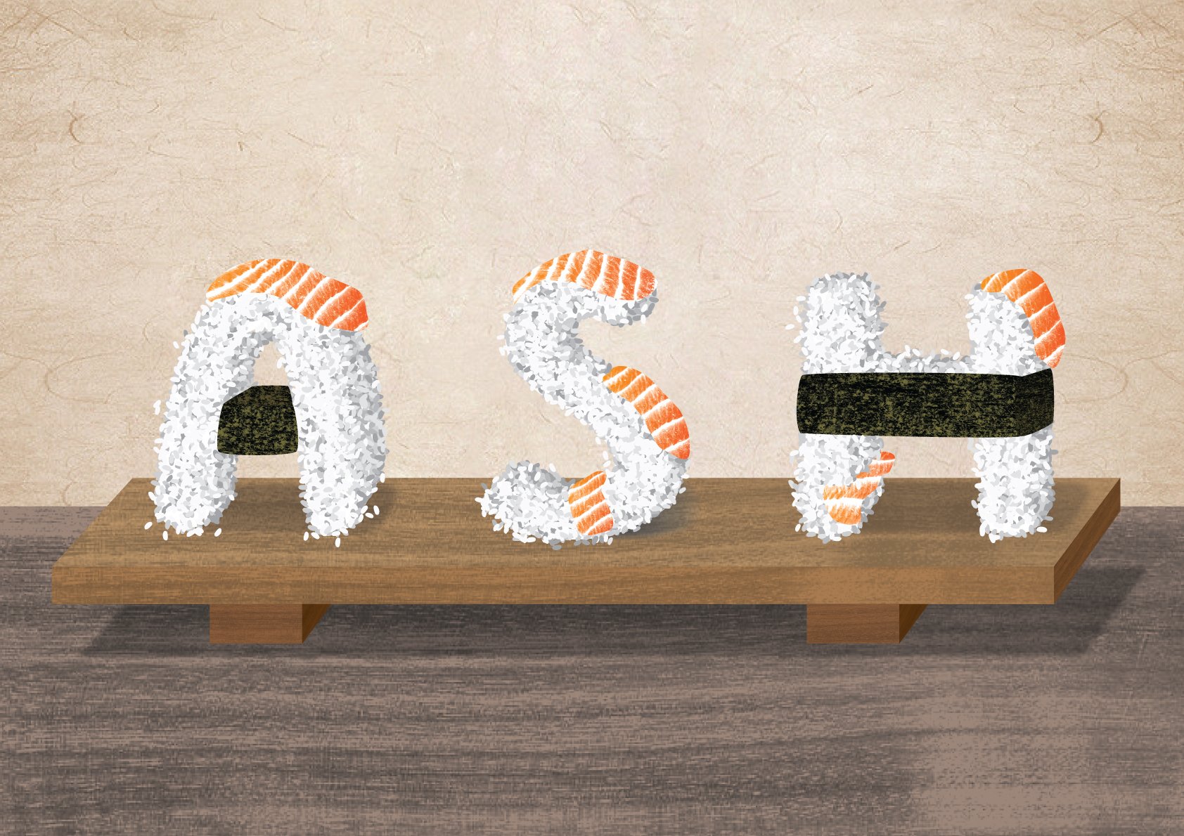
2. Frozen Sushi Chef

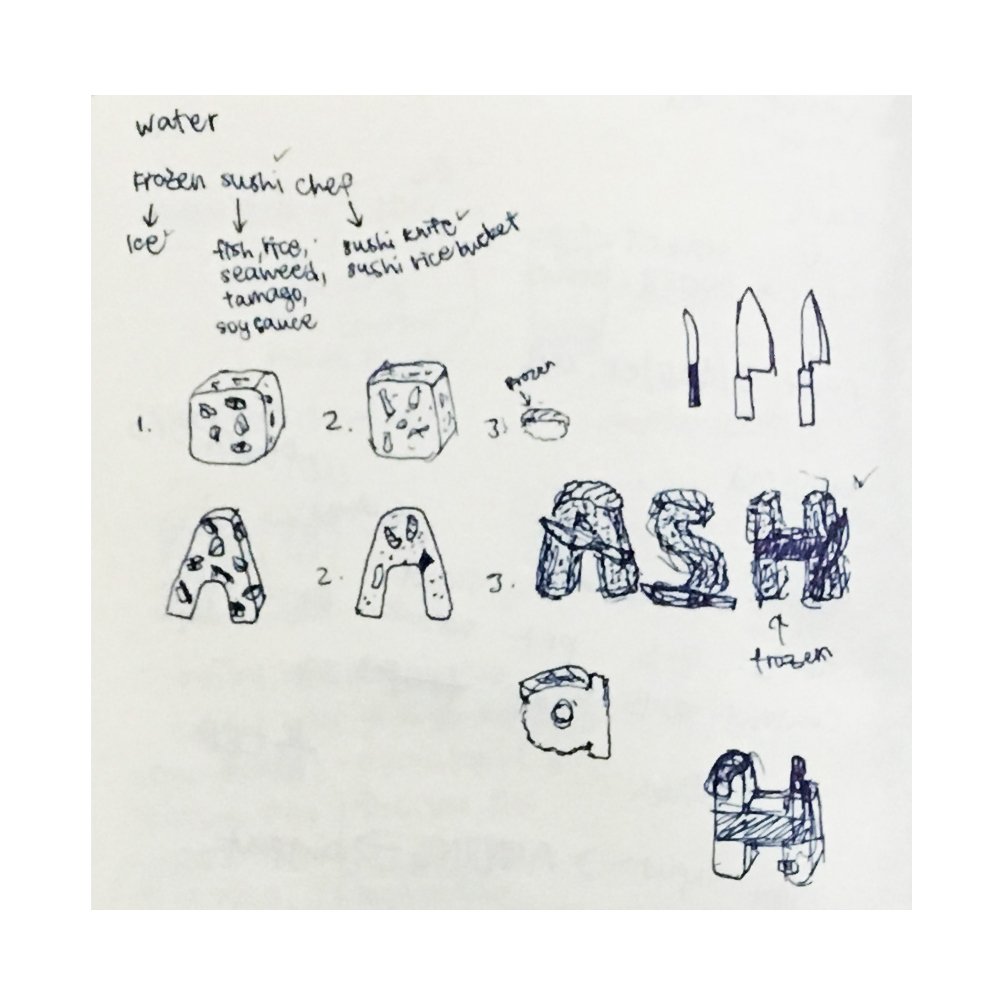
I combined the element of Water (Ice) and the job of working at a sushi restaurant.

3. Cloud Curator

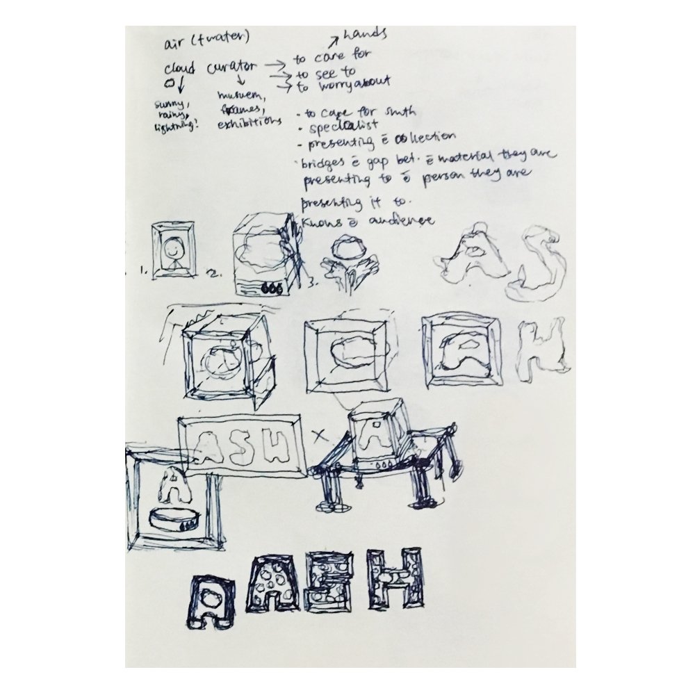
I combined the element of Air and a job that I have never worked as.

4. Floriculturist

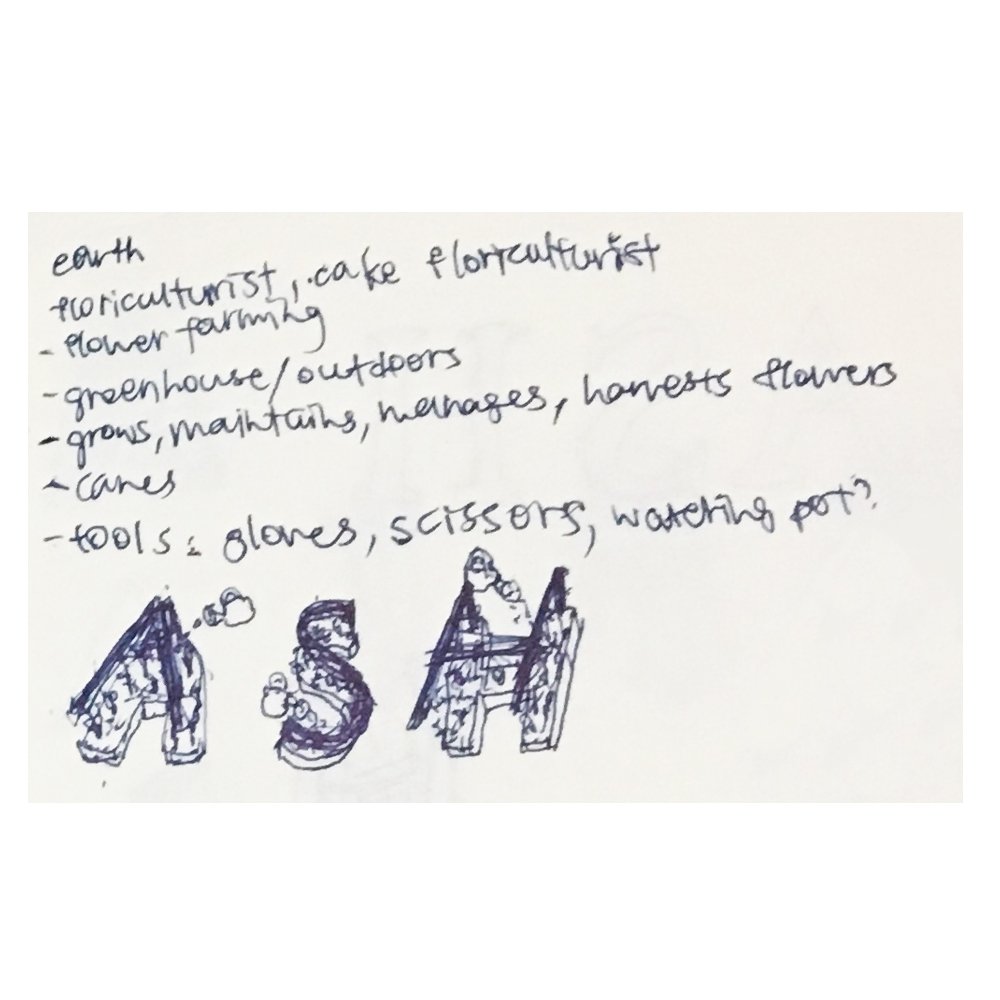
I combined the element of Earth and the job of working at a florist.

However, I did not manage to follow the theme of using the four elements as it didn’t work out as well as I thought it would be. I will be explaining the ideation and thought process below.
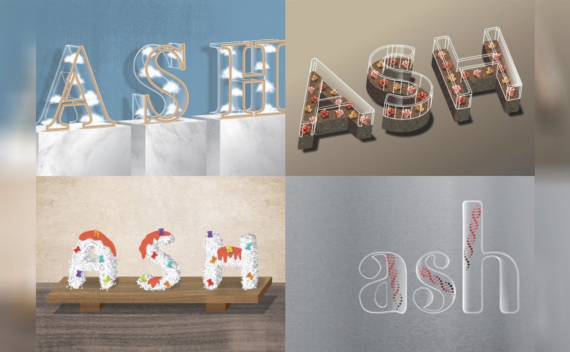
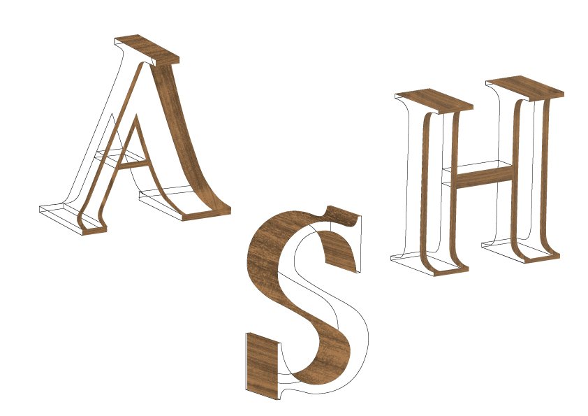
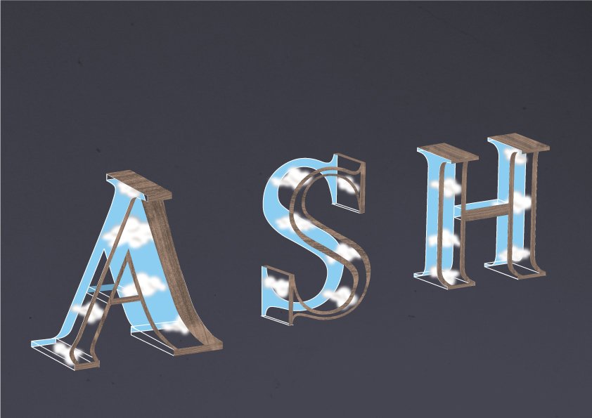
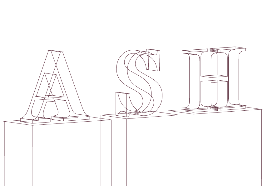
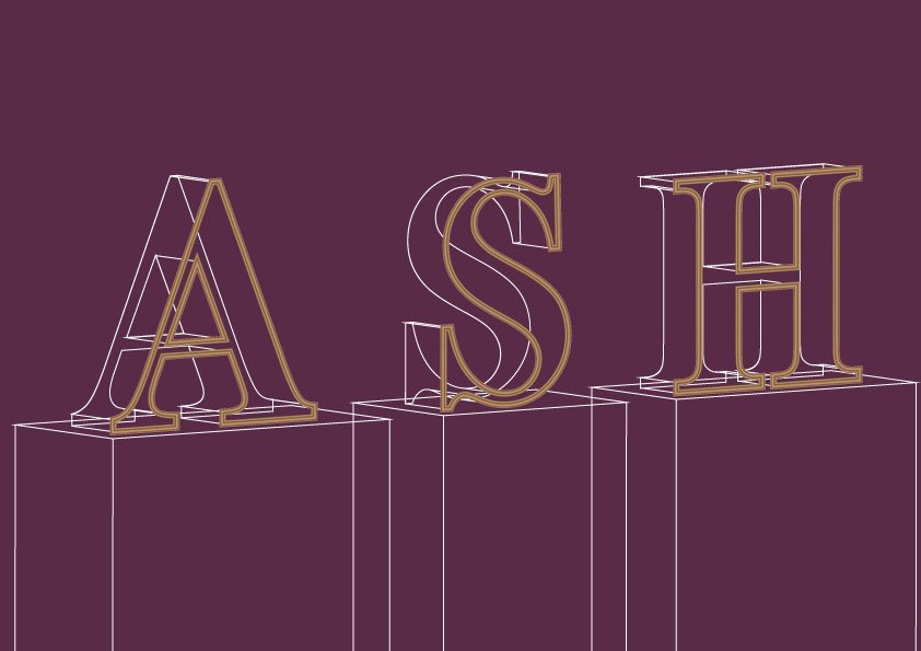
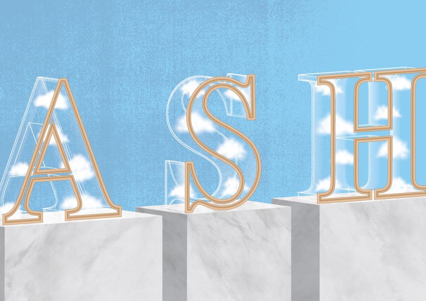
Cloud Curator

I decided to use the elements of a picture frame, glass display, and clouds in my typeface. 

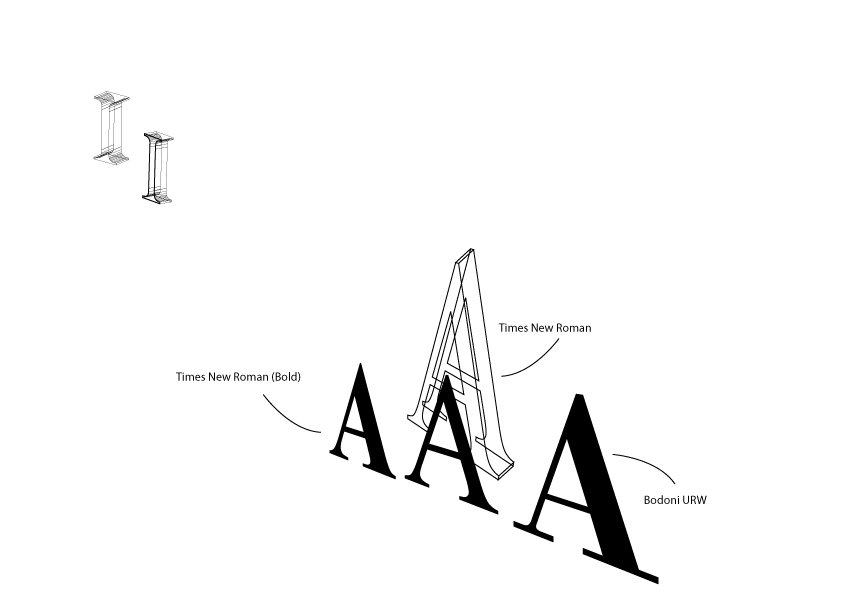
As mentioned in the research post, I wanted to use the style of this typeface for my Cloud Curator font. Initially, I was choosing between Times New Roman, Times New Roman (Bold), and Bodoni URW. Serif fonts look professional and stable which reflects the job of a curator. I decided on Times New Roman in the end and adjusted the width of the stern/stroke of the font according to my preference.

v1 – Added the frames using a clipping mask to mask wood texture to the shape of the borders.
v2 – Changed the border of S.
v3 – Added in the clouds (tutorial below) + blue background, but doesn’t look realistic and still does not look like a glass display containing clouds. The “frame” looks like a stick-on wallpaper.

v4 – Added in the gallery light. Tried to add in the cloud wooden frame as a brush pictured on the top right-hand corner, but it did not work as a border for the letters at all because the illustration cannot be bent to the curvature of letters. 


v5 – While doing the typeface for floriculturist, I learned the 3D > Extrude & Bevel function which created a more accurate isometric perspective for the fonts. Thus, I decided to redo the fonts and removed the extra “I” element by the side. 
v6 I also found a YouTube tutorial which taught me how to make a realistic picture frame using the pre-made wood gradient in the swatches.

v7 – Added in the glass texture to show the font as a glass display, redid the clouds using the Symbols function, the blue background to show relation to the clouds, texture to the wall for more depth, and finally the pedestals with a marbled texture to show context.

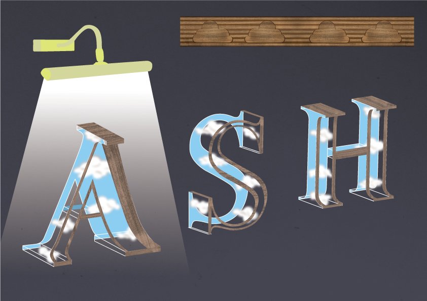
The glass tutorial which I used for 3 of my typefaces.

Clouds tutorial: http://www.gtpdesigns.com/design-blog/view/tutorial-create-realistic-clouds-in-adobe-illustrator

v8 (final version) – Added shadows behind the glass displays, changed the lighting for the pedestals, and made the wall background darker to show light focusing on the cloud displays.

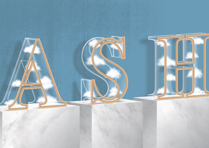
I decided to cut off a small part of the “A” and “H”, and the pedestal using the principle of gestalt (closure). The viewer will perceive the letter as a whole by filling in the information. 

I decided to use a darker tone of sky blue to show that the environment is darker, to show that the light is only shone on the displays. The colour of the frame is also yellow-toned to complement the blue background.
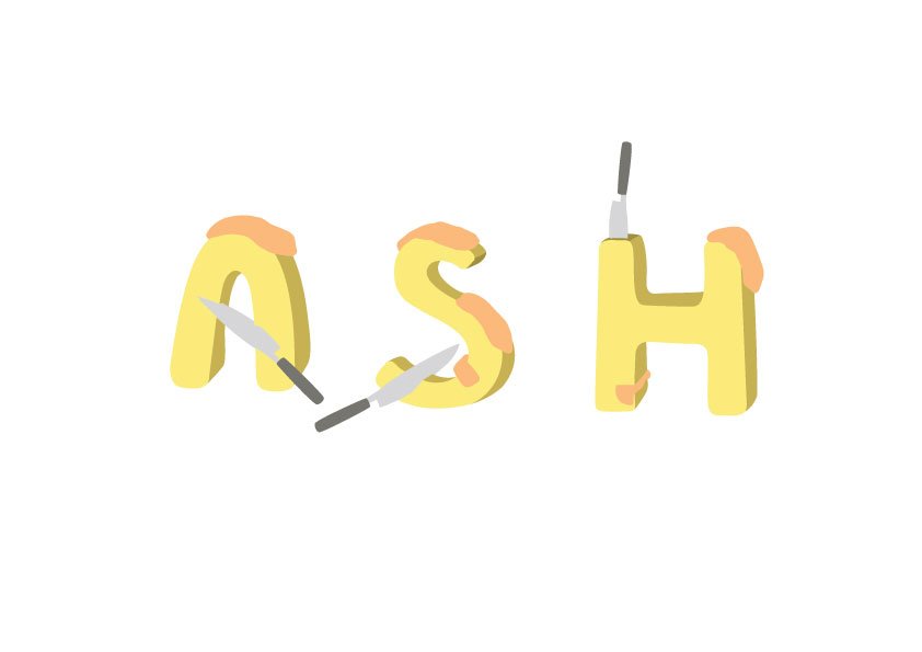
 

Sweet Sushi Chef

I decided to use the elements of rice, sweets, and jelly in my typeface. 

Sketch for initial ideation: Frozen Sushi Chef
v1 – Sketch in vector form
v2 – Tried the texture of rice using the YouTube tutorial shown below. Created my own scatter brush to do this. Also added a translucent layer of blue on top of the rice to see if it looks like ice.

v3 – Changed the colour of the ice to white with a coloured background
v4 – Placement of the letters
v5 – Placement of the letters
v6 – Placement of the letters
v7/8 – Added the texture of the salmon using the clipping mask and gradient tool.
v9 – I received feedback that the rice was not obvious as it is covered by the ice, and the rice looks like confetti. Thus, I decided to remove the ice and improve on the rice texture.
v10 – Added nori (seaweed) textured strips to the letters and also wood texture to the plate by using the clipping mask function.
v11 – Added in rice paper background, as well as shadows to make it more realistic.
v12 (final version) – I received feedback again that being a sushi chef is very common. Therefore, I thought of what other elements I can change to make “my job” more interesting than just a sushi chef. I decided to use sweets as sushi is usually savoury (when dipped in soya sauce), adding a “twist” to my job.

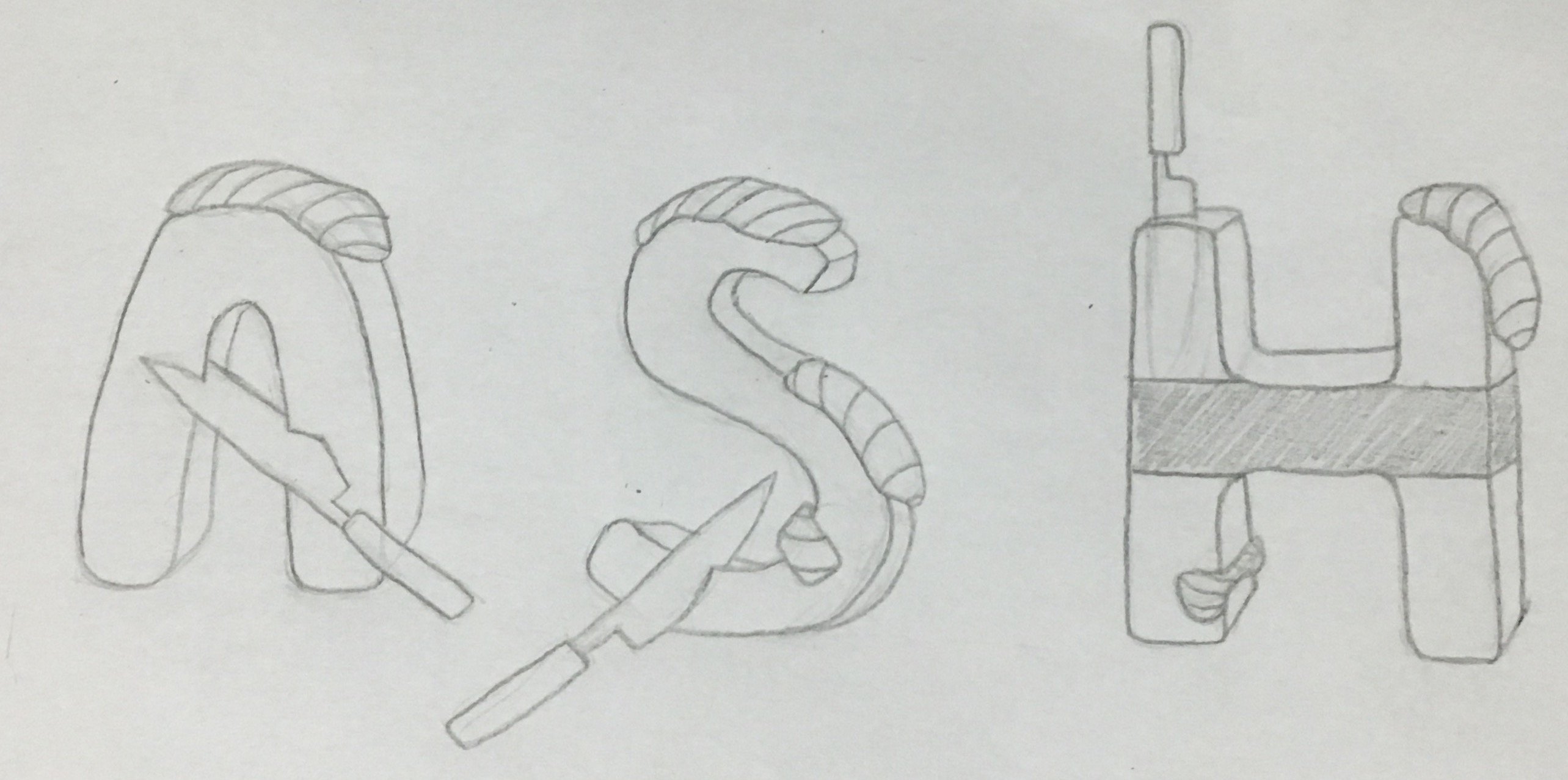
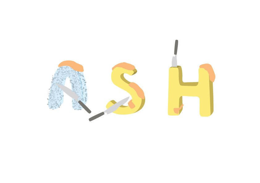
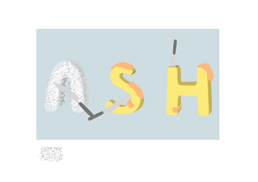
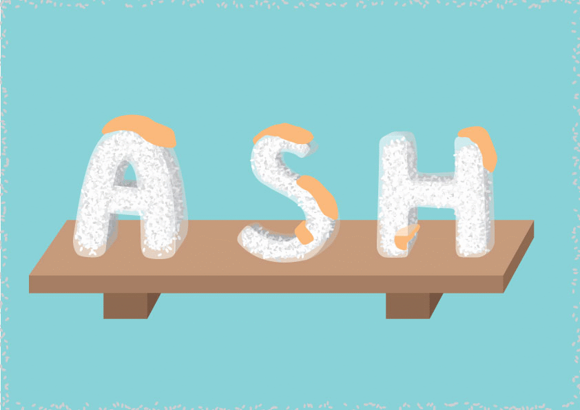
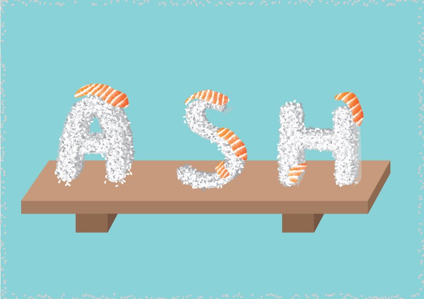
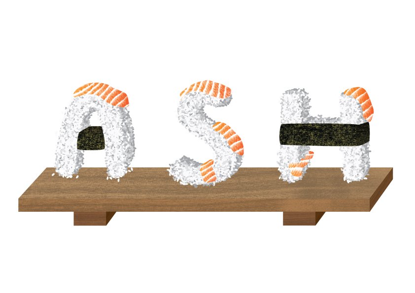
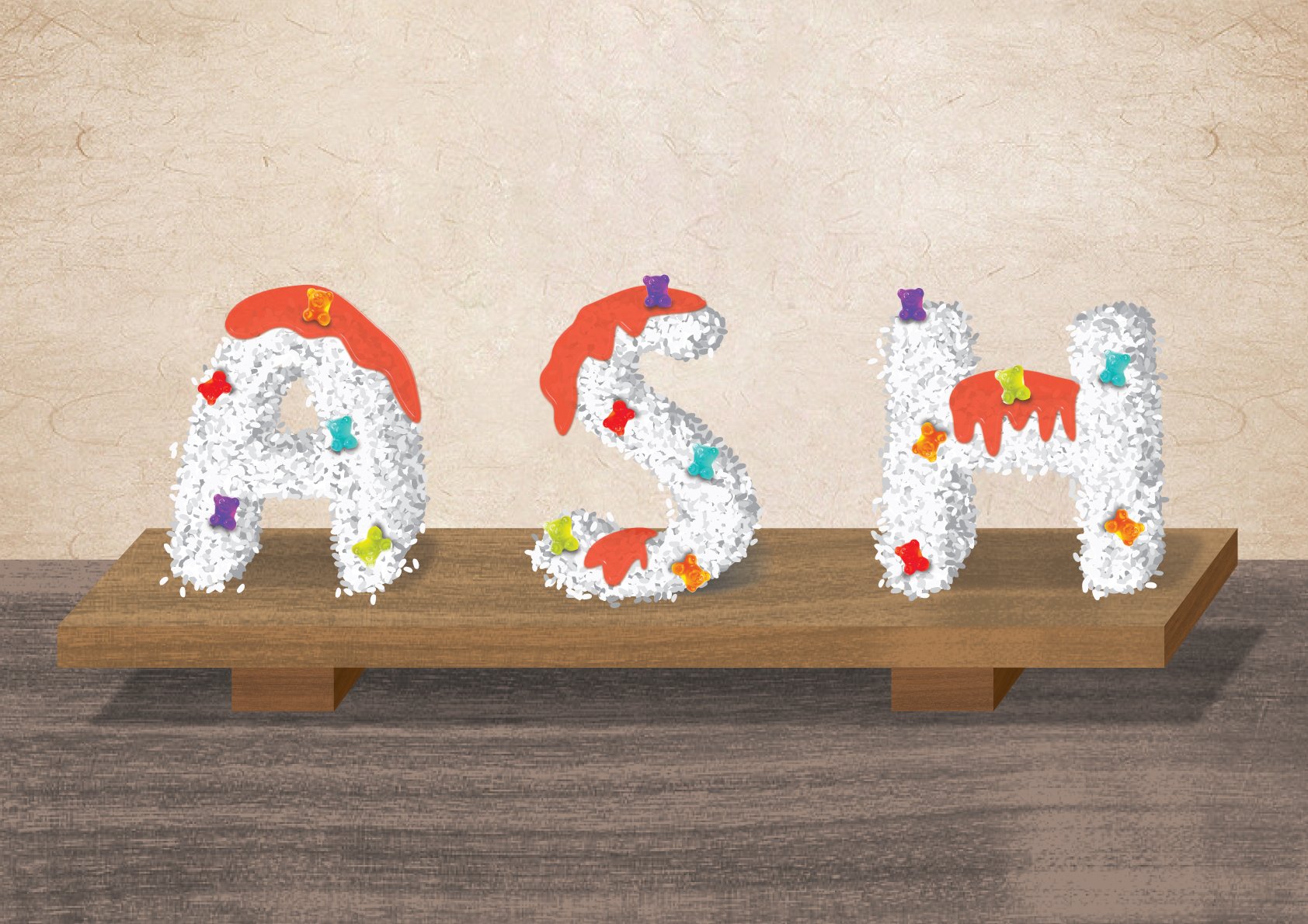
I decided to place the letters in the centre to emphasise on the fonts, and to balance out the three letters. Referring to version 5, I tried to put the A in front of S, and S in front of H to create distance between the letters. Even though it does guide the viewer’s eye from A to H, I feel that it does not balance out as a whole as A is too big compared to H. Another solution to that is to add more elements on the right side of the image, where H is placed at, to balance out the image.

I used a mixture of bright colours with saturated hues to signify playfulness and evoke a childlike feeling. 
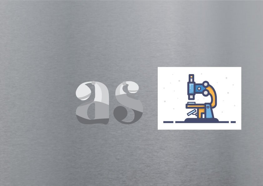
 

Genealogist

I decided to use the elements of a petri dish and DNA (genes) in my typeface. 

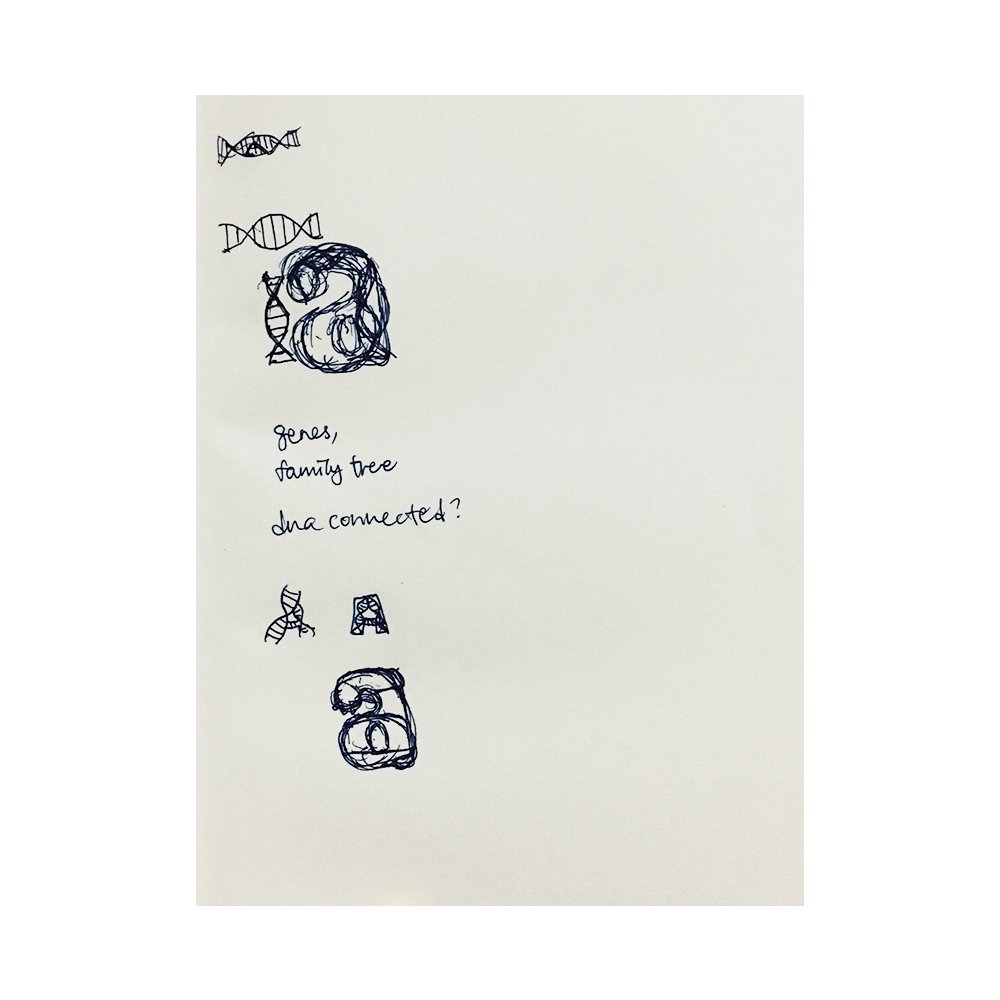
I changed my initial idea of being a Burnt Toast Scrapper to a Genealogist as I wanted to see how I can create a typeface about a job that I am completely unfamiliar with. 

v1 – Base font
v2 – I wanted to shape my letter into a microscope, but I only remembered that I cannot bend objects into letters when I was already halfway done…so I redid another idea!
v3 (final version) – I decided to incorporate elements of the petri dish and DNA into my typeface. Using knowledge from previous jobs on how to create a glass texture, I was able to complete this the fastest among the other jobs. Used a metal background as grey is a neutral colour.

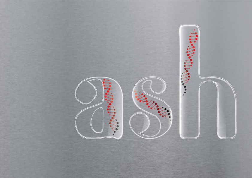
I decided to place the letters on the right, leaving negative space on the left. Cutting off my name at “h” gives the viewer a feeling that there could be more to the letters presented here. (Gestalt)

I decided to increase the tonal value of red from the bottom up to show the relation of the ancestry component of the job. The gradient symbolises the decrease of DNA inherited from their ancestors.

Floriculturist

I decided to use the elements of flowers growing, soil, and greenhouse in my typeface. 

v1 – I added in the elements of flowers + soil + greenhouse into this typeface. I followed the YouTube tutorial below to learn how to make an isometric text effect. After going through this tutorial, I also applied and redid my Cloud Curator typeface to make it more accurate than before. The flowers used were masked in photoshop from their original images and exported as PNGs with a transparent background to illustrator. Added the shadows under the flowers as well.

v2 (final version) – Added in the glass texture, soil texture to the sides of the letters, shadow under text, and also a brown gradient background.

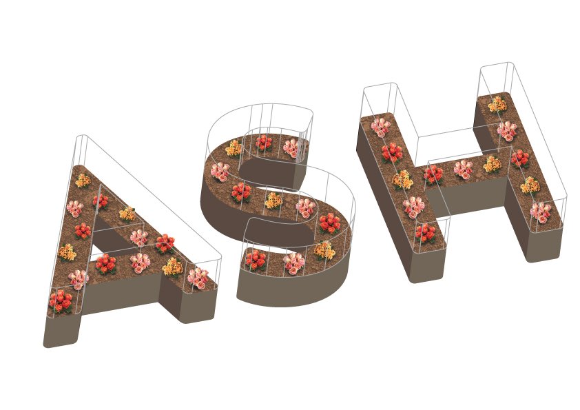
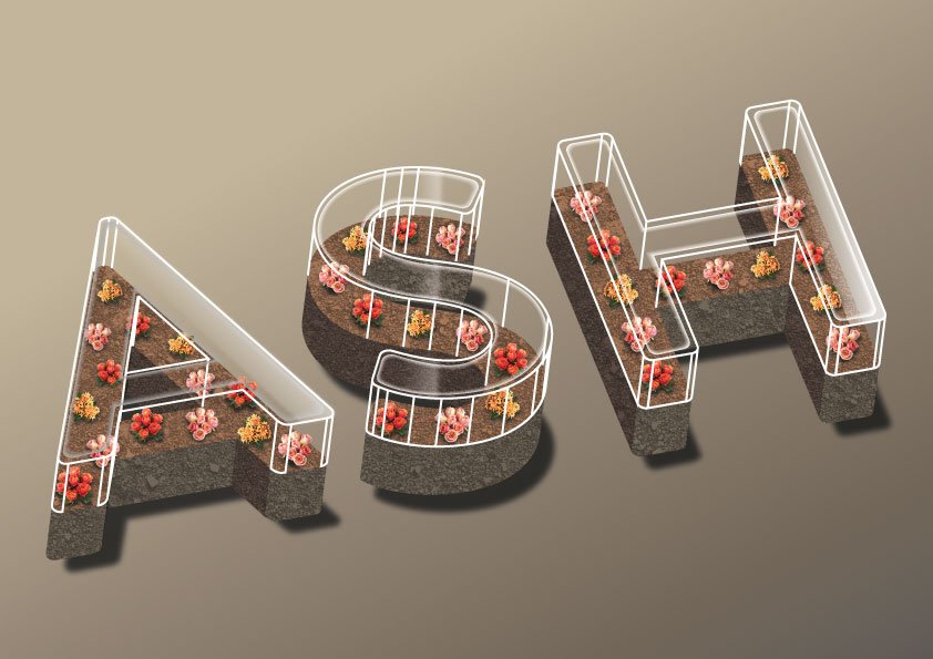
Contrast is shown in this image in terms of the bright colour of the flowers and the dull soil base. The shadow is also used to show contrast.

It is also dynamic as perspective is shown by tilting the angle, leading the viewer’s eye from a nearer point to a further point

An anagalous colour scheme is used for this image. Red, orange and pink flowers with red toned soil. It looks more natural as a whole.

Reflection

Although this project is challenging in terms of the ideation and executing it, I feel that I have learned a lot in terms of how I think (deconstructing objects to their basic elements) and also improving my technical skills. My greatest takeaway is to always ask for feedback and accept positive criticism to improve your work. Sometimes we are so drawn into our own work that we don’t see it objectively. For example, I was thrilled to learn about creating rice using the scatter brush. However, I did not realise that the letter that I have created is not as realistic as I thought. Feedback from a friend made me improve on my work, and I am always grateful for that.

My research is shown here:  https://oss.adm.ntu.edu.sg/a180062/project-1-image-making-through-type-research

The final outcome is shown here: https://oss.adm.ntu.edu.sg/a180062/project-1-image-making-through-type-final


Project 1: Image Making Through Type (Research)

Typography Research

 Typography is the visual art of creating written words.

basic parts of the anatomy of typographic characters

5 types of typefaces

serif typeface

Serif   |   Traditional, respectable, stable

Serif fonts carry a distinguished feeling of heritage and pedigree. They make a brand feel respectable and reliable, instilling the audience with a sense of comfort that they’re in the hands of someone reputable and stable.

Serifs are super easy to read because those little feet create a subtle visual connection between the letters. This readability makes them great for paragraphs of text.

sans-serif typeface

Sans serif   |   Simple, straightforward, sensible

Audiences perceive sans-serif fonts as clean and simplistic in a modern way. They allow the message to speak for itself without hiding behind a façade—straight and to the point in an objective way. Designers for the web often use sans serif fonts. They carry a reputation for being contemporary and current no matter what decade you use them in.

Sans Serifs are usually clean and geometric, which makes them easiest to read when they are either really large or really small. Sans serifs are often used for headlines, captions, and short descriptive texts.

display typeface

Display   |   Friendly, quirky, unconventional

Display fonts are meant to be displayed at a large size (generally 14 pts. or higher). So, display fonts tend to have big personalities in order to draw an audience. Display fonts have to be a little on the loud side, so they’re often friendly or amusing and grab people’s curiosity.

A display typeface is a typeface that is intended for use at large sizes for headings, rather than for extended passages of body text. Display typefaces will often have more eccentric and variable designs than the simple, relatively restrained typefaces generally used for body text.

script typeface

Script   |   Personal, feminine, fancy

Script fonts (and by extension most handwritten fonts) inspire feelings of elegance, grace, and femininity. We often use handwriting in expressions of affection. Because of this, audiences perceive these typefaces as personal, creative and genuinely heartfelt.

These typefaces have lots of swoops and curls and sometimes even look handwritten. Script typefaces look awesome for logos, large headlines, and for little details to give something a nice handmade touch.

symbols and dingbats


Inspiration/Styles/References

I thought that the type for this image was very interesting as it acts as both “H” and “h”. The letter “I” is also seen at the side. Even though the type is a little confusing to understand (to see “H”, “h”, and the element of “I” at the side), I feel that this is what makes the typeface more complex, inviting the viewer to “solve” the puzzle of finding the different sides. I was intrigued to the design of this type which influenced my design for my Cloud Curator job typeface. 

I thought the usage of textures of the typefaces in this photo set was quite realistic, therefore used it for reference. 

View this post on Instagram

🔥

A post shared by Jennet Liaw (@jennetliaw) on

View this post on Instagram

“Rolfe” by @judithandrolfe for today’s #GoodtypeTuesday with @youbringfire! • In light of our upcoming Austin workshop with @youbringfire, we asked Scott Biersack to host this week’s #GoodtypeTuesday! He wants you to letter the name of a person that you would like to thank for simply anything. Could be saying thanks for the love, the education, paying for lunch, etc. Tag it @goodtype and @youbringfire and hashtag it #GoodtypeTuesday. • As always, we will repost some of our favorites. And remember, this is all for the fun, encouragement and practice of lettering. Only positive comments and constructive feedback welcome. Multiple entries welcome. All skill levels welcome. Please only enter YOUR work. Entering your work does not make it ours. We give credit where credit is due. • This is a 24 hour activity that happens once a week! Join the Goodtype Newsletter to get a head start on the weekly #GoodtypeTuesday prompt. • Know someone who should participate? Tag 'em! 👆 #strengthinletters #goodtype #lettering #handlettering #type #typography

A post shared by Goodtype | Strength In Letters (@goodtype) on

View this post on Instagram

“Kasi” by @kayturp representing her name with a few things like NYC, her plant friends and her long hair for today’s #GoodtypeTuesday! • This week, we teamed up with @myedeleon! Mye is a freelance lettering artist, designer and workshop leader based in Singapore. And the author of @MasteringHandLettering.  She is giving away a copy of the book to 3 of our #GoodtypeTuesday participants! • Mye believes in the importance of self-promotion because it paves the way for progress and growth through community by building friendships, collaborations and camaraderie that allows conceptualization of new ideas and opportunities to help each other not only for brand growth but for creative skills as well. • Your challenge this week is to letter your name then combine decorative elements that best represent you.

To officially enter your piece into the contest you must post it on your Instagram Feed, tag @goodtype and @myedeleon then hashtag it #GoodtypeTuesday and #GiveMeMyesBook for a chance to win a copy of Mastering Hand Lettering. • Winners will be announced via our Instagram Stories. #strengthinletters #lettering #handlettering #type #typography #art #design #illustration #graphicdesign

A post shared by Goodtype | Strength In Letters (@goodtype) on

View this post on Instagram

Lettering by @benjohnstondesign . It's me again @ianbarnard guest curating for the @goodtype feed today, and I'm sharing some of my favourite designers and their work that have inspired me or helped me to produce the kind of work I'm doing today. . Ben Johnston is an artist & designer from Toronto, Canada. I've been following Ben's work for a long time now and seeing the progress and development of his lettering murals has been the inspiration behind me wanting to do them too. I love the variety of complex effects he adds to his type work and then goes and applies that to the side of a massive building, still with the quality and consistency that you would see on a sheet of paper. His work often pops up in other people's feeds as they take selfies in front of his murals, which is a sign of just how attractive they are. . Head over to Ben's feed to see his catalog of great work and the well produced process videos of his murals.

A post shared by Goodtype | Strength In Letters (@goodtype) on

I thought warping/liquifying of typefaces was a really cool idea so I added this two photo sets  as reference.


Job research

Cloud Curator

Cloud: a visible mass of condensed water vapour floating in the atmosphere, typically high above the general level of the ground.

Elements: Cloud, Sunny, Rainy, Lightning?

Curator: a keeper or custodian of a museum or other collection. (According to the video below, a curator is someone who 1. cares for something, 2. is a specialist, and 3. is presenting a collection. They bridge the gap between the material they are presenting to the person they are presenting it to.)

Elements: Museum, Frames, Exhibitions, Hands? (to care for), Display boxes, Barricades


Sweet Sushi Chef

Sweet: a small shaped piece of confectionery made with sugar. (or anything sweet)

Elements: Sweets, Gummy bear, Jelly, Jam, Candy Strips

Sushi: a Japanese dish consisting of small balls or rolls of vinegar-flavoured cold rice served with a garnish of vegetables, egg, or raw seafood.

Elements: Fish, Rice, Seaweed, Tamago, Soy sauce

Chef: a professional cook, typically the chief cook in a restaurant or hotel. 

Elements: Sushi knife, Sushi rice bucket


Genealogist

Genealogist: a person who traces or studies lines of family descent.

Elements: Anything related to chemistry (Microscope, Petri dish, Flasks, Test tubes, Pipette, etc.), Family tree, DNA (genes)


Floriculturist

Floriculturist: focuses on the cultivation of flowering and ornamental plants for gardens, floral industry and for export. They also develop new varieties. (Grows, cares, maintains, manages, harvests flowers.)

Elements: Flowers, Farming, Garden tools (Scissors, Gloves, Watering-pot, etc.), Greenhouse, Irrigation system, Outdoors


Colour Harmony

Some research about colour harmony from the previous assignment, Ego.


I will cover more on the ideation, process and different versions of these 4 jobs in my process post:  https://oss.adm.ntu.edu.sg/a180062/project-1-image-making-through-type-process

The final outcome is shown here: https://oss.adm.ntu.edu.sg/a180062/project-1-image-making-through-type-final


Sources:

https://design.tutsplus.com/articles/a-20-minute-intro-to-typography-basics–psd-3326?utm_source=CMblog&utm_medium=link&utm_campaign=what-is-typography

http://westchicagoprinting.com/fonts-feelings/

https://edu.gcfglobal.org/en/beginning-graphic-design/color/1/

Types of Typefaces