Version 1
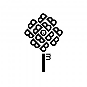
Final Version
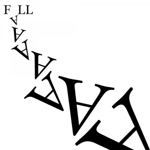
Version 1
Final Version
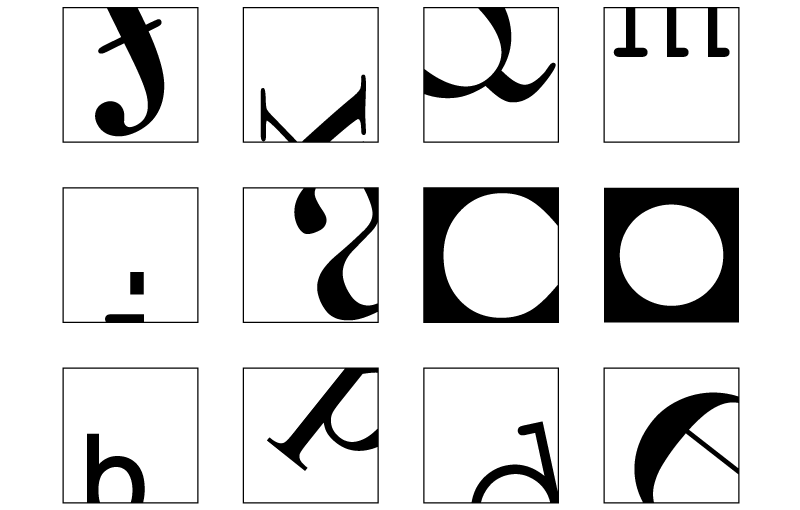
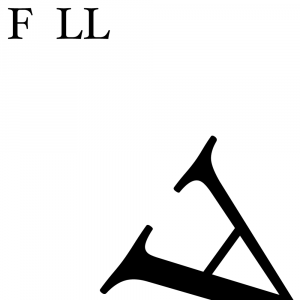
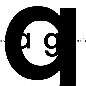
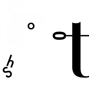
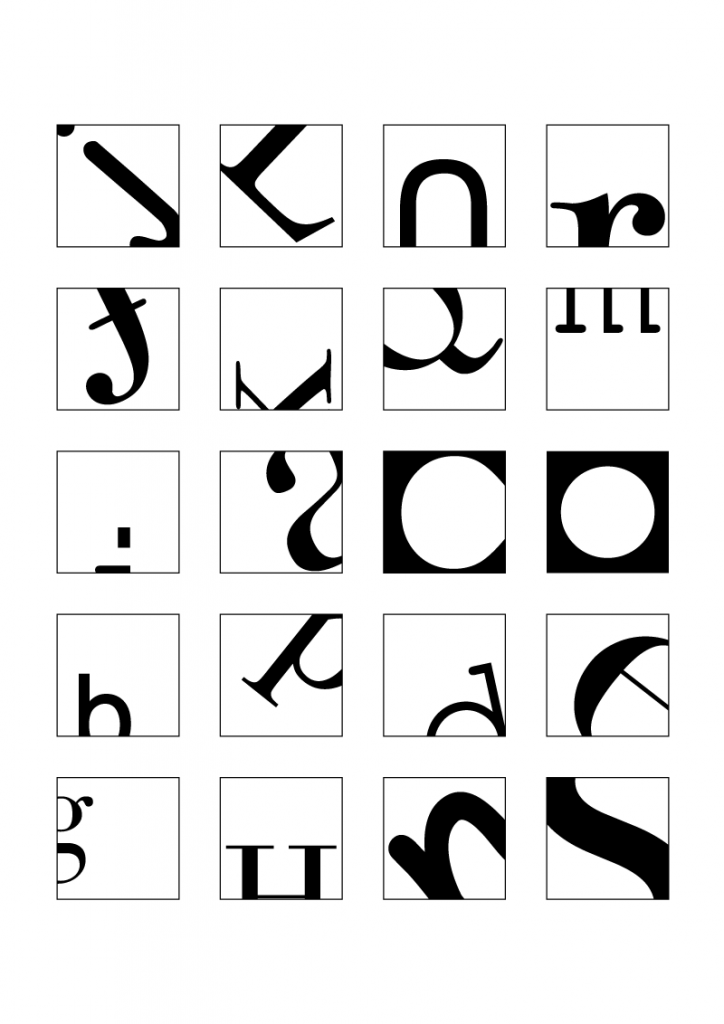
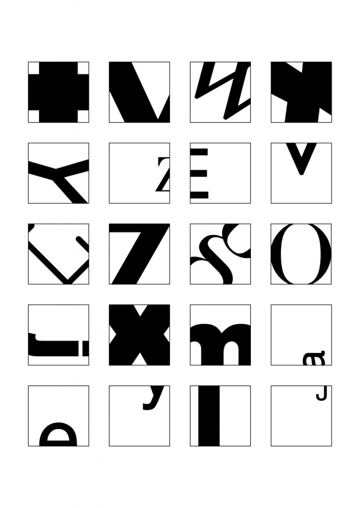
Letter Croppings
Cropping letters to the point before they become illegible! I tried to show the unique characteristics of each letter, e.g. the tail/descender for the letter ‘p’, the arc for the letter ‘m’, and the vertex for letter ‘v’.
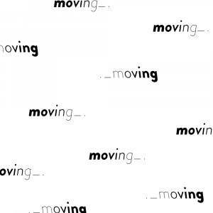
Typefaces used: Arial Black, Bodoni 72, Comic Sans MS, Courier New, Didot, Futura, Gill Sans, Helvetica, Myriad Pro, Times New Roman (randomly picked haha)
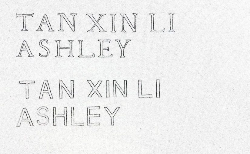
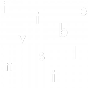
1st Version
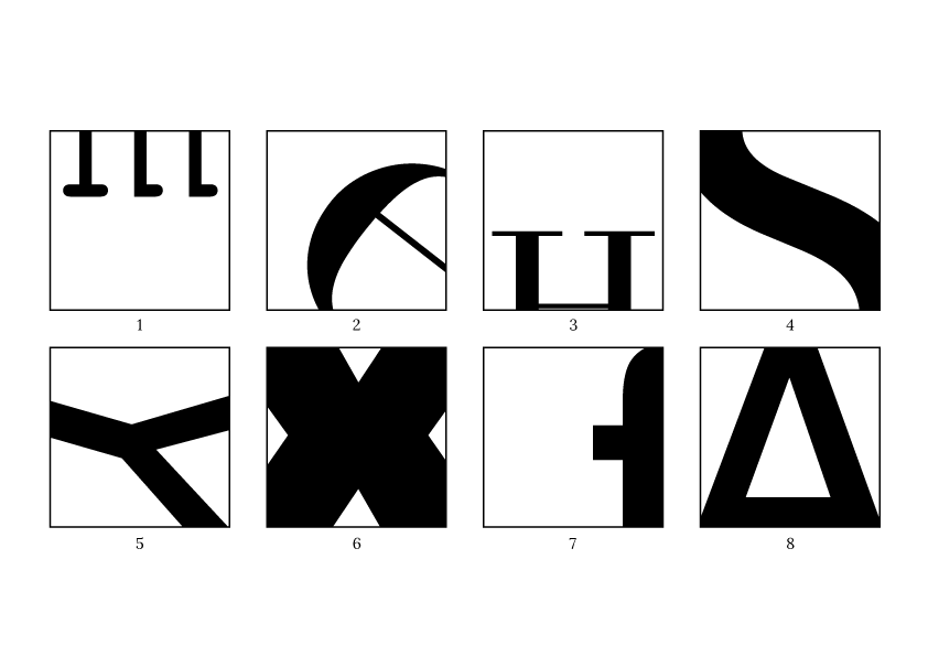
1 (m), 2 (e), 3 (H), 4 (s), 5 (y), 6 (x), 7 (f), 8 (A)
1 (m), 3 (H), 7 (f): has too much white space at the bottom/side
Final Version
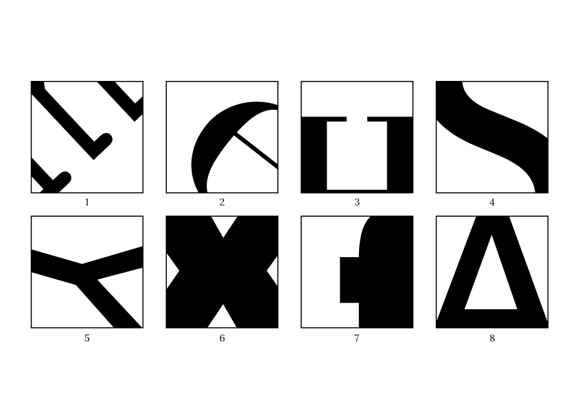
1 (m): Cropped m even further. Kept the serifs of the “m” visible to indicate that it is neither “w” nor “E”
3 (H): Scaled up “H” to reduce white space
7 (f): Scaled up “f” to reduce white space
References:

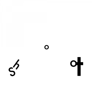
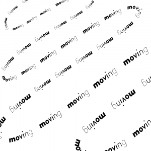
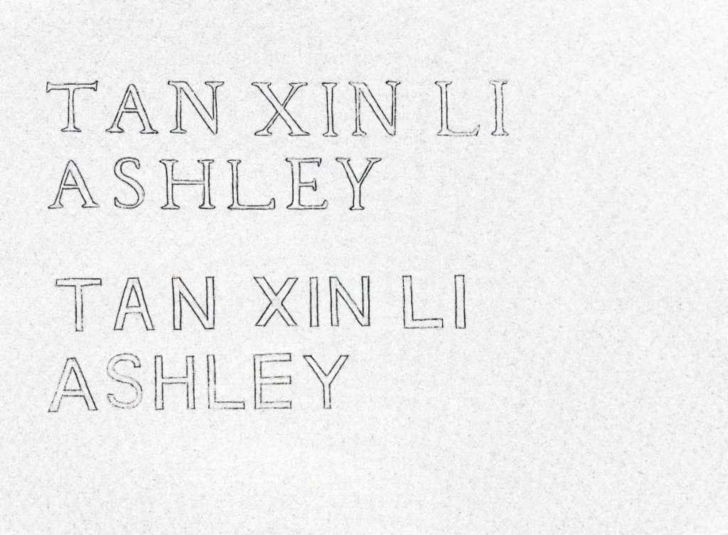
Letter Drawings
Some observations I have made while drawing my name in both serif and sans serif styles:
Serif: Serifs, thick and thin stroke weight/width for different strokes
Sans Serif: No serifs, same stroke weight/width throughout
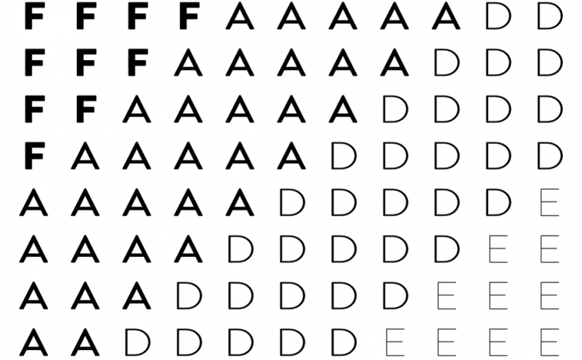
Both: Has the same cap height and baseline since it’s all capital letters, different kerning (space between letters?) between each letter and each word
Transitional typeface: extremely thick and thin stroke weight, the contrast of stroke weight is higher
References: