Graphic Design so far : Reflection

This week’s topic covered how has graphic design evolved tremendously from its humble beginnings to today’s plethora of offerings, spanning across almost every industry, from advertising, movies to even educational content and medical infographics.

One of the things that caught my eye in this week’s presentation was the mention of Saul Bass’ groundbreaking title sequences. Fast forward a few decades, this has transformed into an entire art form in its own right. One can easily see for him/herself on a site such as artofthetitle.com.

Comparing to today’s titles, I can see how much was achieved with the little technology that Saul Bass had at his disposal. Today’s highly-charged shiny graphics with bold colors and impressive graphic wizardry is definitely much more alluring, but Saul Bass’ titles will always stand the test of time, with its elegant simplicity, directness and clarity of motifs and visual poetry.

I think there is a good reason why as designers, we need to, from time to time, examine our roots and learn from the past. This is true even for fields outside of the creative industry; the golden adage of ‘back to basics’.

Through this semester’s history of design series of lectures, I think my main takeaway was a better/more thorough understanding of how design came to be, in all forms; graphic, interactive and industrial/product design. Many new ideas tend to come from addressing needs/problems of the era. I think in our current time, there is an enormous amount of issues that need to be looked into, and as designers, we can either join the crowd and dish out ever flashier, meaningless fodder, or we can strive for something much deeper; to engage with humanity’s biggest problems and provide some solutions, and in the process make our lifetimes more meaningful.

History of Design Essay

Q. Given the purview of past design movements which flowed with changing contexts (social, political, economic, scientific, technological, philosophical, environmental, etc), what could be a potential emergent design manifesto, ethos, movements, styles, trends or directions, which you could creatively adopt for your FYP/Graduation Project?


Better Design, for a Better Future

By Toh Yixue

In the last century, mankind has experienced tremendous progress in food, infrastructure and industrial production. Capitalism and consumerism have led to incessant goods production and massive wastage of natural resources. The new century is upon us, and the net effects of global warming are becoming increasingly apparent. Challenges of the 21st century include overpopulation, landfill shortages and diminishing natural resources. There is clearly an urgent need for better consideration of material choices and production methods. These issues need to be addressed head-on; e.g. infrastructure that can harness natural forces positively for lighting or heat. Wars and conflicts are also indirect consequences of societies’ insatiable thirst for dwindling natural resources. Slowing down consumption patterns by building intimate connections with people via well-designed, considered products, could be a feasible solution. Highly economical use of materials will be a genuine necessity in the foreseeable future; thus a good understanding of diverse disciplines; material science, mechanics, renewable energy production etc. will be important to the contemporary designer.

The concepts mentioned above are not entirely new. There have been similar movements and companies that have embraced these forward-thinking ideas.

Droog design is a unique practice from the Netherlands. They believe in practical use of recycled materials, with an interesting concept of combining skills and ingenuity to create something useful with found materials. They are primarily concerned with usability, utility and humility of objects. By combining high tech with low tech in a peaceful synergy, and complementary relationship between craft, industry and technology, the craftsmen of Droog were ‘redesigning’ the process of design.

Muji is a conceptually unique brand with products and services spanning across multiple sectors. Its concept of ‘brandless’ is a statement in direct contest of consumerism and brand dilution; a living example of quality over branding in principle. Its minimalist design philosophy places an emphasis on recycling and waste avoidance in production and packaging.

Super Normal is a compilation of products from all over the world. These products draw parallels to Wabi Sabi sensibilities; functional, personable yet not excessive. The considered use of materials, functionality and form show a highly evolved sense of design thought from their designers.

Having examined past trends, the emergent design philosophy in product and architectural design, will likely be made up of a contemporary design ethos utilising a combination of science(materials, engineering, harnessing of natural forces), philosophy(reduction, practicality, uniqueness without branding, ecological impact consideration) and systems design(modularity, repairability, flexibility in design change, open source; no propertatiery hardware, use of off-the-shelf components, 3d print fabrication).

Customisation will be key, and can be achieved via parametric or algorithmic design. Products will also possess multidimensional use-cases: practical, social and environmental benefits. Having such qualities in products will likely start a ripple effect indirectly; promoting dialogue on sustainability awareness, people getting to see and experience possibilities first-hand, inspiring future generations. This direct, incremental and localised approach doesn’t rely on top-down approach, which has failed us thus far.

The reasons for such a design philosophy are plenty. Necessity is key; these are direct responses to challenges that lie ahead in a global context. Structural materials and practical issues can be adapted for local context. Harnessing of natural forces by structures can be tailored to site’s availability. Upcycling, repurposing, repairability and interchangeability can help waste reduction across generations, thereby improving wasteful consumption mentality. This could potentially build deeper connections between user and product. A change in mindset could regulate anxieties of a fast-paced society; tackling problems head-on rather than taking the easy way out(repair instead of discard and acquire).

With these aforementioned trends in mind, they can be incorporated meaningfully into a FYP.

A shelter structure, with the ability to harness solar, wind, rain(kinetic) energy, is built with recycled, discarded or upcycled materials. Its design will possess a high degree of maintainability and modularity with a light environmental footprint. The structure’s primary role is to provide shelter, yet reduction of energy consumption is achieved via solar harnessing for illumination. Social values can also be cultivated via mechanisms that encourage ‘group play’, possibly driven by kinetic energy and playful design, to be enjoyed by families and strangers alike. Structure mobility and modularity also allows for flexibility and scalability; structure can be reused elsewhere, strategically repositioned and repaired.

Building a better future requires careful consideration, and a better design philosophy can be the answer.

To Bauhaus & Beyond Reflection

Isotype (International System of Typographic Picture Education), Otto Neurath & Gerd Arntz,
c. 1935

As the century progressed and more information was being conveyed via print, it seemed that designers started to think more about and experiment with structuring dense amounts of information visually. This is in tandem with the rise of the Bauhaus school of thought were design is increasingly mixed with the mathematical and physical sciences; this interdisciplinary approach no doubt helped shape new ideas amongst designers.

Chairs at Margate, Laszlo Moholy-Nagy, 1935

Wider access to better photographic techniques became new important creative tools for designers to experiment and exploit. In ‘Chairs at Margate’, a simple split composite of two photographs conveys much depth and could be interpreted in several different ways according to any given context. This is something we take for granted now in the early 21st century, but at that time I can only imagine its impact and profoundness.

Adolf the Superman: Swallows Gold and Talks Tin, John Heartfield,
1935

The earliest photomontages were all done by hand, naturally, and it is interesting to see it employed across all genres, including satire, as seen here in ‘Adolf the Superman’. The composite is not only visually rich, there is a great deal of information that is conveyed in this one image. I can imagine a whole paragraph is probably required to fully explain what this image is representing. The beauty of an image is also that its highly interpretive; words tend to box in and cast meanings in stone.

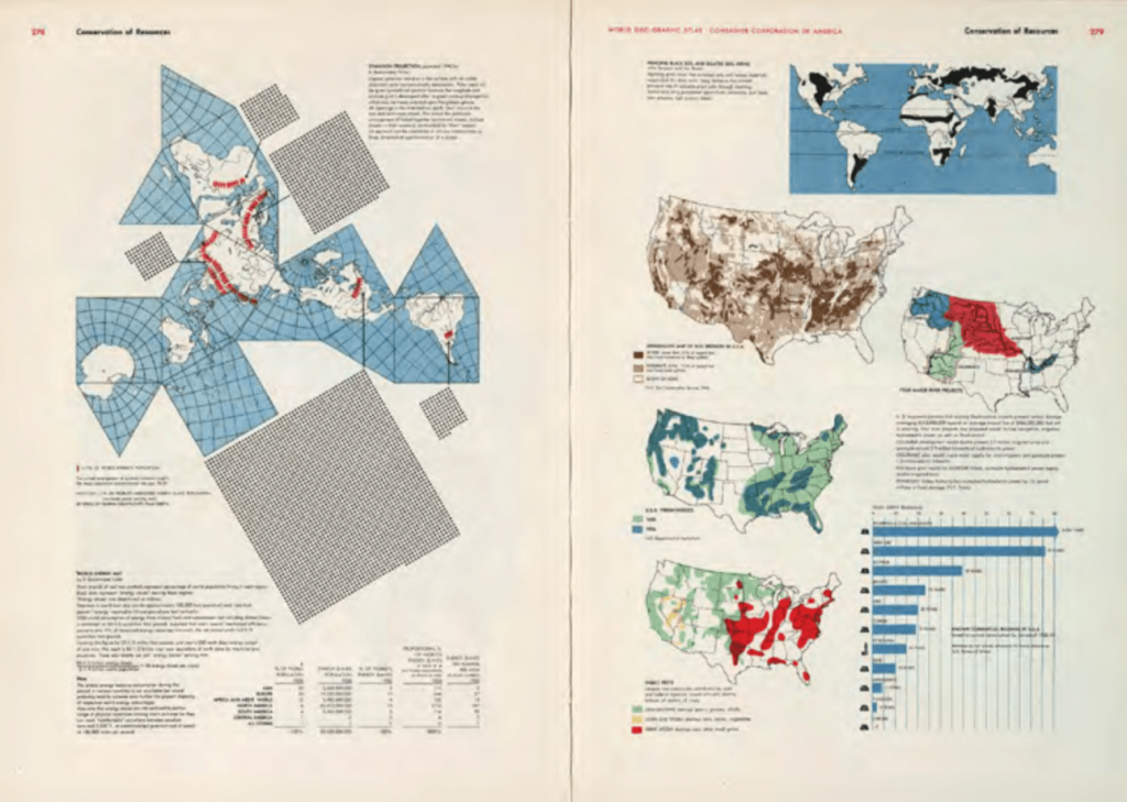
World Geo-Graphical Atlas by CCA, Herbert Bayer, 1953

World Geo-Graphical Atlas by CCA, Herbert Bayer, 1953

Finally, the first infographics was a culmination of using highly technical drawings(which are probably photographed) combined with rich graphs and complex arrangements of accompanying text. These heavily content-dense pages is wonderful in its own way; given an option to describe something like these in only words would have taken several pages and most probably still fail to sufficiently inform the reader.

Fast forward to current state of affairs, most infographics are lavishly used for silly marketing reasons which convey little to zero information.

Industrial Revolution & Graphic Reactions Reflection

The humble beginnings of the written word have progressed slowly from pure pictorial forms to distinct characters in a variety of languages and cultures.

As the technology of the printing press improved, it was no longer enough to just communicate via words. Paintings and illustrations came into the fold, and the once separate mediums of paintings and prose combined to become books and editorials.

It is instructive to see the progression of experimentation. In the beginning, words are presented beside illustrations clearly, each serving their own purposes.

Likewise, paintings such as the Japanese’s ‘The Great Wave off Kanagawa’ had words as part of informative text within the picture frame.

But soon, with the advent of various art movements, artists became much more adventurous and started embedding text within pictorial forms in an organic manner. ‘La Dame aux Camelias’ from the Art Nouveau period saw text forms uniting with lavish illustrations seamlessly.

And finally, on the other extreme, Kolomon Moser had text so seamlessly blended into his design that it almost seemed not crucial that the text was even easily readable.

This shift of emphasis towards the form and function of text over the different periods could possibly mirror the society’s attitudes and sensibilities. For me, it is highly interesting to think about what the designer for a particular piece might have been thinking and feeling when he/she was creating his/her work.