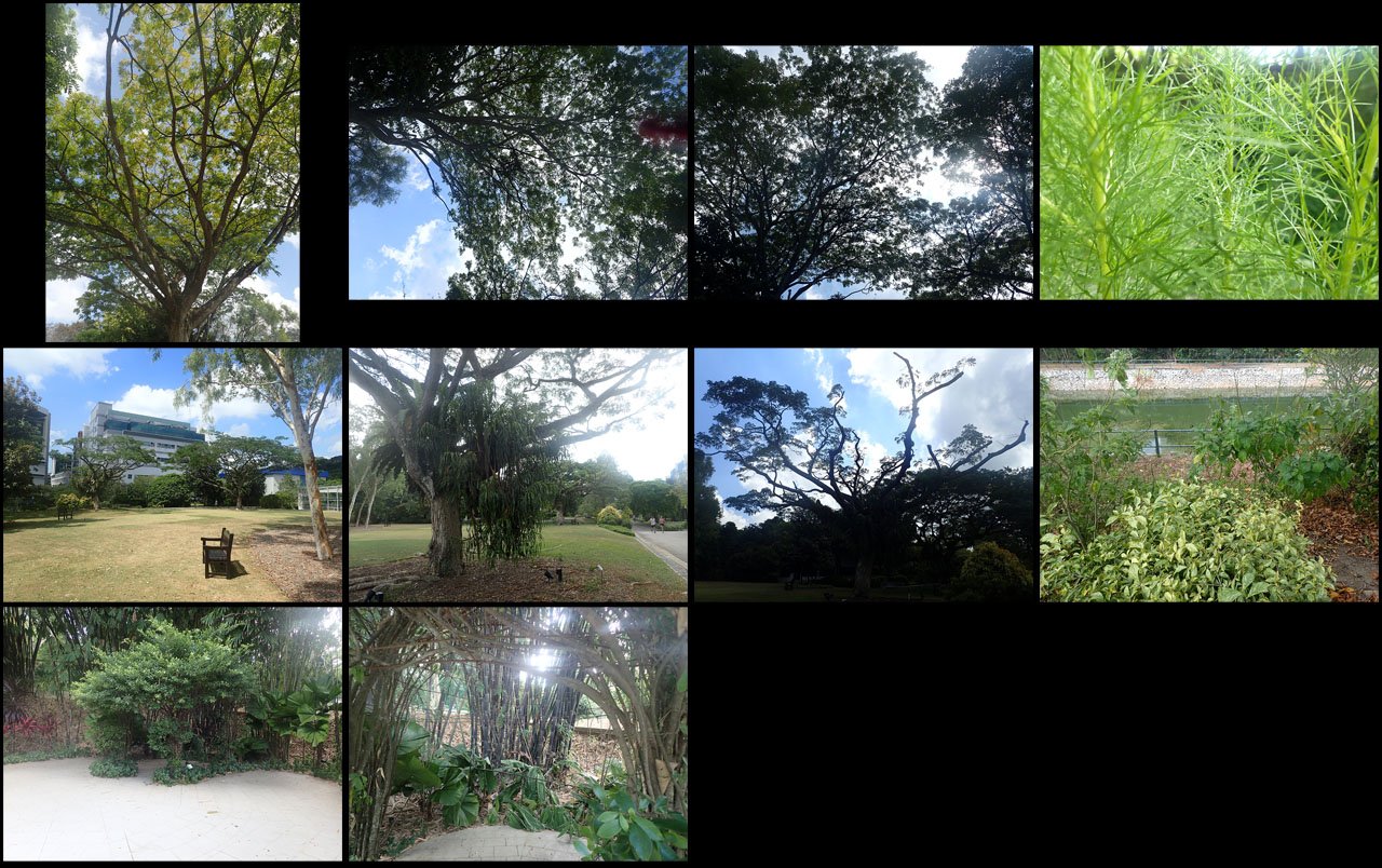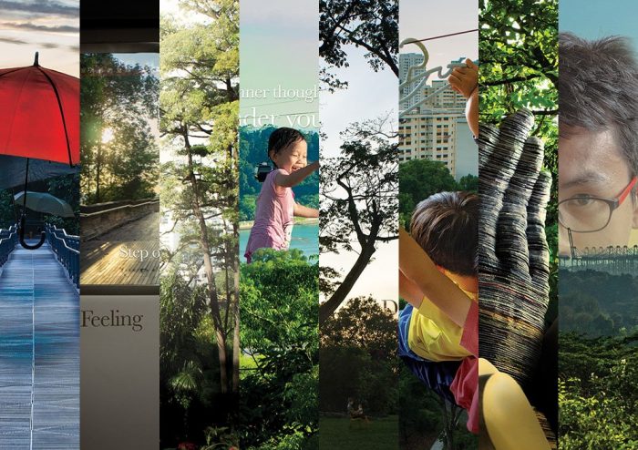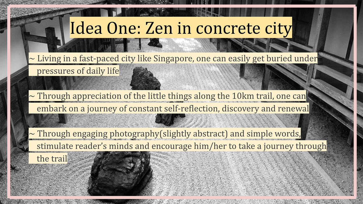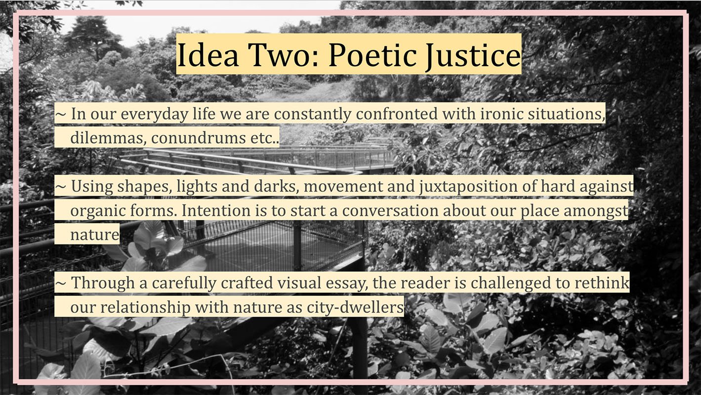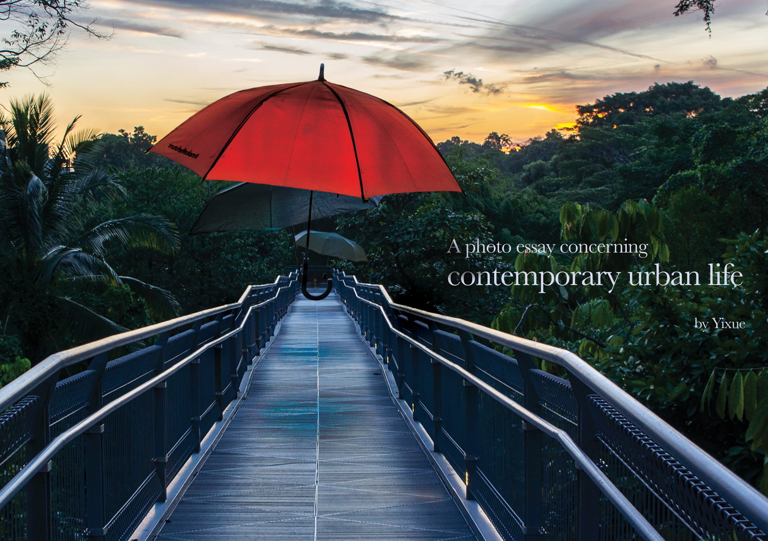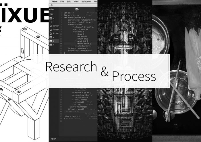
Get inspired !
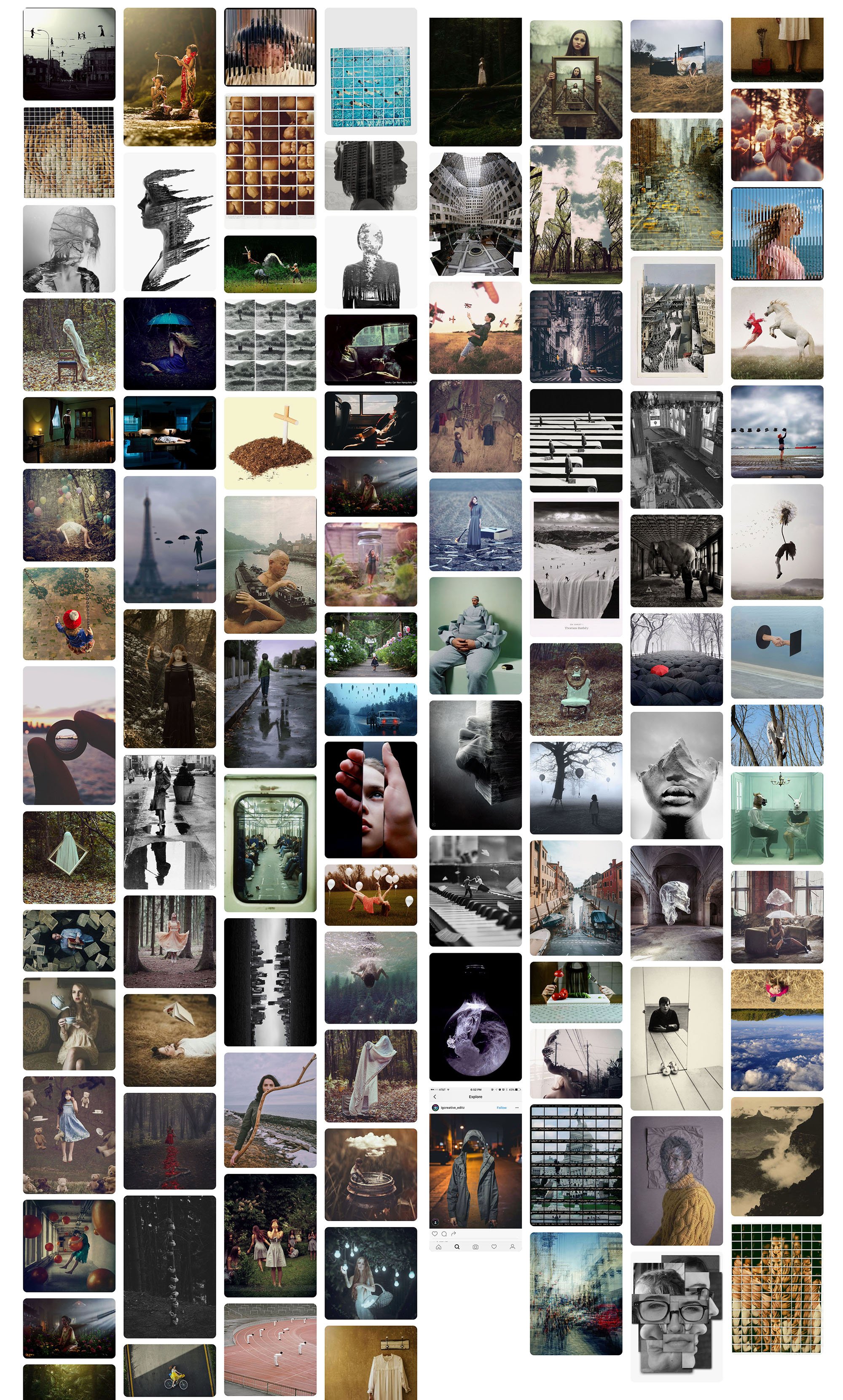
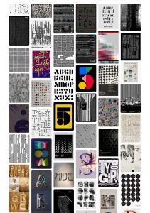
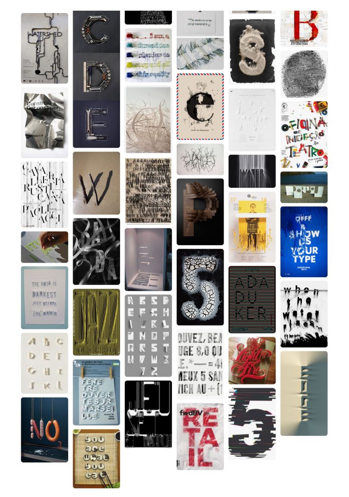
There is so much stuff on Pinterest that really opened my eyes to the possibilities. Naturally I made a board and saved everything that resonated with me. Most of them I try to derive textural and technical qualities. From there I have to weave in an additional layer of context to whatever profession I chose to portray.
We were tasked to complete an in-class assignment. The parameters were loosely defined, revolving around the concept of cubism. I tried my best to combine the shapes from the pictures, and develop a line drawing. Then I painted in photoshop using light and dark shapes, trying to mimic a cubist approach at the same time, intent on portraying multiple viewpoints at the same time. It was pretty experimental, but definitely made me loosen up a little.
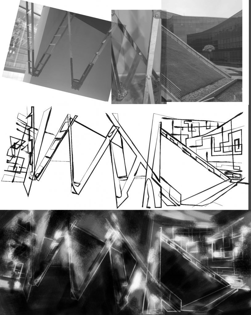
In-class assignment, exploration of cubism
I am not really a paper and sketch kind of guy, so I try to jump in straight and start making simple prototypes whenever I can to just test out ideas.
……………………………………………………………………………………………………………………………………………………………………
Let’s get to work !
Copyright Lawyer
I tried to come up with a highly ‘conceptual’ idea, one that is less literal and more ‘poetic’. I started with the idea of scanned images of objects. I loved the visceral quality of these grayscale images. Looking at some of these objects, I thought of how some of these objects are intellectual properties in their own right. Then I connected the dots and somehow came up with the highly abstract idea of portraying the copyright lawyer with these images. The result is shown below, but upon consultation it was deemed too gimmicky and a little cheesy. I agree. Moving on…

Ingredients
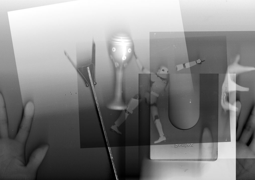
Copy-right-Lawyer?
……………………………………………………………………………………………………………………………………………………………………
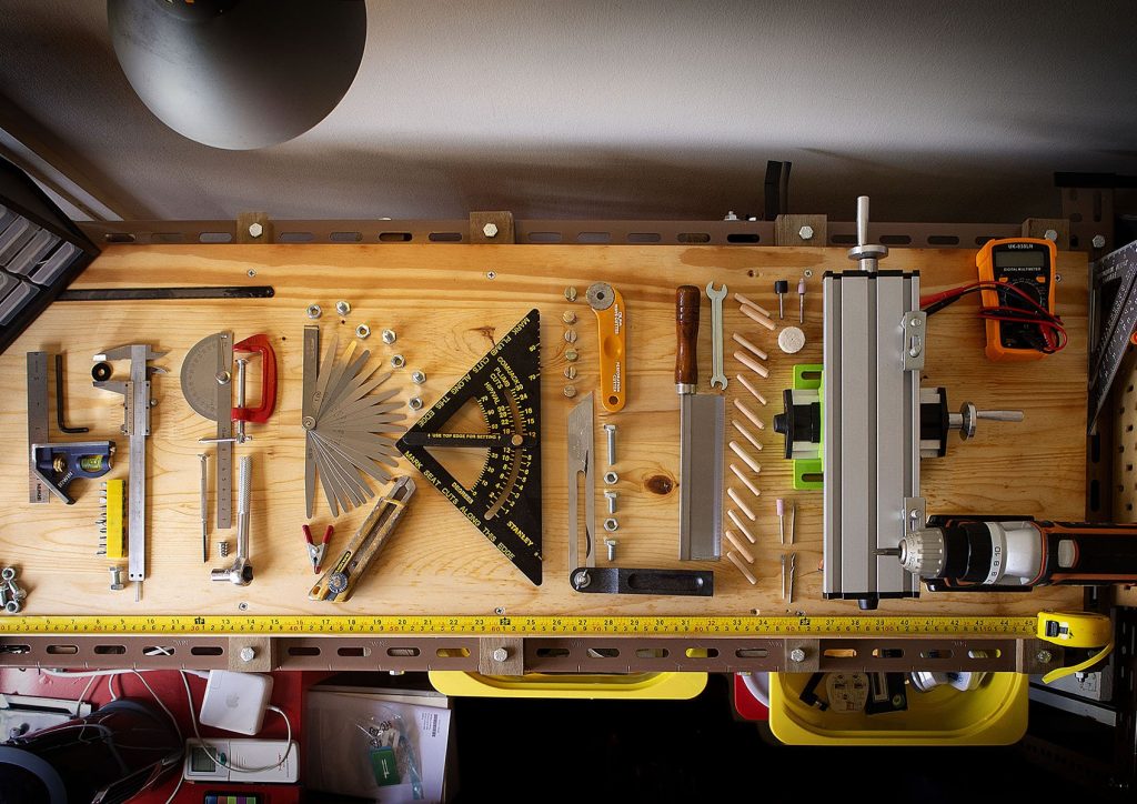
Fabricator -> Cook
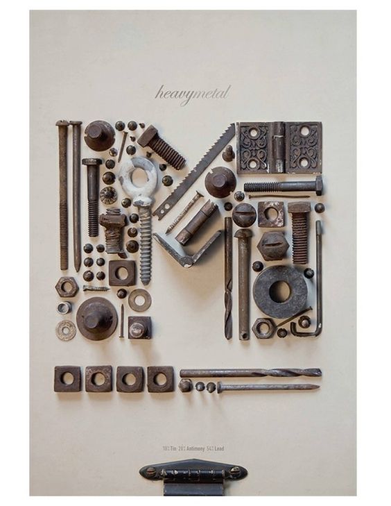
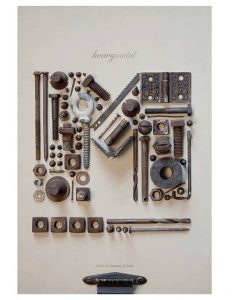
I love my tools and hardware. I also love these images where people layout all kinds of items systematically to form text. It’s really neat. But conceptually I am not very sure if there is anything to offer other than being eye-candy. I did a mockup, and decided maybe I won’t pursue it after-all.
Found Object Letters @ DIY Home Design
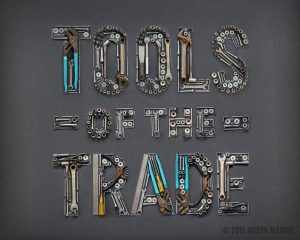
by Joseph Alessio
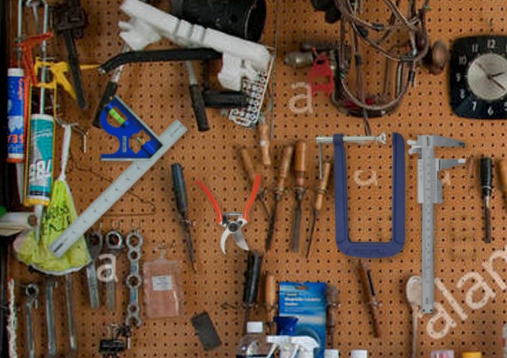
My crappy mockup
Attempt at making something
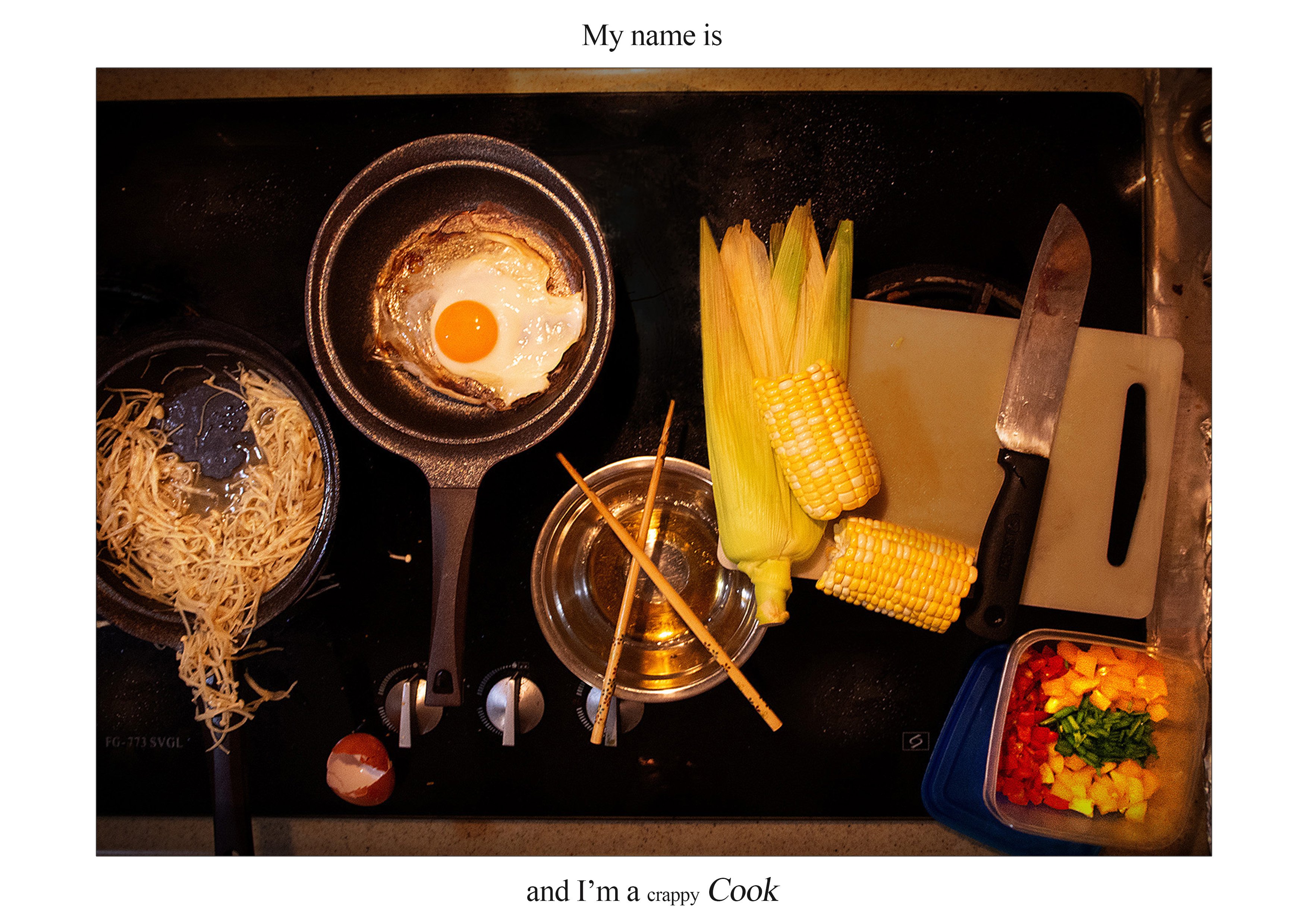
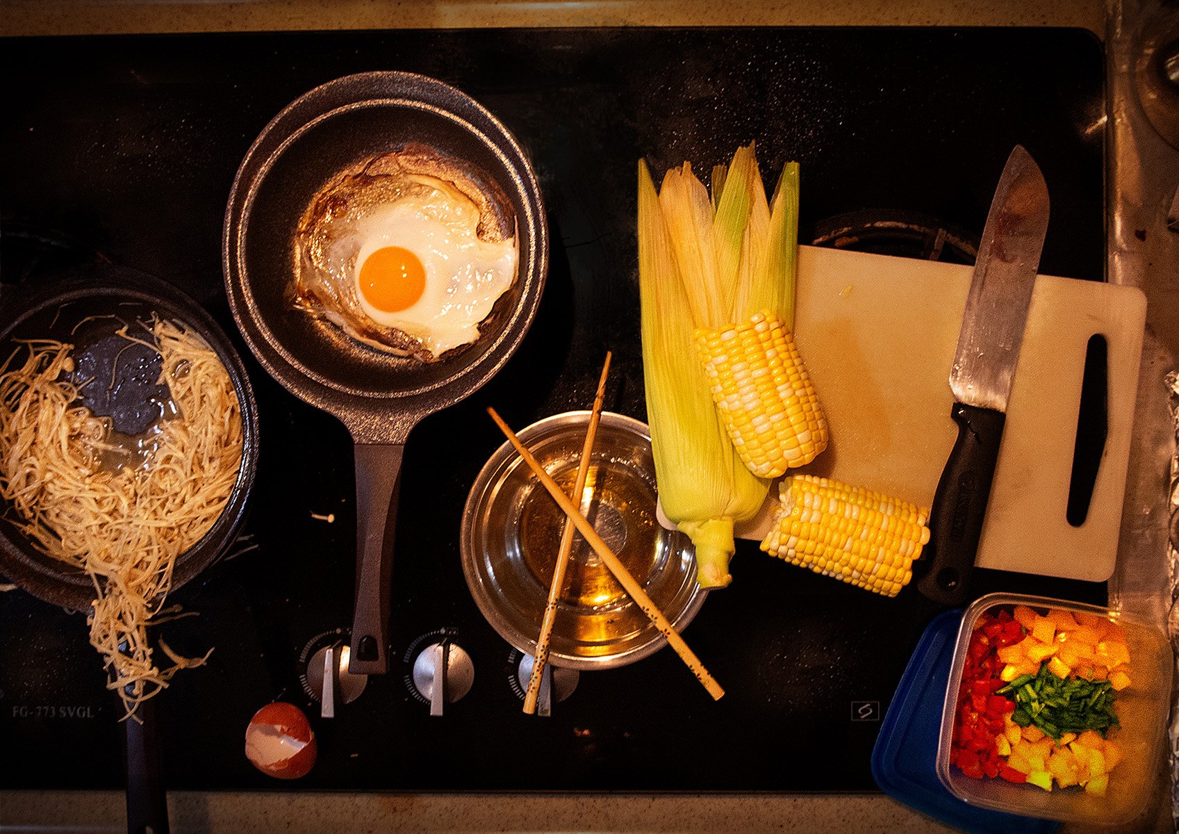
At this point, I thought of doing something with food instead. So I went to the supermarket, looked around and grabbed some corn, capsicum, mushrooms, tomatoes and some other stuff. Then I whipped up something for dinner since I was all alone at home. Yes, I know I am a messy cook.
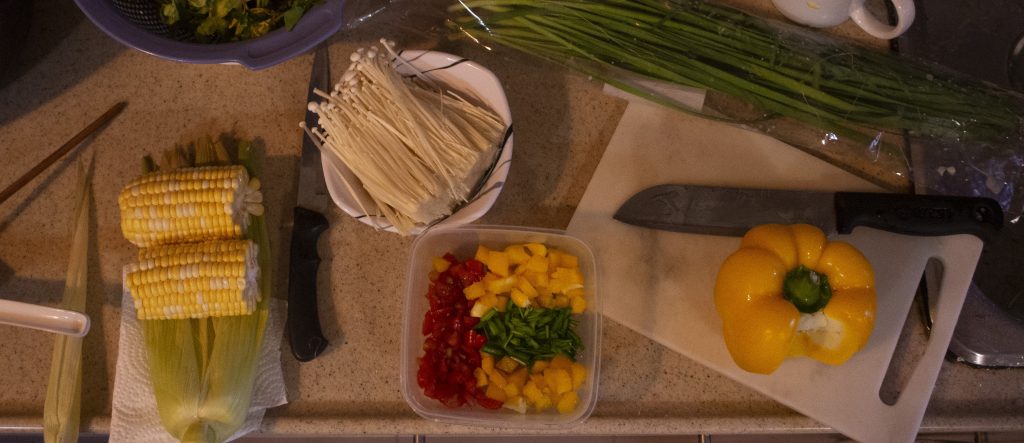
Ingredients prep
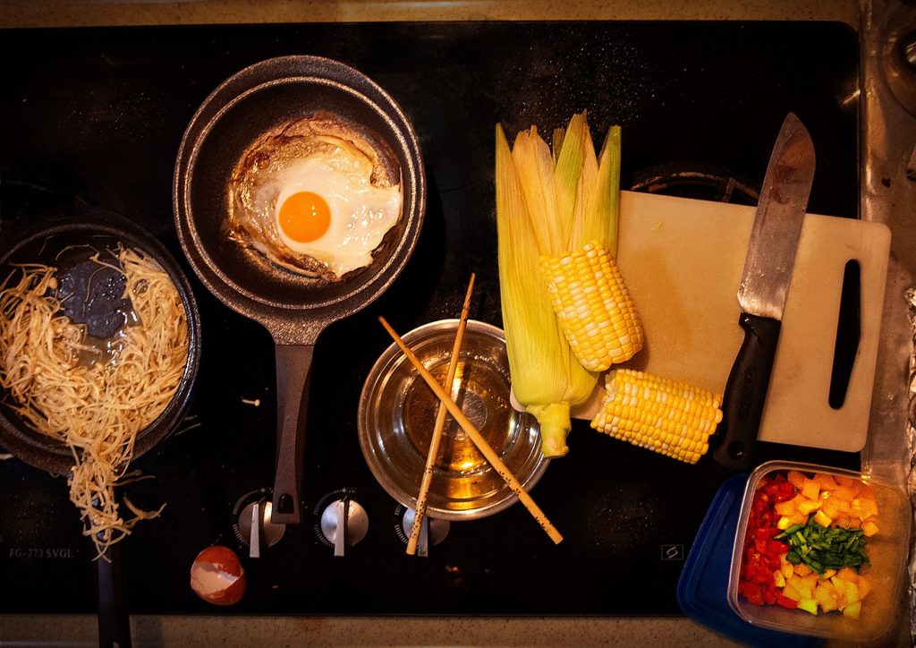
Messy cook
Not exactly appetising, but it gets the job done..
……………………………………………………………………………………………………………………………………………………………………
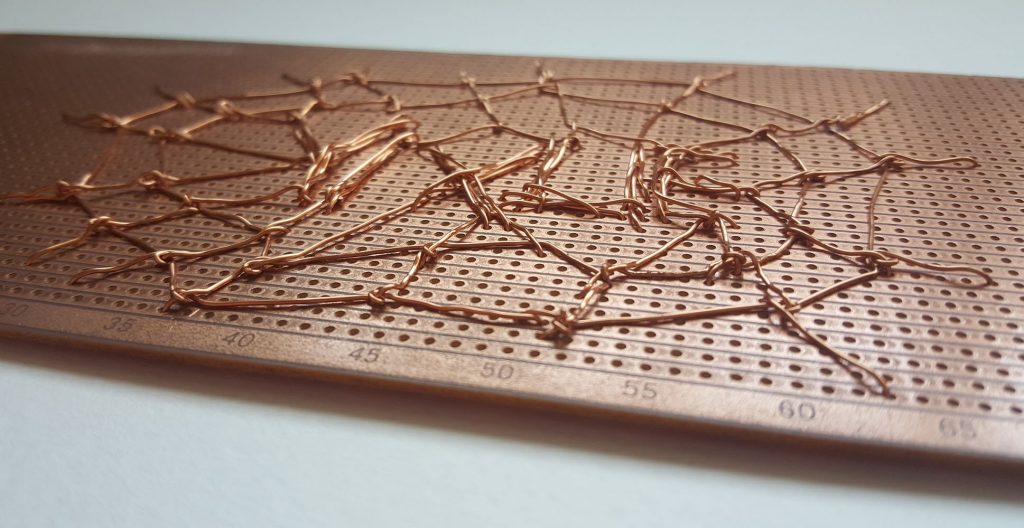
Webmaster
Ok, I am back at trying to be more poetic in my concepts, and this time, I try to ‘weave’ the idea of spider web and electronics together to depict a webmaster. Yes, I know… Did a small patch of mockup, it was pretty, but decided to leave it at that.
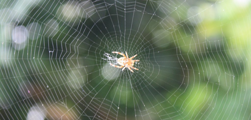
by Stephencdickson

Looks like spiderman’s
……………………………………………………………………………………………………………………………………………………………………
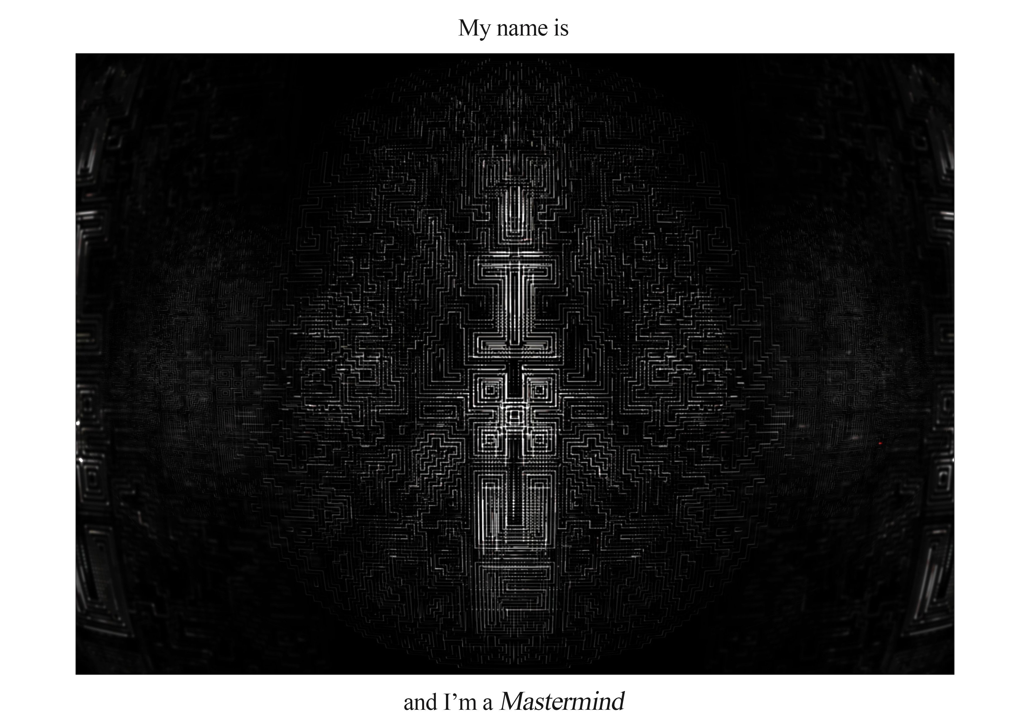
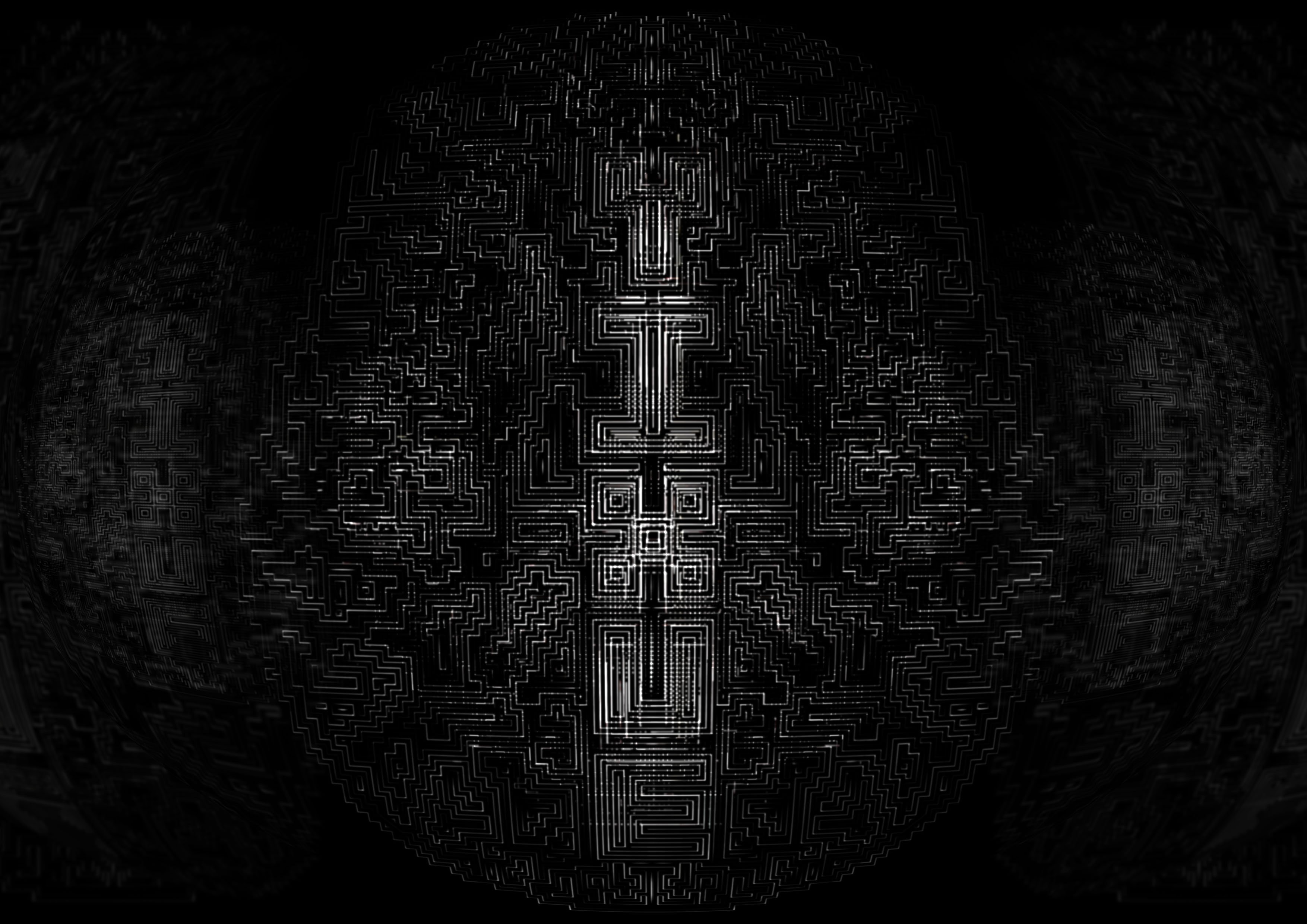
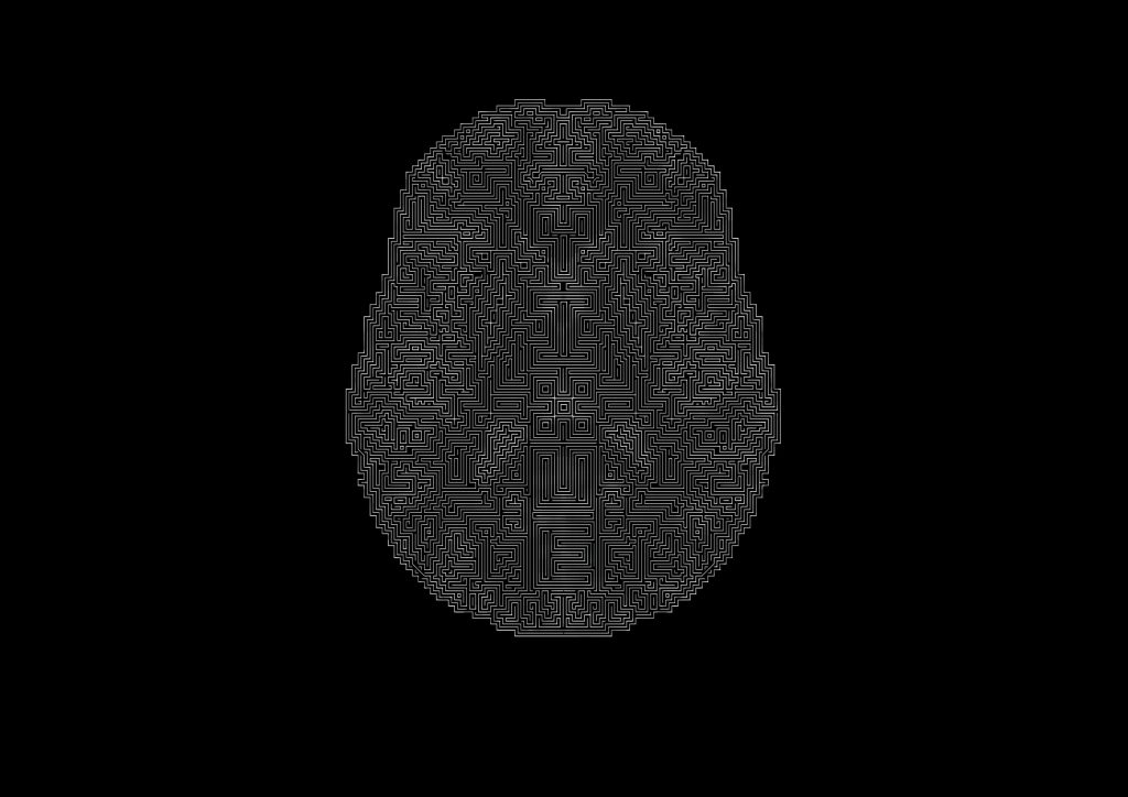
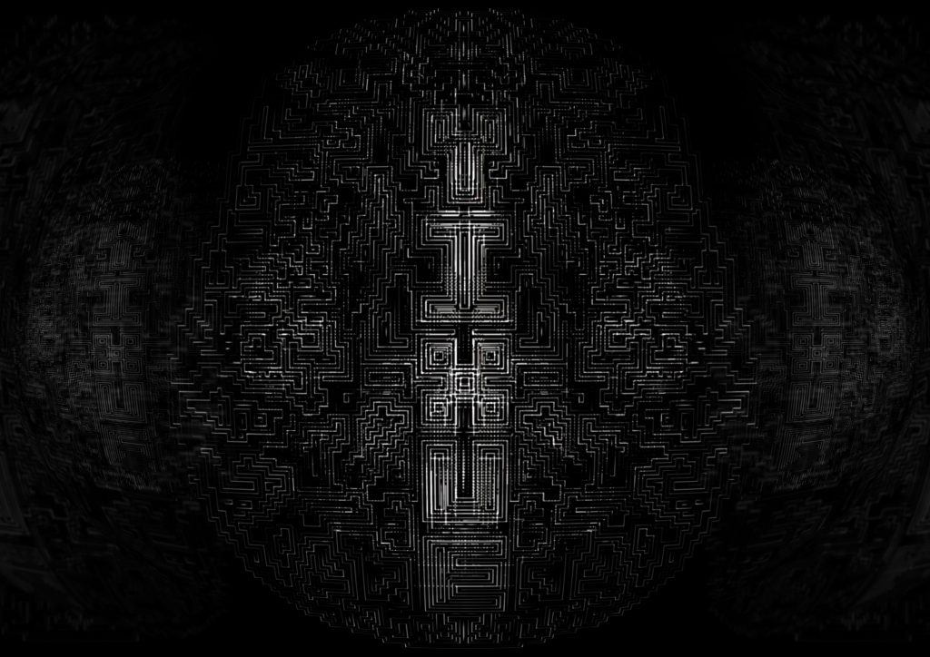
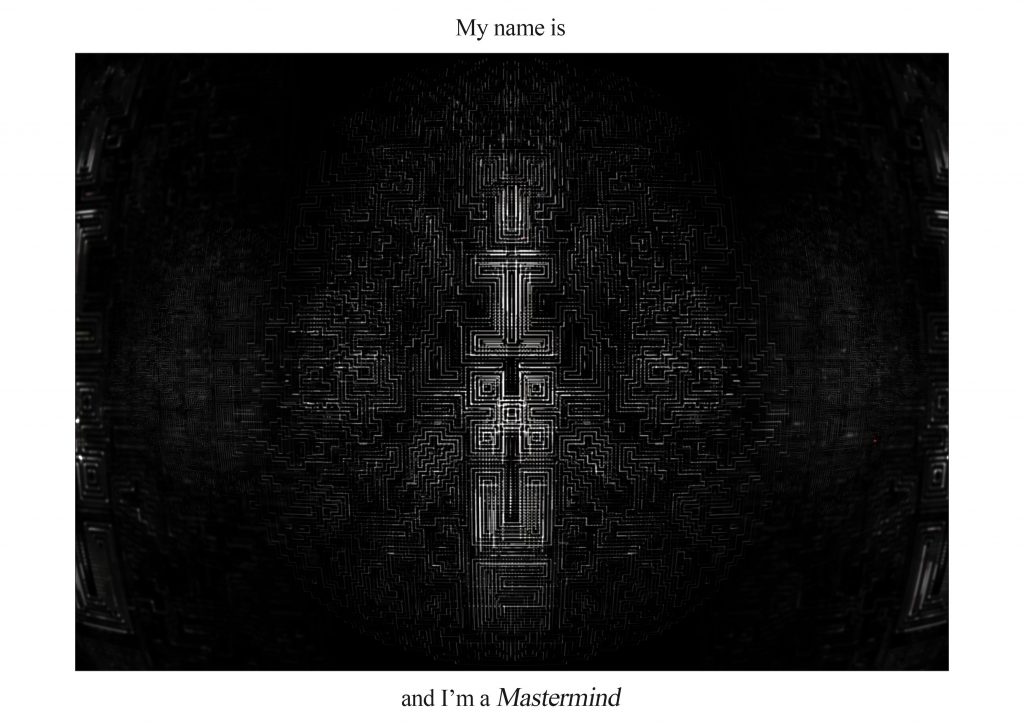
Mastermind
Moving on to become more literal and less poetic, I next came up with the idea of a mastermind. I was first inspired by the “Hypno” font, courtesy of Martin. This idea of a maze and organised straight lines really resounded with me, thus mastermind was born. I made it in the shape of a brain, for obvious reasons. After several tortuous hours of drawing maze lines, I ended up with a plain-looking set of lines in illustrator. Very disheartening. But photoshop came to the rescue, and a bit of layering magic, masking and effects fiesta sealed the deal.

by Onss Mhirsi
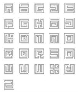
“Hypno” Font by Martin Malacek
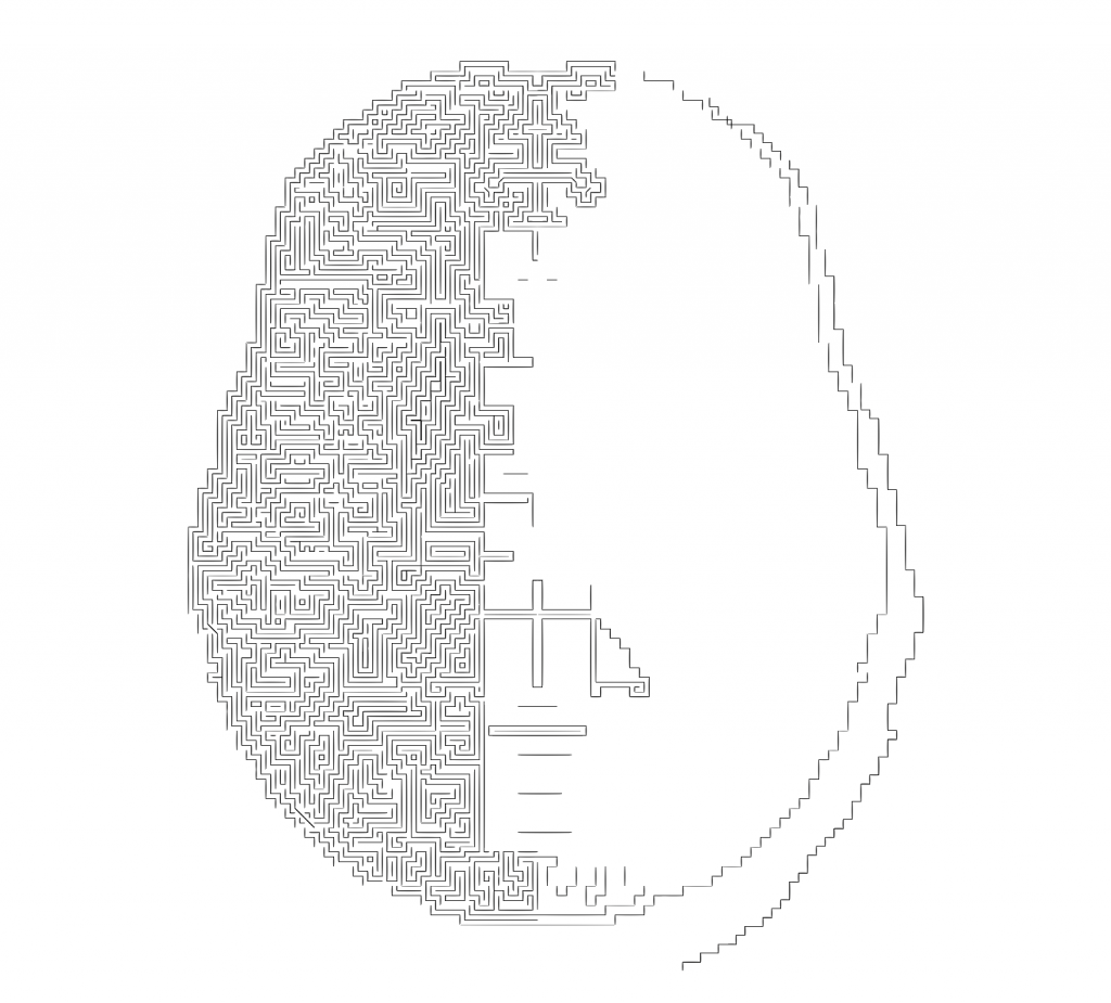
Creating the maze in Illustrator
Highly uninspiring …
Thank you photoshop !
……………………………………………………………………………………………………………………………………………………………………
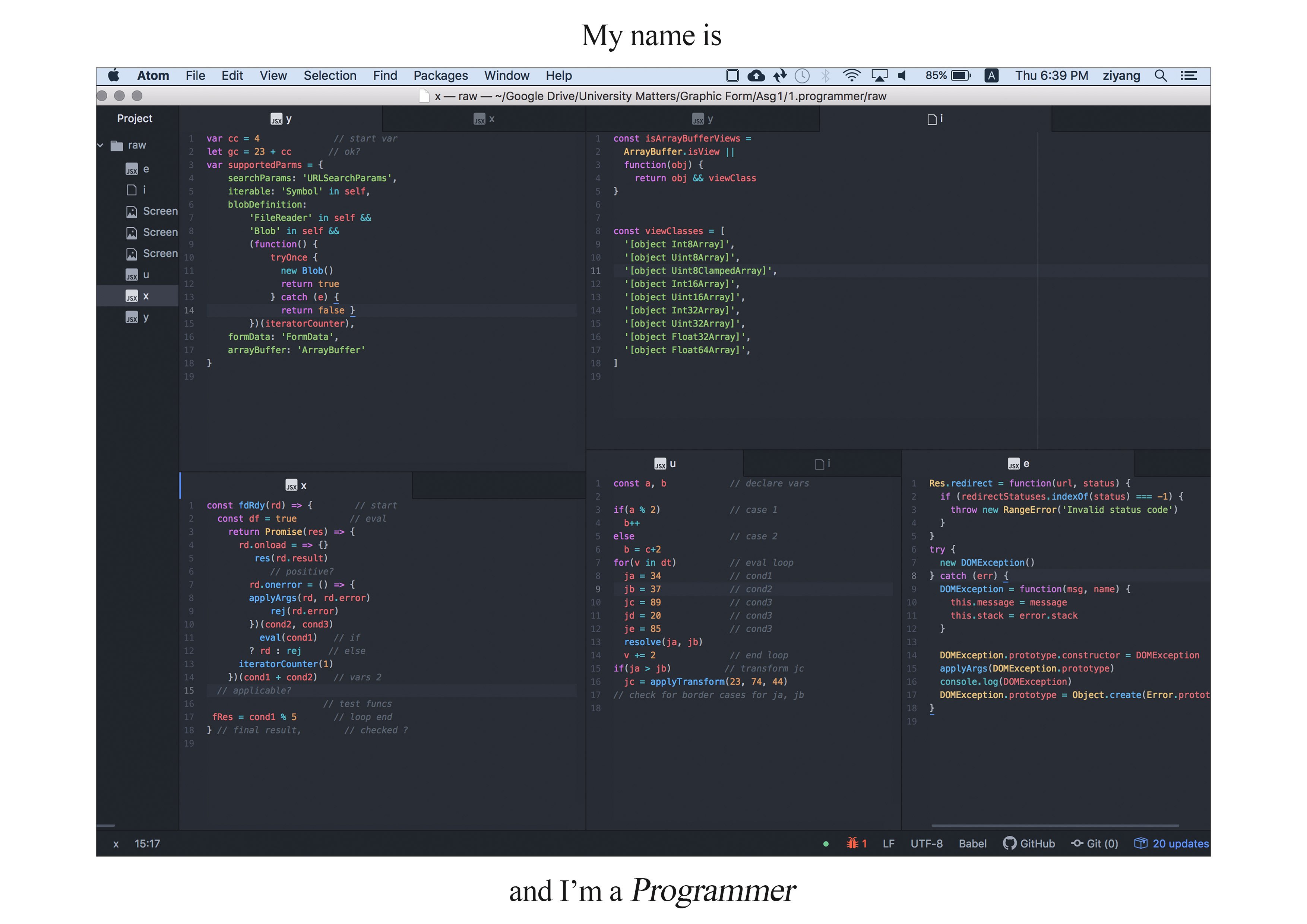
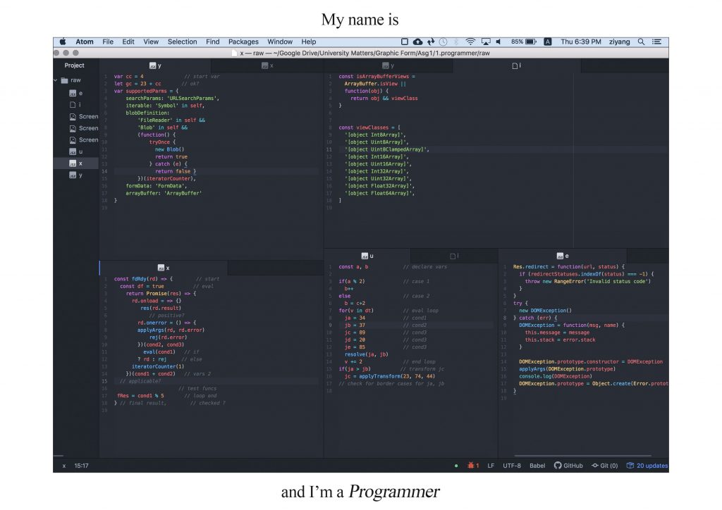
Programmer
I love coding, so this one was on my plate right from the start! I thought the idea lent itself pretty well, code does look like something with all the indentations going on. I try to put in as realistic a code as possible, and only ‘cheat’ a little to construct the letters. The highlighting of keywords in the code editor also adds a nice touch of visual interest. My second attempt, upon consult, wasn’t very clear, so I tried my best to make the letters come out better in the final iteration. Fingers crossed..
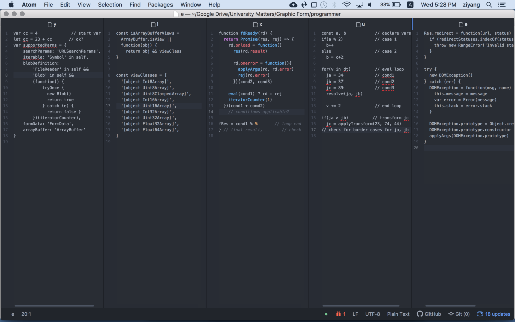
First attempt
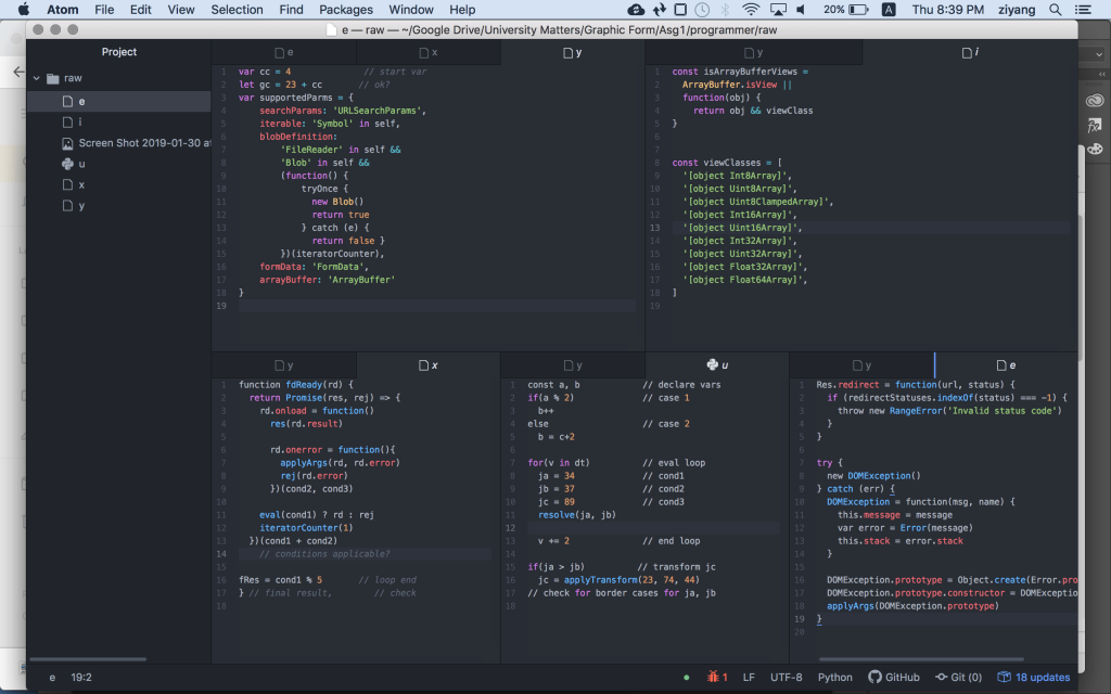
Second attempt
……………………………………………………………………………………………………………………………………………………………………
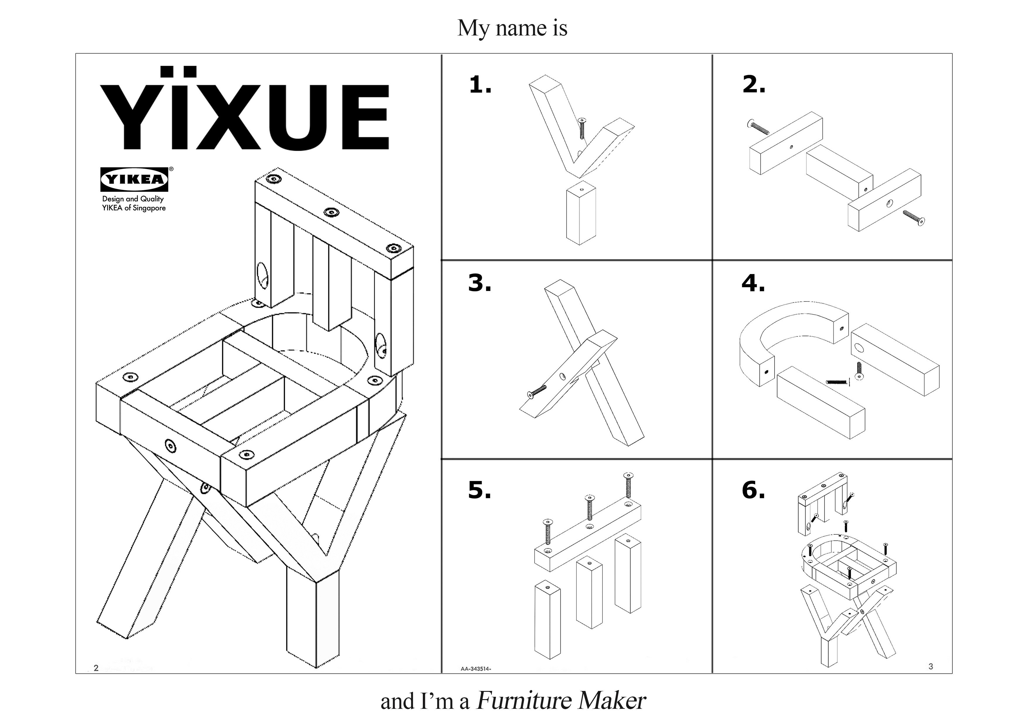
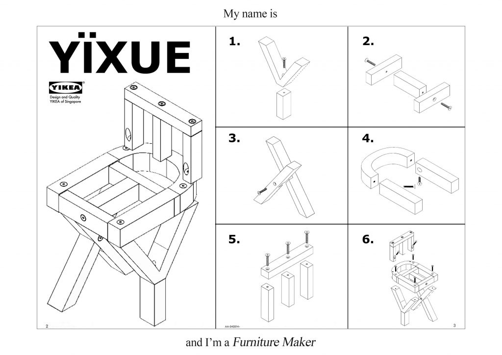
Furniture Maker
This idea was born from seeing an image in google image search…
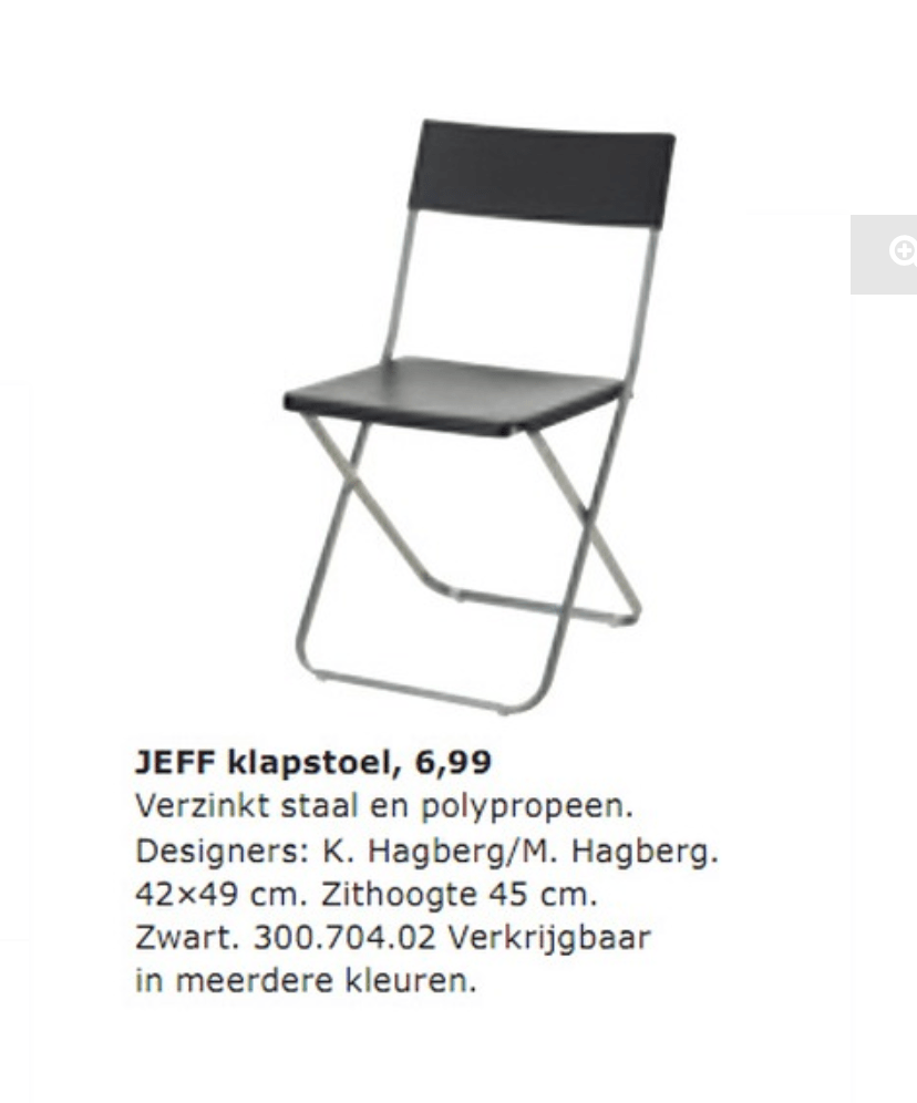
I have 2 of these at home !
Yes, Ikea furniture. And their world famous manuals. That is how I came to realise that I have to make a piece of furniture that literally spells my name. A chair would be nice, with assembly instructions included.
The parts are modelled in CAD, so that I don’t have to do isometric drawings in Illustrator. And I might decide to go into business some day, so… As a bonus, I think the design could actually work for real …
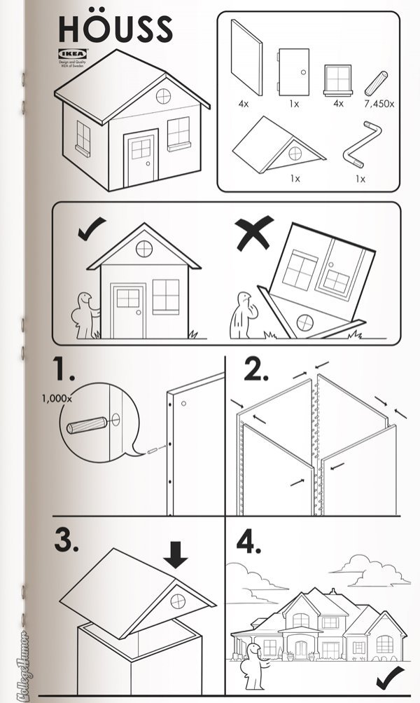
The Classic Ikea manual
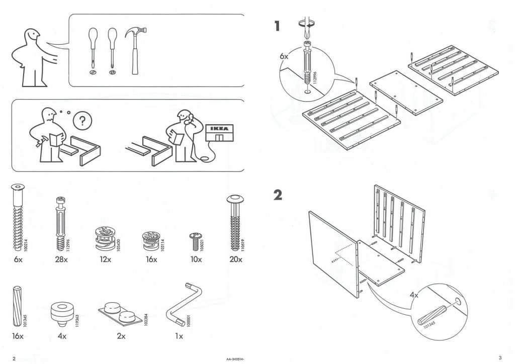
More Ikea manual details
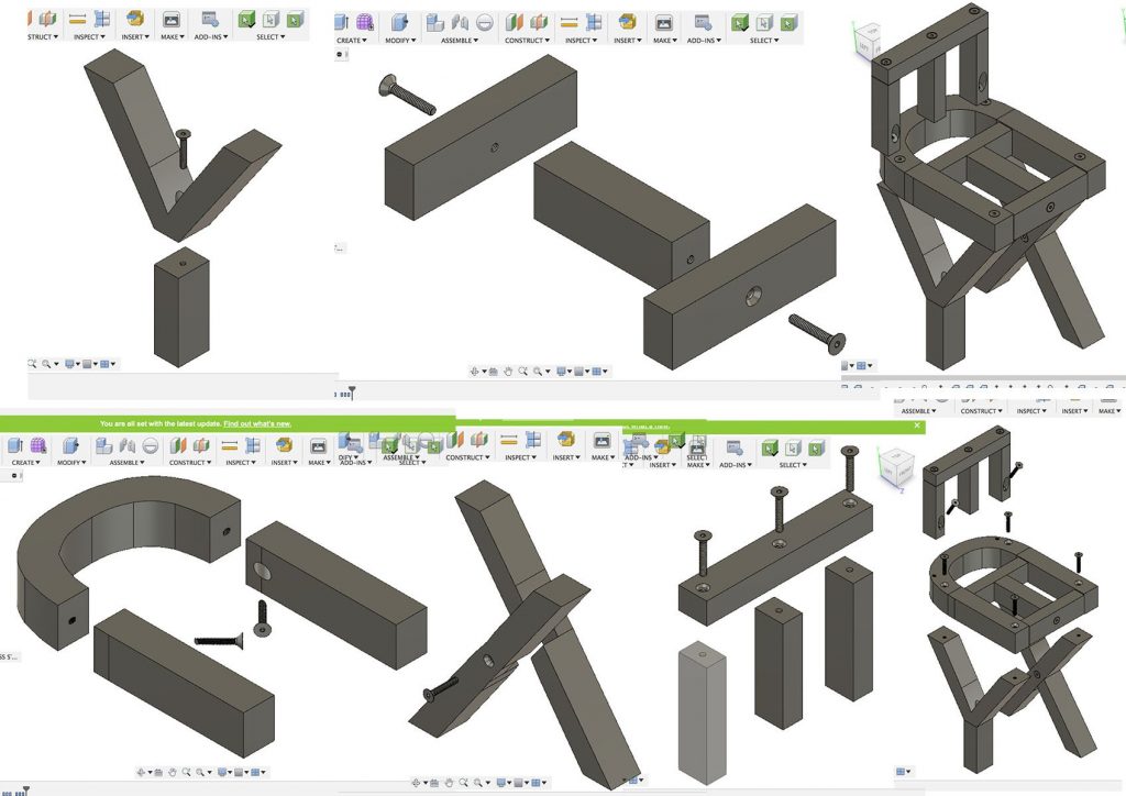
Creating the models in CAD
……………………………………………………………………………………………………………………………………………………………………
The Grand Finale

Overall, I am quite satisfied with the end results. I managed to try a mix of analog and digital processes. I think the end product is a little rough on the edges, but I kinda like that aspect of it.
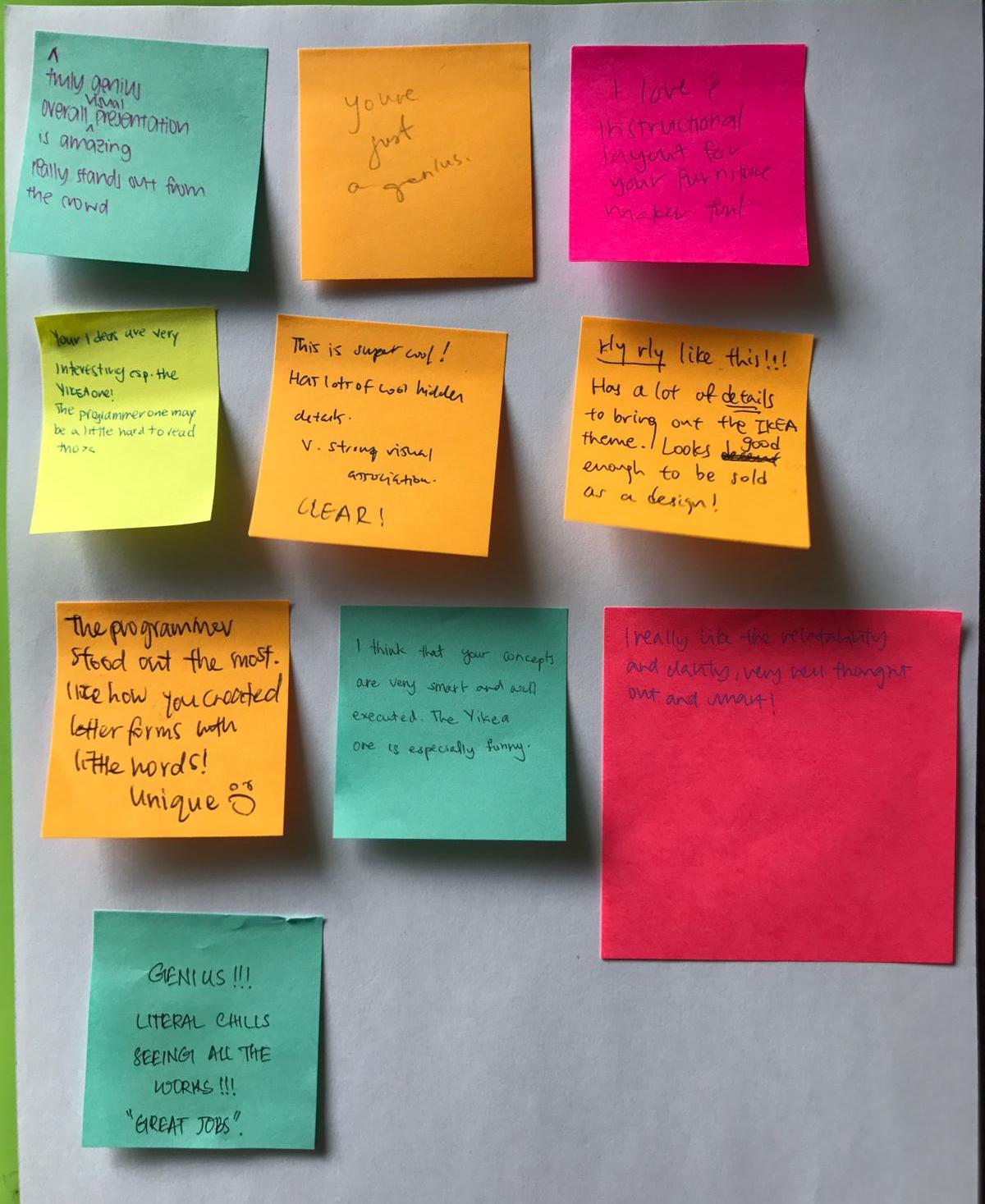
Post-presentation Reflection
Very humbled by the overall positive response for the peer critiques 🙂 Very glad everyone loved the Yikea one… My personal favourite as well, Cheers!
Throughout the duration of this project, I feel that I have gained more appreciation for the difficulty of embedding concepts with symbols/shapes/lines, etc.
I find it illuminating that even though this assignment has a rather rigid set of rules, they provide an opportunity for practising how to develop an idea with clarity, and relevance, in relation to the job title. And as seen from above, trying to weave additional layers of context or meaning to the pieces is a formidable task in itself :p
One of the main hurdles for me is trying to not be too straightforward or obvious ; I try to make the results not appear overly staged, as well as possess a certain amount of charm(rawness?).
Of all the works that were presented by my fellow classmates, the ones that really resonated with me were those that had an element of interactivity to them. I think through interaction we can derive a deeper sense of meaning to perhaps promote a certain idea/message. Case-in-point would be the brilliant observation made by Brian, 🙂 , regarding the photographer piece by Carol. Shariffah’s optical illusion piece elicits joy, and Wende’s invisible ink mechanics really impressed me, in part due to its underlying simple mechanics. Doing interesting things with simple ideas are really hard to do.
……………………………………………………………………………………………………………………………………………………………………
Sources