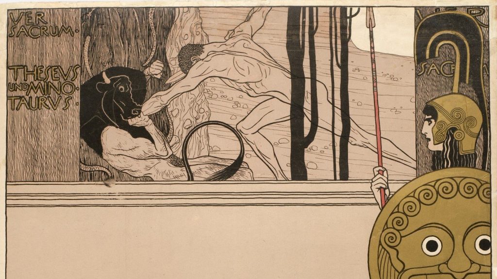
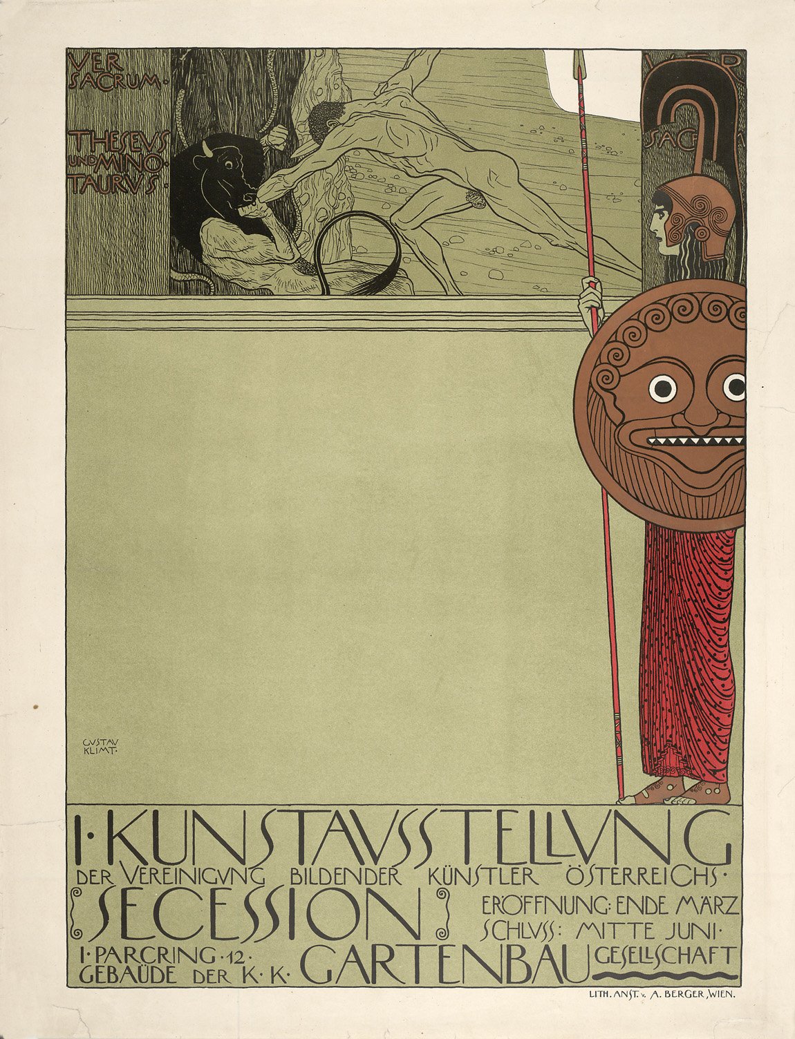
For Lecture 3, what piqued my interest the most was the slide on Gustav Klimt’s Poster for the First Vienna Secession Exhibition. I really liked the composition of the poster. I felt that the use of white negative space in the middle was really unique and rather editorial. I also liked how the warrior at the right is the only thing that is coloured, making her the focal point. She adds unbalance to the whole poster, but also ties both horizontal sections, the top(image) and bottom(text), nicely together. Lastly, the sans serif display type with curvylinear feels used in the poster is also quite interesting- especially when you look at the very thin and slanted S, the stacking of the double LLs, the width of the letter N and the slightly curved top and bottom lines of E, et cetera!
Gustav Klimt, Poster for the First Secession Exhibition
  (censored version), 1898, lithograph, 63.5 x 46.9
            (The Museum of Modern Art)
Desmond briefly talked about how this was Poster for the First Vienna Secession Exhibition in Austria, but what I didn’t know was that the Vienna Secession was an art movement itself. I had assumed that it was a kind of yearly/monthly exhibition called Vienna Secession. But through more research, I came to realise that it was an important movement in Austria!
The formation of the Vienna Secession in 1897, marked the formal beginning of modern art in Austria. During that time, Austria was a nation known for its highly conservative traditions. The Vienna Secession was created as a reaction to the conservatism of the artistic institutions in the Austrian capital at the end of the 19th century.
Back then, two principle institutions dominated the Visual Arts in the years prior to the secession : The Akademie de bildende Kunste (the Academy of fine arts) and the Kunstlerhaus Genessenschaft – a private exhibiting society founded in 1861.
Any established artists during that time would be a part of the Kuntlerhaus society. Works from the group would be selected/rejected yearly for public exhibitions at. Vienna’s main exhibition halls, Ringtrasse buildings. However, with Vienna’s conservatism, it was not uncommon for modernist thinking artists (like impressionists, etc) to have their works rejected in favour of the prevalent naturalism of academic painting, during these juried selections. Conservative artists were favoured and members efforts in decorative and applied arts were discouraged.
Hence, the younger, more progressive members in Kunstlerhaus began to meet regularly at either two cafés to discuss works from emerging modern artists and exchange their own ideas. Eventually, these meetings culmulated into the forming of 2 informal art societies.
Cafe The Blaues Freihaus was home to the group called “Hagenbund”, who were mostly painters. They still tended more towards naturalism. Café Sperl was the haunt of the more exclusive “Siebener Club (Club of Seven)” formed in 1894-95. The Siebener Club consisted of a more diverse crowd (architects, graphic designers, painters), and was more towards stylization. Both groups shared a commitment to new art and a frustration at what they saw as a stagnation of the arts by the Academy and the Kunstlerhaus.
Gustav Klimt, who was a famed decorator for Ringtrasse buildings at that time even began visiting the Siebener Club. Despite Klimt being highly renoun in the bourgeois Ringtrasse culture, he became the most recognized breakaway artist. Eventually, he assumed leadership of the new movement that was about to begin.
On April 3, 1897, a letter was announcing the formation of a new group with Klimt as president was given to the Kuntslerhaus. Many members of the new movement were present members of Kuntslerhaus. They had intended to stay in Kuntslerhaus, while also being a part of the new group. However, on May 22nd a motion of censure against the new group was put forth by the directors of Kuntlerhaus. Thus, the group decided to resign and leave the Kuntlerhaus
Eventually, “The Vienna Secession” was born. It was the coalescence of the first movement of artists and designers who were committed to a forward-thinking, internationalist view of the art world, all-encompassing in its embrace and integration of genres and fields. Whats interesting about this movement is that it doesnt have a specific style/trend, which most other art movements have. Their pluralist approach to the arts makes this movement unique. The Vienna Secession united Naturalists, Modernists, Impressionists, etcetera. Since the Venice Secession was founded to promote innovation in contemporary art and not to foster the development of any one style, the formal and discursive aspects of its members’ work were in constant change back then, to keep with current trends in the art world. Additionally, The Venice Secession also brought together artists from all disciplines, in hopes of creating “total art” – Gesamkunstwerk, in which all aesthetic elements are subordinated to the whole effect. They were a group of artists, architects and designers who pursued artistic rejuvenation in combining quality building processes with new materials and technologies, and expressive modernist forms. In practice, this concept promoted artistic craftsmanship across a wide spectrum of disciplines and favored collaborative models of creation over individual authorship. With a focus on bringing back artistic quality craftmanship, the Secession drew inspiration from William Morris and the English Arts and Crafts movement Desmond talked about in previous slides, which sought to re-unite fine and applied arts.
Stylistically, the Secession has been commonly seen as synonymous with the Jugendstil/ Art Nouveau movement. However, it is incorrect to say that they are one and the same, just from different countries. Both Secession and Jugendstil are their own seperate art movements! It is true that Secessionists did incorporate many Jugendstil elements in it’s work such as the curvilinear lines that decorate the facade of the Secession building. Additionally, many Secessionists had been working in the Jugendstil style prior to joining and the group. The Vienna Secession also did honour the Art Nouveau movement in France by devoting an entire issue of Ver Sacrum, their journal/manifesto, in 1898 to Alphonse Mucha’s work. Nevertheless, the Secession developed its own unique ‘Secession-stil’ centred around symmetry and repetition rather than natural forms. The dominant form was the square and the recurring motifs were the grid and checkerboard. The influence came not so much from French and Belgian Art Nouveau, but again from the Arts and Crafts movement. In particular the work of William Asbhee and Charles Renee Mackintosh both of whom incorporated geometric design and floral-inspired decorative motifs, played a large part in forming the Secession-style.
The Secession movement was also heavily influenced by Japanese design. Like what Desmond said, the rise of Japonism rapidly swept through Europe during the late 18th century. Many French artists (Cezanne, Van Gogh) were huge collectors of Ukiyo-e and woodblock prints, and were quick to incorporate the elements of woodblock into their works. Japanese design was quickly incorporated by the Secessionists for its restrained use of decoration, its preference for natural materials over artifice, the preference for handwork over machine-made, and its balance of negative and positive space. In a way, the Secessionists saw in Japanese design their ideals of a ‘Gesamkunstwerk’, whereby design was seamlessly incorporated into everyday life. They even devoted the Secession exhibit of 1903 to Japanese art. Additionally, the emphasis on flat visual planes, strong colours, patterned surfaces, and linear outlines appealed to the secessionists and helped form a bridge between fine and graphic arts. Klimt would eventually adopt many of these techniques into his own paintings (such as Hope II).
The Venice Secessionist’s building, the Secession House is also something that can be further researched upon. From the onset, one of the most important aims of the secessionists was to have their own exhibition building. Their first exhibition was held at the Horticultural Society in March 1898; where they had to pay a huge amount of money to rent the space. However, due to the success of the exhibition, they were able to financially construct a permanent exhibition building, The Secession House. It was specially designed by one of the members, Josef Olbrich.
The house itself has a lot of further meaning that can be researched upon, but I leave that next time and jump to the meaning of the First Venice Secession Exhibition Poster that caught my attention! –
Despite Classicism having stifled the artists so much, they did not completely reject it when The Venice Secession was born. In many of Klimt’s works, he uses classical symbols/stories as metaphors to depict the struggle against historicism and repression of the instinctual nature of man. One such example is the poster for their first exhibition.
Their first exhibition was held on the premises of the k. k. Gartenbaugesellschaft (Imperial Royal Horticultural Society) in 1898. Klimt designed a poster that not only functioned as an announcement to promote the exhibition, but also as a manifesto of sorts. In the poster, the myth of Theseus slaying the minataur to liberate the youth of Athens is used, as Theseus and the Minotaur is depicted in battle. Theseus, sheltered by Pallas Athena, is the personification of the Secessionists’ new conception of art, while the Minotaur stood for the conservative Künstlerhaus. A similar, but slightly interpretation of the poster- Athena, is seen as the liberator of the arts, overseeing the conquest of historicism and inherited by the new generation of artists, who is represented by Theseus. This depiction was taken as an affront. Thus, the k. k. Censurbehörde (Imperial Royal Censorship Office) objected to the fig leaf covering Theseus as they they deemed too small. As such, Klint was forced to censor it by the strategic placement of branches. It was only after this detail had been “corrected” that the poster was allowed to be displayed.
To me, the act of forcing Klint to censor the poster in order for it to be exhibited, clearly illustrates how the art society in Austria back then was so conservative, and restrictive to their artists.
fig leaf .vs. branches