ZINE RESEARCH
WHAT: Short for “fanzine” or “magazine,” a zine is a noncommercial, often homemade, mini magazine. Zines are published in small print runs. As zines are not typically made to turn a profit, they can often give expression to views and interests outside the cultural mainstream.
BRIEF HISTORY: Self-publishing has always been closely associated to art, with movements such as Dadaism, Surrealism and Fluxus, etc. Young artists used zines as a way to break out of the gallery exhibition system, to forge their own unique creative space, and independently reach out to audiences to convey whatever messages they wished. Zines became a distinct form, and grew steadily in importance from the 1930s to the 1960s with Science fiction fanzines. Punk zines emerged in the late 1970s as part of the punk movement and DIY ethos in that era. With increased accessibility of photocopy technology, the zines developed a photocopied, cut-and-paste style that has now come to be associated with zines. In 1991 the Riot Grrrl scene encouraged an explosion of personal and political zines with explicitly feminist and activist themes. After the 1900s, with the rise of the internet and digital technology, zine culture was not killed. Instead, it evolved into another category of zines, E-zine, creating online and open source spaces for zine communities to network and exchange information.

Compzine: Collaborative zine, usually one editor only
Artzine: Feature photos, artworks; or even the zine as an artistic concept itself
Political zine: Zines that specifically deal with topics like politics, anarchy, social justice, history and current affairs
COMPONENTS OF A ZINE:
FOLIO (HALF FOLD)
FC- Front cover
IFC- Inner front cover
Page 1- odd always on the right side
Page 2- even always on the left side
Page … …
IBC- Inner back cover
BC- Back cover
Note: FC, IFC, BC and IBC and all have a higher media value; advertising
ZINE ART STYLES RESEARCH:
Its actually quite hard to look for zines online??


Simple illustrations/images with lots of white space. First 3 are of more graphic style, narrative.
Last 2 slightly more interesting as the text and images interact with each other, although I think
there's too much negative space

^ Photobook layout should I choose to use photography. Large photographs, with equidistant white borders. Minimal/small text


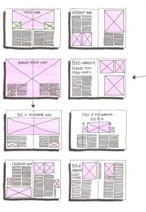


Usual photo and text magazine layout. Very organized --> too static and boring?
SENGKANG RESEARCH (aka. content idea)
I researched upon a design thinking framework useful for ethnographic research and deep user observation: POEMS framework. I decided to use this framework to a smaller targetted area around my house (as Sengkang is very big so I narrowed it down).
PEOPLE– main groups of people there
- Children (at playground)
- Old folk (at the resident corner)
- Helpers (accompanying)
- Aunties (dancing one)
- Families/Working adults
- Petowners
OBJECTS– objects used by the people and populate the environment
- Chairs and benches
- Bicycles, scooters
- Balls
- Court yard open space
- Flower potsENVIRONMENT– describe the surroundings and main features
- Mainly HDBs
- Carparks
- Compassone Mall
- Playgrounds and Exercise corner
- Foodcourts
- LRT Tracks
- Community garden
- Rather quiet in the day, more lively at night
MESSAGES– messages/conversations being communicated and how
- Scams/Phishing (in lifts)
- Repainting of HDBS (notice board)
- Elderly conversing about gardening
SERVICES– services offered/available to people
- Coffee shops
- NTUC
- Book borrowing cart
- Transport- LRT and Bus
I would say that SengKang is a rather normal neighborhood, that is characterized by the sheer number of HDB blocks. However, I realised one thing that set it aside from other HDB populated neighbourhoods (like Yishun or AngMoKio, etc) was the LRT tracks that weaved in and out the buildings. Researching a bit more, I learnt that only 3 LRT systems exist in Singapore, and Sengkang was the 2nd one to have it.
_resized.jpg)
I found out that Sengkangs LRT cars were different from Bukit Panjangs one, making Sengkangs cars slightly more uniquely Sengkang. Since I am now focusing on the LRTs in Sengkang, I wanted to feature a specific spot- A carpark rooftop garden. It is my favourite space in Sengkang. One of the special qualities about that specific rooftop garden is that you get to be on the same level as the LRTs (whilst most other carpark gardens around the area are either higher or lower than the track). You get a great view of the LRT tracks, and can even catch the sunset there. Furthermore, the greenery there provides a nice contrast between nature and manmade (HDBs, LRT track).
Possible elements/principles–> Form, Shape, Space, Contrast, Line?
PRESENTATION:
sighs I think it was too boring:///
DESIGN RESEARCH
I decided to go with LINE. But what about a line can I use?
- horizontal
- vertical
- diagonal
- straight
- curved
- thick
- thin
- opaque
- translucent
- IMPLIED LINES -> use of neg space
- broken lines
- line starts off as a dot
- outline?
ZINE RESEARCH 2.0:
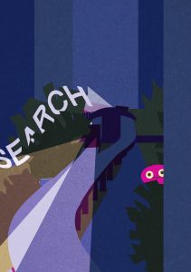
https://www.peopleofprint.com/collective/groduk-boucar/ –> strong presence of lines, and art style.
https://www.peopleofprint.com/solo-artist/amrita-marino-fiorucci-zine/ –> simplicity, strong colour palette, use of texture
https://www.peopleofprint.com/pop/12-posterzine-best-sellers/ –> all rather unusual colours?
https://www.peopleofprint.com/interviews/andrew-stainforth-zine/ –> experimenting with different materials, the interleaf translucency
CONSULT 1
Wanted to focus on mrt and the garden. but shirley said too boring to see too many times?? I used a photobook kind of approach, but without the borders. I think the zine just lacked substance and content. Then i told her about me wanting to try drawing instead? And she said that might be good cause then I can get more interesting angles, and to try something new!


Original photography idea of garden x lrt
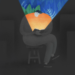
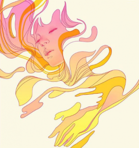
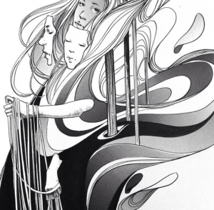
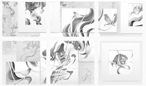
ARTIST REFERENCE
I’ve never tried a flat simple vector style before. My drawings are usually quite 3d shaded style. So I decided to challenge myself to do just a vector style. I found some artists for reference:


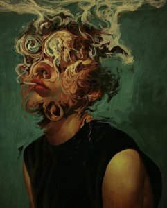
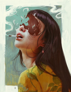
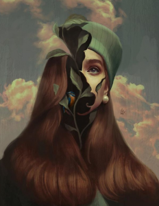
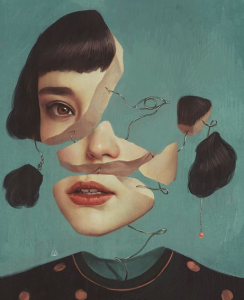
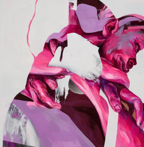
Strong use of diagonals and dramatic lighting. Use of grainy texture + strong color palettes


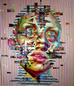
Again, TEXTURE!! Humans and environments as patterns


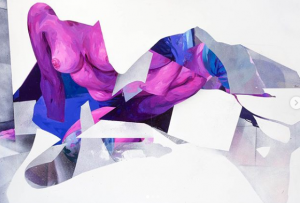
Bold eye catching colors. Patterns, GESTALT (stripe beach one), fusion of objects with play of angles?
entirely flat application of colour

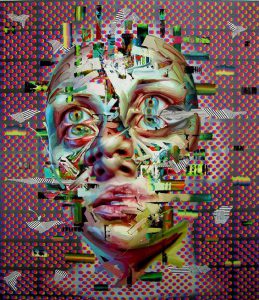
TEXTURE. night scenes? hmmm.
The use of gradient
Their use of texture makes the vector style a lot nicer. And the importance of colour selection.
So I tried doing something fast and small in their style. I added noise to the apple, but I think that my grain can afford to be bigger to show the texture better:

IMAGINE DRAGONS-
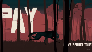
I really liked how the art style and text layout in two imagine dragon music videos- BAD LIAR and NATURAL !!!


Text confined within shape of the image. Text warp with the shape. Text obscured by imagery. Kind of gestalt? Interesting angles for visuals. Play in the size of fonts.


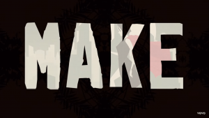
Layering of text and visuals create depth. Patterns and text! Image in text instead? Diagonal layout.
CONTENT IDEA 2.0
Honestly, I feel really lost as to what to do. I think this is because despite actually never moving house, I don’t really relate to Sengkang (unlike other people who have like deep ties with their locale cause its their childhood). My impression of Sengkang is just imprinted as this place with a lot of HDBs, and thats about it. Even though Sengkang is my house, I live in Bishan (grandparents house) and Jurong (NTU hall now :/) for a larger part of my life than Sengkang itself. I feel slightly displaced at this point in time. I was thinking of using this as my story maybe? A narrative kind of zine, more storybookish. I also wanted to make use of the idea that a line is a moving dot.
“A line is a dot that went for a walk.” Using this as the main action for my zine, I thought of the following narrative: A dot feels out of place in his surroundings, so he decides to embark on a journey around Sengkang to try and come to terms with himself and his locale. Through the pages, he starts growing longer and becomes a line. Eventually when he comes back to the start, he is content. Sits happily in his environment now. Feels that he has grown.
STARTING ON FINAL:
ILLUSTRATIONS


draft compositions and possible text


First image was my first attempt at trying a vector style,
but it was still sort of 3D-ish. And the colours looked very
dull, so I decided to reference an artist's artwork for
colour palatte and style - flat with dramatic hard edged shadows
and highlights.


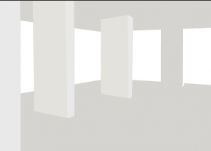
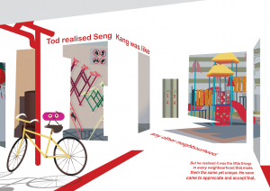
I had the idea of using white space to simulate walls and create
an implied void deck(Gestalt). Additionally, the images that
were between the walls would be a montage/collage of different
parts of the neighbourhood that were mundane yet interesting
in their own way. But I wasn't sure how to go about doing it.
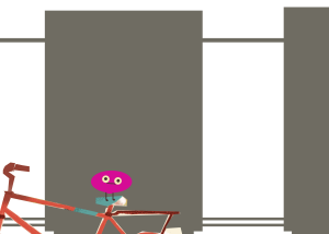


I thought of just doing some closeups of void deck pillars,
and putting a bike in place to provide some depth and context,
but it was still very hard to get...


In the end, I decided to follow the exact structure of my void deck.
I also decided to add in a few other tones (grey and red)
to help define the space a bit more, instead of solely
using white space. The fifth pic felt like it lacked
depth to me, it looked like a flat gallery wall.
So I decided to try and the walk way even further back,
and I think that the zig zag path way helped simulate
more space.

Finding images to put into my collage. I felt that playing
around with the sizing of objects in my montage helped bring
about more depth too. I tried having a kind of realistic proportion
like the playground at the back is smaller, but at the same time
I wanted to make it more evident its a collage, so theres images
that are out of proportion (like the pipes. they should be smaller)


Objects within my montage I illustrated


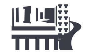
I wanted to do a top down view of the HDBs similar to artist ref
(first image is an outdated pic of the color of the HDBs)


Making of my vector HDB blocks based on the color scheme
of my HDB in real life. Some awkward windows I did not know
how to draw. And then I decided to make the windows and balconies
and lift lobbies into a separate pattern before warping them
to fit the buildings. The buildings themselves are a pattern/
tessellation as well.


Deciding on cropping of this composition
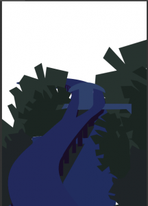


Illustrating the LRT uniquely weaving through the HDBs in SengKang


Trying to create a pattern based on iconic images from my
previous pages for some additional texture. HDB windows,
balcony railing, LRT track and void deck made into a "logo"
which is then tiled behind the map. (After test printing: Words
on the map are too huge!!)
INTEGRATING TEXT
Font Choice: Arial Rounded MT Bold.
Being a more storybook like zine, I wanted a fun and friendly font that was simple, so it could complement my more detailed illustrations. Arial Rounded is sans-serif making it less formal and serious than a serif font, more fun! The rounded-ness made the font organic and pleasing to the eyes. Coupled with the bold, this font is really simple and easy to read. Because it isn’t fanciful, it doesnt distract the users away from the visuals that are equally (or even slightly more) important.

Title: Align is a play on "A Line" as they sound similar.
Decided to make the title big and ironic by misaligning the
word itself (l,i,g,n) in a slightly chaotic manner. I also
tried to fit it within one column.


Tried warping text so it helped to create more depth. Initially
was contemplating doing the starwars style,but it was too hard
to read. The text also became very big, making my font size
inconsistent throughout my zine,so I decided to compose my
layout with the three columns in mind and fit it within 2 columns.
Then, I skewed the paragraph slightly to still give it some
perspective since my other text in this spread had perspectives;
consistency!!


Adding contact details to the last page. First image was kinda
cool, but felt too much like a magazine, didnt fit the style
of my zine. Decided to go with the cloud idea as it fits my
and actual utilizes my illustrations.

Attempting to follow the layout of three columns for some of
my text. So I get a variety of text layout styles? Ones that
warp, flow with the illustrations and ones that are aligned
with the columns.
COLOR PALETTE (and text size)
Complementary colors- Blue + Orange
Analogous colors- Orange + Brown, Purple + Blue

Front cover: Vibrant blues contrast with the orange,
making the page very bright and happy. Happy colors
ironic compared to the dot's mood, though it sort of
reveals the happy ending

Back cover: The cheerful colors reflect the line's mood

Color palette compliments friendly storybook style of my zine
Monochromatic purples and greens. (Also analogous)
Color palette of HDB buildings accurate with real life

Cool colors create an added moodiness that is in line
with Tod's uneasiness/questions.

Tod is called Tod because its dot backwards!!

Font size of TOD: 48 as I wanted to introduce my character
Rest of the fonts: 12. Though if compared to my text at
the back, they look slightly bigger (I think it's because
of the warping process. I should've accounted for this and
adjusted my text smaller after warping?)

Text colors: Darkest shade on the left page, and white on
the right for maximum contrast.
Diverse colour palette as this is a montage of diff scenes.
But I think the colours in the montage is kind of faded/pastel
though rather saturated, so they are still quite harmonious?

Variety of colour helps show the mood change of Tod's feelings.
Reflect how he is introduced to all these normal things but
sees them in a new light.

Tod realised font: 24. Bigger to incite visual hierarchy so
viewers will know where to start reading the sentence.
Rest of font: 12.

Text color: Red to match the void deck elements (pipe and
floor tiles. Also to be more eyecatching and help act as
leading lines
Monochromatic colours: Orange, Blue, Grey
Analogous: Blues + Purples
Complementary: Blues + Orange, Purple + Yellow

Left page sunset because I wanted to make it seem like a
full day of walking has passed. And that its obvious that
time/something has changed with Tod. Sunset --> understanding/
new found appreciation has set within Tod.

Right page map,wanted the LRT track to be more obvious so made
it bright blue with yellow below, while the rest of the map was
dark. The yellow from the this page is also the same as that
on the left and on the covers. Consistency!! Purple and greys
used also found in other spreads.

This is home font size: 24. Because I wanted to make it a
point. But I didn't want to make the visual difference between
font sizes too big as that would be too jarring, loosing its
intimacy.
Places name font size: 24. To make it obvious on map.
Rest of the fonts: 12, consistent with previous pages.

Font colour: Darkest shade on the left page and brightest
shade on the right. blue font against orange, and yellow font
against purple, complementary colors ensure that the contrast
will make my text readable.

After doing the inside spreads, I realised that the colours
inside were more similar compared to the ones I used on the
cover spread, so I considered using the same cool purple blue
colours on the outside. However, I felt that changing complementary
colour scheme to analogous made my cover duller and less
attractive. With the lack of warm colors, it lost that happy
feel and meaning, though it did look slightly more harmonious...
But I felt that my orange cover was okay because in the sunset
page, I would reuse the same/similar warm colours again. And
theres still some in the middle spread, so them being on the
cover would'nt be out of the blue (pun intended haha)
FINAL:


.
PRINTING WOES:
My placement of elements were too near the edge of the paper, and even with bleeds, it was very hard to get it printed right. T^T my contact information cloud got cut in order for all the pages to align nicely so I had to troubleshoot. I cut another cloud up from my other print and sticked it over haha….
I tried printing on two different papers, art card and high white. The colors on art card were super bright, slightly neon-ish. It was too striking, and the paper was slightly yellow, which made my void deck spread look a bit weird. So i decided to submit high white which had bright white paper and slightly less vibrant colours so they looked more harmonious. Also I asked the store to help me bind my art card one, but it was slightly off at certain pages as they didn’t account for the misalignment during printing. Hence, I binded the high white one myself.


(sorry blurry image) but my @username got cut off at the bottom
Second image there's a white line (though i thought I left bleed??)
(ft. the cloud I cut up for my final submission)
Third image the page didn't line up in the center
After printing, I realised that the spreads on the right perhaps look better
when they are paired up like that as they have similar visual elements (HDB or Track)
and brightness. Hence I was contemplating switching the layout of pages, but I would need
to edit the story and texts, so I decided against it..

REFLECTIONS:
I was afraid that my work wasn’t very zine-y, because it didnt have a lot of overlapping font and mixed media. But I was heartened by peoples comments from the feedback session:”)) They were so nice:””)) I thought my zine would be boring but people actually liked it!! I think a zine can be anything, so my zine is ziney too!!!! I’m actually pretty proud of how my illustrations turned out. Because I wanted to follow a certain style, I really paid more attention to artist works and their colour palettes this time. I would draw in this style again next time heh^^ And at the beginning, I really struggled with my disconnect of Sengkang not really feeling like home or being super unique with cool, quirky places to visit. But now I think that that’s okay! Because SengKang really is just like any other neighbourhood. Its a humble, quiet, unassuming town, where the small things add a little character to it, and thats what I like about it. I’m happy to call it my locale. Sometimes we focus too much on interesting things that we dont realise boring can be interesting too?
THANKS FOR EVERYTHING SHIRLEY!! <3


 ANSWER: Typography assignment, so the typo should be obvious and the main focus. The typography should be fonts that adopt the characteristic/elements of another thing, instead of being a direct image of the warped thing.


 After consult, I realised that my design ideas were not exactly what was expected. They were
too illustrative, and not all elements of my job would be encompassed in the font itself.
Or it was placing things ontop of my typeface/ placing it in things.
After consult, I realised that my design ideas were not exactly what was expected. They were
too illustrative, and not all elements of my job would be encompassed in the font itself.
Or it was placing things ontop of my typeface/ placing it in things.


 Now that I better understood what I was supposed to do, I identified the elements related to the job and
tried synthesizing them onto the font. Brainstorming composition of elements to present my final font design.
Now that I better understood what I was supposed to do, I identified the elements related to the job and
tried synthesizing them onto the font. Brainstorming composition of elements to present my final font design.


 Tried using Photoshop 3D extrusion, but I think self drawn typeface was nicer in the end
 choosing an appropriate background. Perspective of font on plates would fit
the second bg better, but I decided to go with the first as the swimming pool
tiles are more subtle than the pool itself. Suggestion from Shirley: make the
tiles smaller, so its less distracting
choosing an appropriate background. Perspective of font on plates would fit
the second bg better, but I decided to go with the first as the swimming pool
tiles are more subtle than the pool itself. Suggestion from Shirley: make the
tiles smaller, so its less distracting


 Playing around with the composition of the objects in the jelly, and then
editing it so they look like they are inside the jelly. Finally, adding highlights
to the jelly to make it more shiny and smooth, important elements of jello.
Playing around with the composition of the objects in the jelly, and then
editing it so they look like they are inside the jelly. Finally, adding highlights
to the jelly to make it more shiny and smooth, important elements of jello.
 Final design's (2nd image) background slightly darker to bring more emphasis to the words.


 Trying out different ways to position the alphabets and make them interact with each other.
Last image is me realizing that I didn't leave enough breathing room for my font, and it
was just an awkward slight crop, so I decided to zoom out a bit
Trying out different ways to position the alphabets and make them interact with each other.
Last image is me realizing that I didn't leave enough breathing room for my font, and it
was just an awkward slight crop, so I decided to zoom out a bit

 Trying out different backgrounds
 Playing around with the composition of the side cages to
find a more balanced composition to reach my final (2nd one)
Playing around with the composition of the side cages to
find a more balanced composition to reach my final (2nd one)


 Initial background idea- silhouettes of snakeskin products, mainly shoes and bags. Last image is trying out a darker bg instead of white


 Printed the grey NS then drew scales over it (Letter S), and
scanned. Then redraw digitally. Or could just do a masking
(Letter N)
Printed the grey NS then drew scales over it (Letter S), and
scanned. Then redraw digitally. Or could just do a masking
(Letter N)
 Okay, this isn't really artist ref, but I was kinda inspired
by peel to reveal stickers. So my presentation would be peel
to reveal more snake layers under.
Okay, this isn't really artist ref, but I was kinda inspired
by peel to reveal stickers. So my presentation would be peel
to reveal more snake layers under.
 Initially wanted to use a crumpled/folded and torn piece of tracing paper as snake shed, but scrapped the idea as there was too many layers


 Bought like mounting tape, so that I could make the first layer
popped out from the last layer, but in the end I didnt really like
the effect it gave. So I stuck to just sticking the papers directly
onto each other without any elevation
Bought like mounting tape, so that I could make the first layer
popped out from the last layer, but in the end I didnt really like
the effect it gave. So I stuck to just sticking the papers directly
onto each other without any elevation

 Physical cut out product and the individual digital layers (flesh and bone)
Thinking back now, I'm uncertain if Shirley will accept my element of peel
(action) as being part of the typeface. But I would personally think it is
acceptable as if I didnt present it as such in the different layers, I would
have just combined the peeling and layers into one plane/frame, and just like
digitally draw the first image. So its the same thing? Like showing multiple
photoshop layers versus merging them into one ahahahah
Physical cut out product and the individual digital layers (flesh and bone)
Thinking back now, I'm uncertain if Shirley will accept my element of peel
(action) as being part of the typeface. But I would personally think it is
acceptable as if I didnt present it as such in the different layers, I would
have just combined the peeling and layers into one plane/frame, and just like
digitally draw the first image. So its the same thing? Like showing multiple
photoshop layers versus merging them into one ahahahah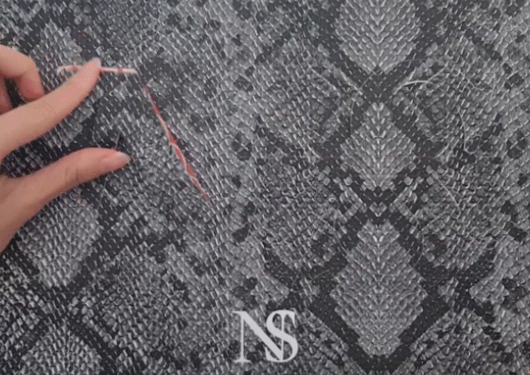
 Finals (first image physical presentation). Second image is
just to clearly show the different layers.
Finals (first image physical presentation). Second image is
just to clearly show the different layers.


 I liked how Z and N can be used interchangeably, so I was trying to incorporate that into my composition
 (some experiments when my original idea was driftwood mushroom shaker)


 Initially wanted a more subtle show of the element mushroom
by using the gills of a mushroom,and trying to tie it to
urban planning as the gills also looked like the lines on town
plans, but to be honest, due to time constrains I was unable to
develop this route more, and I thought that it might be a bit
too forceful and too abstract for people to guess my job.
Initially wanted a more subtle show of the element mushroom
by using the gills of a mushroom,and trying to tie it to
urban planning as the gills also looked like the lines on town
plans, but to be honest, due to time constrains I was unable to
develop this route more, and I thought that it might be a bit
too forceful and too abstract for people to guess my job.
 Adopted

 ZQ and Nat

 Trying out a background. I think the first image, my gif
is not working, but its supposed to show how I made the wood
have a yellowy hue, so the last background matches with my
colour palette more. But I thought it was a bit too
distracting there, so I shifted the colored part to the top
left (Final below).
Trying out a background. I think the first image, my gif
is not working, but its supposed to show how I made the wood
have a yellowy hue, so the last background matches with my
colour palette more. But I thought it was a bit too
distracting there, so I shifted the colored part to the top
left (Final below).

 Masato_tsuchiya
 esrarois
 Akutmaykut

 Kittisak Thapkoa
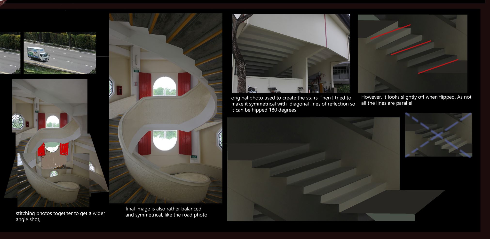
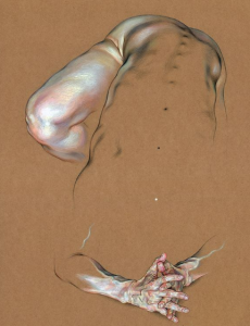
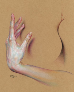
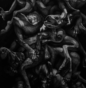
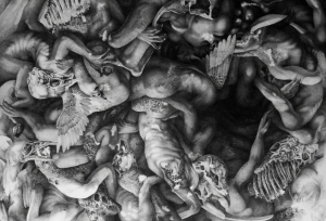
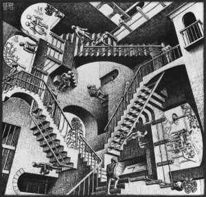 STAIRS
A section of prepwork I did on stairs in my prev coursework. MC Eschers famous stairs!!
Illusionistic stairs could be part of my work...
  STAIRS
A section of prepwork I did on stairs in my prev coursework. MC Eschers famous stairs!!
Illusionistic stairs could be part of my work...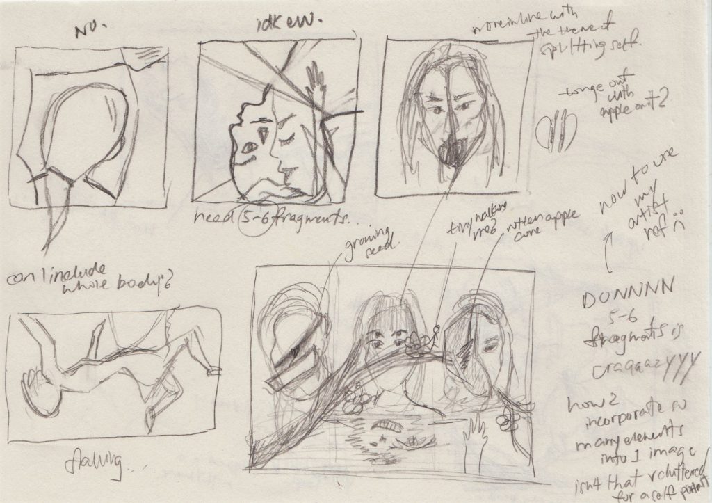
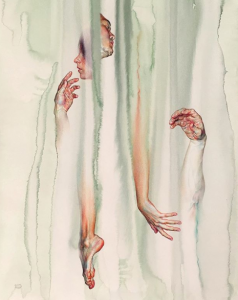
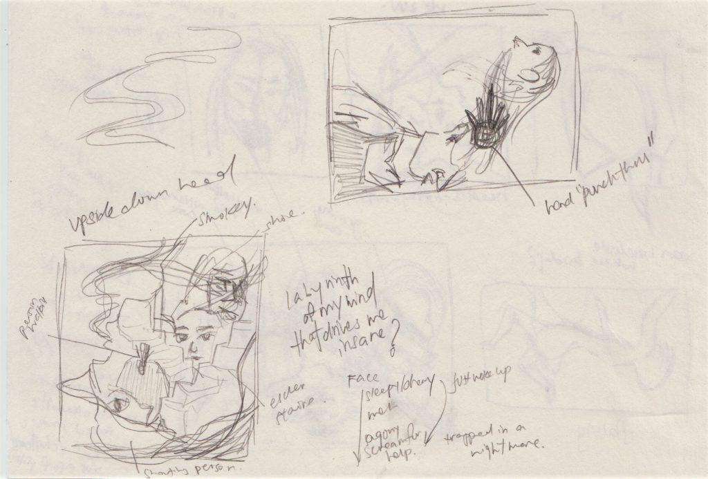 sry
vv messy (and ugly) rough ideas you probably wont be able to get hahaha
  sry
vv messy (and ugly) rough ideas you probably wont be able to get hahaha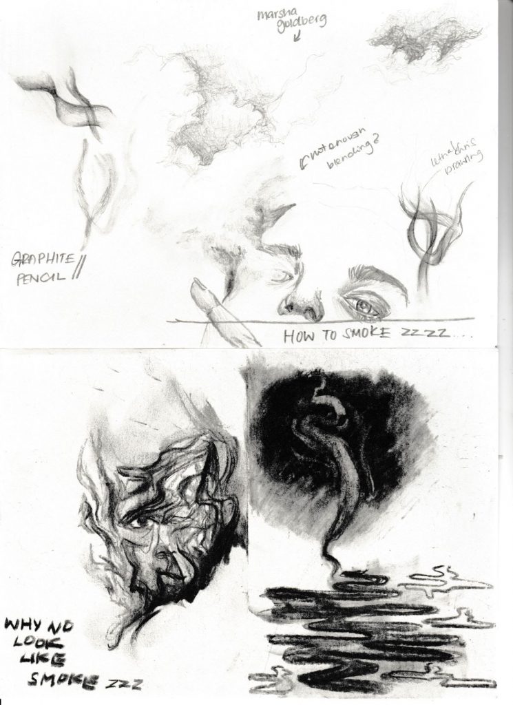
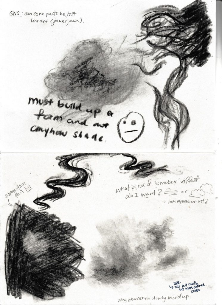 Charcoal + Graphite tests
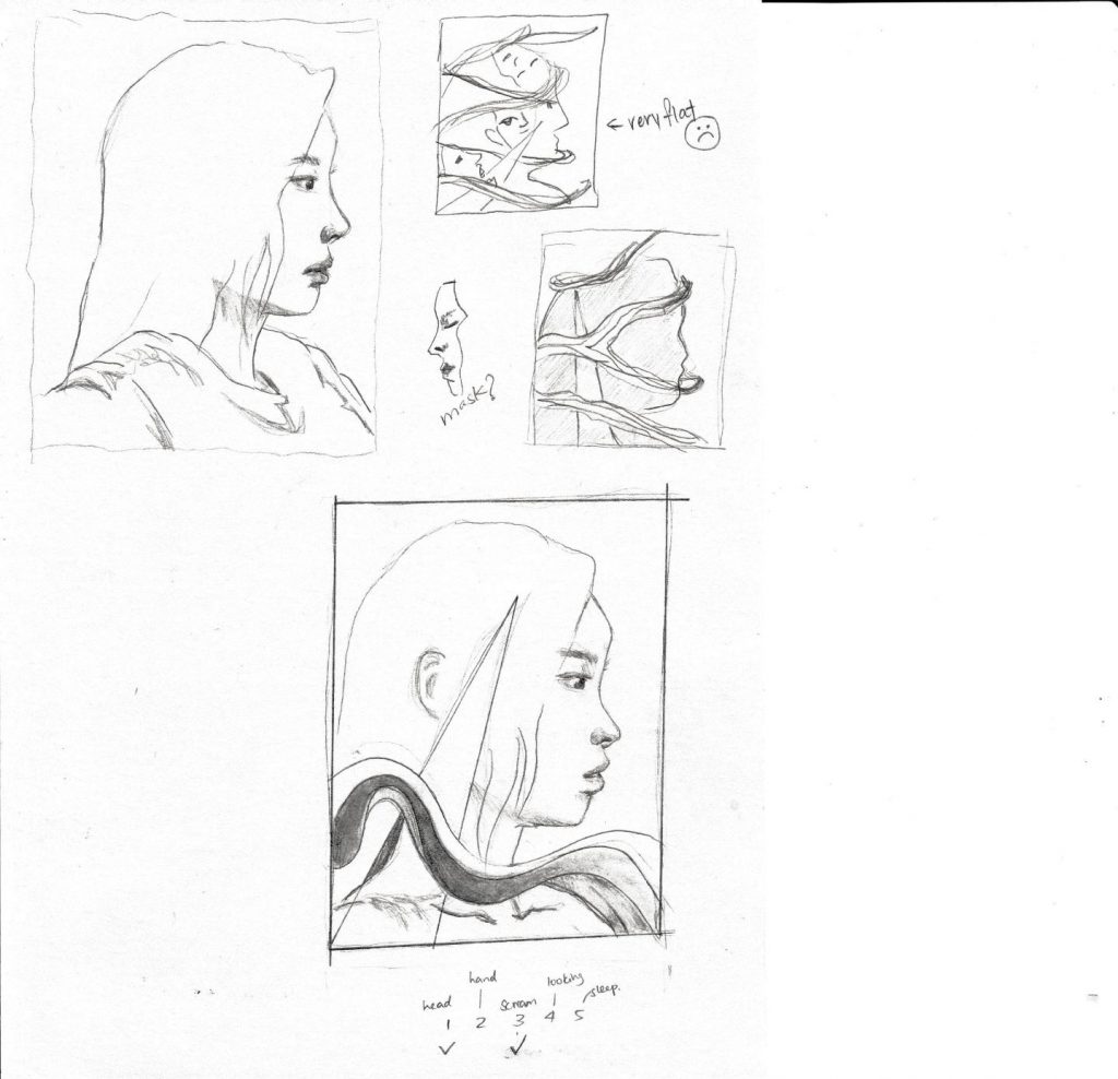
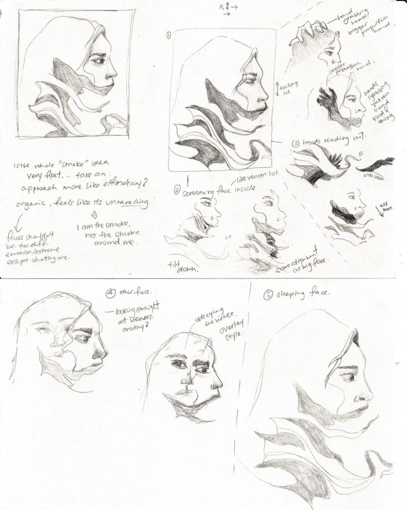
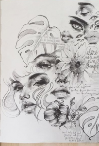
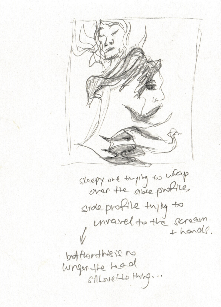 Trying to compose 5 fragments [rejected ugly composition:
 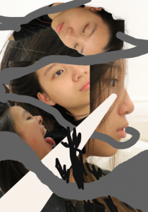 yikes]
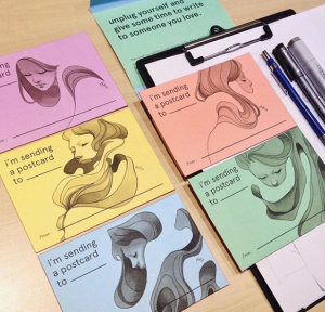
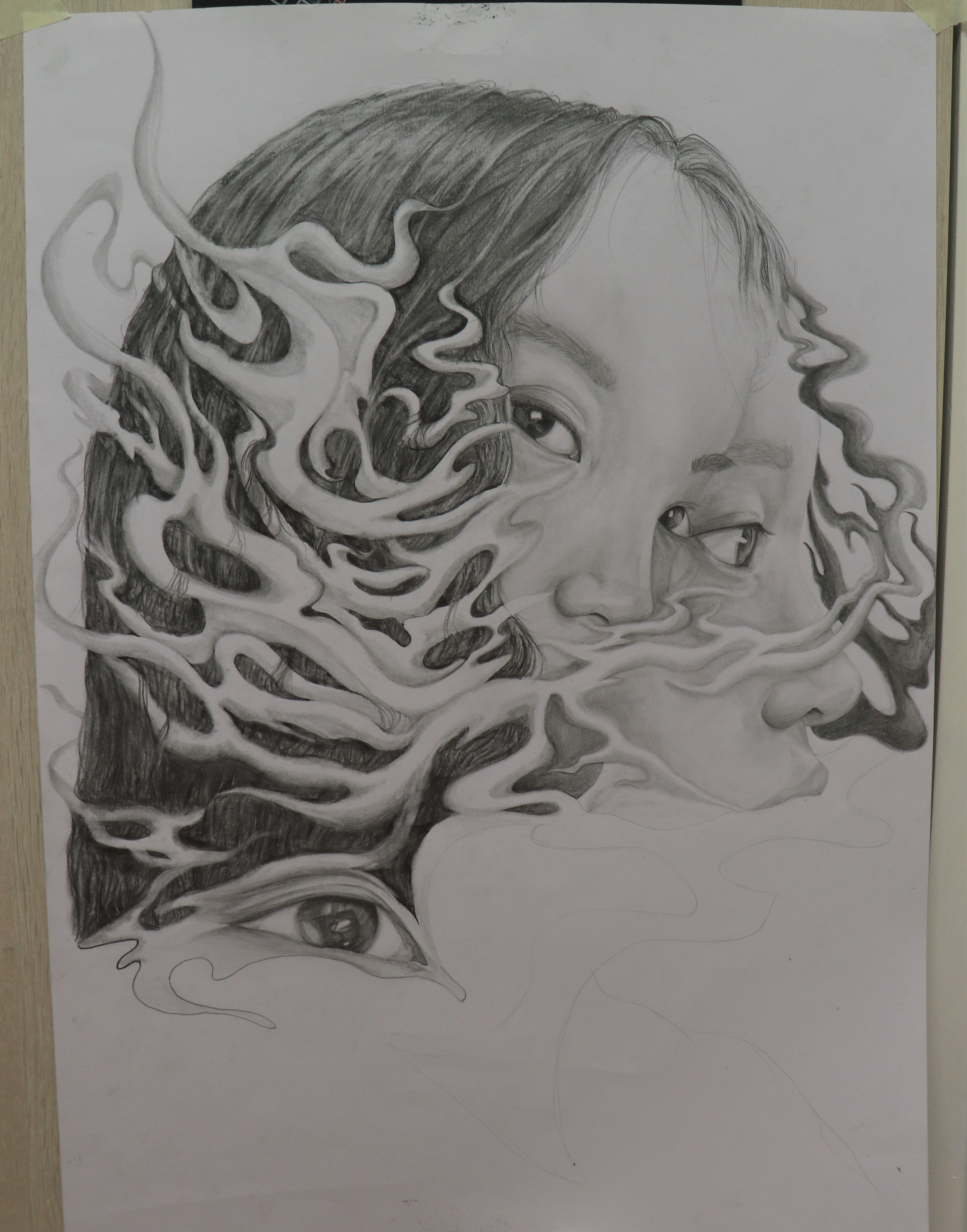
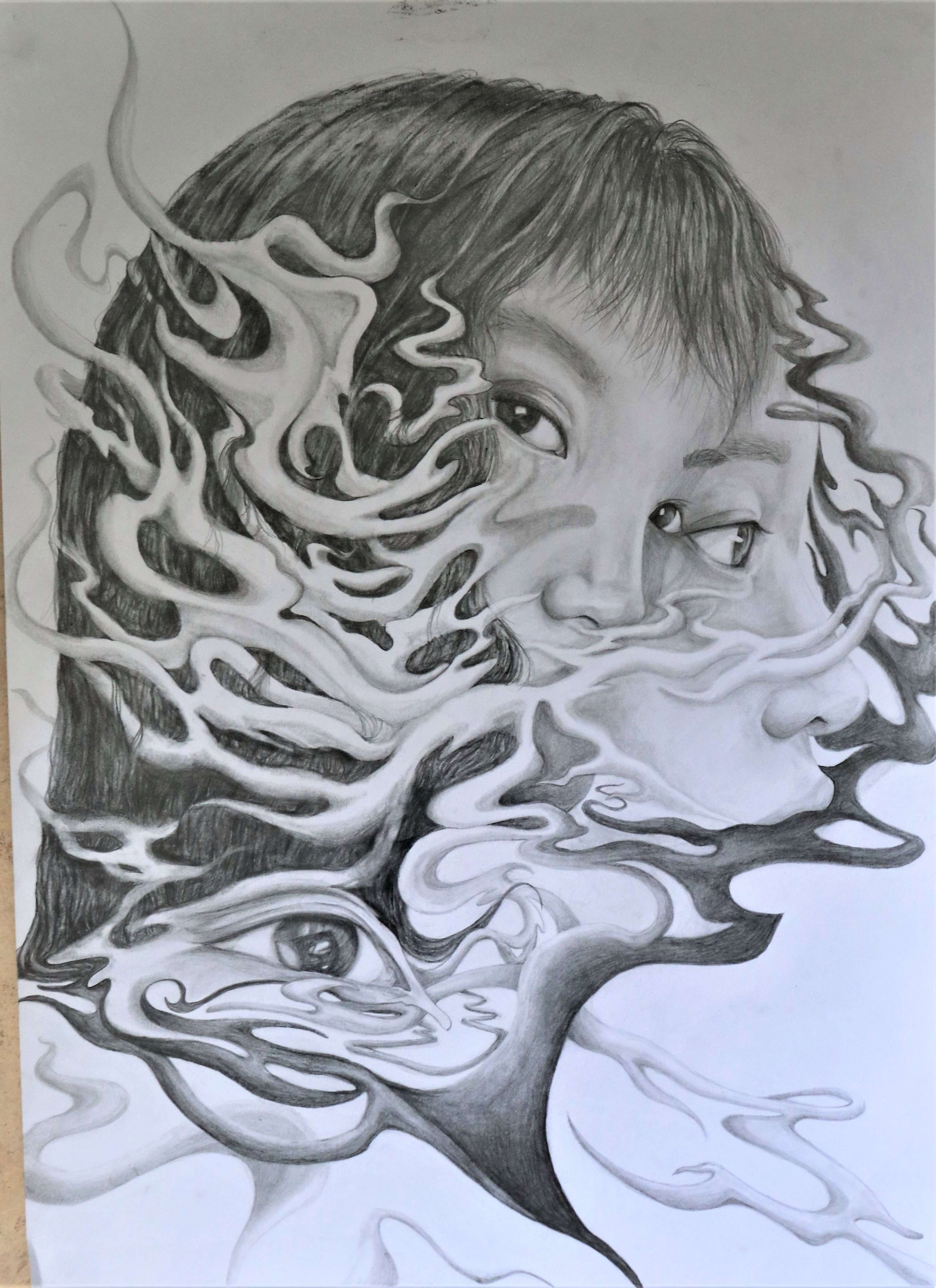
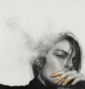
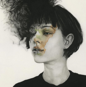
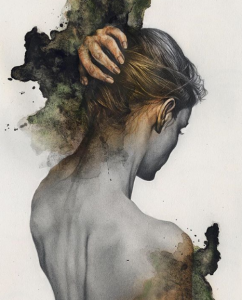
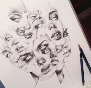
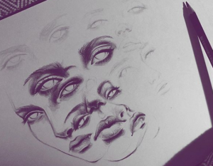
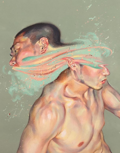
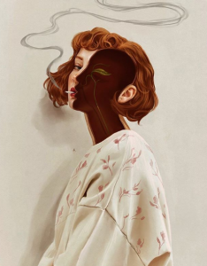
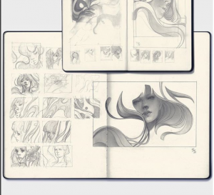 elfandiary
Very stylistic organic lines, play with positive and negative space. Depth !!!
      elfandiary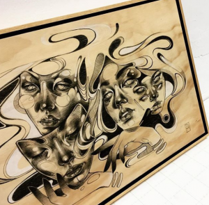
Very stylistic organic lines, play with positive and negative space. Depth !!!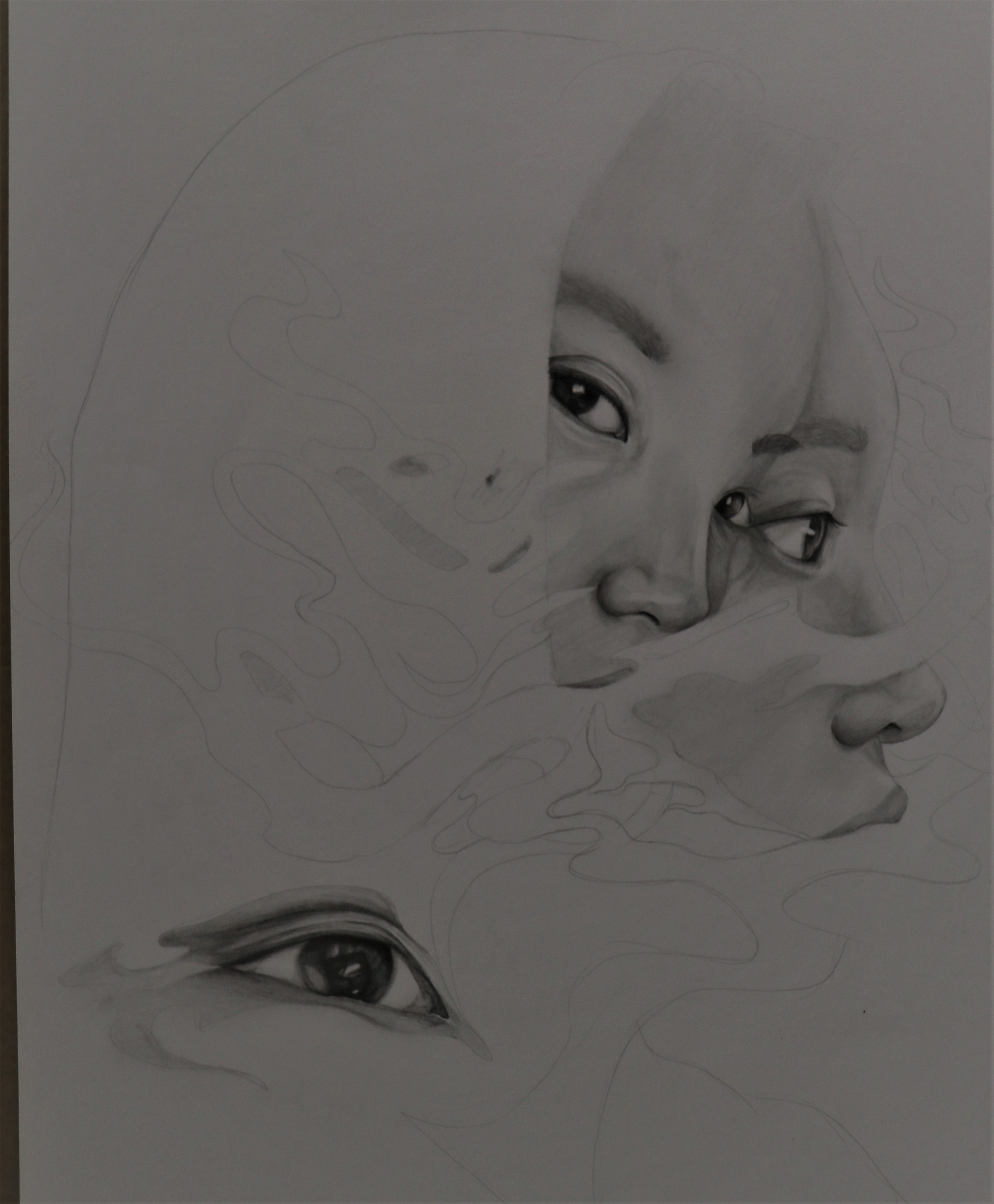 Started with the face first, and because the space around was white, the shading of the face looked okay. But then I later on coloured 8B for the hair (which i didnt take a picture), and the hair was so flat it just looked like a hole + it was so dark it made the face look like I didnt shade it at all CRIES ;n; So I had to lighten the hair a lottt, and add highlights + shadows