Personal Diary, T H E J O U R N E Y Day #1, 9th December 2031.
The last thing I remember was falling
Then a loud resounding thud through my head Sickly red pooled around me.
Its warmth comforted me
as the darkness I wished for finally came.
The next time I opened my eyes, I found myself sprawled on red. But this time, it wasn’t warm- it was cool and damp. As I slowly sat up, I realised that I was surrounded by rolling hills of crimson red.
A dark sea of mis-colored grass, as if mocking me.
Even the sky was a deep shade of red…
The sun was setting, but the unsettling thing was that there were two moons.
One of the moons, so small it was barely noticeable in the presence of the other– why, do I understand how that feels like?
However, they both radiated the same cold blue. A reflection of the isolation I was feeling in this foreign place– where is this?
I stood up. Legs as heavy as lead, I trudged through the tall grass, my head pulsating.
It felt as if an invisible string was pulling me, because I kept moving forward aimlessly.
As it got darker, I realised that a path began to reveal itself- blue illumination that didnt sit well amongst the sea of red
led me down the mountain and towards a small town nestled in the valley
The night was deathly silent as the two moons hung at their highest and brightest now.
The trail of light finally led me to an effulgent house. It was the only thing in the whole town that was illuminated. It felt so out of place. It beckoned to me — have I seen this building somewhere else before?
I felt it now, even harder. An invisible tug.
The nearer I got to the house, the more I felt my head clearing up.
By the time I reached the front door, my head was no longer hurting.
As I opened the door,
A) it gave out a loud creaking sound and I cautiously stepped into the dark house.
B) a flood of emotions/memories coursed through me, physically knocking me off my feet.
4 illogical jobs. Characteristics of the jobs/ imagery?
Medium used –> Digital or Traditional? Mix? Attention to background detail
SOME ILLOGICAL JOBS:
Time keeper
Planet Curator
Upside downer
Cotton Candy Topiarist
Shadow Traveler
Dragon Tamer
Cat’s Servant
Witch
Snake Skin peeler
Skin Parachuter
Rainbow roller-coaster architect
Android counselor
Fruit Puncher
Some Questions: Should I approach it on a more typographic style or illustrative (like subtle letterforms) ANSWER: Typography assignment, so the typo should be obvious and the main focus. The typography should be fonts that adopt the characteristic/elements of another thing, instead of being a direct image of the warped thing.
Below: rough scribble of what I learnt from first consult
———————-
TYPOGRAPHY RESEARCH:
url: https://www.youtube.com/watch?v=wOgIkxAfJsk
WHAT I LEARNT:
backletter- first ever typeface, modelled after scribes. thick vertical lines, thin horizontal connectors. V dense and squished when printed
roman type- Straight lines, regular curves-> clear and legible
Old style- thick serifs, low contrast btwn thin and thick strokes
Transitional- thinner serifs, higher contrast btwn thin and thick strokes
Modern- very thin serifs, extreme contrasts btwn thick and thin strokes
Sans-serif:
Futura- geometric sans
Gill sans- gentler more natural curves, humanist sans
helvetica- has simple curves, available in many diff weights
computer now allows ppl to create their own unique typeface
JOB SELECTION AND BREAKDOWN:
((PLEASE RIGHT CLICK AND OPEN IMAGE IN NEW TAB TO SEE BETTER ! ))
CONSULT 1:
After consult, I realised that my design ideas were not exactly what was expected. They were
too illustrative, and not all elements of my job would be encompassed in the font itself.
Or it was placing things ontop of my typeface/ placing it in things.
CONSULT 2:
Now that I better understood what I was supposed to do, I identified the elements related to the job and
tried synthesizing them onto the font. Brainstorming composition of elements to present my final font design.
DESIGN #1 – JELLY SWIMMER :
Tried using Photoshop 3D extrusion, but I think self drawn typeface was nicer in the end
choosing an appropriate background. Perspective of font on plates would fit
the second bg better, but I decided to go with the first as the swimming pool
tiles are more subtle than the pool itself. Suggestion from Shirley: make the
tiles smaller, so its less distracting
Playing around with the composition of the objects in the jelly, and then
editing it so they look like they are inside the jelly. Finally, adding highlights
to the jelly to make it more shiny and smooth, important elements of jello.
FINAL:

Final design's (2nd image) background slightly darker to bring more emphasis to the words.
DESIGN #2 – TIME KEEPER:
Trying out different ways to position the alphabets and make them interact with each other.
Last image is me realizing that I didn't leave enough breathing room for my font, and it
was just an awkward slight crop, so I decided to zoom out a bit
Trying out different backgrounds
FINAL:

Playing around with the composition of the side cages to
find a more balanced composition to reach my final (2nd one)
DESIGN #3 – SNAKE SKINNER :
Initial background idea- silhouettes of snakeskin products, mainly shoes and bags. Last image is trying out a darker bg instead of white
Printed the grey NS then drew scales over it (Letter S), and
scanned. Then redraw digitally. Or could just do a masking
(Letter N)
ARTIST REF:

Okay, this isn't really artist ref, but I was kinda inspired
by peel to reveal stickers. So my presentation would be peel
to reveal more snake layers under.
Initially wanted to use a crumpled/folded and torn piece of tracing paper as snake shed, but scrapped the idea as there was too many layers
Bought like mounting tape, so that I could make the first layer
popped out from the last layer, but in the end I didnt really like
the effect it gave. So I stuck to just sticking the papers directly
onto each other without any elevation
Physical cut out product and the individual digital layers (flesh and bone)
Thinking back now, I'm uncertain if Shirley will accept my element of peel
(action) as being part of the typeface. But I would personally think it is
acceptable as if I didnt present it as such in the different layers, I would
have just combined the peeling and layers into one plane/frame, and just like
digitally draw the first image. So its the same thing? Like showing multiple
photoshop layers versus merging them into one ahahahah
FINAL:
Finals (first image physical presentation). Second image is
just to clearly show the different layers.
DESIGN #4 – DRIFTWOOD MUSHROOM URBAN PLANNER:
I liked how Z and N can be used interchangeably, so I was trying to incorporate that into my composition
(some experiments when my original idea was driftwood mushroom shaker)
Initially wanted a more subtle show of the element mushroom
by using the gills of a mushroom,and trying to tie it to
urban planning as the gills also looked like the lines on town
plans, but to be honest, due to time constrains I was unable to
develop this route more, and I thought that it might be a bit
too forceful and too abstract for people to guess my job.
ARTIST REF:

Adopted Samjith Samz's matte painting style typography.
He uses realistic texture on his typeface, and realistic imagery
on the face of the font, coupled with dramatic lighting to create
this fairy tale looking design.
ZQ and Nat
Trying out a background. I think the first image, my gif
is not working, but its supposed to show how I made the wood
have a yellowy hue, so the last background matches with my
colour palette more. But I thought it was a bit too
distracting there, so I shifted the colored part to the top
left (Final below).
FINAL:
OVERALL:
What was the difficulties you have faced during the thinking and making of this project and what did you “take away“?
Thinking: It was really hard to grasp what was the “correct” approach to dealing with this project. The forcing an obj into the shape vs applying elements of the shapes were super similar to me at first, but the more Shirley explained, and the more I tried different designs and ideas, I eventually got it in the end! And I’m glad I was understand this method in the end, because its a much more unique way to present your typeface, and it can also be applied to other forms/works of art too! A beneficial skill.
Another difficulty during thinking is deciding the elements of the job to put in. Should I be literal and use the thing itself, or should I be more vague and use objects associated with but not represent the thing. I think that although I tried to have a balance of both, my works were leaning more to the literal end as I was afraid it would be difficult to convey the message of an illogical job to the viewers.
Making: I think that the process of making my works was relatively more smooth sailing then the conceptualization process. But because my elements were quite literal, the hardest part would be trying to make them look realistic or capture the essence of the object properly (my jelly, the showcase, mushrooms, flesh, etc..). But with more practice and experimenting around on my own, I was able to get the hang of photoshop 3d extrusion and like illustrator as well.
Takeaway: Honestly, I think looking back is also one of the most difficult things of any project. Like I think I like the works I’ve produced for this project, and I am a little proud of them. However, I’m always worried that I may have strayed from the project brief, and I notice all the “wrongs”, that I couldve worked better on. Looking back, I’m afraid that my designs might be considered a bit too complicated? especially for my backgrounds as well.. But overall, I learnt a lot about typography and image making to convey a message through this project and hope to do better on my next!! 🙂
Thanks for reading !
PDF of my writeups incase the images above are not clear enough: TYPO
must be “fragments” or just an abstract portrait, cause one of the ones don showed is just incomplete + the palette testing thing ? like what if i just obscure part of my face with stuff. ANS: CAN
PREP WORK BY WEEK 10
Research (artist influence, how)
Concept Write-up (100 word on concept)
Concept Sketches and Thumbnails (8-10sketches, idea, composition, value, design)
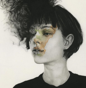
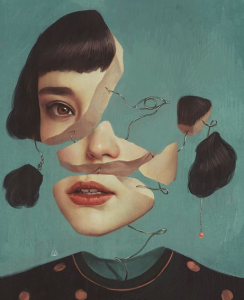
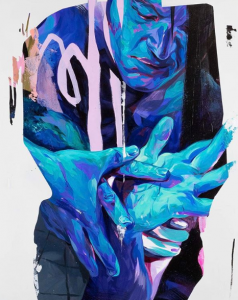
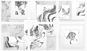
ARTIST INFLUENCE:
Masato_tsuchiya
Isolated areas of colour draw more attention to those areas
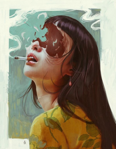
Black and white smokey effect
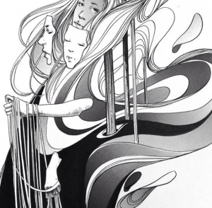
sarsar
Fluidity (curvy lines surrounding some of the faces)
Smooth transition/placement of the different faces
Using overlay method with faces from different perspectives- smooth fragmentation (compared to harsh geometric one)
Focus on facial features (especially eyes)
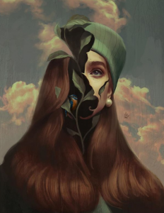
In the third picture, feels like there’s a narrative- taking a mask off or something
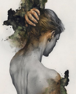
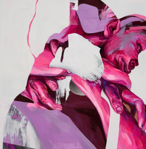
esrarois
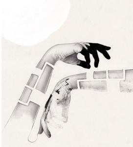
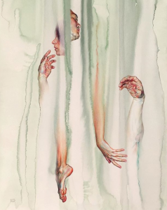
Breaking down the hand? (similar to aykutmaykut)
Willeys_art
Fluidity! (organic motion lines similar to sarsar)
The body in motion (even face)
Playing with positive and negative space. Doesn’t show the entire body, but the mind pictures it on our own. Is the body disappearing or reappearing?
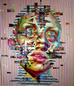
Akutmaykut
Fluidity!! (for the third time hehe)
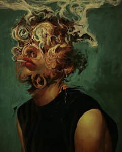
Love the idea of the portrait turning into smoke
Or cutting up the face to reveal something else inside
Taylurk
masking effect
I like the idea of different forms being contained in one bigger shape (and some parts of the form breaking that boundary)
And its like some of the silhouettes look like a human body shape and the stuff inside has hands or face positioned at where it shld be, but in a wrong perspective. (like fourth pic the looks like 2 people hugging)
sort of like how you loose control of your own life / our over-reliance on technology
Kittisak Thapkoa
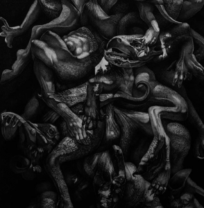
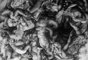
Macabre-ness
Mass of writhing arms and heads
  STAIRS
A section of prepwork I did on stairs in my prev coursework. MC Eschers famous stairs!!
Illusionistic stairs could be part of my work...
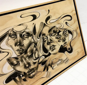
CONCEPT WRITEUP: what do the fragments represent?
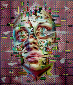
More akutmaykut x sarsar kind. Blurry smokey feels, because thats what I feel about myself and my personal identity.
Maybe like the idea of peeling off my mask (like in sarsars one). Mask is a smiling face, then once peeled off is a emotionless face or scream or distorted face with multiple eyes? Im ugly/suffering inside
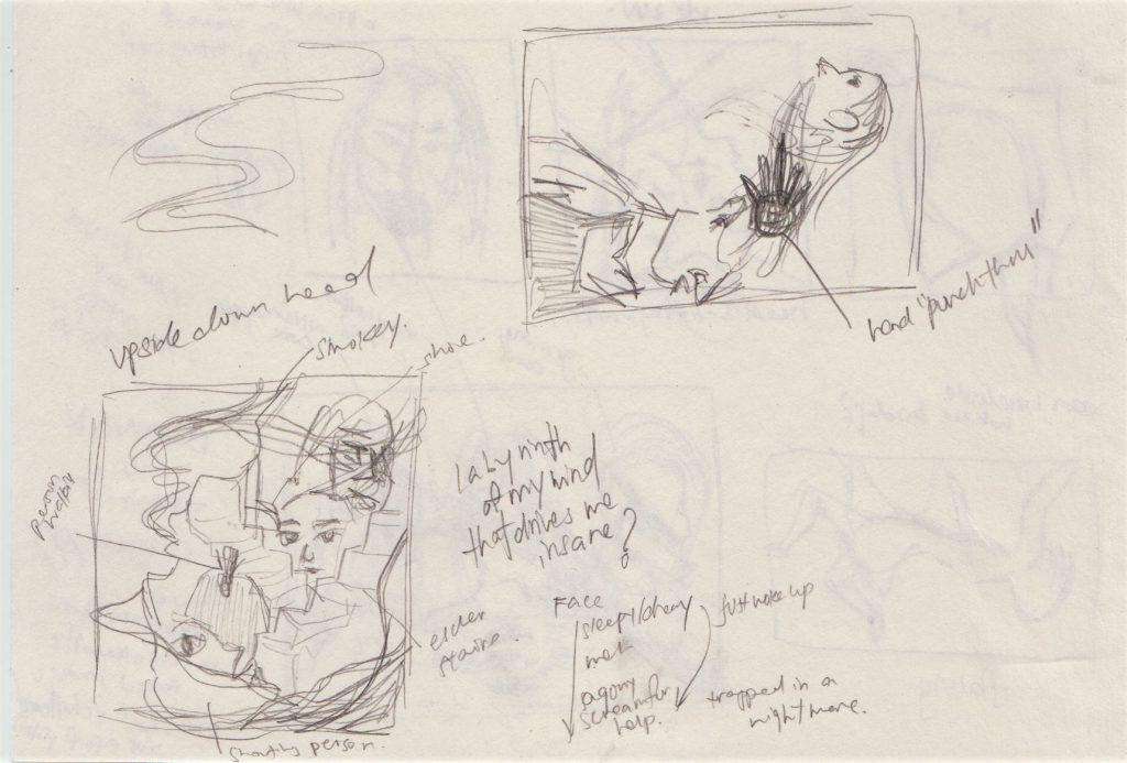
More taylurk kind. Overall silhouette is a upside down head, then inside is the confusing fragments- How my mind is always so complicated to me, and I confuse myself. But maybe arms or some fragments trying to break out-> me trying to escape from my own mind, to find liberation or help.
Exploded self portrait (like akutmaykut) then inside is a rotten apple core or twisted apple. im rotten to the core
dance?
100 WORD WRITE-UP : I really dont know what to write aish. I draw first
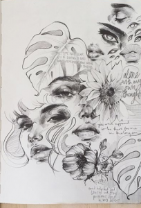
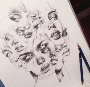
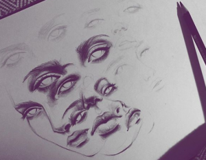
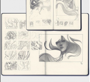
8-10 CONCEPT SKETCHES AND THUMBNAILS:
  sry
vv messy (and ugly) rough ideas you probably wont be able to get hahaha
(idea chosen to build upon mentioned below)
100 WORD WRITE-UP Update: After consult#1 with Don
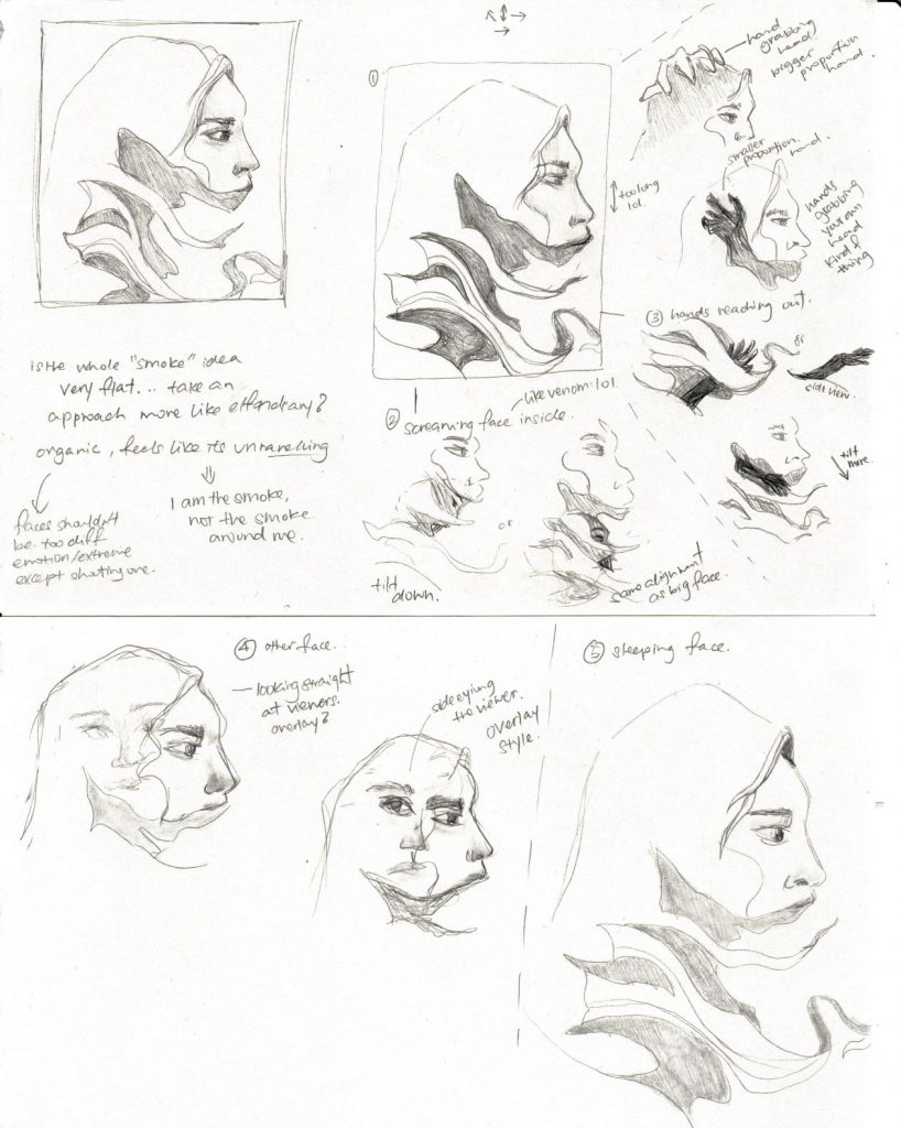
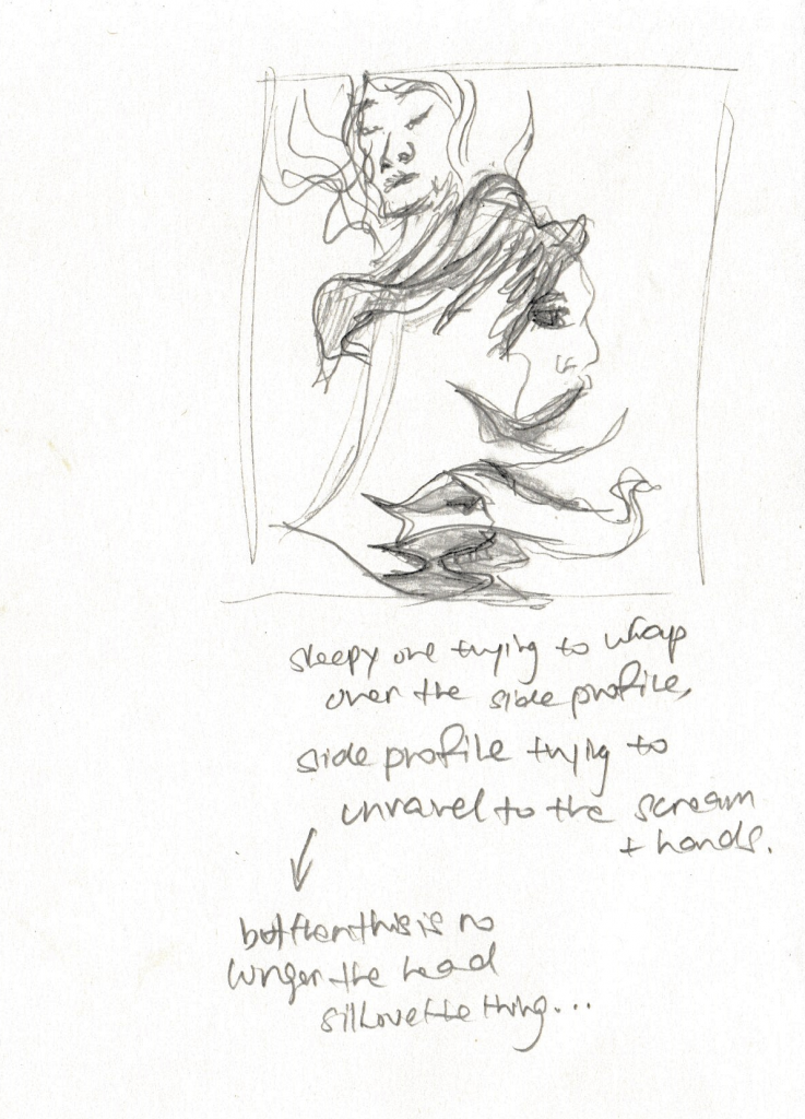
Decided to work upon the silhouette idea x fluid organic fragments. So the overall shape will be a head, and the fragments will be inside-> How everything is contained in my own head. But then there will be some parts where arms will slightly break out of the boundary of some white fragments –> me trying to escape from my own mind, to find liberation or help. The demarcation of fragments will be shown through white smokey lines that flow inside the head, and some will link out of the head and around (maybe then these can be black). Overall feel should be somewhat cloudy, like shrouded in mystery–> reflecting how i see myself in 2 ways: 1) I feel like my personal identity is very hazy to me, I cant directly say who I am/what kind of a person am I (I feel like I dont have a definite shape, thus the use of smokey mysterious vibe) and 2) From 2D “My line is emo” mark making, I realised that I tend to make much more organic works and lines (instead of hard geometric lines, hence I wont be doing like mirror fragmentation), I am more for organic fluidity whoo. As for the different fragments, I was thinking of having an increase in the expression of the faces from top to bottom? Like The faces gradually look more pained/intense –> 1) Sleepy/Dreary closed eyes, 2) blank stare, 3) screaming –> Like waking up and realising you are trapped in a nightmare –> Labyrinth of my mind that drives me insane –> optional objects to put in the composition could be stairs, like MC Eschers. Conclusion: Me trapped in my mind aaaaaaa.
“How will we ever get out of this labyrinth of suffering?’
“You spend your whole life stuck in the labyrinth, thinking about how you’ll escape one day, and how awesome it will be, and imagining that future keeps you going, but you never do it. You just use the future to escape the present.’
― John Green, Looking for Alaska
PREP WORK BY WEEK 11
Staged portraits, print + experiment
Medium test
Experimentation (compositions, tonal, medium studies / drawing techniques researched)
IMAGE INQUIRING ( cue the cringe oh god)
(I shall not post my picS HAHAHA)
MEDIUM TEST x PRACTICE TECHNIQUES
Charcoal + Graphite tests
COMPOSITION
Trying to compose 5 fragments [rejected ugly composition: yikes]
ARTIST REF 2.0
      elfandiary
Very stylistic organic lines, play with positive and negative space. Depth !!!
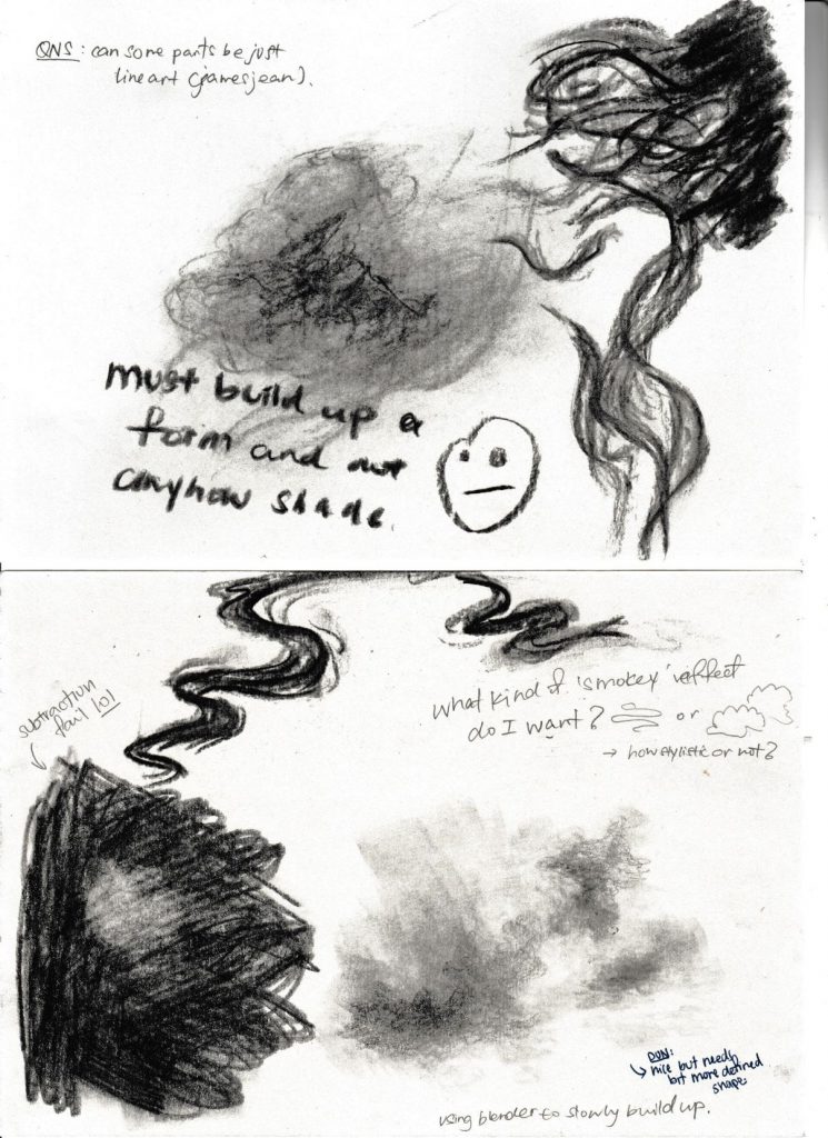
WEEK 11 CONSULT
Use graphite -> smoother gradient and more delicate feels.
Maybe can use the unraveling parts to form another face so those parts are not wasted
PROCESS: 3 DAYS OMg :((((
Actually didnt properly plan the smoke, because I thought I would go with the flow. And make not only the final work a self portrait, but also the process- because I’m the kind of person that will make plans, but then not end up following through exactly, instead I prefer doing what I am currently feeling!! I also thought that overplanning the smoke might make it loose its organicness and fluidity?? Like it wont be natural mmz…
Started with the face first, and because the space around was white, the shading of the face looked okay. But then I later on coloured 8B for the hair (which i didnt take a picture), and the hair was so flat it just looked like a hole + it was so dark it made the face look like I didnt shade it at all CRIES ;n; So I had to lighten the hair a lottt, and add highlights + shadows
I think the bottom part was the hardest because I wasnt sure how to nicely tie everything together. In the end, when I had this hole left to fill, I had to use photoshop in planning out the smoke. It was like a jigsaw puzzle so hard:((
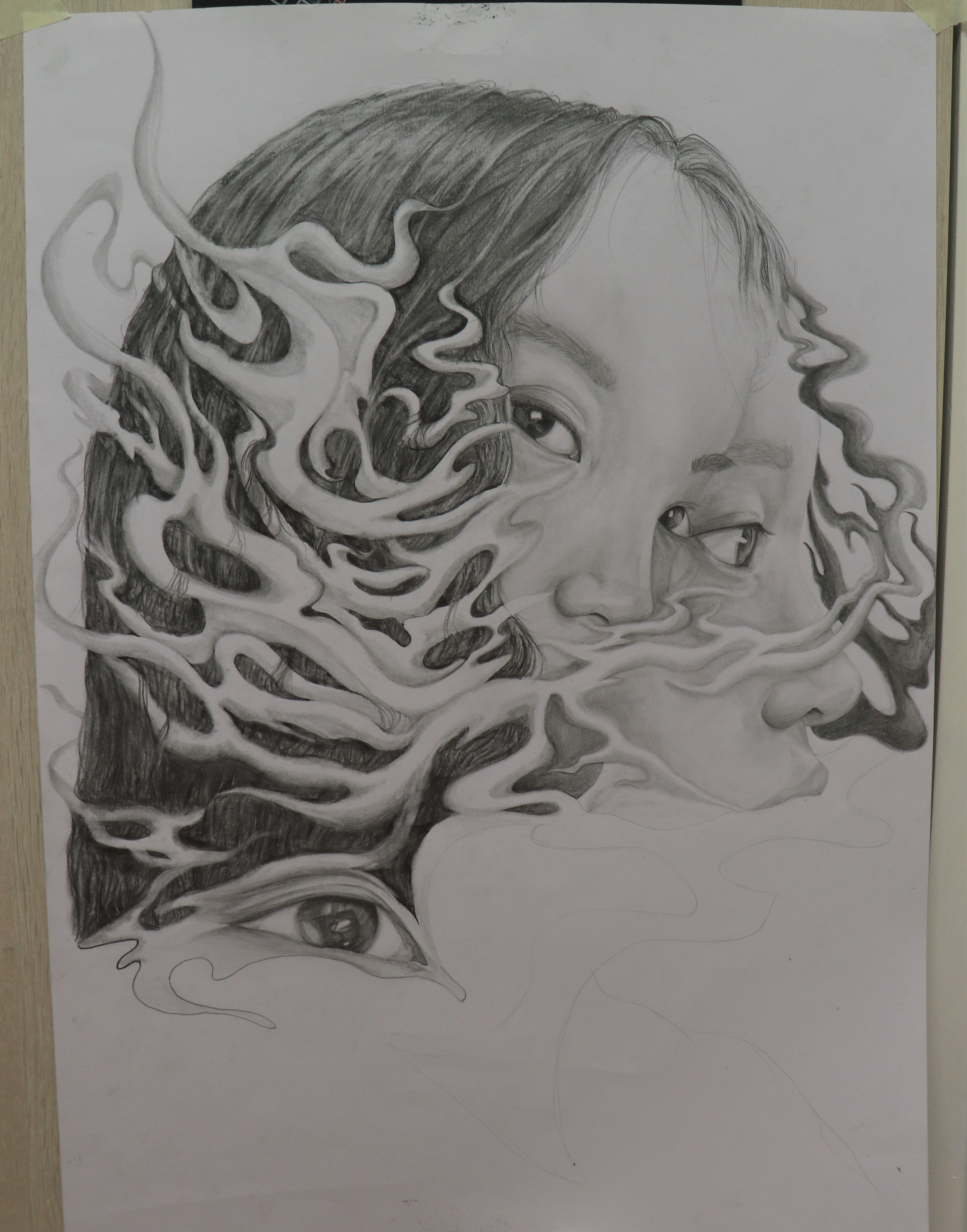
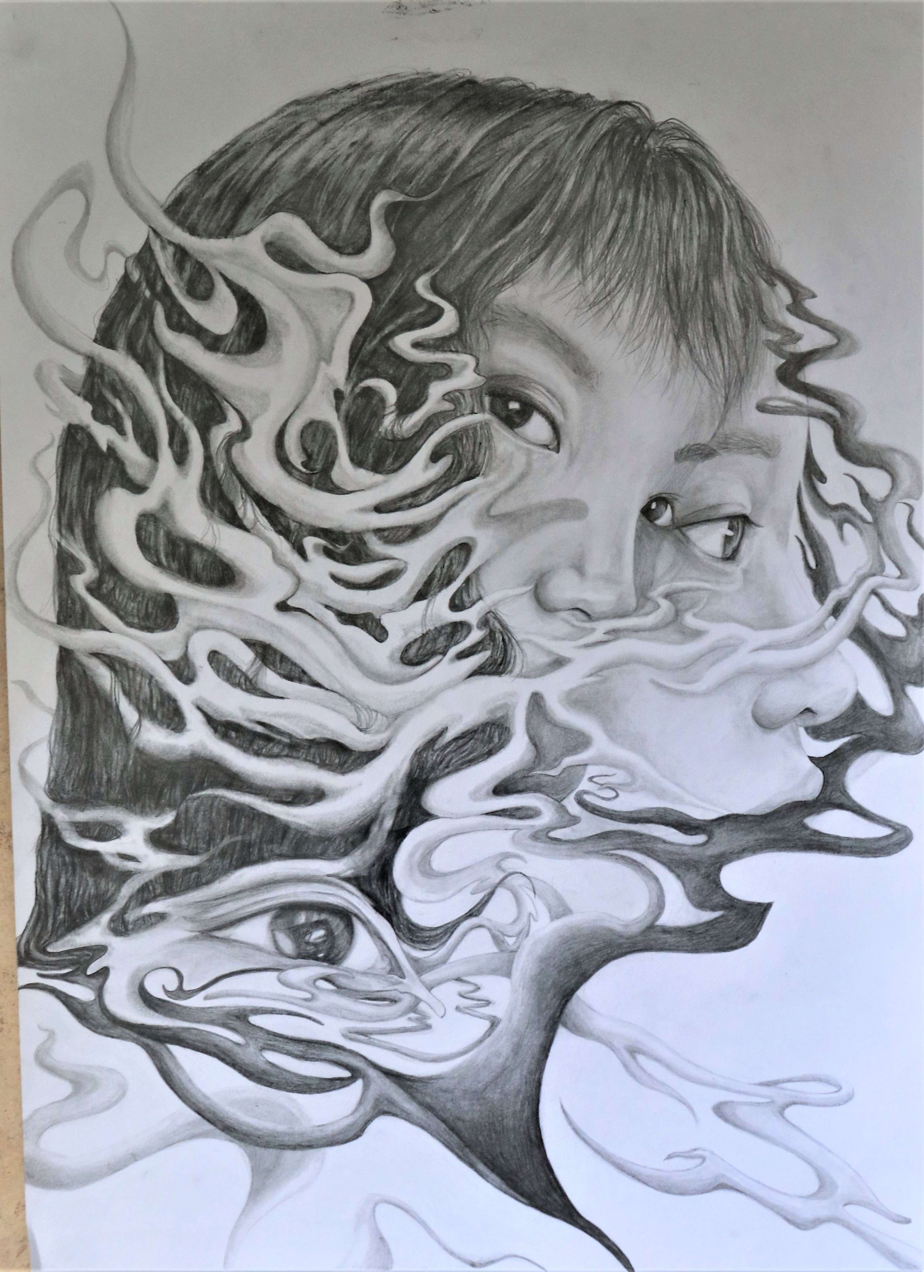
FINAL SUBMISSION INFORMATION
ARTWORK DETAILS
Medium: Graphite drawing
Size: A2
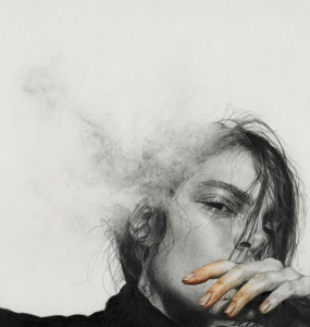
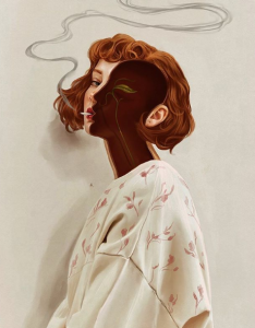
FINAL CONCEPT:
With the project being “FRAGMENTED self portrait”, I knew I didn’t want it to be geometric. As that would be the usual interpretation, and because I felt like geometric shapes were not a good representation of me. From 2D “My line is emo” mark making, I realised that I tend to make much more organic works and lines (instead of hard geometric lines, hence I wont be doing like mirror fragmentation), I am more for organic fluidity!! And with “self portrait”, I feel like my personal identity is very hazy to me, I cant directly say who I am/what kind of a person am I, I feel like I dont have a definite shape or identity. Its kind of like a grey area to me. Hence, I decided to use smoke as my fragments in this project. So the overall composition will be a big head, suggesting how everything is in my own head. And then there will be smoke around my head, with some parts of myself becoming the smoke itself, showing how I think of my self identity as smoke that you just cant quite grasp. As for the faces, I wanted the middle one to be staring directly at the viewer, because I felt like it would make the viewer more connected to my self portrait. I also wanted to make it unsettling, with how she stares at you wherever you go, much like how I closely scrutinize and judge myself harshly:”)
FINAL:
COMMENTS
I think i took too much time because I spent 3 days on this and the end result was quite underwhelming. Honestly, I liked my can drawing much much better. I think being the compulsive blender I am, I put too much time into over-rendering and fussing about small details that are hard to see from afar. Even though I did consider and look at a bigger picture, I think I still could’ve made it even more impactful from afar and cut down on details
I thought composing the smoke would be easy because I could come up with whatever I wanted, but that made things even harder. Because I had white + black smoke and the dark hair + light face, I had to carefully compose the smoke so that all these 4 parts would nicely balance out. If one part was too white, without blacks or vice versa, it would draw too much attention away. So tonal planning was actually really important for me. Also, I had to ensure that the smoke was organic enough, and flowed nicely. The style of the smoke also had to stay too consistent- there were times when I realised i made the bends/ends of the smoke too rounded, instead of slightly pointy, thus making it look different from what i drew before and weird. Variation of the different shapes and widths of smoke was hardddd. Never underestimate drawing smoke is what I learnt.
I think some parts had slightly weird proportions. Like my forehead looked quite big and made me look bald even though I drew so much hair. So I decided to cover the forehead with bangs. Also I’m not sure why but initially, the distance between the eyes and nose of the staring portrait looked quite far apart (2nd proccess pic), so I extended the grey smoke in the middle of them, to obscure the distance a bit (final drawing pic), and I think it fixed the problem quite nicely!! HA the art of obscuring to cover up problems:”)
Not enough contrast!!!!!!!! I used normal graphite and tended to blend quite a bit, so the tonal change was very subtle, especially for parts like the face. From afar, it really looked like I didnt even render it and was super disappointing!!:((((( I needed even blacker darks to create more contrast and dramatic lighting, to make my portrait take on a more dimensional form. The face shading needs to be reworked on and darkened. One face could even be darker than the other for even clearer distinction between the two
Other improvements included: Making more hair turn into smoke. Blending the smoke into the hair even more (though I already tried, I think some parts the value edges too sharp?). Making the smoke less white, so only some parts would be highlighted and so it looked even more 3-dimensional like it was going around the hair. Making most of the smoke darker would also push it back into my hair more, and make the whole painting less overwhelming? Because i think right now its a bit too much to take in all at once sighs… maybe I should’ve made the composition of the portrait smaller so there would be more breathing space for the viewer, if not i think it feels a bit too messy now:( ??
OK LA BUT I THINK ish not bad i guess:v I tried quite hard:”””)
FOUNDATION DRAWING SEM 1 PEACE OUT!!!!!!!! I will miss it, i think i did improve:”””)


 ANSWER: Typography assignment, so the typo should be obvious and the main focus. The typography should be fonts that adopt the characteristic/elements of another thing, instead of being a direct image of the warped thing.


 After consult, I realised that my design ideas were not exactly what was expected. They were
too illustrative, and not all elements of my job would be encompassed in the font itself.
Or it was placing things ontop of my typeface/ placing it in things.
After consult, I realised that my design ideas were not exactly what was expected. They were
too illustrative, and not all elements of my job would be encompassed in the font itself.
Or it was placing things ontop of my typeface/ placing it in things.


 Now that I better understood what I was supposed to do, I identified the elements related to the job and
tried synthesizing them onto the font. Brainstorming composition of elements to present my final font design.
Now that I better understood what I was supposed to do, I identified the elements related to the job and
tried synthesizing them onto the font. Brainstorming composition of elements to present my final font design.


 Tried using Photoshop 3D extrusion, but I think self drawn typeface was nicer in the end
 choosing an appropriate background. Perspective of font on plates would fit
the second bg better, but I decided to go with the first as the swimming pool
tiles are more subtle than the pool itself. Suggestion from Shirley: make the
tiles smaller, so its less distracting
choosing an appropriate background. Perspective of font on plates would fit
the second bg better, but I decided to go with the first as the swimming pool
tiles are more subtle than the pool itself. Suggestion from Shirley: make the
tiles smaller, so its less distracting


 Playing around with the composition of the objects in the jelly, and then
editing it so they look like they are inside the jelly. Finally, adding highlights
to the jelly to make it more shiny and smooth, important elements of jello.
Playing around with the composition of the objects in the jelly, and then
editing it so they look like they are inside the jelly. Finally, adding highlights
to the jelly to make it more shiny and smooth, important elements of jello.
 Final design's (2nd image) background slightly darker to bring more emphasis to the words.


 Trying out different ways to position the alphabets and make them interact with each other.
Last image is me realizing that I didn't leave enough breathing room for my font, and it
was just an awkward slight crop, so I decided to zoom out a bit
Trying out different ways to position the alphabets and make them interact with each other.
Last image is me realizing that I didn't leave enough breathing room for my font, and it
was just an awkward slight crop, so I decided to zoom out a bit

 Trying out different backgrounds
 Playing around with the composition of the side cages to
find a more balanced composition to reach my final (2nd one)
Playing around with the composition of the side cages to
find a more balanced composition to reach my final (2nd one)


 Initial background idea- silhouettes of snakeskin products, mainly shoes and bags. Last image is trying out a darker bg instead of white


 Printed the grey NS then drew scales over it (Letter S), and
scanned. Then redraw digitally. Or could just do a masking
(Letter N)
Printed the grey NS then drew scales over it (Letter S), and
scanned. Then redraw digitally. Or could just do a masking
(Letter N)
 Okay, this isn't really artist ref, but I was kinda inspired
by peel to reveal stickers. So my presentation would be peel
to reveal more snake layers under.
Okay, this isn't really artist ref, but I was kinda inspired
by peel to reveal stickers. So my presentation would be peel
to reveal more snake layers under.
 Initially wanted to use a crumpled/folded and torn piece of tracing paper as snake shed, but scrapped the idea as there was too many layers


 Bought like mounting tape, so that I could make the first layer
popped out from the last layer, but in the end I didnt really like
the effect it gave. So I stuck to just sticking the papers directly
onto each other without any elevation
Bought like mounting tape, so that I could make the first layer
popped out from the last layer, but in the end I didnt really like
the effect it gave. So I stuck to just sticking the papers directly
onto each other without any elevation

 Physical cut out product and the individual digital layers (flesh and bone)
Thinking back now, I'm uncertain if Shirley will accept my element of peel
(action) as being part of the typeface. But I would personally think it is
acceptable as if I didnt present it as such in the different layers, I would
have just combined the peeling and layers into one plane/frame, and just like
digitally draw the first image. So its the same thing? Like showing multiple
photoshop layers versus merging them into one ahahahah
Physical cut out product and the individual digital layers (flesh and bone)
Thinking back now, I'm uncertain if Shirley will accept my element of peel
(action) as being part of the typeface. But I would personally think it is
acceptable as if I didnt present it as such in the different layers, I would
have just combined the peeling and layers into one plane/frame, and just like
digitally draw the first image. So its the same thing? Like showing multiple
photoshop layers versus merging them into one ahahahah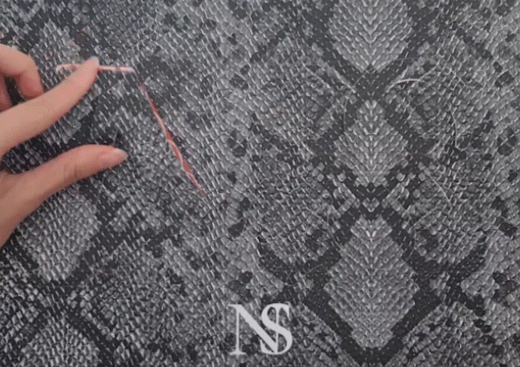
 Finals (first image physical presentation). Second image is
just to clearly show the different layers.
Finals (first image physical presentation). Second image is
just to clearly show the different layers.


 I liked how Z and N can be used interchangeably, so I was trying to incorporate that into my composition
 (some experiments when my original idea was driftwood mushroom shaker)


 Initially wanted a more subtle show of the element mushroom
by using the gills of a mushroom,and trying to tie it to
urban planning as the gills also looked like the lines on town
plans, but to be honest, due to time constrains I was unable to
develop this route more, and I thought that it might be a bit
too forceful and too abstract for people to guess my job.
Initially wanted a more subtle show of the element mushroom
by using the gills of a mushroom,and trying to tie it to
urban planning as the gills also looked like the lines on town
plans, but to be honest, due to time constrains I was unable to
develop this route more, and I thought that it might be a bit
too forceful and too abstract for people to guess my job.
 Adopted

 ZQ and Nat

 Trying out a background. I think the first image, my gif
is not working, but its supposed to show how I made the wood
have a yellowy hue, so the last background matches with my
colour palette more. But I thought it was a bit too
distracting there, so I shifted the colored part to the top
left (Final below).
Trying out a background. I think the first image, my gif
is not working, but its supposed to show how I made the wood
have a yellowy hue, so the last background matches with my
colour palette more. But I thought it was a bit too
distracting there, so I shifted the colored part to the top
left (Final below).

 Masato_tsuchiya
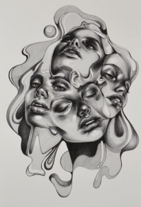
 esrarois
 Akutmaykut

 Kittisak Thapkoa
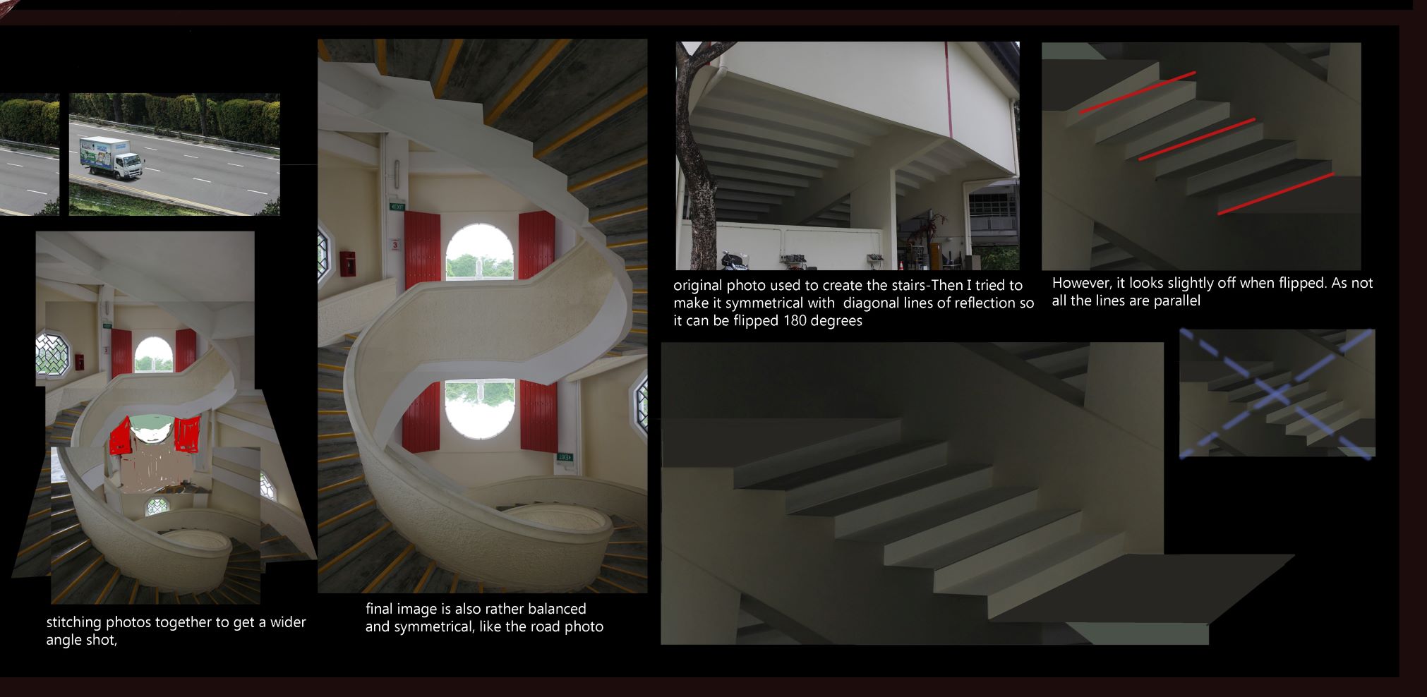
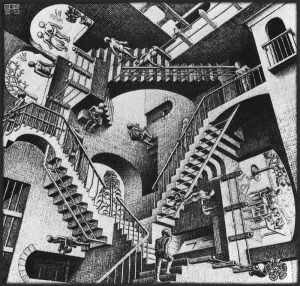 STAIRS
A section of prepwork I did on stairs in my prev coursework. MC Eschers famous stairs!!
Illusionistic stairs could be part of my work...
STAIRS
A section of prepwork I did on stairs in my prev coursework. MC Eschers famous stairs!!
Illusionistic stairs could be part of my work...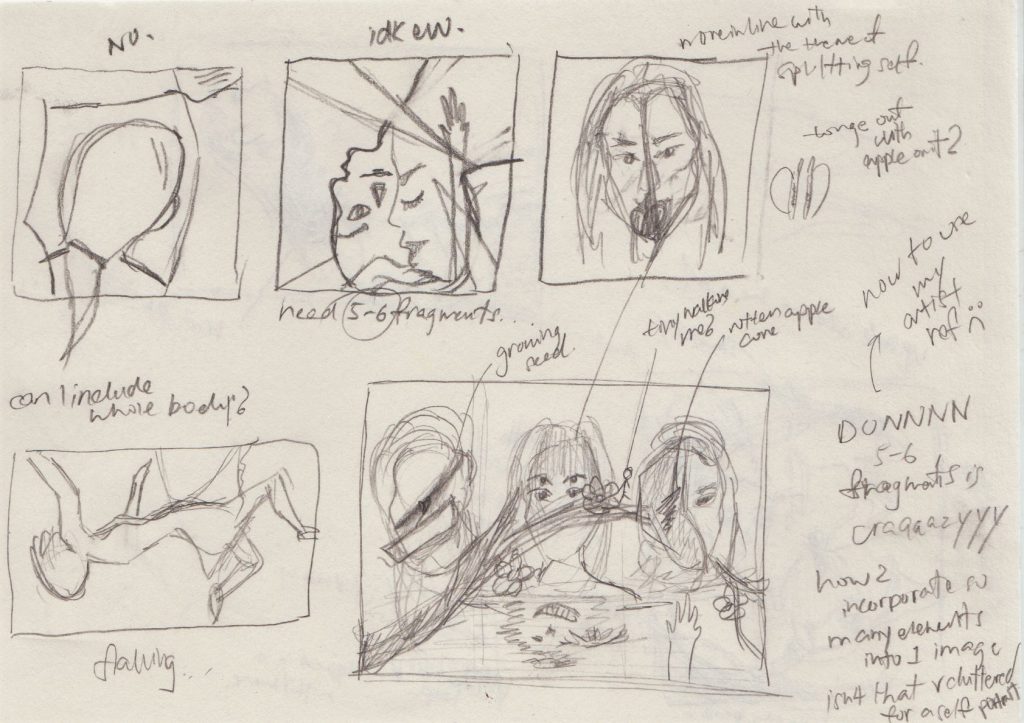
 sry
vv messy (and ugly) rough ideas you probably wont be able to get hahaha
sry
vv messy (and ugly) rough ideas you probably wont be able to get hahaha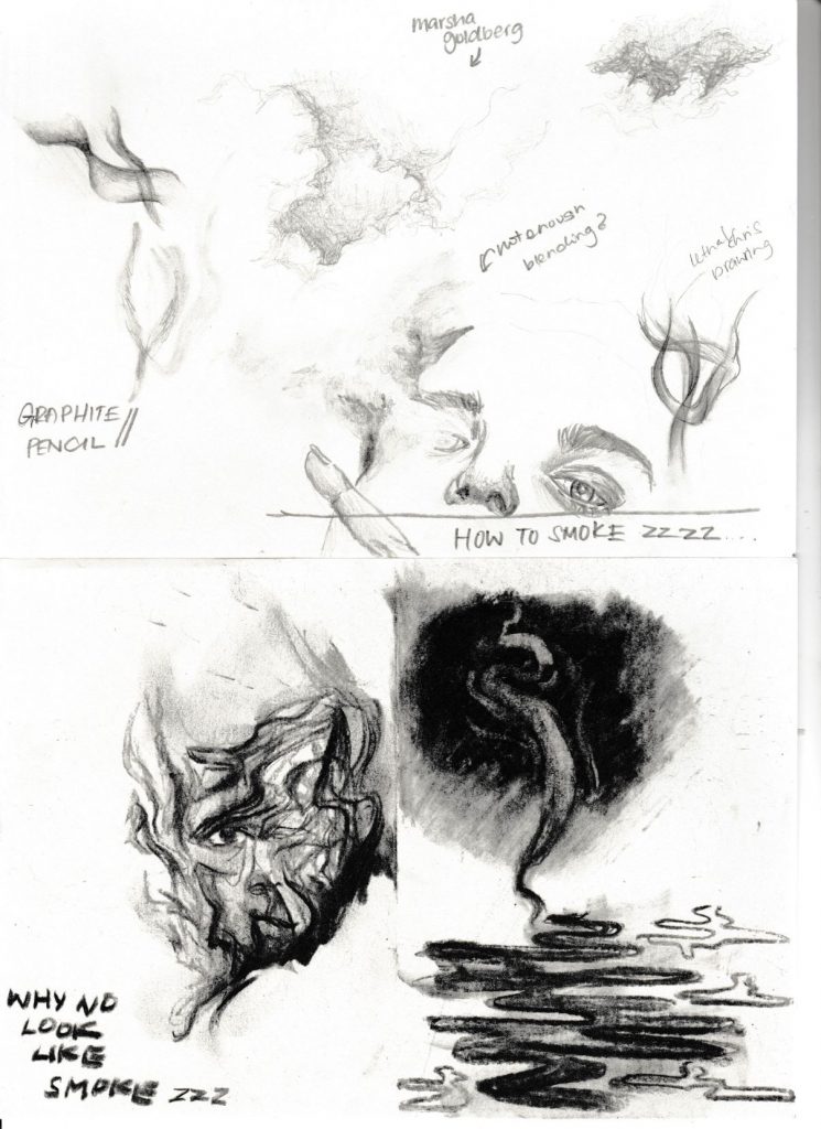
 Charcoal + Graphite tests
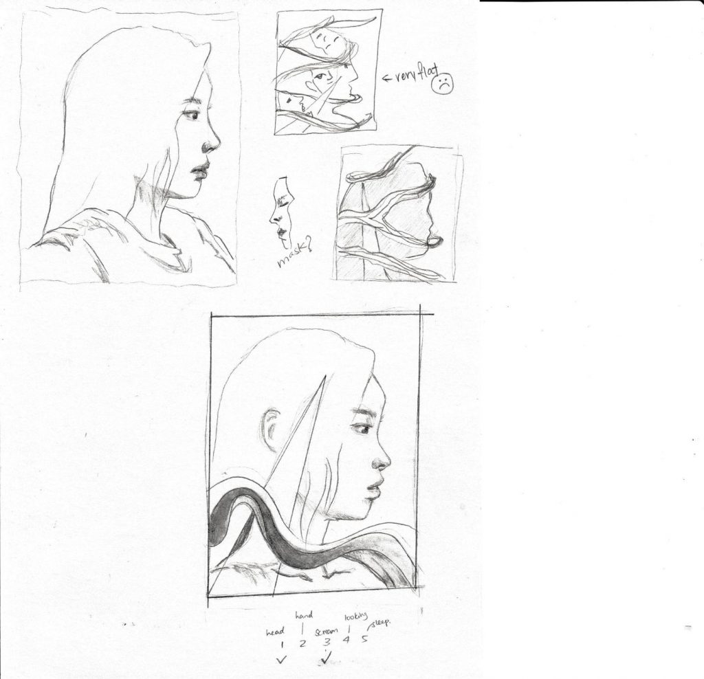
 Trying to compose 5 fragments [rejected ugly composition:
 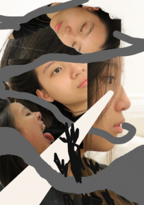 yikes]
 elfandiary
Very stylistic organic lines, play with positive and negative space. Depth !!!
elfandiary
Very stylistic organic lines, play with positive and negative space. Depth !!!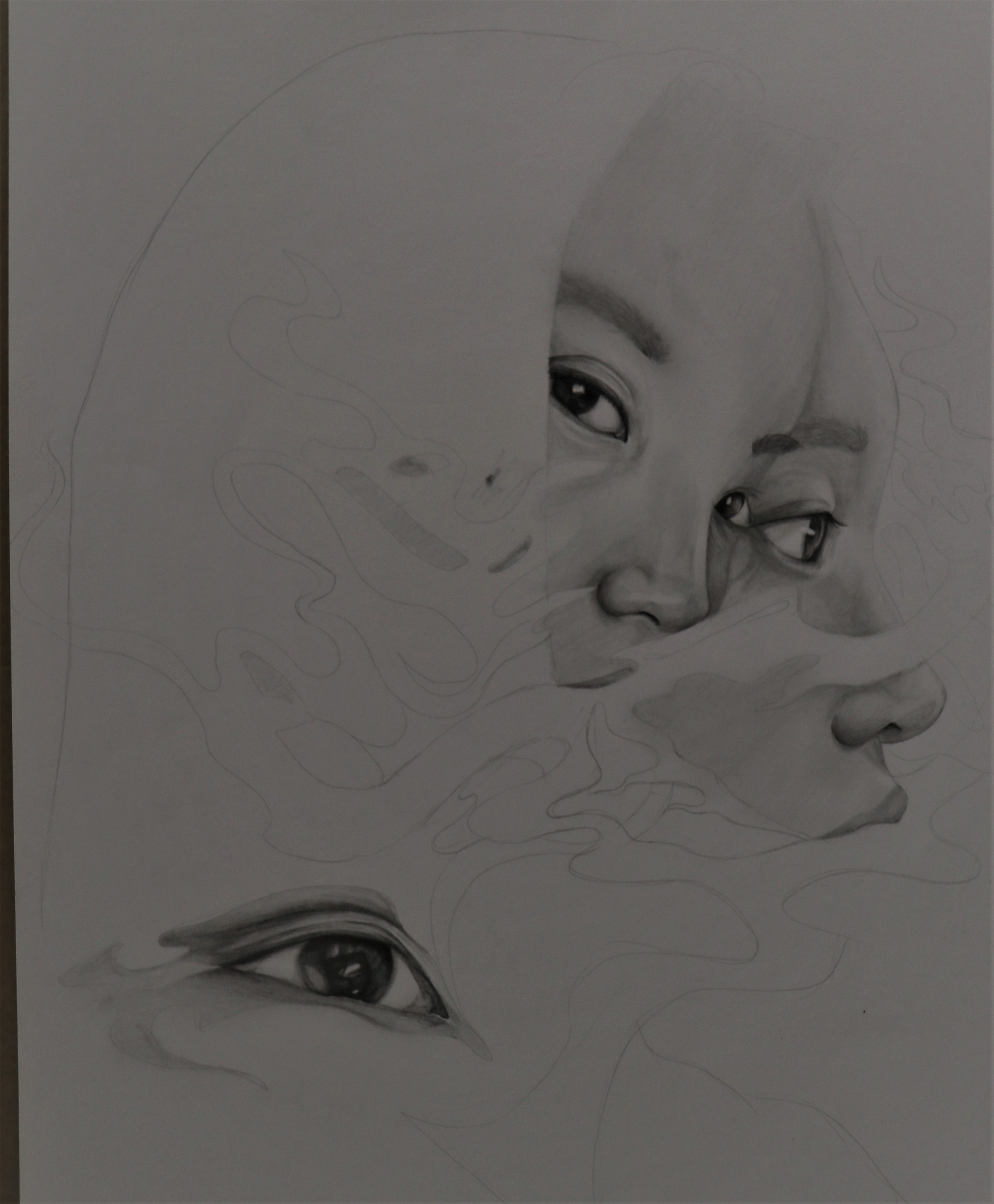 Started with the face first, and because the space around was white, the shading of the face looked okay. But then I later on coloured 8B for the hair (which i didnt take a picture), and the hair was so flat it just looked like a hole + it was so dark it made the face look like I didnt shade it at all CRIES ;n; So I had to lighten the hair a lottt, and add highlights + shadows