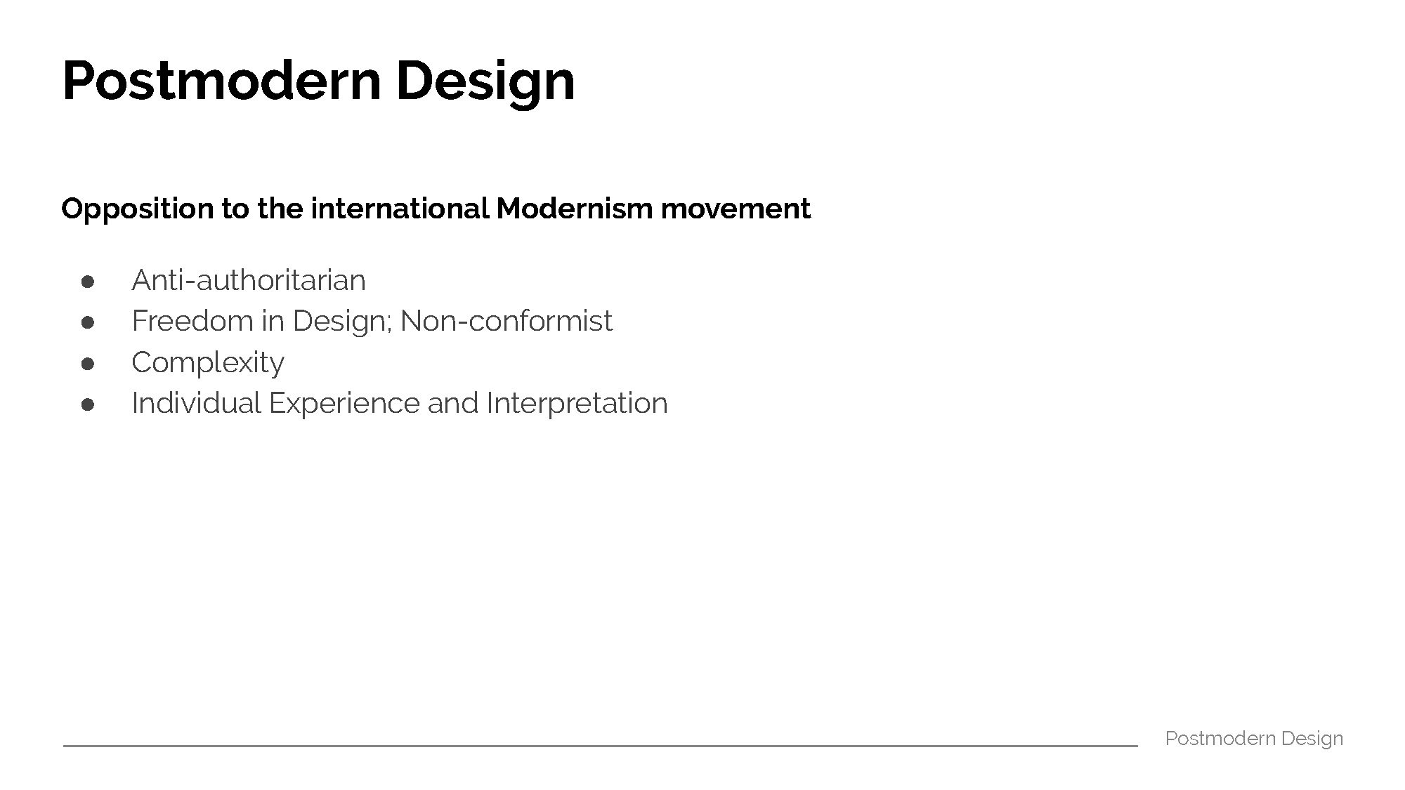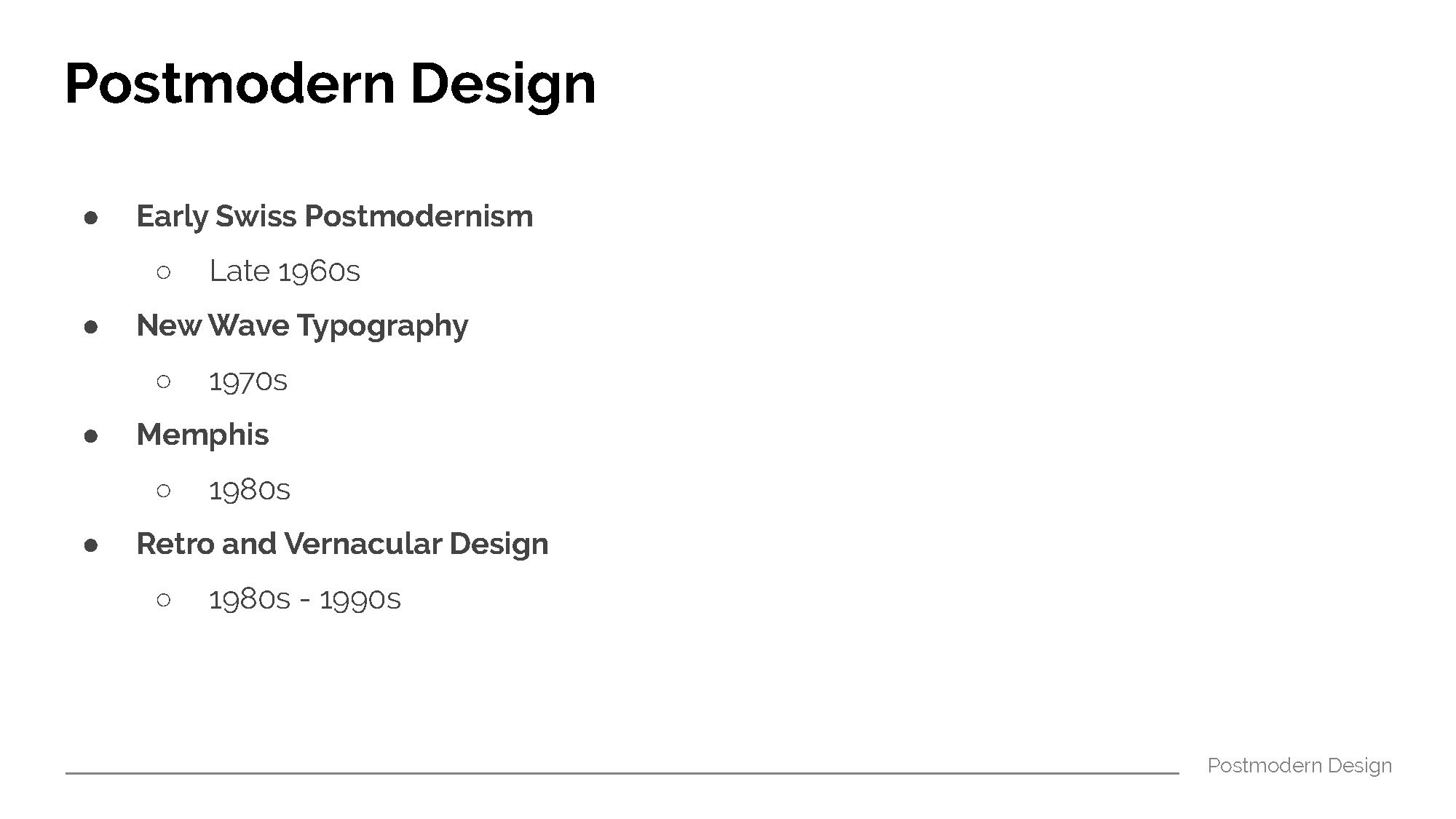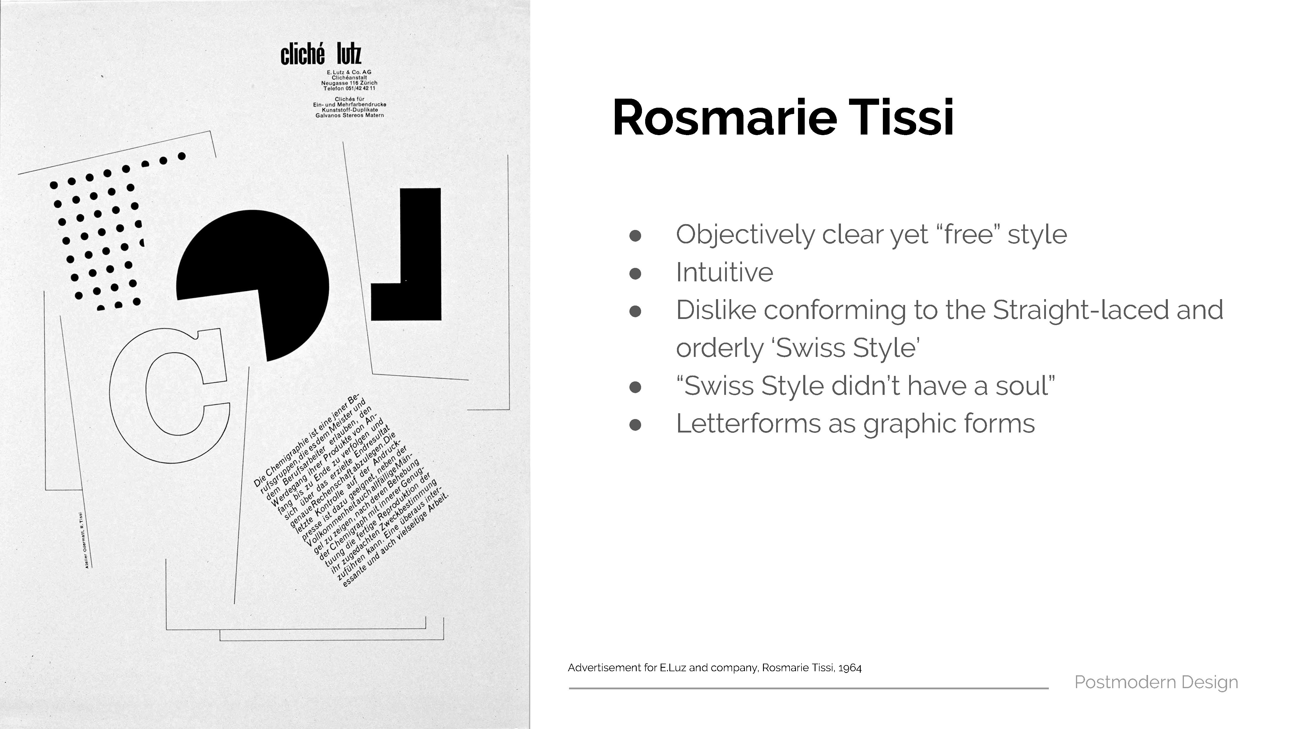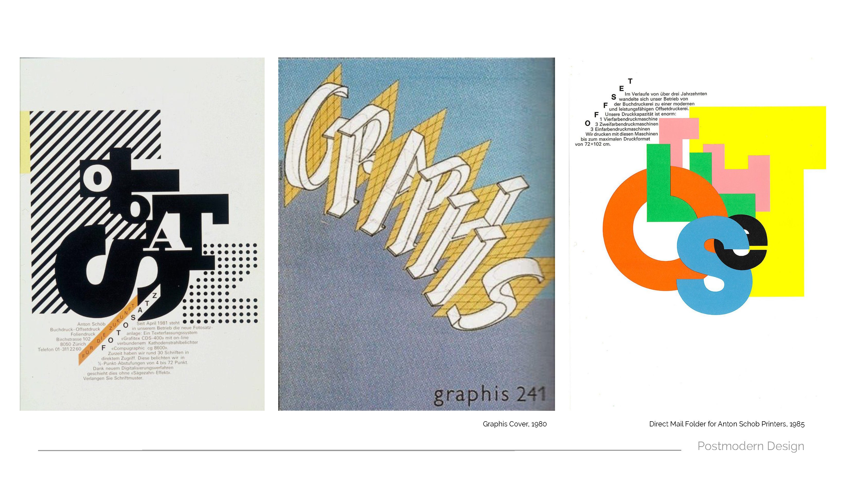
Watch Where You Are Going
by Feriga and Sherry
“Watch Where You Are Going” is a provocative object, aimed to raise awareness about “distracted walking”. Almost everybody are guilty of walking while distracted, yet many people seemed to think that the problem only involved others, and never themselves, as they believe that they are totally capable of multitasking, and have “never” caused an accident or disruption. Hence, the objective of our project was to put the user into the role of an unaware distracted walker, and the audience in the surrounding whom are most probably guilty of distracted walking in real life as well, into the shoes of the people whom would be affected by such actions in real life.
Why should we care?
The number of accidents caused by distracted walking are on the rise in both Singapore, and globally. These accidents does not only occur in the vehicular traffic flow ( on the roads ) but in the pedestrian traffic flow as well, and they range from minor mishaps such as bumping into a person or walking into a fountain, to more serious mishaps such as getting fractures and concussion, or even walking to your deaths.

A local survey in 2015 found out that despite 84% of the people who participated in the survey acknowledged that distracted walking is dangerous, 93% of the people admitted that they still does it anyways. Another survey in the United States found out that 74% of the participants felt that “other people” were usually or always walking while distracted, only 29% said the same about themselves, and 46% acknowledged that it was dangerous.
Many millennials felt that there are no serious consequences to walking while distracted, and that the most “serious” consequences would probably be being in an “embarrassing” situation. Most of them have the widespread belief that they are capable of multitasking while walking, and it was absolutely safe as they often look up from time to time. However, many a times, people would tend to get totally immersed in using their phones, and would often forget about looking up from time to time, as well as the surroundings altogether. Furthermore, research have proven that the human brain can never truly pay attention to more than one thing at a time, and that our peripheral vision can drop to 10% of normal when we look down at our phones while walking.
Setup


We wanted to simulate the situation at busy walkways in places such as MRT stations and Orchard Road, where there would be a high human traffic flow, and where “distracted walking” can be commonly seen at. It is in these areas that “distracted walking” tend to cause lots of disruptions and inconvenience to others.

However, as the walkways in school are wide, and we are unable to really get a crowd, we decided to cordon off half of the walkway with tapes to make the walkway smaller, and the signage to prevent people from walking at the cordoned off area. Hence, there would be higher traffic flow in the smaller walkway, and the impact of “distracted walking” would be larger – simulating the crowded and busy walkways in public, as well as the situation in areas which are cordoned off.

Observational Documentation
- The user would be helped to put on the hat and the fanny pack.
- The user would be handed a handphone, and would have to follow the instructions stated on the screen.
- Instruction on the screen: “answer the question stated below as you walk towards the other end of the corridor”
Feedbacks & Observations from Testers & Audience:


-
-
- One tester did not know that there were instructions on the phone, as the screen was on a whatsapp chat page ( the instructions were sent by a person in the chat, and the user was supposed to reply the question in the chat – mimicking texting while walking )
- Cannot feel the vibration, which was supposed to annoy her
- Vibrations felt ticklish / comfortable instead of annoying
- Stopped midway in the walkway to take a closer look of the contents on the screen – which caused disruption behind
- Cannot type properly
- Able to see the reflection of the lights on the screen
- Audiences were not reacting to the lights; they already know about the output
- The setting was too casual
- It would have been better if the people were randoms / planted
-
Design Process Documentation
Previous Posts:
Project Development Sketches
Bodystorming Exercise
Initially, we wanted the hat to be worn by a planted person, walking through the crowds of people while using his / her phone, and occasionally stopping abruptly to mimic how people often stops walking abruptly while they are using the phone. We also wanted the person to walk and stop abruptly in front of the real distracted walkers in the crowd as well.
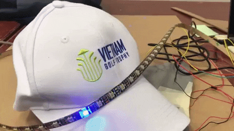
The brightly lit LED strip was to draw attention onto the person, and to enable people to look at what he / she was doing. It also acts as a warning for people to avoid him / her from behind – the red light lights up whenever the person is using the phone and might stop or slow down abruptly. The bright lights also enable people in the surrounding to help take note of him / her, who might walk to close to the staircase and such, and causes an accident or mishap to happen.

The provocative message, “watch where you are going”, were sewn at the back of the hat. People behind him / her might feel triggered by the message; as the wearer himself / herself was not even watching where they are going, but is telling people at the back to watch where they are going in case they were to bump into him / her. We wanted the sarcastic / ironic message to provoke thoughts and self-reflection by the people who are seeing the message – people who are probably guilty of distracted walking as well.

We decided to help the user to wear the hat and fanny pack as we did not wanted the users to trigger the output accidentally by tilting the hat when they are wearing it. We wanted them to remain oblivious to the attention grabbing output of the LED strip, as well as the provocative message at the back of the hat, to mimic how a distracted walker in real life remains oblivious to the disruptions and inconvenience that he / she was causing.

Initially, we wanted to use a photocell to prevent the false triggering, as the users might accidentally tilt the hat while they are putting the hat on. But we were unable to get the code to work despite several attempts – if the photocell works, the tilt sensor would no longer be in use. Hence, we decided to help the users to put the objects on instead to prevent the false triggerings.

We also decided to use a crowd marshal vest to relate to the idea of the flow of human traffic.
Materials Used & Steps
Materials Used
- Tilt sensor
- Vibrating coin motor
- Addressable LED Strip
- Jumper wires
- Resistor
- Arduino Uno
- Breadboard
- Powerbank
- Cloth ( same colour as the hat )
- Black duct tape
- Needles
- Threads ( same colour as the hat )
- Embroidery threads ( vibrant colours )
- Fishing line
- Bucket hat
- Fanny-pack
Contents
- Testing the angle of the tilt sensor
- Testing the LED Strip & Adjusting the colours
- Coding & circuit
- Sew the provocative message at the back of the hat
- Attach the tilt sensor and vibrating motor onto the insides of the hat
- Attach the LED strip onto the hat
- Tidy up the wires
- Place the arduino, breadboard, and powerbank into a fanny pack.
-
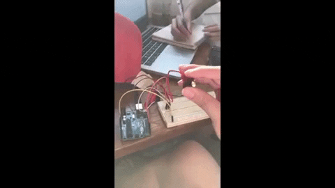
Step 1: Testing the tilt sensor

Gauge the angle of the tilt sensor by using it to trigger a simple LED circuit.
-
Step 2: Testing the LED Strips and adjusting the colours
-


-
Step 3: Coding & Arranging the circuit

It took us quite some time before we are able to trigger both the LED strip and the vibrating motor at the same time using the tilt sensor.


-
Step 4: Sew the provocative message at the back of the hat


We used embroidery thread as they were thicker, and are in red and orange as they resembled warning colours, and are almost the same colours as the colour we have chosen for our LED light light strip.
Initially, we tried using the usual cotton / polyester thread, but it was too thin and flimsy.
-
Step 5: Attach the tilt sensor and vibrating motor onto the insides of the hat
The tilt sensor is sewn at the side of the hat, at 15 / 20 degrees instead of it being fully upright.


The tilt sensor and vibrating motor are first taped onto the insides of the hat to ensure that it remains in position. Sew the sides and corners of the tape to ensure that it would not come off. Use the black cloth to cover them, and sew the cloth onto the hat.
Hide the wires underneath the internal flap of the cap.
-
Step 6: Attach the LED strip on the exterior of the hat

Remove the tape from the back of the LED strip. Attach the LED strip onto the exterior of the hat. Then, use a black thread and sew the LED strip down onto the hat, by going around the orange / chip-like area – so that the black thread would not be blocking the light of the LED.

Sew the wires of the LED strip down onto the back of the hat. A black cloth can be overlayed and sewn over the wires to cover the colours.
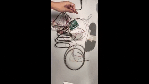
Step 7: Tidy up the wires

Tie the wires tidily using fishing lines, then wrap the wires using black duct tape to make the wires look less frightening due to the amount of colours.

Step 8: Place the arduino, breadboard, and powerbank into a fanny pack

Final


Reflection
I felt that our final demo was probably too casual as well, and seemed to be rather untidy. I agree that the reactions from our peers were not very successful, as they were already aware of the outcome, and it would probably work better on people who are not familiar with the project and are unaware of the outputs. We initially wanted to do a demo video in the crowded areas in public, but eventually decided against it as we would probably seem too suspicious with the wires and all.
Nevertheless, I was rather satisfied with how our object turned out to be, and it was a fun experience trying to make something a design which implemented coding / interactive elements, and it enabled us step out of our comfort zones and try out something new.


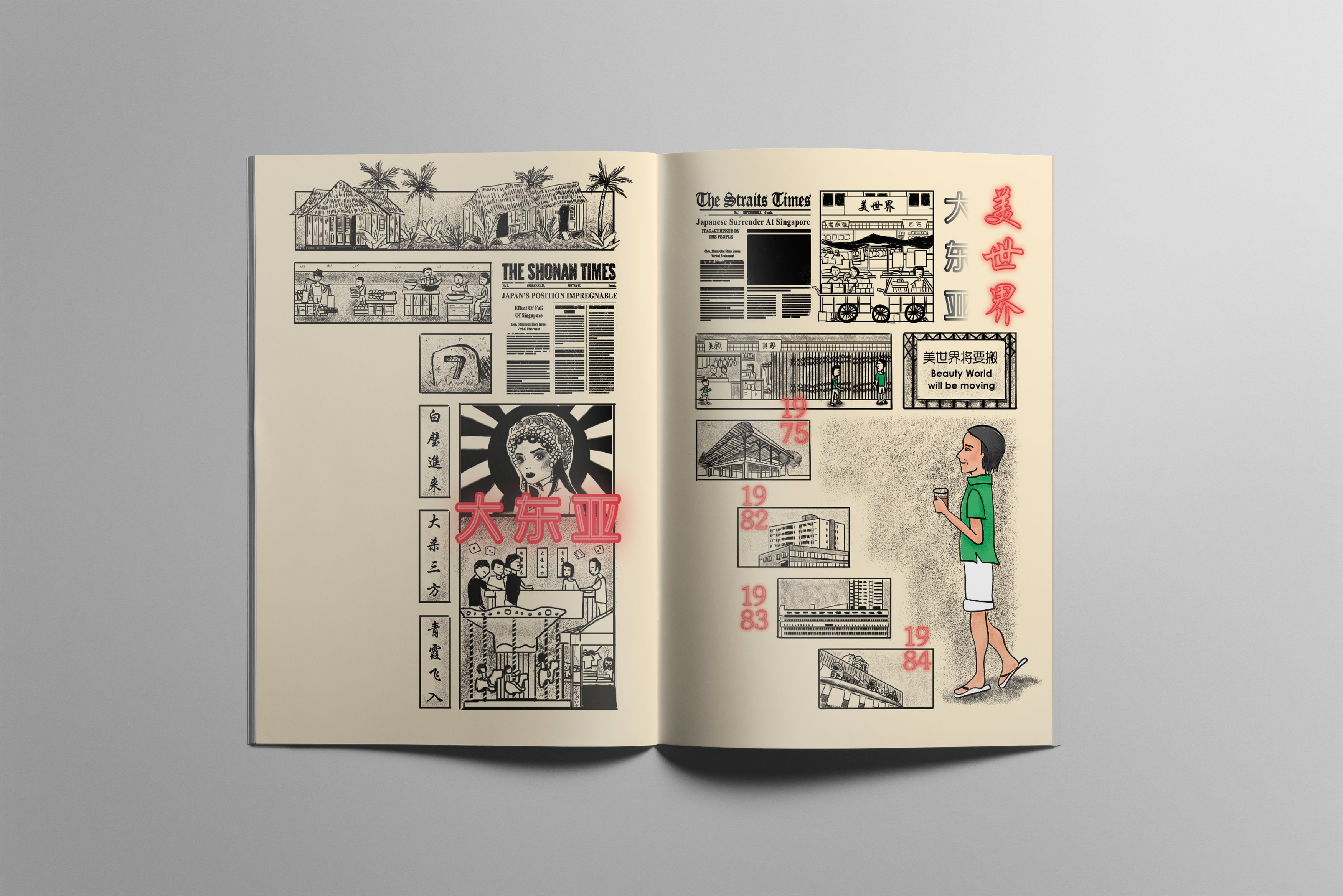
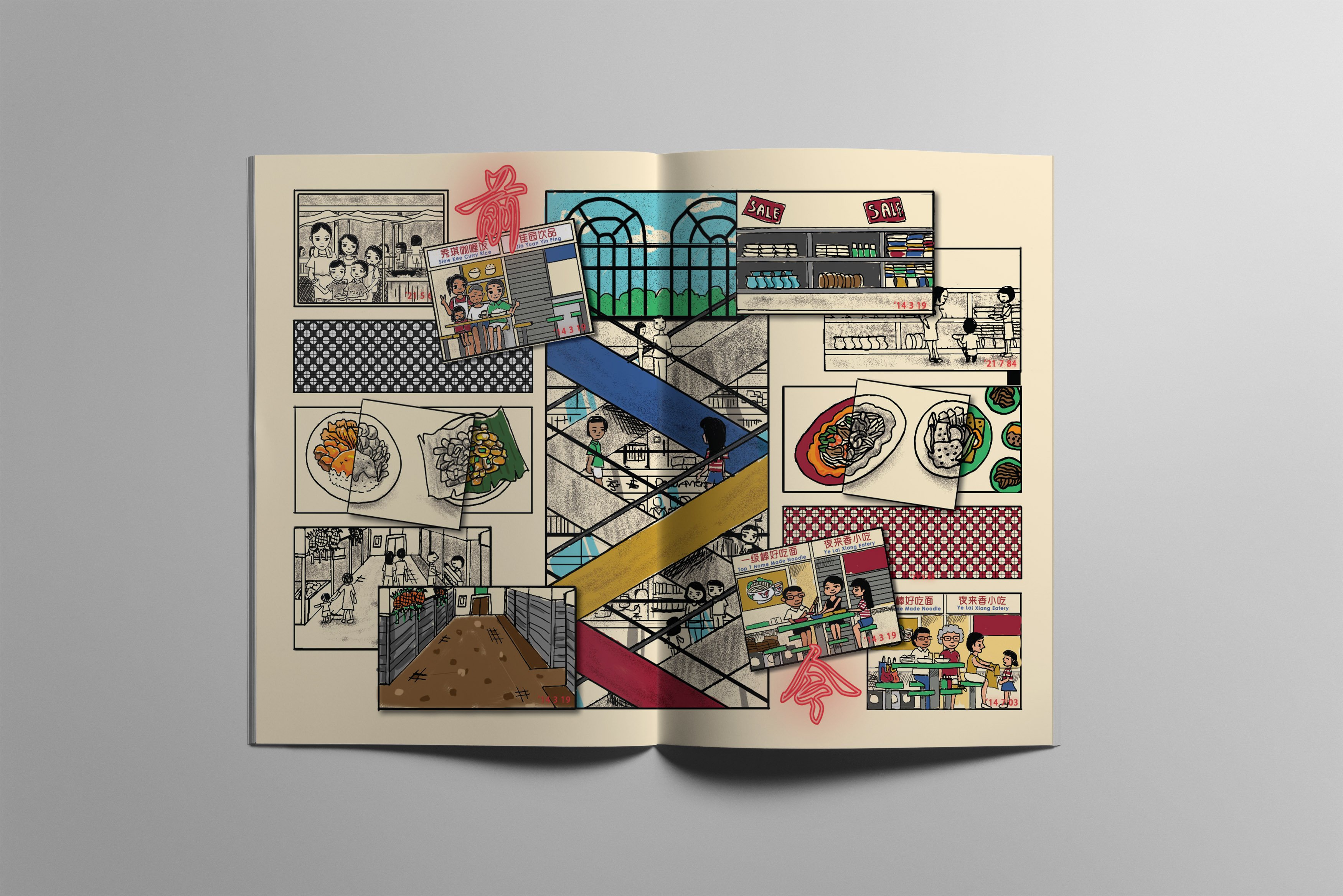
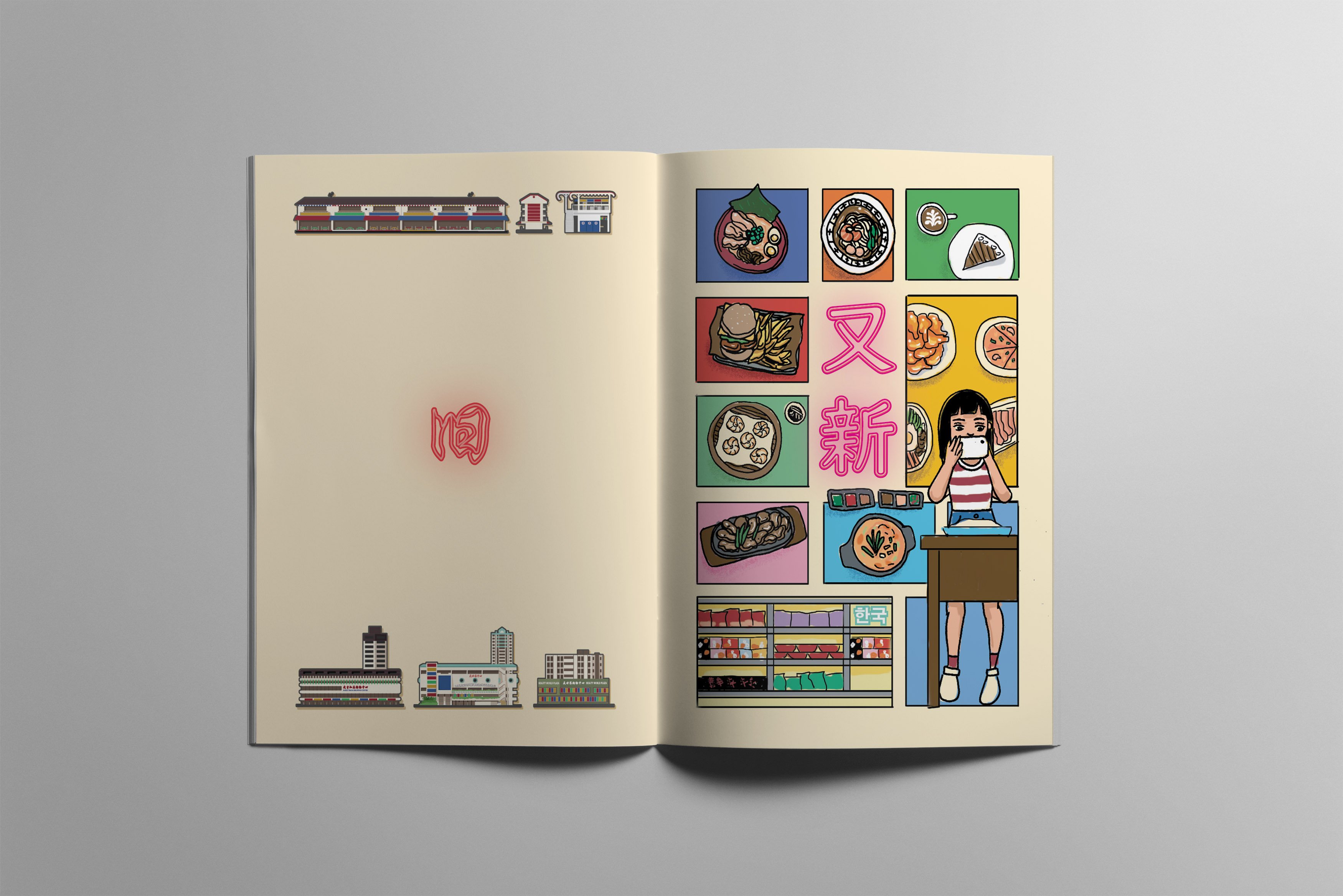


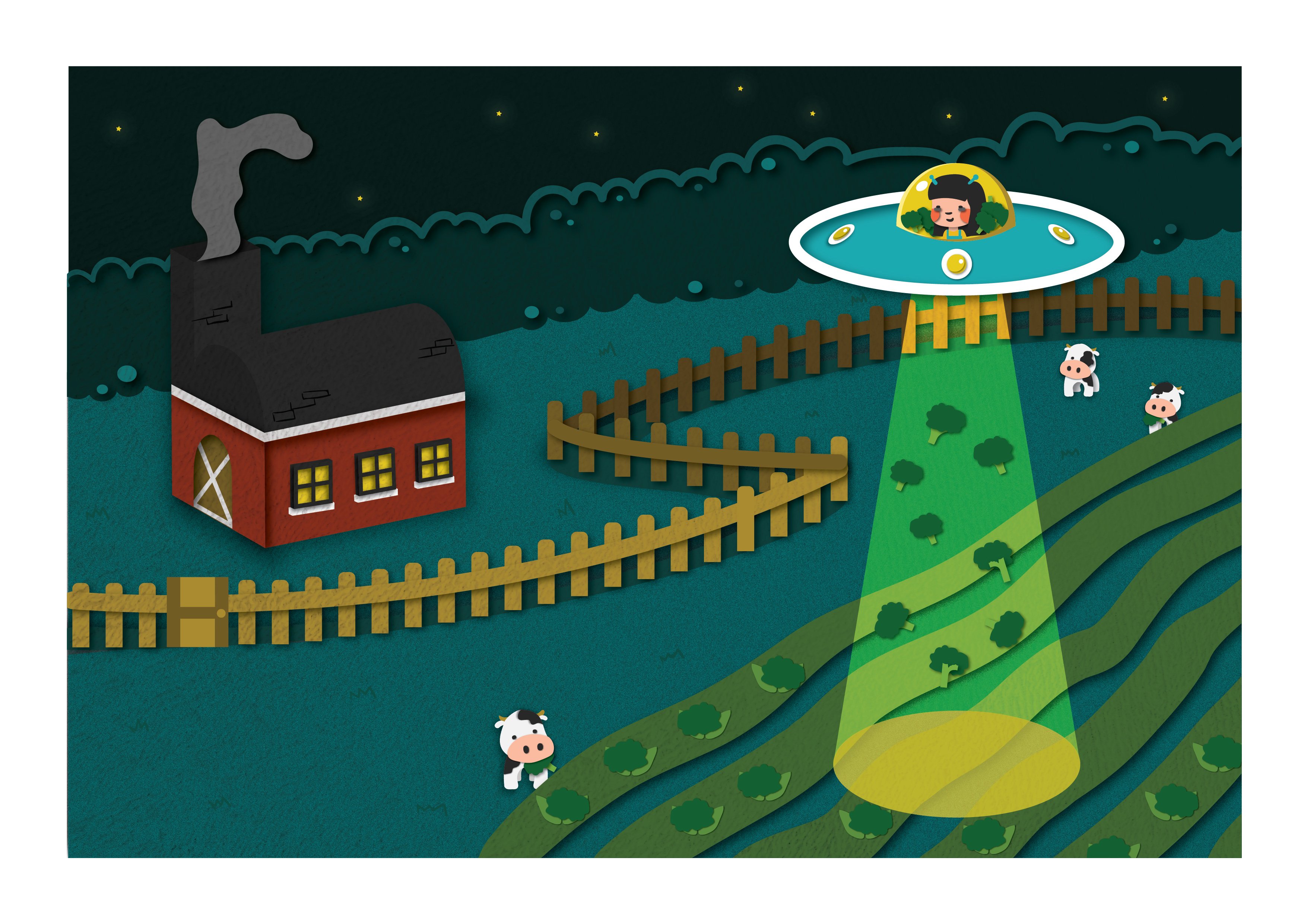
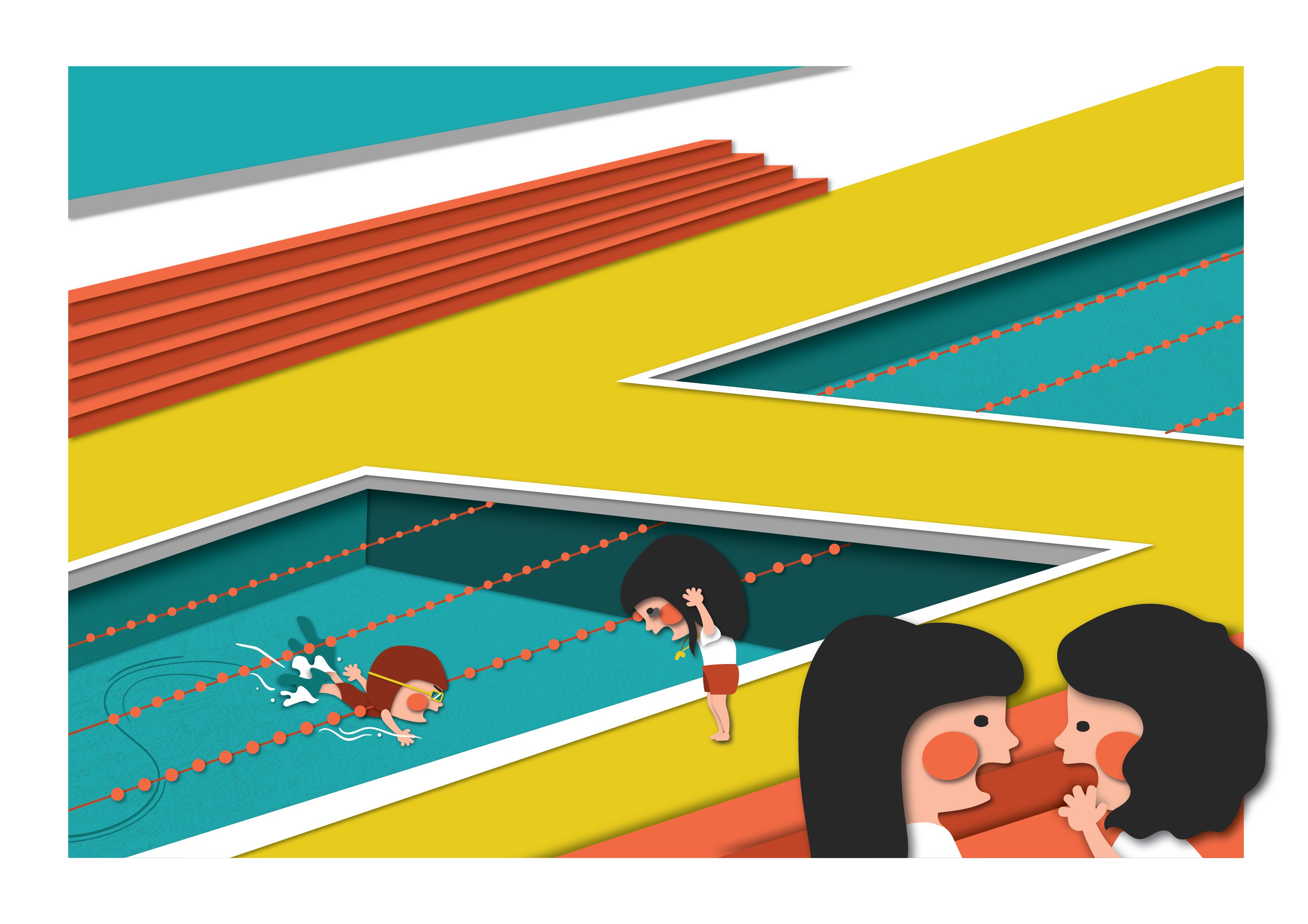
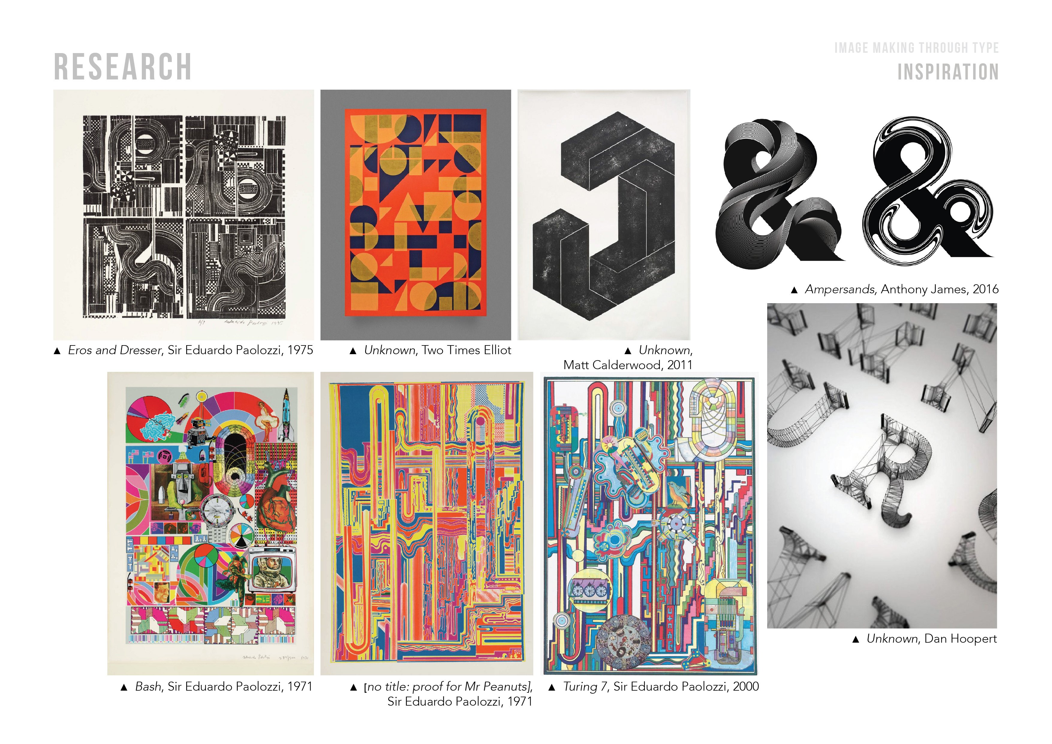 Initially, I was inspired by the works of Sir Eduardo Paolozzi. The collage-like style was interesting, and was something which I have yet to try out with.
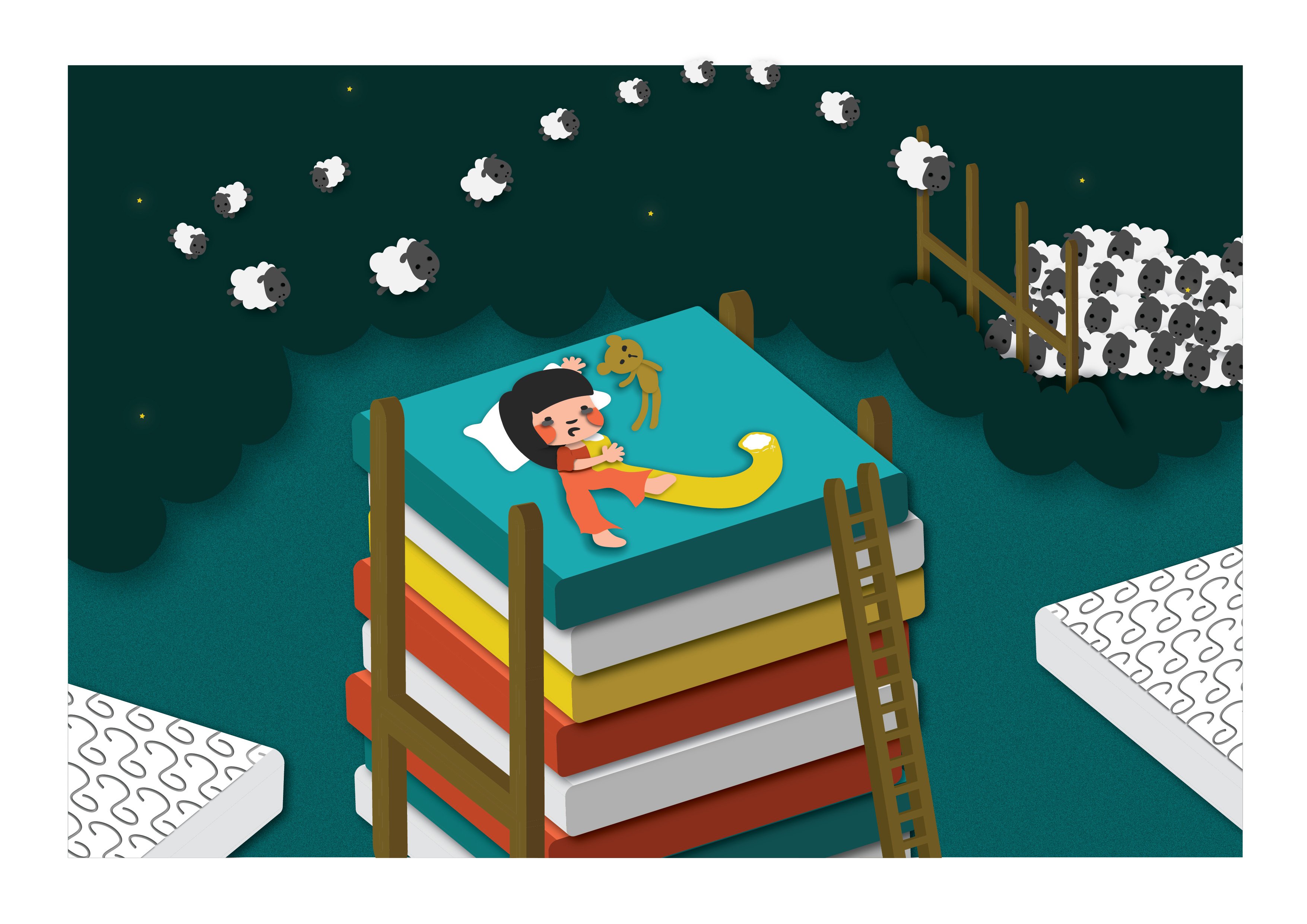
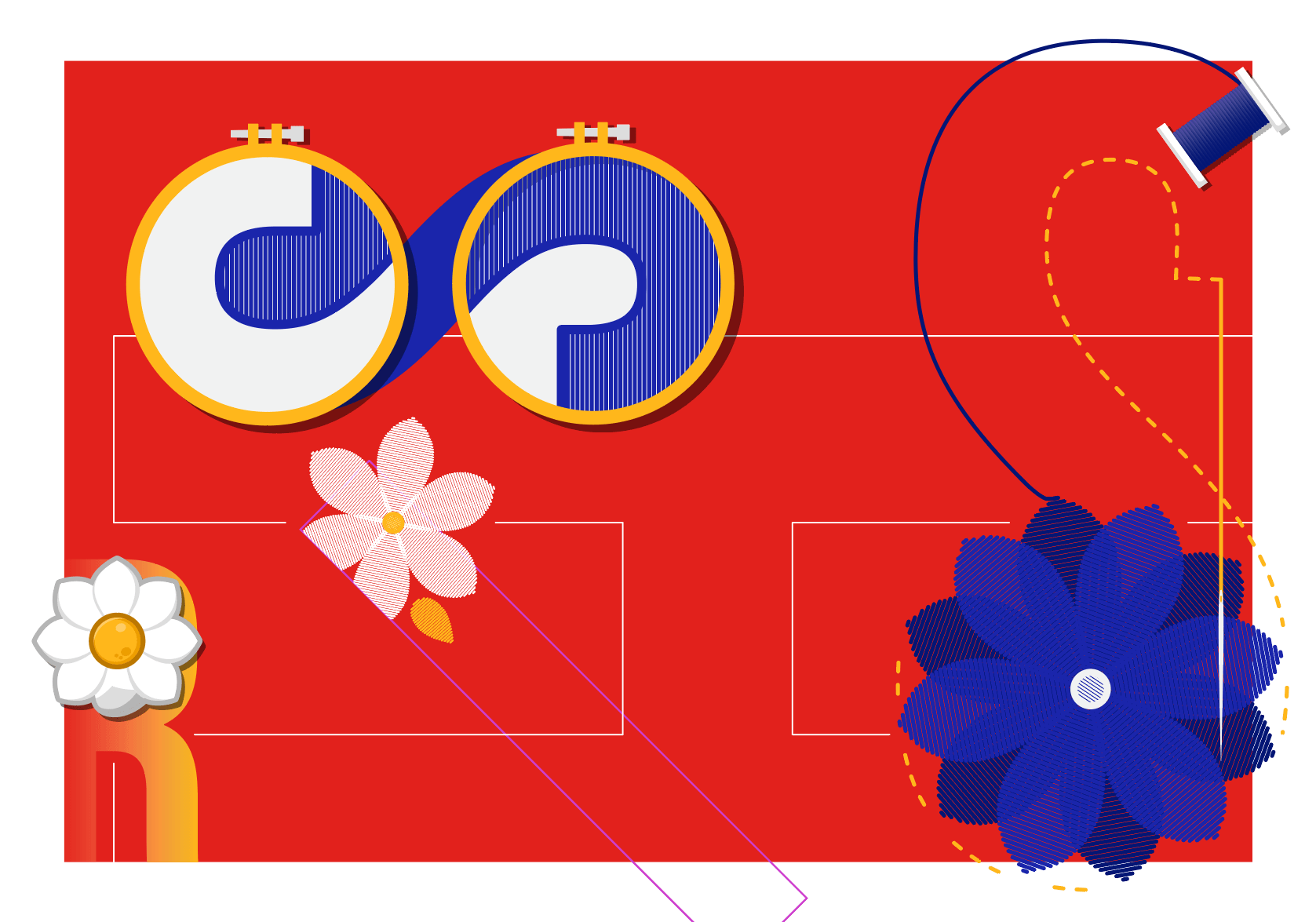 Sewist
 Sleep Specialist
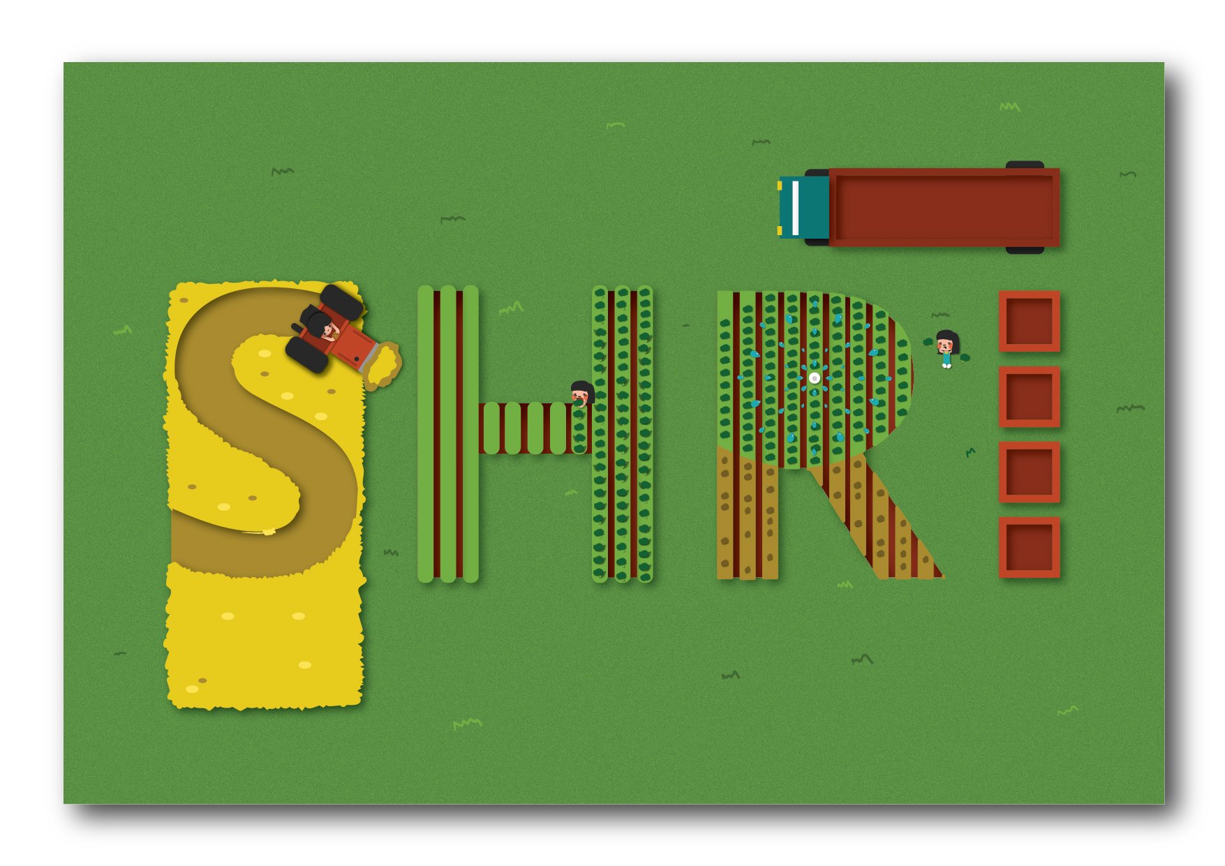 Farmer
 Shipmaster