History of Design – Graphic Design So Far

Image result for philippe apeloig

Philippe Apeloig is a French graphic designer and typographer well-known for his expressive and experimental usage of typography, with inspirations his love of paintings, literature and the performing arts. In the 1980s, Philippe Apeloig had an internship with April Greiman in Los Angeles, who was one of the first few designers to embrace the usage of computers in design, and the experience encouraged him to embrace the emerging technologies in his designs.

Although posters are two-dimensional, elements and typography in his designs tends to look three-dimensional and conveys a sense of movement, interactions, and emotions.

1.28.01_MUSEE_ORSAY-CHICAGO

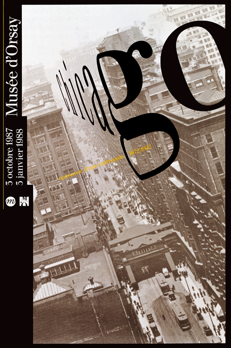
Chicago. Naissance d’une Metropole, 1987.

One of his most well-known works, the 1987 Chicago, Naissance d’une Métropole poster, Philippe Apeloig used CAD softwares which was used exclusively for technical purposes, to distort his letterforms to create the illusion of three-dimensional space. The photograph of the city was taken at a dramatic angle, and the way he skewed his type enhanced the photo to create a sense of speed and vertigo.
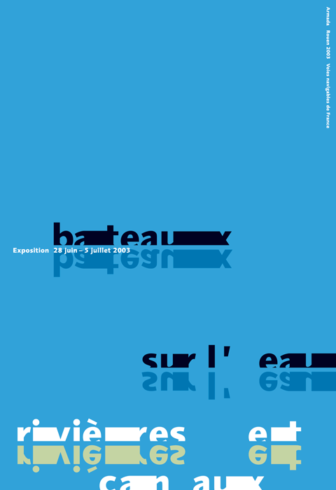


1.17.01_BATEAUX_SUR_LEAU-01

Bateaux sur l’eau2003.

In many of his designs, he allows letters and typography to function as an autonomous image. One of the posters which I felt to be very interesting was the Bateaux sur l’eau poster for the French navigable waterways, where the letters were treated to represent boats, the solid blue background and the reflected letterforms suggested that it was water and reflections on the water. I like the subtlety and how utterly simple it was, yet the poster was able to convey the message rather clearly without the usage of other images / elements.


Poster featuring the text "VIVO IN TYPO" composed of red, black and white computer-generated punctuation marks. Additional text with details of exhibition printed in white at the right hand side.

Vivo In Typo, 2008.

Vivo in Typo was a poster to promote an exhibition of his own poster designs at Espace Topographie de l’art in Paris. He produced pages of computer-generated punctuation – such as periods, hyphens, and backslashes, and manipulated them into individual text forms. He varied the spacing between the punctuation, used a limited colour palette, and layered them in different scales to enable the several layers of the title “Vivo in Typo” to emerge as if they were woven together in a tapestry, and at the same time, I felt that they resembled like digital glitches as well.

References

https://www.theatlantic.com/entertainment/archive/2014/04/a-new-legend-of-french-design/360098/

https://www.stedelijk.nl/en/news/philippe-apeloig-using-type

http://www.designculture.it/interview/philippe-apeloig.html

http://apeloig.com/

https://www.wallpaper.com/design/dutch-design-week-2019-highlights

Task 1B: Exploratory Research

In Task 1A, I decided to pick the issue about Climate Change as I felt that environmental issues have always resonated with me. However, I felt that the topic was too broad and I decided to narrow it down further to the causes of climate change. One of the causes which I found rather interesting was the vastly overlooked environmental issues of Food Waste.


Target Audience


Topic – Food waste, and the environmental impacts of food waste


Survey 1 – Climate Change in general

I did a short survey to find out more about what people think and are doing about climate change, and if the environmental impacts of food waste might be overlooked by Singaporeans, by not mentioning anything about food waste.

Results

  • Almost all the respondents are concerned about global warming and climate change.
  • Most of the respondents listed plastics and fossil fuels as major contributors.
  • Deforestation, electricity, and transportation were mentioned by many too.
  • Only 2 mentioned about agriculture.
  • 1 person mentioned food waste.
  • All the respondents said they were willing to adopt more environmentally-friendly habits, and are currently practicing some.

Insights

Survey 2 – Food Waste

A few weeks later, I did another survey more specifically about food waste to find out more about my target audience’s understanding of food waste.

Target audience does not cook often / at all, and the 2 respondents who chose “a few times a week” were aged 41 and above.

The majority of the respondents felt that food waste was a problem in Singapore and many stated socio-economic issues, such as there are many others in poorer countries or families which are not able to afford food, and that we were wasting food which could have been given to those who needed them. 6 respondents stated terms such as “pollution”, “global warming” and “wastage of resources”.

Whereas another 6 respondents felt that food waste might or might not be a problem, as food waste can be decomposed unlike plastics, and could also be reused as fertilisers. A few also cited that there were initiatives where we could donate unwanted food before it spoils to prevent food waste.

After asking if the respondents thought of food waste as a problem in Singapore, I decided to gauge how big of a problem do they think it was and if they knew the exact figure.

Only 3 respondents selected the correct figure ( 760,000,000kg in 2018 ). Whereas the majority ( 23 respondents ), thought that food wastage in Singapore was smaller, with 14 respondents thinking it might even be more than 100x smaller.

The respondents’ top three reasons for food waste was base portion being too big, discounts for buying more, and food turning bad / expiring.

Only 3 thought food waste was incinerated, while the majority thought that our food waste were decomposed or recycled into fertilisers, or were unsure.

8 respondents stated environmental impacts, such as pollution, wastage of resources, and climate change.

Whereas the majority stated social / monetary impacts such as high demands from us means low supply for the people in the poorer countries. People would take food for granted because food is so accessible to us in Singapore. Or that wasting food is wasting money.


Insights from surveys + research

  • Most respondents does not cook – do not often buy perishable groceries
      • However many cited “food turning bad / expired” as their reason too – perhaps other perishables such as bread, confectioneries, fruits, dairies and other food such as homecooked / leftovers / takeaways.
      • Target Audience are either studying or working – majority of them would take meals outside.


  • Most respondents are concerned about the environment, and are willing to adopt or have already been practicing at least one or more environmentally-friendly habit(s) in their lifestyle.
      • Which mostly revolved around plastics.
      • Worldwide coverage / emphasis on the plastic problem.
      • Movements in Singapore – e.g. no straws at F&B, rise of reusable straws, needing to pay extra for takeaways / plastic bags / paper bags to reduce plastic usage.


  • Most respondents were tend to overlook / are unaware of the extent of the environmental impacts of food waste.
      • Food waste is a social, economic, environmental issue.
      • Respondents who cited environmental impacts and cited that resources used to produce the food, such as water, manpower, time, are wasted.
            • Tend to overlook that wastage includes other resources such as transportation, packaging, agricultural resources, land, etc.
            • As well as food waste which was occurred during upstream and midstream – not just downstream (  after it ends up in retail / with consumers )
            • Risks of contaminating other recyclables and hindering recycling efforts.
      • Tend to only think more about the environmental impacts when they are reminded about it.
            • e.g. when asked “what do we waste when we waste food?”
      • Most cited social / economic / monetary issues.
            • Tend to overlook environmental impact as they were not very aware / felt that those other issues were more important
                  • Even though they were rather interlinked
                        • Climate change affects the prices and supplies of food, and would further contribute to food security and food poverty.
            • Most of the previous campaigns about food waste in Singapore were focused on monetary impacts:
                  • Asked some respondents, they felt that the campaigns were more applicable to households.
                        • Waste less, Save More for a fun family outing
                        • Don’t cook often – not wasting money on unused groceries
                  • From my survey, food waste was largely due to portion issues.
                        • Asking for lesser portion does not mean that it would be cheaper.
                        • “More food better than not enough food” thinking

Credits: National Environment Agency


  • Lack of knowledge about food waste in Singapore.
      • Underestimated the amount of food waste that we generate and dispose.
            • And food waste in Singapore have been increasing by approximately 40% over the last decade.
      • Very aware of the plastic problem but unaware of food waste which was the second most disposed-of waste after plastics in 2018.
      • Most respondents are unaware of what happens to our food waste after it enters the bin.
      • A large number believed that food waste would be recycled / decomposed / turned into fertilisers.
            • When food rots, it produced methane, a greenhouse gas which is 30x more potent than carbon dioxide.
            • Only 17% of our food were recycled.
            • Anaerobic Digesters – converting methane from decomposition into electricity at processing plants are still under research & testing.
            • However, despite the development of food waste recycling technologies, it is still “best to not waste food in the first place”.
  • Most respondents did not know that food waste were incinerated.
        • Considered a good way to dispose food waste.
              • To prevent them from producing methane and reduce the space needed for landfill disposal
              • Able to produce biogas to produce electricity
              • However, food should not be wasted in the first place due the large amount of resources used to produce them.


Task 2 – Final Infographic Poster

Don’t Add Food to the Fire

I decided to go with this title as I liked how it was sort of like a play on words. It was inspired by the widely-used phrase, “adding fuel to the fire“, which meant making a situation worse. When used in the climate change / global warming context, the “fuel” could refer to the burning of fossil fuels, as well as our actions which contributes to climate change.

For my title, I replaced it with the word “food” to link to food waste, and how most of our food waste in Singapore are literally being burnt to reduce them into ashes before sending them to the Semakau Landfill. The title also meant how the burning of food also contributes to global warming and the worsening of climate change.

The word “food” in the title was treated differently in the infographic poster – resembling a food label being stick on to create further emphasis, and as well as it looking as if it was stick onto / covering the original word below it, which was supposed to be the word “fuel”.


Process / Refinements


Final Infographic Poster

// Click here for a clearer view //

History of Design – To Bauhaus and Beyond Reflection

Sach Plakat / Plakatstil

Lucian Bernhard, Manoli Cigarettes, 1910.

Sach Plakat or Plakatstil, which literally meant “object-poster” and “poster style” in German respectively, was a style developed in 1905 by Lucian Bernhard in Berlin. During the start of the twentieth century in Germany, the complex and decorative forms of Art Nouveau were replaced with emphasis on strong vibrant colours, abstract and simplified flat shapes, typography / message which was reduced to the bare minimum, and a rejection of anything decorative. Designers and artists wanted their works to be more easily read and understood by the passerbys.


Lucian Berhard

Lucian Bernhard, Priester, 1906.

It was started by Lucian Bernhard when he took part in a poster competition held by Preister Matches, and he took a creative approach of drawing two large matches, and wrote the brand name above them in bold letters. The stark simplicity and cleanness enabled him to win the competition, and it marked the departure from the complexity of the Art Nouveau style in Germany. His reductive and flat imagery subsequently became the foundation for a revolution in commercial advertising in pre-war Berlin, and was spread throughout Europe and the United States.


Ludwig Hohlwein

Ludwig Hohlwein, Direct China Cotton Importers – Wonalancet, 1909.

Ludwig Hohlwein, Vivator, 1912.

Other notable works done in the Sach Plakat style was that of Ludwig Hohlwein’s. His poster designs were primarily influenced by the collage technique of the British poster designers The Beggarstaffs, and he took inspiration from the emphasis on simplicity, pattern, silhouette, integral typography, and the usage of a limited colour palette. 


Oto Baumberger

Otto Baumberger, Marque PKZ, 1923.

Over time, the flat style that was developed by Lucian Bernhard was expanded into a more colourful and realistic style, but the emphasis on just the product and the brand name or minimum text was still there. In 1923, Swiss designer Otto Baumberger drew a tweed coat for PKZ with its label serving as the only text in the poster. Many people mistook the poster for a photograph.


The style was prominent until the Great War in Europe. After the war, advertising techniques re-shifted once again, and the Sach Plakat style declined. However, this revolutionary modern outlook on poster design and advertising in the early twentieth century no doubt still have an impact in the design industry today, as the style or its influence can still be seen in many designs in present day.


https://www.moma.org/artists/2700

http://www.iconofgraphics.com/Ludwig-Hohlwein/

https://www.internationalposter.com/style-primers/plakatstil-the-poster-style/

Task 2 – Infographic Poster Progress

Initially, I wanted to do a visual explanation infographic to show the process of our food systems to show how food was not the only thing that was wasted when we waste food. However, I felt that it would be too complex for an infographic poster, and it would be rather difficult to highlight key stats and information that respondents from my surveys did not know about:

      • The extent of the environmental impacts of food waste.
      • What we are wasting when we waste food.
      • The underestimated amount of food waste that we generate in Singapore.
      • The lack of knowledge about food waste are being incinerated, and are only second behind plastics to be disposed of / incinerated in Singapore.

Hence, initially I decided to summarise and use half the page for the process, while the other half for the key stats:

Combined the process with the central image. However, I felt that it was rather difficult to place information around the centralised globe. I tried to move and resize the globe, but it was still rather restrictive.

Feedbacks:

  • The printed colours were very dark, hard to differentiate things.
  • Figure-ground and background not pronounced.
  • Colours and tints – need to make it pop out even more.
  • Title needs to be bolder, or stacked.
  • Title too far away from the main visual.
  • The food being thrown to the fire are too messy.


Refinements:

  • Placed the central image together with the title to have a more distinct relationship with one another.
  • Which could also free up more space and enable both the globe and the title to be bigger.
  • Made the colours pop out even more.
  • Made dividers more distinct.
  • Re-illustrated some illustrations to make them clearer.
  • Replaced the process and impact with summarised icons of the wastage
      • Which was what I wanted to highlight.
      • Reduced to just icons, headers for the icons, and the summarised impact as the information was too chunky.
  • Text remained a little larger to enable people to read key texts from a distance.
  • Tried to keep the text to as short as possible, and straight to the point.


Final Infographic:

  • Changed the overall typeface as people might misread the capital “G” of the previous typeface.
  • Made texts smaller to generate contrasts.
  • Tweaked the colours again to ensure that the darkest colour can still be seen against the background.
  • Standardised yellow text as the divider.
  • Made the illustrations in the last row smaller.
  • Made the text in the last row centralised.


// Clearer view of Final Infographic here //