Design Outcome 2 – Bus-stop Advertisement

Design Outcome 2

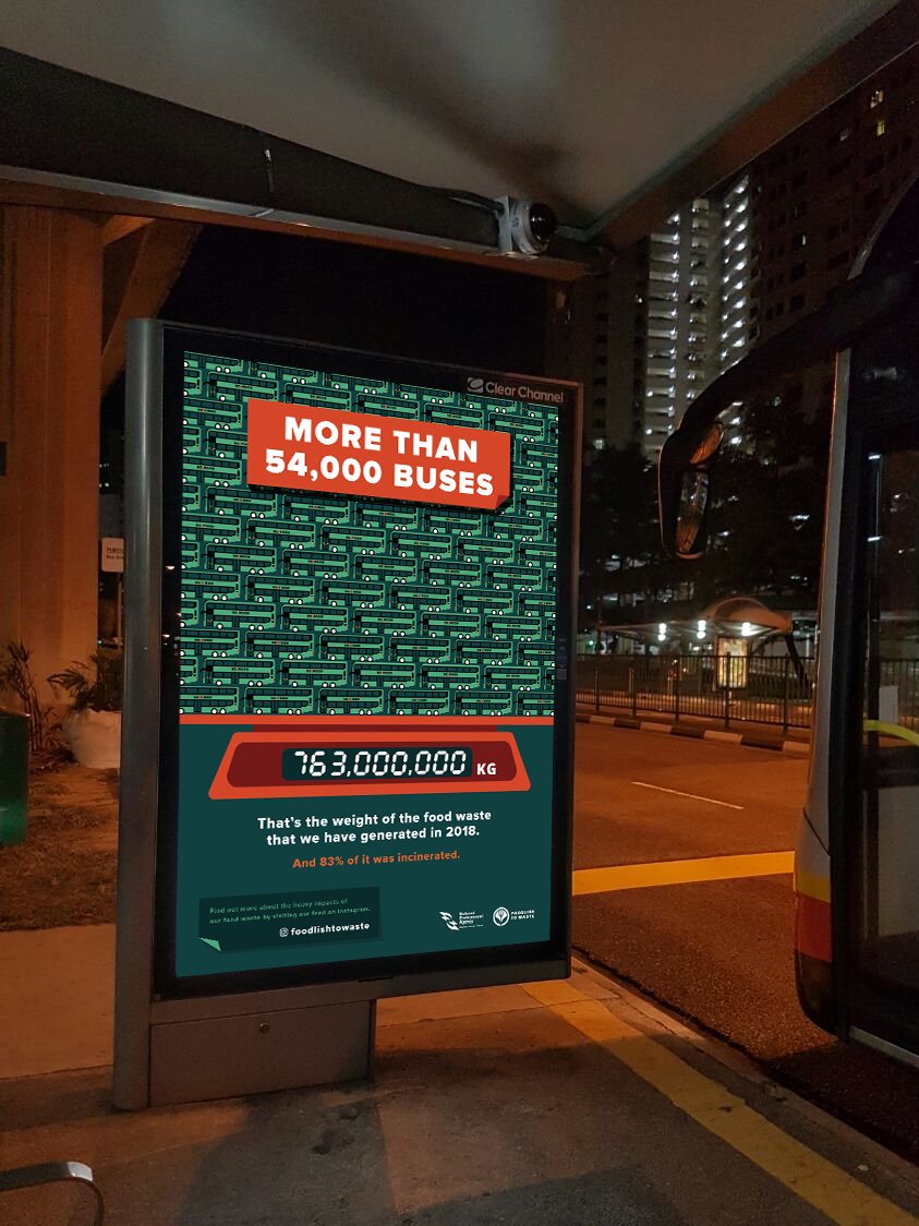
For my second design outcome, I wanted it to raise awareness about the food waste issue, and as well as to compel the viewers to visit the instagram page of the campaign at the same time. However, it would be rather difficult to place the deliverable at the places where food waste will take place as businesses would usually want to encourage patrons to purchase more food through promotions and bundles.

Hence, I decided to do bus-stop advertisements as public transportation would be the most widely used transportation by my target audience, aged 18 to 25 years old.
 

Bus Stop Advertisement 1
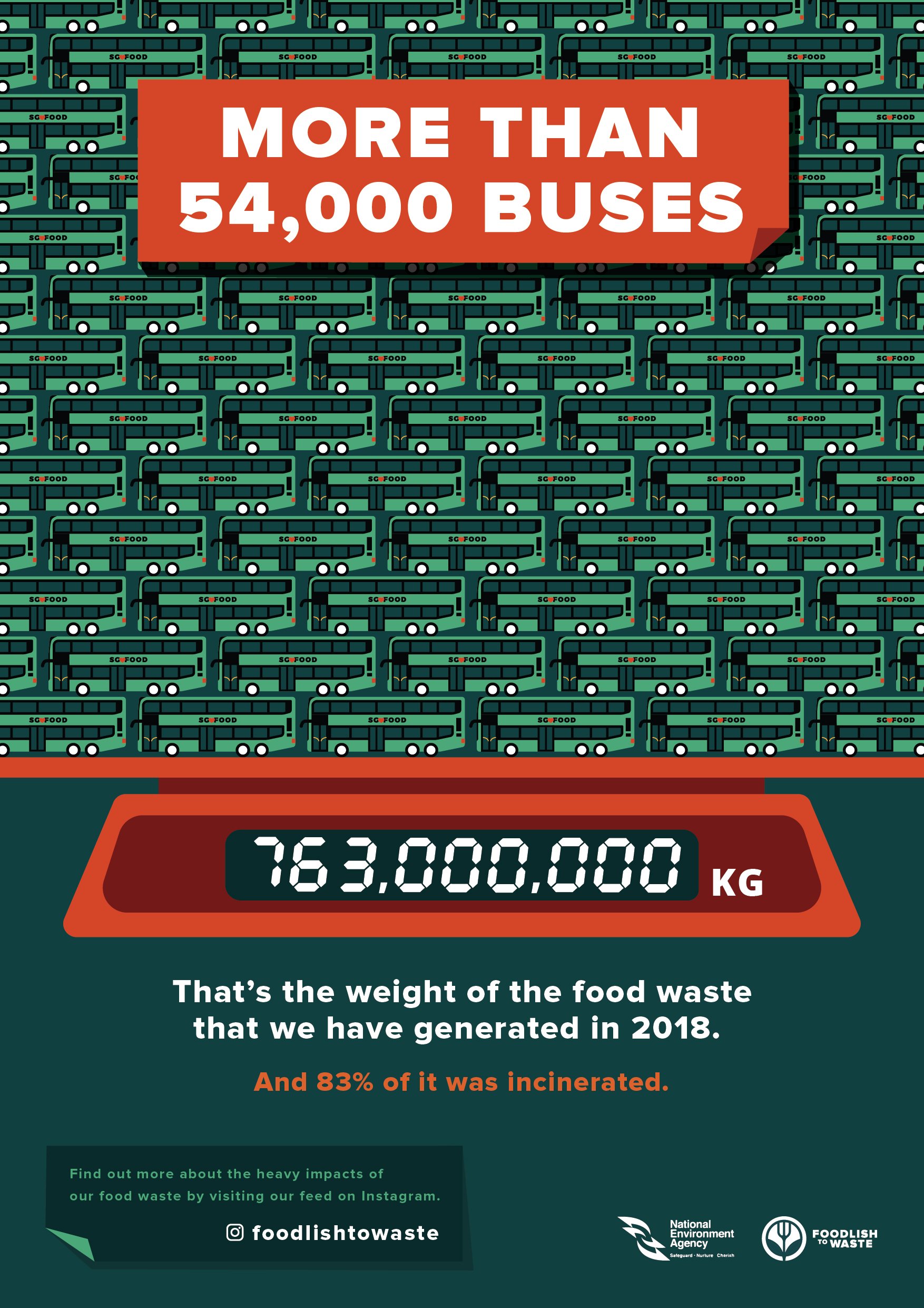
I wanted to raise awareness about the widely underestimated amount of food waste that we actually generate in Singapore. I felt that it would be more eye-catching to state the gargantuan amount in numbers, and would be interesting to place an advertisement which compares the weight of our food waste to the weight of the buses, at a bus-stop.


Bus Stop Advertisement 2
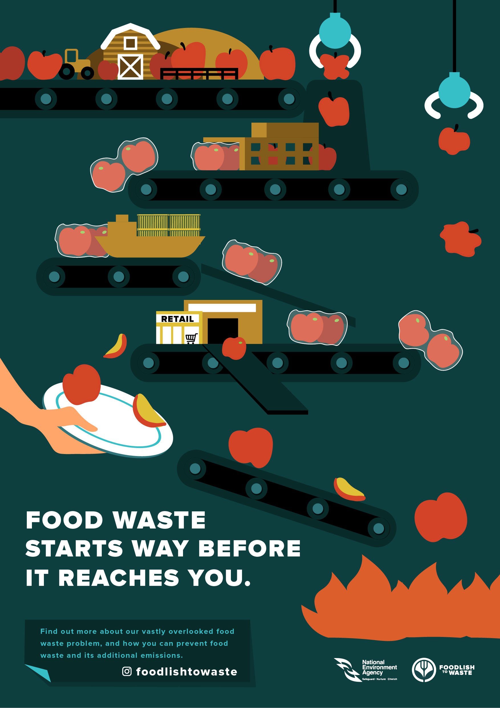
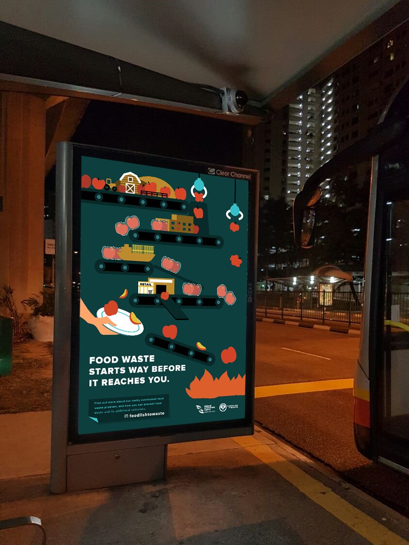
I wanted to show how food waste was not just about wasting what was on our plates, but rather, it starts way beforehand. I decided to use conveyor belts to represent the journey, icons to represent the different parts of the journey –

        • Barn, tractor and hills to represent production stage
        • Factory-like building and the apples being packaged after going through it represent the processing stage
        • Cargo ship represents distribution stage
        • Building with the word retail, and the supermarket trolley to represent retail stage
        • Hand with plate represents consumers

And that food, which was represented by the apples are being lost at every stage, and how there were actually more apples at the top and it slowly gets lesser at the bottom stages.

        • UFO claws catching apples and throwing them away at the production and processing stage
              • which looks deformed / small – wastage due to standards and other factors
        • Packaged apples falling off the conveyor belt to represent the food being “lost” during distribution
              • damaged due to transportation / storage issues
        • A slope that allows apples to bypass the consumers and go straight into the fire represent the food that was wasted by retailers due to cosmetic standards
        • Arm with the plate titled in a way where the apples will continue its journey towards the fire represent how consumers are not consuming the food and are throwing it away.

Design Outcome 1 – Social Media Campaign

Design Outcome 1

I decided to come up with a social media campaign as my target audience are milennials aged 18 to 25 years old – which a majority of them uses social media frequently. Furthermore, as my topic covers about environmental issues, it would be contradictory if I were to do printed deliverables for distribution, such as brochures and flyers, which would generate even more emissions and waste.

Secondly, it was rather difficult to place deliverables at places where my target audience waste food – food places outside such as food courts, restaurants, cafes, etc. ( according to my survey, they rarely cook, and as they are students / working adults, they would probably have frequent meals in school / outside ), as businesses would usually want to encourage their patrons to order more through promotions and bundles, as there are no mandatory laws in Singapore which address and deter businesses from generating food waste.

Furthermore, as my objective was to raise awareness and to educate people about food waste and its environmental impacts, I felt that it would be more easily accessible on social media platforms which the target audience are using, rather than websites – there are a lot of environmental-organisation websites in Singapore that we don’t even know about ( e.g. cgs.com – in the Waste Less Save More campaign video which many of us know about as it appeared repeatedly on the television but we never did notice or visited the website ). Plus putting information on social media platform saves the hassle of downloading a new application which would just host educational informations / tips.

Foodlish to Waste

After a long contemplation about the name and logo, I decided to go with “Foodlish to Waste“, which was a shortened form for “foolish to waste food”, as the objective was to educate people that it is foolish to waste food, due to the wastage of resources and the endless list of environmental impacts.

Decided to reuse the same colour palette as the infographic poster, and I felt that the extensive usage of blueish-green rather than green, and an icon of a fork instead of a food / produce would prevent people from confusing it with vegetarianism.

Final Logo:

Colour Palette:


Design Outcome 1 – Social Media Campaign (Instagram Page & Sponsored Posts)


Inspirations:

I was mainly inspired by Dain Walker’s page, where he uses big typographic texts with accompanying graphics. I felt that his posts were very straight-to-the-point and informative.


Instagram Page:


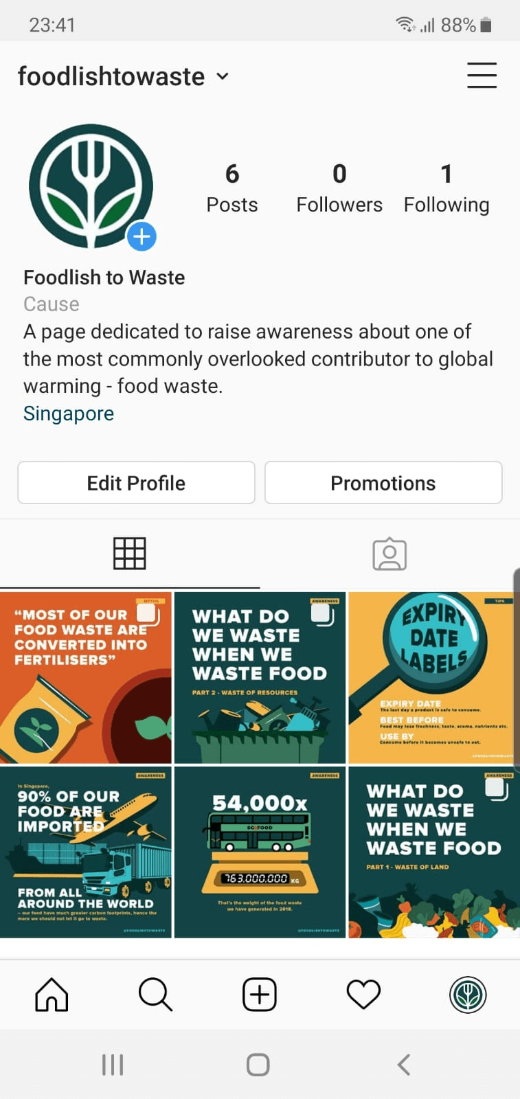
 @foodlishtowaste

A page which would be updated regularly to raise awareness and to educate people about food waste. The posts on the page consist of summarised key stats / information to educate people, tips to reduce food waste, polls, and common misconceptions / myths about food waste.

Majority of the posts would consist of several slides which can be swiped ( carousel posts ), and a writeup as the captions to explain things further. Each post would be categorised by the different background colours taken from the same colour palette, and an indicator at the top right of the first slide of each post:

        1. Awareness / Informative posts would have the blue-green background
        2. Tips would have the golden-yellow background
        3. Common misconceptions in reddish-orange background

Some of these posts would appear as sponsored posts on the target audience’s feeds, explore pages, and stories as well:


Posts:

Awareness / Informative Posts

These posts would be further categorised into common themes, e.g. a carousel post with numerous slides dedicated to wastage of land, while another is dedicated to the wastage of resources. Carousel posts would include further explanations and a call for action at the last two slides.


Awareness / Informative Post 1 – Wastage of Land


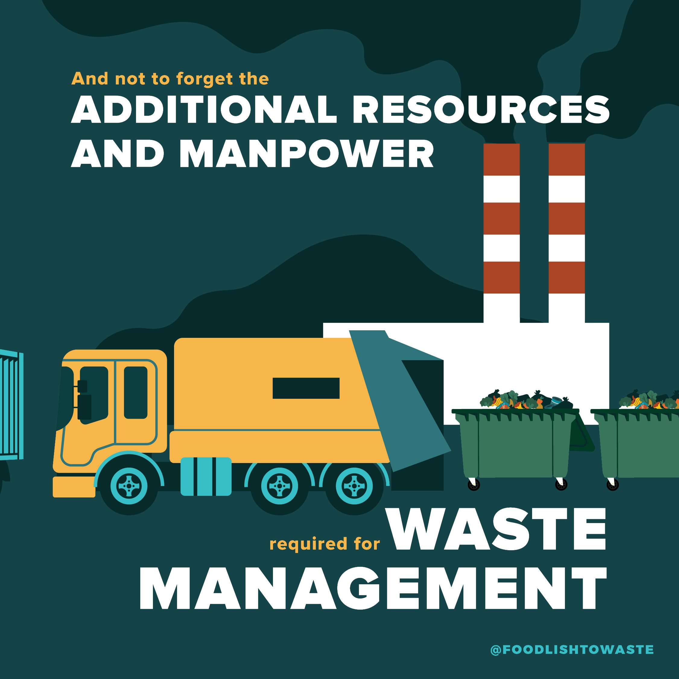
Awareness / Informative Post 2 – Wastage of Resources


Awareness / Informative Post 3 & 4 


Tips Posts


Common Misconception / Myths Posts