History of Design – Graphic Design So Far


Philippe Apeloig is a French graphic designer and typographer well-known for his expressive and experimental usage of typography, with inspirations his love of paintings, literature and the performing arts. In the 1980s, Philippe Apeloig had an internship with April Greiman in Los Angeles, who was one of the first few designers to embrace the usage of computers in design, and the experience encouraged him to embrace the emerging technologies in his designs.
Although posters are two-dimensional, elements and typography in his designs tends to look three-dimensional and conveys a sense of movement, interactions, and emotions.
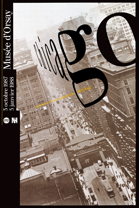
Chicago. Naissance d’une Metropole, 1987.
One of his most well-known works, the 1987 Chicago, Naissance d’une Métropole poster, Philippe Apeloig used CAD softwares which was used exclusively for technical purposes, to distort his letterforms to create the illusion of three-dimensional space. The photograph of the city was taken at a dramatic angle, and the way he skewed his type enhanced the photo to create a sense of speed and vertigo.
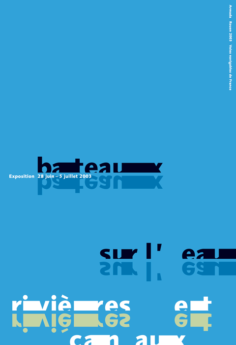
Bateaux sur l’eau, 2003.
In many of his designs, he allows letters and typography to function as an autonomous image. One of the posters which I felt to be very interesting was the Bateaux sur l’eau poster for the French navigable waterways, where the letters were treated to represent boats, the solid blue background and the reflected letterforms suggested that it was water and reflections on the water. I like the subtlety and how utterly simple it was, yet the poster was able to convey the message rather clearly without the usage of other images / elements.

Vivo In Typo, 2008.
Vivo in Typo was a poster to promote an exhibition of his own poster designs at Espace Topographie de l’art in Paris. He produced pages of computer-generated punctuation – such as periods, hyphens, and backslashes, and manipulated them into individual text forms. He varied the spacing between the punctuation, used a limited colour palette, and layered them in different scales to enable the several layers of the title “Vivo in Typo” to emerge as if they were woven together in a tapestry, and at the same time, I felt that they resembled like digital glitches as well.
References
https://www.theatlantic.com/entertainment/archive/2014/04/a-new-legend-of-french-design/360098/
https://www.stedelijk.nl/en/news/philippe-apeloig-using-type
http://www.designculture.it/interview/philippe-apeloig.html
http://apeloig.com/
https://www.wallpaper.com/design/dutch-design-week-2019-highlights
History of Design – To Bauhaus and Beyond Reflection

Sach Plakat / Plakatstil
 Lucian Bernhard, Manoli Cigarettes, 1910.
Sach Plakat or Plakatstil, which literally meant “object-poster” and “poster style” in German respectively, was a style developed in 1905 by Lucian Bernhard in Berlin. During the start of the twentieth century in Germany, the complex and decorative forms of Art Nouveau were replaced with emphasis on strong vibrant colours, abstract and simplified flat shapes, typography / message which was reduced to the bare minimum, and a rejection of anything decorative. Designers and artists wanted their works to be more easily read and understood by the passerbys.
Lucian Berhard
 Lucian Bernhard, Priester, 1906.
It was started by Lucian Bernhard when he took part in a poster competition held by Preister Matches, and he took a creative approach of drawing two large matches, and wrote the brand name above them in bold letters. The stark simplicity and cleanness enabled him to win the competition, and it marked the departure from the complexity of the Art Nouveau style in Germany. His reductive and flat imagery subsequently became the foundation for a revolution in commercial advertising in pre-war Berlin, and was spread throughout Europe and the United States.
Ludwig Hohlwein
 Ludwig Hohlwein, Direct China Cotton Importers – Wonalancet, 1909.
 Ludwig Hohlwein, Vivator, 1912.
Other notable works done in the Sach Plakat style was that of Ludwig Hohlwein’s. His poster designs were primarily influenced by the collage technique of the British poster designers The Beggarstaffs, and he took inspiration from the emphasis on simplicity, pattern, silhouette, integral typography, and the usage of a limited colour palette.
Oto Baumberger
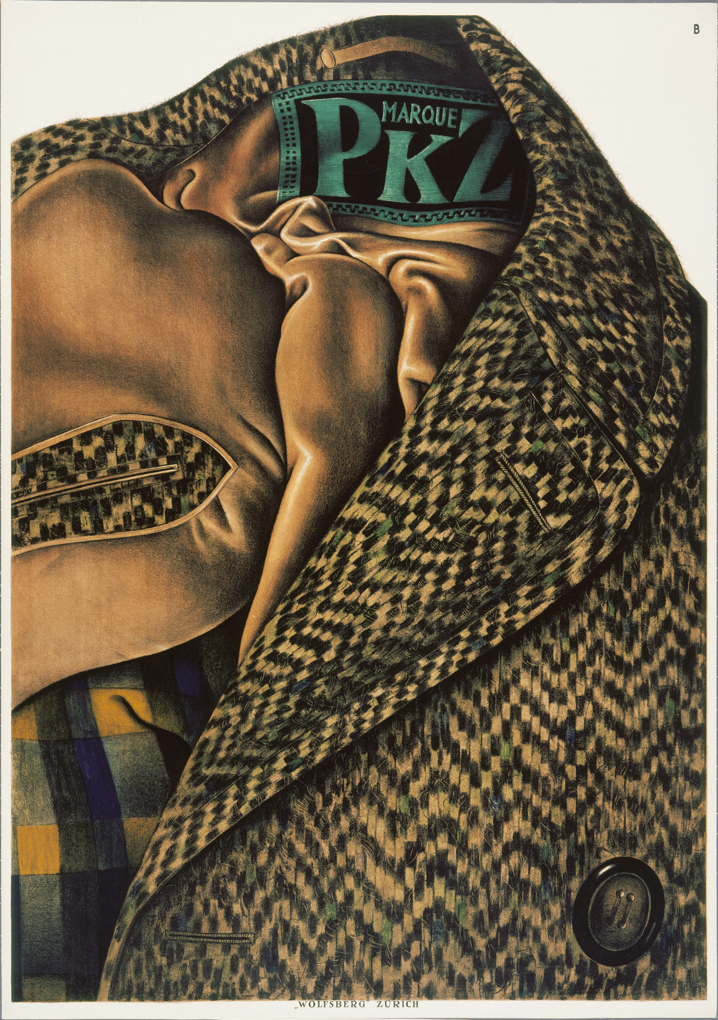 Otto Baumberger, Marque PKZ, 1923.
Over time, the flat style that was developed by Lucian Bernhard was expanded into a more colourful and realistic style, but the emphasis on just the product and the brand name or minimum text was still there. In 1923, Swiss designer Otto Baumberger drew a tweed coat for PKZ with its label serving as the only text in the poster. Many people mistook the poster for a photograph.
The style was prominent until the Great War in Europe. After the war, advertising techniques re-shifted once again, and the Sach Plakat style declined. However, this revolutionary modern outlook on poster design and advertising in the early twentieth century no doubt still have an impact in the design industry today, as the style or its influence can still be seen in many designs in present day.
https://www.moma.org/artists/2700
http://www.iconofgraphics.com/Ludwig-Hohlwein/
https://www.internationalposter.com/style-primers/plakatstil-the-poster-style/
History of Design – Industrial Revolution & Graphic Reactions Reflection

Lithography

Benjamin West, Angel of the Resurrection, 1801-1806
Lithography was a method of printing first invented in Germany in 1796, by Alois Senefelder. Unlike other image printing methods back then which required carving into the medium, lithographs were created by drawing an image using greasy ink or chalk onto a smooth stone, usually limestone, and was treated with water and chemicals, before transferring and printing on paper. The flat surfaces of the stones enabled artists to have more freedom in drawing directly on the medium, and enabled prints to resemble exactly as what the artists drew or painted, unlike other methods of printings.
The “permanent” impressions on the stones enabled Lithography to become one of the most popular printing method in the 1820s, as engravings made on copper and steel would flatten over time due to the pressure from the printing processes. Hence, Lithography enabled the prints to be more easily mass-produced and at a lower production cost.
Lithography process video
Chromolithography process video
Process:
- Image / artworks are drawn directly onto a limestone using oil-based or waxy material.
- The limestone is coated with gum arabic and other chemicals to etch the portions of the stone that was not drawn.
- Moisture would be applied to the surface of the limestone, and would adhere to the areas coated with the chemicals applied previously.
- Once the surface is ‘dry’, the ink roller oil-based ink will go over the surface, and the ink would adhere to the areas drawn with greasy ink.
- The artwork / image would then be transferred onto paper.
Chromolithography
Chromolithography was later developed in France by Godefroy Engelmann in 1837. Chromolithography is a method of making multi-coloured prints, developed from the processes of lithography. It uses the same process as lithography, but with more stones – one stone for one colour, and a full-coloured print would consist of several layers of printing. A chromolithograph could also be made using as many as forty stones. The process could be rather arduous and time consuming, as each individual layer of colour had to be individually aligned one after the other.

Louis Prang, Prized Babies, 1888
Louis Prang was one of the key figures of Chromolithography. During the Civil War, he travelled to Europe to study printing methods, and brought the technique back to Boston. He realised how he could make prints which resemble greatly to an oil painting, but at a much lower cost. He produced fine-art subjects, such as still-life, landscapes, and famous paintings. One of his most popular print was the Prized Babies, which used 19 different stones. He would also commission artists to create artworks which would eventually be mass-produced as greeting cards, which worked as a self-advertisement of sorts to promote his ability to produce prints, while the commissioned artists would be able to get people to be more familiarised with his/her works.
Chromolithography eventually became one of the most successful and dominant colour printing method in the 19th Century, and enabled coloured prints and art to the affordable for the masses. It was amazing how the earlier and higher-quality Chromolithographs were able to replicate picturesque images and and artworks which resembled oil-paintings so identically without the usage of technology that we have today.
These two methods of printing eventually led to the development of offset printing, which was also based on the same principle that grease and water does not mix.
References
https://www.npg.org.uk/collections/explore/glossary-of-art-terms/chromolithograph
https://americanantiquarian.org/prang/whatisachromo
https://blog.bookstellyouwhy.com/vlog-four-videos-on-the-art-of-chromolithography
https://www.britannica.com/technology/offset-printing
Header Image credits:
https://www.wdl.org/en/item/9288/
https://americanantiquarian.org/prang/files/original/562b32f3dd8462b2f0071be197752373.jpg
History of Design: Writing to Typography Reflection

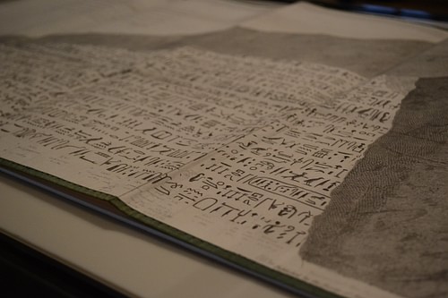
During the lecture last week, I was rather intrigued by the Rosetta Stone which was inscribed with three different scripts.
The Rosetta Stone is a granodiorite steele which was part of a larger stone slab which would have stood about 2 meters in height. It was inscribed with three different scripts – Hieroglyphic script at the top, Demotic script in the middle, and the Ancient Greek language at the bottom. The Rosetta Stone was considered as the key to understanding the Hieroglyphic script, as it died out in Egypt during the fourth century CE, and the knowledge of how to decipher it was eventually lost until the Rosetta Stone was discovered in 1799.
 Image Credits: The British Museum, Claire Thorne
Hieroglyphic Script:
 Credits: The British Museum
- A script made up of small pictures and was used in Ancient Egypt for religious texts
- Hieroglyphic means ‘Holy Writing’ in Greek
- 3 Basic types of signs – logograms, phonograms and determinatives.
- Had over a thousand different hieroglyphs
- Can be written / read in either directions.
- Only used by a small number of priests by 196BC
Demotic Script:
 Credits: The British Museum
- A cursive form of Egyptian hieroglyphs
- Lack any pictorial trace
- Around 7th Century BCE.
- Represented letters and sounds that had the markings of an alphabet
- Written from right to left
- The common script for the people
Ancient Greek:
 Credits: The British Museum
- Written from left to right
- Egyptian pharaohs were Greek-Macedonian during then
- Brought over from Greece by rulers of the Ptolemaic dynasty
- Used by the Ptolemaic government
Three Translations of the Same Decree
The inscriptions were actually three translations of a single decree passed by a council of priests, to assert the royal cult of the then thirteen-year-old Ptolemy V on the first anniversary of his coronation in 196BC. The Hieroglyphic script were for the priests, the Demotic script for the common people, and the Ancient Greek language was for the rulers and royalty.
The decree was copied onto steeles and was placed in every temple in Egypt – the Rosetta Stone was one of the many copies.
Credits: Ancient History Encyclopedia
It was fascinating how 3 different scripts and 2 languages – Egyptian and Greek, were inscribed on the face of a large stone slab simultaneously in order for people back then to be able to understand the decree. More than a thousand years later, these inscriptions enabled us to decipher the Hieroglyphic script which would have been still otherwise lost in time, and has also enabled us to decode the other Ancient Egyptian texts and to finally be able to understand their culture and history better. Scripts were not just a way of writing and a transmission of information – they were also a reflection of the culture at that time. Similar to how the different inscriptions on the Rosetta Stone reflected the culture of the Ptolemaic dynasty in Ancient Egypt, how the Egyptian hieroglyphs fell into oblivion reflected the fall of Ancient traditional Egyptian cults and the development of new scripts and writing.
References:
http://www.byui.edu/special-collections/exhibits/rosetta-stone
https://www.ancient.eu/Egyptian_Hieroglyphs/