History of Design – To Bauhaus and Beyond Reflection

Sach Plakat / Plakatstil

Lucian Bernhard, Manoli Cigarettes, 1910.

Sach Plakat or Plakatstil, which literally meant “object-poster” and “poster style” in German respectively, was a style developed in 1905 by Lucian Bernhard in Berlin. During the start of the twentieth century in Germany, the complex and decorative forms of Art Nouveau were replaced with emphasis on strong vibrant colours, abstract and simplified flat shapes, typography / message which was reduced to the bare minimum, and a rejection of anything decorative. Designers and artists wanted their works to be more easily read and understood by the passerbys.


Lucian Berhard

Lucian Bernhard, Priester, 1906.

It was started by Lucian Bernhard when he took part in a poster competition held by Preister Matches, and he took a creative approach of drawing two large matches, and wrote the brand name above them in bold letters. The stark simplicity and cleanness enabled him to win the competition, and it marked the departure from the complexity of the Art Nouveau style in Germany. His reductive and flat imagery subsequently became the foundation for a revolution in commercial advertising in pre-war Berlin, and was spread throughout Europe and the United States.


Ludwig Hohlwein

Ludwig Hohlwein, Direct China Cotton Importers – Wonalancet, 1909.

Ludwig Hohlwein, Vivator, 1912.

Other notable works done in the Sach Plakat style was that of Ludwig Hohlwein’s. His poster designs were primarily influenced by the collage technique of the British poster designers The Beggarstaffs, and he took inspiration from the emphasis on simplicity, pattern, silhouette, integral typography, and the usage of a limited colour palette. 


Oto Baumberger

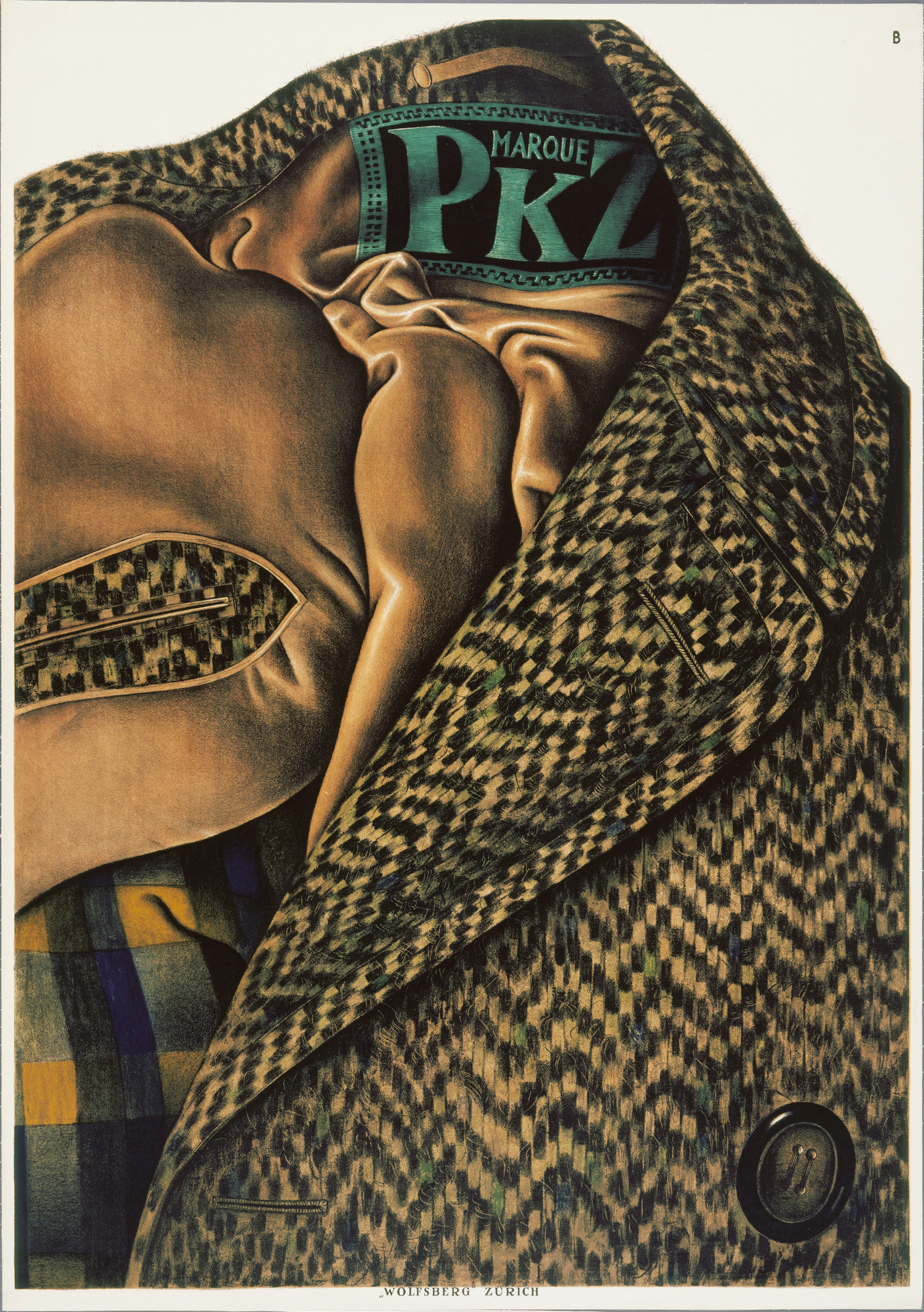
Otto Baumberger, Marque PKZ, 1923.

Over time, the flat style that was developed by Lucian Bernhard was expanded into a more colourful and realistic style, but the emphasis on just the product and the brand name or minimum text was still there. In 1923, Swiss designer Otto Baumberger drew a tweed coat for PKZ with its label serving as the only text in the poster. Many people mistook the poster for a photograph.


The style was prominent until the Great War in Europe. After the war, advertising techniques re-shifted once again, and the Sach Plakat style declined. However, this revolutionary modern outlook on poster design and advertising in the early twentieth century no doubt still have an impact in the design industry today, as the style or its influence can still be seen in many designs in present day.


https://www.moma.org/artists/2700

http://www.iconofgraphics.com/Ludwig-Hohlwein/

https://www.internationalposter.com/style-primers/plakatstil-the-poster-style/

Task 2 – Infographic Poster Progress

Initially, I wanted to do a visual explanation infographic to show the process of our food systems to show how food was not the only thing that was wasted when we waste food. However, I felt that it would be too complex for an infographic poster, and it would be rather difficult to highlight key stats and information that respondents from my surveys did not know about:

      • The extent of the environmental impacts of food waste.
      • What we are wasting when we waste food.
      • The underestimated amount of food waste that we generate in Singapore.
      • The lack of knowledge about food waste are being incinerated, and are only second behind plastics to be disposed of / incinerated in Singapore.

Hence, initially I decided to summarise and use half the page for the process, while the other half for the key stats:

Combined the process with the central image. However, I felt that it was rather difficult to place information around the centralised globe. I tried to move and resize the globe, but it was still rather restrictive.

Feedbacks:

  • The printed colours were very dark, hard to differentiate things.
  • Figure-ground and background not pronounced.
  • Colours and tints – need to make it pop out even more.
  • Title needs to be bolder, or stacked.
  • Title too far away from the main visual.
  • The food being thrown to the fire are too messy.


Refinements:

  • Placed the central image together with the title to have a more distinct relationship with one another.
  • Which could also free up more space and enable both the globe and the title to be bigger.
  • Made the colours pop out even more.
  • Made dividers more distinct.
  • Re-illustrated some illustrations to make them clearer.
  • Replaced the process and impact with summarised icons of the wastage
      • Which was what I wanted to highlight.
      • Reduced to just icons, headers for the icons, and the summarised impact as the information was too chunky.
  • Text remained a little larger to enable people to read key texts from a distance.
  • Tried to keep the text to as short as possible, and straight to the point.


Final Infographic:

  • Changed the overall typeface as people might misread the capital “G” of the previous typeface.
  • Made texts smaller to generate contrasts.
  • Tweaked the colours again to ensure that the darkest colour can still be seen against the background.
  • Standardised yellow text as the divider.
  • Made the illustrations in the last row smaller.
  • Made the text in the last row centralised.


// Clearer view of Final Infographic here //

History of Design – Industrial Revolution & Graphic Reactions Reflection

Lithography

Benjamin West, Angel of the Resurrection, 1801-1806

Lithography was a method of printing first invented in Germany in 1796, by Alois Senefelder. Unlike other image printing methods back then which required carving into the medium, lithographs were created by drawing an image using greasy ink or chalk onto a smooth stone, usually limestone, and was treated with water and chemicals, before transferring and printing on paper. The flat surfaces of the stones enabled artists to have more freedom in drawing directly on the medium, and enabled prints to resemble exactly as what the artists drew or painted, unlike other methods of printings.

The “permanent” impressions on the stones enabled Lithography to become one of the most popular printing method in the 1820s, as engravings made on copper and steel would flatten over time due to the pressure from the printing processes. Hence, Lithography enabled the prints to be more easily mass-produced and at a lower production cost.


Lithography process video


Chromolithography process video

Process:

  1. Image / artworks are drawn directly onto a limestone using oil-based or waxy material.
  2. The limestone is coated with gum arabic and other chemicals to etch the portions of the stone that was not drawn.
  3. Moisture would be applied to the surface of the limestone, and  would adhere to the areas coated with the chemicals applied previously.
  4. Once the surface is ‘dry’, the ink roller oil-based ink will go over the surface, and the ink would adhere to the areas drawn with greasy ink.
  5. The artwork / image would then be transferred onto paper.


Chromolithography

Chromolithography was later developed in France by Godefroy Engelmann in 1837. Chromolithography is a method of making multi-coloured prints, developed from the processes of lithography. It uses the same process as lithography, but with more stones – one stone for one colour, and a full-coloured print would consist of several layers of printing. A chromolithograph could also be made using as many as forty stones. The process could be rather arduous and time consuming, as each individual layer of colour had to be individually aligned one after the other.


Louis Prang, Prized Babies, 1888

Louis Prang was one of the key figures of Chromolithography. During the Civil War, he travelled to Europe to study printing methods, and brought the technique back to Boston. He realised how he could make prints which resemble greatly to an oil painting, but at a much lower cost. He produced fine-art subjects, such as still-life, landscapes, and famous paintings. One of his most popular print was the Prized Babies, which used 19 different stones. He would also commission artists to create artworks which would eventually be mass-produced as greeting cards, which worked as a self-advertisement of sorts to promote his ability to produce prints, while the commissioned artists would be able to get people to be more familiarised with his/her works.

Chromolithography eventually became one of the most successful and dominant colour printing method in the 19th Century, and enabled coloured prints and art to the affordable for the masses. It was amazing how the earlier and higher-quality Chromolithographs were able to replicate picturesque images and and artworks which resembled oil-paintings so identically without the usage of technology that we have today.

These two methods of printing eventually led to the development of offset printing, which was also based on the same principle that grease and water does not mix.

References

https://www.npg.org.uk/collections/explore/glossary-of-art-terms/chromolithograph

https://americanantiquarian.org/prang/whatisachromo

https://blog.bookstellyouwhy.com/vlog-four-videos-on-the-art-of-chromolithography

https://www.britannica.com/technology/offset-printing

Header Image credits:

https://www.wdl.org/en/item/9288/

https://americanantiquarian.org/prang/files/original/562b32f3dd8462b2f0071be197752373.jpg

History of Design: Writing to Typography Reflection

During the lecture last week, I was rather intrigued by the Rosetta Stone which was inscribed with three different scripts.

The Rosetta Stone is a granodiorite steele which was part of a larger stone slab which would have stood about 2 meters in height. It was inscribed with three different scripts – Hieroglyphic script at the top, Demotic script in the middle, and the Ancient Greek language at the bottom. The Rosetta Stone was considered as the key to understanding the Hieroglyphic script, as it died out in Egypt during the fourth century CE, and the knowledge of how to decipher it was eventually lost until the Rosetta Stone was discovered in 1799.

Image Credits: The British Museum, Claire Thorne

Hieroglyphic Script:

Credits: The British Museum

  • A script made up of small pictures and was used in Ancient Egypt for religious texts
  • Hieroglyphic means ‘Holy Writing’ in Greek
  • 3 Basic types of signs – logograms, phonograms and determinatives.
  • Had over a thousand different hieroglyphs
  • Can be written / read in either directions.
  • Only used by a small number of priests by 196BC

Demotic Script:

Credits: The British Museum

  • A cursive form of Egyptian hieroglyphs
  • Lack any pictorial trace
  • Around 7th Century BCE.
  • Represented letters and sounds that had the markings of an alphabet
  • Written from right to left
  • The common script for the people

Ancient Greek:

Credits: The British Museum

  • Written from left to right
  • Egyptian pharaohs were Greek-Macedonian during then
  • Brought over from Greece by rulers of the Ptolemaic dynasty
  • Used by the Ptolemaic government

Three Translations of the Same Decree

The inscriptions were actually three translations of a single decree passed by a council of priests,  to assert the royal cult of the then thirteen-year-old Ptolemy V on the first anniversary of his coronation in 196BC. The Hieroglyphic script were for the priests, the Demotic script for the common people, and the Ancient Greek language was for the rulers and royalty.

The decree was copied onto steeles and was placed in every temple in Egypt – the Rosetta Stone was one of the many copies.


Champollion's notes from the Rosetta Stone

Credits: Ancient History Encyclopedia

It was fascinating how 3 different scripts and 2 languages – Egyptian and Greek, were inscribed on the face of a large stone slab simultaneously in order for people back then to be able to understand the decree. More than a thousand years later, these inscriptions enabled us to decipher the Hieroglyphic script which would have been still otherwise lost in time, and has also enabled us to decode the other Ancient Egyptian texts and to finally be able to understand their culture and history better. Scripts were not just a way of writing and a transmission of information – they were also a reflection of the culture at that time. Similar to how the different inscriptions on the Rosetta Stone reflected the culture of the Ptolemaic dynasty in Ancient Egypt, how the Egyptian hieroglyphs fell into oblivion reflected the fall of Ancient traditional Egyptian cults and the development of new scripts and writing.


References:

blog.britishmuseum.org

http://www.byui.edu/special-collections/exhibits/rosetta-stone

https://www.ancient.eu/Egyptian_Hieroglyphs/


Reflection on Role Playing as a Research Technique

Briefly share your experience going through Dialogue in the Dark. What were some of the feelings, thoughts, challenges and insights gained while role playing a blind person? (200-300 words)

As a person who had been so dependent on the sense of sight, the idea of being in a pitch black place for an extended period of time was rather daunting. When we first started, I felt insecure as I could no longer see what lies ahead of me, and there was technically no one in front of me as I was the first in line. I did not know what to expect and had kept my right hand vehemently on the wall as we walked through the darkness in the beginning. Initially, I even felt reluctant to leave the “safety” of the walls and to move towards the voice of our guide. However, as we progressed through the exhibition, I started feeling less anxious due to the guidance and the presence of our guide and peers, as we led and helped one another in this very unfamiliar place.

Some of the challenges that I faced was probably how I could not remember to make a sound in time to signal that I have stopped walking, hence causing us to bump into each other several times. There were several occasions where I reached out my hand towards my peers without making a sound before realising that they cannot see it. Another challenge would be how I was not quite able to differentiate and identify things through only our sense of touch; such as differentiating between a real and fake leaf, and identifying the alphabets. Identifying sounds from different animals or insects was rather challenging as well; those sounds were familiar but we just could not really have a definite answer as we probably have never really tried to focus on these background noises before.

Navigating and identifying things in a controlled and safe environment like this exhibition was already rather challenging for most of us. Although we were just going through tasks which would have been mundane in our daily lives, everything felt unfamiliar in the complete darkness, and we would probably have been lost and not be able to accomplish anything without the guidance of our visually impaired guide and our peers. The exhibition made me realise how I did not truly understand the challenges of being visually impaired; who have to experience this on a daily basis, albeit in places outside where it is not exactly safe, changes are constant, and there would not be people there to guide them throughout their journey.

Drawing on your experience, can you think and list some of the benefits inherent in the design research technique of role playing?

Through this experience, we were able to personally experience how difficult it was to get through tasks in the absolute darkness, which seemed pretty simple in our daily lives. The experience enabled us to relate better to the challenges that others are facing, which may often seem like a miniscule matter to us, but were an issue to others. By experiencing the issues through the perspectives of the affected parties instead of simply looking at the issue through our point of view, we would be able to get better insights and understandings, compared to relying on the information on the web which we could understand but not completely be able to relate to.

Can you think of some contexts where role-playing can be useful  to help discover and definition of design challenges or contribute to the development of design solutions?

I think that role-playing enables people to understand better and empathise certain issues in the world or the issues that some people might face better. Sometimes, having the knowledge about an issue is different compared to having an experience about the issue. Role-playing enables designers to implement better insights and understandings in their designs and works, which would in turn create better works to suit the cause or the needs of the intended audiences. Role-playing designs could also have a greater impact on the participants as well, e.g. Dialogue in the Dark, which enabled me to understand the challenges that the visually-impaired faces better by placing myself in their shoes. Having read information about blindness and imagining or visualising the situation was definitely different compared to the impact of “experiencing” it.