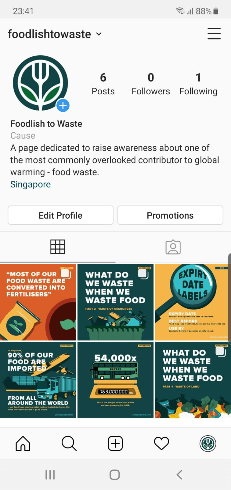
Design Outcome 2 – Bus-stop Advertisement

Design Outcome 2

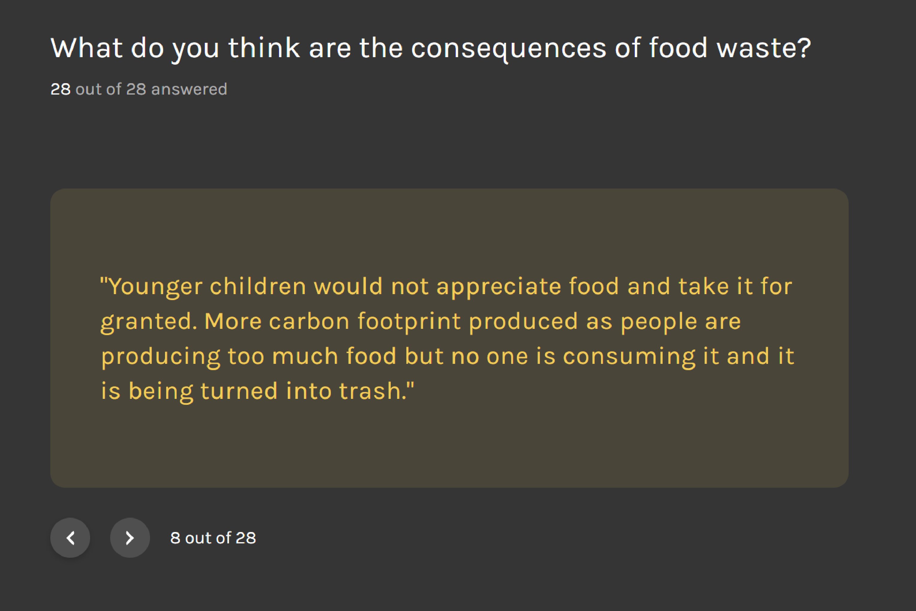
For my second design outcome, I wanted it to raise awareness about the food waste issue, and as well as to compel the viewers to visit the instagram page of the campaign at the same time. However, it would be rather difficult to place the deliverable at the places where food waste will take place as businesses would usually want to encourage patrons to purchase more food through promotions and bundles.

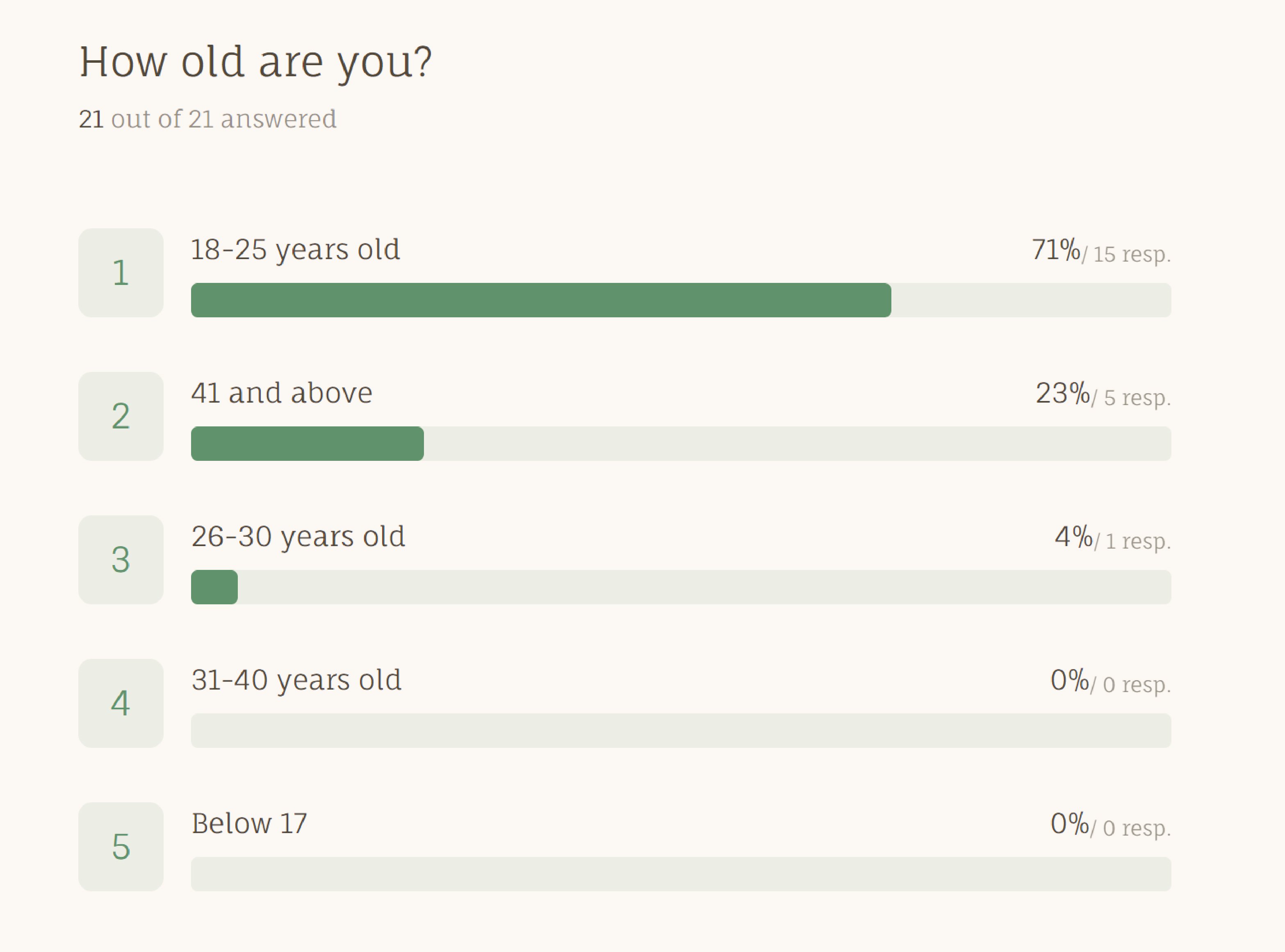
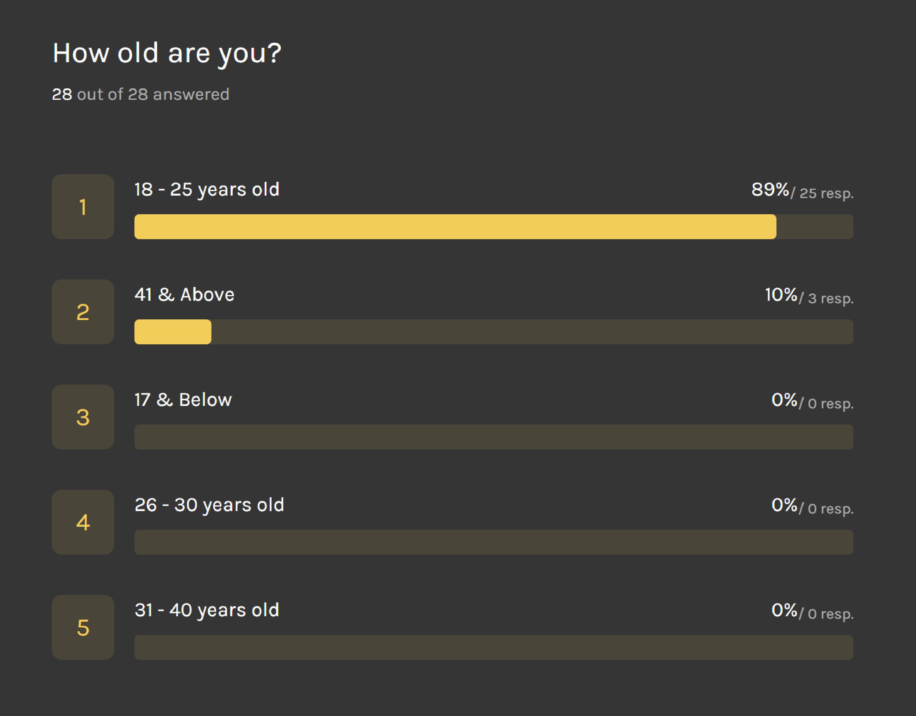
Hence, I decided to do bus-stop advertisements as public transportation would be the most widely used transportation by my target audience, aged 18 to 25 years old.


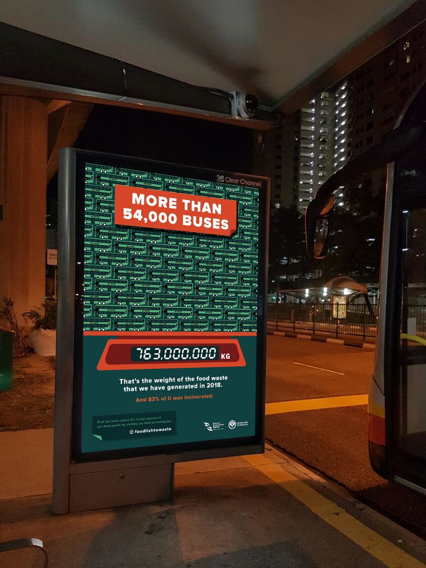
Bus Stop Advertisement 1

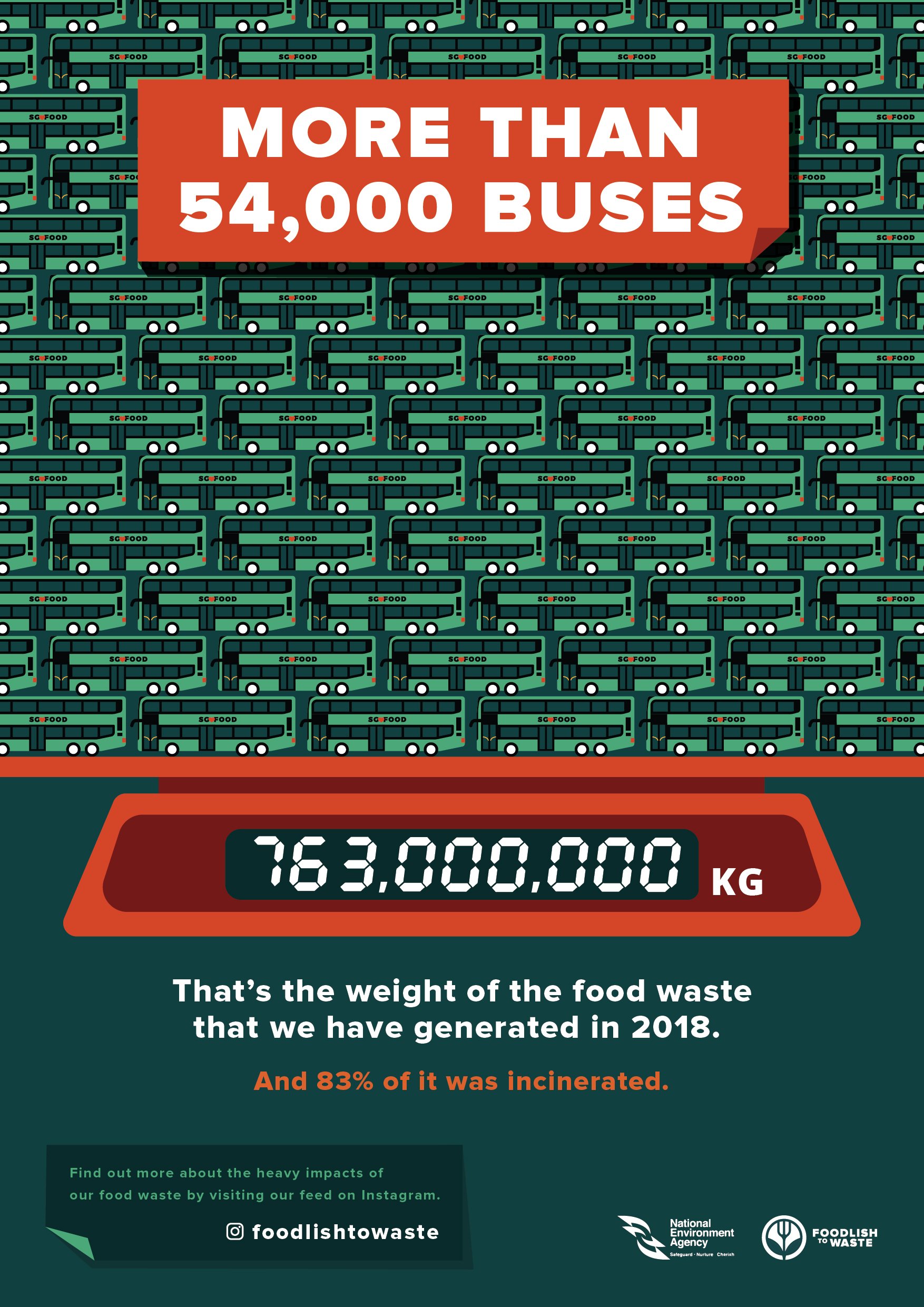
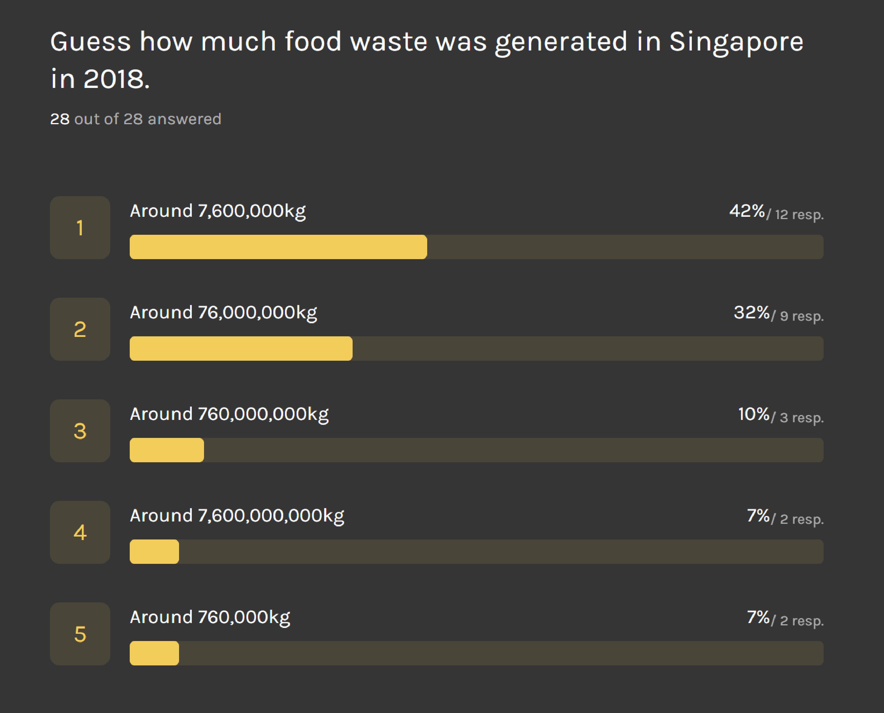
I wanted to raise awareness about the widely underestimated amount of food waste that we actually generate in Singapore. I felt that it would be more eye-catching to state the gargantuan amount in numbers, and would be interesting to place an advertisement which compares the weight of our food waste to the weight of the buses, at a bus-stop.


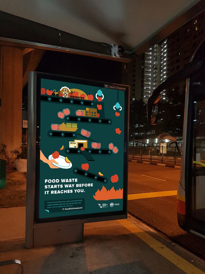
Bus Stop Advertisement 2

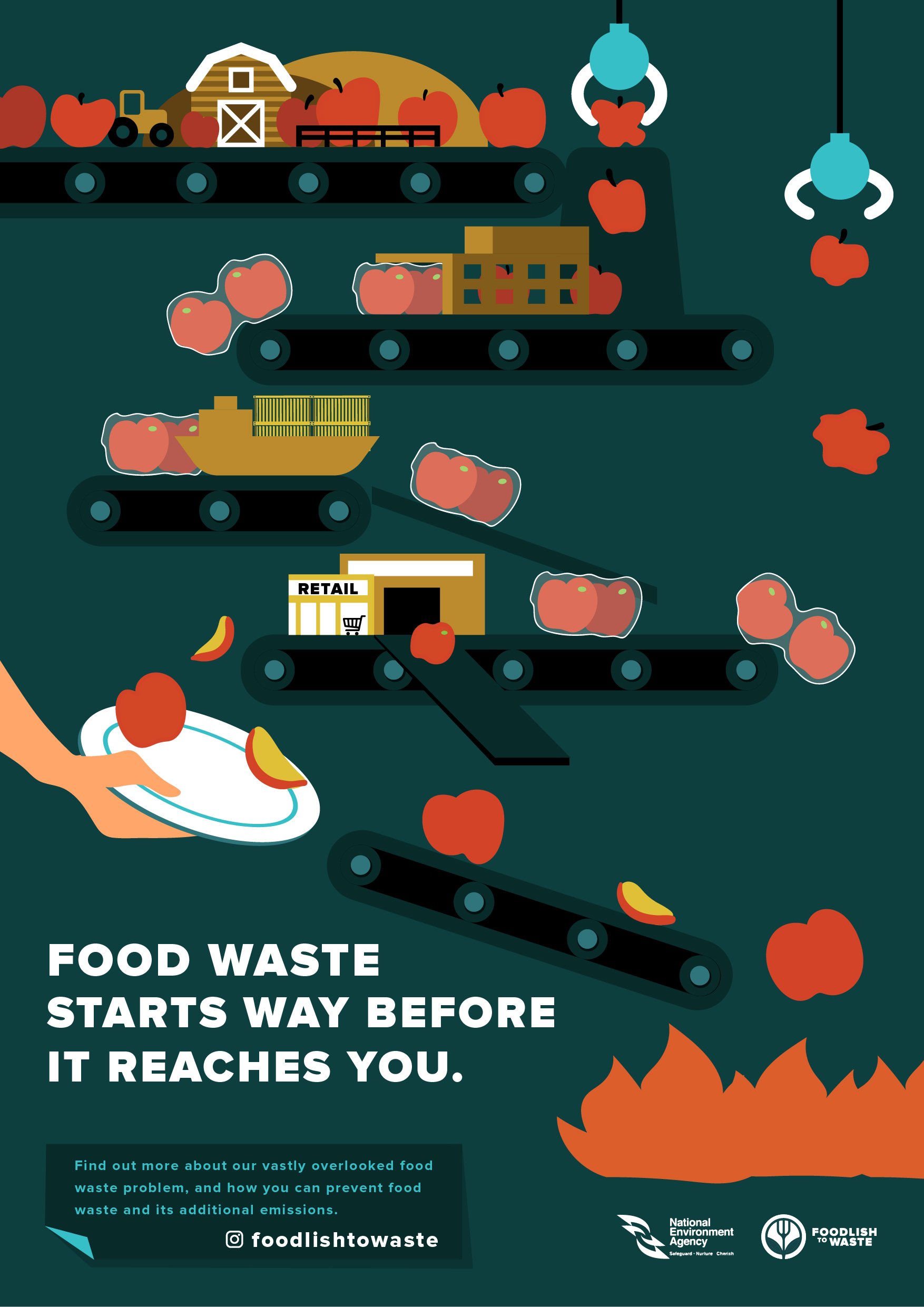
I wanted to show how food waste was not just about wasting what was on our plates, but rather, it starts way beforehand. I decided to use conveyor belts to represent the journey, icons to represent the different parts of the journey –

        • Barn, tractor and hills to represent production stage
        • Factory-like building and the apples being packaged after going through it represent the processing stage
        • Cargo ship represents distribution stage
        • Building with the word retail, and the supermarket trolley to represent retail stage
        • Hand with plate represents consumers

And that food, which was represented by the apples are being lost at every stage, and how there were actually more apples at the top and it slowly gets lesser at the bottom stages.

        • UFO claws catching apples and throwing them away at the production and processing stage
              • which looks deformed / small – wastage due to standards and other factors
        • Packaged apples falling off the conveyor belt to represent the food being “lost” during distribution
              • damaged due to transportation / storage issues
        • A slope that allows apples to bypass the consumers and go straight into the fire represent the food that was wasted by retailers due to cosmetic standards
        • Arm with the plate titled in a way where the apples will continue its journey towards the fire represent how consumers are not consuming the food and are throwing it away.

Design Outcome 1 – Social Media Campaign

Design Outcome 1

I decided to come up with a social media campaign as my target audience are milennials aged 18 to 25 years old – which a majority of them uses social media frequently. Furthermore, as my topic covers about environmental issues, it would be contradictory if I were to do printed deliverables for distribution, such as brochures and flyers, which would generate even more emissions and waste.

Secondly, it was rather difficult to place deliverables at places where my target audience waste food – food places outside such as food courts, restaurants, cafes, etc. ( according to my survey, they rarely cook, and as they are students / working adults, they would probably have frequent meals in school / outside ), as businesses would usually want to encourage their patrons to order more through promotions and bundles, as there are no mandatory laws in Singapore which address and deter businesses from generating food waste.

Furthermore, as my objective was to raise awareness and to educate people about food waste and its environmental impacts, I felt that it would be more easily accessible on social media platforms which the target audience are using, rather than websites – there are a lot of environmental-organisation websites in Singapore that we don’t even know about ( e.g. cgs.com – in the Waste Less Save More campaign video which many of us know about as it appeared repeatedly on the television but we never did notice or visited the website ). Plus putting information on social media platform saves the hassle of downloading a new application which would just host educational informations / tips.

Foodlish to Waste

After a long contemplation about the name and logo, I decided to go with “Foodlish to Waste“, which was a shortened form for “foolish to waste food”, as the objective was to educate people that it is foolish to waste food, due to the wastage of resources and the endless list of environmental impacts.

Decided to reuse the same colour palette as the infographic poster, and I felt that the extensive usage of blueish-green rather than green, and an icon of a fork instead of a food / produce would prevent people from confusing it with vegetarianism.

Final Logo:

Colour Palette:


Design Outcome 1 – Social Media Campaign (Instagram Page & Sponsored Posts)


Inspirations:

I was mainly inspired by Dain Walker’s page, where he uses big typographic texts with accompanying graphics. I felt that his posts were very straight-to-the-point and informative.


Instagram Page:


 @foodlishtowaste

A page which would be updated regularly to raise awareness and to educate people about food waste. The posts on the page consist of summarised key stats / information to educate people, tips to reduce food waste, polls, and common misconceptions / myths about food waste.

Majority of the posts would consist of several slides which can be swiped ( carousel posts ), and a writeup as the captions to explain things further. Each post would be categorised by the different background colours taken from the same colour palette, and an indicator at the top right of the first slide of each post:

        1. Awareness / Informative posts would have the blue-green background
        2. Tips would have the golden-yellow background
        3. Common misconceptions in reddish-orange background

Some of these posts would appear as sponsored posts on the target audience’s feeds, explore pages, and stories as well:


Posts:

Awareness / Informative Posts

These posts would be further categorised into common themes, e.g. a carousel post with numerous slides dedicated to wastage of land, while another is dedicated to the wastage of resources. Carousel posts would include further explanations and a call for action at the last two slides.


Awareness / Informative Post 1 – Wastage of Land


Awareness / Informative Post 2 – Wastage of Resources


Awareness / Informative Post 3 & 4 


Tips Posts


Common Misconception / Myths Posts


Task 1B: Exploratory Research

In Task 1A, I decided to pick the issue about Climate Change as I felt that environmental issues have always resonated with me. However, I felt that the topic was too broad and I decided to narrow it down further to the causes of climate change. One of the causes which I found rather interesting was the vastly overlooked environmental issues of Food Waste.


Target Audience


Topic – Food waste, and the environmental impacts of food waste


Survey 1 – Climate Change in general

I did a short survey to find out more about what people think and are doing about climate change, and if the environmental impacts of food waste might be overlooked by Singaporeans, by not mentioning anything about food waste.

Results

  • Almost all the respondents are concerned about global warming and climate change.
  • Most of the respondents listed plastics and fossil fuels as major contributors.
  • Deforestation, electricity, and transportation were mentioned by many too.
  • Only 2 mentioned about agriculture.
  • 1 person mentioned food waste.
  • All the respondents said they were willing to adopt more environmentally-friendly habits, and are currently practicing some.

Insights

Survey 2 – Food Waste

A few weeks later, I did another survey more specifically about food waste to find out more about my target audience’s understanding of food waste.

Target audience does not cook often / at all, and the 2 respondents who chose “a few times a week” were aged 41 and above.

The majority of the respondents felt that food waste was a problem in Singapore and many stated socio-economic issues, such as there are many others in poorer countries or families which are not able to afford food, and that we were wasting food which could have been given to those who needed them. 6 respondents stated terms such as “pollution”, “global warming” and “wastage of resources”.

Whereas another 6 respondents felt that food waste might or might not be a problem, as food waste can be decomposed unlike plastics, and could also be reused as fertilisers. A few also cited that there were initiatives where we could donate unwanted food before it spoils to prevent food waste.

After asking if the respondents thought of food waste as a problem in Singapore, I decided to gauge how big of a problem do they think it was and if they knew the exact figure.

Only 3 respondents selected the correct figure ( 760,000,000kg in 2018 ). Whereas the majority ( 23 respondents ), thought that food wastage in Singapore was smaller, with 14 respondents thinking it might even be more than 100x smaller.

The respondents’ top three reasons for food waste was base portion being too big, discounts for buying more, and food turning bad / expiring.

Only 3 thought food waste was incinerated, while the majority thought that our food waste were decomposed or recycled into fertilisers, or were unsure.

8 respondents stated environmental impacts, such as pollution, wastage of resources, and climate change.

Whereas the majority stated social / monetary impacts such as high demands from us means low supply for the people in the poorer countries. People would take food for granted because food is so accessible to us in Singapore. Or that wasting food is wasting money.


Insights from surveys + research

  • Most respondents does not cook – do not often buy perishable groceries
      • However many cited “food turning bad / expired” as their reason too – perhaps other perishables such as bread, confectioneries, fruits, dairies and other food such as homecooked / leftovers / takeaways.
      • Target Audience are either studying or working – majority of them would take meals outside.


  • Most respondents are concerned about the environment, and are willing to adopt or have already been practicing at least one or more environmentally-friendly habit(s) in their lifestyle.
      • Which mostly revolved around plastics.
      • Worldwide coverage / emphasis on the plastic problem.
      • Movements in Singapore – e.g. no straws at F&B, rise of reusable straws, needing to pay extra for takeaways / plastic bags / paper bags to reduce plastic usage.


  • Most respondents were tend to overlook / are unaware of the extent of the environmental impacts of food waste.
      • Food waste is a social, economic, environmental issue.
      • Respondents who cited environmental impacts and cited that resources used to produce the food, such as water, manpower, time, are wasted.
            • Tend to overlook that wastage includes other resources such as transportation, packaging, agricultural resources, land, etc.
            • As well as food waste which was occurred during upstream and midstream – not just downstream (  after it ends up in retail / with consumers )
            • Risks of contaminating other recyclables and hindering recycling efforts.
      • Tend to only think more about the environmental impacts when they are reminded about it.
            • e.g. when asked “what do we waste when we waste food?”
      • Most cited social / economic / monetary issues.
            • Tend to overlook environmental impact as they were not very aware / felt that those other issues were more important
                  • Even though they were rather interlinked
                        • Climate change affects the prices and supplies of food, and would further contribute to food security and food poverty.
            • Most of the previous campaigns about food waste in Singapore were focused on monetary impacts:
                  • Asked some respondents, they felt that the campaigns were more applicable to households.
                        • Waste less, Save More for a fun family outing
                        • Don’t cook often – not wasting money on unused groceries
                  • From my survey, food waste was largely due to portion issues.
                        • Asking for lesser portion does not mean that it would be cheaper.
                        • “More food better than not enough food” thinking

Credits: National Environment Agency


  • Lack of knowledge about food waste in Singapore.
      • Underestimated the amount of food waste that we generate and dispose.
            • And food waste in Singapore have been increasing by approximately 40% over the last decade.
      • Very aware of the plastic problem but unaware of food waste which was the second most disposed-of waste after plastics in 2018.
      • Most respondents are unaware of what happens to our food waste after it enters the bin.
      • A large number believed that food waste would be recycled / decomposed / turned into fertilisers.
            • When food rots, it produced methane, a greenhouse gas which is 30x more potent than carbon dioxide.
            • Only 17% of our food were recycled.
            • Anaerobic Digesters – converting methane from decomposition into electricity at processing plants are still under research & testing.
            • However, despite the development of food waste recycling technologies, it is still “best to not waste food in the first place”.
  • Most respondents did not know that food waste were incinerated.
        • Considered a good way to dispose food waste.
              • To prevent them from producing methane and reduce the space needed for landfill disposal
              • Able to produce biogas to produce electricity
              • However, food should not be wasted in the first place due the large amount of resources used to produce them.


Task 2 – Final Infographic Poster

Don’t Add Food to the Fire

I decided to go with this title as I liked how it was sort of like a play on words. It was inspired by the widely-used phrase, “adding fuel to the fire“, which meant making a situation worse. When used in the climate change / global warming context, the “fuel” could refer to the burning of fossil fuels, as well as our actions which contributes to climate change.

For my title, I replaced it with the word “food” to link to food waste, and how most of our food waste in Singapore are literally being burnt to reduce them into ashes before sending them to the Semakau Landfill. The title also meant how the burning of food also contributes to global warming and the worsening of climate change.

The word “food” in the title was treated differently in the infographic poster – resembling a food label being stick on to create further emphasis, and as well as it looking as if it was stick onto / covering the original word below it, which was supposed to be the word “fuel”.


Process / Refinements


Final Infographic Poster

// Click here for a clearer view //

Task 2 – Infographic Poster Progress

Initially, I wanted to do a visual explanation infographic to show the process of our food systems to show how food was not the only thing that was wasted when we waste food. However, I felt that it would be too complex for an infographic poster, and it would be rather difficult to highlight key stats and information that respondents from my surveys did not know about:

      • The extent of the environmental impacts of food waste.
      • What we are wasting when we waste food.
      • The underestimated amount of food waste that we generate in Singapore.
      • The lack of knowledge about food waste are being incinerated, and are only second behind plastics to be disposed of / incinerated in Singapore.

Hence, initially I decided to summarise and use half the page for the process, while the other half for the key stats:

Combined the process with the central image. However, I felt that it was rather difficult to place information around the centralised globe. I tried to move and resize the globe, but it was still rather restrictive.

Feedbacks:

  • The printed colours were very dark, hard to differentiate things.
  • Figure-ground and background not pronounced.
  • Colours and tints – need to make it pop out even more.
  • Title needs to be bolder, or stacked.
  • Title too far away from the main visual.
  • The food being thrown to the fire are too messy.


Refinements:

  • Placed the central image together with the title to have a more distinct relationship with one another.
  • Which could also free up more space and enable both the globe and the title to be bigger.
  • Made the colours pop out even more.
  • Made dividers more distinct.
  • Re-illustrated some illustrations to make them clearer.
  • Replaced the process and impact with summarised icons of the wastage
      • Which was what I wanted to highlight.
      • Reduced to just icons, headers for the icons, and the summarised impact as the information was too chunky.
  • Text remained a little larger to enable people to read key texts from a distance.
  • Tried to keep the text to as short as possible, and straight to the point.


Final Infographic:

  • Changed the overall typeface as people might misread the capital “G” of the previous typeface.
  • Made texts smaller to generate contrasts.
  • Tweaked the colours again to ensure that the darkest colour can still be seen against the background.
  • Standardised yellow text as the divider.
  • Made the illustrations in the last row smaller.
  • Made the text in the last row centralised.


// Clearer view of Final Infographic here //