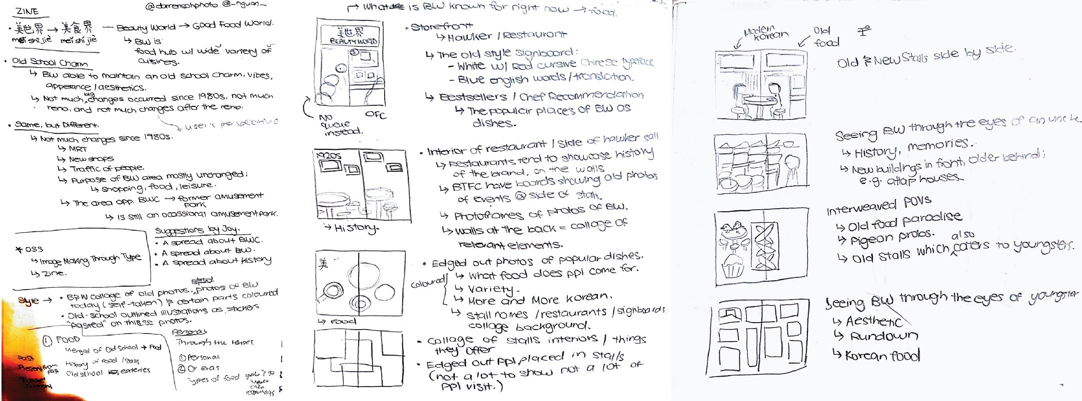
Ideation
Inspirations
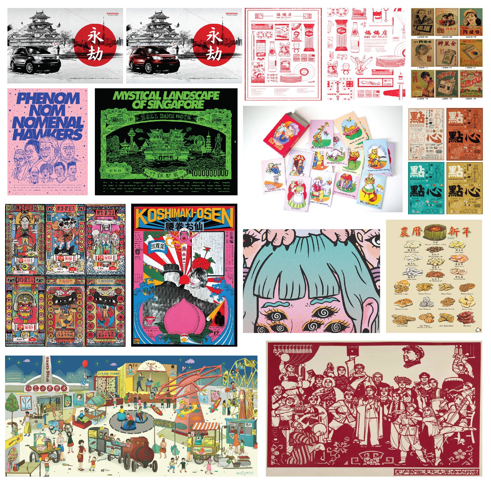
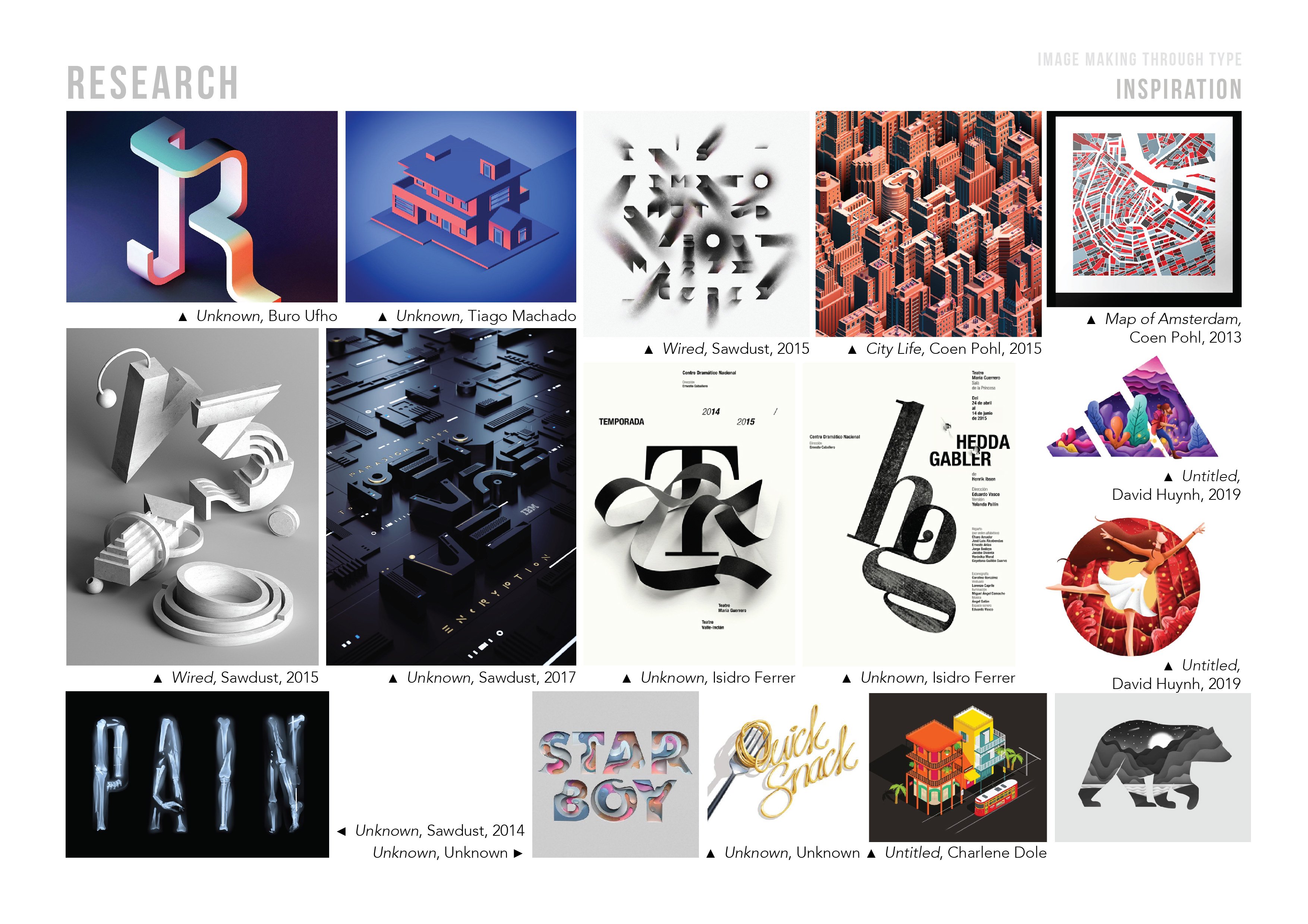
I was mostly inspired by retro-like illustrations with black outlines. I was also inspired by the juxtaposition of the colours in the illustrations for Honda on the top left.
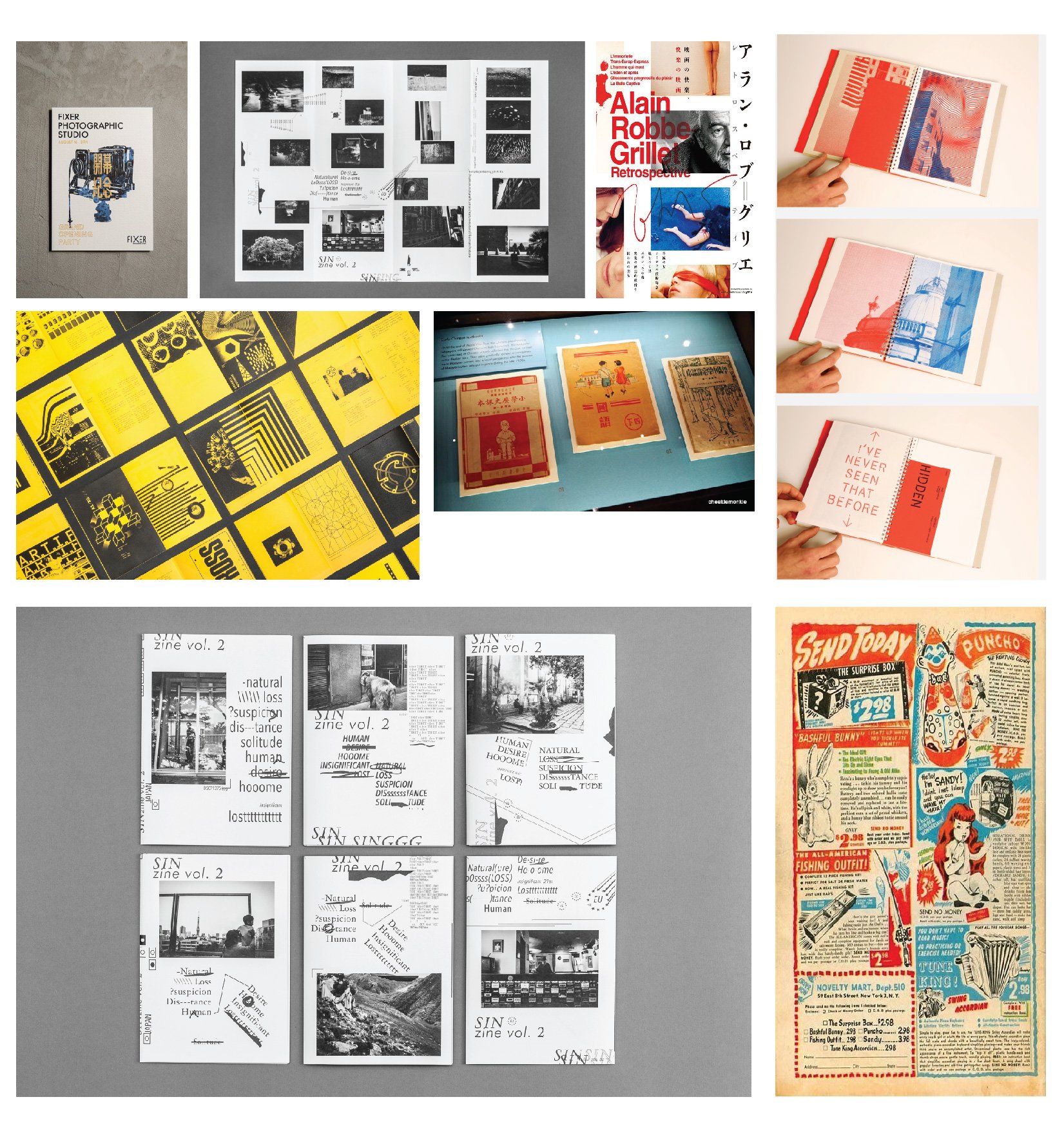
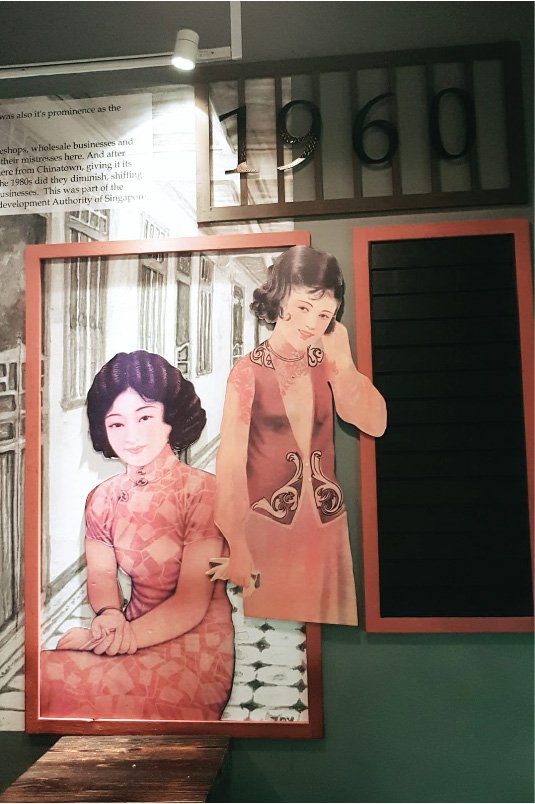
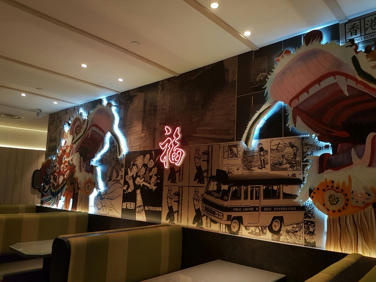
For my zine layout, I was inspired by the wall decors on the Keong Saik Bakery, as well as the wallpapers of Xin Wang Cafe. I liked the juxtaposition of colours a lot, as well as the retro illustration-comic-collage vibes.
Process

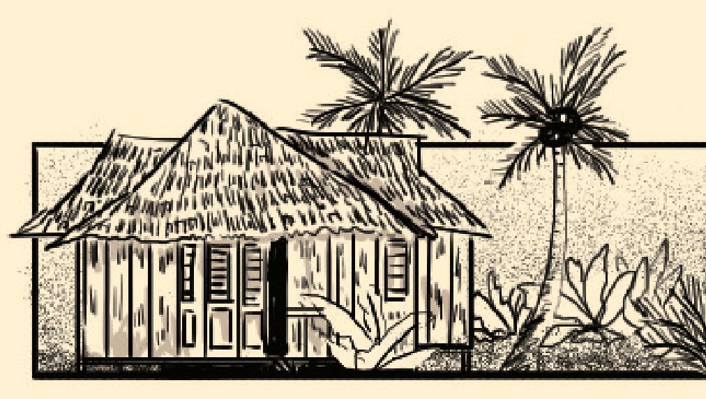

Decided to use a comic-like, black-and-white illustration style, with black borders framing the illustrations.
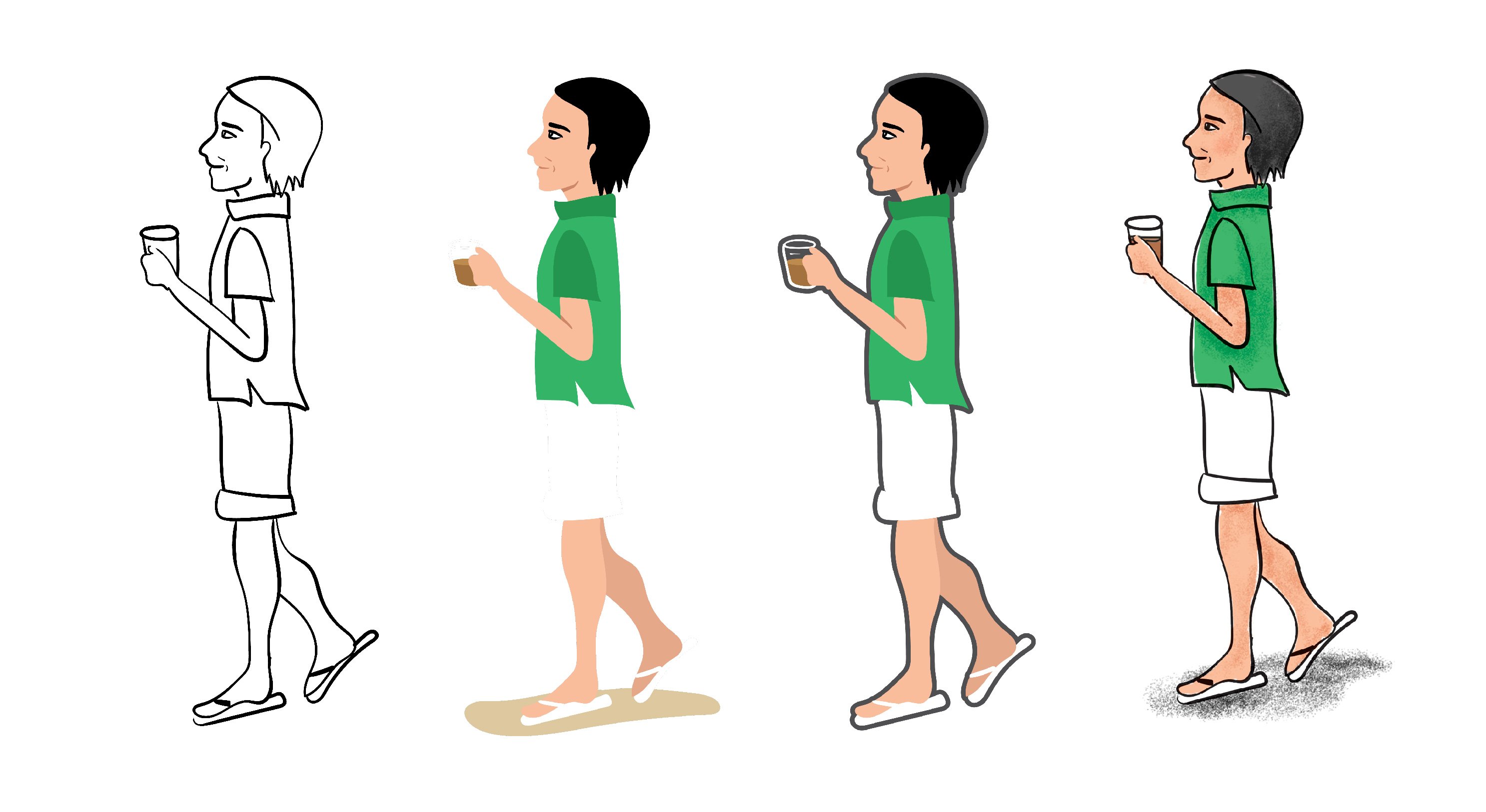
Exploration of styles for illustrations representing the present. Initially tried out vectors as I wanted it to have a juxtaposition between not only the colours (B&W vs. Colours), but a juxtaposition between the style as well. However, decided to go with the last variation as it would not look too jarring when placed together with the B&W illustrations.
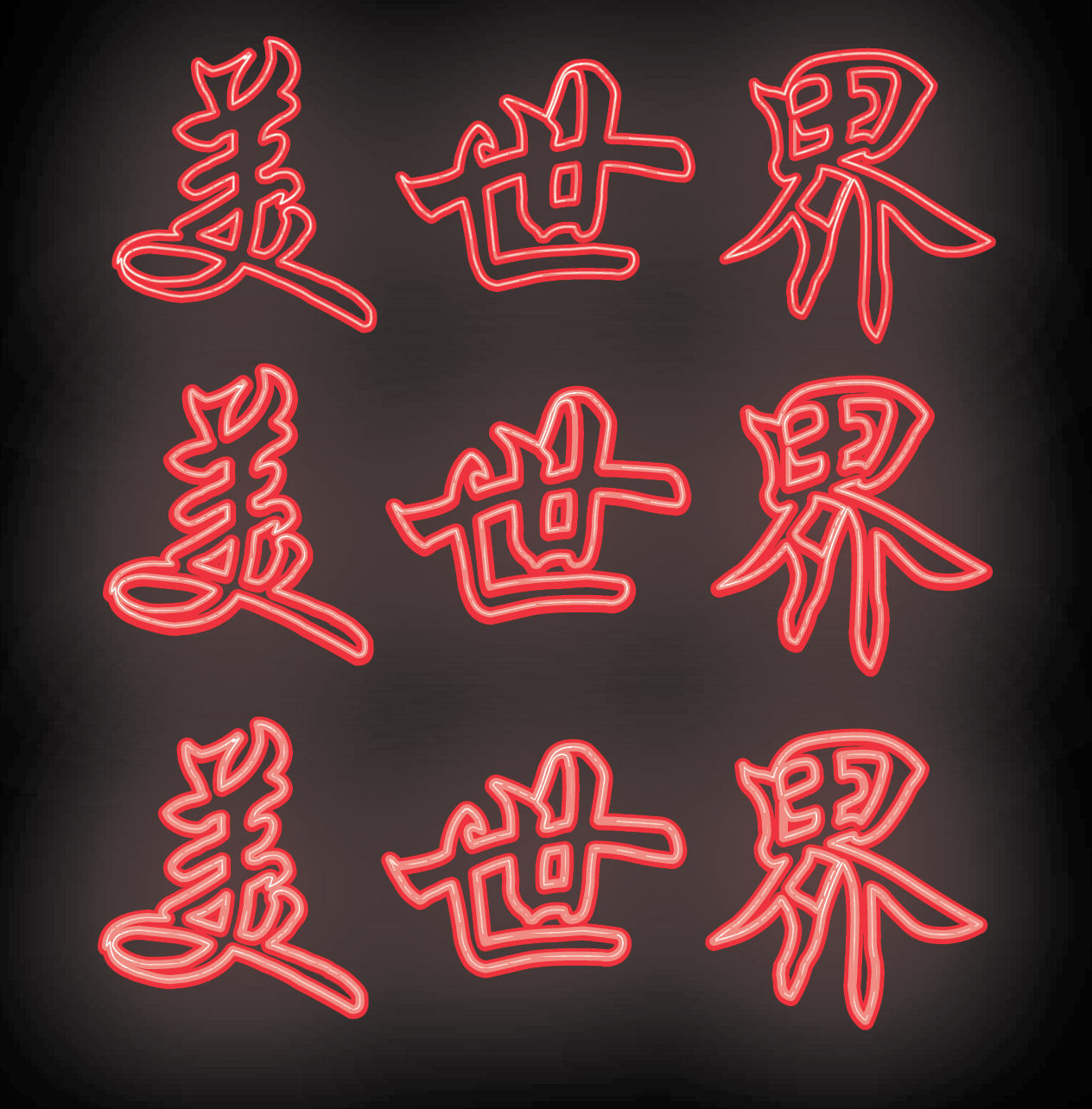
I tried to experiment around with the texts to replicate the neon-light effect.

Almost all the elements / frames in the zine are all aligned to the grid.
Final Zine
I decided to take a more narrative-like approach, using illustrations to convey the different perspectives of the different generations. It is mostly graphics, with a few Chinese characters to help to convey / depict certain messages. I decided to use mostly Chinese characters as the stallowners, hawkers, and patrons were mostly Chinese – both in the past and in the present.
The theme revolves around the change in the Beauty World area. As most of the changes occurred before the 1980s, and there were only minimal / subtle changes in the area ever since, not much of the younger generations are aware of Beauty World’s history. However, in the recent years, Beauty World started to have an influx of foreign cuisine restaurants and cafes, and the younger generations started to visit the area, or returned here for the newer additions. Hence I decided to do a zine which was split into two perspectives; the older generation and the younger generation to depict the older changes and the recent changes in Beauty World.
The zine can be flipped from either the front and from the back.
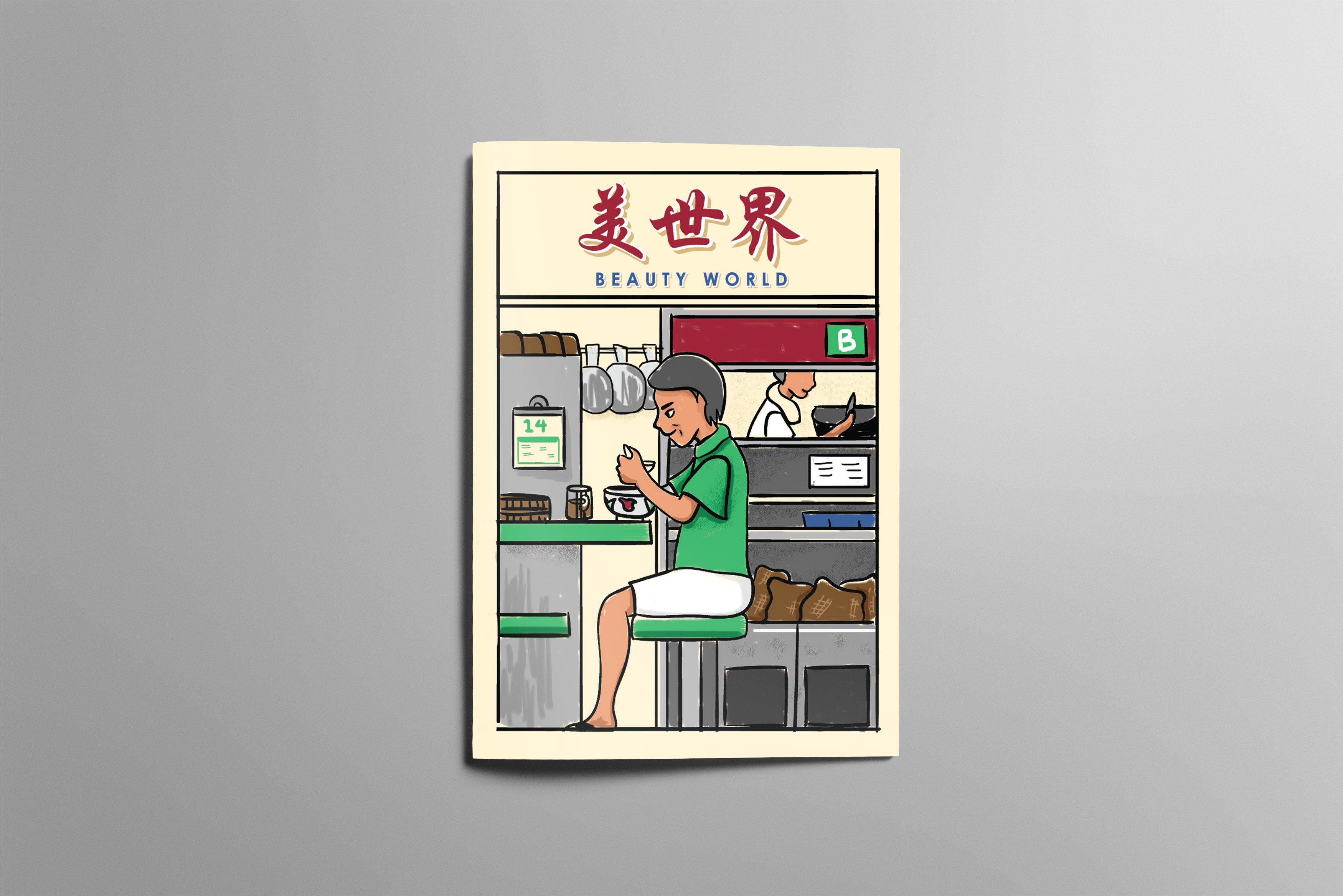
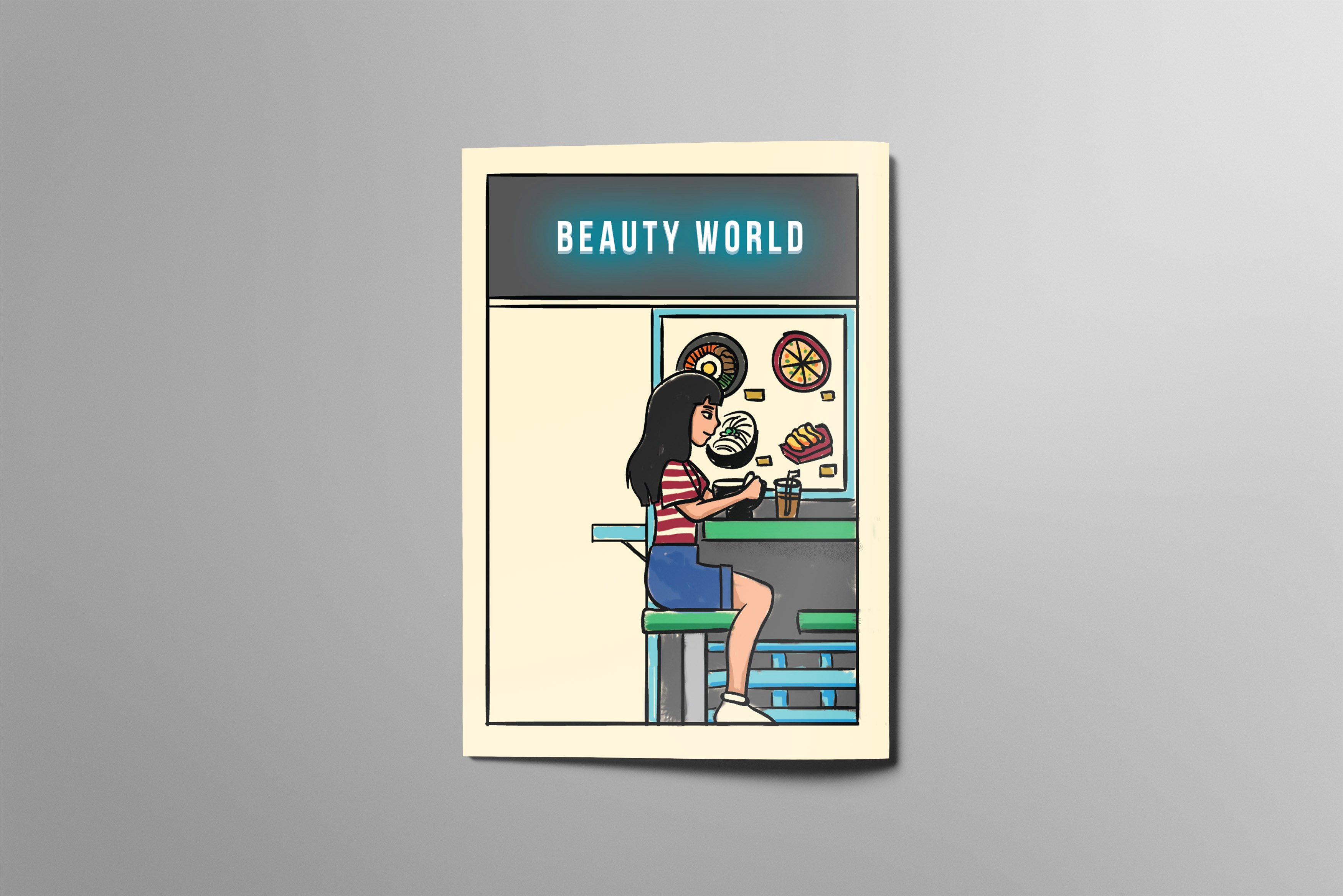
Back Cover & Front Cover – New ( Back cover ) & Old ( Front Cover )

The front cover consisted of the Uncle, who was the representation of the older generation, sitting outside an older stall while eating the “older” authentic food – which was implied by the traditional bowl and the old signboard of the stall.
Whereas on the back cover, the girl, who was the representation of the younger generation, was sitting outside a newer and more modern stall, eating more the “modern” modern food – implied by how the bowl was same as the bowl on the menu of the more modernised stall, and how the stall had a signboard consisting of only English words and neon lights.
I decided to depict a scene at the hawker centre, as Beauty World was mostly known for its food, and its hawker centres.
The colour scheme used was the same as the one in Locale, and are found onsite. The typefaces chosen are also found onsite.
First Spread – POV of the Uncle ( Representation of Older Generation )
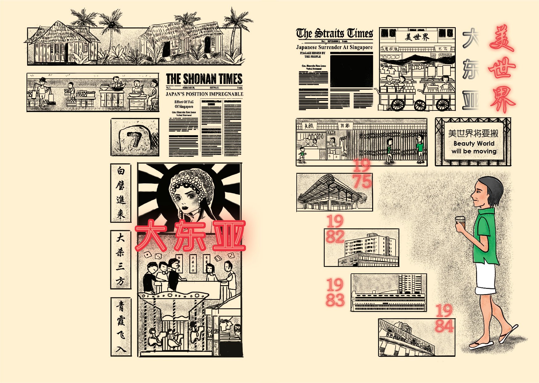
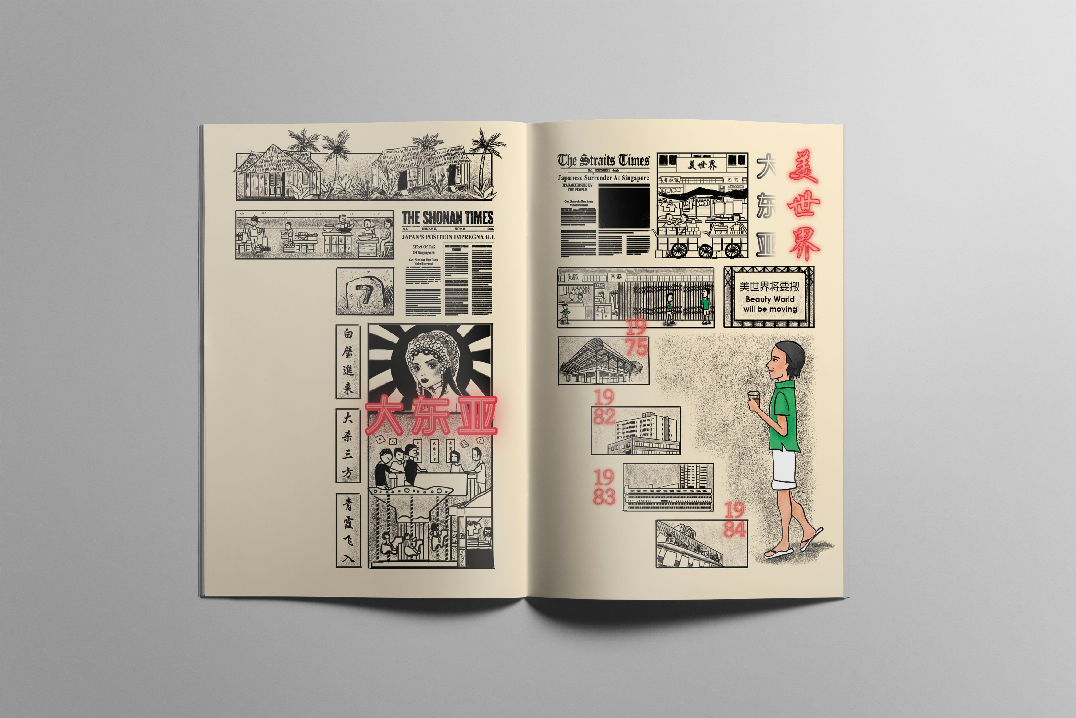
Whenever I asked the older generations about Beauty World, they would always speak fondly about the memories of the former Beauty World, as well as how bustling Beauty World was compared to how it was now. Hence, I decided to depict more of the history of Beauty World in the first spread, and in black and white to show that it was in the past.
The spread is split into two; key changes before and during the Japanese Occupation, and the key changes after the Japanese Occupation. I included illustrations of newspapers – The Shonan Times and The Strait Times, to imply the Japanese Occupation, as well as after the Japanese Occupation.
I decided to split the pages up as I wanted the viewer to view the first page first before moving to the second page, instead of just reading the spread horizontally. The elements of the spread was also shaped into the number “70”, to symbolise 70+ years of Beauty World.
The uncle in the spread was coloured to symbolise that he is of the present.
1st Page
- Bukit Timah Village , and market along the road.
- Located at / near the 7th Milestone
- During the Japanese Occupation, 大东亚( Da Dong Ya) Amusement Park was built
- Gambling dens to curb inflation
- The 3 signage were words commonly found at the gambling dens
- Wayang shows were really popular there, but the stages were also used to spread propaganda
2nd Page
- After the occupation, the place was turned into a market and was renamed 美世界 (Beauty World – the former Beauty World)
- The former Beauty world eventually closed down (due to repeated outbreaks of fire) and was moved
- Bukit Timah Market and Food Centre, Beauty World Plaza, Bukit Timah Shopping Centre, and Beauty World Centre was eventually built in close succession, and housed many of the stallowners from the Former Beauty World
Middle Spread – Overlapping POVs of the Older Generations & Younger Generations
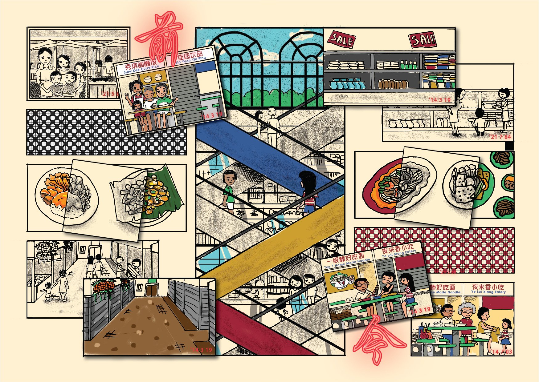
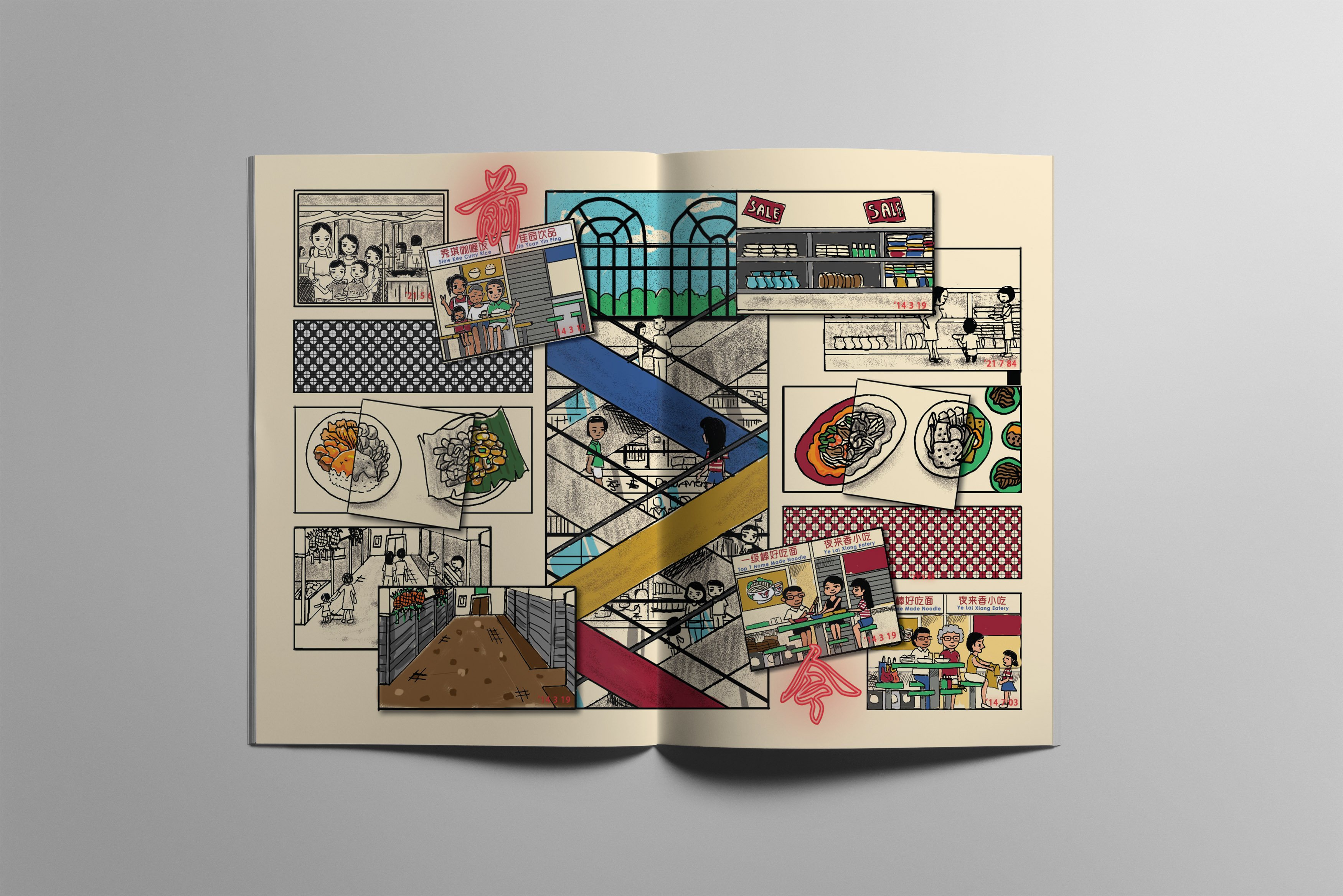
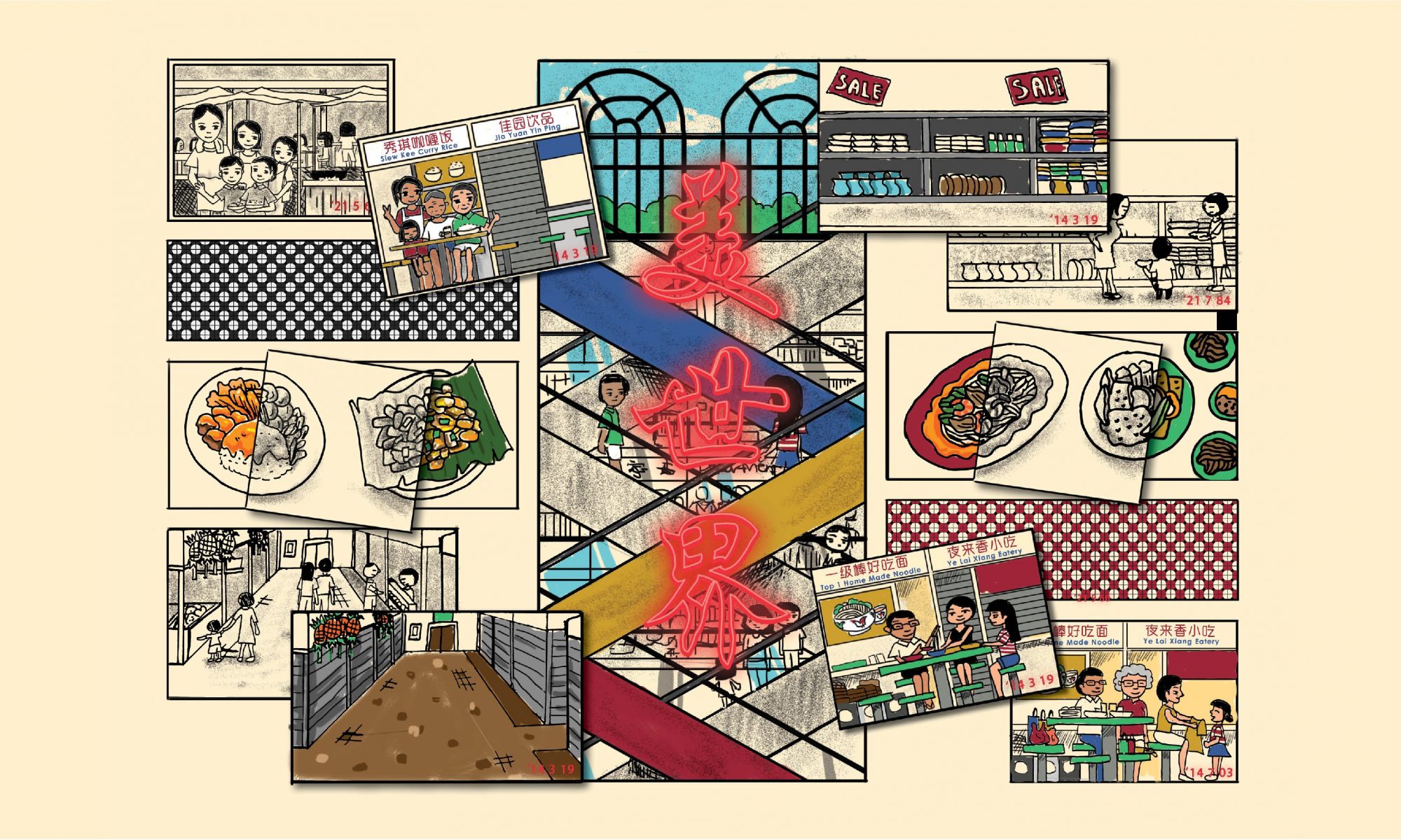
The middle spread consisted of the interweaving perspectives of both generations; both generations comes to Beauty World ( occasionally for the younger generations ) for the authentic food which have been around for 30 to 70 years. Both generations are mostly also aware of the gradual change in human traffic in Beauty World; the older generation were around when Beauty World was bustling, and the younger generations frequented this area in the past with their family, when it was more crowded.
Hence, I decided to use a combination of both black and white, and coloured illustrations to depict the comparison between the past and the present. “Dates” of the “photographs” stating the year it was taken are stated on the bottom right of all the illustrations of photographs.
I decided to depict the iconic escalators of Beauty World Centre in the middle, as escalators could symbolise movement – change, and travel – how time travels, and how the escalators were placed criss-crossed resembled the idea of interweaving.
I also used the Chinese characters, “前” and “今”, which means “past” and “today”, to further help convey the idea.
Furthermore, the layout of the pages in the spread were reflected to show how certain perspectives of both generations are similar – reflected one another’s.
Last Spread – POV of the Girl ( Representation of the Younger Generation )
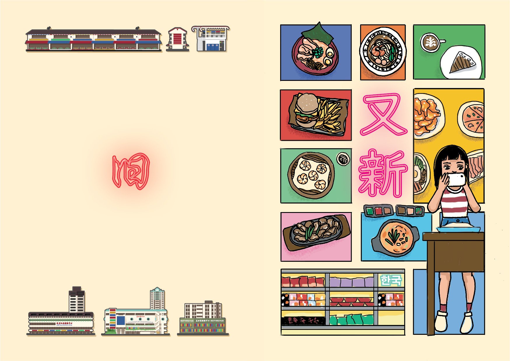
The last spread is the perspective of the girl, and the illustrations are all coloured to reflect the idea of the present.
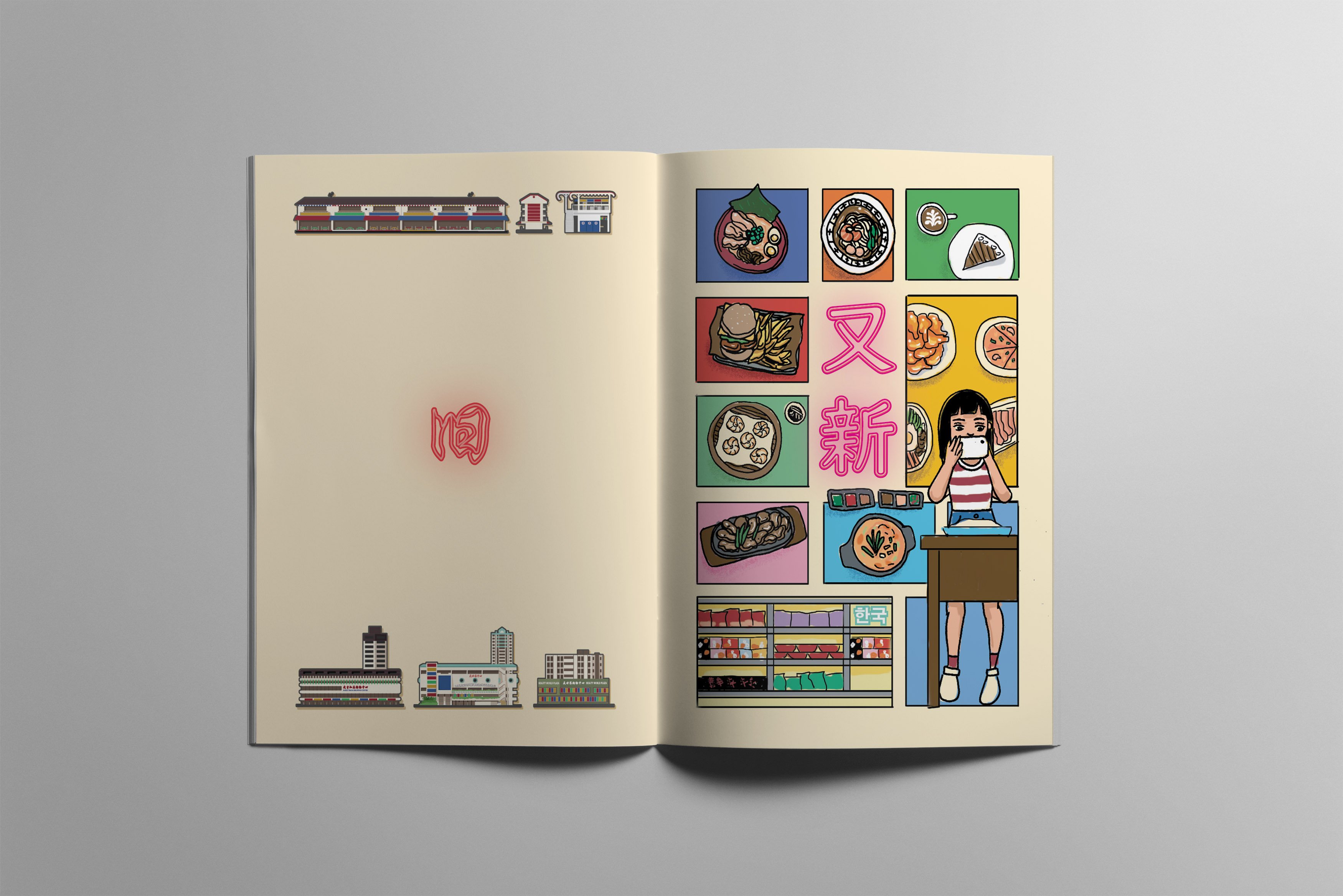
On the left page, the page was primarily empty, with illustrations of the exteriors of the more well-known buildings in Beauty World, and with the single word “旧” in the middle. The page was rather empty compared to the other pages in the zine, as this page symbolises the knowledge of the younger generation have about Beauty World. Most of the younger generations felt that the place is old and rundown, and have been around for quite a while, but are unaware of its history and purpose. Hence, I decided to depict the page emptier to signify the lack of knowledge about the place, and only the exteriors of the buildings as the younger generations mostly only “sees the exterior”.
Whereas on the right, the page was filled with lots of “modern” food – food from different cuisines, ranging from Thai, Japanese, American, etc., and are primarily Korean ( I tried). The words “又新”, which means “and new”, was in a more modernised Chinese font, and was in pink neon lights to further amplify the idea of more “modern”. This page was to symbolise how the younger generations frequently comes for these different cuisines, and some of them are only aware of the existence of Beauty World as these eateries and restaurants were located here.
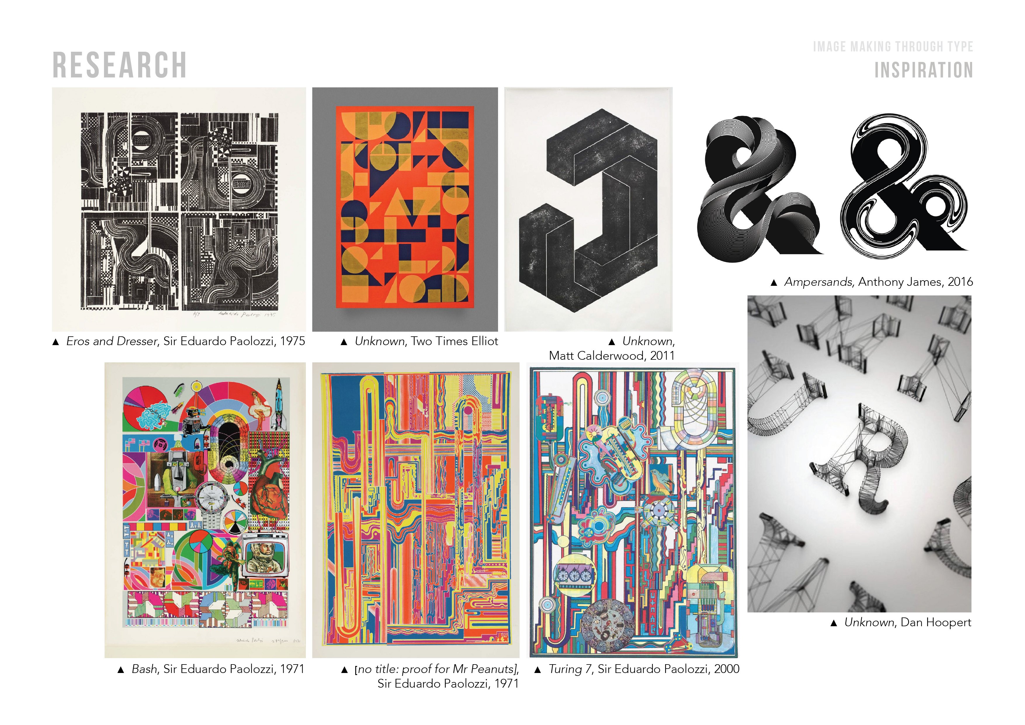 Initially, I was inspired by the works of Sir Eduardo Paolozzi. The collage-like style was interesting, and was something which I have yet to try out with.
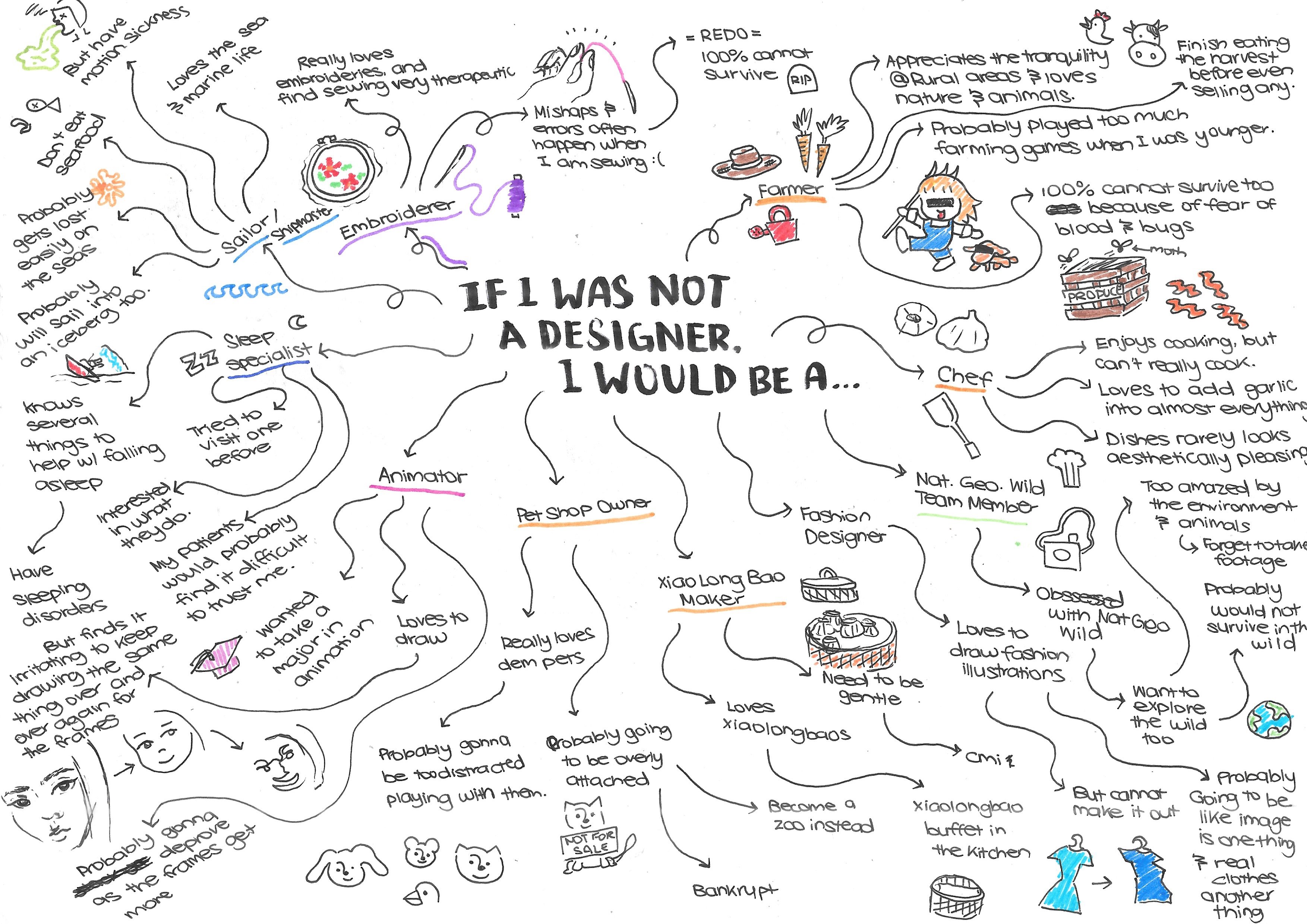
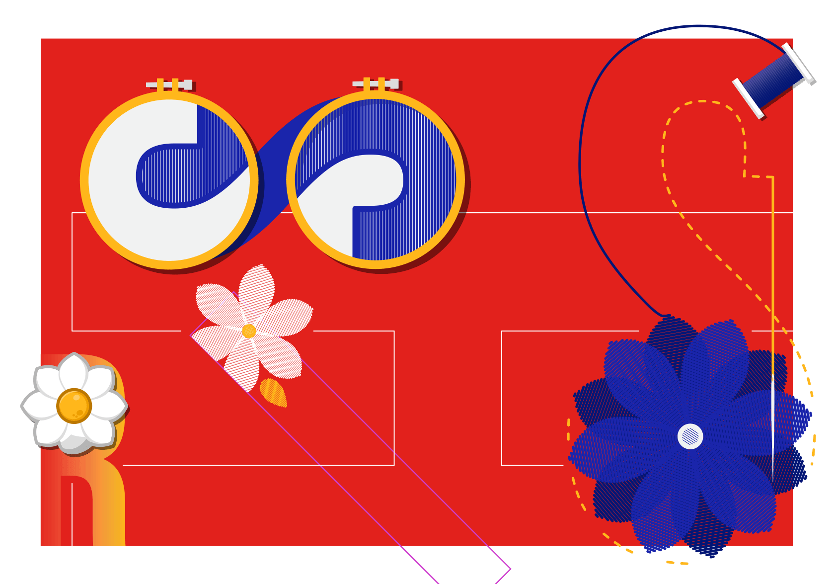 Sewist
 Sleep Specialist
 Farmer

 Shipmaster
