Beauty World
I decided to choose Beauty World as my location, as it was a place which I used to frequent when I was younger. I felt that it would be more interesting to choose a place with fond memories so that I could relate to it better, and it would be a great chance to know more about the place, which I did not actually know much about.
It was rather interesting how the area was able to remain almost the same as I remembered it to be almost 15 years ago, unlike how many malls and places in Singapore, which tend to undergo major renovations and have influxes of new shops and fastfood / restaurant chains. Apart from minor changes to the exteriors and the interiors, a few new stalls / shops, and a new MRT station, Beauty World remained almost the same as it was all these years – albeit with lesser crowds.
Secondary Research
History
Before this project, I too, thought that Beauty World = Beauty World Centre. However, it was actually named after a former market with the same name. Although the area did not undergo much changes throughout the recent years, the area underwent plenty of changes before the 1980s.
Brief Summary of Key Changes:
Bukit Timah Village & Bukit Timah Village Market > Da Dong Ya Amusement Park > Former Beauty World > Bukit Timah Market and Food Centre > Beauty World Plaza, Bukit Timah Shopping Centre, Beauty World Centre

Photo Credits: National Archives of Singapore
- Bukit Timah Village & Bukit Timah Village Market ( < 1920s )
- Located along Jalan Jurong Kechil
- Village Market was said to have been opened before the 1920s.
- Rubber and pineapple plantation workers
- “Beh Chia Loh Boey”, back of horse carriage road in Hokkien – Bukit Timah Road
- Site was badly destroyed during the Japanese Occupation
- Da Dong Ya Amusement Park 大东亚 / 大东亚世界 ( 1942 – 1945 )
- “Greater East Asia / Greater East Asia World”
- In line with the Japanese’s “Greater East Co-prosperity Sphere” concept
- Market and entertainment hub established during Japanese Occupation
- Gambling stalls, coffeeshops, general stores, photo studio, movie theatre, dance hall, wayang and getai stages
- Gambling dens to stop inflation
- Stages was also used to spread propaganda

- Former Beauty World 美世界 ( 1947 – 1975 )
- Located at the empty plot of land opposite current Beauty World Centre
- Renamed to Beauty World after the war
- Inspired by the trend of amusement park names with the word “world” in Singapore, as reminiscence of it “being” an amusement park
- Transformed into a market for the residents around the area, with a cinema and a Chinese temple
- Eventually became a popular spot for the people living in the West as well
- Ravaged by huge fires on 5 occasions, and was closed in 1983
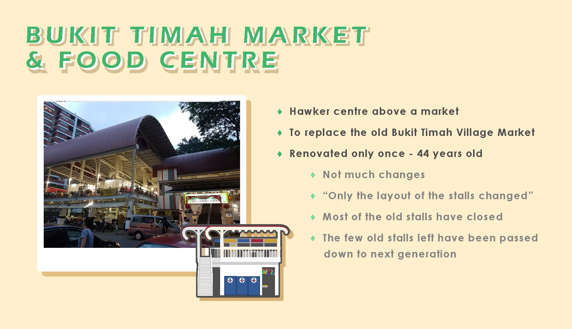
- Bukit Timah Market and Food Centre ( 1975 – )
- A new wet market and hawker centre
- Former hawkers and stallowners from Bukit Timah Village Market and Former Beauty World relocated
- More hygienic environment
- 1 renovation since 1975, only the colours & layout of stalls changed

- Beauty World Plaza ( 1982 – ), Bukit Timah Shopping Centre ( 1983 – ), Beauty World Centre ( 1984 – )
- To house hawkers and stallholders across the road, from former Beauty World
- Still houses lots of stalls & shops which have been around since the 1980s, or earlier
Beauty World in the Present

Location
- Located conveniently in Central Singapore, along Upper Bukit Timah Road
- Great accessibility
- by cars
- by buses ( more than 10 services )
- by train ( Downtown Line )
- Nearby schools
- Korean International school
- Ngee Ann Polytechnic
- Several tertiary schools located nearby ( e.g. around Tan Kah Kee )
Popular Places
- Beauty World Centre
- Shophouses along Cheong Chin Nam Road
- Restaurants & Food stalls
- Shophouses along Chun Tin Road
- Old family bakery
- Korean mart & restaurants
- Bukit Timah Food Centre
- Bukit Timah Shopping Centre
- Lorong Kilat Apartments ( Shops downstairs )
- Uncle Ringo ( Comes and goes )
Popular Timings / Peak Hours
- Lunchtime, Dinnertime
- Saturday morning / late afternoon
- Sunday morning / late afternoon
Recent Changes
- Opening of Downtown Line MRT station ( Beauty World station )
- New Korean marts and restaurants
- Several new cafes
- Several new restaurants and shops
Primary Research
Onsite Research
- Saturday, 16 February 2019, late afternoon – evening
- Beauty Word Centre, Shophouses along Cheong Chin Nam Road & Chun Tin Road, Lorong Kilat area, Uncle Ringo
- Crowds @ Beauty World Food Centre, foodstalls & restaurants @ shophouses area, large crowd @ Uncle Ringo
- Friday, 1 March 2019, afternoon
- Beauty World Centre, Shophouses, Beauty World Plaza
- Crowds @ Beauty World Food Centre until around 2pm
- Almost nobody inside Beauty World Plaza
- Saturday, 2 March 2019, afternoon
- Beauty World Centre, Shophouses, Lorong Kilat
- Larger crowds @ Beauty World & Beauty World Food Centre
- Tuesday, 5 March 2019, late afternoon – evening
- Korean restaurant @ Shophouses area, Bukit Timah Shopping Centre, Bukit Timah Food Centre
- Sunday, 10 March 2019, late afternoon – evening
- Large crowds @ Bukit Timah Food Centre
Onsite Interviews
Some of my interviews with the shopowners:


Interviewed mostly shop and stallowners from Beauty World Centre, as most of the shops are self-owned. Found out that were some stalls which are relatively new as well, some were around for only 2 years, yet they have became very popular.
It was rather difficult to interview at places such as the stalls & restaurants at the shophouses & Bukit Timah Food Centre as they were constantly busy. Language barrier was also another issue when it came to the Korean restaurants, and occasionally the Chinese stalls as well. :’)
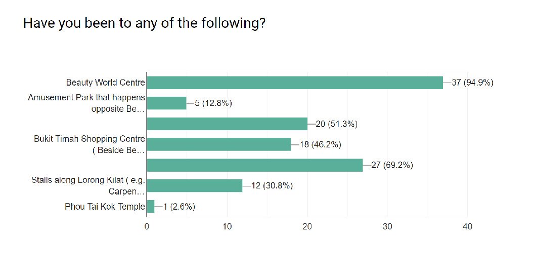
Onsite Survey / Online Survey
Some of the answers from my online survey & from asking people on site:


Other Observations
Places which are not food related tends to be quieter and emptier during most times.


Deliverables
I decided to do an illustrated infographic poster and presentation slides as my deliverables, as it would be difficult to film the interviews with the people there; they were mostly the elderly – who tends to dislike being photographed or filmed.
Colour Scheme & Typefaces

Image Credit: Eugene Tan, stateofbuildings.sg

The retro-like colour scheme and typefaces which were used in the deliverables were found on site.
Red – The colour of the old facade of BWC, and on the stall signboards
Yellow – The colour of the old facade of BWC, signages, tables and chairs
Blue – Also from the colour of the old facade of BWC and the stall signboards
Green – the colour of the table and chairs at BWC
Beige – The off-white colours of the buildings

Typefaces taken from Beauty World Centre’s signage.
Final Infographics

I did an A2 size infographics to summarise the key statistic findings from my online survey, observations at Beauty World, and onsite interviews.


Presentation Slides