Graphic Form – Locale


Beauty World

I decided to choose Beauty World as my location, as it was a place which I used to frequent when I was younger. I felt that it would be more interesting to choose a place with fond memories so that I could relate to it better, and it would be a great chance to know more about the place, which I did not actually know much about.

It was rather interesting how the area was able to remain almost the same as I remembered it to be almost 15 years ago, unlike how many malls and places in Singapore, which tend to undergo major renovations and have influxes of new shops and fastfood / restaurant chains. Apart from minor changes to the exteriors and the interiors, a few new stalls / shops, and a new MRT station, Beauty World remained almost the same as it was all these years – albeit with lesser crowds.


Secondary Research

History

Before this project, I too, thought that Beauty World = Beauty World Centre. However, it was actually named after a former market with the same name. Although the area did not undergo much changes throughout the recent years, the area underwent plenty of changes before the 1980s.

Brief Summary of Key Changes:

Bukit Timah Village & Bukit Timah Village Market > Da Dong Ya Amusement Park > Former Beauty World > Bukit Timah Market and Food Centre > Beauty World Plaza, Bukit Timah Shopping Centre, Beauty World Centre


Photo Credits: National Archives of Singapore

  • Bukit Timah Village & Bukit Timah Village Market ( < 1920s )
    • Located along Jalan Jurong Kechil
    • Village Market was said to have been opened before the 1920s.
    • Rubber and pineapple plantation workers
    • “Beh Chia Loh Boey”, back of horse carriage road in Hokkien – Bukit Timah Road
    • Site was badly destroyed during the Japanese Occupation


  • Da Dong Ya Amusement Park 大东亚 / 大东亚世界 ( 1942 – 1945 )
    • “Greater East Asia / Greater East Asia World”
    • In line with the Japanese’s “Greater East Co-prosperity Sphere” concept
    • Market and entertainment hub established during Japanese Occupation
    • Gambling stalls, coffeeshops, general stores, photo studio, movie theatre, dance hall, wayang and getai stages
    • Gambling dens to stop inflation
    • Stages was also used to spread propaganda


  • Former Beauty World 美世界  ( 1947 – 1975 )
    • Located at the empty plot of land opposite current Beauty World Centre
    • Renamed to Beauty World after the war
    • Inspired by the trend of amusement park names with the word “world” in Singapore, as reminiscence of it “being” an amusement park
    • Transformed into a market for the residents around the area, with a cinema and a Chinese temple
    • Eventually became a popular spot for the people living in the West as well
    • Ravaged by huge fires on 5 occasions, and was closed in 1983

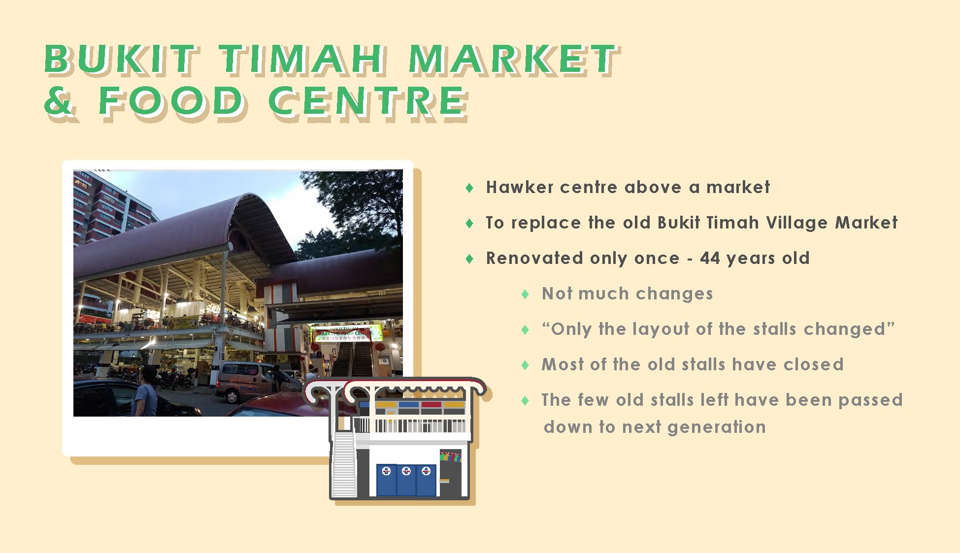
  • Bukit Timah Market and Food Centre ( 1975 – )
    • A new wet market and hawker centre
    • Former hawkers and stallowners from Bukit Timah Village Market and Former Beauty World relocated
    • More hygienic environment
    • 1 renovation since 1975, only the colours & layout of stalls changed

  • Beauty World Plaza ( 1982 – ), Bukit Timah Shopping Centre ( 1983 – ), Beauty World Centre ( 1984 – )
    • To house hawkers and stallholders across the road, from former Beauty World
    • Still houses lots of stalls & shops which have been around since the 1980s, or earlier

Beauty World in the Present


Location

  • Located conveniently in Central Singapore, along Upper Bukit Timah Road
  • Great accessibility
    • by cars
    • by buses ( more than 10 services )
    • by train ( Downtown Line )
  • Nearby schools
    • Korean International school
    • Ngee Ann Polytechnic
    • Several tertiary schools located nearby ( e.g. around Tan Kah Kee )

Popular Places

  • Beauty World Centre
    • Beauty World Food Centre
  • Shophouses along Cheong Chin Nam Road
    • Restaurants & Food stalls
  • Shophouses along Chun Tin Road
    • Old family bakery
    • Korean mart & restaurants
  • Bukit Timah Food Centre
    • Old & authentic food
  • Bukit Timah Shopping Centre
    • Cafes
  • Lorong Kilat Apartments ( Shops downstairs )
    • Cafes
  • Uncle Ringo ( Comes and goes ) 

Popular Timings / Peak Hours

  • Lunchtime, Dinnertime
  • Saturday morning / late afternoon
  • Sunday  morning / late afternoon

Recent Changes

  • Opening of Downtown Line MRT station ( Beauty World station )
  • New Korean marts and restaurants
  • Several new cafes
  • Several new restaurants and shops


Primary Research

Onsite Research

  • Saturday, 16 February 2019, late afternoon – evening
    • Beauty Word Centre, Shophouses along Cheong Chin Nam Road & Chun Tin Road, Lorong Kilat area, Uncle Ringo
      • Crowds @ Beauty World Food Centre, foodstalls & restaurants @ shophouses area, large crowd @ Uncle Ringo
  • Friday, 1 March 2019, afternoon
    • Beauty World Centre, Shophouses, Beauty World Plaza
      • Crowds @ Beauty World Food Centre until around 2pm
      • Almost nobody inside Beauty World Plaza
  • Saturday, 2 March 2019, afternoon
    • Beauty World Centre, Shophouses, Lorong Kilat
      • Larger crowds @ Beauty World & Beauty World Food Centre
  • Tuesday, 5 March 2019, late afternoon – evening
    • Korean restaurant @ Shophouses area, Bukit Timah Shopping Centre, Bukit Timah Food Centre
  • Sunday, 10 March 2019, late afternoon – evening
    • Large crowds @ Bukit Timah Food Centre


Onsite Interviews


Some of my interviews with the shopowners:

Interviewed mostly shop and stallowners from Beauty World Centre, as most of the shops are self-owned. Found out that were some stalls which are relatively new as well, some were around for only 2 years, yet they have became very popular.

It was rather difficult to interview at places such as the stalls & restaurants at the shophouses & Bukit Timah Food Centre as they were constantly busy. Language barrier was also another issue when it came to the Korean restaurants, and occasionally the Chinese stalls as well. :’)

Onsite Survey / Online Survey

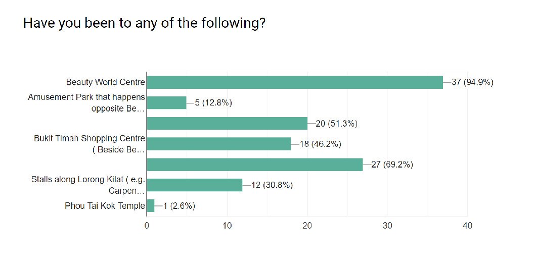
Some of the answers from my online survey & from asking people on site:

Other Observations

Places which are not food related tends to be quieter and emptier during most times.


Deliverables

I decided to do an illustrated infographic poster and presentation slides as my deliverables, as it would be difficult to film the interviews with the people there; they were mostly the elderly – who tends to dislike being photographed or filmed.

Colour Scheme & Typefaces

Image Credit: Eugene Tan, stateofbuildings.sg


The retro-like colour scheme and typefaces which were used in the deliverables were found on site.

Red – The colour of the old facade of BWC, and on the stall signboards

Yellow – The colour of the old facade of BWC, signages, tables and chairs

Blue – Also from the colour of the old facade of BWC and the stall signboards

Green – the colour of the table and chairs at BWC

Beige – The off-white colours of the buildings


Typefaces taken from Beauty World Centre’s signage.


Final Infographics 


Beauty World Infographics

I did an A2 size infographics to summarise the key statistic findings from my online survey, observations at Beauty World, and onsite interviews.


Presentation Slides 


Research Critique – Design Noir

DESIGN NOIR

‘Design Noir’ was a term came up by Anthony Dunne and Fiona Raby, in their book about the Critical Design Movement, which focuses on the relationship between humans and the rapidly developing technology, and how electronic objects shape our lives. Both Anthony and Fiona were the founders and pioneers of the movement, where design embodies alternate social, cultural, technical, or economic values to challenge the conventional values of today, and as well as to critique the established ‘problem’-solving role of design. The term ‘Design Noir’ was inspired by how the characteristics of Critical Design was similar to noir films; especially the part about “trying to escape from the normalisation in urban settings”, where normalisation is design being functionality-centric, and are mass-produced.

In today’s culture, the role of design is transforming into an agent for capitalism, with the main purpose of creating and maintaining the demand for newer and improved products. Corporations are more focused on meeting the consumers’ expectations and are often reluctant to invest in a more responsible and pro-active role within the society. Hence, Critical Design and human oriented values are often neglected in favour of designs which focuses solely on functionality, practicality, and popularity. The alternate possibilities of the designs, and important human-oriented values are often disregarded, and are slowly being deemed as only fictional.

According to the authors, design can be classified into two broad categories – Affirmative Design, in which most designs today fall under, and Critical Design. The main purpose of Critical Design was not to appeal to the masses and to generate sales, but to raise debate over the social and cultural values that we deemed as real or fictional, the aesthetics of our electronically mediated existence, and as well as the given roles of existing designs. Unlike Affirmative Design which are created for the market and are mass-produced, Critical Design can never be popular, as they are questioning and challenging the industry’s agendas.

As Thomas Frank wrote in his book, One Market Under God(2001), “the marketplace is viewed as the only reality”. A design is only considered successful if it was popular, and was able to sell in large numbers. Designs which are not meant for the market are regarded with suspicion and are often dismissed as elitist. Hence, Critical Design, which tends to be provocative and challenging in nature, and its main purpose of stimulating reflection and challenging industrial agendas, would tend to only remain as prototypes, as they are “not suitable” for the market, and are unlikely to be funded by the industry.

COMPLICATED PLEASURE

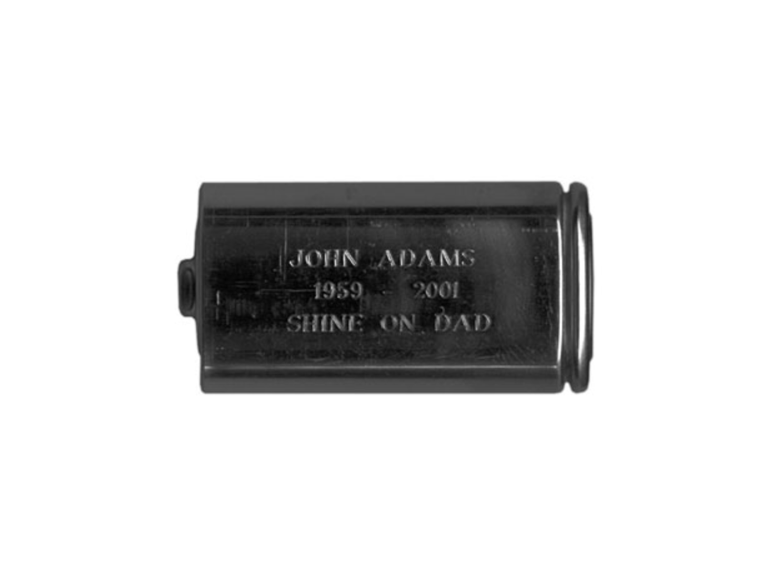
In order for conceptual designs to be effective, it must be able to provide a form of ‘pleasure’. Often causing contradicting or complex feelings, Martin Amis has called this experience provided by such designs as ‘complicated pleasure‘. This experience happens through the development of ‘value fictions‘, which are the scenarios we imagine in our heads. In such scenarios, the technology is realistic, while the social and cultural values are highly ambiguous, to question viewers about what they deemed as real or fictional. These designs are usually alternatives of existing designs / objects, and are often provocative in nature. One of such design was Afterlife, by Jimmy Loizeau.

The idea of an afterlife was something intangible, which nobody can prove, and there are no scientific evidence to back that it do exist. As the designer was an Atheist who did not believe in any gods or a spiritual afterlife, he wanted to “prove” that an afterlife do exist, in a physical and tangible way through the usage of technology. Although it does not actually prove that a spiritual afterlife does exist, it was able to prove that it was possible . Not only does the design act as a ‘proof’, it also serves as an object that helps people to cope with grief.  Apart from all these, I felt that it was also questioning our “electronically mediated culture”, and how “a battery might become as significant than an urn”.


Slides


References

Design Noir: The Secret Life of Electronic Objects – Anthony Dunne and Fiona Raby
http://www.augerloizeau.com/projects/afterlife
https://books.google.com.sg/booksid=_49YTKJ16l4C&printsec=frontcover#v=onepage&q&f=false
https://www.moma.org/artists/27788


Assignment 2A – Polyhedron Dreams ( Research & Process )

Planar Model Process: Tetrahedron

My initial planar model was made of 6 planes, 2 sets of 3 similar planes.

Initially, when I thought about making something to resemble a tetrahedron or imply its shape, I thought of making something symmetrical and angular. However, after completing the model, I felt that it did not look very interesting from different angles, as they were almost all the same. Hence, I decided to change my planar model.

Initially, I had difficulties drawing the different perspectives on paper. I wanted to use a big triangle as my dominant plane, without placing it in a way that it was one of the entire plane of the tetrahedron. Hence I wanted it to be tilted at an angle while being supported by another shape. It was then, when I placed the linear model over the two shapes that I felt that if I created and arranged shapes which touches all 3 points / ends of the triangular plane on every sides, it would be able to imply the shape of a tetrahedron more clearly.

Final Planar Model


Final Model Research:


Triangles and Arches, Alexander Calder, 1965         Beta Paper Installation, Richard Sweeney

I was inspired by the works of Alexander Calder, especially Triangles and Arches, where he uses triangles, but distorted their shapes and forms by making them curvier. I felt that it was interesting, and how it resembled like dolphins hopping out of the water and going back into the water.

Richard Sweeney’s Beta Paper Installations has also inspired me to create curves instead of flat planes. I liked how the creases and the bends of the papers greatly suggest a flow.

Untitled, Alan Brain                                      Untitled, Alan Brain

I was also inspired by the paintings of Alan Brain, where he uses mostly geometric shapes, but distorted them in a way where it did not look like the usual flat geometric shapes. I felt that movements or flow was implied through the distortions.

Bojes Chapel, Africa                                                            Walt Disney Concert Hall, Los Angeles

I felt inspired by these wavy architecture as well.


Final Model Process:

Initially, I had problems trying to visualise it and putting it on paper. I started out with trying to envision the original planar and linear models, and how to make the planes break apart from one another.

My linear + planar model and my Combination model prototype. Inspired by Alexander Calder, Alan Brain, and Richard Sweeney, I decided to make curves using geometric shapes made of cardboard. I used the same planes from the planar model; same / similar shapes but bigger / longer to amplify the idea of movement as the planes looked smaller when I creased the flutes to create the curves.

My prototype model. Used cotton thread to hold the planes, but felt that it looked weird and out of place like this. Also felt that the rubber bands were rather distracting, and it comes off easily.

Hence I decided to remake the model. It was rather difficult to catch the angle while using hot glue gun to stick the chopsticks together. Removed the extra plane in my prototype, and swapped the positions of some of the planes. I decided to use cotton thread to hold an entire side of the planes to the chopsticks instead of just holding it from the ends. I felt that this could portray the notion of movement, and looked less out of place compared to the prototype.

Final Combination Model