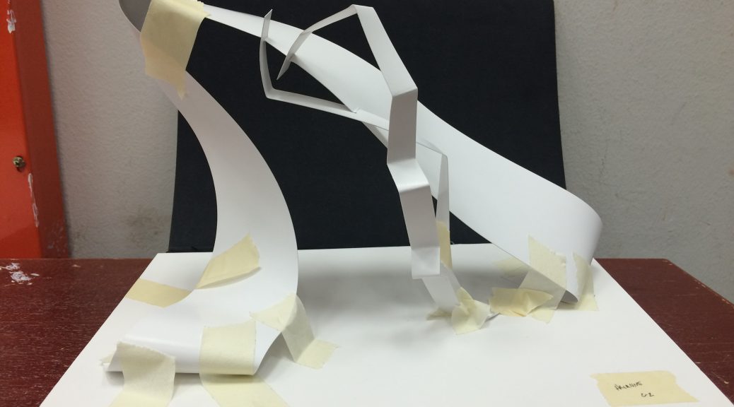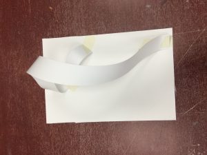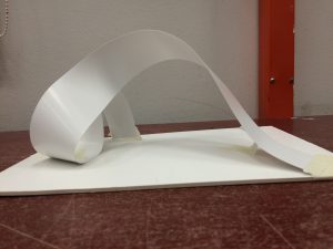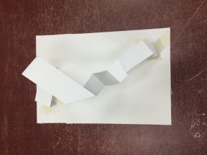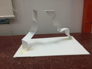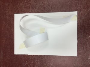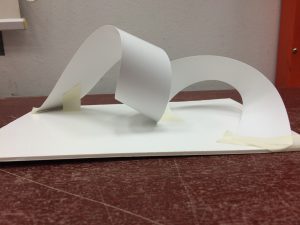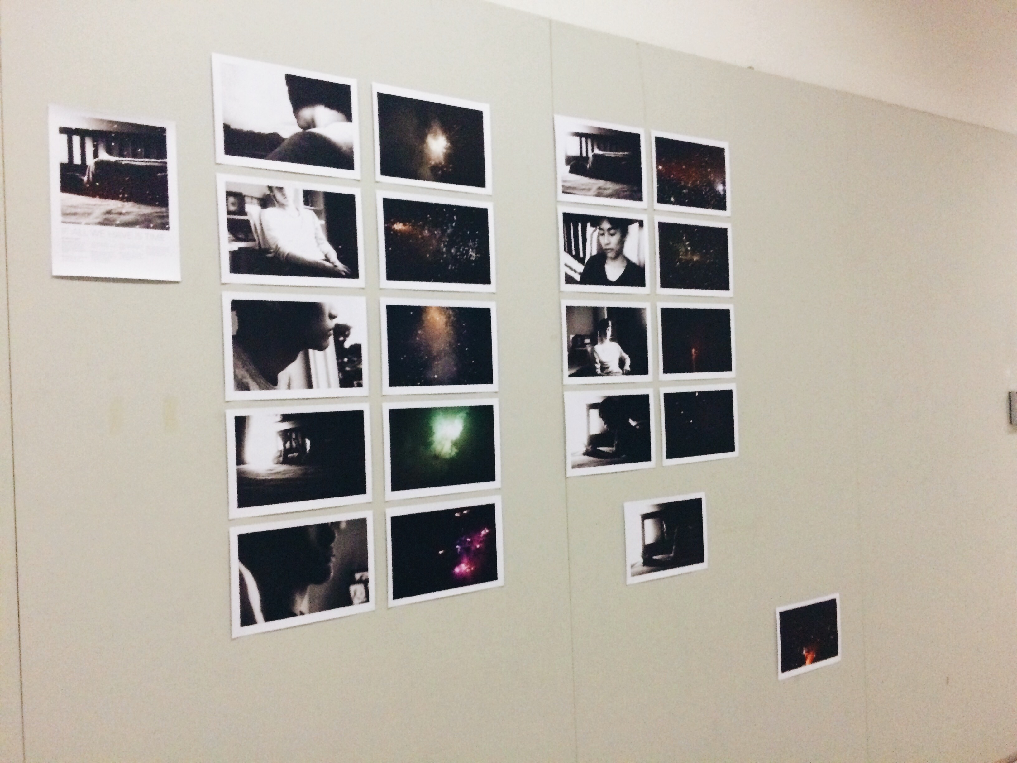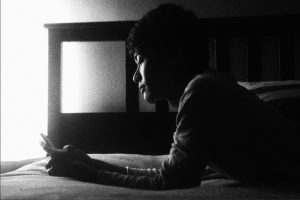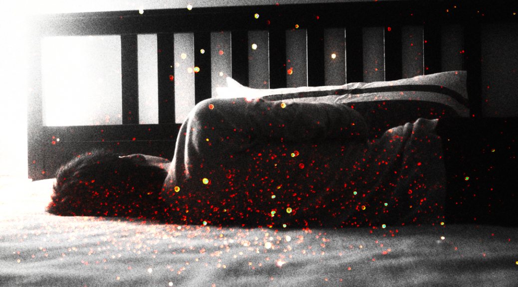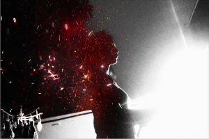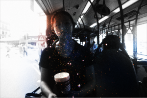
The final results of this project consist of my visual interpretations of 18 specific emotions. Experimenting with different methods of mark-making reveal many different outcomes that imply certain emotions. The project’s specifications about using only black and white (no colour) places a huge amount of emphasis on the mark-making itself, without the distractions of colour.
As a result, I have experimented with mono-printing, drawing, paper cutting, and stitching into the strips of paper for each emotion. Most have elements of mono-printing, but I believed that I could combine mono-printing with different elements and add layers onto my strips, as one will see below. These are the final works for each emotion. I chose the primary emotions of love, anger, and sadness.
➤ Primary Emotion of Love
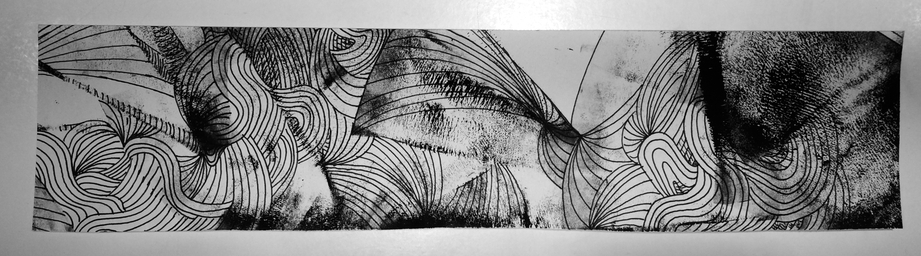
↳ LOVE: I believe that this emotion is full of ups and downs; very turbulent but also has a flow. That’s what I wanted to show with the combination of mono-printmaking, drawing, as well as stitching with white thread. The combination of mediums also translates to the combination of highs and lows in love; there are dark points and there are also light points. I wanted to show that there is a journey with this emotion and so the strip has a flow from left to right, and from dark to light – love can take you out of dark times.
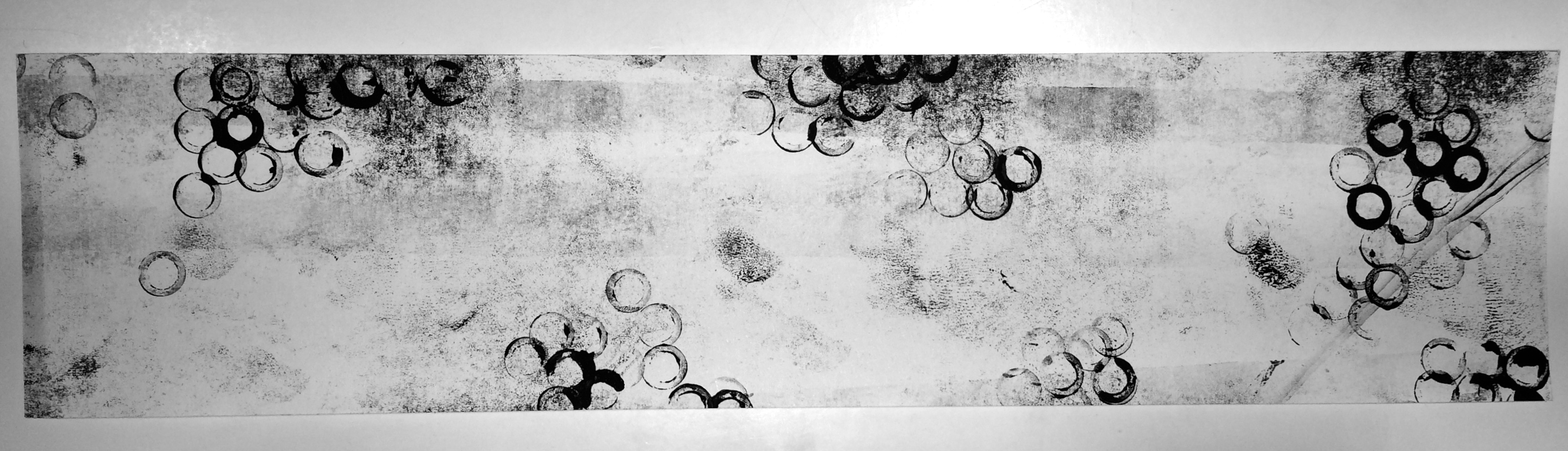
↳ AFFECTION: I think that this emotion is a much softer version of love, with a ‘bubble-like’ feeling that carries and makes you feel like you are floating and light-hearted. This piece is solely mono-printmaking. The background is lighter and more empty to give a more positive feeling. The darker patches convey more intense areas of the emotion of affection, like the feeling of wanting to bite a baby’s cheek or squish their face – that kind of affection.
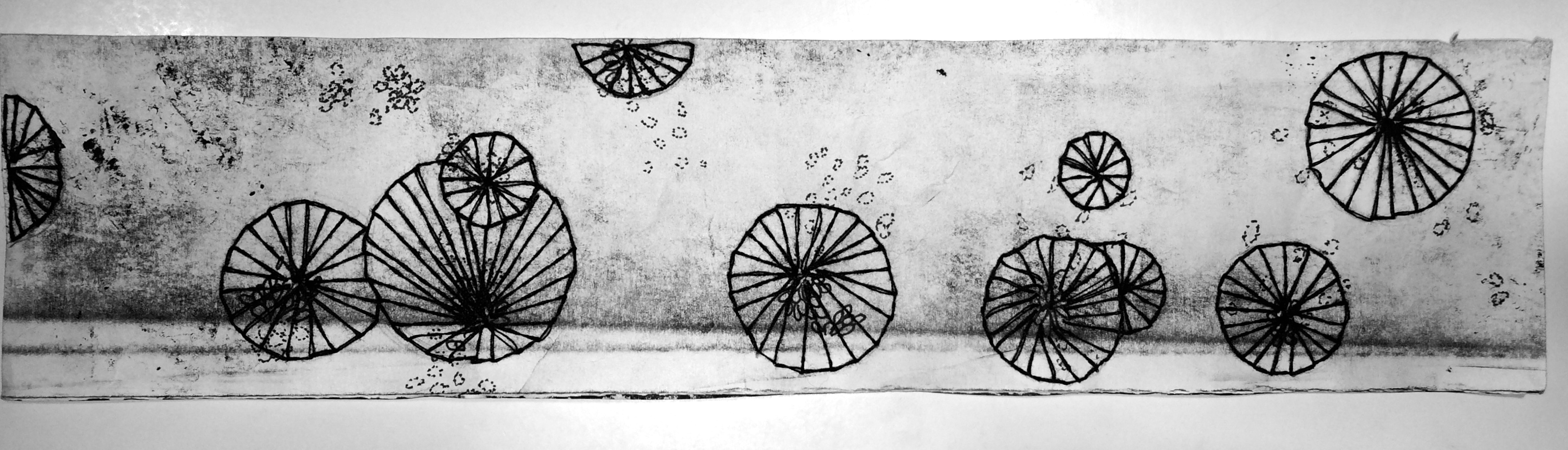
↳ FONDNESS: This strip is a combination again of mostly stitching and drawing. The background is one streak of a roller without much paint to communicate the straight-forwardness of fondness. It isn’t as turbulent as love and is much more simple; it has one direction and that is to the person/thing it is directed at. I think it is a little more bittersweet, however, than affection because fondness can lead to unwarranted bias and can often cage you in your opinion of a person based on how fond you are. That’s why even though the circular shapes of the thread are happier and softer, the lines in the middle lead to harsher points that communicate this “trapping” in your fondness for someone.

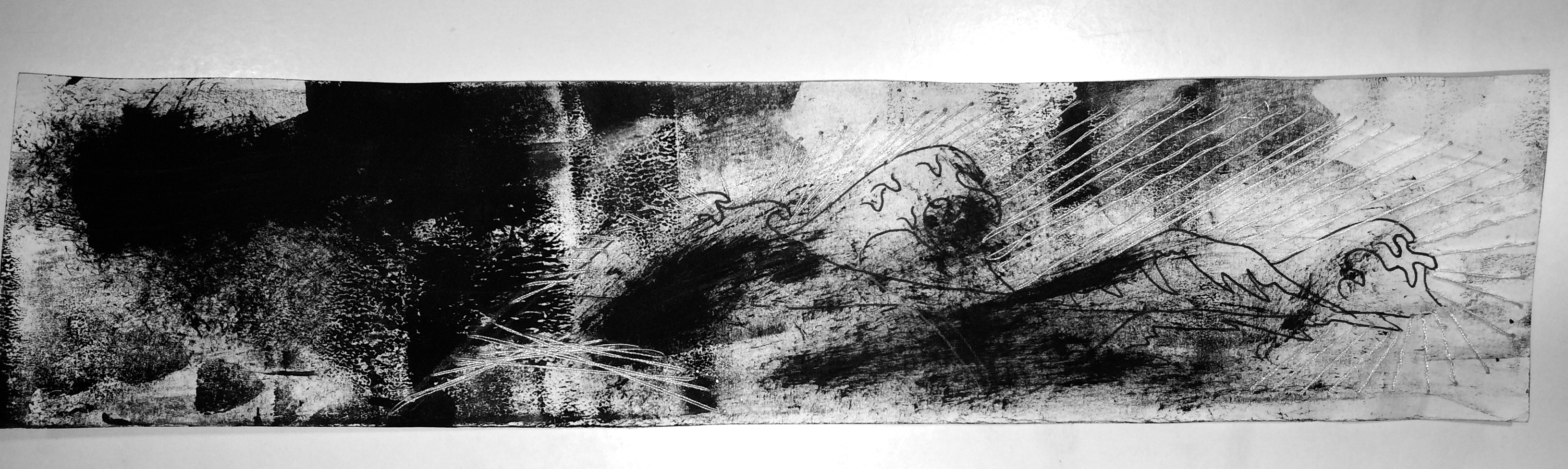
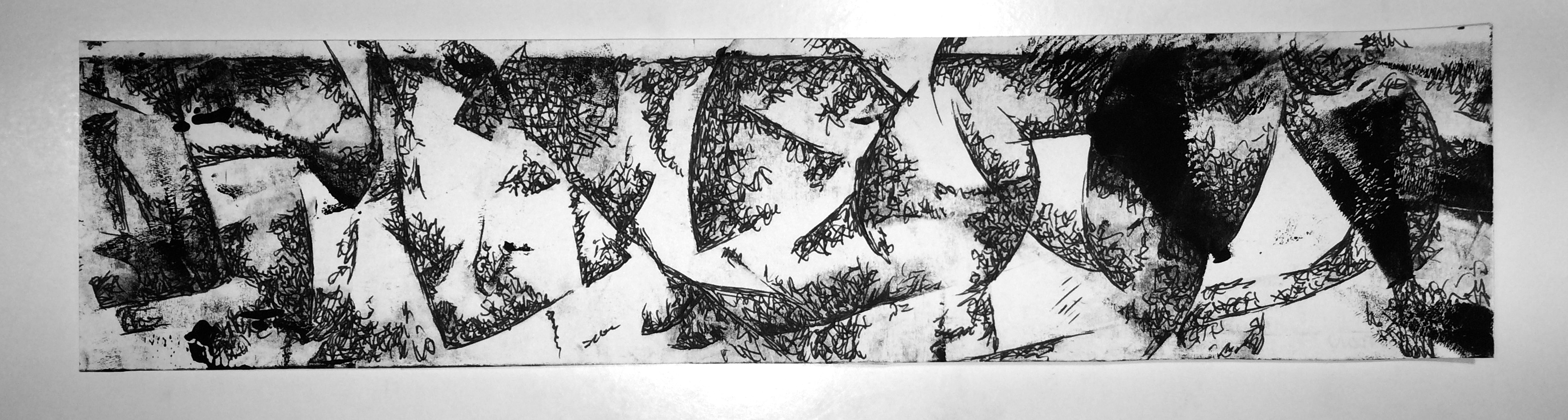
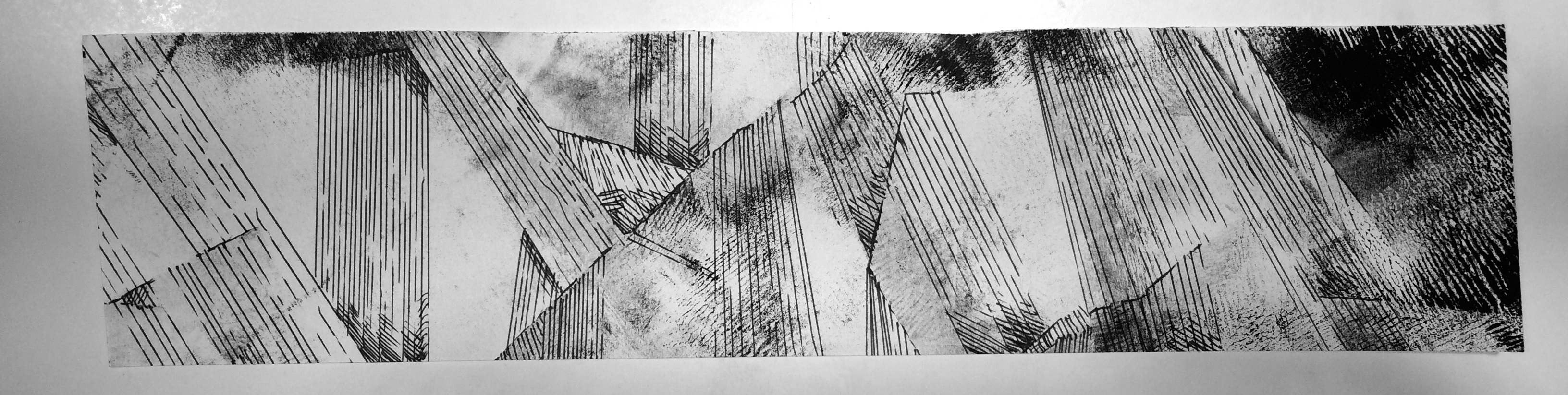
↳ LUST: Like love, lust is a turbulent emotion but I think it is much more intense and harsher than love; it is almost like a hazy feeling that clouds one’s vision. I used paper cutting over the whiter areas of the strip to communicate the feeling of being blocked by this emotion – you cannot see beyond the fierce wall of intense lust. The straighter lines in the background are also similar to fondness where lust is also very straightforward and raw as a human emotion, in my opinion. It leads to one thing; the flow of the strip goes to that destination by the flow of the black paper cut and the darker, intense marks.
↳ ADORATION: I think adoration is hard to hide. It is an emotion that is light-hearted and fun, but also has twinges of intensity (shown by the darker, random spots), and it can cut down the metaphoric wall one will put up to maintain their demeanour and shows through easily. I drew tiny “bubbles” and “pieces” coming off from the weakening, flimsy “wall” that runs along the middle to show this feeling of lowering your defences to the emotion that doesn’t hide itself from others.
↳ AROUSAL: I think arousal is similar to lust where it is very intense, but with this particular emotion I believe time plays an element. On this strip, from left to right, I wanted to portray a rhythmic increase in intensity and darker marks, to show the progress of arousal, which in my opinion, is the pre-cursor to lust. It’s a step-by-step increase in the strength of the feeling.
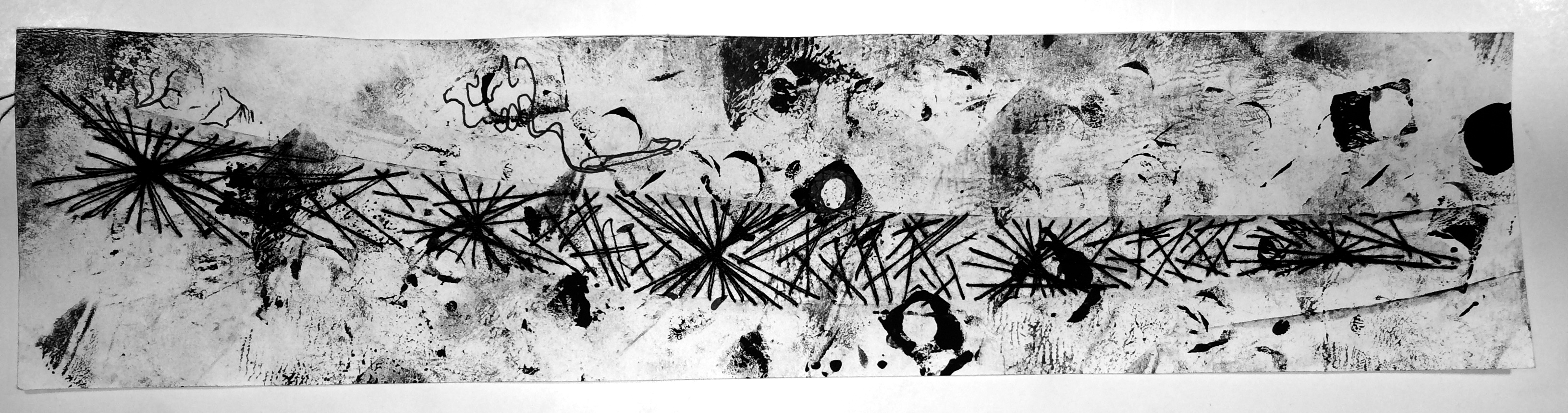
➤ Primary Emotion of Anger
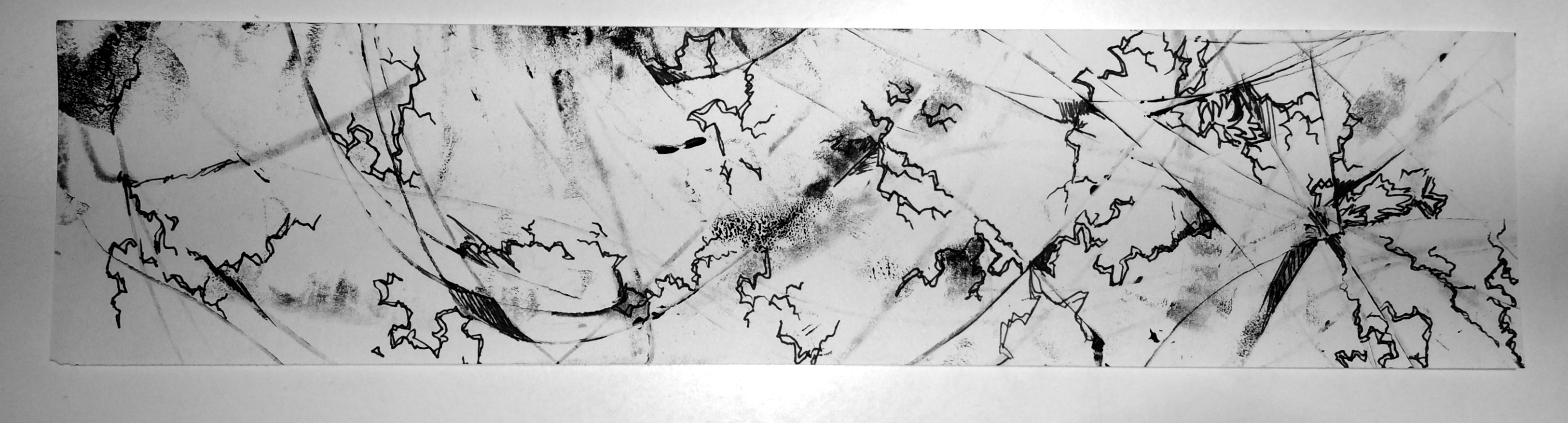
↳ ANGER: I didn’t choose to make anger look very intense. I don’t think that the emotion itself brings a darkness to the person; I believe that like arousal to lust, anger is a pre-cursor to emotions like rage and wrath. It is an emotion that weakens and “breaks” the person, per-se, which is shown through the crooked ‘crack-like’ and fragile. Along some of the edges, I showed the imminent darkness creeping out; marks that threaten to overcome the person and take over with more intense, powerful emotion.
↳ IRRITATION: Irritation to me is an incessant feeling that is the same as white-noise but if white-noise was darker and had a shrilling sound. I communicated this by curved, topsy-turvy turns of tiny scribbles that can be described as simply “incessant.” It takes your mind and turns you around and constantly irritates and annoys you, so I wanted to show that by using drawing on a mono-print background.
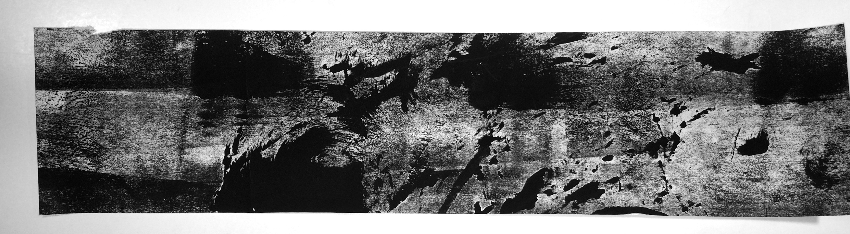
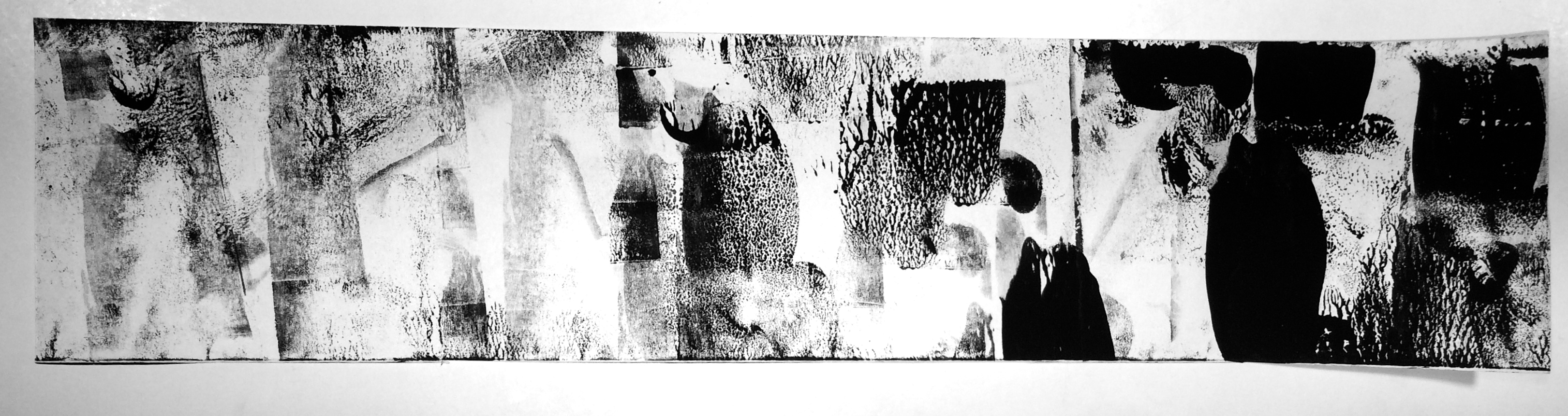
↳ RAGE: Rage is what comes after anger. It is a violent, tempestuous emotion that seems to turn one’s mind into a motion-blur movement, where the only thing one can focus on is the dark rage that spits and spews around like a relentless tornado/whirlwind. I think this emotion has a lot of movement, and so I translated that into movement on the strip for rage, using both mono-printmaking as well as applying paint using a roller. Rage is a very wild emotion.
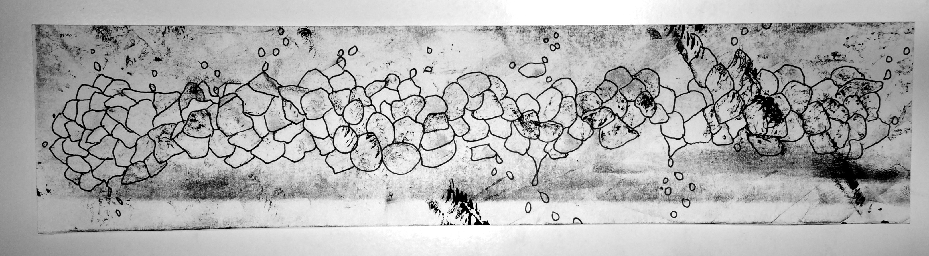
↳ CONFUSION: Confusion is not necessarily a bad emotion. Though I categorised it under the primary emotion of anger, I think confusion can also be taken as the term: “ignorance is bliss.” My strip illustrating confusion is quite giddy in nature. There are darker points where the spirals appear to fade into the unknown (which is also an essential part of confusion as an emotion) but there are also areas where they blissfully go without direction or reason – this is what I believe is also a very important part of confusion. The main idea behind this strip is that confusion has no direction and can be either blissful or dark and unclear. I aimed to show both of those sides to this feeling.
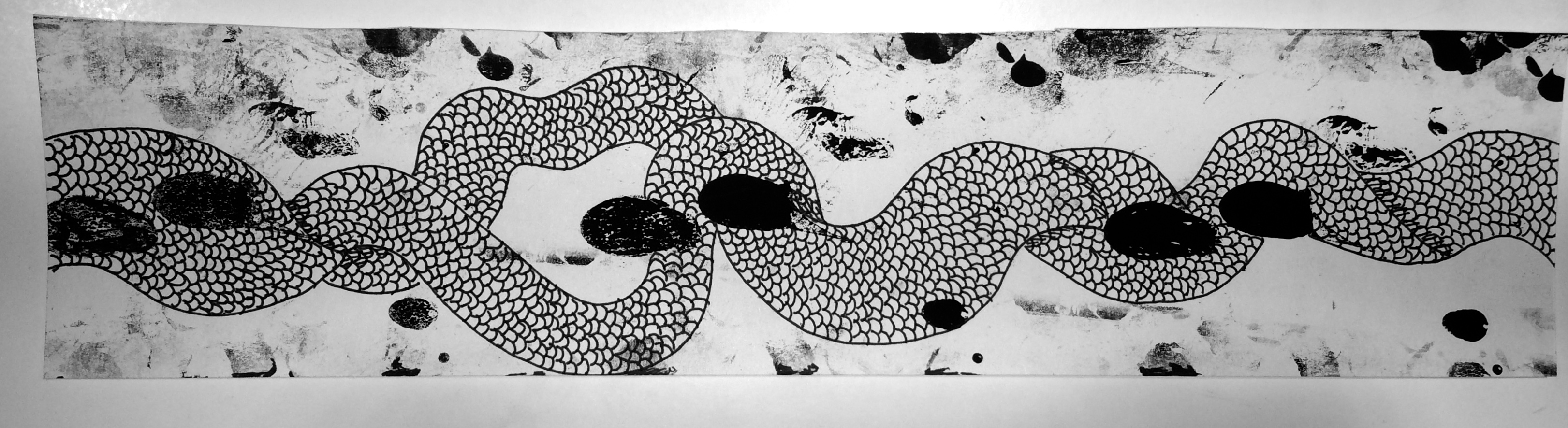
↳ RESENTMENT: To me, resentment is also a journey. I wanted to also include time into this strip, but go ‘backwards’ instead. Most people read from left to right, but I wanted to make the strip appear as though it were going from right to left, because resentment as an emotion brings you back into past grudges and things, where one cannot move on and is continuously travelling back to the resentment in their mind. I also wanted to include drawings on the mono-print because I felt it would be effective if I drew scales and twisting shapes around what appears to be footprints (a symbol for journeying) to give the impression as though the journey is trapped within the twisting resentment, and that even though there’s a gap (2/3rds from the right), as though it were struggling to break free, it goes back together and continues to move backwards.

↳ WRATH: I think wrath is a long-lasting emotion. Like rage, it is dark, powerful and very intense, but there isn’t as much movement across the strip as there is within the elements on the page. I wanted the misty, dusty dark patches to have some energy within themselves because I think wrath festers as an emotion and stays, vibrating and moving where it is because it lasts. The various shapes and hazy patches around the dark areas circulate around the two circular dark areas to communicate that everything will rotate and revolve around the fermenting grudges and intense anger.
➤ Primary Emotion of Sadness

↳ SADNESS: Sadness is a downwards moving emotion, always dripping and sluicing down because it brings one to their knees. For me, it ‘drapes’ across my mind with darker (not intense, but hazy) scratches that weaken my mind and allow the sadness to leak down and bring me down lower. I wanted to show this movement with the drawings on top of the mono-printmaking, to extend further this feeling of downwards movement. There is also a lot of negative space around the draping scratched areas to express the notion of emptiness; the only thing you focus on are the drips.
↳ DISAPPOINTMENT: Many of the secondary emotions to sadness have a downwards movement, and disappointment is no different. But I think rather than dripping, disappointment is a quick, straight fall down into the feeling of regret and sorrow. I wanted the strip to have the impression that the lines were moving from somewhere ‘high’, where one was not full of dismay but where one was happy, and that it was descending down into a darker, unknown area where one was let down somehow. It is a very straightforward emotion though, in my opinion, which is why I used straight lines. Some of the lines also become faint, because I wanted to symbolise the feeling of weakening trust in someone or something.
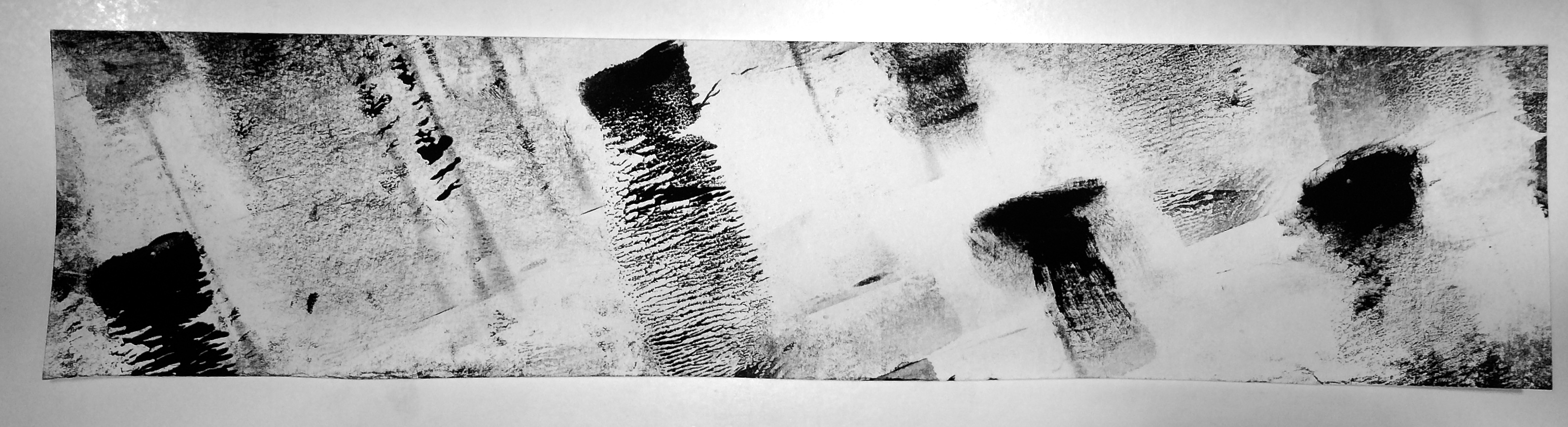
↳ GRIEF: Grief is an emotion that is not consistent. It peppers you with streaks of dark, intense sorrow that eventually fade but will come back from time to time. I wanted to show that by the mono-printmaking patches on the strip, where you can see that the darker points gradually become lighter and fade, but as you move across the paper more and more dark patches come back over time. The empty space behind them was also used to have a ‘ghostly’ feeling of the grief coming back to haunt, as well as the notion of emptiness again. The patches are also all angled downwards to communicate the descending feeling again that is notorious in the emotions under sadness.
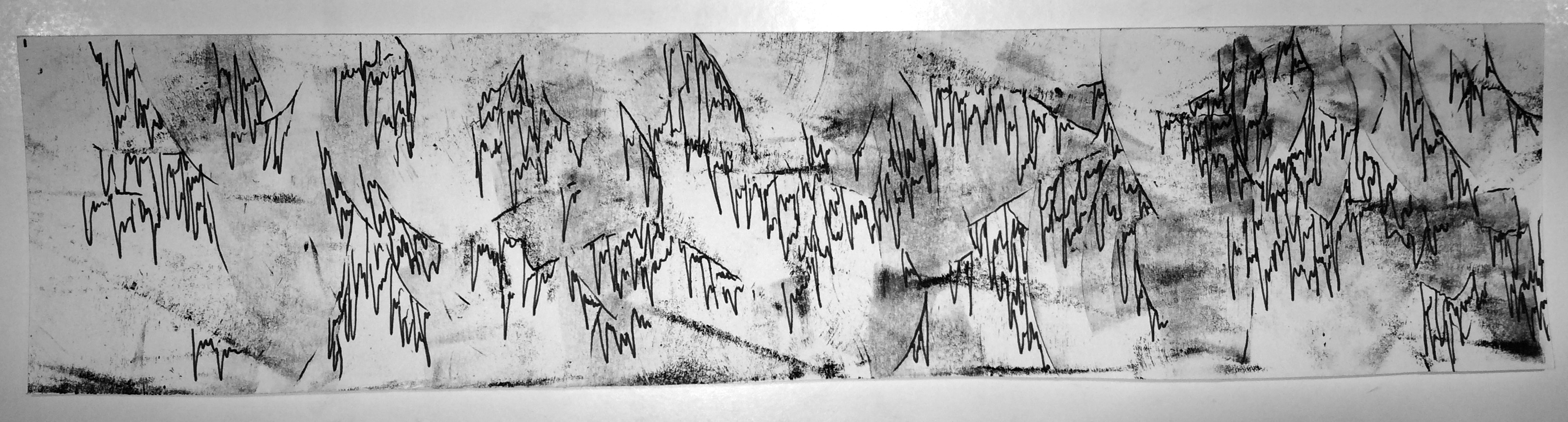
↳ GLOOM: Gloom is like cobwebs, threatening to cloud over your vision and mind with a sticky, stringy feeling that is always dripping down. It is also hazy; hence the faded, random mono-print background, but I think gloom is a ragged curtain that obstructs and contributes to the haziness of the mind. So, I also included pen drawing over the patches to display this idea. I also think gloom is an emotion that connotes age and wear, which is why I drew the tears hanging down as though it were old.
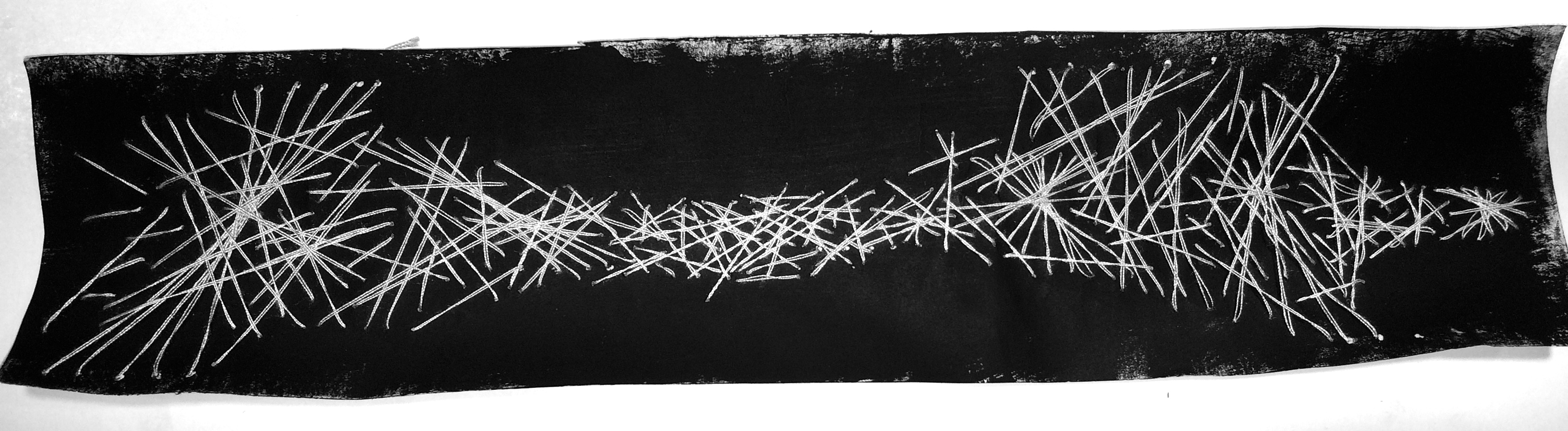
↳ HEARTACHE: I think heartache is a very relentless feeling. It is cruel and unkind to the person experiencing it. I specifically used white thread on a dark background and stitched the thread into the darkness to 1) communicate that heartache brings gloom and darkness and 2) that it is always being wrapped and twisted by the heart-wrenching feeling that – in my own experience – feels like strings tightening around your soul, tangled; there appears to be no way to disentangle yourself from the ache. One string over the other (I also thought thread was fitting because of the term: heartstrings) wrapped over each other, tightening and then becoming broader and looser, but then tightening into a painful cage once again. This is the rawness I wanted to demonstrate by threading into the paper.
↳ SHAME: Shame is a dark, but fluttery emotion. To me, it is the feeling of always wanting to get away from the humiliation that brought about the shame, like a frantic pitter patter of footsteps as you run away from the memory, but it is very messy and un-coordinated. I also think that because it is tangled and messy, I used the combination of thread and mono-printmaking again. The square and circular marks are meant to imply the feeling of discord and confusion of what to do to get away from the shame (which is the feeling of shame itself: to escape, to hide) and the thread shows how messy the emotion is.