Process

My process was simple but tedious.

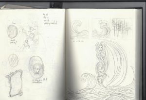
I first started out by sketching out ideas for my equations.    image-5 image-4

I then zeroed in on the equations that I thought best suited me. And started to sketch out the compositions. Although they changed when I did my final outcome.

image-11 image-10 image-9 image-8 image-7 image-6

After that I just went with my guts.

The first thing was to cut out the 20 by 2o rectangles.

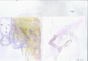
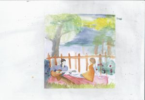
After words I used a mixture of oil pastel and water colour to create my compositions which I then scanned into the computer

animal-mask robot sea-gurl seaq-girlanimal-maskimage-2

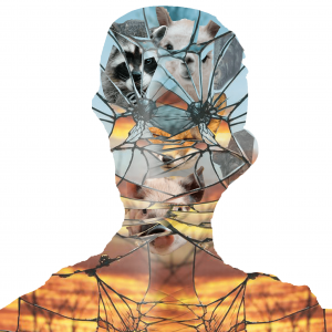
I then manipulated them digitally and printed them.

untitled-1-min mask-min golden-mirror-min golden-foxes-min crowd-of-animals-minsea-gurl coup human-again-01fox-in-the-woods-min

I then threw out some and added more things to the rest. I did a repeat of scaning and adding more stuff to certain squares as evident in my end product. I even got rid of some because it did not convey what I wanted.

Here is an example

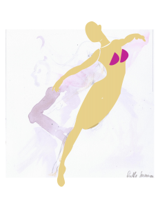
imageorange-dance

And here are some things I made put did not put inimage-12


I did all 12 together with very long stagnant periods as I was not sure how best to represent what I wanted.

I guess this whole project was an experiement. I wanted to see if I could make something not aesthetic that it becomes aesthetic


Final


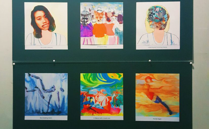
photo137649183987445534

This were the meaning behind my works from top to bottom.

  1. Me (on Guard) as I usually do not like to reveal too much when I meet people for the first time as I dont trust them. However I would reveal a little to be genuine. The colour face is to show how I try to appear more interesting and bubbly when I first meet people.

Plus a new enviornment. The reason for why the people only have certain facial features is to show how I usually zero in on certain parts of people when I meet them and I usually cant really remember their face in entirity. The goat legs at the bottom was to represent the humour I usually try to inject when I am trying to lighten an awkward mood.

Equals to me becoming Dora the Explora. I use the spelling of explora cos my friends like to spell it that was saying that it ryhmes more with Dora. I think this image is self explantory, as almost everyone who found out I am called Dora makes the link to the cartoon. I made her faceless to represent how I have nothing to say or an expression to give anymore cos I am always hearing the same joke and it gets quite boring.

2. Me as Me. This time I do not have a mask on as I am with friends I trust and see no need to hide too much. However I do occassionally put on a fake smile even when I am tired so that I can keep conversation going.

Plus a friend’s party. The reason why I replaced human faces with animals was to show the different characteristic that my friends have. It also acts as a mask as there are friends who I know who puts on a public persona in front of a large group of people

Equals to Me becoming a mirror. I say that I become a mirror as I usually try to mirror and accomadate to my friends so they would feel more comfortable around me and around new aquaintances.

3. Me breaking down. I think this is another self explantory one. When I am constantly working I try to not think about being tired and constantly thinking about work and trying to do something related to work so I feel productive. But after awhile I would fall sick or feel mentally drain. I relate this to being a robot as a robot can constantly work or suppose to but sometimes it breaks into pieces when it gets overworked.

Plus Time spent with loved ones. The caption says it all about the image expect maybe for the part where I portary the girl still being part human part robot. This is to show how spending time with my partner helps me recuperate mentally.

Human Again. Just shows me being alive again.

4. Me as the sea to present me when I am alone. I used the sea as it appears calm but beneath it still has currents, like how I let my mind wander when I am alone.

Plus the forest because I love to explore nature,cimb rocks and look at insects act in their natural habit

Equals to a world of imagination as I will be able to imagine stories of the trees and animals and come up with communities and tribes. Helping me spend my time when I am alone.


On a whole I try to have the first and last image in each equation to show that not everything of me has changed when I am put through those settings. The colours constantly change cos I wanted it to be as colourful as possible and occasionally trippy to portray a certain kind of eccentric-ness. It was fun trying to battle myself on making everything more aesthetic. And to be honest if I was to do a project like this again I would probably stick to flat design because I can portray a more vibrant and cohesive colour scheme and some simplicity.  Yup definitely have a love hate relationship with my work. But more love hahaha

EGO- references

leonid-afremov041 leonid-afremov031 leonid-afremov011 leonid-afremov071 leonid-afremov121 leonid-afremov131 leonid-afremov141 7e23123886636e47ac721982730e1157 7d1e05e3614cff5d17d62854845b3233

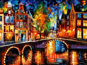
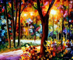
My colour references was mostly by the artist Leonid Afremov. All of his paintings were colour but always had an emphasis on warm colours. I did look at pinterest too to see if there were any other warm colour schemes that could evoke more apparent moods.

As for my composition I had drawn a lot of ideas from pinterest and hence had not much of an artist to follow. But here are some of the images that inspired my works.

0cda56b3e719afad2eb5e76427cd62b2 b8630f6661dad8b9b0df171ec72d789b artist-michael-hirshon01-illustration-friday f59f24f92d76a4cc6d51afe99a1a0b39 c845933c77a058b2c8cf7c80d52bf20d linder-sterling-mirror-iron-pictumblr_nk80lzmv5k1rv44ddo1_1280 tumblr_nk9ywhziyp1rv44ddo1_1280

Honestly I had no particular style in mind and wanted to mix styles to see what monostristy could come out but yet still convey what I wanted. I would see something that was interesting and which I thought I could achieve and did it.

Home Alone

I chose the quote “I’m eating and watching rubbish, you’d better come out and stop me” as I thought it portrays Kevin McCallister, the main character very well. I would say this quote was the hardest for me because I couldn’t find a more symbolic way of representing the quote so I did it the most literal one. I used a telly and a fridge to represent eat and watch.

alone

The water gun again was to represent the cheekiness of the main character as he tricked the robbers into thinking that the water gun was a real gun. However, the border of guns was a bit off and I had to do away with it.

alone2

Again the similar idea of TV and fridge, but this time I added the traps that were placed in the movie. However it was too cluttered and lacked a protagonist.

junk-4

This was the third version but it lacked a solidness. I did add a jester to portray the main character’s playfulness.

junk-3

This time it was the same, and I tried adding a foreground. However the field of depth still wasnted very clear. So I decided to try another approach and went with new images because I was getting tired of the old one.

junk-7

So for the last one I decided to exaggerate it as much as possible. I placed him in space to give the sense that he was unstoppable cos he was too far away. I also placed the face in the way that the boy was both eating and watching the unhealthy food.

Process for the quotes relating to hot fuzz

I really wanted to do a quote on the movie Hot Fuzz as it is my favourite movie.

The synopsis is as follows, “Op London cop, PC Nicholas Angel is good. Too good. And to stop the rest of his team looking bad, he is reassigned to the quiet town of Sandford. He is paired with Danny Butterman, who endlessly questions him on the action lifestyle. Everything seems quiet for Angel, until two actors are found decapitated. It is called an accident, but Angel isn’t going to accept that, especially when more and more people turn up dead. Angel and Danny clash with everyone, whilst trying to uncover the truth behind the mystery of the apparent “accidents”.

The first quote I wanted to use was “Dad just said it was his special club”. This was when Danny realises that his Dad was a leader of a cult.

I basically wanted to portray a cult which sacrifices humans.

special-club

The ring of the same symbols are to symbolise the cult members with the top one being the leader. The middle symbol was to signify a human head. I chose these particular symbols as I thought they were similar to human figures

special-club-2

These picture was the similar thought process but a different type of graphic. However this quote wasnt working out so I had to change it to a quot that was easier to work with.

So I chose “No, I have not ever fired my gun up in the air and gone Ahhhh”.

gone-up-in-the-air-and-said-ahhh

I really wanted to show Angel’s displeasure at Danny for being so naive and thinking that police in action movies were like in reality.

gun-2

I stuck with this image but substitute the car with guns to allude to the use of many guns in the movie.

ACT YOUR AGE

The quote “act your age, not your shoe size” is from the movie Uptown Girls.

Synopsis: Molly Gunn has never worked a day in her life and has lived like a queen since her father, a famous rock ‘n’ roll star, died and left her his fortune. But everything changes when Molly realizes that her manager has stolen her money. She lands a job as a nanny for Ray , a young girl whose serious attitude is the opposite of Molly’s carefree one. With help from her boyfriend, Neal, Molly tries to bond with Ray and learn how to be an adult.

act

Since the teacups were quite significant in the movie, I thought of using it to represent both the characters with the bigger cup signifying the adult who is very in her own world and child like while the small girl is signified by the smaller cup and symbols that make more sense. However it was a rather jarring design as it was conflicting in styles.

act-2

So I went for a less metaphoric look, just that the adult’s head is replaced by symbols to represent nonsense. It was rather plain so I decided to try adding a background.

act-3

This was the last of the backgrounds I tried to use. I tried about 4 others but all looked too busy, or the characters looked out of place. So I decided to just try one character.

act-4

I tried to use just the adult cos the quote was just about her, but the background overpowered her.

act-6

At the end I decided, something simple would be best and came out with this..

What happened before the final piece

Some behind the scenes of the project.

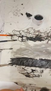
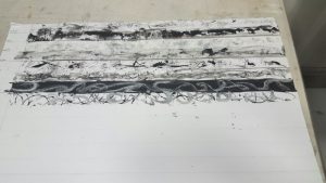
851519876_30782_4087859534948804468This was when I was doing memory drawing with brushes and rollers but then forgot what emotions they were.
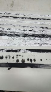
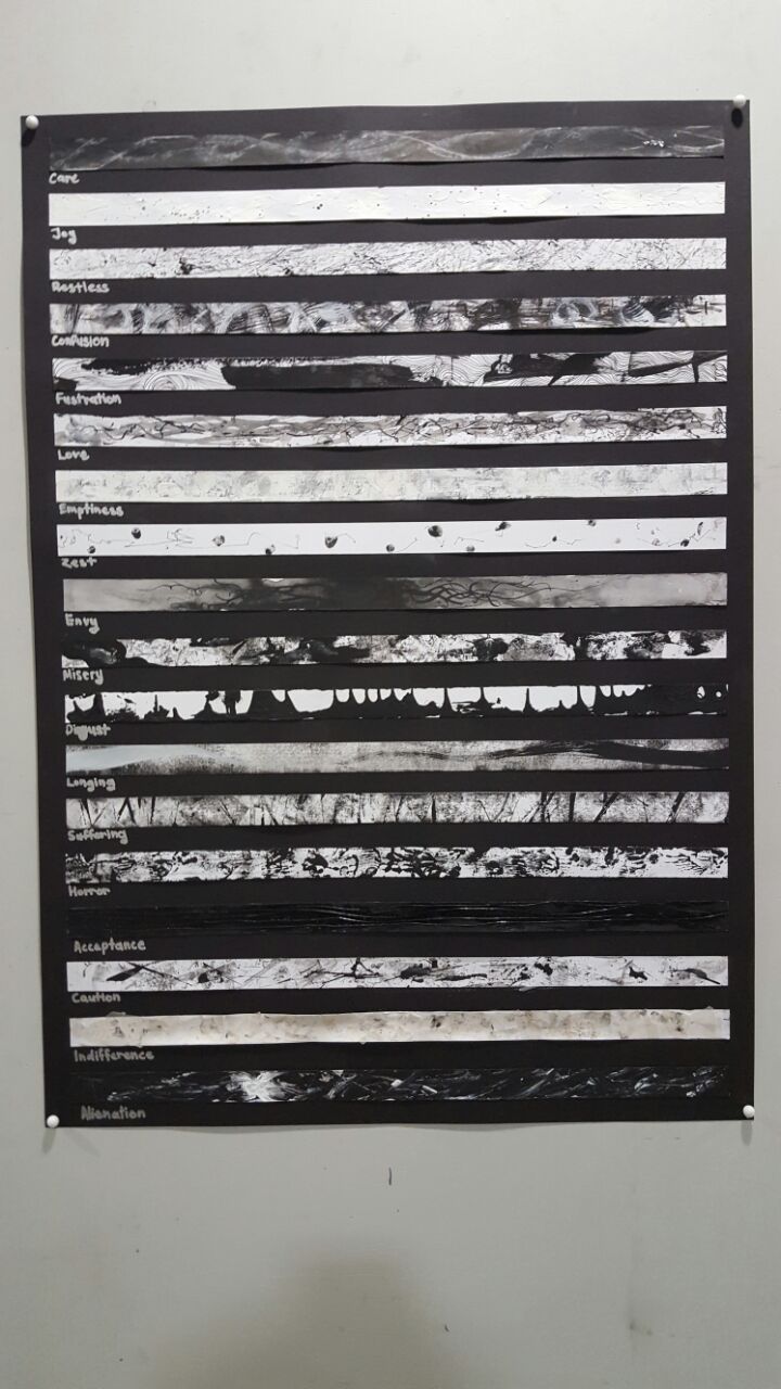
851517687_31024_644390613717357381So I just cut them up into strips and group them according to how I felt.
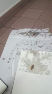
851439365_64853_15560830579698532934I got smarter and labelled my memory drawings afterwards, and did them in strip form.851517216_31719_2835080936669190272This was just a failed attempt at fumage.
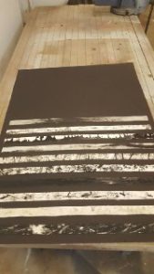
851517717_30833_2282028405505625938When I was almost done I placed them together to see if they looked too alike and change them when they did.

851516450_31467_7388033706298815808Then came the mounting, which was a pain as the strips kept falling off.