My process was simple but tedious.
I first started out by sketching out ideas for my equations. 

I then zeroed in on the equations that I thought best suited me. And started to sketch out the compositions. Although they changed when I did my final outcome.


After that I just went with my guts.
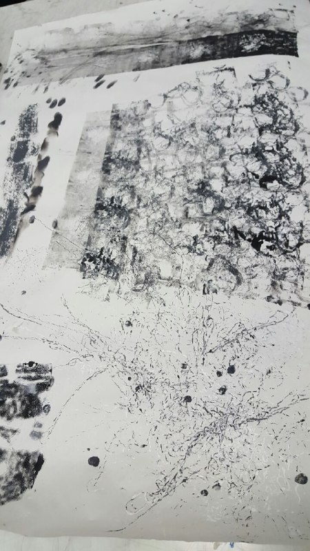
The first thing was to cut out the 20 by 2o rectangles.
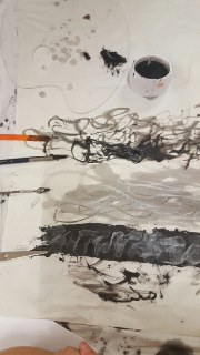
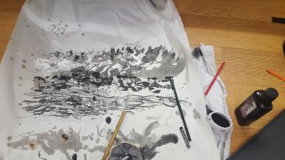
After words I used a mixture of oil pastel and water colour to create my compositions which I then scanned into the computer


I then manipulated them digitally and printed them.


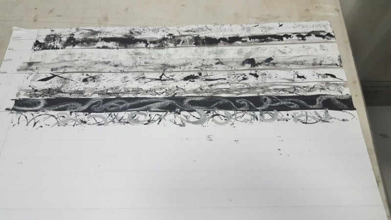
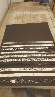
I then threw out some and added more things to the rest. I did a repeat of scaning and adding more stuff to certain squares as evident in my end product. I even got rid of some because it did not convey what I wanted.
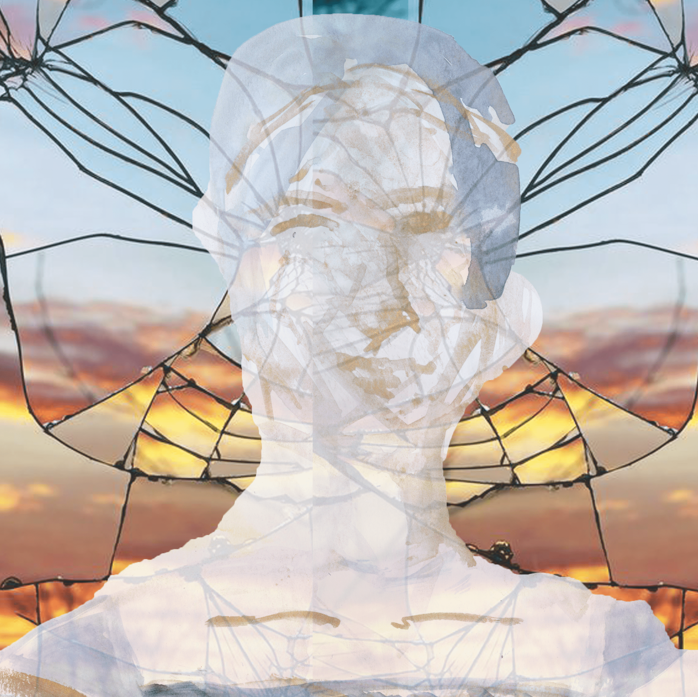
Here is an example


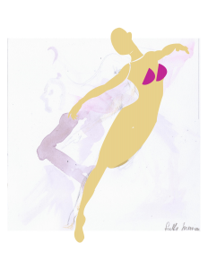
And here are some things I made put did not put in
I did all 12 together with very long stagnant periods as I was not sure how best to represent what I wanted.
I guess this whole project was an experiement. I wanted to see if I could make something not aesthetic that it becomes aesthetic


 T
T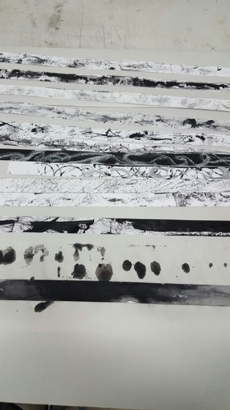
 I
I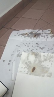