Tag Archives: colours

Ego in different setting – WIP 05 (colours)

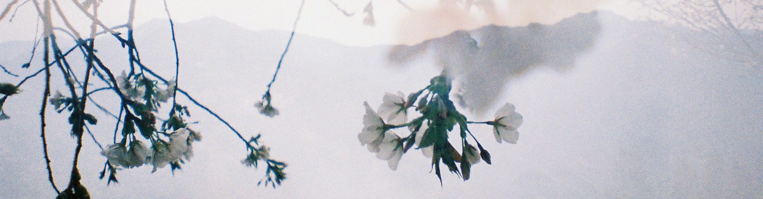
I was going through inspiration for my drawing assignment when I came across a few painting that have really nice colour palette. I thought that maybe instead of trying to think of the palette myself I could take it off from painting or photos since I am just barely starting on colours. Putting them together myself would actually be difficult. I also picked the from online colour palette and somewhat tweak from there.

colour_pick

palettes-02

analgous-colors

895

cvetovaya-palitra-1010


For the colours of the equations i will explain why I specifically picked that colour tone for it.

equations

  1. Since the first equation is about something happy and things that I like, I thought of something bright and perhaps a little more colourful than the rest? So I  thought of like searching up for a more pastel like colours. Then I came across the colour scheme of the turquoise and orange, which somehow screamed out to me.
  2. For the second equation, I thought that it seems like a quite morbid thing of mine. Hence why I decided to give it a more dull feeling and go monochrome. Plus the colour blue also gives the cold yet disturbed feeling, which is why I decided to pick it for this equation.
  3. As for the third equation, I thought that perhaps I could have a colour that can strike as something creepy but yet funny. So I thought of the colour purple. Somehow purple give me a weird feeling? Like how if an environment is lit up a purple light, would it not be seem as dubious? Like is there something there?
  4. The last equation was something that make me think about for quite sometime. I wanted something bright to show thhe lightness of the whole thing and that was when I saw the blue and yellow complimentary colour scheme. so I thought hey I could work with that.

Ego in different setting – WIP 01 (Colour research)

Honestly speaking when I first read the assignment brief for this particular assignment, I was really excited. I am a person who really likes colours, even though I would say that I am not quite good with them. We have to pick a colour or a few to represent ourselves. But the funny thing is that the colour or rather shade that I like is black, which is not something that I guess I should avoid for this assignment?

So I thought that perhaps finding the meaning of the different harmonies would help me decide on which colour to pick for this assignment.

  1. Monochromes harmony: Using the same colour but of different tones, tints and shade.

monochromatic_colour-test

Examples :

Gustav Wentzel

gustavwentzel

Karen Margulis

karen-margulis


2. Analogous harmony: colours located adjacent to each other on a colour wheel. Generally with one being the dominant colour, which tends to be a primary or secondary colour, and a tertiary.

analogous_harmonies

Examples :

analagous_color_scheme_2

homagehoward-f-pr-copy


3. Analogous harmony warm and cool : Blue, Purple, Green (Cool) Red, Yellow, Orange (Warm)

However the inclusion of too many colours in the art piece using this harmony may ruin the harmony.

analogous_harmonies-warm-cool

Examples:

Cool colour : Teagan White

Teagan white

Warm colour : Melelel

melelel


4. Complementary hues : Colours that are opposite each other on the colour wheel

complimentary-hues

Examples:

1010101353

sun3

Eugene Wang

140530-green-and-red-apples


5. Split complimentary : It uses the two colors adjacent to its complement

tumblr_lcs3f2brgg1qfok2yo1_r1_500

how-to-use-split-complementary-color-scheme

Examples :

a899f6152b4f215e1d8280fa85d1cab0

Elizabeth Martinez

wc-warren-complements


After looking through the the different colour harmonies, I would say that I was mainly intrigued by the split commentary hues and the analogous harmony. I feel like I would be able to play and try out the colours more. I guess I would need to see the medium or even the style that I picked for this assignment to decide which harmonies I would actually pick together with the colours.