Tag Archives: Inspirations

Ego in different setting – WIP 04 (Artist reference)

I feel that I do not really have a distinct art style even after being in animation course for three years. Even though my friend told me that I have a style of my own, I genuinely feel like they are not something that I have turn into mine yet. Perhaps I would say I have not grasps it right yet? Since they vary and changes from time to time.

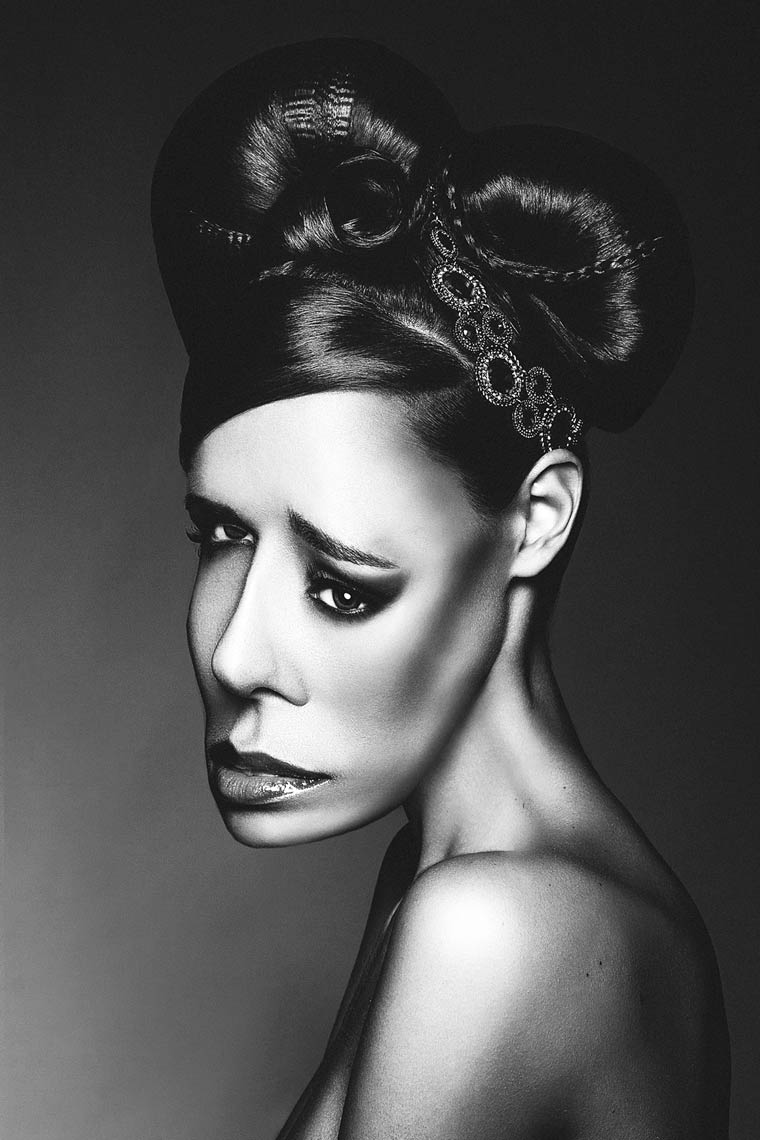
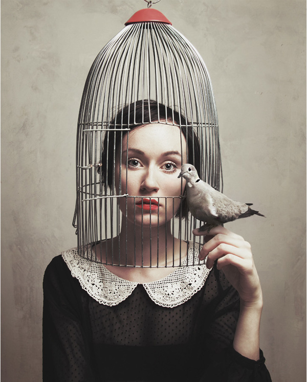
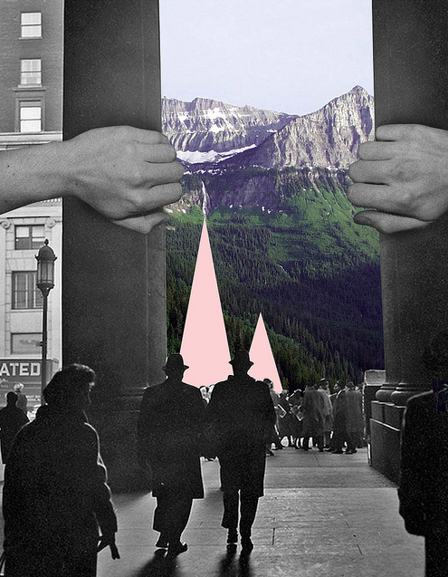
I generally like arts that incooperates the element of cuteness and scariness together. I feel that it adds to the quirkiness of it. It gives them a more cartoonish type of feeling. One of the examples would be Michael Bisparulz. I really love his art style a lot. The playful feeling he has is being expressed through his art.

I really like the pastel tone he has for his art considering how I am a fan of pastel tone. But I feel like that colours do not represent me as a person since they are so pretty and cute. I do not think of myself as such a sweet and cute person?

8250260242_49c69b43c5_z

7375185386_c7a952a555_z

7685726898_fdf5b20eb8_z

Hmmmmm…. Speaking of this one of my friend once told me that when she first saw me, I portrayed the colour of red. Also, the fact that I am a cheerful person but somehow the me on the inside is actually someone who is a deep thinker and feel for people a lot. I was honestly quite shock to hear that considering how have always thought of myself to be quite expressionless. Since I only know how to show happiness and sadness. The rest of my emotions tends to get all jumbled up.

I feel like the style that I actually want to show and use is the me on the outside. The me that I want people to see but the colours that I like and would use is perhaps what I am actually feeling on the inside.

Also, I remembered once that my poly lecturer told me that your art represents and show what you are as a person. You might be doing a design unconsciously but in actual fact it can show what you are actually thinking at that moment and also how we ourselves as a person is.

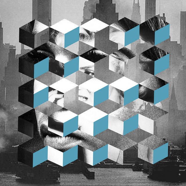
Somehow I seem to have gone off track, back to artist references! I tend to remember things through colours, perhaps that could be why I am suddenly having so many memory flashbacks. Another style that I really am fond of is the “texture” feeling. The way some artists render their drawings gives the sketchy yet graphic feeling.

Mark Hearld

mark_hearld

Gabriel Schemoul

gabriel_schemoul

As for the colours I feel that I should probably reference them try to pick them out from photos. I could  probably pick different colours for each of the different panels and how I want them to feel, which might in turn lead to the combination of both colours for the outcome of the equations.

Appearance. – WIP 01 (Research)

For assignment three, I was thinking of portraying being free from modern society standards. But after thinking again, I was not sure of what or how to portray it. The first that actually came to me for this assignment was “Be free. Be you.” Honestly speaking the first that I thought that I could actually get inspiration from is music video. However after what hearing what Mr Robert said in class about not having to depend on the lyrics to show what  I am trying to tell the audience than I thought of advertisements. That fact that They are also about the length of 1-2 minutes, I thought why not trying to get some ideas from there how how I could or should shoot my scenes.

But then I actually came across this short video which was actually pretty interesting to me. Basically, the video is what it is titled. It was a compilation of people breathing in many different scenario. The fact that breathing can actually tell us quite a lot about what someone is actually feeling or doing, from us sighing to even breathing intensely when we are in a state of panic.

To me the thought of freedom is actually something similar. The fact that we could be whoever we want whatever we want to be in this ever changing society. There was recently an advertisement by SK-II where they ask the adults and kids about what is their dreams.

That was when I started realising a lot of things after hearing what the kids said about their dreams. The amount of constraints that society has put on us and the stereotypical judgement we have on people just somehow make people more afraid of showing themselves. I feel like when it comes to freedom there is Adidas and Nike advertisement is perhaps something that I could possibly get some inspiration from while perhaps incooperating the idea from the breathe short film.

https://www.youtube.com/watch?v=CupTwyj3JrI

I especially like this advertisement from Adidas because of the shots use. The way the back view of different people is shown and the fact that even from the back you could clearly see that everyone is different. At the end of the clip, it is clearly you yourself who will be the one shaping your own future, which in turn shows the is what I wanted to try to show in my assignment three. “Be free. Be you.”

So I thought about my 50 words statement that I should write for my film and thought that perhaps it will go like this :

Has the modern day society shaped us into the cookie cutter shaped cookies? The us whom we are afraid of expressing because of the judgement that we are scared of getting. Perhaps we should let “the us” be seen. Maybe it is time to be free and be you.

Freedom – Artist Inspiration

For the second assignment, we had to work on the same topic as our first assignment. Since the word freedom is a very vague term, I picked a topic from my first assignment. One of the freedom that was shown for my photo is freedom from worry. I feel like this is something a lot of people can relate to, be it work, study or even relationship. We are required to find 15 – 30 images, be it found images or from old photo and make an image sequence from them.

For the first assignment I did double exposure, which was a really nice experiment on photography for me. I had a lot of fun and learnt new things through the process. For this assignment I thought that maybe I can use both taken images and found images to tell a story through there, be it through photo manipulation or through the photos.

I actually went to search on google and typed in Freedom in the search box to see what are the images. Somehow the images that are there are generally of birds flying away , people with wide open arms or photos of the sky, etc. I guess this are probably one of the few things that will pop up in ones mind when the word freedom is mentioned. So I thought to myself what are other things that one would link to the word freedom, should I make it more personal to me or not?

Since I was kind of stuck, I went to look on different photographers. While I was searching for images related to freedom, I came across this photographer called Julia Nimke. Her photograph are really beautiful, she also using double exposure for some of her photographs. The thing that actually stand out to me a lot when looking through her photographs is that her photos contain a certain depth to them. You could actually feel the vastness and space of the place through her photos, its really comforting in a sense to me too.

julia_nimke_06julia_nimke_03 julia_nimke_05julia_nimke_02julia_nimke_08julia_nimke_09

I really how the people in her photos looks like they are feeling very wild and free. The shot somehow feels very natural and it gives off this very calming feeling looking at her photographs, for me at least.


Another photographer that I actually found interesting is Flora Borsi. Even though the work she do may not necessary mean freedom, I really like the way she portray identity and dreams through surrealism. She using photo manipulation using metaphors, or even dark fantasies to make one think and feel through her photos. Something that I actually really like about her is the fact that her photos seems so right but yet wrong at the same time, I really pushes ones boundary.

flora_borsi_01 flora_borsi_02 flora_borsi_03 flora_borsi_04 flora_borsi_05

I was actually thinking of something like conceptual photography for my assignment two, but I am actually quite worry about how I would execute it since conceptual photography is something that I myself think is a lot more harder than double exposure photography.


Ashley Edwards really intrigued me with her photo montage. Her photos have this really vintage touch to them, but even if I were to do photo montage I would not do this kind of vintage pin-up style. However what I really like about her is the way she put her photos together. She expressed a story through the photos using a mysterious yet  abstract way.

ashley_01 ashley_02 ashley_03 ashley_04 ashley_05 ashley_06

I have always wanted to try out photo montage, it is such a unique way of photo manipulation. In a sense it is like graphic design yet also photography at the same time. I am really curious on how all this type of photography techniques will work out, perhaps everything will work out when I get the feedback.

Artist inpsirations

I have always been a person that has difficulty expressing herself, so artists that are able to fully express their using such an abstract/contemporary way really have me looking up to them a lot. Since emotions are generally shown using expression the artists uses the notion of lines and strokes to evoke and show us the different feelings. I find that really interesting. I have really learnt a lot through 2D lesson, even if it is only just the first assignment.


Teun van der Zalm

One of the artist that really inspires me is Teun van der Zalm. I was really intrigued by how fluid the painting feels. It makes me feel like i am floating, makes me feel very calming and soothing. Even though it might be a different feeling from what he may be trying to portray. I really like his Black and white series. But i really feel like it really is beautiful series even if it was sort of controlled chaos. By the side of the photo he will write down what he thought it was from his painting. Paintings like a lady or even a bird.

From 2004 to 2008, Teun van der Zalm studied at Utrecht School of the Arts in The Netherlands. He specialized in animation, mainly 3d computer. During his study he made several short films including “City of Lights” and “De Breuklijn”.

Teun van der Zalm

Teun van der zalm 02


Mari Pack

I really like how her painting inspirations comes from her daily life. It helps to find tranquility through her pain and anxiety. The fact that she uses the different colours to evoke the feelings from one is really cool. Even though for this assignment we are only allowed to use monochromatic colours, i believe even by using different shades we can also evoke different type of emotions. Be it a good emotion or a bad emotion. Finding different composition also can help one to paint a pictures even through painting with only just splatters and droplets from the different rhythm and many angle.

My paintings are an exploration of boundary and psyche. Color can make the heart beat faster, whet the appetite, or spark a memory. Much of our reaction to color is subliminal. My intention is to provoke the audience to find imagery through movement.

Mari Pack

mari pack


Samantha Lesley

Another artist that really stroke a chord within me would be Samantha Lesley. I like her simplicity in her paintings. The way she overlays her paints with different shades. My favourite piece would be the painting below, I really like how the painting knife cuts and stops the flow of the paint, how the curves of the paint seem to like represent out life with the turns but also at a point of out life it seem to have stopped happening for us. However it could also mean another strokes, starting point, for us.

Using a mixed palette, my work shows the physical gesture in the way I scrape the paint in different directions, to create a textured piece which the audience can interpret in their own way.

Samantha Lesley

samantha lesley


Mirza Zupljanin

The final artist would be Mirza Zupjanin. I really like how he painted this. The way the different strokes looks like humans and raindrops among a city landscape. It looks like a brightly lite city landscape with a few visible hints of the surrounding and structures . It feels like he just used the strokes of a paintbrush and dip it with different shades of colours and somehow the image come to live.

Mirza Zuplijanin

How i see the world – Research

4D project 01 – Using my concerns in life to explore and develop a body of work.

Something that is meaningful to me, how i see the world. This is funny since i have never actually given a thought about something that actually bothers me. I would actually be intrigued by something rather than to be bothered by it. I would always like to dwell on the darker side of life. Perhaps one of my biggest concern would be wanting to be free from my thoughts. But i guess different people have different ways of defining what is being free. Be it away from the digital world, out in the woods enjoying nature.

So i thought that maybe i could work on something that represent the word free through my memories. The realm between reality and dream. I have also been thinking about how colours actually affect our thought. How specific colours create different emotion in us. So i went and search for the colour(s) that represent the word free. The colours that came up was blue and green. Perhaps its like the vastness of the sky, sea and nature.

The first thing that came into mind when i think about a way to show the realm between reality and dream is through double exposure. I have always like double exposure photography as it gives off a dreamy feeling. I have tried playing with exposure myself with film cameras. I just love how the photos feel like a memory. The way he expresses it with the person and the environment.

And_2 And_12

– Photo from Andre De Freitas

I also like the photos taken by Sara K Bryne. Her double exposure photos gives off a different feeling. It shows a world inside someone instead of a world with someone.

10446291_846740528671044_8581875109716837640_o-400x600 in-camera-double-exposure-900x600

– Photo from Sara K Bryne

There was another way of art that i found interesting. It was drawing illustrations on a photograph. It is like a way of showing a world that is your own reality. It could be a input or a world that you could imagine from that time and moment.

0b95e62510918.56017536d574cb55cf92510915.56017506d6861

– Photos from Johan Thörnqvist 

I am still thinking of the way of showing the end product. Should it be a series of photos that tells a story or a film that brings people through a journey? Should there be a main subject where they take a journey to finding the meaning of being free? Or it is a view of many different people representing the meaning on being free? On to more brain storming, in search of freedom.

MY LINE IS EMO

For assignment 01, we needed to use lines to express a variety of moods and emotions in an abstract way.

Inspirations for the lists of 18 different emotions:

1) Joy

– Relief : Sunshine, nature, waves

waterLeavesSun ray

– Excitement : Glitters, stars, paint splatters

ab8386a741cd3b58d68e77f600c197073da1e7a68fc62ea04feb79f1666bd0b8 tumblr_nf0w8jUsP31qef1f6o1_1280

– Euphoria : Spirals, wavy lines, curves

d318ab4859cc8669a241619ae9e242fa b19857d06e64b9b13fa69d57de4f065fb756d6998c6a23a0a268625adb839f94

2) Love

– Desire : Scratches, Swirls, Tree barks

f66a982e419978d106f9b5958900015a437af98fb87a1b8c6e8d74321cf704e99b30715fb168d06717297fac0d612e88

– Attraction : Feathers, mushroom caps, curves

4d3a83b744b98bde07ba42ceede84538 b5df2adcd978bf0ff7aa6f4b8a7b9f520c6cb81692effb2446506171c5ac85b0

– Lust : Spasm, sharp edges, intertwine

4c1344709187f8e5a5576f2e2157ce92e842d8e54d5869c87781966f213220d7197e631182b4ed447dd2f30be0203a68

3) Anger

– Disgust : Corals, beads, dragonfly fabric

c21857f22ee4aa6e26c5a6b0a92a907c3609e55d892ad3b0b2481201f143b64a 6d67884545155e7151ba26745d8506a4

– Agitation : Cracks, droplets, paper creases

38e1098cf9d15a3cd9136446a5d8430a32cac360cde2d9691238faae03d1de5f  04755d0c63f26806b855bd42358df3bf

– Exasperation : Vertical lines, dark holes (dense lines), Zigzags

2421fce2db411946f633f79122c55a9c a272b674bf9e30a30c03391dd374ba6f e89a1a08921edaa32c4acbaff4290c74

– Torment : Vertical lines, twigs, stitches

da36d74bab7c0c70a0f047d6cfc6a2dd927c62a7ab51578329f6036f6681be6d 29351a9f65557717158db53164948277

4) Sadness

-Displeasure : Spastic waves, doodles, converging lines

0e3971d39f8a60e0e0d61fa613c95809 5f10fa59be4ec73073730d465057f318 (1) 92ec361ce06fa46457258cd7068035cf

– Isolation : circular notion,  repetitive patterns, cellular

049cf1f283ee6a1bc832c69266a3adc3  a6fc6cf8809346954a221ec2c2a634f21ac4f6be4dfd4ea07120265858235f91

5) Fear

– Anxiety : Dense lines, static, blobs

53a07f5026564d315fdfffac3569ec0f076b35f11b0c12cbb823c229ea980f50  0a63a19306599bf840b7c6a418268ea6

– Panic : Blooming, cross hatch, stripes

1c447fdfd22e707ac53fd6b656b3595c 1475082bc71c1469dbe56a3e12c69def b134e3bb0773a649e7a7f30c6e705fc4

– Horror : Harsh raining lines, creaks, rocks

19cc43d2de9c3000d6c1141811b162ff 1ff4375e3dec88e4895c456ff963185e21c8f9595f0e0a272a0d3375f6926220

– Dread :  Criss-cross, brush tip, trapped

 a65d9df33a5989e4b74564517b6d2a7b fa64d69bf4696be8975fa40d867c8372aa61d6c763ddde5e1a70caead62b8ce0

– Insult : Cross hatch,  broken pieces, patches

c5893a95e7b85c81dae079fa5583e2b5227293e5a4e2a1779695142f0c63a331 1a2ac835b00cc1247f3114ae8a507194

6) Surprise

– Amazement : Zebra stripe, fins, squiggles

 c9875793d048c21a812bceb4bf98207381376d1fe558c7d2d66308e5650f724d73894dd77b0aa72c52debfa831617cd8