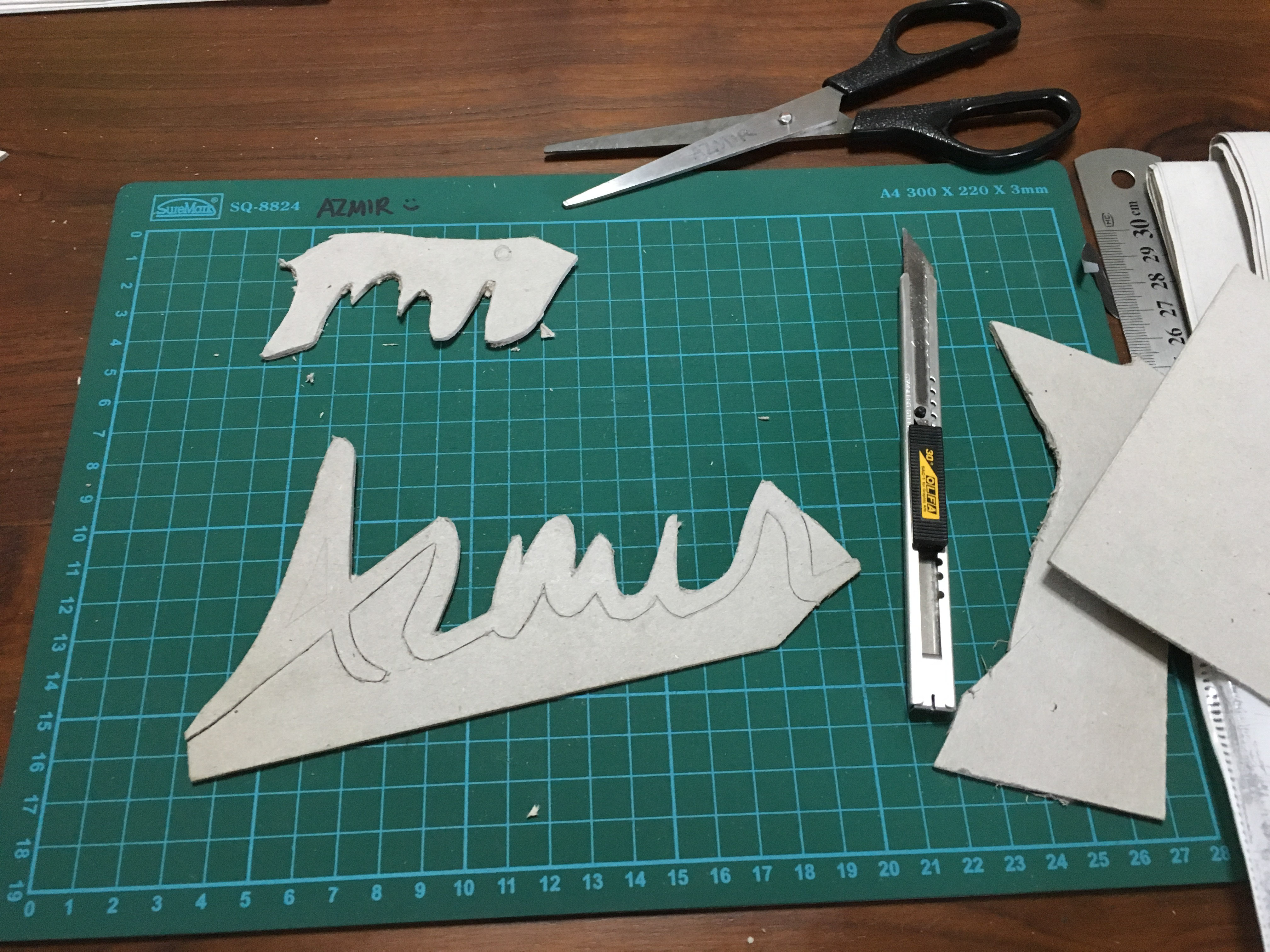
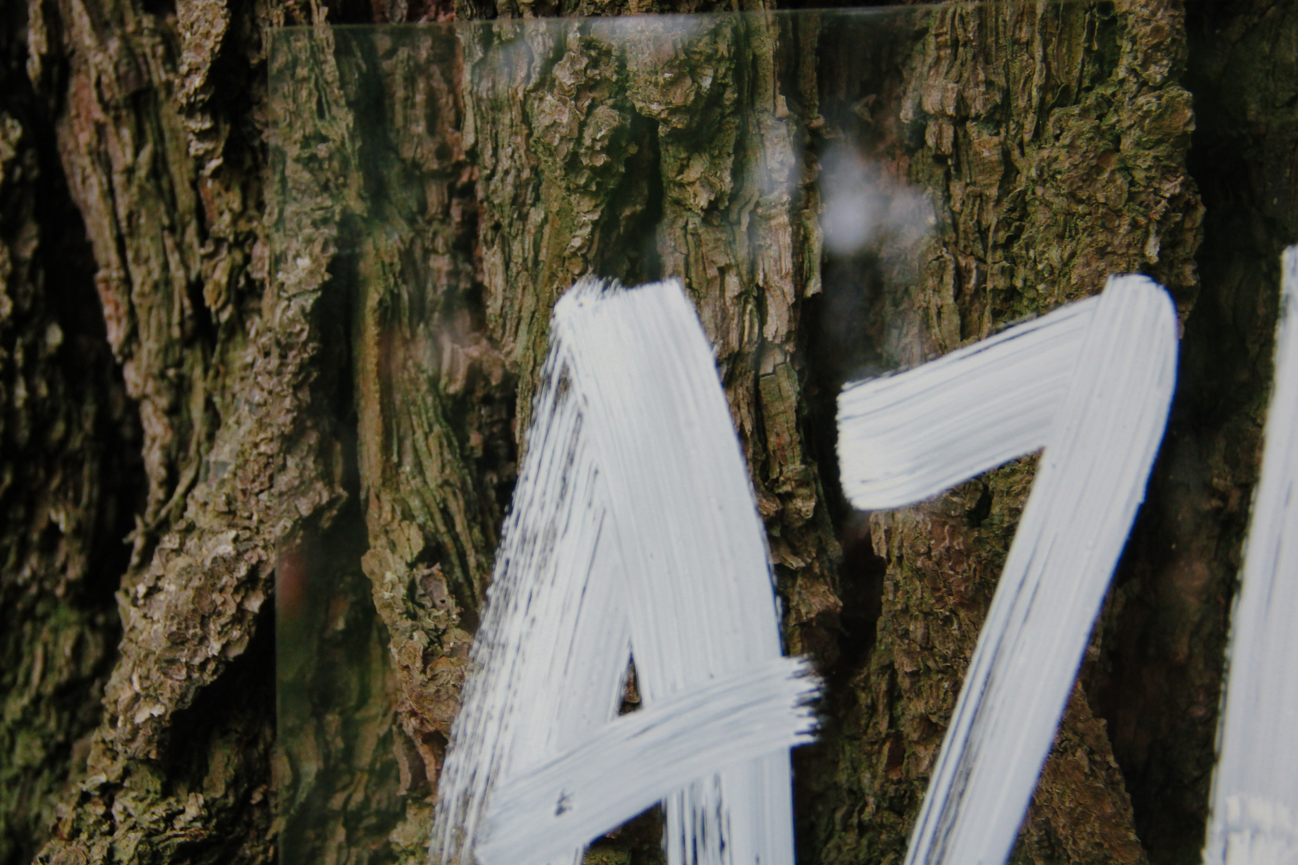
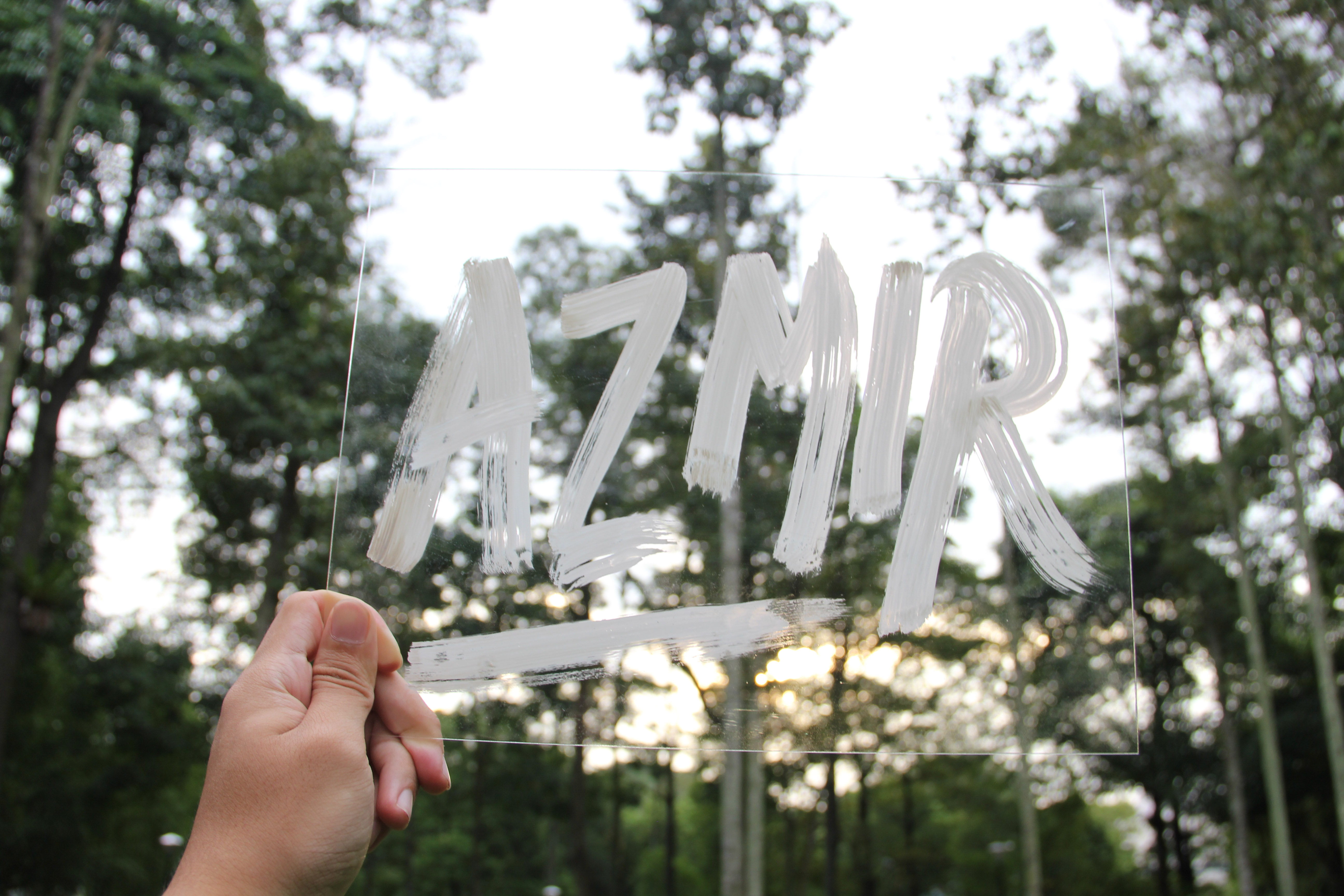
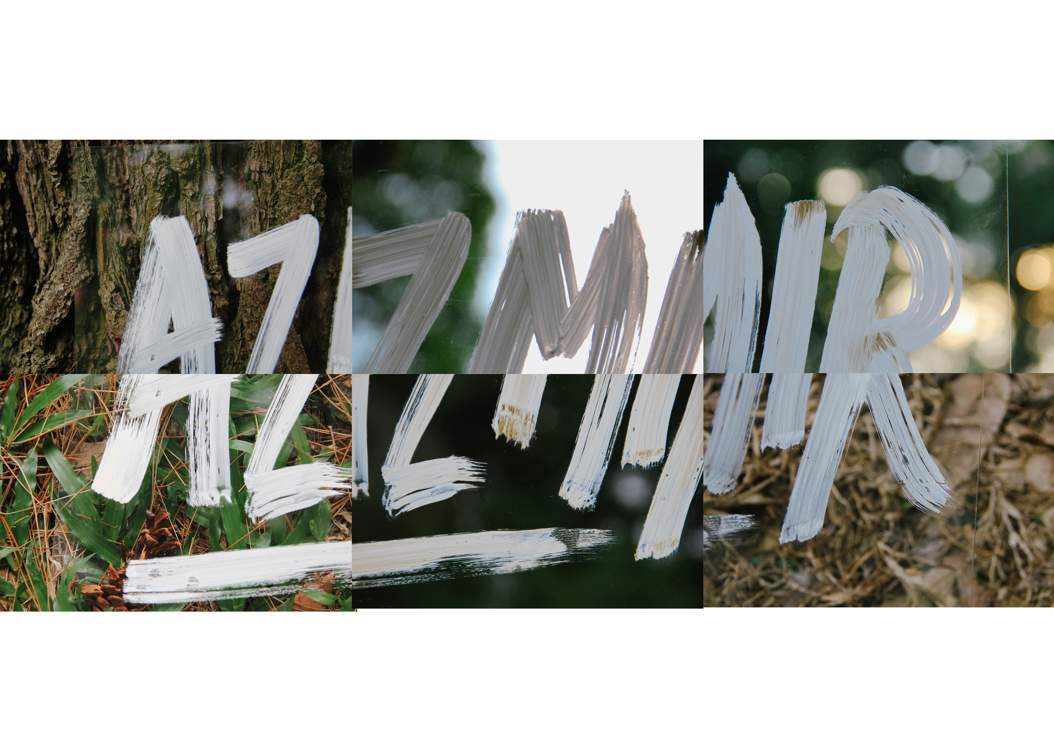
2D Project 2, Week 7: Conceptualisation Of Ideas

Brief

We were tasked to select a subject/topic and express it in 18 different points of view.

I wanted to use something simple, either an everyday object or a topic that we disregard often or something we tend to overlook as we lead our daily lives.

Objects/topics that I considered:

  • A piece of bread
  • A cardboard box
  • A piece of wood
  • Fridge
  • Relief
  • Comfort
  • Freedom
  • Light

A piece of bread

  • piece of bread from the point of view of me is comfort food
  • An oven/toaster   from the point of view of a piece of bread is a tanning salon
  • A piece of bread from the point of view of a baker is a masterpiece
  • A dough from the point of view of a piece of bread is family

Cardboard

  • A cardboard box from a point of view of a cat is a comfortable resting place.
  • A cardboard box from a point of view of a sneakerhead is a fresh pair of kicks
  • A cardboard box from a point of view of a child is a playspace
  • A cardboard box from a point of view of a homeless man is a night’s stay
  • A cardboard box from a point of view of a cardboard collector is livelihood
  • A cardboard box from a point of view of an art student is a masterpiece
  • A cardboard box from a point of view of a techie is a 21st century invention
  • A cardboard box from a point of view of a postman is responsibility
  • A cardboard box from a point of view of a retrenched man is disappointment
  • A cardboard box from a point of view of a warehouse is a piece of a puzzle

Fridge

  • The fridge from a point of view of a sweaty man is temporary bliss
  • The fridge from a point of view of a midnight snacker is a guilty pleasure
  • The fridge from a point of view of a murderer is an accomplice
  • The fridge from a point of view of a hotel guest is indulgement
  • The fridge from a point of view 0f time is paying the bills

Light

  1. Light from the point of view of ‘late-worker’ is guidance/a way home (Street Lamp)
  2. Light from the point of view of a timid child is comfort (night light)
  3. Light from the point of view of a party animal is a future hangover/night of impulse
  4. Light from a point of view of a student is burning the midnight oil (Desk Lamp)
  5. Light from a point of view of a beach bum is a pursuit of beauty (sun)
  6. Light from the point of view of (phone)
  7. Light from the point of view of a minimart is paying the bills

Comfort / Relief

comfort
ˈkʌmfət/
noun
  1. a state of physical ease and freedom from pain or constraint.
    “there is room for four people to travel in comfort”
  2. the easing or alleviation of a person’s feelings of grief or distress.
    “a few words of comfort”
    • Comfort from the point of view of a warm summer is an ice cream
    • Comfort from the point of view of a backpacker is a night’s stay
    • Comfort from the point of view of an eskimo is a cup of hot chocolate
    • Comfort from the point of view of a marathon runner is an ice pack
    • Comfort from the point of view of a cat is a cardboard box
    • Comfort from the point of view of a jeep is a dirt road
    • Comfort from the point of view of a beach bum is the sound of the waves
    • Comfort from the point of view of voyager is reaching the shore
    • Comfort from the point of view of an OCD person is a neatly arranged shelf
    • Comfort from the point of view of a horse is a grassy plains
    • Comfort from the point of view a diver is going into the deep ocean
    • Comfort from the point of view of an artist is a brush/canvas
    • Comfort from the point of view of a soldier is a homecooked meal
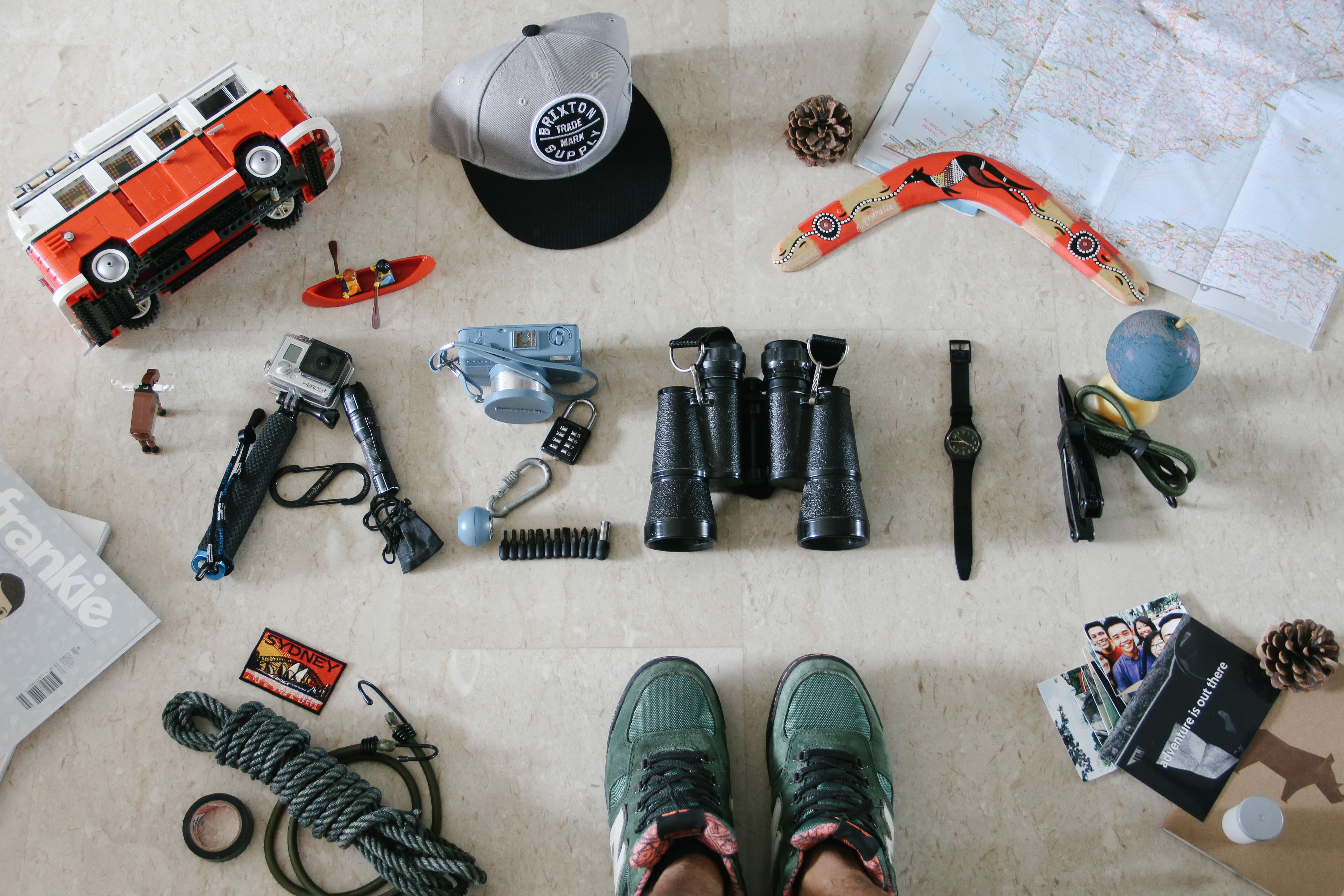
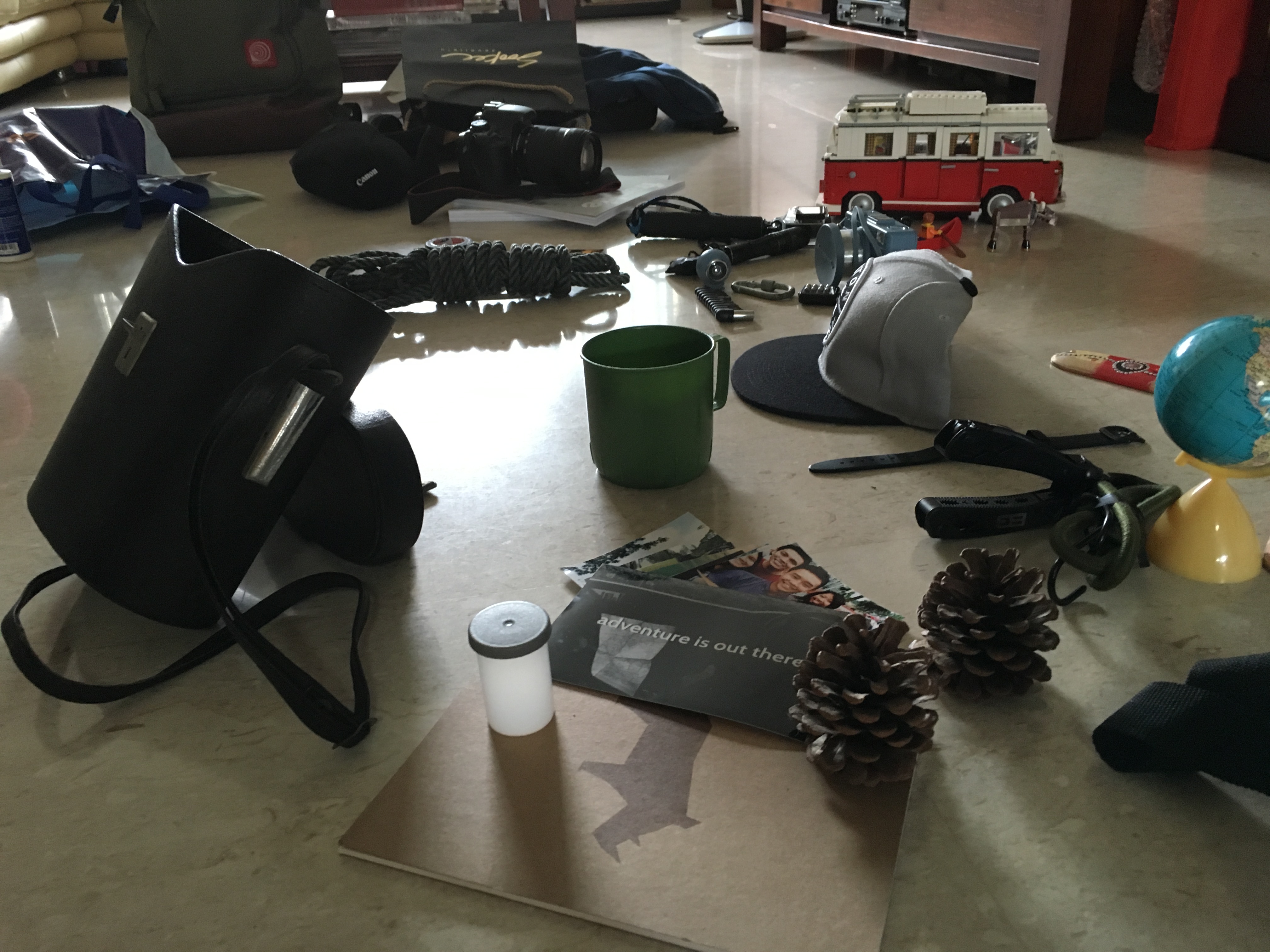
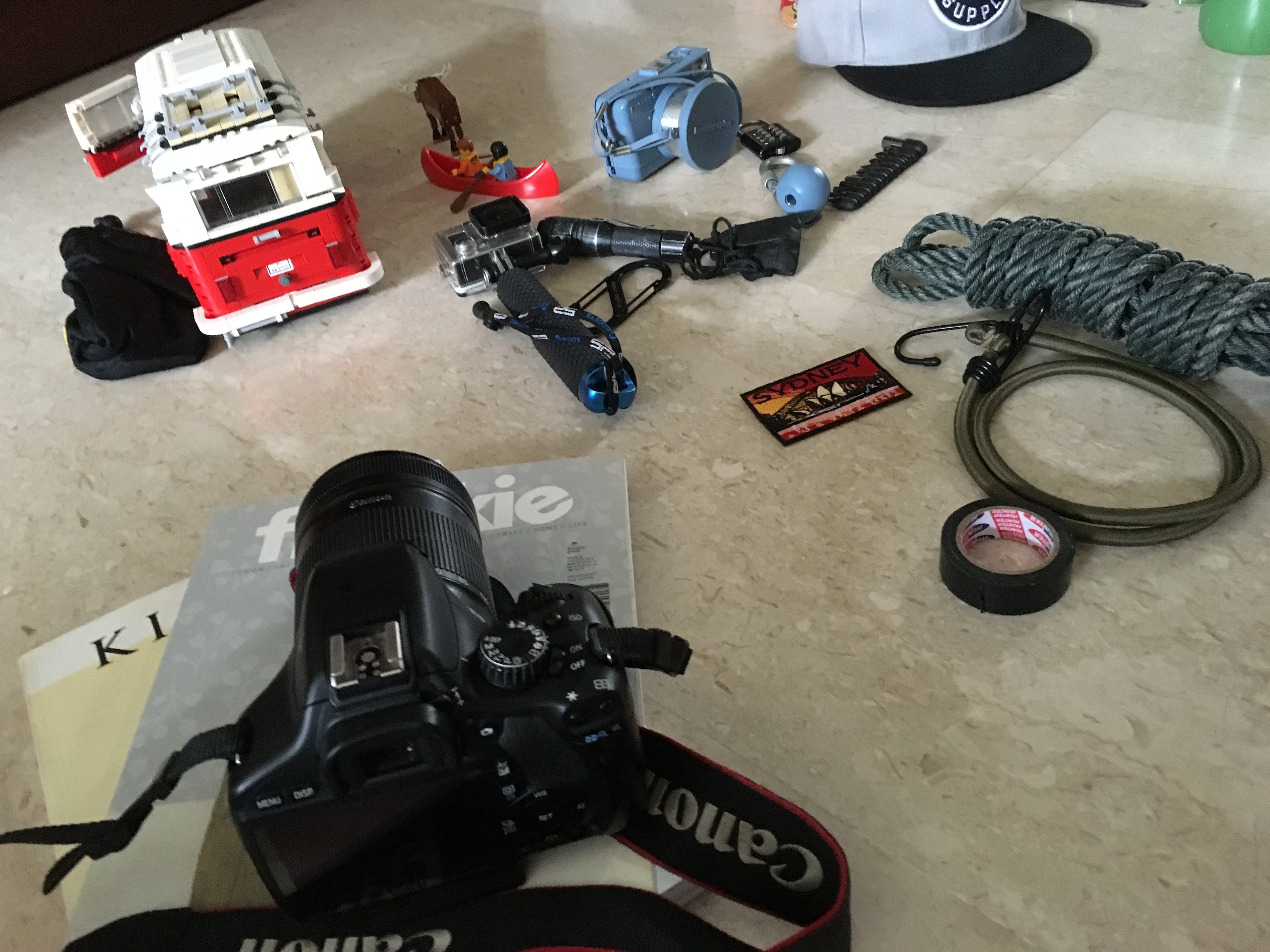
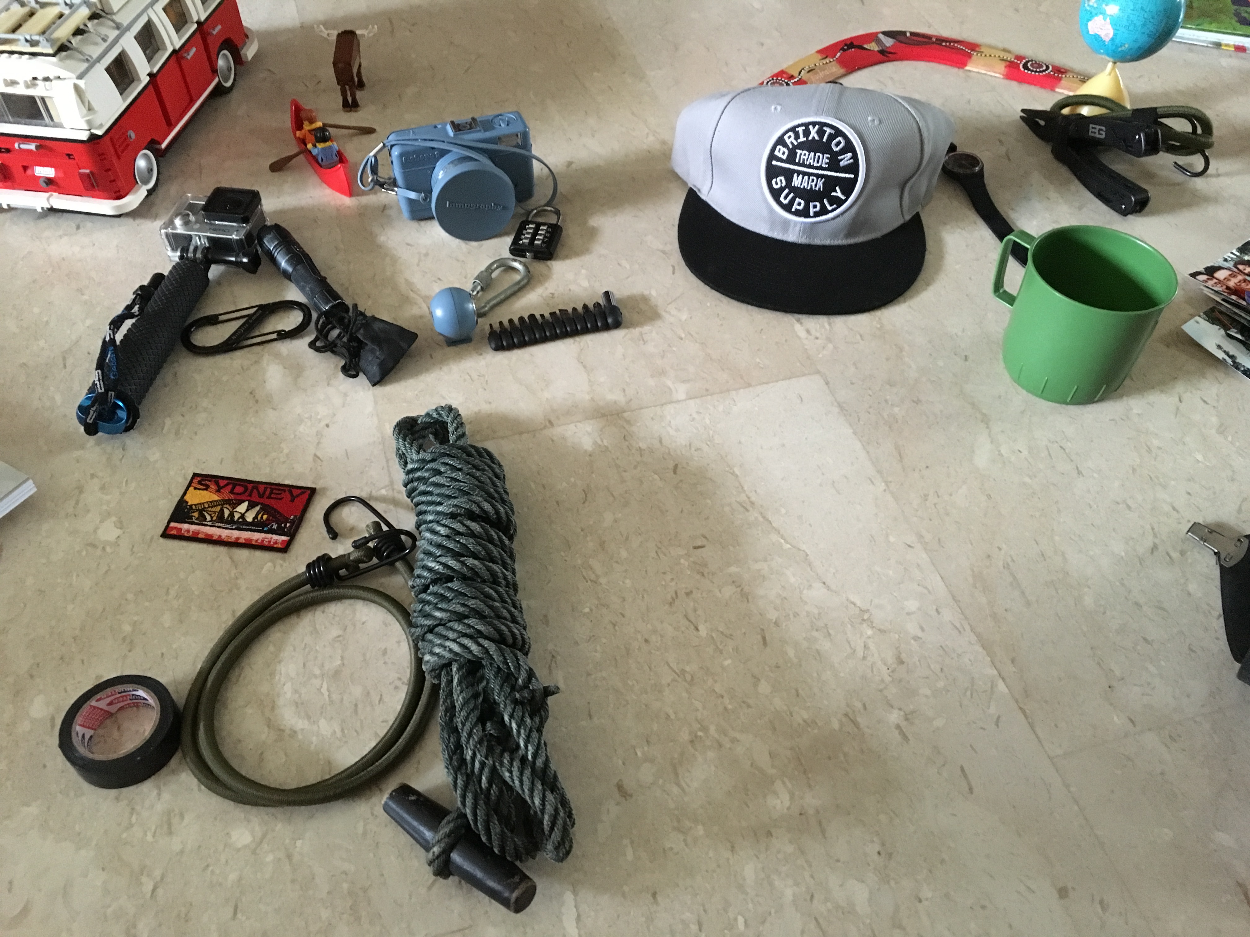
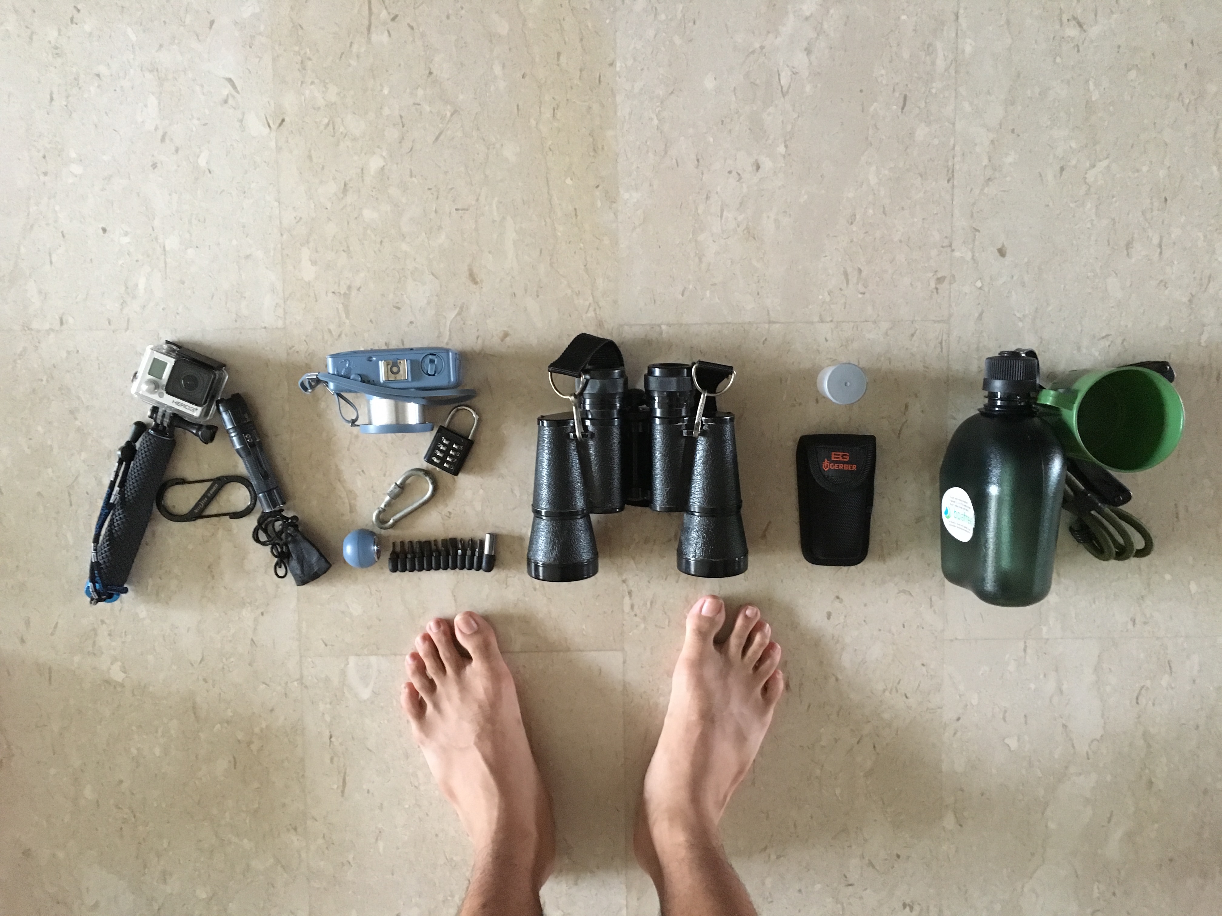
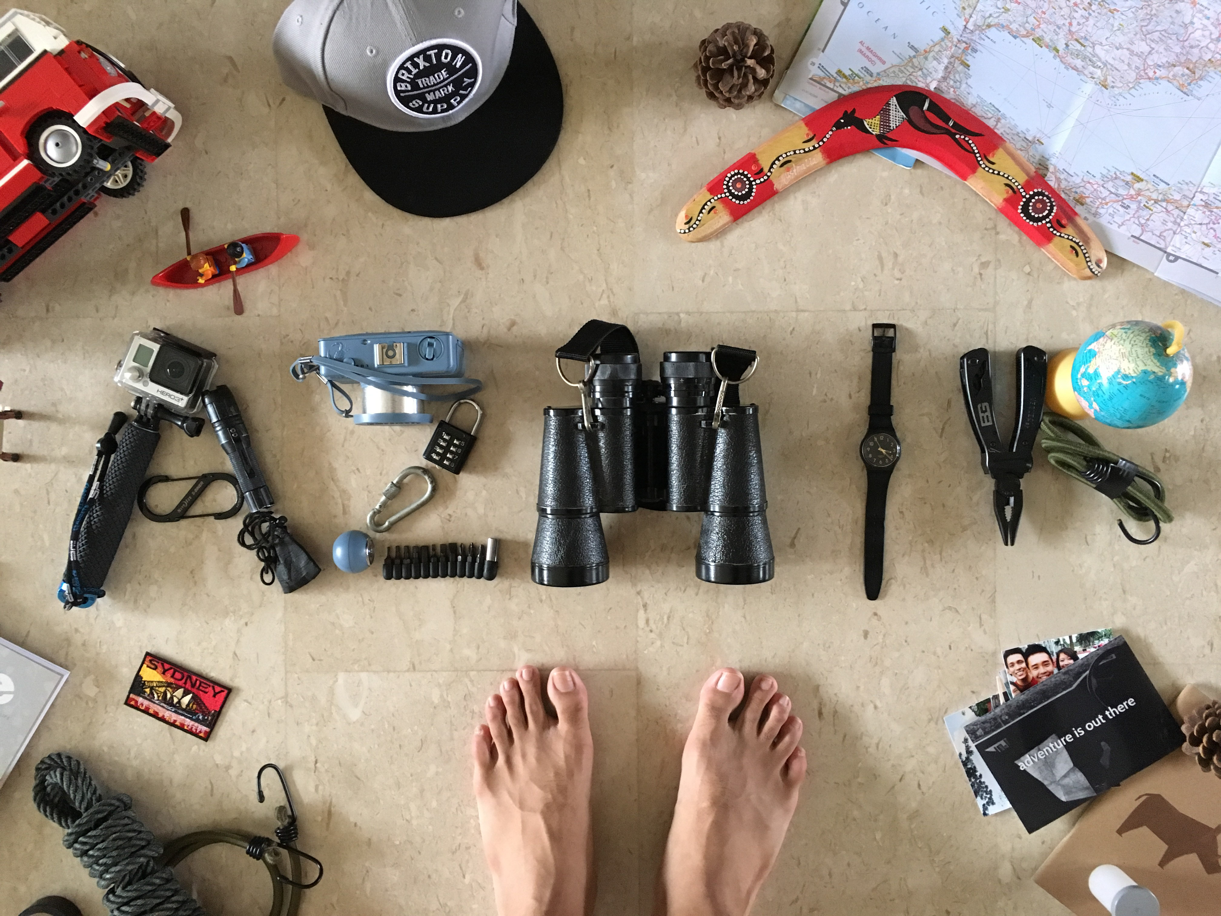
    • Comfort from the point of view of an adventurer is the outdoors
    • Comfort from the point of view of a child is attention
    • Comfort from the point of view a homeless man is a good shower
    • Comfort from the point of view of a bookworm is a library
    • Comfort from the point of view of a bear is a fresh catch
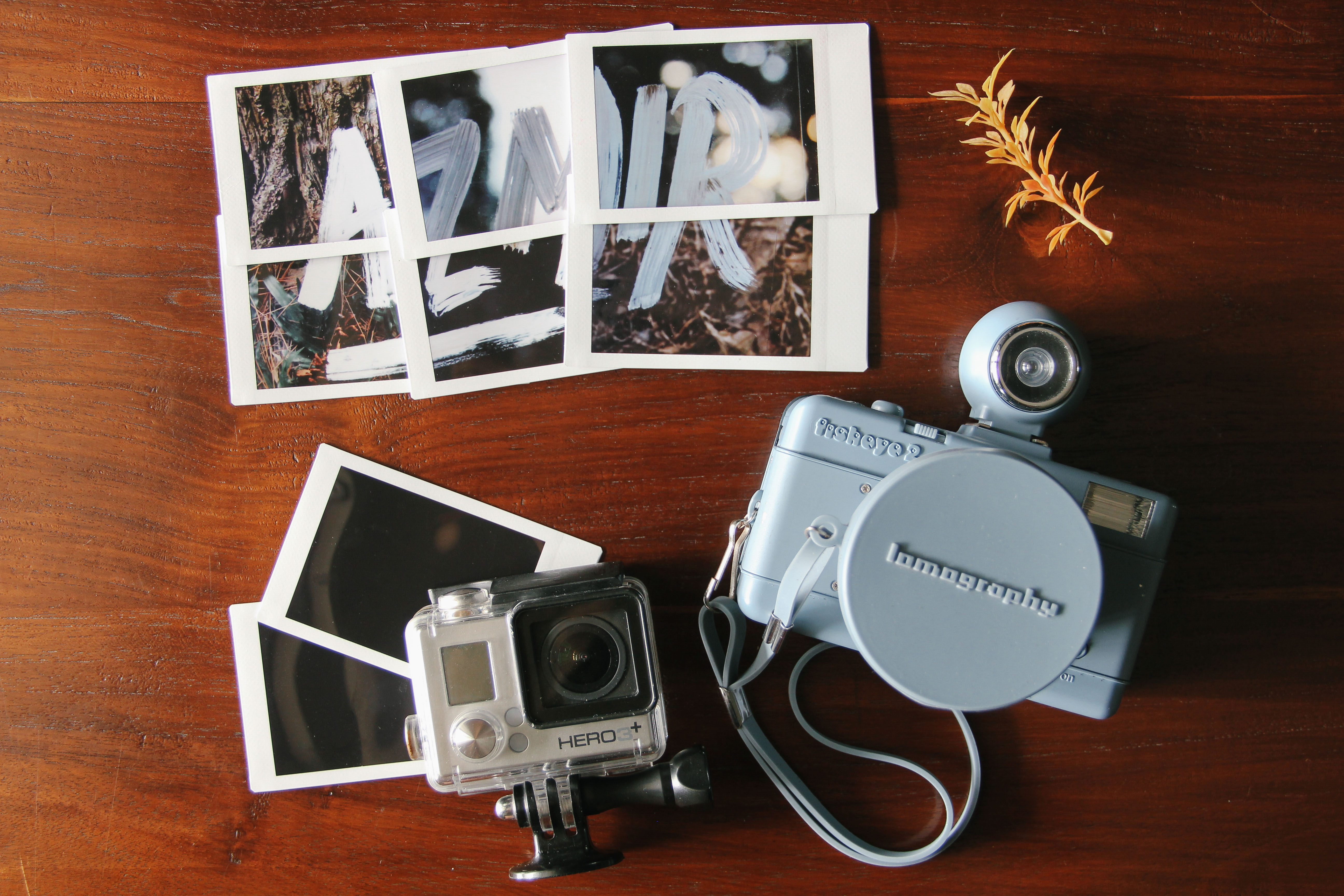
    • Comfort from the point of view of a photographer is the click of the shutter
    • Comfort from the point of view of a daydreamer is a quiet space
    • Comfort from the point of view of a writer is a pen
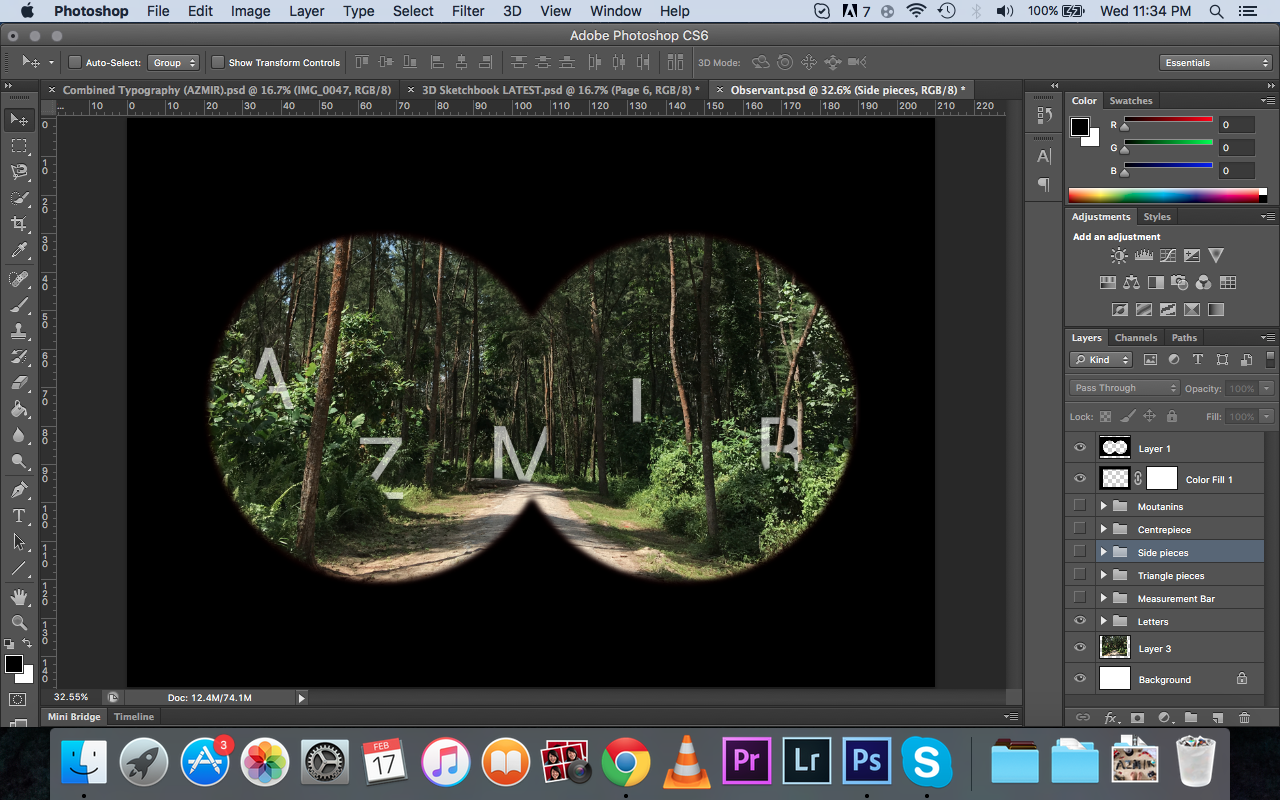
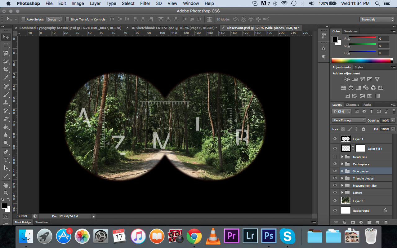
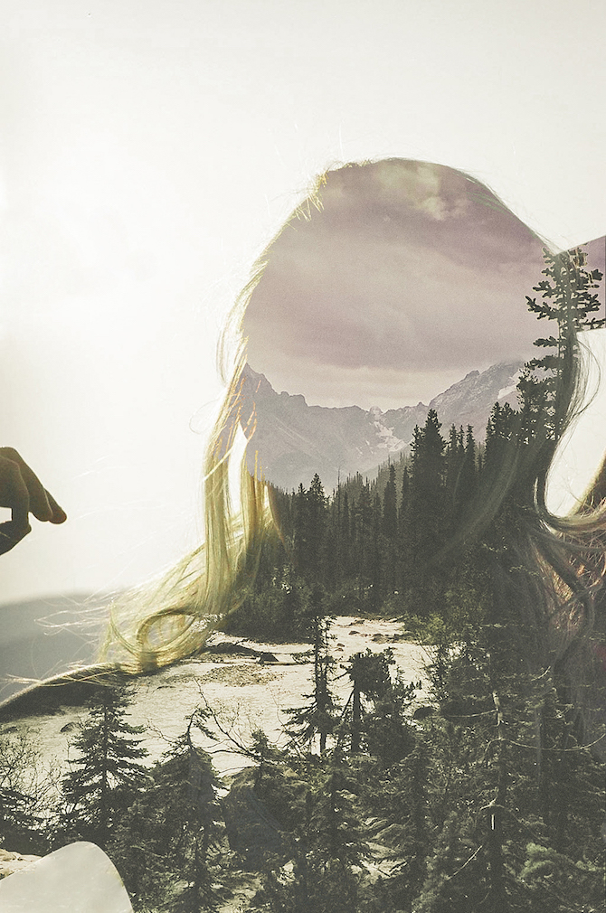
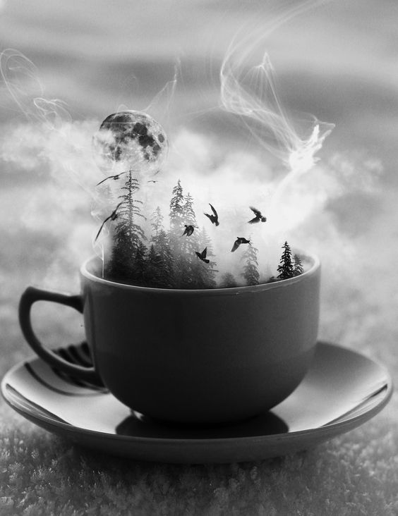
Double Exposure

lukegram_photography-01 lukegram_photography-03 lukegram_photography-04

Luke Gram


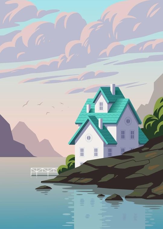
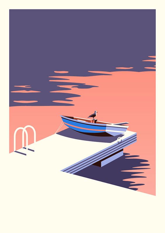
Vector Illustrations
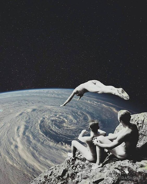
 Vector 3 Vector1

vector 4

vector 5

Surrealism

surreal 1 Surreal 2 Surreal 3

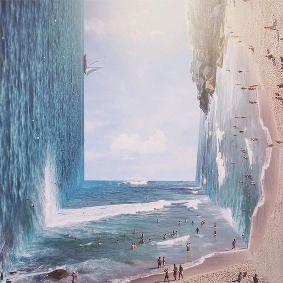
Inspiration of people and their comforts

Inspired by http://www.jasperjames.co.uk/project/people-and-places-2/

Food Landscapes Inspiration

Subversive Food Landscapes By Barbara Ciurej And Lindsay Lochman

An Art Exhibition Of Everyday Objects By Sou Fujimoto


2D Project 1, Week 6: Final

Hello my name is..

IMG_0010 EDITEDOSS

and I’m an adventure seeker

I love the idea of going out for an adventure, finding new and incredible things, and just being curious about the world. It has always been a dream of mine to want to travel to different parts of the world, experiencing new cultures, be it the city life or the countryside. I am inspired by the videos that I watch on Youtube almost everyday about how travelling brings new experiences that are never taught in classrooms. Finding adventure in a place is something I am working towards, going the extra mile to see places and do things I never thought of doing.

The items displayed in the photo above are some of the things that represent adventure to me. I included my feet as part of the photo because they are what I rely on to go for these adventures.


Hello my name is..

IMG_0031OSS

and i’m a tree hugger

I’ve always been passionate about nature and the environment since I was young. I enjoy going for walks in nature reserves, the parks and just being out and about. I included my hand as part of the photo as it resembles my idea of wanting to lend a helping hand for the environment in the future. I feel like right now, I am not doing much to help in the conservation of earth but I hope to be able to participate in conservation projects in the future. This is also in relation to my idea of seeking adventure.


Hello my name is..

ObservantFINALOSS

and i’m observant

I’ve always been an observant person. I am quick to notice certain things in the environment. Sometimes, I just tend to notice things that people normally overlook and analyse them more in-depth in my head. The binoculars view implies the idea of using a binoculars as being observant, to look out and see things beyond what people actually see. It always amuses me sometimes at how I can remember small little details of people and objects around me that people don’t really take notice of. In addition, being observant feeds my habit of people watching. While waiting for my bus, I will sit down by the bench and just watch people go about in their daily activities. It is always interesting to see people’s reactions, how they walk, what they are carrying and I just wonder like where they are from, where are they going, who are they meeting etc.


Hello my name is..

IMG_0170OSS

and i’m a visual storyteller

I’ve always been fascinated about cameras and different tools of storytelling. I developed a strong interest in photography and videography since I entered polytechnic back in 2010. My interest amplified when my mom bought me a Canon DSLR as a birthday gift and up till today, I am still using it for different purposes. As the years went by, different cameras were introduced to me and I was intrigued at how each camera has its own way of defining itself and its delivery methods. Therefore, I am now using these tools as a way of telling my stories. I like to film and take photographs when I travel to different countries, and put up short videos on Youtube so I can share it with the rest of the world. It is one of my ultimate goals to travel around the world and film. Also, the reason I chose to photograph parts of my name in different polaroids and then combining it together because its with these different parts of my life, when brought together, becomes a whole picture.

Overall, I had a good learning experience from making each individual composition all the way from the thought process up to the execution process, facing certain problems along the way but eventually finding out the solution to it, as well as the generous feedbacks from my classmates during consultation and during my presentation 🙂

You can view how I did all of these compositions here, BEHIND THE SCENES!

2D Project 1, Week 5: Behind The Scenes

This is the behind the scenes of my final product for Project 1! If you’ll like to check it out, click HERE!

Adventure Seeker

For this piece, I had to go around the house finding objects and items that meant ‘adventure’ to me. Initially, I wanted to play around with the idea of negative space which was brought up by Daniel during the group consultation. However, after much consideration, I felt that the use of negative space would mean that I would have to find even more objects around the house and that was already a challenge to begin with. I decided to settle with my initial idea of using objects to make the typeface instead which require less work. Below are some the images that eventually led to the final output of this piece.

24667252869_c94a995fda_o

Setting the scene

24667251299_3984031c15_o

Making sure the items are placed properly

24916836112_4407199857_o

Side perspective of the scene

IMG_0841

Test shot #1

IMG_0847OSS

Test shot #2 (without shoes, tighter crop)


Tree Hugger

For this piece, there were a lot of hands-on work to be done prior to the execution.

2D Typography

Firstly, I browsed through the internet looking for a suitable font. This font is called ‘Cheddar Jack’, I typed it out on photoshop and printed it out to act as a template.

24667245359_1cb714e515_oOSS

Once printed, I cut away all the white spaces to form my template.

24667245439_59f584ba34_oOSS

24916832652_18e4e3f985_oOSS

I laid the template over a piece of cardboard to create a much more sturdy template as compared to paper.

25034881705_999e10ed1a_oOSS

24667248719_5d0321b49c_oOSS

Just like in step 1, I cut the negative spaces out.

24667248819_f9325472f9_oOSS

Materials for the next step

24916835782_35b69d5c25_oOSS

Next, I used PVA glue and sprinkle the moss over the top.

24667250389_cbe60c5e09_oOSS24666326719_d998bc985f_oOSS

Completed product

Next, I had the idea of placing it on my arm because it relates to my idea of wanting to lend a helping hand in conservation projects in the future. It took me several different shots and how its placed to get what I want. As the sun was setting, I had to make a quick decision of which composition that I want in order to get the best lighting possible. In the end, I managed to get exactly the perfect shot which is in the other OSS post.

IMG_0020OSS

Test shot #1

IMG_0019OSS

Test shot #2

IMG_0024OSS

Test shot #3

IMG_0036OSS

Test shot #4


Observant

My initial idea for this piece was that I wanted to feature myself holding a pair of binoculars looking out and fitting letters of my name in between the lens, but after the group consultation, they suggested that I can consider using the inside view of the binoculars, basically in the perspective of the user using the binoculars. Therefore, I resorted to the use of Photoshop to bring out the binoculars effect and create my typography from there.

Screen Shot 2016-02-17 at 11.34.08 PM

I started out with an A5 sized blank canvas.

Screen Shot 2016-02-17 at 11.34.18 PM

Next, I found the binoculars effect on google and decided to put it first as part of my composition.

Screen Shot 2016-02-17 at 11.34.28 PM

Next, I used a photo from a photowalk about a month ago in Coney Island. I really love this photo as it fitted with my overall theme of having earth and nature tones.

Screen Shot 2016-02-17 at 11.34.40 PM

Next, I typed out my name letter by letter and painstakingly placed it in different parts of the path/forest. I decided it was best if the letters were spaced out throughout the composition so it doesn’t look like its squeezing to one side. Then, I played with the opacity of the letters so it does not look as striking and bold to make it fit into the forest. I also erased parts of the letters so as to make it appear that the letters are sort of hiding behind the trees and leaves (gives more depth to the letters).

Screen Shot 2016-02-17 at 11.34.47 PM

I went to look at more examples of how the view of a binoculars should look like and I added more details to it, giving it a measurement bars, making the whole binoculars effect more realistic.

Screen Shot 2016-02-17 at 11.34.52 PM


Visual Storyteller

For this piece, there were a lot of preparation work to be done before actually getting to the final product. Firstly, I engaged the help of my friend who is good at doing typography to mimic a font called Edo SZ.

Screen Shot 2016-02-18 at 11.17.46 PM

24916830632_0193a3b36d_oOSS

We first tried it on paper first to get the feel of how it is going to turned out.

24667256109_6757967422_oOSS

As I wanted the ‘paint’ look, we used gauche paint and a thick paintbrush. After numerous tries on paper, we were confident enough to do it on the acrylic piece itself. The idea of painting it on an acrylic piece is so that I could manipulate the background easily. As it is transparent, I was able to hold it up to any background that I want with ease and took a polaroid photo of it. Below are the shots that I manage to take with my polaroids.

IMG_0047OSS IMG_0056OSS IMG_0057OSS IMG_0064OSS IMG_0078OSSIMG_0098OSS

It wasn’t easy trying to frame the shots and getting the polaroid to come out the way I wanted. It took me a few wasted tries to finally perfect the form that I wanted. As it was taken with a polaroid, it felt like a surprise every time the photo comes out because even though you frame the shots, the outcome will be slightly different even with a slight change in lighting conditions.

IMG_0082OSS

The whole acrylic piece itself against the background.

Combined Typography (AZMIR)OSS

Visualizing the outcome of the final typography with each picture combined

IMG_0881

Putting it together.

IMG_0925OSS

Test shot #1

IMG_0181OSS

Test shot #2

IMG_0183OSS

Test shot #3

2D Project 1, Week 5: Work In Progress

Ever since the last update, the attributes has since then been brought down to 4 instead of 6. Therefore, the finalised 4 attributes I will be doing are as follows:

1) Adventure Seeker

2) Tree Hugger (Nature-Lover)

3) Observant

4) Visual Storyteller


After much deliberate thought and research about the main concept that links all 4 of my attributes together, I’ve decided to go with the idea of incorporating the use of body parts/senses for each attribute. The final outcome of the 4 attributes will be an A5 photograph of my executed idea.

Last week, we had a group consultation where we share the ideas that we wanted to execute and get feedback from our classmates. I believe the group liked my idea and were excited to see what the final outcome was going to be and there wasn’t really any major changes to my initial idea. Throughout the consultation, they had some interesting inputs and ideas to other people’s work that I could possibly incorporate to my own work as well.

Adventure Seeker

For this attribute, I want to play with the idea of using items I can find around my house that spells adventure. Using these items, I will then make out my name out of these items and surround the typography with other items to complement the whole idea of ‘adventure seeker’. I will feature my feet for this piece.

EXPLORE

This is roughly the look that I’m going for.

Tree Hugger (Nature Lover)

For this attribute, I will be doing something similar like the image below where I will use moss to be placed on a typographic template of my name. This template will then be placed on my hand which will then be photographed on a tree.

An example of moss typography

Observant

For this piece, it will mainly be digitally manipulated. The letters of my name will ‘interact’ with the environment through the view of a binoculars.

24173a31cf6785fb7d59eec01e7b075f

This is one example of how I intend the final outcome to be

Visual Storyteller

The process for the final outcome of this attribute will be tedious.

  • I will be writing out my name on a piece of acrylic sheet using white paint. This gives me the ability to manipulate the background to whatever I want because it is transparent. White paint is used because the colour stands out on any background.
  • Next, I will be taking photos of different parts of my name placed on different backgrounds using a polaroid camera.
  • Once the polaroids are developed, I will then rearrange them to make out my name again. I will then take a photo of the arranged pieces and will be accompanied with items that I use to visually tell my stories. 🙂
9697eab16455b4b7fe8a80945f23d633

Rough idea

As of now all the works are currently in the progression stage. The final outcome will compose of just A5 photographs with those 4 attributes. Hopefully, everything will turn out as planned and I’m looking forward to see the works of my other classmates!