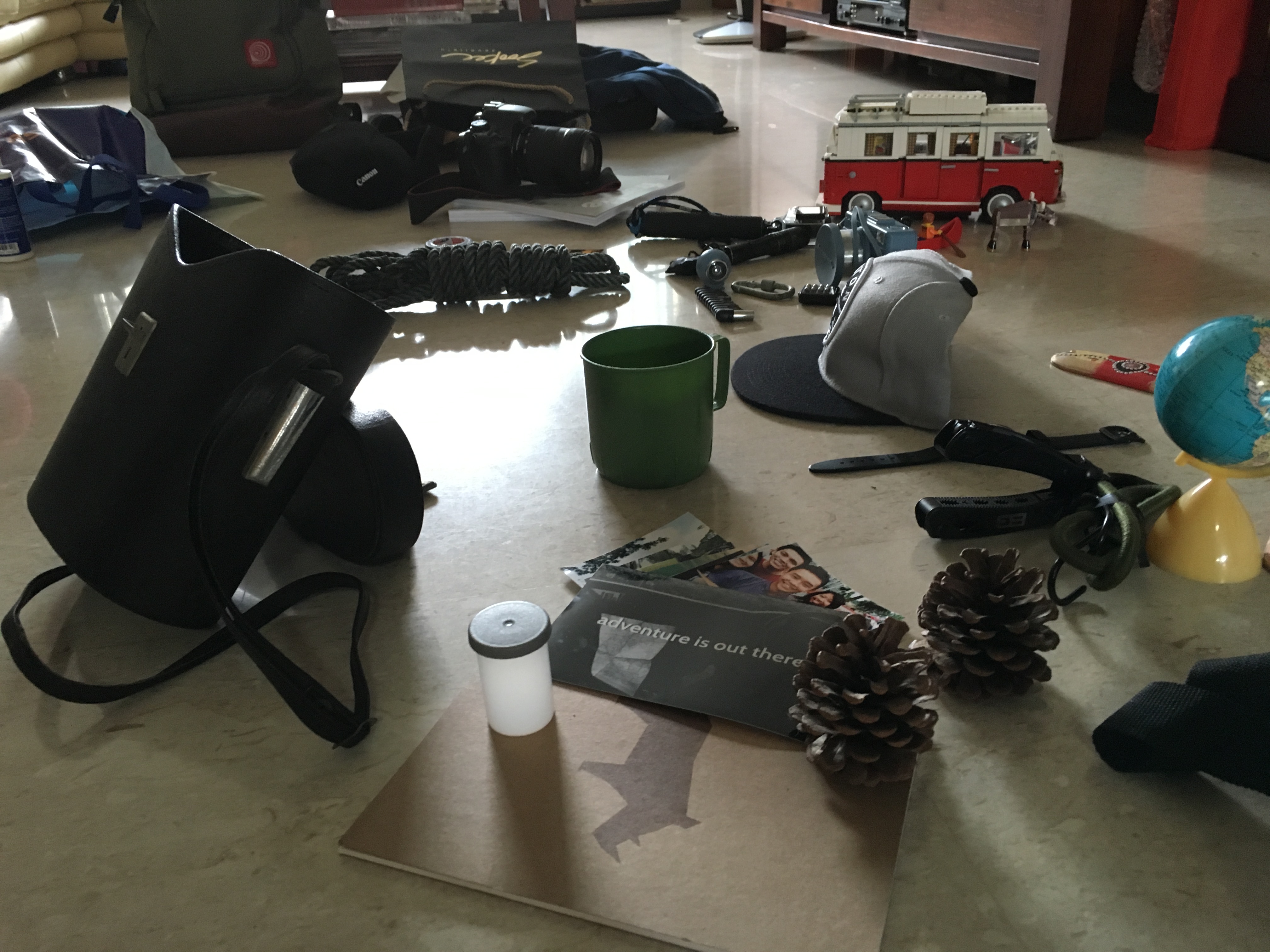
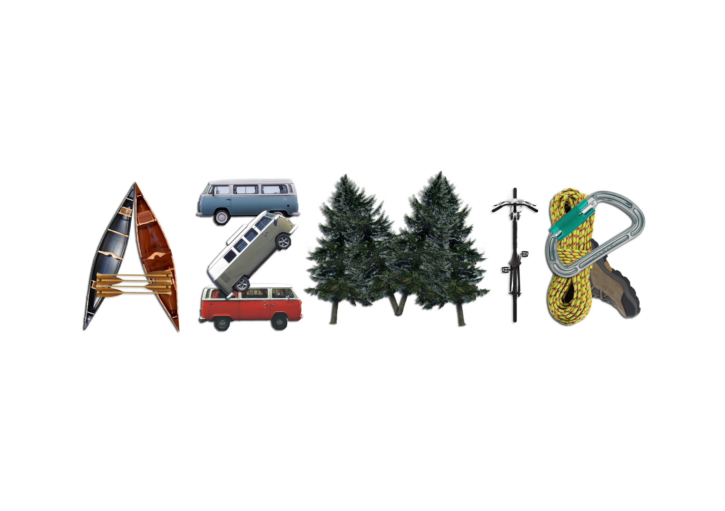
Hello my name is..
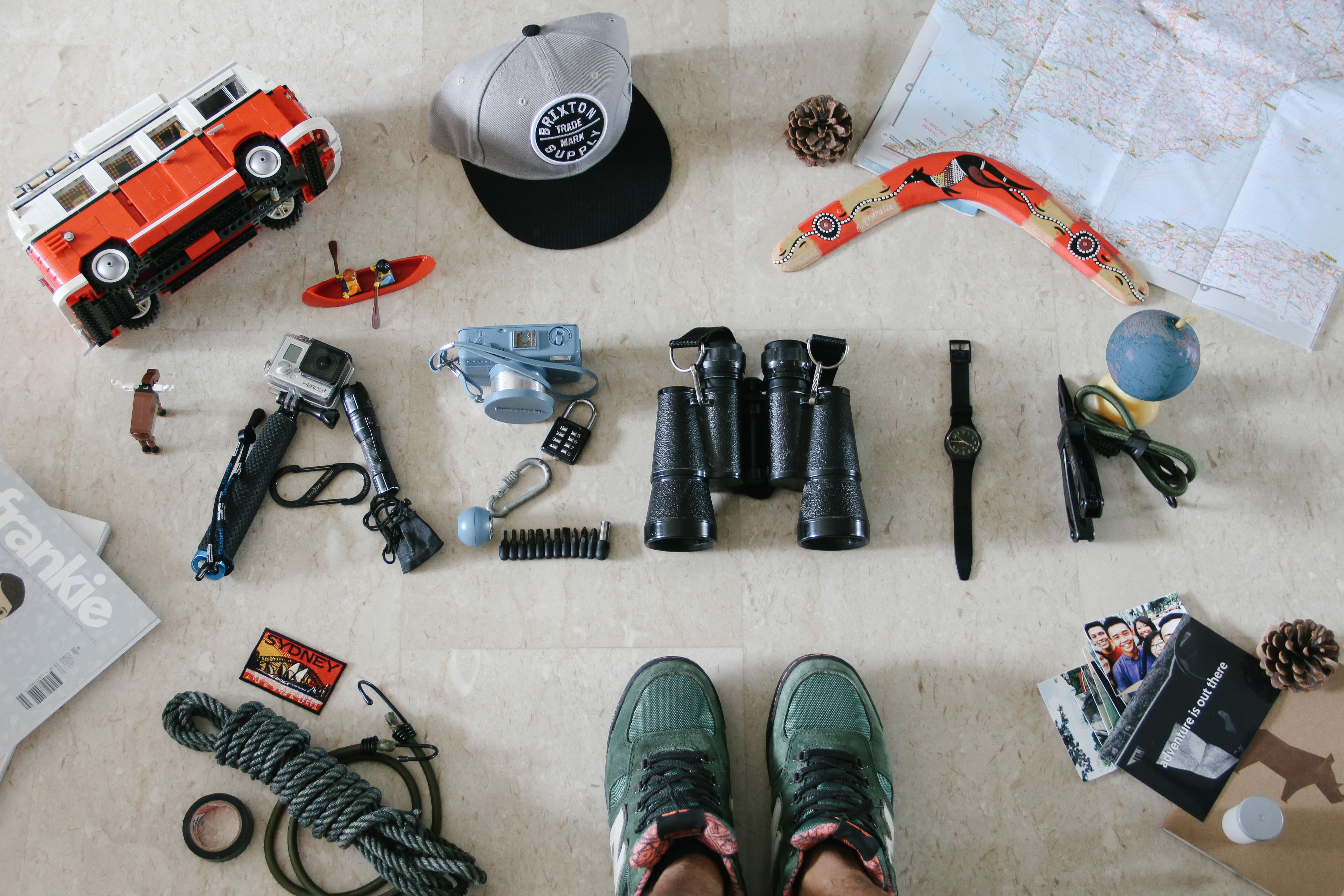
and I’m an adventure seeker
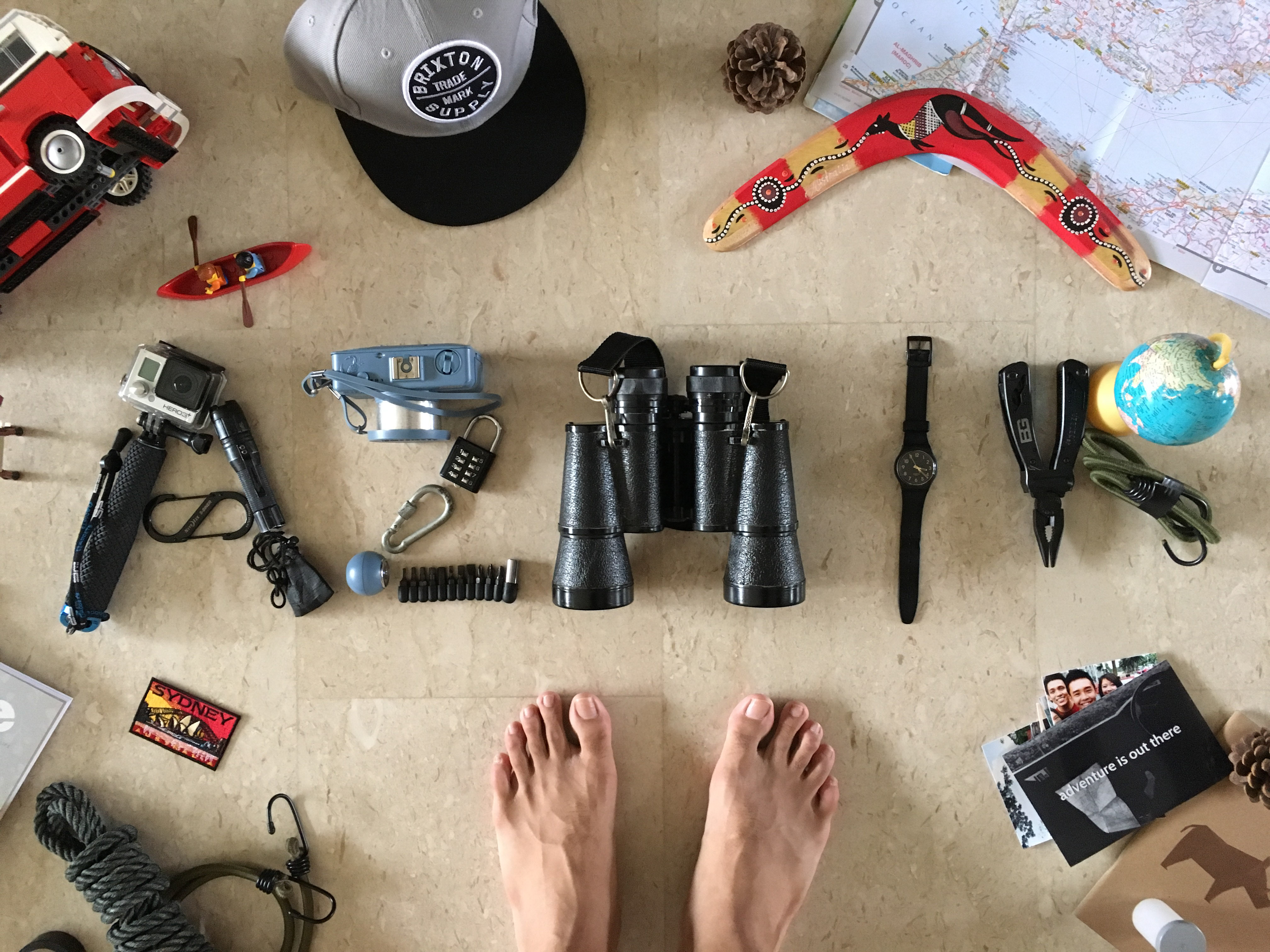
I love the idea of going out for an adventure, finding new and incredible things, and just being curious about the world. It has always been a dream of mine to want to travel to different parts of the world, experiencing new cultures, be it the city life or the countryside. I am inspired by the videos that I watch on Youtube almost everyday about how travelling brings new experiences that are never taught in classrooms. Finding adventure in a place is something I am working towards, going the extra mile to see places and do things I never thought of doing.
The items displayed in the photo above are some of the things that represent adventure to me. I included my feet as part of the photo because they are what I rely on to go for these adventures.
Hello my name is..
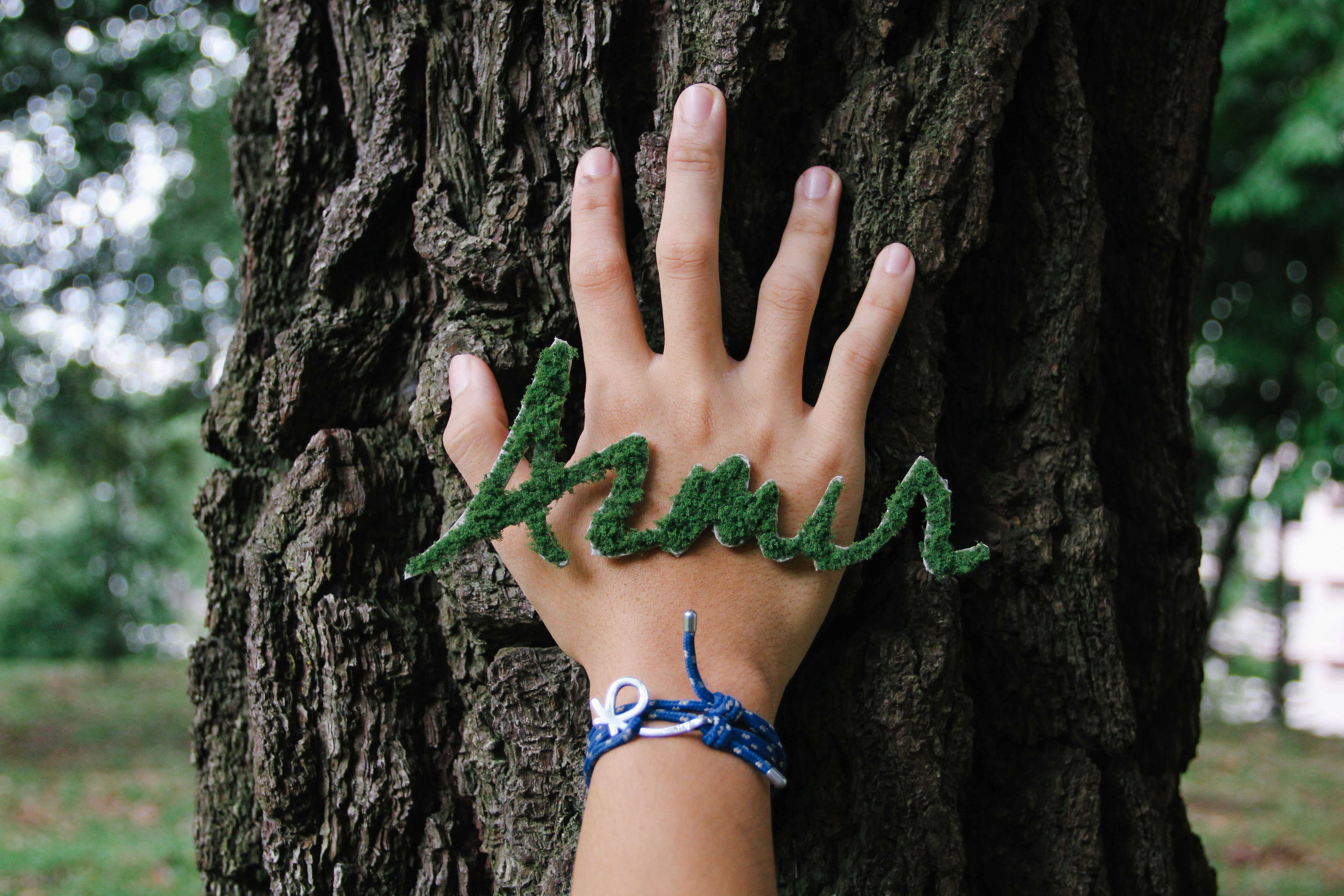
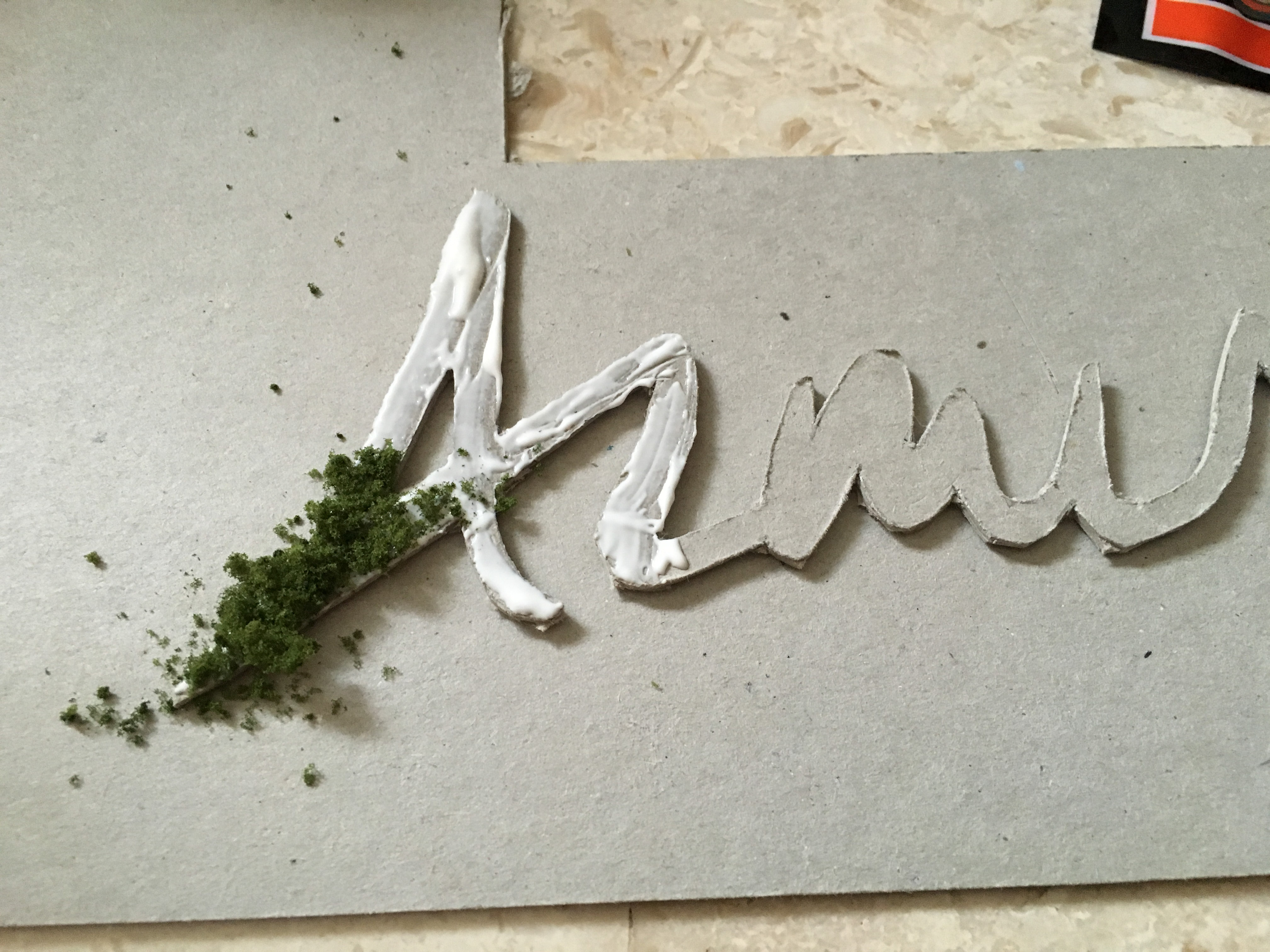
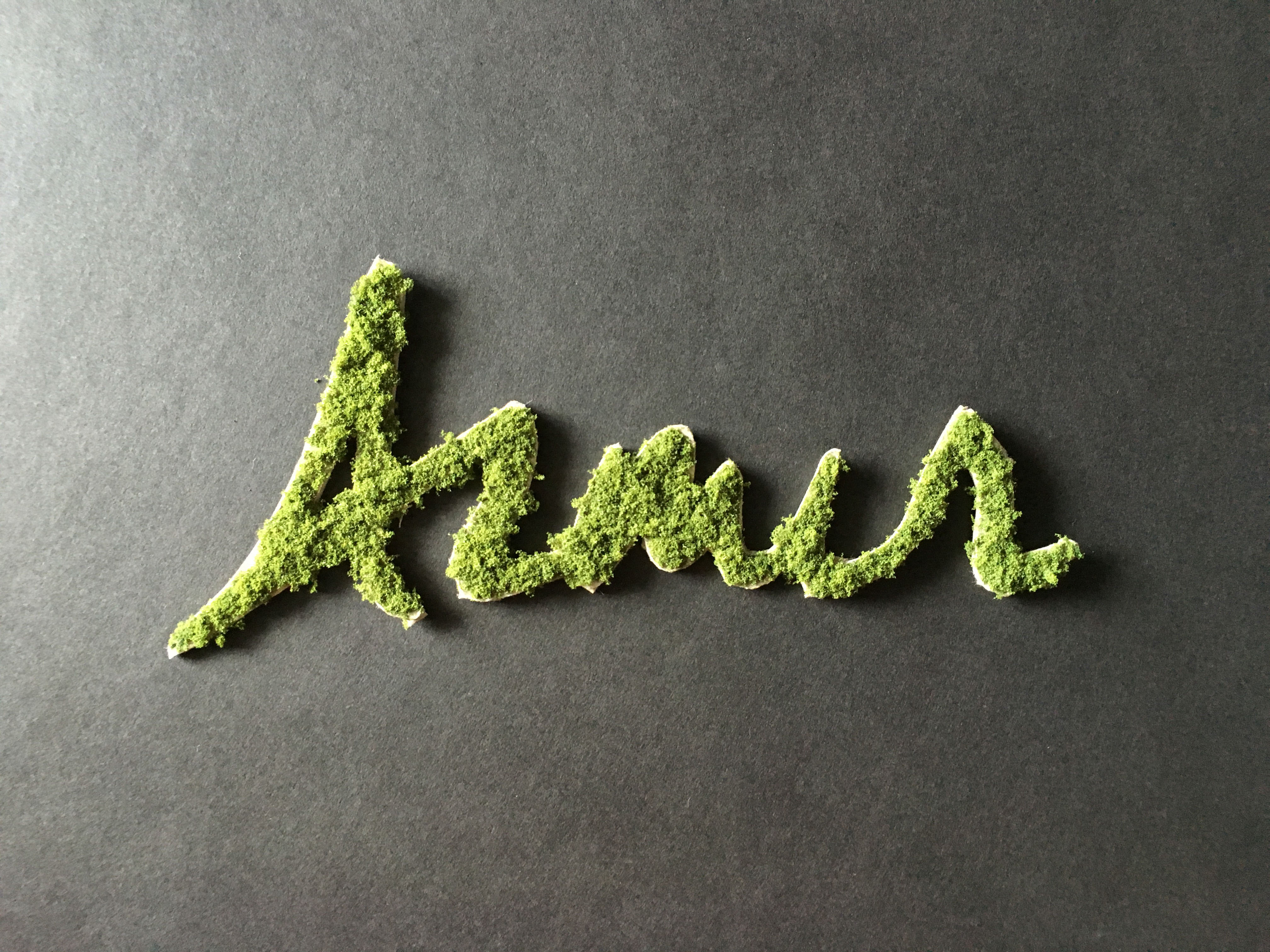
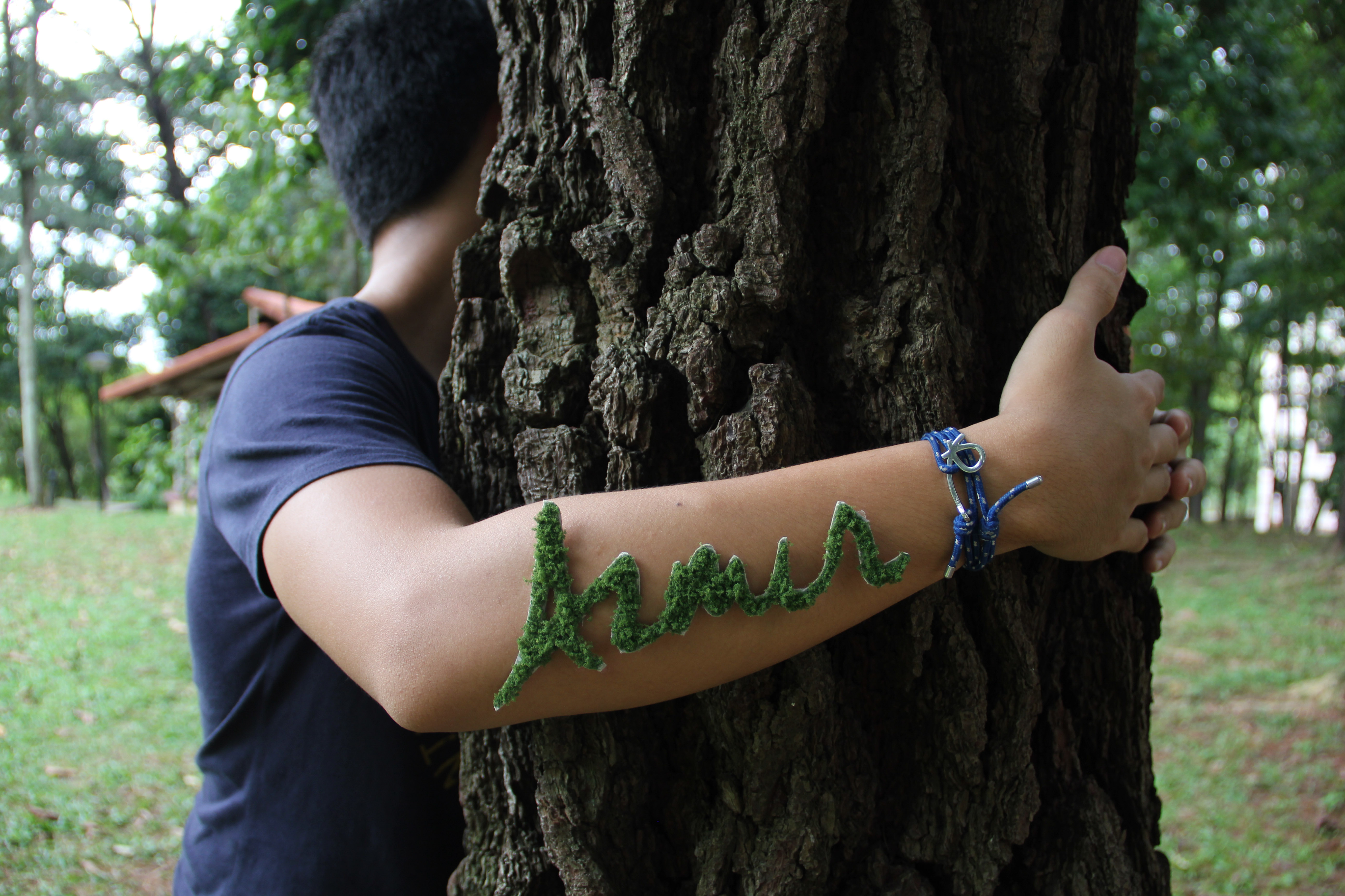
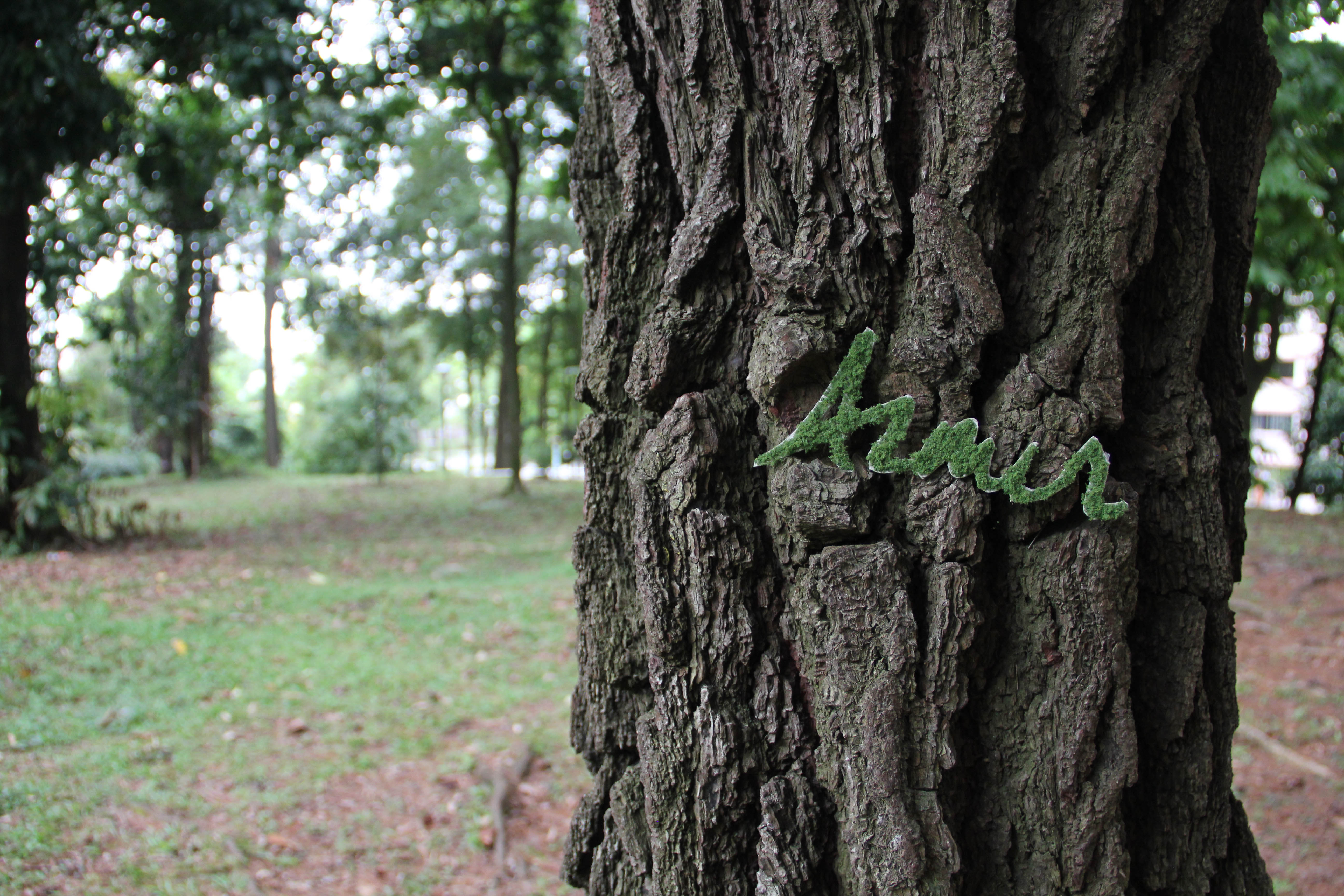
and i’m a tree hugger
I’ve always been passionate about nature and the environment since I was young. I enjoy going for walks in nature reserves, the parks and just being out and about. I included my hand as part of the photo as it resembles my idea of wanting to lend a helping hand for the environment in the future. I feel like right now, I am not doing much to help in the conservation of earth but I hope to be able to participate in conservation projects in the future. This is also in relation to my idea of seeking adventure.
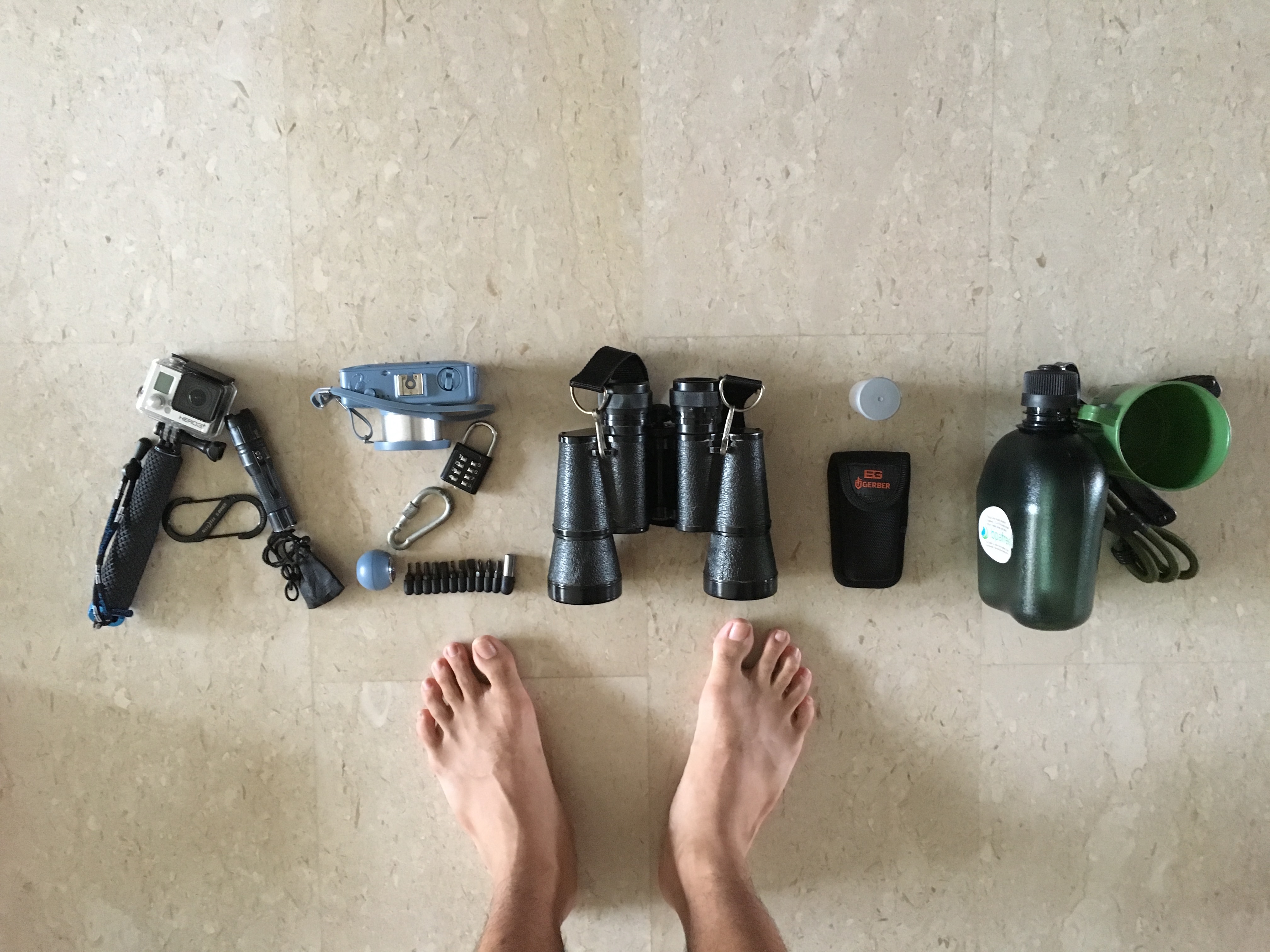
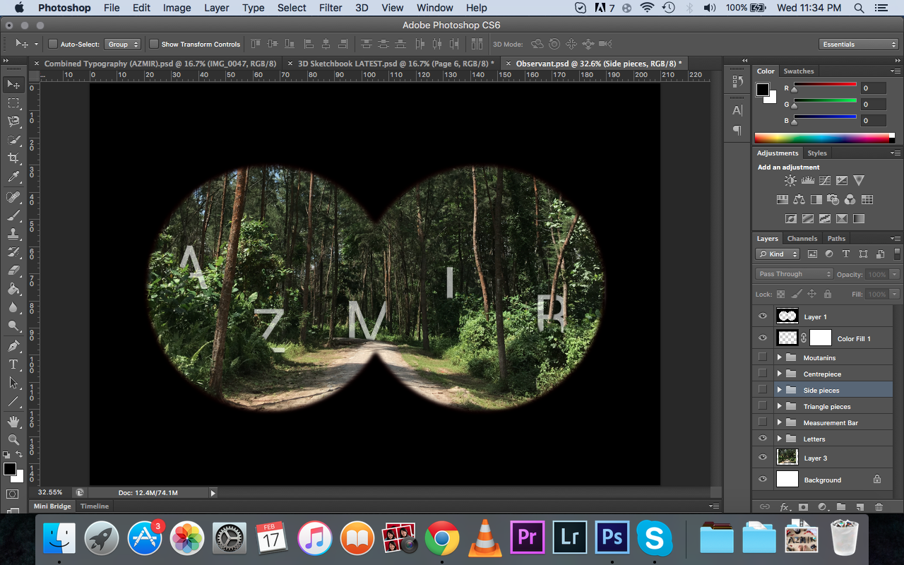
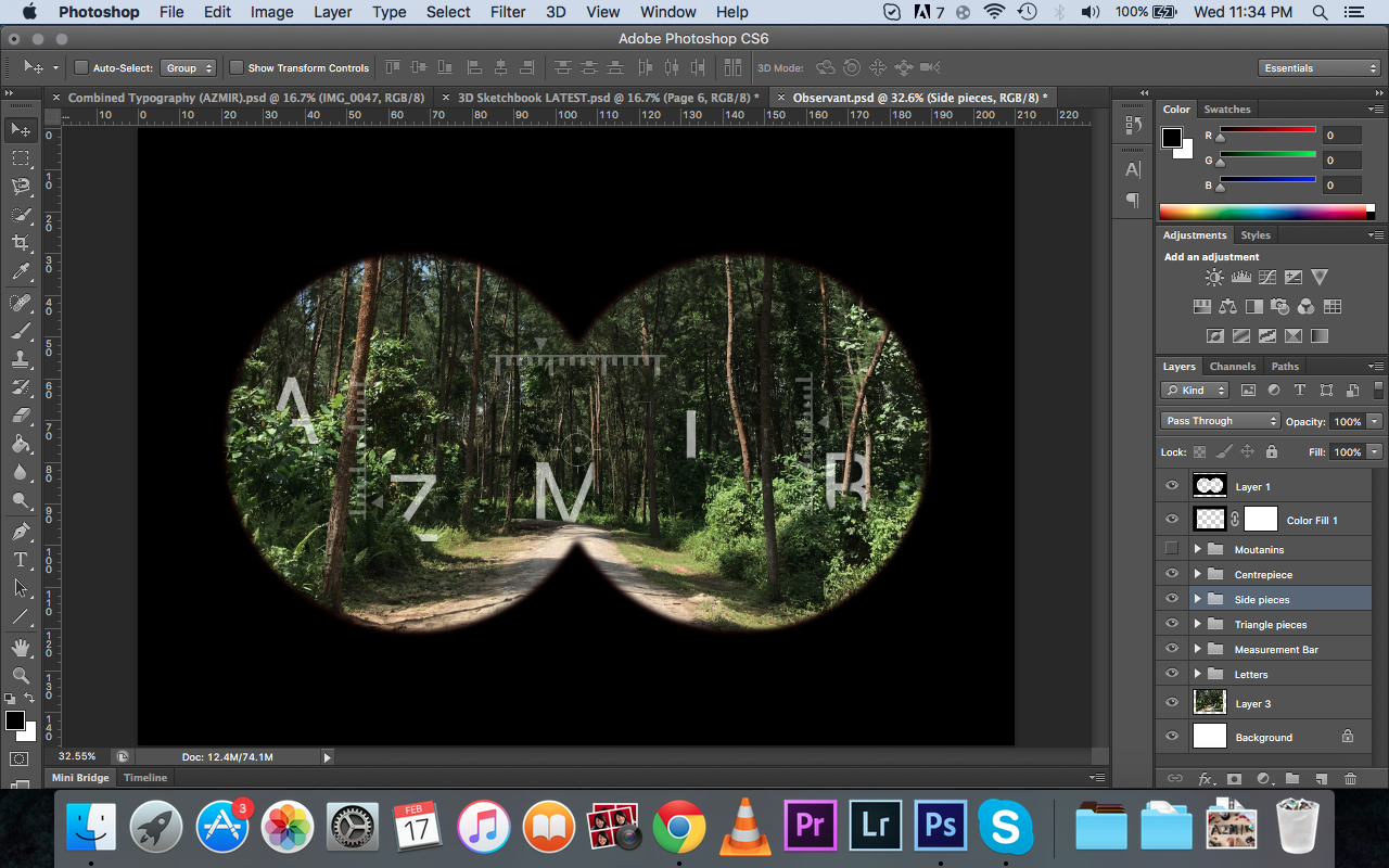
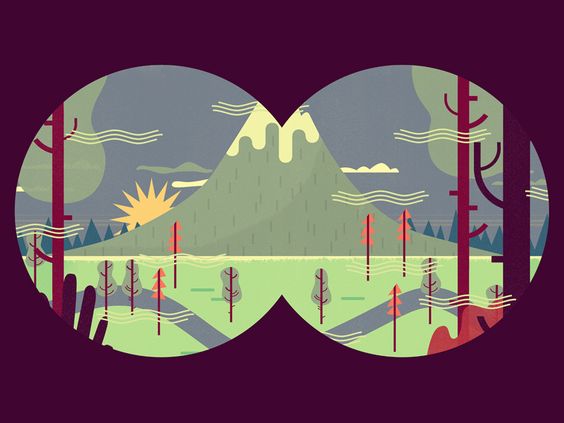
Hello my name is..
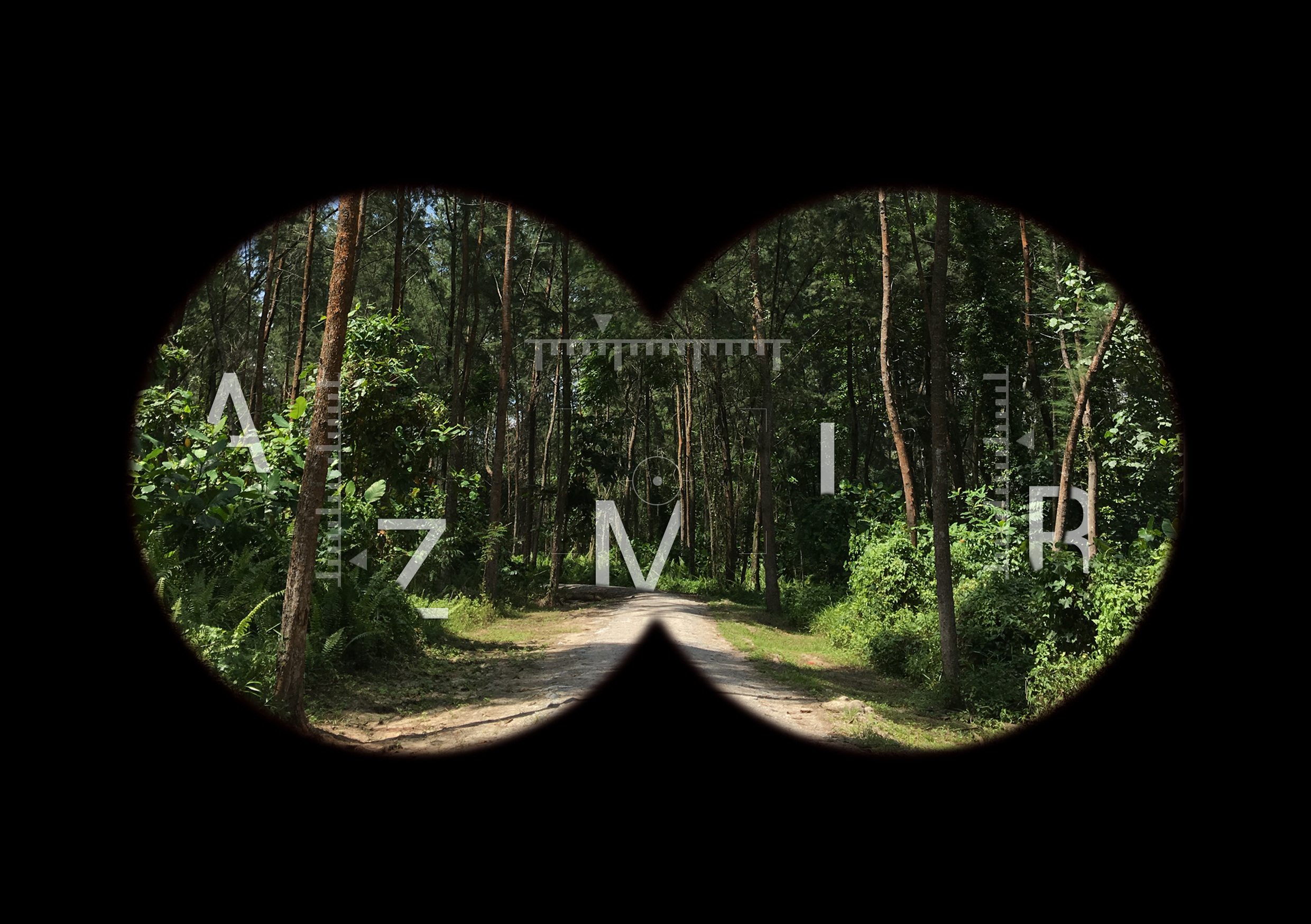
and i’m observant
I’ve always been an observant person. I am quick to notice certain things in the environment. Sometimes, I just tend to notice things that people normally overlook and analyse them more in-depth in my head. The binoculars view implies the idea of using a binoculars as being observant, to look out and see things beyond what people actually see. It always amuses me sometimes at how I can remember small little details of people and objects around me that people don’t really take notice of. In addition, being observant feeds my habit of people watching. While waiting for my bus, I will sit down by the bench and just watch people go about in their daily activities. It is always interesting to see people’s reactions, how they walk, what they are carrying and I just wonder like where they are from, where are they going, who are they meeting etc.
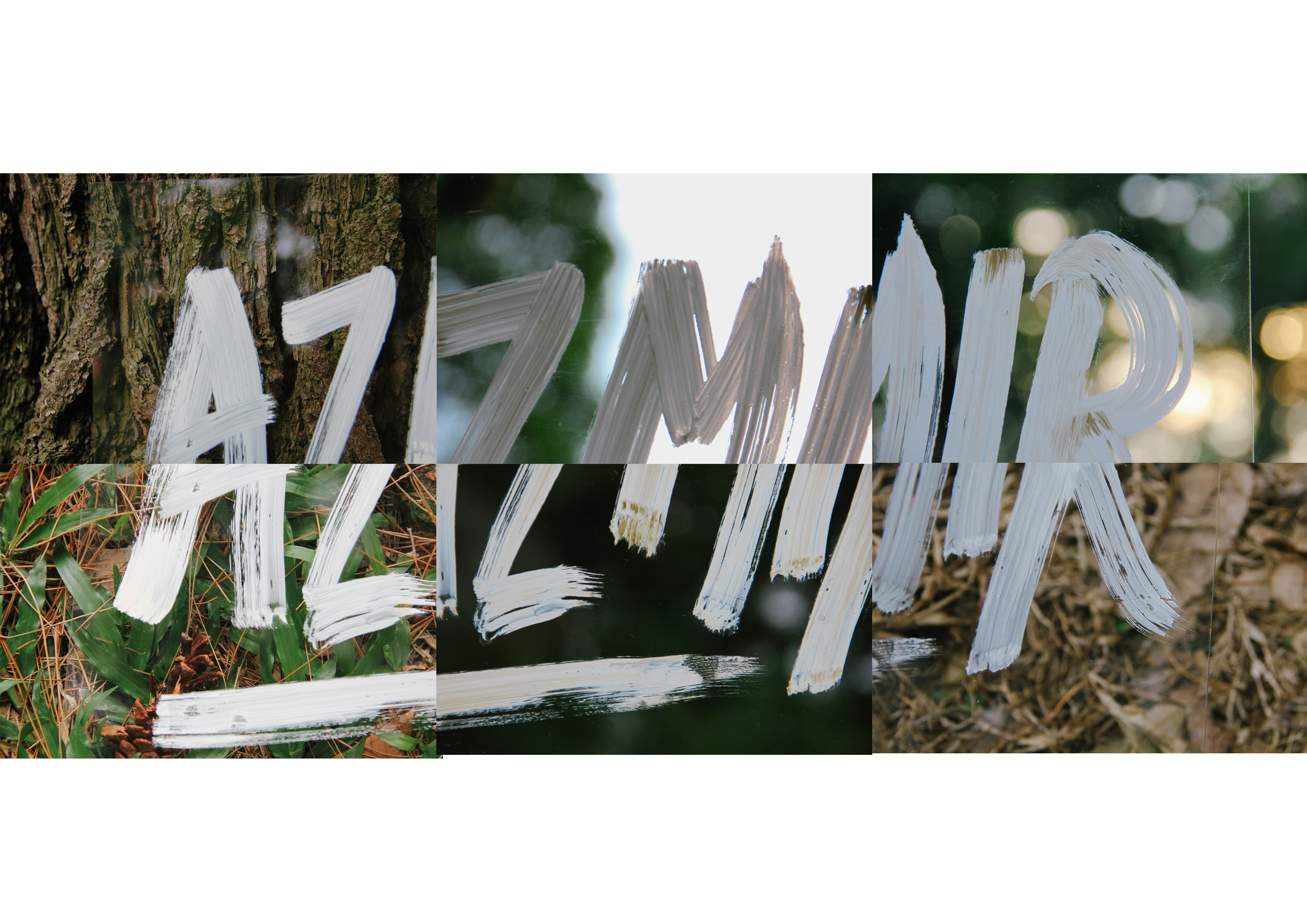
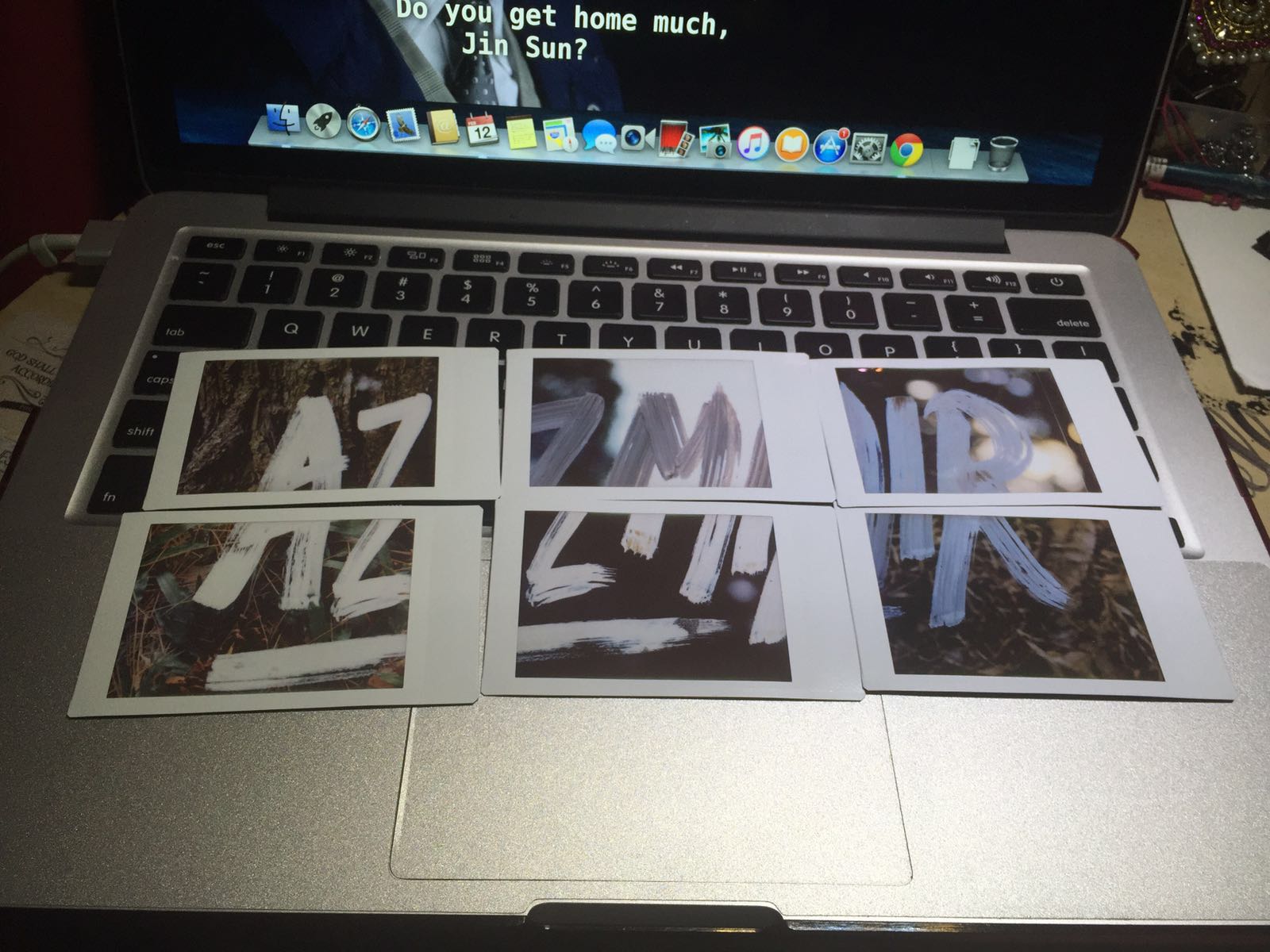
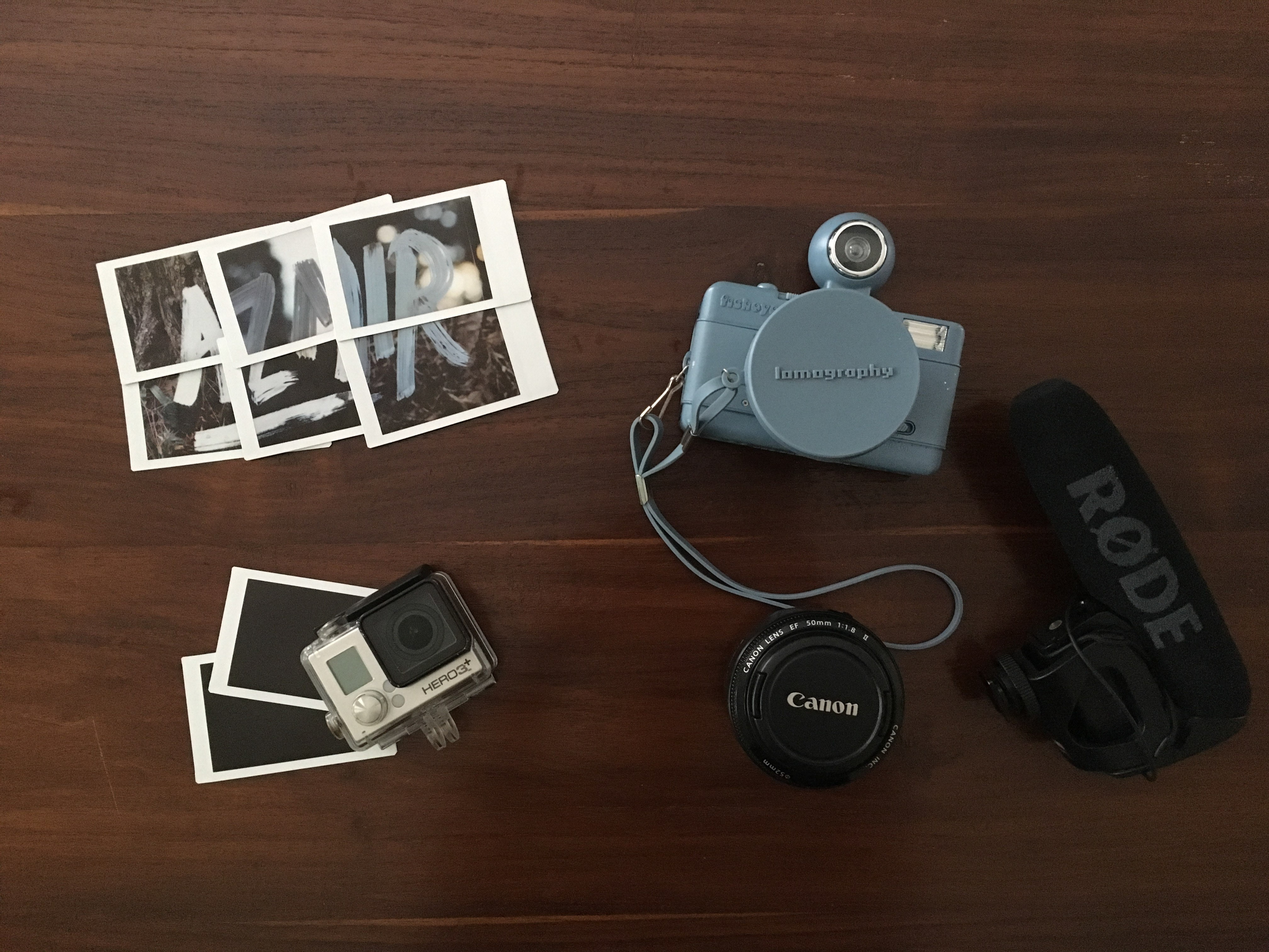
Hello my name is..
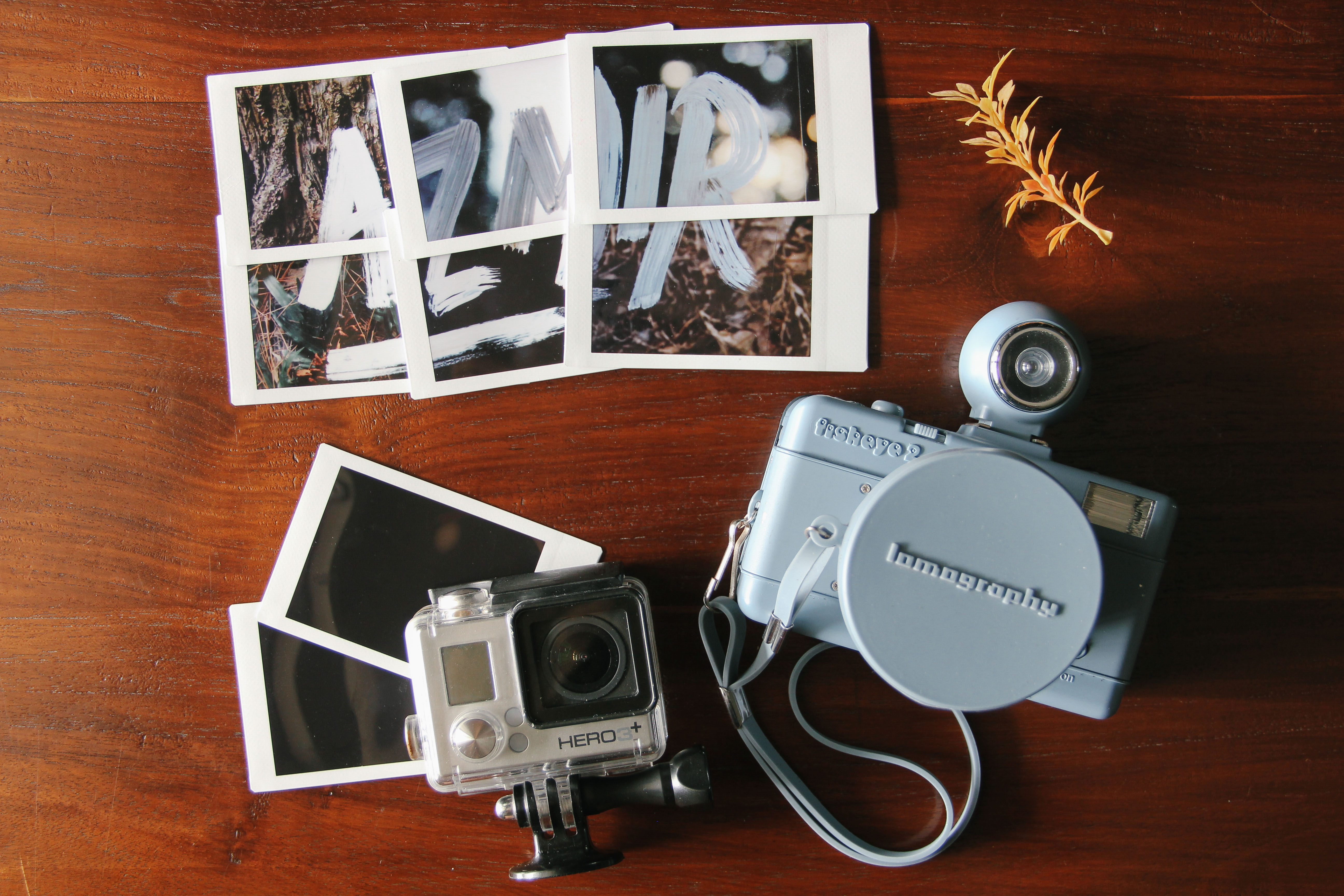
and i’m a visual storyteller
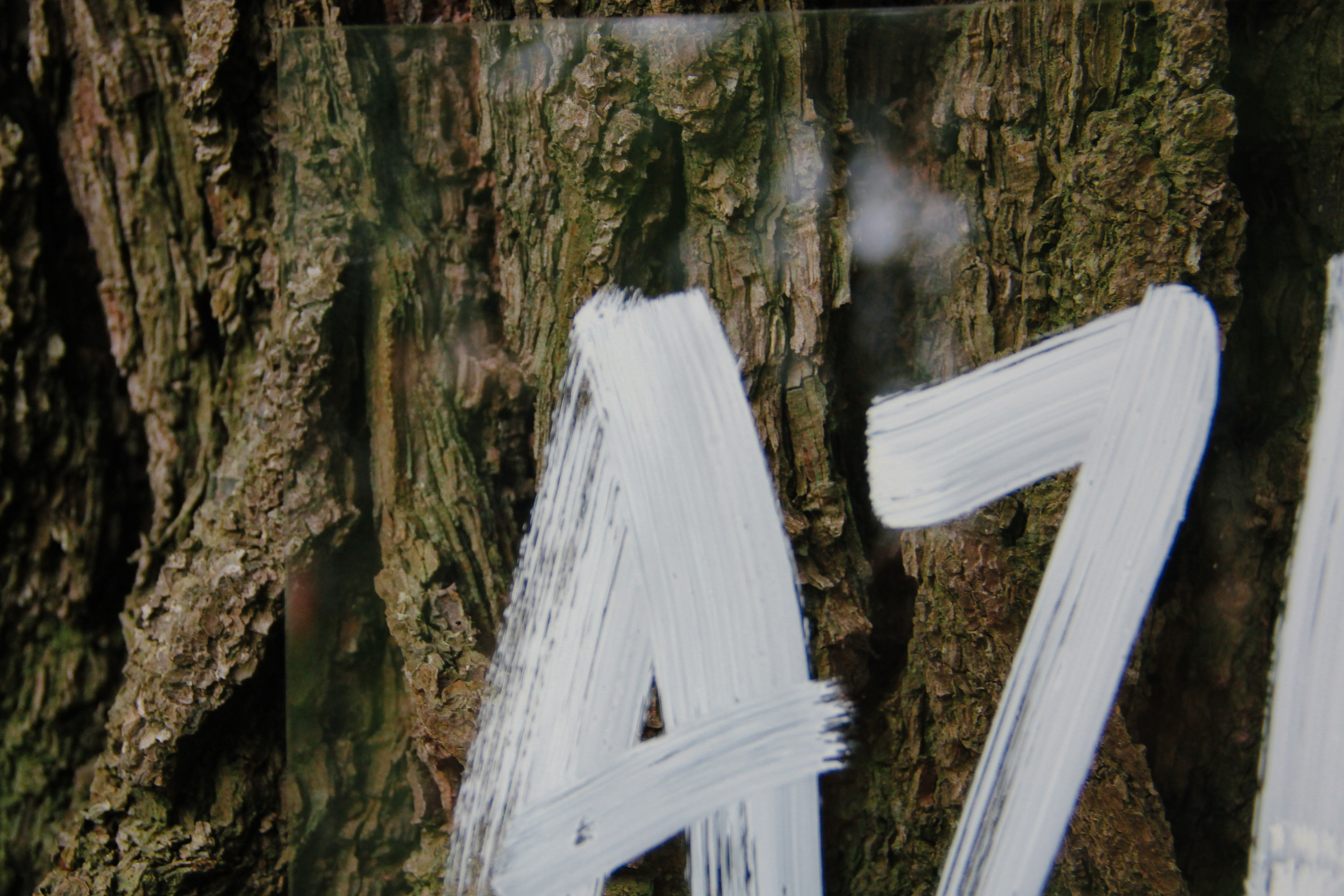
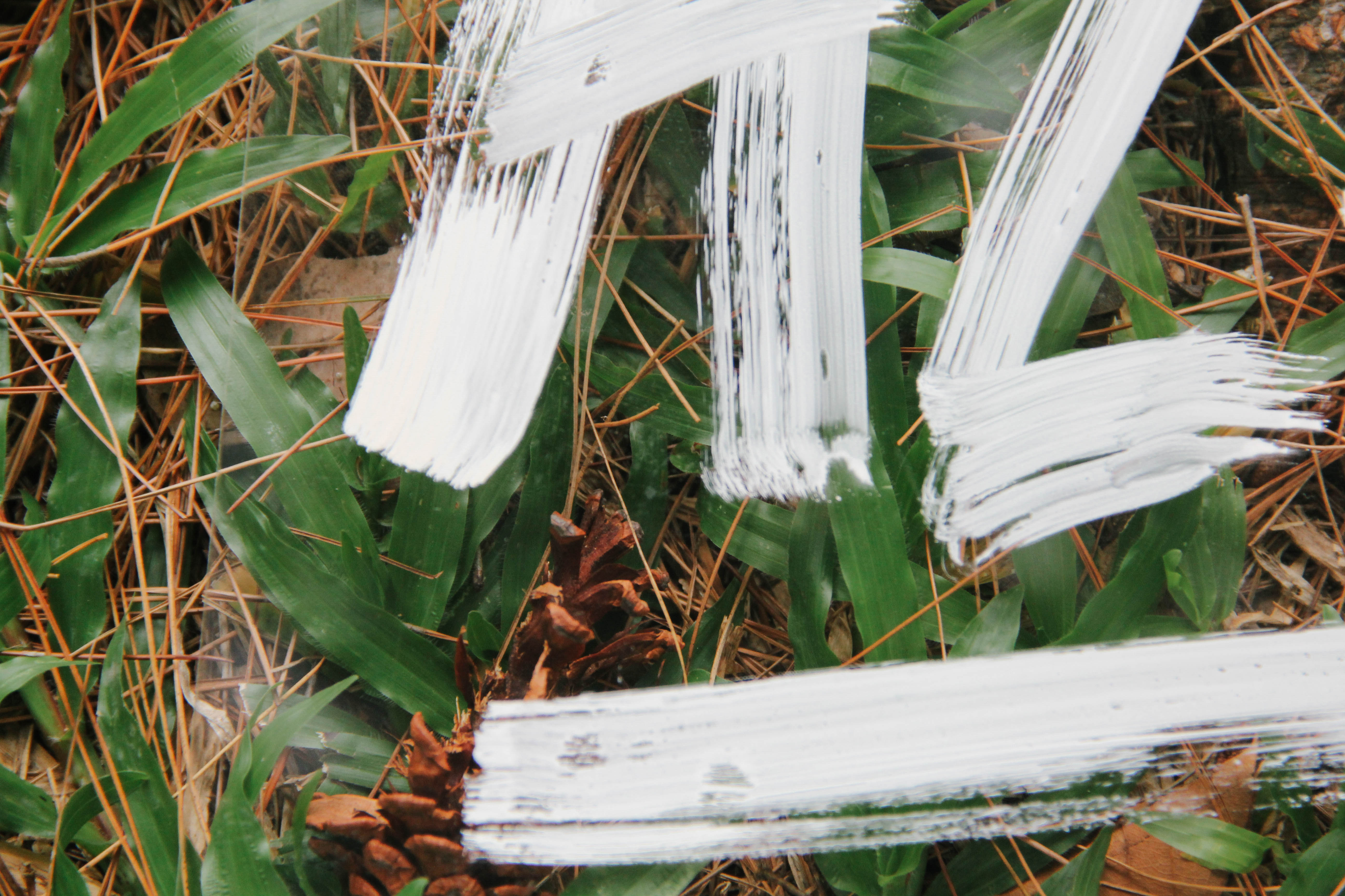
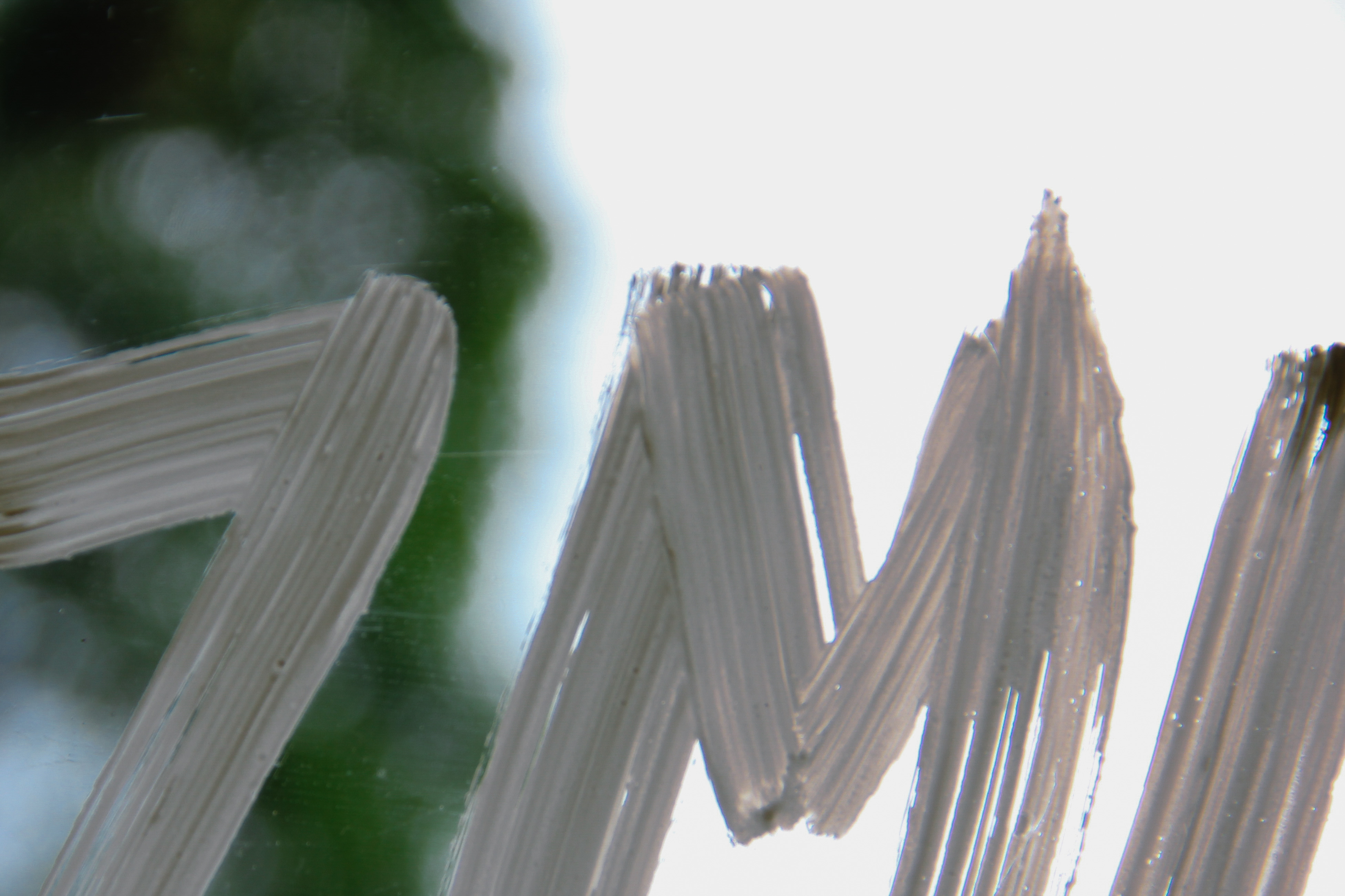
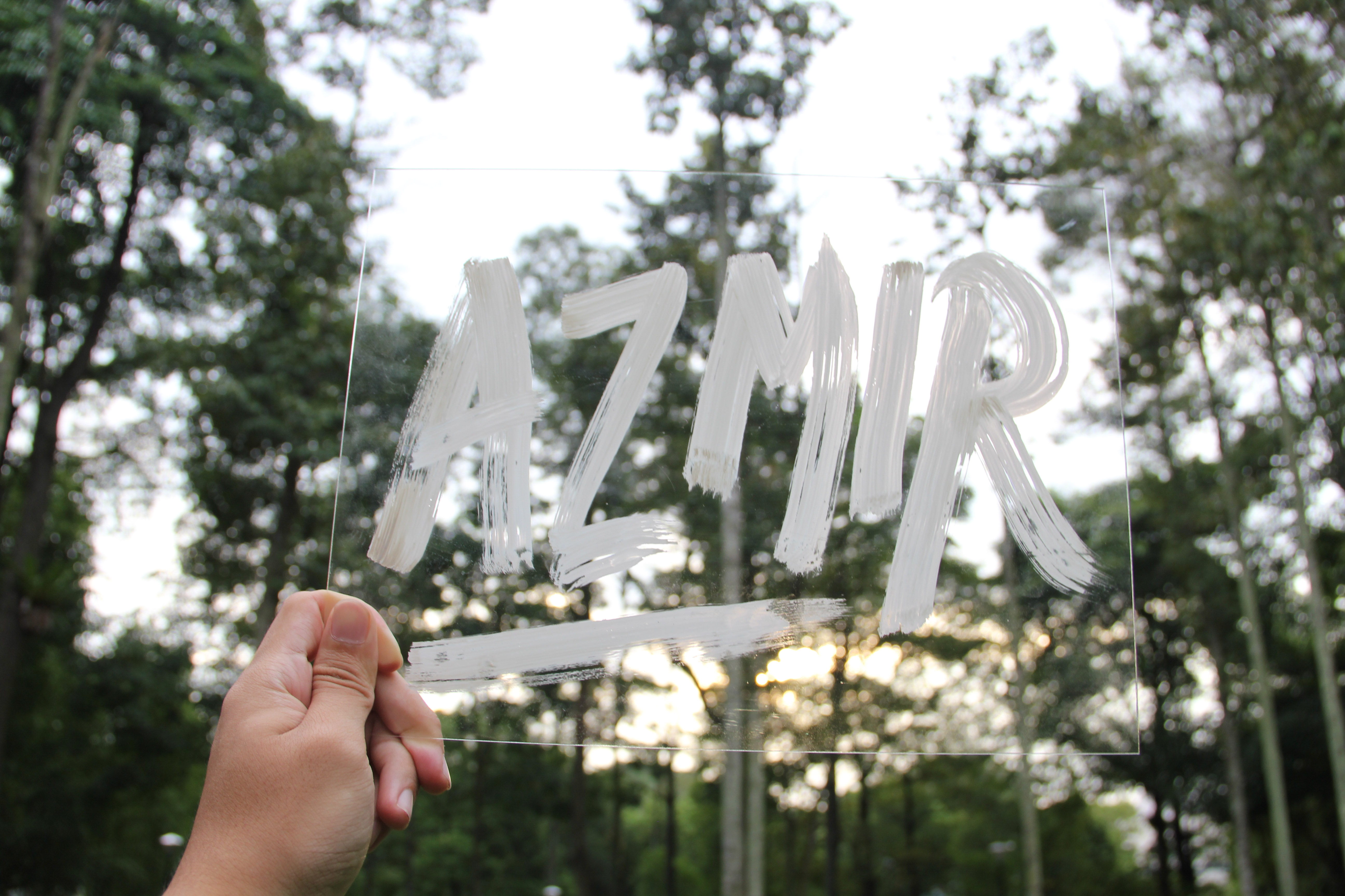
I’ve always been fascinated about cameras and different tools of storytelling. I developed a strong interest in photography and videography since I entered polytechnic back in 2010. My interest amplified when my mom bought me a Canon DSLR as a birthday gift and up till today, I am still using it for different purposes. As the years went by, different cameras were introduced to me and I was intrigued at how each camera has its own way of defining itself and its delivery methods. Therefore, I am now using these tools as a way of telling my stories. I like to film and take photographs when I travel to different countries, and put up short videos on Youtube so I can share it with the rest of the world. It is one of my ultimate goals to travel around the world and film. Also, the reason I chose to photograph parts of my name in different polaroids and then combining it together because its with these different parts of my life, when brought together, becomes a whole picture.
Overall, I had a good learning experience from making each individual composition all the way from the thought process up to the execution process, facing certain problems along the way but eventually finding out the solution to it, as well as the generous feedbacks from my classmates during consultation and during my presentation 🙂
You can view how I did all of these compositions here, BEHIND THE SCENES!